Order Desk

How Eleken’s redesign gave new life to an aging e-commerce order management app

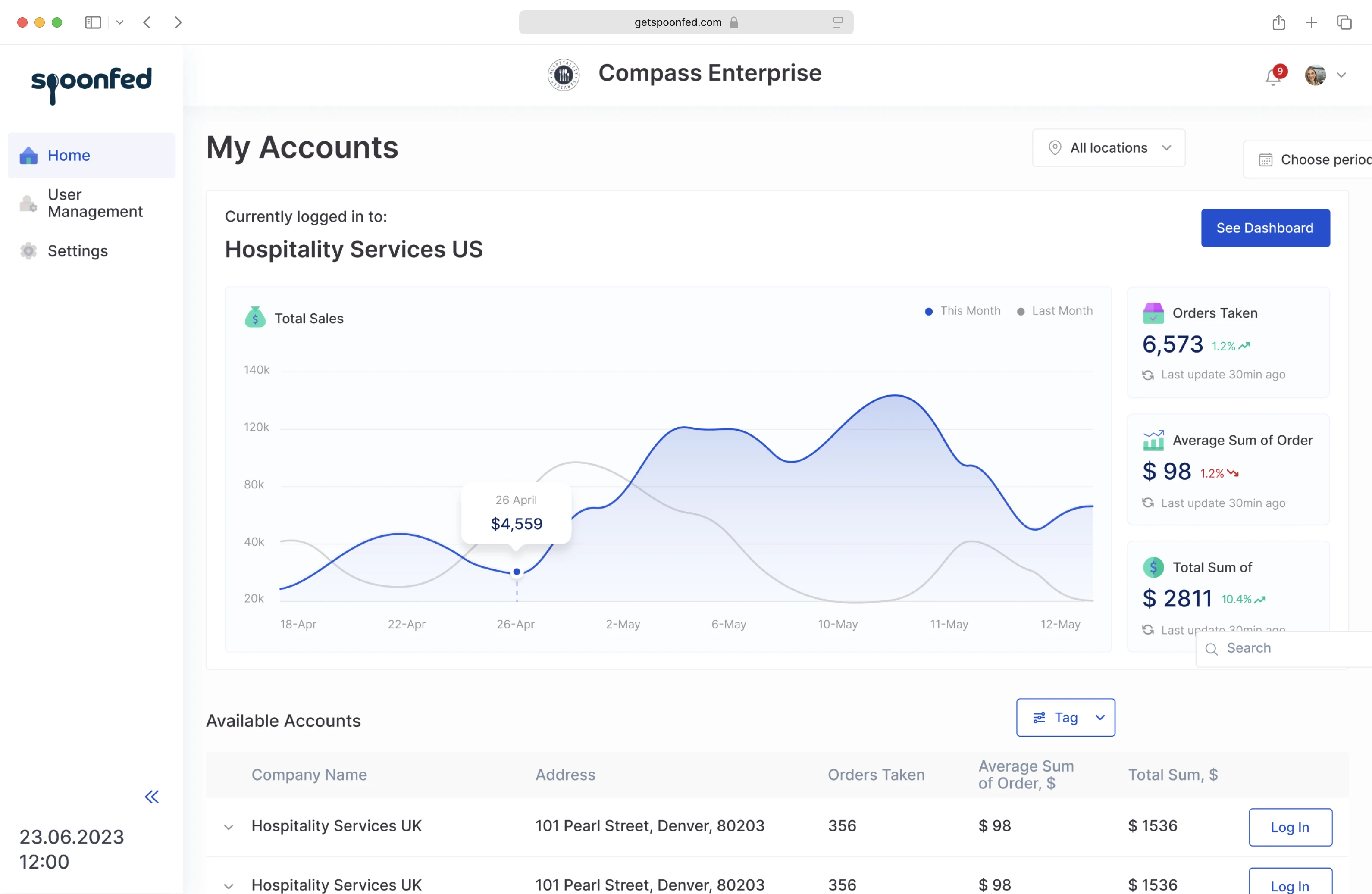
Order Desk is an e-commerce order management app with 300+ integrations that automates vendor workflow. They have been on the market since 2014 and have been growing steadily in terms of functionality and the user base. But over time, it became clear that the system got outdated and hard to maintain.  As features piled on top of each other without the underlying thought-out system, the workflows became too complex.
icon quote

Looking at the product with fresh eyes, 
it seems kinda intimidating

image

David Hollander, Founder /

image logo

One more issue the company had to overcome was the complete absence of the mobile app. Although most users still preferred the desktop version, the rising popularity of mobile devices meant they couldn't lag behind. But to move on to mobile app development,  Order Desk had to deal with the underlying tech and design system issues.

So Order Desk decided that rather than improving the existing app, it's better to "start it over" and do a complete tech and design revamp. They wanted their redesigned order management system to "look good and be really easy for customers."

Order Desk's developers tried to rebuild the app themselves, but they didn't have the necessary design expertise. After trying to find a freelance designer without much success, Order Desk decided to partner with a reliable design agency that:

Has prior experience in working with data-heavy apps.
Is able to design complex workflows in a simple-to-get manner
Can create an aesthetically appealing UI

And that's why they came to Eleken.

The redesign started with the UX audit to identify the issues

UX audit and design system analysis helped us identify some specific problems in terms of UX:

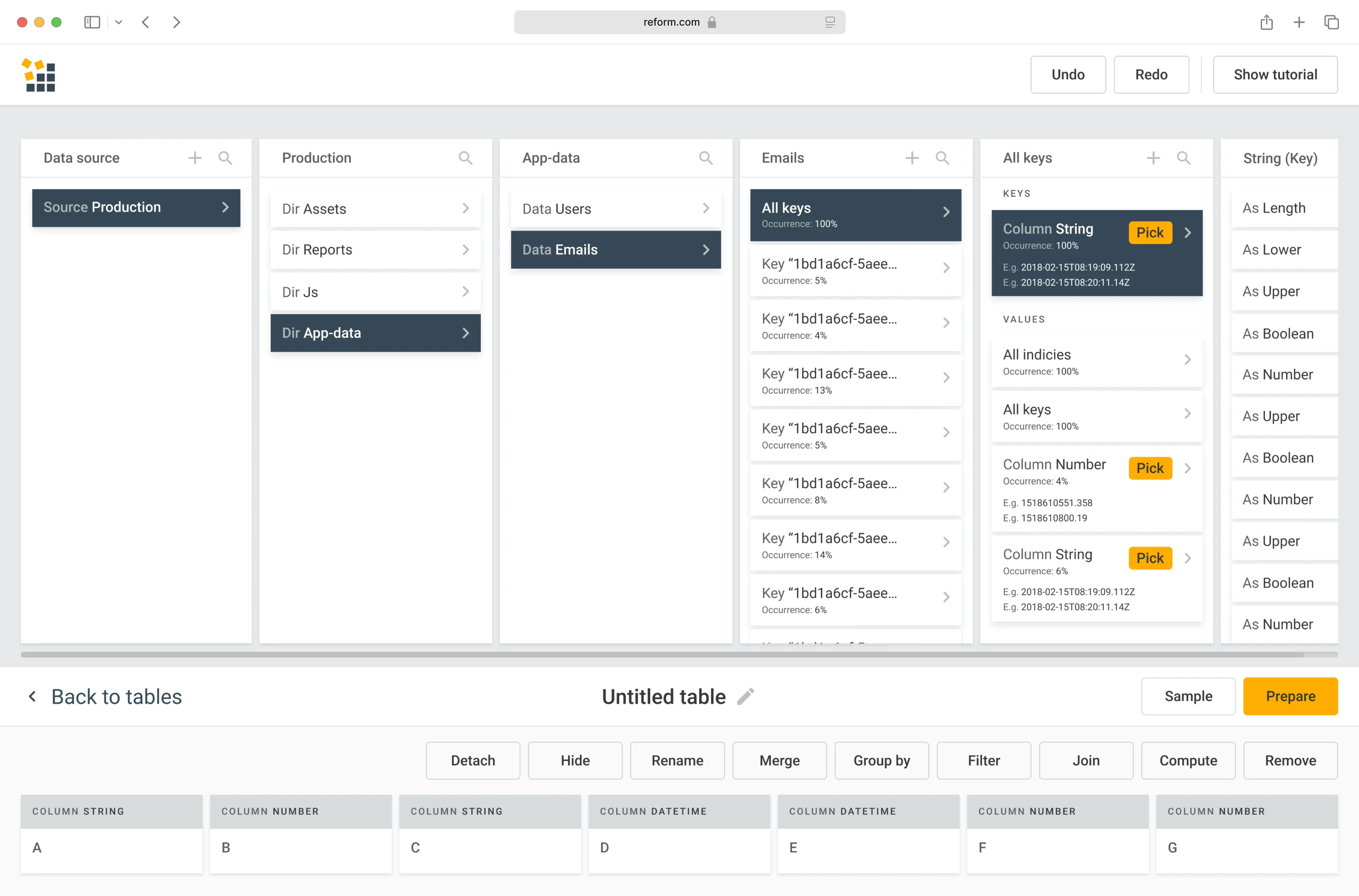
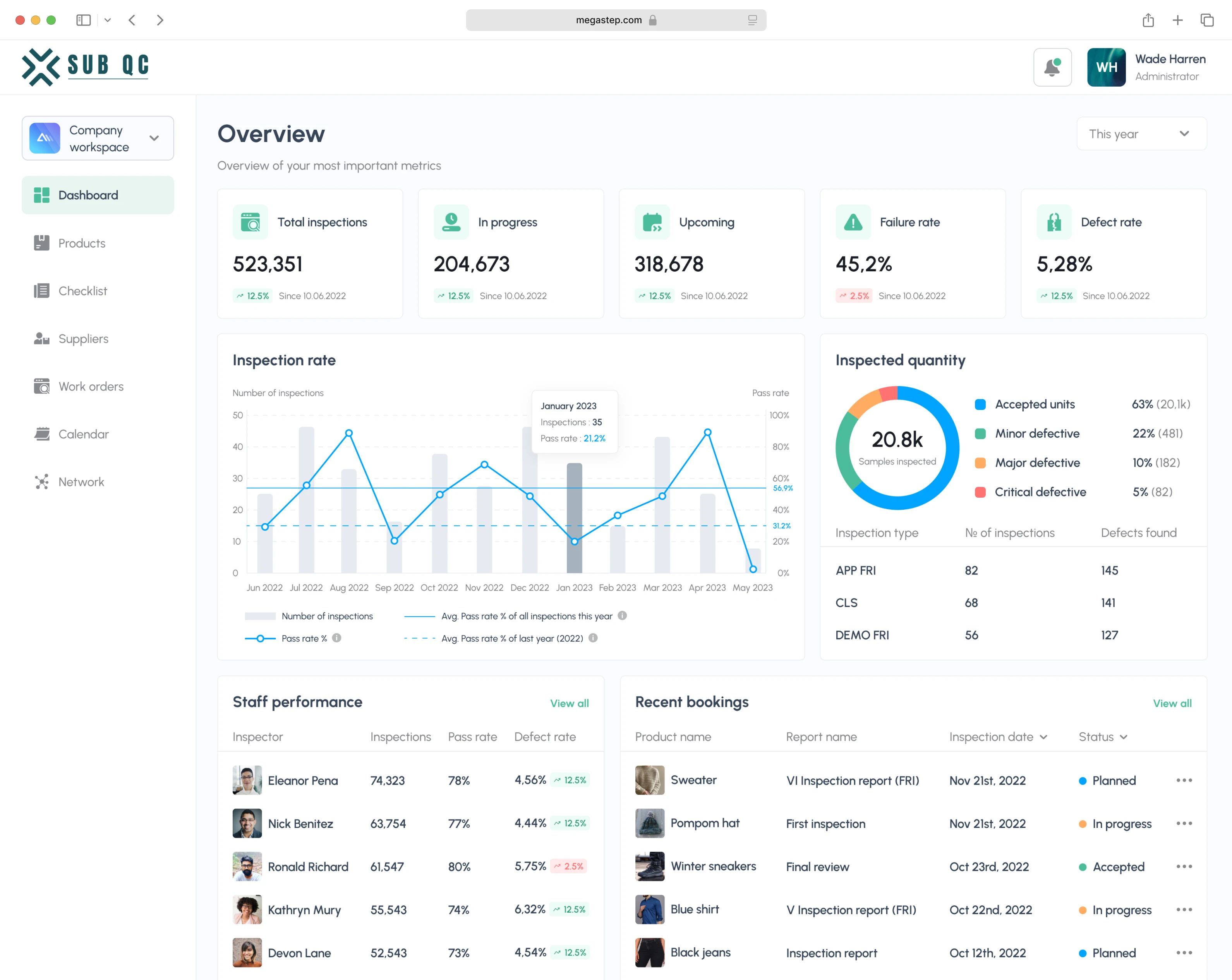
A lot of data was presented on one screen with no clear hierarchy or structure. It was especially noticeable with the sidebar menu. Some companies had up to 500 custom folders with no grouping between them.
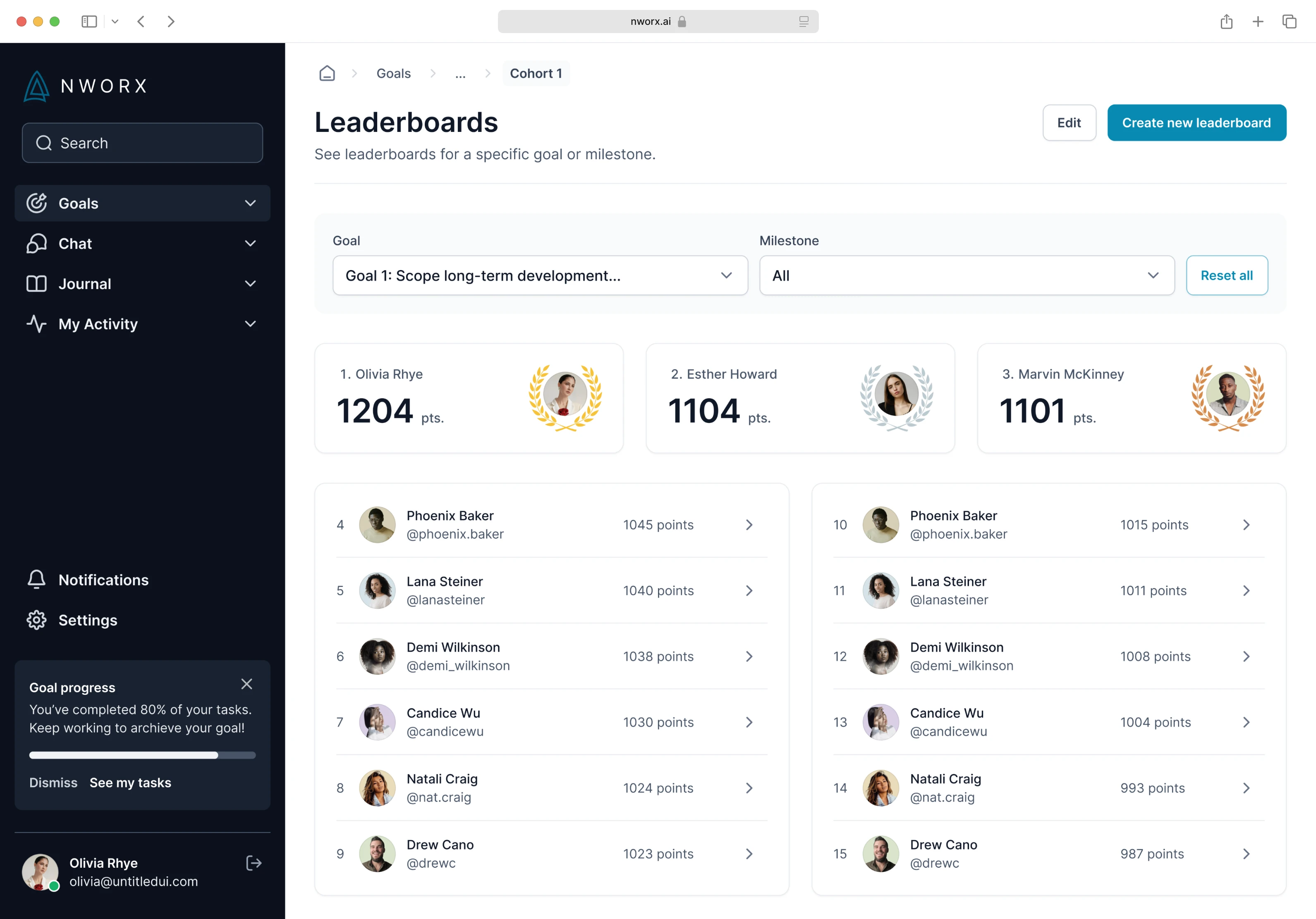
Bad filters. They were made to be customizable, but as the number of data displayed increased, lack of coherence and textual cues meant that only the person who created the filters might have been able to remember what this or that color stands for.
Lack of clear workflow when it comes to automatization sequences. Instead of having a straightforward, manageable list of actions, the user just piled up the actions and rules for different situations and hoped they would not contradict each other without their notice.
Email templates for receipts, invoices, etc, were the weakest point. They were not visualized at all. The users had to deal with long lines of raw code with no cues.

After identifying the major issues, Eleken designers got to work.

Restructuring the data and workflows

Our designers started with the most fundamental issue: the workflows.

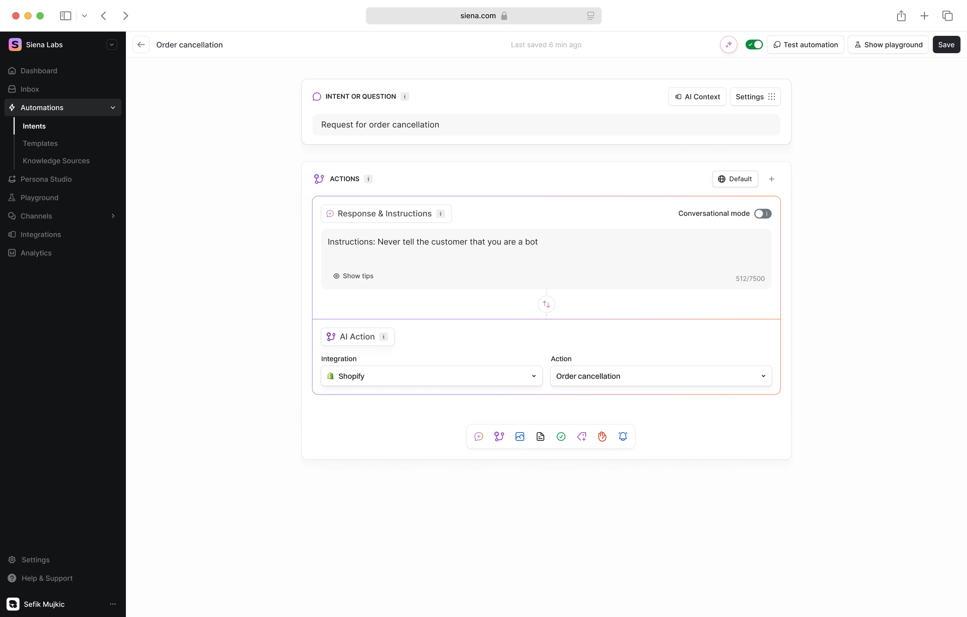
Creating linear and intuitive sequence builder

In an existing version of an app, users could build "rules": what should be done when an order comes through. These rules covered communication with printing houses or warehouses, dispatch, sending receipts and so on. However, all of this had to be done manually, and there were no safeguards against contradictory rules, which could cause mix-ups and delays in order delivery.

So, our designers turned it into a step-by-step sequence builder.

If the following action happened to contradict the previous one, it would simply not be enacted by the app, so it prevented the user from accidentally messing up the workflow.

Our designers also added a drag-and-drop feature to make the user's job even easier.

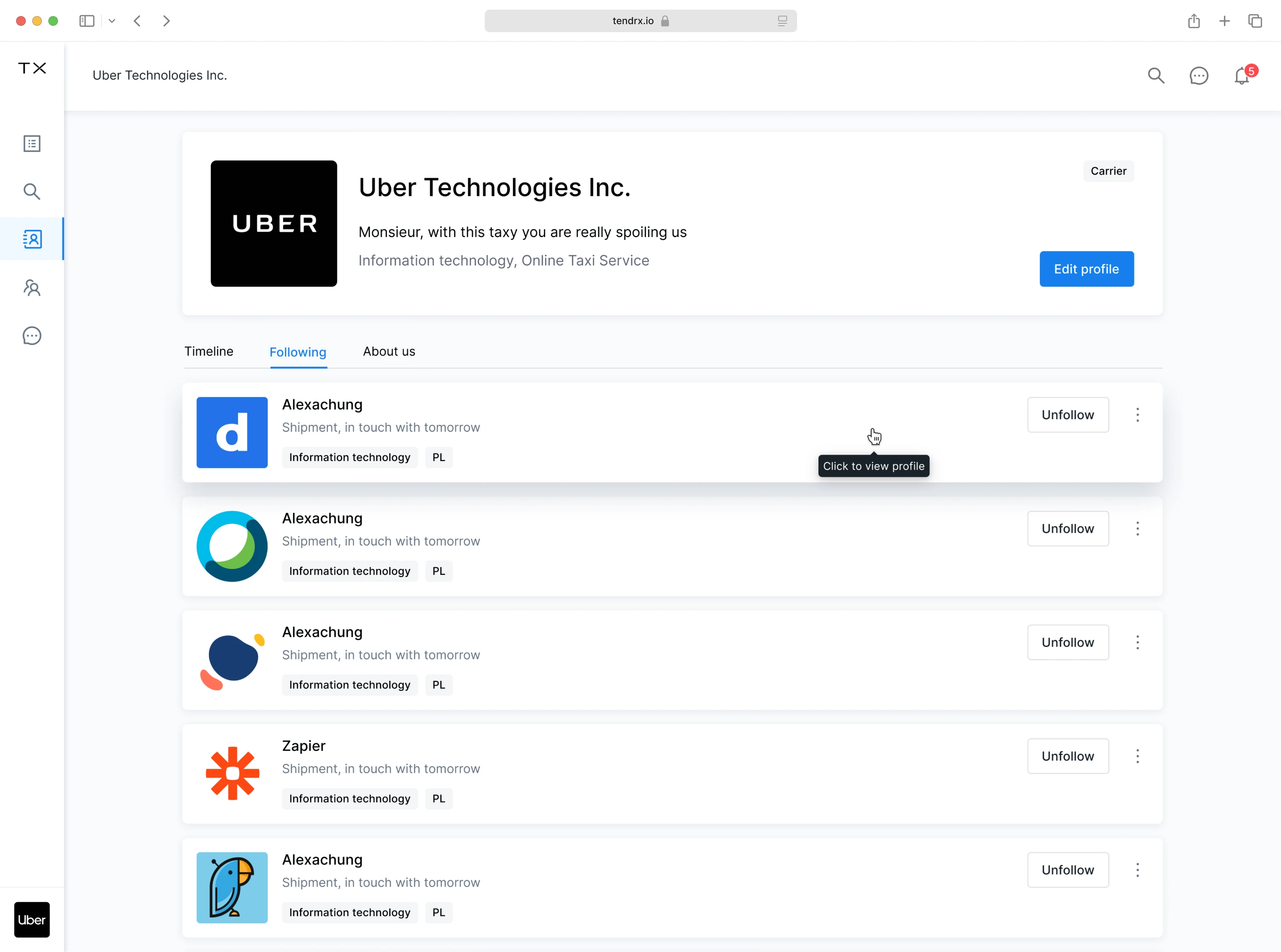
Organizing the hierarchy of the sidebar menu

The sidebar menu was another thing that posed a serious navigational issue.

The options in the "Tools" and "Settings" categories were not structured hierarchically.
The "Folders" category had no structure at all.
Automatically added folders mixed up with manually added, and some stores had hundreds of them. Navigating among them became pretty much impossible.

So, our designers simplified the sidebar menu and made the hierarchical structure much more clear and easier to navigate.

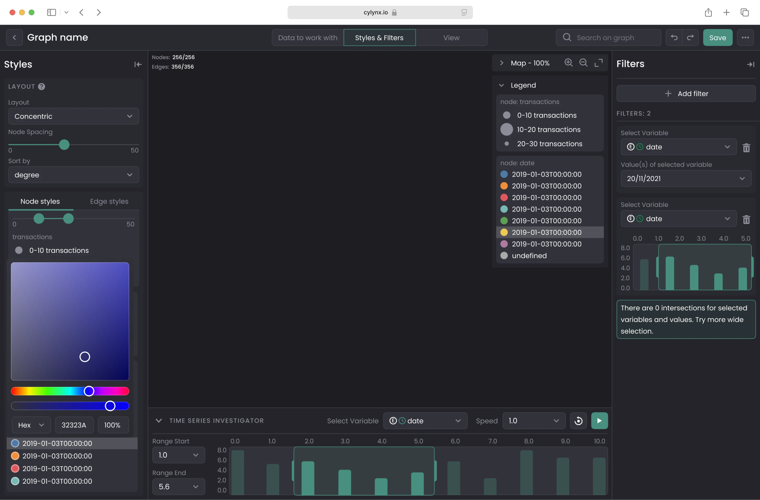
Labeling tags and filters

Previously, customizable colored tags were available, but it was not possible to label them. So, if there were too many of them or more than one person was working on the account, confusion was inevitable.

Adding the possibility to label the filters and making sure they are distinct in color was one of the easier fixes, which still made a world of difference to the ease of navigation.

Visualizing the raw code

Email templates posed a particular challenge to users and, to our designer as well. To edit a template, the user had to decipher quite the lengthy rows of code.

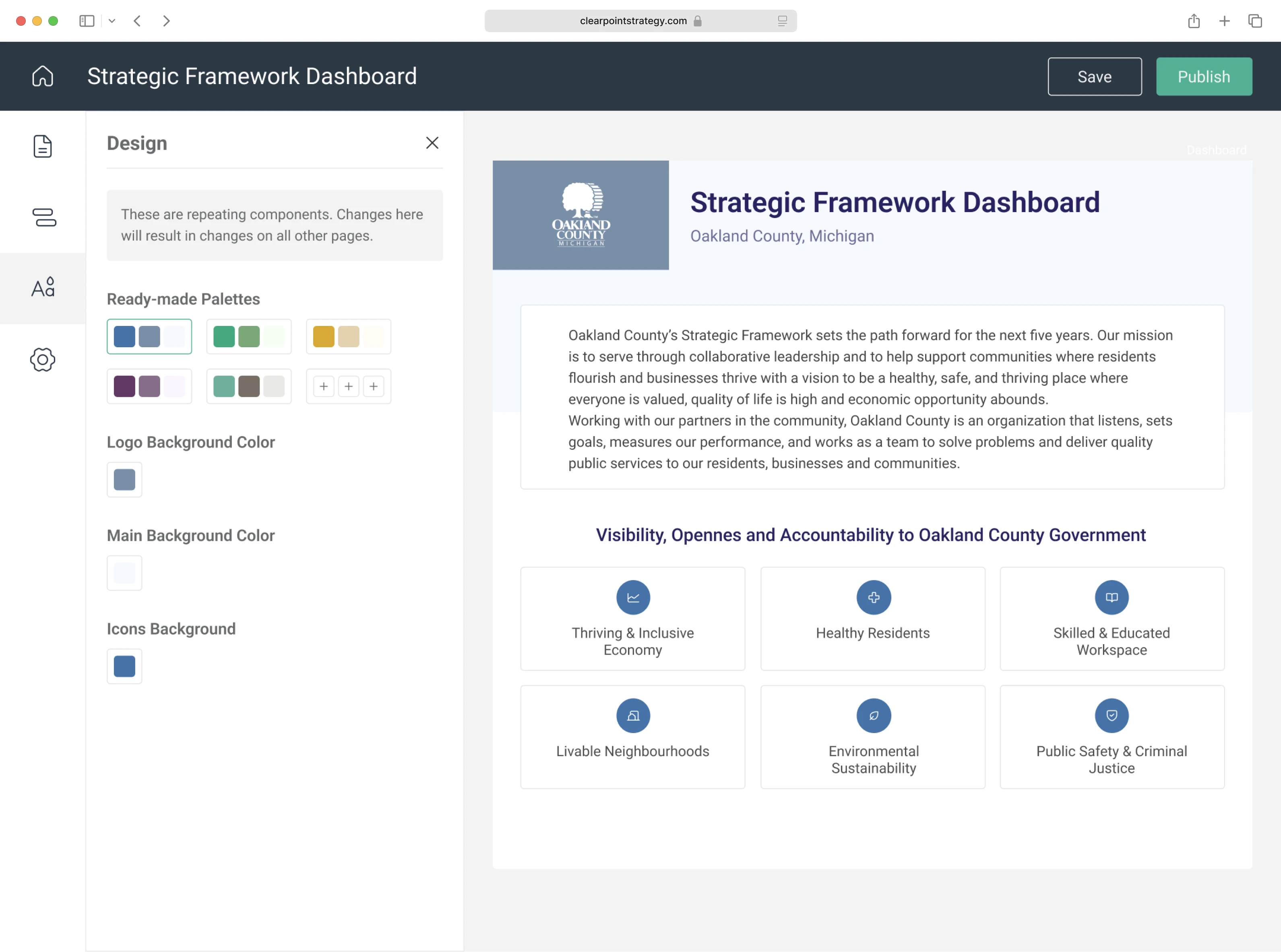
Here’s what we did to fix it. First of all, most information provided with HTML was turned into a settings panel on the right. It resembles the interfaces of all popular text editors, so it immediately became more understandable

Where it was impossible to get rid of the code completely, our designer provided visual cues on what piece of data should go where.

And in most places, the add buttons were created with the drop-down menus, which substituted the raw code with the visual constructor.

Going mobile

As a final touch, our designers designed the mobile version of the app.

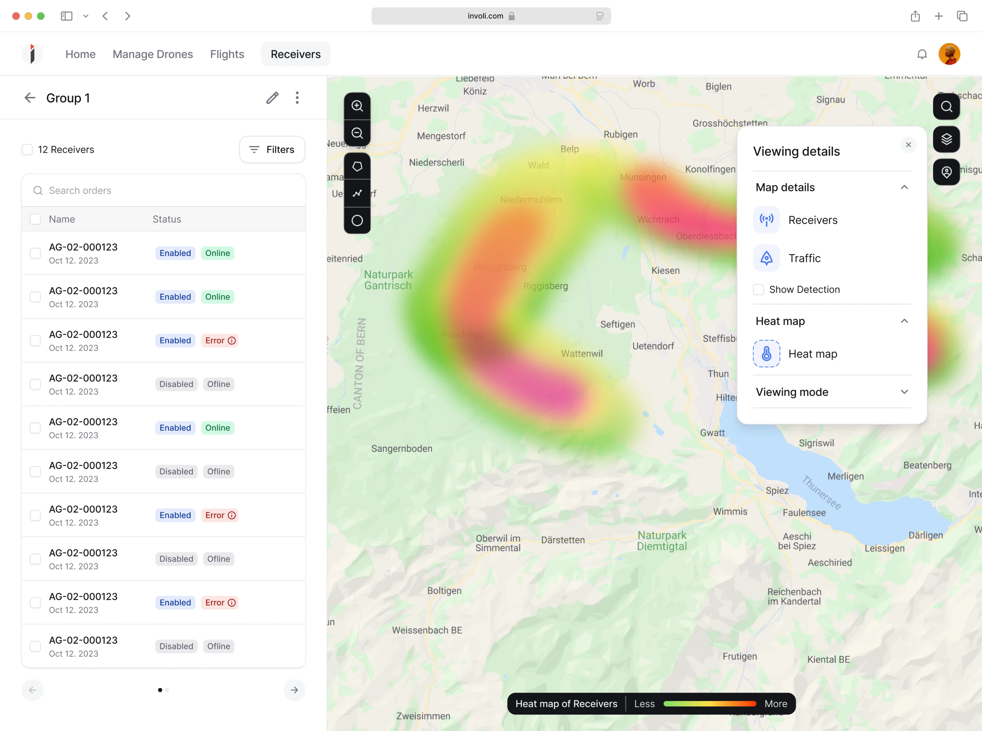
The task of any good mobile app is to fit only the necessary information on one screen and avoid any unnecessary scrolling, especially sideways, which was a major problem with viewing the desktop version on the phone. Our designers created a clean and straightforward mobile adaptation that allowed users to work on the go without losing any data in confusing scrolling and zooming in.

After our work was done, Order Desk got a more user-friendly and intuitive order management solution

Doing a complete tech overhaul and redesign takes time. Order Desk has been working with Eleken for half a year now, and the work is still in progress. But the results are already there.

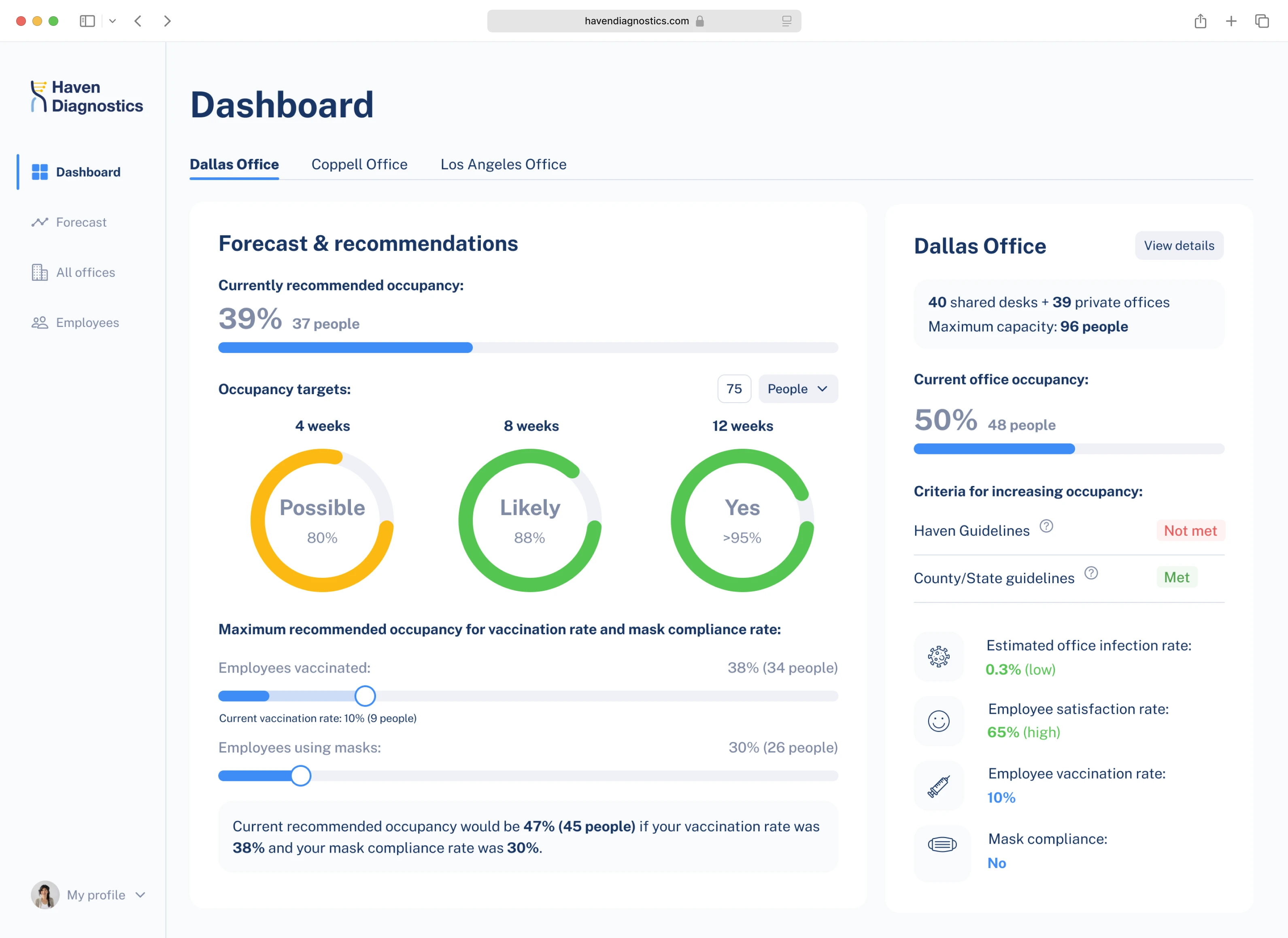
Working on Order Desk, our designers ensured intuitive and straightforward workflows, clear navigation and data hierarchy, as well as added visual and textual cues where necessary. All of this makes the redesigned version of the Order Desk easy to use, reduces the learning curve of new users, and lessens the errors and dissatisfaction of existing ones.

Let's design something special

If it feels like our UI/UX design company is a good match, but you still have questions about our work process, we can give you a free 3-day trial working with one of our designers.

Let’s talk