JobCall
Helping a property maintenance startup turn their MVP into a full-scale product
When you’re a property manager with the whole apartment complex under your responsibility, there’s always a great volume of calls from residents with numerous problems and questions to resolve: the air conditioning went out, the heating doesn’t work, the shower is leaking, and much more.
Managing and prioritizing these requests is a big headache. Most of the time, property managers and their workers are either resolving resident issues, giving tours, or are just not present to answer calls at all. As a result, some calls get missed and left in a voicemail box that is disorganized and difficult to search through. Because of this, fewer people sign leases, the level of resident satisfaction drops, and the business receives less revenue.

To help property owners cope with this issue, JobCall created an app that simplifies receiving, prioritizing, and resolving resident call requests - starting with emergency maintenance.
As their first step, JobCall built an MVP version of the product to prove the concept and quickly gain first users. A minimum viable product was enough to successfully start helping property owners make their businesses more efficient.
But what comes after developing an MVP?
An established loop of iterations based on customer feedback should gradually turn a minimum viable product into a coherent fully-fledged product.
This way you can keep early adopters interested in your offer and any of its further updates. It not only has a significant effect on how the public perceives the business, but also creates new opportunities to generate more revenue.
When the JobCall team was developing its MVP, they needed to do it quickly, and with minimum expenses, so they didn’t pay much attention to the visual aspect of their product. This led to many design issues both with the user interface and the user experience, which complicated the company’s further growth.
At this point, it was especially crucial to have a professional UI/UX designer with expertise in SaaS product design on board to be able to quickly react to user feedback and make improvements that suit both customer requests and company strategy.
That’s when JobCall reached out to Eleken for professional design help
We joined the JobCall team to help them evolve their software so that they could generate a loyal customer base and, eventually, more revenue.
Basically, our scope of work consisted of two main tasks:
- Refining existing UI design and adding new features to the interface.
- Creating a responsive design to make the mobile version easier to use.
We used an original product version as a basis, reviewed and improved it. Our goal was to make it appealing and intuitive for the end user. To be able to make informed decisions on how to refine the app’s interface, together with the JobCall team, we conducted several user interviews that allowed us to identify customers’ true needs.
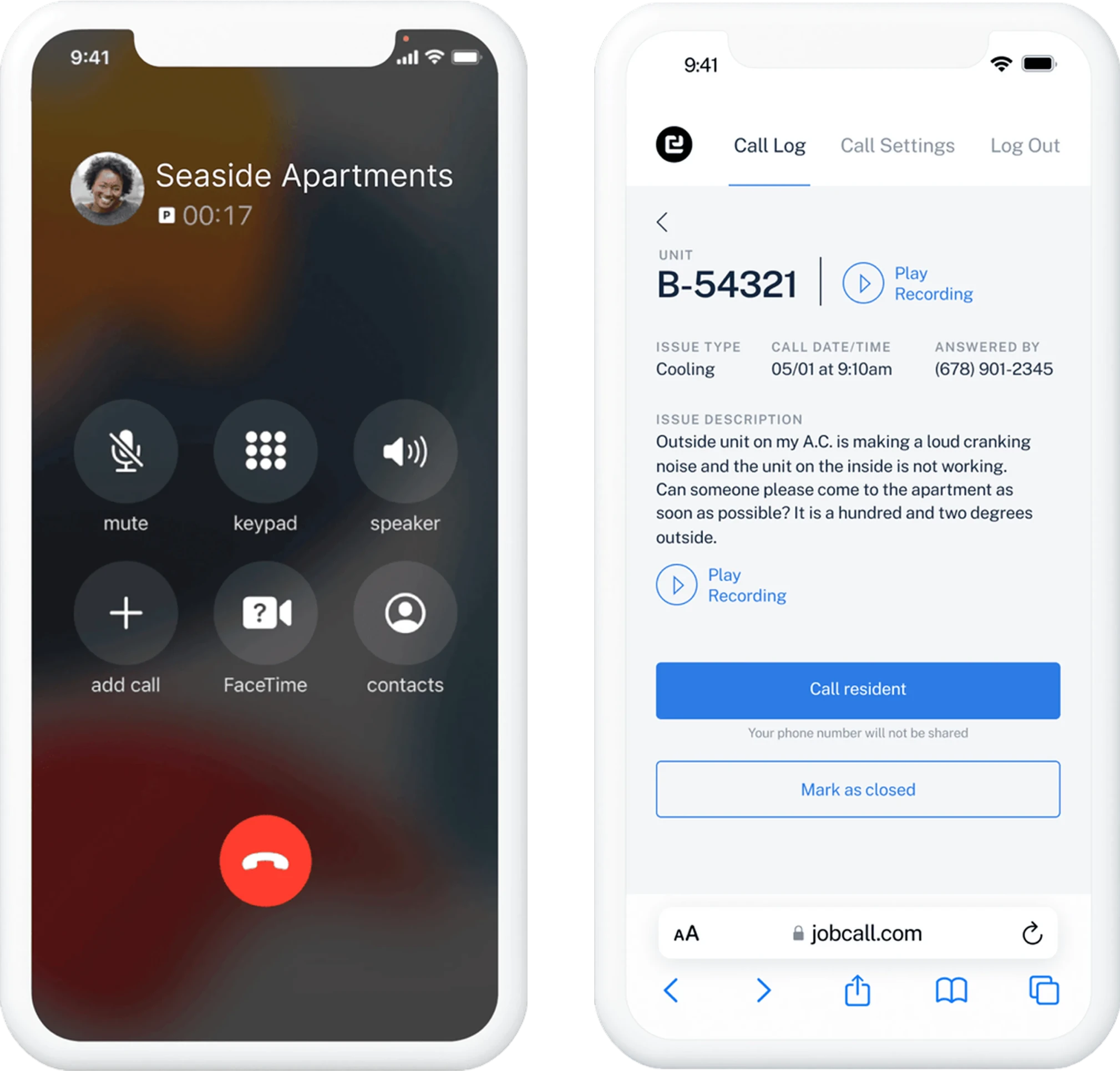
To better understand the changes we made, here’s a brief explanation of how JobCall works
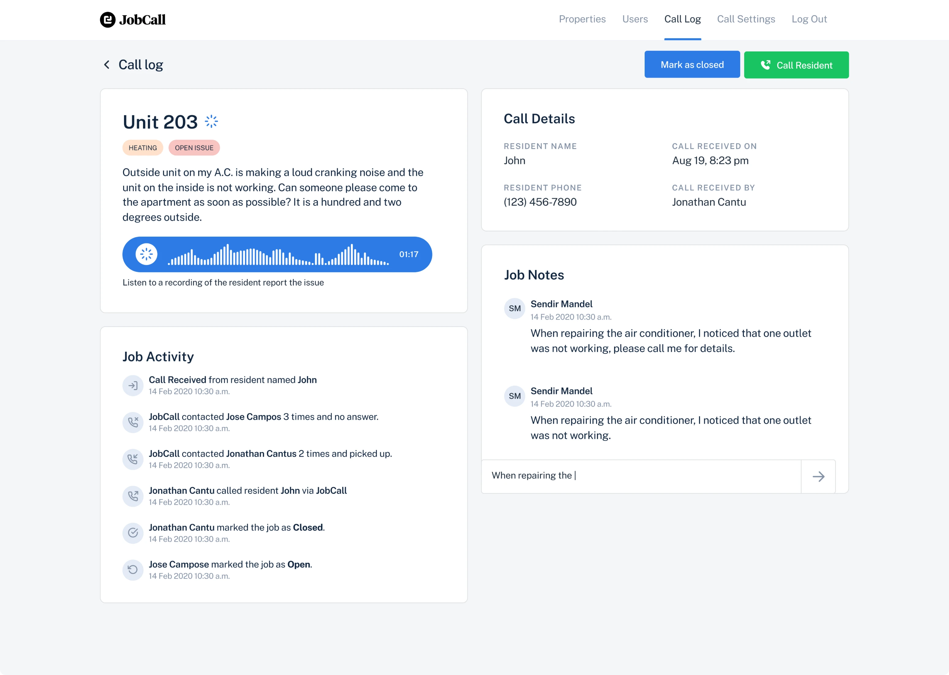
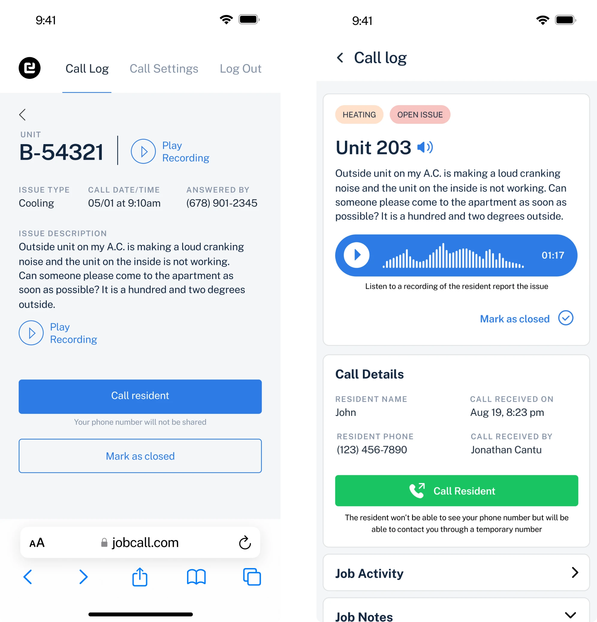
When a resident calls the property manager with an emergency issue, but for some reason, the call is missed, the resident leaves a voice message that is then displayed in the JobCall.
Property managers and their staff access the app to
- View the list of requests that residents leave about issues they experience.
- Answer issue requests, call the resident back, make notes regarding the issue and resolve it when the work is done.
- View the list of workers responsible for resolving issues and their phone numbers.
Admins can additionally assign workers responsible for certain issues, add, edit and delete the users and the property.
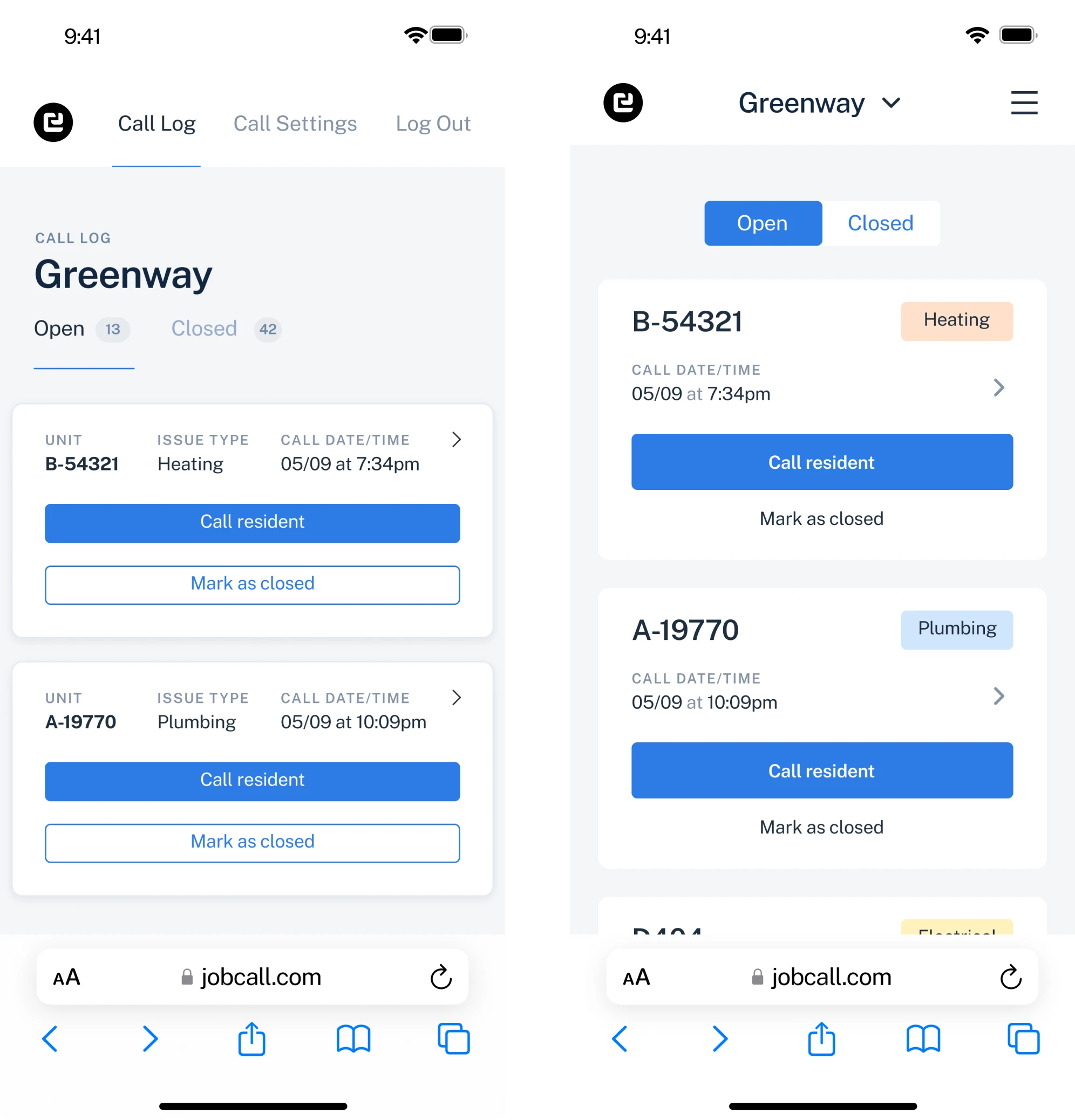
Reducing the amount of time needed to search through the list of issue requests
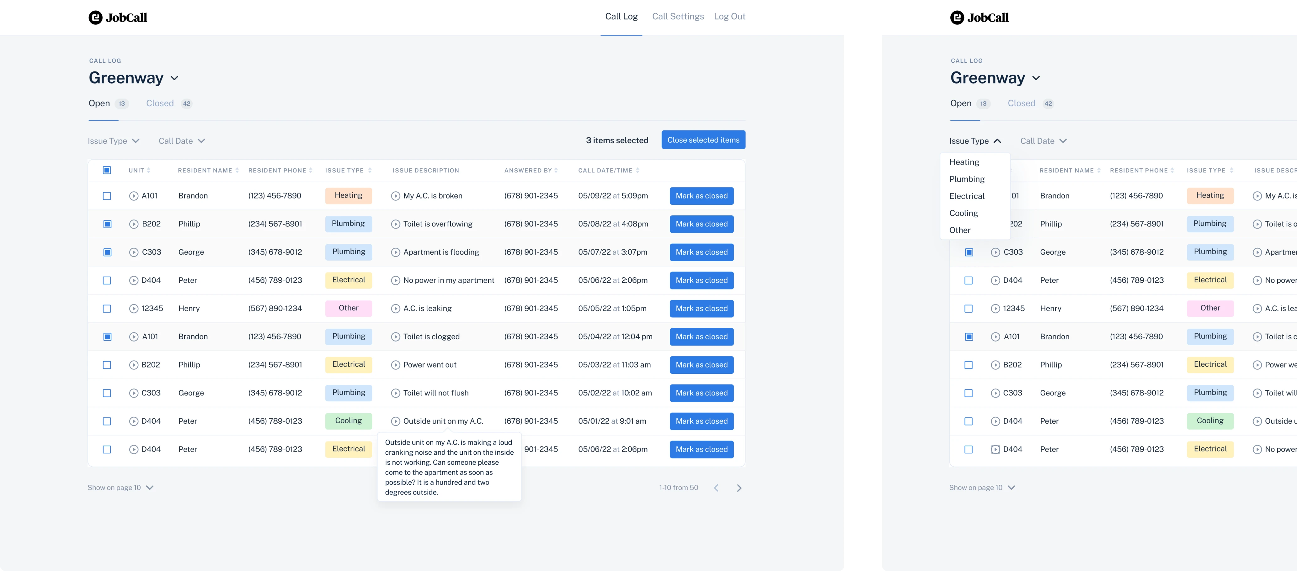
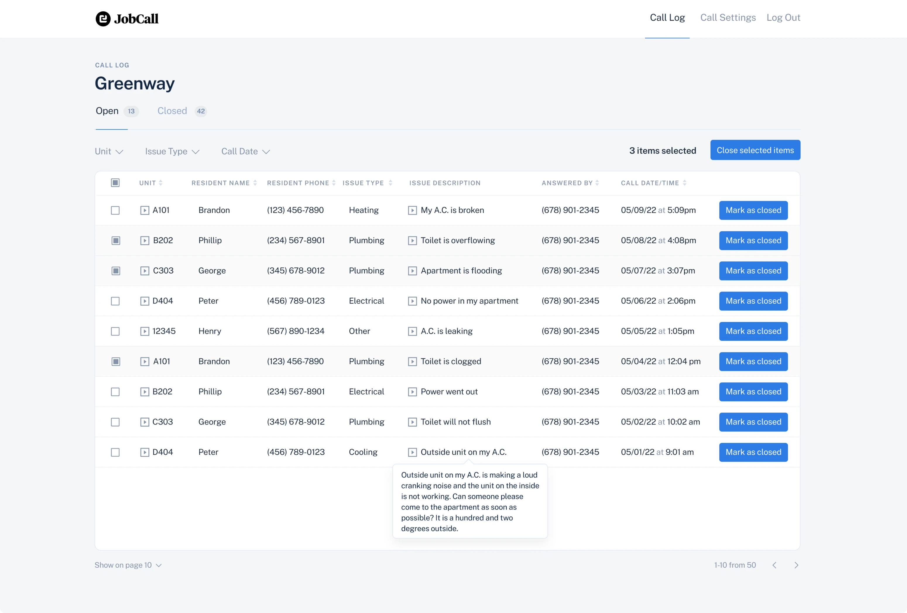
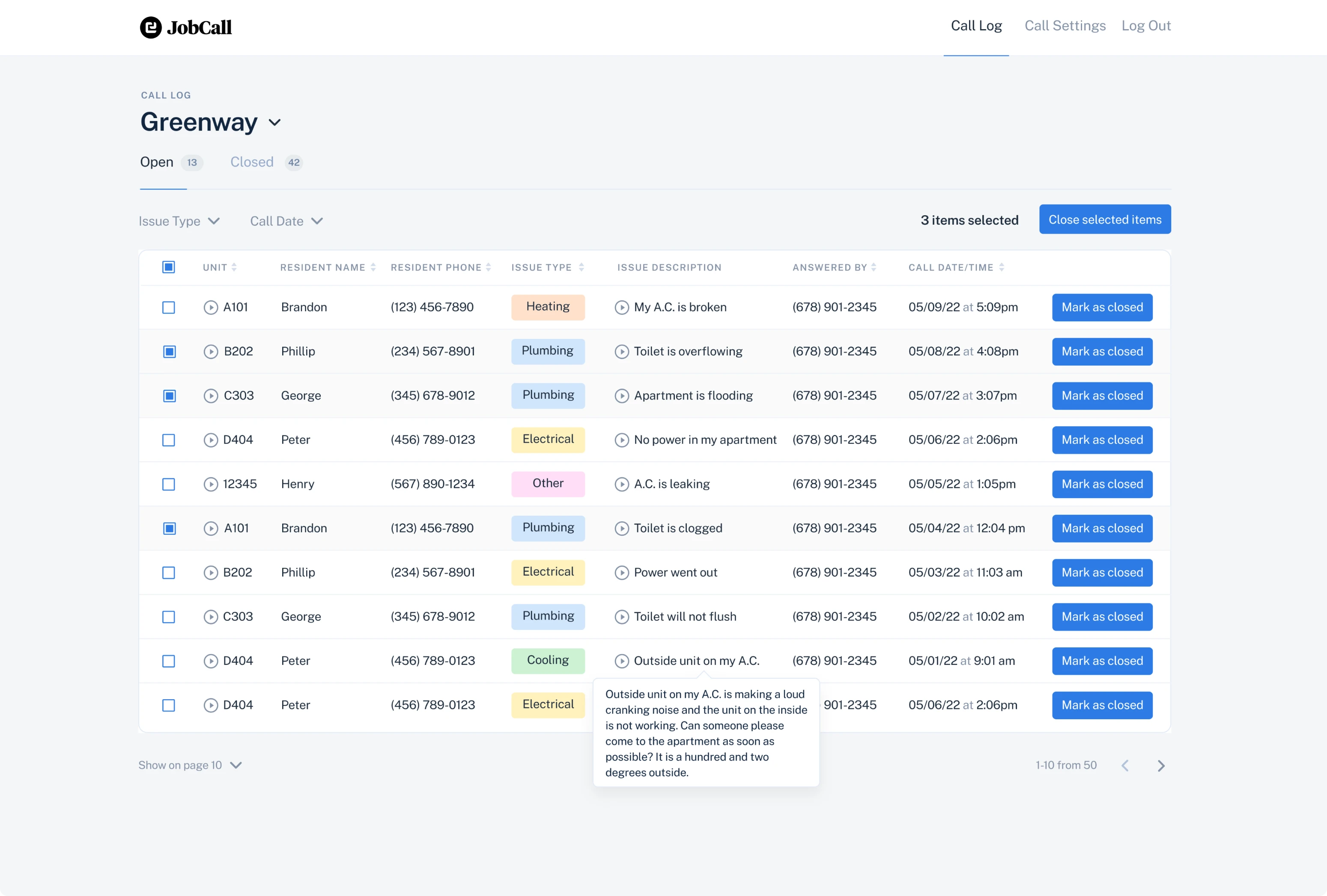
First of all, we had to enhance the user experience on the Call Log page - the screen that includes the list of issue requests and all the information about them.
To help users quickly scan through a great number of requests, we needed to make different issue types clearly visible.
To cope with this task we
- Highlighted issue types using different colors.
- Added filter functionality to enable quick search.
As well, to make the process of interacting with issue requests even easier, we offered to design a multi-choice feature. This way, if the user needs to open or resolve several requests at the same time, they will be able to easily flip through pages and choose the needed number of cases to work with. Such an improvement makes it possible to accurately estimate the scope of work and is more convenient than infinite scrolling.
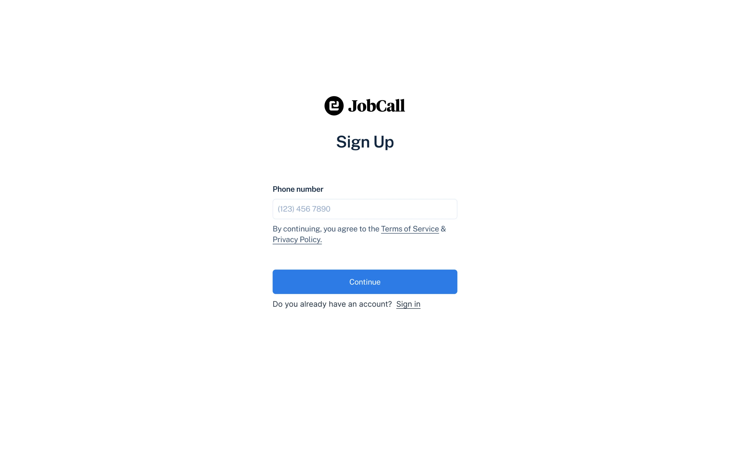
Decreasing the users' workload by simplifying the sign-up process
While working on the app’s UI, we noticed that the sign-up process was inconvenient and complex both for admins of the app and for workers that wanted to join it.
Previously, to get access to the application, a person should have sent an email with their personal data to the admin, then the admin had to manually put this information into the app and register the new user. Also, each time the user wanted to sign in, they had to fill in their phone number and wait for a verification code to start using JobCall.
To make the lives of users and administrators easier, we offered to enable users to independently enter data for registration, and let admins confirm or decline the requests to join JobCall.
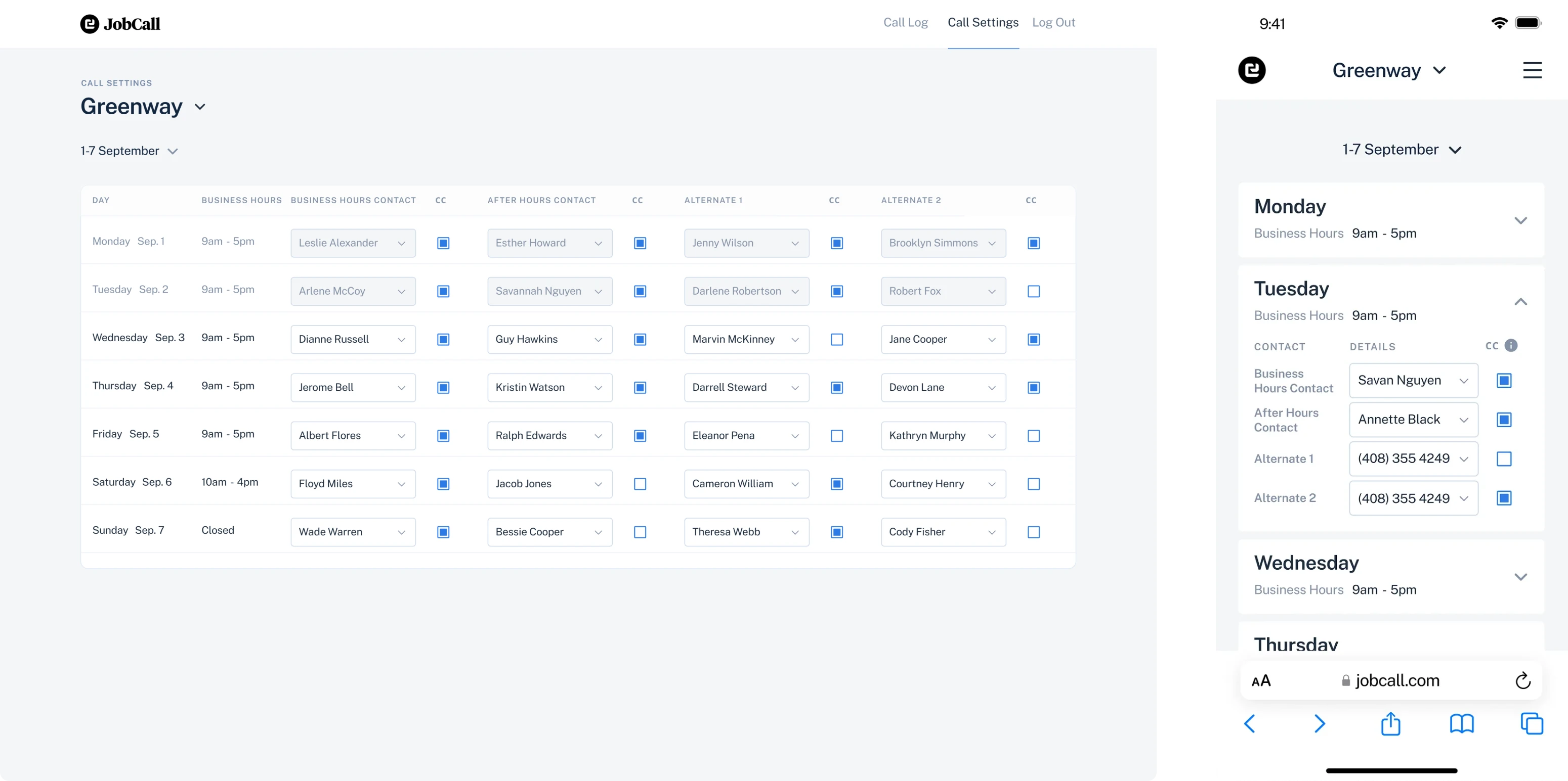
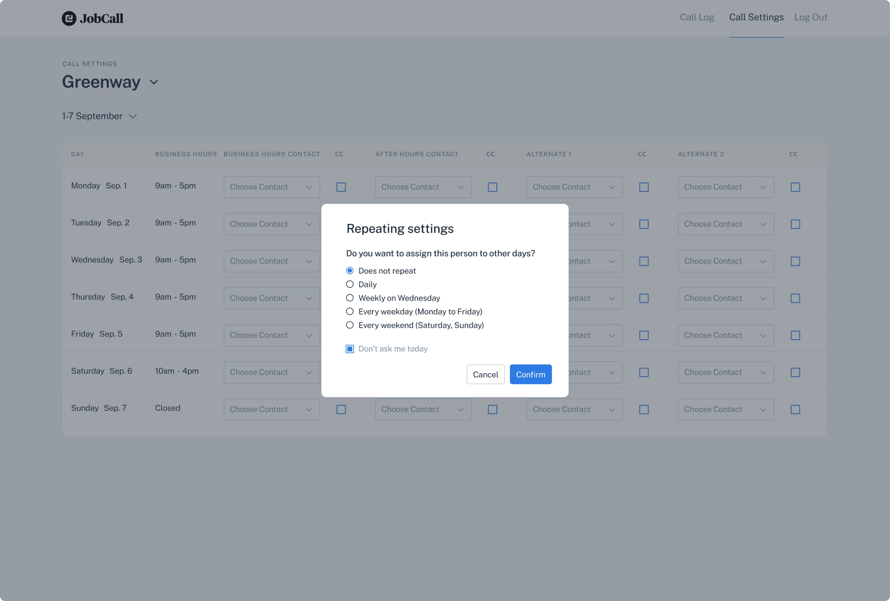
Making the process of assigning workers faster and more efficient
Previously, JobCall admins could assign people responsible for receiving calls from residents within one week only. This way, at the beginning of a new week, they had to repeat the whole process again. Additionally, it was possible to appoint workers only by filling in their phone numbers, which was quite lengthy and inconvenient.
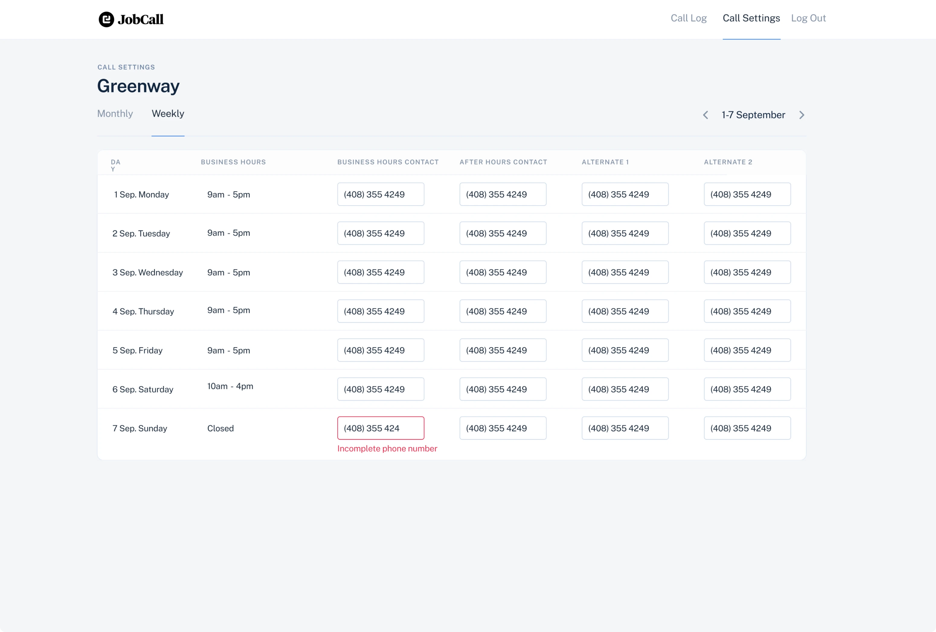
To let admins plan the work further than seven days ahead, we enabled them to choose any dates they want. Now they can assign workers by filling in their phone numbers or by choosing them from the drop-down list.
To speed up the assigning process, we created a modal window that allows to repeat settings automatically.
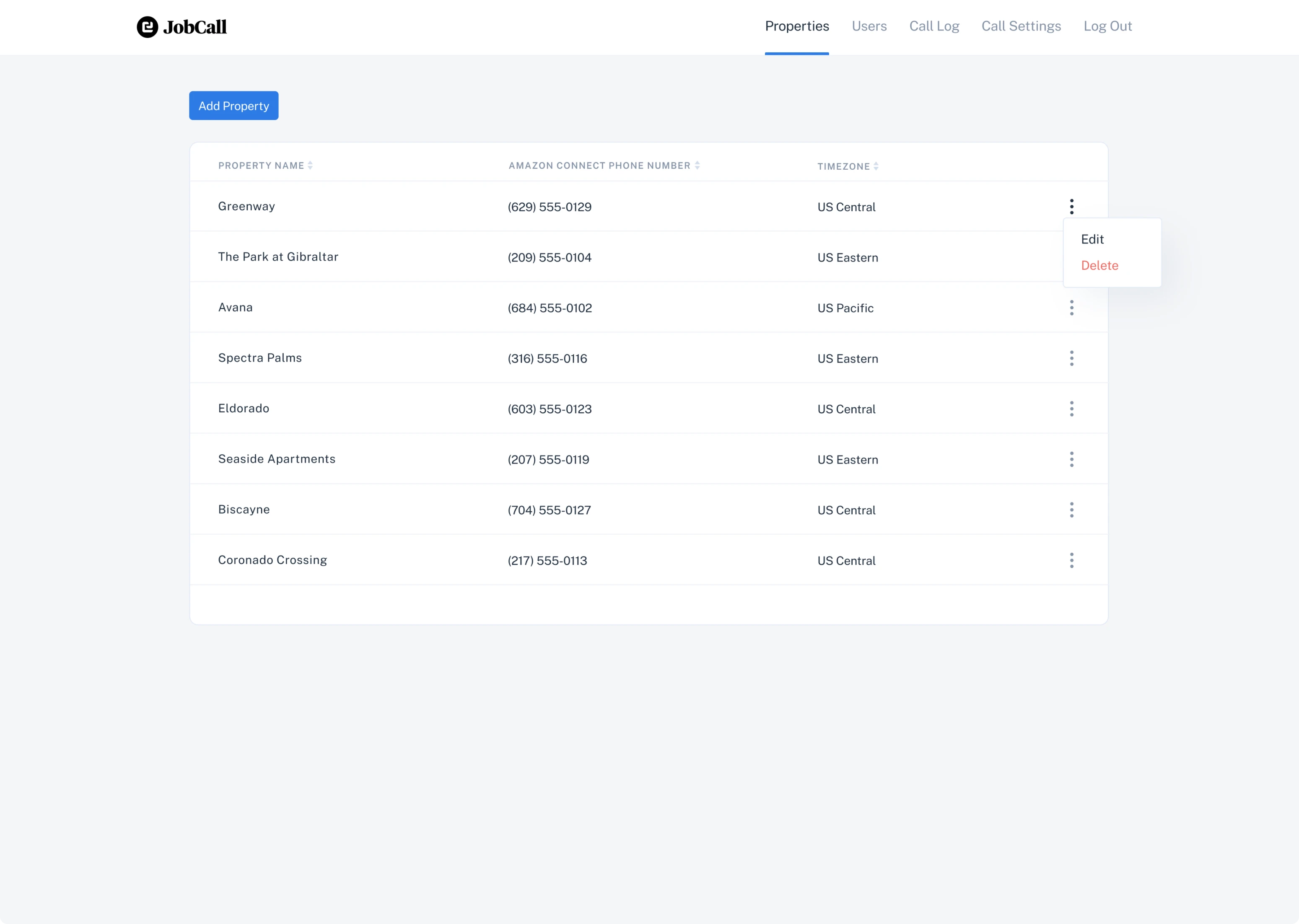
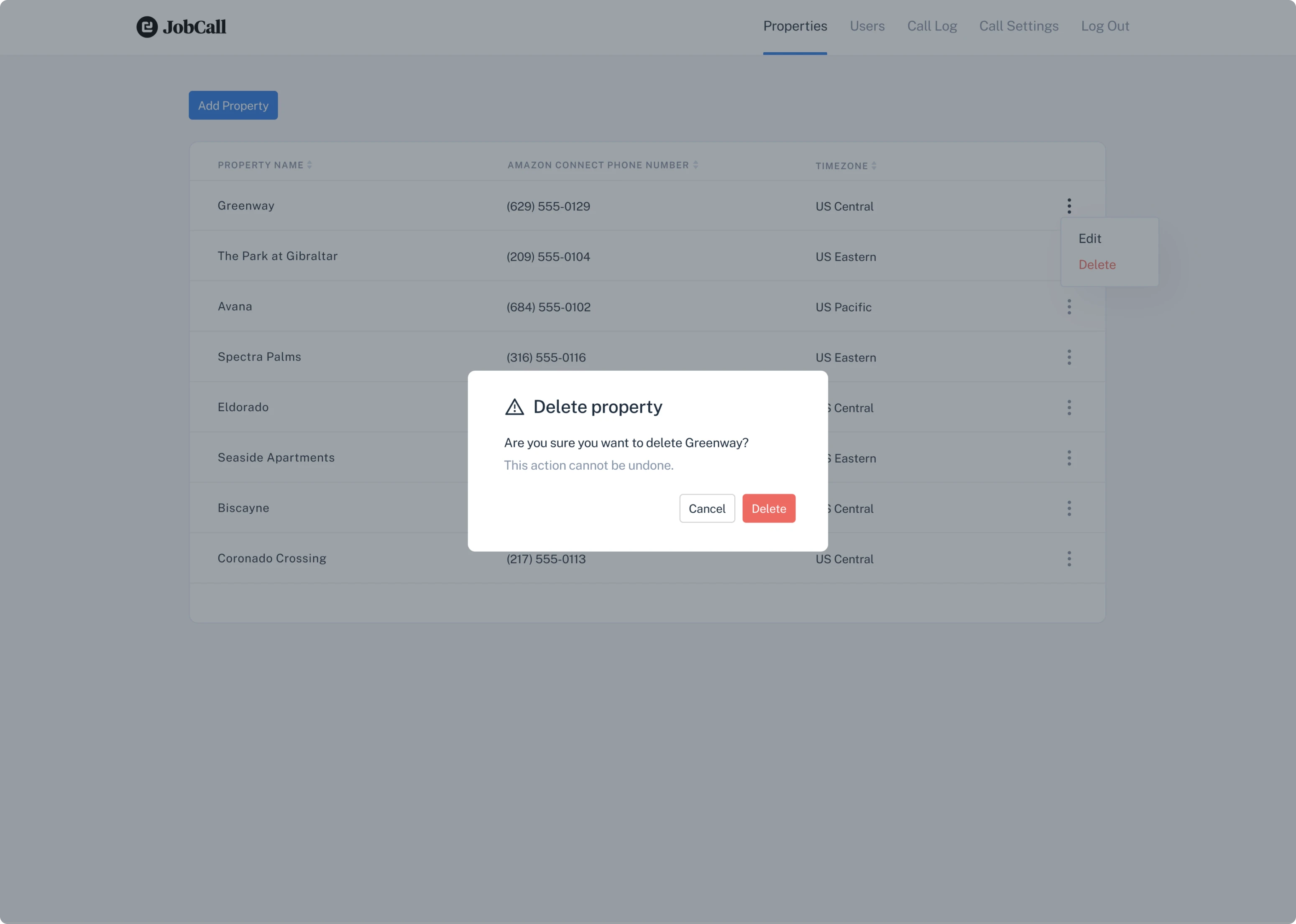
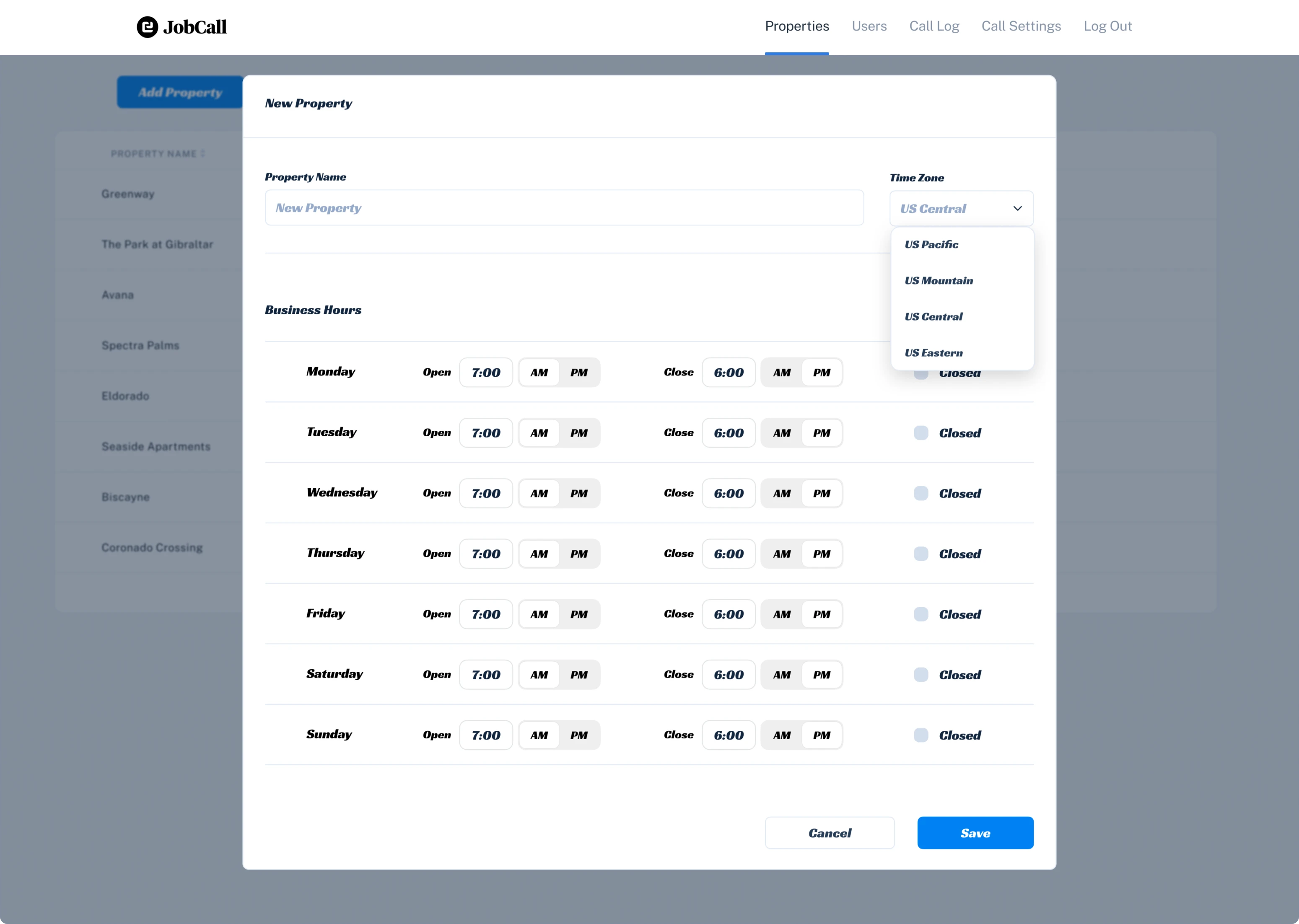
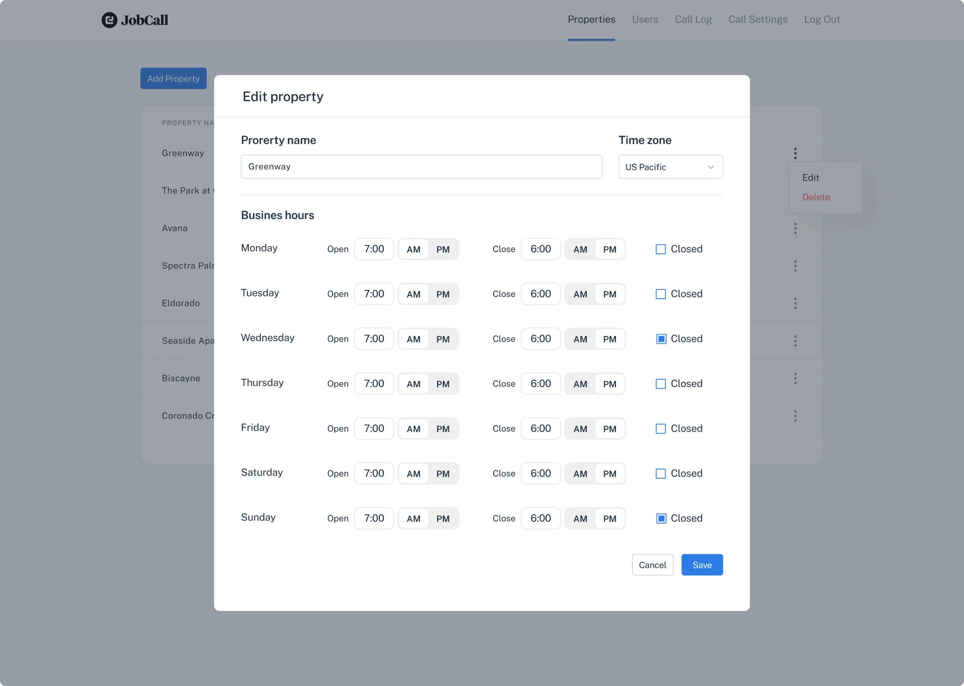
Rethinking the Property page to make it intuitive
Important features available for admin users only are adding, editing, and deleting properties. However, when you look at the Property screen interface in the MVP version, you probably won’t understand how to call out this functionality.
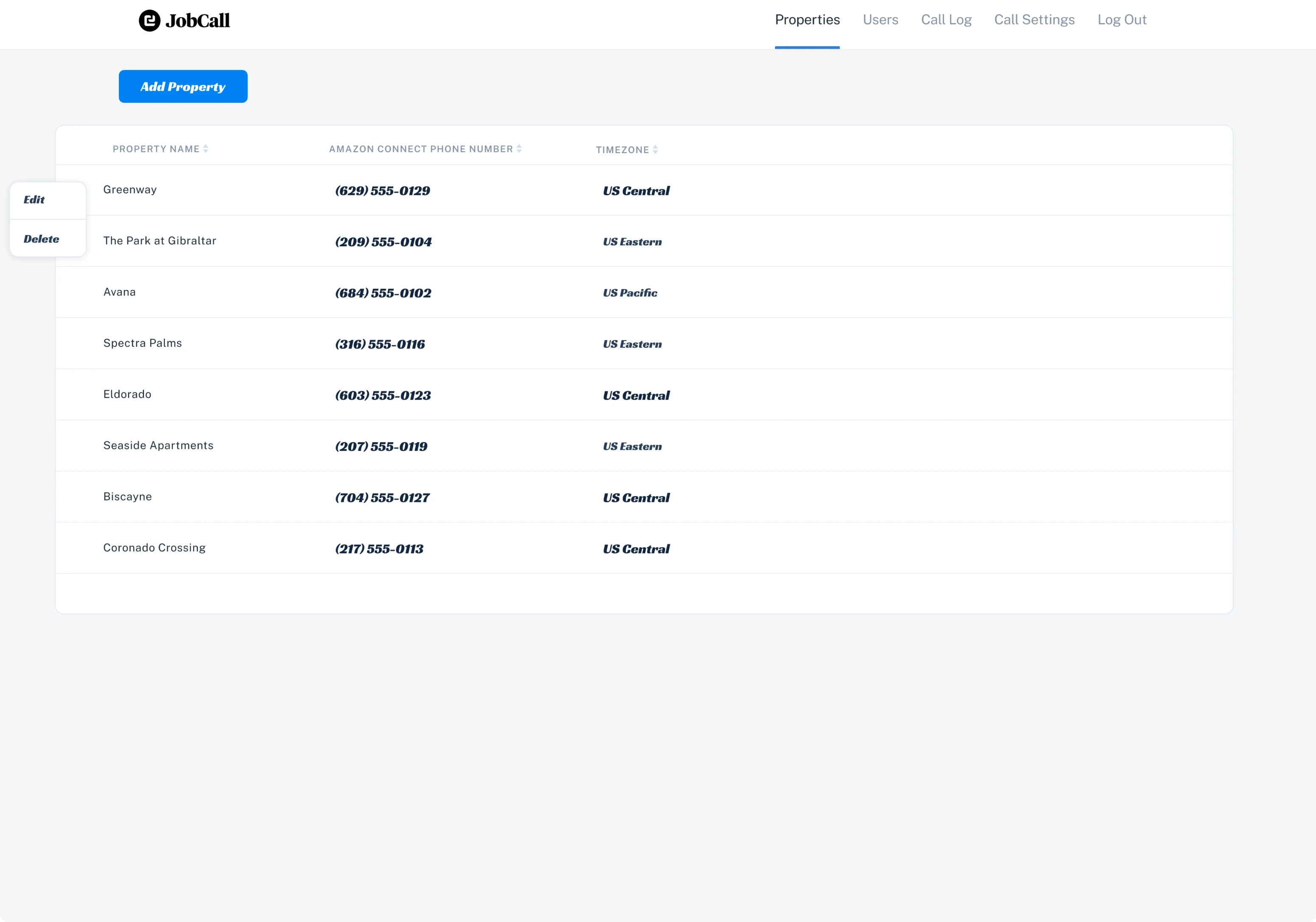
We added a three-dot menu icon that is typically used to indicate that there are more options available so that it was obvious for users where to find edit and delete functions.
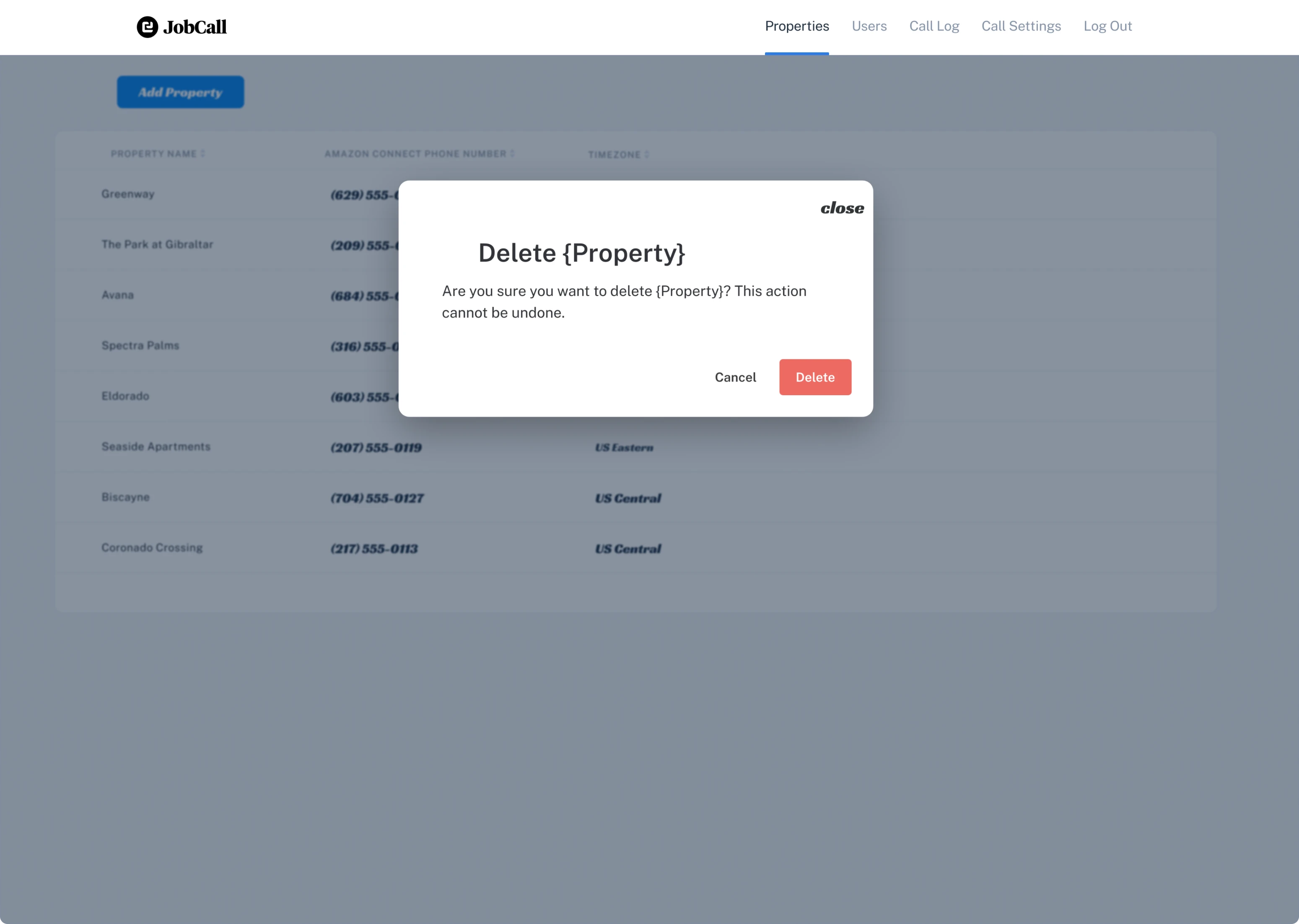
As deleting a property is an irreversible action, we wanted to prevent users from making mistakes that can’t be fixed. We decided to use the contrast of different intensities to divide the text depending on its importance and make the warning message readable.
The majority of JobCall users access the app from their smartphones, so it was essential to create a high-quality responsive design
JobCall’s mobile version was originally more desktop-oriented. As a result, users found it difficult to comprehend information, especially in lists and tables.
Moreover, because of the small size of mobile screens, they were packed with a lot of content, and as designers, we had to be very careful when adding new elements not to clutter the interface.
So, our main challenge when working with a mobile version was to keep the interface clean and the distances between design elements convenient enough to navigate through the app.
- We moved the main menu into a hamburger menu so that it took less space and users didn’t accidentally mis-tap the buttons.
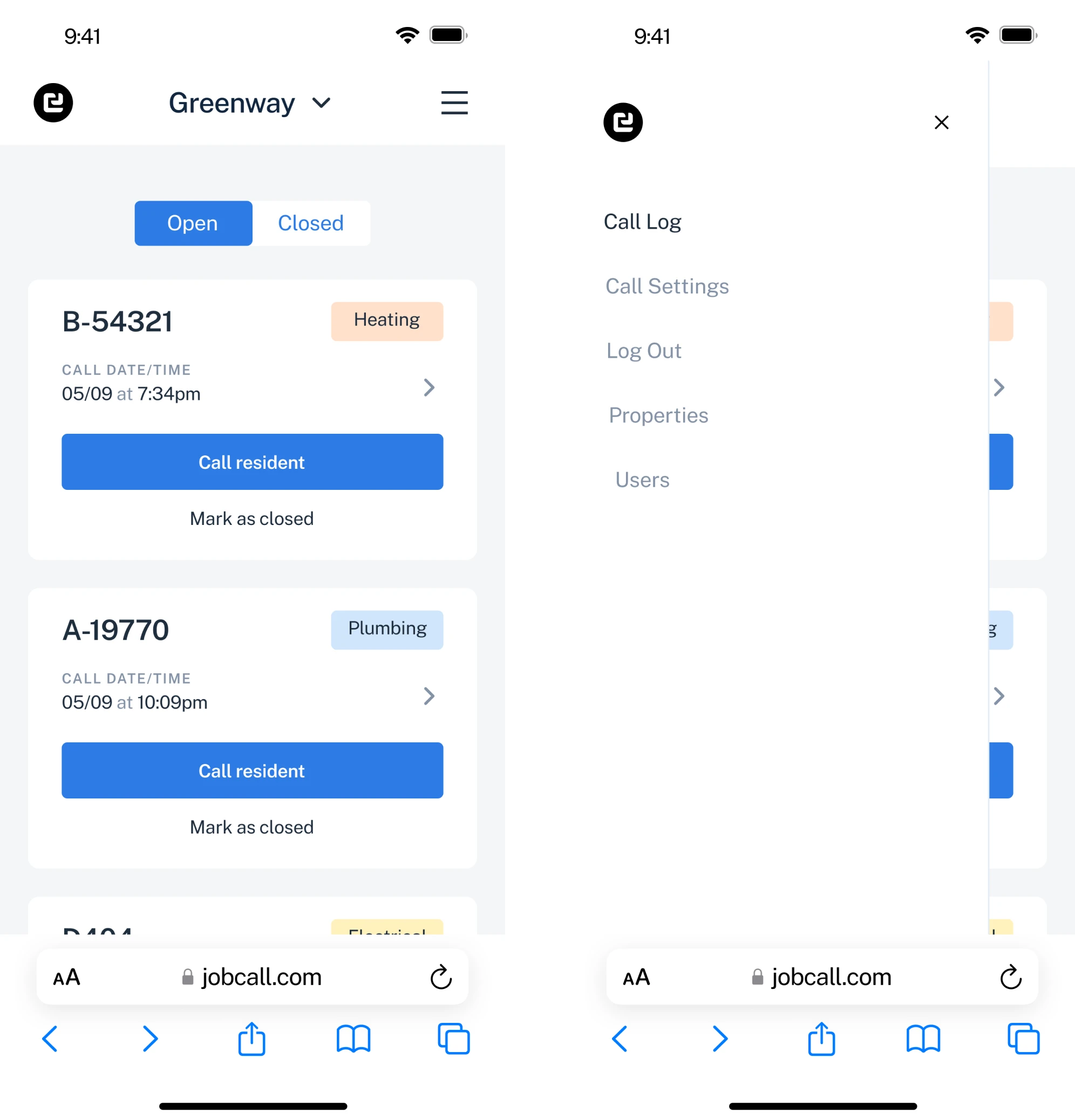
- We placed the “choose property” feature at the top of the screen so that it could be easily found, and redesigned the switcher for open and closed requests to make it better visible.
- To make the Call Log page accessible we increased the size of the buttons, highlighted important CTAs, and removed unnecessary headings.
- When creating a responsive design for the Edit Property screen, we focused on making it as close as possible to the desktop version, but at the same time, we wanted the user to be able to comfortably press any button without having to scroll all over the screen from top to bottom and from left to right.
Explaining software features to older consumers
Due to the fact that a great amount of JobCall users are senior customers, we were asked to create a brochure that would describe all app features and contain instructions on how to use them.
It was an interesting experience for us to create such a product instruction, and we hope the brochure will be a great help.
In less than two months the JobCall MVP evolved into a fully-fledged product ready to reach new heights
During the design process, we refined the user interface, added some new functionality to the software, and created a convenient and easy-to-use mobile version design.
Each of our design decision was determined by the insights received from the user feedback data and all the changes we offered were instantly approved and released by the JobCall team.
This way, over the course of redesign, JobCall was constantly evolving to become a full-scale product that meets the current needs of the customer and the market. The latest customer feedback showed that they are happy and satisfied with the updates.