My Video Spot
How we redesigned My Video Spot’s complex platform into a seamless teacher experience in 2 months
Teachers don’t have time for clunky tools. They need to record a lesson, share it, check submissions, and move on. My Video Spot had all the right features, but they were buried under a bloated interface and too many clicks.
The platform had everything: screen recording, quizzes, video hosting, even landing pages. Over 700 school districts were using it. But as functionality piled up, usability dropped off.
That’s when Eleken came in.
In two months, we helped My Video Spot untangle the experience, simplify workflows, and make the platform feel as smart as it actually is.


Three-day trial, one homepage, zero guesswork
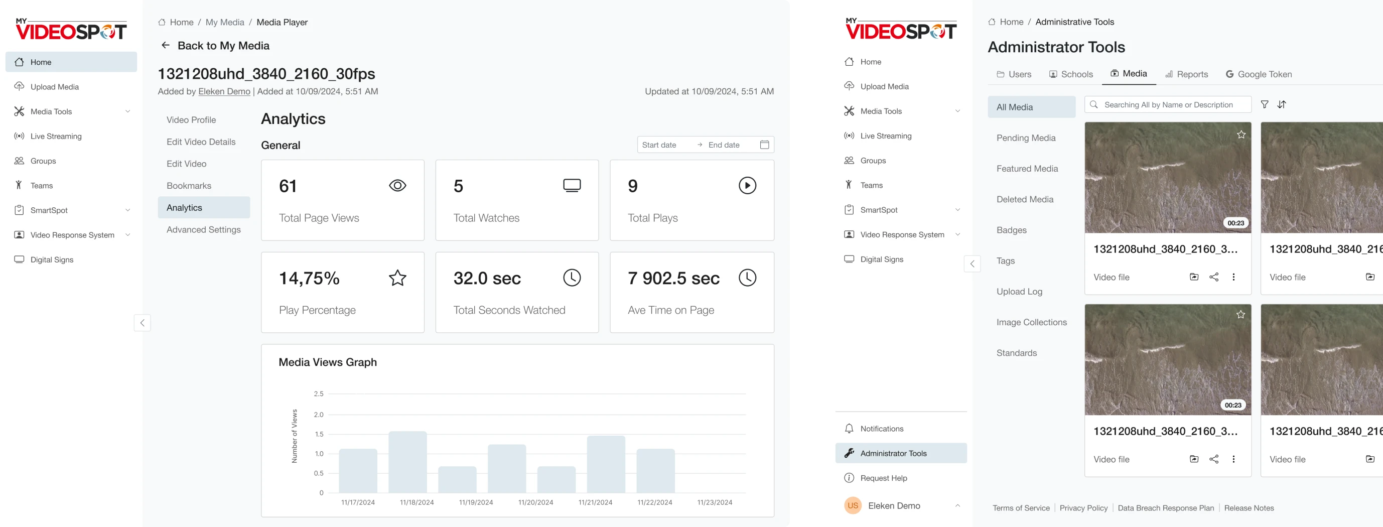
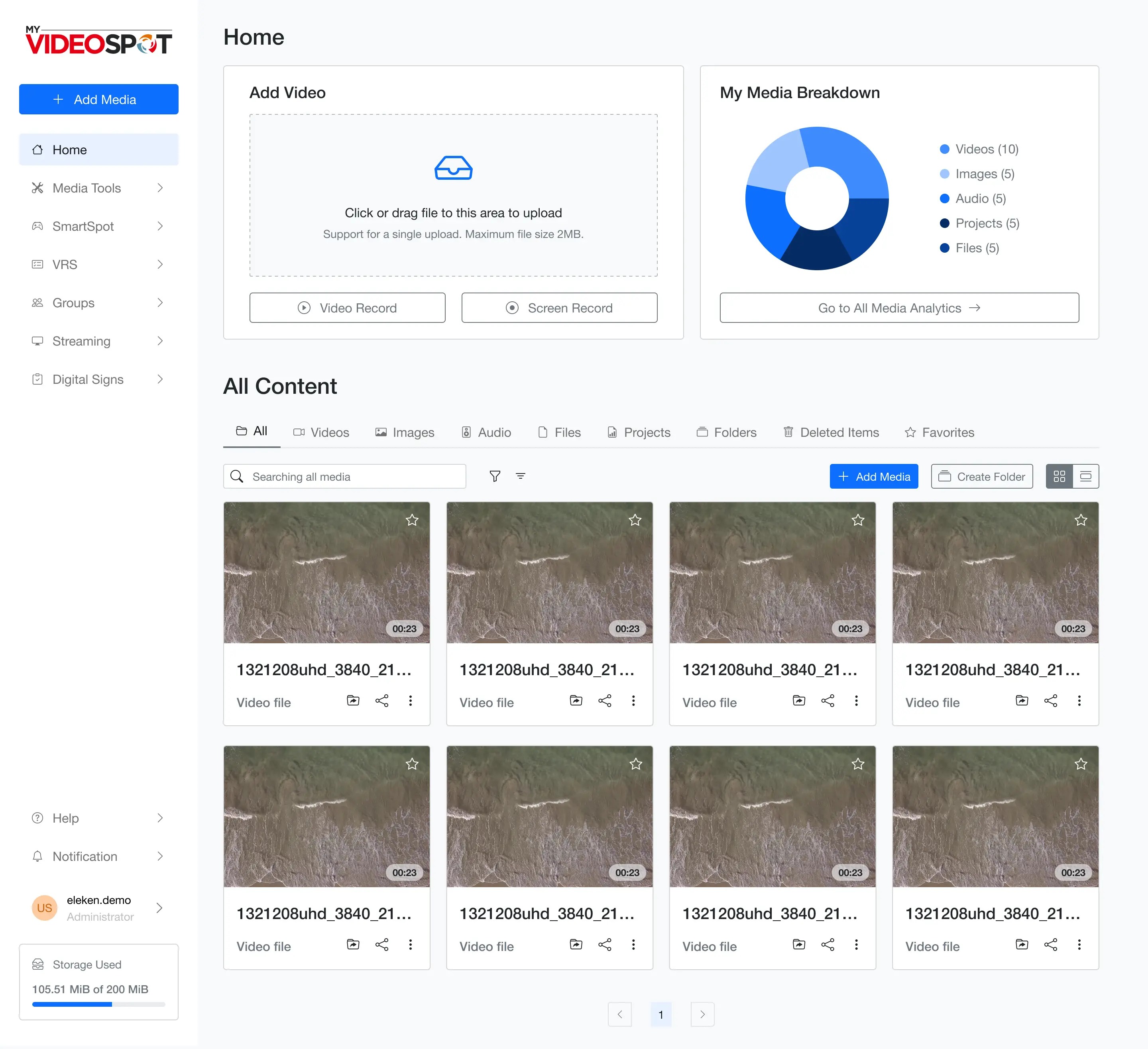
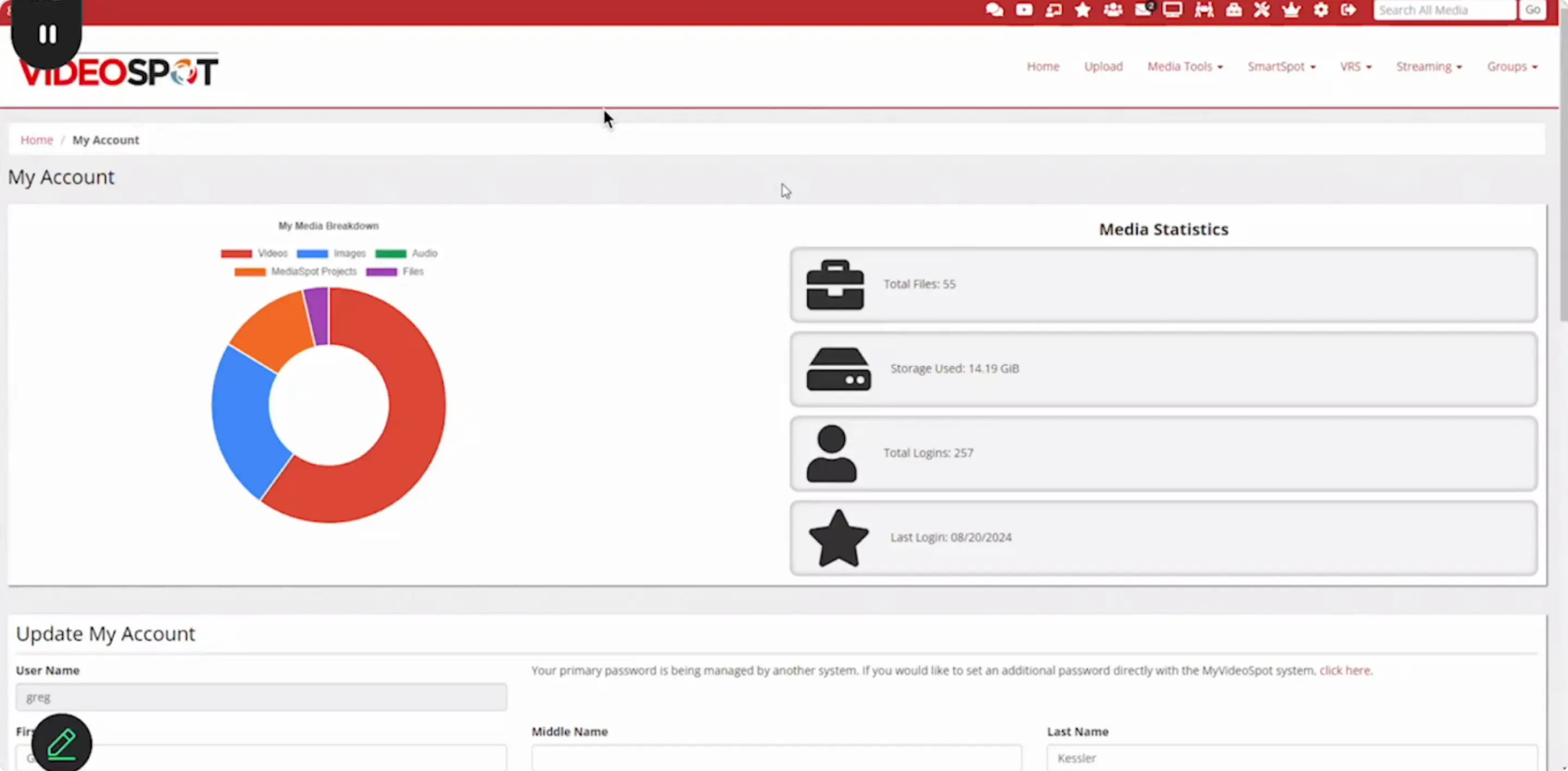
The first thing My Video Spot wanted to test was how well we understood their users, especially teachers. So, for the trial phase, we focused on the screen educators interact with the most: the homepage.
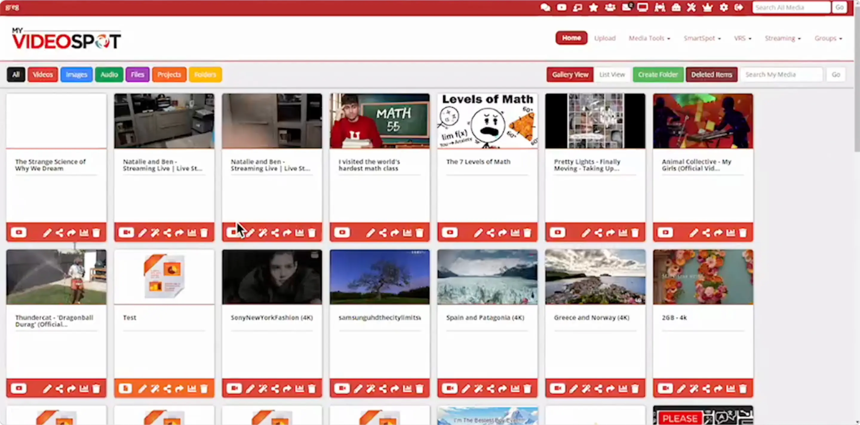
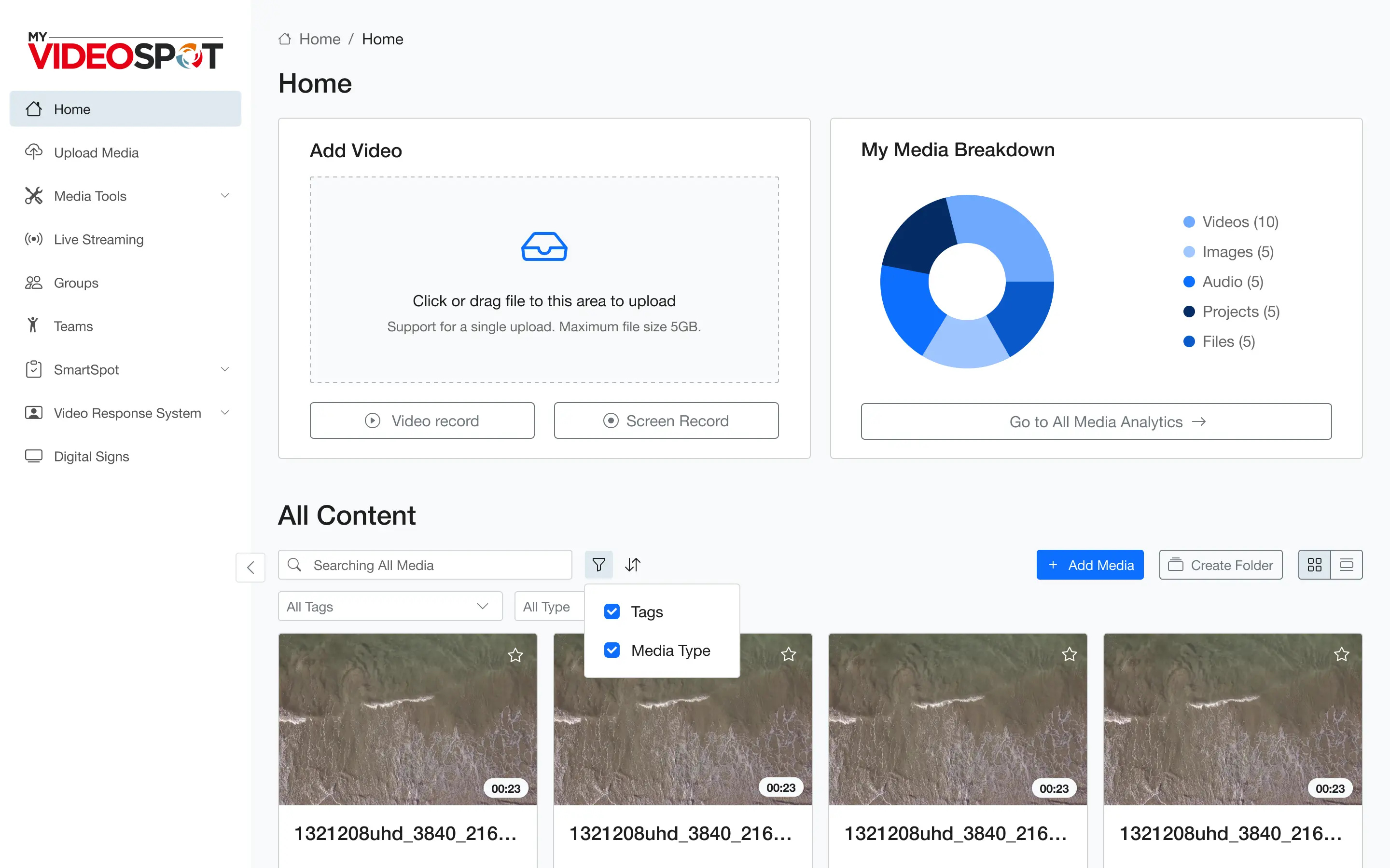
This was the main control center. The place where teachers uploaded new videos, checked performance, and organized their content. And unfortunately, it was also where many of them got lost. Too many buttons. Too many colors. No clear hierarchy. It was easy to forget what you came there to do in the first place.
So our goal for the next 3 days was simple: bring clarity to the chaos.
We started by offering two design concepts. Both were cleaner takes on the current layout, each with a slightly different arrangement of elements. The client made just one small suggestion, and with that, the new home screen was approved.
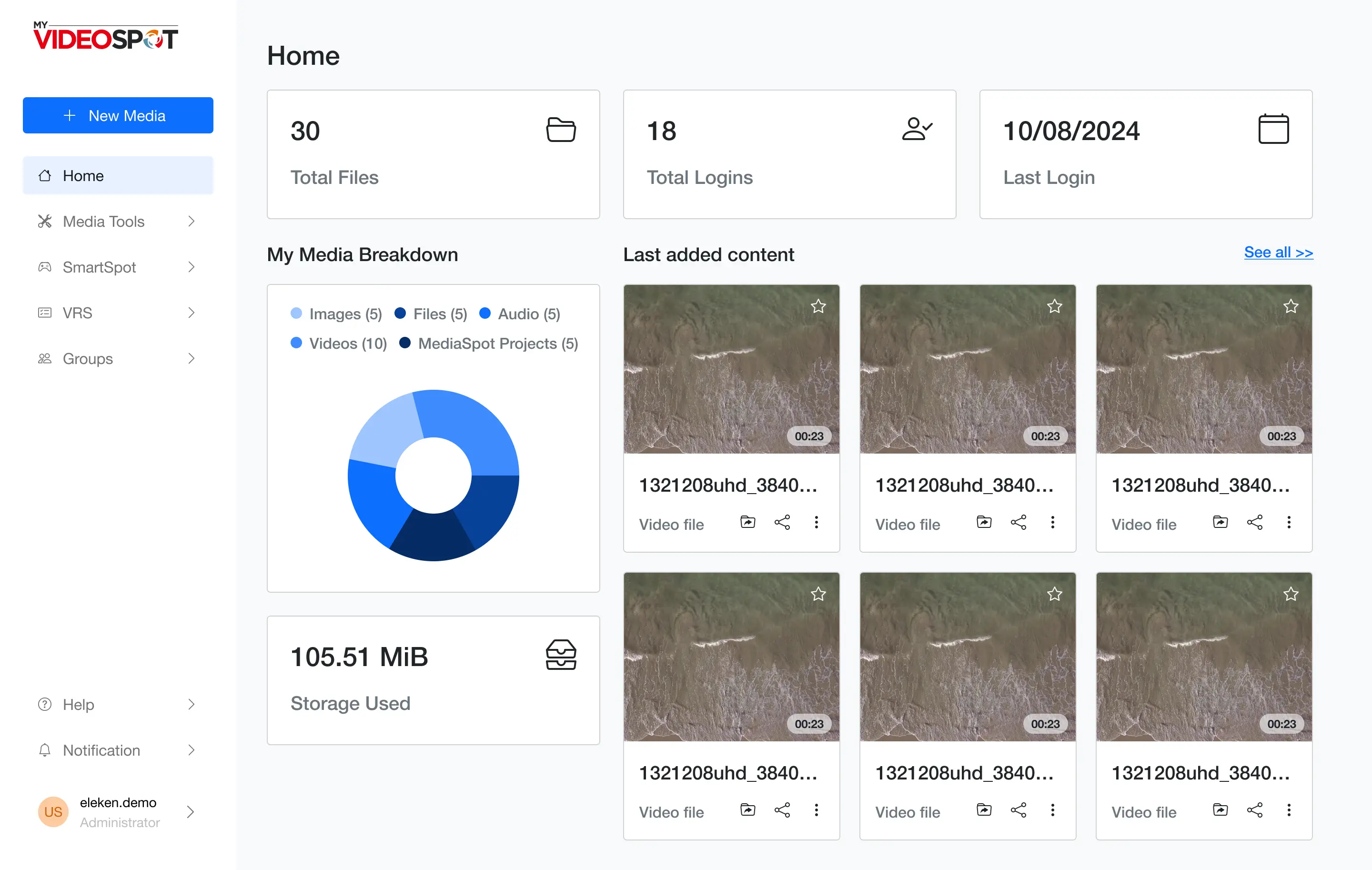
It was only a trial redesign, but it marked a big first step in My Video Spot’s collaboration with Eleken.
Competitive analysis to sharpen our own path
To create order, we needed to know where to start.
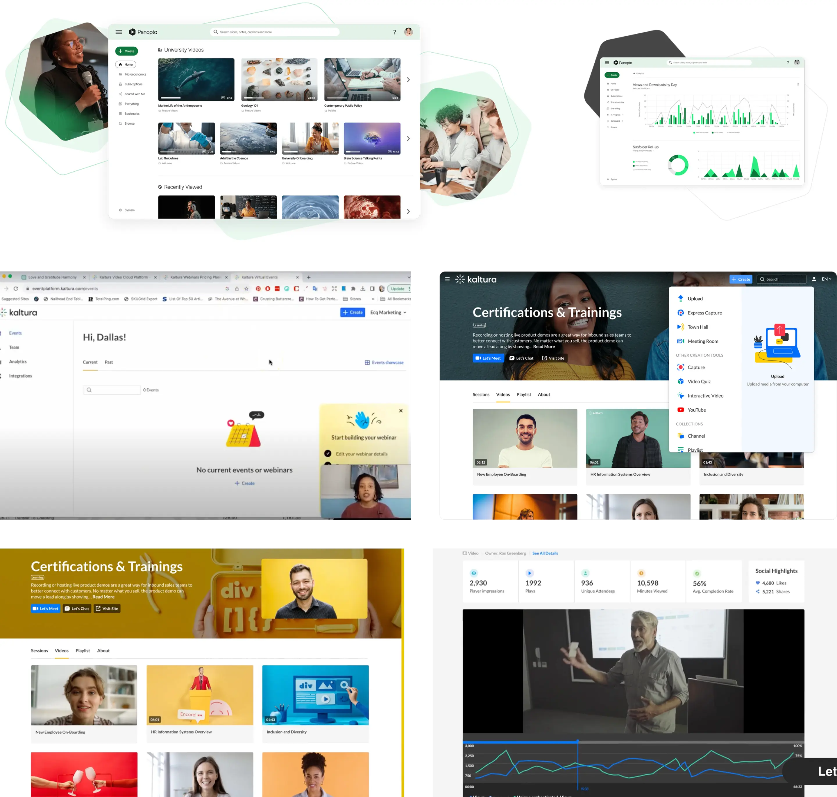
Our designer kicked things off with a competitive analysis, studying platforms like Kaltura, Panopto, and Warpwire. We also peeked at more general tools like YouTube Studio and Zoom, just to see how they solved similar problems.
We noticed that:
→ competitors had more modern designs and clearer hierarchies;
→ their layouts felt more intuitive and easier to navigate;
→ features were logically grouped, making them quicker to access.
But none of them offered as many tools as My Video Spot did.
Alongside that, we ran a heuristic evaluation of the platform’s current interface. It didn’t take long to spot that it was powerful, but a bit far from intuitive. From here, we had a solid foundation of what to fix.
A better structure for a feature-packed interface
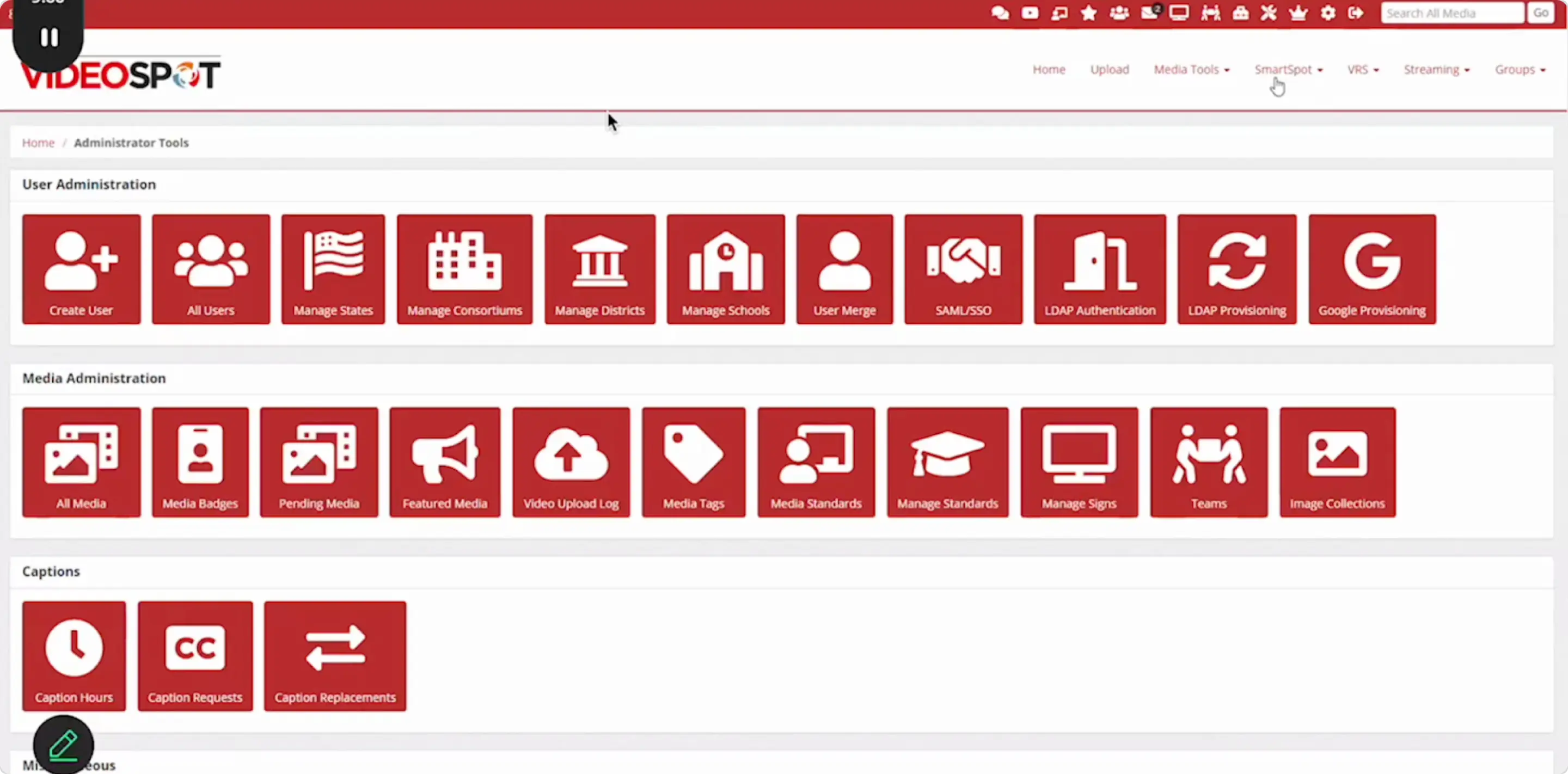
What’s important is that we had to work with limited flexibility, cause the platform was built on Bootstrap. Recognizing this, we carefully adapted our solutions within this existing framework.
The navigation was especially tricky. There were buttons below the menu, icons above it, and no clear sense of flow. Users were left guessing where to click next. And considering that people naturally scan screens in an F-shaped pattern, this horizontal layout was working against their instincts.
So, we restructured everything.
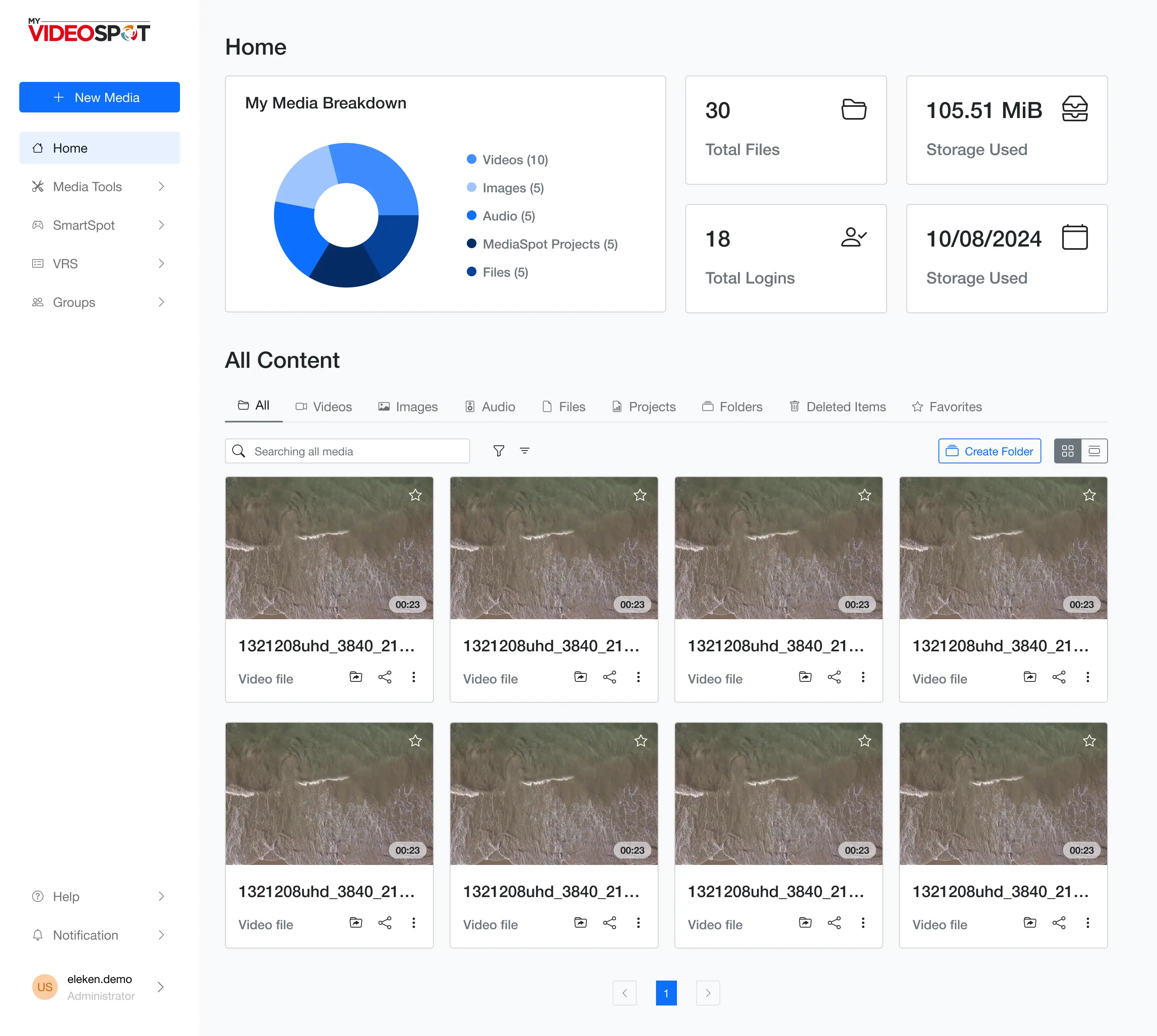
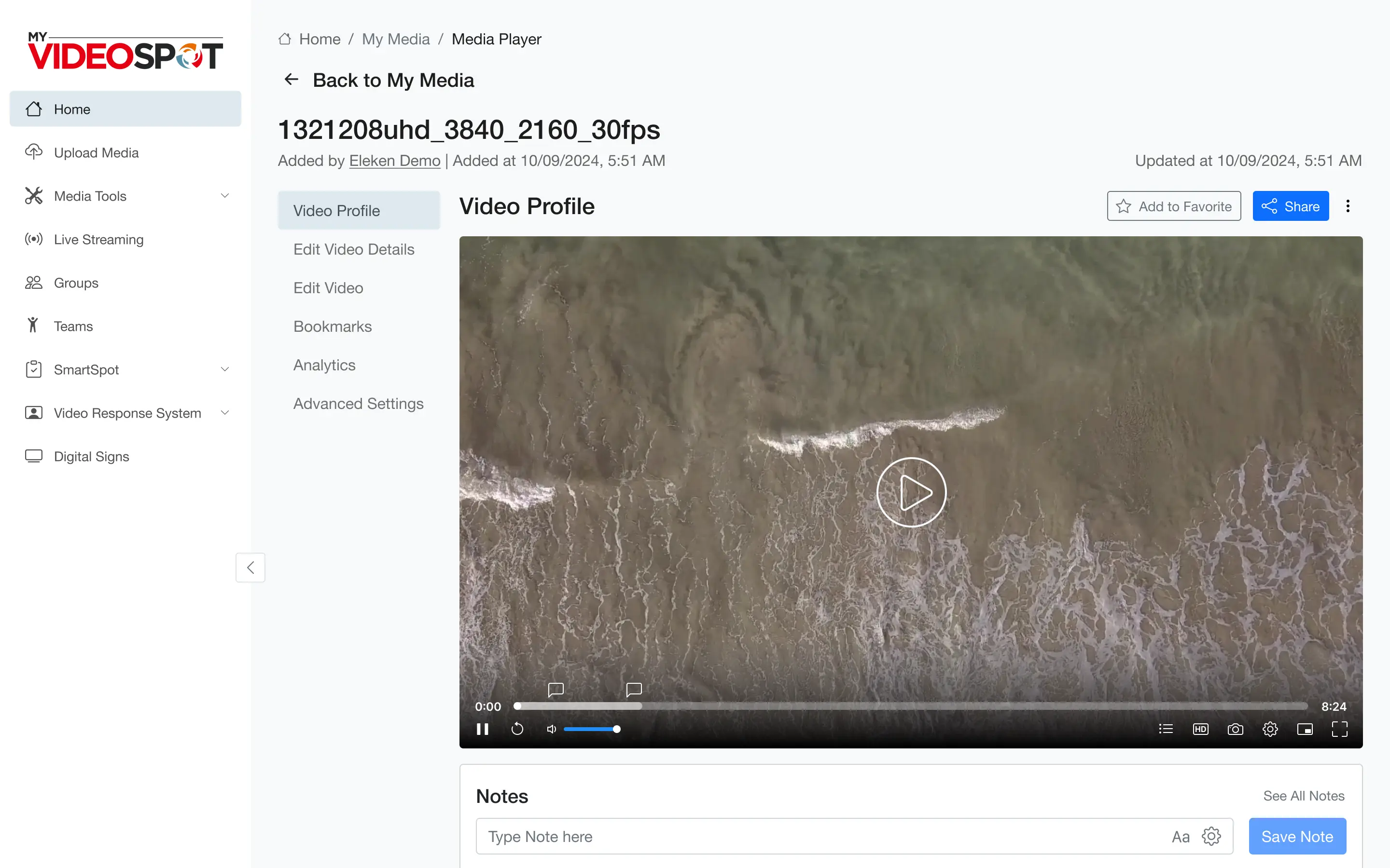
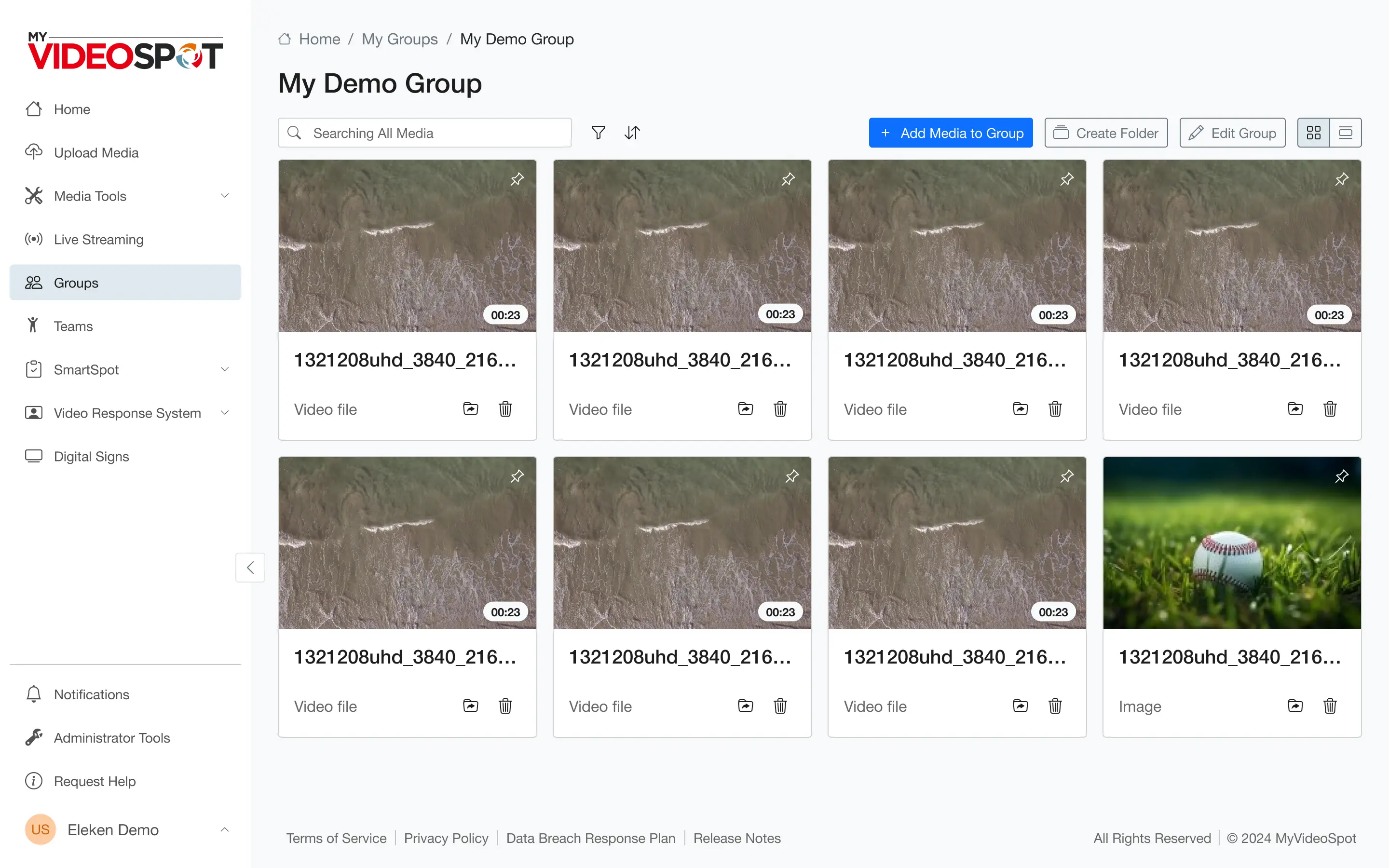
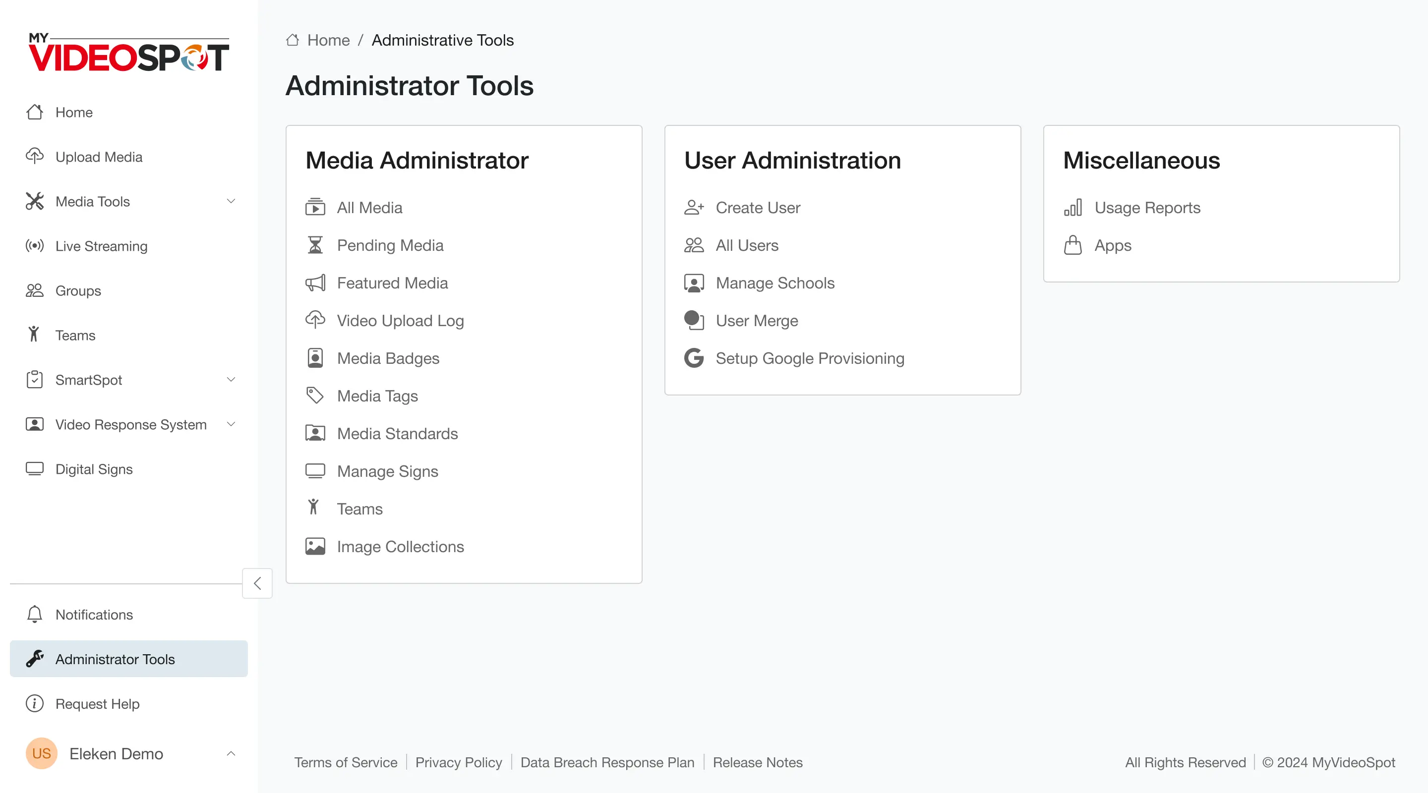
We introduced a vertical sidebar that housed all the key sections of the platform. This gave users a consistent place to start and a logical path to follow. On each page, a gallery or list layout was adopted, making it easier to skim, scan, and act.
To make the experience even smoother, we added tooltips and warnings so users could discover new features and understand when something wasn’t working, without needing to dig through help docs.
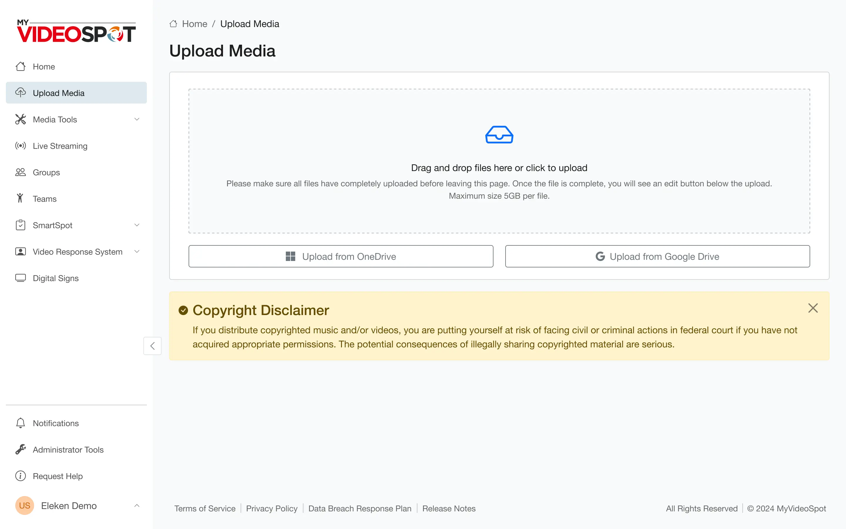
We also introduced media filters by tags and file types, so educators could quickly narrow down their content and stay organized.
Overall, Eleken’s designer made sure the platform worked with the user, not against them.
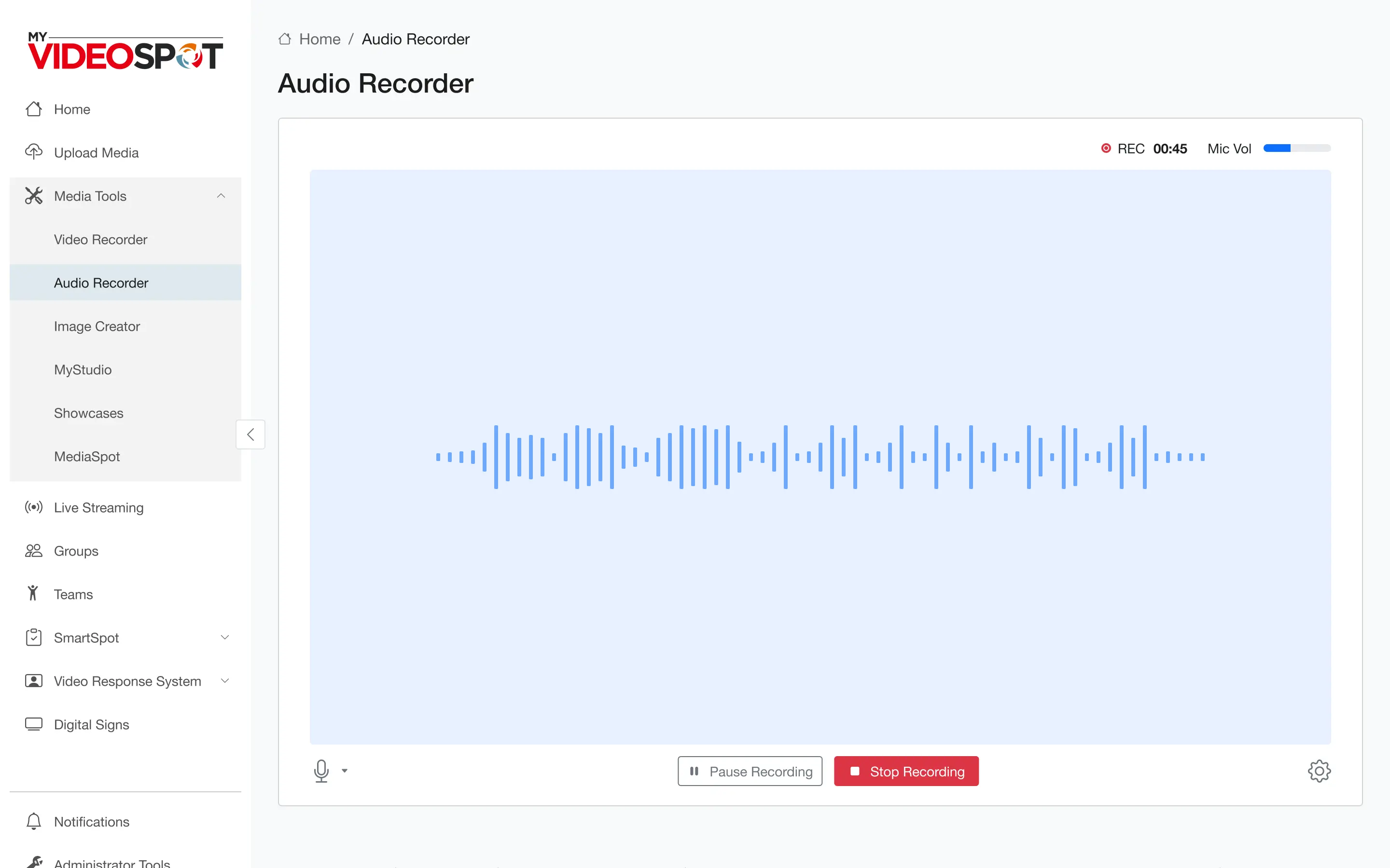
Recording experience reimagined with simpler options
When it comes to recording a lesson or a screen tutorial, educators don’t have time to explore hidden settings or guess which button does what. The process needs to be quick, clear, and reliable. That’s exactly what we set out to deliver.
We started by breaking the recording feature down into four clear options:
- Record camera only;
- Record screen only;
- Record both (camera and screen);
- Record audio only.
The first three are grouped directly on the Video Recorder page, with toggles placed intuitively at the top left of the preview window. This allows for seamless switching between modes without interrupting the flow.
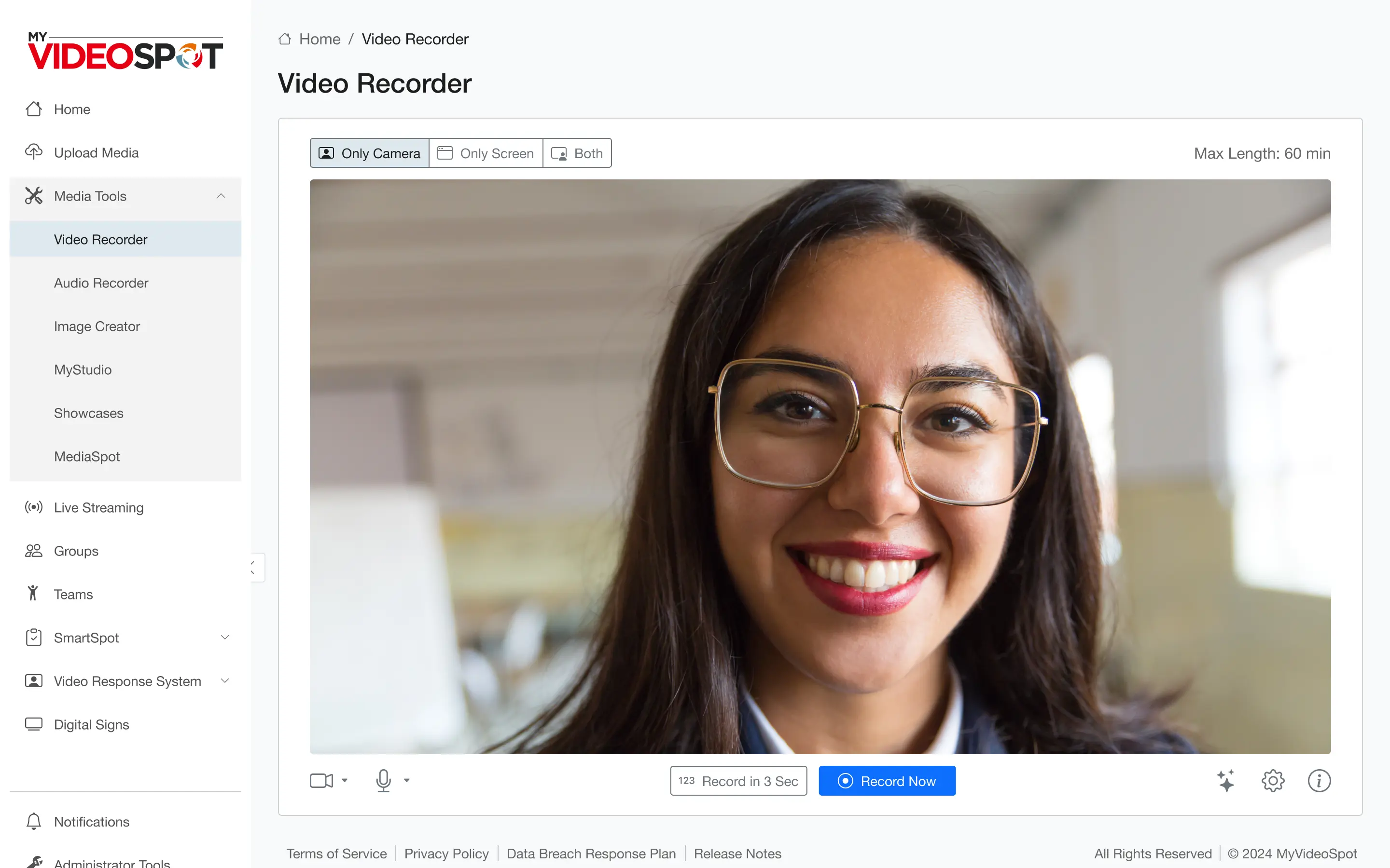
To improve clarity even further, we streamlined the interface around the recording action. Users now clearly see where to set up their camera, choose background effects, and check mic input. Time indicators and visual feedback keep them informed at every stage.
If users want to record audio only, they can head to a dedicated Audio Recorder page, keeping things focused and uncluttered.
Cutting the clutter in visual design
Once the structure was locked in, it was time to clean up the visuals. Our goal was to reduce noise and help users focus on what matters.
The color system was one of the first things we addressed. We simplified it to just one core shade to guide user actions and highlight important states.
Next, we tackled iconography. Our designer revamped the existing set of My Video Spot icons to help users quickly recognize actions and features.
UX that finally matches the product’s power
Over the course of just two months, My Video Spot transformed from a platform full of great features into one that’s also great to use.
The process was smooth and collaborative. With direct feedback from the CEO and CTO, Eleken’s designer made quick decisions, iterated fast, and moved through the project one screen at a time.
By the end of the project, My Video Spot had:
- A modernized homepage with customizable widgets for a more personal and efficient workflow.
- A clean, logical interface structure that replaced chaos with clarity.
- A simplified video recording experience, broken into clear modes that matched users’ real needs.
- A reorganized landing page builder that supported creativity without overwhelming users.
- A consistent visual language from custom icons to smart color use and interaction states.
- Helpful tooltips and feedback elements that improved usability and reduced confusion.
For the teachers, admins, and students using My Video Spot every day, this meant one important thing: less time figuring things out, and more time focusing on what matters.