Avid
How we helped an AI-powered fundraising tool build a feature no one else had

Avid built a powerful system for fundraising teams that combines CRM, email, and donation data with an AI engine trained on 650M donor interactions.
As the product expanded, the UX couldn’t keep up. Features piled on, the interface got messy, and nonprofit users struggled to understand what the platform could actually do. On top of that, the client had an idea for a new feature they were eager to make real.
They turned to Eleken with a clear set of goals:
- Design a new campaign deployment module.
- Simplify and improve the UI/UX of the existing product.
- Apply the new branding to the platform.
Our designer came on board with the client’s dev and UX strategist to untangle the experience, clarify the value, and turn complexity into clarity.

What it took for us to bring the idea of a new AI feature to life
Step 1. Understanding the goal
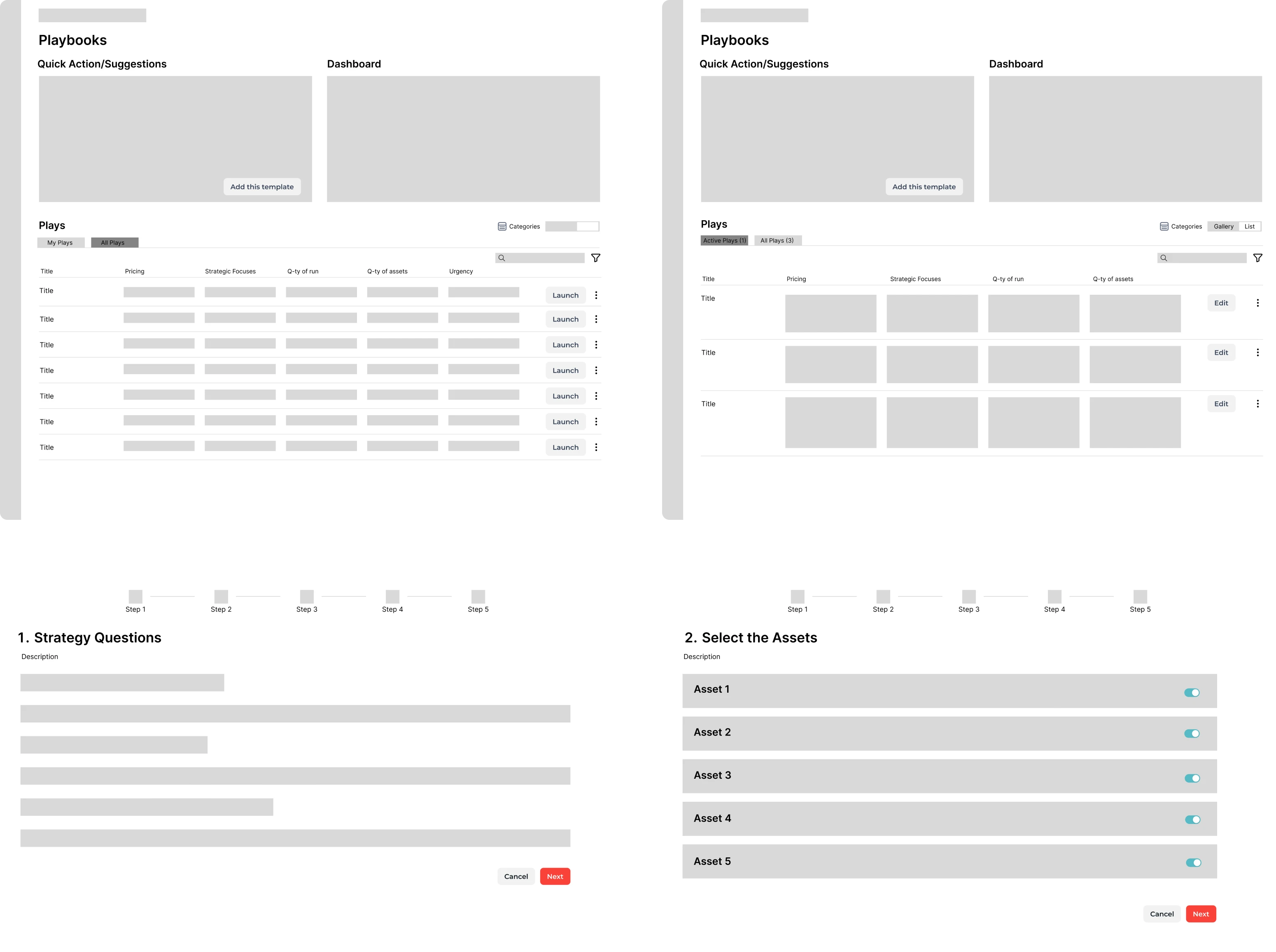
The goal of a new feature was to help nonprofit teams know what to do next. Instead of expecting users to dig through dashboards, Playbook would surface timely insights and recommend campaign actions based on what’s happening in their data.
This feature was something no other platform in the space was offering.
From day one, our designer understood the assignment. She immersed herself in the client’s business goals and focused on crafting solutions that combined powerful functionality with simplicity.

Step 2. Conducting user interviews
To better understand the people Avid was building a new campaign deployment module for, we collaborated with a freelance UX strategist from their side and ran a series of user interviews.
For this, our designer first created wireframes and then prototypes, helping validate the flow, identify weak spots, and ensure that the interface truly aligned with what people needed.
Our main focus was to create a journey that feels direct and intuitive. One that helps users reach outcomes without drowning in decisions.
Across all conversations, four common triggers emerged:
- Declining donor trends.
- Campaigns losing impact.
- Shifts in messaging or strategy.
- Financial urgency.
These were the turning points where Avid could help most. And that became the foundation for what we built next.
Step 3. Creating informational architecture
Our challenge was to shape the new product feature in a way that didn’t overwhelm users.
To avoid noise, our designer focused on structuring a journey that prioritized clarity and momentum. The architecture she came up with guided users through key decisions without forcing them to think about every possible option.

Step 4. Designing the interface
With enough insight behind the scenes, it was time to bring Playbook to life.
To support the streamlined UX, we introduced a set of decisions:
- Custom-designed cards that presented AI-generated recommendations in a digestible format.
- A supporting table view that gave users more flexibility to sort, filter, and explore campaign data.

We improved the core platform’s UI/UX by making it lighter and faster to use
During collaboration, we had a very specific task: rethink the sign-up flow, making it faster, clearer, and less frustrating for new users. To be concrete, we needed to redesign the onboarding, reducing it from four steps to two, and keeping everything on a single page.

Our designer got straight to work. She rethought the UX logic and simplified the entire process. As a result, she delivered:
- A streamlined UX flow with eight different visual layout options.
- A clearer structure that splits flows for nonprofits and agencies.
- A refreshed, friendly style that included welcoming imagery.
- Reorganized error message logic, making responses more contextual and helpful.

As we continued, we reviewed other parts of the interface, simplifying layouts, improving structure, and minimizing the number of micro-decisions users had to make along the way.
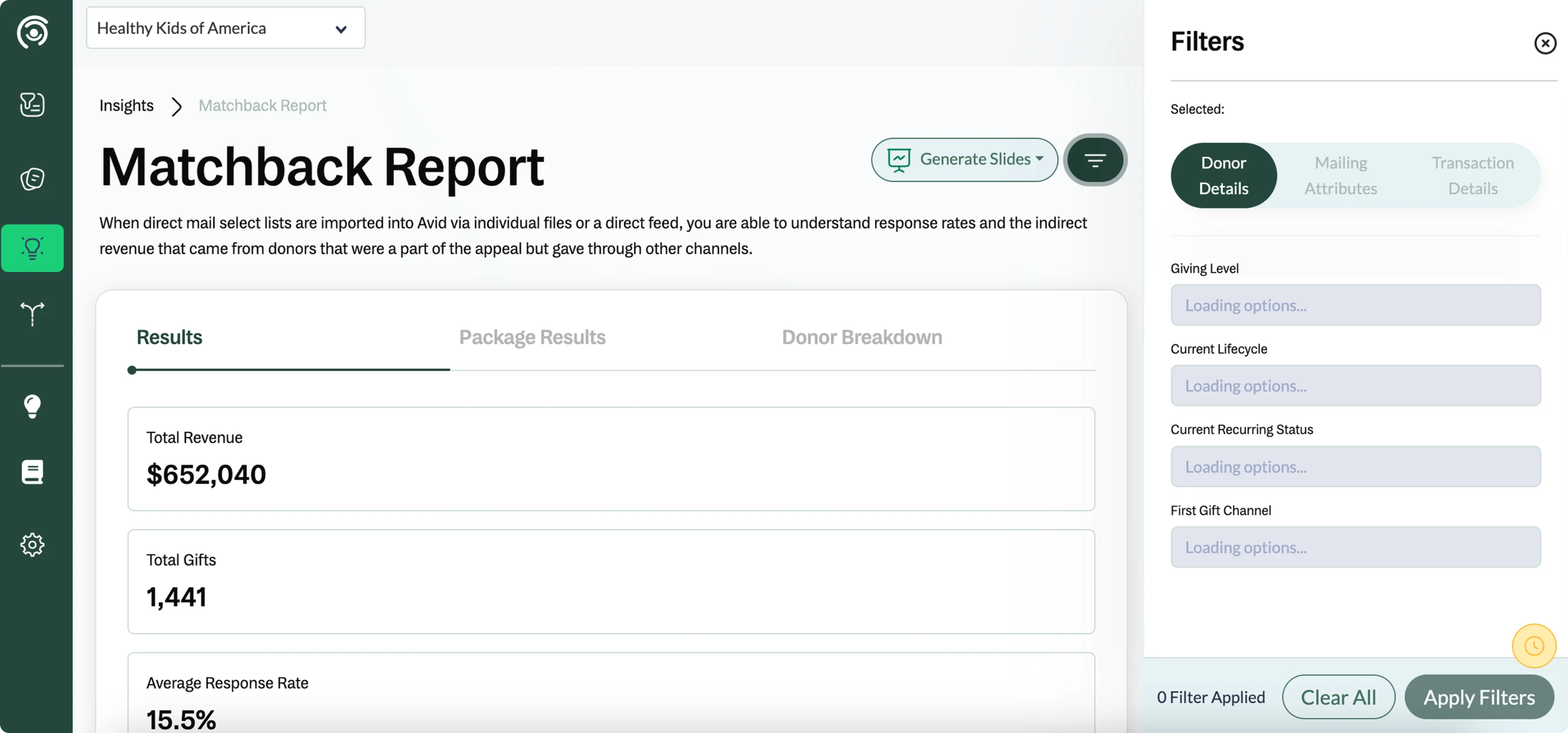
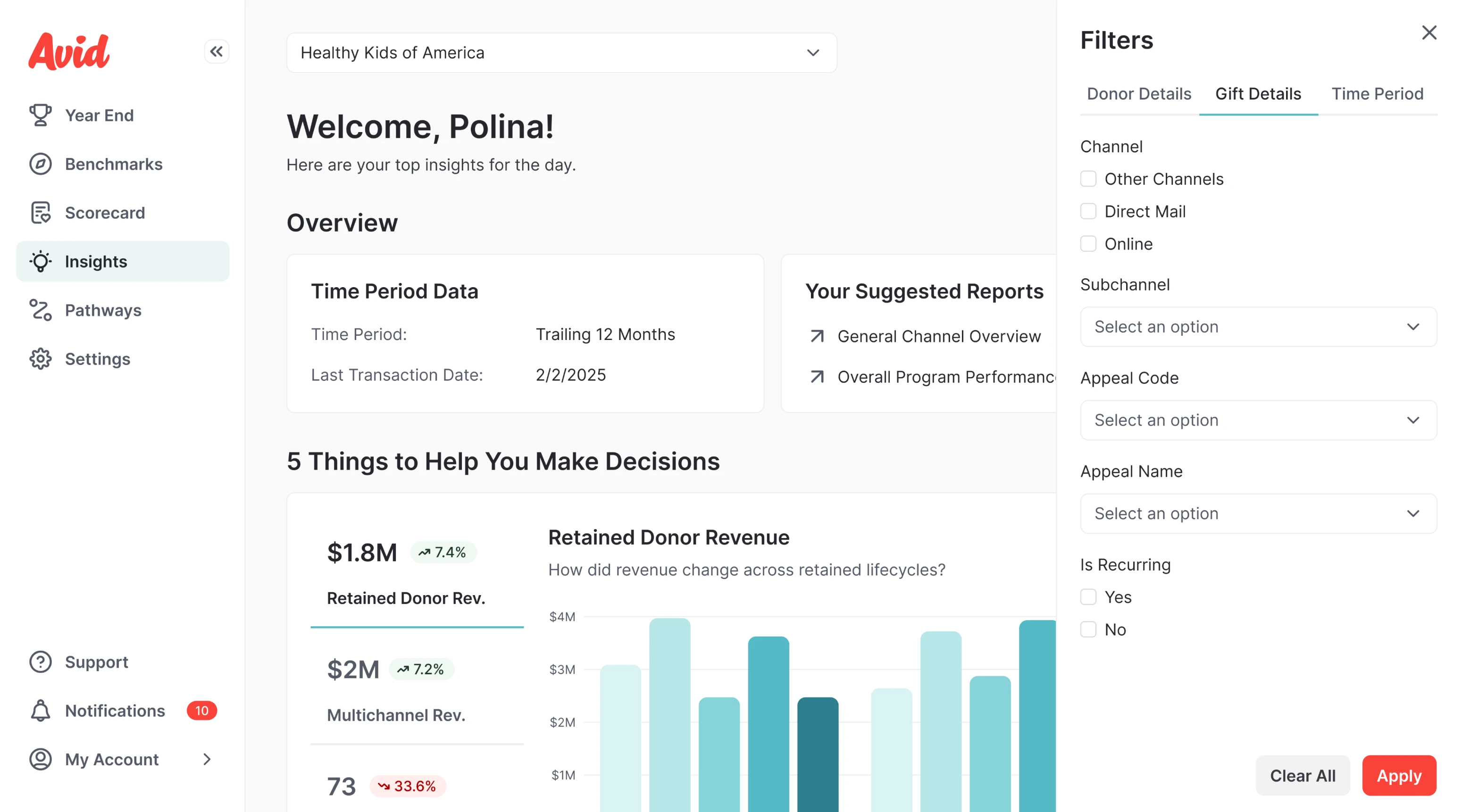
To ensure consistency across all updated flows, we customized a design system, laying the foundation for a unified UI that could grow with the platform.

Having brand assets in place, we made the platform feel aligned with its visual identity
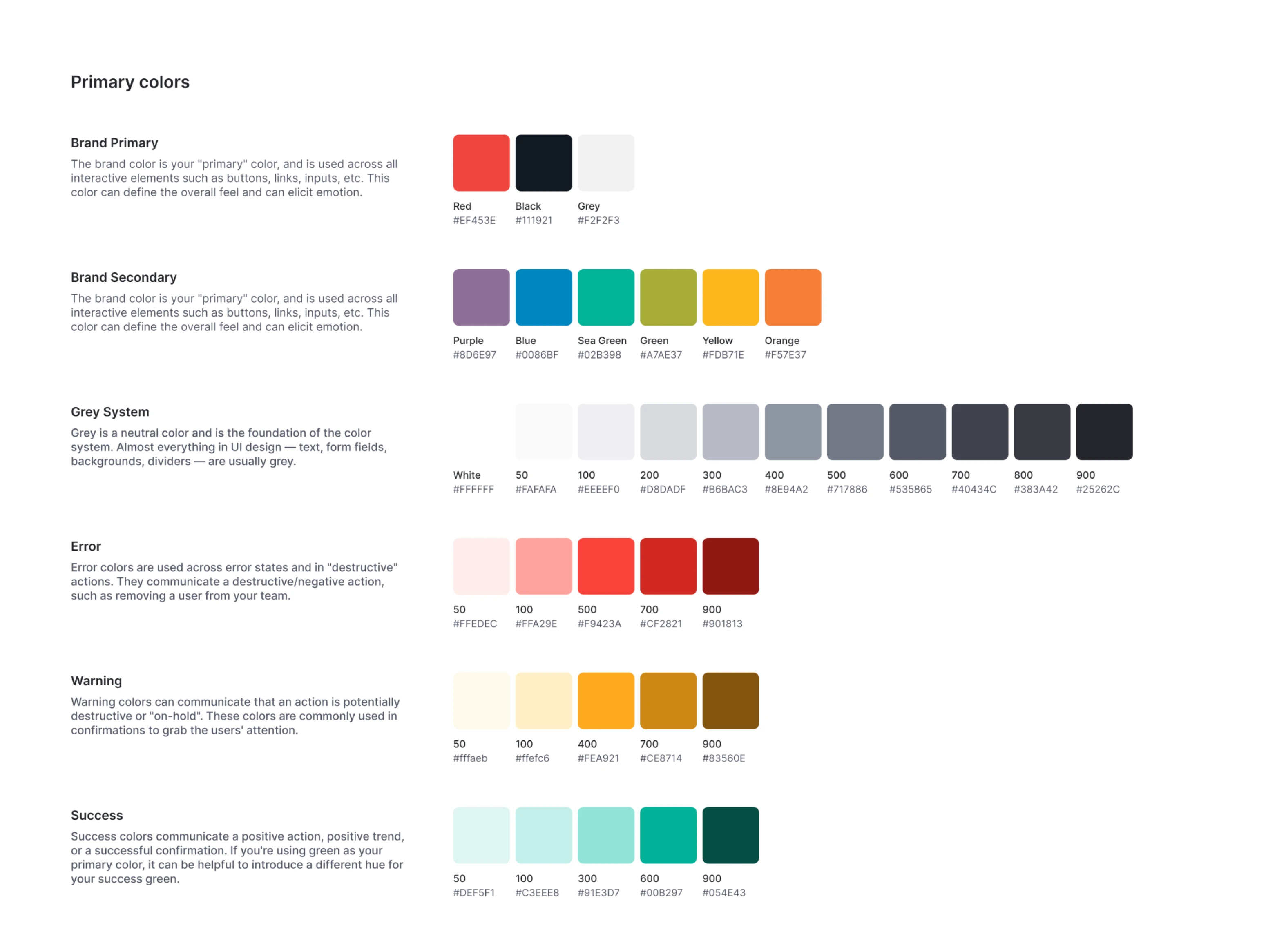
Alongside design improvements, Avid wanted their product to visually reflect the strength of their brand. They already had a solid identity in place, but it hadn’t yet made its way into the product.
Our designer reviewed their existing brand assets and used them to build a consistent, functional UI across the platform.
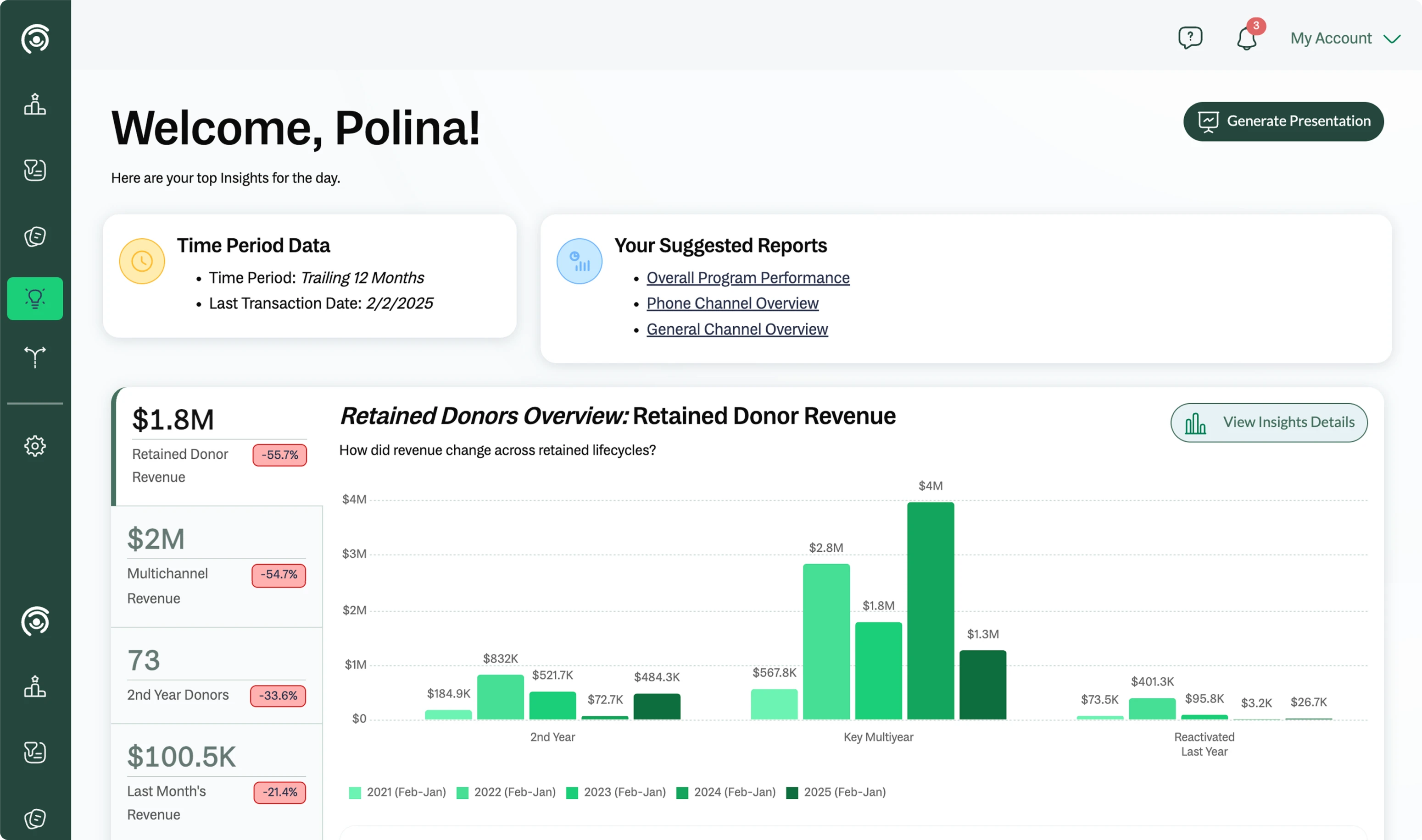
The core color palette centered around bold reds, deep blacks, and clean grays. To add visual clarity, especially in charts and data-heavy views, we introduced additional shades of green, which helped users quickly scan and interpret metrics.
Beyond color, we refined the platform’s visual elements:
- Custom-designed icons and spot illustrations to add personality.
- Buttons with sharper corners to reflect Avid’s confident tone.
- Thoughtful spacing, typography, and component rules throughout.

Everything was shaped to feel clear, modern, and aligned with the platform’s identity.
We supported Avid’s growth by rebuilding the experience
By the end of the design phase, Avid’s product finally matched the strength of its underlying technology. The platform became easier to use, more connected with its audience, and better equipped to support strategic decision-making.
Our designer stepped into the process, asked the right questions, collaborated closely with the client, and helped make key choices along the way. Thanks to such a great collaboration, Avid continues working with us.
We keep designing new features, improving existing ones, and refining the product based on ongoing feedback from both the team and real users.