Haven Diagnostics
Returning to safe office spaces
It was the beginning of 2021, and many employers faced a question: how do we bring the employees back to the offices without sacrificing safety?
That is where Haven came to play. They were the first to apply the mathematical models for projecting the infection risk used in the health industry to corporate offices.
Haven started off by making agent-based models for private clients and came to us when they wanted to automate the process. Our initial task was to build an MVP, but in the end, we did way more — our brainstorms laid the foundation for marketing and the development of the product.
Haven helps to assess the risks of disease spread in the office using the so-called agent-based modeling: formulas that allow to consider many factors and provide a precise evaluation of the situation.

Brainstorming. Startup-style
The product was at the initial stage of development and thorough analysis was the foremost task. Haven diagnostics was about to build a platform and they needed to understand their users well before developing the product.
We started with making a first version of the dashboard, and then dived deep into the research. Our designer Alexandra was on calls with the CEO and engineer regularly discussing their wishes and design ideas, suggesting improvements that shaped the product.
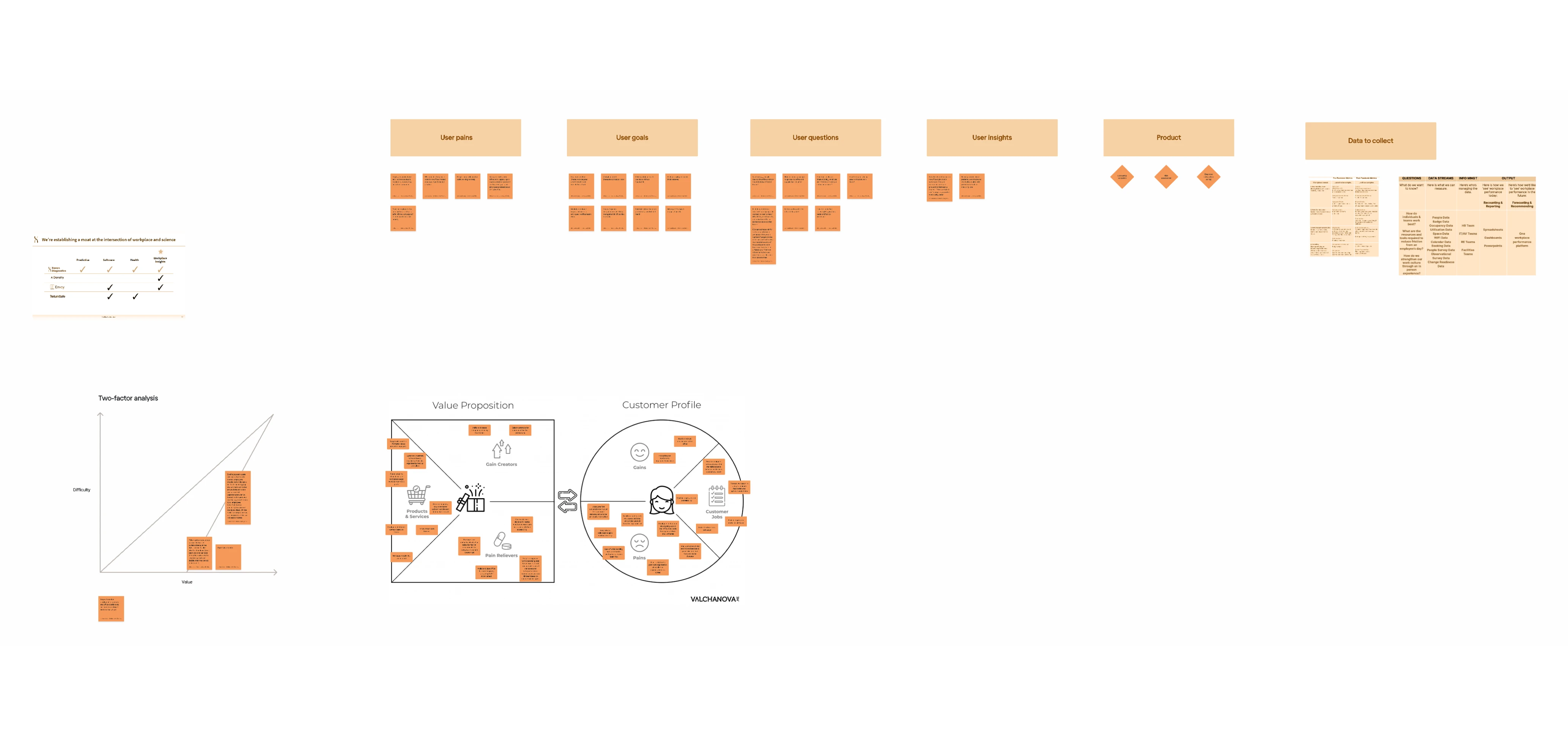
It was more than just design ideas. It was all that initial research that startups have to make before the launch (and many of them overlook): defining Value Proposition, crystallizing the value of the product, empathizing with the client’s pains, and brainstorming for the best solutions.
We started with competitors’ analysis. Other companies on the market were analyzing office space usage and gave recommendations regarding work schedule based on daily surveys estimating risks of infection, but none of them was doing projections. We found out what sort of data other companies use and how they visualize the results of their modeling.
The ideas that all of the team members liked were verified with users. We conducted interviews with existing clients to see what their problems and expectations were.
We were discussing their current office policies and asking them what they think of our ideas. The situation, restrictions, and regulations change rapidly, so we had to think forward in the future.
Research that impacts the development
The architecture of the dashboard allows it to be used for analysis and projections not only related by Covid but also for seasonal flu, for example. Did you know that $226 billion is lost yearly because of sick leaves? Not talking about all the negative effects that flu can have on an employee’s health.
During the brainstorming, we came up with ideas on how to make the calculations more precise and better adjust the results to individual clients’ needs. This process did not have a visible impact on design, but it did influence the back-end and improved the quality of the product.
Some of the research insights:
- Scheduled office work and hybrid work schedules can help to avoid overcrowding the spaces. To measure the effectiveness of this system, productivity metrics of those who work with hybrid work schedules can be compared with 100% remote workers (a control group).
- It’s hard to check whether the workers adhere to the schedules. Running surveys about preferred work mode and then failing to align with preferences leads to credibility loss.
- Private data, such as health and vaccination status, can not be demanded by the employers, but it can be entered by the employees voluntarily and anonymously to get a general dataset about the office, and thus the app will provide more precise forecasts.
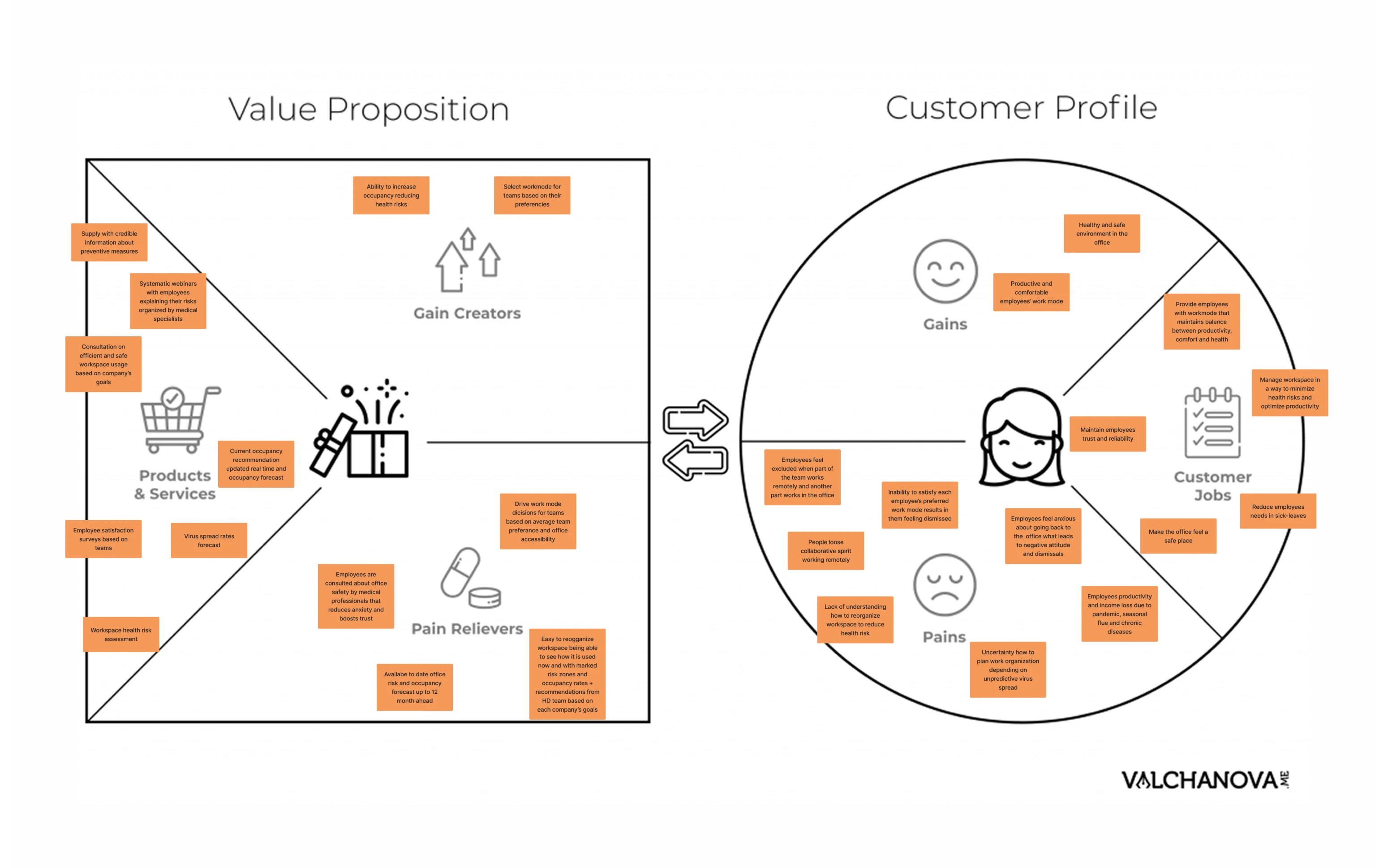
Based on the user needs’ insights, we developed a Value proposition and conducted a two-factor analysis. Our findings have laid the basis for the development strategy of the emerging startup.
Having gone through thorough research and considered various ideas of incorporating new data sets to increase the accuracy of the mathematical models, we decided to start with the proven techniques.
Risk control dashboard
We decided to build a minimalist MVP that would contain only the features that were already in use and saved the rest of the ideas for the next stages of product growth. The sketches made during brainstorm sessions were transformed into elegant screens with a simple user flow.
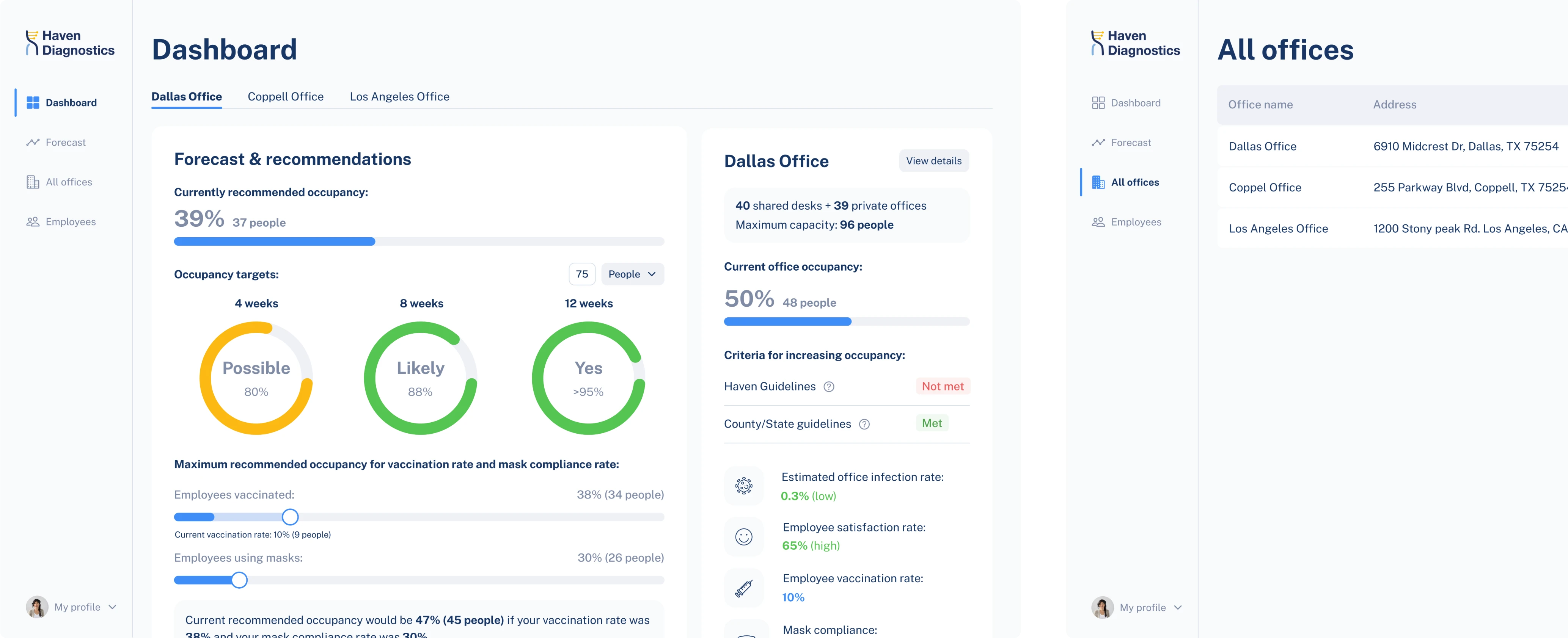
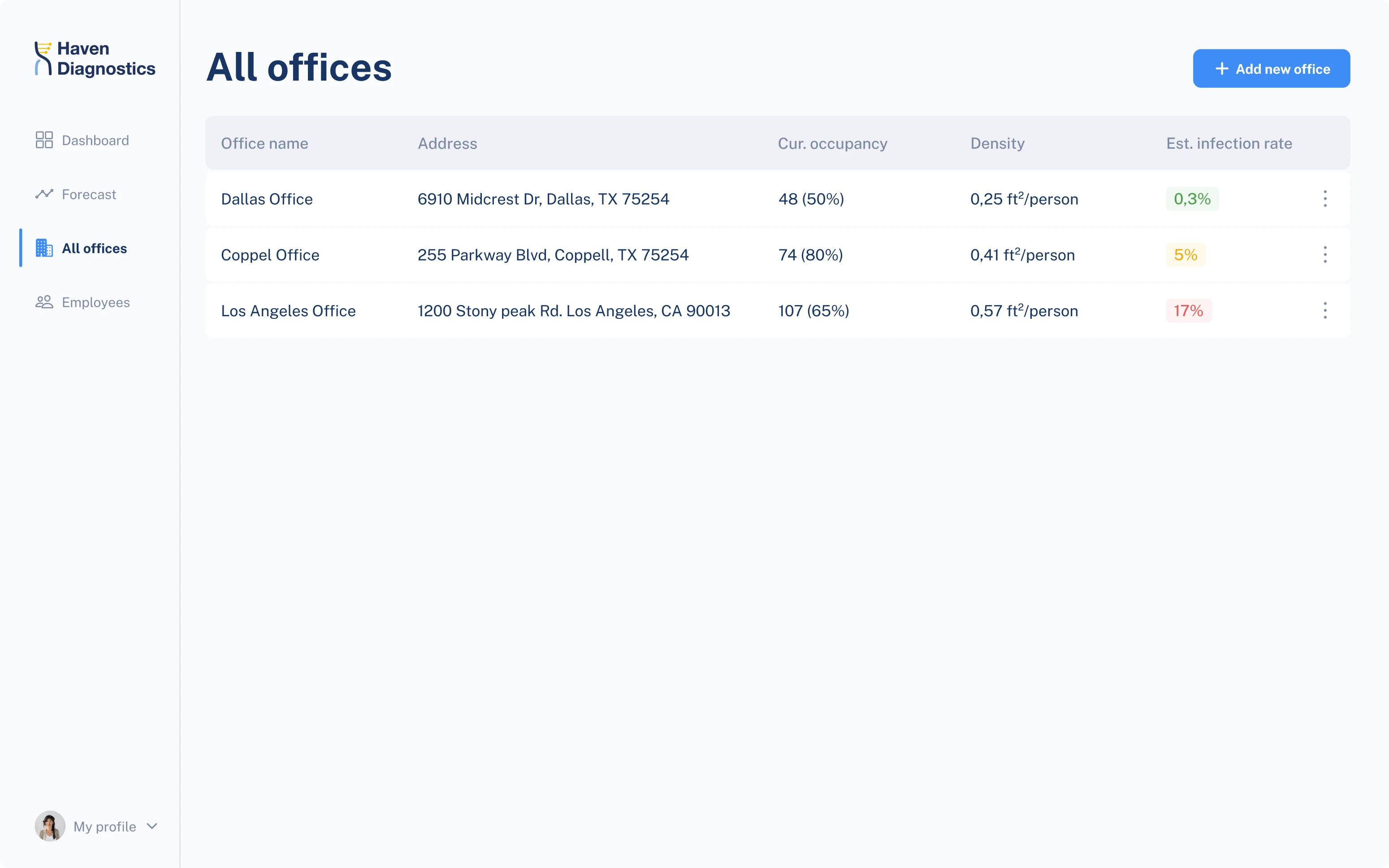
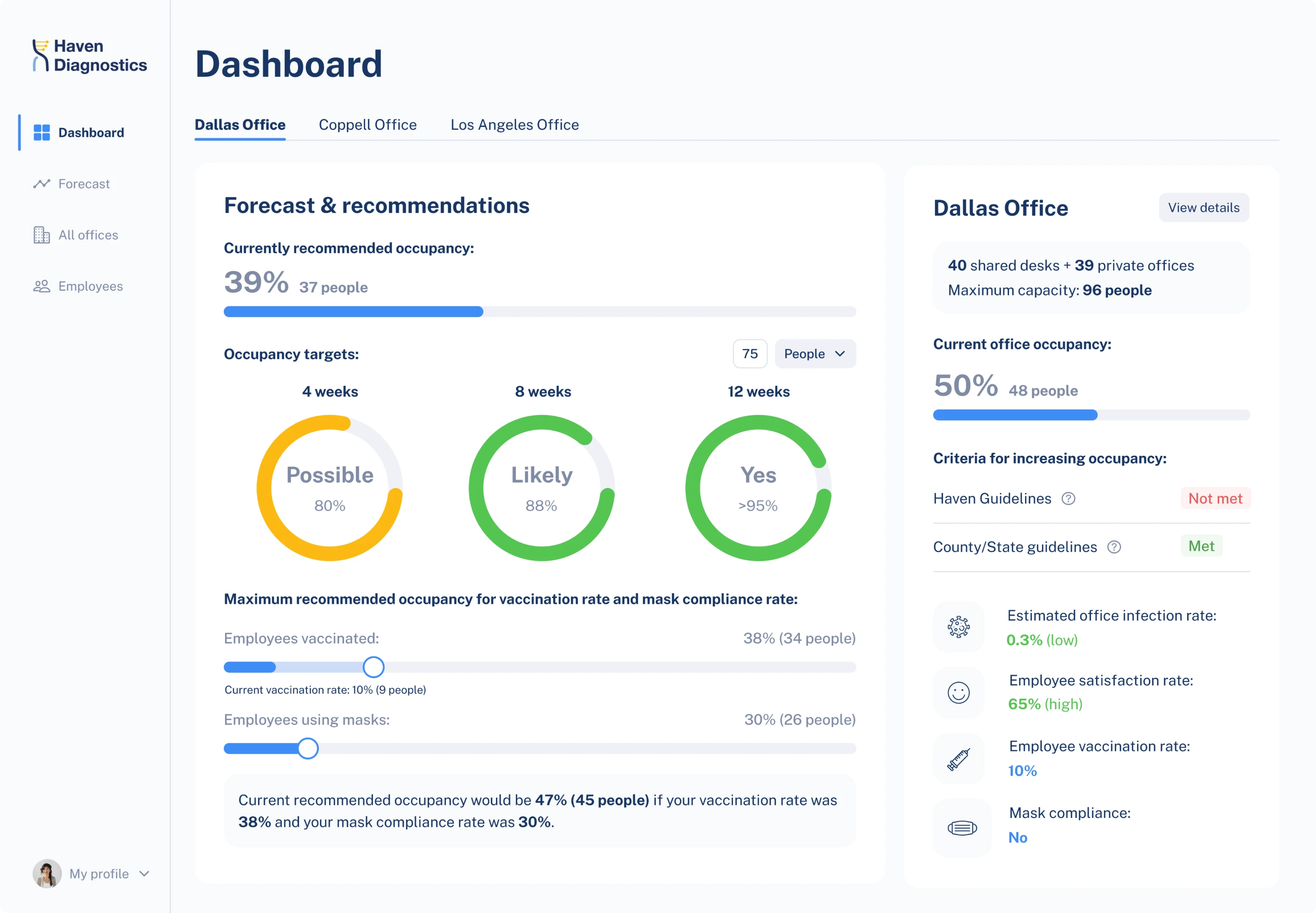
For the first screen, we built a dashboard based on the reports that Haven provides to their clients: it includes information about the current situation, projections, and recommendations.
The dashboard is comfortable to use even for the companies with many offices in different locations: each office is placed on a separate tab, and the workplace restrictions applied in each country or state are visible so that users can keep track of ever-changing regulations.
A separate page of the dashboard is dedicated to the forecast: it shows contagion graphs with projections, information about current variants of the virus that are circulating in the area where the given office is located.
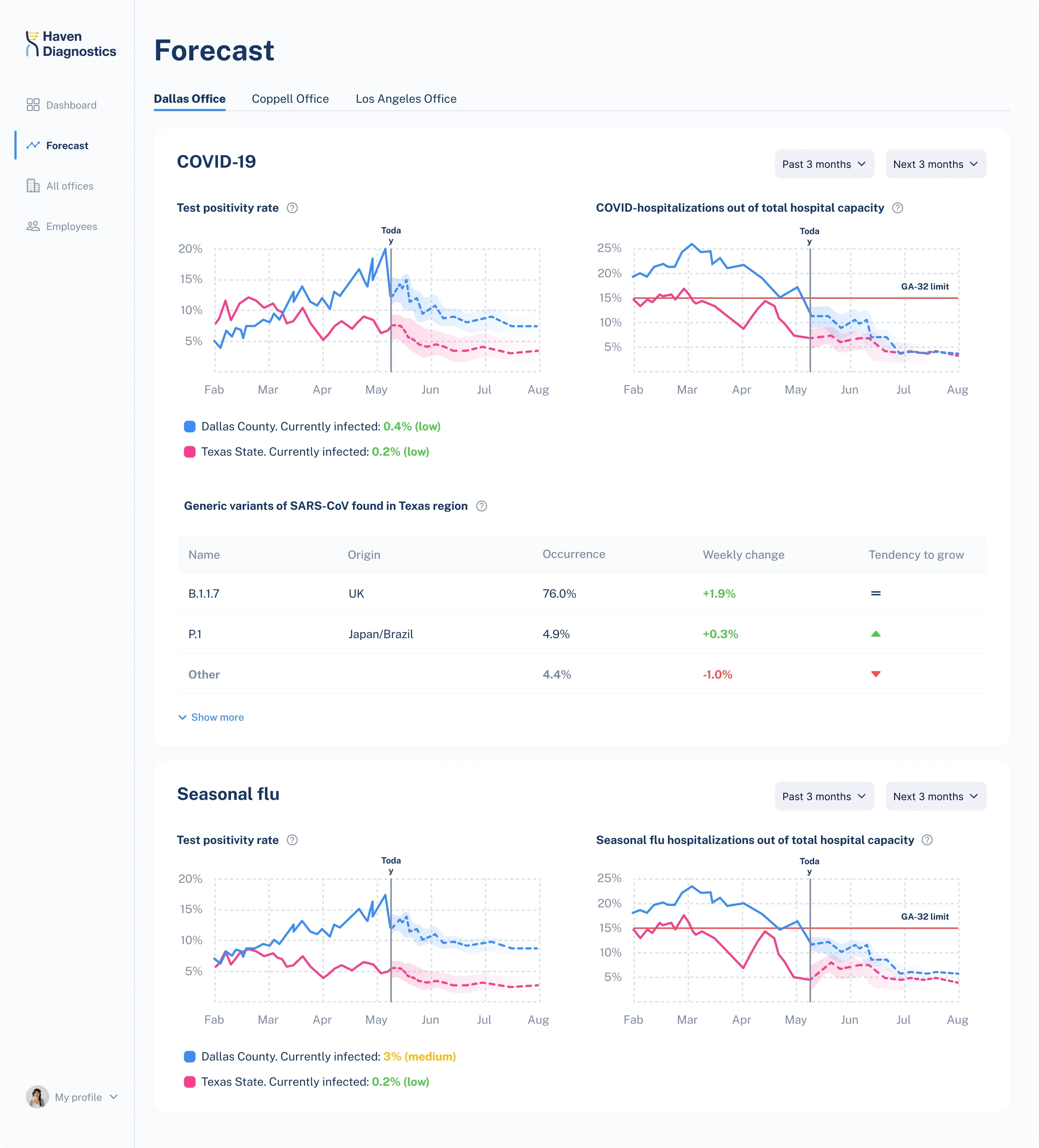
The overall risk assessment is shown in percentage and color: green is for a safe situation, red is for potentially dangerous. The page of each office shows recommended occupancy and the current one. Colored diagrams show the probability of reaching target occupancy in the next 4, 8, or 12 weeks.
To simplify the lengthy process of entering data, the “add a new office” screen uses a Wizard design pattern: all the parts of the data are divided into steps, one group on a page, the top part of the screen showing the sequence of stages.
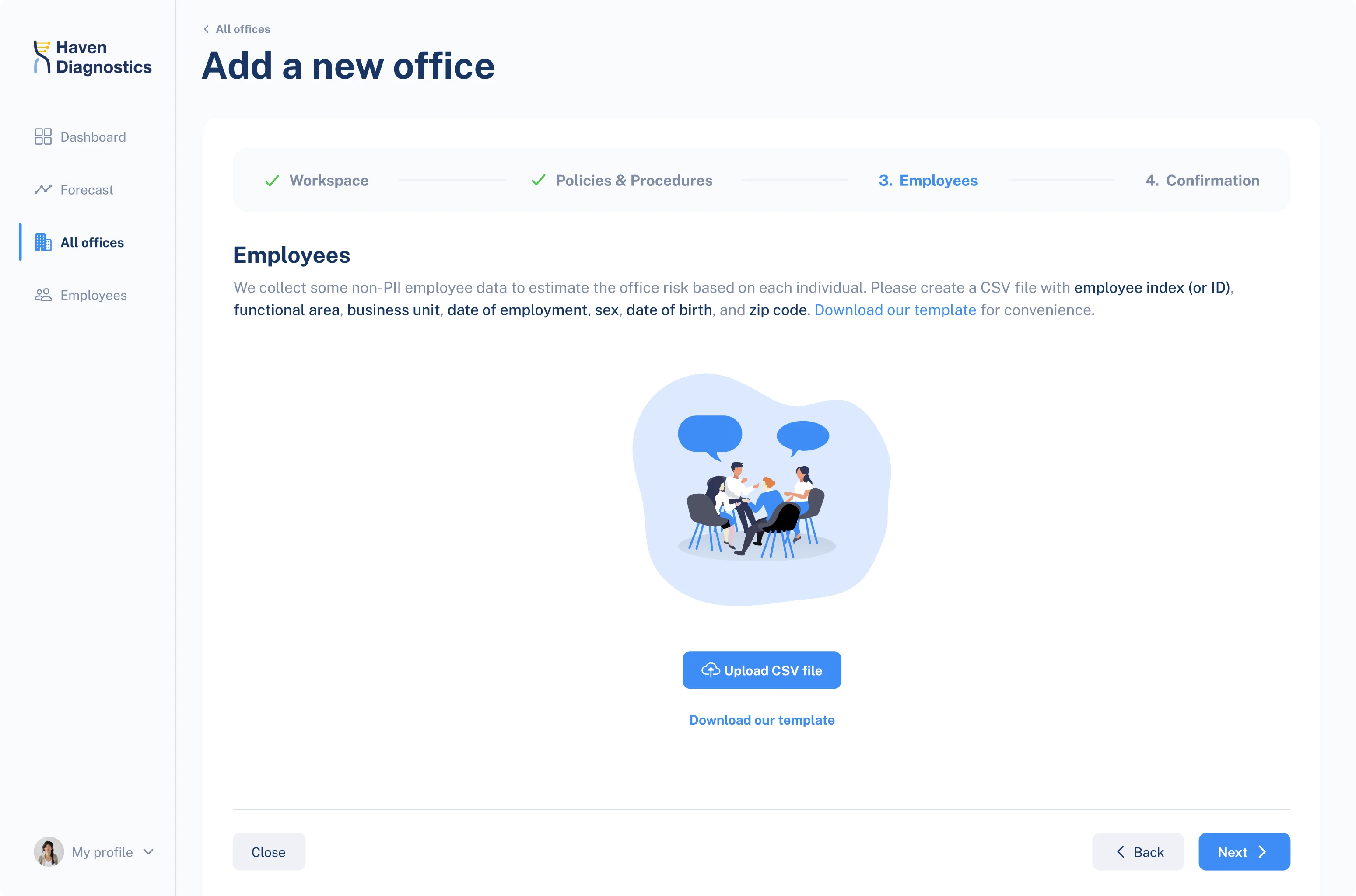
Managers can import employee data from a CSV file that doesn’t contain names, only employee IDs to protect their private data. app will replace employees’ names with a code to protect their private data.
All the screens were united into a clickable prototype, ready for investors’ pitch.
Visual solutions
The visual style of the app is consistent with the company’s style. We used the same blue tones like those from their website. The blue color symbolizes crisp cleanliness, transparency and transmits trust.
The color palette is monochrome. Contrasting colors - red, yellow, and green - are used only on the graphs that show the level of an office risk.
We used a calm color theme and rounded angles to represent the product objective: to reduce risks and calm the worries related to office work.
Font and illustrations were chosen to fit into the visual style of Haven diagnostics.
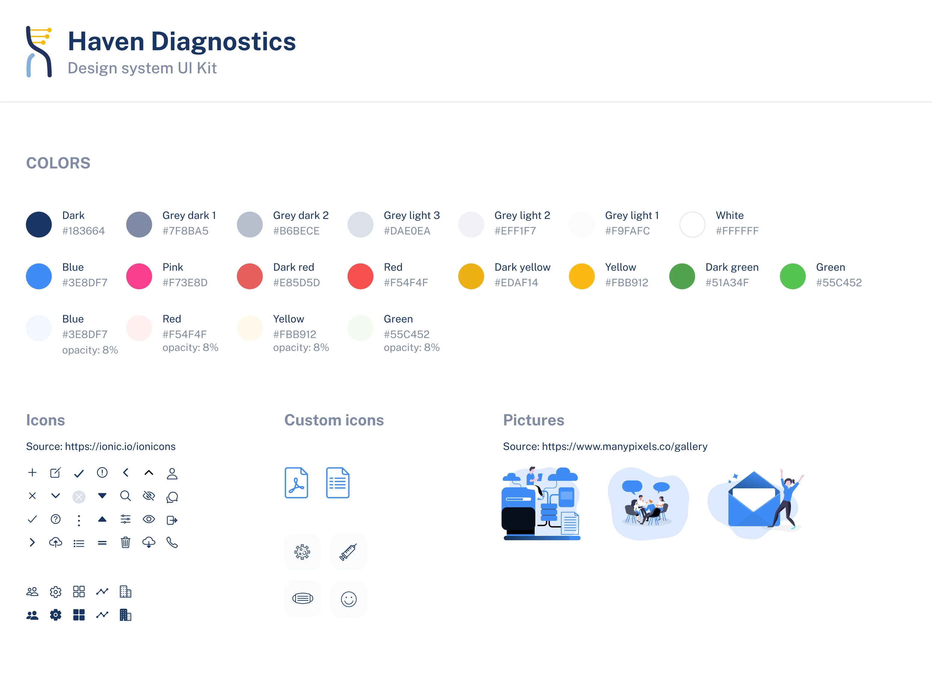
The final step of our work was organizing all the visual elements in a consistent UI kit so that any designer that would come to work on the product at the next iteration would easily add features following the same visual style.