Zaplify
How Eleken helped Zaplify double activation rates with a UX overhaul
Zaplify (now AndSend) made a bold move. They let go of their entire sales team and bet everything on product-led growth. From now on, users had to onboard themselves, discover value fast, and stay engaged all without a human guiding them.
But there was a gap between vision and reality.
The platform required help just to get started. Outreach workflows were clunky and confusing. Navigation made users feel lost, not empowered. And the design team didn’t have the senior firepower to rethink core flows quickly.
To make product-led growth work, Zaplify didn’t just need feature tweaks, they needed a UX that could sell.
That’s when they brought in Eleken.

Starting with the problem
Zaplify kicked off the partnership with a simple test: Could we understand their users better than anyone else?
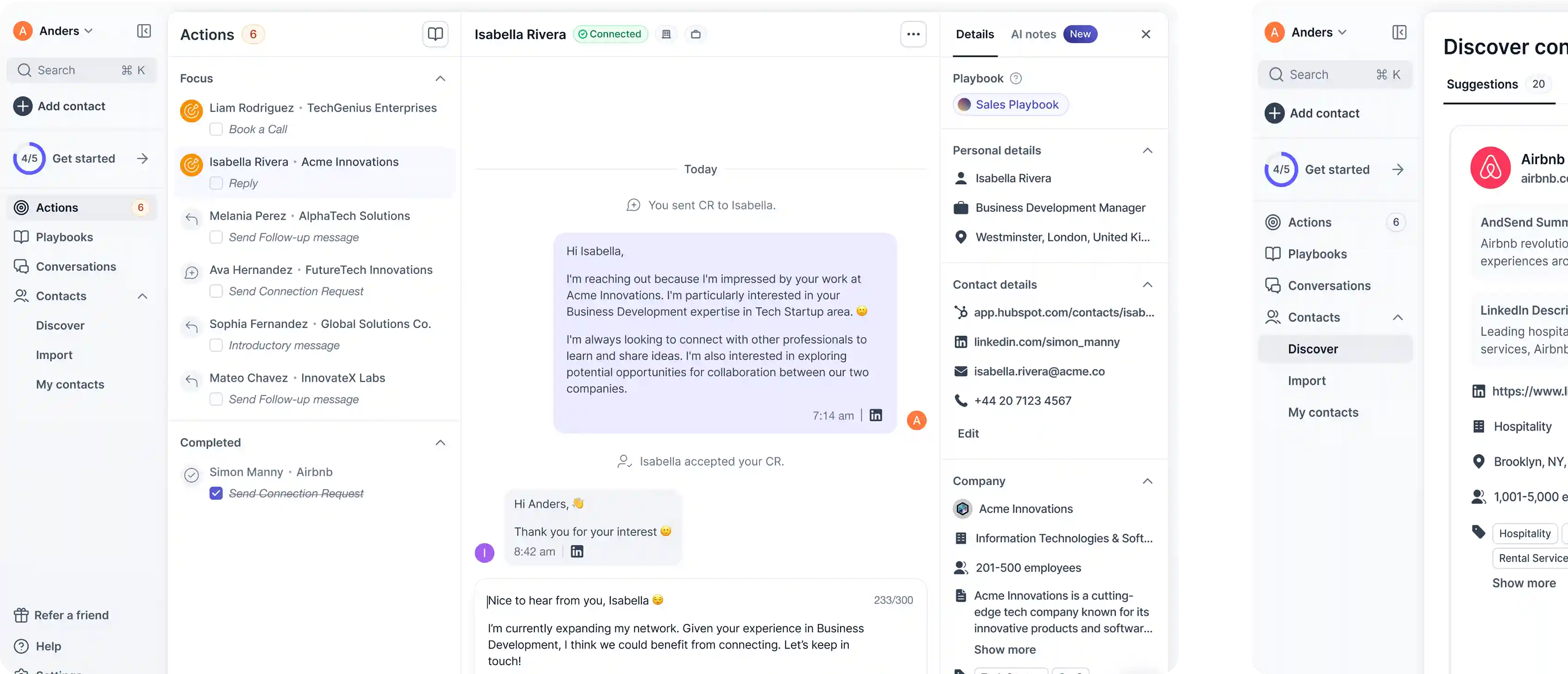
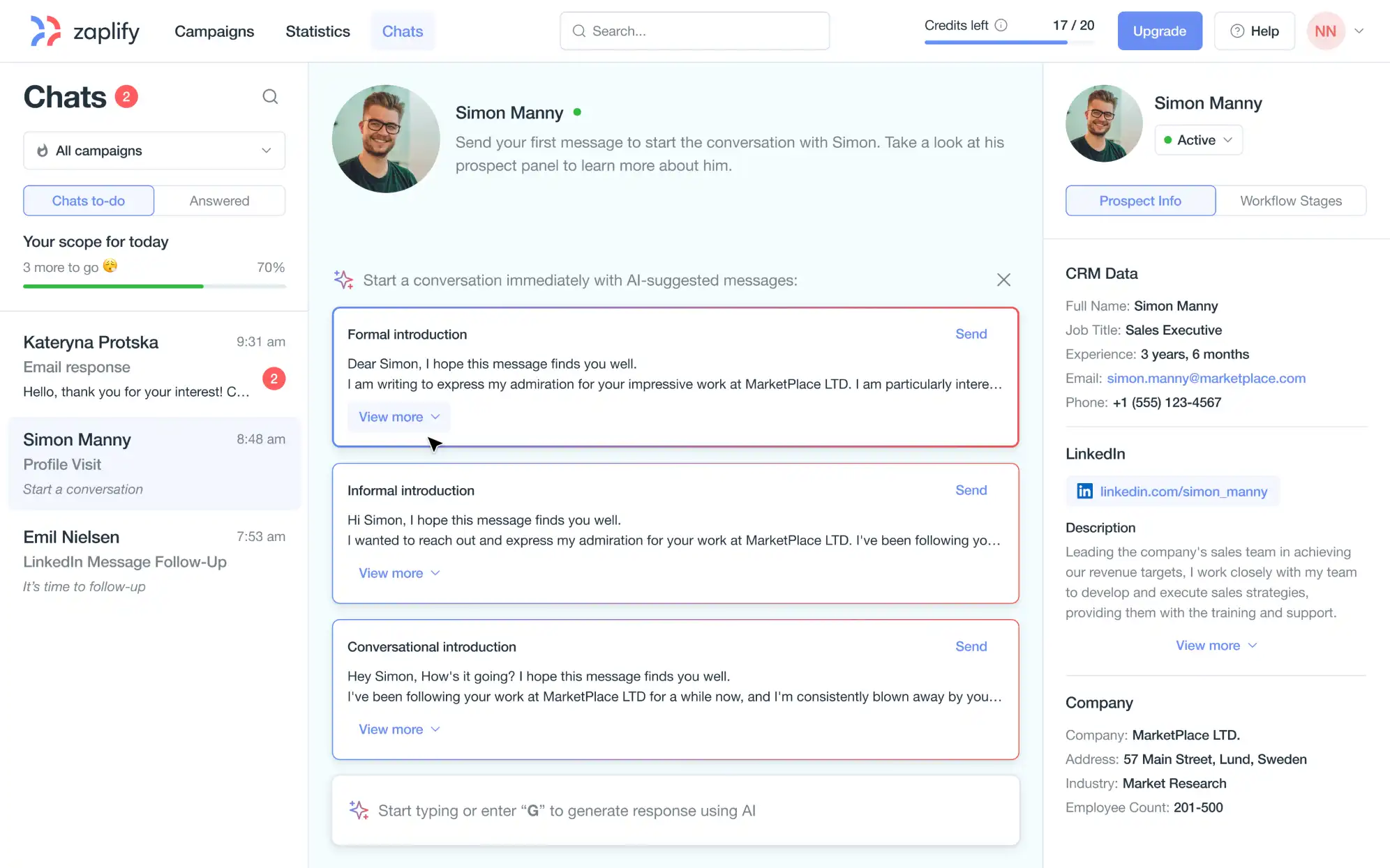
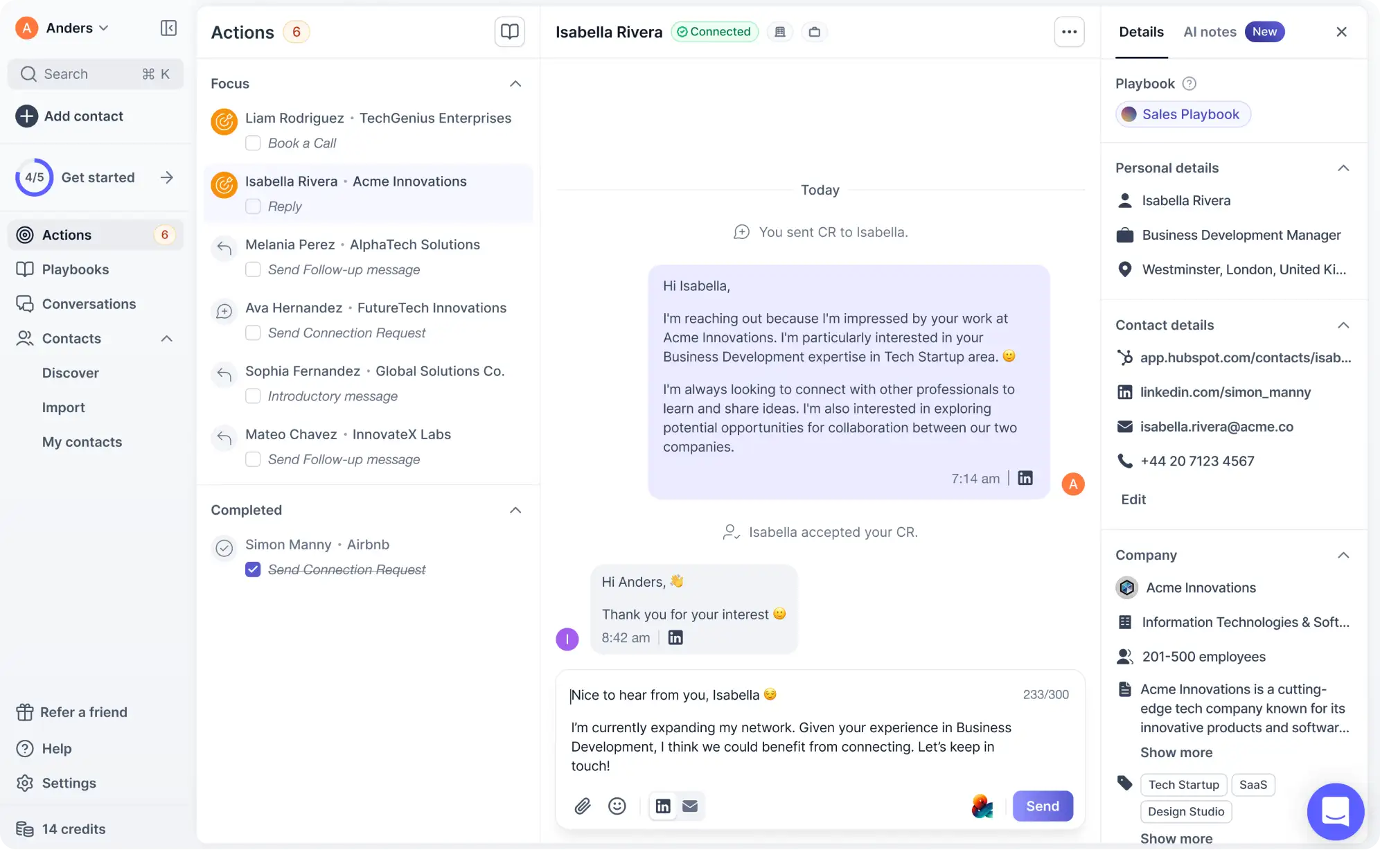
For the 3-day trial, we focused on what mattered most: the core workspace where outreach happens. At the time, that workspace didn’t even exist. Messaging relied on pre-set templates. Users couldn’t switch channels, see past conversations, or view context on a lead. It was a system designed around the tool’s limitations rather than user behavior.
We started from zero, setting aside assumptions and focusing on a single question: what does a good outbound flow actually feel like for a salesperson?
We interviewed sales reps, watched user sessions, and pulled in inspiration from tools like Superhuman, and Apollo. In that short window, we delivered a fully functional concept: an AI-powered chat workspace that felt human, structured, and productive. It included:
- A clean chat interface designed for daily use
- AI-powered message generation and personalization
- Seamless switching between LinkedIn and email
- A prospect info panel with context users needed
- A gamified checklist model that turned each message into an “action” users could complete
It also revealed the bigger issues we’d need to solve going forward.
What we found
Through daily interviews from the Customer Success team, plus two deep-dive workshops with stakeholders, we uncovered five major blockers:
- Message paralysis: Users weren’t sure how to write intros or follow-ups, and it stalled their outreach completely
- Too much friction: Campaign setup required repetitive clicks and too much manual editing
- Low trust: Asking for LinkedIn or Gmail access up front made people hesitate, especially under GDPR
- Poor context: Prospect search felt like a giant spreadsheet with no relevance or clarity
- No clear path: Users didn’t know what to do next, or if they were making progress
These weren’t feature bugs. They were UX failures that blocked activation and buried product value.
That’s why we set up a rapid discovery loop. Every Thursday, we scoped a new UX experiment based on what we learned. By Friday, we reviewed live data with the team. This rhythm let us validate changes quickly and build momentum week after week.
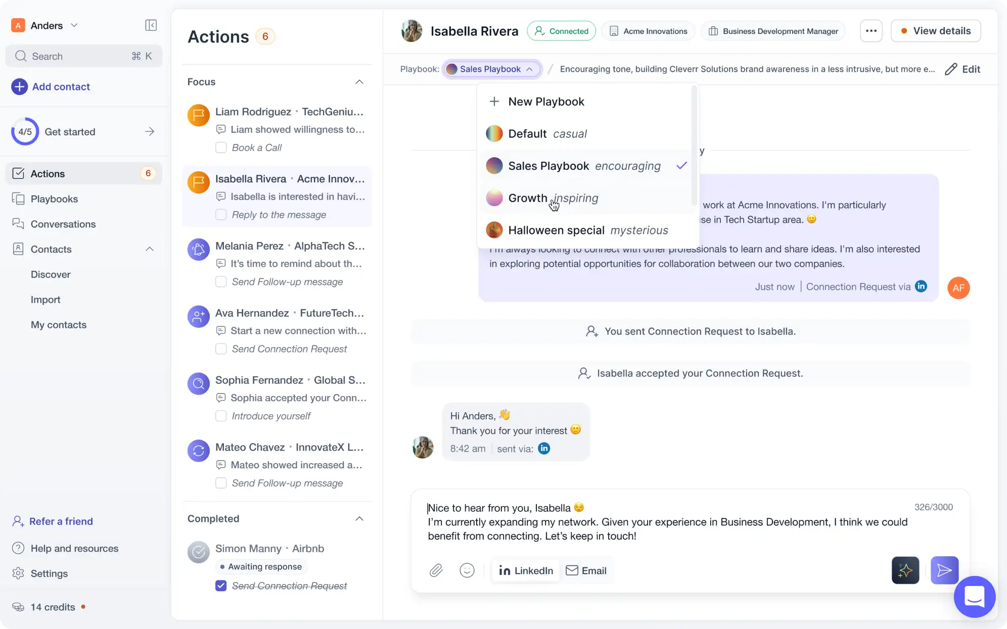
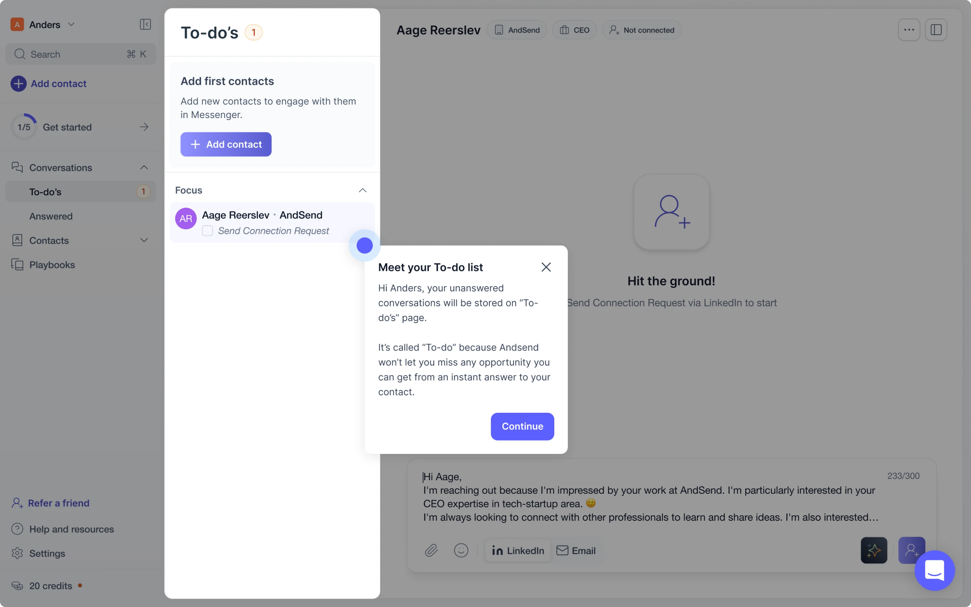
Rethinking the core: from campaigns to conversations
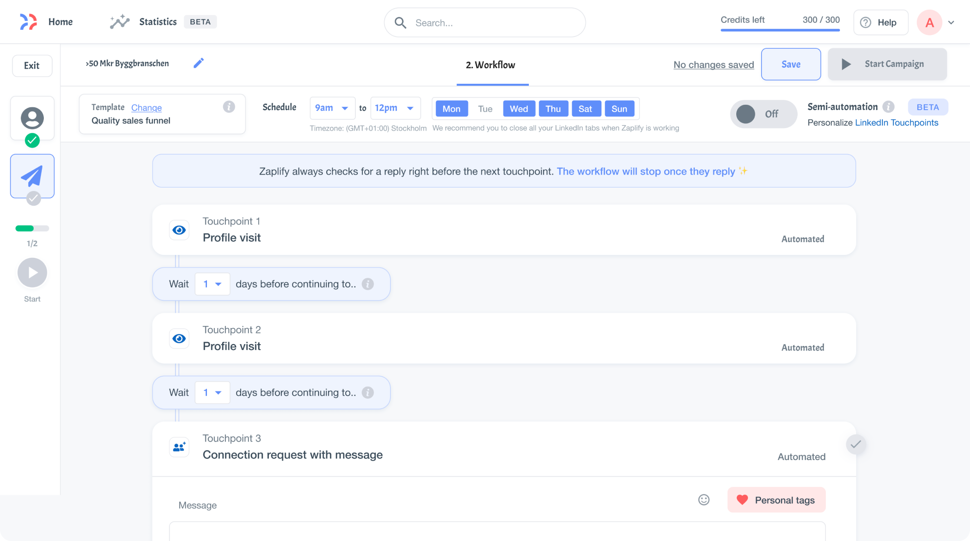
Before the redesign, Zaplify’s outreach system was locked into fixed templates. Users picked a predefined sequence — say, two emails and one LinkedIn message — and sent it to a list of prospects. They couldn’t edit steps mid-flow or respond naturally. Communication was static, inflexible, and disconnected from real conversations.
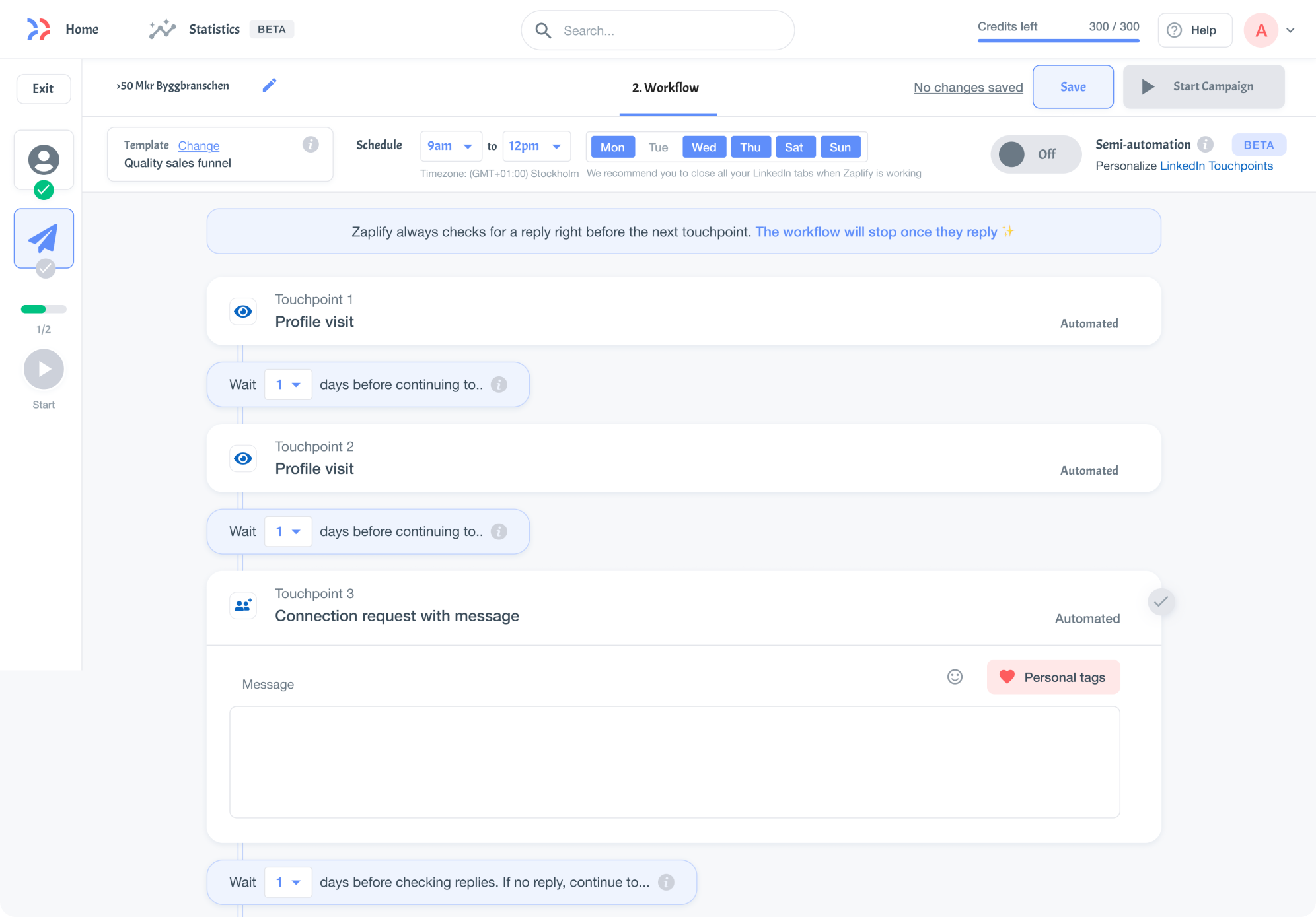
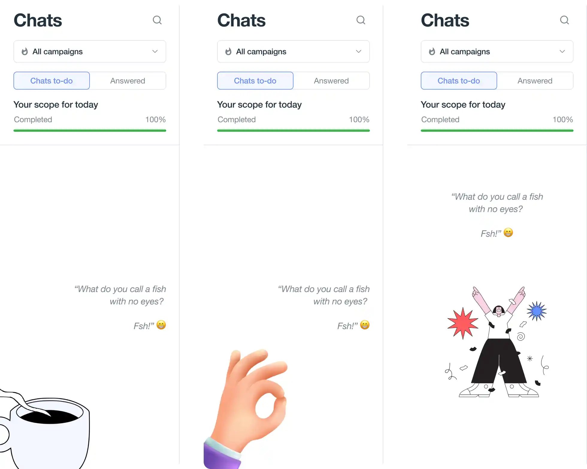
We replaced the campaign builder with Actions — a streamlined, AI-powered checklist where each step was a single, meaningful task: send a message, follow up, archive. Inspired by tools like Superhuman, it reframed outreach as daily progress, not a complex setup.
The new experience reduced choice paralysis and helped users build daily habits. Each completed action gave them a visible sense of progress.
Scaling personalization with playbooks
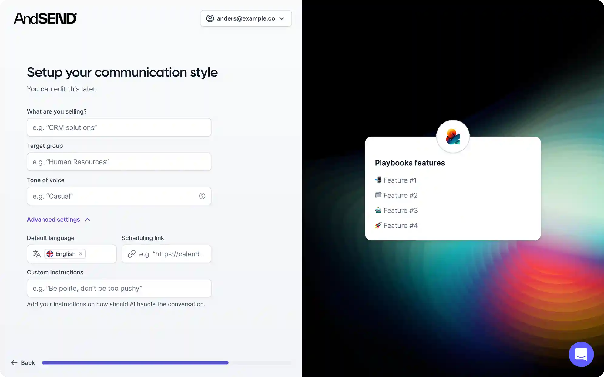
Users didn’t just need templates; they needed a flexible strategy that could adapt to different leads, each with their own tone, goals, and communication style. Manually adjusting every message wasn’t scalable, especially for users without writing or marketing experience.
Playbooks solved this by offering pre-configured strategies with editable settings like intent, audience, tone, and language, giving the AI enough direction to generate messages that felt natural and relevant.
Because Playbooks were built into the Actions system, users stayed in one flow, getting personalized, high-quality messaging without guesswork, while also learning what effective outreach looks like through real use.
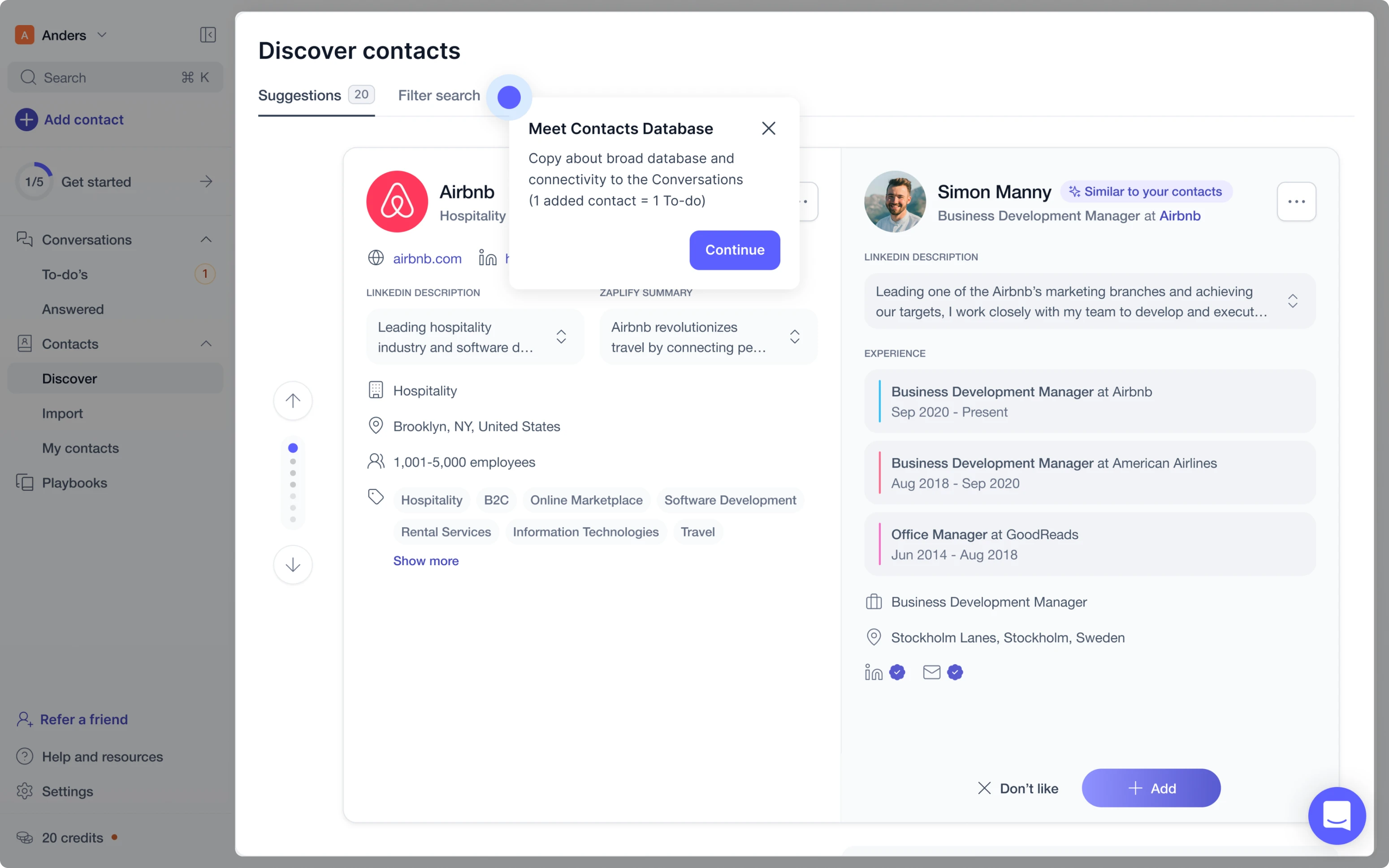
Prospecting without the Spreadsheet
Lead discovery used to be a cold scroll through tables. Endless rows, minimal context, and no clear way to assess relevance. Users didn’t just lack information, they lacked confidence that any lead was worth their time.
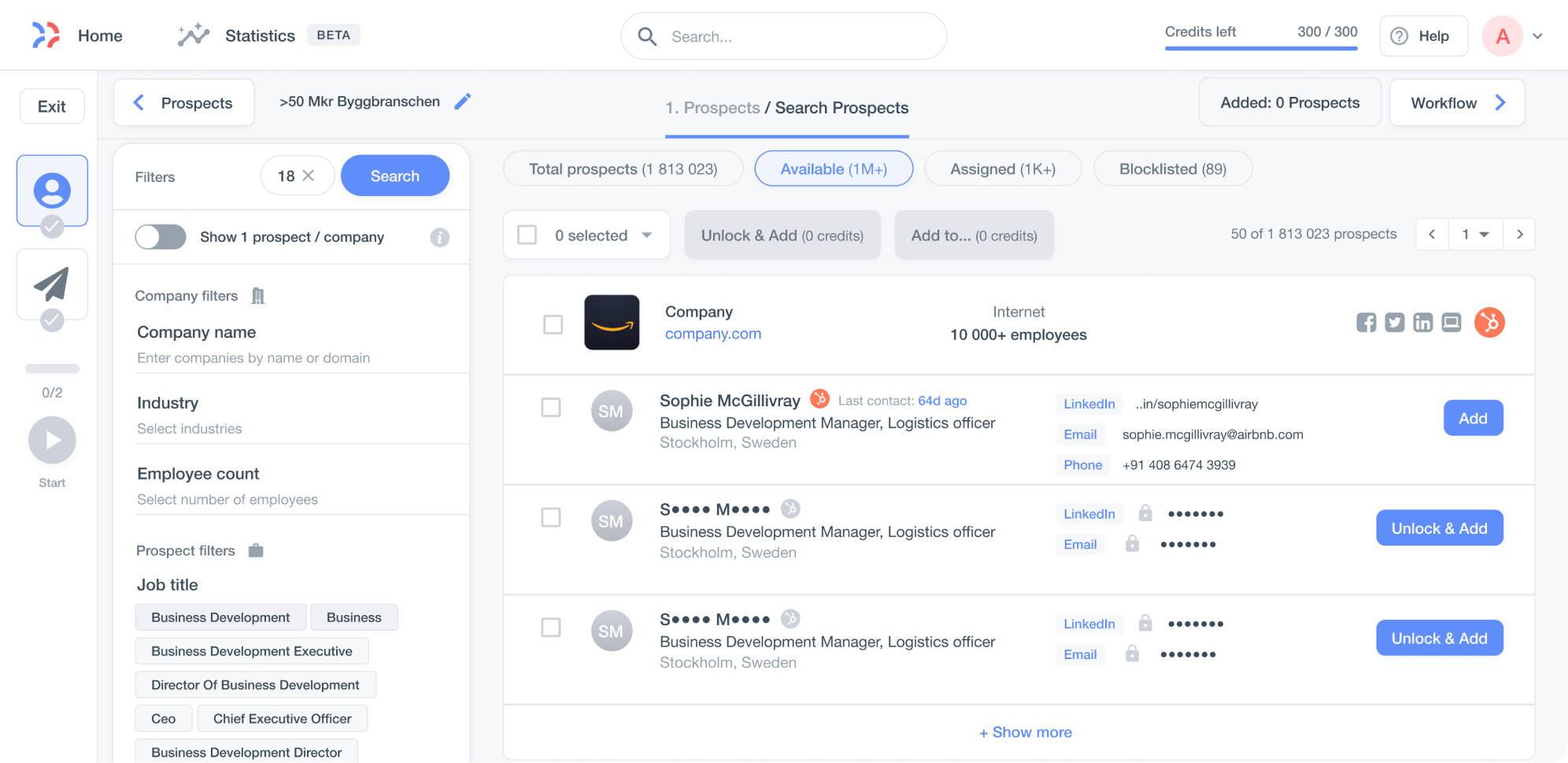
We flipped the experience. Instead of bulk scanning, users saw one full-screen profile card at a time. Each card included LinkedIn-based insights: job title, work history, company details, and even AI-generated context on why this lead was recommended. It was like browsing LinkedIn with a built-in coach.
The interaction was deliberately focused — one lead per screen, scroll to move forward. No arrow-clicking, no cluttered UI. Just thoughtful pacing and clarity. The effect? More thoughtful decisions, less overwhelm, and better quality leads moving into the pipeline.
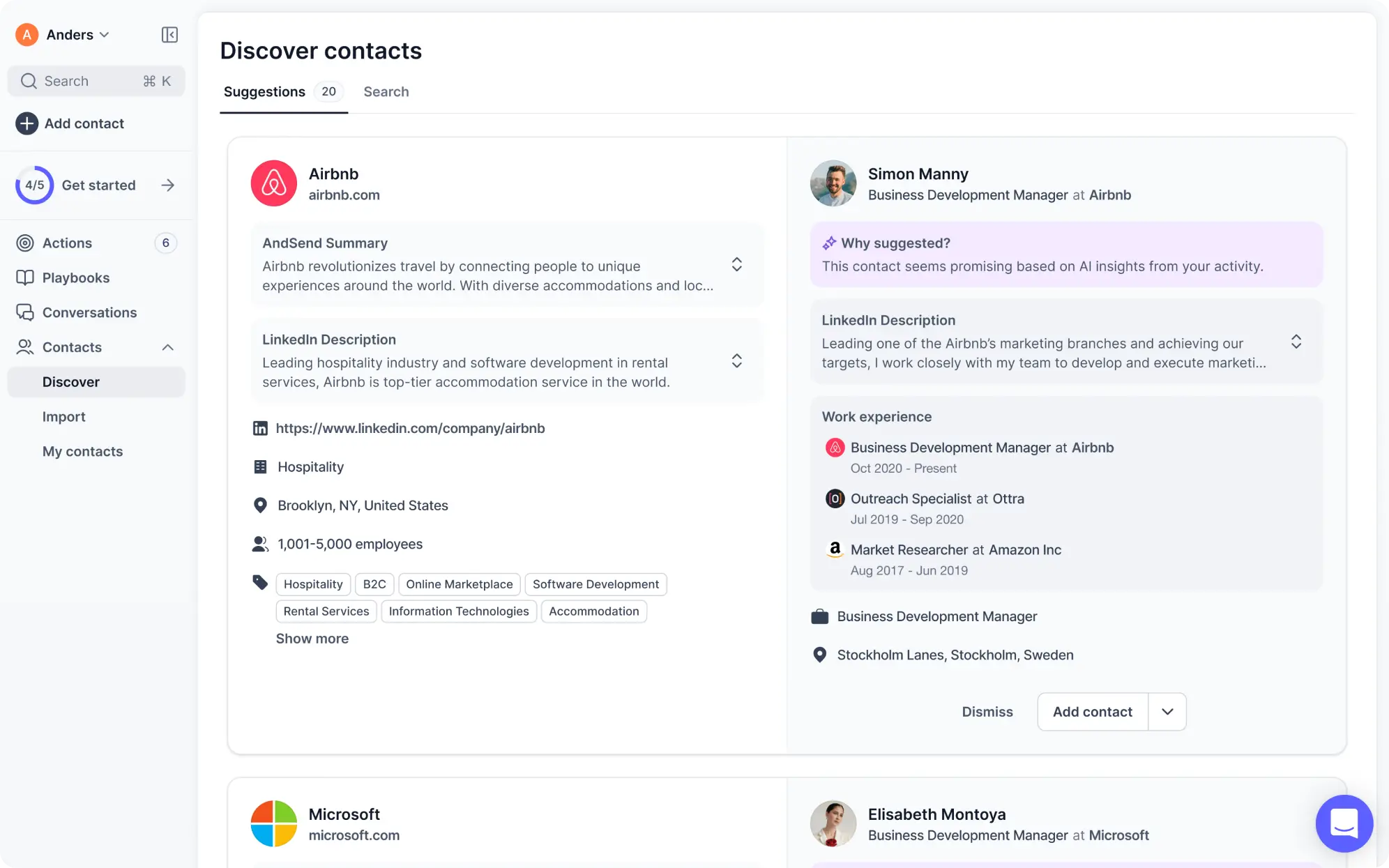
Onboarding Built for Trust, Not Just Tasks
Switching to a product-led model meant users had to start and succeed without help. But Zaplify’s original onboarding flow wasn’t designed for self-serve. New users were greeted with blank screens, unclear next steps, and immediate requests for LinkedIn and email access before they understood why it was needed.
That triggered hesitation, especially in GDPR-conscious markets like the EU. For a platform built on trust and personalization, this was a critical flaw.
So we rebuilt onboarding from scratch, starting with the user's mindset. From the registration screen, every step was designed to explain not just what to do, but why it mattered.
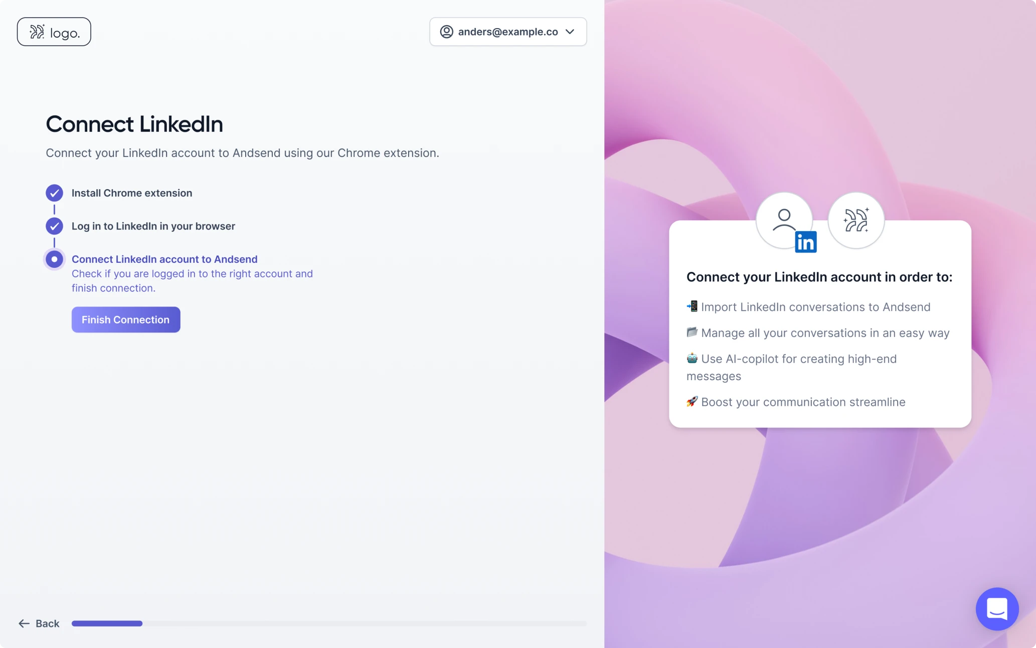
Users saw contextual highlights guiding them through the interface, and AI-generated messages that removed the pressure of writing from scratch. Even integrations were handled with care: before asking for access, we explained exactly what the tool needed, when it would be used, and why it was safe.
The new onboarding experience didn’t just teach the product, it earned trust. Users moved faster, with fewer drop-offs and more confidence. Activation didn’t depend on a sales call anymore. It depended on UX.
What Happened After the Redesign
The results were immediate. Activation rates rose from 20-25 to nearly 40 percent, with more users reaching their “aha” moment on their own, without needing a sales call or extra support.
What began as a redesign turned into a full transformation. Zaplify reintroduced itself as AndSend, a product-led platform where the user experience drives real growth. The new interface did more than look better — it delivered clarity, speed, and momentum.
In a product-led world, UX has to do the selling. That means removing friction, highlighting value, and guiding users forward through every interaction. We didn’t just add features, we made the right ones feel effortless.