Spoonfed
A redesign for food logistics product
Spoonfed is a solution that helps restaurants administrate their business, and regular people — order food delivery. They have been on the market since 2013 and continue to grow. Right now, Spoonfed plans to expand on foreign markets, switch to another platform, and make a big design update. That’s why they came to us.

The company is highly user-oriented
The Spoonfed team keeps track of all the requests from customers and regularly makes product updates based on them. Now the time has come to go beyond the features and make the whole design more comfortable for users.
The product is complex, and implementing a full redesign (while moving to a new platform) takes a lot of time. Of course, nobody wants to wait for many months to make customers happy. There are always some little things that can make a big difference.
Spoonfed went for an original, but logical solution: while the work on the big redesign is in the process, a parallel “tiny redesign” will take place.
The “tiny redesign” has three objectives:
- Prepare users for the future new look: menu on the left side and new navigation.
- Improve usability without making big changes.
- Test redesign with users and correct it before investing a lot in the final one.
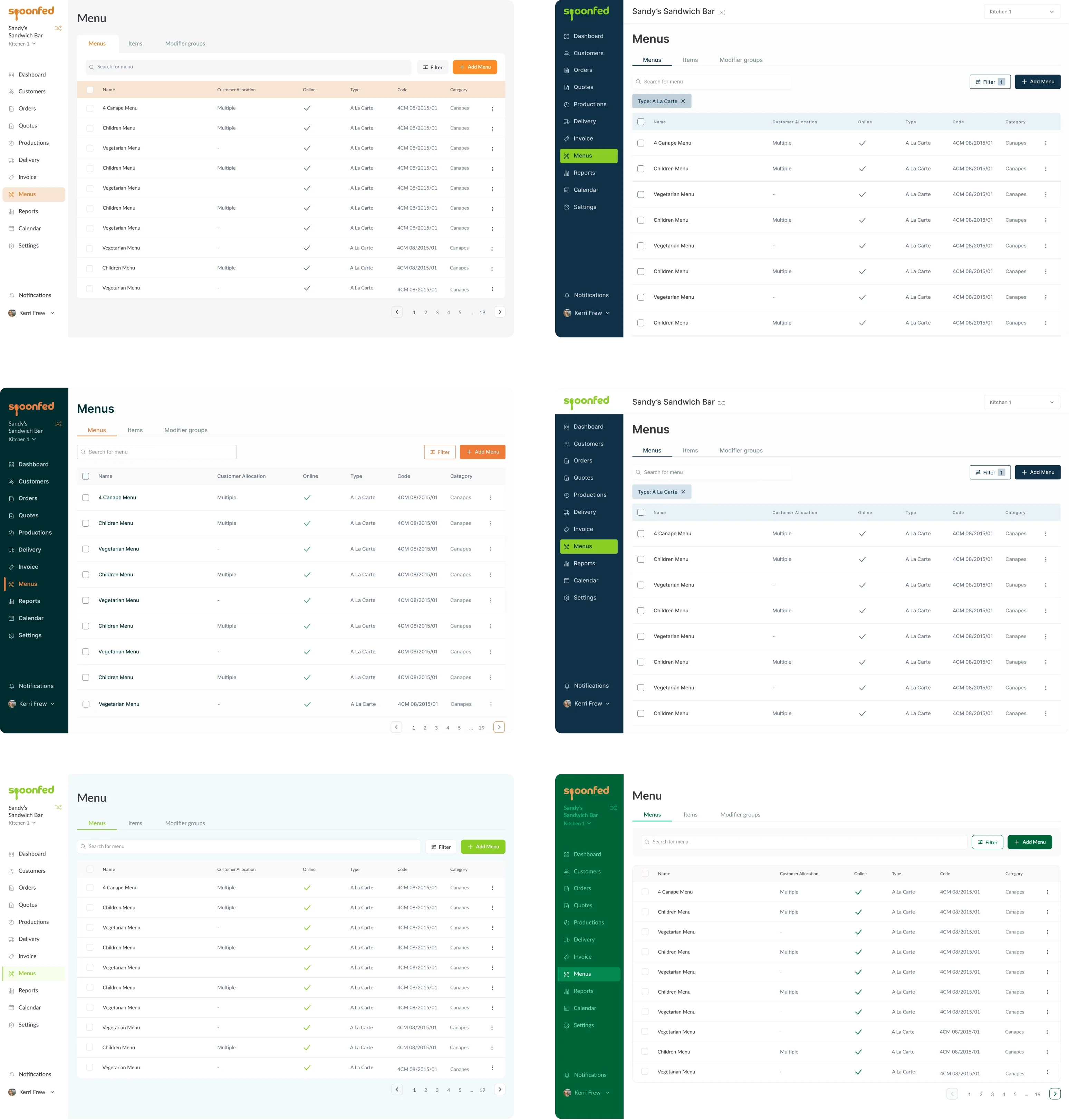
80% of the existing design has remained intact. After all, it was functioning well, even though some aspects of the user experience could be improved. UX has changed slightly, but it was mostly the UI that got tuned up.
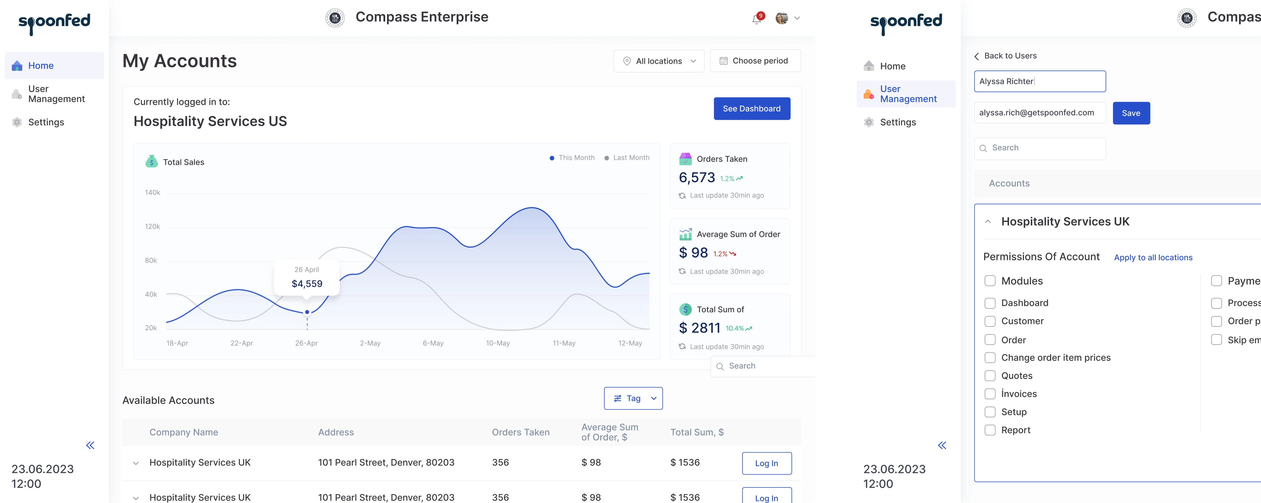
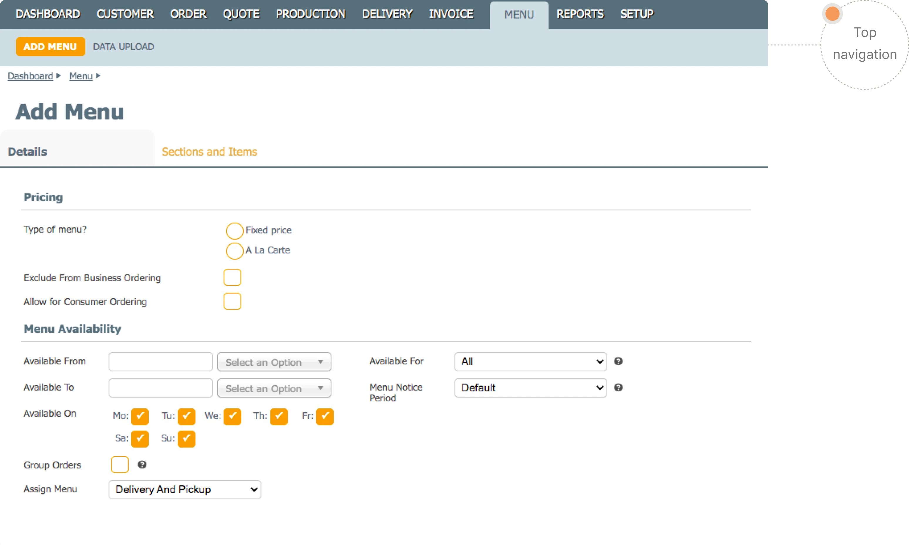
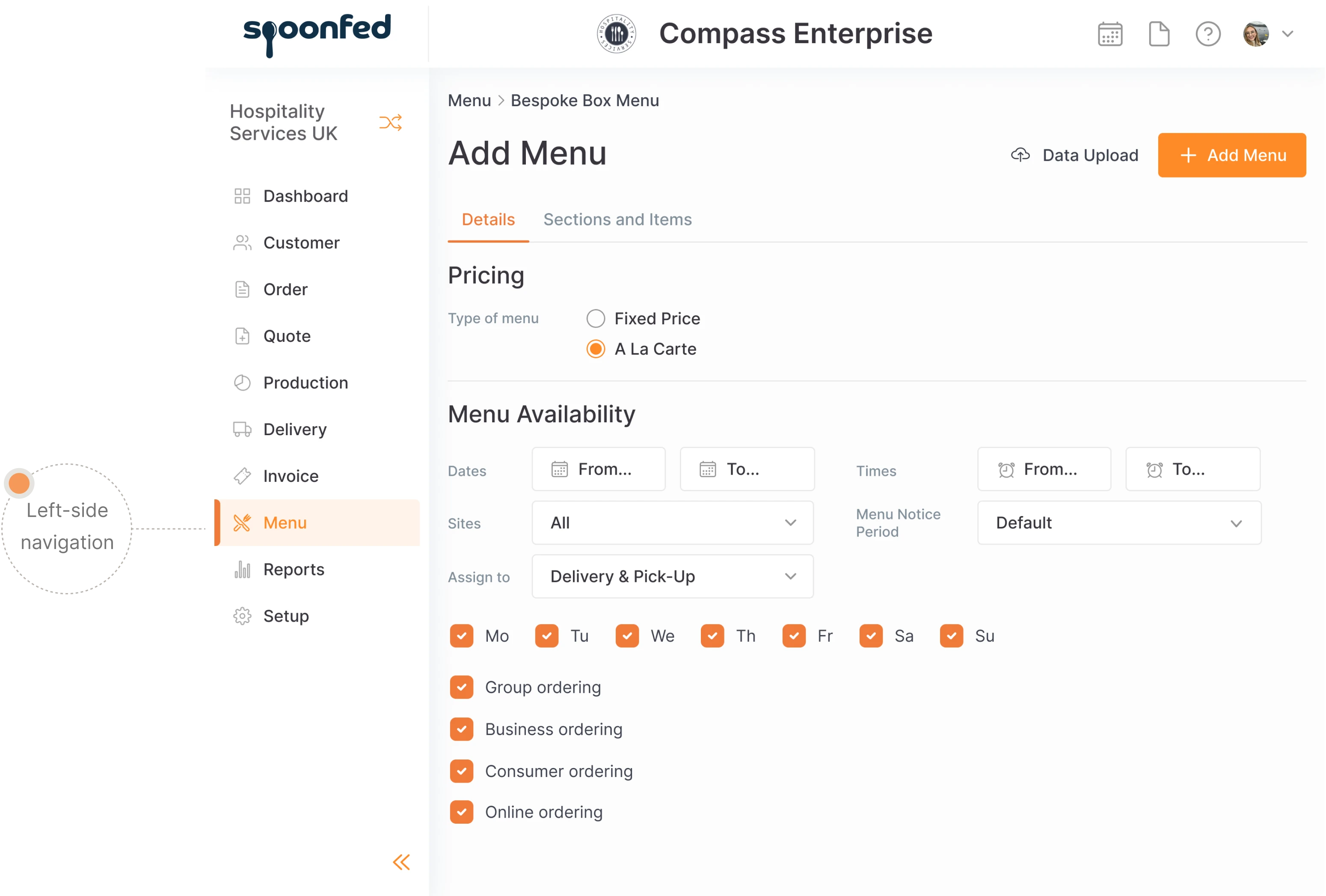
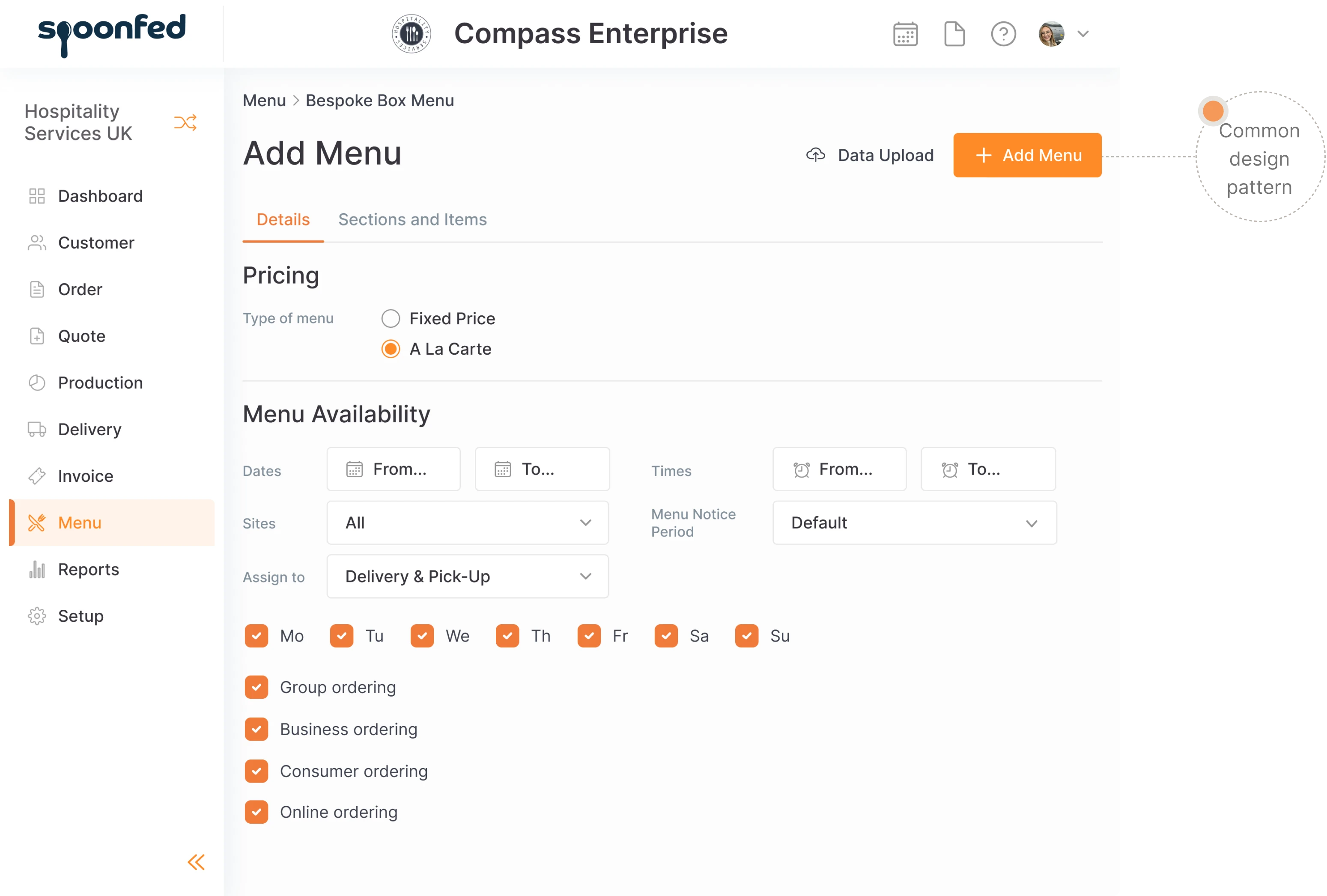
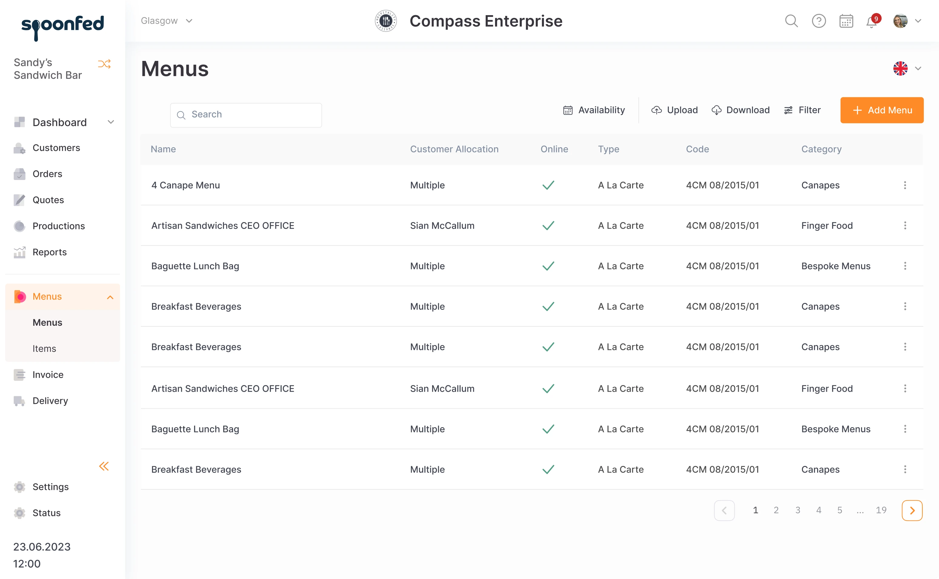
The layout of the page had been created a while ago, and design standards have moved on since then. The page is narrow and it leaves lots of unused space on the sides. By moving the menu to the left, we made use of this free space and simplified navigation.
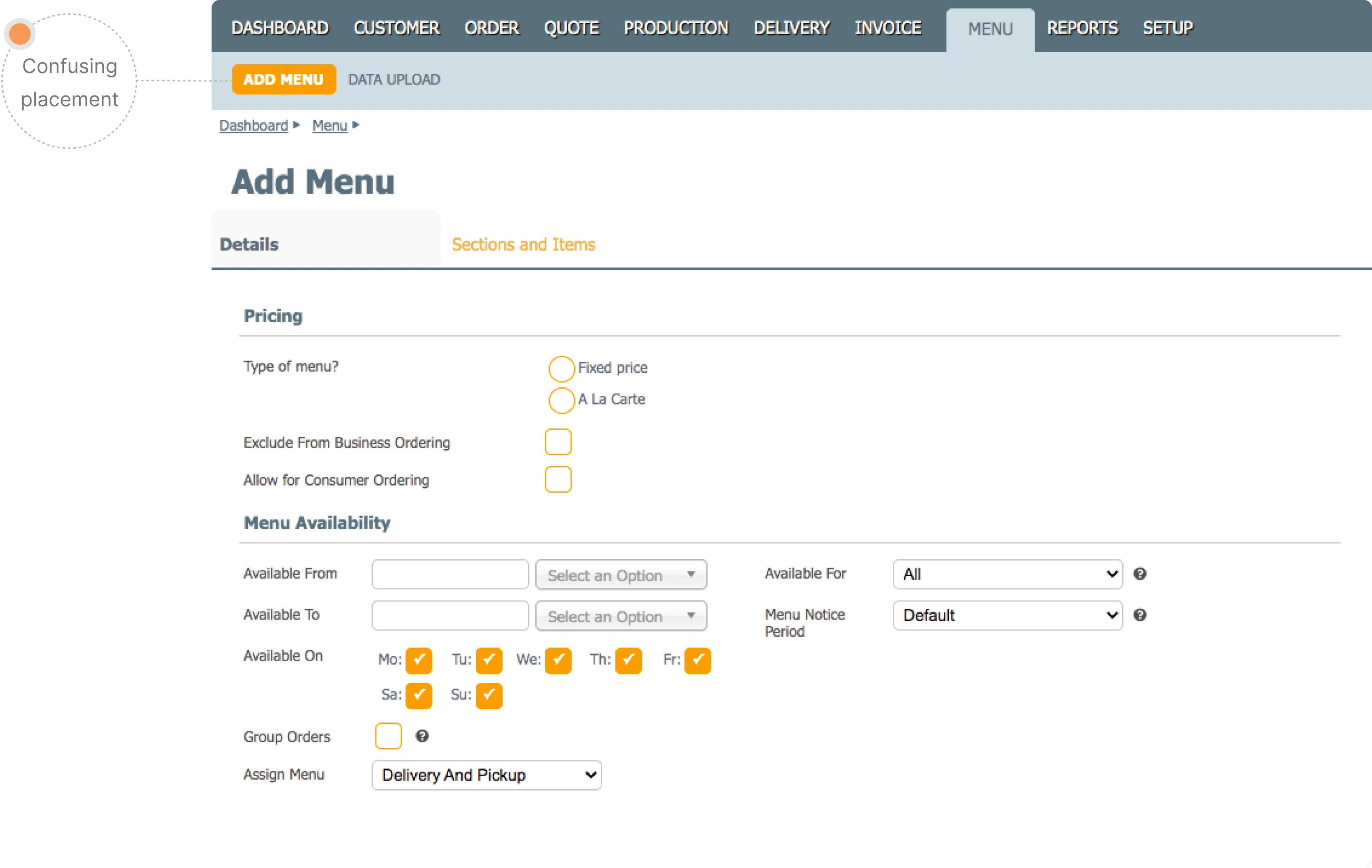
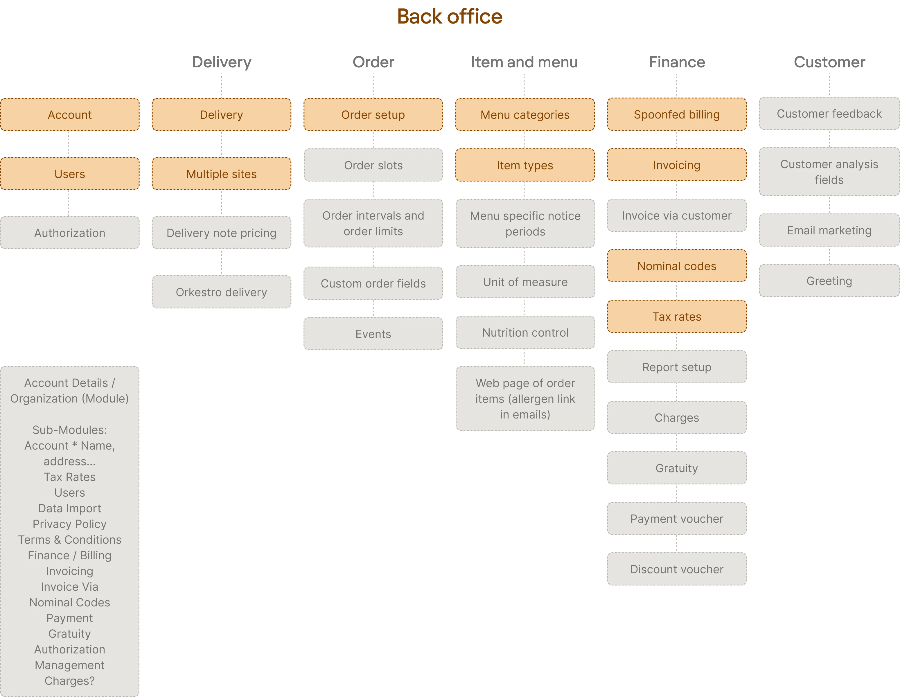
Spoonfed had a common problem that many products face with time: numerous features are added one by one, stuffed into the existing structure, making the menu become confusing. Our designers tried to disassemble this little Frankenstein and arrange categories following a single logic.
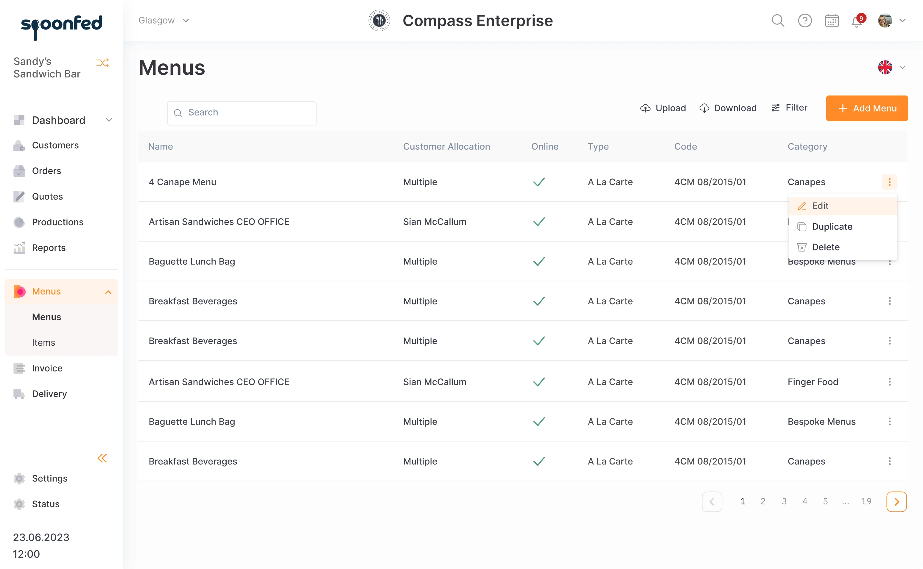
Also, some elements were changed according to the common design patterns. For example, the button “Add Menu” was moved from the upper left corner to the right, as it is the place where people are used to seeing it in most modern apps.
New platform, new design
While the current design is being changed little by little, work on the future version is also going on. In the big redesign, the changes will be more global.
The redesign starts at the roots of the product. The structure of some elements, such as setup, needed restructuring. It was a challenging chunk of work that required the whole team to brainstorm on calls almost daily.
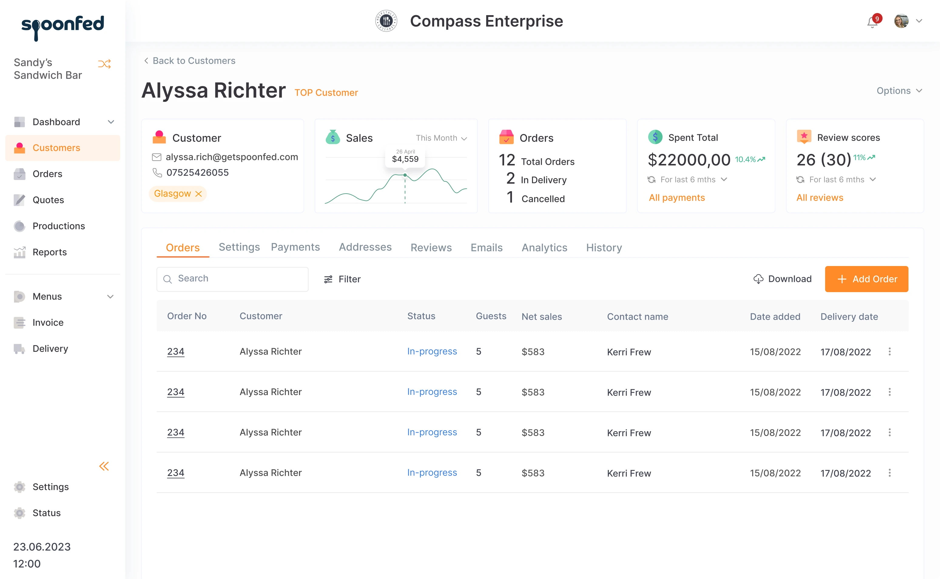
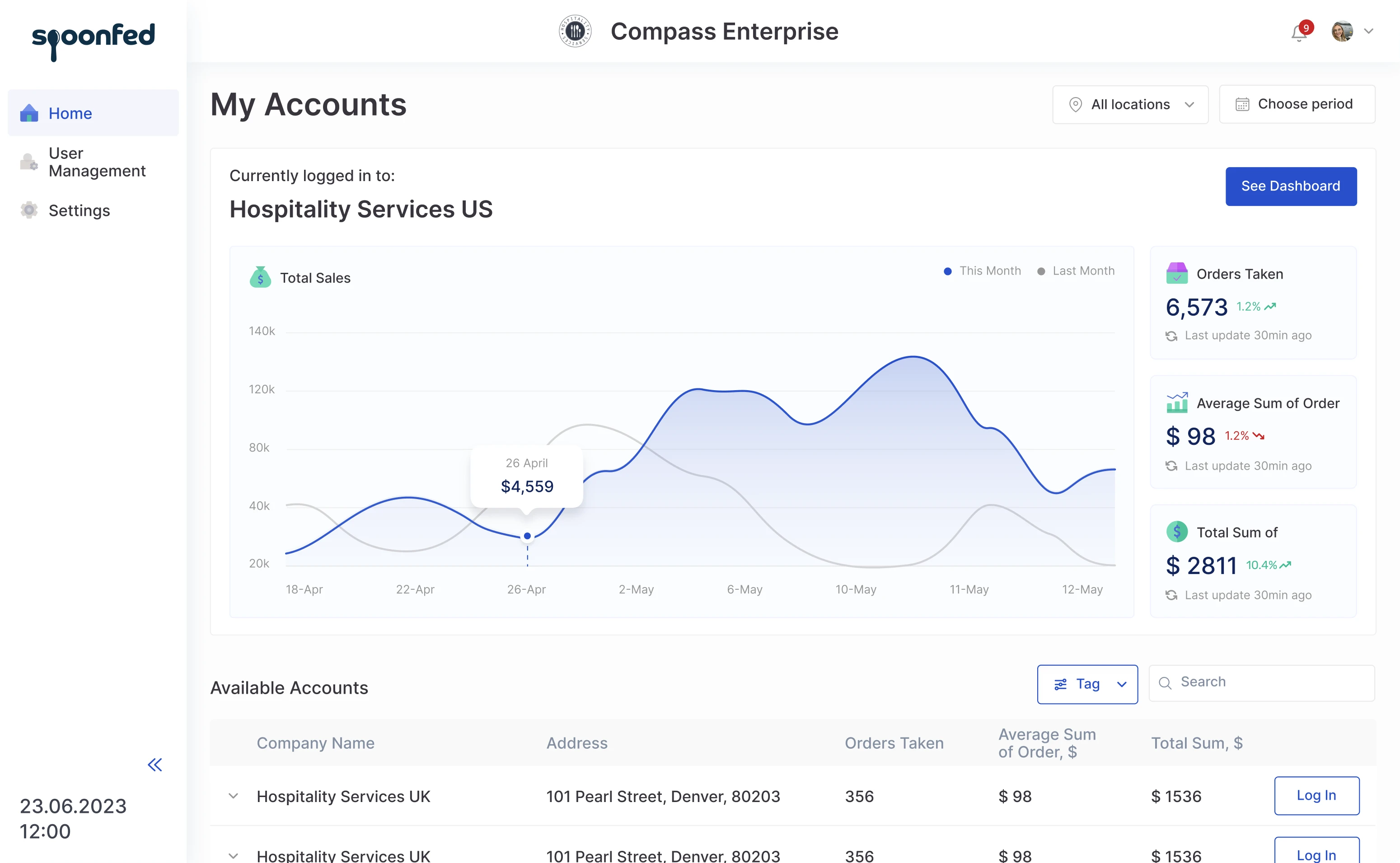
The dashboard in the restaurant management system is customized to fit the needs of different users. For instance, when the accountant enters the system, they see the data about income and expenses, and when the chef enters, they see the orders statistics and providers' information.
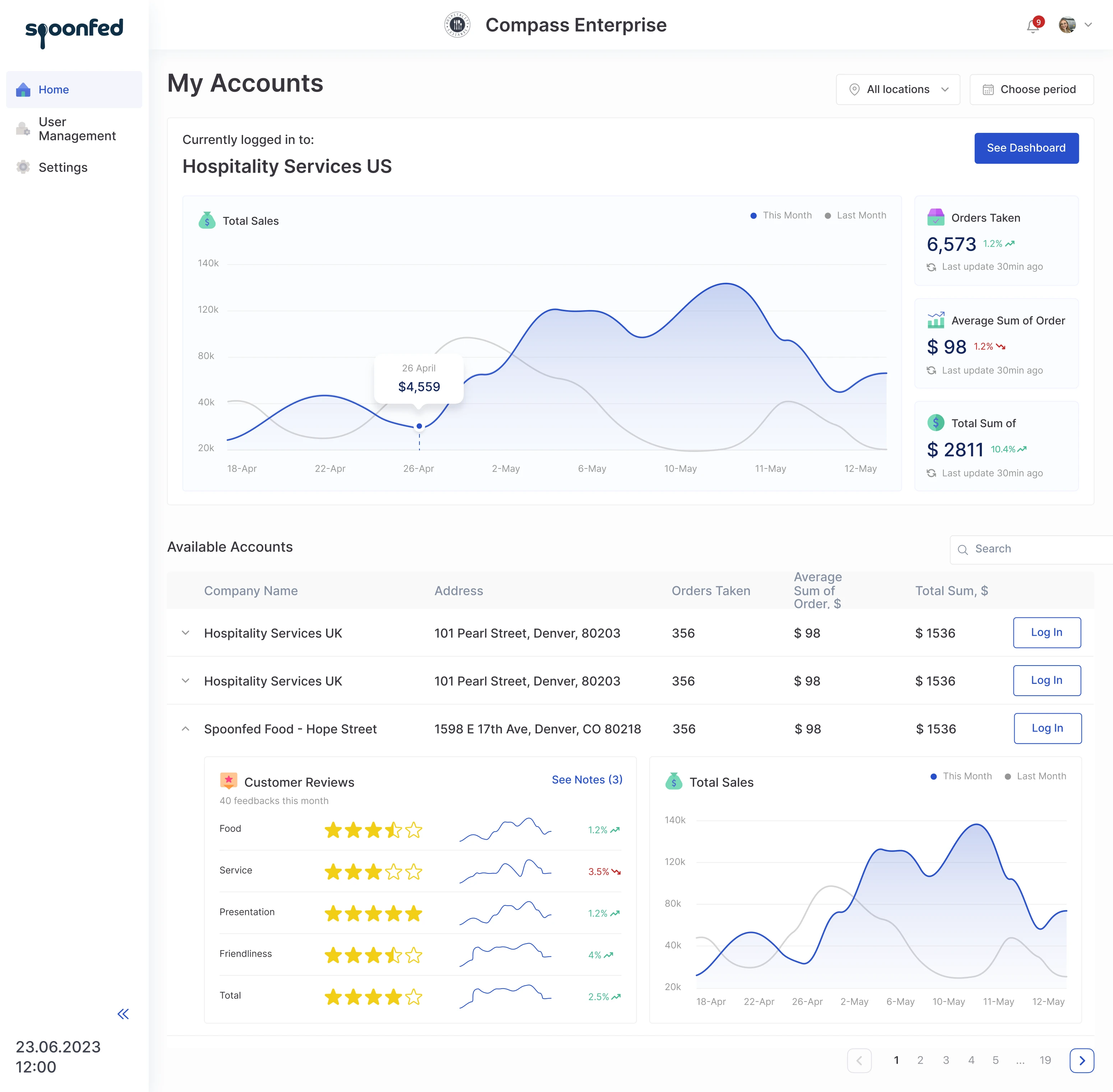
“Enterprise” mode will be added, which helps managers to access information about different restaurants or chains that belong to one enterprise.
The logo of an enterprise or a restaurant is shown in the heading, and the left drop-down allows a user to switch easily between different locations.
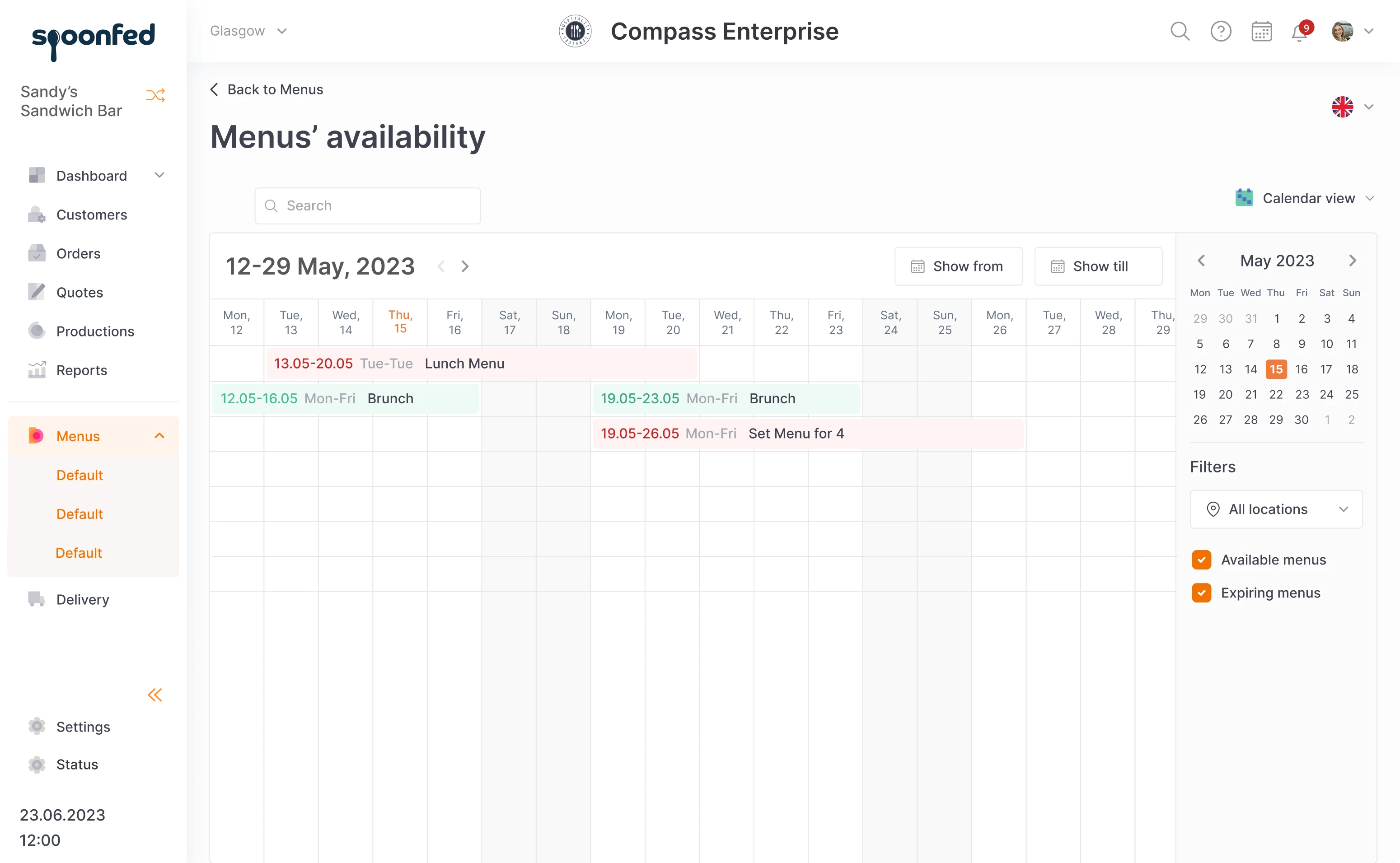
Calendar view is a simple visualization that allows restaurants to control the menu’s availability, depending on the day and time. Just to make sure that nobody will order brunch on Wednesday night.
Modern search system
As happens to UX design made in the past decade, the app had search by categories. It worked for Spoonfed clients, but when it comes to search, we need to get more options.
First of all, we added a general search field. Second, instead of categories, we introduced filters. This is the UX standard of our time. Complicated search can cause frustration, which is why combining search methods helps improve user experience.
Accessibility complying with the US digital design standards
When we think of accessible design, font size and color contrast are the first things that come to mind. However, there is a lot more to it.
For example, voiceover functions for people who have low vision.
It is a function of the browser that works with every page with the text on it. But imagine a food delivery page which has detailed description of all dishes. If the voice starts reading all of them, it won’t help anyone.
To work properly, text on the page has to be marked hierarchically: heading 1 for "Pizzas", heading 2 for Margarita, Pepperoni, Diavola, and heading 3 for ingredients of each one. In voiceover, all these formatting details that people usually don’t pay much attention to, are very important.
Accessibility standards in the US are strict and every digital product does its best to comply. Spoonfed’s clients and restaurants also wanted their personal pages to meet the accessibility norms.
One of Spoonfed’s features is the restaurant website constructor. Each page can be customized to suit corporate style: colors, pictures, logos, and so on. When working on the redesign, we try to shape this constructor in a way that would prevent users from creating designs that make their websites less accessible.
New visual style
When we started our collaboration, the first task during the trial period was to make a new visual style and create a menu layout. Our designer made a few different versions and the client chose the one that best reflected their vibe.
Later, when they discussed the desired look, the client used Stripe as a reference. So, we decided to use one of the elements of a trendy Stripe look, bright colorful icons, without copying their design. Our designer replaced standard icons with custom-made ones.
This little detail helps to spice up the look a bit, while not changing the color scheme drastically. When new design has continuity, changes cause less stress to users.
Flexible working plan
In our work, we didn’t have a fixed plan and a list of deliverables. One thing brings up another, and when we have to run a long-lasting project that includes two redesigns for a product that adds features on users’ requests… Well, not trying to stick to one plan is just a realistic approach.
Our designer was working not solely on one project. Apart from redesign, there have been a number of development requests from Spoonfed clients, who required design support. On top of that, some clients needed help to make their websites, created in the constructor, comply with the accessibility standards. That was one of the designer’s tasks, as well.
Since Spoonfed doesn’t have an in-house designer, Eleken designer became a part of their team, doing small graphic design tasks besides her UX work.
She had regular calls with Spoonfed team: account manager, head of development, and founder. It was a great opportunity to get into all the details and discuss everything directly with people responsible for the development and general decision-making.
Lasting partnership
It has been nine months since we started our collaboration and counting. Spoonfed team has already got positive feedback from some clients on the current redesign and we are moving forward on the road to the final design together.