Process Place
How we designed a workflow management app that fights organizational chaos
The first rule of business processes states that if anything can go wrong with business processes, it will go wrong. Hardly exists a company that has never dealt with missed deadlines, stressed colleagues and unhappy customers. Given that most processes recur, like employee onboarding, or writing an article, they must be polished to perfection, right?
Wrong. Because chaos slams on the brakes of your processes, making them siloed and disorganized. You know exactly what is organizational chaos if you've ever:
- struggled to find a key document (since it was stored on a local desktop rather than in a collaborative repository);
- were waiting from vacation the only employee who knew how something is supposed to be done;
- had to deal with a mistake that someone made because they guessed, and guessed wrong.
It makes sense to identify moments of ambiguity everywhere they happen and stamp them out from business processes, mercilessly. It’s a hard job to do, but in the SaaS era, nobody has to fight ambiguity alone.

The productivity apps dilemma
So we need an app to organize our recurring processes. What about productivity tools?
We have dozens of beautiful apps for projects & tasks, like Asana, Notion, or Basecamp. The beauty of universal tools is their flexibility. But the downfall of universal tools is, again, their flexibility.
Given that anyone can use a tool in different ways, you end up having your team members using it in all different ways. As a result, you don’t promote clarity — you actually promote ambiguity.
Process Place was specifically created for managing processes
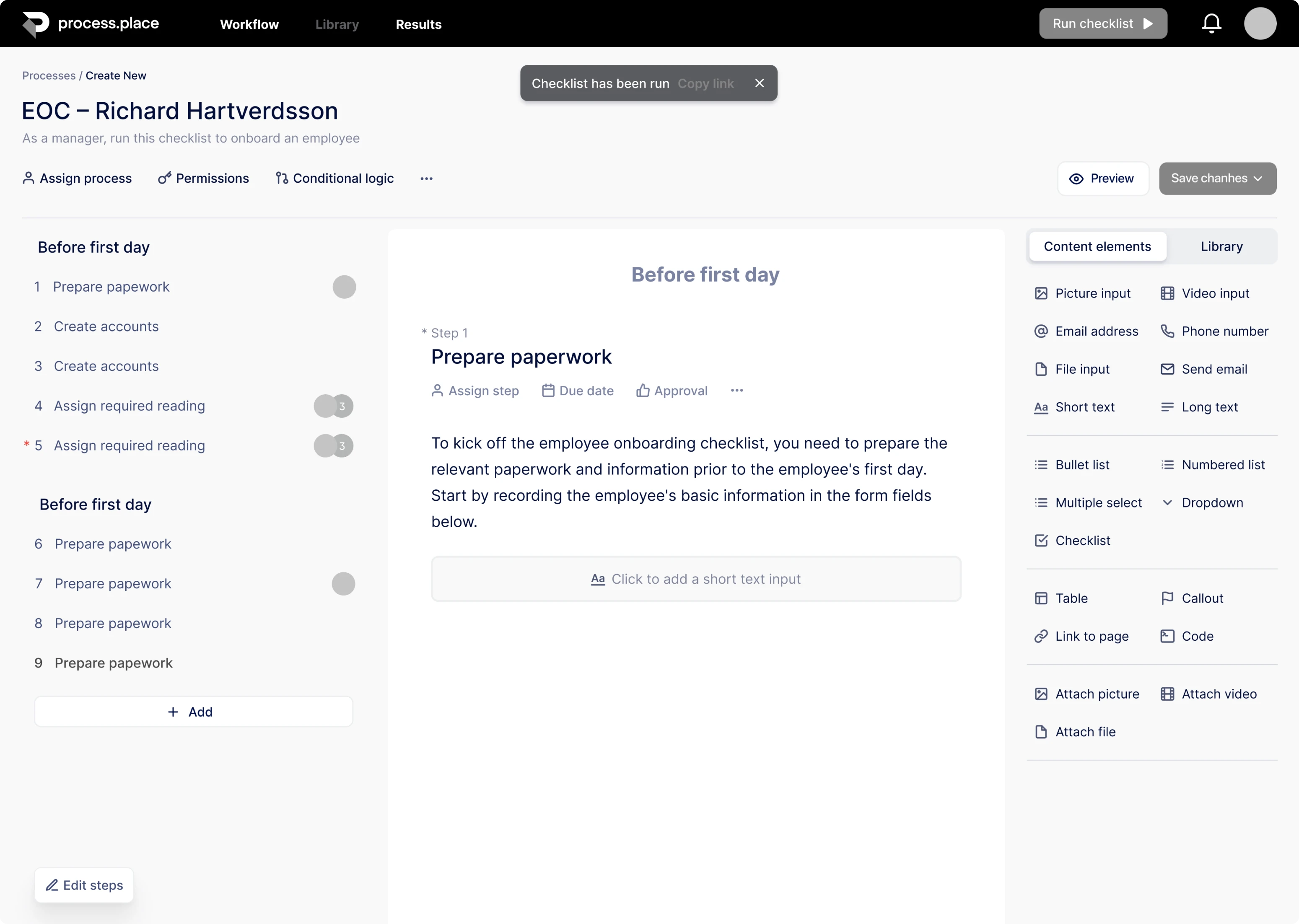
What if you can map up all your workflows so that there is no ambiguity about what people have to do?
What if all your processes were online, interactive, so people can click on every step of the process and pull up all the associated proms and documents relevant to that step?
What if your team could have a single source of truth about how processes are rolling in the company, complemented with an intuitive way of searching for things?
With all that questions in mind, we designed a prototype of a workflow management tool created to clear up messy processes. The name of the tool is Process Place.
Here’s how we designed it
Designing a new product from scratch rarely goes linear. It's like taking a long car drive and believing all lights to be green. But as you start driving, various unexpected things happen. You make unplanned stops, you loop around looking for the right path, or even turn back to get around some obstacle.
But we all here love clarity, huh? So we roughly divided our complex design process into four progressive steps, presented below.
Step 1: Start from competitor research
Any good design starts with research, so does ours. To dive into the work and decide on the set of features our future app needs, we analyzed the market of process management tools. What are competitors’ weak points that we can turn into our strong points?
Here we noticed one little thing. Apps that were intended to bring ease into business processes were not so easy to use.
An intuitive user interface can be our competitive advantage.
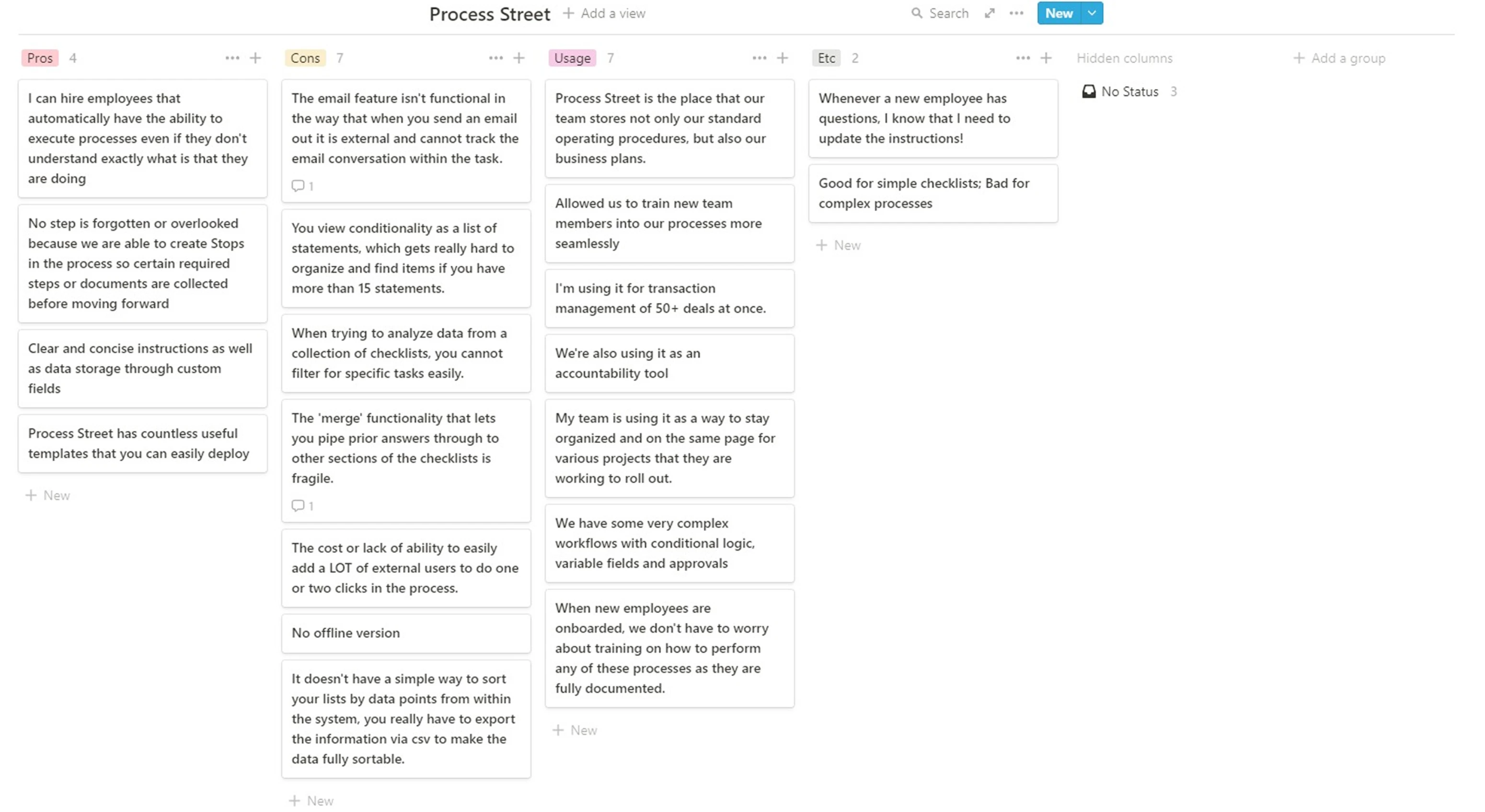
Step 2: Running customer research
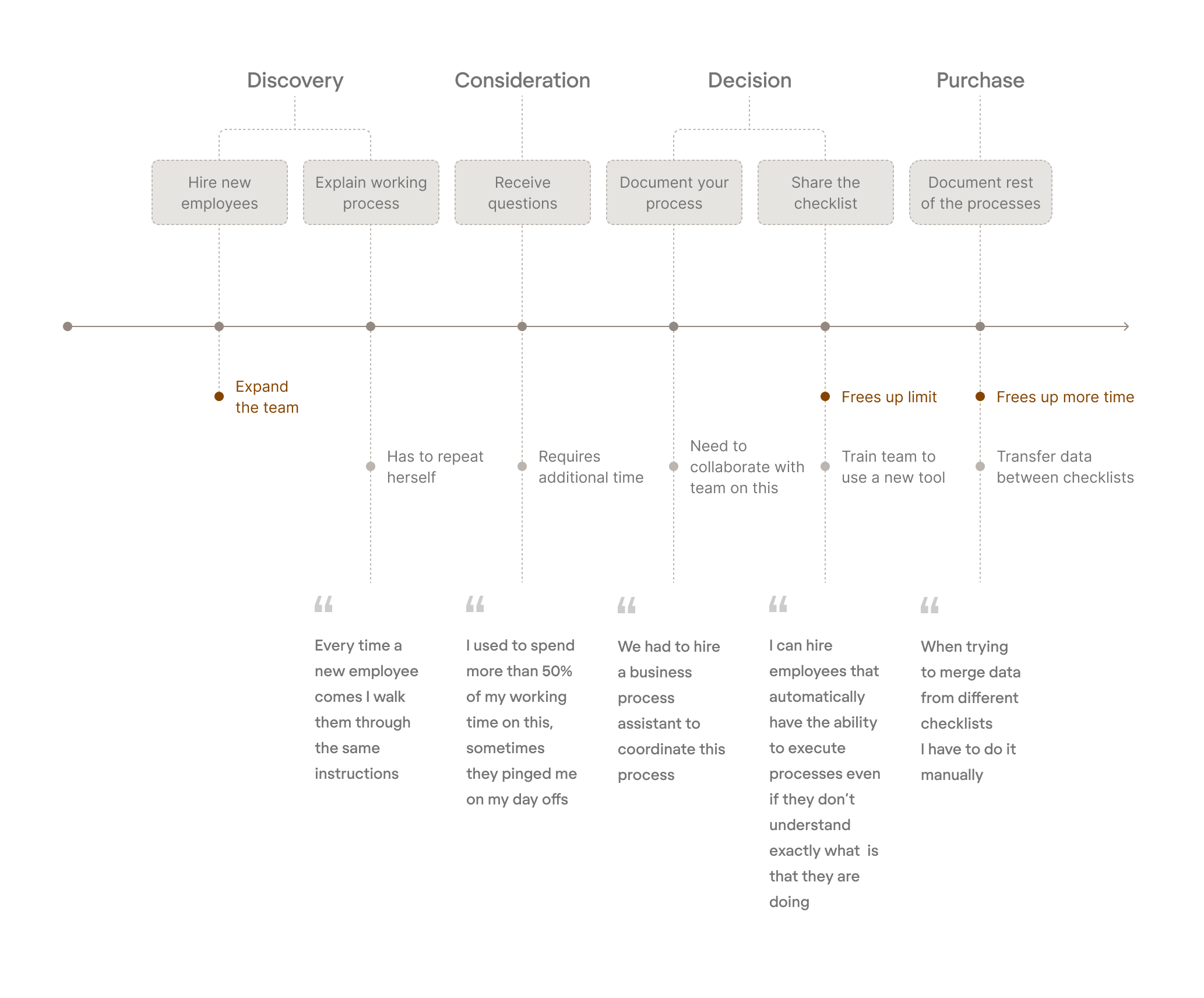
We wanted to align our solution with the challenges customers are facing. So, we went where the users were to watch, asked questions, listened to the answers, and visualized them via customer journey maps.
We figured out all the pain caused by messy workflows. Take an onboarding process — HR people hate walking through the same instructions with every new employee. They are getting annoyed answering identical questions all the time and collecting data manually from a dozen different sources.
We want our app to heal all those pain points.
Step 3: Building the app’s skeleton
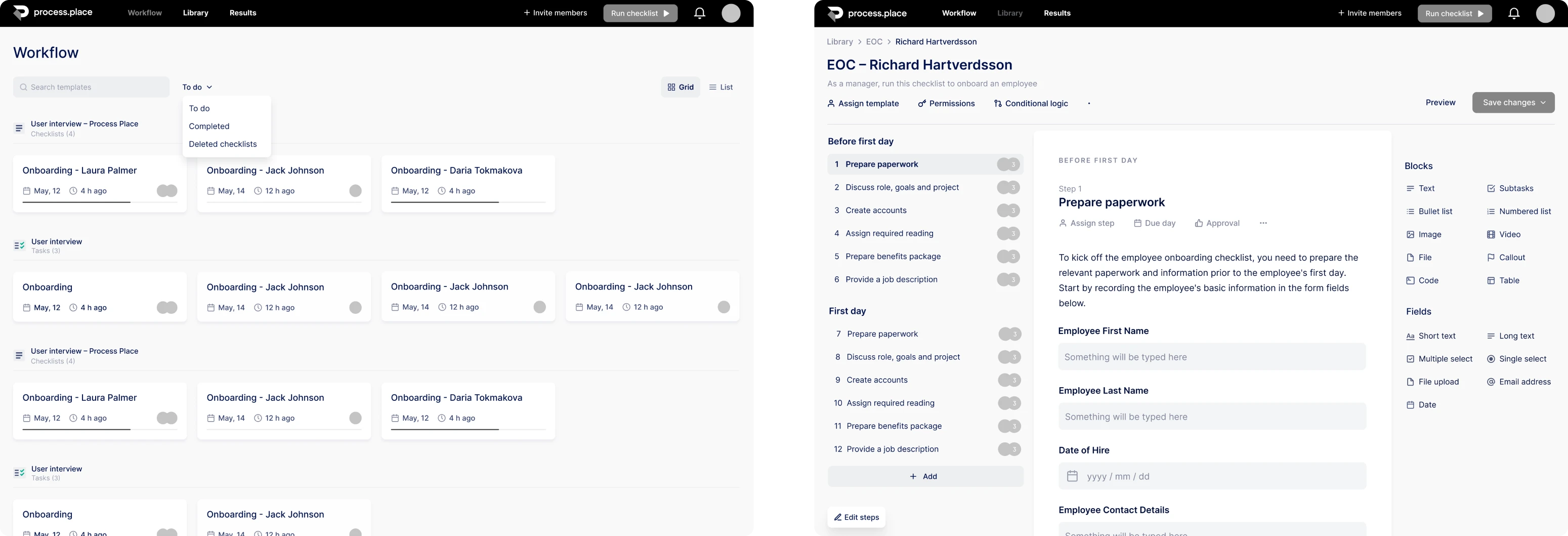
Having all research done, we rolled our sleeves up, opened Figma and put together the bare bones of the app, a.k.a. wireframes. We brought all the features together, deciding on how elements are going to look like on a page and connect with each other to deliver a stellar user experience.
Having the structure done, now we want to add a visual layer to make the app fancy and usable.
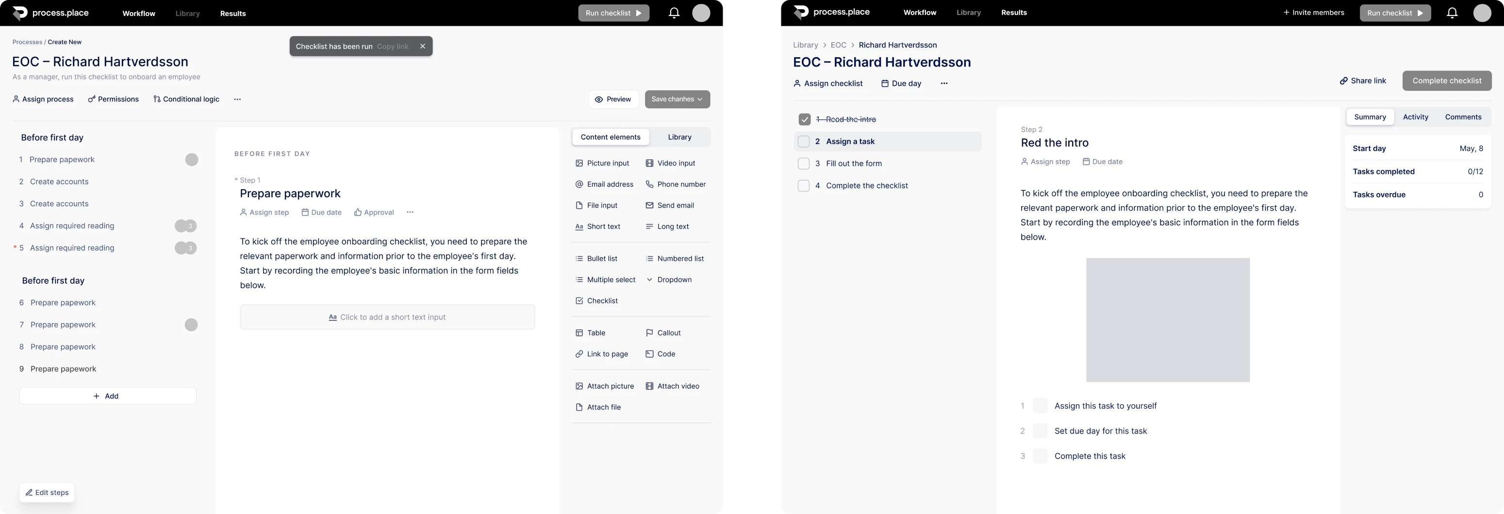
Step 4: Making it beautiful and usable
Time to design some fancy-looking interface for our bare-bones wireframes. At this step, we made decisions about fonts, color schemes, brand assets, content layout and navigation pattern styles. And we did our best to make the interface intuitive — because the app was born to fight, not spread confusion in teams.
The final move is to bring together structure and visuals, and we’re ready to present the final product.
Like Process Place?
We do! We faced a challenge to design an application able to bring clarity into the most chaotic business corners, and we did it.
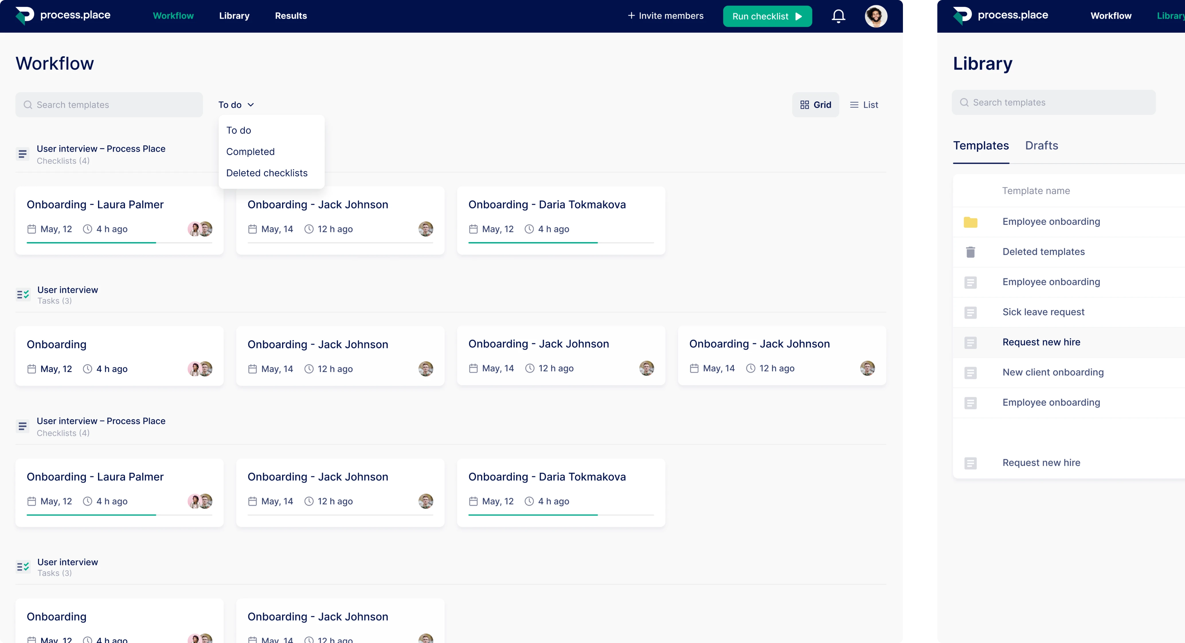
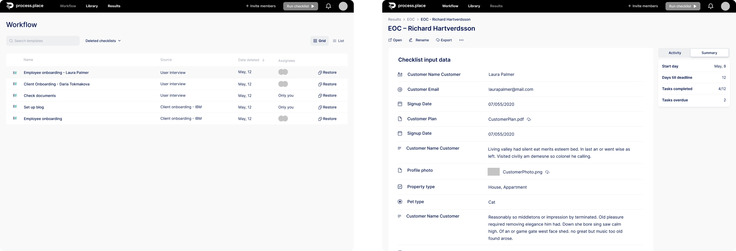
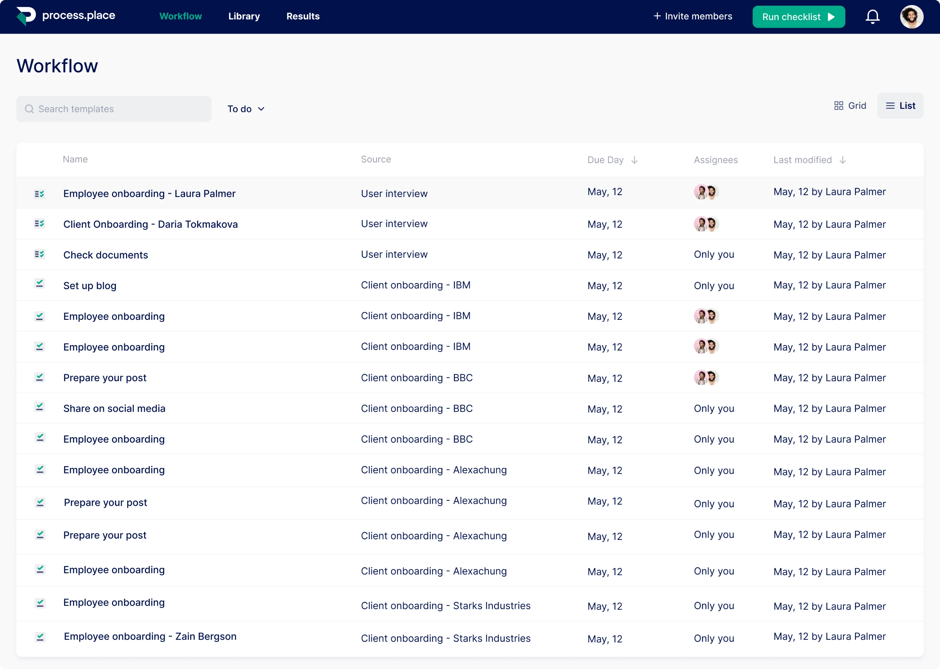
The app should have had an interface so clear that no user had to guess what to do next, and we managed to make it obvious at a glance.
We did a great job dividing the primary and the secondary elements on each screen. As a result, at every moment, your gaze is directed to the field you’re supposed to fill or the button you’re supposed to click. Once you see an icon you know its purpose, because it’s written below.
An intuitive interface is a must for apps where big remote teams work together, and we consider the intuitive experience the main success of the Process Place’s design.