Hirerise
UI/UX design for an applicant tracking system
Most existing recruitment software focuses on serving the needs of huge enterprises that have a separate HR team and are regularly hiring dozens of specialists. At the same time, for middle-sized or small companies that just start to scale, managing a hiring process can cause a real headache. To somehow track applicants, businesses usually use free of charge tools like Excel, or are trying to find their own way to cope with the issue.
Experiencing the pain of structuring and managing candidates firsthand, our client came up with the idea to help small businesses by creating software that would make the hiring process simple, fast, and clear.

An applicant tracking platform that makes hiring hassle-free and pleasant
Hirerise is a recruitment system that allows you to fully solve the problem of hiring, starting from launching the process and receiving the first resume, ending with sending an offer to a suitable candidate.
With the help of Hirerise, users can easily manage:
- The jobs positions
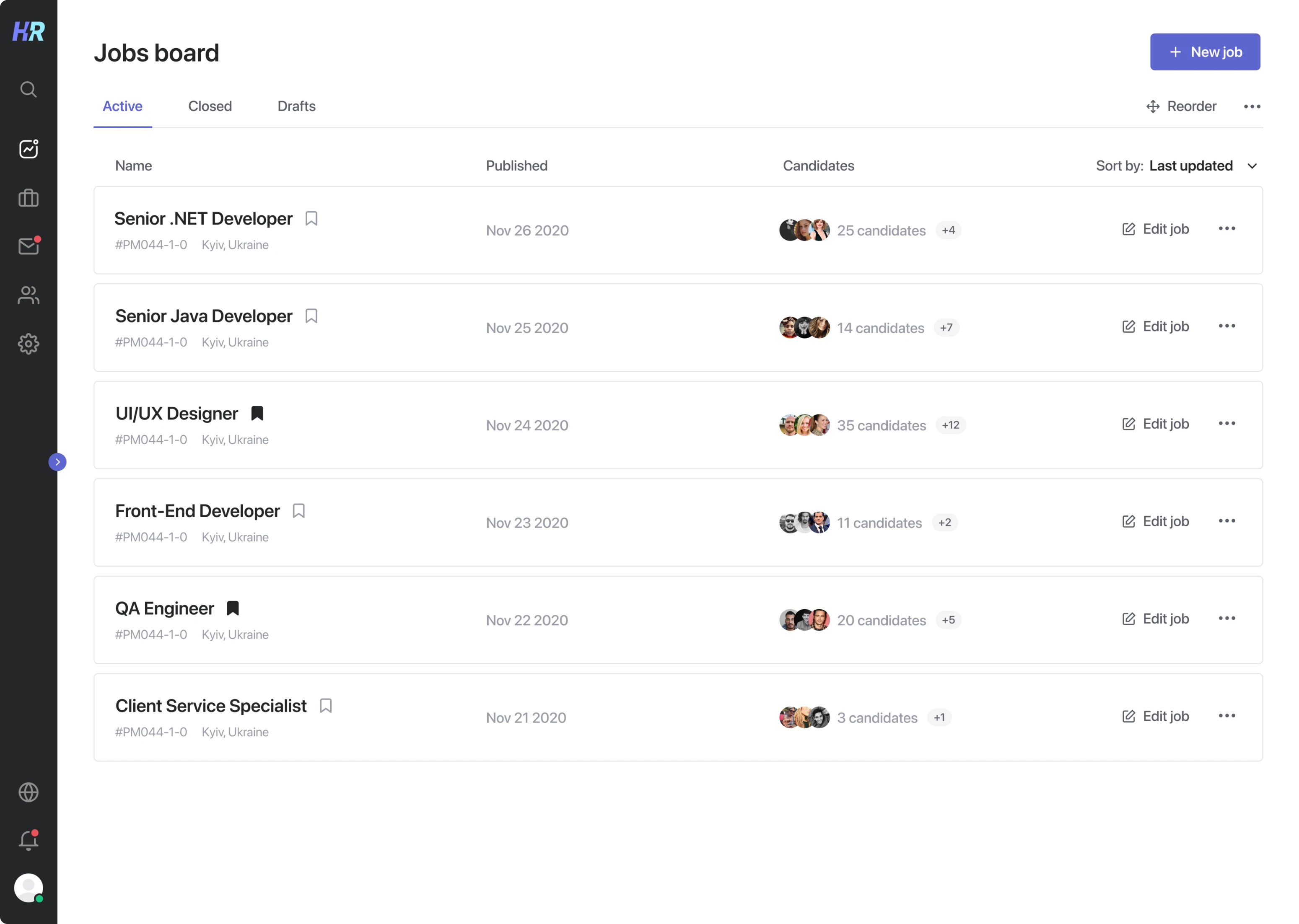
- Candidates
- Hiring team
Making the software clean, minimalist, but valuable from the users’ standpoint
As all similar software on the market looks a bit outdated and complex, the main idea our client came to us with was to make Hirerise both visually pleasing and functional.
To be able to meet the above requirements, Eleken carried out research with the goal to understand how to make Hirerise convenient and helpful, but not overloaded with too much functionality or unnecessary design elements.
Competitive analysis
An essential and very productive part of the research phase was conducting competitive analysis. Carefully going through rivals’ products (like Recruitee) helped us to identify the main features we could implement considering the product’s format and its target audience. As well at this stage, we decided on the user flow, and screens to build.
Moodboard
Together with the client, we gathered UI references and formed a moodboard which helped steer our design ideas in the right direction.
Building wireframes
The next step was to visualize the insights we got at the research stage with the help of wireframing.
Wireframes help to define the basic structure and content layout of each screen before creating a visual design. This way our designers could take into account both customer needs and user journey at the initial stage of product development.
What we got at the outcome
Our intention was to simplify each stage in the user flow to make interaction with the app just a piece of cake. For that reason, we not only created the minimalistic user interface but also designed many intuitive features that allow users to accomplish their goals fast.
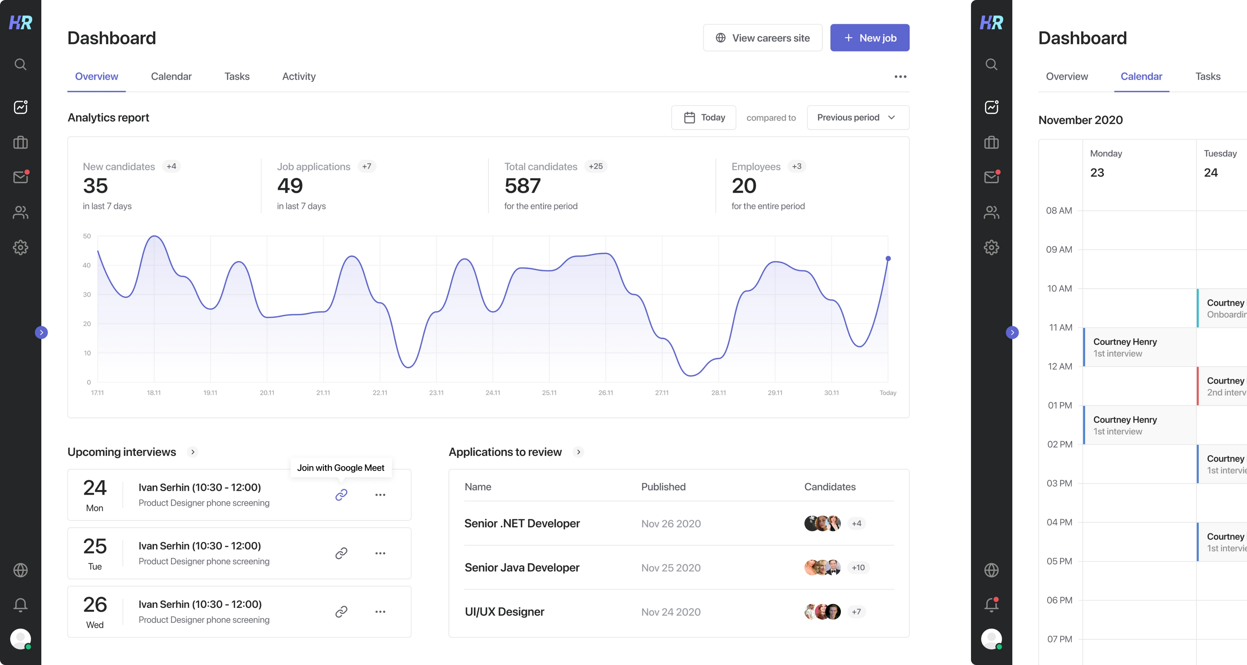
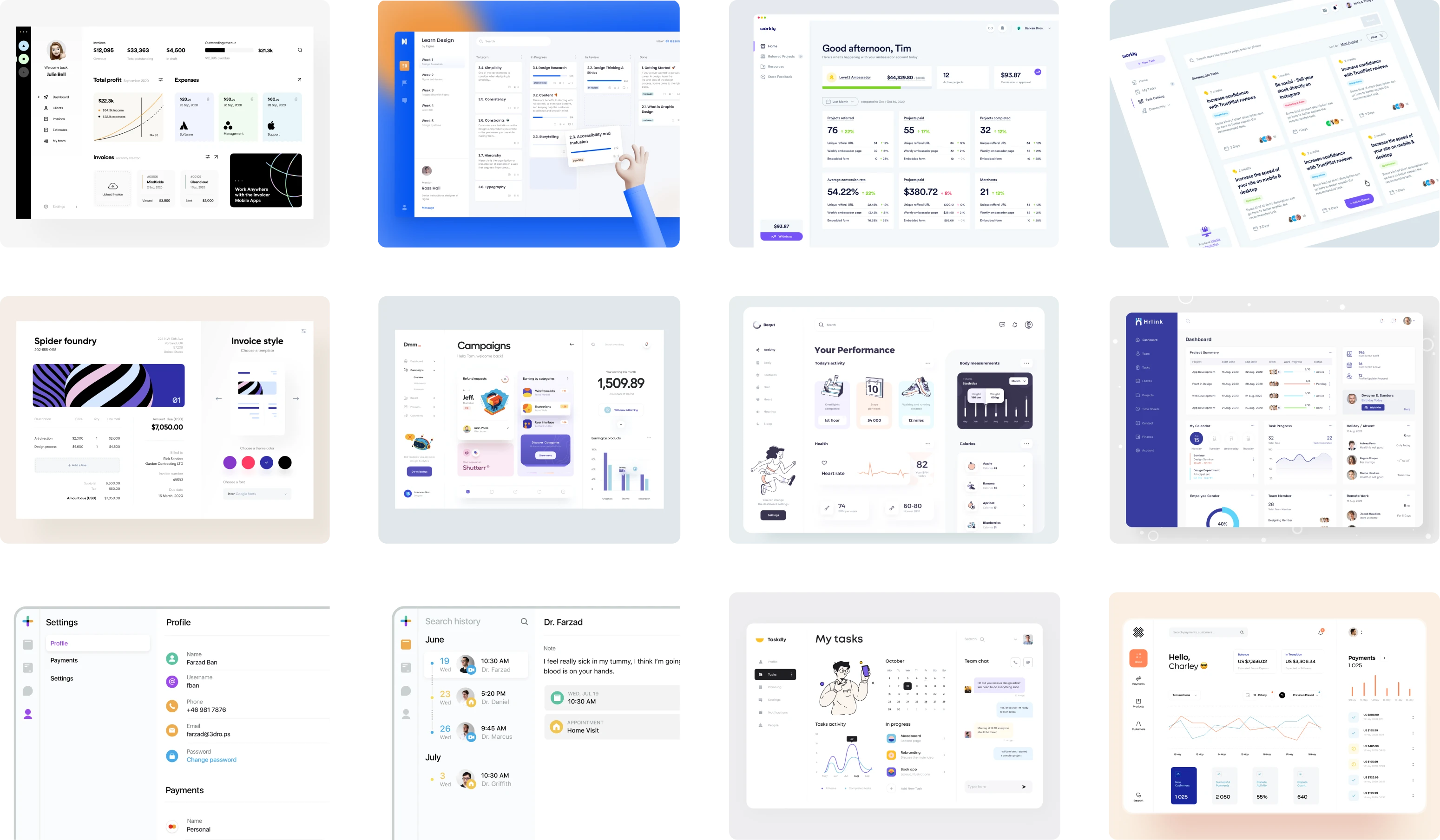
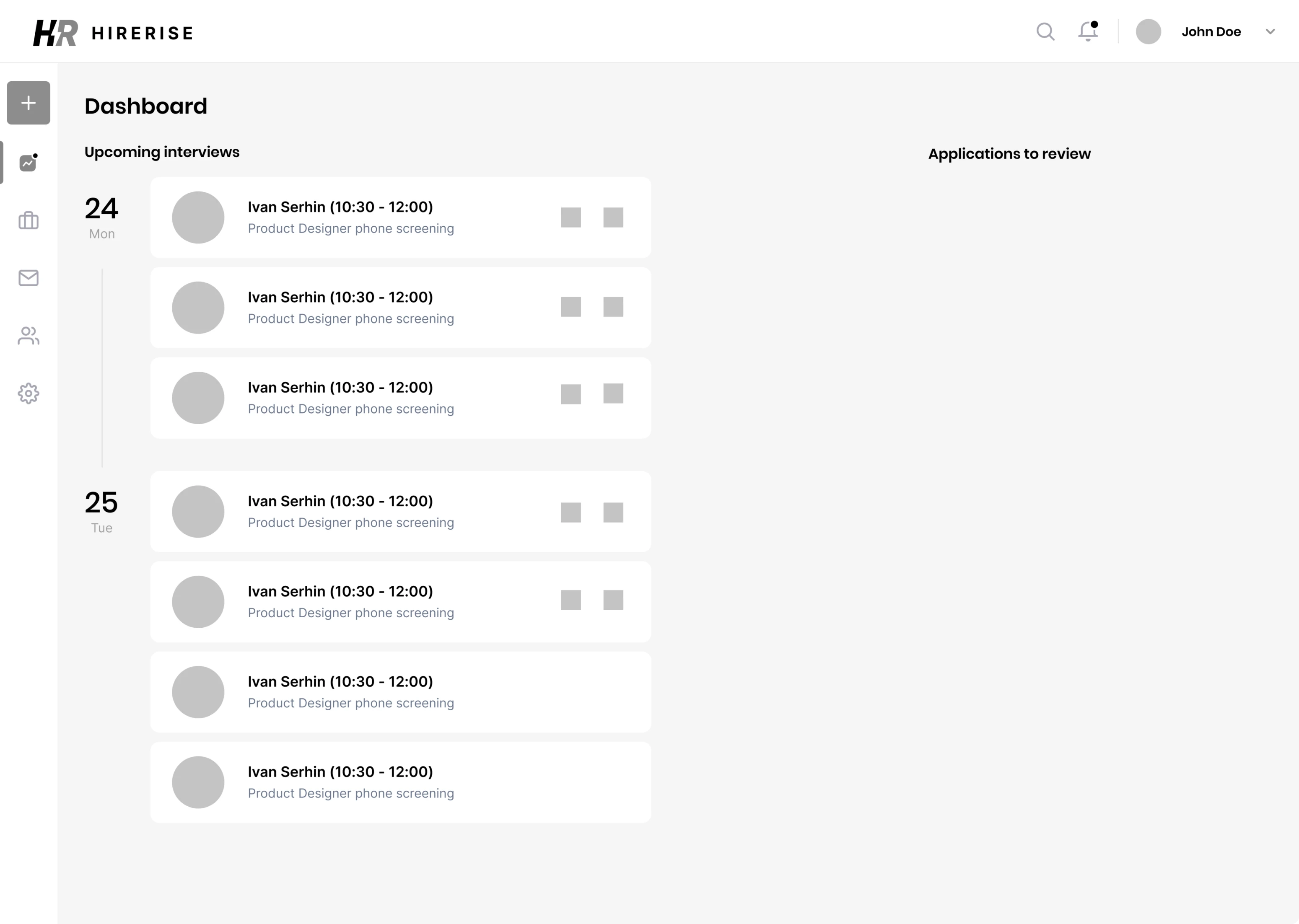
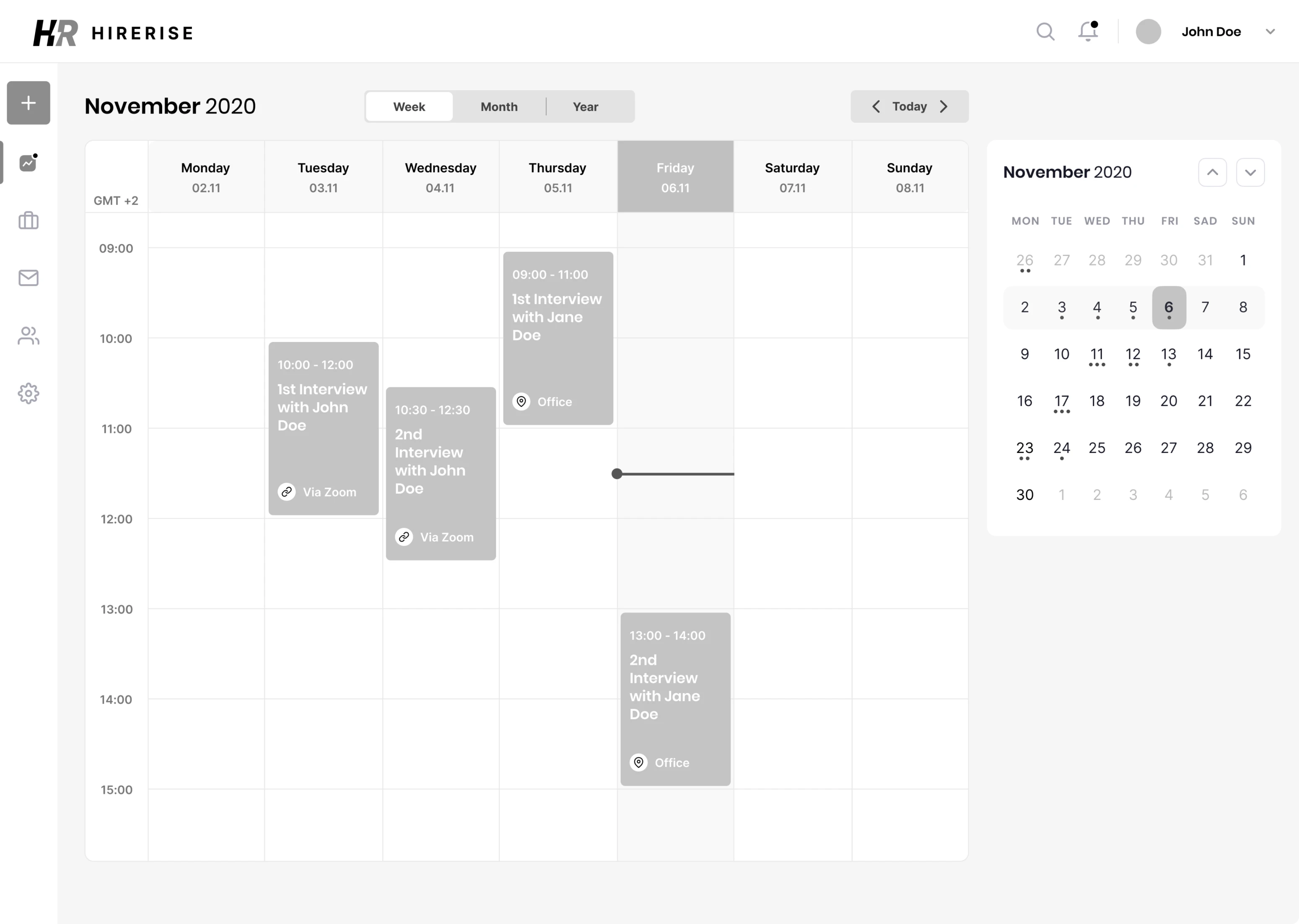
Dashboard
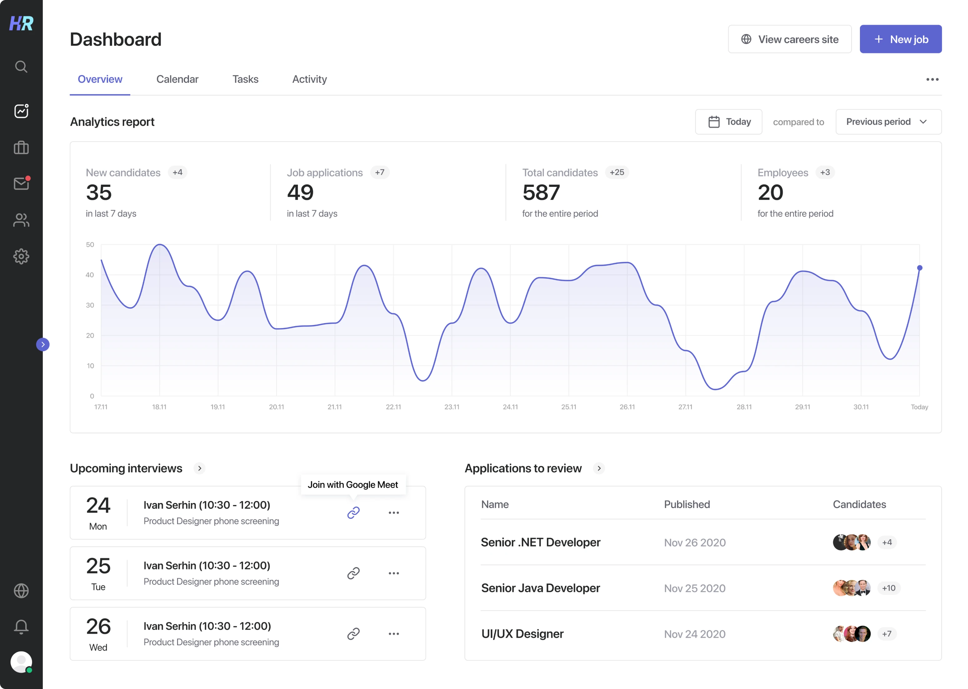
The dashboard is the first screen the user sees when they open the application. Its purpose is to give the viewer a quick overview of the most important information.
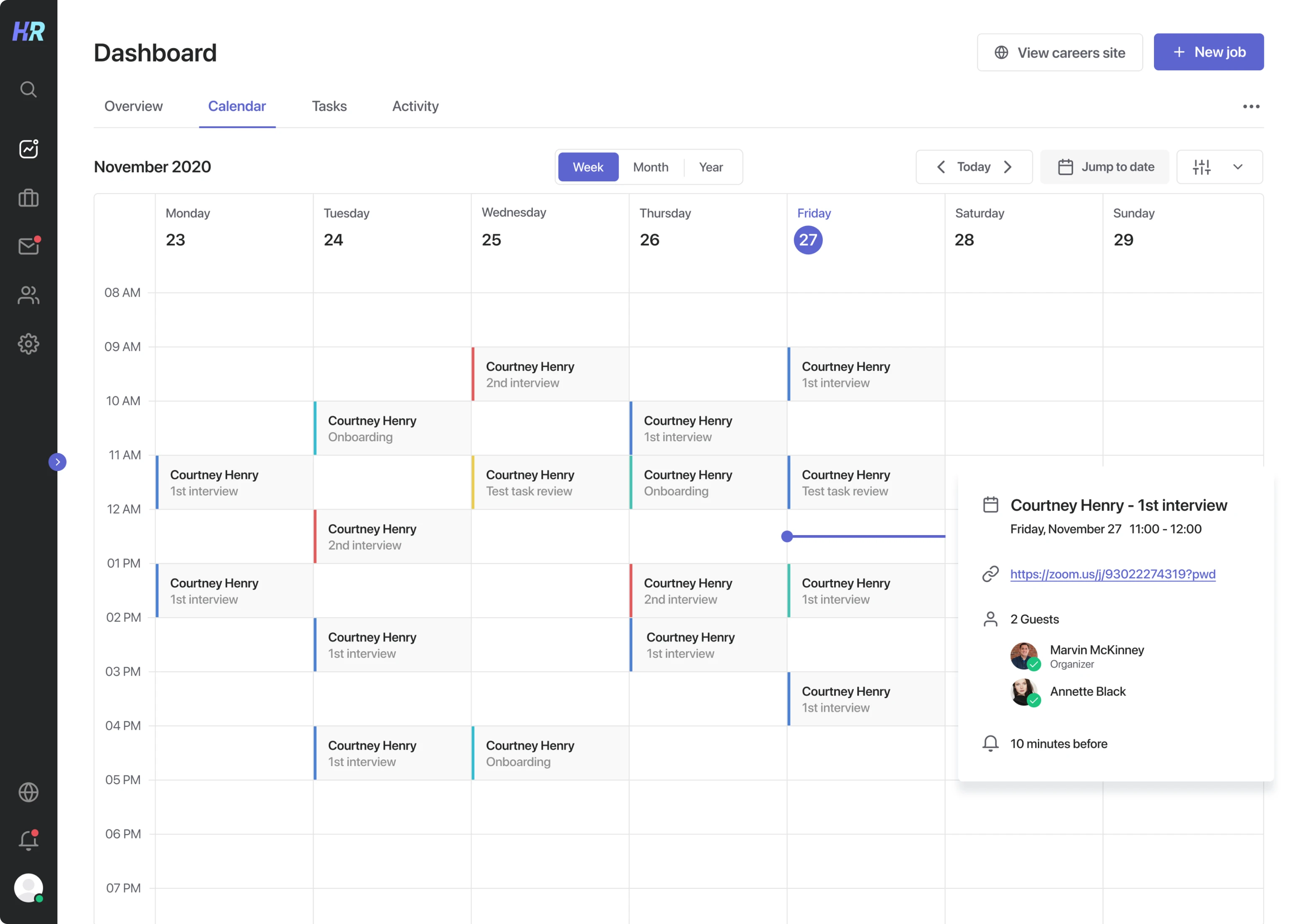
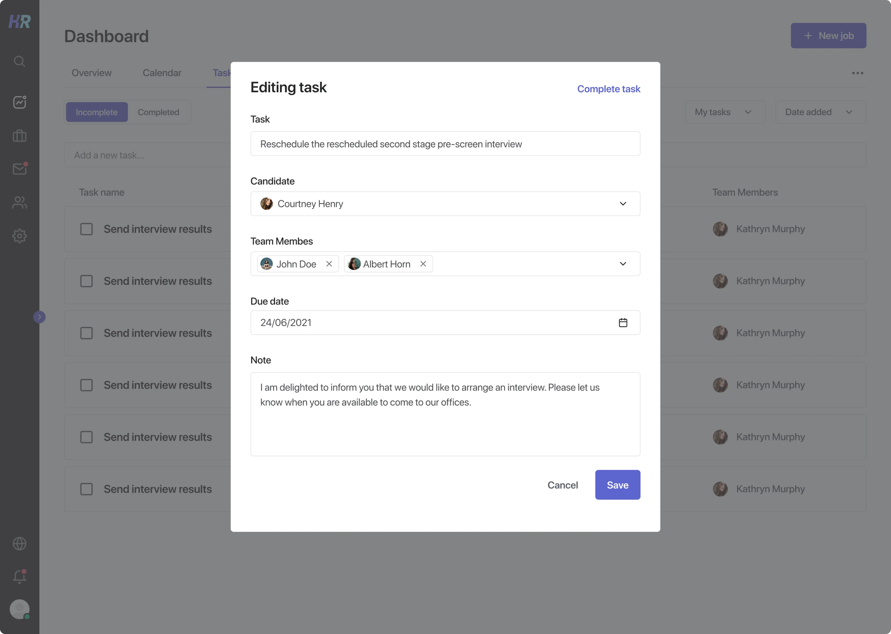
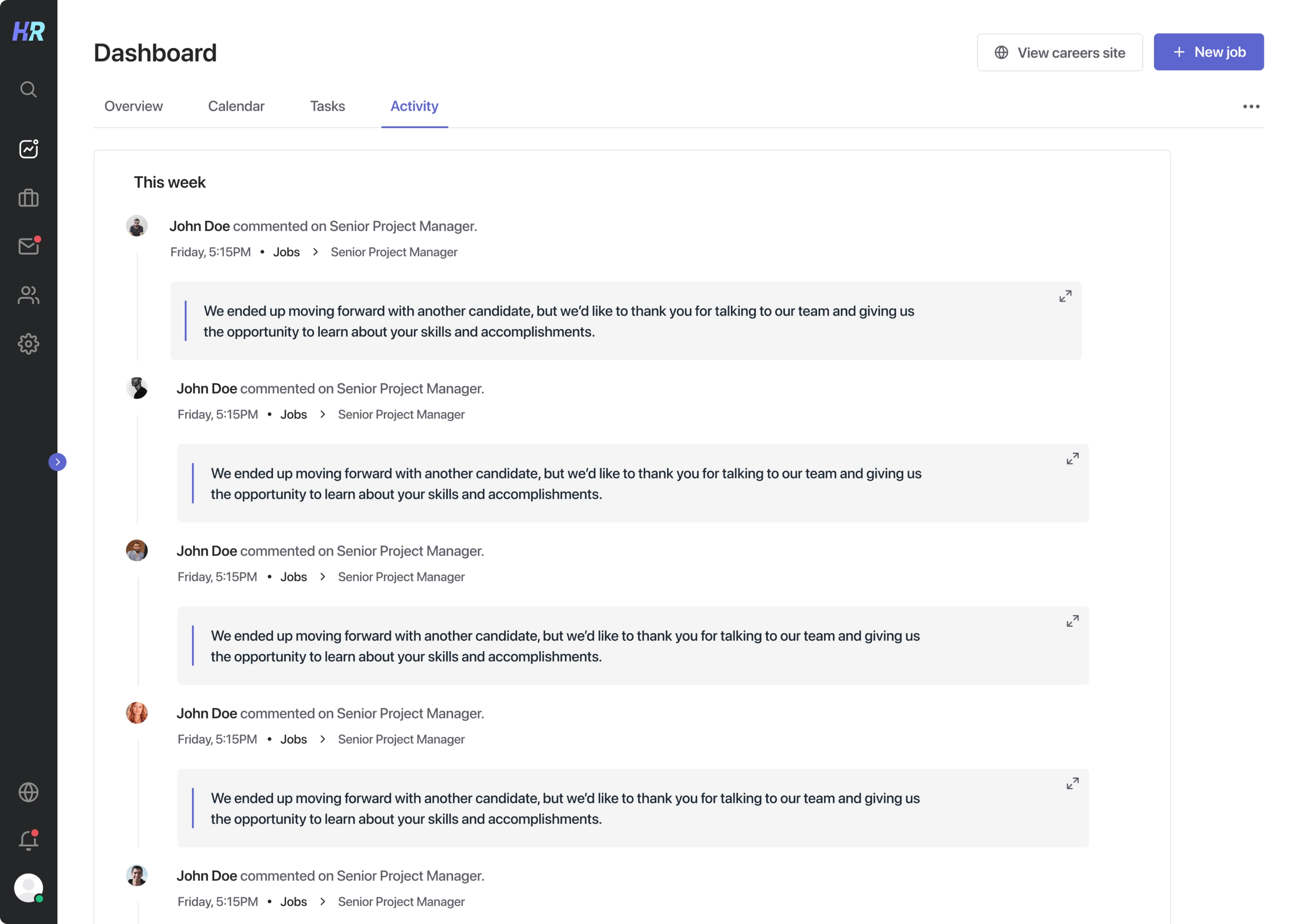
For Hirerise, we decided to divide the dashboard into four tabs: overview, calendar, tasks, and activity.
Overview
The overview tab presents basic analytical data and reminds the user about upcoming tasks they have to complete, like conducting interviews or reviewing applicants.
Calendar
A user-friendly calendar allows users to build their schedules, as well as reminds them about upcoming events.
Tasks
This section shows incomplete and completed tasks with all their details.
Activity
The activity section helps not to miss any important updates your team members made in Hirerise.
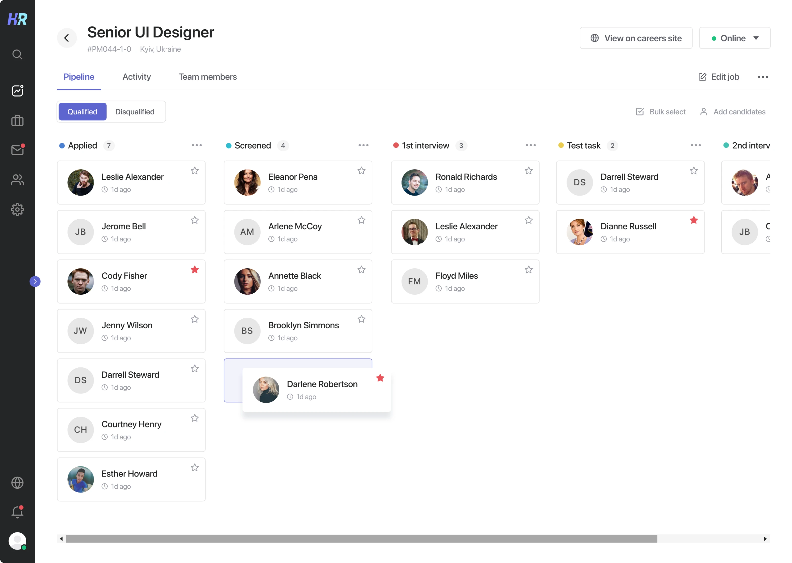
Progress and results
In Hirerise you can easily track the progress and results of your candidates through all stages (applied, screened, the first interview, test task, the second interview, and hired).
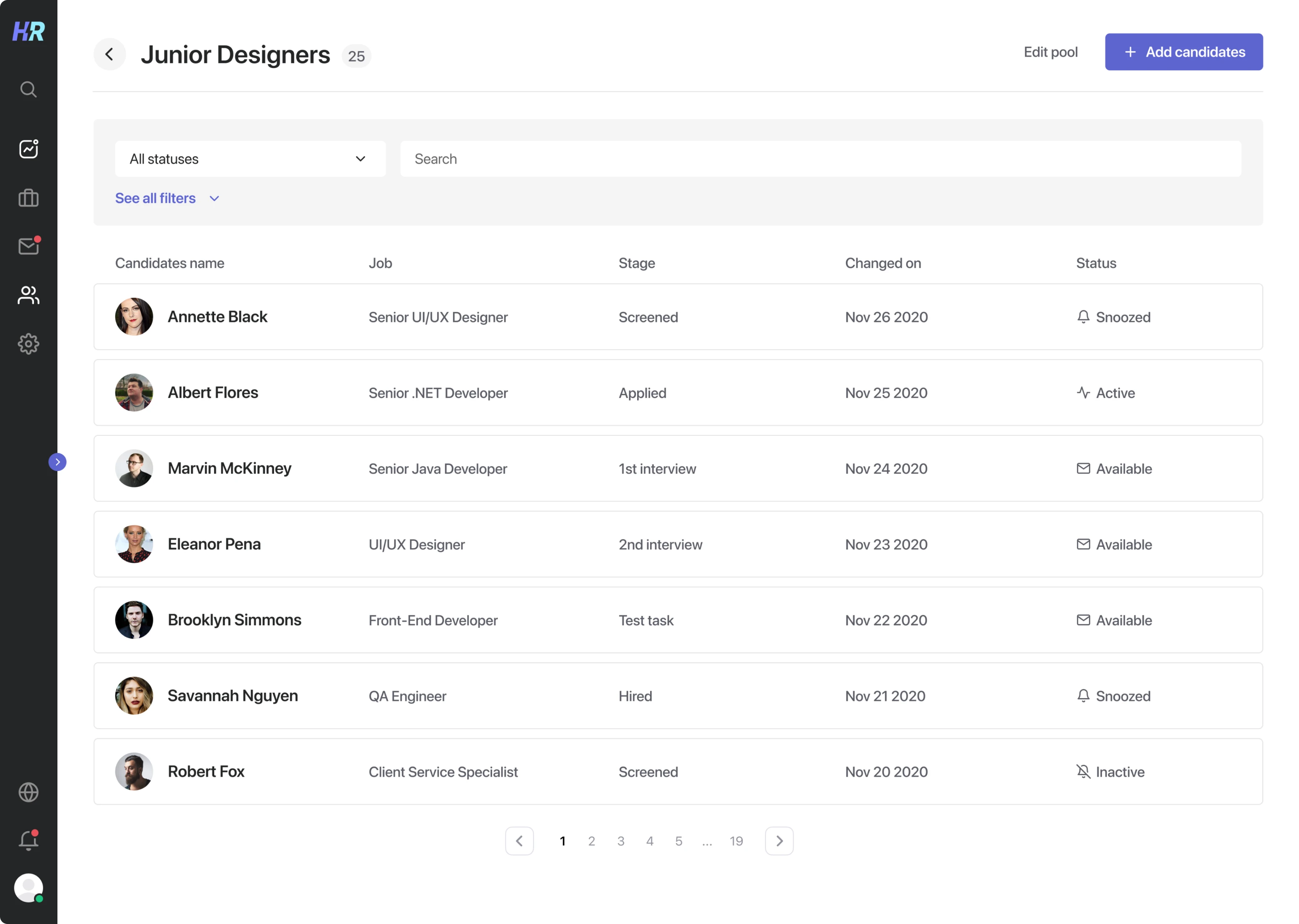
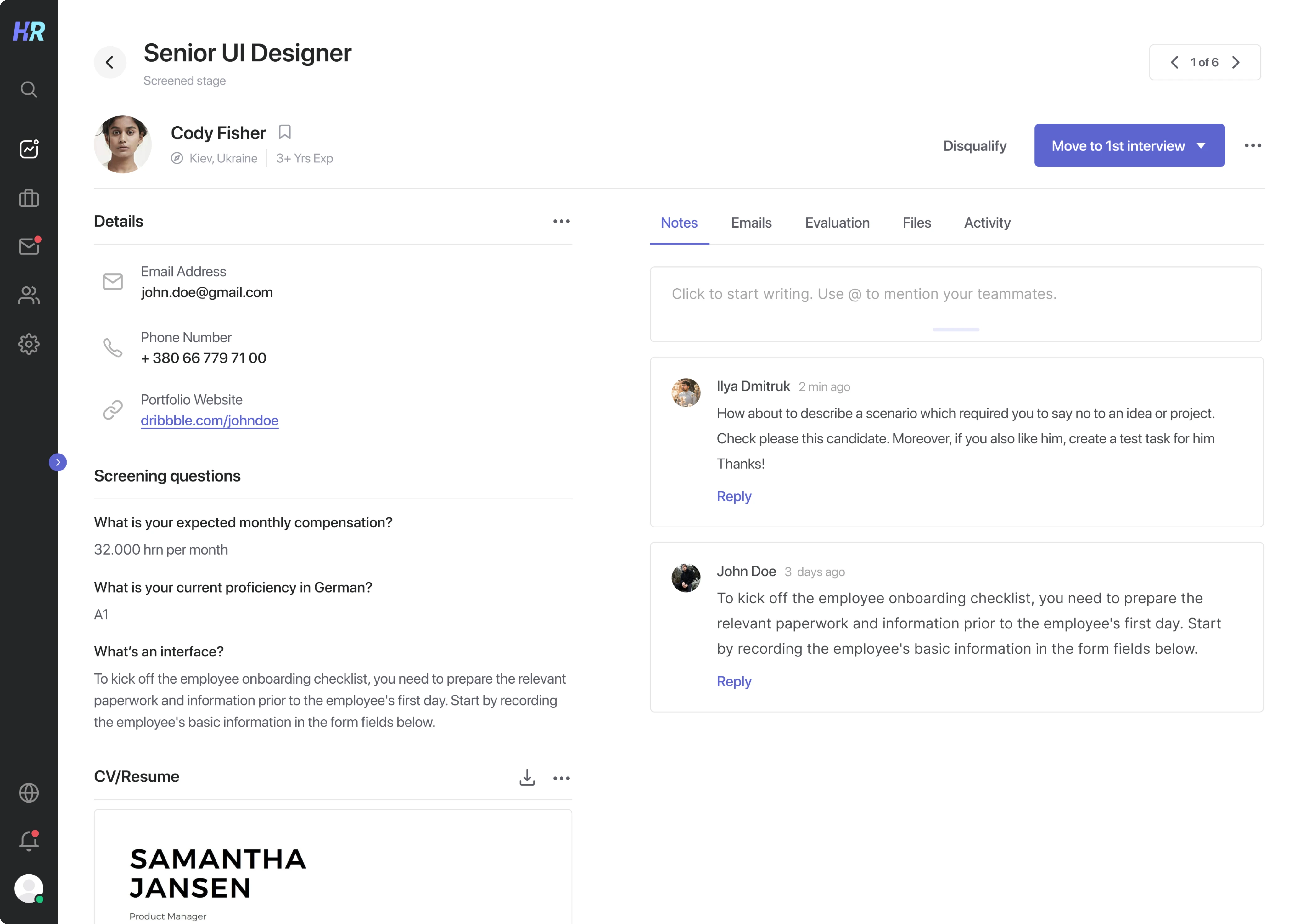
As well, we moved the card with detailed information on the candidate to a separate screen so as not to overload the interface and to make it more convenient for a recruiter to track each applicant.
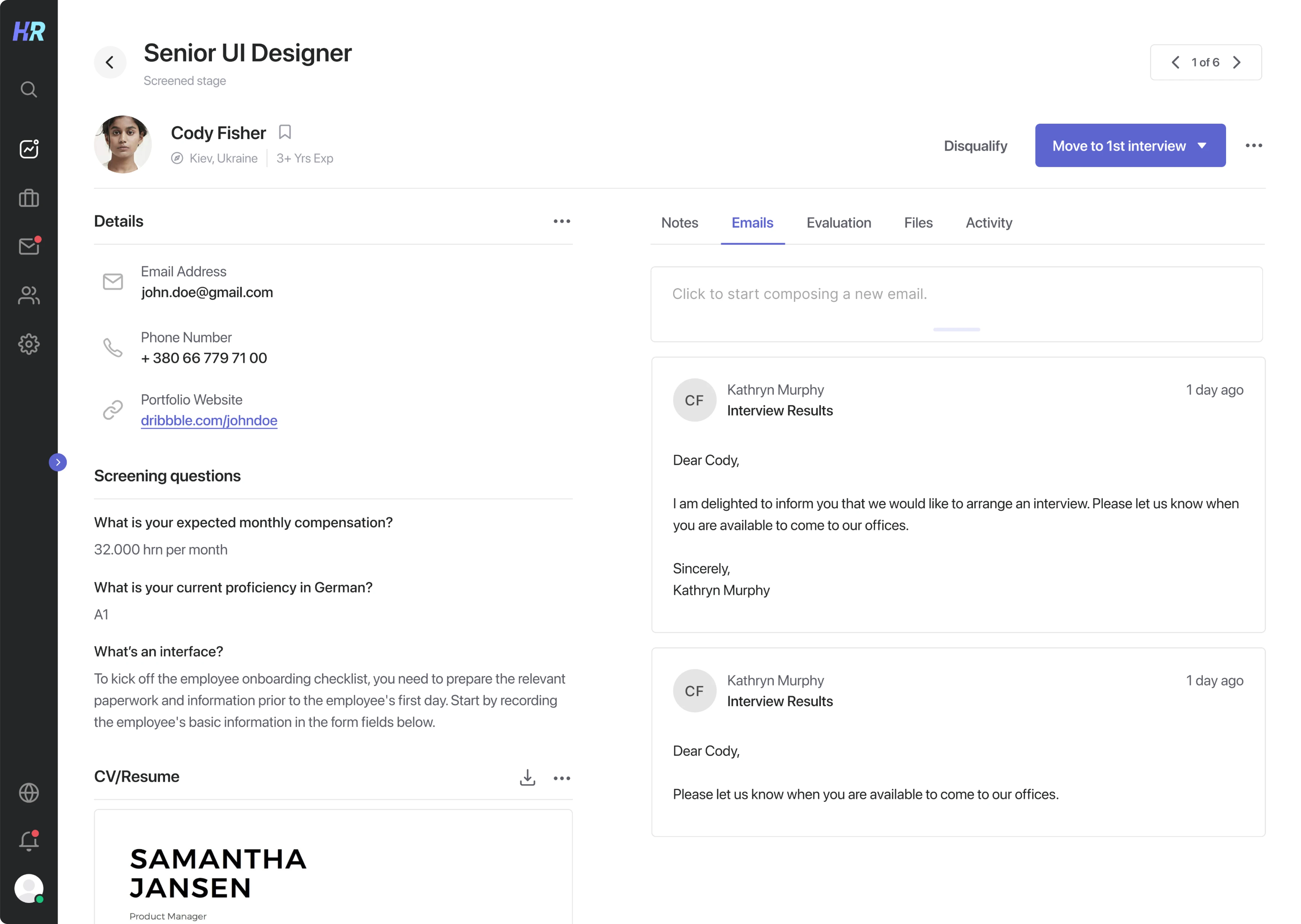
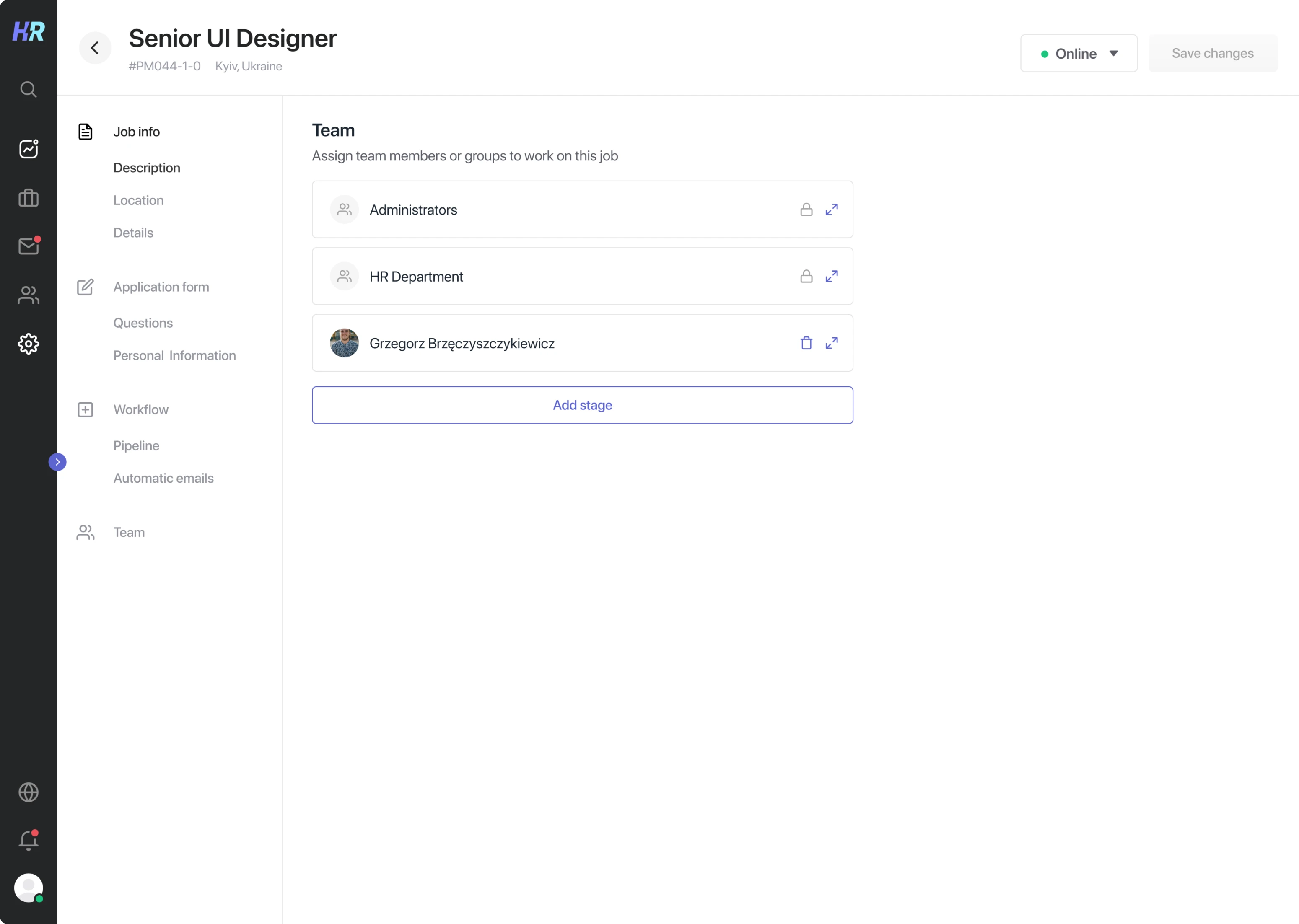
Team communication
Usually, during the whole interview path, applicants have to communicate with and be approved by several experts from different departments. That’s why, it was essential for our client to make team communication in Hirerise clear and coherent.
The software gives you the opportunity to add all needed people to the Hirerise team. You can easily comment on each applicant, tag your team members, and set each other tasks, which greatly speeds up the process of candidate evaluation.
To emphasize the comment feature in the interface, we put it on one screen together with candidates’ info. This way, users get all essential information in one place and don’t have to switch between different tabs.
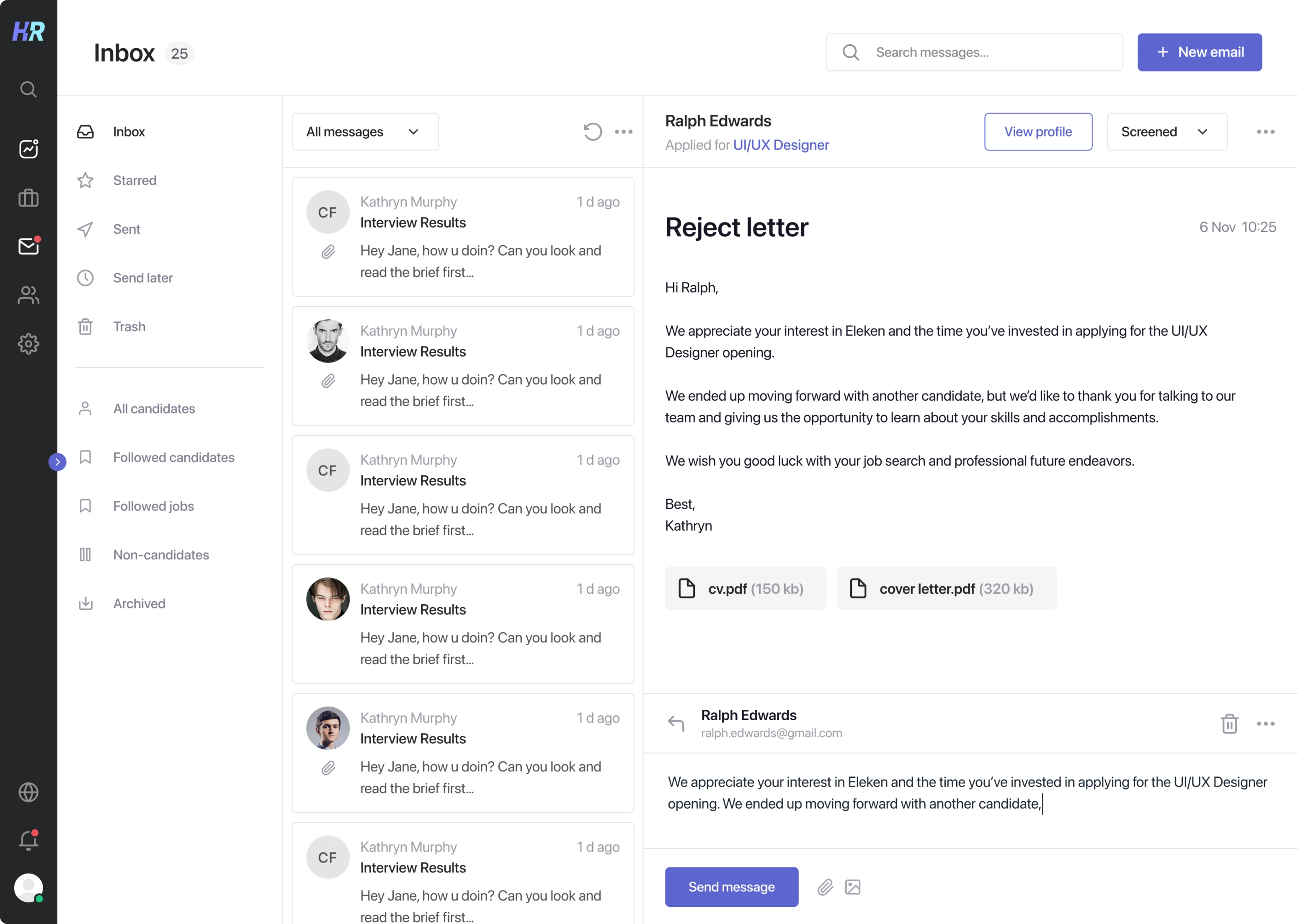
Mailbox
To quickly get in touch with appliers, we integrated the mailbox to exchange emails with candidates, without leaving the applicant tracking system.
Careers site
One more important feature that makes recruiters’ life easier is the ability to create careers sites.
In Hirerise you can generate a website to post your job positions there. This feature is especially suitable for small companies that don’t want to spend much time creating their custom job boards.
Software that simplifies the way you recruit
Words “clean” and “simple” went through our whole product design process. When designing each screen for Hirerise, Eleken’s team strived to create an intuitive and minimalistic UI, get rid of all unnecessary elements, and design features that would shorten users’ time-to-hire and make the hiring process easy and pleasant.
Looking to design or redesign your product? Schedule a call with our team so we could talk over the details.