MyInterview
Redesign to fix the 90% user churn issue

Even great tech can fail if people don't stick around to use it. myInterview knows this all too well. They're innovators in the hiring world, with video interviewing software that cuts hiring time by 70% for over 5,000 companies. But they faced a critical issue: 90% of candidates were dropping out mid-interview. And that wasn't the only challenge they were facing.
myInterview turned to our team at Eleken with a clear set of challenges:
- Tackle the massive drop-off problem
- Revamp the existing web app and design new features
- Develop a design system for consistent branding across products
- Craft compelling demos to hook potential enterprise clients
Each of these tasks was crucial for setting myInterview up for long-term success. Let's dive into how we approached each challenge, starting with the most pressing issue — the high candidate churn rate.


Fixing input design to reduce the candidates' dramatic churn
The myInterview platform consists of two main user flows: one for recruiters to set up job descriptions, candidate flows, and branding, and another for candidates to complete the customized application process.
We needed to improve user experience of both flows: optimize setting up the job for ease of use and optimize the application process for conversions. But the second issue was more critical to tackle right at the beginning, as the candidate’s retention was critically low.
Routine user flows should be designed to help users complete their jobs quickly without extensive exploration of each new page. That’s why designers use common UI patterns to aid navigation. These conventions work across different apps, just as traffic systems function across various cities, creating familiar expectations for users.
Breaking common UI patterns during tasks like data input can deceive users' expectations. Instead of focusing on the task, users must learn how to navigate the interface. This leads to wasted time, increased errors, irritation, and ultimately, user churn.
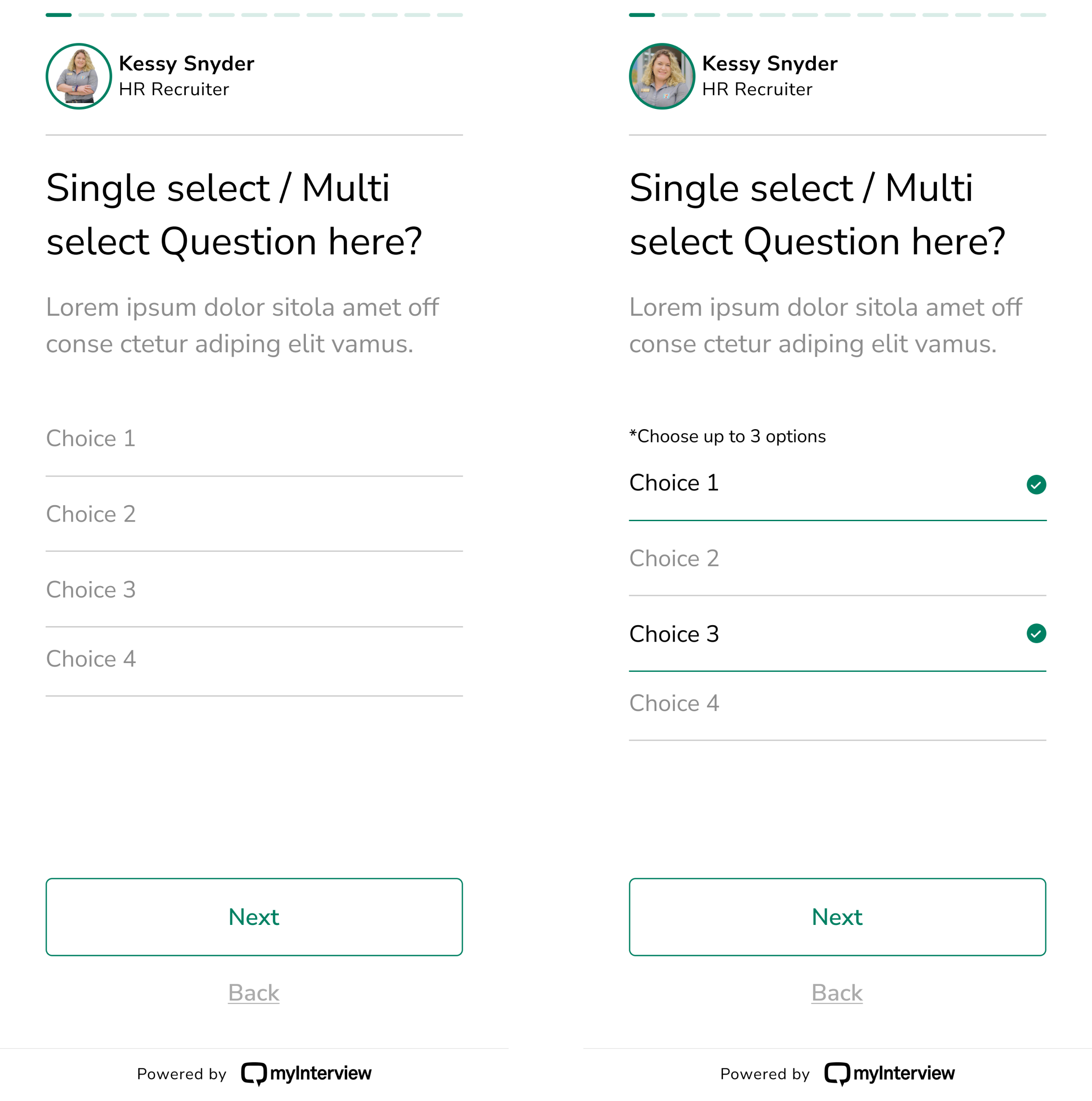
Look at one of myInterview’s “before” screen examples:
- It's meant to be a multi-select list, but that's not clear from the underlined fields design;
- It’s not obvious at all where to click;
- Selected options get green check marks, looking more like correct answers than choice variants;
- A "3 options max" limit pops up only after clicking, with no prior warning;
- Not to mention that a true multi-select interface shouldn't limit choices at all.
Such issues confuse users and slow down task completion.
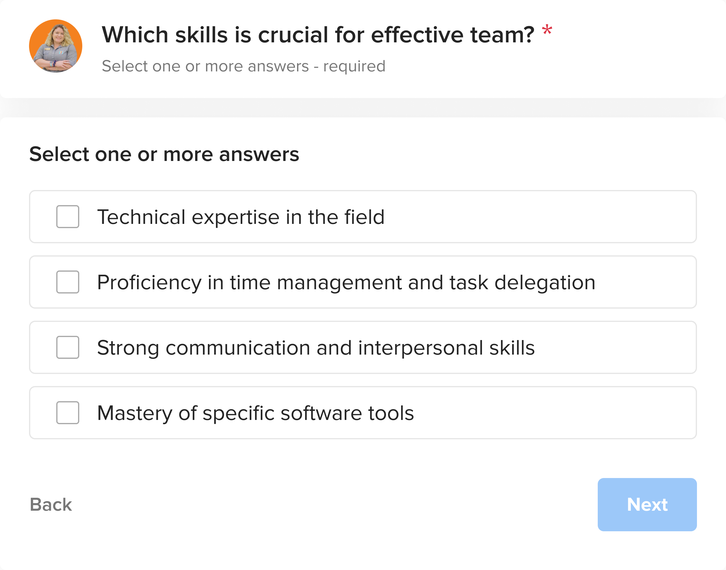
And now you can see the same screen redesigned:
- Obvious multi-selection functionality with checkboxes and clear copy
- Clickable areas span entire input borders, suggesting where to click
- Filled checkboxes clearly show chosen options
This design enhances clarity and ease of use.
Just like that, we improved the UI of all steps and all question modules of the candidates’ flow:
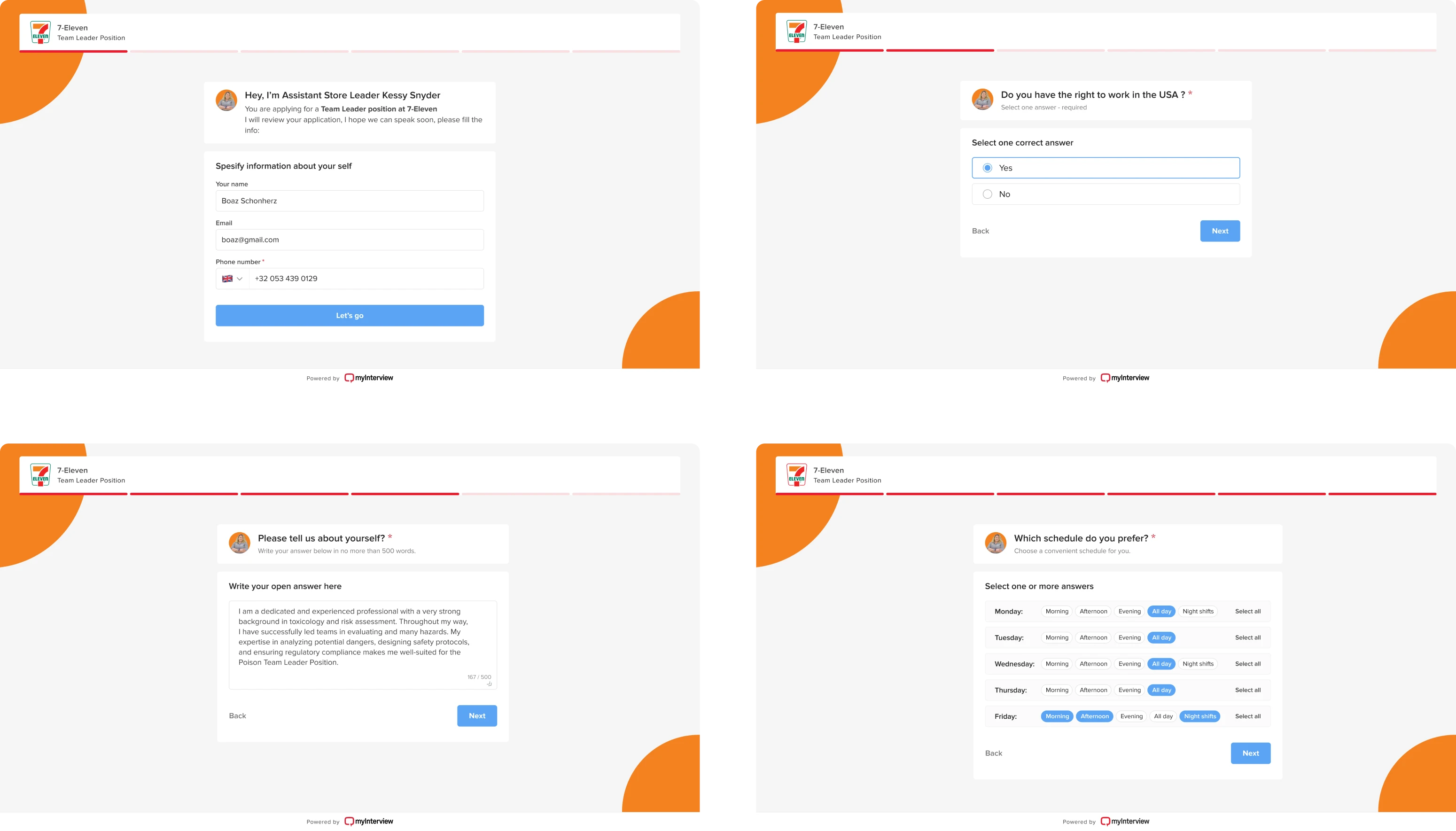
Apart from fixing input patterns, the new design version takes the candidates’ experience to the next level thanks to:
- Desktop responsiveness
- Enhanced visual hierarchy
- A structured, aligned layout
- Clarified instructions copy that is visually separated from fill-in field
A highlight is the subtle animation — just enough to draw attention without overshadowing the content.
Empowering recruiters’ flow with UI/UX best practices
Another key task for the Eleken team was to help myInterview advance their project by improving existing design and adding new AI-powered features.
Designing innovative features is challenging: there are no established best practices or helpful competitive research. The path forward involves rapid iteration: create, gather feedback from clients and users, then refine repeatedly until features become intuitive and user-friendly.
We started with designing a step-by-step job creation flow. It guides users through each stage, from entering job details to inviting candidates. To enhance usability, we incorporated real-time previews. These allow users to see how their job postings will appear to candidates before publishing.
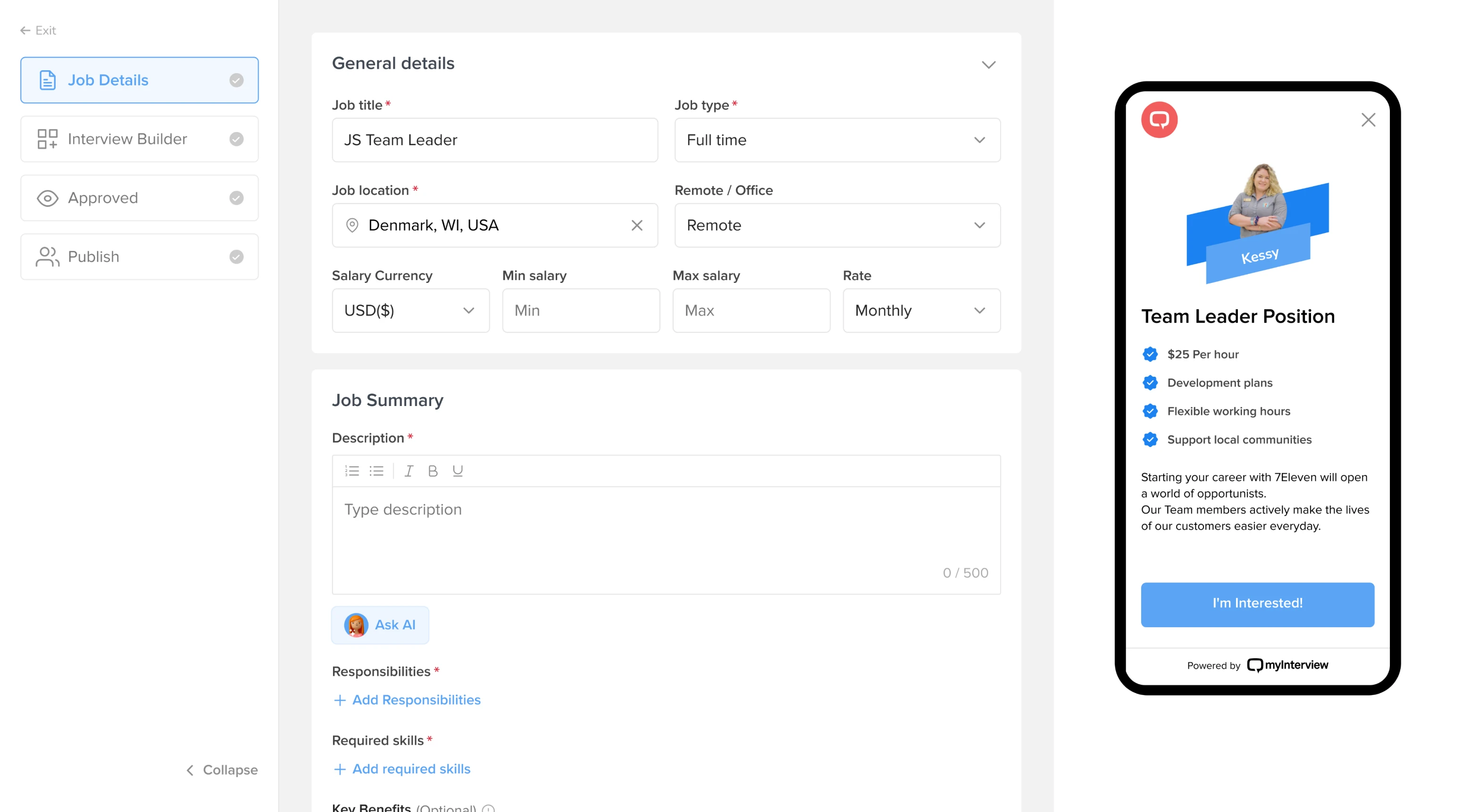
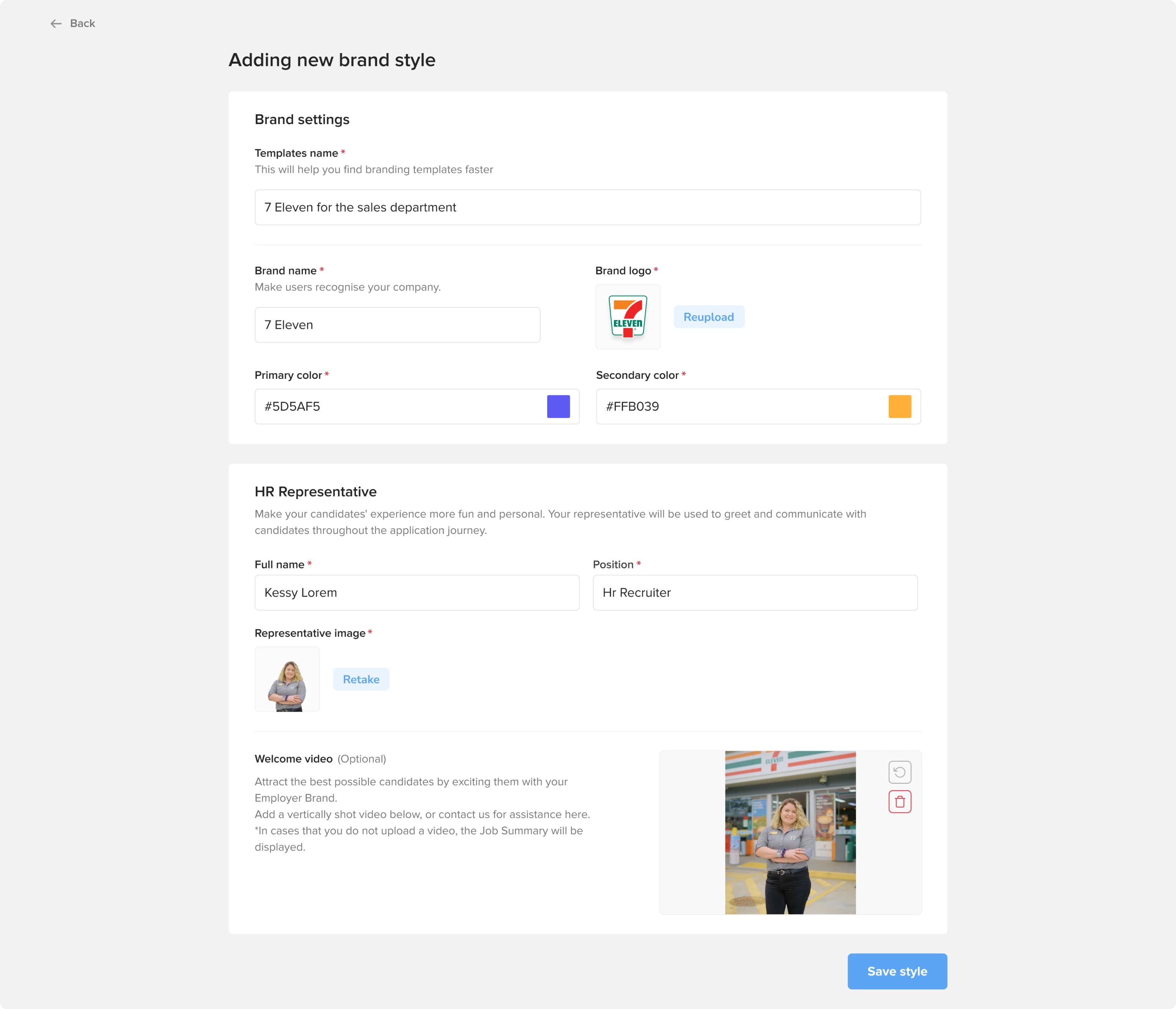
Next, we integrated custom branding options into the job creation flow. This feature allows companies to apply their unique visual identity to job posts, enhancing brand consistency and recognition.
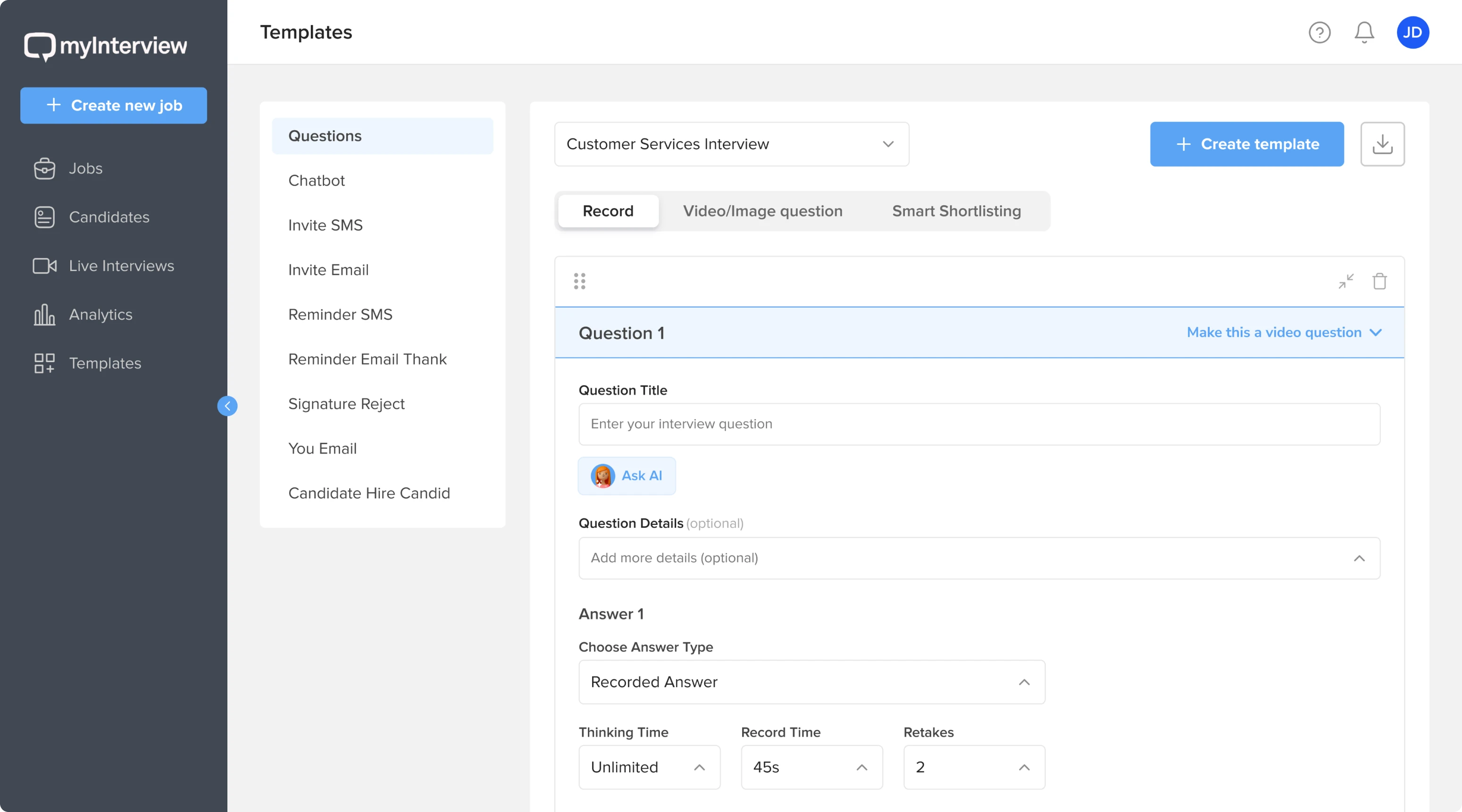
We introduced a template system to streamline job creation. Users can now choose from a variety of predefined templates or create custom ones tailored to their specific job requirements.
We created a totally AI-automated flow, where admin gave input data and AI can read requirements generate required skills for candidates, and create tailored interview questions based on these skills.
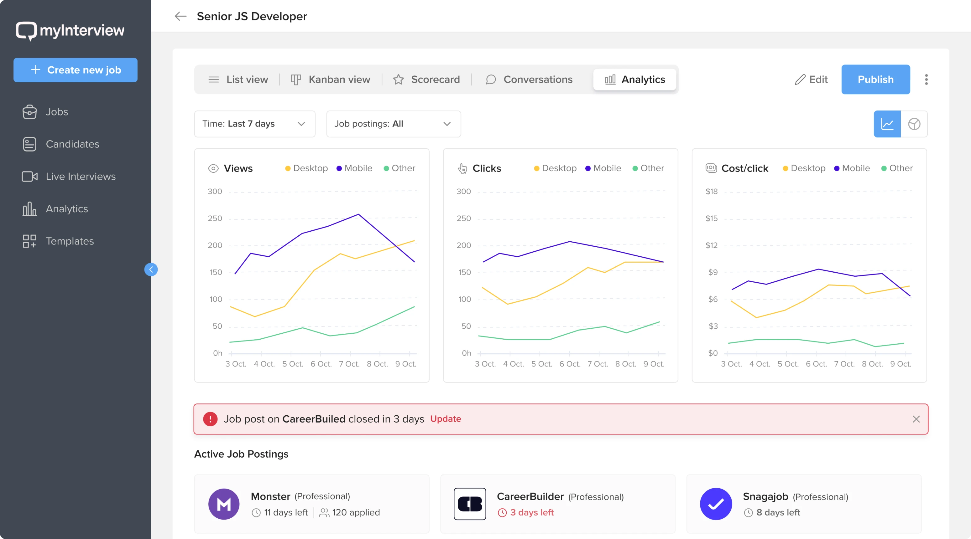
Finally, we developed interactive dashboards that offer real-time insights into the hiring process. These allow HR teams to effortlessly track candidate progress and key performance metrics.
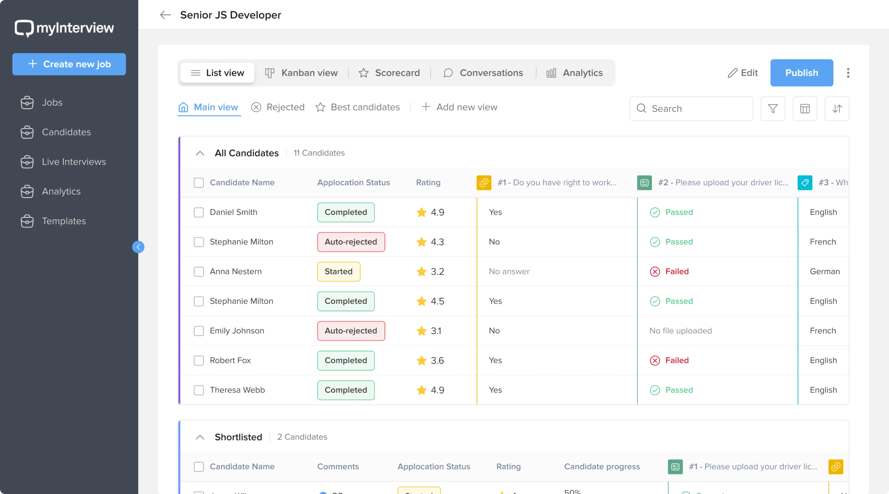

Creating irresistible demos to win enterprise companies
myInterview's core idea is streamlining the recruitment process to save recruiters' time. This value proposition is most significant for enterprise companies receiving thousands of resumes per position. Imagine manually analyzing and scoring that volume. Thus, myInterview targets enterprises with large hiring flows — like McDonald's, Mondelez, or Volvo.

Software adoption at such companies is far from the quick, self-serve model common in smaller businesses — it’s usually a long chain of negotiations with each company and manual adaptation to the company's needs. Given what is at stake, you need to be very, very convincing during those negotiations. This is precisely the case where "seeing is believing" – a compelling demo can be far more effective than words alone.
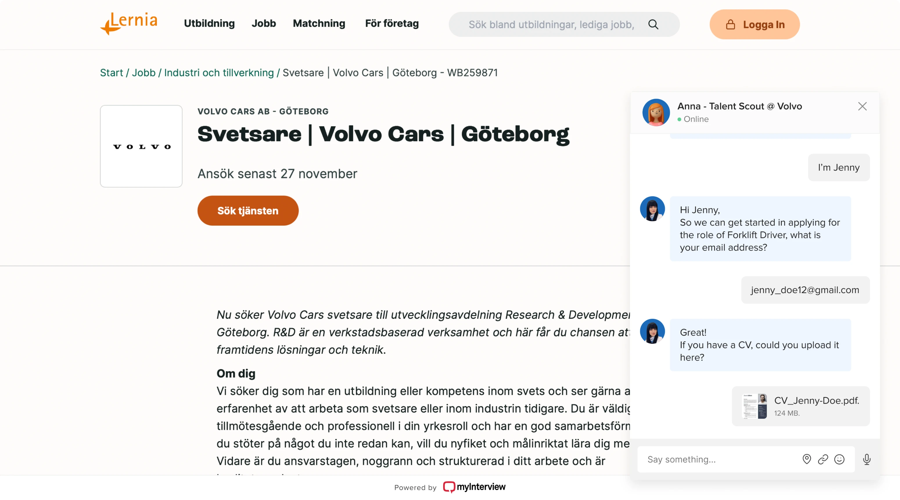
A UI/UX designer adds great value here. They can create tailored demos fast and precisely. Below is a fragment of a demo we designed for Volvo's pitch, showcasing the main flow as a clickable prototype with company branding, relevant position, and copy.
Also, enterprise companies might be interested in some specific functionality you don’t have yet. Volvo, for instance, requested a chatbot feature. Would you develop it from scratch? That’s a way too long and too expensive event to be done just for demonstration purposes.
Here, a designer can save the day with a quick clickable prototype, like the one below. This chatbot prototype for Volvo looked promising and received positive feedback. Due to its success, the prototype was later incorporated into the final product, becoming a standard feature.
Creating a design system for consistent branding across different products
myInterview's platform includes several products with different designs, sometimes integrated into a single user flow. For example, when candidates record a video, they encounter a completely different interface with new colors, layout, and shapes. Such drastic changes can confuse people, make them feel out of control, and reduce trust in the product.
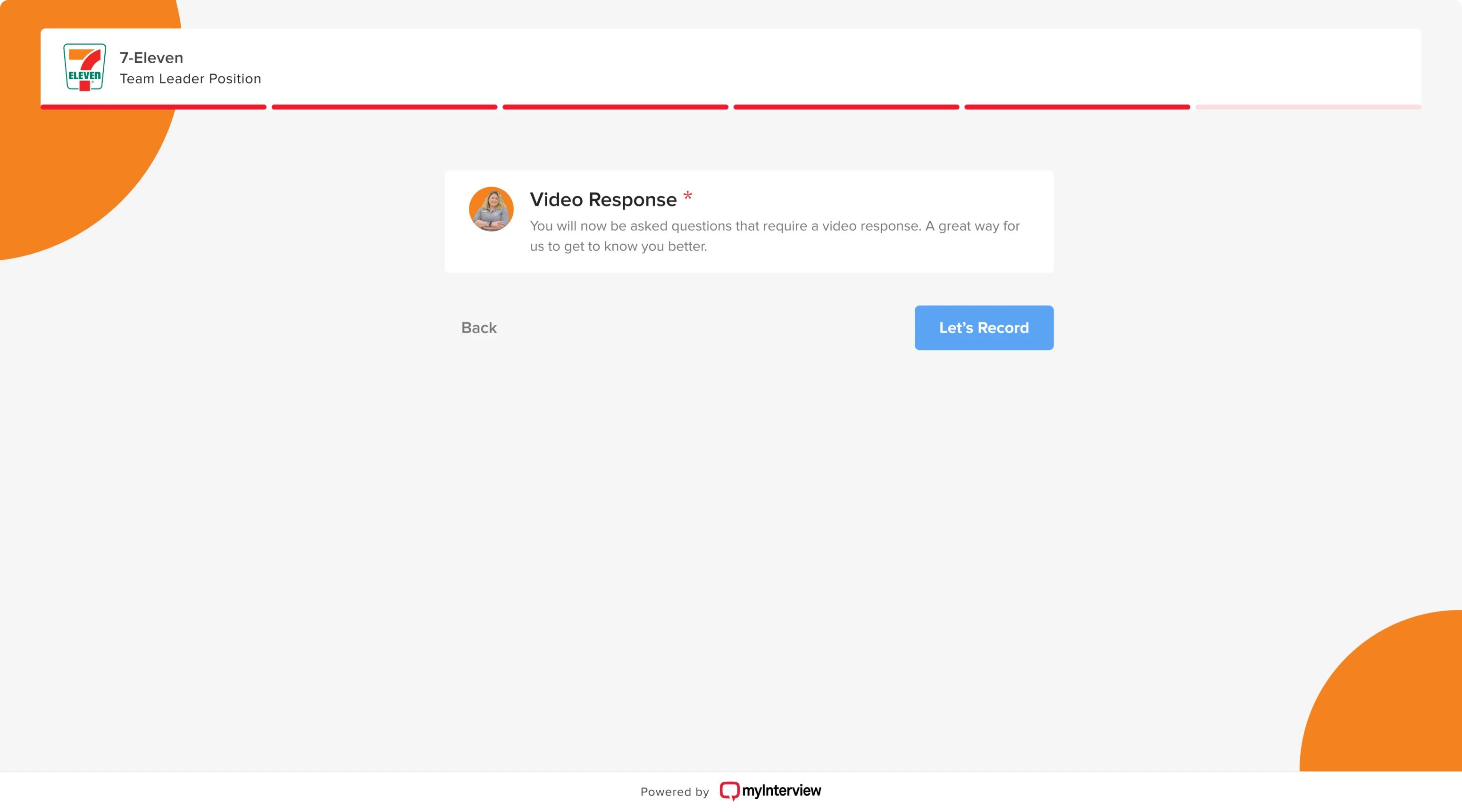
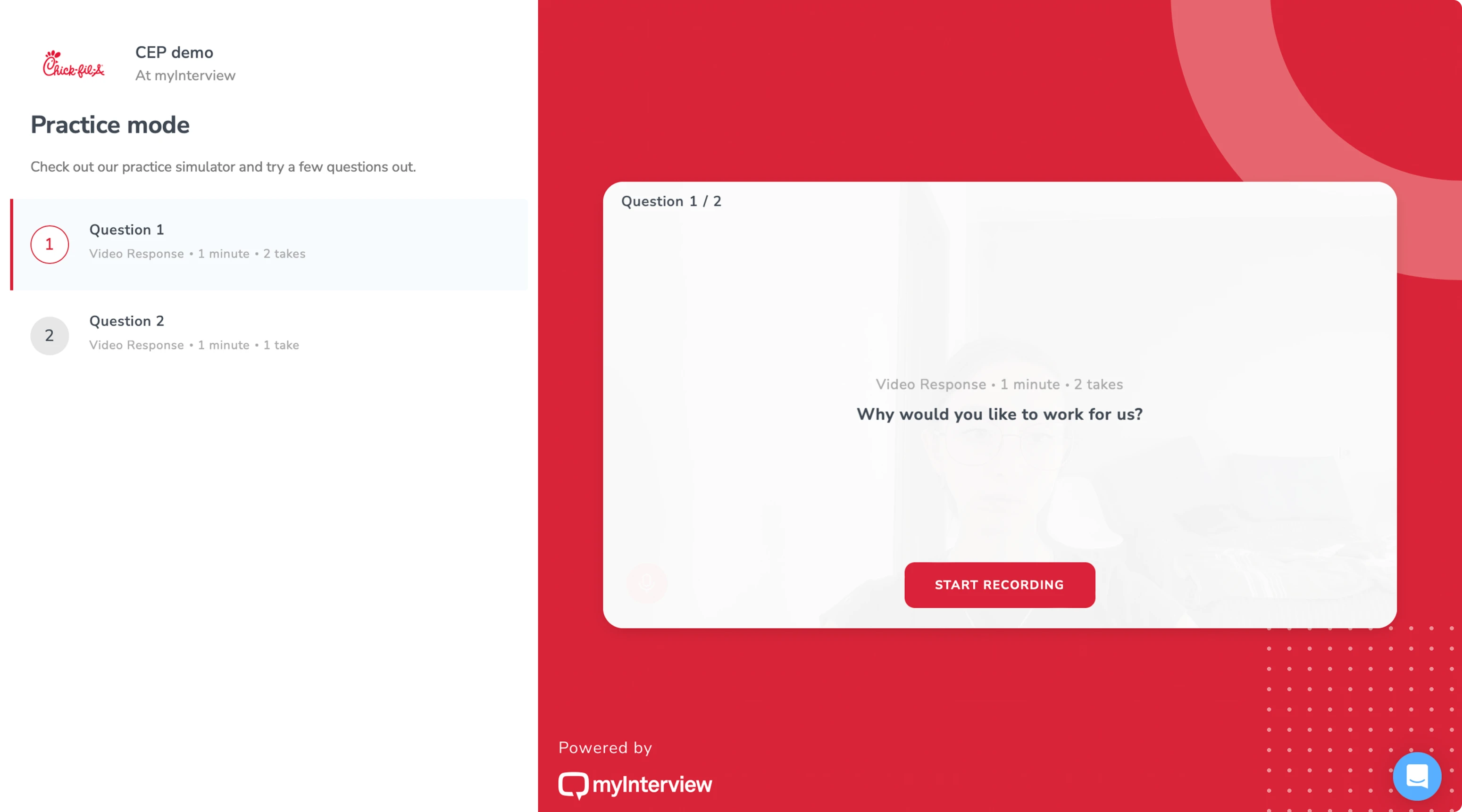
As myInterview scaled, the degree of chaos increased:
- The number of features went up;
- Product team circled back to the same problems;
- User experience suffered from inconsistency.
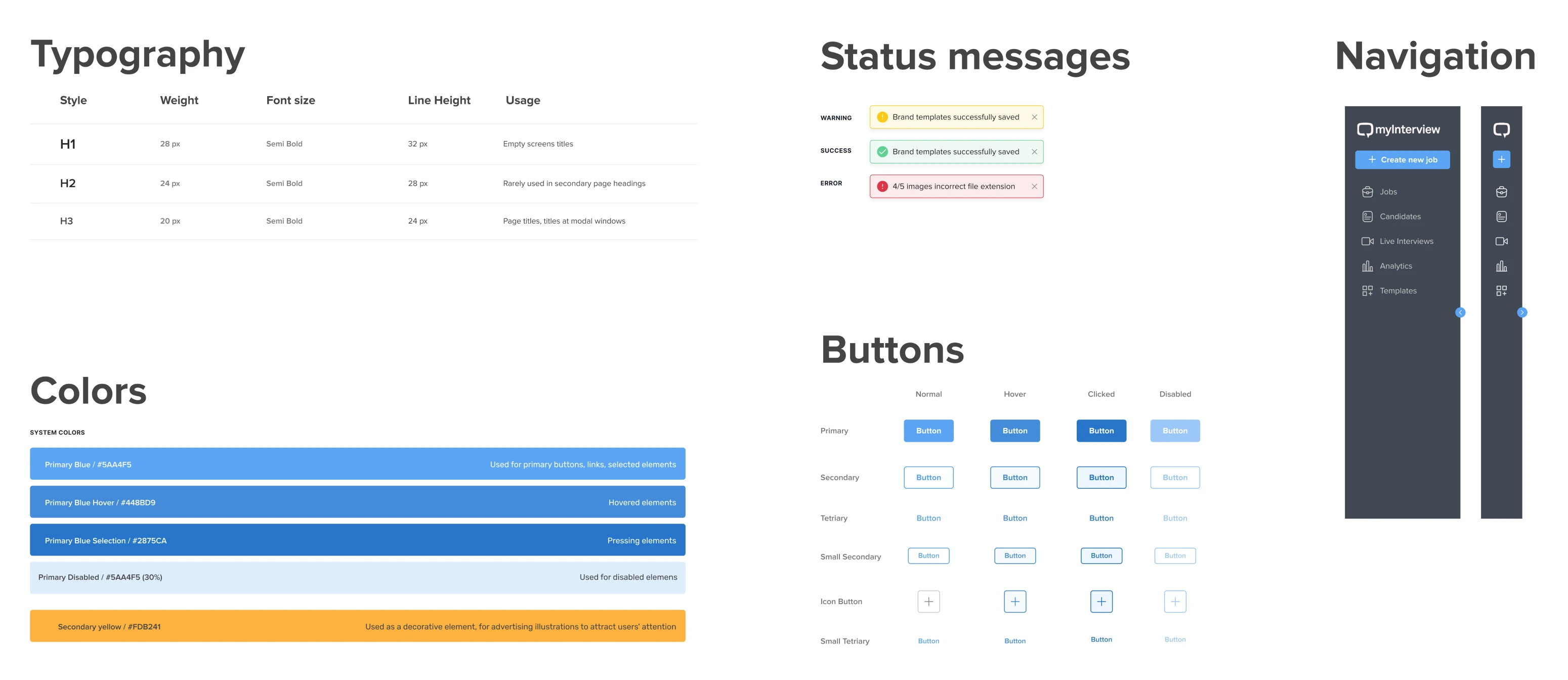
Eleken addressed this systematically by creating a scalable design system for all products. We developed a single source of truth with ready-made, interactive components (navigation, modals, notifications, etc.) to share with engineers and the whole product team.
myInterview’s case shows how good design solves real business problems
We fixed usability issues, iterated new features to perfection, helped to reach design consistency and win enterprise clients with quick yet impressive demos.
What's next for myInterview?
After a brief pause, myInterview has returned to Eleken to design the integration of their exciting AI features into Microsoft Teams, and now admins can create interview flows through the chatbot in Teams, making the hiring process significantly more efficient and convenient for all participants.
It's this kind of innovation that excites us and makes us eager to get back to work. And that's the beauty of partnering with Eleken — we fit the dynamic tempo of startups like myInterview. Unlike with in-house designers, clients can pause our cooperation when the scope dries up and easily renew when fresh design challenges arise. It's flexible, it's efficient, and it's perfectly suited to the ever-evolving world of tech startups.


