BookPeep
Improving the design of a customizable booking platform
Peep is an ultimate booking platform that provides beauty salons, medical facilities, barbershops, pet care salons, and spas with outstanding customizable solutions. In particular, Peep covers some of the most critical business processes, such as scheduling, invoicing, online booking, performance tracking, and inventory tracking.
To meet the needs of existing and new clients, the Peep team has to constantly improve their platform. But with more newly added features, the solution was becoming harder and harder to use and navigate. As a consequence, one day they found themselves with a solution that has many UX frictions and lots of unsatisfied users.

To deal with the challenges mentioned, the Peep team needed experienced designers that would be proactive, and capable of independent design decisions. They sought professionals who would become part of their team, are passionate about SaaS business challenges and are ready to work in the vibrant pace of startup life. And that's what Eleken is all about!
Read about the UX audit process and the design decisions we implemented to help our client improve the UX of their product without costly and time-consuming redesign.
Conducting UX audit to detect critical UX frictions
First of all, we analyzed a user flow created by the product team and looked into the target audience’s core needs to understand how to improve the most critical flows.
Diving into the product’s specifics allowed us to understand where the design lacked the necessary logic, intuitiveness, and consistency in the information hierarchy. We found points of friction and proposed some changes to the existing design.
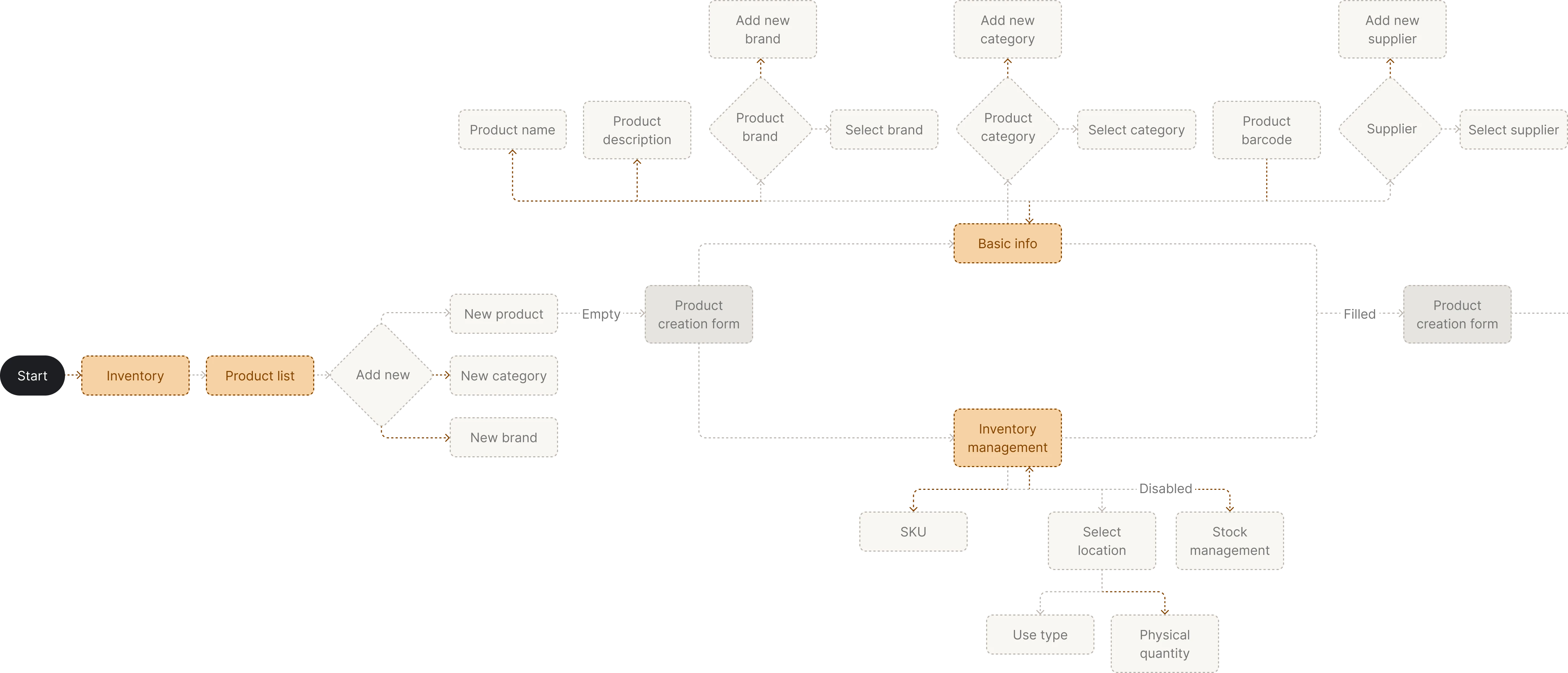
Here are some of our most important UX audit findings
One of the most significant issues was the lack of clarity in certain design elements. Many components of the user interface didn’t meet the core principles of material design and were confusing for both the development team and product users.
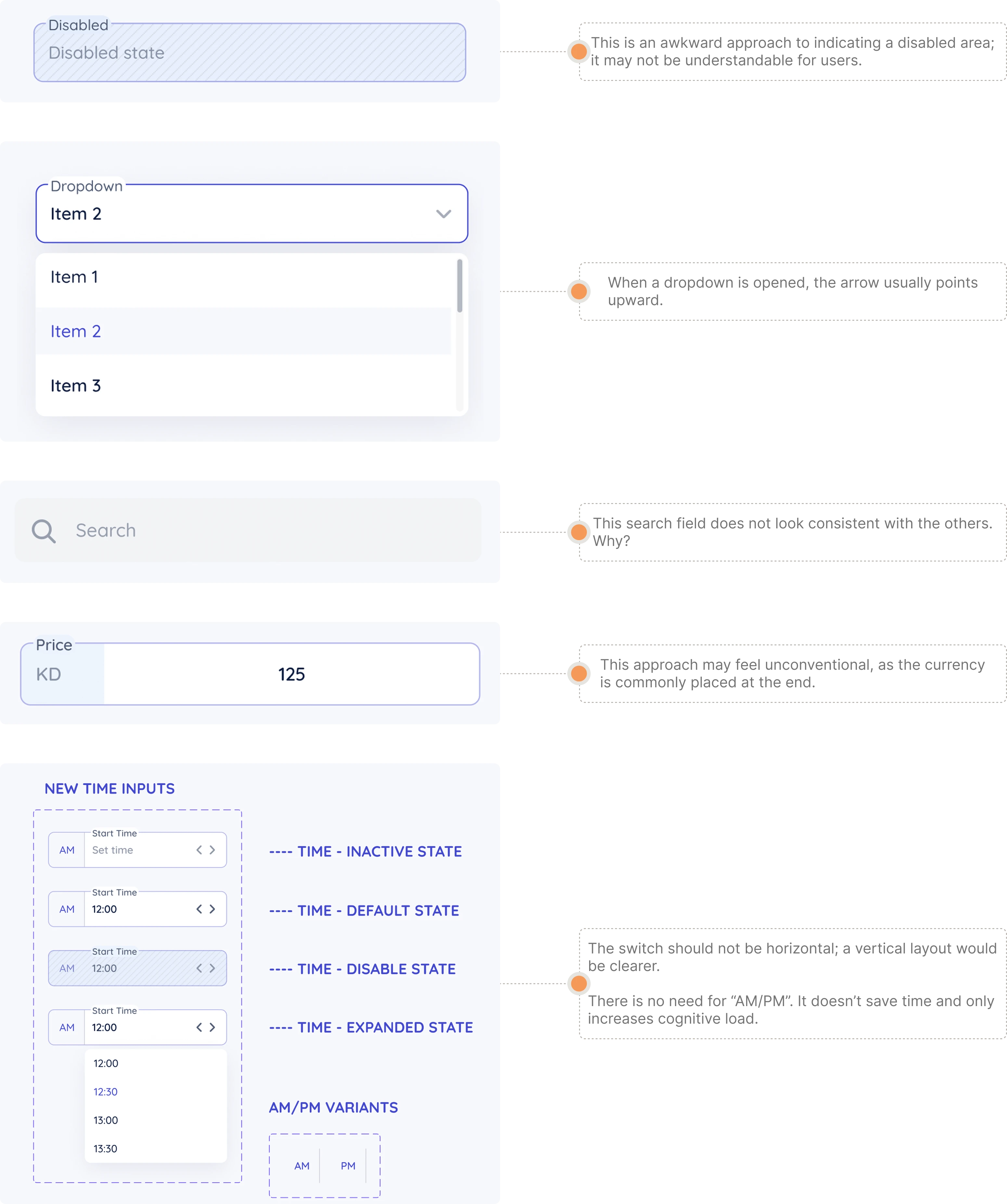
- Disabled fields didn’t look clear to users.
- Dropdown menus were pointed down when opened. Such little details go against the established Material design best practices.
- The internal search feature didn’t look the same throughout the interface, causing inconsistency.
- In the field displaying the price of an item, currency was placed at the beginning, although customers usually expect to see it right after the price.
- Time inputs contained “am/pm” options, which only increased cognitive load.
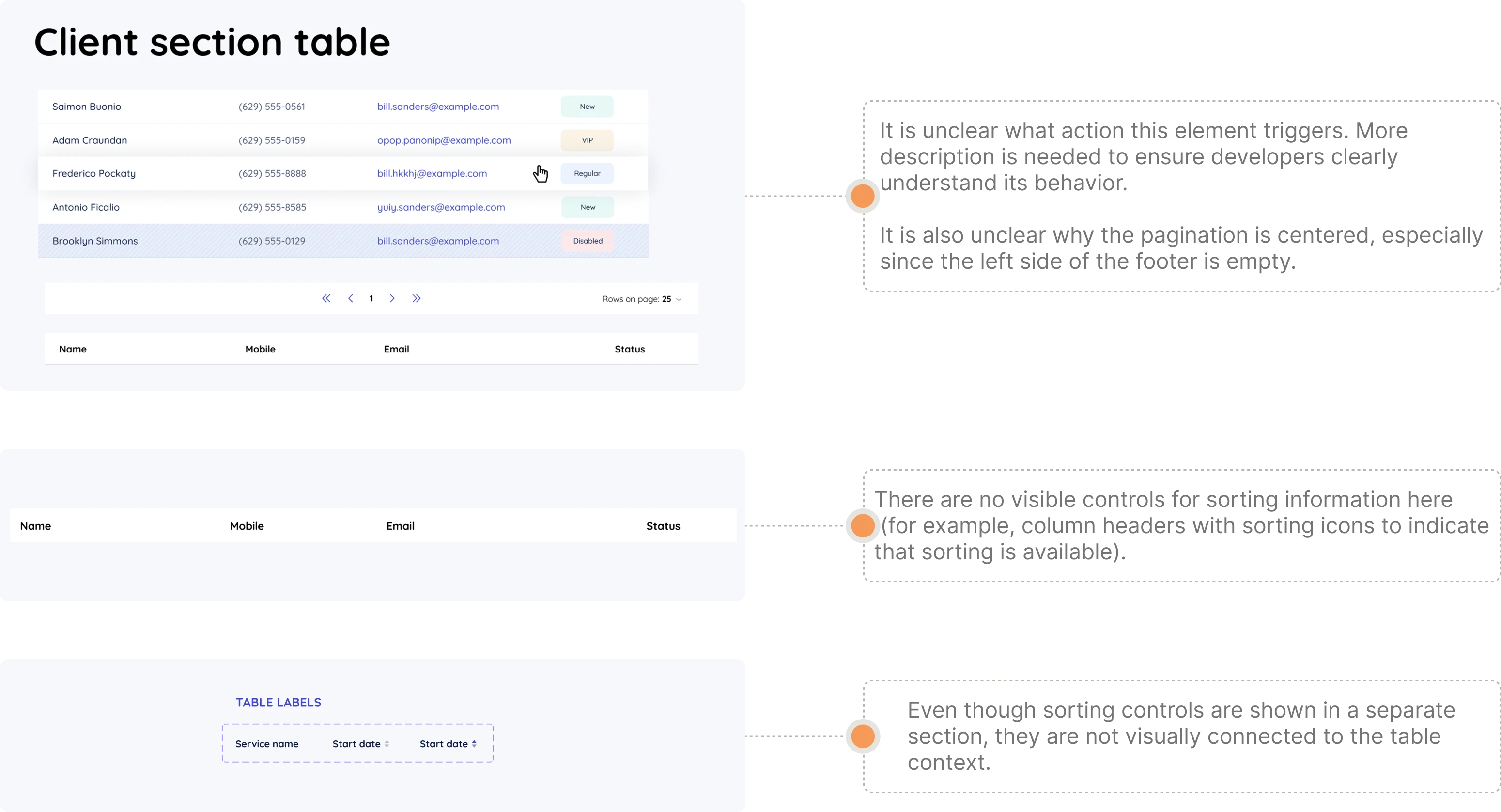
On the client section table, there were several other unclear elements that could overwhelm or confuse users.
- Some components of the table had unclear descriptions, which made it more challenging for developers to understand how to implement them.
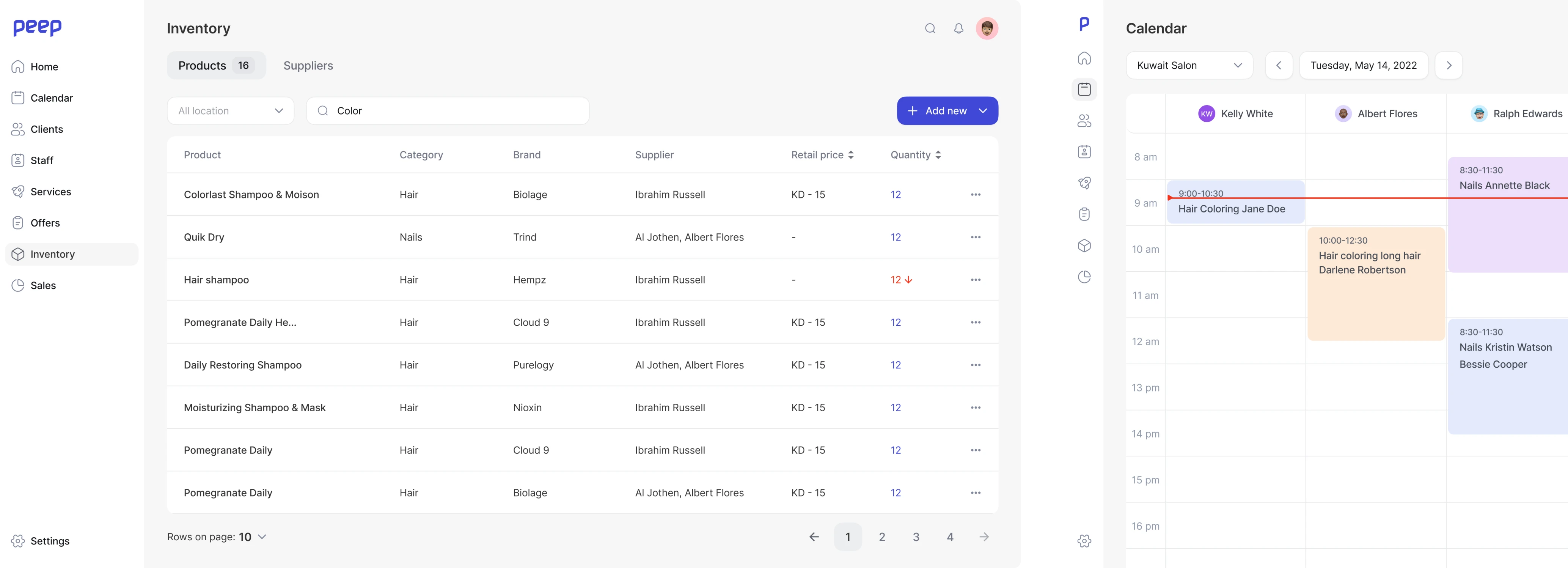
- Issues with information hierarchy. Once a user entered the home screen of the app, they were not able to instantly see which information is primary and what they need to focus on first. This is a significant issue as once a customer opens this page, they should get at-a-glance access to the most important insights and understand how to move on through the interface.
- Confusing duplicates. On the home screen information about upcoming events was duplicated, making users’ in-app experience unclear and inconsistent.
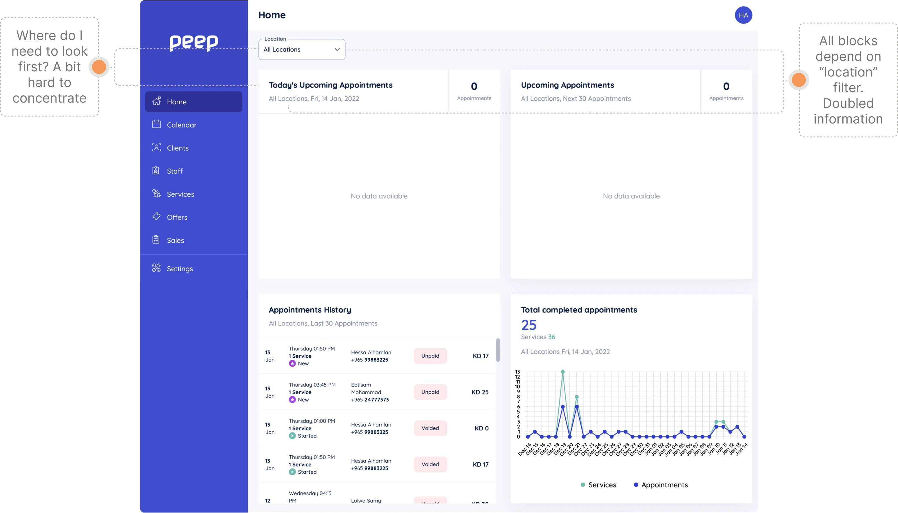
Another problem was an overwhelming user interface that contained too much information and looked too complex. When adding an appointment to each block, including current, upcoming, and previous appointments, a customer would likely get confused. That is why we suggested a more straightforward and concise design of the app’s home page.
.webp)
As a result, the UX audit conducted by the Eleken team gave the client multiple helpful insights. These findings helped us improve the product’s design system, achieve more consistent information and visual hierarchy, and change particular interface components according to the principles of user-friendly design.
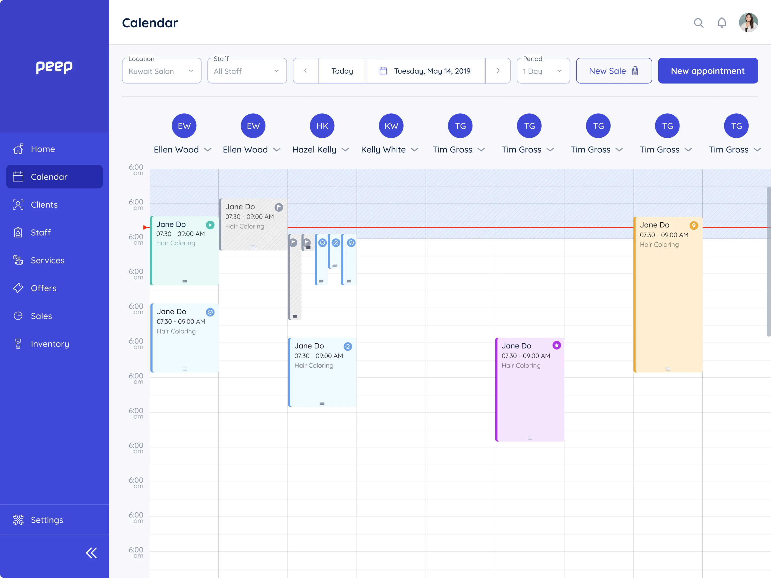
To create more space on the interface we left only the most important elements. The rest were organized under the filter icon. Adding a new event became more intuitive, we moved it to the bottom right corner and created a simple plus button.
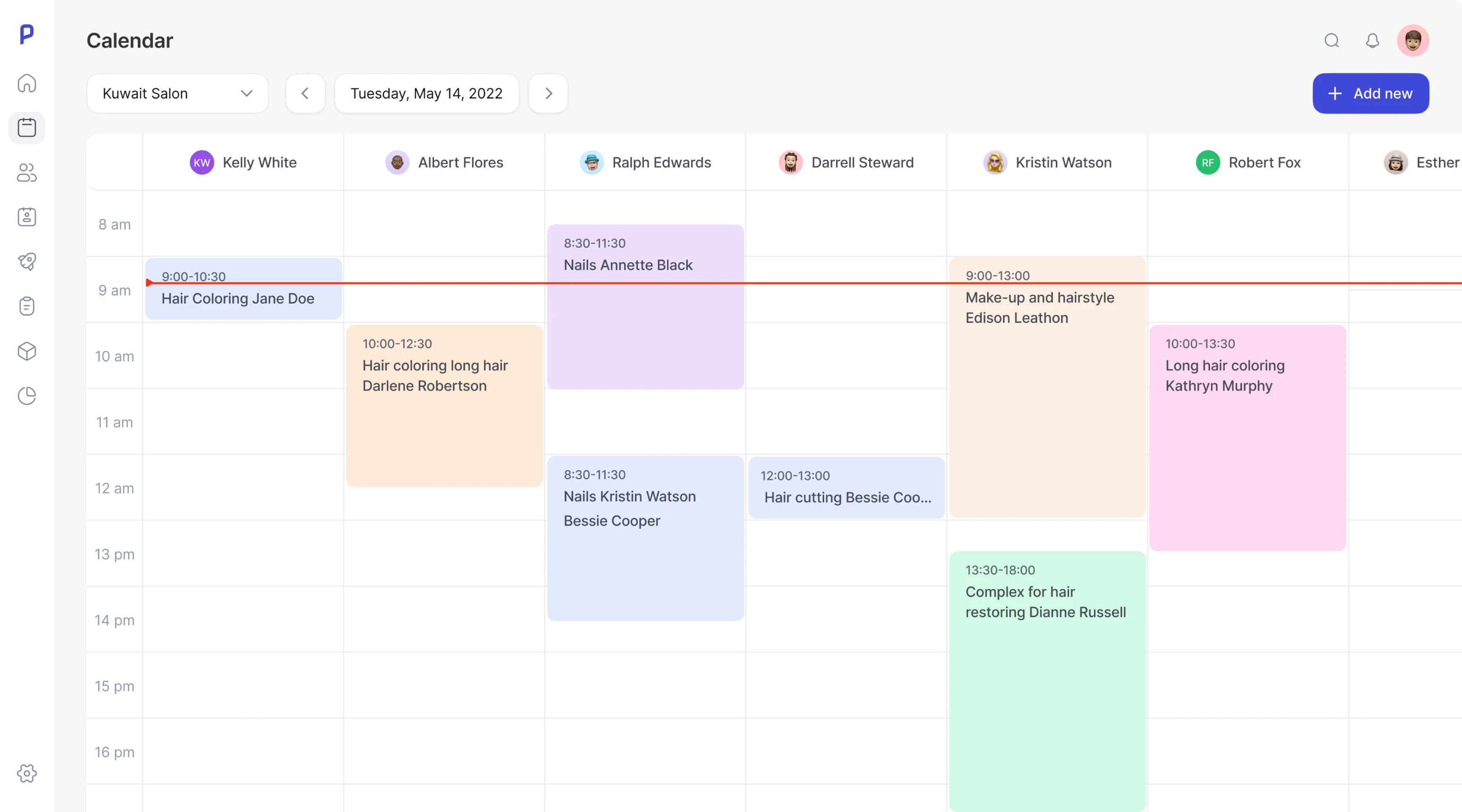
Another challenge was to upgrade Peep’s mobile app, making it more minimalistic and easy to get while avoiding drastic and expensive changes. Here are some of the most important decisions we made to achieve this.
- Changed angle radius. This small design decision made the app look tidier and more spacious.
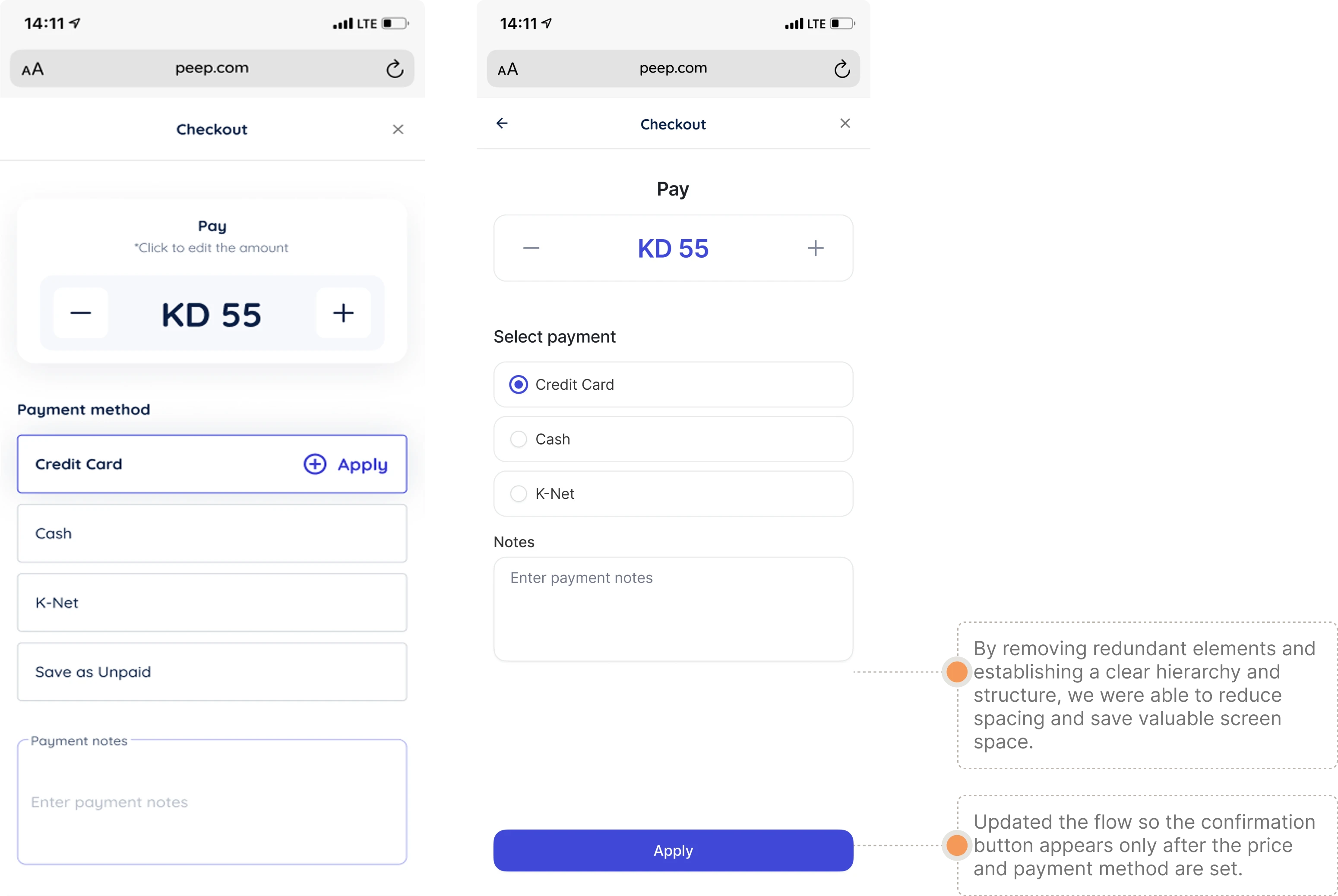
- Removed redundant elements. Some design elements were unnecessary and took too much space. We decided to remove them and make the app’s interface less overwhelming.
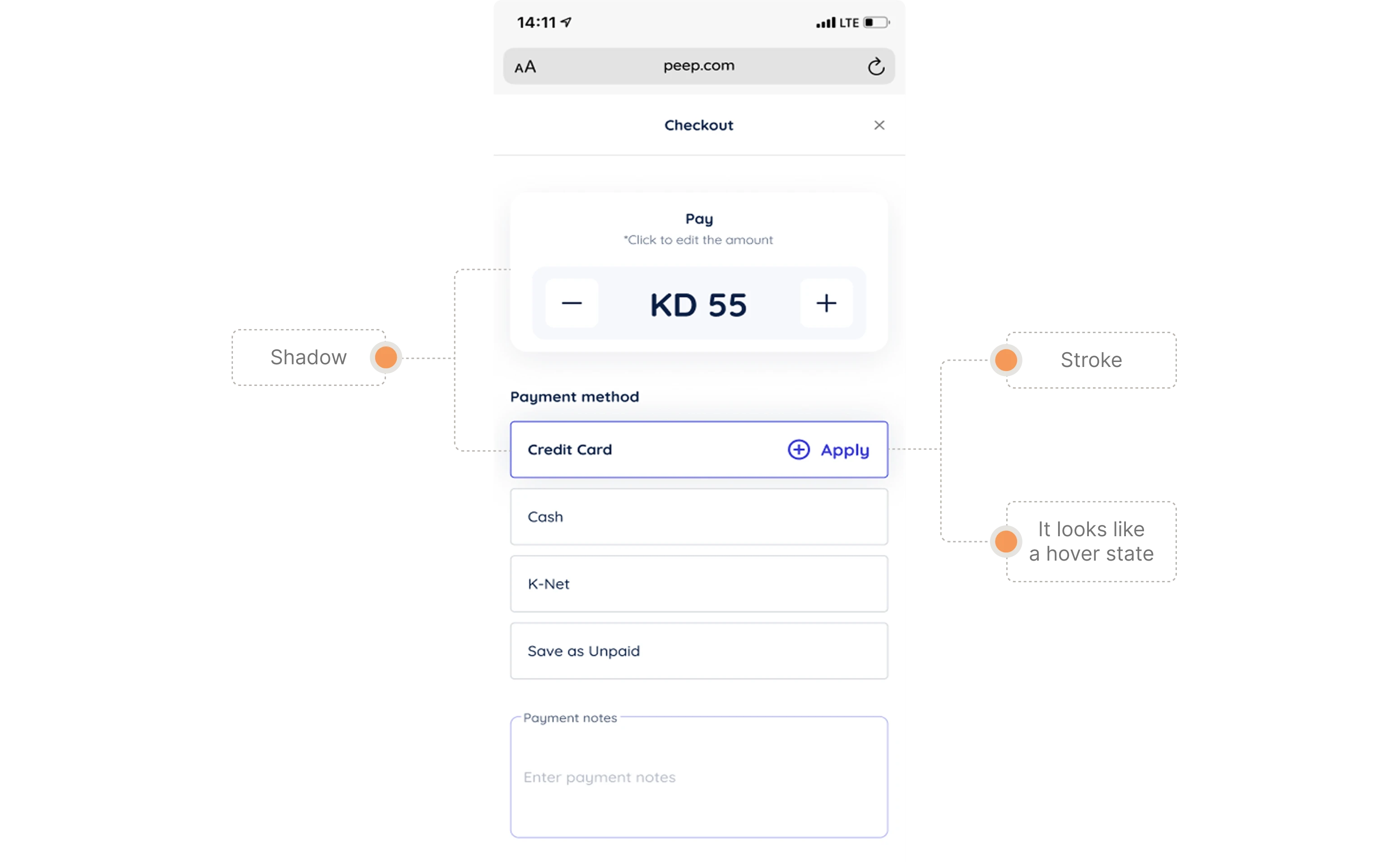
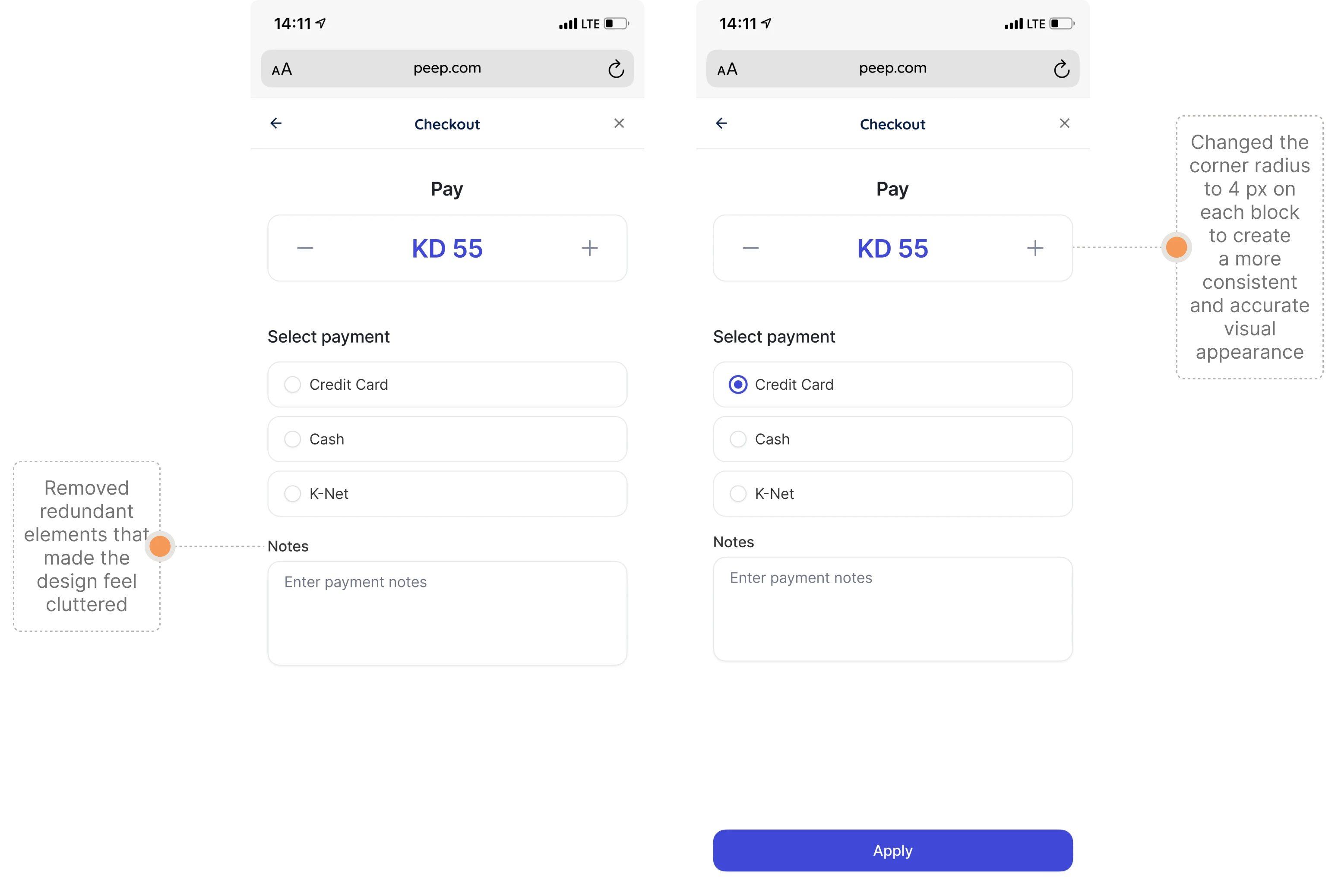
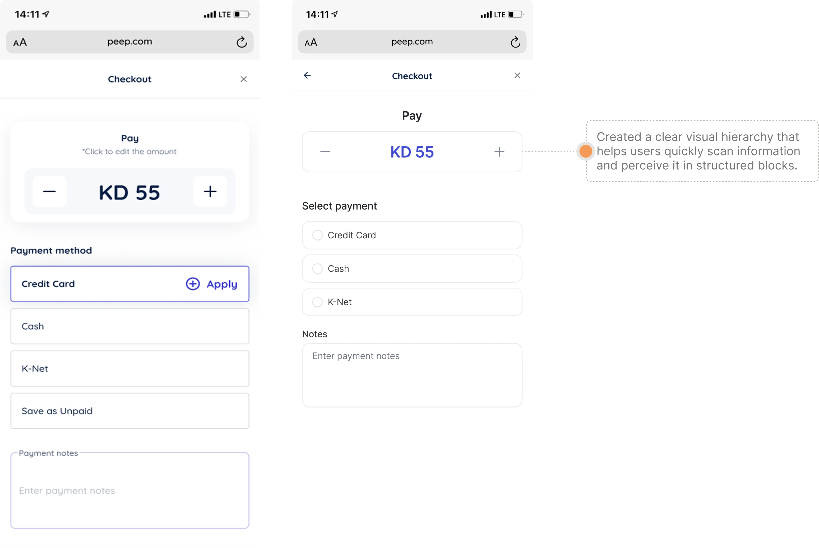
- Better visual hierarchy. We divided information into consistent blocks so that users can instantly perceive it and prioritize what’s important.
- Clearer interface structure. By removing unnecessary interface elements, we provided more free space on the screen, making it less overwhelming.
- Improved checkout experience. The confirmation button appears after a user sets the price and picks a payment method, so it doesn’t interrupt the checkout flow.
Professional design work saved the company’s resources and resulted in an improved product
Together with the Peep product team, Eleken managed to set the product design process back on track and make small but crucial changes. We made the platform more convenient, and user-friendly, while the design system became more consistent and convenient for the developers' team. As a result, Peep got an enhanced product design and was able to offer a better experience for its existing clients in no time.
If you find your business in a similar situation and need a professional design team to uncover and fix current design problems without stopping your business processes, Eleken designers are ready to join forces with your product team.