Cylynx
Designing an MVP for a no-code graph visualization platform

The owners of large or middle-scale companies know that over time they accumulate loads of valuable analytical data (concerning their customers, business processes, and so on). Working with all that information is not a piece of cake. The bigger the business, the more data you have, the more difficult it becomes to process and benefit from it.
The above situation causes the need for an effective data analytics tool that would help businesses, researchers, and analytics effectively work with data and extract valuable insights from it. One easy way we can process data is by graph visualization, a way of representing structural information in diagrams, graphs, and networks.
Cylynx came up with an effective solution that simplifies the work of anyone who deals with graph-related problems.

A software that helps analysts transform connected data into actionable insights
Consuming large sets of data sometimes makes it difficult to discern useful information from the overall amount. Cylynx is a graph intelligence software that translates graph data into business insights and allows to:
- Explore and analyze data faster (not with the help of code, but with easy-to-use tools and a clear interface)
- Collaborate across teams
- Study data relationships
- Reveal trends and discrepancies
The above characteristics make Cylynx a perfect tool in the sphere of finance and fraud detection. With the help of Cylynx, you can upload some already existing data or connect the software to your constant data source to automate the process.
When the information is in Cylynx, you can edit visualization of it: you can change the mapping, hide some sets of data, display data in different forms and colors.
The crucial benefit that sets Cylynx apart from similar graph visualization platforms is that it is not custom-built, and the user doesn’t have to possess any coding skills to use it. In fact, this software helps to shorten the development time of a network visualization solution by 6 months.
Turning demo into a minimum viable product
When Cylynx reached Eleken, they had a demo version of the product, but with limited functionality that didn’t allow users either to subscribe or store their files in the software. Cylynx’s team’s goal was to improve the demo’s interface and turn it into a full-fledged MVP so that individual users and corporations could start subscribing.
The main challenge for us was to understand in what situations real customers use Cylynx
Technically, Cylynx is easy to implement, but being product designers, we at Eleken understand that to be successful the software has to provide intuitive and consistent UX as well as effectively solve user’s problems. That is, it has to be human-centered.
From the Cylynx description we’ve provided above, you could understand that the software has its specific target audience, and it’s not that easy for someone who doesn’t work with graphs or data to understand the use cases of this platform. That’s why the main challenge for us was to understand in what situations real customers will use Cylynx so that we can design the product usable, valuable, and convenient for the end-user.
Our designer used the Double diamond framework as a basis for the product design process to overcome this challenge.

The Double diamond model predetermines that you think of as many ideas as you can and then narrow them down to find the best one. It has two big stages in the process (diamonds):
- Identifying the problem area (Research). The designer gathers as much information about the product as they can.
- Synthesize the information to find the big picture (Design). The designer finds connections between sets of information and systematizes them to bring some order to the overall picture and develop an effective design solution.
Now let’s dive deeper into what we did during our design process.
Our design process
Basically, we can divide all scope of work into two parts: updating and improving the graph editor’s interface and developing easy-to-use navigation. But at Eleken, we never jump straight into designing interfaces without conducting research first.

UX audit of the current demo version
First of all, we asked the customer to tell us as much information about Cylynx as possible to discover the product deeply. Together, we analyzed the Cylynx demo, discussed in detail how it operates and defined the situations in which users can benefit from using the software.
The next important part of understanding the essence of the product is to put yourself in the customers’ shoes. That’s why our designer tried out the Cylynx as if he was a user to better understand how the product worked.
To sum up, at this stage our task was to define:
- What the product does
- What tasks it solves
- In what way it helps the customer
- In what cases customers use Cylynx
- Why the features in the demo version work as they do

Competitive analysis
Another integral part of the UI/UX research process is analyzing the competitors.
In Cylynyx’s case, we looked through popular graph visualization tools (like Gephi, neo4j, Lnkurious, Tiger Graph, Graphistry, Cytoscape) and gathered their screens in one place to make them easier to compare and analyze.
Still, similar visualization platforms look complex and, unlike Cylynx, require coding skills. That’s why we didn’t use any graph visualization tools as a reference.
Only after a thorough research was done, we proceeded with designing an interface for the graph editor.
Designing graph editor
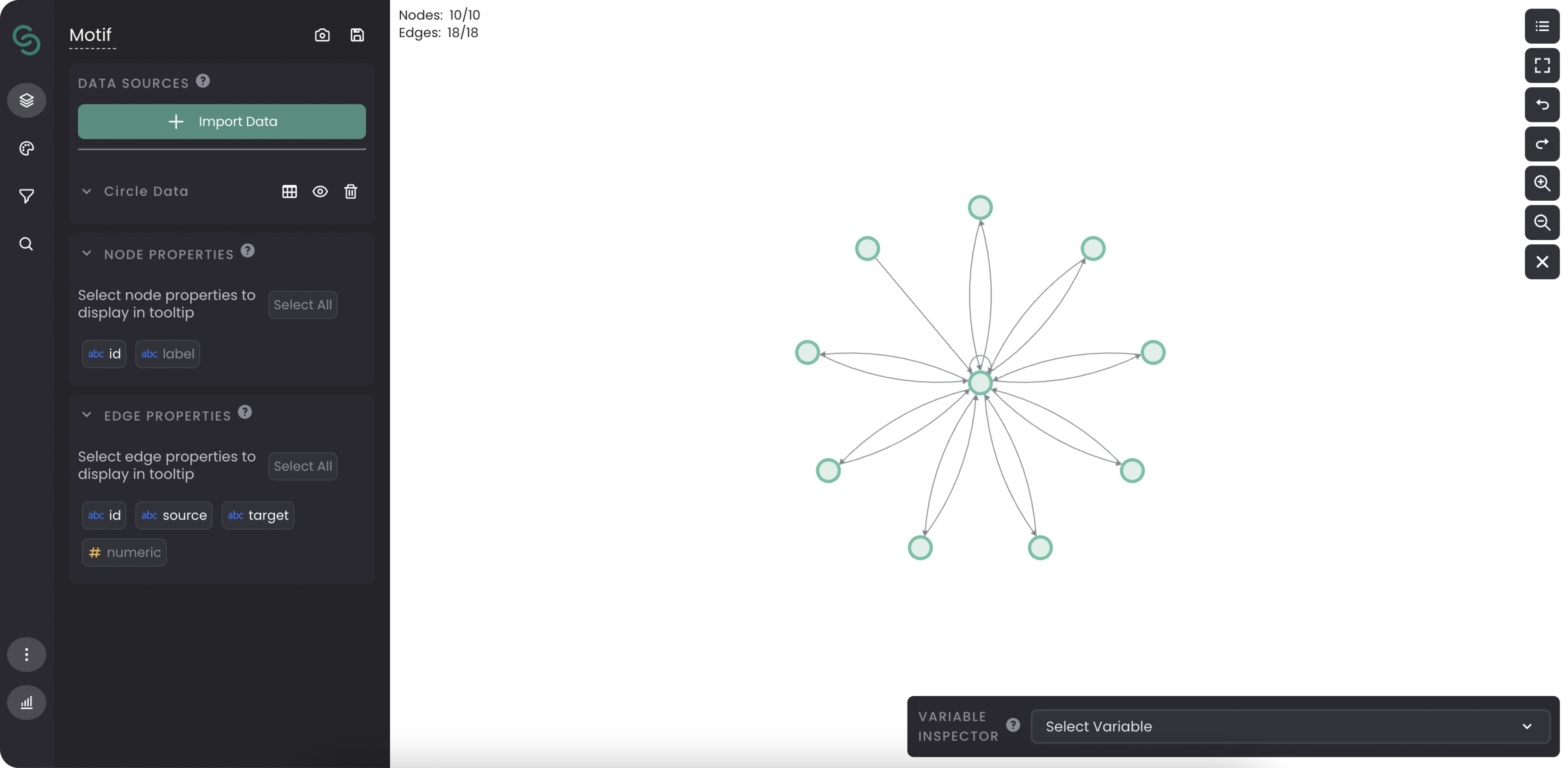
A graph editor is a place where users work with the data they imported.
In Cylynx’s demo version, its interface consisted of four equally important and independent tabs. The problem with graph editor design was that when users performed actions in different tabs (for example, change the style of the graph, put on some filters, and so on) they overlapped each other, and it was not clear from the interface what those changes caused and what their purpose was.
That is, when the user took a certain action in one tab, they didn’t see the parameters they selected in the previous tab. To cut a long story short, the interface was confusing.
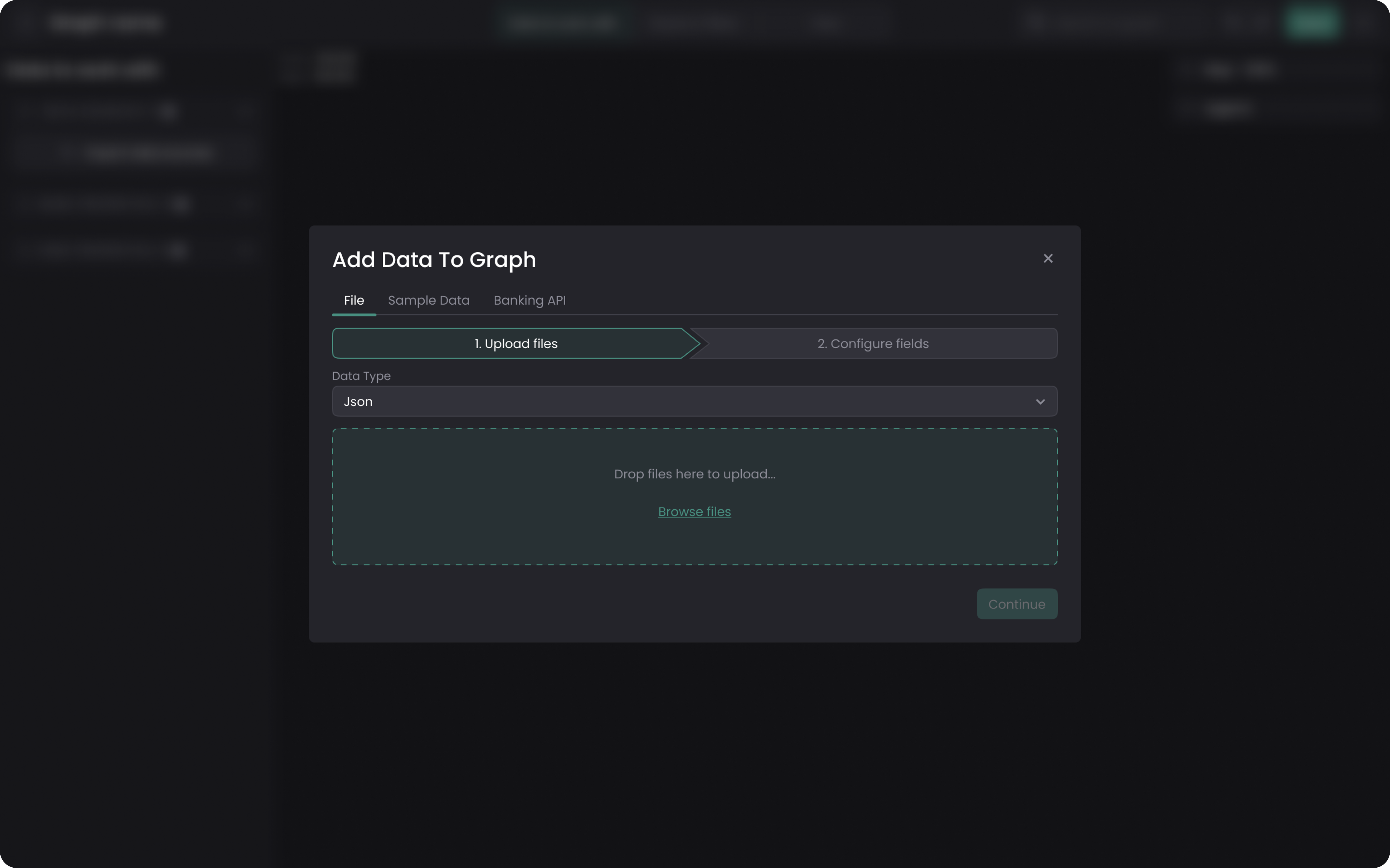
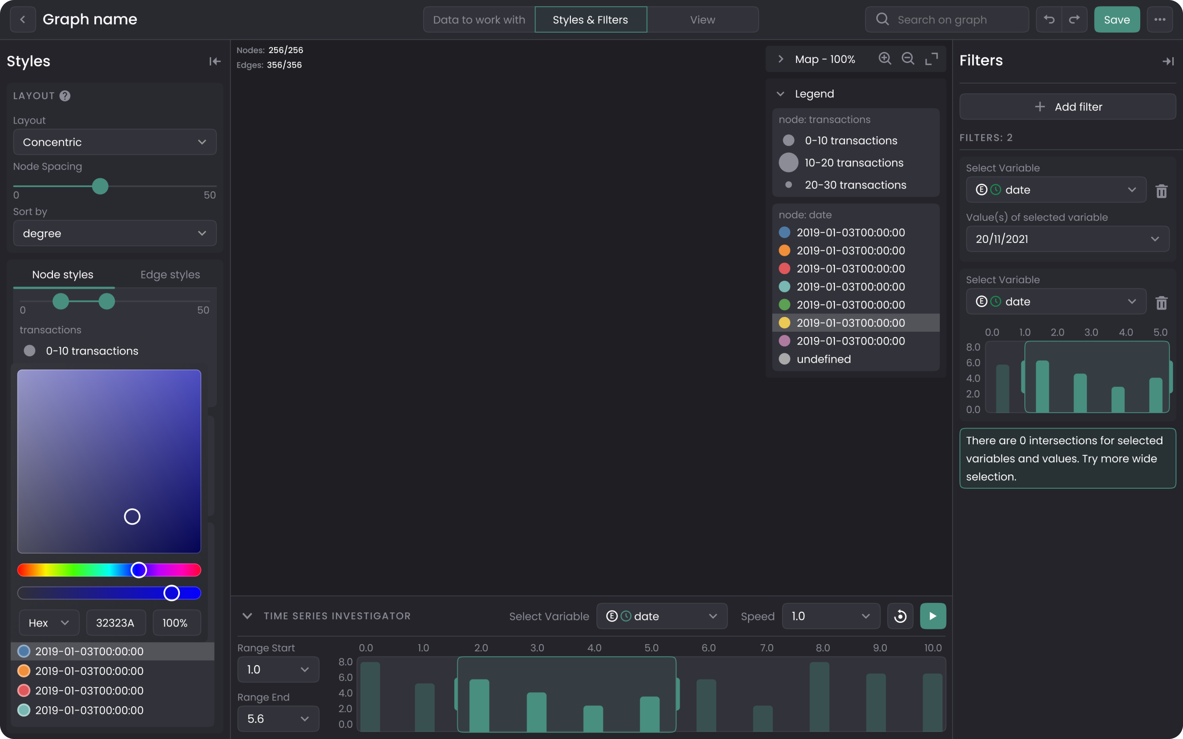
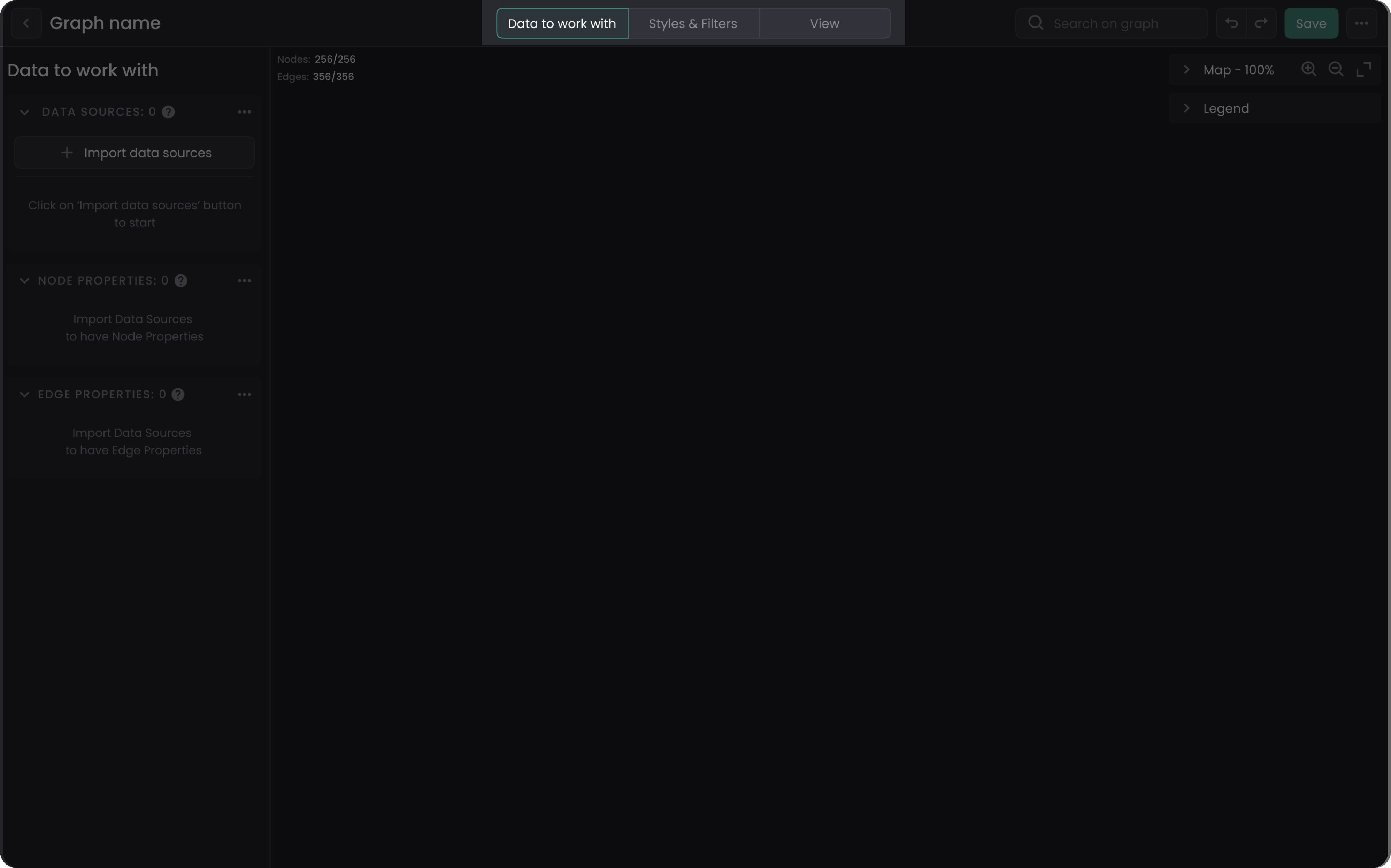
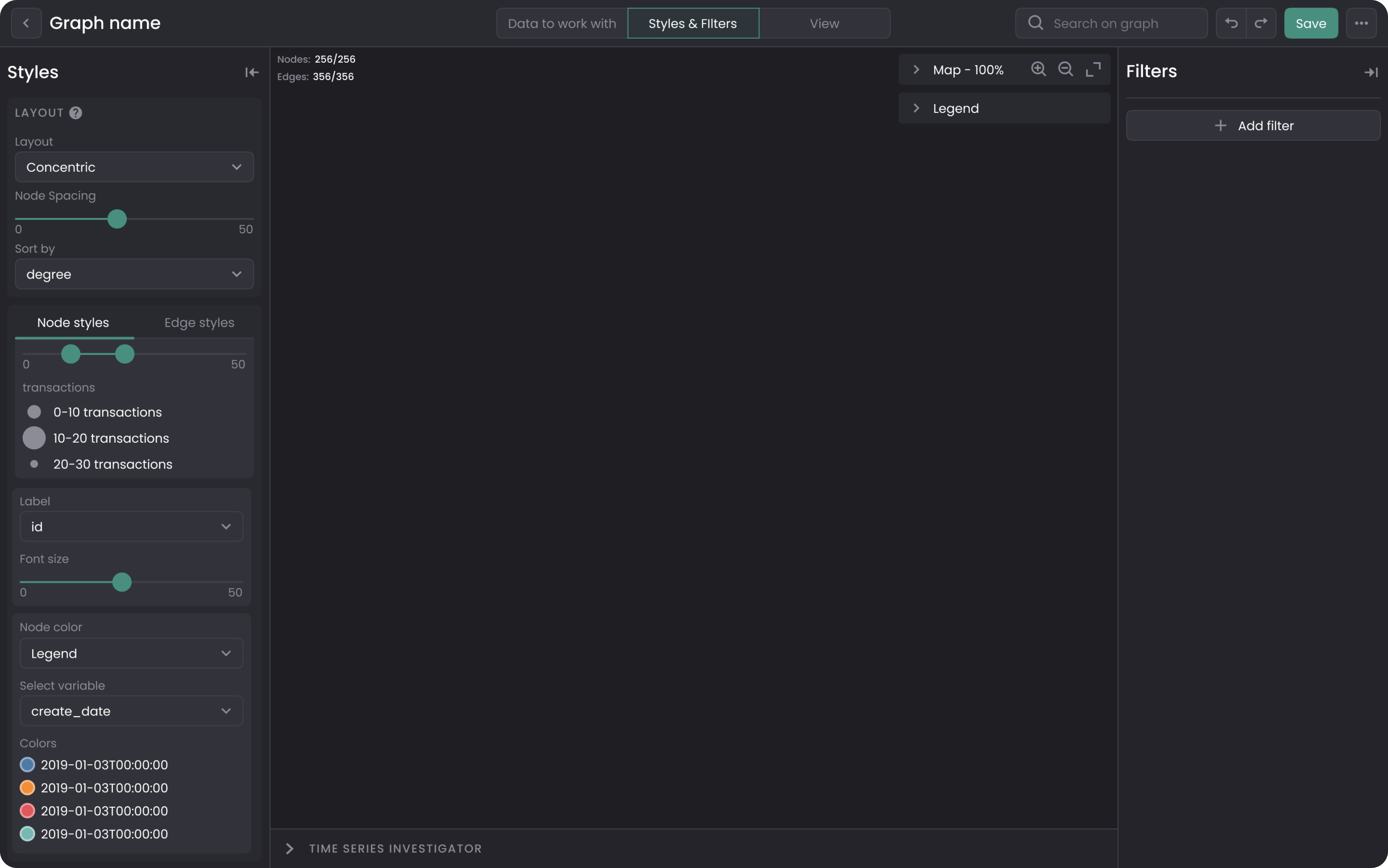
To find the best solution for this issue, we collaborated with Cylynx developers. Together we decided to divide the graph editor’s interface into three tabs:
- Data to work with. It allows users to upload the needed data, select which data set to display.
- Styles and filters. Styles make it possible to visually change the graph (enlarge it, change color, link data sets together), and filters help to limit what data the user wants to display (more specifically than in the previous tab).
- View. The third tab allows you to leave comments (the demo version didn’t have this function) and view the graph without editing it.
Time series investigator
One more important feature that we decided to improve is the time series investigator (it allows to run the graph in a certain time sequence). To make this piece of functionality more user-friendly, we increased its size, added more values to make it more flexible and easier to adjust.
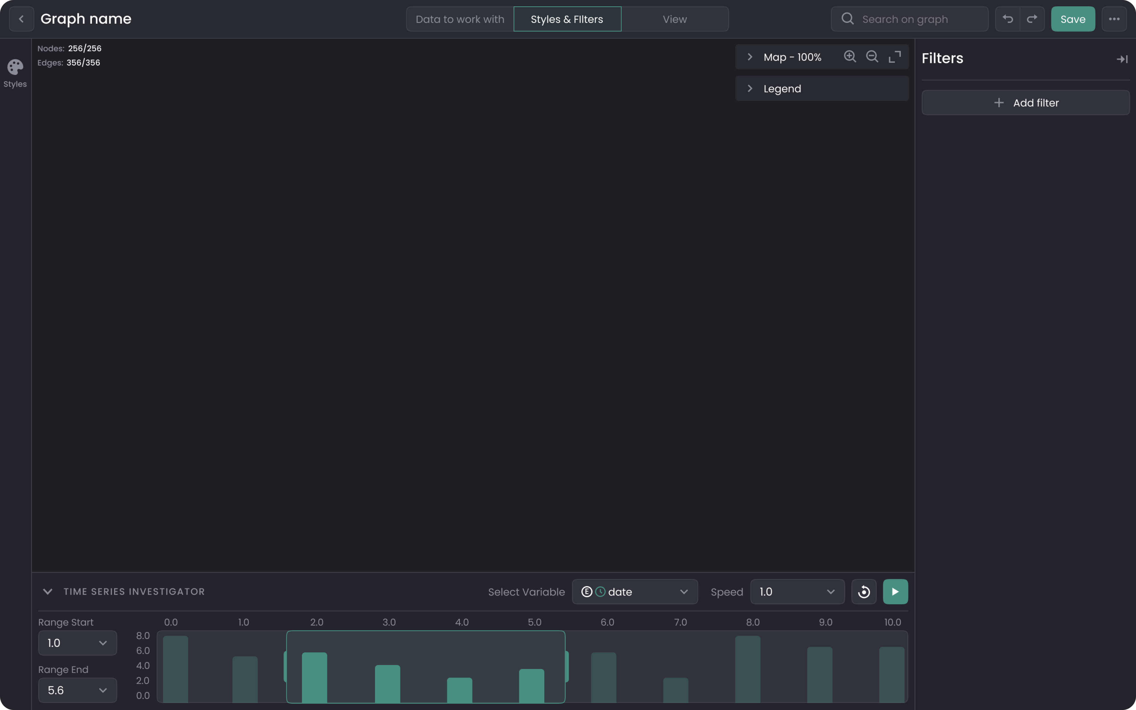
Such improvements allow the user to clearly see all of Cylynx’s tools and understand their function. It decreases confusion and makes the Graph editor more practical and user-friendly.
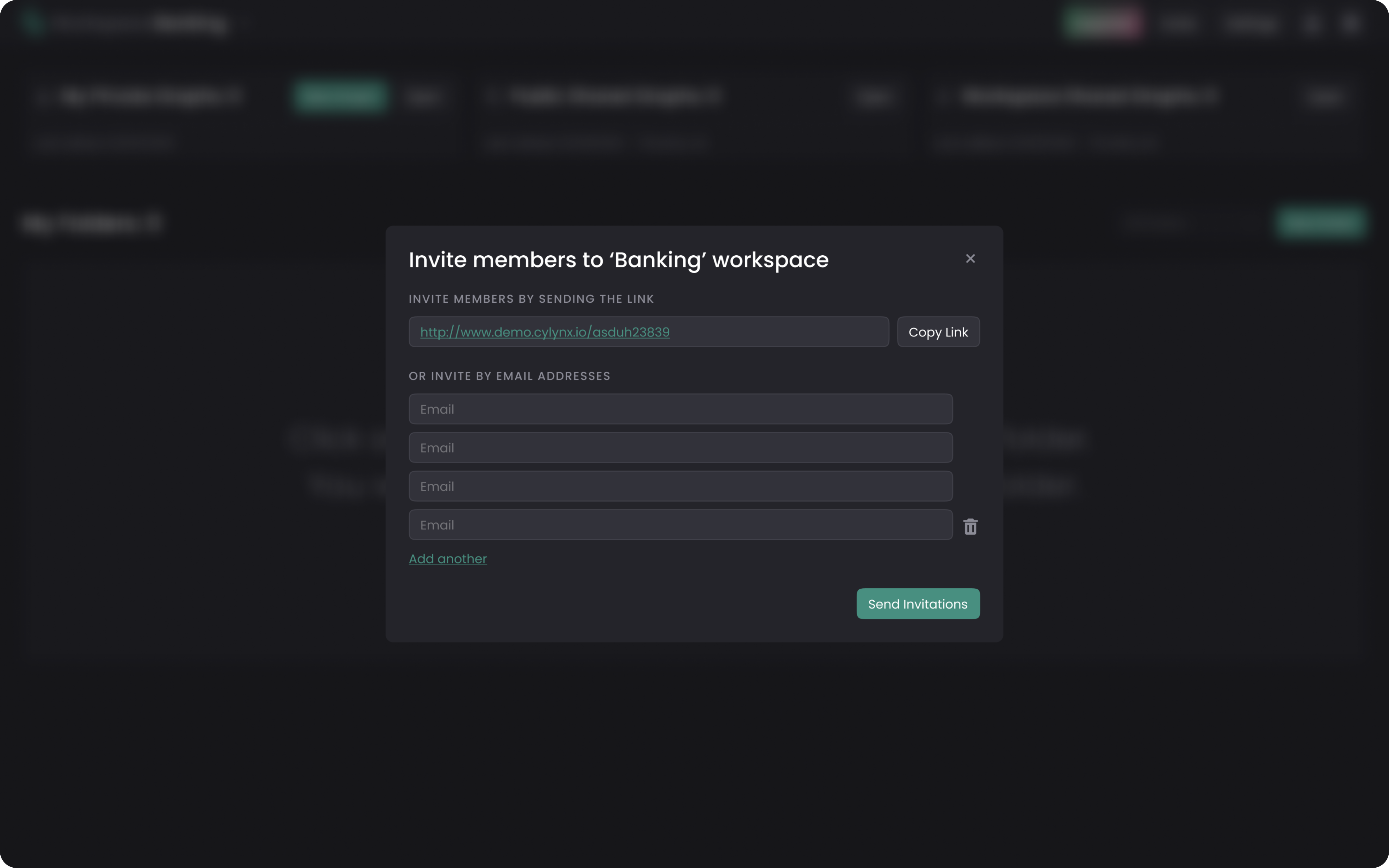
Designing the navigation
Thinking over the navigation of the software caused no problems as Cylynx’s structure is similar to a regular CRM platform, and our designer had a good understanding of how the user flow was supposed to look and work. We just had to clarify details about users’ roles, access level, SaaS pricing model, and so on to focus better on the end-user and our client’s business goals.
Working with Cylynx navigation included designing:
- A signing up process
- File storing
- File sharing

- Inviting new members and more
Visual design
The demo that Cylynx came to Eleken with was made based on Base Web, a UI React framework that is based on Uber’s design system.
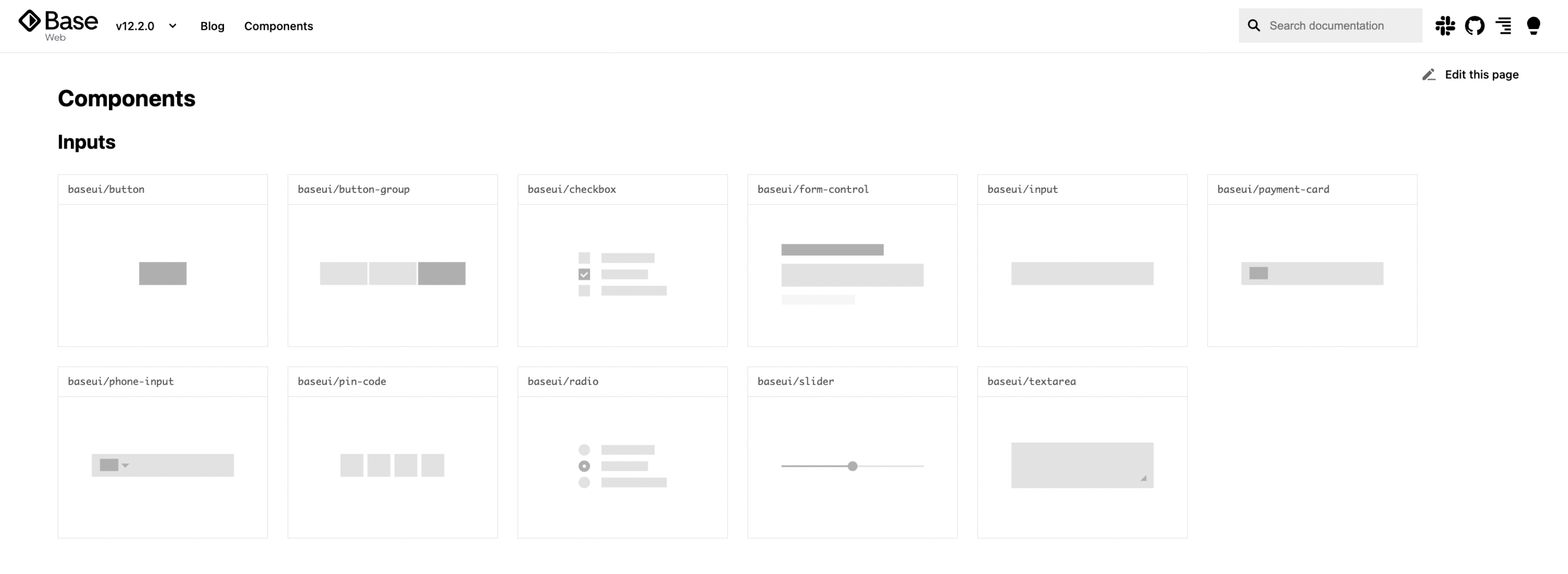
We analyzed this framework with all its components and used them when designing the visual part of Cylynx. However, we changed the size and arrangement of Base Web design elements to effectively use the space on the screen.
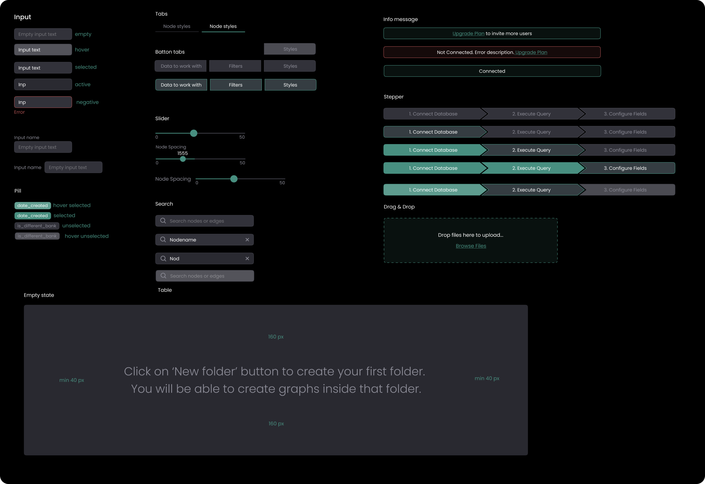
References
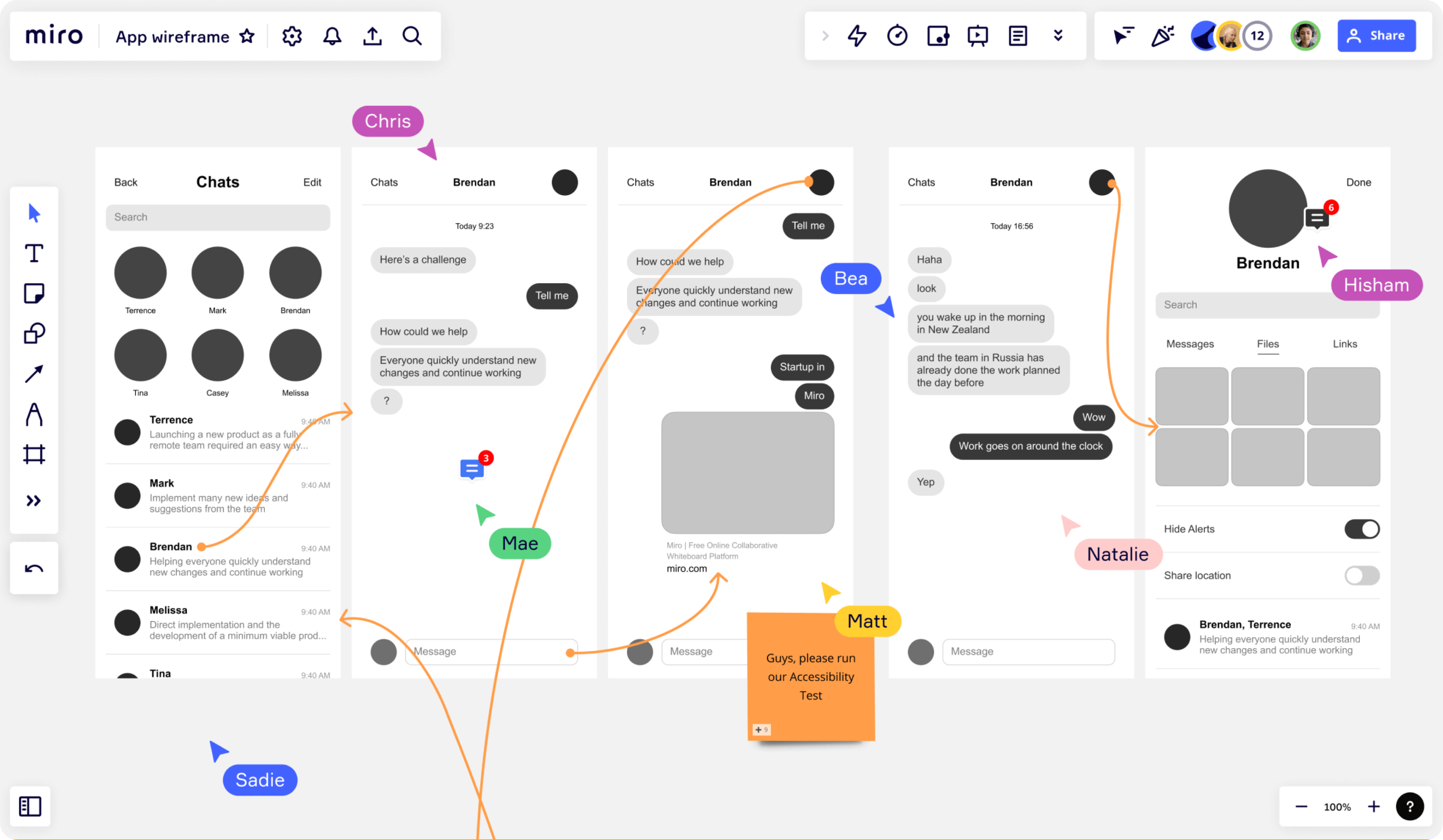
As the main references for the Cylynx visual design, we used Miro and Figma, because they are easy to use and have a similar structure: big canvas in the middle of the screen, where users work with files/data and small bars with hidden functions to the left and right side.

Result
Due to the iterative way of collaboration with our client, numerous discussions, and constant communication not only with the project manager but with developers and other Cylynx’s team members, together we managed to create a consistent and usable design of a platform that allows businesses to connect the dots between different data points and helps users to faster explore and analyze data.