Datawisp
How our redesign helped a no-code data analysis platform to raise a $3.6M seed round
Without data analytics, companies on the web are blind like a deer caught in headlights. They have no idea about what, when and how their users are doing. Still, may prefer to stay blind because you need either an engineer or a data scientist to make sense of an awful lot of information.
Datawisp solves the problem by creating a new, visual way of working with numbers so that everyone could discover valuable ideas. Just like Webflow removed coding from web development, Datawisp removed coding from data analytics. The only problem is that the product is confusing as hell and looks more like Windows 98 interface rather than an innovative user-friendly app.

Datawisp struggled without a skilled product designer
- A raw prototype allowed Datawisp to validate the idea and raise a $435K pre-seed funding, but to move to the next round, the company needed an MVP that not only works, but also looks good.
- A limited investment, divided by their burn rate, determined that Datawisp was racing against the clock. So they needed MVP to be designed fast.
- Datawisp’s team wasn’t sure that an all-in-one design studio would be able to grasp their sophisticated product. They were looking for product designers that had experience with data-heavy apps.
Eleken product agency turned out to be a perfect match to all Datawisp’s design needs.

It took Eleken less than a week to get started with a redesign
We always have a few product designers on bench, so we were able to get to work as soon as we discussed Datawisp's design needs. We usually begin our partnerships with a three-day trial to let our clients try before they buy.
During this time, we can design a couple of pages or a short user flow. In the case of Datawisp, we did a complete redesign of the product’s main screen and provided several options to choose from. The client was pleased with the results and our working approach, so we continued with the full-scale product redesign.


The approach to assign one main designer to our project, that worked full-time on it, was very unique, but it allowed them to build a very detailed understanding of our - sometimes a bit complex - product.

That is how the redesign process looked like
Step 1: Going into details
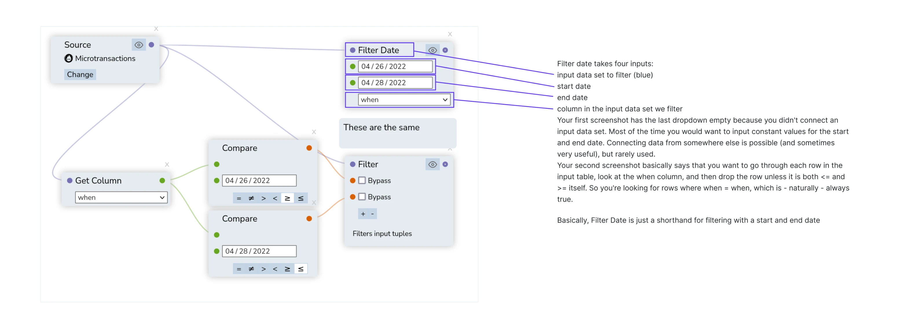
Before Eleken designers open Figma to revamp some interfaces, they figure out how everything works. We started with a deconstruction of the Datawisp app into user flows, and user flows – into separate data blocks, cards and tables. All to understand the role and meaning of every single design element.
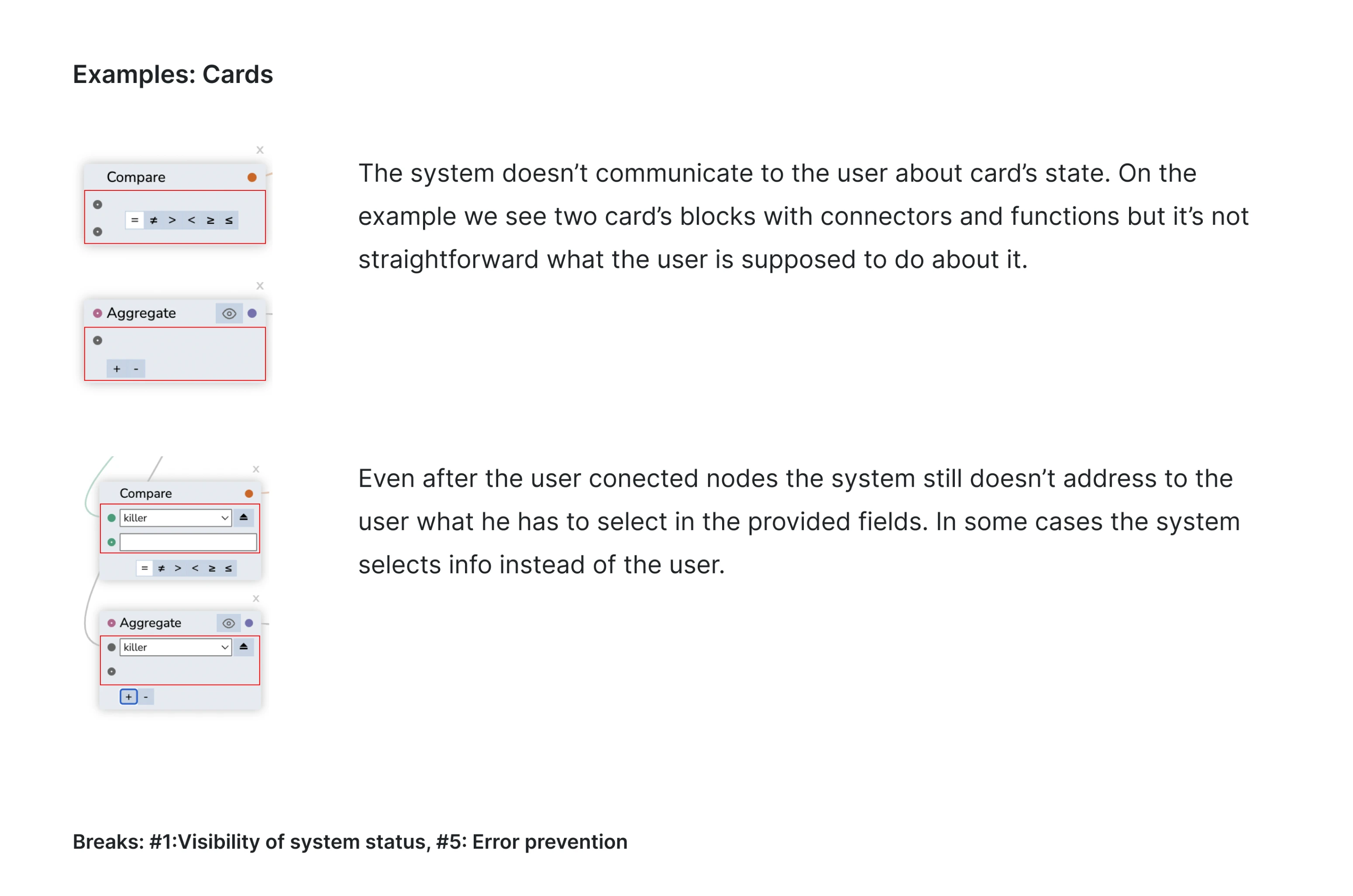
Step 2: Running UX audit
The next move is to uncover user experience problems by research and analysis using Jakob Nielsen’s ten usability heuristics. Below, you can see several cards investigated together with comments on problems detected.
Step 3: Wireframing
To recreate the app’s screens and user flows using design best practices, our designers started with raw wireframes. They helped to outline the arrangement of the elements on the future interface.

Later, raw sketches turned into high-fidelity wireframes — a series of thought-through screens that illustrate each element and the connections between them. After the designs got approved by the Datawisp team, we proceeded to the visual direction.


Step 4: Doing visual design
We brought together every element on the user interface – colors, shapes, layout – to create an intuitive user experience. This was the step when the product got its final polished look.
Now let us zoom in to go through some details of the final result.
Cards
Cards are one of the key interface elements for Datawisp, so we worked a lot to make them appealing and functional. Below, you can see the before and after for one of the cards.

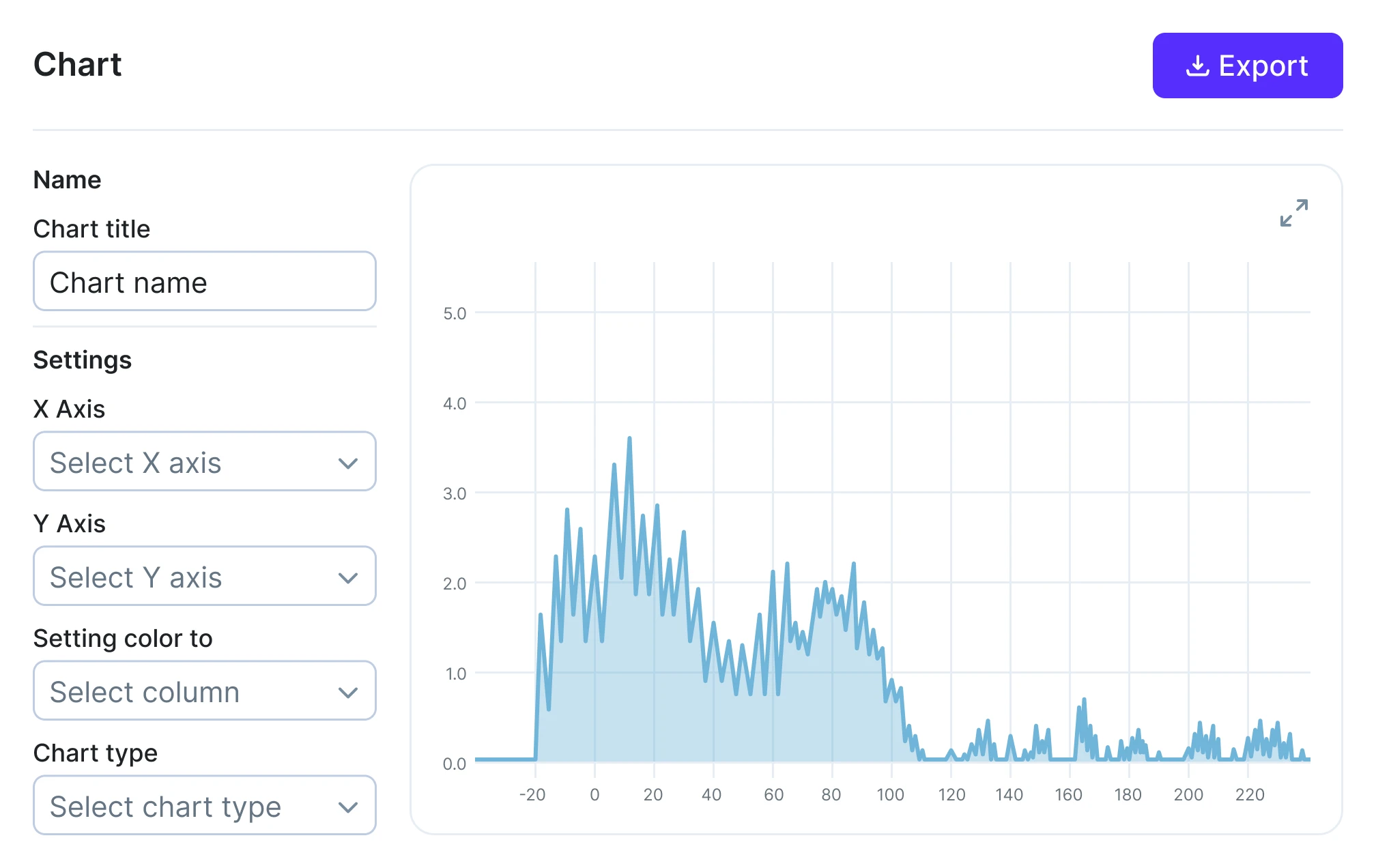
Charts
If your killer feature turns data into visuals, you can’t afford those visuals to look unconvincing.
The way Datawisp represents information now lives up to the innovative idea and disruptive technology behind this feature.


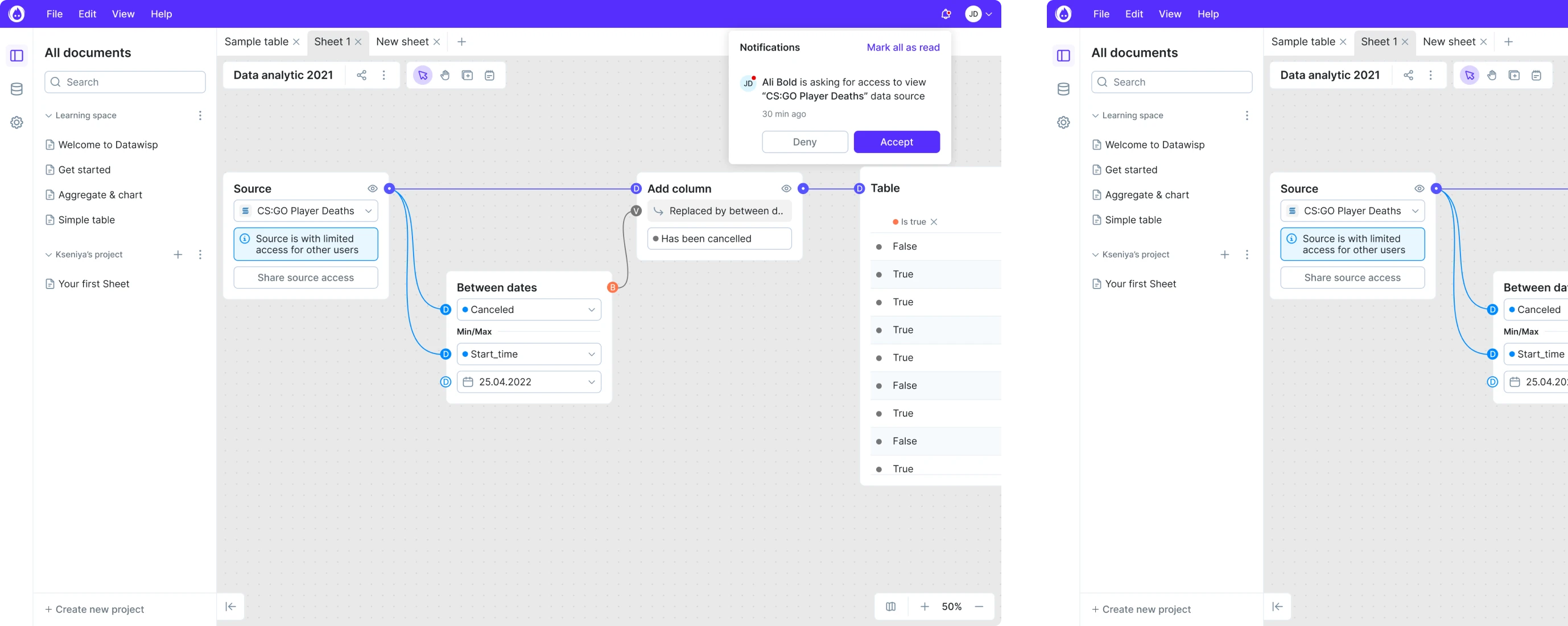
Final results
The redesign process was successful, and now, Datawisp looks fresh and bold.
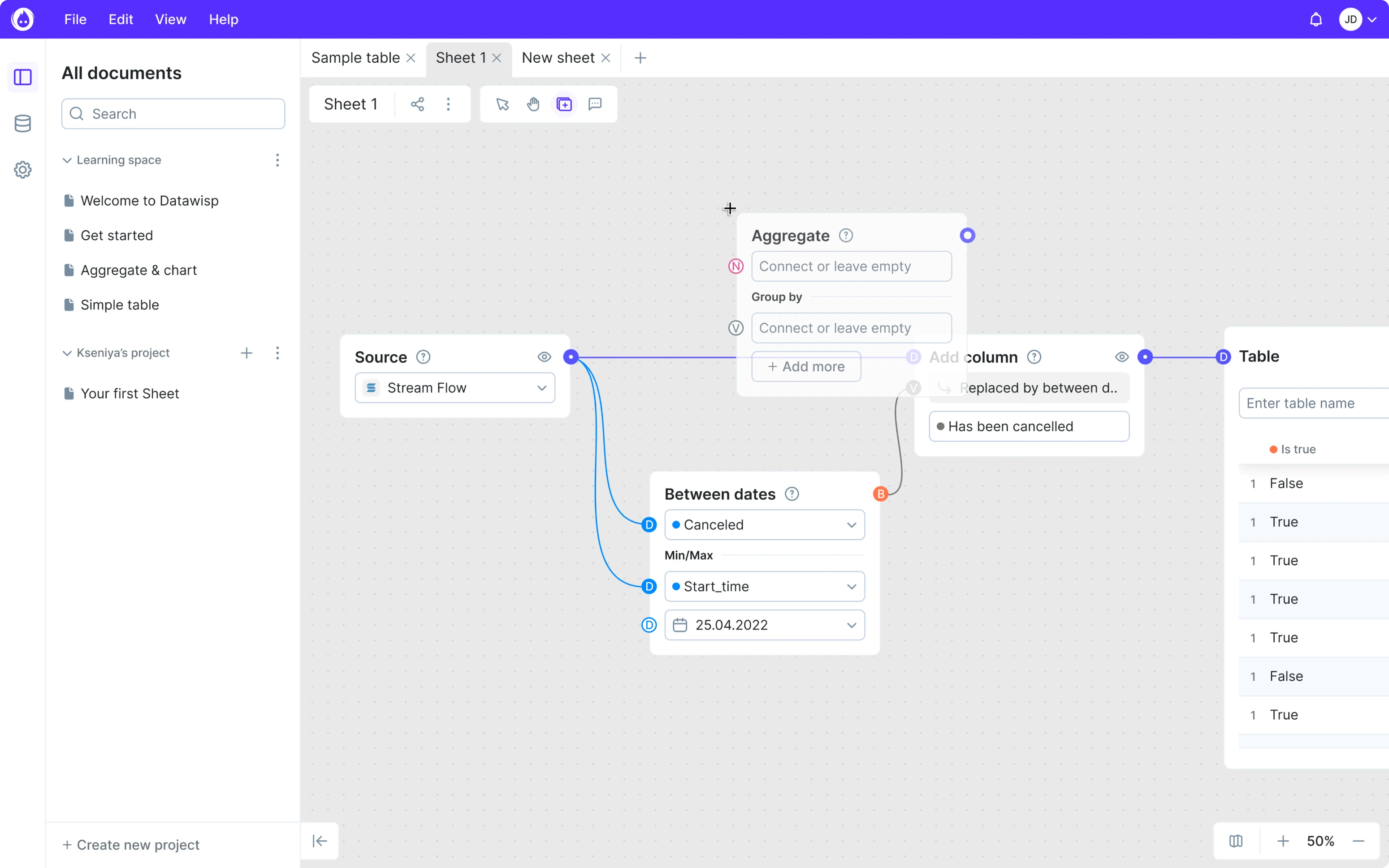
Here are some app’s screens as they are now.


Step 5: Design system for consistency
Products that focus on the technical side rather than on users often suffer from design inconsistencies. So after revamping the app's visual style, we also provided a base for the consistent UI as Datawisp will acquire new features. In other words, we created a design system.
The design system not only defined brand colors, icons and fonts, but also explained the logic behind navigation, cards, filters, and more.

We managed to fix the overcomplicated UI/UX and helped Datawisp to get funding
Thanks to the redesign done by our team, Datawisp received rave reviews from both users and investors. As a result, the team closed a $3.6M seed round.
User feedback of our software has changed from "this looks complicated" to "this looks easy", and our software progressed from a prototype, to actual, real, usable software.
What’s next?
This redesign story proved to the Datawisp team that UI/UX plays a crucial role in startups’ success. So as soon as they received funding, they returned to Eleken to continue our cooperation.
Even a successful finished product has room for improvement because design is a process, not an event. So now, we are running user tests for Datawisp and plan some changes according to the results.
But that’s another story.