QU3ST
Redesigning a web3 gaming analytics platform to stand out from the competition
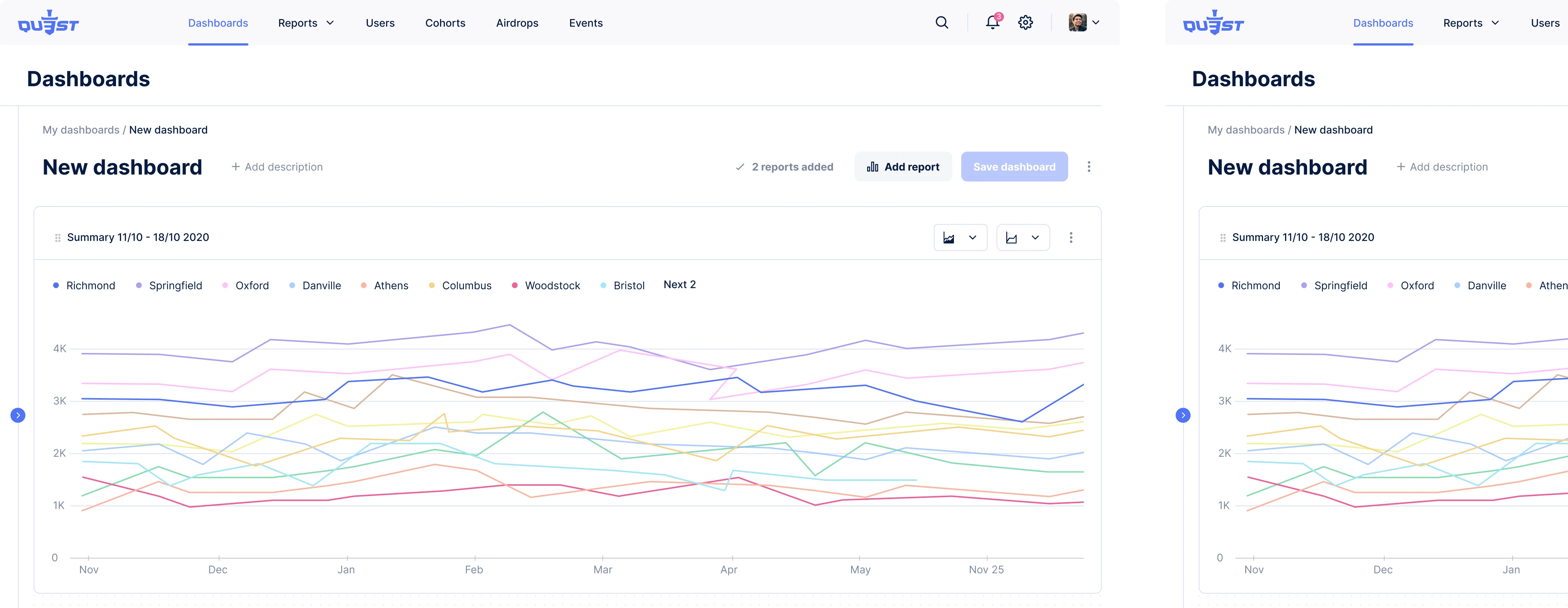
Like many startups, QU3ST began without a designer, using Material Design templates to quickly test their front-end. Templates worked well for validating ideas, but once the team started preparing their MVP for the market, the limitations became obvious.
The product looked generic, and the UI couldn’t support the kind of rich data visualization an analytics dashboard demands.
That’s when the QU3ST team realized they needed a professional designer who could turn complex datasets into clear insights and help the product stand out in the competitive Web3 gaming space.
So, they were looking for a designer who could suggest creative solutions to make large datasets comprehensible and create a modern visual style that reflected their brand. Eleken was a perfect match.


The new design system adds a touch of gaming vibe
At the start of our collaboration, we found that while the QU3ST team had done thorough competitor research, they hadn’t yet explored how their product should look and feel. That gave us the opportunity to make key visual design discoveries together.
During a free 3-day trial, our designer presented several different versions of visual styles: light, dark, and neon, allowing the QU3ST team to choose the direction that best fit their product and brand.

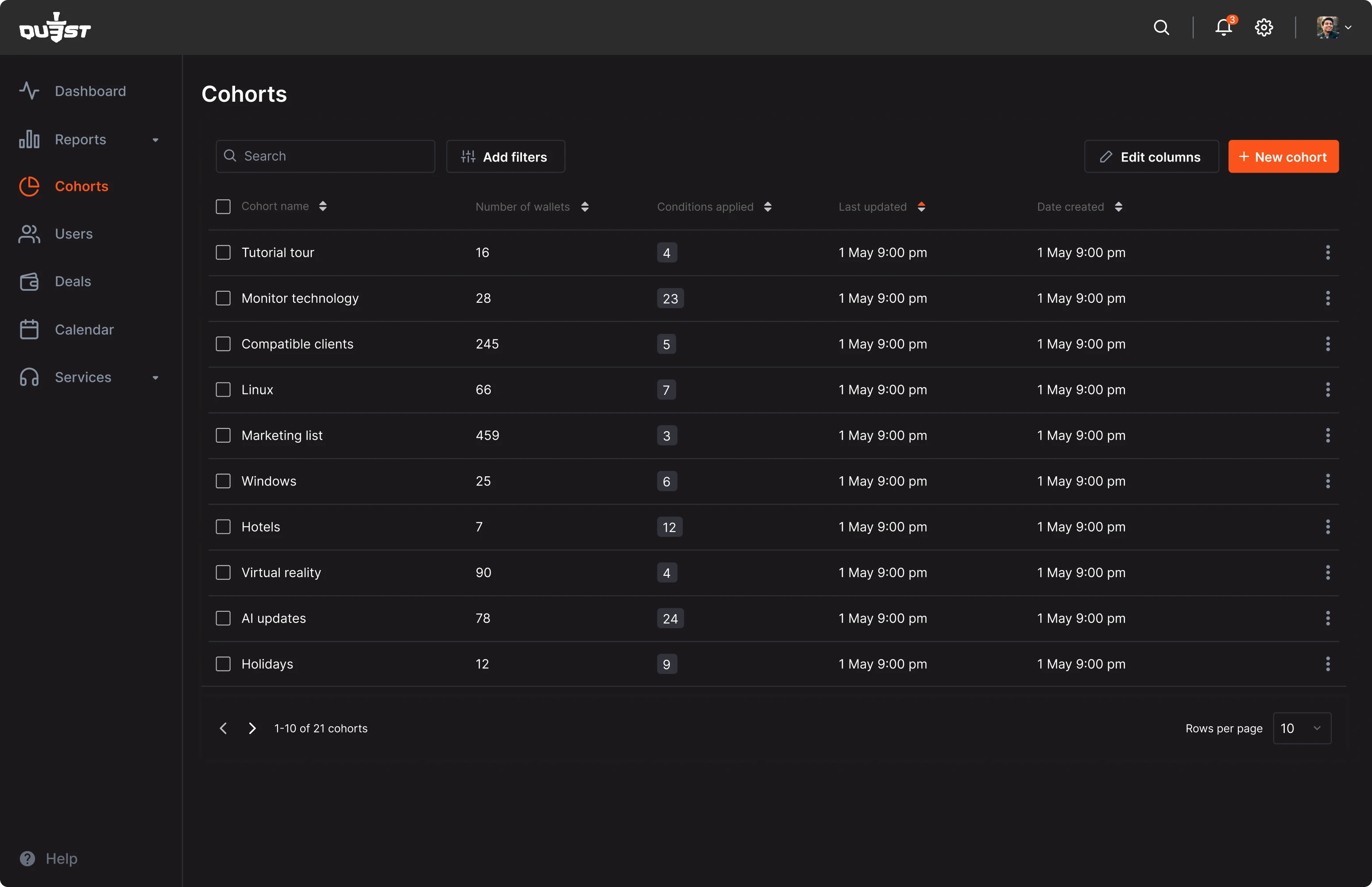
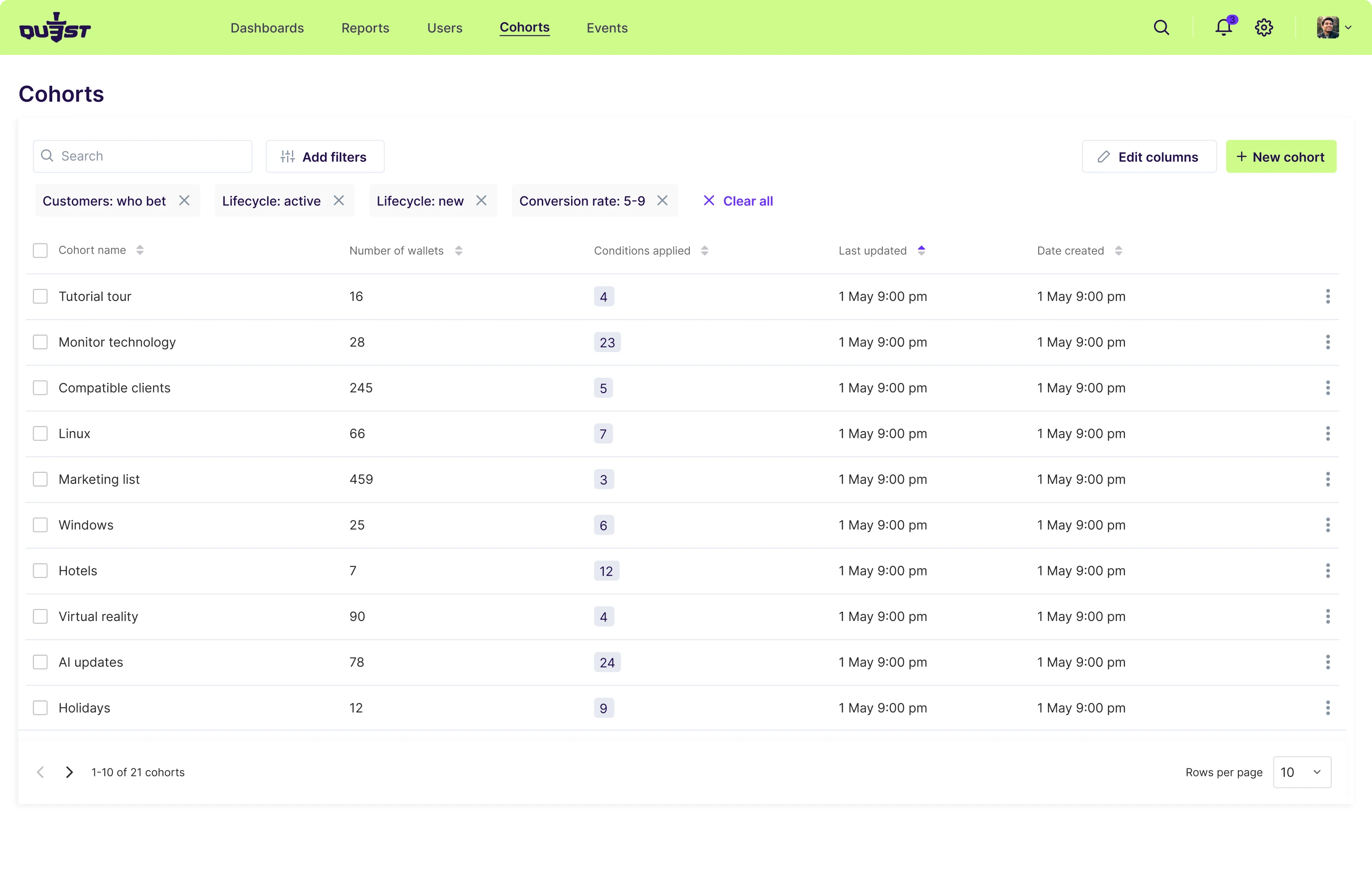
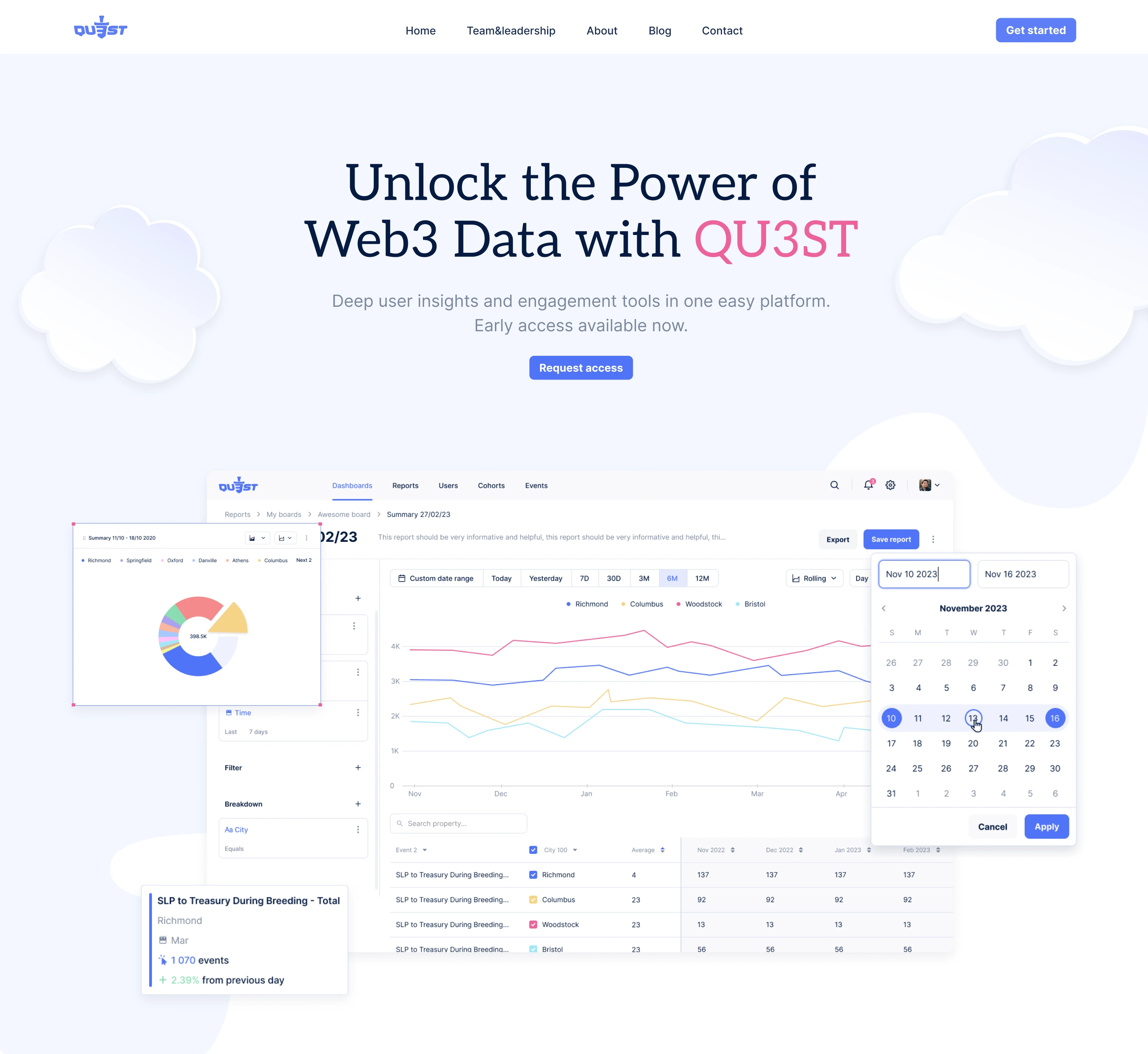
The QU3ST team chose the light one with the bright blue color. Compared to other products in the world of gaming and web3, it looks pretty classic and thus stands out. Skeuomorphic illustrations add a touch of gaming vibe to the neutral design.

Clouds became core to QU3ST’s brand
A website is balancing between being too formal (as an analytics product) and too informal (as a product operating in web3 and gaming). Its main element is clouds, referring to the product's intrinsic nature as a cloud-based solution. In the context of web3 technology, which operates on decentralized and interconnected networks, the imagery of clouds reflects the seamless, borderless, and dynamic environment in which the product works. The client suggested using clouds as the main visual elements on the website, and our designer brought this vision to life.
These subtle design cues don’t need to be explicitly explained to every visitor, but they help tie the entire experience together, reinforcing the product’s identity in a meaningful way.
Design in sync with development realities
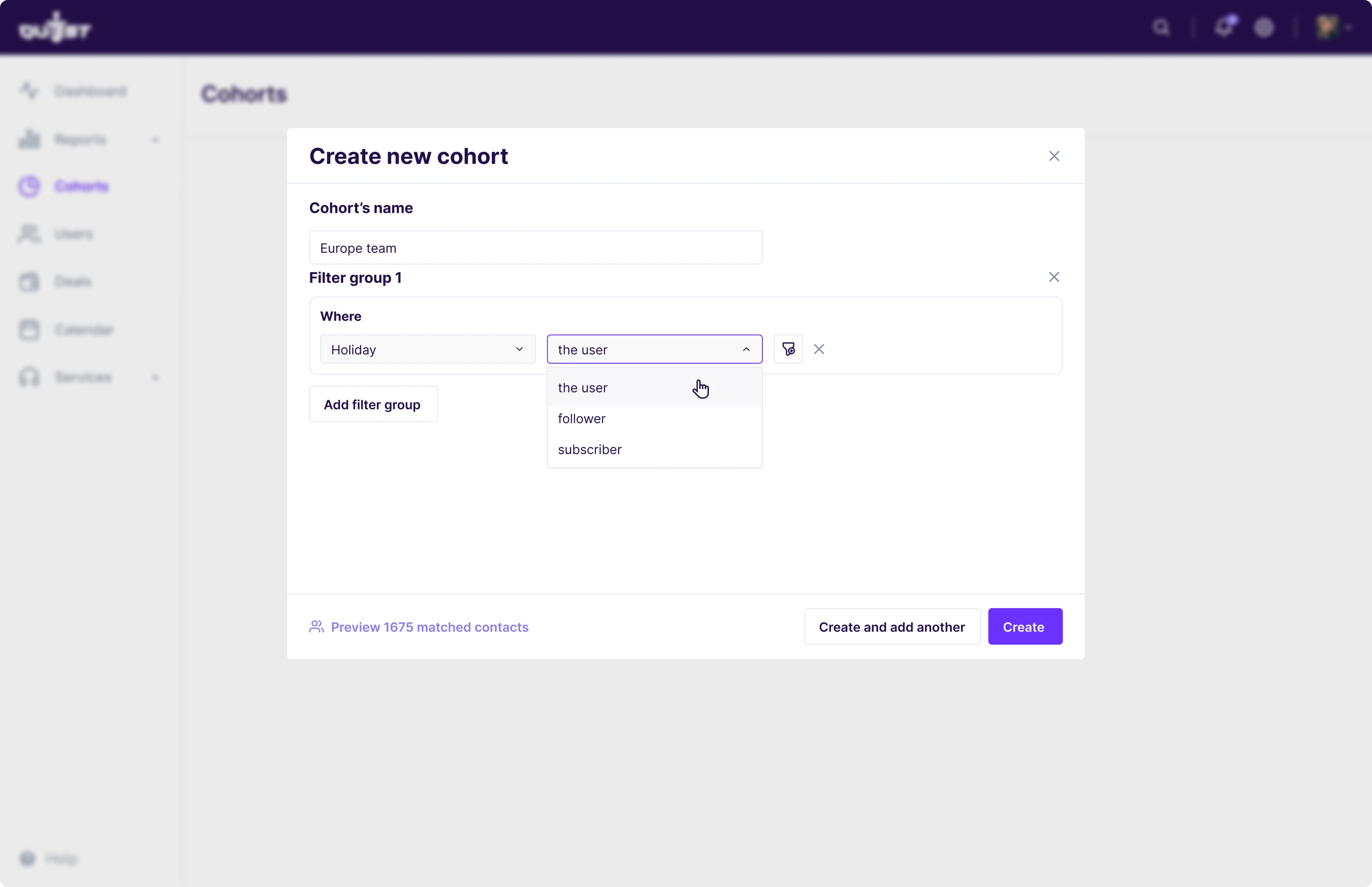
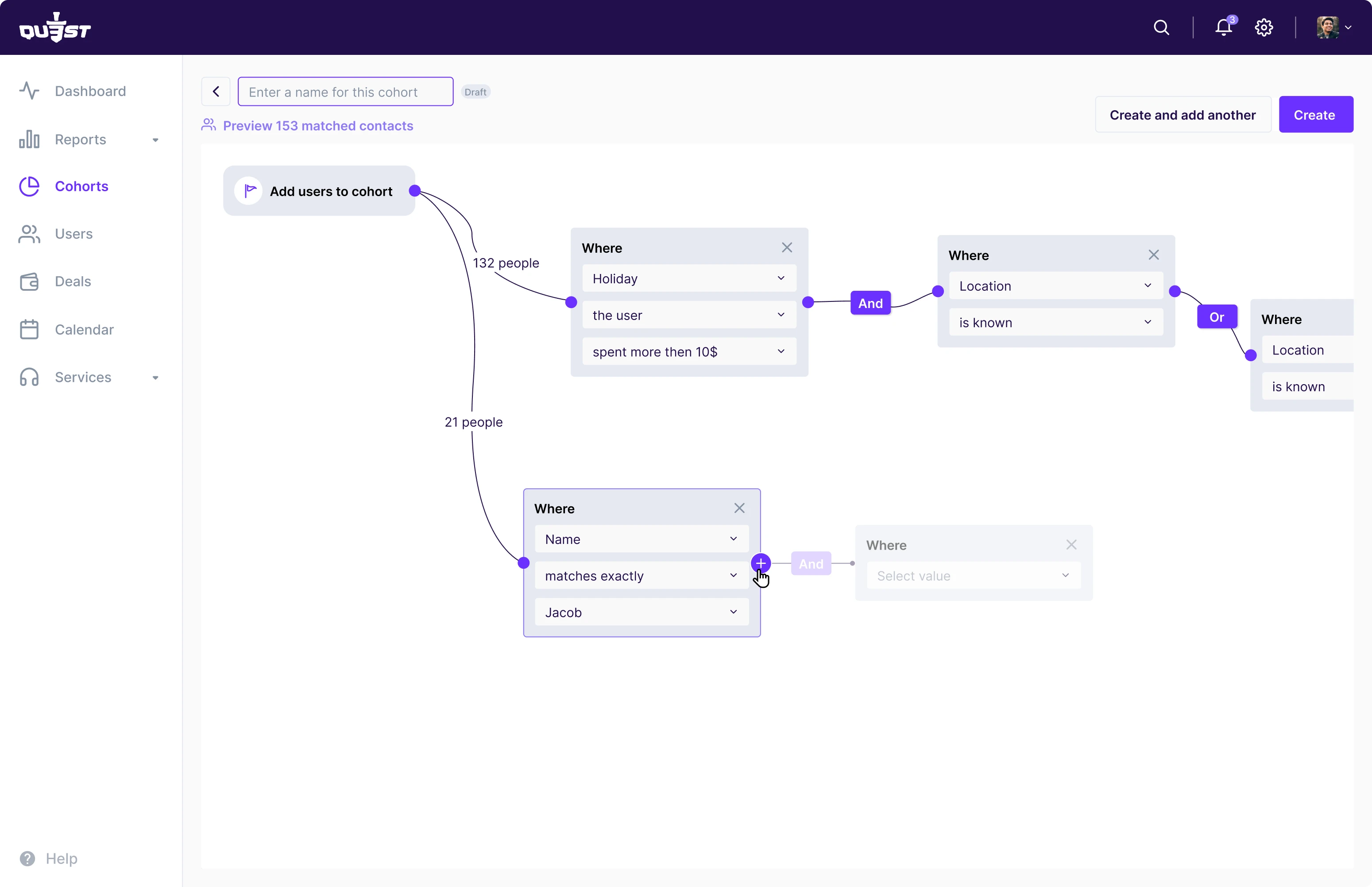
Design choices are not just a question of taste or style. Often design can impact development, too. When working on the “cohorts” page, our designer presented two visualization options: a creative bubble-based layout and a more traditional table format. While the team initially preferred the bubble version, they ultimately chose the classic one because it was quicker and easier to implement with their current resources.
Expanding the palette with a new accent color
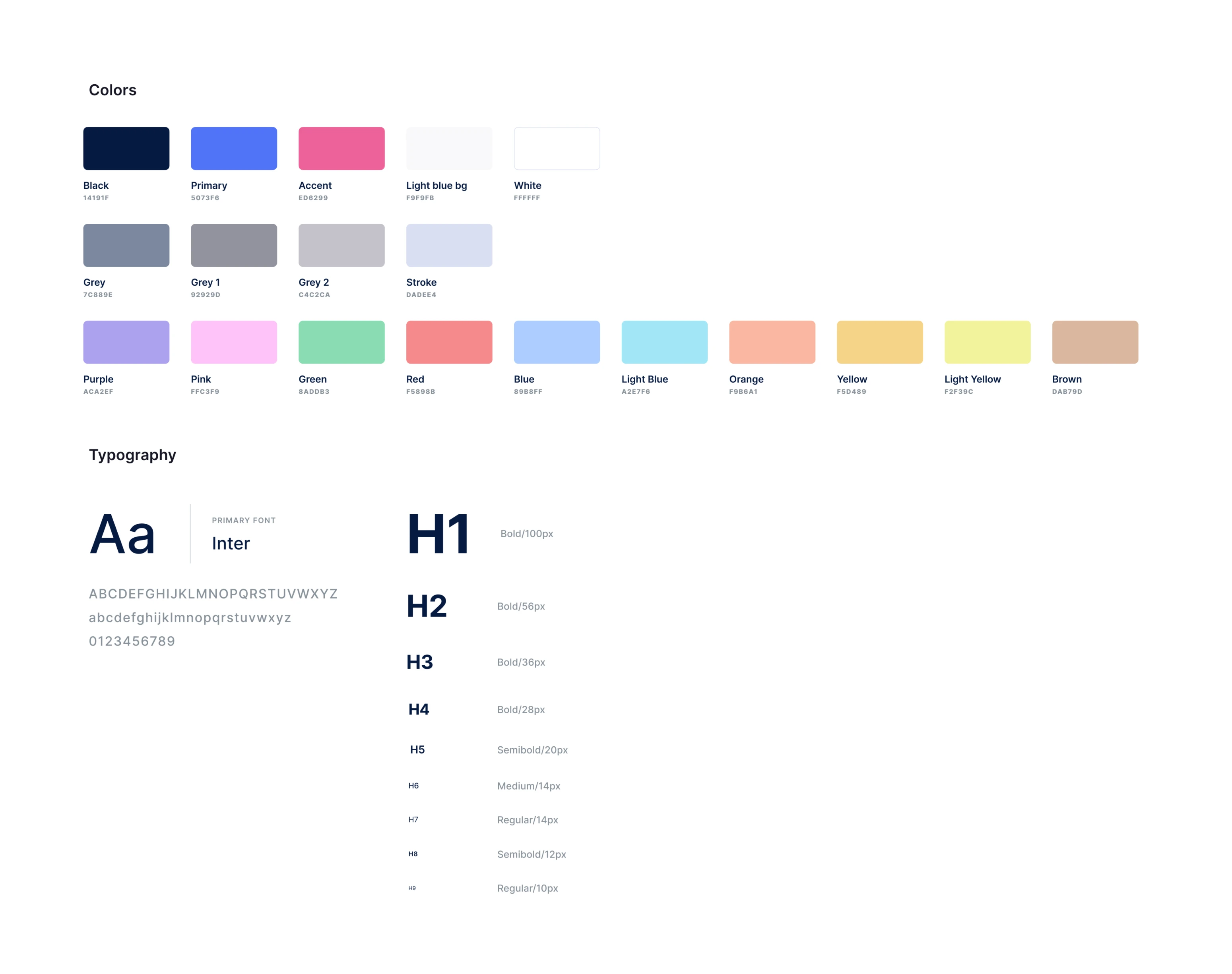
At some point, the client team decided to add one more accent color — pink — as they wanted to introduce a pig as a mascot for their product. Our designer found the right shade to harmonize with the existing palette.
Design Support That Goes Beyond the Product
QU3ST came to us with basic wireframes to illustrate their vision for the layout. From there, we refined and expanded the design.
Beyond the product itself, our designer also created a landing page and helped polish the client's presentation. These small touchpoints help maintain a consistent, professional brand across every surface.
QU3ST is a market-ready product aligned with its brand and mission
Over five months of close collaboration, we helped QU3ST build a design system that truly reflects both their brand and the nature of their product. The result struck the right balance: visually distinctive, yet simple and practical enough for seamless implementation.
In a space full of flashy visuals and gimmicks, QU3ST stands out by being clear, classic, and user-first, just what a data-driven analytics product should be.
Still relying on Material Design for your MVP? Let’s talk about how to turn your product into something users love, not just something that works.
