UI/UX Design for Geospatial & GIS Products
Over the years, we’ve designed more than a dozen geospatial and map-heavy SaaS products — from GIS, platforms and remote sensing tools to AI-powered satellite analytics. We understand layers, basemaps, spatial workflows, and complex map interactions — so your team doesn’t have to explain the basics or wait while designers learn on your time

Common GIS UI patterns we design
Our GIS UI design services focus on proven patterns that help teams build clear, usable, and scalable geospatial products.
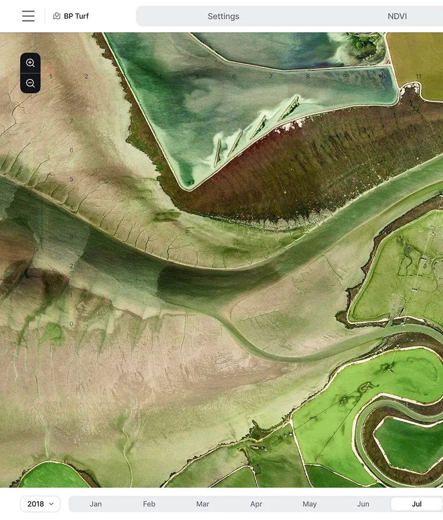
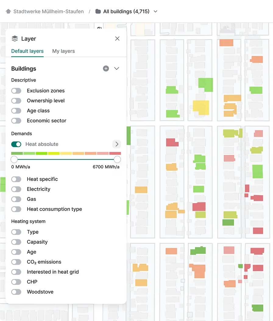
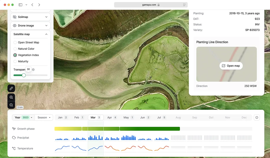
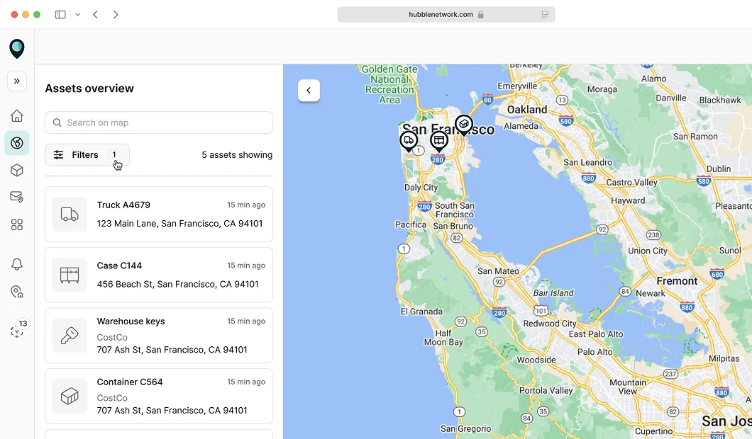
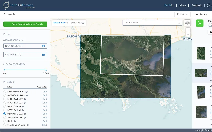
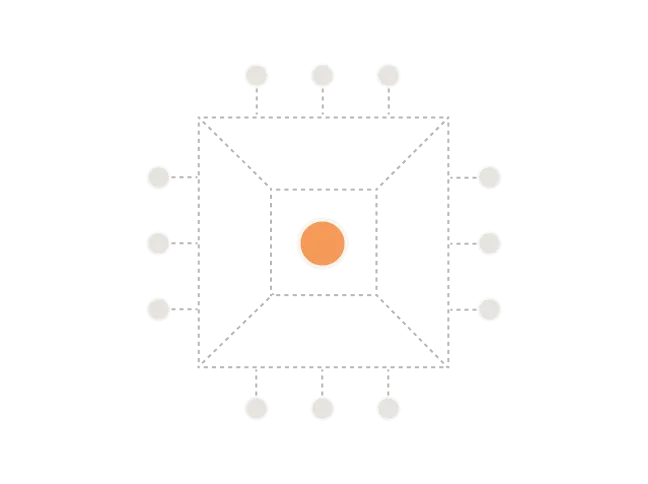
Layers panel
A layers panel lets users control what data is visible on the map and quickly understand how different datasets relate to each other. In complex GIS products, we design layers with clear visual differentiation, using color, opacity, and grouping, so overlapping data stays readable.
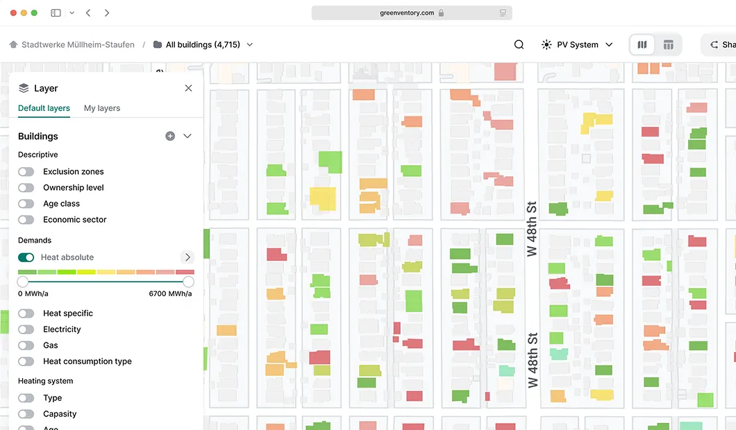
Legend
Legends translate visual cues on the map into meaningful information.We make sure legends explain map data at a glance, helping users instantly understand intensity, statuses, and distribution.
Time slider
Time sliders allow users to explore how spatial data changes over days, seasons, or years without leaving the map context.Our job is to design temporal controls that stay visually connected to the data, making trends, anomalies, and correlations easy to spot as users move through time.
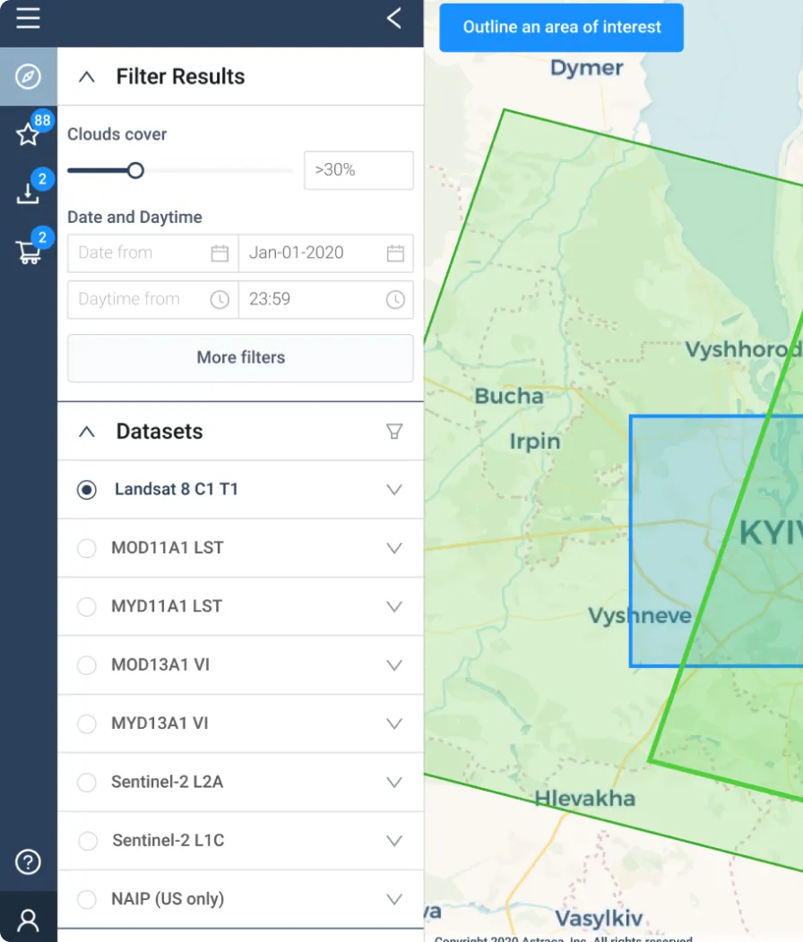
Search/geocoding
Search and geocoding help users quickly locate places and jump straight to the relevant area on the map.Search experiences we design connect location results with contextual map views, so users can instantly explore objects, review attributes, and take action without manual map navigation.
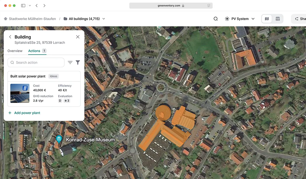
Popovers/tooltips
Popovers and tooltips reveal key details without pulling users away from the map or breaking their flow.Our approach focuses on showing only the information users need, right where they need it, so they can inspect objects without losing their place.
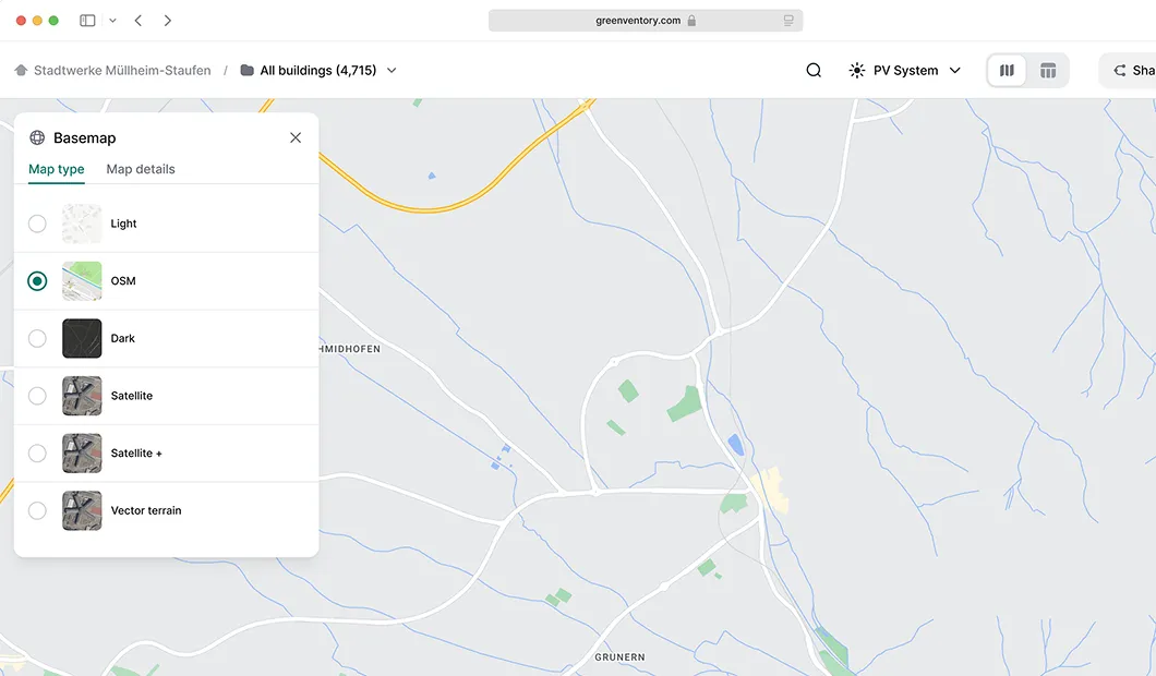
Basemap switcher
Different mapping tasks require different visual contexts, from high-contrast views to detailed geographic imagery.As product designers, we let users quickly adjust map context — switching between light, dark, satellite, or terrain views to match their task and data type.
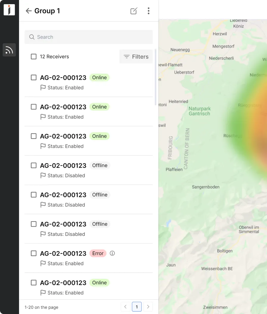
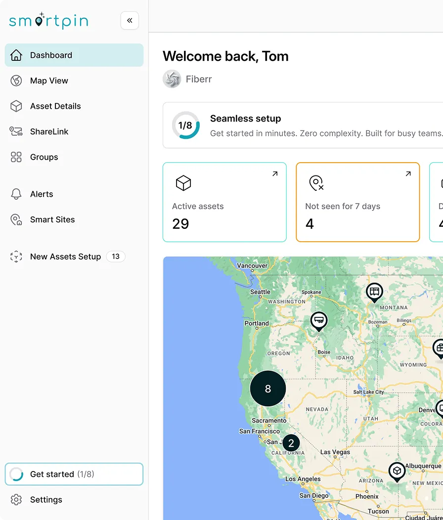
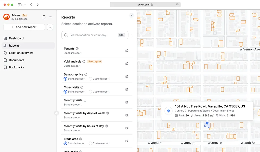
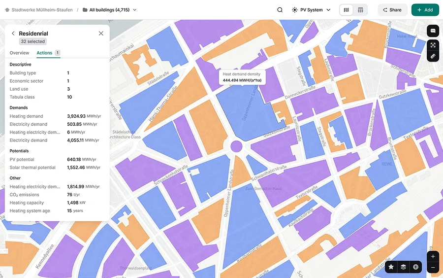
Data table map sync
Maps alone don’t scale well when users need to manage many items at once.We know how to make linked tables that give users a fast way to scan, filter, and act on data while keeping spatial context intact.
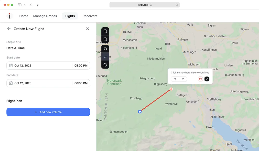
Measure and draw tools
Measure and draw tools support spatial tasks like building routes, defining areas, and checking constraints directly on the map.We design these interactions to give immediate visual feedback, highlighting restricted zones, blocked paths, and conflicts in real time, so users can adjust routes and make decisions without trial and error.
Domains we support as a geospatialUI/UX agency
We work across industries where spatial data, maps, and analytics are central to decision-making.
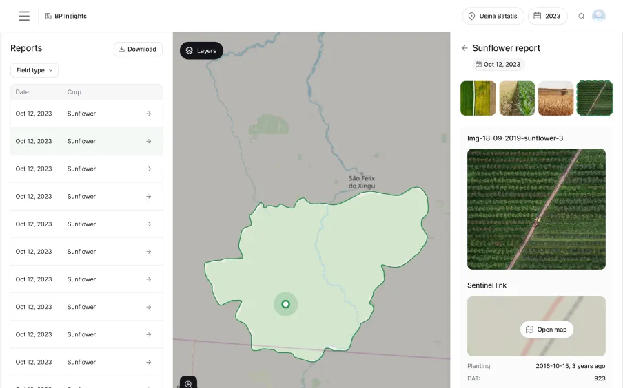
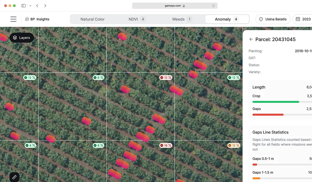
Agritech and precision agriculture
Designing map-based tools that help farmers and agronomists monitor crops, analyze fields, and act on satellite and drone data.
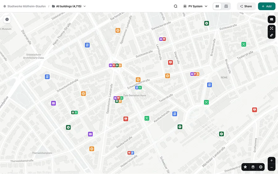
Energy, utilities and infrastructure planning
Creating geospatial user interfaces for planning, modeling, and managing energy assets and large-scale infrastructure.
Remote sensing and earth observation
Turning complex satellite imagery UI design and analytical outputs into understandable, decision-ready visualizations.
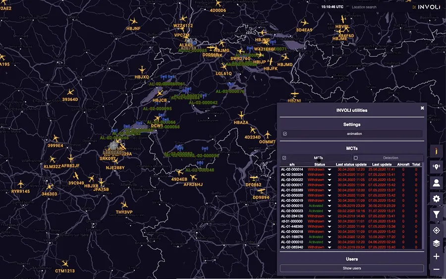
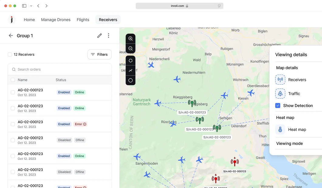
Drone and airspace management
Designing map interactions for flight planning, monitoring, and managing airspace constraints in real time.
Smart cities and urban analytics
Building city-scale dashboards that support urban planning, sustainability, and infrastructure decisions.
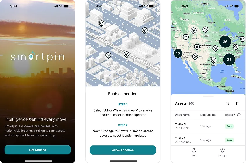
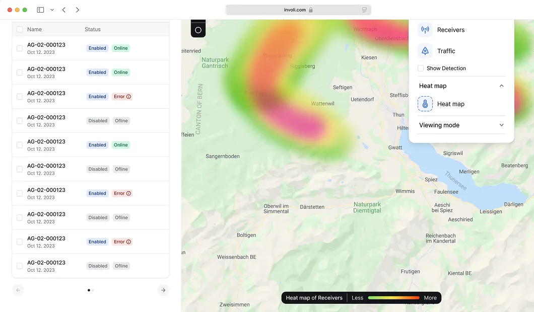
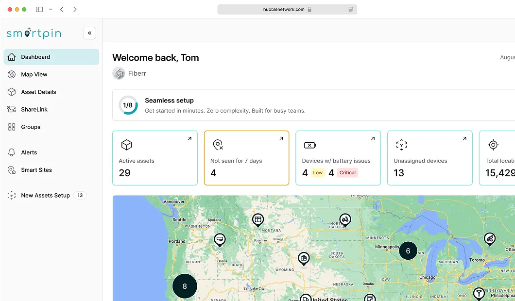
IoT and geospatial network monitoring
Designing location-aware dashboards to monitor distributed devices, networks, and system health.
Map interaction design for technical and non-technical users
To help geospatial data companies design interfaces that enable mapping, analysis, visualization, and decision-making for users with different levels of expertise, we follow these principles:

Geospatial dashboard design
Location intelligence dashboards, operational monitoring dashboard, remote sensing dashboard UX and more – we design geospatial dashboards that combine maps, metrics, and filters into clear analytical views.
Here are principles that guide how we make complex spatial data easy to explore and act on.
 Map + KPIs work together
Spatial data is always paired with key metrics for quick understanding of the situation.
- Context never gets lost
Navigation between dashboard and map preserves spatial and analytical context.
- Easy to zoom from big picture to details
Users can start with an overview and drill down without losing clarity.
- Filters turn data into answers
They allow narrowing the view and focus on exactly what users need.
- System states are instantly clear
System states are communicated through consistent visual signals, which reduce the need to inspect each item individually.
- Relationships are easy to trace
It’s clear how entities relate and affect one another.


Explore related expertise
AI-based solutions
Incorporate our seasoned AI product designers into your team.
Developer-focused tools
Opt for Eleken for intuitive, developer-first designs.
What businesses say about working with us
“So many consulting companies claim they provide fantastic customer support but often find out after the contract is signed that this isn’t the case. This is not the situation with Eleken. Their engineer and project manager have been easy to get a hold of and have been in constant contact with our team throughout the project.”
"The UI prototypes by Eleken have been a significant help in gathering internal and external customer feedback. The team has stayed on track by effectively utilizing communication tools for daily interaction. They have also provided valuable suggestions for the company's further improvement.
"The designs met the requirements and expectations of the internal team. Eleken responds quickly to inquiries and is willing to adapt where necessary. The team is hard-working and collaborative, facilitating a smooth workflow."
"The workflow with the Eleken team is seamless. They work as an embedded member of our team. It is unusual to find a designer who has experience building applications with geospatial data - especially imagery data. We found that in Eleken."
Discover Eleken’s SaaS design in 3 free days
Our process is transparent — you’ll work directly with our in-house SaaS design experts.
Select a flow or feature to test.
Get one of your design challenges solved.
Evaluate how we collaborate.
Scale the project only if satisfied.
Pick a small part of your existing product.


.webp)
FAQ on our geospatial UI/UX design services
- Interactive maps and dashboards
- Location-based analytics platforms
- GIS (Geographic Information Systems) tools
- Satellite imagery and spatial data visualizations