Greenventory
Design for green energy planning: how we defined Greenventory’s innovative app
Greenventory is a young energy startup based in Germany. With a goal to help people move to zero-carbon energy as mandated by the German government, the company wanted to create a solution for calculating necessary energy resource placement and generate reports with the press of just one button.
The company founders created a technical sketch, but didn't have the right design expertise to implement it. So they needed a full-time designer with expert knowledge, who will be ready to not only design the product but offer their own insights.

So, Greenventory was looking to hire a UX designer, who:
- Had experience of designing data-driven maps;
- Is capable of making independent design decisions;
- Can offer their own insights and be proactive.
Having worked on such projects as Gamaya, Astraea, and other data-driven products, Eleken checked all the boxes. Read on to learn about our cooperation, which has been lasting for more than two years now.
Using Excel spreadsheets and iterative design to shape the product's functionality
The problem with revolutionary products is that there are no references to use when it comes to product design. In the case of Greenventory, our goal was to pave our own road, using the technical sketch available.
First thing first, our designer analyzed products from different domains. In our case, we were looking at solutions that allow working with data-driven maps, but are not geared towards the energy industry specifically, so you have to work with such data manually.
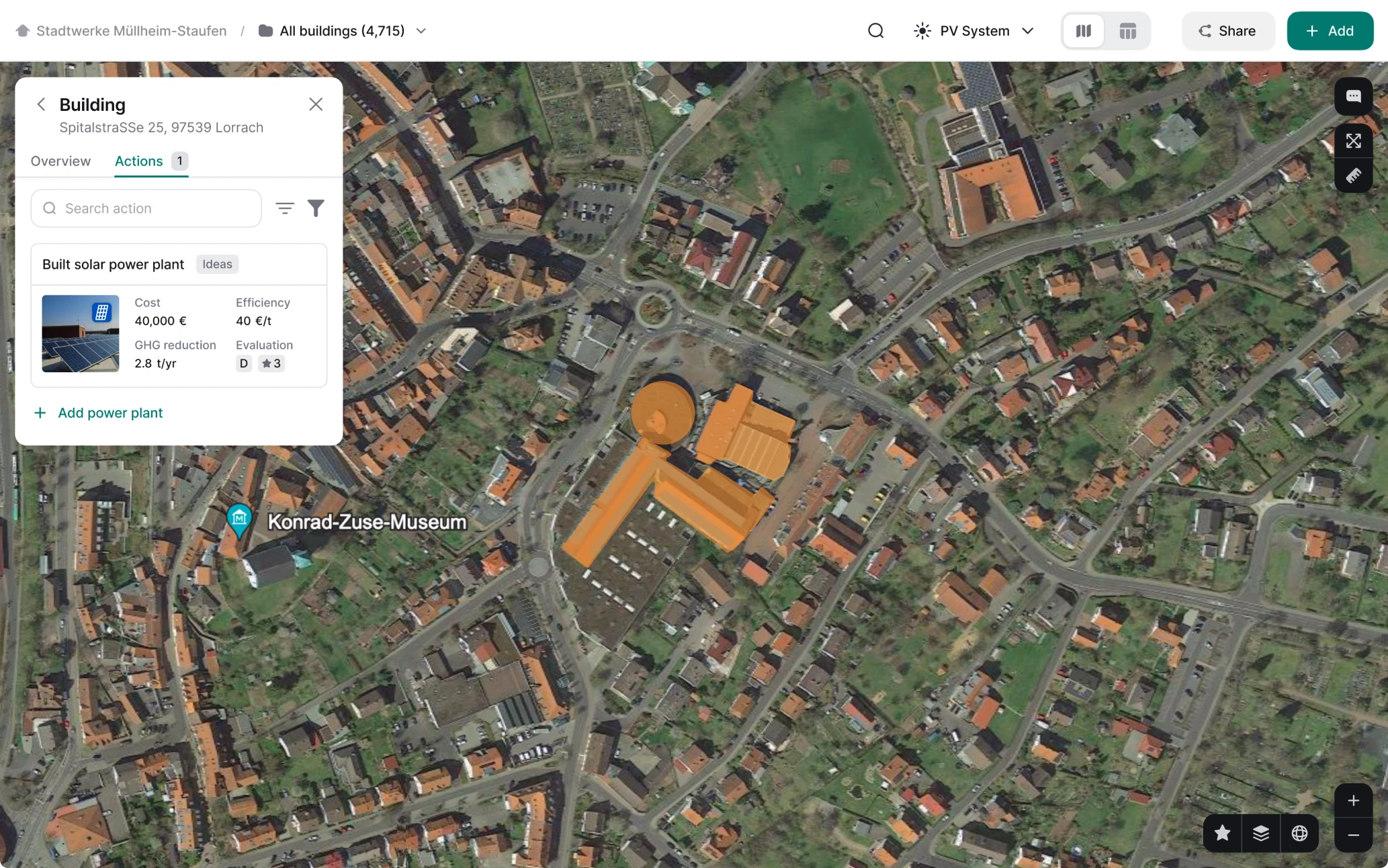
After analyzing competitors' solutions, our designer dived deeper into the specific data that drives Greenventory's functionality. At first, the app only worked with solar panels, and helped users figure out how they would affect energy redistribution for homes, neighborhoods, and cities. Our designer did a lot of work with Excel spreadsheets to understand how different pieces of data were connected.
After our designer got a solid grasp on how this data works, he moved to visualizing it. Instead of manually entering the data to Excel cells, users now could interact with a visual interface: move solar panels onto the roofs and click a button to calculate. Complex calculations became much more user-friendly.
Visualizing layers
The collaboration between the developers and our designer visualizing their vision paid off:
The usability of the platform was greatly enhanced. Through design iterations and user testing, we achieved higher efficiency in user workflows, reduced cognitive load, and improved overall usability scores. This translated into increased productivity for users and reduced training time for new users.
Competitors' analysis and previous experience of working with data-driven maps helped our designer to create the first iteration of the app. But then, Greenventory decided to expand the app functionality and encompass all types of green energy resources. So, we had some work to do as well.
Solid design expertise is crucial for data-driven products
Working with data-driven maps is not something you can approach as a complete rookie. Luckily, with our experience, we can avoid common mistakes, ensuring a smooth UX in geospatial product design. So, here’s what we did for Greenventory app.
Designing around restrictions in external map repositories
External map repositories, like Google Maps or OpenStreetMap, provide the foundation for any data-driven maps. However, they come with certain limitations. For example, they may impose request limits within set timeframes.
Our designer created an interface that stays within these limits but ensures a seamless experience for every user. He also prioritized performance by reducing data requests, optimizing loading speed, and using efficient data visualization techniques.
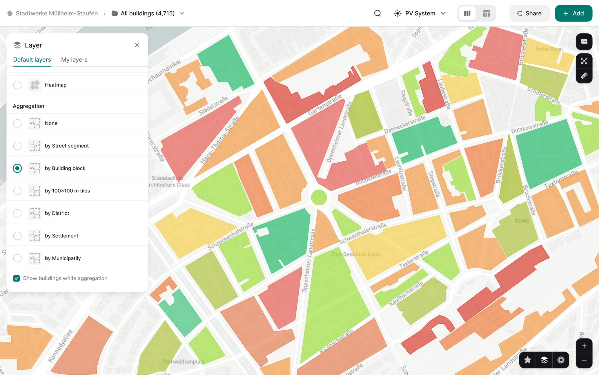
Adjusting the map interface to seamlessly zoom in and out
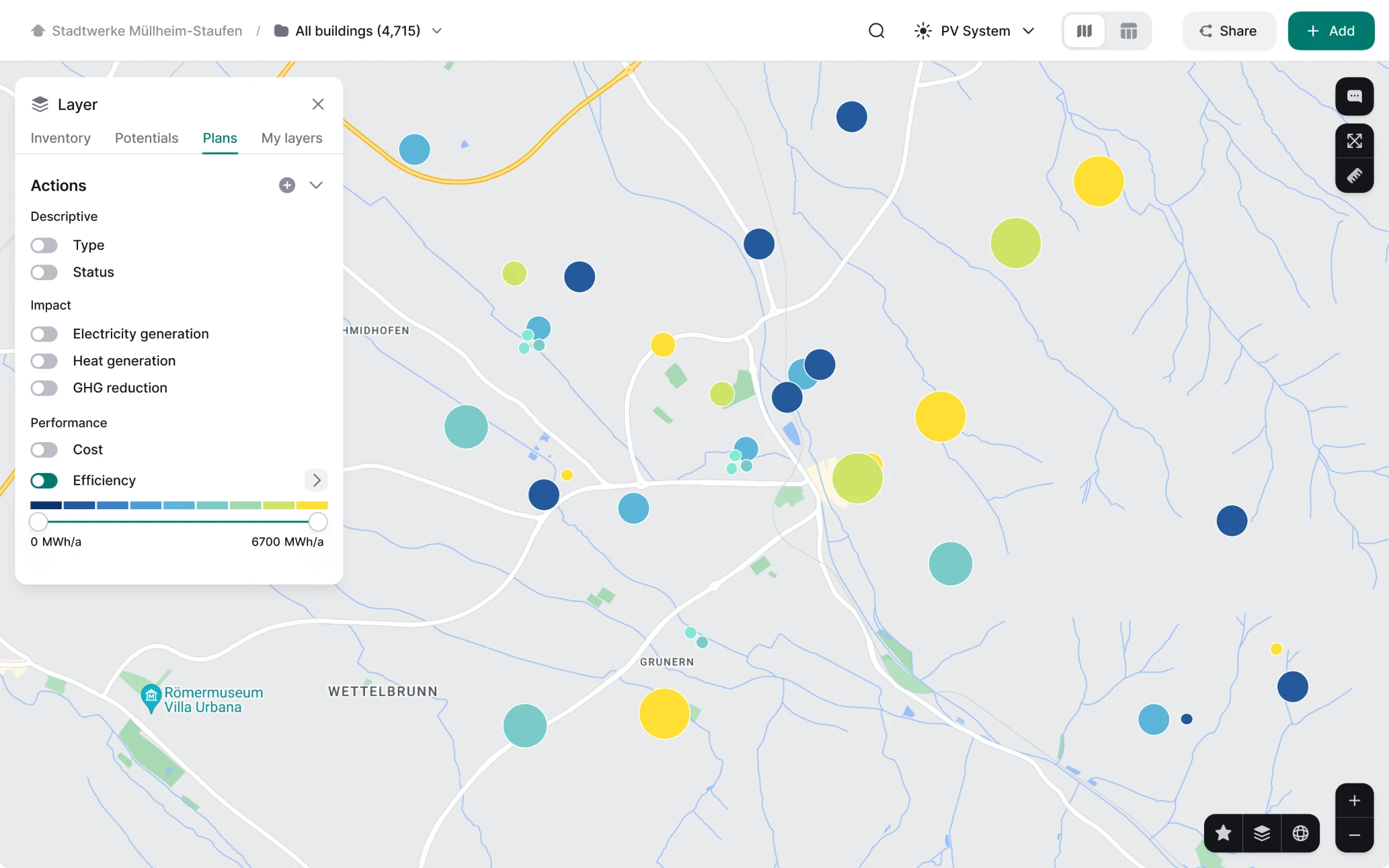
Another vital thing to consider is how the map will react to zooming in and out. Instead of loading all data points at once, our designer implemented a progressive loading mechanism, a subset of data points that load initially, while additional points load as the user zooms in further. Here’s how it works. As users zoom out on a map, the level of detail required decreases. Objects that were individually displayed at higher zoom levels are grouped together into clusters at lower zoom levels.
This approach ensures that only the most relevant data is loaded at each zoom level, preventing unnecessary data overload and increasing the loading speed.
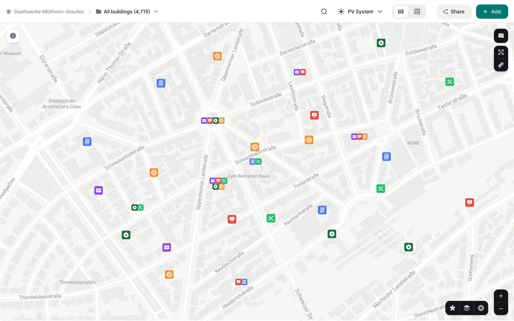
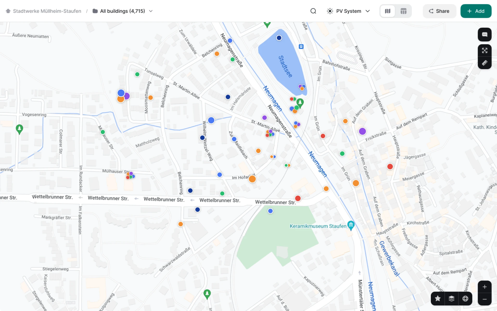
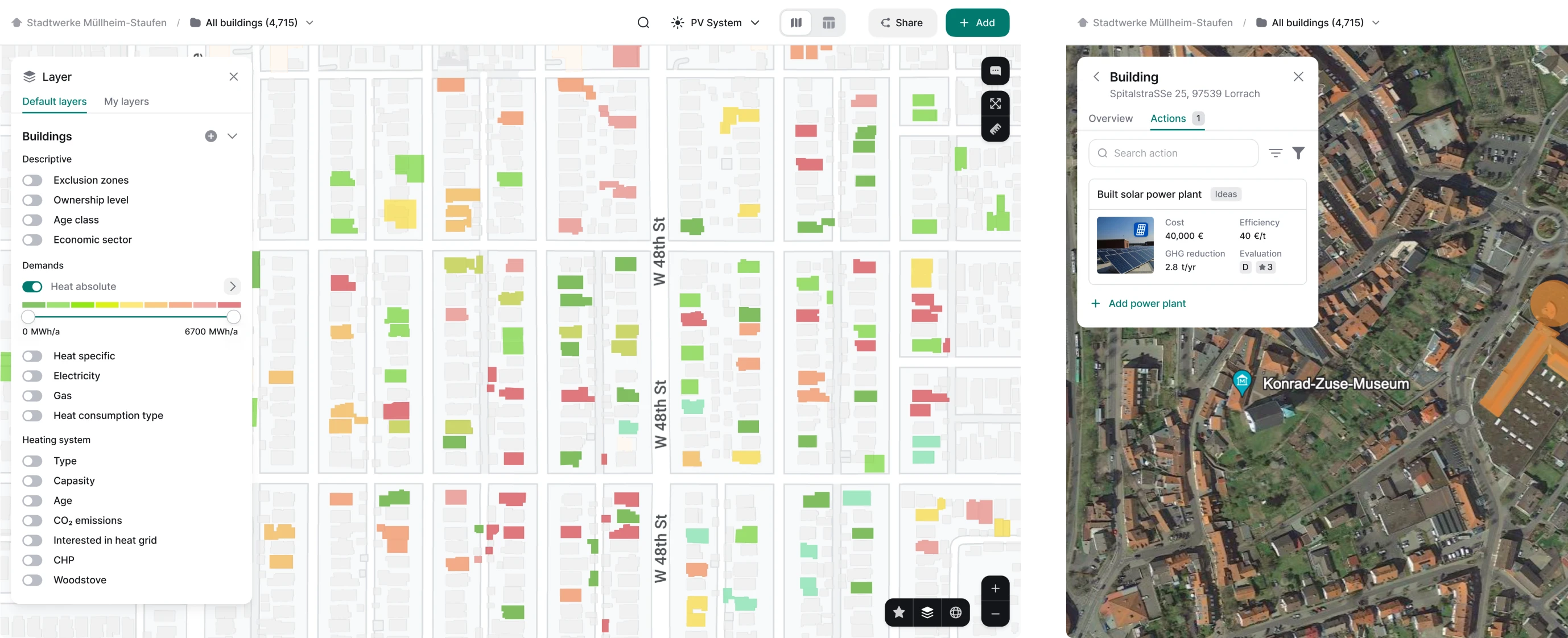
Visualizing layers and objects distinctively
For data-driven maps, having each layer visually distinct from others is crucial for users to easily get what types of info is presented. With Greenventory, we achieved this by using different colors, line styles, and patterns. For example, for displaying solar panel installations and wind turbine locations, we used one distinct color for solar panels and another for wind turbines. This clear visual distinction helps users immediately recognize the different types of data they are viewing.
Distinctive color-coded legend also helps to differentiate this information, while also simplifies user navigation.
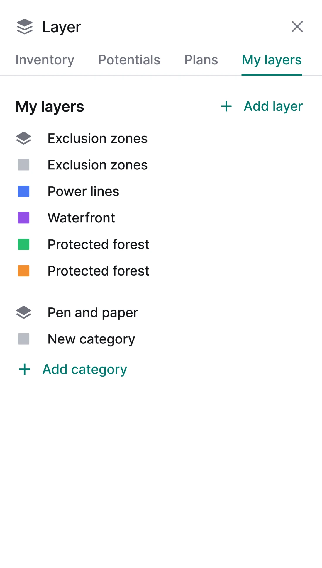
It's also important to make sure that users can switch between different layers, as well as turn them on and off. Our designer ensured that it's immediately clear which layers are turned on through the toggle buttons on the right.
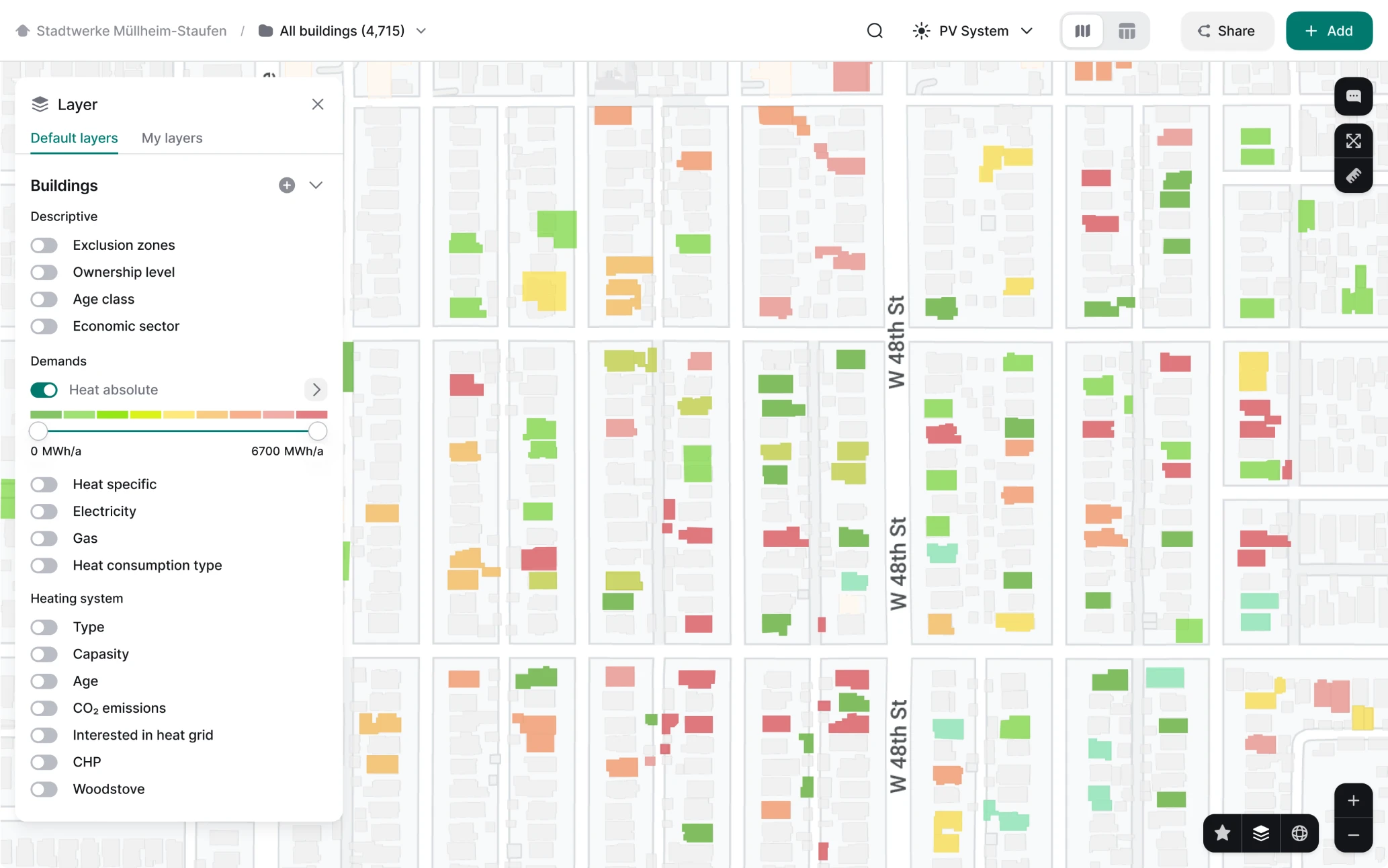
When multiple layers overlap, our designer used different opacity and transparency settings to ensure all of them are still visible and distinctive.
Choosing the colors strategically
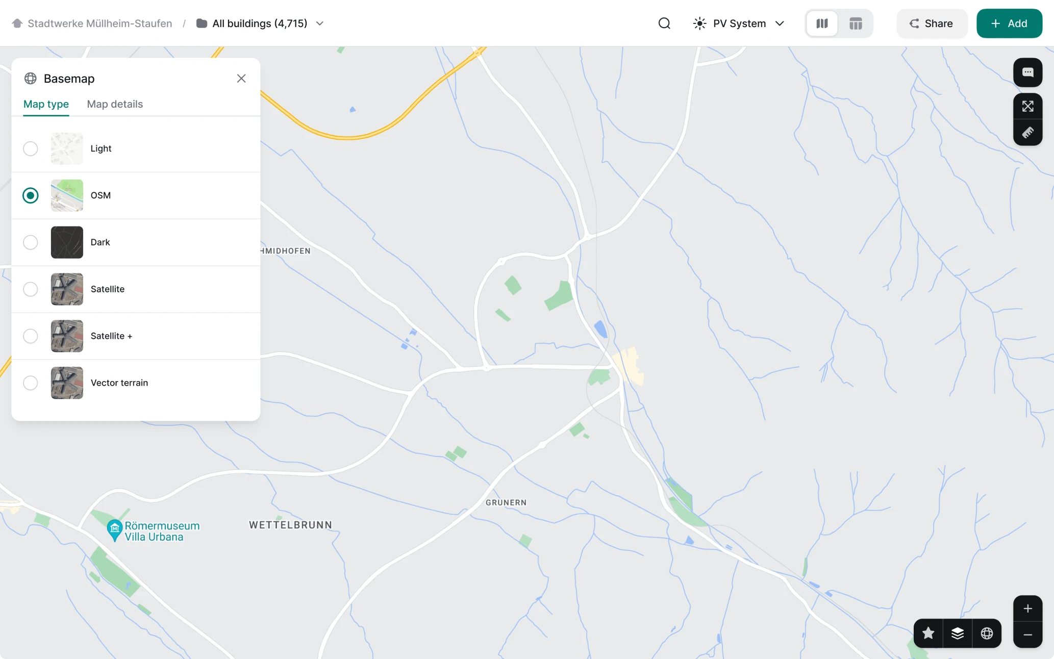
Finally, choosing the right colors is a skill on its own. First of all, the colors should let users easily recognize what they’re looking at, be it a solar or a wind turbine, a forest or a municipal building. Colors should also have sufficient contrast to stand against each other and background, but not be too bright to avoid overloading the user visually and mentally.
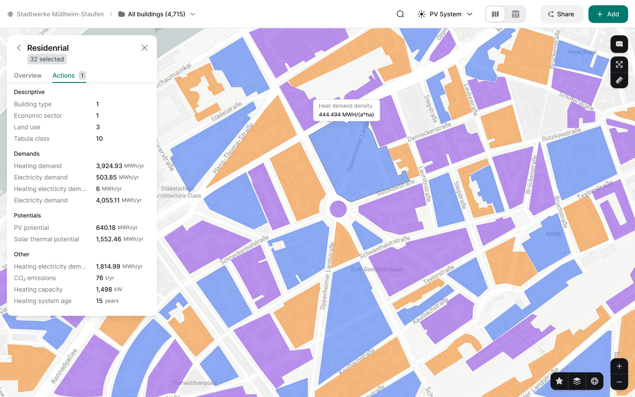
Second, all colors should work with every mode or type of the base map: light and dark, flat and satellite. Each mode presents unique challenges, and colors that work well in one mode might not be as effective in another. For instance, a color that stands out well against a light background might not be as clear on a dark background. Our designer carefully tested his choices to ensure the colors work in each and every case.
Our design helped Greenventory scale the app safely while remaining easy to use
From a technical sketch with only solar panel placement options, Greenventory turned into a complex solution that is still developing, covers all types of green energy assets, and can generate hundreds of pages-long reports to guide decision-makers. And when it comes to functionality, the product has no analogs. Greenventory became a valuable and unique tool with an intuitive and user-friendly interface which belies the complexity of the processes behind the scenes.
With field expertise and a deeply analytical approach, Eleken’s designers became indispensable teammates who helped create and fulfill the product vision. David Fischer, Greenventory’s Director, says:
Their expertise and creative approach enabled them to tackle the complexities with ease, resulting in innovative and effective design solutions. Their dedication to understanding our product in-depth and translating it into intuitive and user-friendly designs truly set them apart. We were impressed by their commitment to delivering high-quality work that exceeded our expectations.