Ricochet360
Revamping the user interface to make the learning curve for sales managers more tolerable
Every successful company reaches a point where it outgrows its product design. That was the case of one of our clients.
Ricochet360 is a cloud phone system and CRM platform that enables sales teams to manage all their prospects in one place, alongside telemarketing, text, and email marketing. They have been on the market for 10 years and were going into the scaling stage. To scale successfully, they wanted to improve user experience and renew the design.

Ricochet360's clients loved the software once they got how to use it. The problem was that it took a while to get how to use it. It took about a month for the Ricochet360 team to help clients set up the application, customize it and train an admin to use it. When users struggle so much at learning, they are likely to churn early.
The best way to shorten the learning curve was to make the design more intuitive. For that, Ricochet360 needed experienced designers who could get it right. And that's why they came to Eleken.
Product analysis to detect weak points
For successful product redesign, we first had to understand the cause of a shallow learning curve. That’s why we started with the product analysis.
Product analysis is about taking a scrupulous look at the design and asking questions aimed at detecting design frictions.
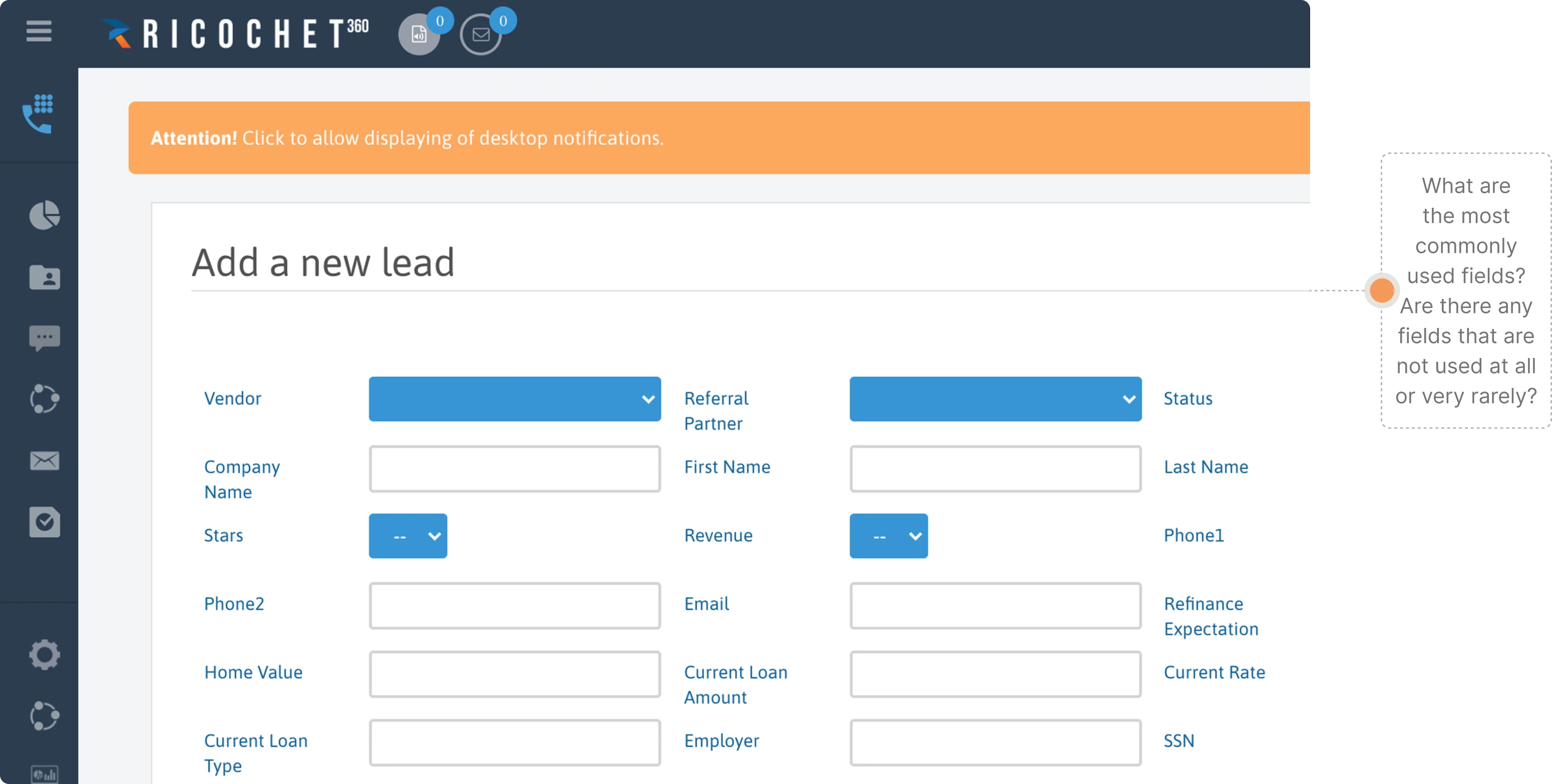
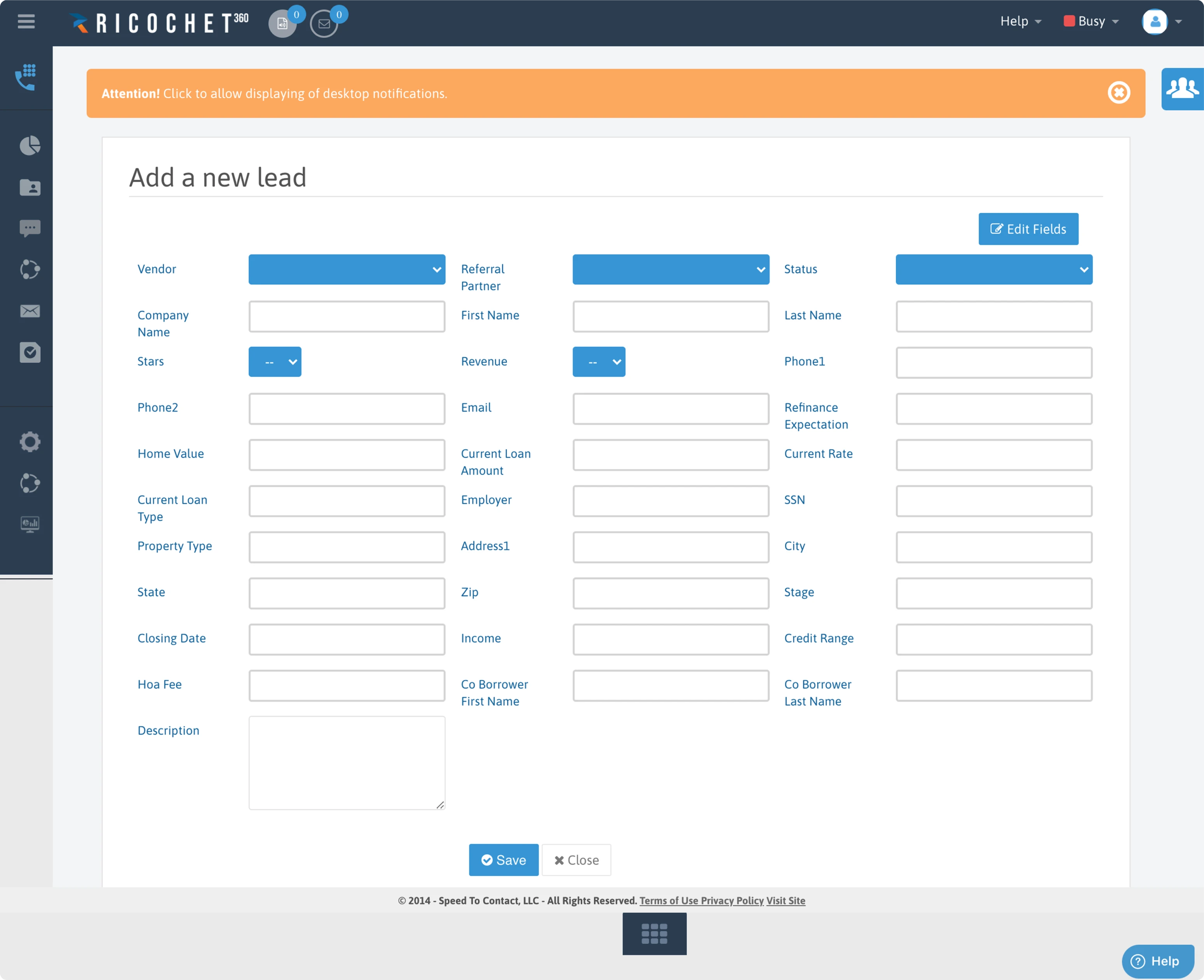
For example, our designers found out that there is no defined format for entering data in the phone number field in the “Add a new lead” screen”. This fact may cause confusion among users and they are more likely to accidentally skip a figure.
Small changes for big results
We had two months for the Ricochet360 redesign project, and it would take another couple of months for developers to implement the new design. Considering the project duration, we offered our client to implement small improvements to the existing design first. They would take minimum effort yet make a positive impact immediately.
Optimizing the “Add a new lead” screen
Let’s take a look at the “Add a new lead” screen, where we found the issue with the undefined phone number format along with some other minor inconveniences that resulted in poor user experience.
Here are some small improvements we made for this screen that immediately made the change for good:
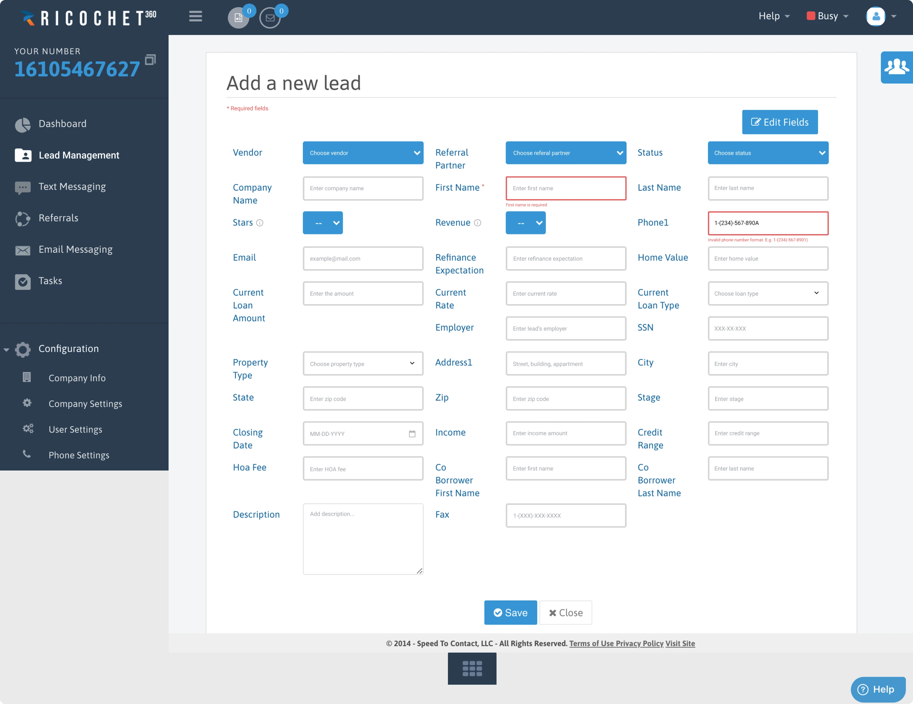
- To get rid of customer confusion, we added a tooltip for every field to show how it has to be filled.
- We implemented standard data formats. Now if users enter a phone number in an invalid format, they get an error message.
- We also indicated required fields with asterisks so users don’t have to guess which fields are necessary for creating a lead and which they can omit.
Based on the current interface, we got a mockup that took us two hours to design and another couple of hours for a developer to put everything in place.
The business performance improved instantly, without waiting for a months-long redesign project to reach the end.
Screens restructuring to simplify user flow
After analyzing the product and detecting frictions, our designers had to restructure the existing user flows by disassembling old screens on their core elements, like a Lego model.
Restructuring is a method used for redesigns to figure out what path is taken by a user to complete a task, and what elements should be on each screen to help the user cope with their task. By making user tasks easier to complete, we would manage to shorten the learning curve.
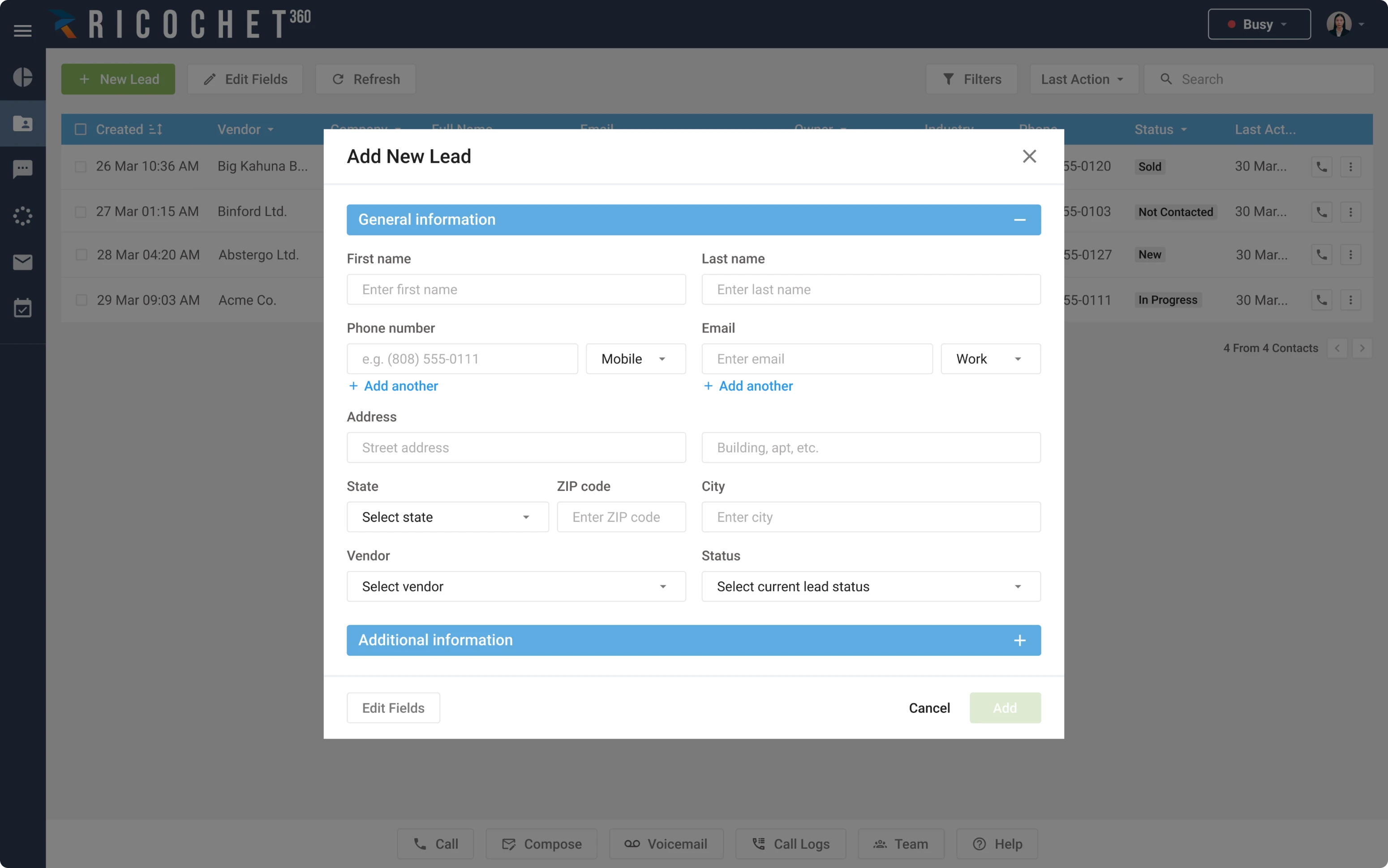
Let’s come back to the Add a new lead page. Restructuring helped our team to formulate the following hypotheses:
- It’s too much for one form to have more than 30 fields. Not all of them are equally important. We can hide rarely used fields so that users call them up when needed.
- People grasp information better when it is shown in groups. If we divide our fields into groups by meaning, the form won’t scare a user so much.
- We can turn the page into a popup. Adding a new lead often happens to be a subtask that occurs during the work process, so users won’t need to close their primary window to add a new lead.
Here are the results.
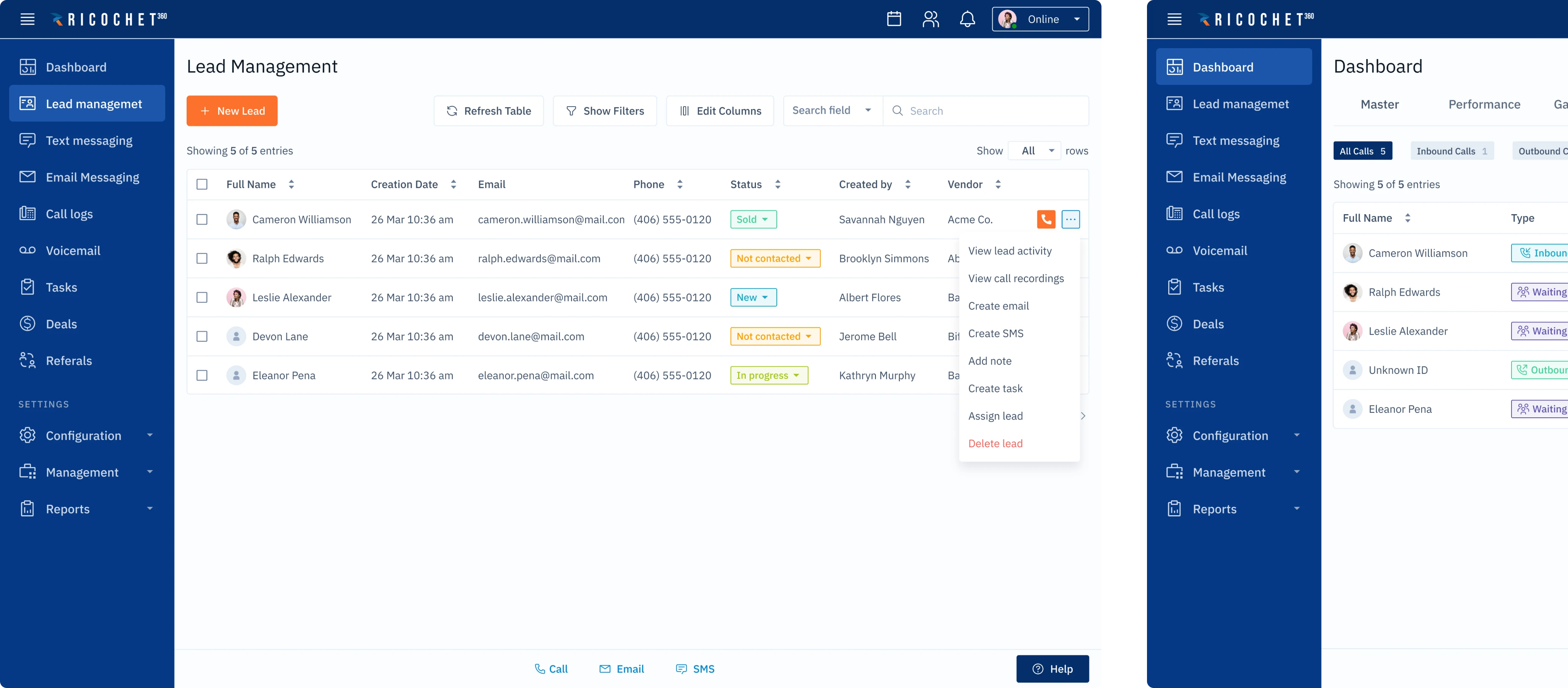
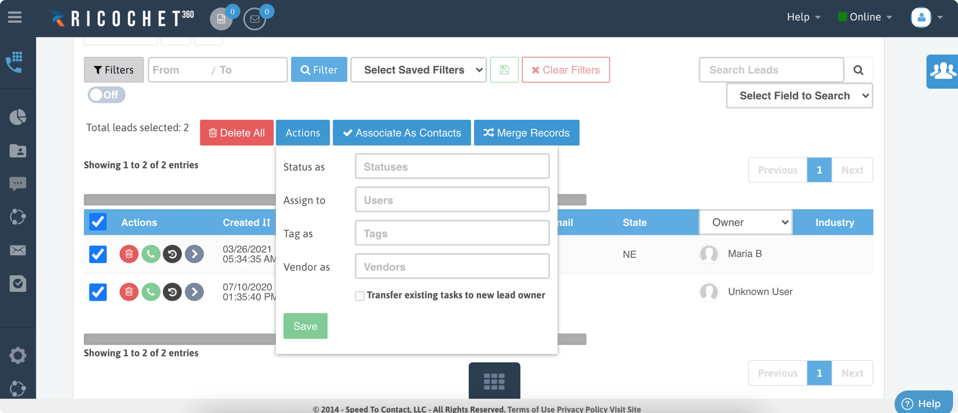
Revising priorities of the lead management screen
On the Lead Management screen, users can see the list of their leads. The previous version of the interface had several huge flaws:
- There were rows of buttons, all in different colors, that gave users no confidence in their choice.
- The Add a new lead button, which is supposed to be the key button here, was barely visible.
- The brightest red buttons on the page were the Delete buttons. It's unlikely that users open a lead management page to delete all the leads. But it's something that the old interface wanted them to do.
We offered our client to restructure the menu. As a result, it became twice as short as the old version, with easy linking between related settings and consistent naming. The Add a new lead button became the main pole of attraction. The Delete buttons are safely hidden, as well as some other excessive elements.
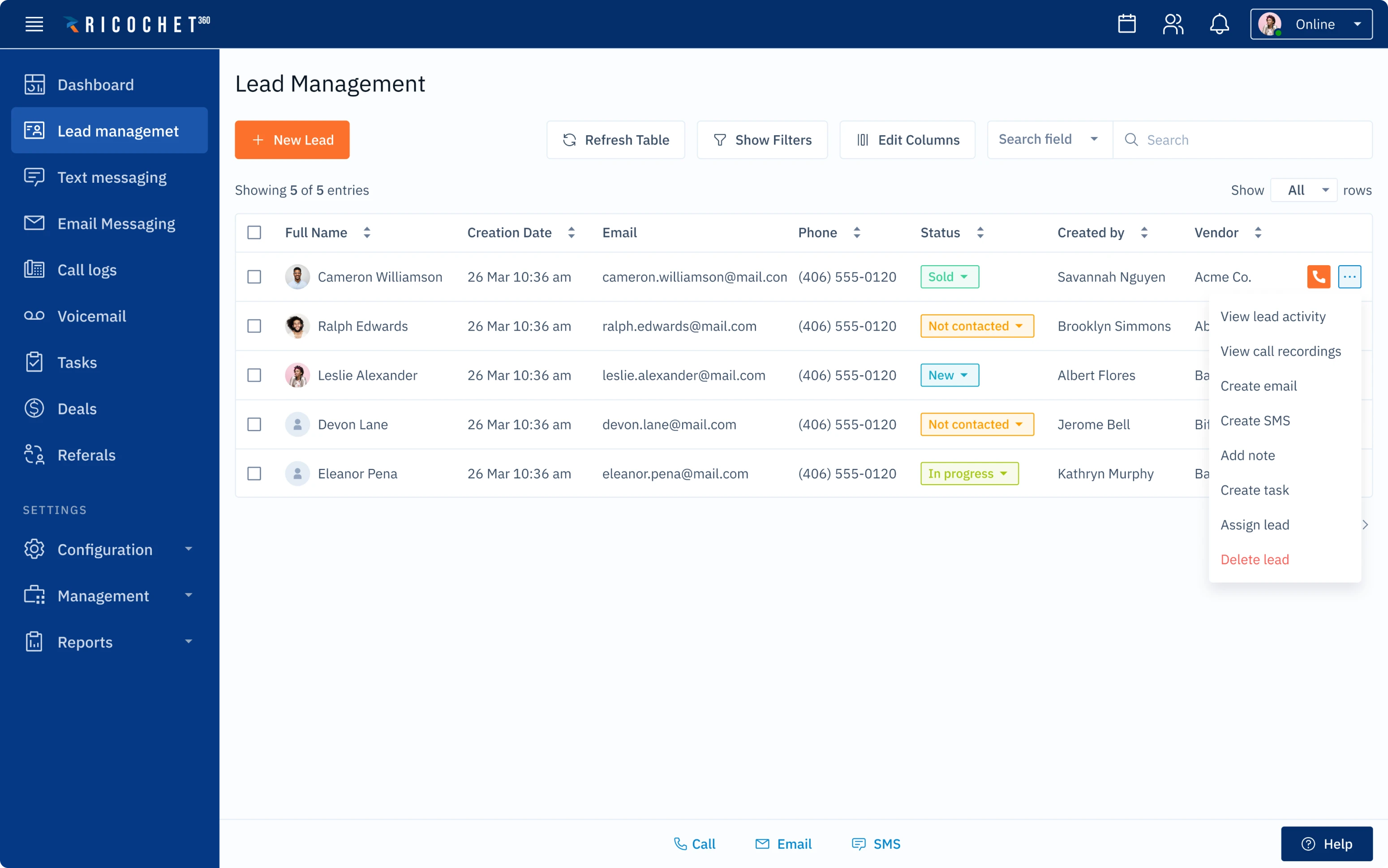
Redesigning the on-call screen to stop straining the user's eyes
Sales agents see the on-call screen when talking to prospects, and the users' experience here is clearly affected by information overload.
- The old screen has so many elements and buttons.
- The names of the buttons are vague, so users don’t understand what they do.
- The Delete button is placed right between the buttons called to save and end the call, so chances are high that users can accidentally delete a lead instead of hanging up.
We redesigned the screen in such a way that just the right amount of information appears.
- All the unnecessary elements had gone, and all the important modules are now positioned in a clear visual hierarchy. It helps users to make sense of what they see — at first sight they understand how important one action is in relation to another.
- Some features that were hardly available are now one click away. For instance, a sales agent can reach the script tab instantly, without leaving the page.
- And of course, we’ve removed the Delete button from the shortcut menu. No accidental lead deletions anymore.
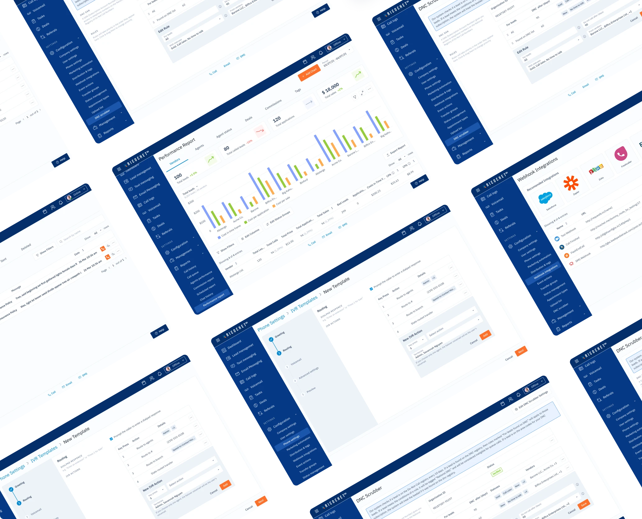
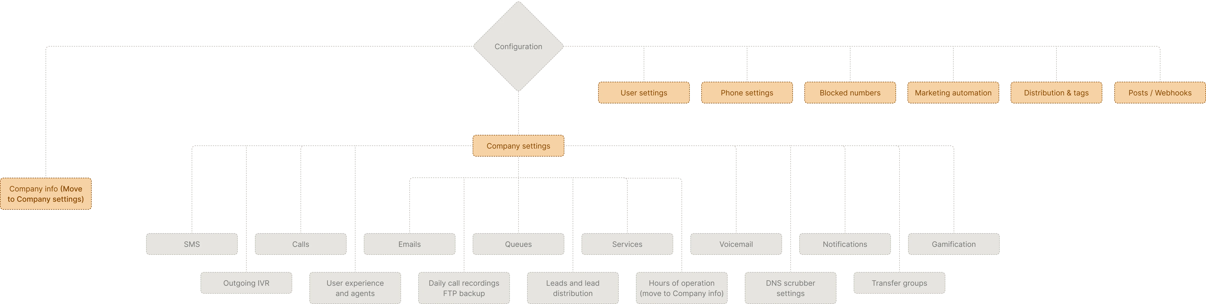
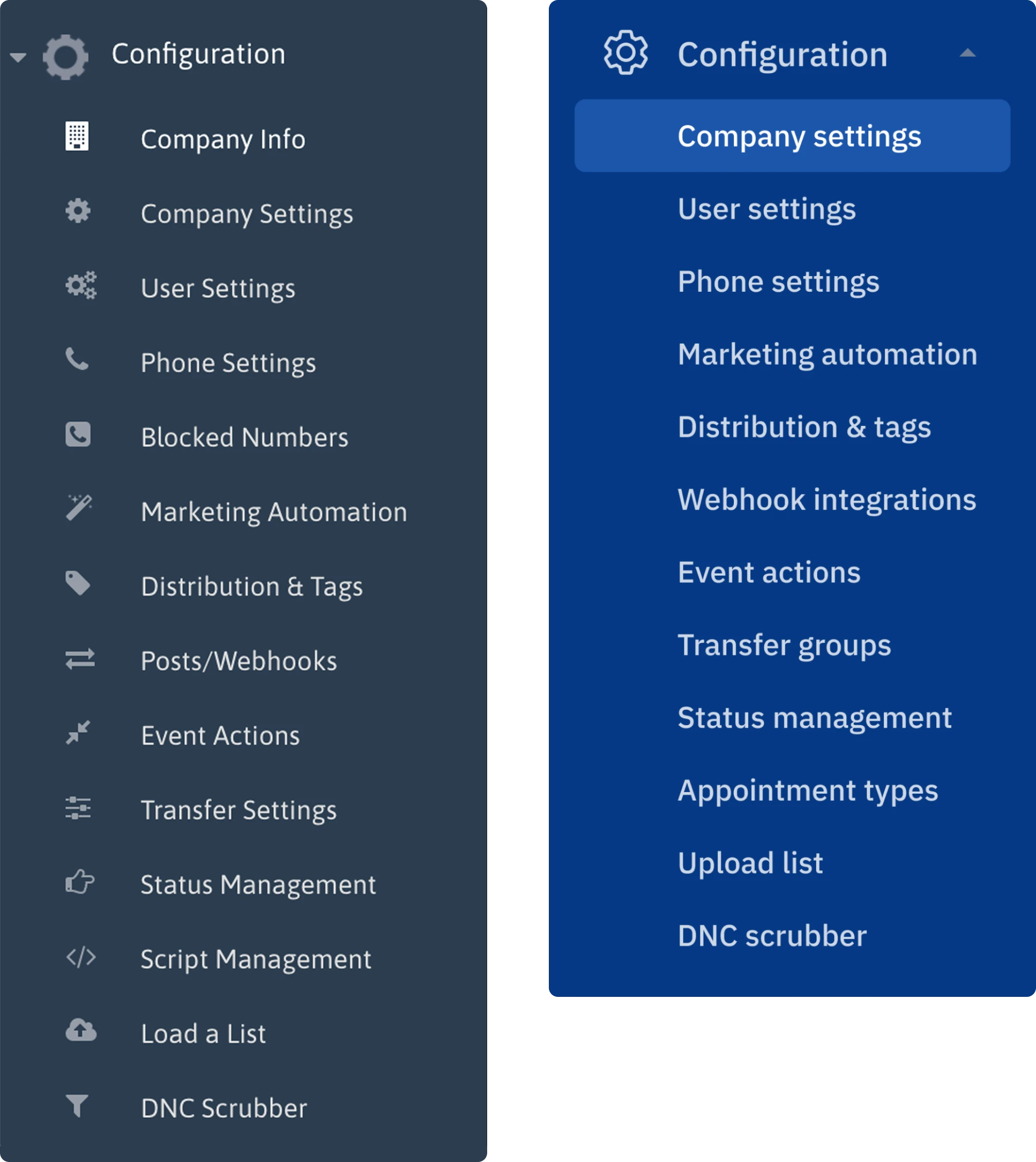
Changing the structure of the configuration menu
We were working on pages of the configuration menu when we noticed some oddity with the menu itself.
- It turned out that some closely related pages, like Transfer settings and Transfer groups, lived on the opposite sides of the menu and never met.
- It also appeared that some names of menu items didn’t match the names of corresponding pages.
- The number of menu items could be easily halved if we merge some of them together. For instance, the Company info page sits perfectly fine inside the Company settings page.
So we offered our client to restructure the menu. As a result, they now have it twice as short as the old version, with easy linking between related settings and consistent naming.
Renewed design resulted in shortening the learning curve
The final redesign did its job: now, new customers require less time to learn how to use the software, thus reducing the workload of support managers from Ricochet360’s side. The new design looks more modern and simple. Now, the company is ready to scale and earn new customers!