Kipsi
How Eleken solved Kipsi’s UX challenges to unlock product-market fit
The R&D tax credit is an excellent opportunity for companies to reduce income tax liabilities and save hundreds of dollars. But the claim process is quite complicated and requires proper documentation and qualifying activities. Tax clients start collaborating with accounting firms to claim R&D tax credits. Yet, these firms don’t often have people for this work. And that’s where Kipsi can help.
Kipsi is a bespoke technology platform for accounting, consulting, and specialty law firms that offer R&D tax credit services. The software helps firms of all sizes streamline and automate their client engagements.

After the Kipsi team reached out to us, we learned that the startup had created the first mockups and was looking to improve the app’s usability, navigation, and visual design.
But the challenge was that the company didn’t have any experienced UI/UX designers in-house to bring their vision to life. The Kipsi team has worked with several different designers, but none of them was a good fit for designing such a complex solution. Luckily, Eleken had the right experts to address their challenges.
The idea of Kipsi is to make things simple
The Kipsi was developed with the goal of making the complex process of conducting the R&D tax credit study simple and clear for everyone. But this simple goal was very hard to implement. Tax accounting products are very complex at their core, and it requires a designer to understand accounting principles and deal with complex calculations. Keeping up with the latest tax laws and regulations is critical as well. The Kipsi team tried hiring an in-house designer but ended up spending a lot of time on training and onboarding without getting the expected results.
So, Kipsi was looking for a UI/UX professional who could:
- Join the project ASAP.
- Understand complex things and concepts related to accounting and reporting processes.
- Ensure a smooth, simple, and intuitive user experience.
And that’s when they found Eleken.
Eleken’s UX designer became the perfect match for Kipsi
At Eleken, we begin our partnerships with a free 3-day trial to let our clients see if we meet their requirements. For Kipsi, we provided an experienced UX designer who joined the project right away.
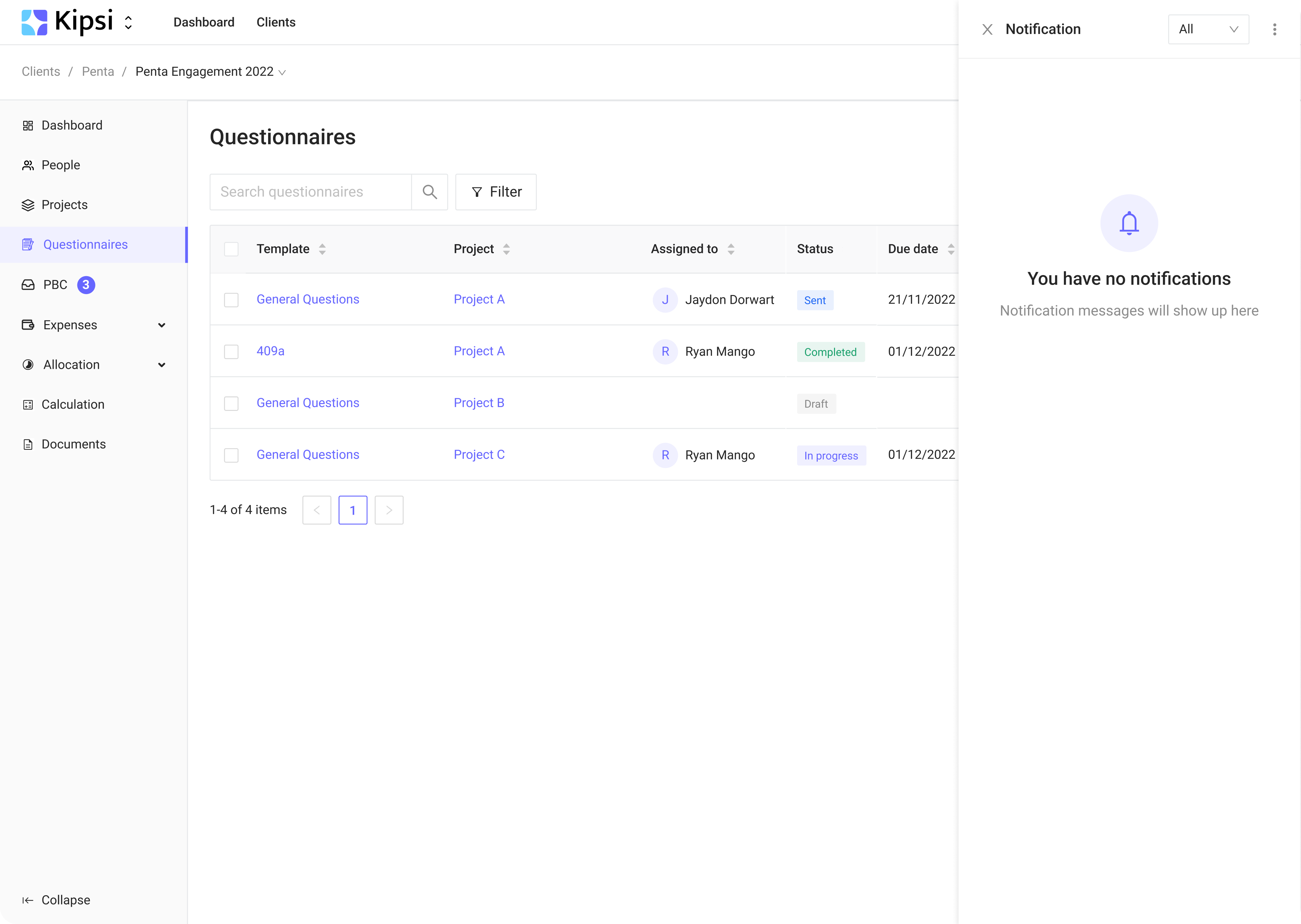
During the trial, Eleken worked on the Questionnaire section.
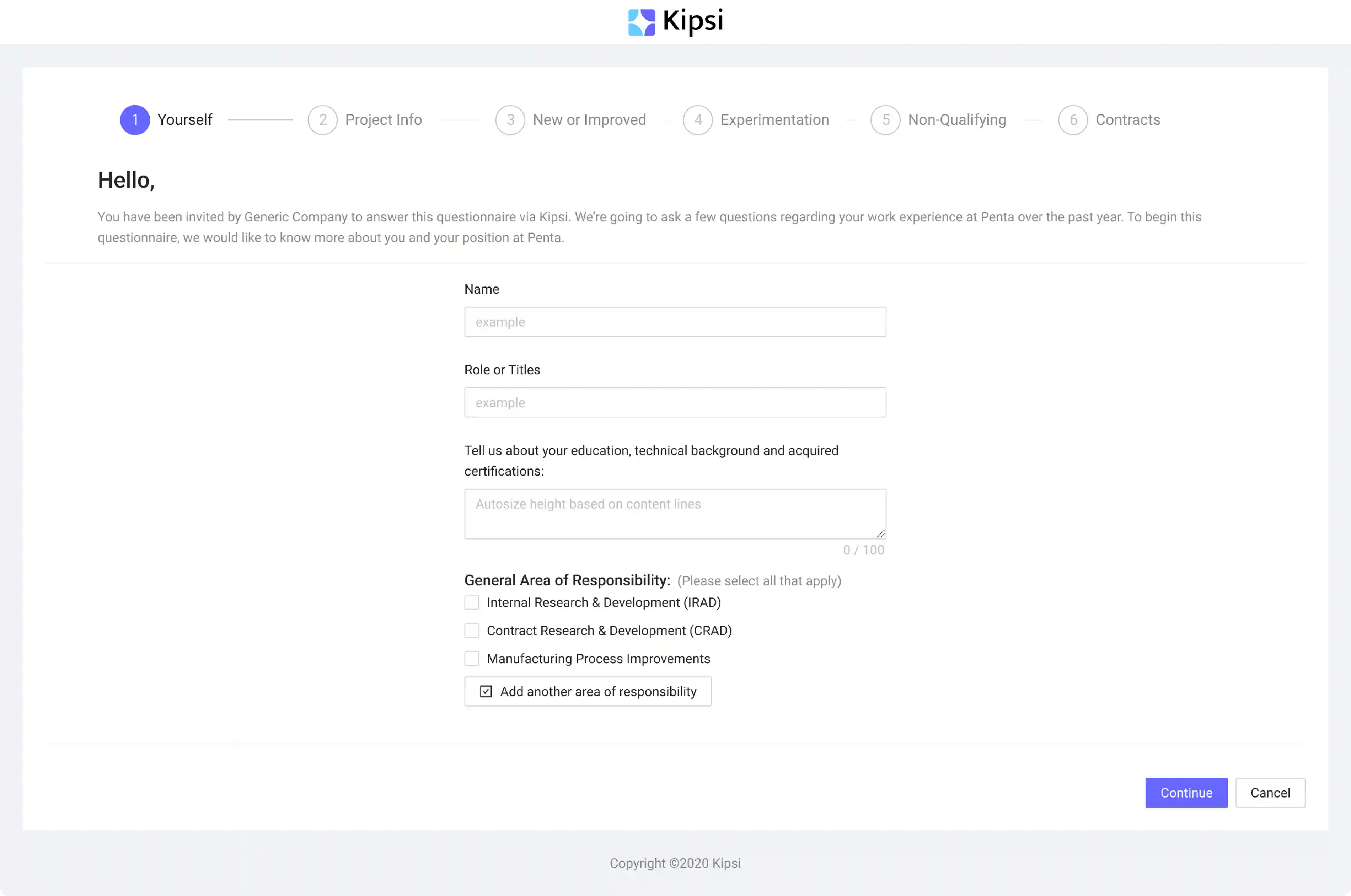
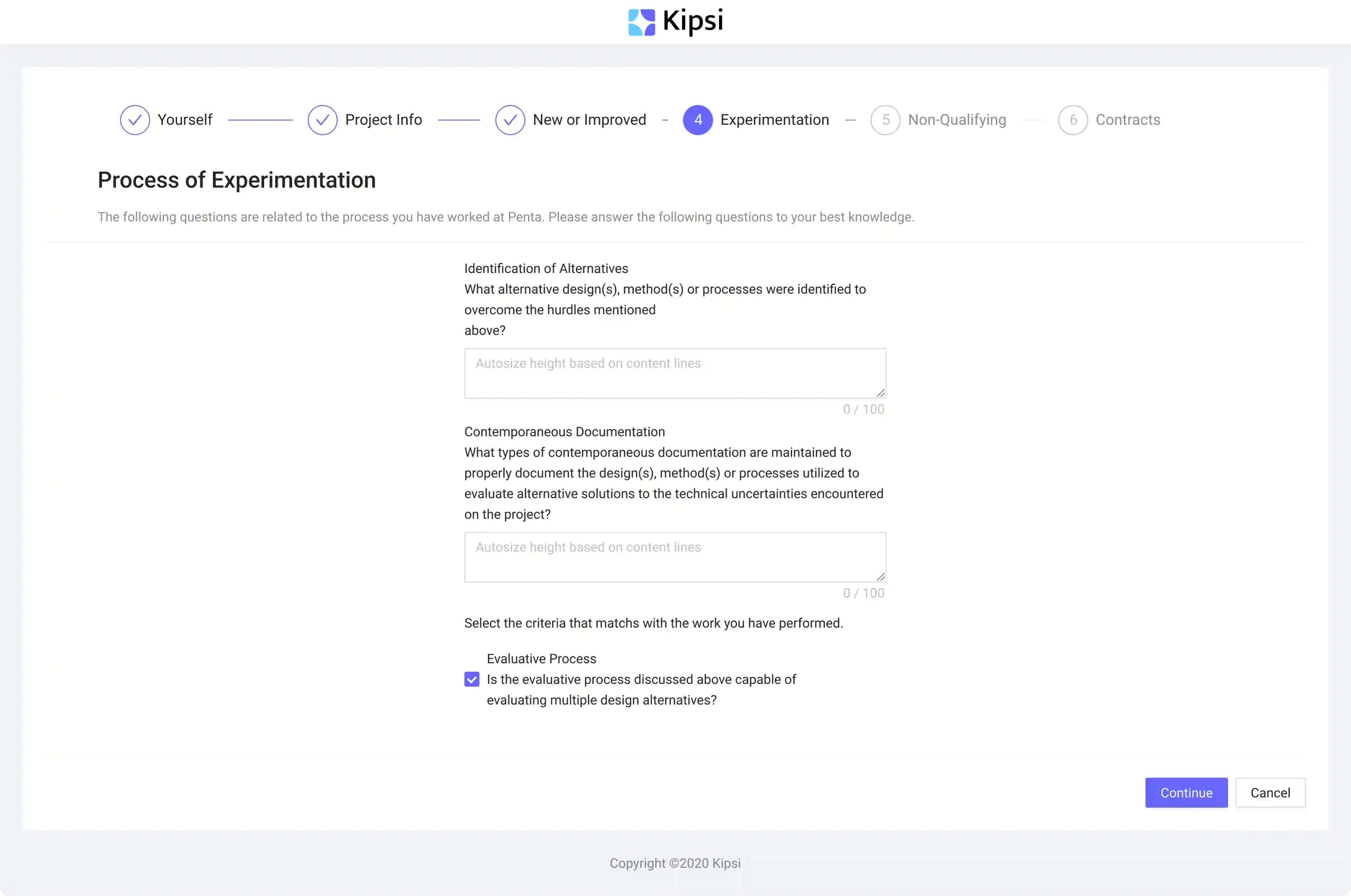
We wanted to make the questionnaire more structured, so we added headers and alignment. Also, we worked on graphics and visual hierarchy, including arranging elements.
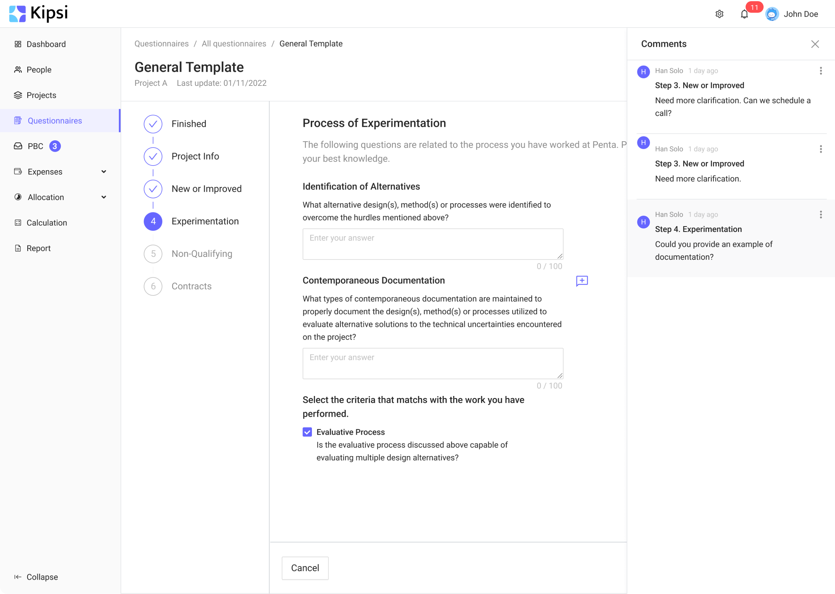
Our client used the React UI framework containing ready-to-use components and basic styles such as color and fonts and didn’t want to transit to other style libraries. So we designed the Questionnaire using these components, adapting them to the client's style. We also added the comments functionality so that accounting firms could communicate and collaborate with their customers.

The client was happy with the results and our working approach, so we continued working on the MVP.
Going through Eleken’s working process
When designing apps, we at Eleken follow an iterative approach, developing one user flow after another. Here is what our collaboration with Kipsi looked like.
Step 1: Studying the product
To provide a better understanding of how the app should look, the Kipsi team shared the app mockups with us. Eleken designers, in turn, carefully studied them to understand how everything works and identify design frictions. Here are some of our findings:
- All sections existed separately. Information on projects, expenses, and contacts related to the engagement was mixed.
- Users could only add a project. It wasn’t clear how to view or edit it.
- There was a problem with navigation. For example, when users visited the Expenses section, the navigation still showed that they were on the Dashboard page.

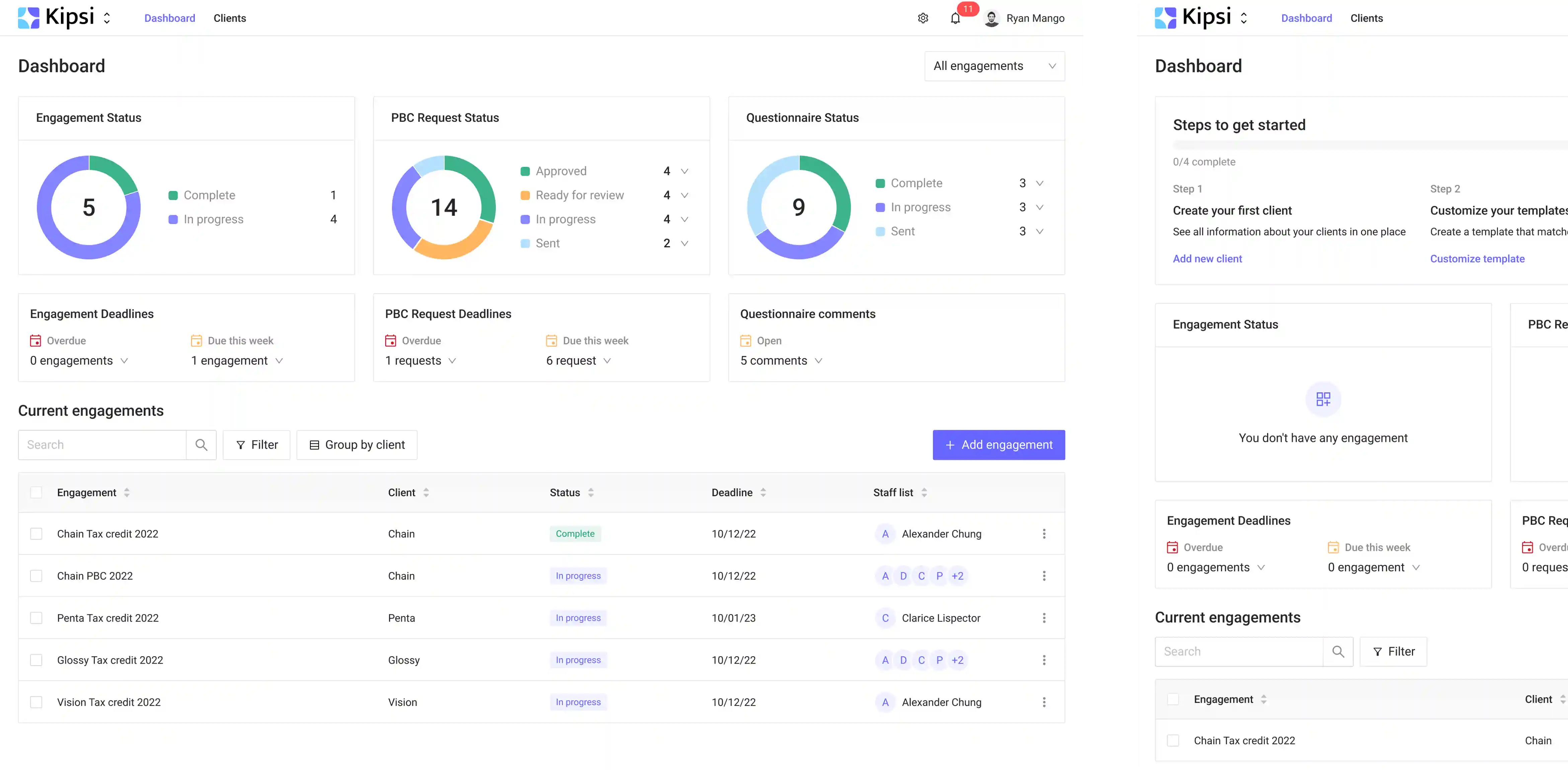
Step 2: Simplifying dashboard navigation
Having all research done, we put together all elements of the app and determined how to connect these elements with each other to deliver a smooth user experience.

Having the schematic structure of the app done, we used Figma to design the dashboard:
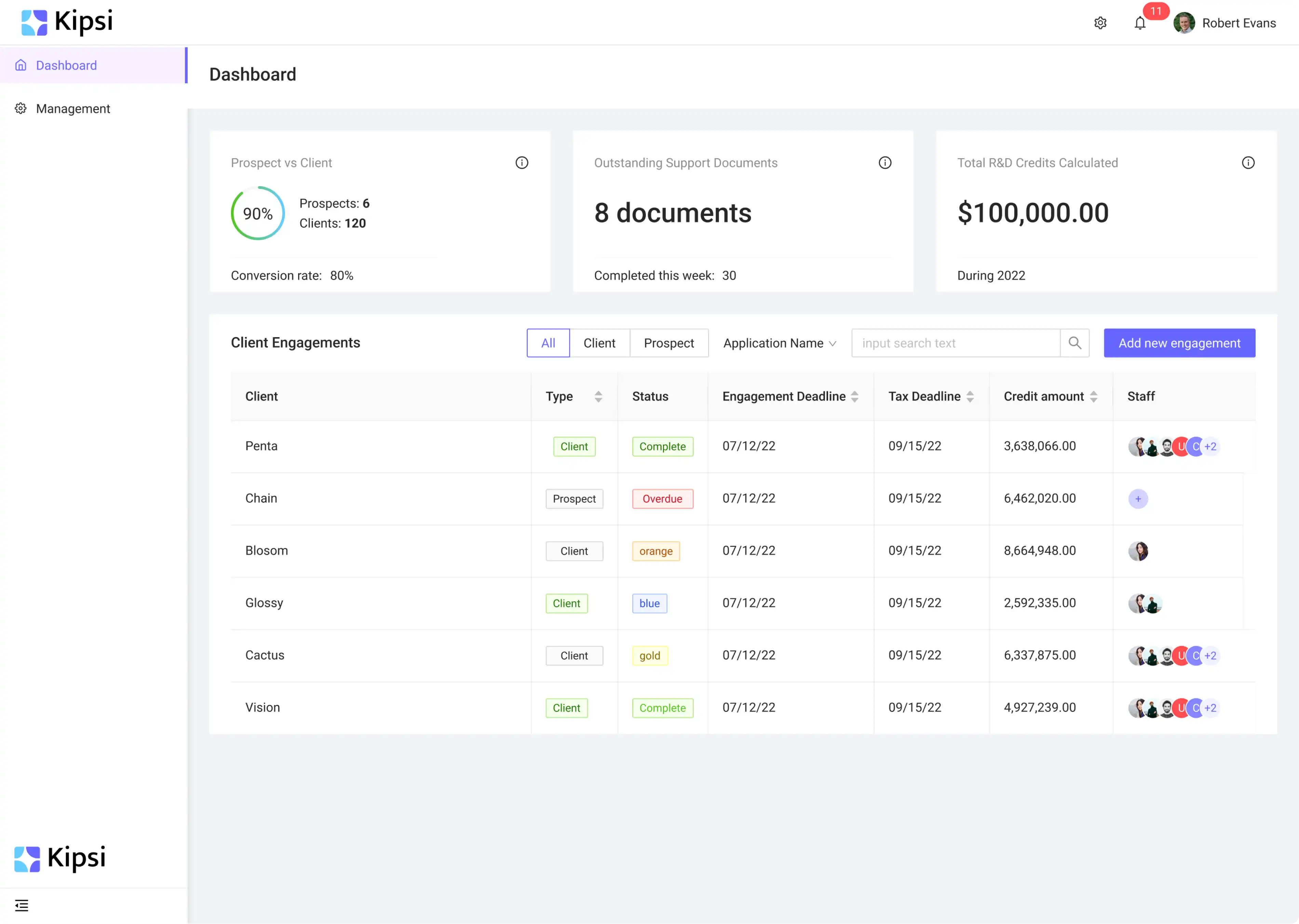
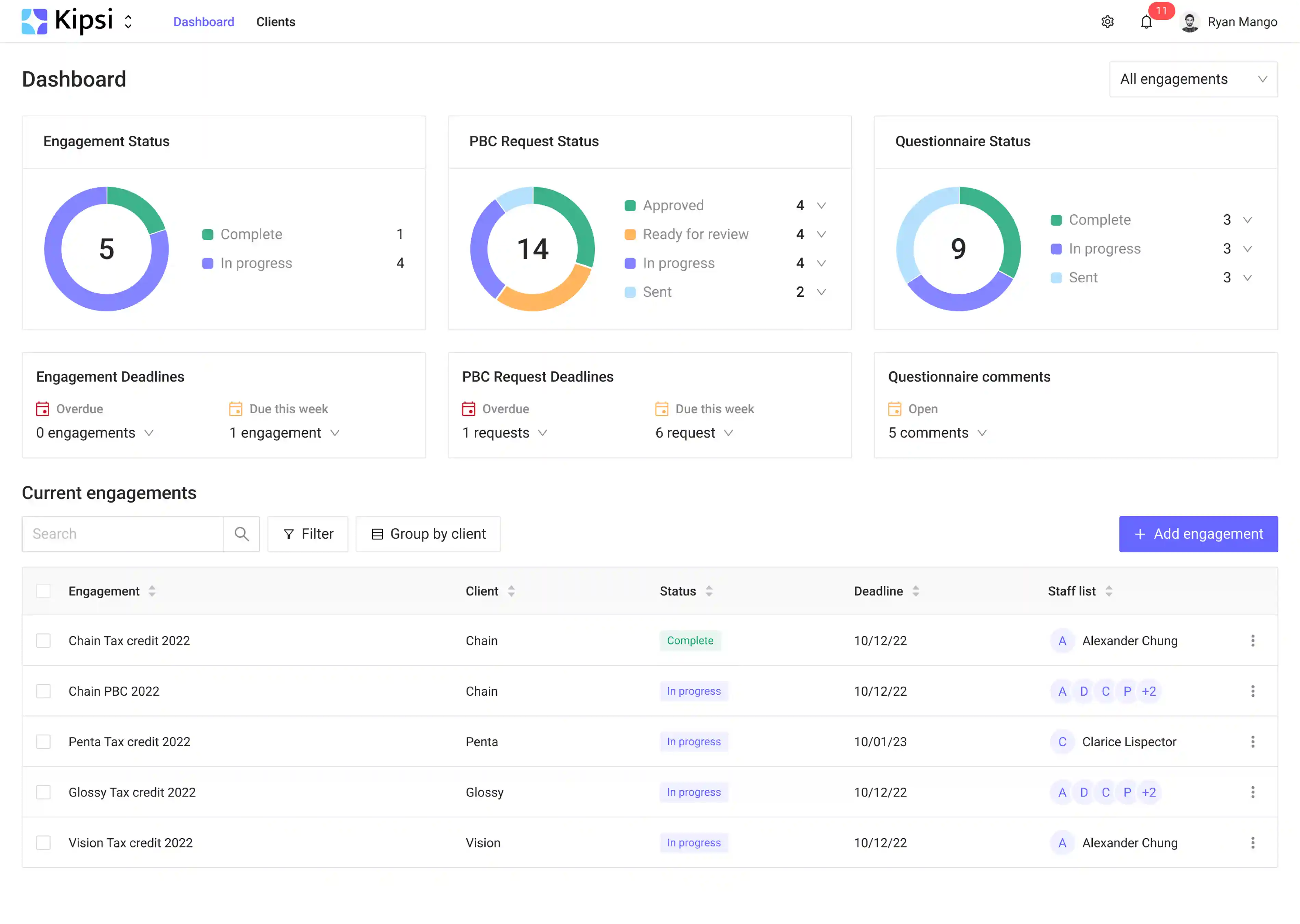
Our designer did her best to make the dashboard intuitive, bringing together the structure and navigation. The navigation was divided into 2 levels:
- High-level navigation, located on the top of the screen.
- Middle-level navigation, located on the left side of the screen.
For users to quickly understand whether the work is done on time, we added the main indicators showing the efficiency of the company's activity, such as statuses on engagements, requests for documents, or questionnaires.
To reduce users’ cognitive load, we simplified the Client Engagement table, leaving only essential information. For example, the columns with the type of client and the tax deadline have been removed.
Here is what else we did for Kipsi:
- Created separate workspaces for firms and their clients. Firms can now view information and respond to each client. We also added a page with a list of clients. This allows firms to manage the list of clients and view information. From the client page, users can view all engagements, not just active ones.
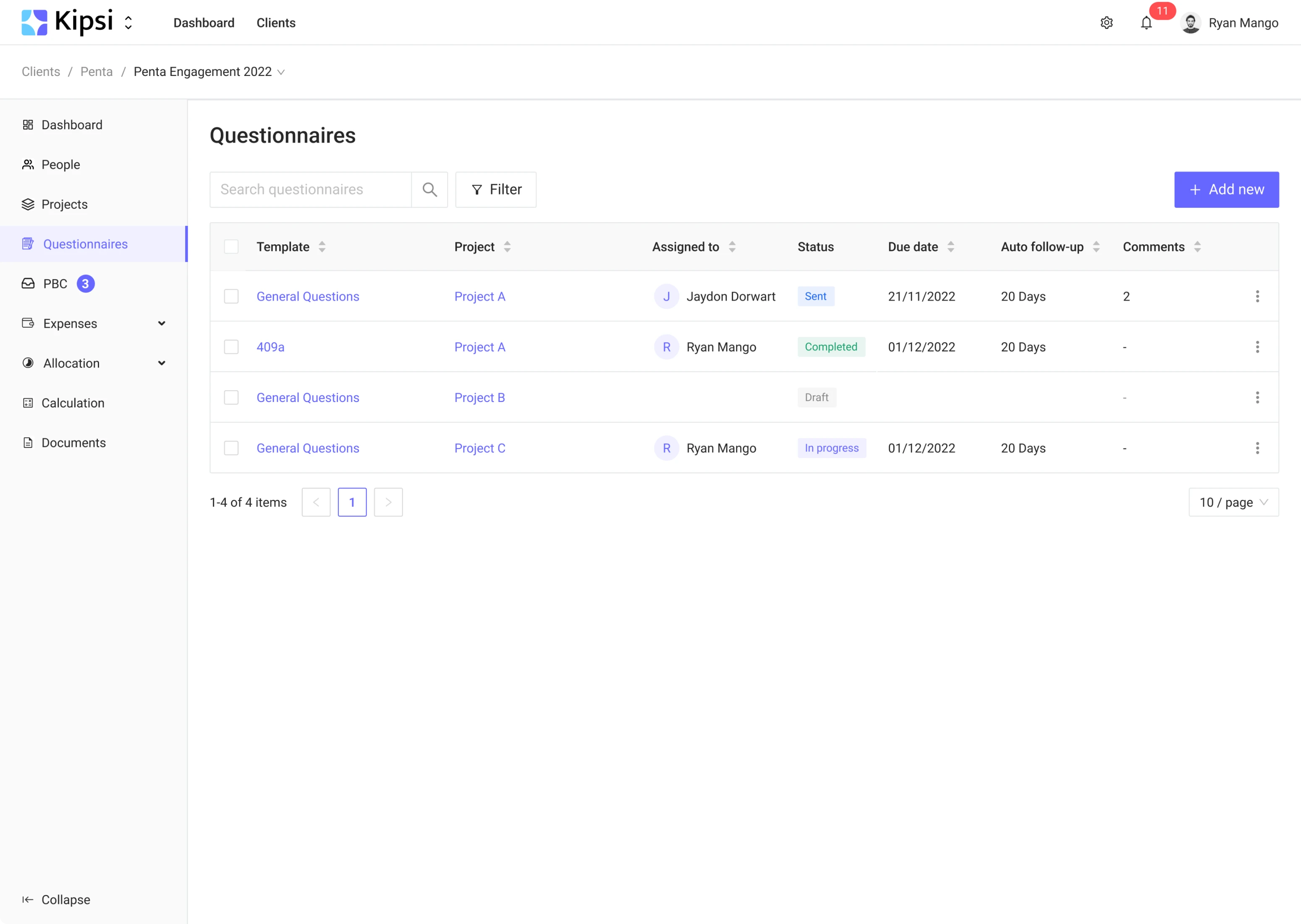
- Added breadcrumbs for quick transition between different engagements.
- Made emphasis on active engagements and focus on current tasks on the main dashboard.
Step 3: Creating consistency in empty states patterns
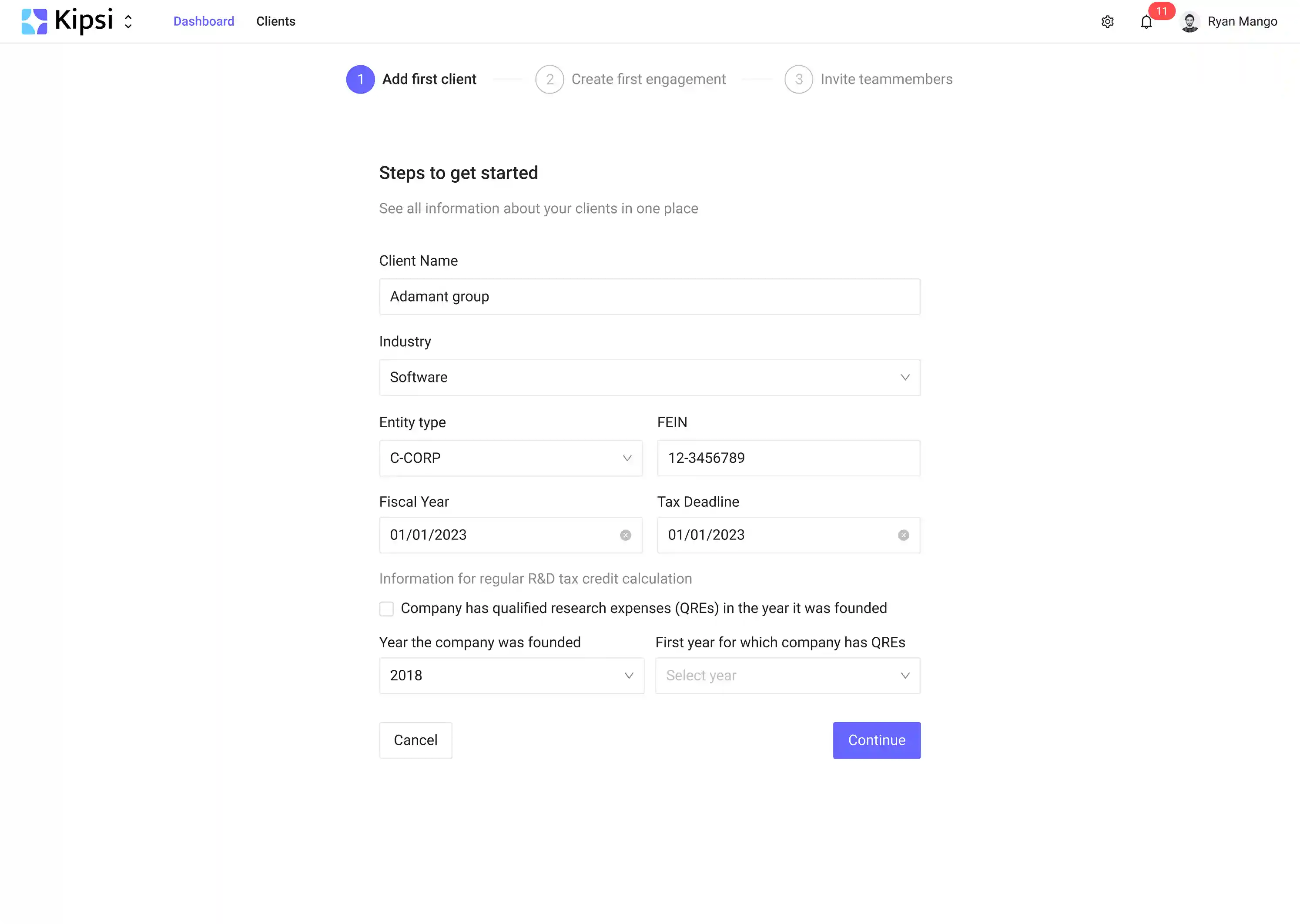
We made the process of adding new elements consistent, using the same patterns on all pages.
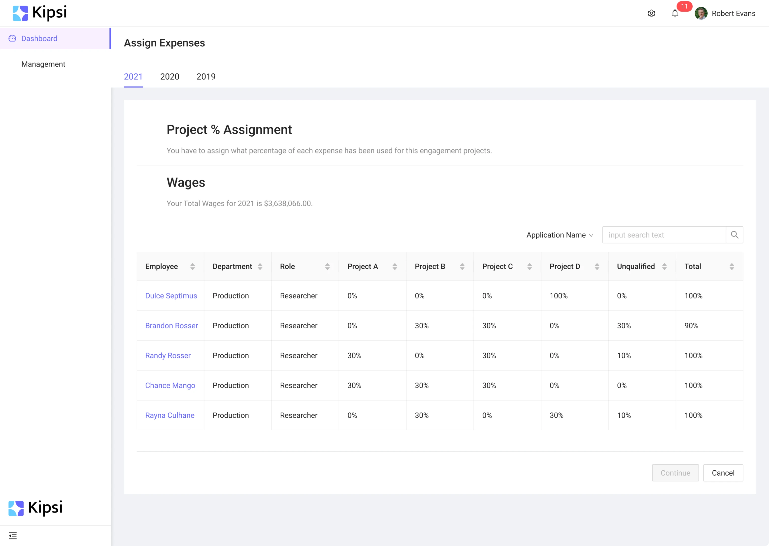
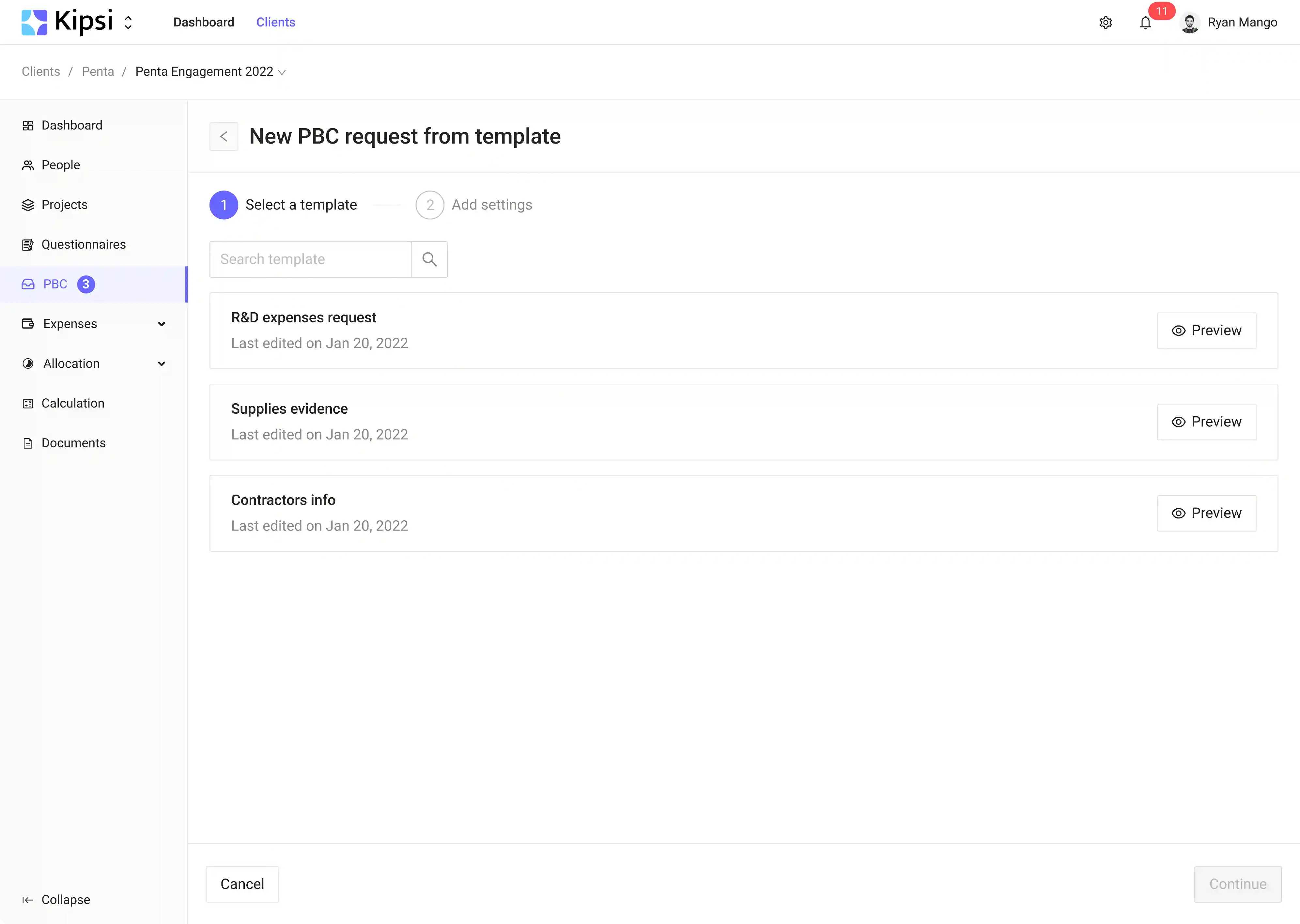
We also thought out various options for simplifying work with large volumes of data. For example, users can now import new information or use templates.

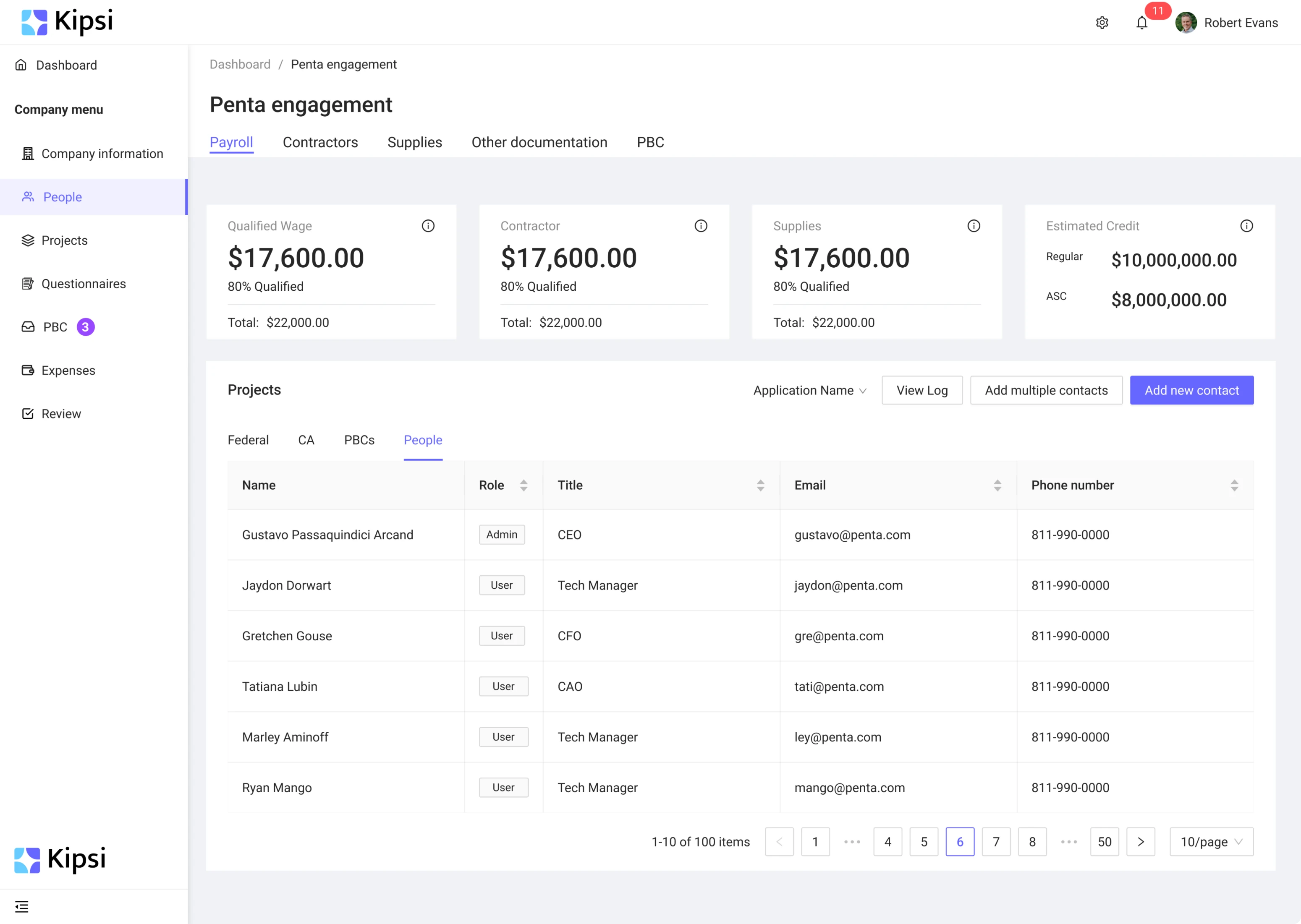
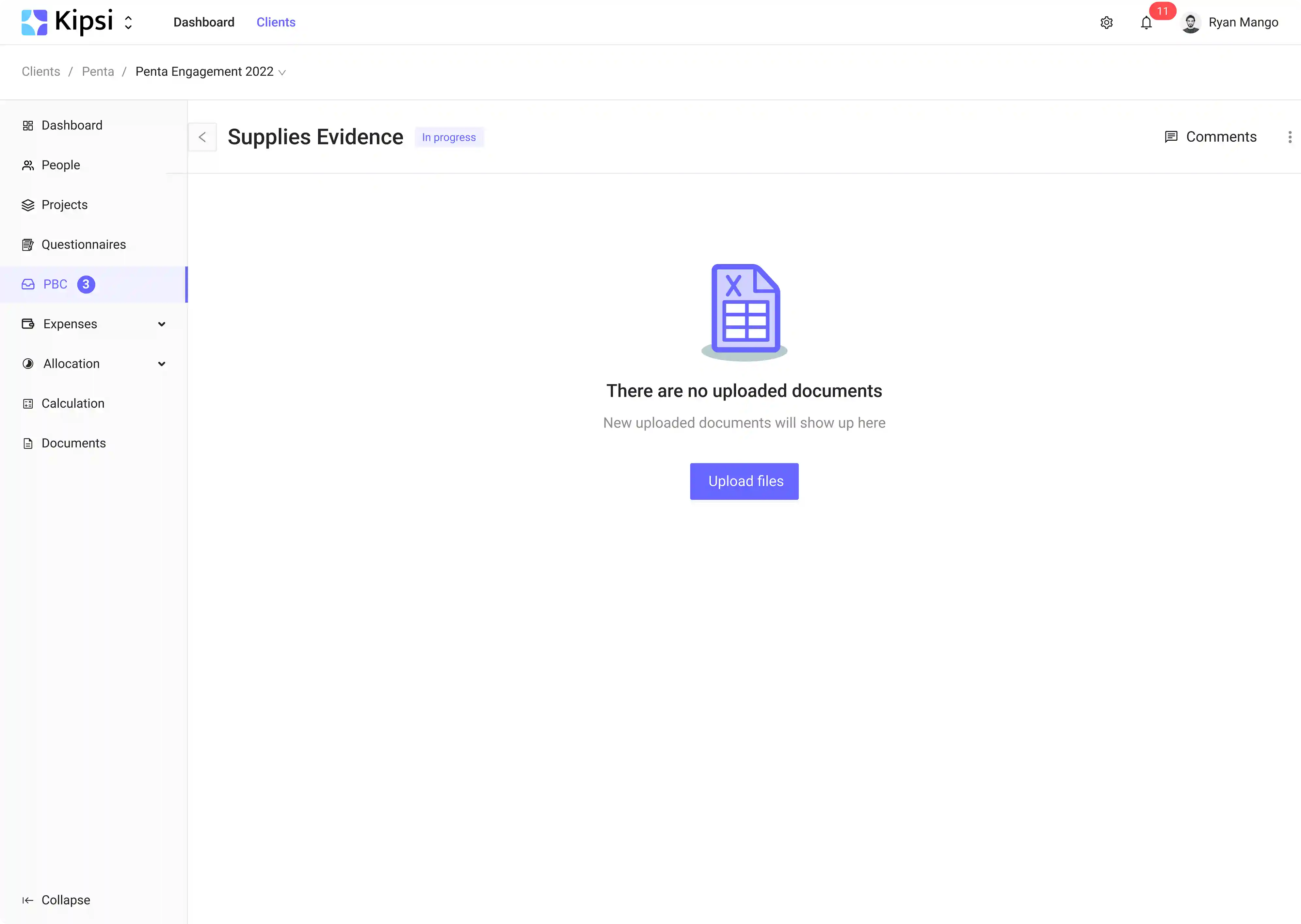
Step 4: Creating two separate workspaces for managing documentation requests
PBC (Provided By Client) block allows users to save time through the portal for uploading documentation. Users can view engagement progress with request status tracking.
In addition, we created two separate workspaces:
- Client’s part (client view): firms’ clients can track the status of their requests:
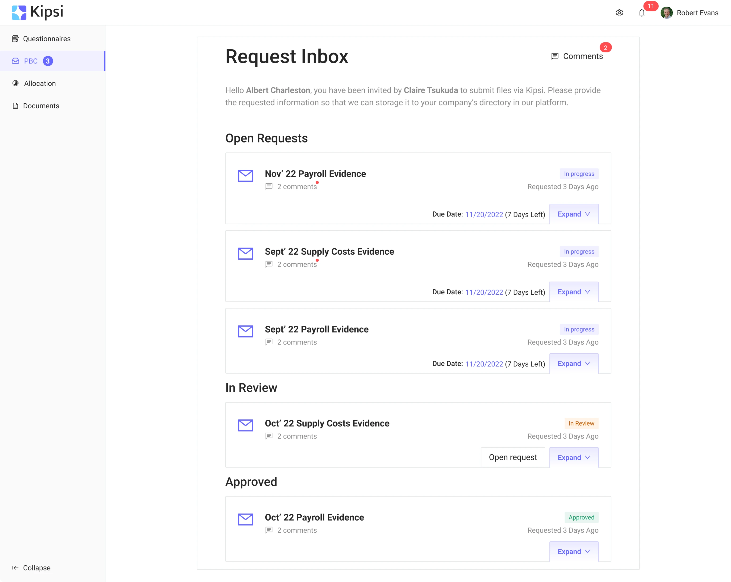
Additionally, clients can mark these requests as "not applicable", as well as upload and submit documents. When they have questions or need help, clients can leave comments.

- Accounting firm’s part (firm view): firm employees can also see the request statuses. They can add documents and leave comments. Responsible employees get a notification when documents are sent.

Step 5: Extending the app functionality with the report block
As the project was moving on, there appeared a need to expand the product and add new sections to extend the app’s functionality. That’s why we added the Report section. After users enter the necessary data and submit documents, the app summarizes all findings and generates the report.

Our MVP design let Kipsi enter the market and create new revenue lines
Eleken designers continue working with Kipsi, designing new features and improving the existing ones. We test new functionality with users and make changes based on the feedback.
As the project results proved to be successful, the app's scope of use has extended to other fields. The app opened a new line of revenue for CPA accounting professionals, consulting, tax, and law firms that provide multiple service lines, including audit and advisory, allowing them to scale and differentiate themselves from others. Kipsi acquired its first users and achieved product market fit.
If you liked what we did for Kipsi and want to translate your complex project into a great UX solution, let’s talk.
We were so pleased with our designer’s work that we decided to continue the relationship with Eleken indefinitely