LogitudeWorld
Eleken designed an intuitive white-label solution for a shipment tracking platform
LogitudeWorld is a freight forwarding SaaS platform that provides its customers with logistics management software to manage daily communication with customers, partners, agents, and carriers. Looking to expand to a new market, the company wanted to create a brand new platform for their clients’ clients to track the shipments with ease.
The problem LogitudeWorld was facing was twofold.
- On the one hand, their new target audience was not tech-savvy, so they needed the design for the new platform to be as simple and intuitive as possible.
- On the other hand, they needed a white-label solution so that their clients could customize the solution according to their branding. This inevitably makes the design more complicated.
That's why LogitudeWorld came to Eleken, trusting our experience designing complex apps that are easy to use. As we've already designed a freight tendering platform, TenderX, we had the right expertise to join the project.

Creating an intuitive and informative dashboard through iterative design
The dashboard where the customers can track their shipments is the first screen the customers see and the one they'll interact with the most.
For the first version, we tried to make the dashboard as simple to get as it could get. The data was divided into blocks, distinctive from one another. Our designers also used different types of diagrams, as well as distinctive color palettes, to make sure the customer can get the info they need at first glance.

However, after receiving customer feedback, it became clear that it was not what they actually needed. We designed a strategic dashboard to provide the users with a birds-eye overview of their shipments, while what they needed was an operational dashboard to keep track of real-time data. Their wish is our command, so we got down to work.
With a newly-designed operational dashboard, the client can get real-time data on their shipments.
- The calendar allows for immediate decision-making if the shipment is arriving in the next few days.
- The interactive map adds a nice touch of visualization.
- Different types of data (map, calendar, as well as lists of different types) are also divided into distinctive blocks, making it easy for users to focus on a specific task.

The design is still in progress, and different prototypes differ a bit, but the client is satisfied with it, and it serves its purpose excellently.
Designing for simplicity with best practices in mind
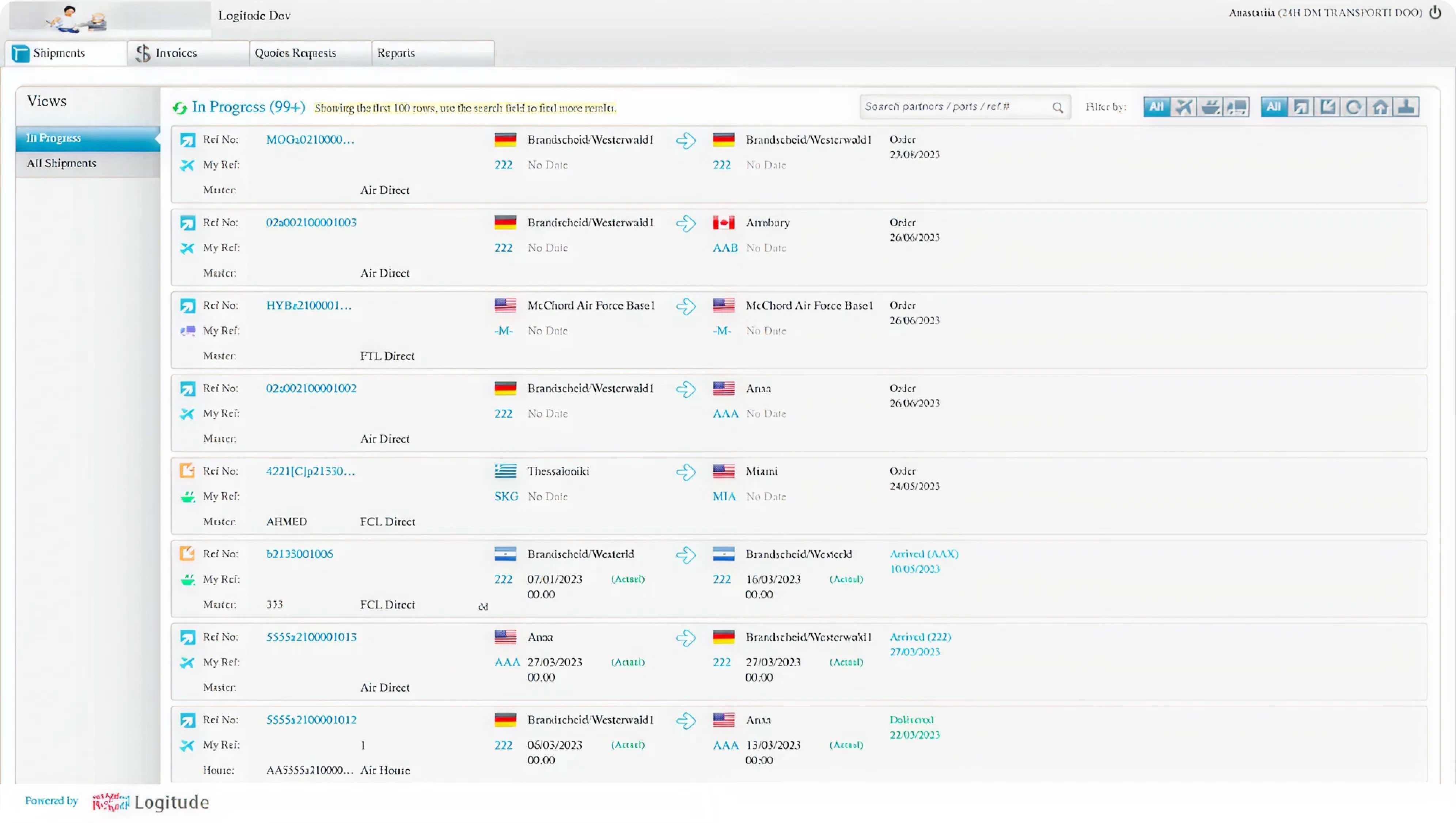
The primary LogitudeWorld platform is quite complex to understand and navigate. The LogitudeWorld team initially tried to design the new platform on their own, using the components of their primary app. However, it did not go well with less tech-savvy users the company had in mind.


What exactly did we do to address this challenge?
Less clicks to accomplish the tasks
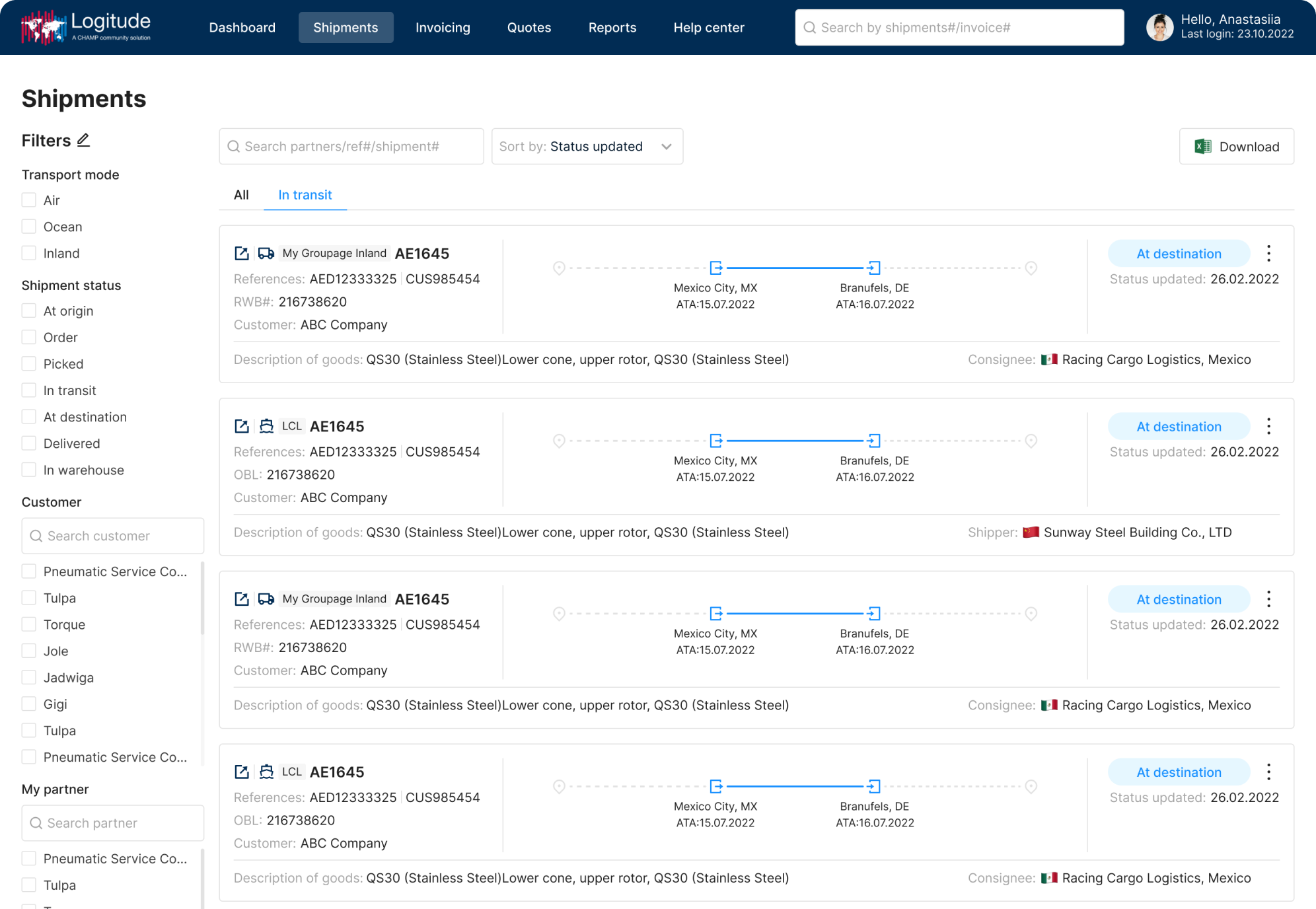
One screen should fit as much information as possible. For example, in LogitudeWorld's initial design, filters were hidden under icons in the right upper corner of the screen. These icons are often not self-explanatory without the labels. So, the users' process was to click on these icons until they found the necessary to then deal with the drop-down menu. To reduce the time spent on these tasks, we moved all the filters in the sidebar menu and made them all visible.
The fact that it allowed us to take up the previously blank space and to balance the composition is a nice touch as well.
Labels for all icons
On their primary platform, LogitudeWorld actively uses the icons, and that's part of their aesthetic.

The client wanted us to make use of them as well. However, when the icons are the only source of information, they can easily become confusing. To avoid that, we ensured all the icons had annotations.
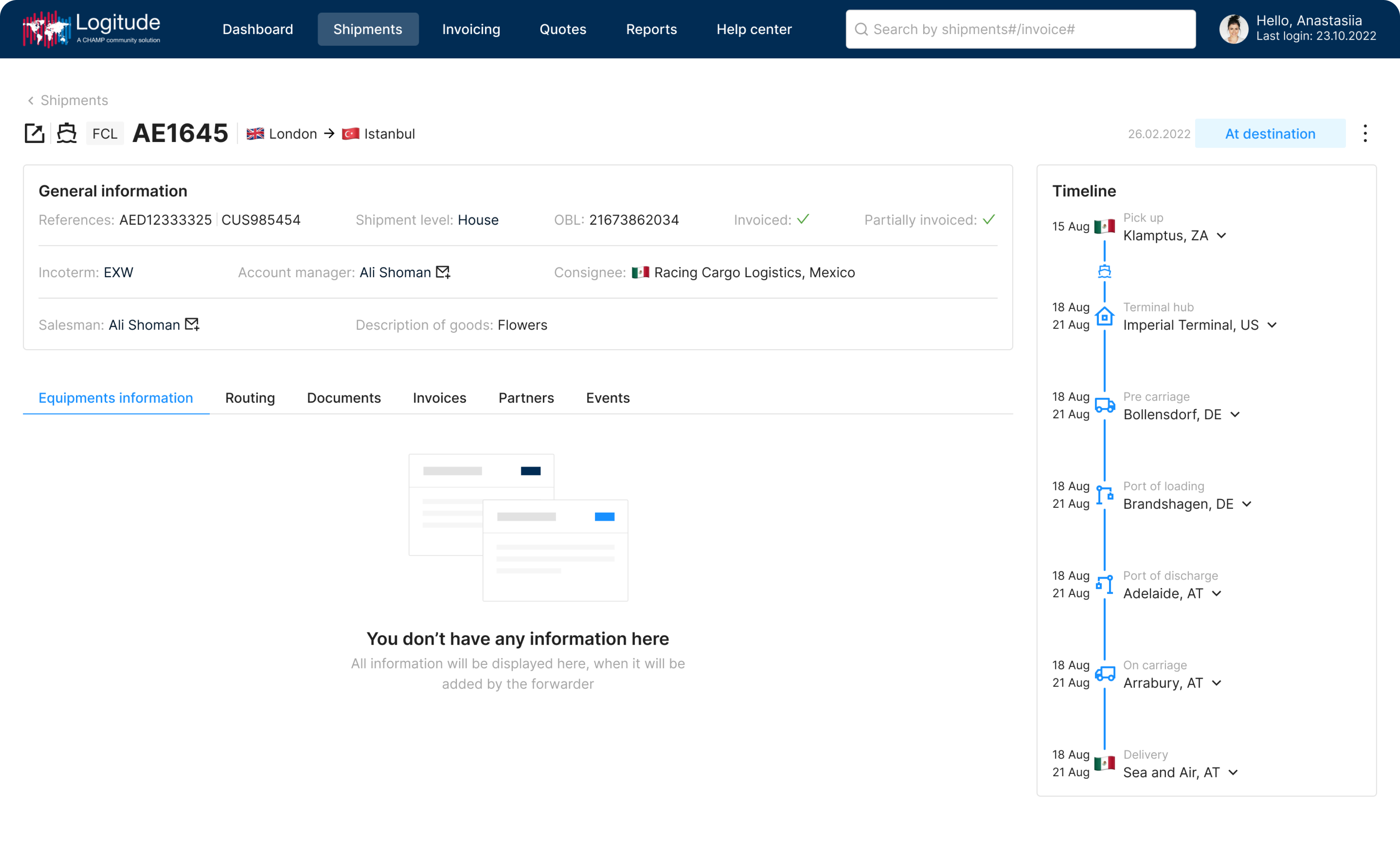
For example, in the "Timeline" section you can see in the screenshot below, different icons represent different shipment stages. Each one has a light gray inscription nearby. This way, the user can easily check them out if they find the icons unclear.

Adding tooltips
Adding hover tooltips or partial information is crucial when designing an app for users who may not be tech pros. This feature ensures that everyone can easily access additional details or explanations simply by hovering over a tool or information, which results in better user experience and accessibility for a broader audience.

These best practices allowed our designers to create a simple, easy-to-navigate interface. Yet we had a second piece of the puzzle: the need to create a white-label design.
Creating white label design while avoiding over-customization
LogitudeWorld wanted an extensive user customization:
- Allow users to choose colors and fonts from a wide range to match their branding
- Make it possible to insert their logos and, later, tailor the filters to themselves.
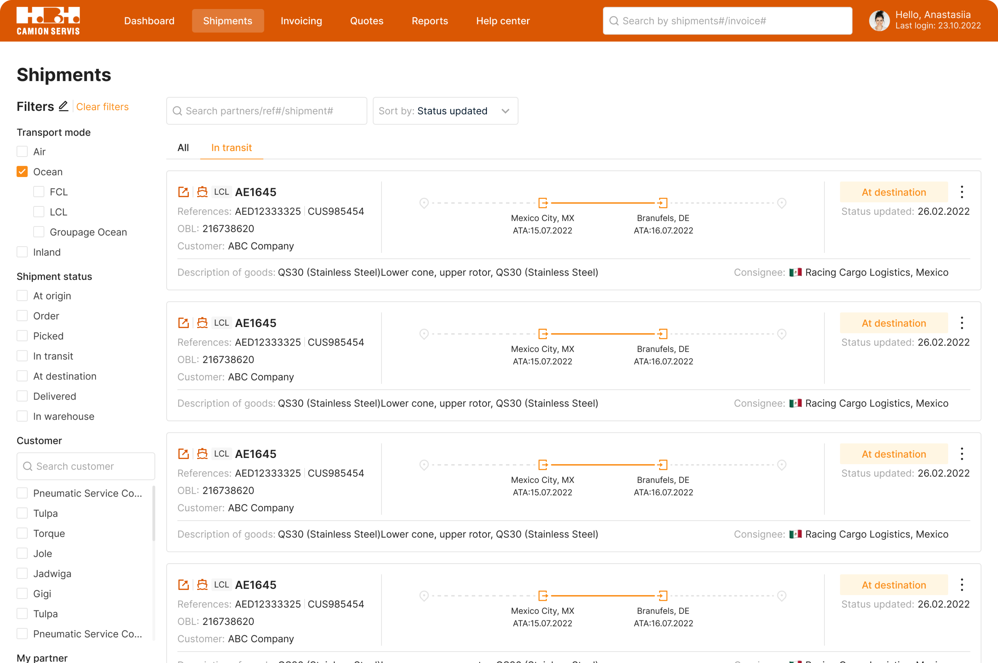
However, allowing users to customize to such an extent is never a good idea. At best, we get an unattractive platform that strains the eyes and hinders usability. At worst, the fonts will become unreadable, and user experience will suffer.
We set out to find a compromise – our designers created color palettes with primary and secondary colors and fonts that should be combined. So, when the user picks up the theme or the primary color they want, the app automatically turns on the complimentary colors, which will look good together with it and ensure the buttons and text are readable and accessible.


Eleken designed an accessible tracking platform
Most of the users LogitudeWorld has already invited to a new platform have adopted it, and they are satisfied with their experience. We tailored the design to the customer's needs while following design best practices and balancing the ease of use with customization options. The platform is informative, intuitive and easy to use.
Eleken is still working with LogitudeWorld. Our designer helps to implement the design. Moreover, she is also working on redesigning LogitudeWorld's main platform to increase its usability.
