Alture Funds
Alture Funds: How we created an investment platform MVP in 2 months
Alture Funds didn’t start from zero. Our client had already launched Elevate Money, a sleek, Gen Z-focused investment platform with neon accents, a dark theme, and a UI that felt right at home alongside crypto wallets and trading apps. It resonated with its audience: young, curious investors taking their first steps into wealth-building.
But, as the platform gained traction, a new opportunity emerged. The client wanted to build a new platform, this time for a more mature audience: investors aged 35 to 40+, who are financially stable and serious about long-term growth.
That vision became Alture Funds, a platform that gives retail investors access to fractional shares of institutional-grade alternative investment funds, a space traditionally reserved for high-net-worth individuals working with wealth managers.

To make it real, the client reached out to Eleken to help reimagine the user experience, reposition the brand, and deliver a fully functional MVP across web and iOS in just two months.
We had to move fast and design with restraint. But that’s exactly where Eleken thrives.

When one product no longer fits all
The client saw an opportunity to serve a new segment: more experienced investors who weren’t chasing the next shiny token. These users had more capital to invest, higher expectations, and a very different mindset when it came to risk and decision-making.
While the core functionality of the platform was solid, the frontend, with its neon accents, crypto aesthetics, and dark theme, didn’t align with this new audience.

To move fast, the client made a smart choice: reuse the backend infrastructure from Elevate Money, but completely reimagine the frontend for this more mature demographic.
That meant:
- A brand that felt trustworthy and grounded, not trend-driven.
- An interface that was clearer, calmer, and more refined.
- An onboarding flow designed to reflect real investor goals, not speculative hype.
By the time we joined the project, the clock was already ticking. There was no time for long discovery phases or creative exploration. But there was one more constraint.
While the frontend needed a full overhaul, the backend had to remain untouched. We were essentially designing a new product on top of an old foundation.
That forced us to be strategic:
- What could we improve without disrupting development?
- How do we shift the tone without rewriting the architecture?
- Where do we push for enhancements, even knowing some might not get built (at least not yet)?
As with any clever redesign, we started where it counts: with a solid UX audit.
Starting smart: audit before action
Before diving into design, we took a step back.
Even with tight timelines, a quick UX audit can go a long way. The foundation was there, but the interface was tailored for a different user. Our job was to spot the mismatches.
What did we look for?
- Visual cues that no longer fit: fonts too playful, colors too loud, screens too crowded for older users who value clarity over cool.
- User journeys that needed smoothing out: onboarding steps that felt fine to a 25-year-old might overwhelm someone juggling work, family, and a real investment portfolio.
- Places where trust was missing, like visual hierarchy, can build confidence.
Because development time was limited, not every insight could be implemented, and that was okay. We focused on suggesting improvements that added clarity and polish without requiring structural changes.
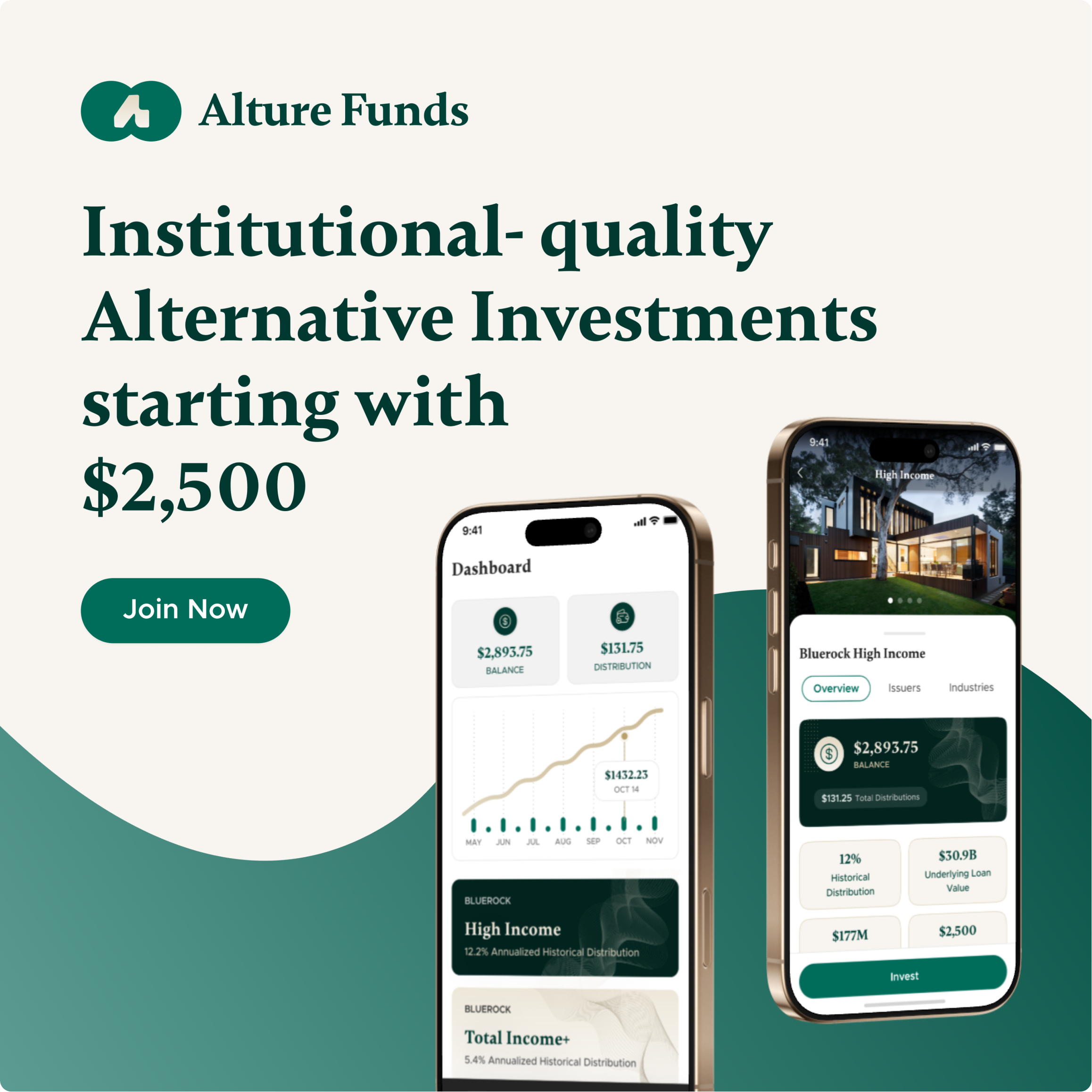
Making onboarding feel flawless
Alture’s onboarding wasn’t a simple “sign up and go” moment.
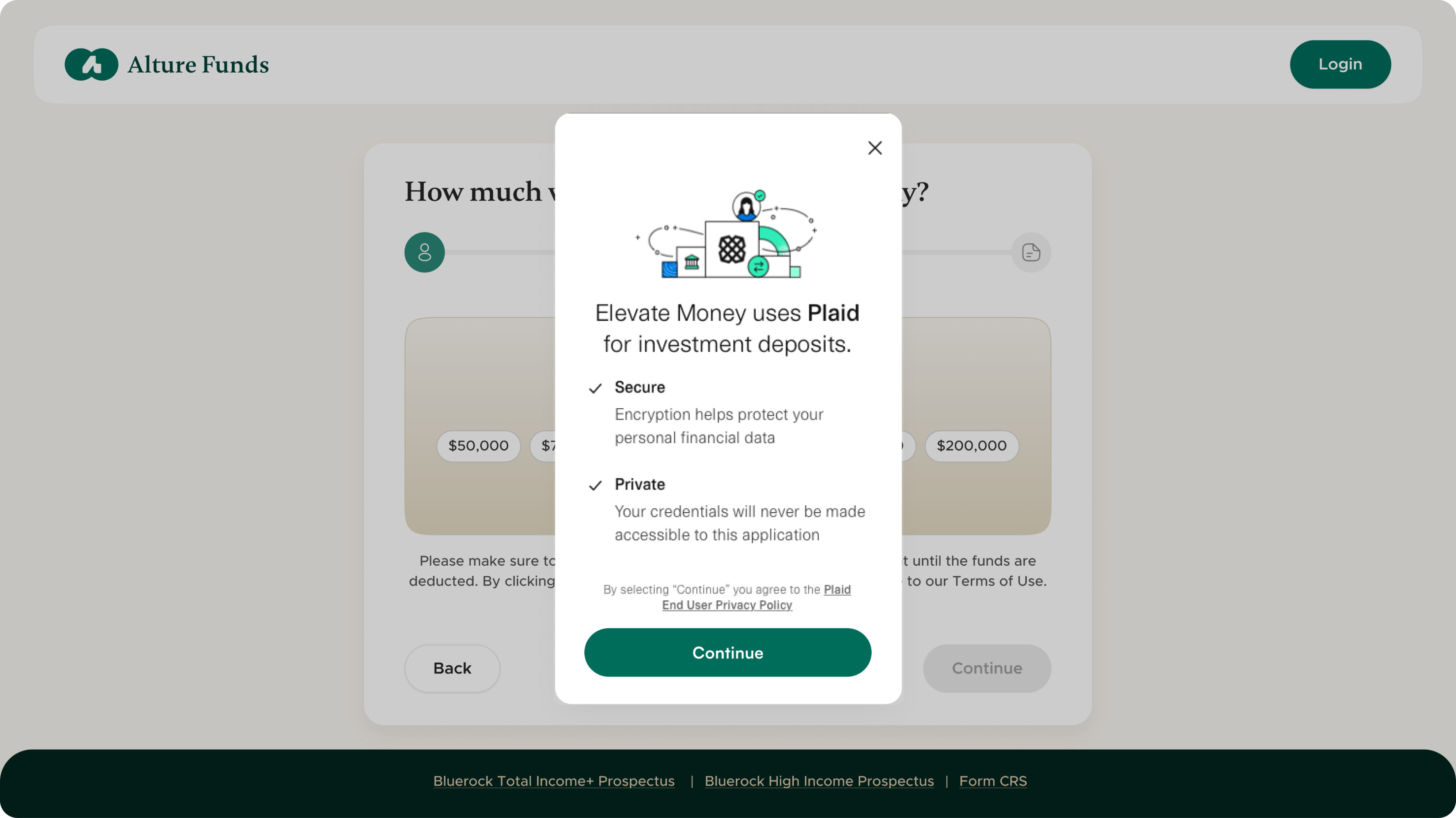
To build a personalized investment portfolio, the app needed to collect a lot of user data, such as financial details, investment preferences, income level, goals, and risk appetite. It was a hefty process, but a necessary one.
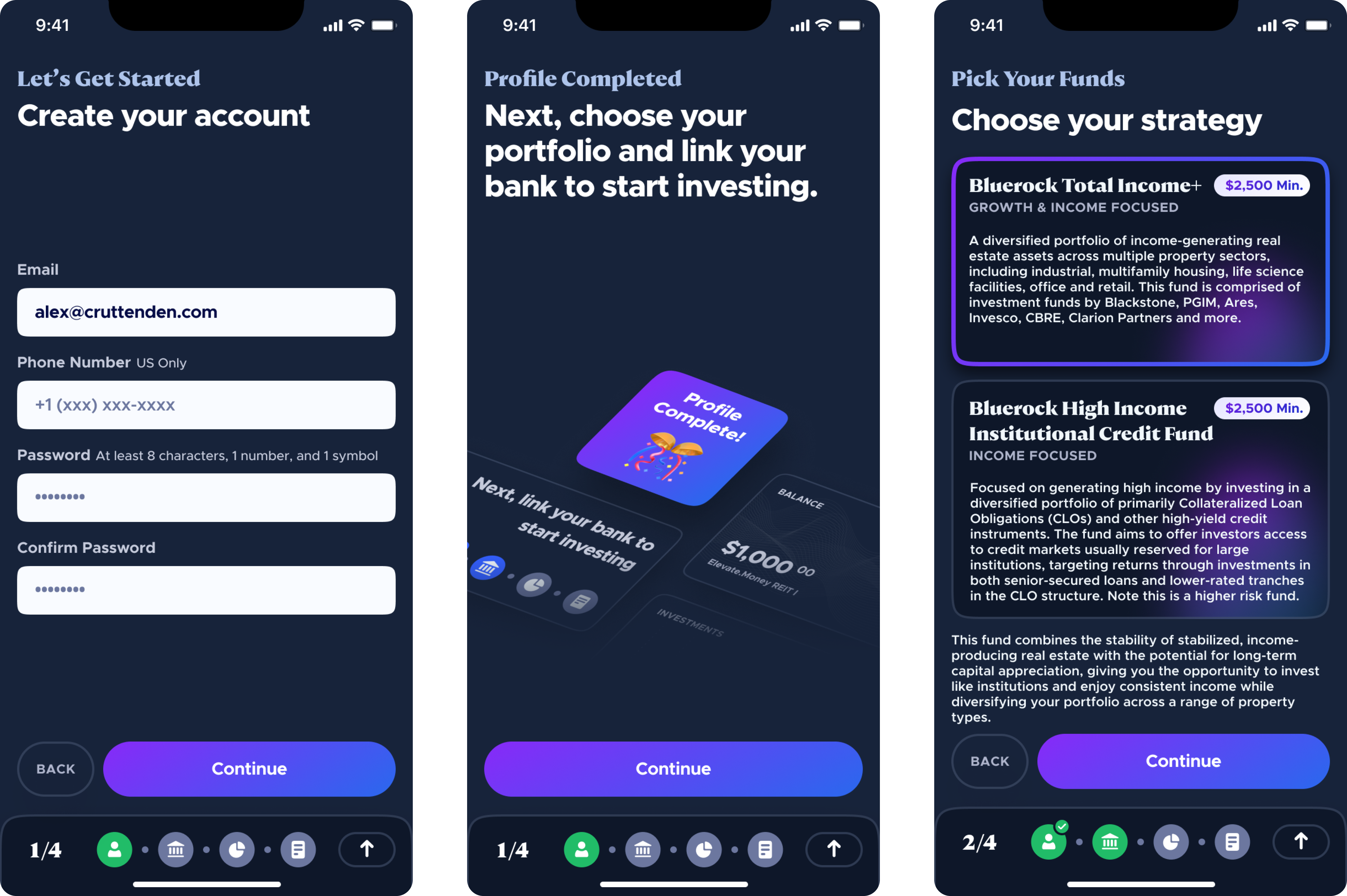
So, we suggested splitting the onboarding into a 4-step guided flow:
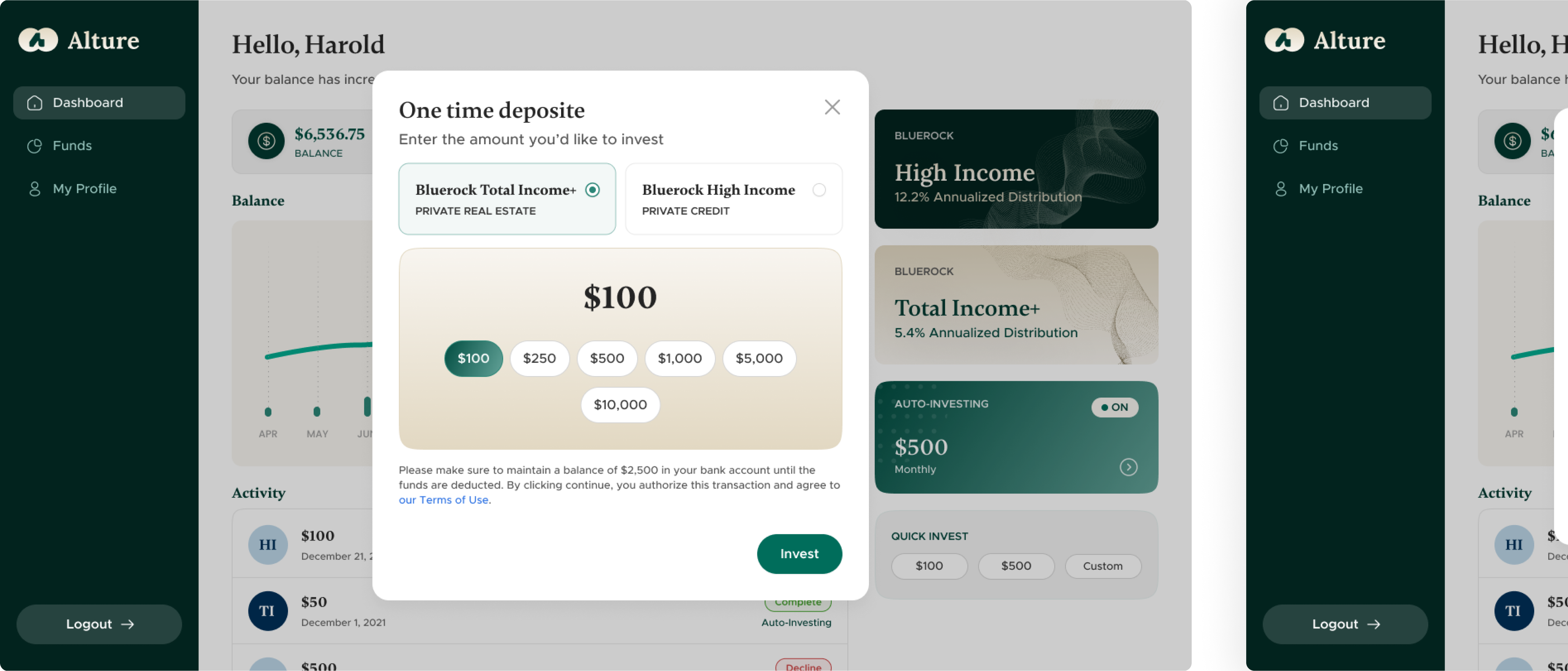
- Select investment funds: Users could quickly compare available funds and pick those that matched their goals.
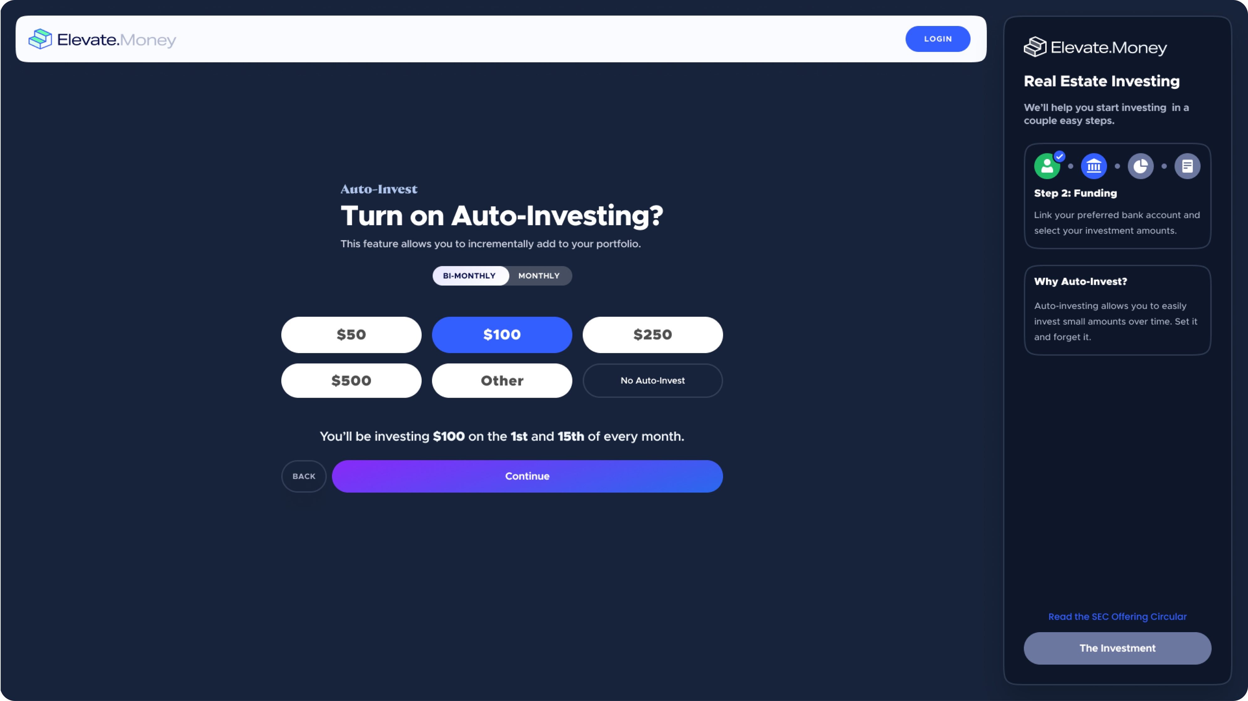
- Set investment amounts: Options for one-time and recurring investments with simple inputs and progress indicators.
- Review total allocations: Let users see their breakdown before committing.
- Make the first investment: Clear CTAs, trust-building microcopy, and confirmation screens to give peace of mind.

At every step, we focused on:
- Chunking content to avoid long, intimidating forms.
- Using calm visual language (space, typography, iconography).
- Providing micro-explanations where decisions might be unclear.
Adding wealth-consciousness into design
Alture Funds needed to feel trustworthy and stable. We proposed a light theme as the new default, a practical choice backed by user behavior: most 35+ users prefer interfaces that are brighter, cleaner, and easier on the eyes.
For color, we explored several directions but landed on a combination that felt both fresh and grounded:
- Deep green, symbolizing growth and reliability.
- Accents of gold, to suggest prosperity, value, and a touch of luxury.
The client liked the familiarity of the original color scheme, so we didn’t reinvent the wheel. Instead, we evolved it, subtly nudging it into a more mature, wealth-focused space.

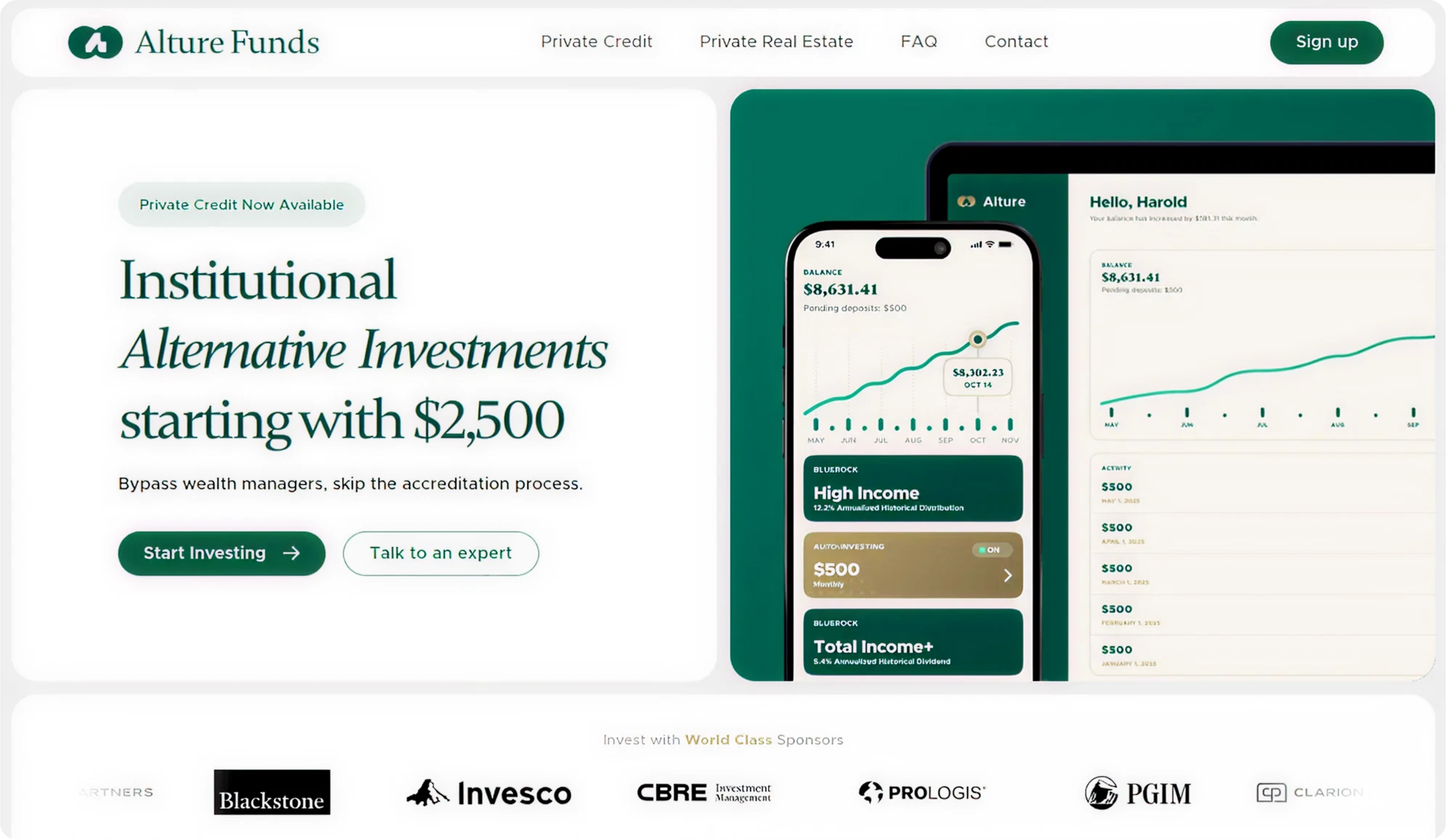
Creating a clean, professional UI for mobile and web
With the brand direction locked, it was time to apply it to the product itself.
Alture Funds was launching both a mobile app (iOS) and a web platform, and they needed to feel like two sides of the same coin, not two completely separate experiences.
So we took a parallel design approach, building for both platforms simultaneously.
Rather than splitting efforts between mobile and web, we mirrored user flows and page structures across devices, building user familiarity.
Whether someone starts on their phone or their laptop, they’d always know where to go next.
We prioritized:
- Visual clarity: There is no unnecessary decoration. Every element had a job.
- Consistency: Colors, components, and typography carried over seamlessly across platforms.
- Touch-friendly spacing: Especially on mobile, we optimized every tap and scroll to reduce friction.

The result was a unified experience that felt modern, stable, and intuitive, with just the right balance of form and function.
Creating the essentials beyond the product
Designing the product was just one part of the job. Alture Funds also needed to make an entrance and look confident doing it.
That meant building a marketing foundation that matched the new product tone: clean, composed, and quietly persuasive.
- Web presence
We designed and built the website in Webflow, allowing quick iterations and immediate deployment.
- Design support for launch
We didn’t stop at the UI. Our designer also created a new logo that felt stable, refined, and quietly premium.
To support Alture’s brand announcement across social channels, we also designed visuals for Instagram and LinkedIn.
We produced a short launch video using Canva, keeping it under 30 seconds for maximum engagement.

In addition, we crafted swipeable educational carousels designed to ease unfamiliar audiences into the world of alternative investing.

Alture Funds goes live in just 2 months
True, development time was tight. The backend was locked in. And while the client was open to design improvements, anything that required new logic or complex implementation was often a non-starter.
Still, that didn’t stop us from thinking bigger.
During the UX audit, we identified friction points where minor tweaks could significantly improve the experience. We proposed enhancements, such as better screen hierarchy and subtle micro-interactions for user feedback and clarity.
Not all of it made the final build, but suggesting improvements, even ones that might not get implemented right away, is part of our process.
We didn’t push for features that the team couldn’t build. Instead, we focused on making the most of what we had.
We helped the client:
- Reimagine the brand for a more mature audience.
- Redesign the product experience across web and mobile.
- Streamline a complex onboarding flow into something clear and calm.
- Build marketing assets and a website to support a confident launch.
And yes, we worked within more constraints than we usually like. But even with limited dev flexibility, we delivered a product that looks and feels tailored to the people it’s meant for.