Nworx
How Eleken helped the corporate learning management platform solve the problem of negative feedback
NWORX is a B2B SaaS platform that embeds professional development into everyday work. The tool allows managers of large companies to create learning programs for their employees. The product also helps workers to learn and grow without interrupting their workflow. The ambitious goals of such a platform require flawless user experience.
When by end of 2021 NWORX had collected user and buyer feedback on the product, they realized there was a problem. While the buyer feedback was great, there was a clear opportunity to improve the UX for end users. To work on this aspect, NWORX partnered with Eleken.

We started with the deep product analysis
To understand where the friction is hidden and how we can help the client’s business to overcome the challenge, we had to understand how the product works.
NWORX customers are businesses that have a certain number of employees. The company submits an application expressing a desire to use NWORX and then it is approved by creating accounts for the employees of the client company. Now, the company's managers can create training programs (of any size) that employees will study.
There’s a system for tracking the individual progress and evaluation of their knowledge at the end of the course. This is the most simple and widespread scenario of using the platform.
The NWORX platform when we started working with it looked like this:
We discovered the following design problems:
- The app critically lacked design hierarchy. It was not clear what actions were of the first priority.
- Navigation within the product was poor. It was unclear where the feature user sees on the screen is located within the product. The connection between design elements was not obvious.
- The interface looked quite messy and outdated. Too much visual noise, and no consistency in UI elements. Design that was good some time ago required modernization to meet the current standards.
- A web platform design was just a scaled mobile application design, which is not the correct way to create web user interfaces. Such a simplified solution caused friction and looked poor on the screen.
During the trial period, Eleken designers addressed these challenges right away. We worked through the conducted analysis, attended brainstorming sessions with the NWORX team, and offered several variants on how we can improve the UX.
Each suggestion was backed up by solid argumentation from our design team. NWORX team was satisfied with the number of options and how quickly they were prepared. After receiving the green light, we started redesigning the platform.
Thorough research enabled us to design improved user flows
To create a great learning platform for corporate clients, we also conducted competitor research and analyzed well-known platforms like Coursera and Udemy which were the closest logical references. We also analyzed user feedback from prior releases. Based on our findings we redesigned user flow wireframes.
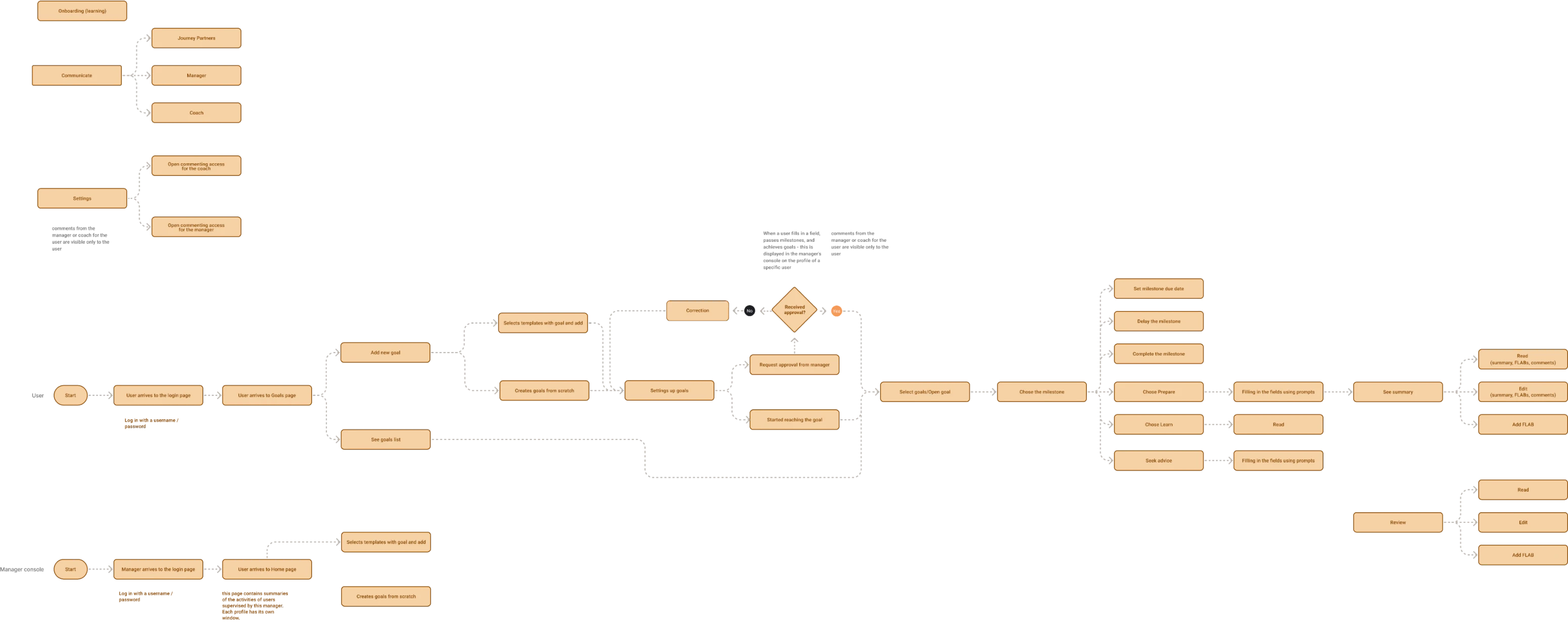
The new user flow became a framework for the rest of the redesign project.
We redesigned a core functionality UX
After user flows were ready, we moved on to high-fidelity design. Through multiple iterations performed in collaboration with the NWORX product team, we revamped the whole NWORX platform.
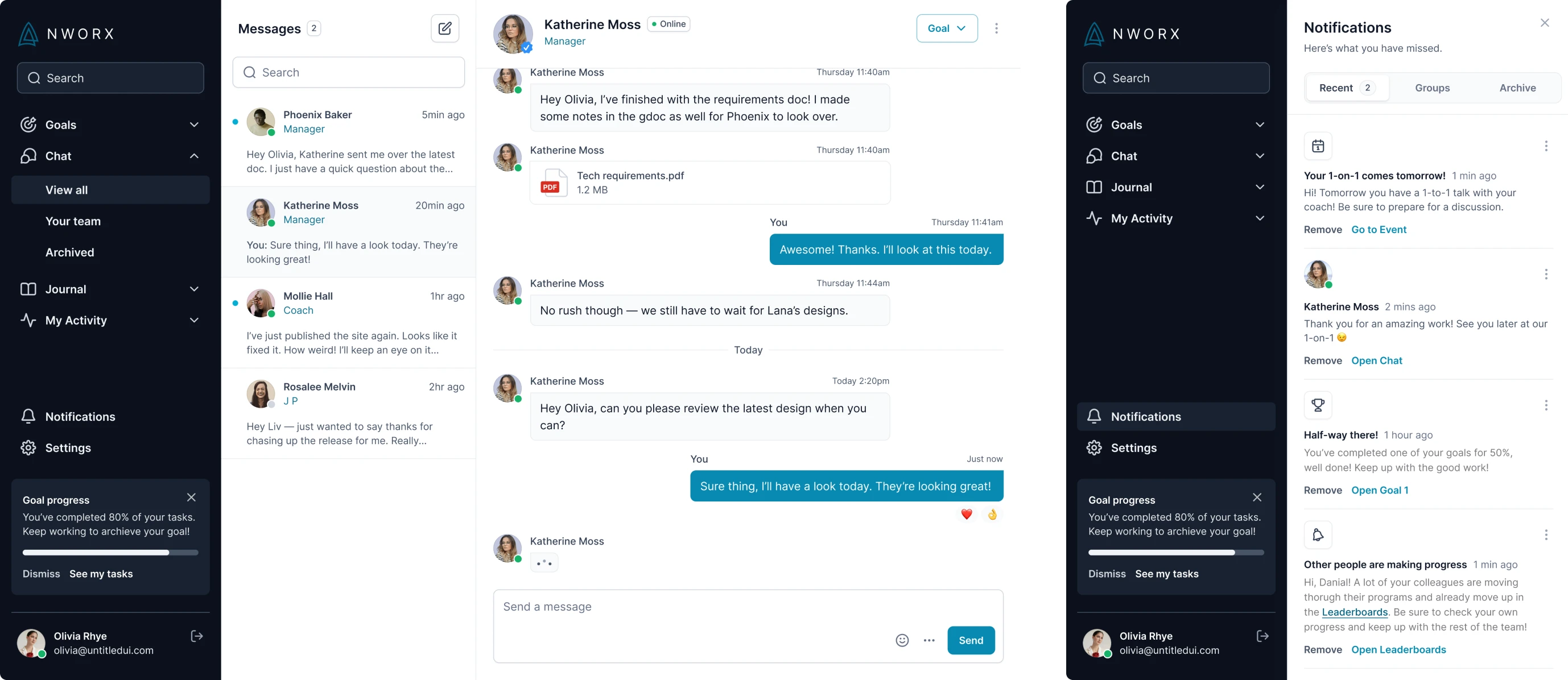
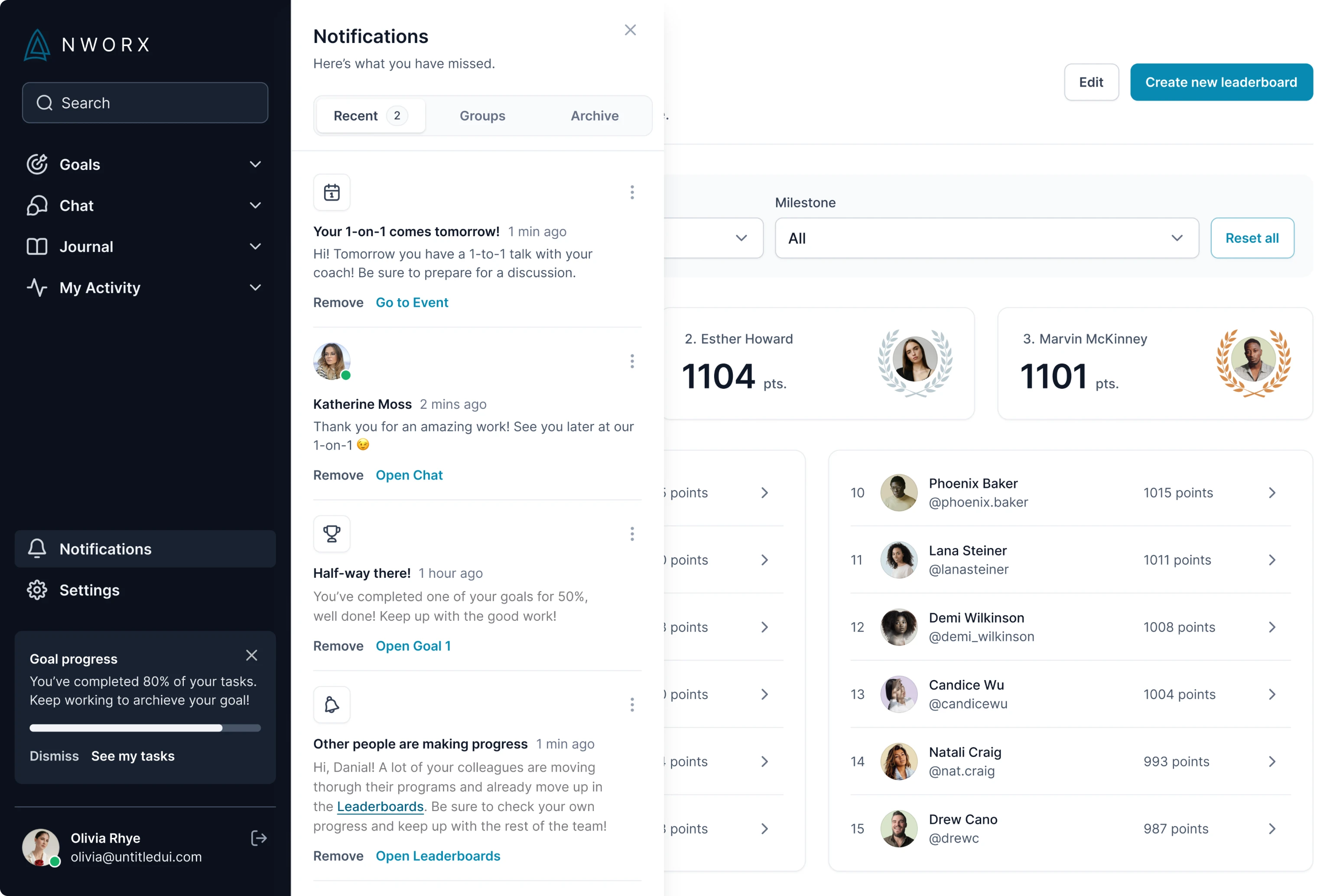
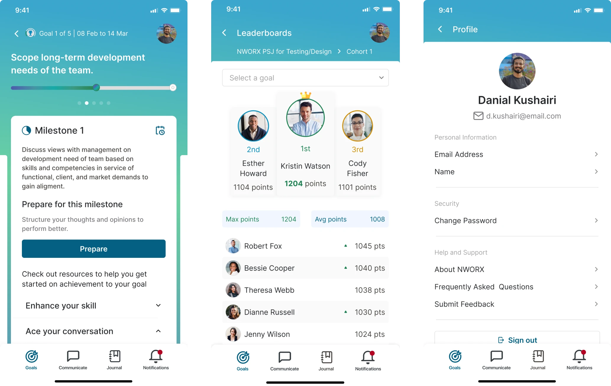
The new platform design consists of a side menu that users navigate through from wherever they are on the platform. The menu bar also organizes the main product features, like search field, goals, chat, journal, settings, notifications, and profile.
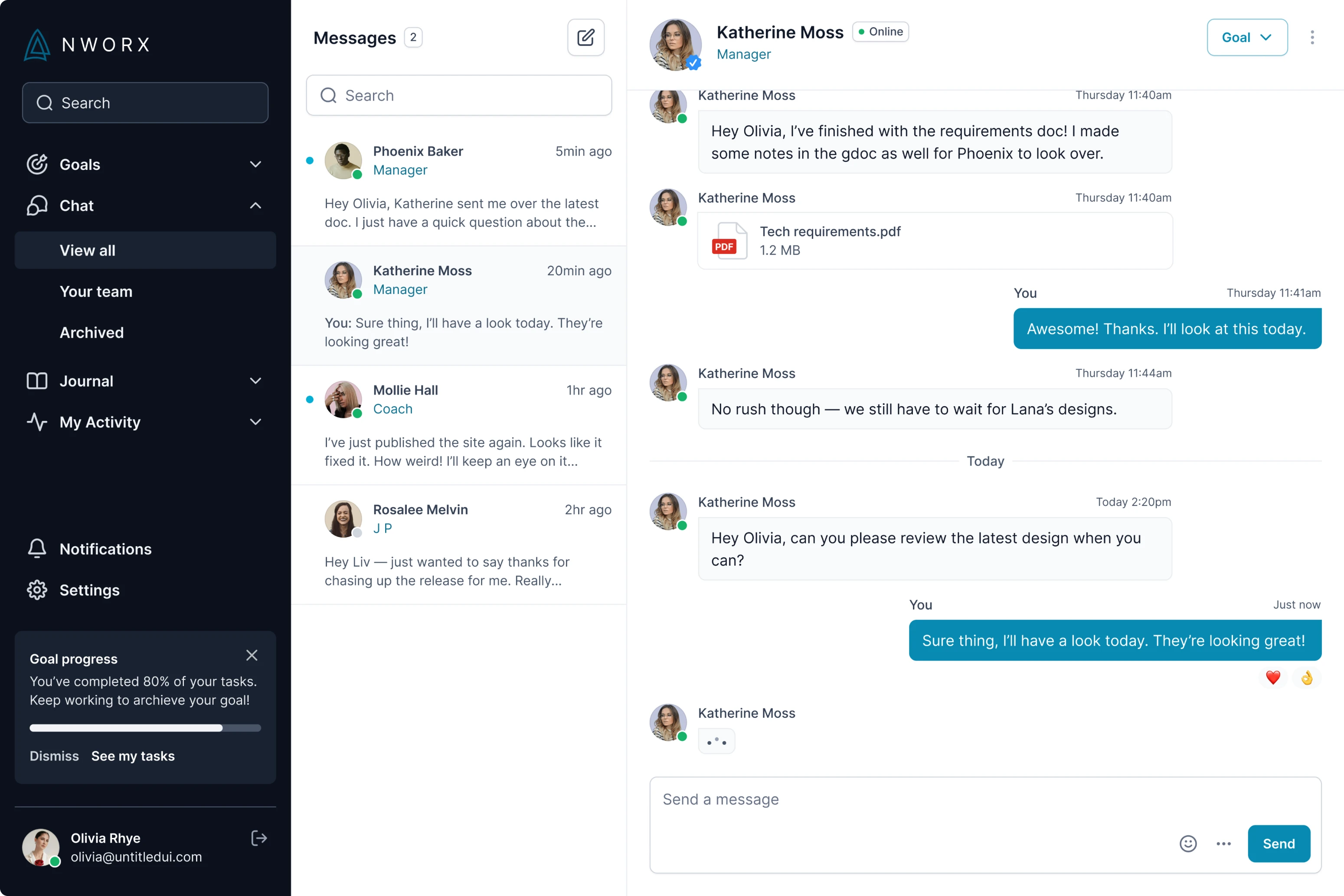
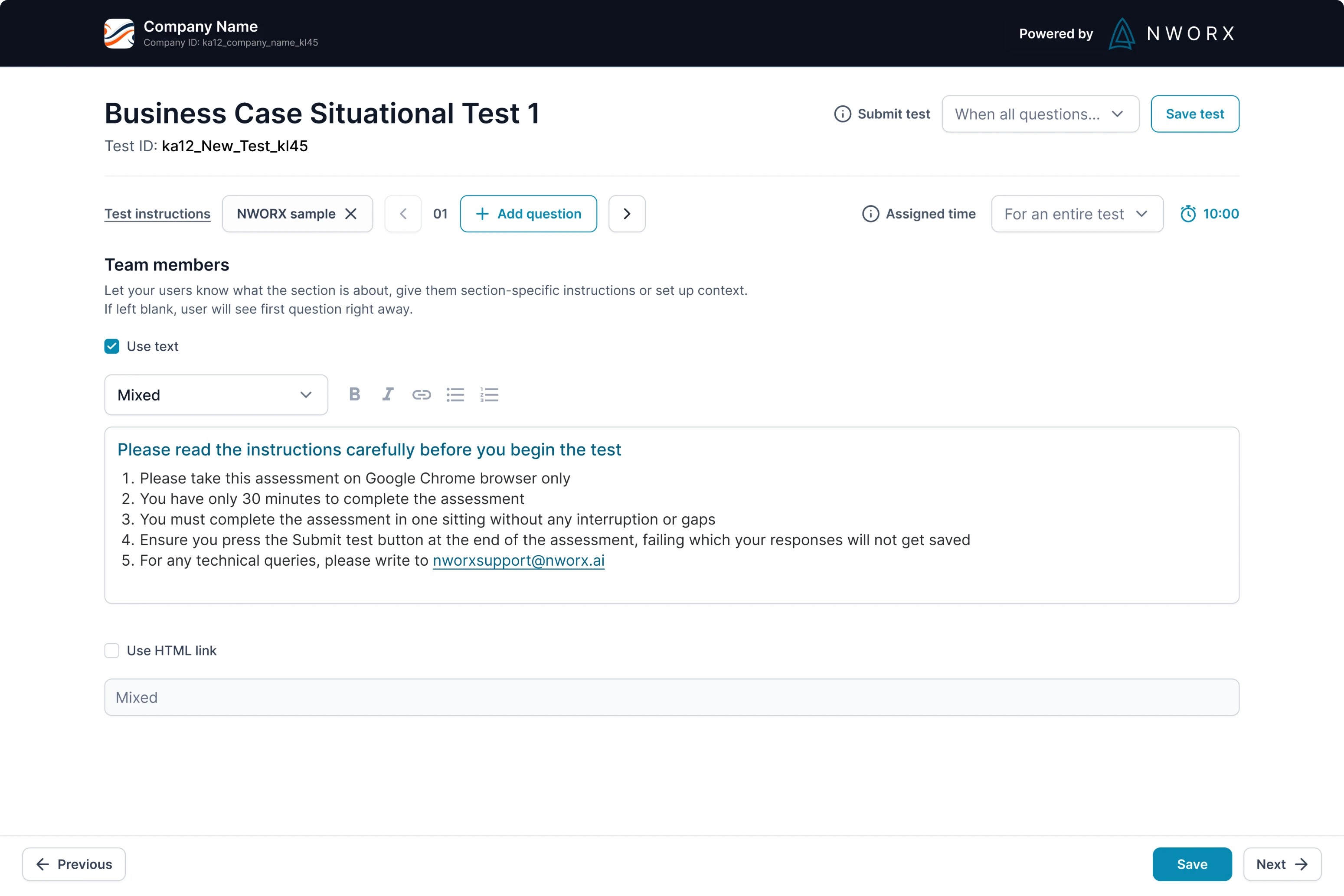
Managers of organizations can use NWORX not only to set up the goals for their teams, but also to create courses, tasks, and tests for their employees. For this we created the page, on which the central element is a text field where managers can write assignments.
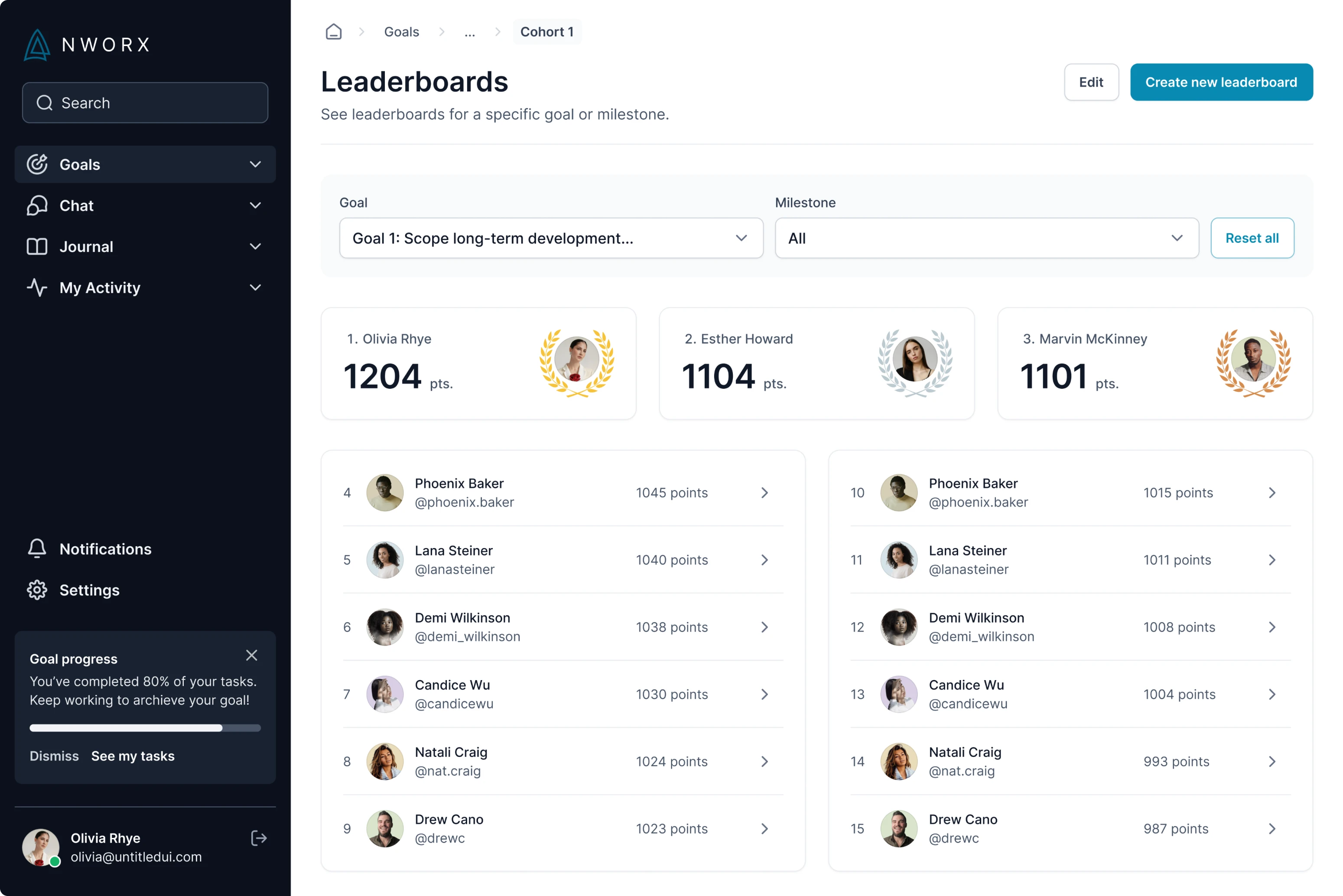
All elements in the new design are following the visual hierarchy, making the platform more comprehensive for users. Now NWORX learners can clearly see their milestones and their statuses, what goals they are on at the moment, and what their deadlines are with a single glance.
Directly addressed users’ needs
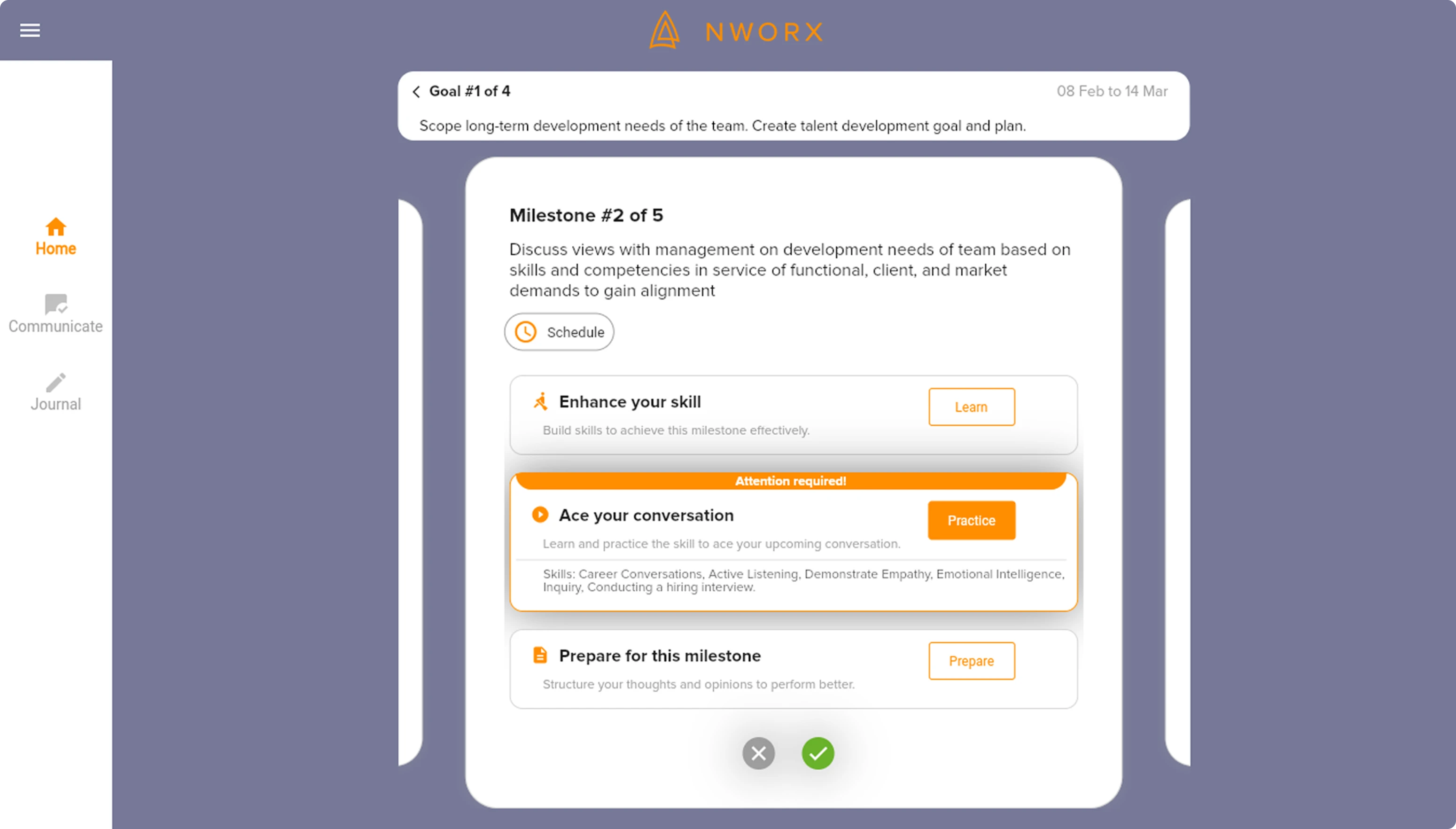
Within the NWORX platform users can track their individual and team progress. Some of NWORX's customers lacked the option to create personal training for themselves and track their progress or a personal diary for self-improvement. So we helped our client and designed this feature as well.
There was one page that was supposed to show student progress, which looked pretty official. Some users didn’t like the official design and wanted to have something more "interactive".
Our designers decided to visualize the progress of the learner and add illustrations that users can associate themselves with.
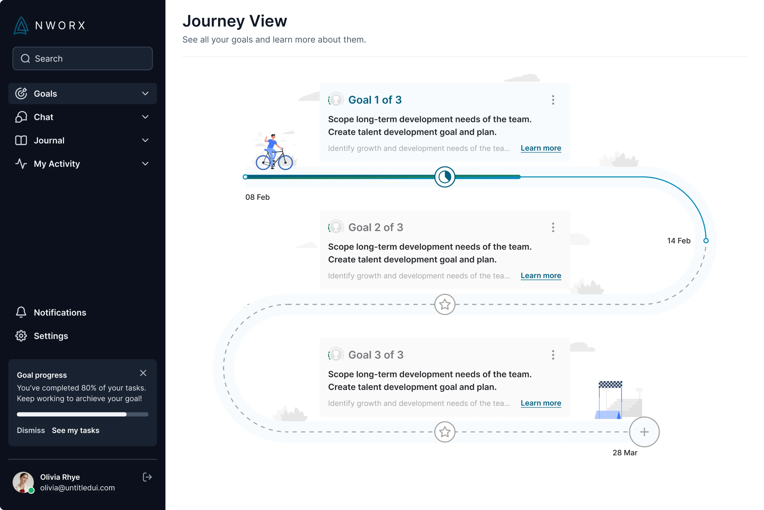
The platform came out to look more friendly and positive. We enjoyed the process and the customer was happy with the result.
But our cooperation with the NWORX did not end with the platform’s UX.
Created a mobile version that complements the platform
Apart from the web platform, the NWORX team needed additional screens for the product’s existing mobile application. For their app, we created a responsive design that works for different types of mobile devices.
For both the mobile version and the web platform, we designed a user interface with great attention to detail and design consistency.
The client and the users loved the new platform
When the designs were finalized NWORX conducted the usability tests, and the new UX performed more than well. Users intuitively interacted with the app and left great feedback about UX. And positive feedback from users about UI increased by 200%. This is what we call the power of design.
If your product is not performing great, the problem might be hidden in the UX. Contact us and let’s discuss how Eleken can help your business.
NWORX3 design has been a success story. We have deployed NWORX3 at multiple enterprises since the redesign. We have seen a significant decrease in the 'UX friction' feedback from end users. There has been a 200% improvement in the positive anecdotes on the App UI. They were professional to the core and ensured that they deliver no matter what./