Frontend AI
Webcrumbs: How Eleken designed a Frontend AI tool that went viral on Product Hunt
Webcrumbs set out to build a platform where every line of code matters and where developers feel at home. But visually, the product told a fragmented story.

When the client came to Eleken, their open-source software project lacked cohesion. Each part of the product looked like it came from a different team:
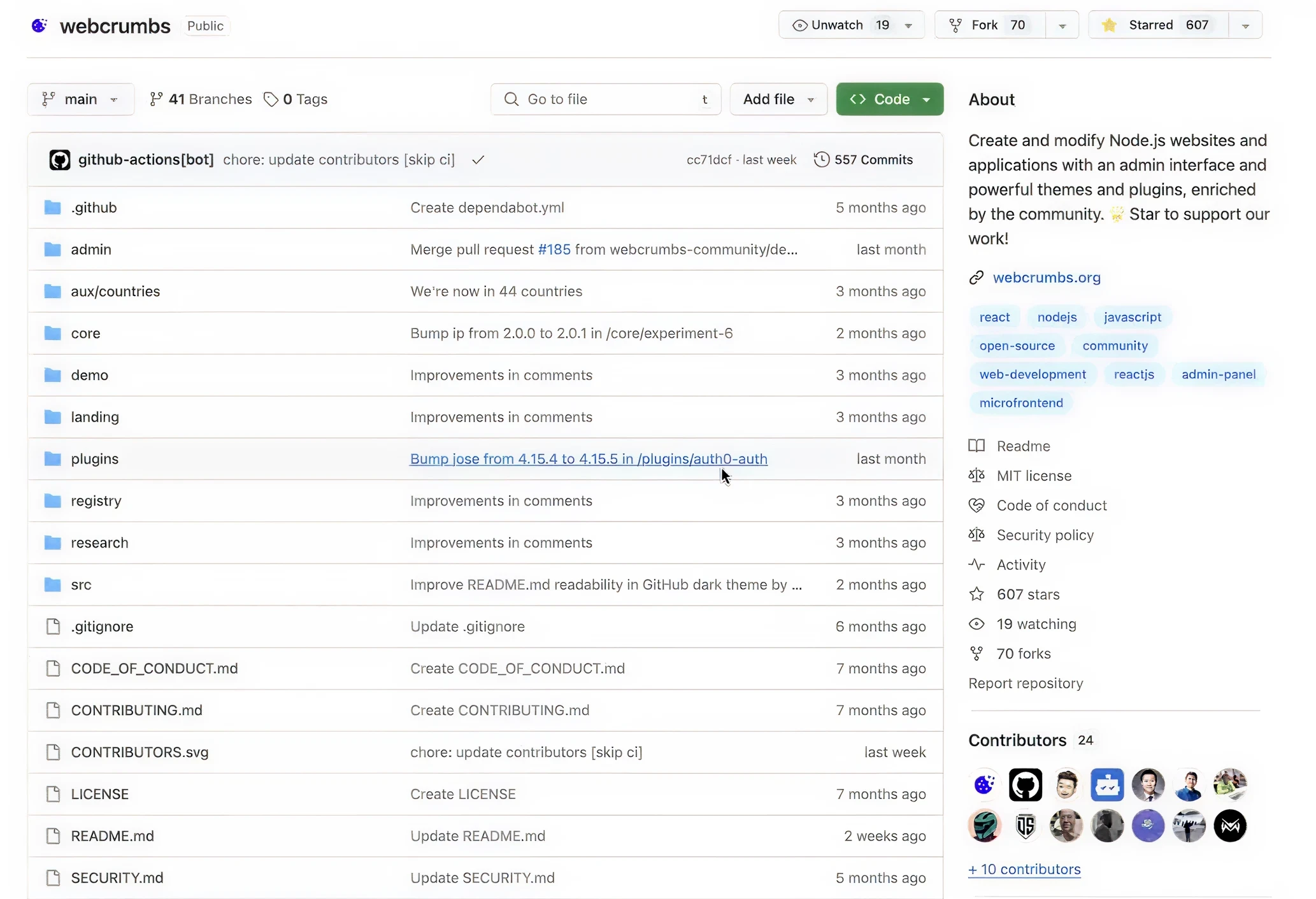
- A GitHub repository with a clean, blue interface.
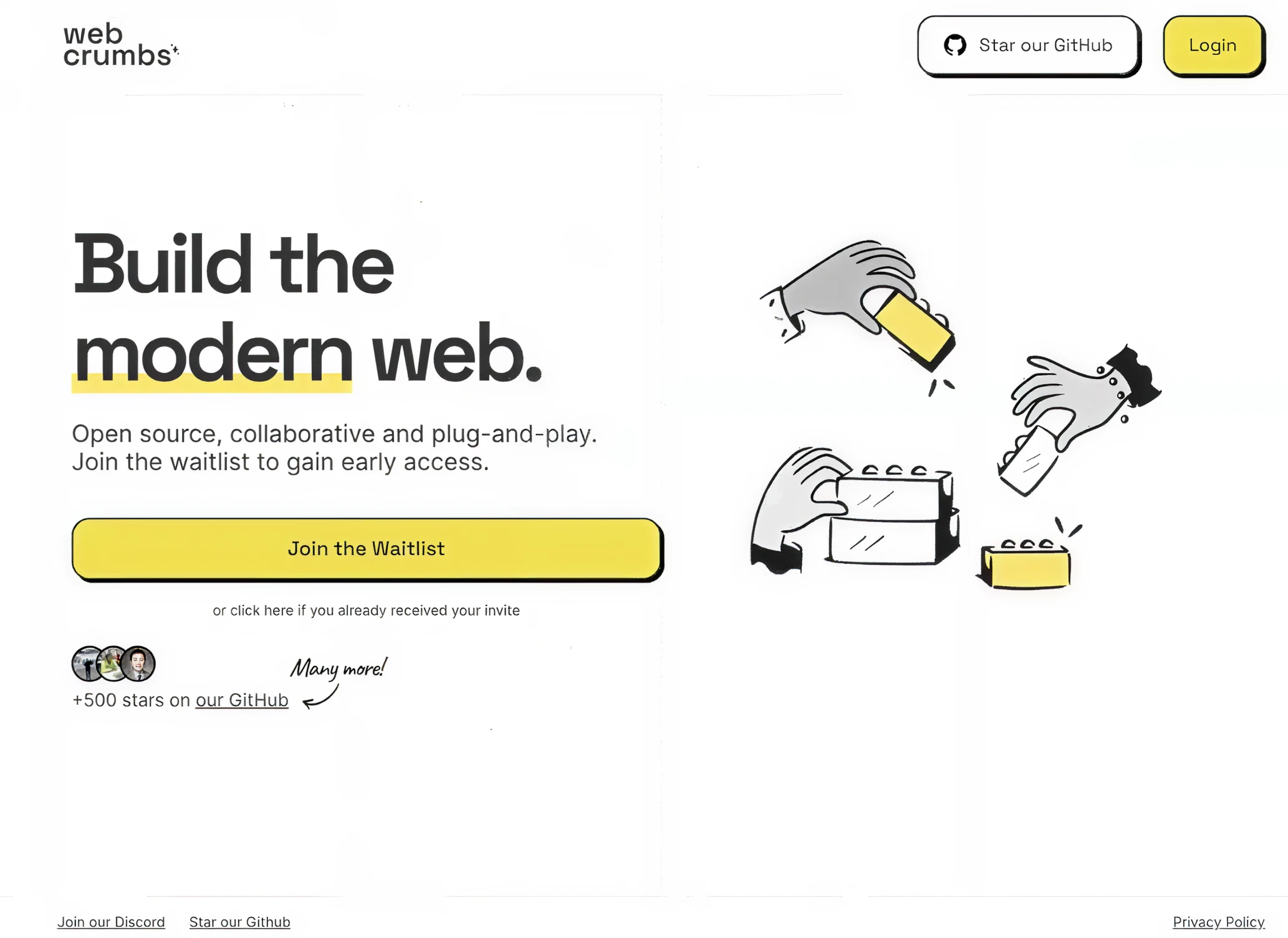
- A waiting list website in a bright, yellow palette.
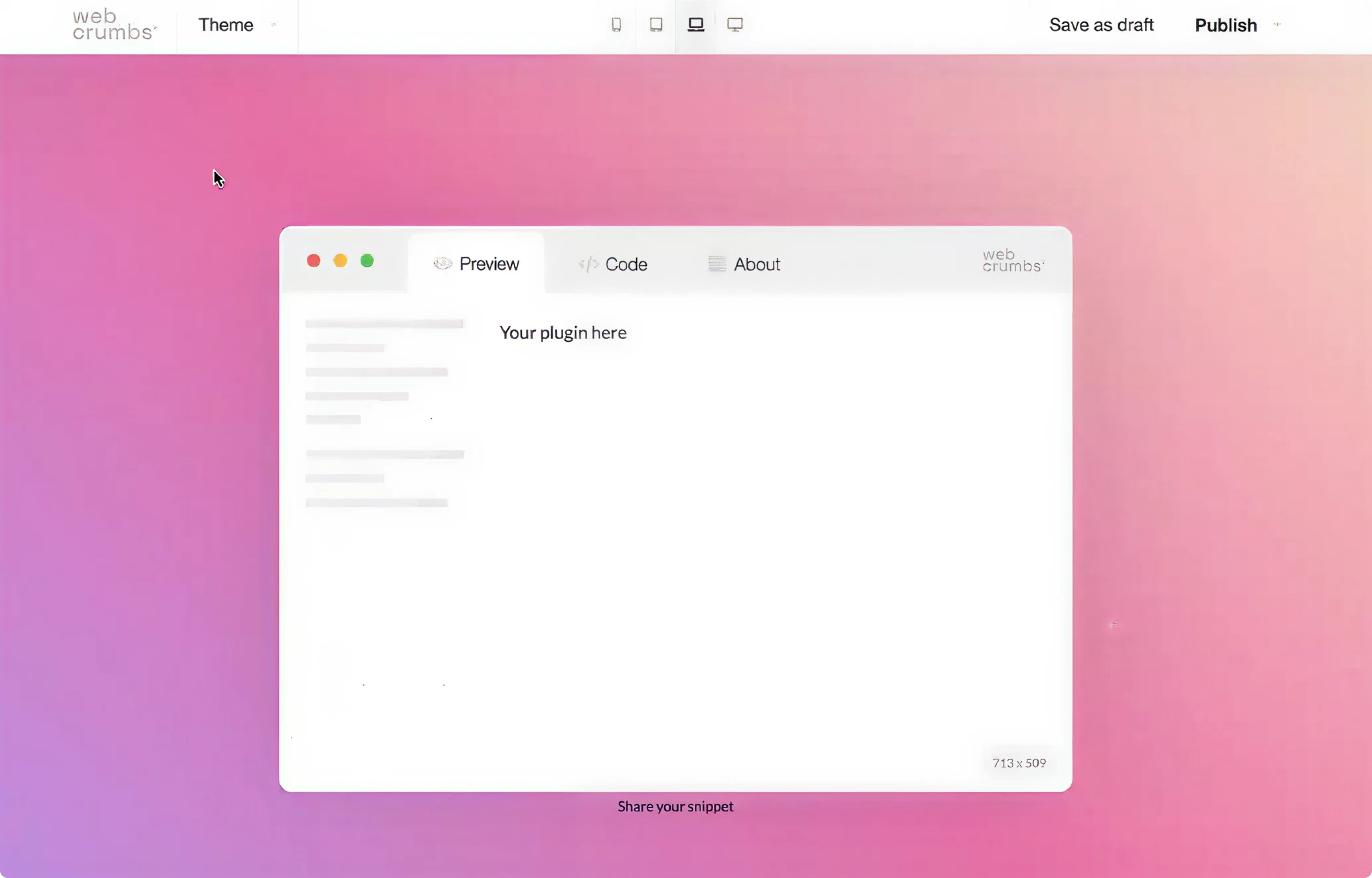
- A plugin UI following yet another, unrelated style.
These key touchpoints had separate visual identities with no connection between them.
For the client, it was a huge problem. They needed a unified design language that would tie everything together and feel intuitive to developers.
The challenge is to achieve visual consistency across the entire platform, from the first repo visit to the final plugin click.
Eleken’s trial starts
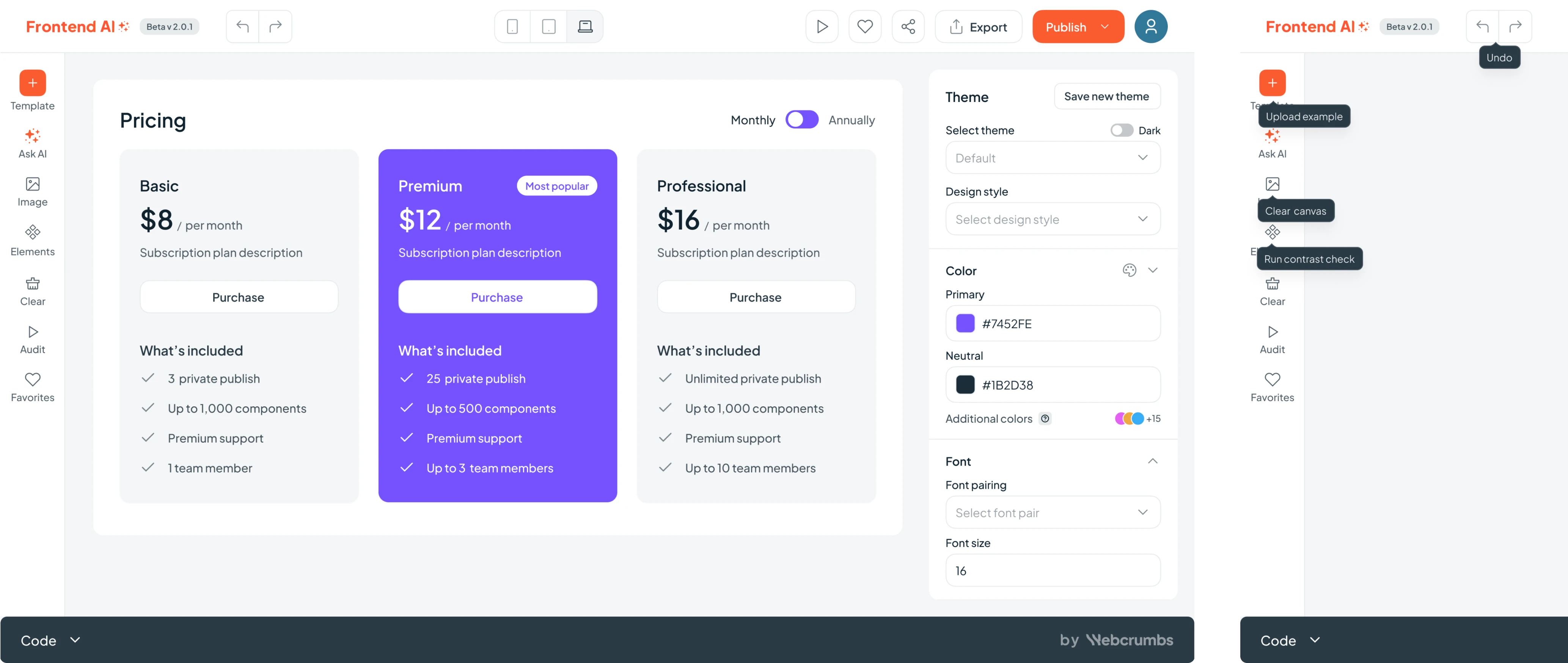
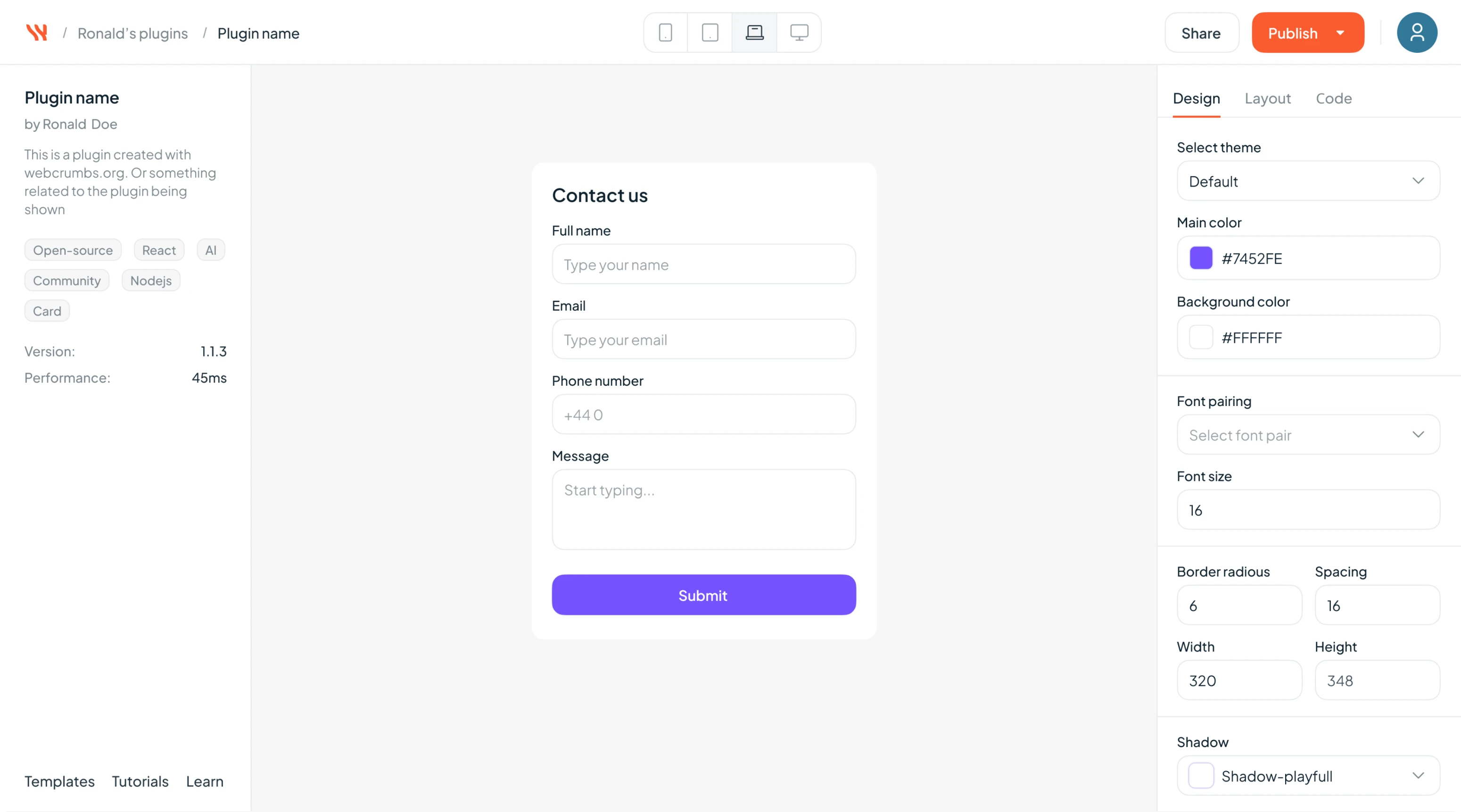
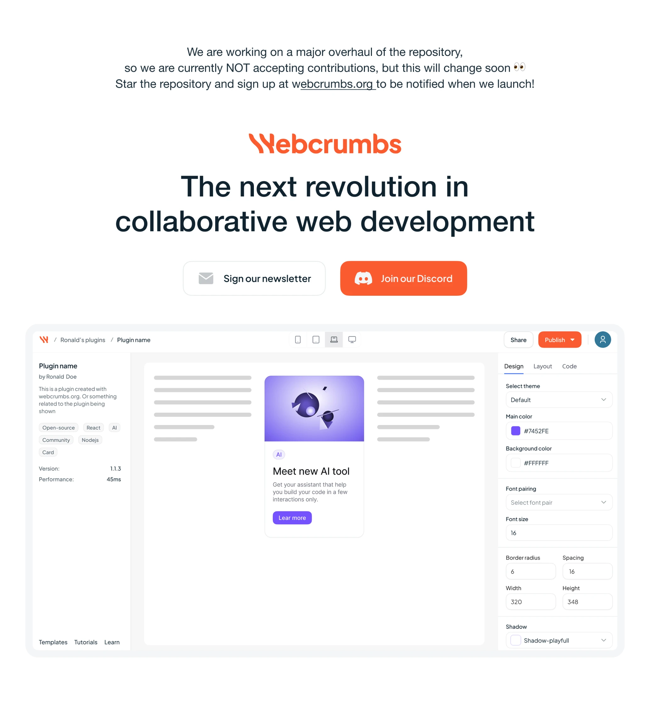
At Eleken, we offer a free 3-day trial so potential clients can see how we work before committing. For Webcrumbs, our trial task was to design a simple plugin screen with one window that let users tweak themes by adjusting colors, fonts, and spacing.
The client’s request was practical: help bring consistency to the plugin UI. We delivered a clean, flexible interface that finally felt intentional.
But as we refined the Plugin Builder, our collaboration shifted.
At Eleken, our designers think alongside clients. And in this case, we helped spark something bigger: a new Frontend AI tool. So, the scope of our work expanded far beyond a single plugin screen.
From a simple plugin UI to a new platform
The trial was successfully over, marking the start of our full collaboration. But within a few weeks, things took an unexpected turn.
While working on the plugin, the client shared an internal tool, a sort of reverse ChatGPT that could generate UI components from prompts or screenshots. It was early-stage, but full of potential.
From now on, our designer became a thought partner, helping shape the product vision from the ground up. Together, we co-created what would become Frontend AI.
Frontend AI is an open-source developer tool that uses artificial intelligence to generate UI components from simple prompts or images, allowing users to customize, export, and build faster without starting from scratch.
Here are some details on what we did next.
Defining a new product
Frontend AI wasn’t entering a crowded space. It was carving out its own.
There were no clear competitors doing exactly this: a tool that lets developers generate UI components from prompts or images, then fine-tune the output and export production-ready code. That meant we couldn’t rely on competitive benchmarks or established UX patterns.
We had to start from scratch by understanding the users before designing for them.
We conducted quick interviews with potential users. We asked about:
- Their current workflow for building UIs.
- How often do they use AI tools, if at all?
- What would make an AI-powered builder actually helpful and not just a novelty?
The insight was clear: people wanted acceleration. That became our guiding principle: Frontend AI should feel like a creative partner, not a black box.
We took that insight and started shaping the product’s core experience.
Designing with and for AI
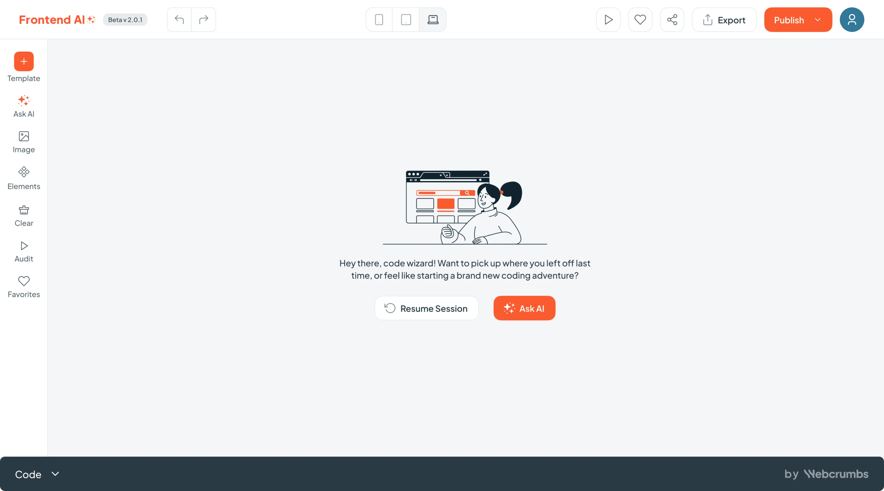
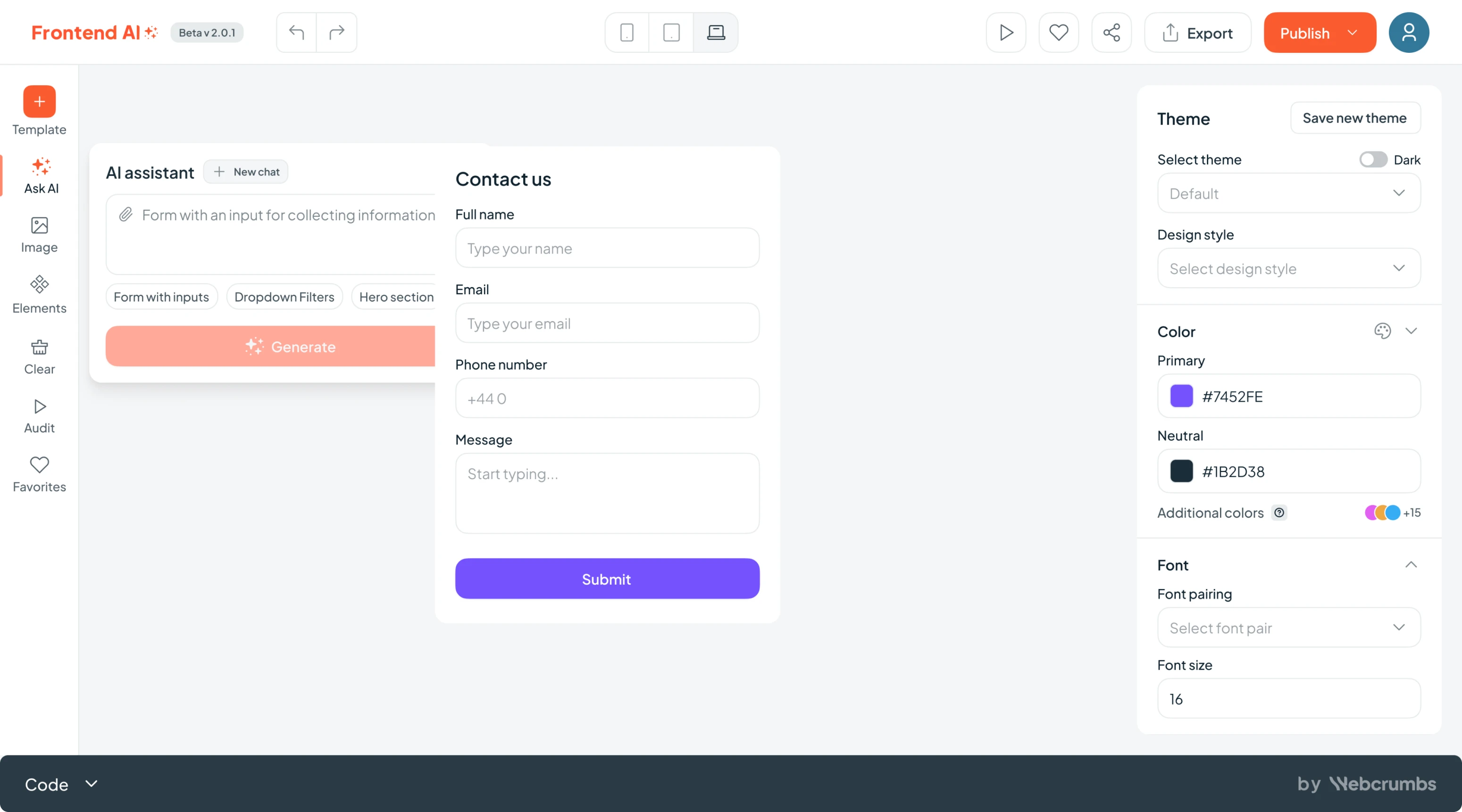
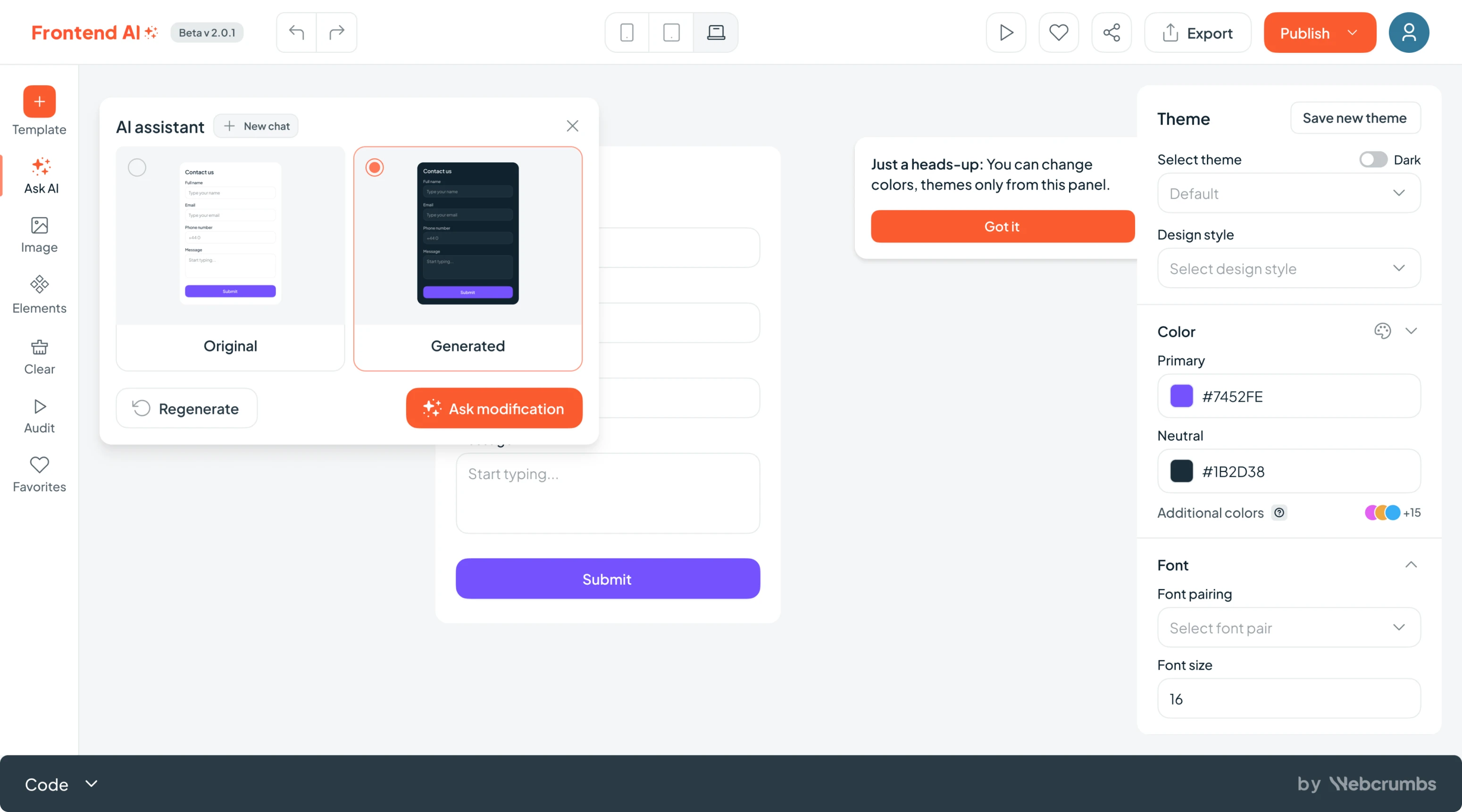
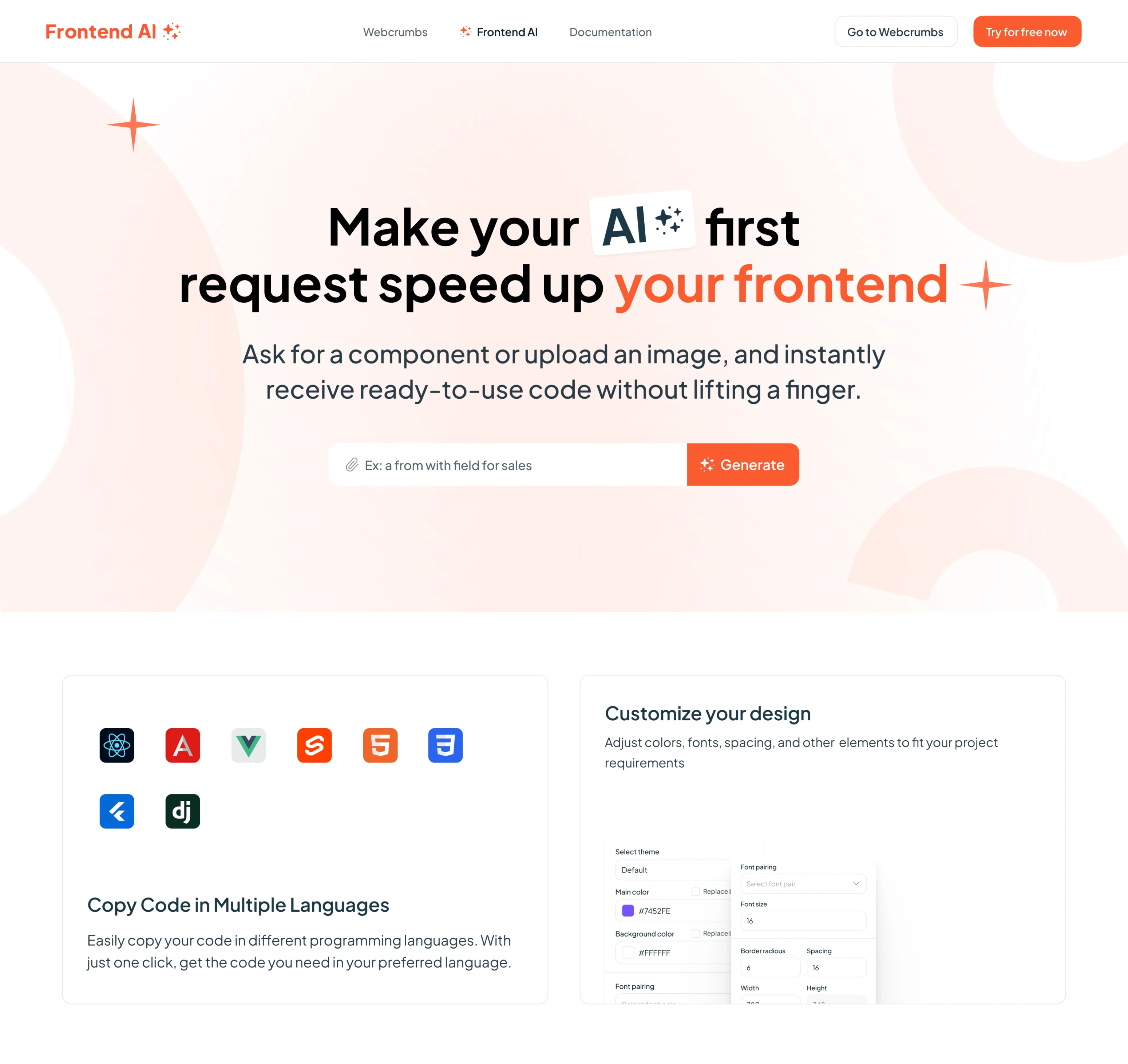
At the heart of Frontend AI is a simple but powerful concept: type what you want, and let the AI build it.
If you need a login screen with two fields, a “Sign in with Google” button, or a pricing section with three tiers and a monthly/yearly toggle, just ask. Frontend AI takes your request into ready-to-use components so that you can move from idea to implementation in minutes.
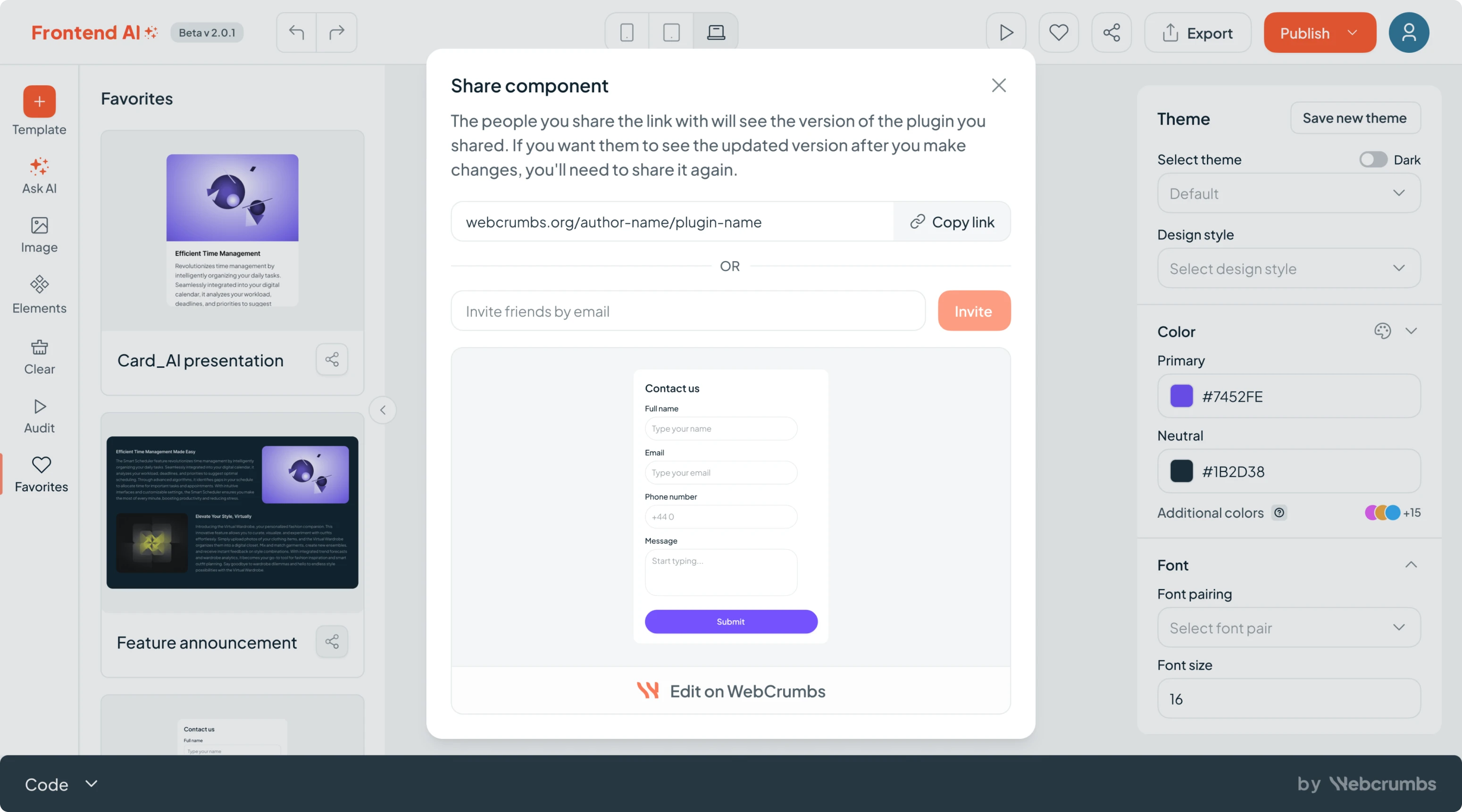
The “Ask AI” interaction became the core block of the product, and it had to feel smooth, clear, and responsive.
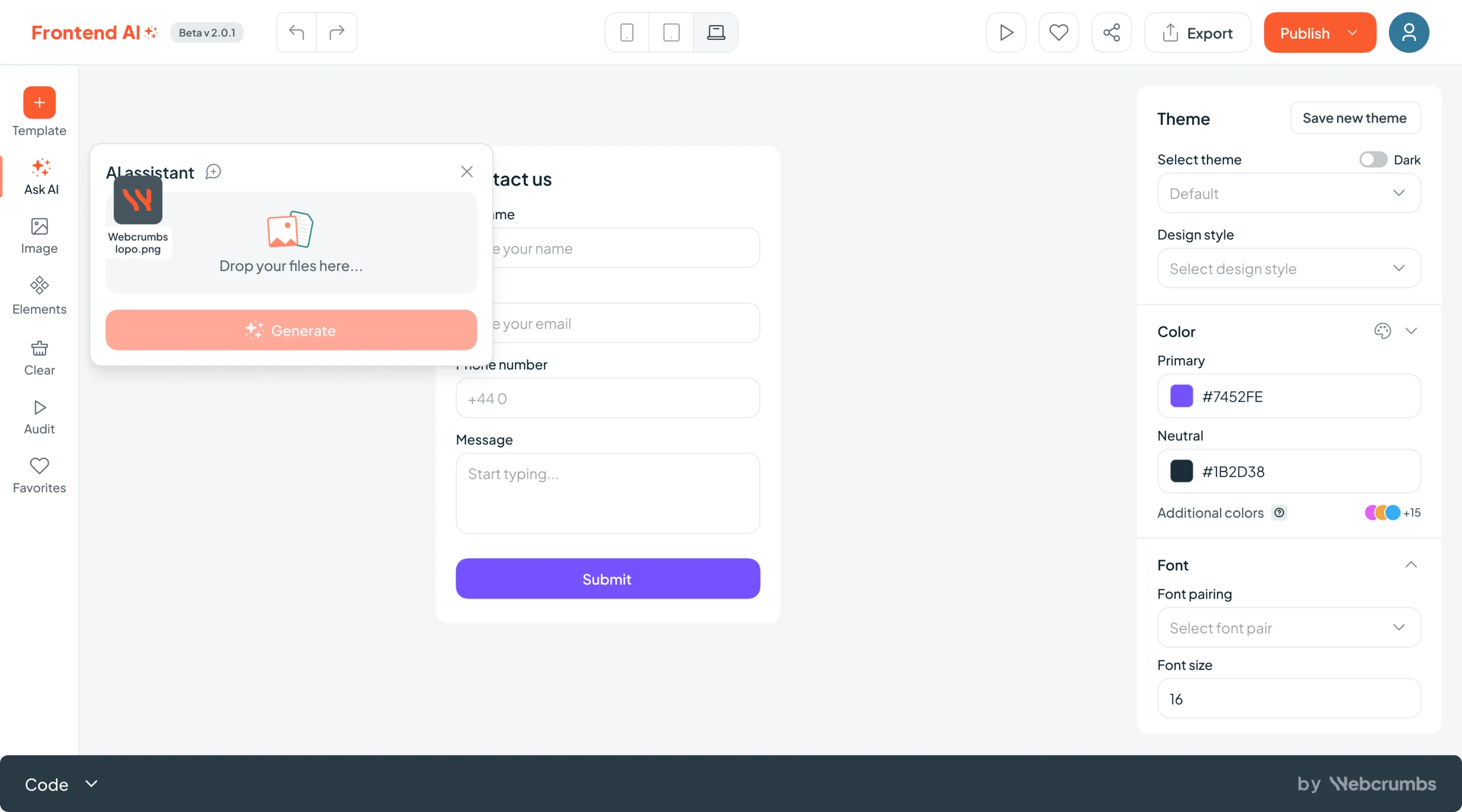
We created a dedicated input area, with space to:
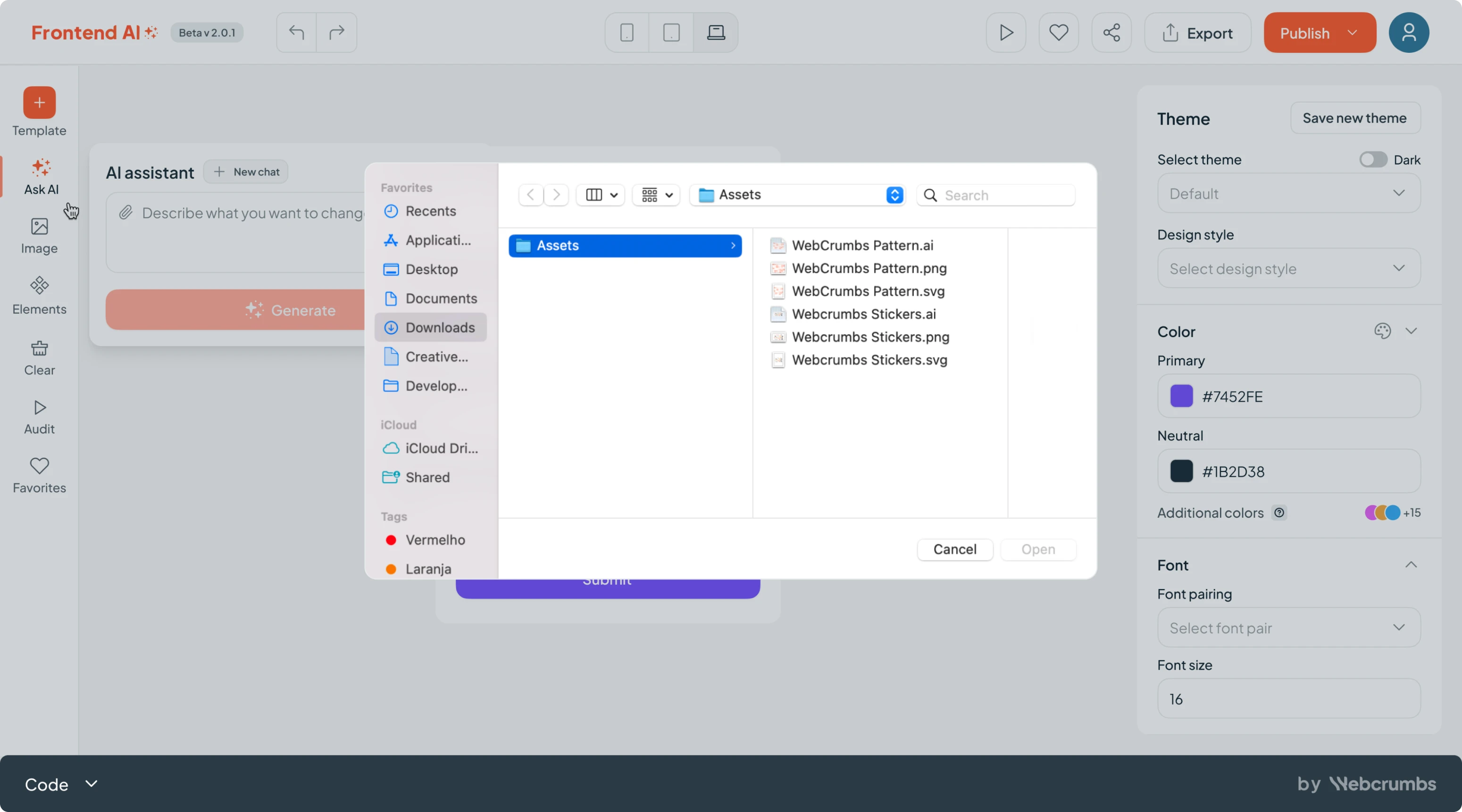
- Type or paste text prompts.
- Upload screenshots or sketches.
- See your generation history and recent results.
Once a user hit “Generate,” the backend kicked in. But there was a challenge: it can take AI from 20 seconds to 2 minutes to generate a component.
That waiting period mattered. We didn’t want users staring at a spinner. So instead, we introduced progressive feedback: every 15–20 seconds, the system displayed small, friendly updates like:
- “Designing your component…”
- “Almost there! Just checking spacing…”
- “Fine-tuning layout options…”
- “Generating your report…”
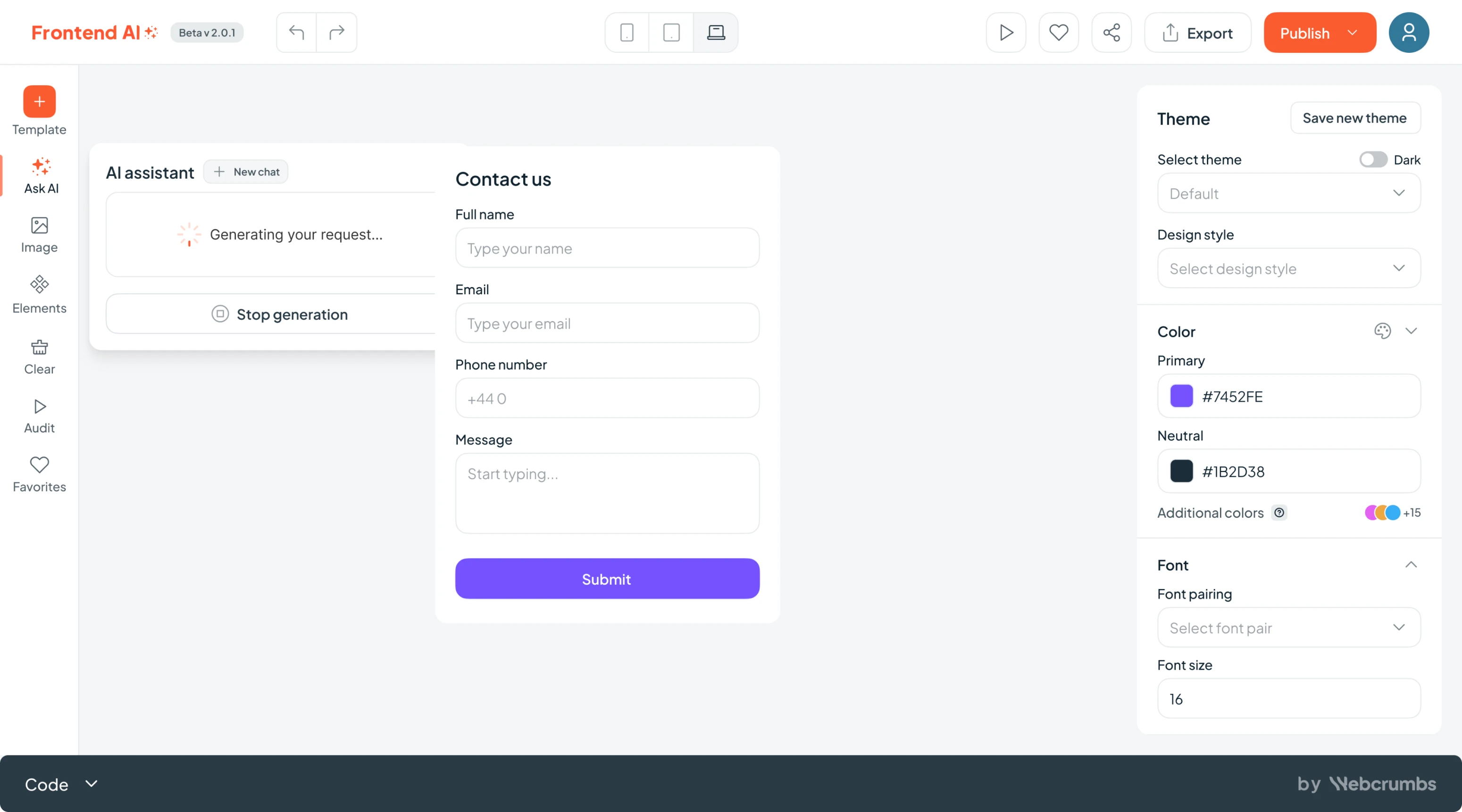
This helped keep users engaged and reassured that the process was moving along.
Once the component was ready, users could:
- Use it as-is.
- Modify it with another prompt.
- Regenerate a new version.
- Or save it to their favorites for later.
It was a conversation with the product, and we designed it to feel that way.
Customizing and making the AI work your way
AI can give you a head start, but developers still want control, especially when it comes to the details. After the initial generation, users needed a way to fine-tune the results without leaving the app or manually rewriting the code.
So we designed a customization layer that bridges AI magic and developer precision.
We introduced a smart sidebar where users could:
- Adjust fonts, colors, and spacing.
- Tweak themes and visual styles.
- Access templates, favorites, and previous generations.
- Start new prompts or modify existing ones.
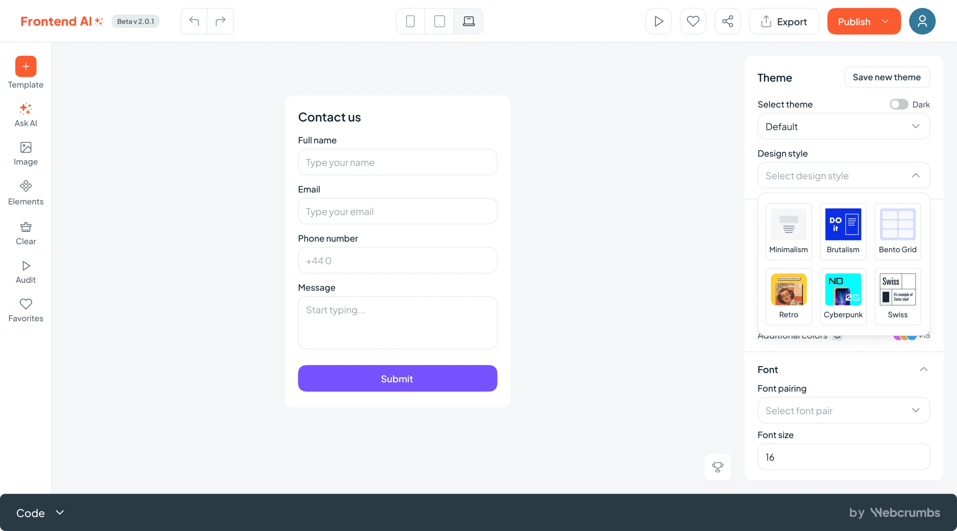
The essentials were grouped in a way that mirrored how devs think while building.
It was like a lightweight design system manager that let you shape the results without breaking what AI just gave you. The editing flow was built with real developers in mind, fast, minimal, and completely frictionless.
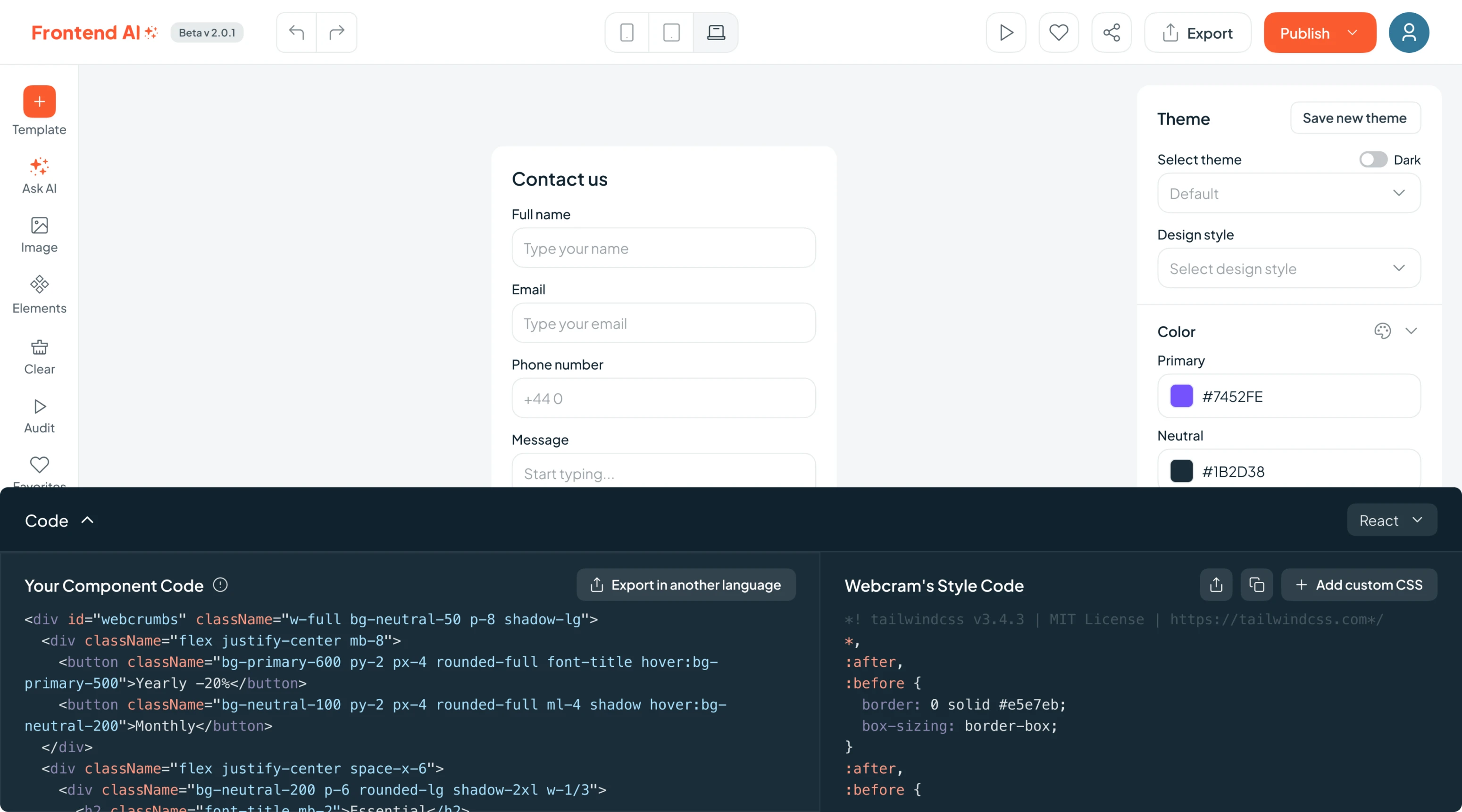
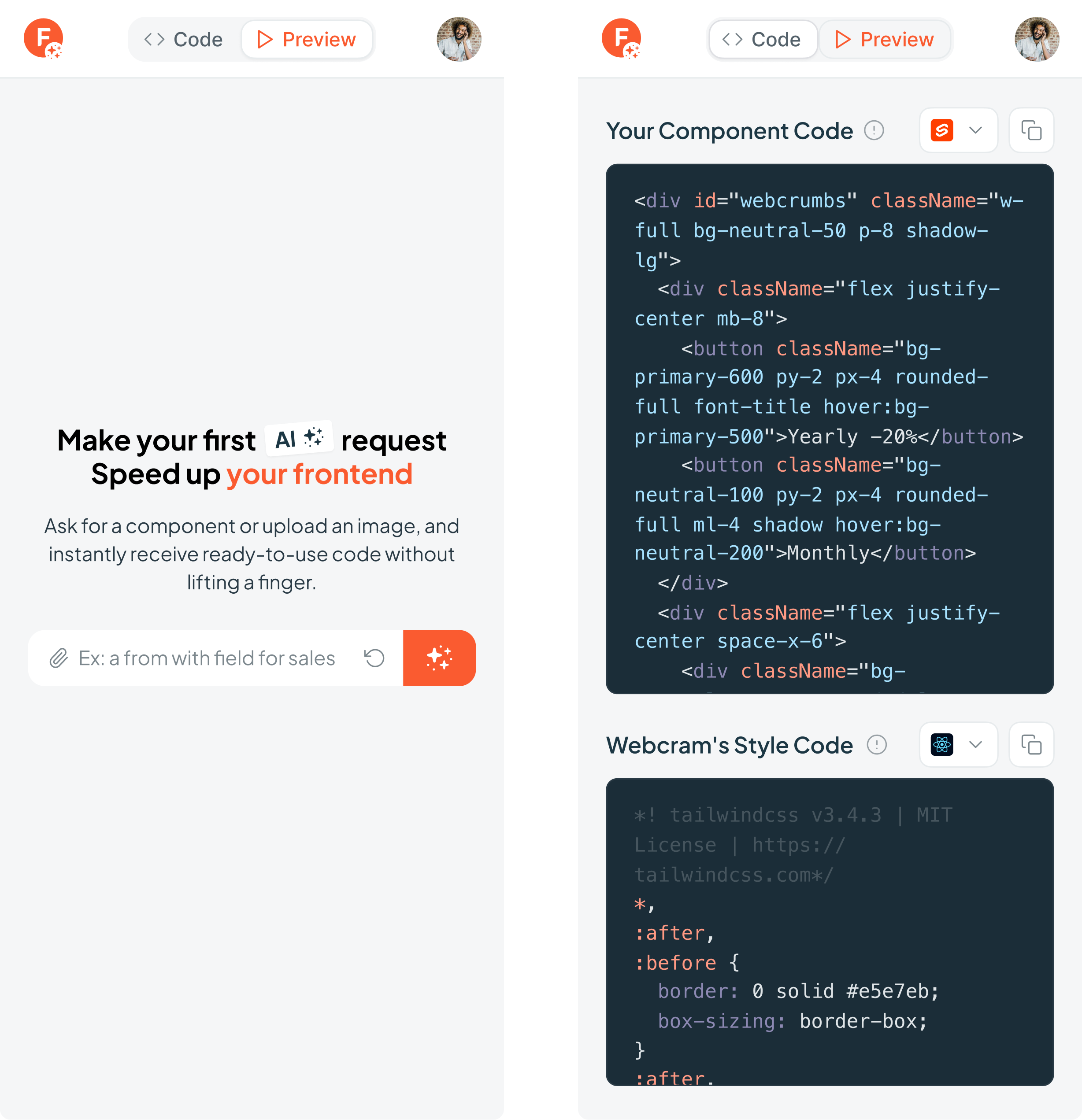
Designing for code flexibility
A generated component is only useful if it fits into your actual tech stack. That’s why flexibility was a core requirement from day one.
Frontend AI is needed to generate real, production-ready code in multiple programming languages and make that process effortless. So, we designed a simple export interface where users could:
- Choose from a dropdown of languages and frameworks.
- Preview the output before copying.
- One-click copy the code, styled and structured, ready to paste into their project.
Creating a mobile experience
We knew most real buildings would happen on the desktop. Still, we didn’t want to completely cut off mobile users. So we designed a streamlined mobile experience that allowed users to:
- Run simple queries.
- View generated components.
- Copy code on the go.
For more advanced editing, the product gently encouraged switching to desktop without forced downloads, just thoughtful guidance.
It feels like Figma but for developers
Originally, the project was about building a UI for one plugin feature. But once the product vision expanded, we started asking: What happens after someone creates a component? What else could this tool unlock for devs?
That’s when we started imagining a whole ecosystem around the builder.
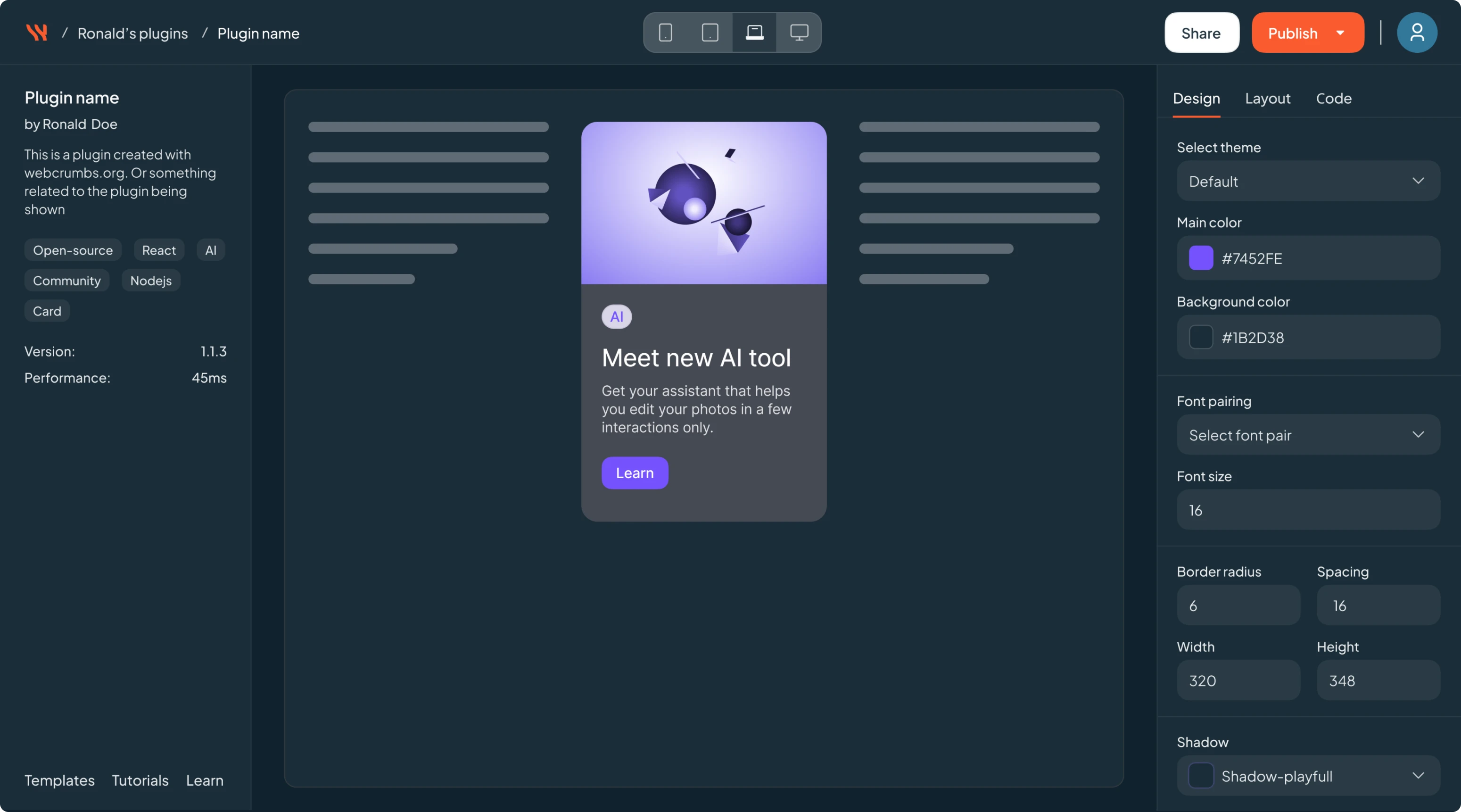
Templates, favorites, and personal libraries
We designed a system where users could:
- Save generated components to a personal library.
- Sort templates by use case or category (buttons, forms, headers, etc.).
- Add items to favorites for quick reuse and share components.
- Browse through previously generated components.
This turned Frontend AI from a mere generator to a living workspace.
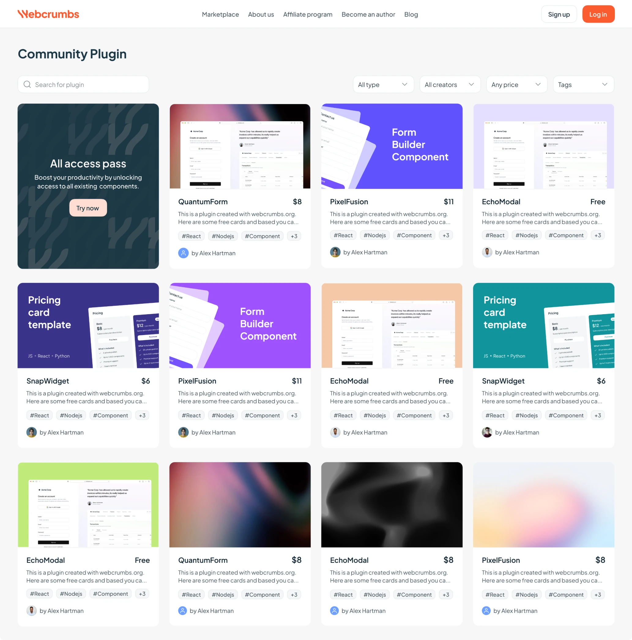
A marketplace for dev creativity
This part wasn’t expected, but it was too good not to build.
We proposed a marketplace where users could:
- Share plugins and components.
- Browse others’ creations.
- Buy or download add-ons.
- Follow friends and creators (a bit like Behance, but for devs).
The client loved it. We mapped out user flows, designed discovery screens, and added gamification elements.
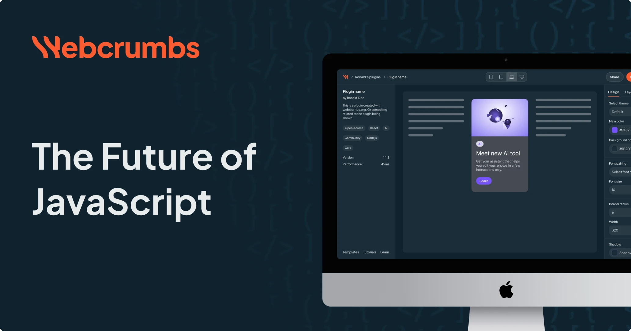
Branding from zero
The client had one core request: make everything feel connected across the platform, wishlist, and marketing materials. Frontend AI needed to look and feel like a movement and resonate deeply with the developer community. So we built the entire visual identity from scratch.
Working closely with Webcrumbs' graphic designer, we created a logo that felt bold yet approachable, and carefully selected fonts and colors that matched the product’s modern, developer-first mindset.

Here’s what we delivered:
- A modern, developer-friendly color palette.
- A clean, scalable typography system.
- A flexible UI kit that allowed the team to ship new features quickly and consistently.
As the wishlist was part of the initial request, we ensured it followed the same cohesive visual style as the rest of the platform.
All of it fed into the product design, website, social visuals, and GitHub presence, so every user touchpoint felt intentional and aligned.
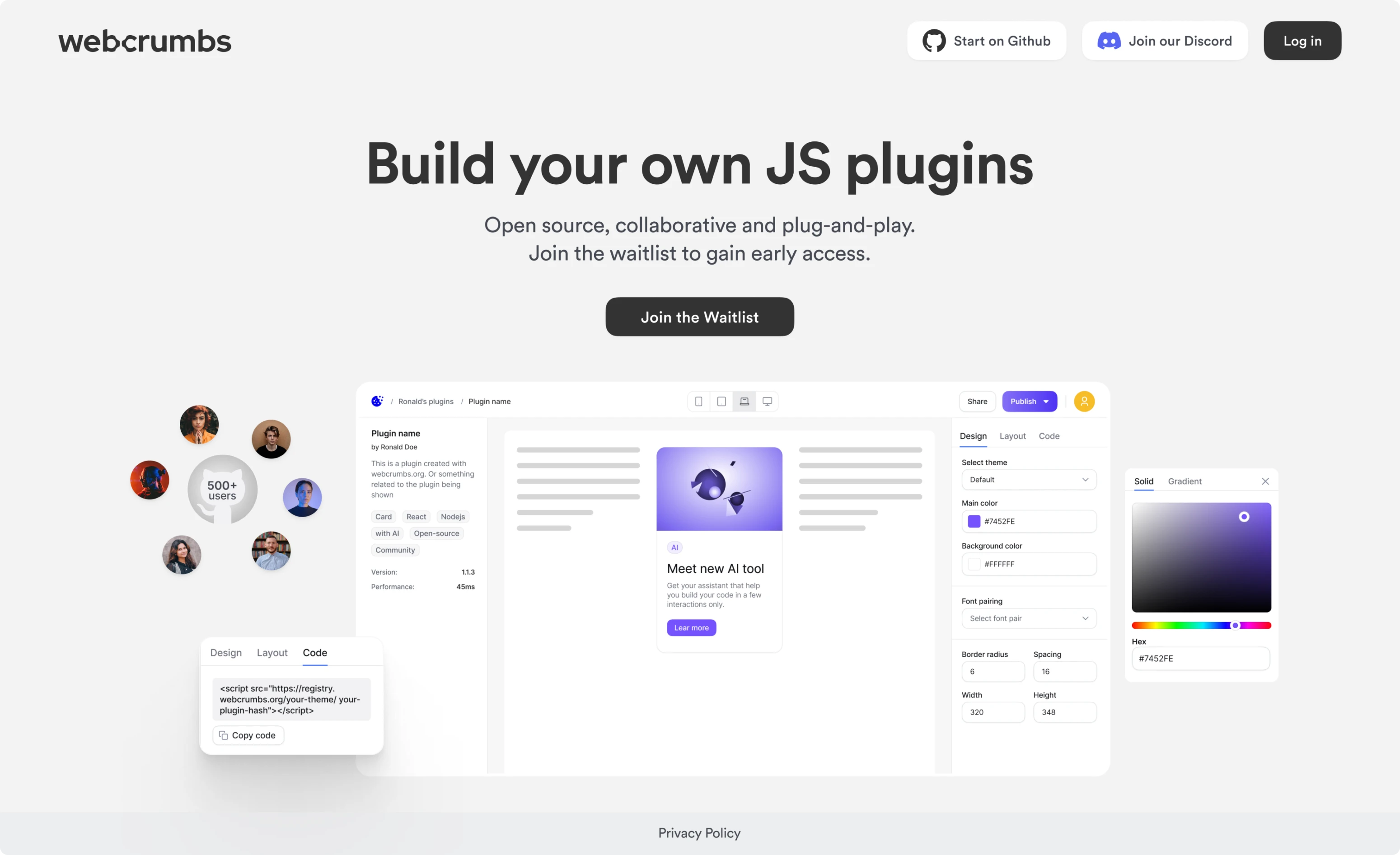
Landing page, GitHub, and social
To support the launch, we also designed:
- A landing page that spoke directly to developers and makers.
- A clean, informative GitHub page for open-source visibility in dark and light themes.
- Visuals for social media to help the team spread the word.
How an idea became a Product of the Day and Week
Two months after the idea was born, Frontend AI launched publicly and quickly proved it had struck a real nerve.
Without spending a single dollar on advertising, it became Product of the Day and Product of the Week on Product Hunt, collecting over 1,200 organic upvotes.
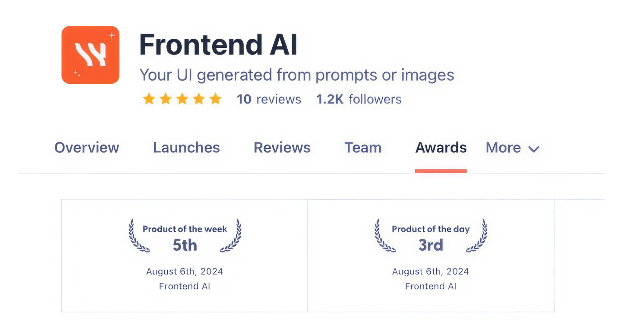
The response was overwhelming: Frontend AI earned front-page mentions, was featured in newsletters, and sparked conversations across tech communities.
Developers, CTOs, indie makers, and product managers started using it, recommending it, and sharing it across social feeds and dev forums.
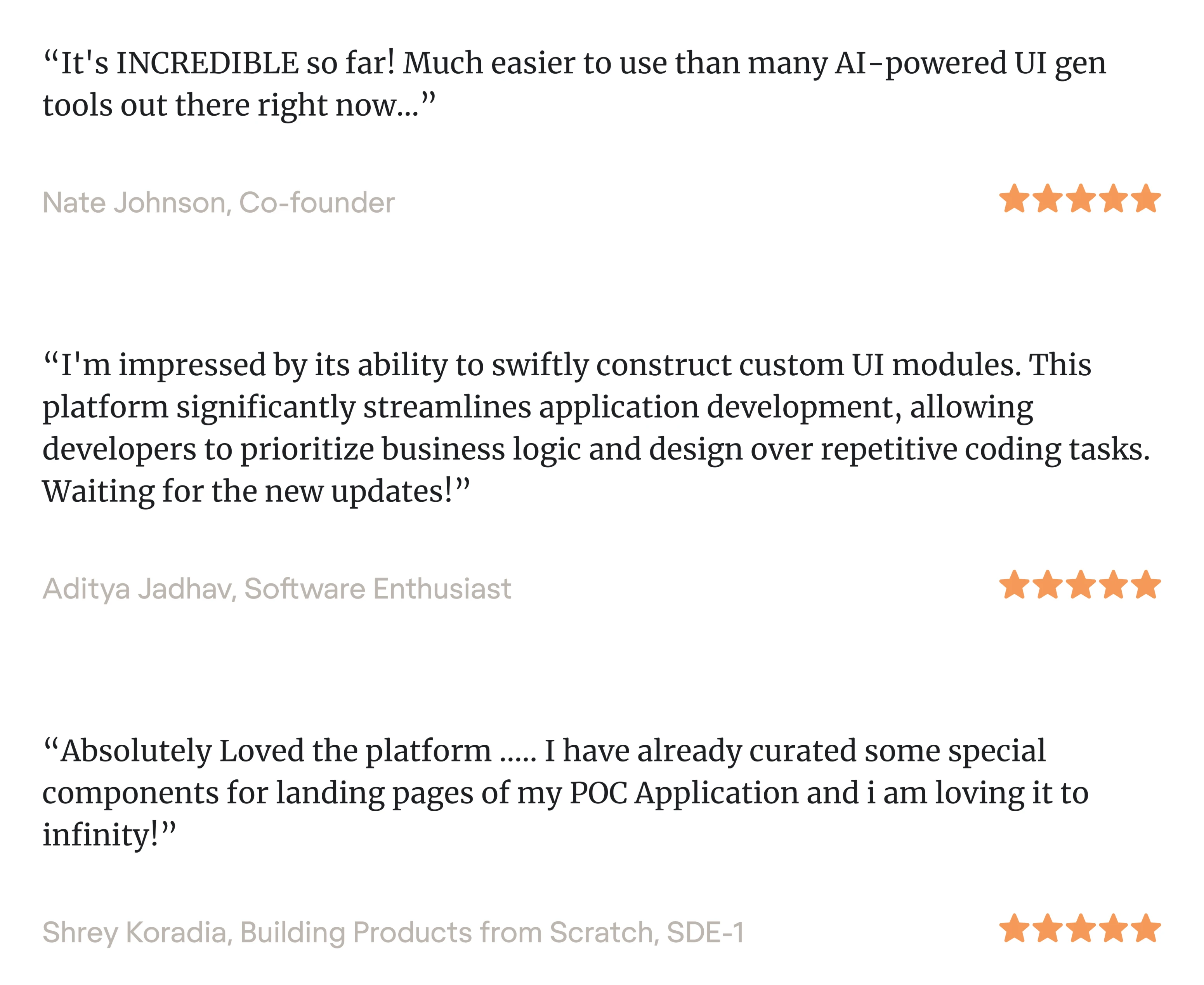
But this wasn’t about going viral for the sake of it. Frontend AI spread because it was genuinely useful:
- A tool that solved a real problem in a way the market hadn’t seen before.
- A platform that feels like Figma, but for code.
- A product that speaks the language of developers.
And for us at Eleken, that’s what it’s all about: helping bold ideas take shape, resonate with users, and grow into products that make a real impact.