Advan Research
How redesign helps to attract new type of users to analytics product
Sometimes companies need a redesign because the product changes. Sometimes, because the user changes. Advan Research is a geographic information system (GIS) that provides complex geographical data to define tendencies and patterns of people's behavior in a certain location.
The product that we have been working on, serves to analyze data for real estate. With ReVeal, businesses can find out if the people visiting a shop do it regularly or seasonally, whether the location would be profitable to rent or not, or whether the traffic has increased after the last marketing campaign.

ReVeal was in need for a redesign. Quite a common story: the product had new features adding up for a long time, which often has a negative impact on user experience. Also, the company wanted to attract new users – not just investors specialized in real estate, but business owners and real estate developers.
Proper redesign starts with UX audit
One of the main advantages of inviting an external designer to work on the redesign is that they have a “fresh eye” on the product. It allows for an unbiased analysis of user experience.
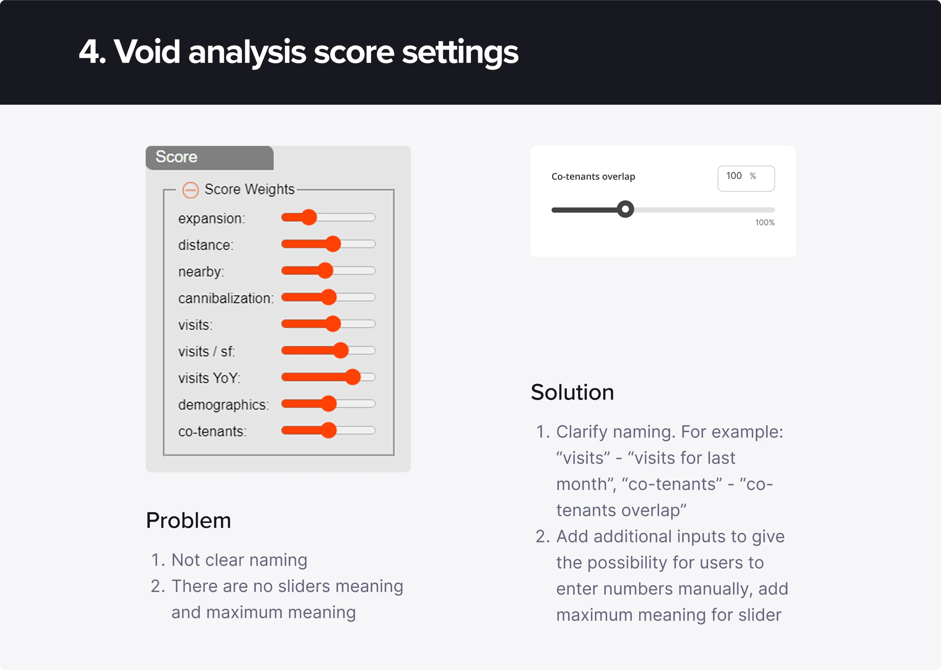
As a result of a thorough UX audit, our designer detected over 30 flaws in the design that could be fixed to improve user experience. For example, here is a suggestion on how sliders can be redesigned to give more information to the users.
After the audit, we moved on to competitor analysis
After the initial audit, we had to see what other companies are doing. AdvanResearch has a clear competitive advantage: the biggest database and the most precise analysis and forecasting. Yet it doesn’t mean that we could have skipped the competitive research.
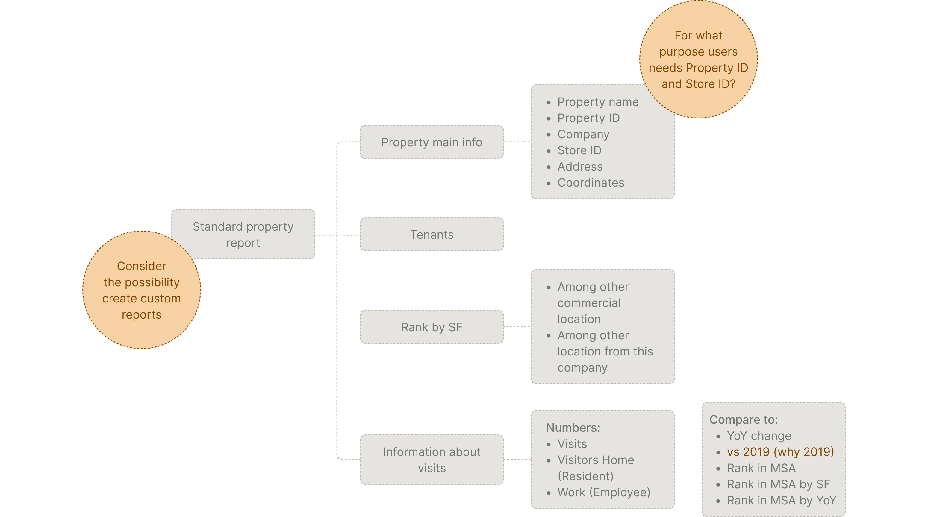
After analyzing two direct and three indirect competitors, we have found opportunities for attracting new audiences. Our designer studied the use cases of other products to build hypotheses about ReVeal. Later, these hypotheses were checked and confirmed by the client team. They became the basis for the redesign concept.
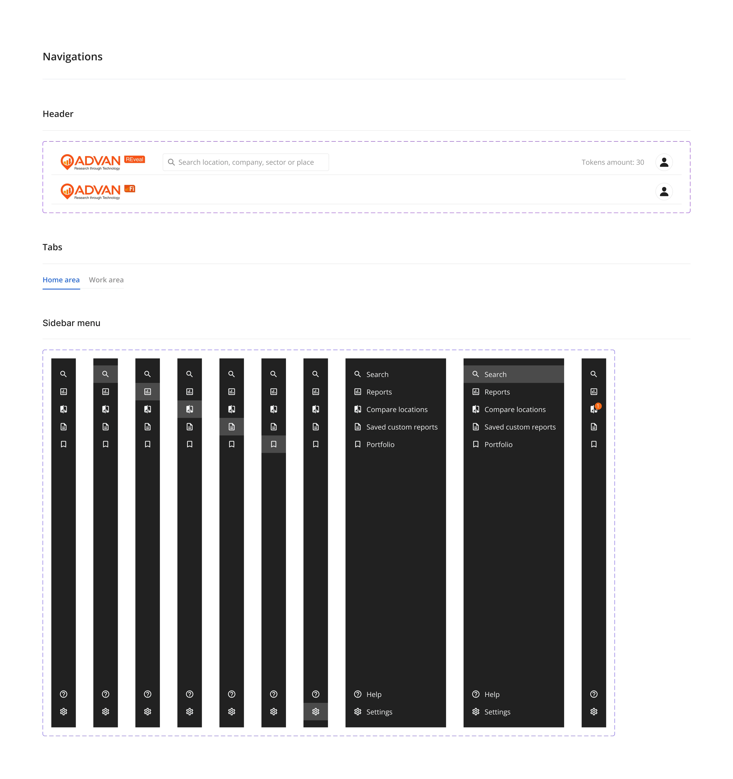
Structuring product for two different audiences
As mentioned above, the app had a bit of a messy structure that needed to be reconsidered. The new structure had to suit two types of users:
- Those who have experience working with foot tracking reports, such as investment analysts
- Users that are new to foot tracking, like businesses and real estate developers
Experienced users need easy access to many features, while new users can easily get overwhelmed by big amount of new information. That was the main challenge that we’ve been working on.
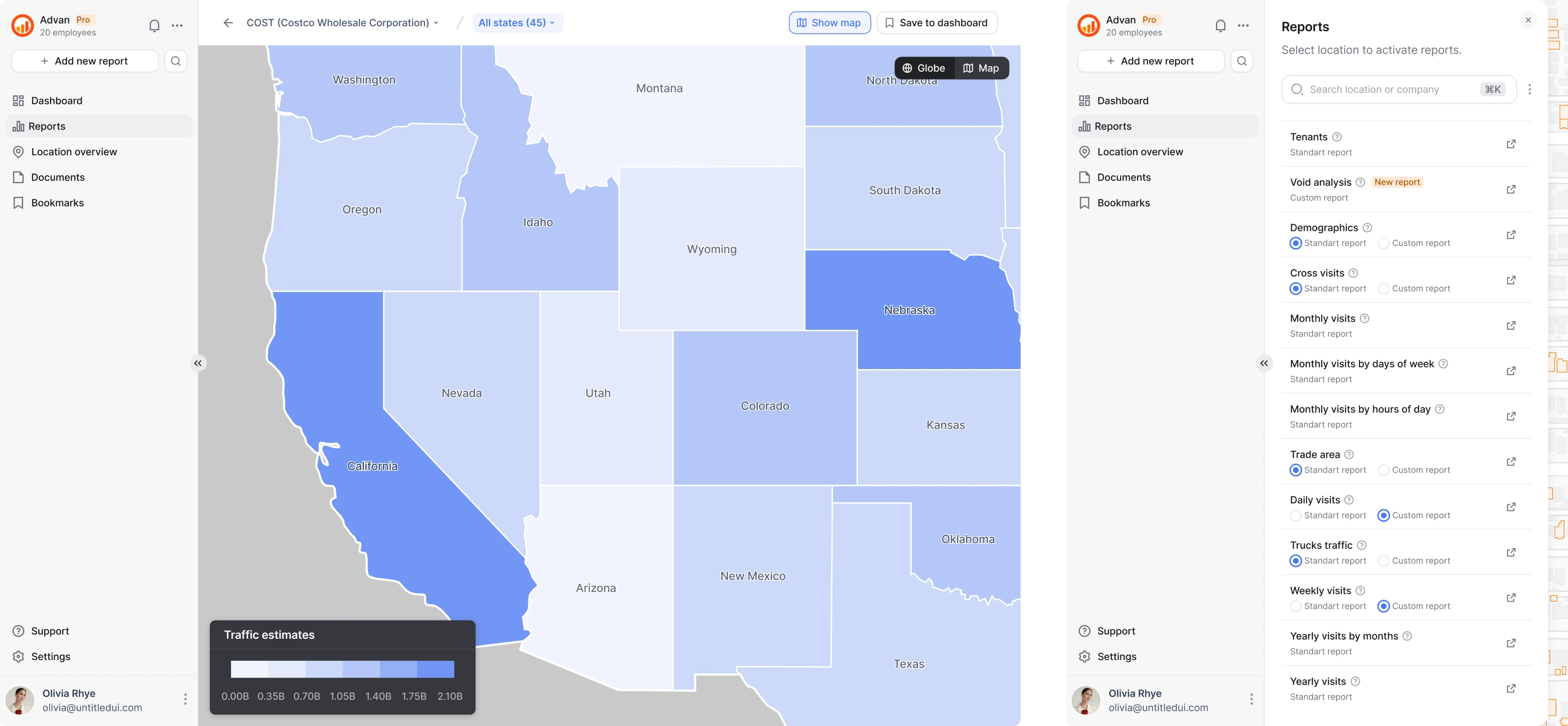
All the available analytics were split into two groups:
- Standard reports (based on the most common user requests)
- Custom reports
Standard reports are free, while custom ones can be bought for tokens.
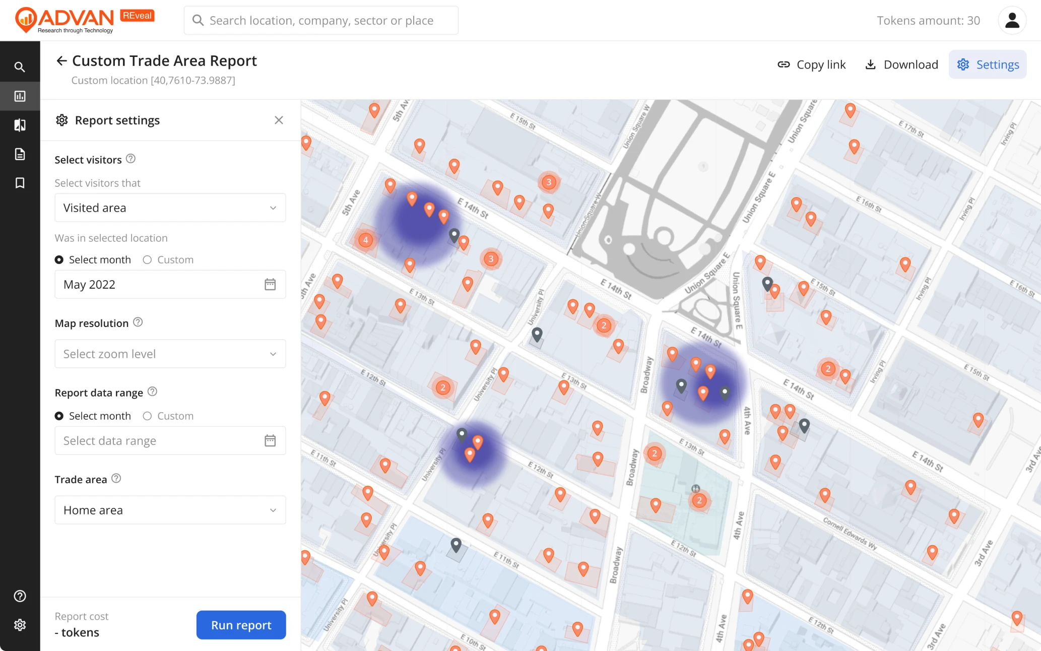
Wireframing
When the app structure was ready, we prepared wireframes. A new layout started to take shape: a two-level menu with icons on the left side, blocks of information separated on cards, filter search, dashboard with round charts.
Navigation for newbies in the world of foot tracking analysis
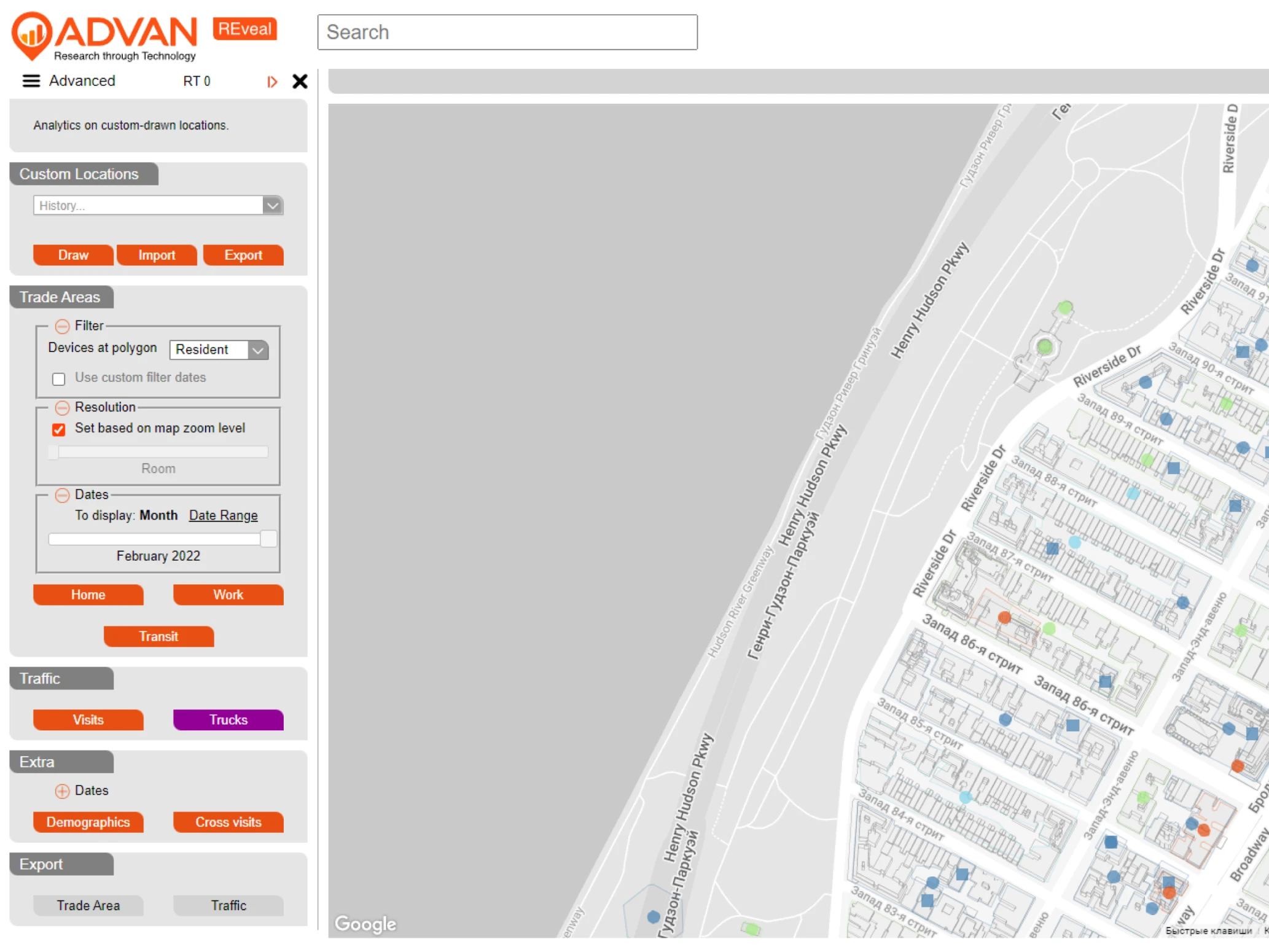
Before the redesign, the interface was clearly made for users who know well what kind of data they want to get and where to get it.
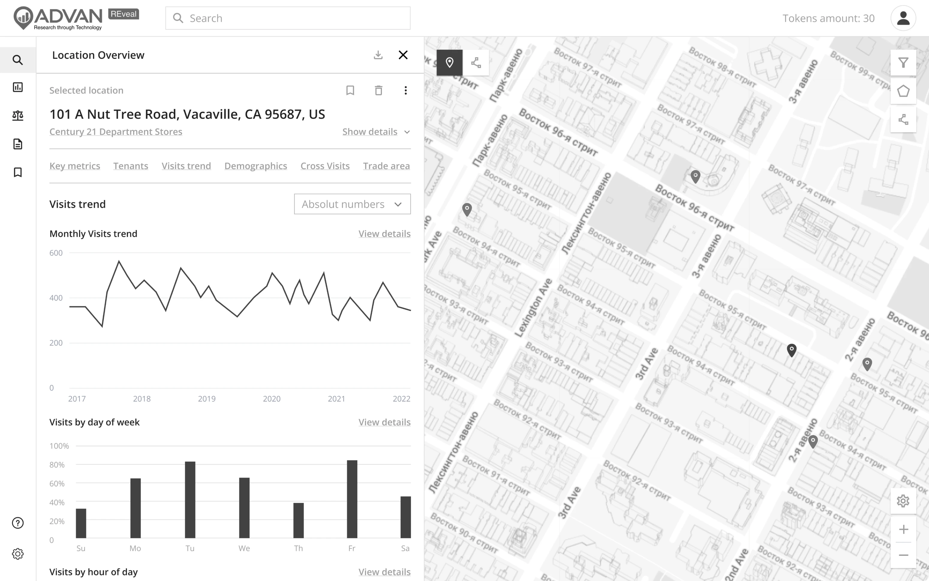
After the restructuring, the first level of navigation became very simple, so that new users can start with ease.
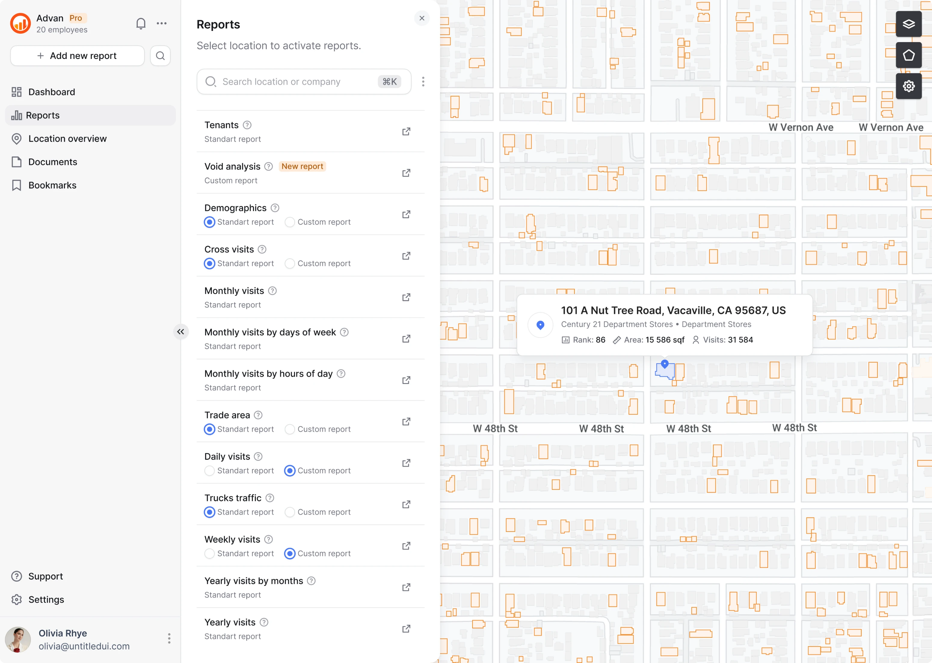
When they click on reports, they see the list of standard reports. Each of them has a little “?” ️button that gives extra information when needed.
For experienced analysts, there is an option of choosing a custom report. This way, they can use all the features they need, having the same simple menu for the newbies. Since the product is constantly developing and new features will be added in the future, we placed a small tag “New report” to draw users’ attention and mark the recent updates.
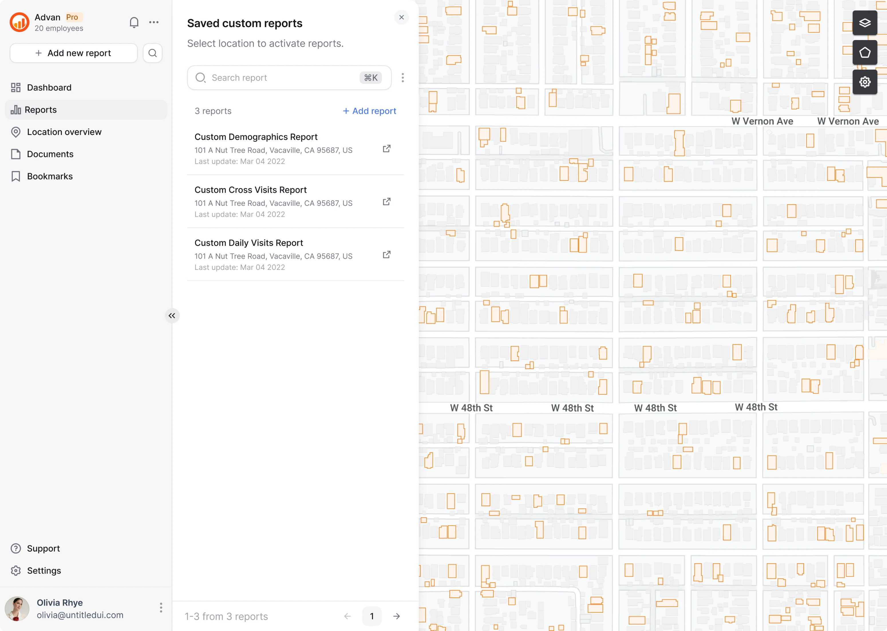
Keeping the history of the reports
Custom reports are heavy and take a while to download. And after that, they can be accidentally lost. The findings of user research gave us a hint that analysts need easy access to past reports.
The icon for “saved custom reports” was placed on the main menu. Each one has a name, date, and location. The search is available through the search field and by clicking on the map.
Optimizing design for speed
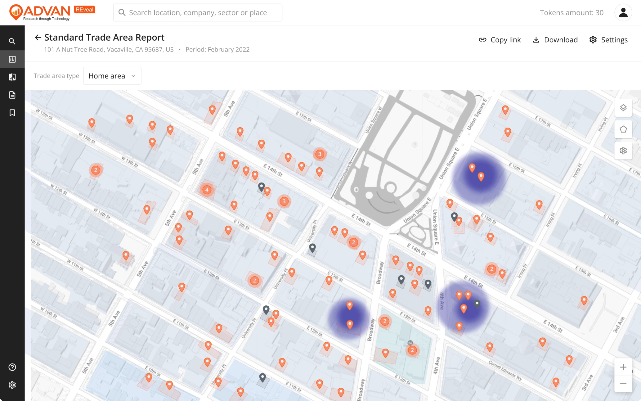
ReVeal manages heavy databases. Browsing a map with many objects on it has a price, which is app speed. Keeping in mind that the database will grow in the future, we had to do something in advance.
The solution was to group the objects on the maps. That way, even when the map will be zoomed out to show the whole map of New York, the number of spots on the map will be limited to neighborhoods.
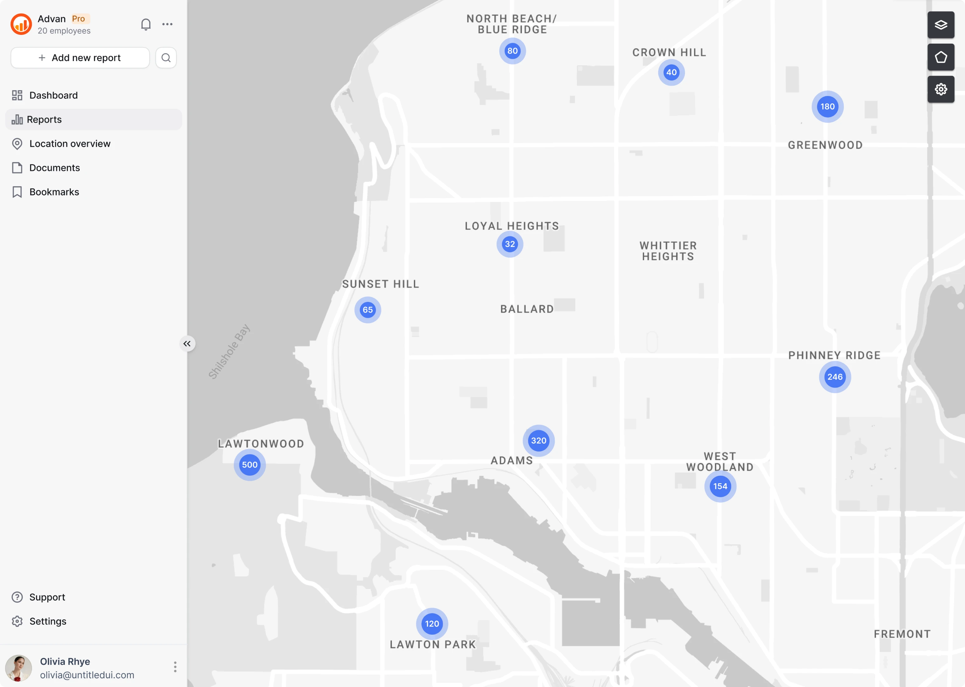
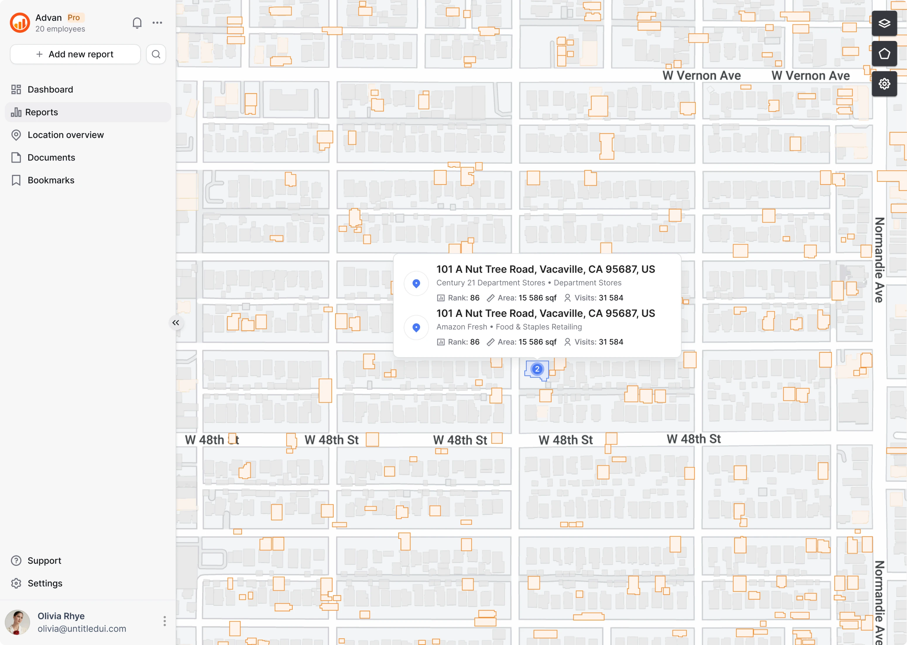
Since one location can contain numerous spots (for instance, shops in a big mall), some objects remained grouped on the map. When clicking or hovering on the group spot, user can see the list of all objects at this location.
New visual style for minimal design
The previous design of ReVeal had many colors but didn’t have a strong visual identity.
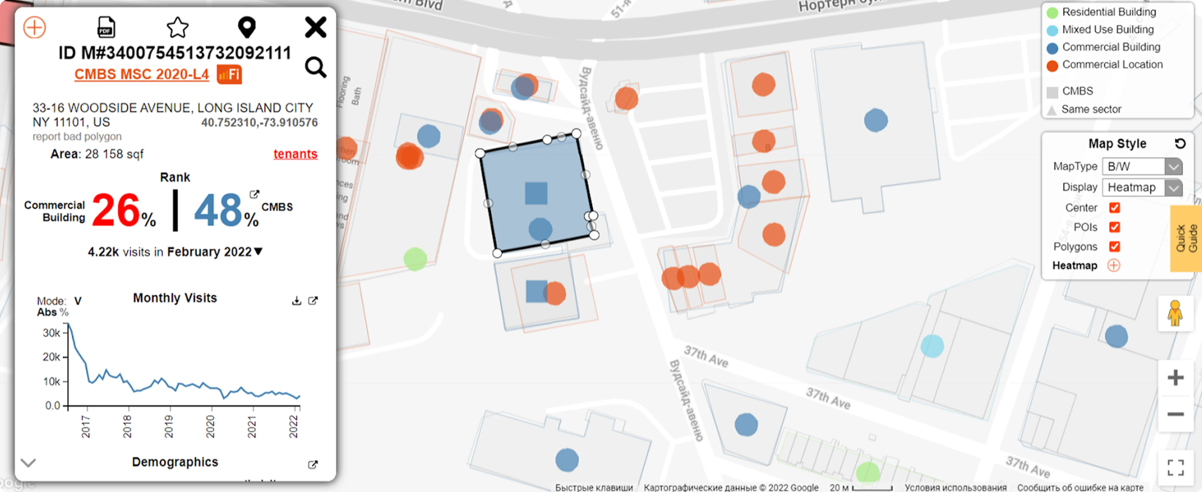
The new visual style is both minimal and distinct from competitors. It uses corporate orange as the accent color, and a variety of colors is used only in graphs.
In a product whose main feature is the biggest precision in data, there was little need for flashy design elements.
Working with an analytics company is all about efficiency
The speed of the work matters just as much as the speed of the app itself. Small improvements, like data visualization on the map, were implemented right away.
Our designer was regularly communicating with the investment manager and developer. It is a dream team: a person who knows best how the product is being used, and a person who knows best which solution would be easier to implement.
In decision-making, we relied on the ICE framework: Impact, Confidence, and Ease of implementation. And the results are impressive: the redesign was done in three months, from the audit to the final screens and UI kit. Now, Advan Research is working on the full implementation of the new design.
Do you need a full-scale redesign in a short time? You are in the right place! Leave us a note, and we'll get back to you to discuss the details.