Drenchworks
Scaling modern software for trade contractors with a new Purchasing section
All parts of the building beyond its walls, floor, and roof fall under the scope of plumbing and mechanical contractors. No wonder, construction business owners have a lot of tasks on their plate, from managing and tracking the time of their workers to keeping documentation and reports concise.
Drenchworks decided to change the game by offering a modern platform for plumbing and mechanical contractors to run their businesses with ease.
Drenchworks’ users loved the platform but lacked a Purchasing section where they could manage their orders and create purchasing lists. Following customers’ expectations, our clients wanted to create a new Purchasing section in their product and seamlessly integrate it with the system so that the entire logic was not affected.

But there was a challenge. The design team Drenchworks previously collaborated with was focused primarily on UI and didn’t have enough expertise in UX design and creating smooth user flows. The clients were looking for a UX professional capable of designing features for a complex platform with lots of lists, documents, and tables and helping create frictionless user experience design and effective user flows. That’s how they met Eleken.
Jumpstarting the cooperation with a free trial
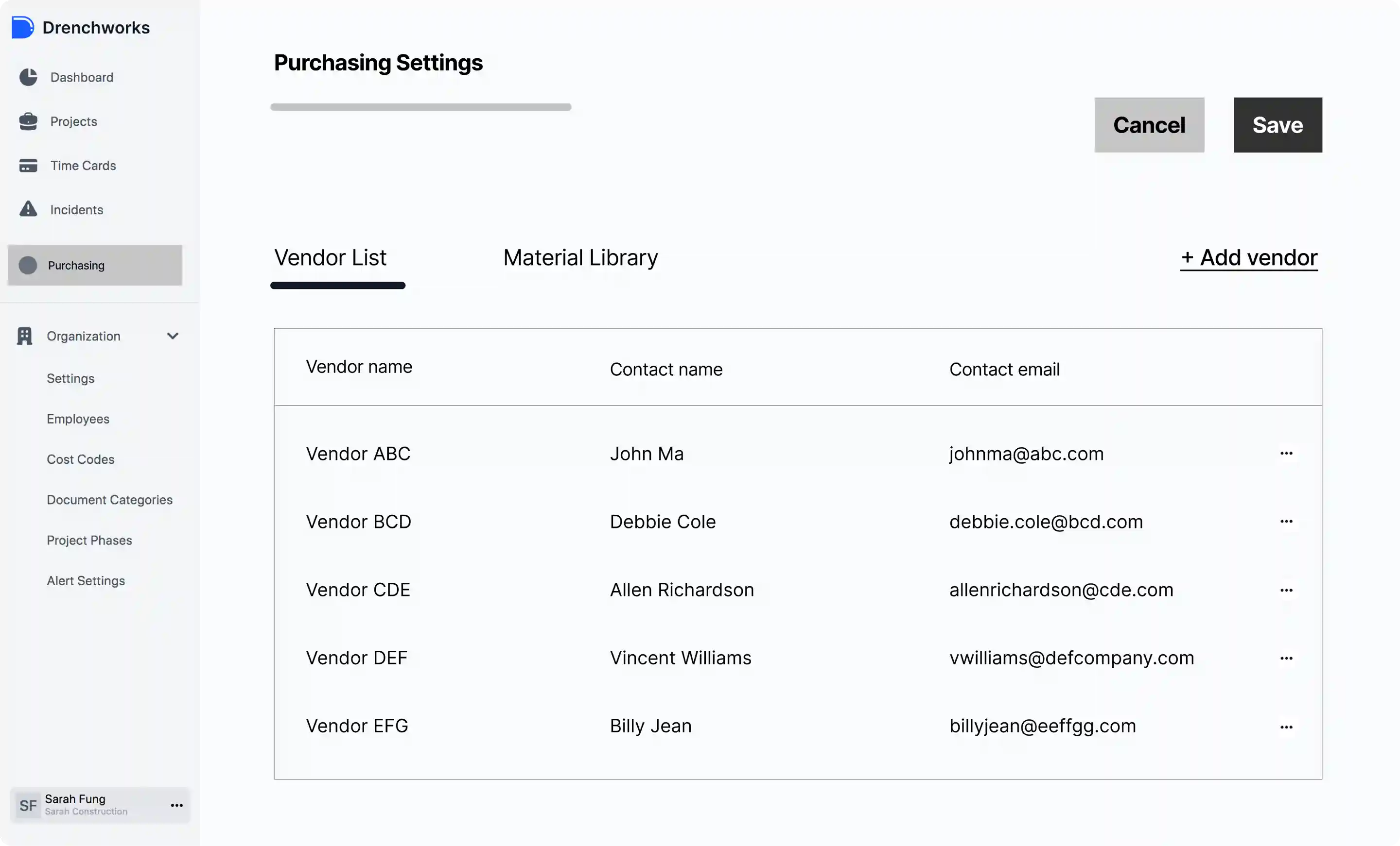
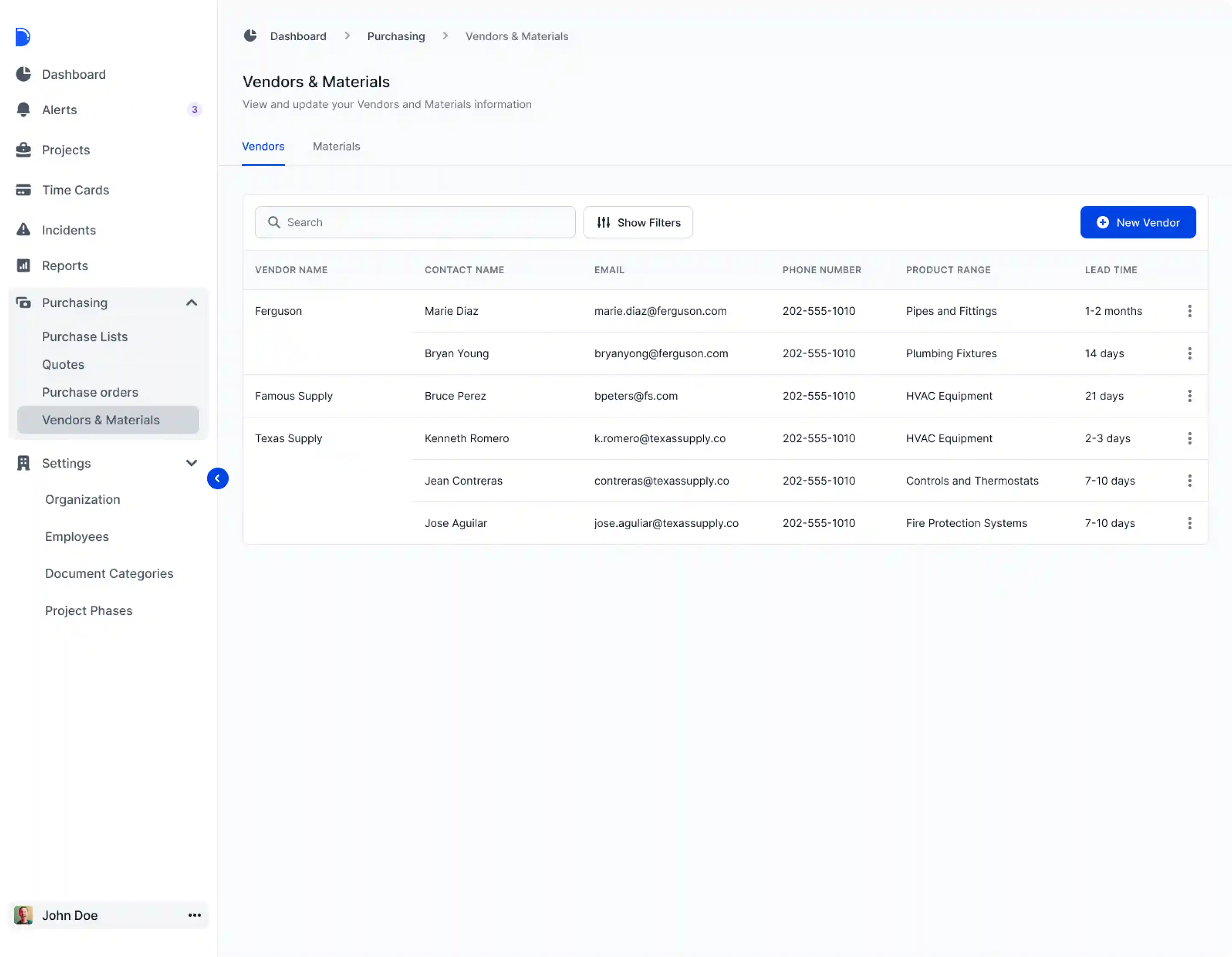
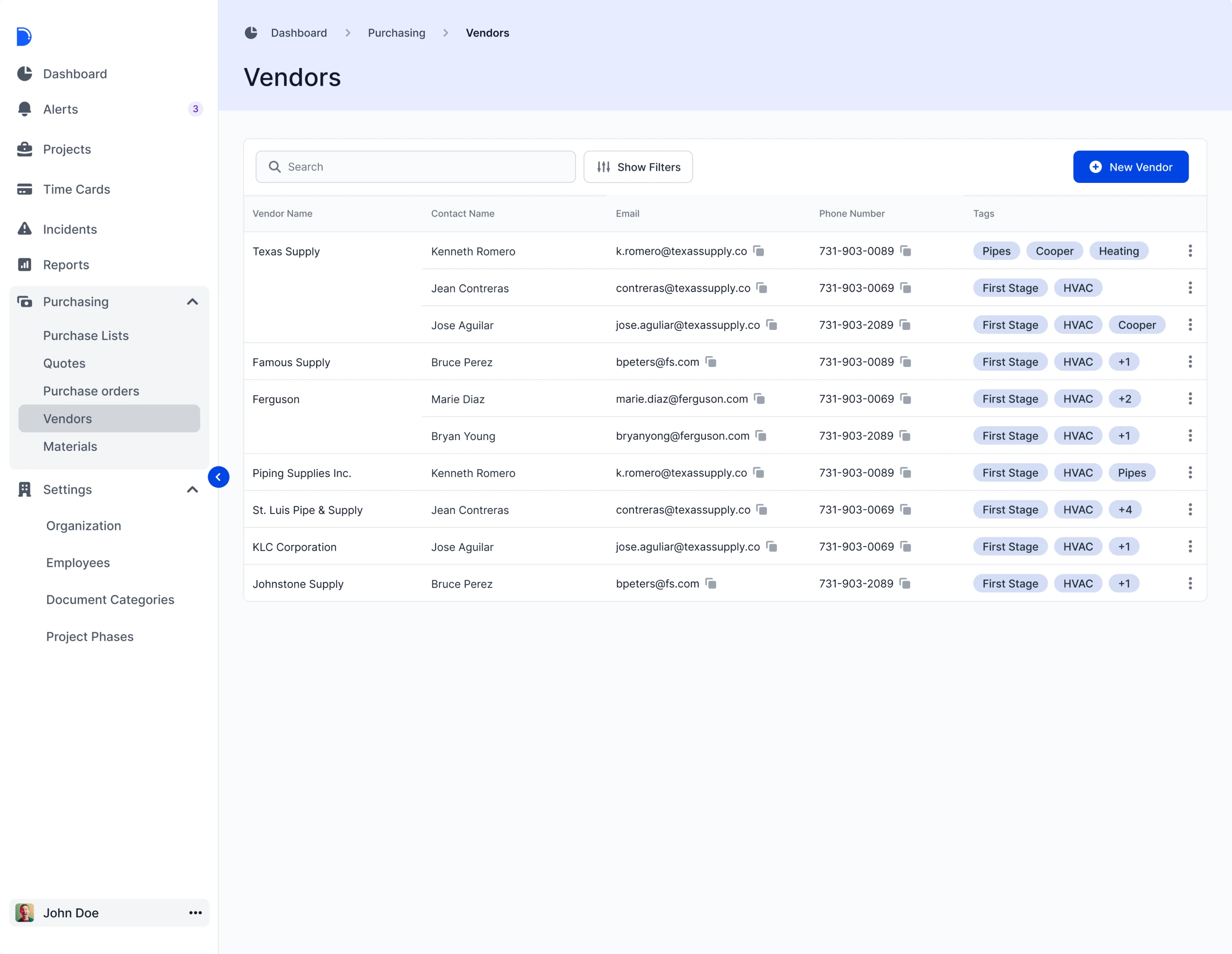
At Eleken, we offer our clients a free 3-day trial to ensure that we meet their requirements. And this time was no exception. The clients have already had some ideas, along with analog document examples and wireframes for the future section. Our team carefully studied these references. To get started, the designer created screen versions for the Vendors page, making all contact information more visible.
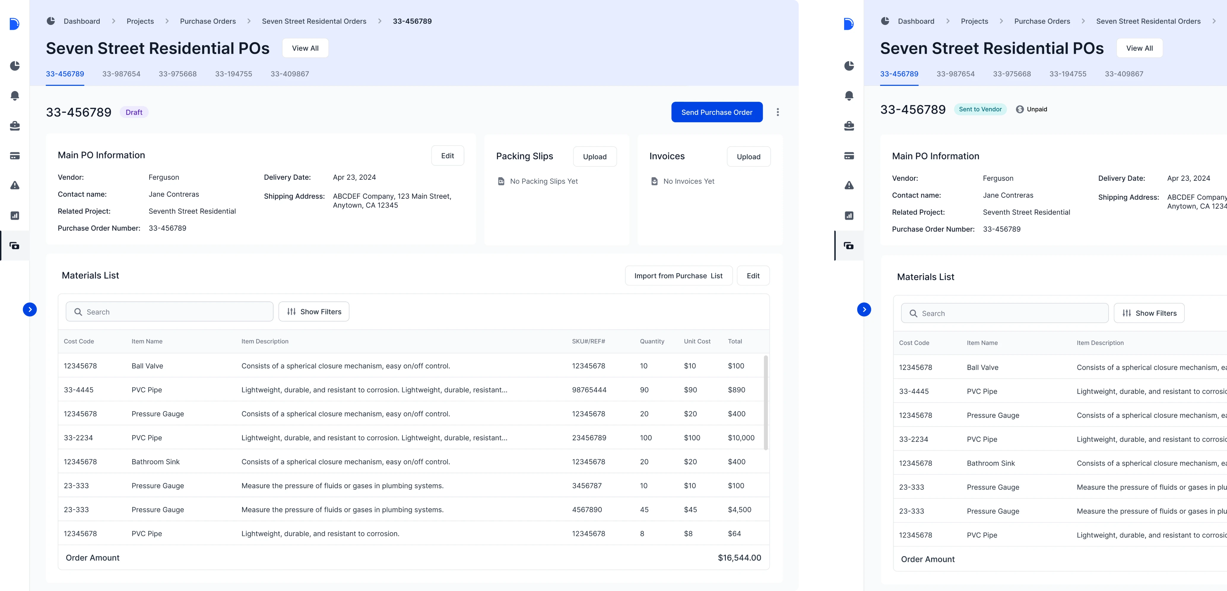
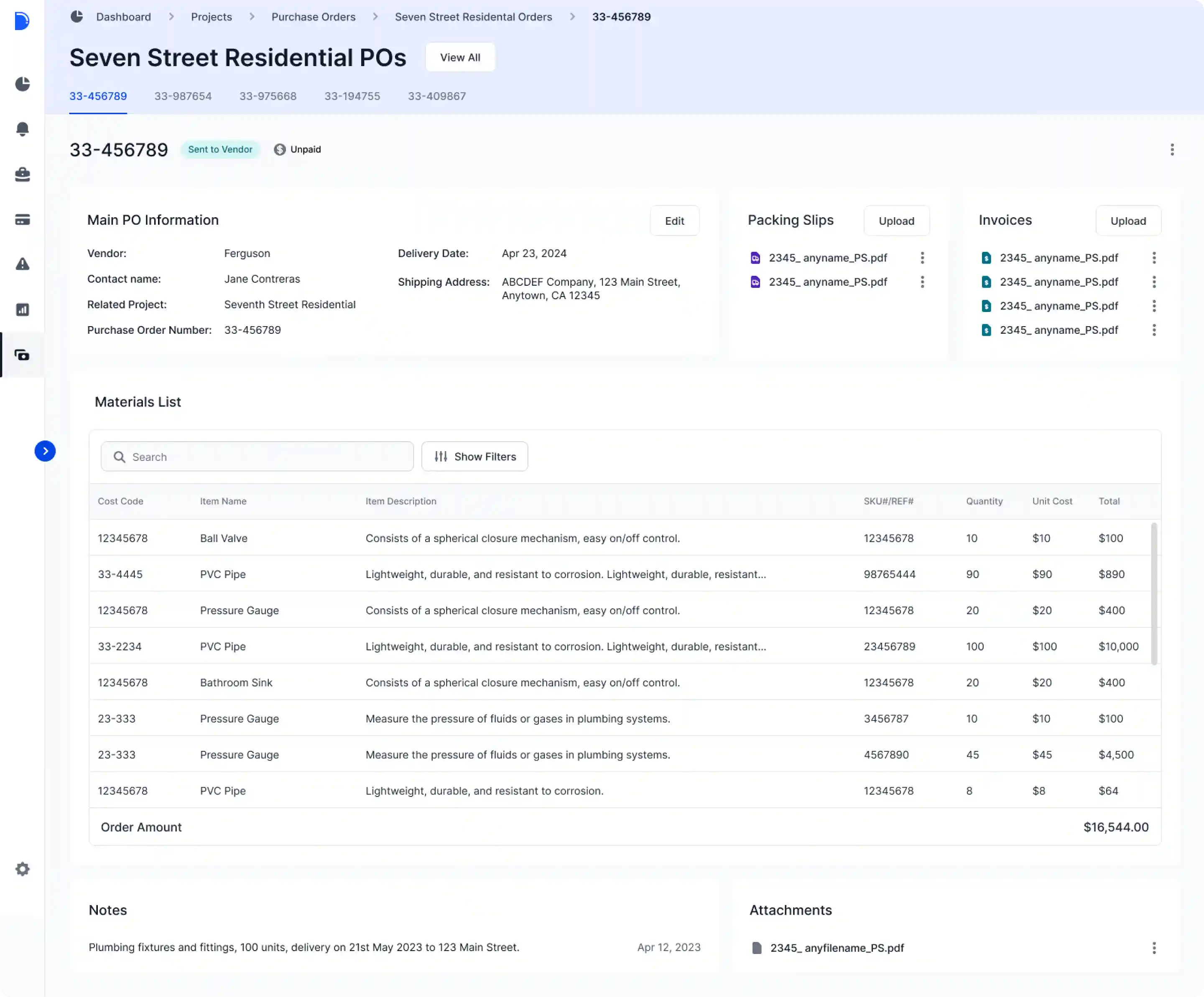
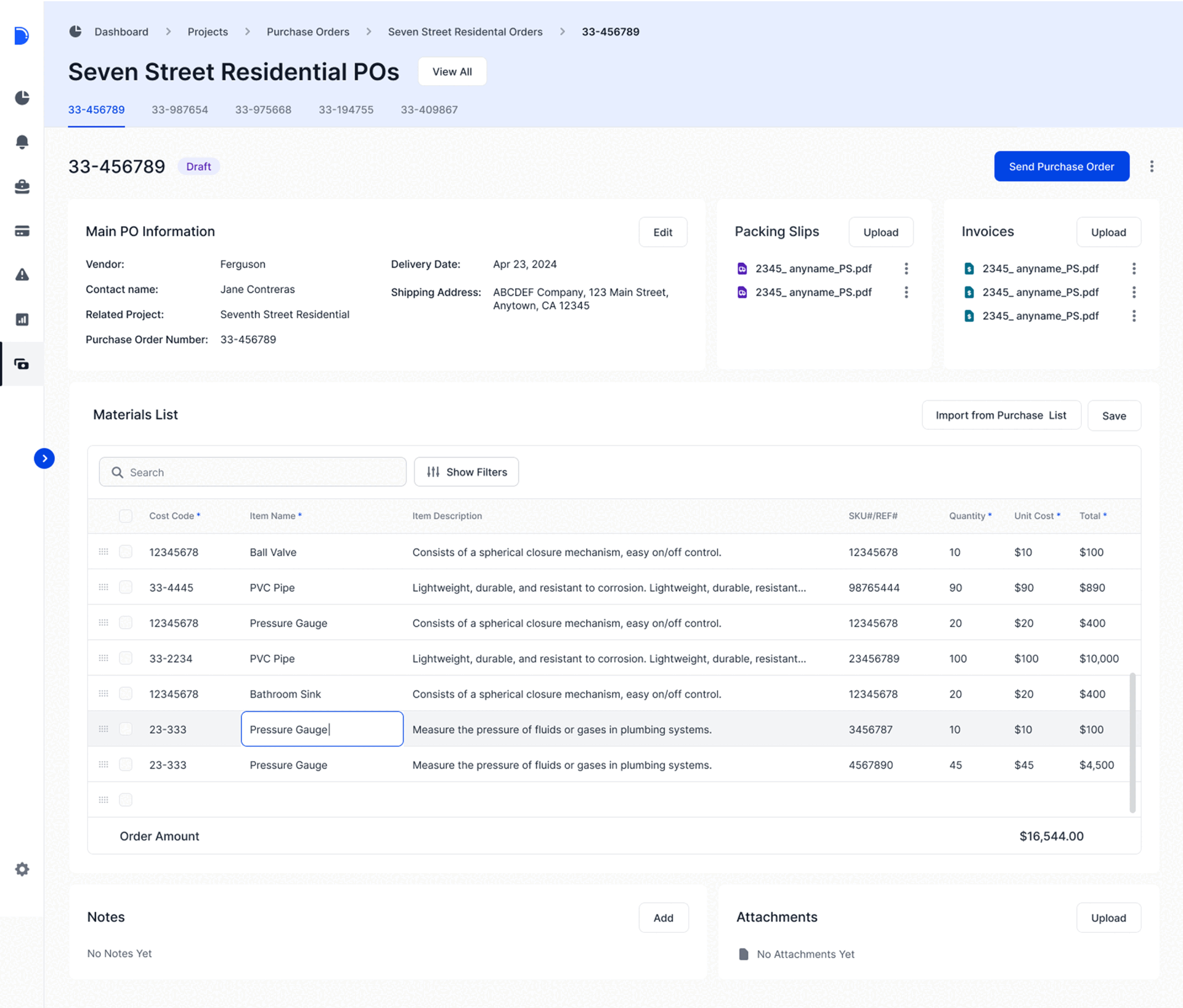
Then, our designers created several versions of the Purchase Orders page and modals where users could enter new information and edit orders:
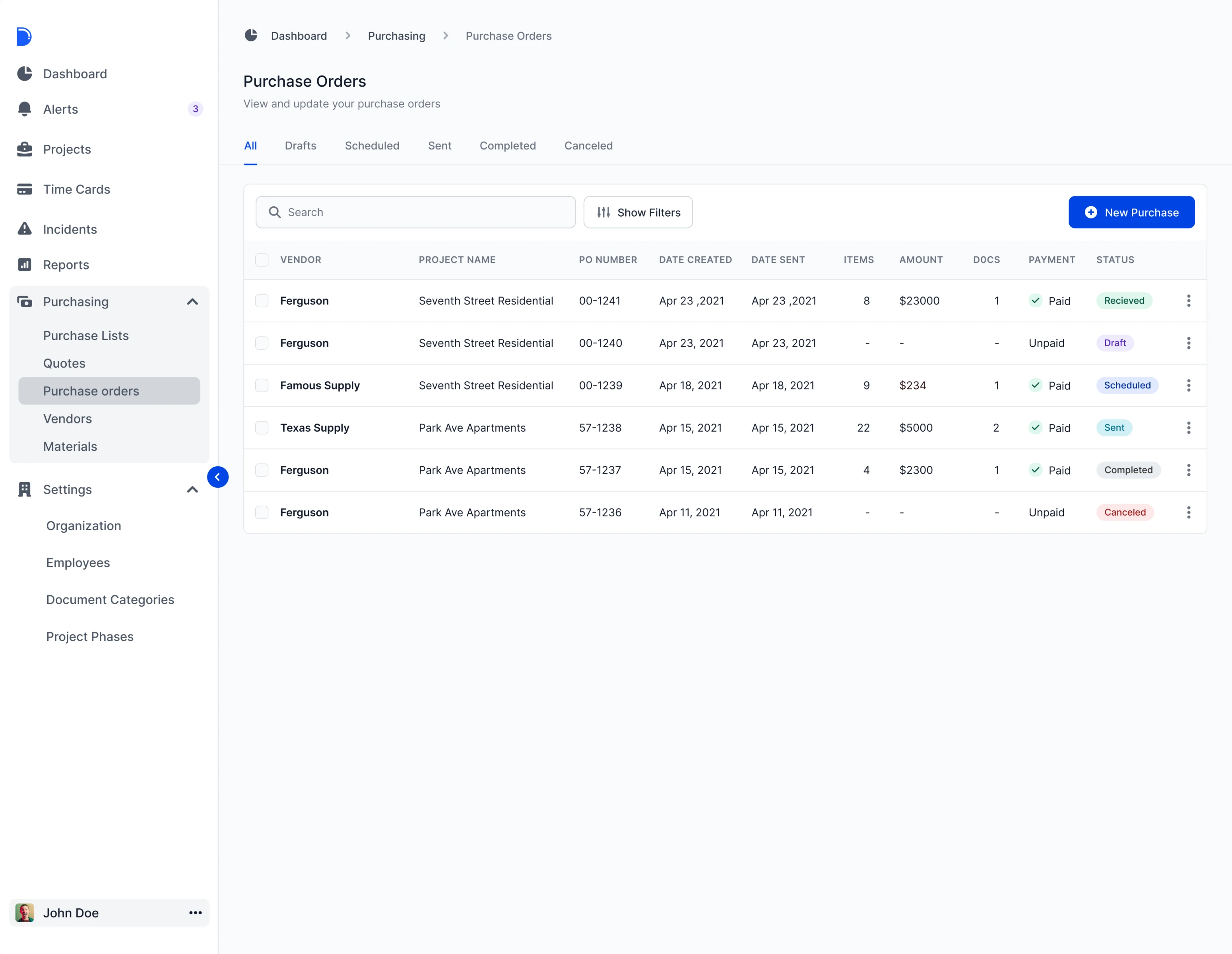
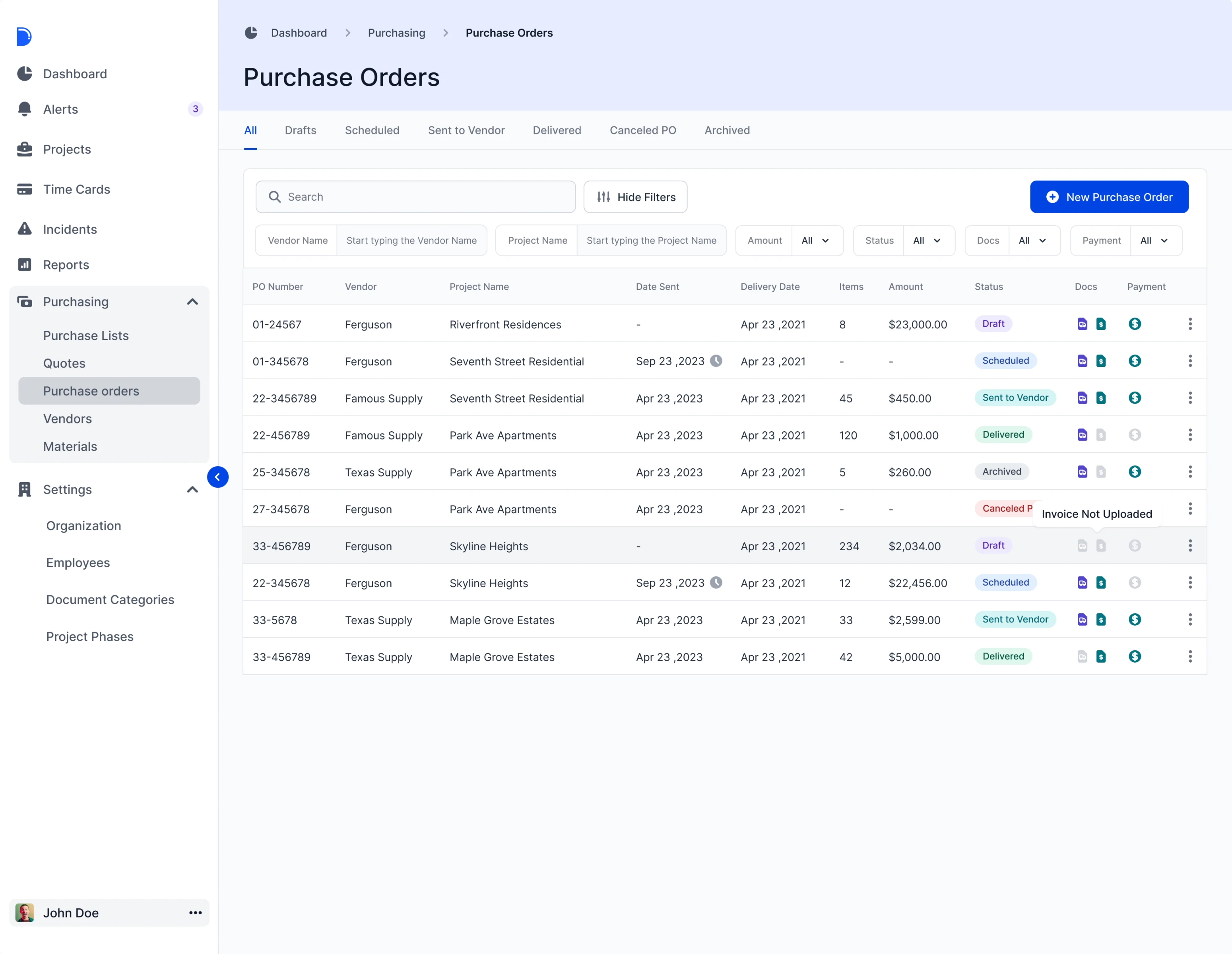
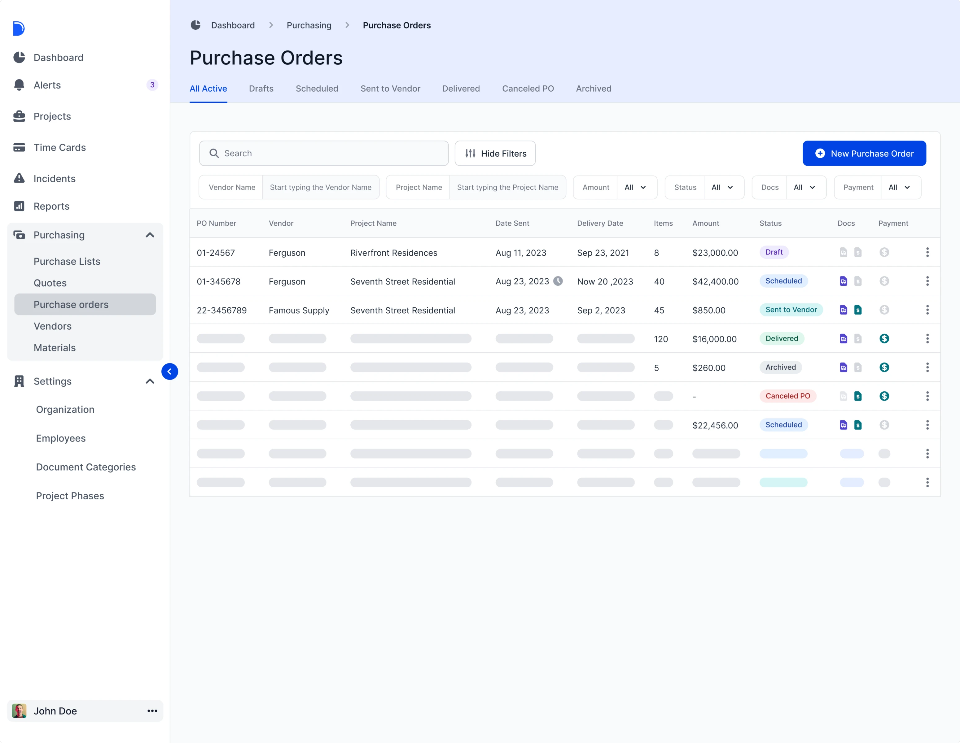
Our designers also included menu sub-items and a sidebar with different styles on the Purchase Orders page. To simplify navigation, they changed the sidebar design and added navigation identifiers (color accents). This allowed us to simplify the display and search of supplementary information that is helpful for navigation as well as show their belonging together.
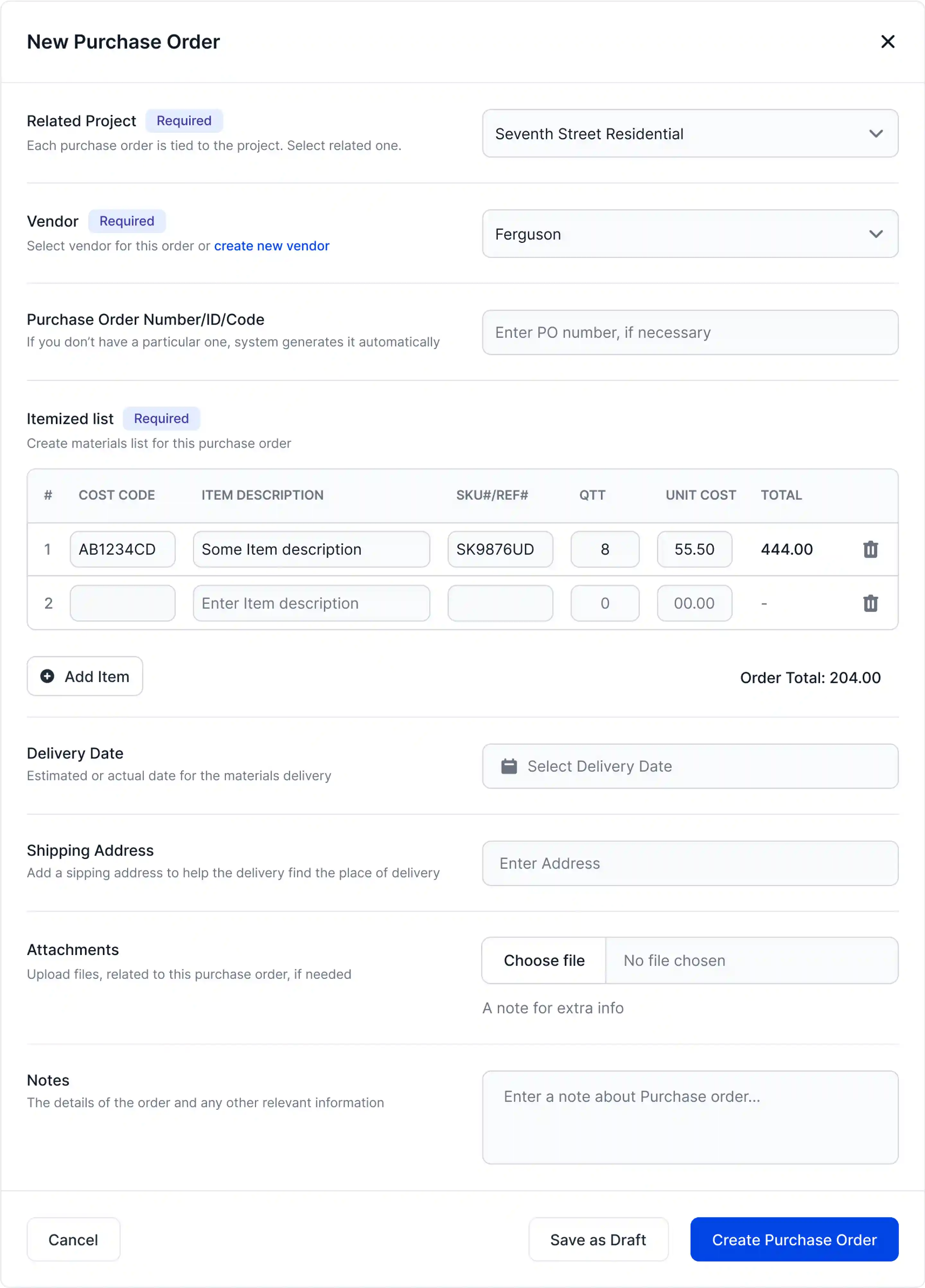
Also, our designer created modal versions for purchase order creation:
- Modal with the main emphasis on tables.
- Modal+Page with general information about orders.
The clients were happy with the result, so we signed a contract, and the work on the Purchasing section began.
How we created Drenchworks’ new section from scratch: 4 key stages
With a clearer idea of the project goals and the first page versions in hand, we focused on planning the design for the new section, as well as defining the next steps and setting out priorities for each iteration. Here are more details.
Stage 1: Starting with logic and interactions in section’s pages
Our team did their best to make the structure and navigation easy to understand and intuitive. For starters, the Eleken designer put together all the section blocks and tried to determine how to divide the page into meaningful segments and connect them to deliver a smooth user experience.
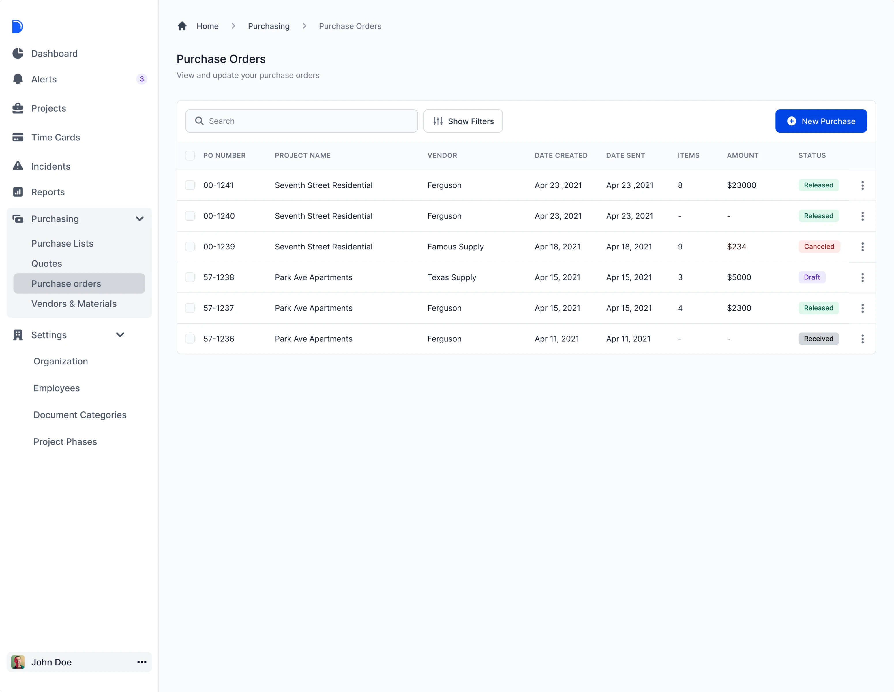
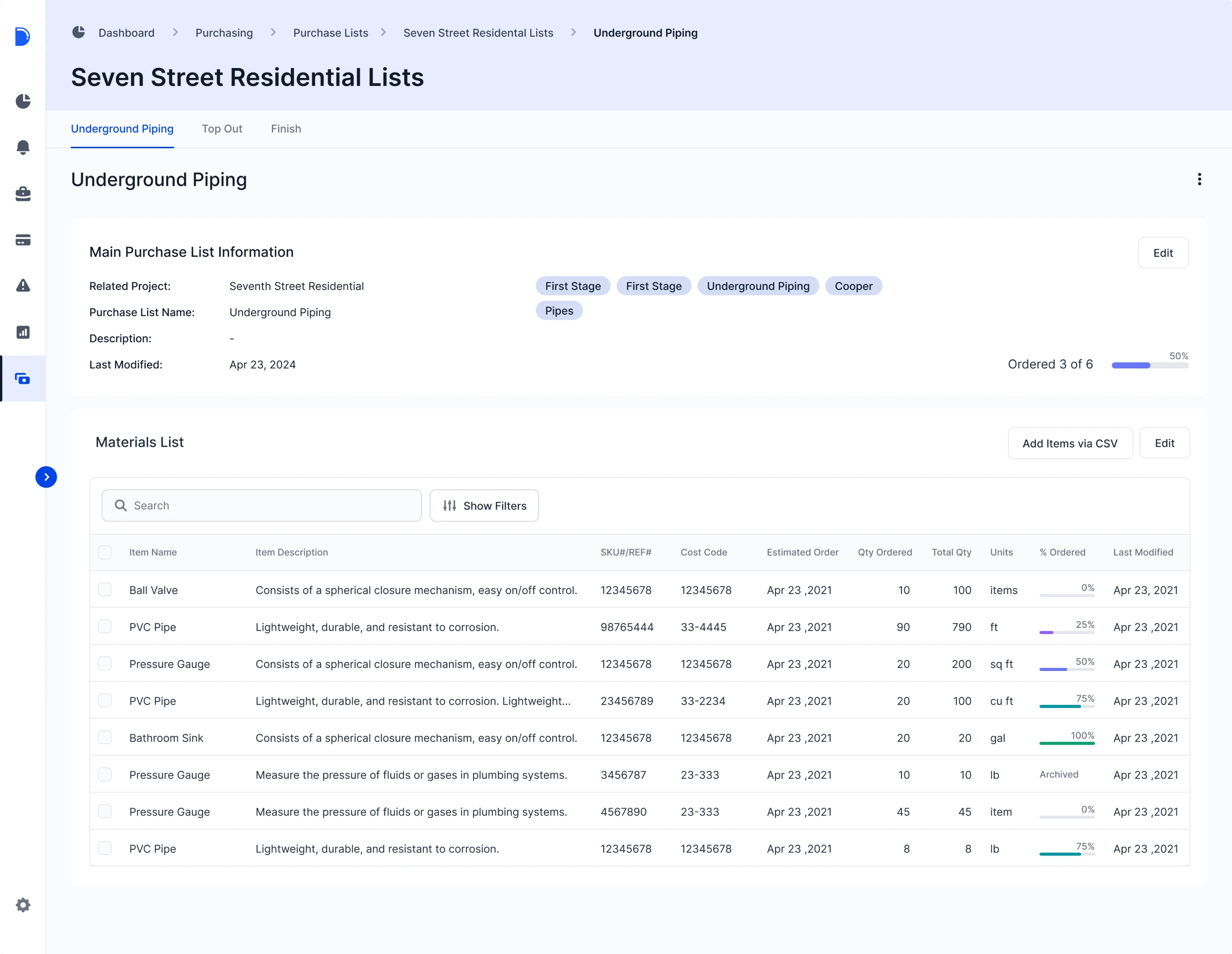
Having the schematic structure done, the Eleken team focused on making the pages for purchase lists and purchase orders, as well as new lists of orders.
We simplified the navigation between these pages without affecting its usability and accessibility.
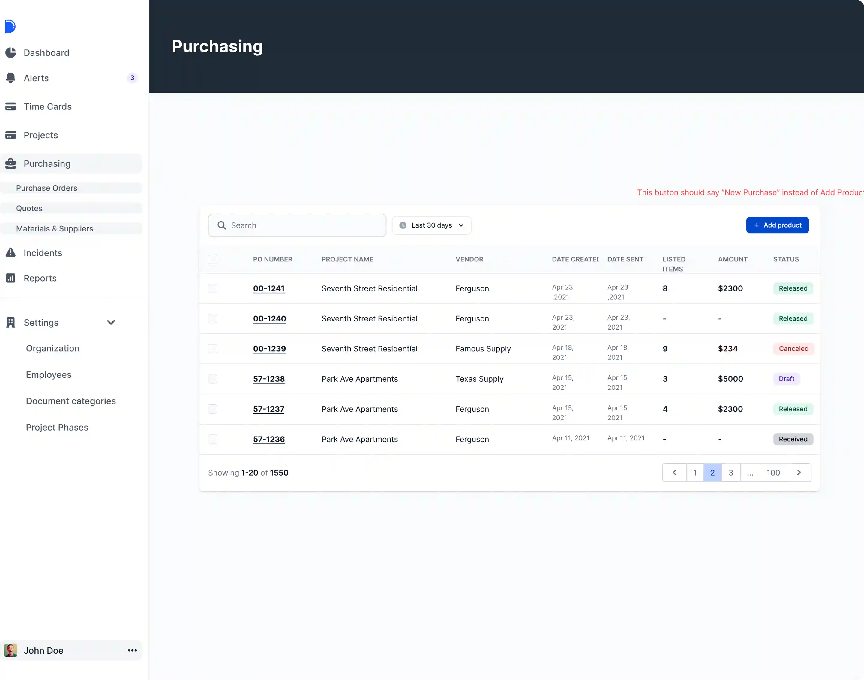
- We removed subtitles that did not carry any meaning but caused visual noise.
- We structured the section items and sub-items in tabs, which allowed us to avoid 3-level navigation, which is considered a confusing pattern.
- We created a collapsible sidebar to reserve more space for tables and information display.
At the same time, all the required information and data were not curtailed across the section. To make navigation easier, we used breadcrumbs, navigational cues that display users’ current location on the section.
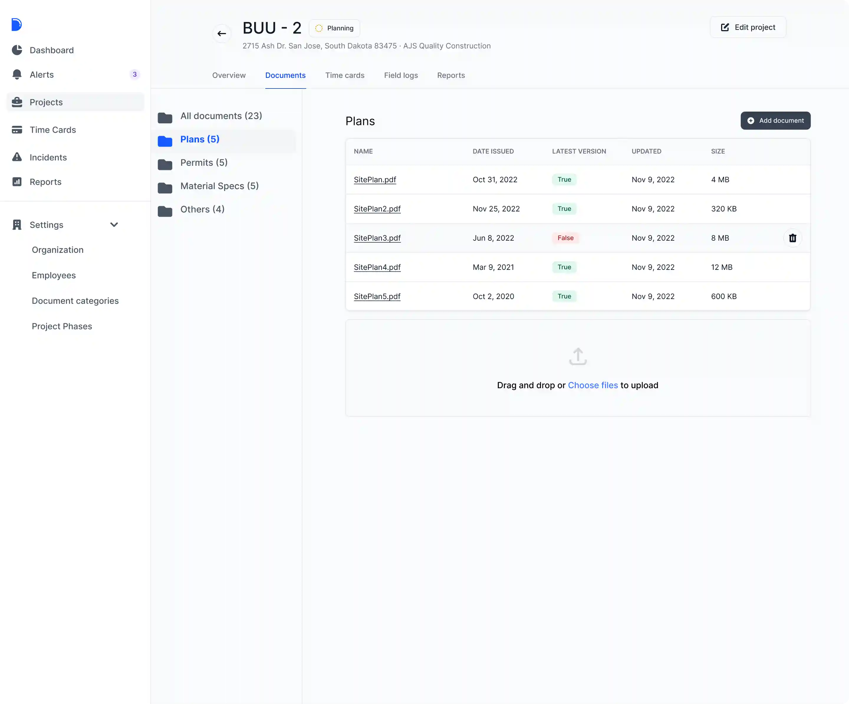
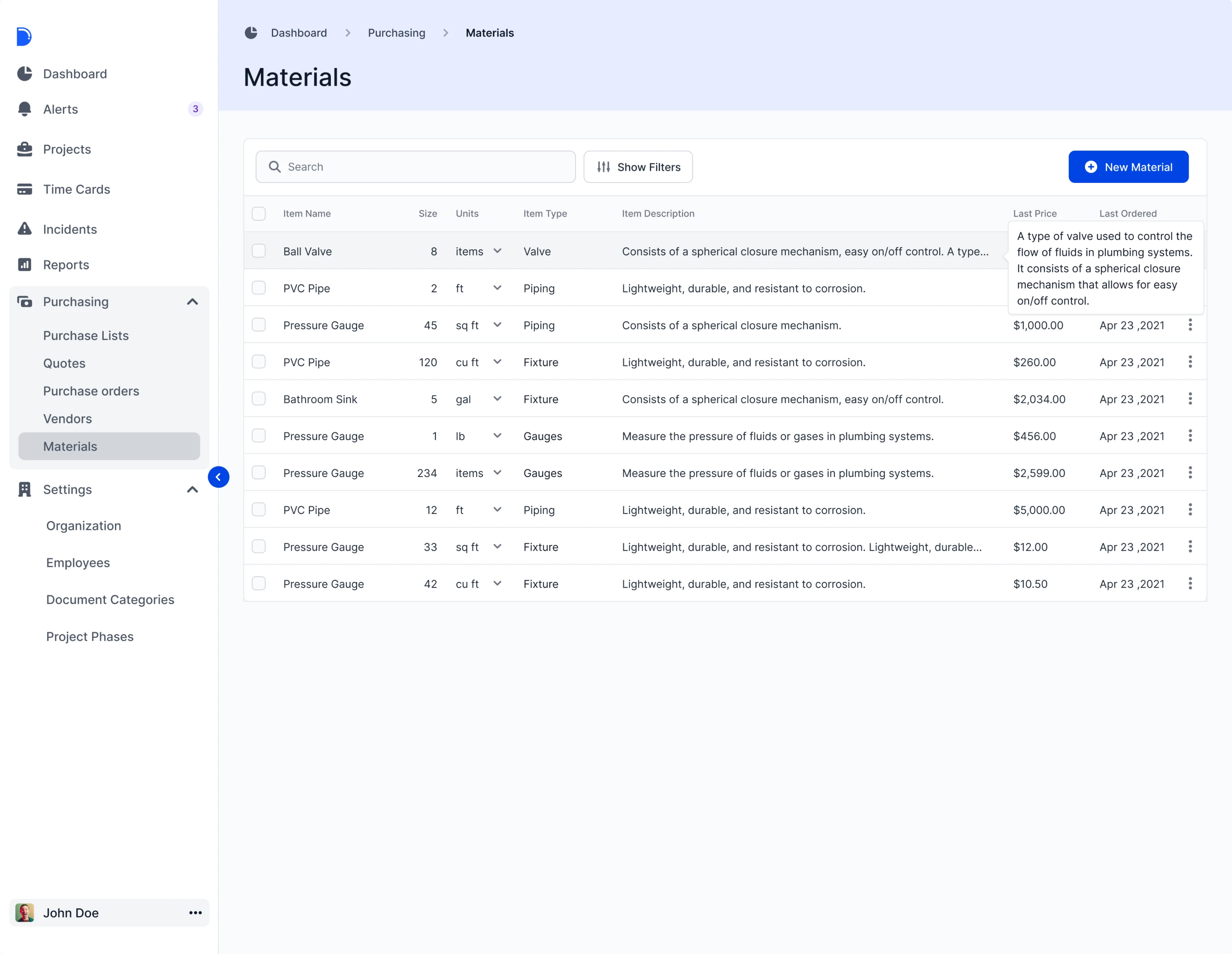
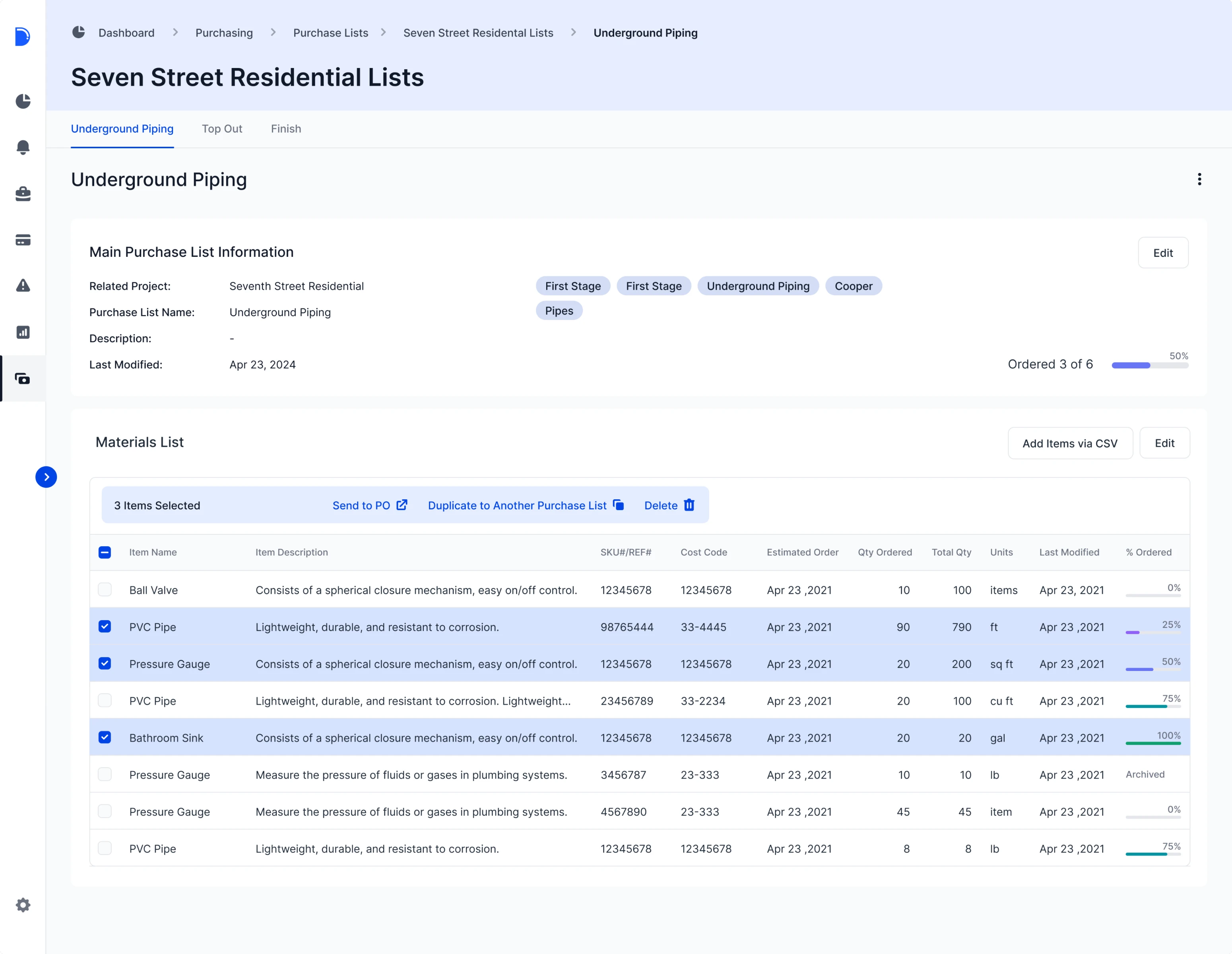
Thanks to the changes made, users can now get access and view detailed purchase lists and orders, as well as edit, archive, duplicate, or delete them. All pages became more consistent and informative.
Stage 2: Redesigning the tables for integrating AG Grid
A key project goal was to streamline data entry with editable tables in Drenchworks' system. To improve this process, our designer recommended AG Grid—a fully-featured and customizable JavaScript data grid similar to Excel. We tailored AG Grid settings, focusing on sorting within columns, ensuring developers could seamlessly integrate it into the product without starting from scratch.
Our task as designers here was to maintain all grid options and rework the tables' design, making sure they fit the Drenchworks design. Apart from that, we also made a unified structure of tables for all pages.
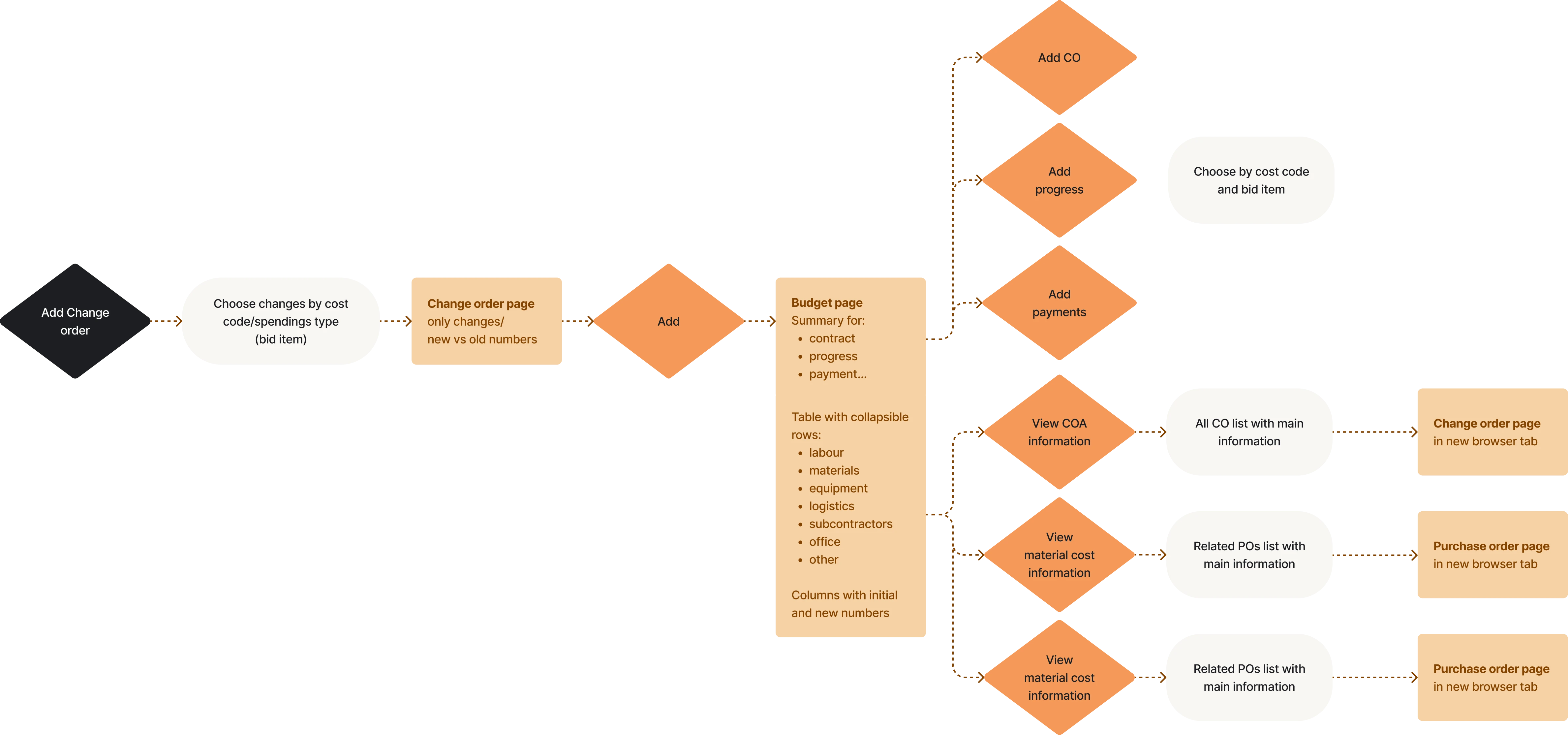
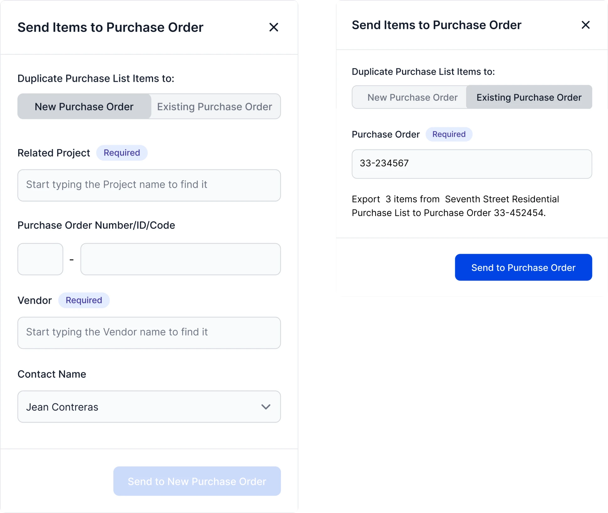
Stage 3: Creating smooth user flows
To create the designs in a way our clients envision them, we always follow an iterative working model. We involve clients in the design process evaluation and gather feedback after each iteration. It is especially important when working on user flows and defining actions the users take to achieve their goals.
Our task was to create the interaction with lists and documents, depending on their status. The next iterations involved redirecting list items from one document to another and importing and exporting information from the system, making these actions obvious and convenient for users.
Stage 4: Adding final touches
Finally, we made slight improvements in the client’s color palette usage, working within the existing color scheme. Also, we worked on the hierarchy to avoid user friction, guiding users in the right direction with the help of color, and helping them accomplish tasks effectively and efficiently.
By the end of the subscription period, we created the website wireframes to ensure it looks and feels the same as the platform, just what they expected.
A newly designed section is well-accepted by users
As a result of our joint efforts, the clients got a new Purchase section with a well-defined structure, clear logic, and a user-friendly design. Apart from that, our team also created smooth user flows, while maintaining the existing logic of the platform.
In the course of the project, our clients conducted user testing to see how users interacted with the new section and assess its usability. The newly designed section was warmly embraced by customers, leaving the clients fully satisfied with the outcome.