Redesign is a sensitive question in the field of product design. Often, the end result is no better than the starting point, and the only metric that is rising is the level of user frustration.
Designers' portfolios are full of “fake redesign” cases, as they show how they would improve existing designs of popular brands or products. It may create an impression that almost everything could look much better with a revamp.
When you scroll through the Behance "Redesign" tag, it almost seems like all those designers for some reason know better than all the huge design teams that actually work for those brands. Why don’t companies all just hop on one of these great product redesign ideas then?
At Eleken design agency, we believe that redesign is not a “silver bullet”. On the contrary, it has to be taken with caution. Redesigning apps is our job and that’s what many of our clients come for. From our experience, many companies that think they need a redesign solution, are actually wasting resources. To understand the situation better, let’s take a look at some real cases.
Redesign examples
When we decided to set a list of redesign success and failure stories, it turned out that often design quality is judged based on subjective critics. Most companies avoid sharing the results of their research publicly.
At the same time, public opinion tends to condemn new designs of popular products as soon as they come up. It is true about website and logo redesign as well. These waves of critique also create an impression that redesigns fail more often than succeed. We found a few product redesign examples that can be backed up with real data.
Busuu push notifications redesign
Push notifications are a pain for designers. They have to be relevant, valuable, and well-timed. Yet in most apps they look like desperate attempts to draw users' attention and make them open the app one more time.
Language learning app Busuu wanted to differentiate from their competitors. The objective of popular learning apps is to engage users to use the app daily. So, they use push notifications to remind about themselves. And naturally, 60% of users turned off notifications, while the rest just ignored them until they find out how to opt out.
Instead of saying “It’s been two days since you haven’t done anything to learn French. Shame on you!”, Busuu asked users a question about the words they learned last time. Here is how it looks like.

Personalization and intrigue (question) worked well. Push open rates increased by whopping 300%, and the increase in revenue on Android reached 10x for the same amount of notifications sent.
Runtastic and users mystery
In personal lifestyle apps, first screens can make or brake the bank. Runtastic (now Adidas Running), a fitness app, decided to redesign the paywall screen to see if seeing a user review instead of a promo statement will engage users.
Instead of risking and changing the design at once, they run the A/B testing first. Two versions of paywall screen were shown to different users.

Testing showed that new design led to a 44% increase in paid subscriptions for Android users, while not making any significant change for iOS users. So, Runtastic changed paywall design only in Android version.
This case is particularly interesting because it shows how data can show totally unexpected results. If there was no segmentation, the results would show 22% increase in paid subscriptions and a future opportunity for improving results for iOS would be lost.
And if you wonder what was the reason for such disparate results, I have to admit that I have no idea. This story tells us that in design, we have to trust user testing, even if we can’t always explain the reasons behind user behaviour.
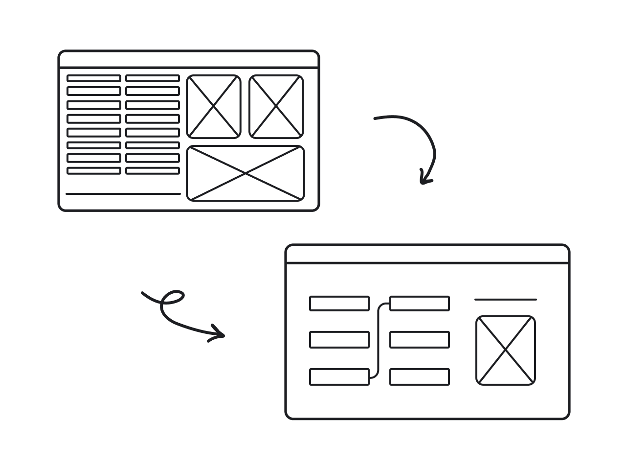
Icons8. Less is less
This story is about how “clean” and “minimalist” design makes your website less user-friendly. It happened in 2017 when the world of UX was obsessed with the “decluttered” interface.
Icons8 is a website that sells icons. Apart from downloading ready-made icons, users could request the ones they need. The requests that had the most votes were drawn by the designers of Icons8.
Website redesign made the number of votes visible only when the cursor was close to the voting space. As a result, people started to vote less just because they didn’t see that option. In the language of metrics, user engagement decreased by 50%. Here is how it looked.


At Eleken, we love analyzing redesign cases in our blog. When you want to learn about other redesign cases, we recommend reading how recent Twitter redesign caused migraines.
Why does redesign fail? Main reasons
Focus purely on aesthetics
This is a very common pattern that we see in product owners who come for a redesign: they see some big successful products using trendy designs, and they just want to follow that path by redesigning their apps in a similar way.
What not all of them know is that trendy design is only a tip of the iceberg. Top companies go through a long process of research, design, and iterations to get to that clean and trendy look, that may look to you like a Wix product.
Did you know that there are over 100 UI/UX designers working at Dropbox? Yes, the app that is not very common to see on the top design lists, is actually investing a lot of resources in design. And yet they use the same blue color as many other apps out there. Talking about blue, did you know that Microsoft once gained $80 bln after choosing the right shade?.
100 designers could have been creating various creative and original designs that would go right to awwwards.com, but that’s not what they do. All their experience and wisdom is needed to decide what exactly needs to be changed and how in a way to make users happy.
Dropbox designers don’t make 100 different designs to choose the best out of them. They research, test, analyze, measure performance, and improve each version to get the best result at the100th iteration.
Assume what users need instead of asking them
It is not very common to hear users saying “we really want this app to be redesigned”. In most cases, people hate when their favorite products get redesigned. Adapting to the new interface is hard, and people, in general, tend to prefer things that they are already used to.
By asking users first, you can make them happier while saving lots of time and resources otherwise spent on the complex design processes. To learn how to ask the right questions and avoid bias, check our “How to talk to users” guide.
An example of a redesign project that really listened to the users is Google Meet. We have analyzed it previously.
Implement redesign without testing
Here is a story that happened to Walmart in 2009. With the best intentions of making their stores more comfortable for customers, they ran a survey asking people “Would you like Walmart to be less cluttered?”.
Guess the result — naturally, people said yes. Walmart managers, happy that they have complied with the abovementioned rule, decluttered the stores by taking away 15% of the inventory. As a result, the sales went down and Walmart had a staggering $1.85 billion loss.
You can say that the question implied bias, but questions are never 100% unbiased. Testing is way more reliable. Had Walmart tested decluttering in one or two shops before redesigning the whole chain, they would have noticed negative dynamics and such a huge loss could have been avoided.
At Eleken, we have a list of red flags that make us understand that the redesign is not the best idea. This is what we hear from prospective clients sometimes:
- We want to make it pop
- Our design is outdated. We would like to have something like Stripe
- We are not happy with our metrics, so we want a redesign
These are the signals that the client does not see the redesign process and objectives clearly.
Of course, we don’t just refuse to collaborate because of that. We are always happy to work with products that need to be redesigned. However, we always try to explain to clients that redesign is not a universal solution. What do we offer instead?
Evolutionary design
This approach is more natural and holistic. Instead of inflicting abrupt changes, we focus on the parts of the design that really need improvement and go through a number of iterations until we get to the desired result.
Think of a TV show that does a makeover for its participants: they buy them new clothes, get a fashionable haircut, do fast “coaching” and turn into a new person. How long do these people stay in the same state after the cameras are off? Right, no longer than a couple of months.
On the other hand, changes that come as a result of personal evolution can last for a lifetime, even though they take way more than one week to happen.
Going back to UX design, evolution is a way to respond dynamically to product needs. The evolutionary design provides perfect ground for application of design thinking.
Our working processes are tailored to evolutionary design principles. That is one of the reasons why we work with the retainer pricing model: it allows us to work on the design with all the necessary iterations.
Unlike other agencies, we can hardly tell clients how long the redesign will take on the first meeting. Evolution doesn’t happen in a minute. With clients who understand that we get to work and deliver measurable results.
So… to redesign or not?
Before answering this question, you can go through the following redesign readiness checklist:
- UX audit
- Performance analysis
- Defined objectives
- Analysis of other solutions
If after all of this you haven’t come to a decision about the redesign, you might need an external opinion. UX audit really makes sense only when it is done by someone outside of the company. If you are seriously considering a redesign, we’re here to help.