Whoosh
Creating the next Zoom: how Eleken's design expertise makes it possible
There are many well-known video call platforms out there like Zoom, Skype, Google Meet, and many more. But even if something is widely used, this doesn’t mean that it is very efficient and user-friendly. Although tech-savvy audiences were able to get a grasp of them instantly, older and younger people (especially school students and teachers) struggled to figure out how to work with such platforms. Both big and small players on the market have their issues, such as Zoom fatigue.
So Banuba, a face software company, saw the flaws the existing apps have and wanted to create a platform that would be much more user-friendly and so simple that “even a granny could use it”. So they decided to develop Whoosh, a solution for video meetings aimed to become one of the best in the market.

Banuba already had a product with user testing, A/B testing, and competitor research conducted. What they needed is the assistance of a professional UI/UX designer who could help build such a high-level product. So they reached out to Eleken for help.
Redesigning Whoosh homepage and finding a way to present new features during the 3-day trial
For clients to know what they pay for, Eleken offers a free 3-day trial. During the trial, our designer joins the client’s team to work on the product, demonstrate their skills and expertise, and verify if they are a good match for the project.
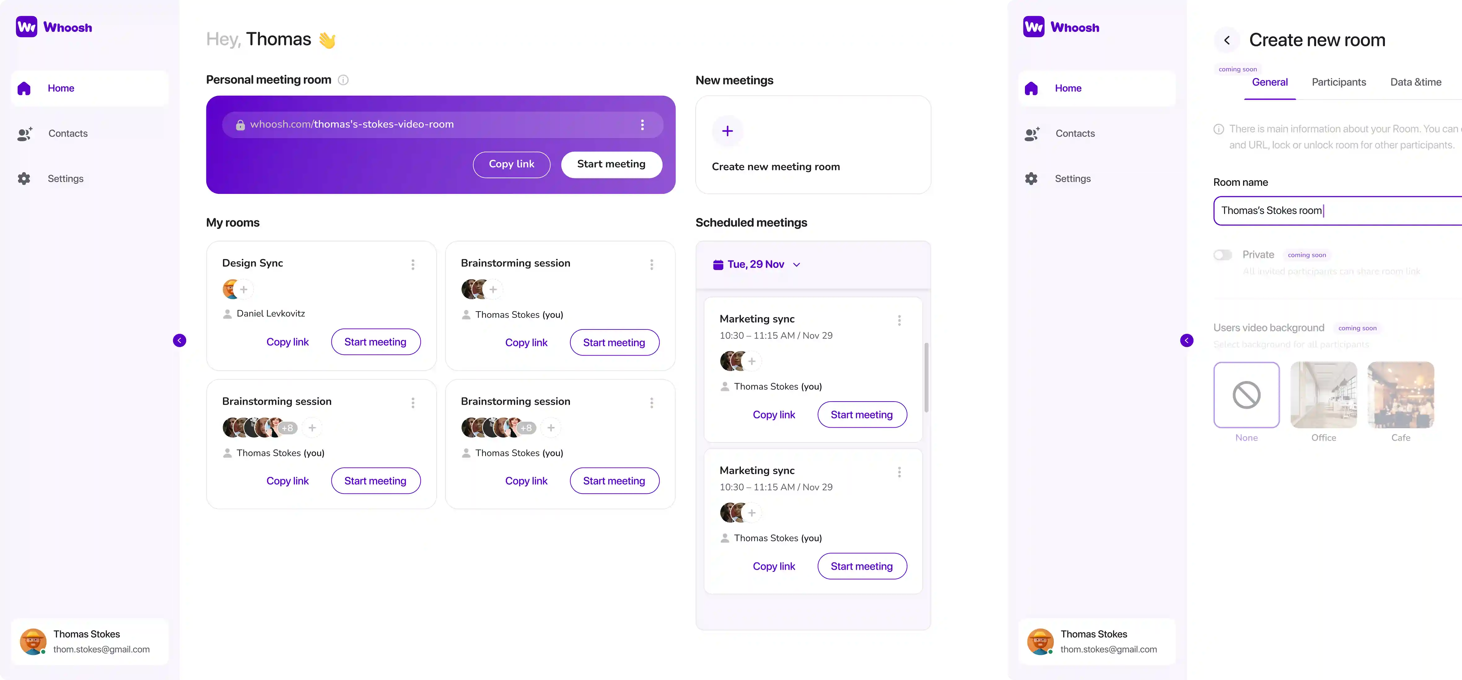
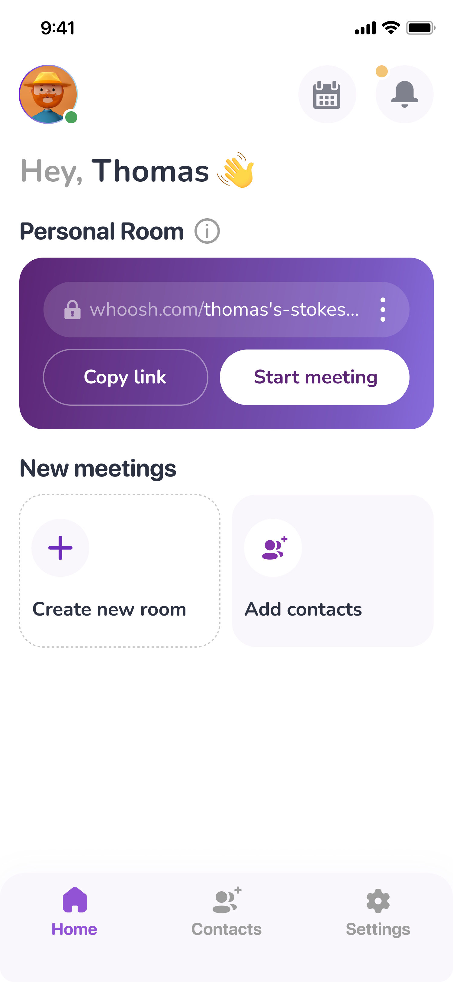
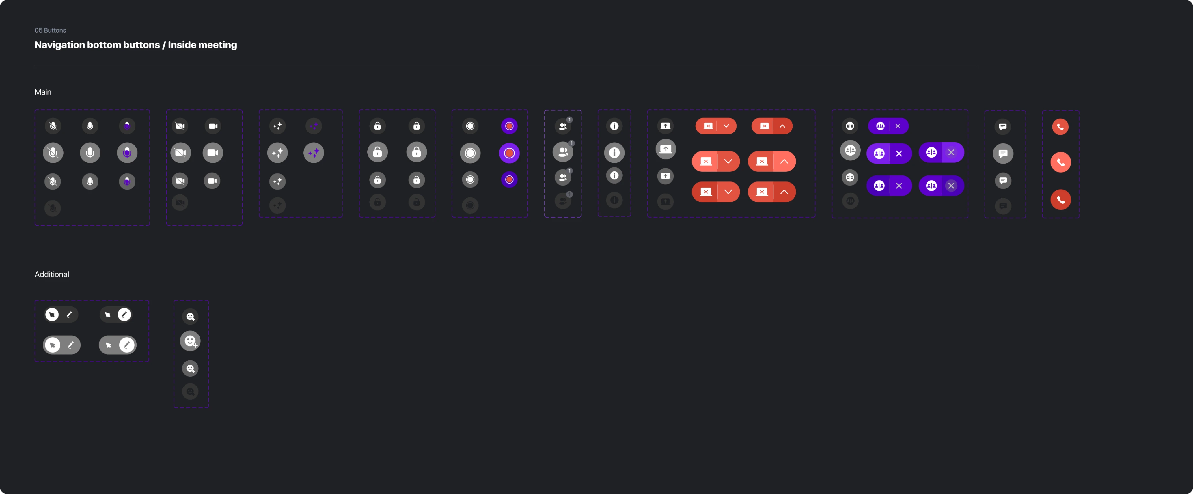
During the trial, Whoosh asked our designer to find ways to improve the product’s homepage (both web and mobile version). There were a lot of colorful and distracting elements, which should have been reconsidered. The client also wanted to improve the look of the rooms’ buttons to make them easy to notice.
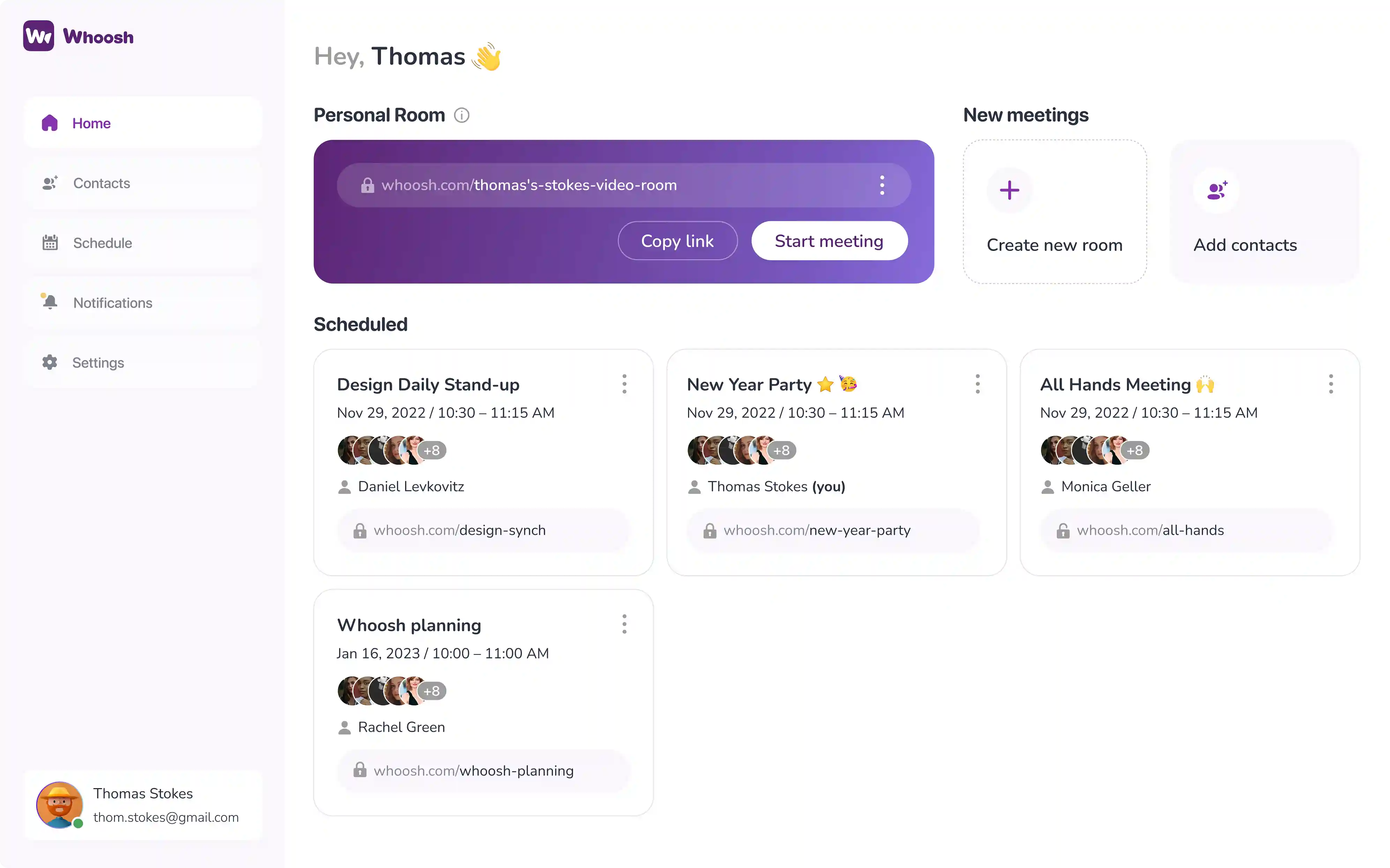
The client’s request was to stick to the initial interface and structure, so the homepage’s design was only slightly updated. Here’s what was done:
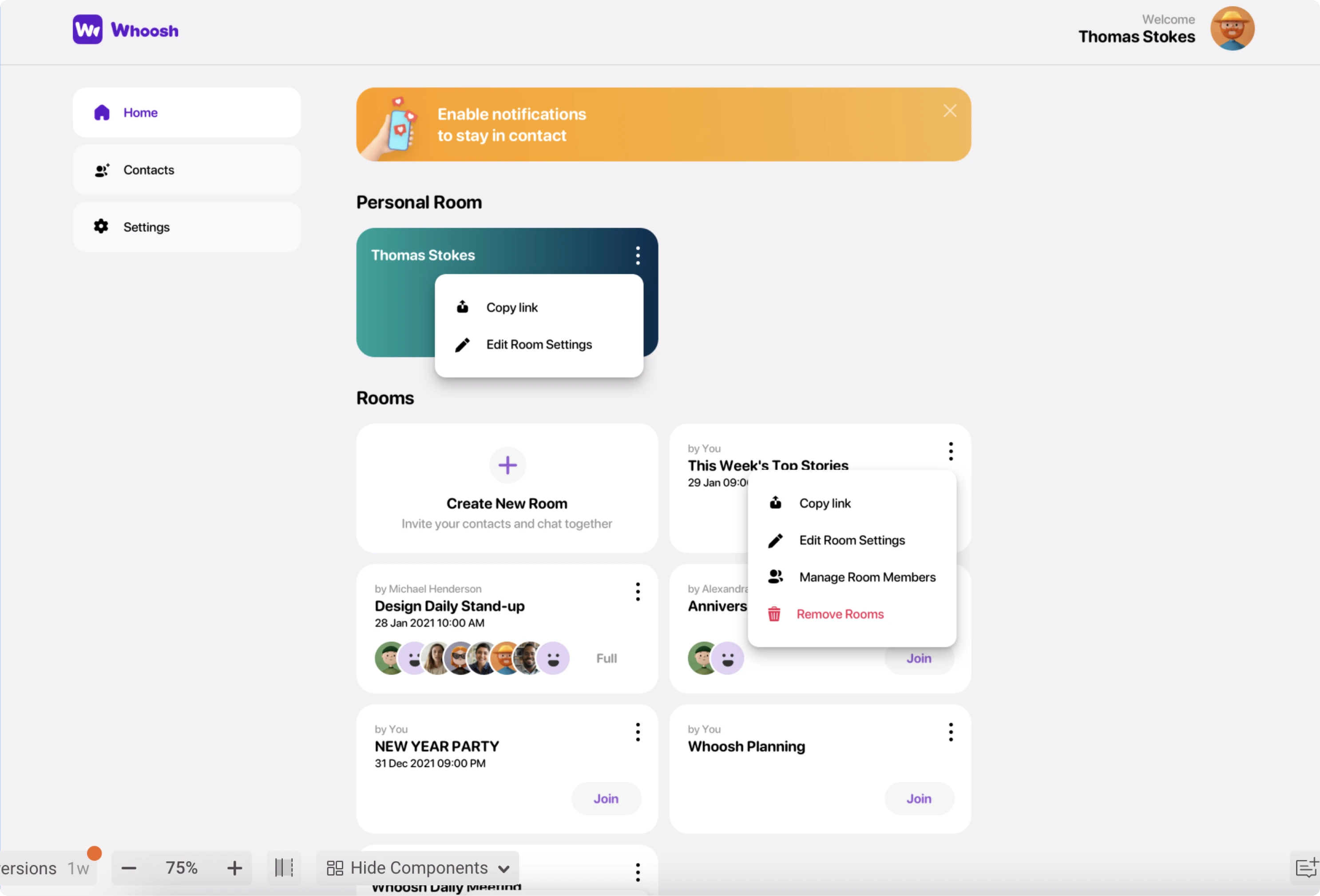
- Redesigned the user bar so that it shows the email address and online/offline status, to be able to differentiate between different accounts (such as personal and work one) and check the connection;
- Changed the look of the personal room bar to make it more distinct;
- Added the lock icons near the URLs to show that a room has restricted access.
The client liked this solution. What impressed them even more is that all of this was designed in 3 days, including the time spent on additional research. So the Whoosh and Eleken collaboration has officially started.
Competitors’ research as an ongoing process
With this project, we didn’t have a research phase with clear start and end dates. Instead, we used data from the client, researched certain competitors and their features on our own, and continued expanding the database as the project was going.
When working on Whoosh, we analyzed over 15 competitors, starting with market’s giants like Zoom, Google Meet, and Skype, and ending with lesser-known solutions like Butter, Around, and Whereby.
Such extensive research allowed us not only to notice the competitor’s best practices but also figure out how to make our product more intuitive to the end-users.
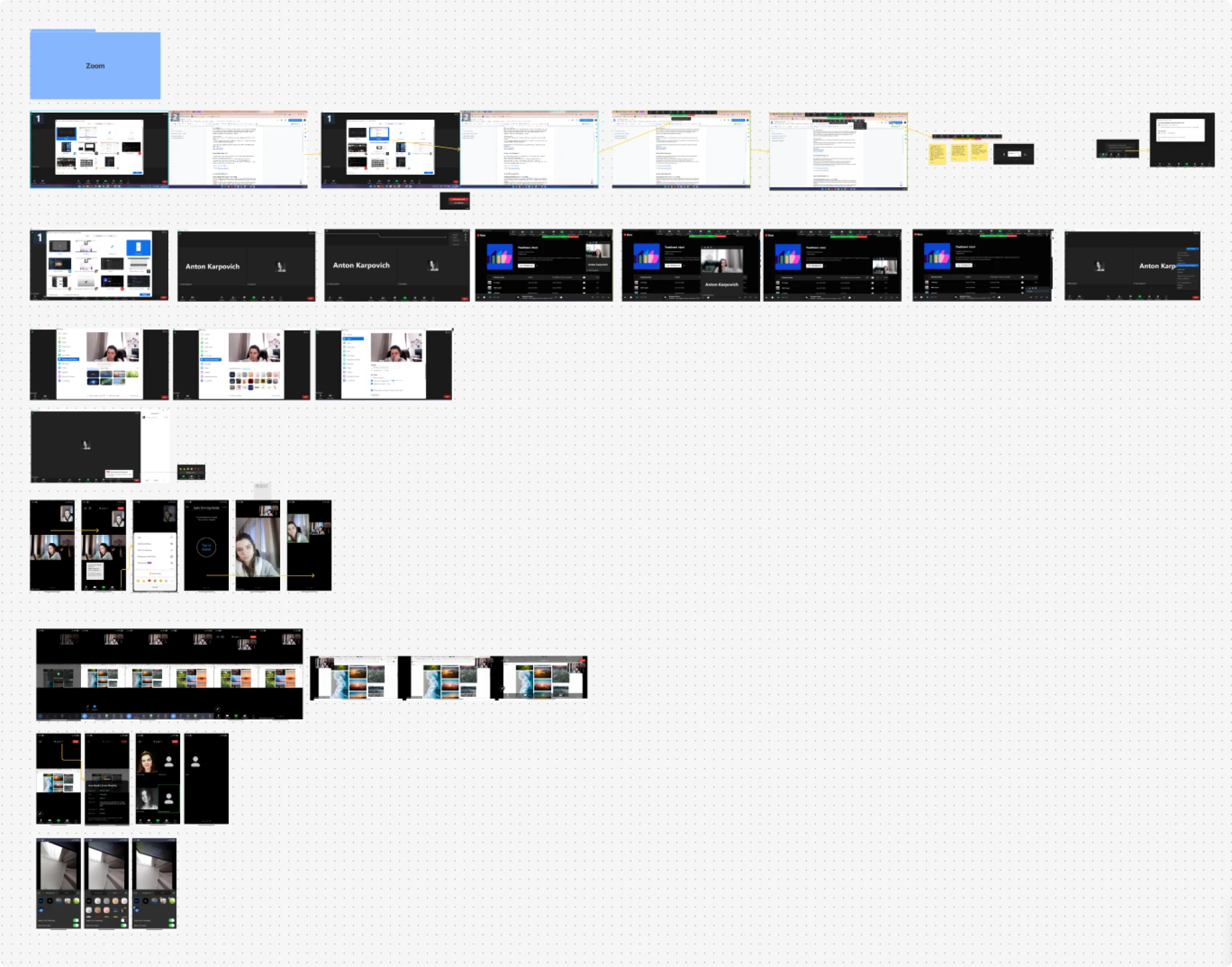
Improving user experience with smart video placement
Many video conferencing apps position the user’s video feed in the bottom corner of the screen. This could be one of the reasons why people often feel fatigued and frustrated after attending video calls. This is because this placement prompts users to frequently check their appearance by looking down, leading to a sense of tiredness and reduced confidence when leaving the call.
Our solution involved relocating the video feed directly beneath the camera. This adjustment encourages users to maintain better eye contact with the camera, improving their confidence and engagement with others. This placing also allows users to cover the video with a sticky note if they get tired of seeing themselves. Research confirms that, stating that user video placement right under the camera is optimal.
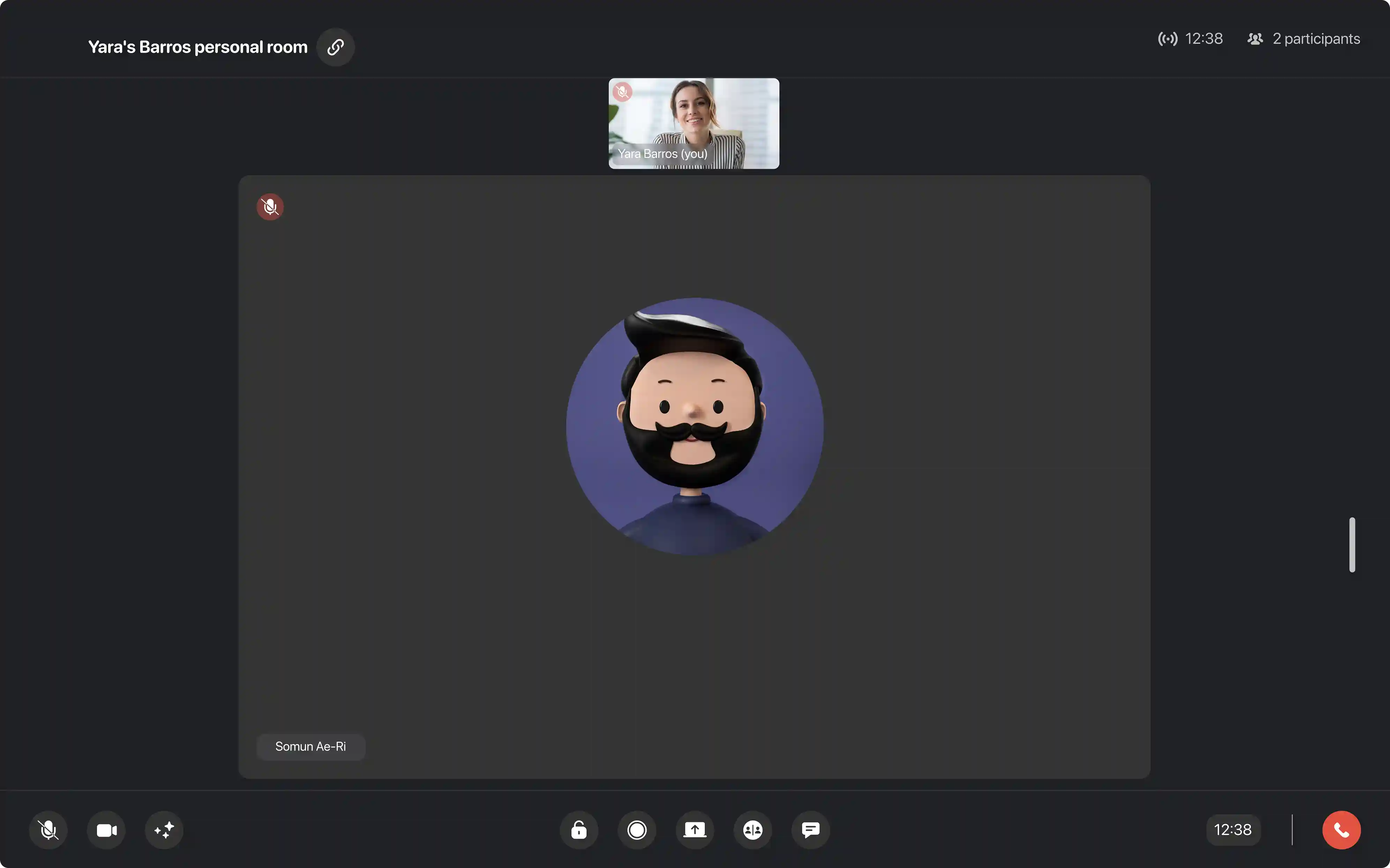
Making presentations more engaging with the help of smart screen sharing
We all know how the presentations looked like before: you shared your computer’s screen and hoped that no messages would pop-up, distracting the viewers and potentially embarrassing you. Lately, video call apps updated this feature, allowing to choose which exact screen you want to share. But viewers have to constantly switch between the content of your screen and your video (usually located in the corner). Alternatively, they can focus on the content only without seeing how you present it, only hearing you.
Whoosh grants you more flexibility with its smart screen sharing feature.
- See the latest open files in the tab above and open them in one click or add a file to that queue by clicking the “Add file” button.
- Preview the slides in the sidebar on the left.
- Switch between the slides in the presentation mode.
- Hide the participants’ videos altogether when presenting something.
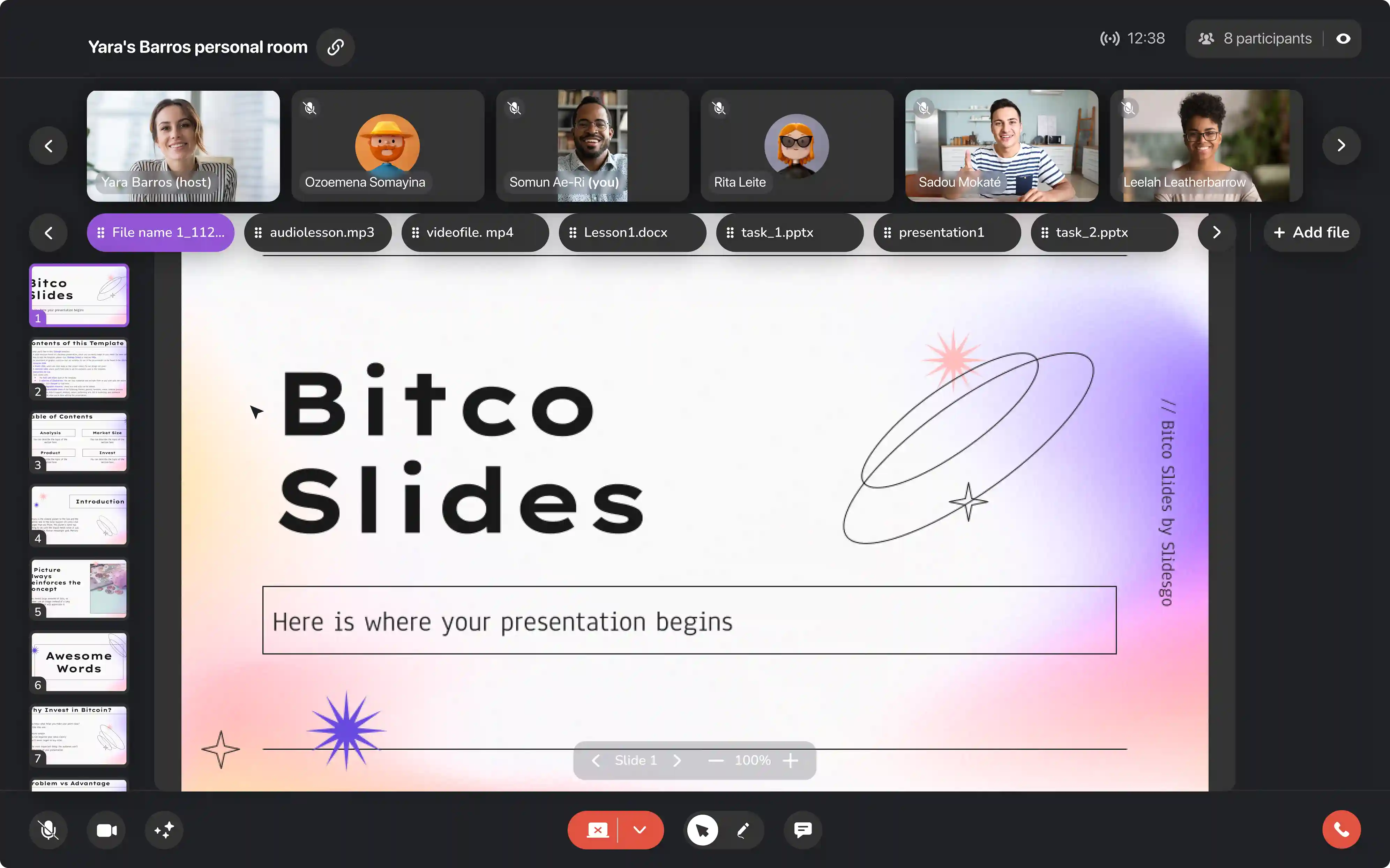
Making breakout rooms simple and custocustomizable with a responsive grid
Breakout rooms allow you to separate viewers into different groups. This feature is often used by school teachers and university professors who teach remotely. It helps explain one and the same content to different groups of students simultaneously, as well as distribute project work with ease.
As the number of people on such calls could differ, having only one type of view for a breakout room is not the most convenient option. So our designer created a responsive grid, which adapts and changes depending on the number of participants inside each room. This allows the host to see all the participants in all groups at the same time, see their reactions and go inside the room if needed.
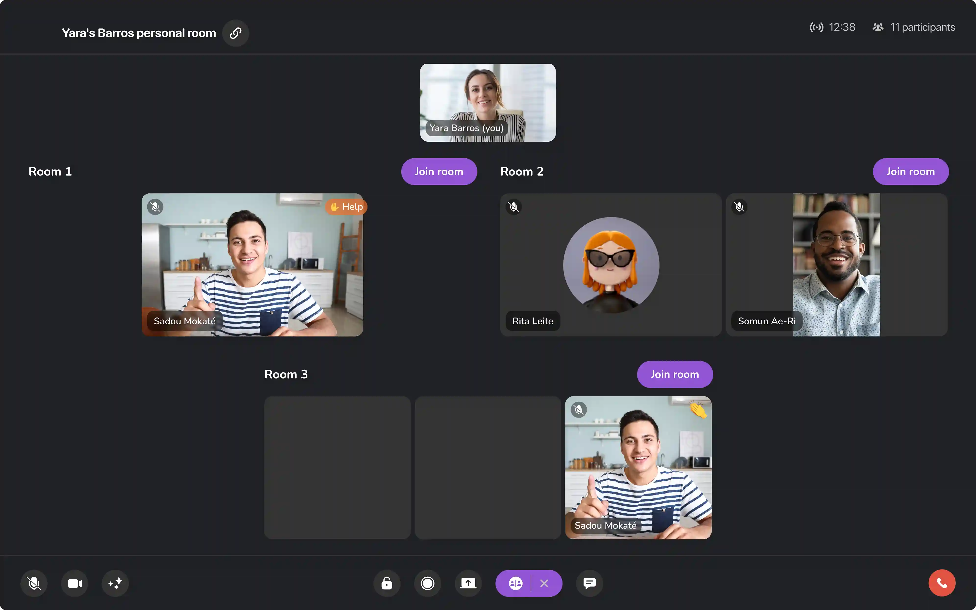
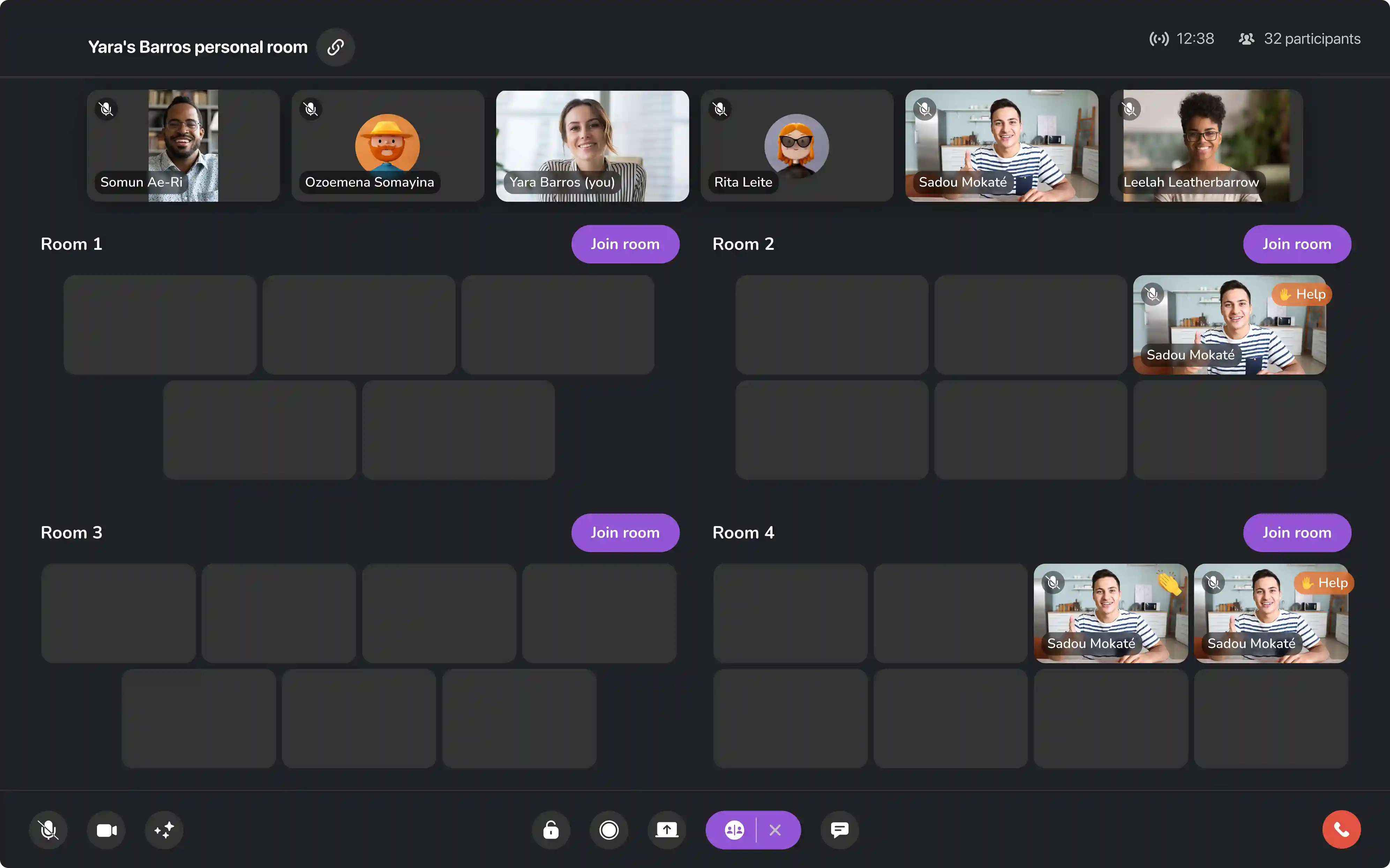
As you can see, the screens aren’t cluttered with unnecessary buttons. The interface looks similar to your regular video call, the only difference is that all participants are split into groups.
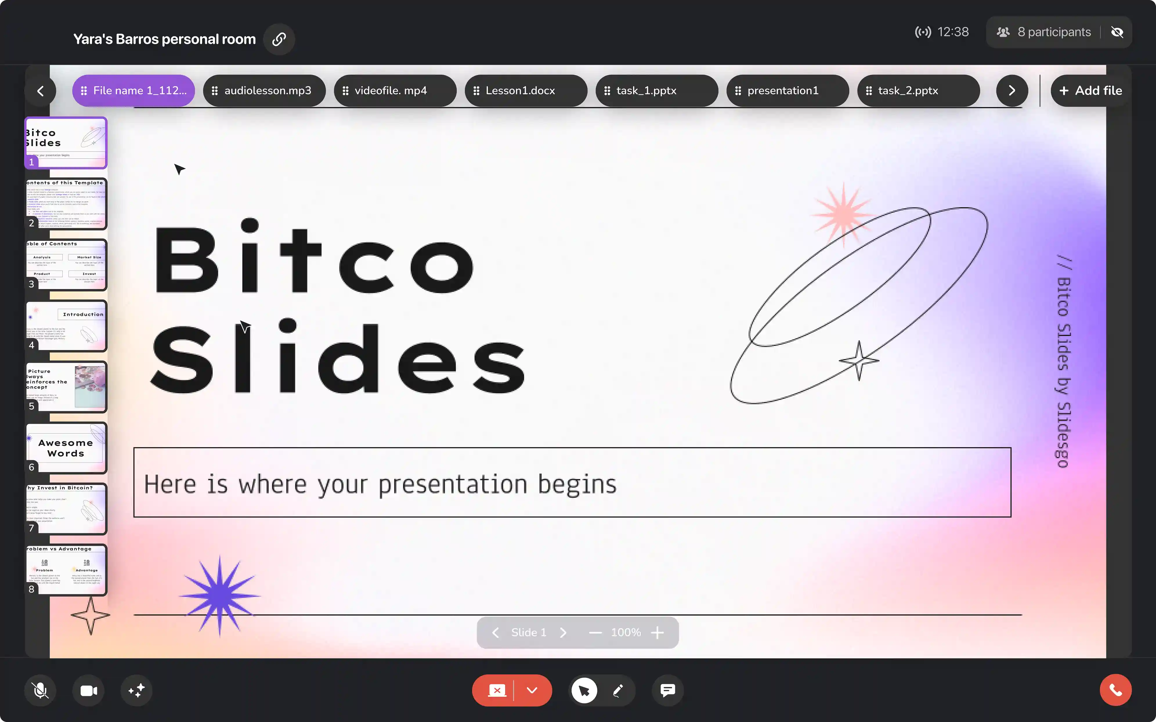
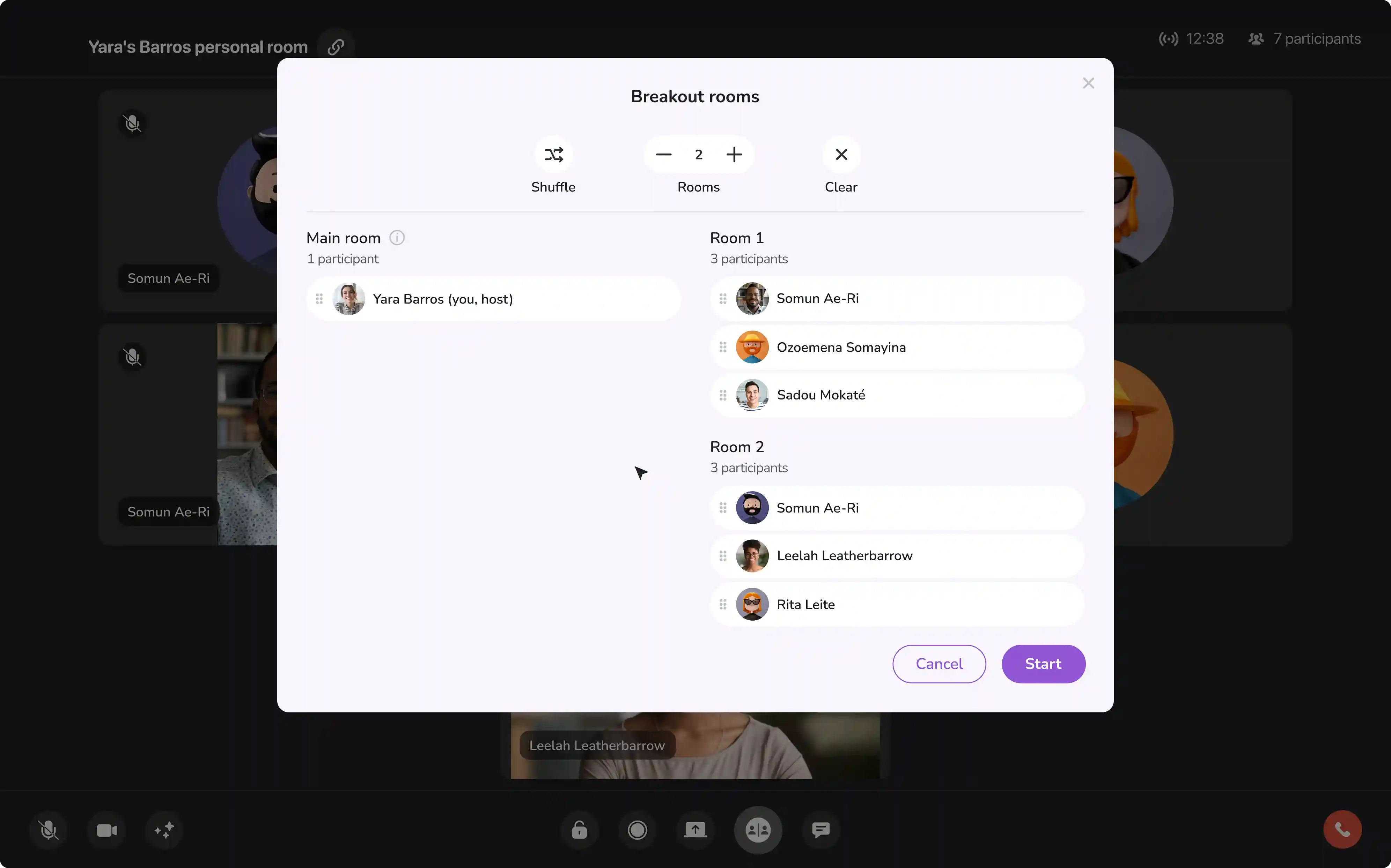
Setting up breakout rooms is also very easy. You can pick the participants manually or use the Shuffle features to set up groups randomly:
Wrapping it up with the well-polished design system
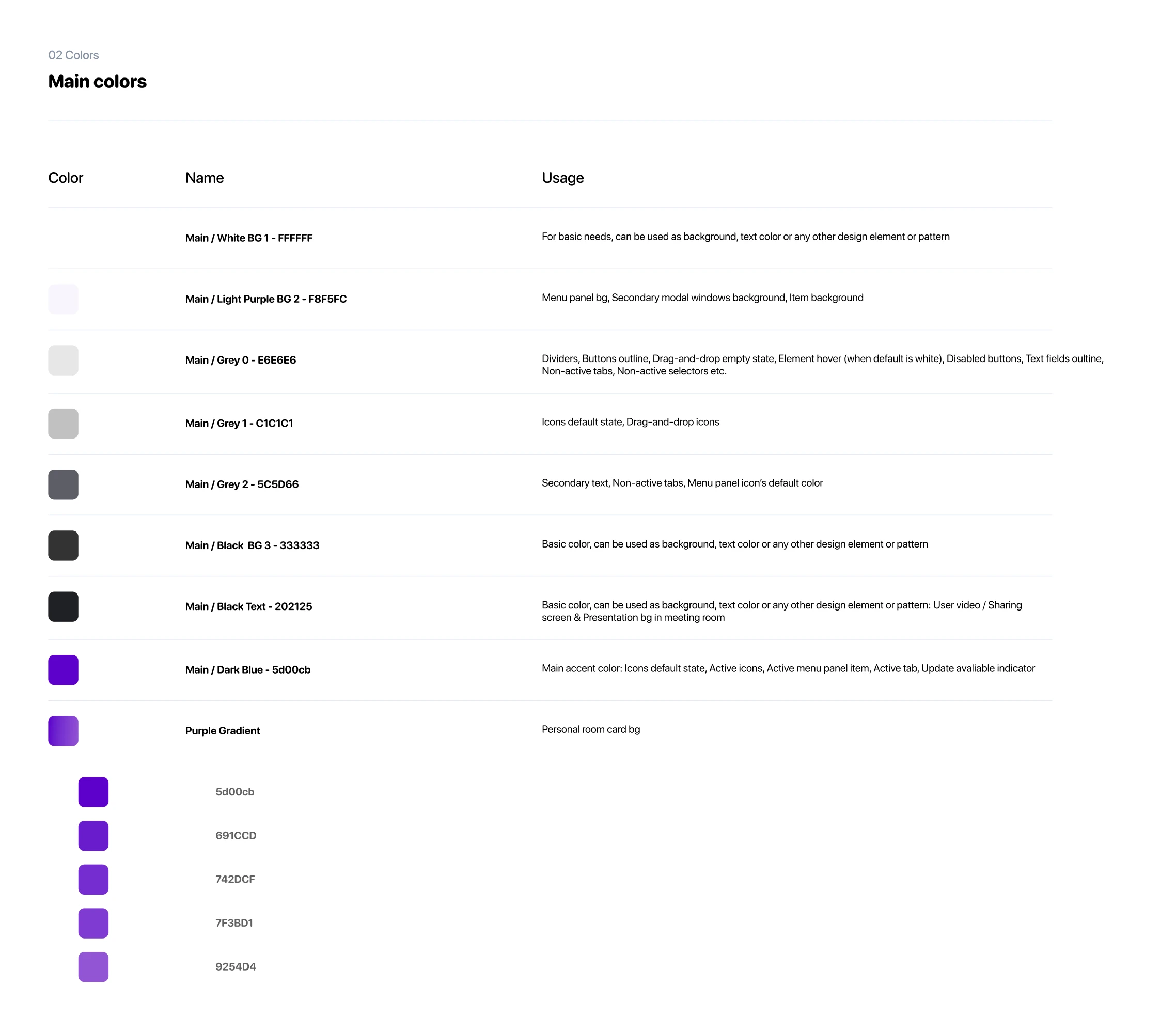
When we started working with Whoosh, they didn’t have any design system in place. So we created one for them, covering all that was needed, from typography and color to icons and user avatars.
Eleken’s support helped Whoosh create a modern, high-level video call app
When Whoosh turned to us, they wanted to build a video call platform that would be simple to understand and great to use. The product developed during our collaboration meets that goal: it helps people present information with ease, create user groups without a headache, understand the interface with the help of tooltips, and many more.
We created an app that doesn’t differ from the original product much in terms of interface and structure, but:
- looks more modern;
- has a detailed design system;
- helps users communicate with each other easily – even if a user in question is a granny, who hadn’t dealt with apps like that before.
If you like Eleken’s approach and feel that we could create something great together, don’t hesitate to reach out for a free consultation!