UX case studies
for every SaaS niche
A collection of all our UX case studies across industries, business models, and design challenges. See how we tailor design solutions that solve real problems and drive product growth.
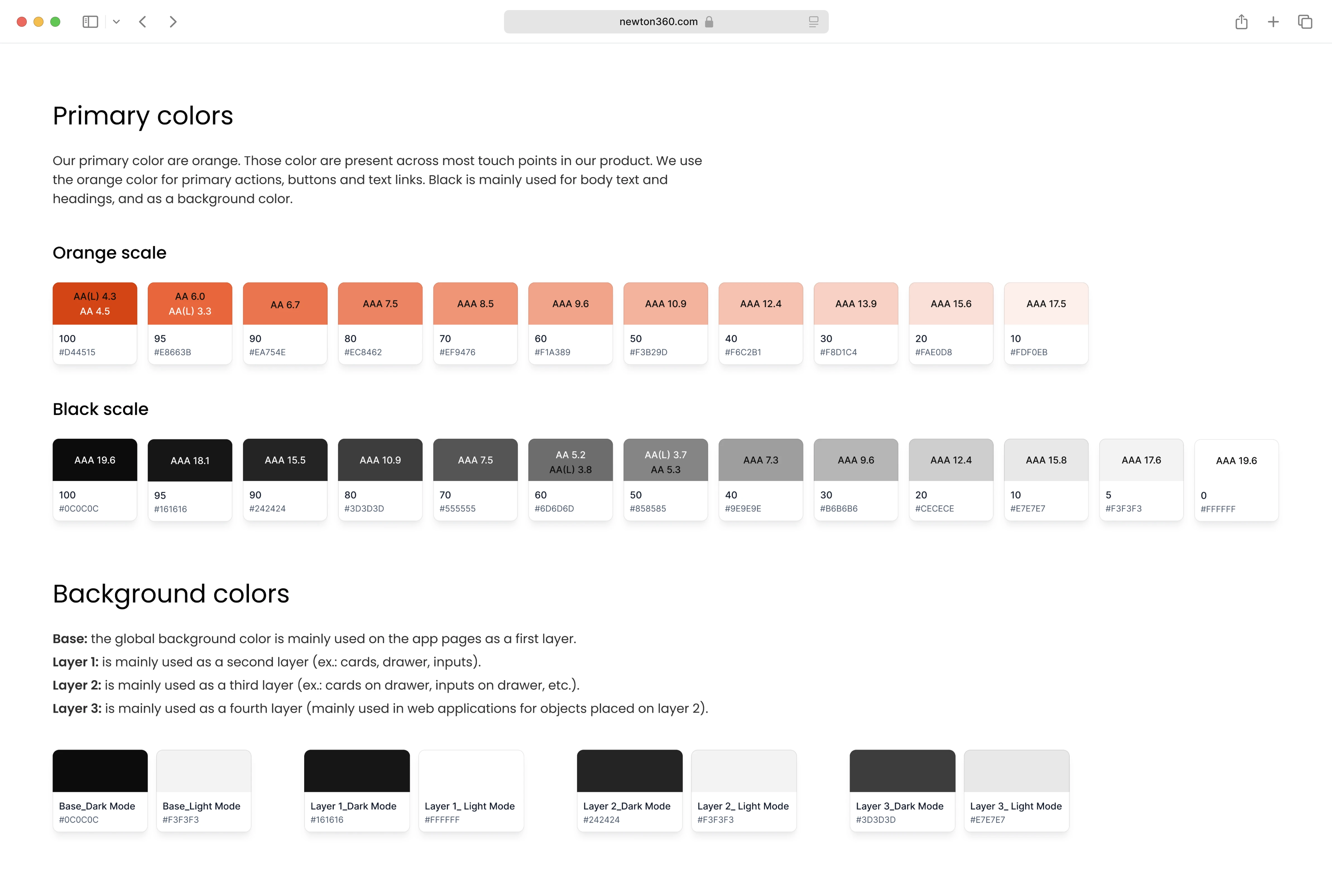
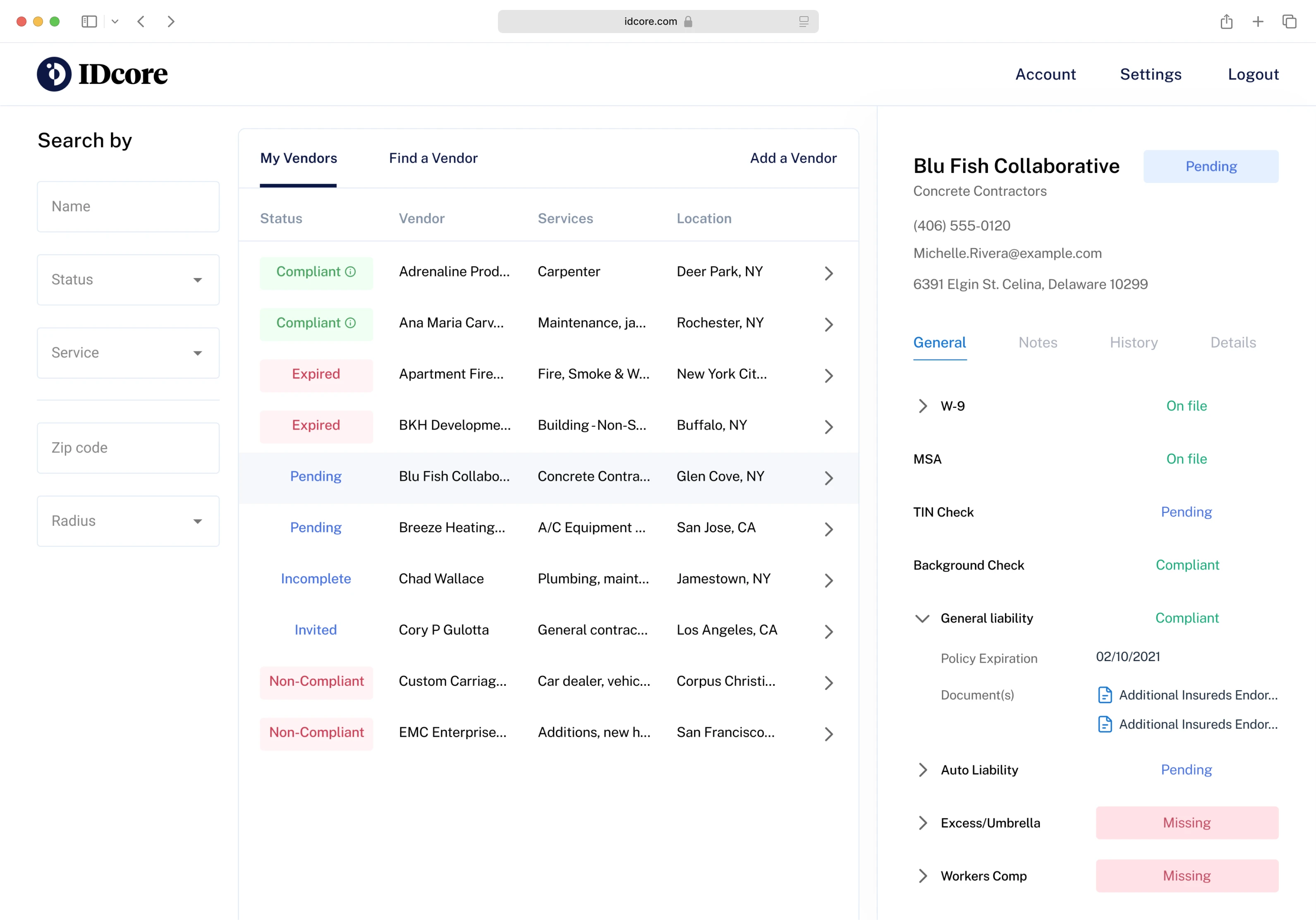
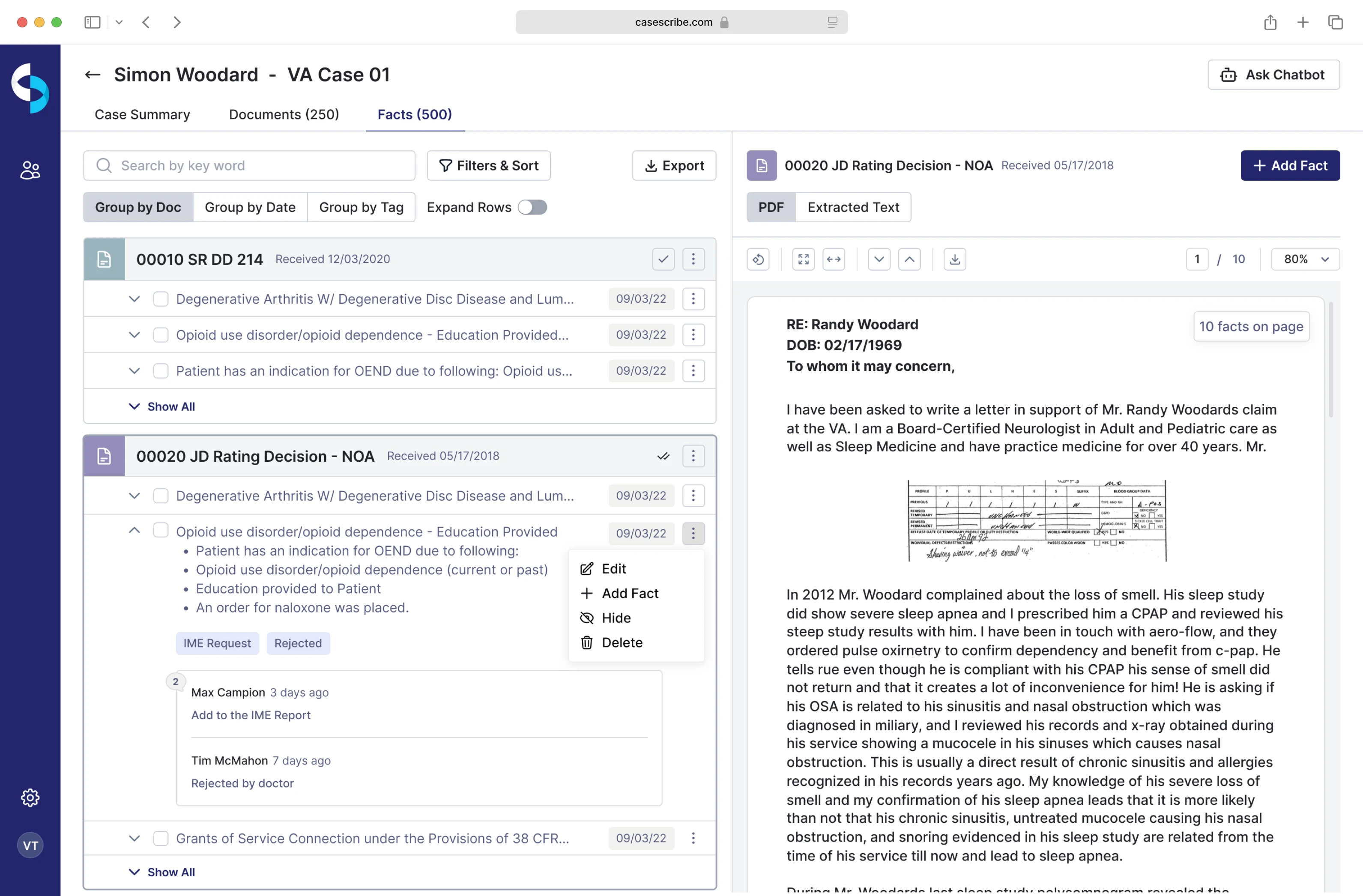
Legal
Legal products can be intimidating. Our case studies reveal how clear design, structured workflows, and empathy help users navigate compliance and decision-making with confidence.
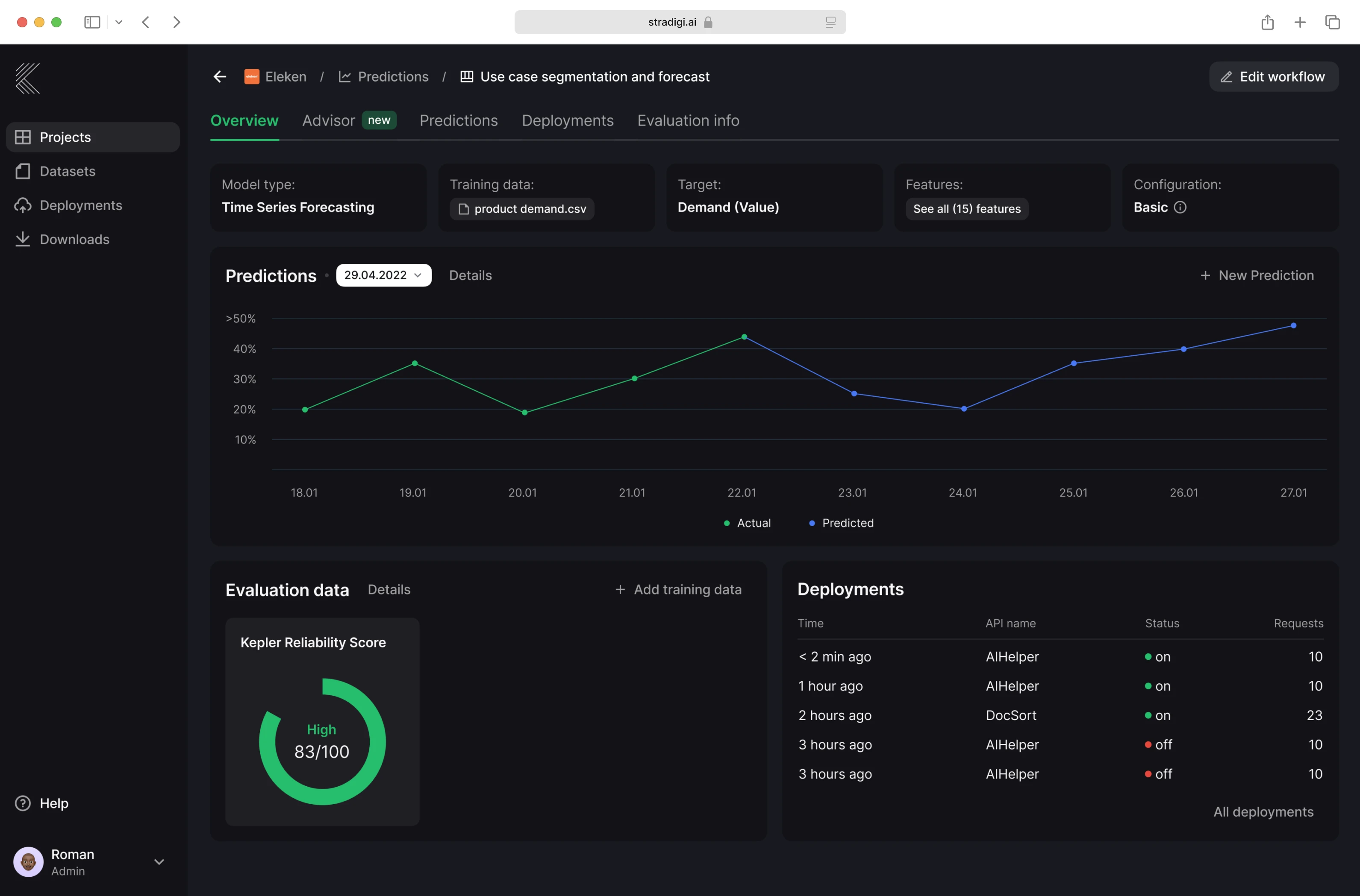
AI
Exploring the world of artificial intelligence, these case studies show how thoughtful UX can make complex technology feel intuitive, trustworthy, and human-centered.
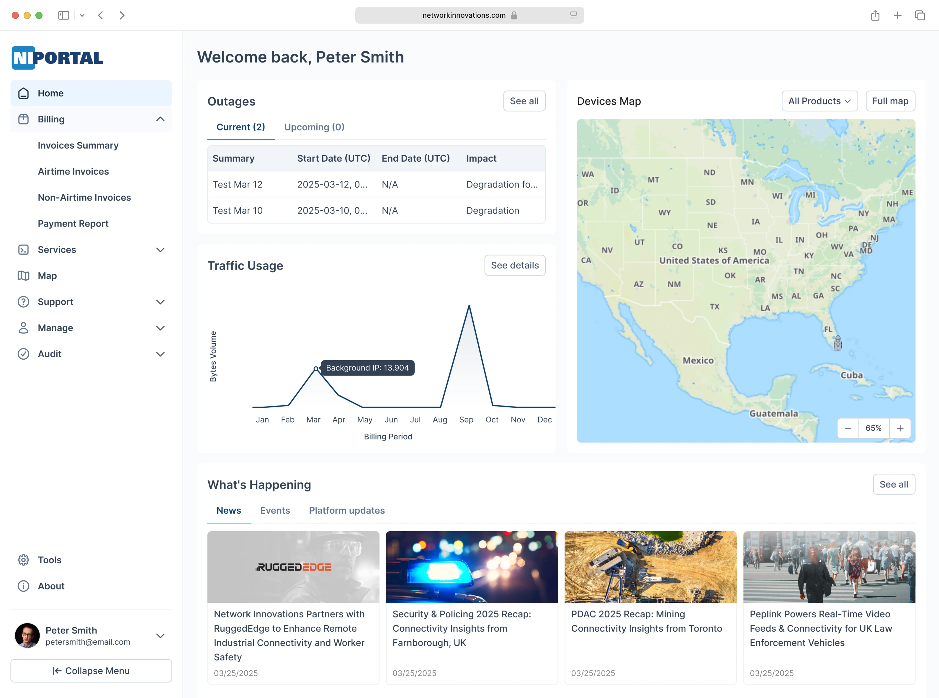
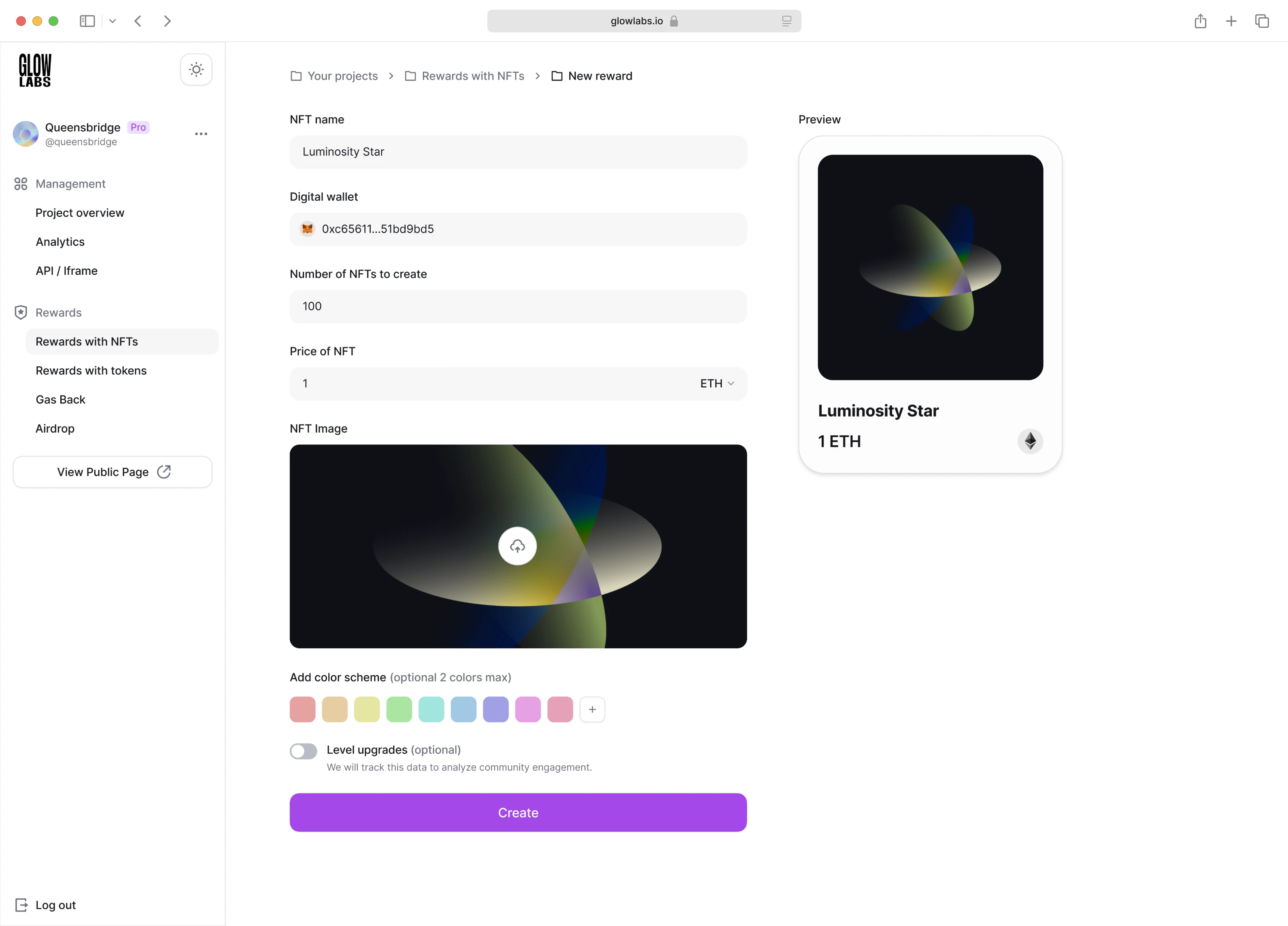
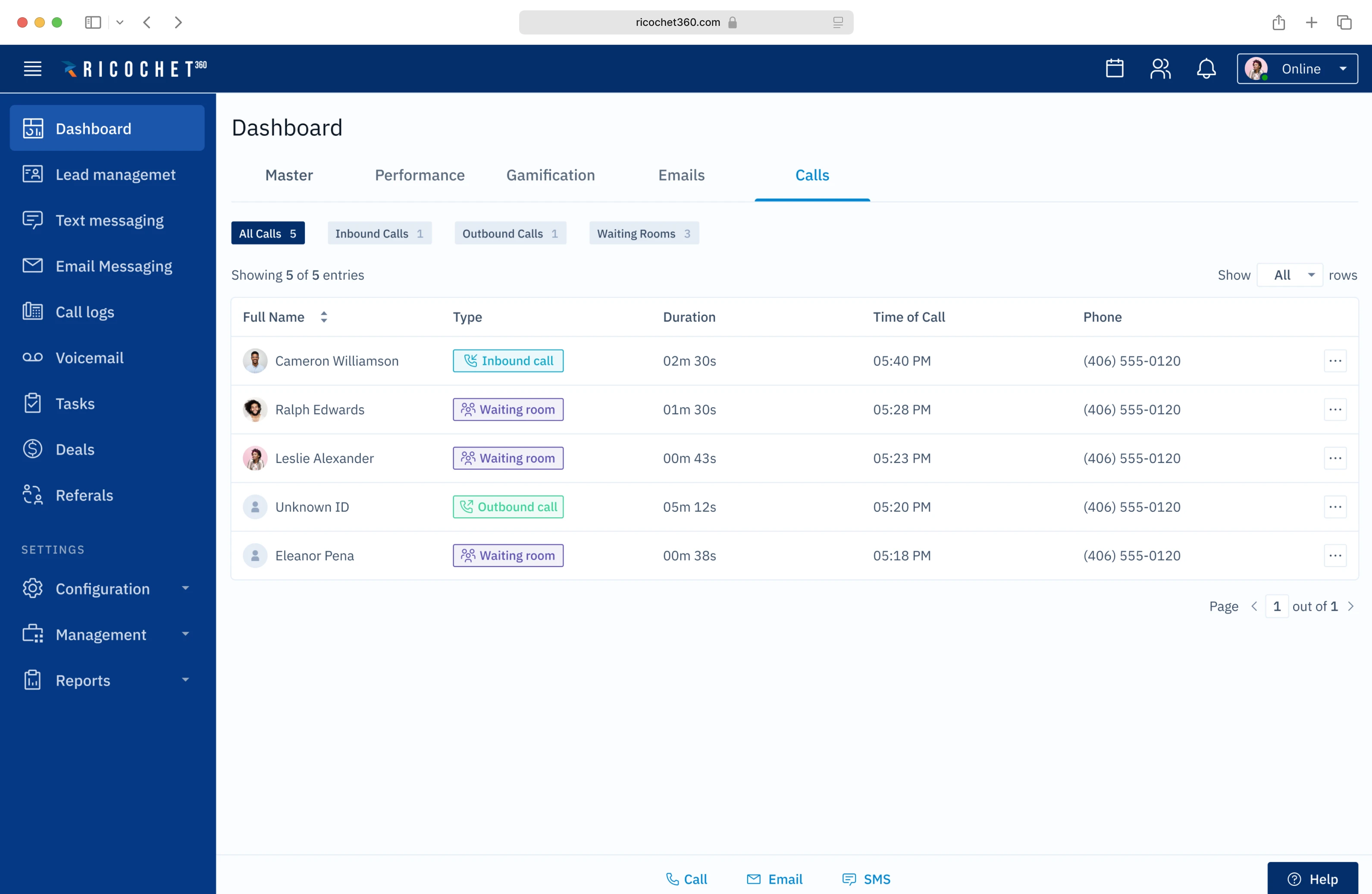
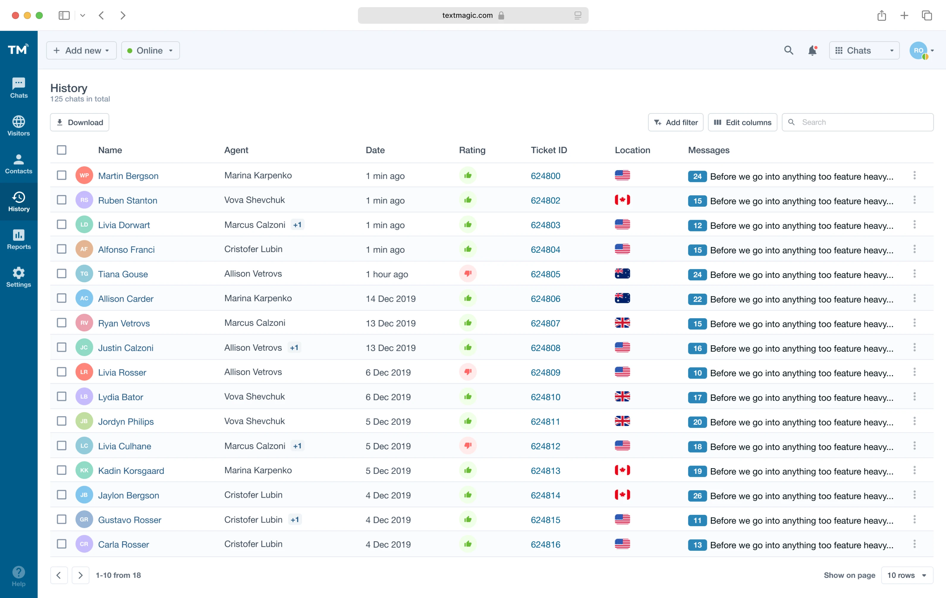
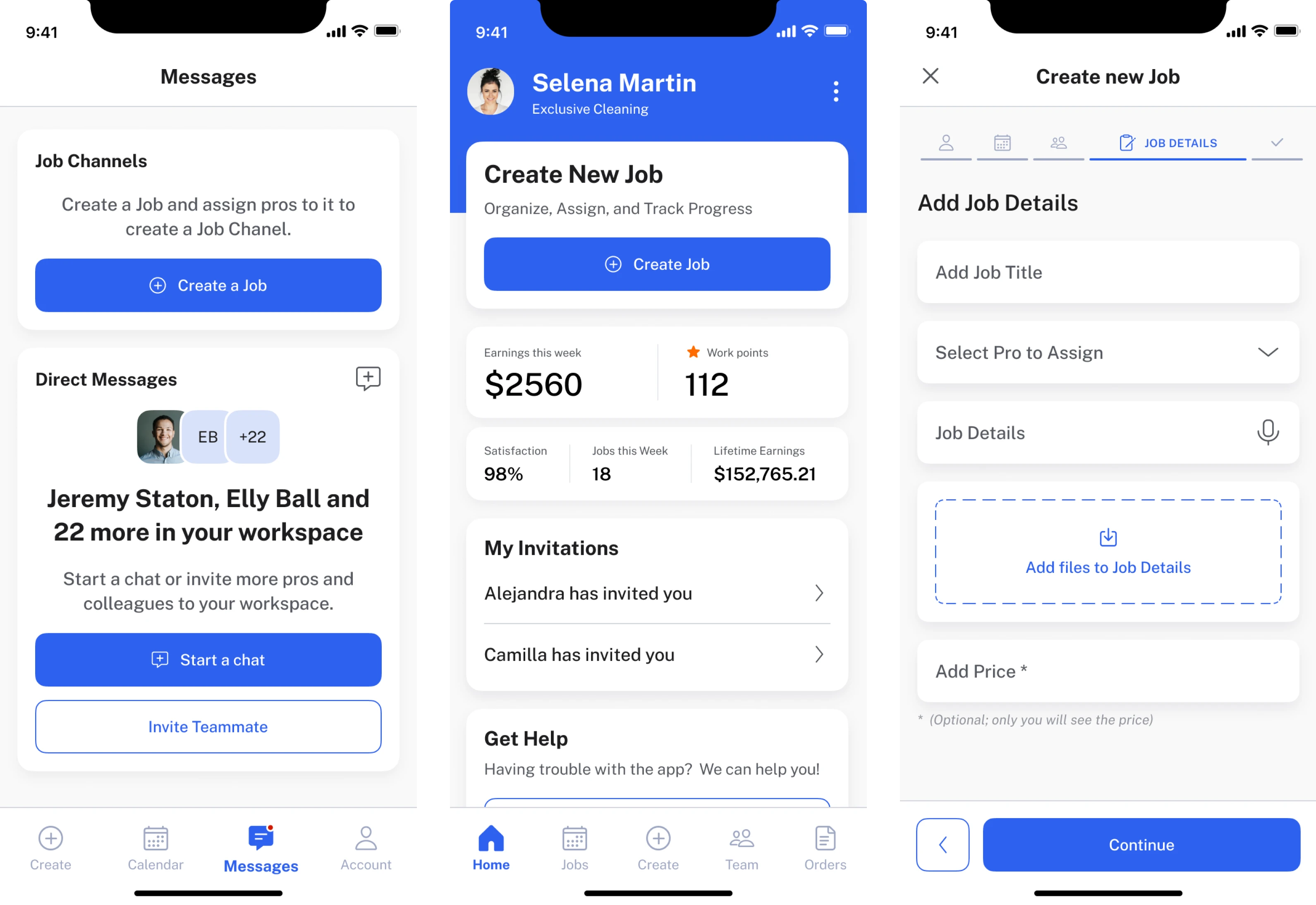
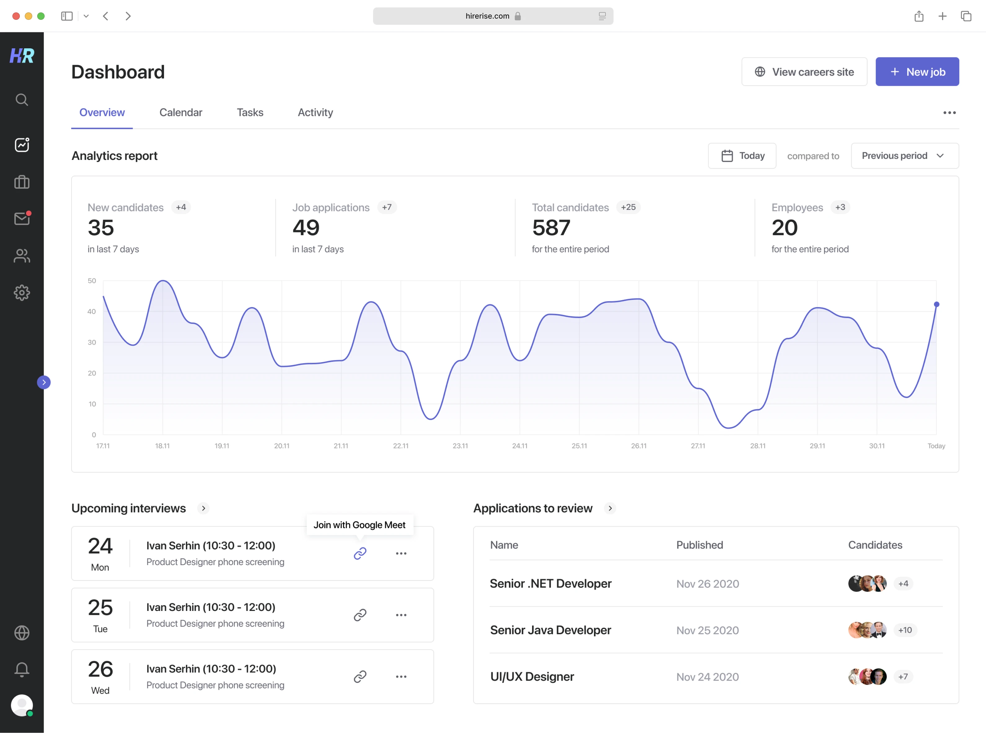
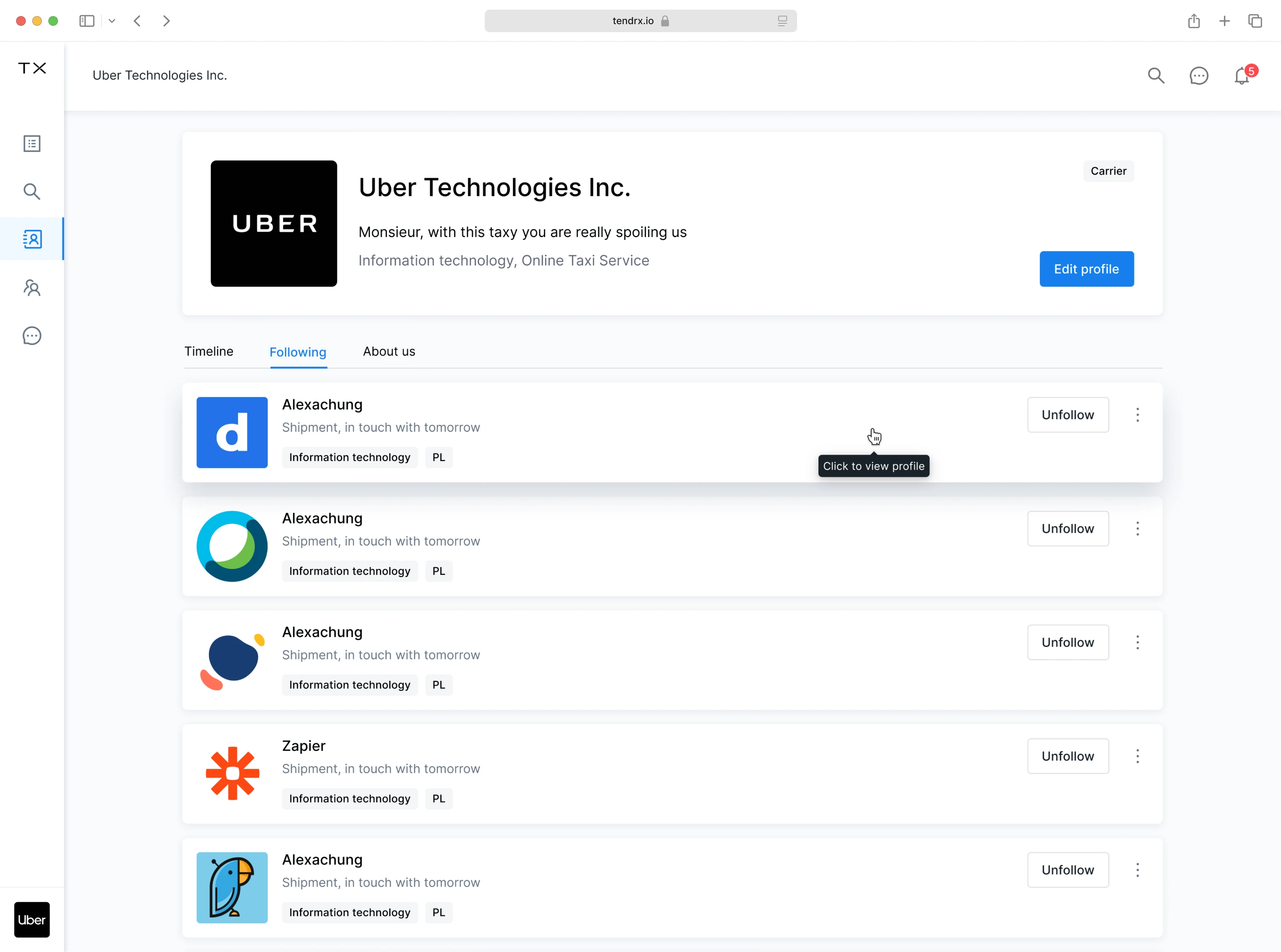
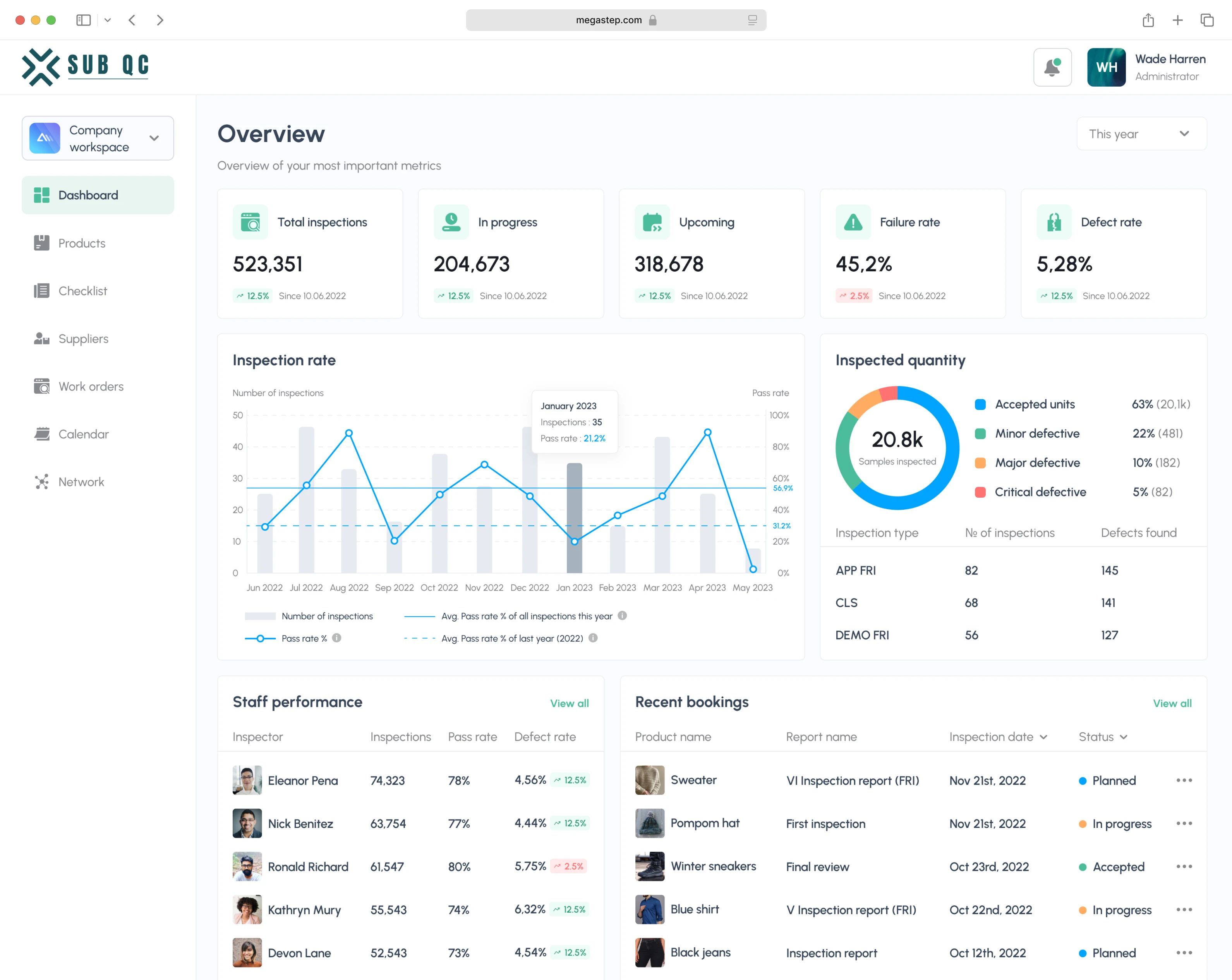
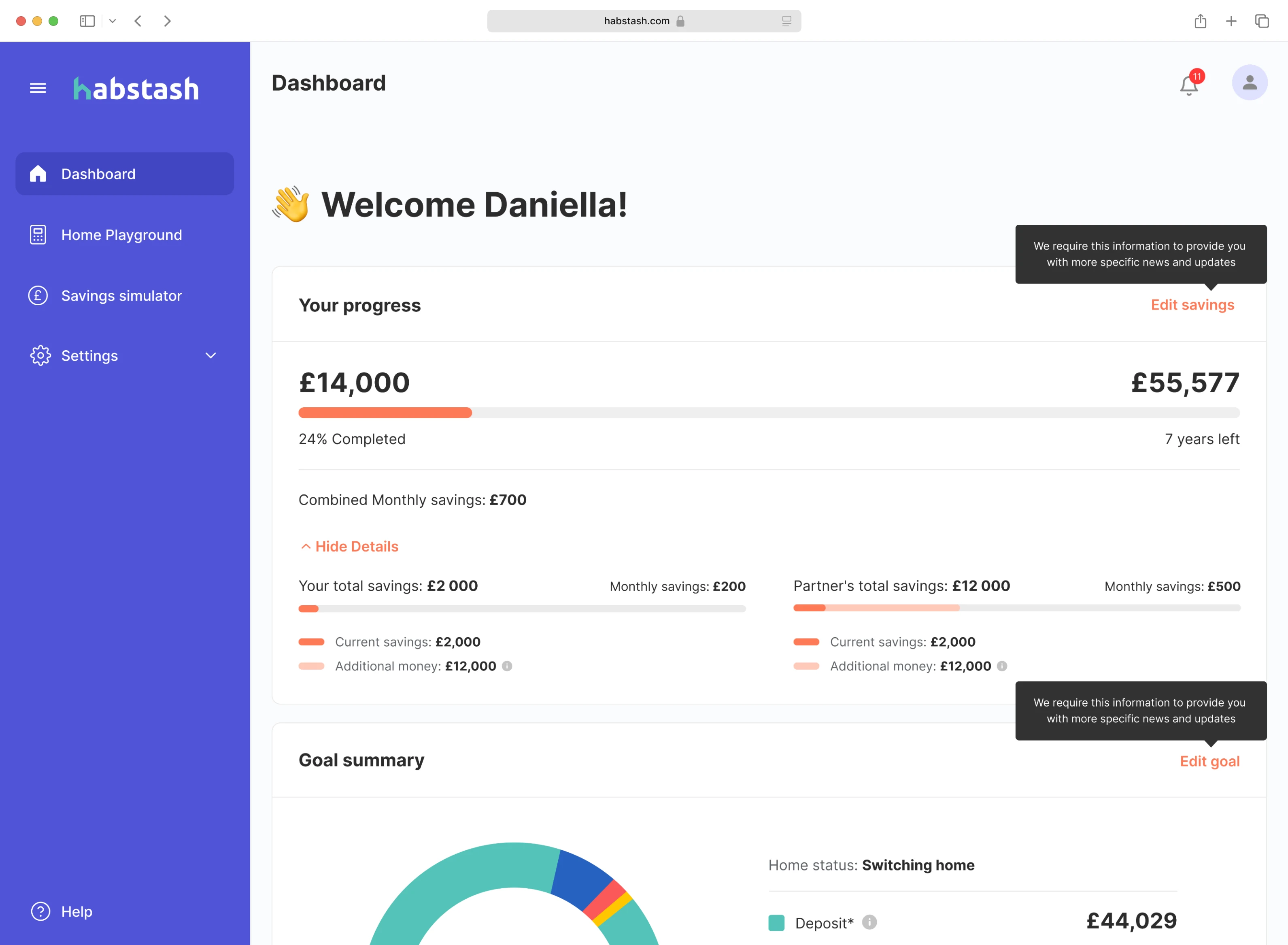
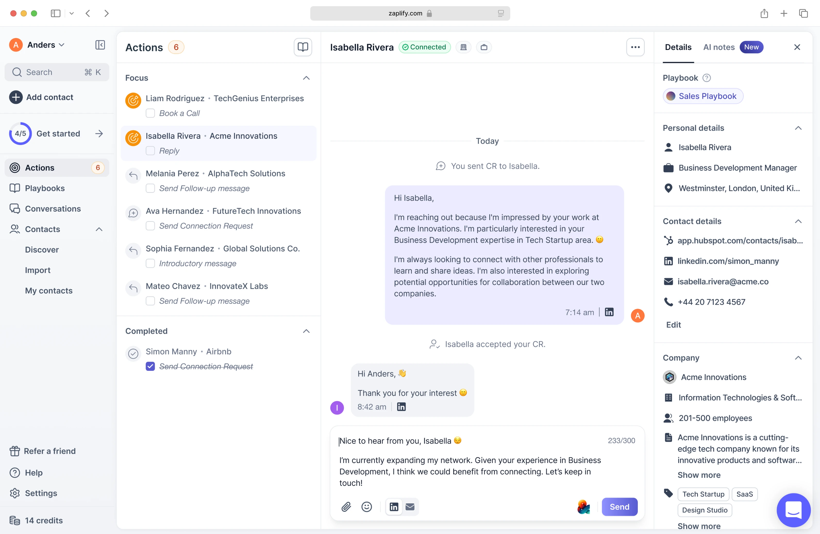
Sales
These case studies highlight UX that empowers sales teams, simplifies CRM systems, and creates smooth, data-driven experiences that help close deals faster.
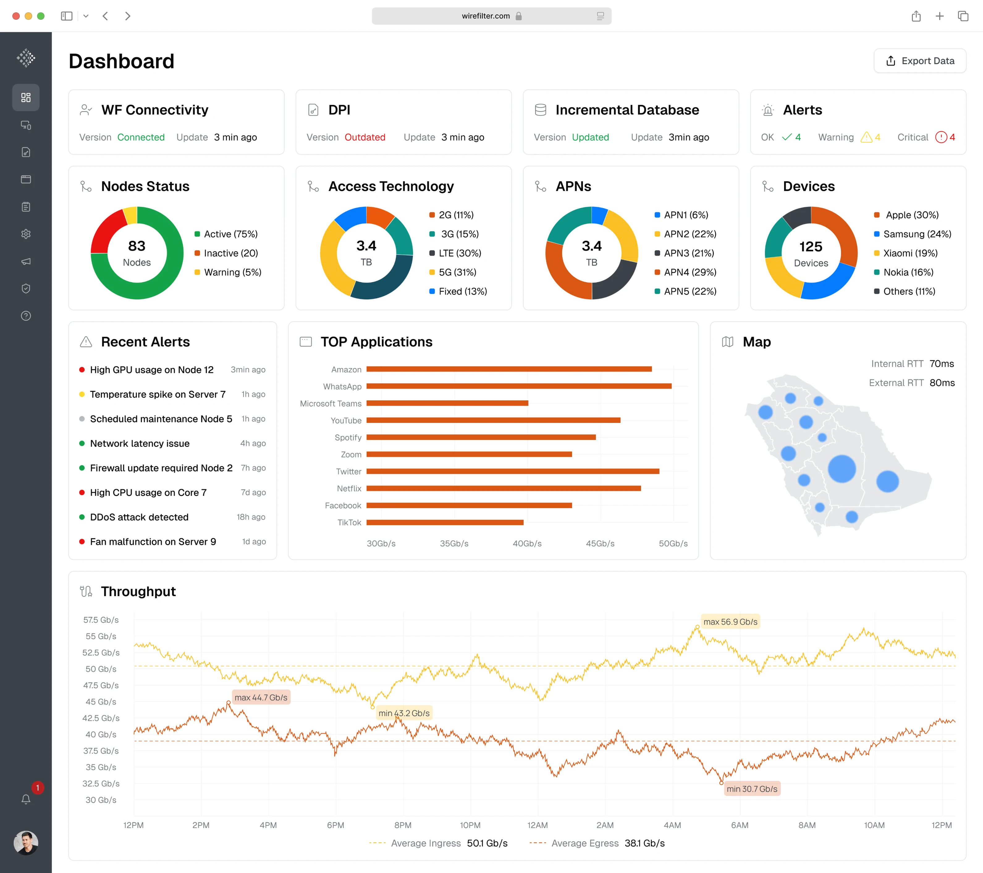
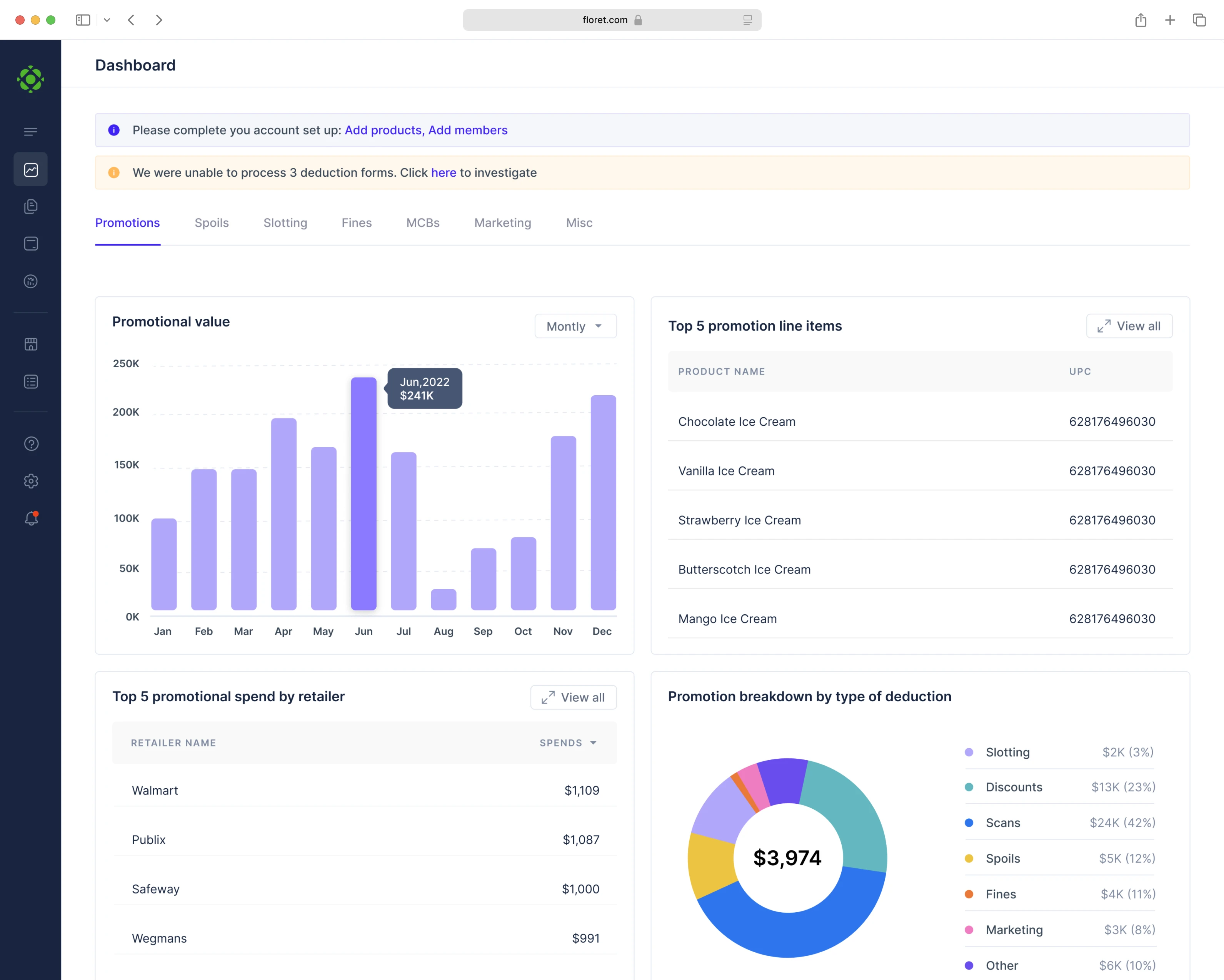
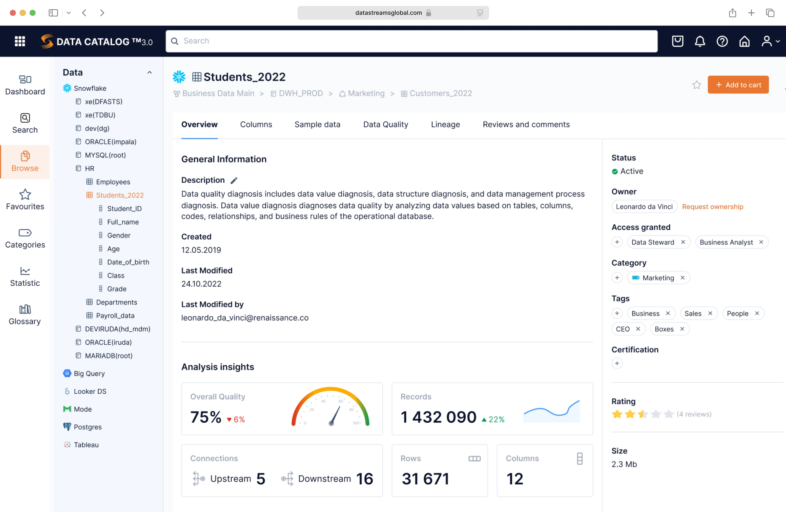
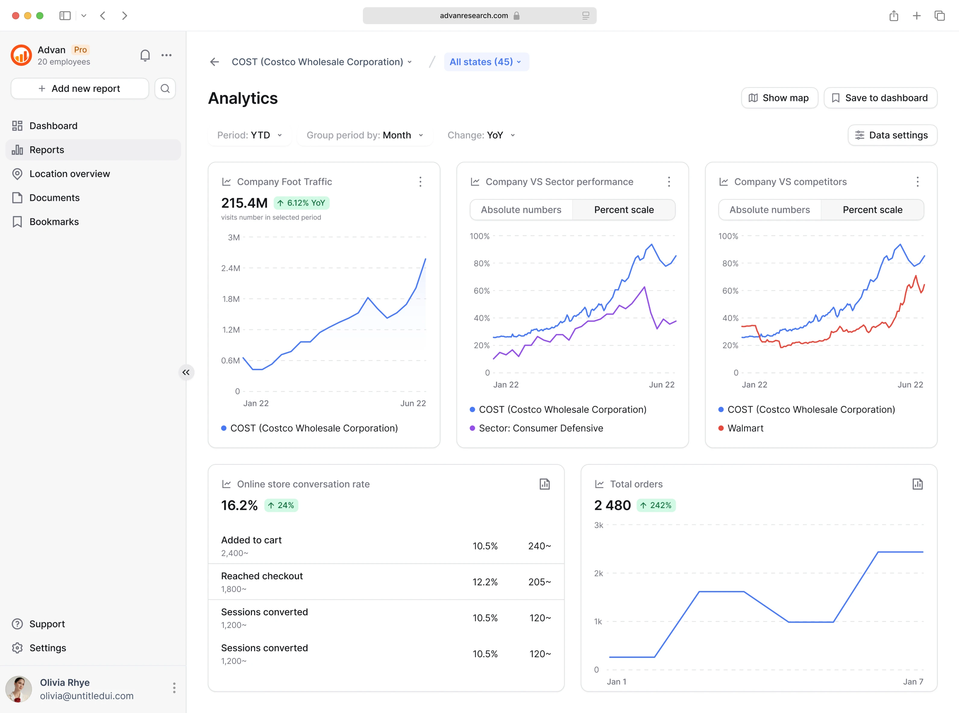
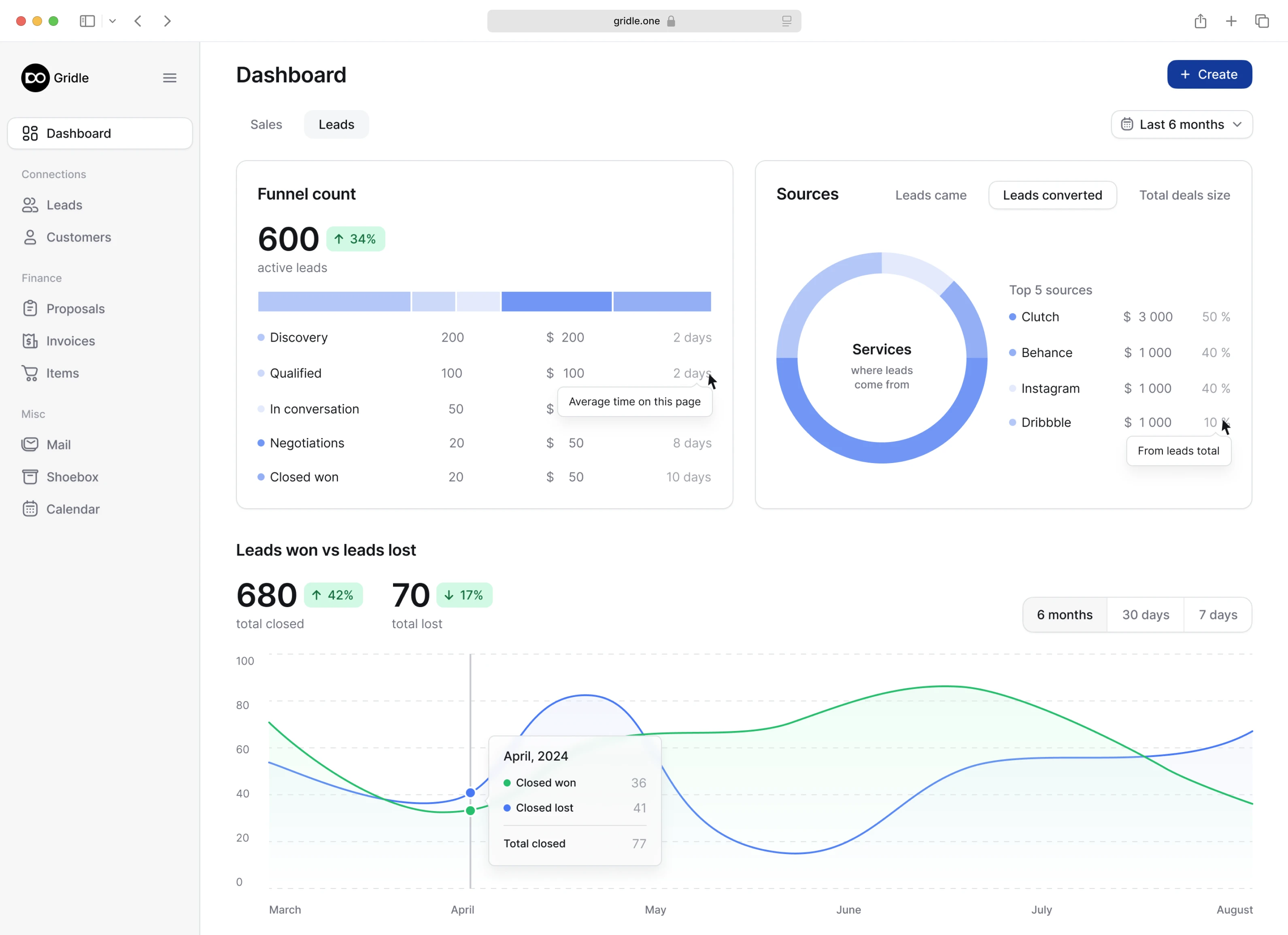
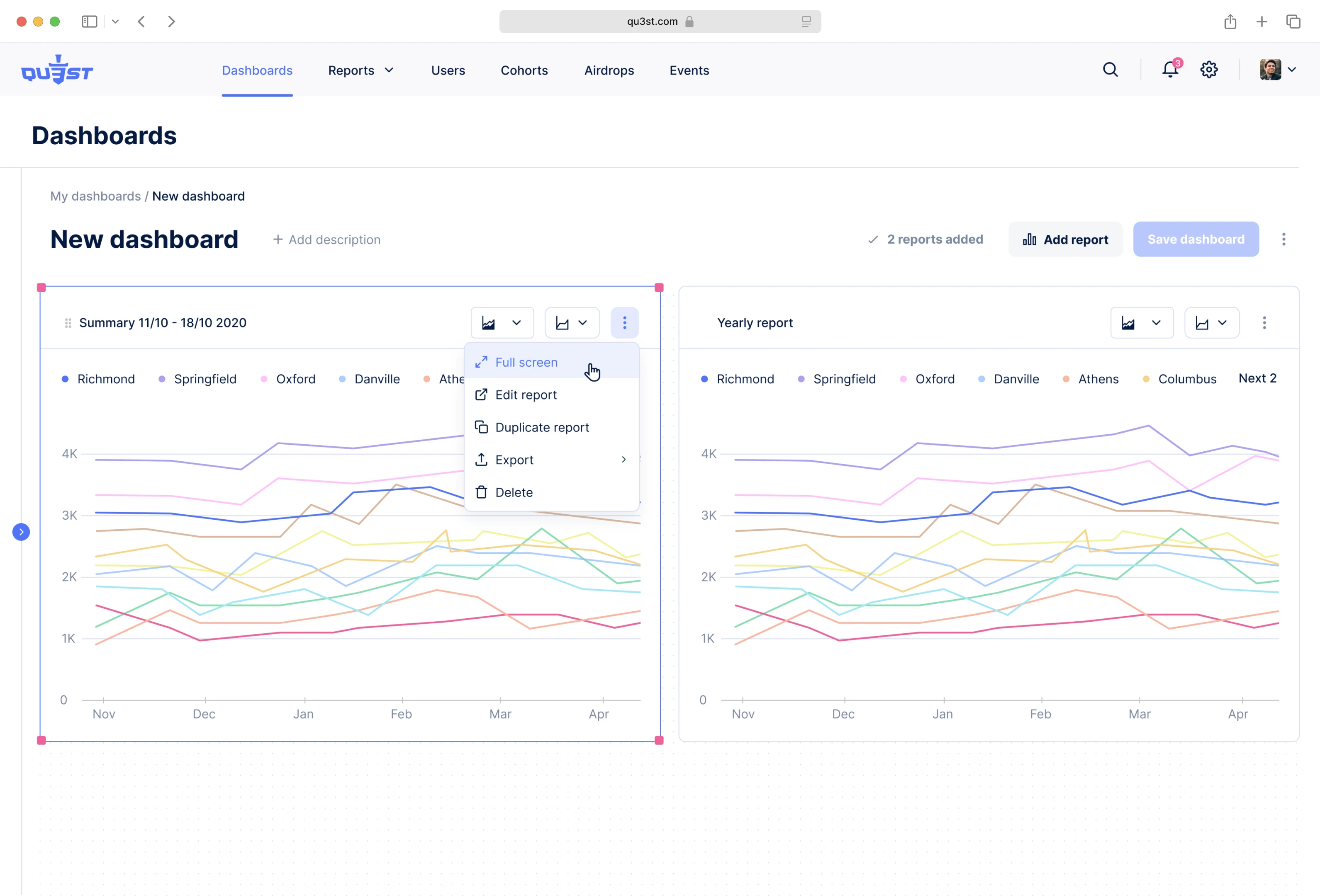
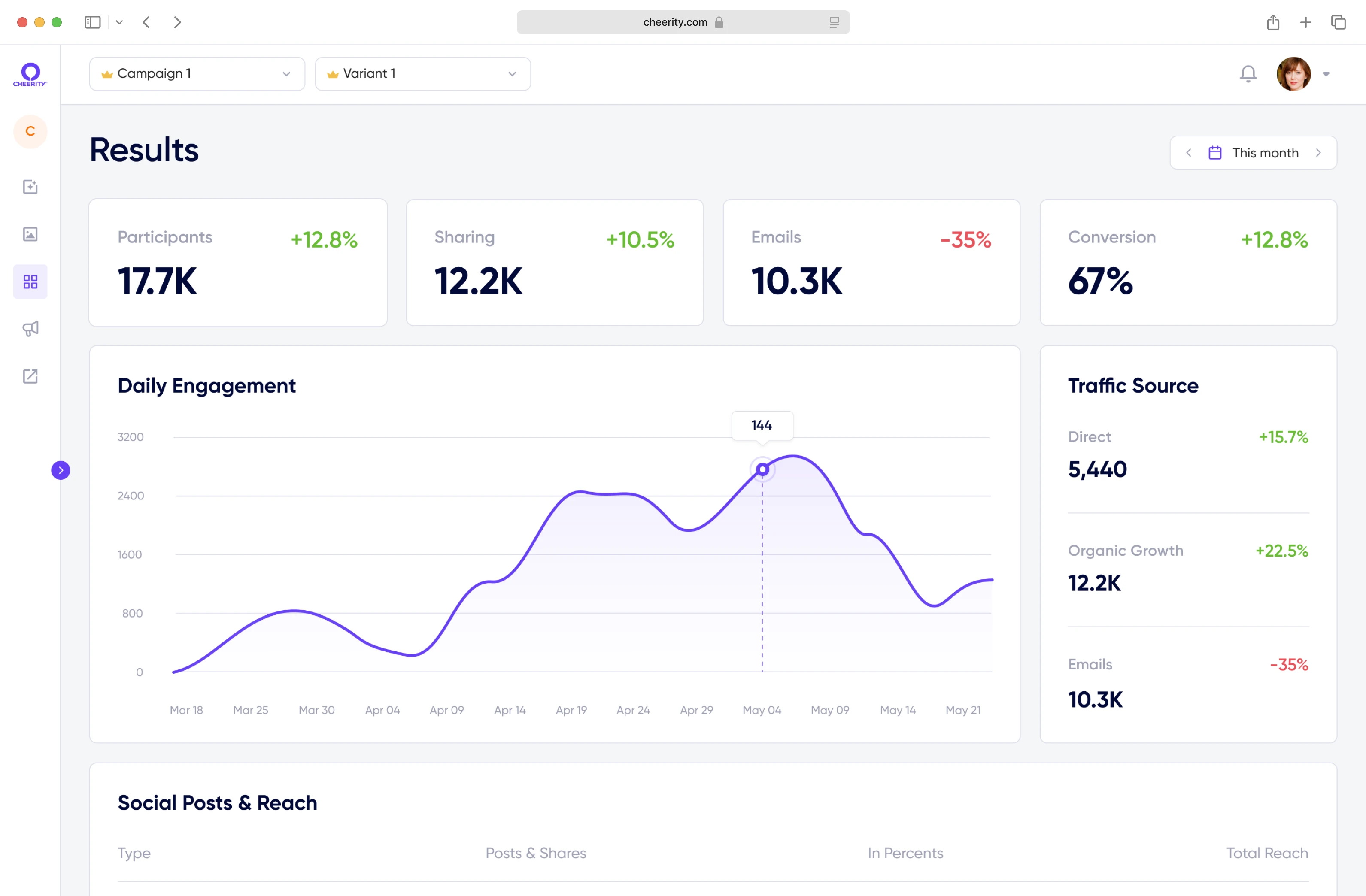
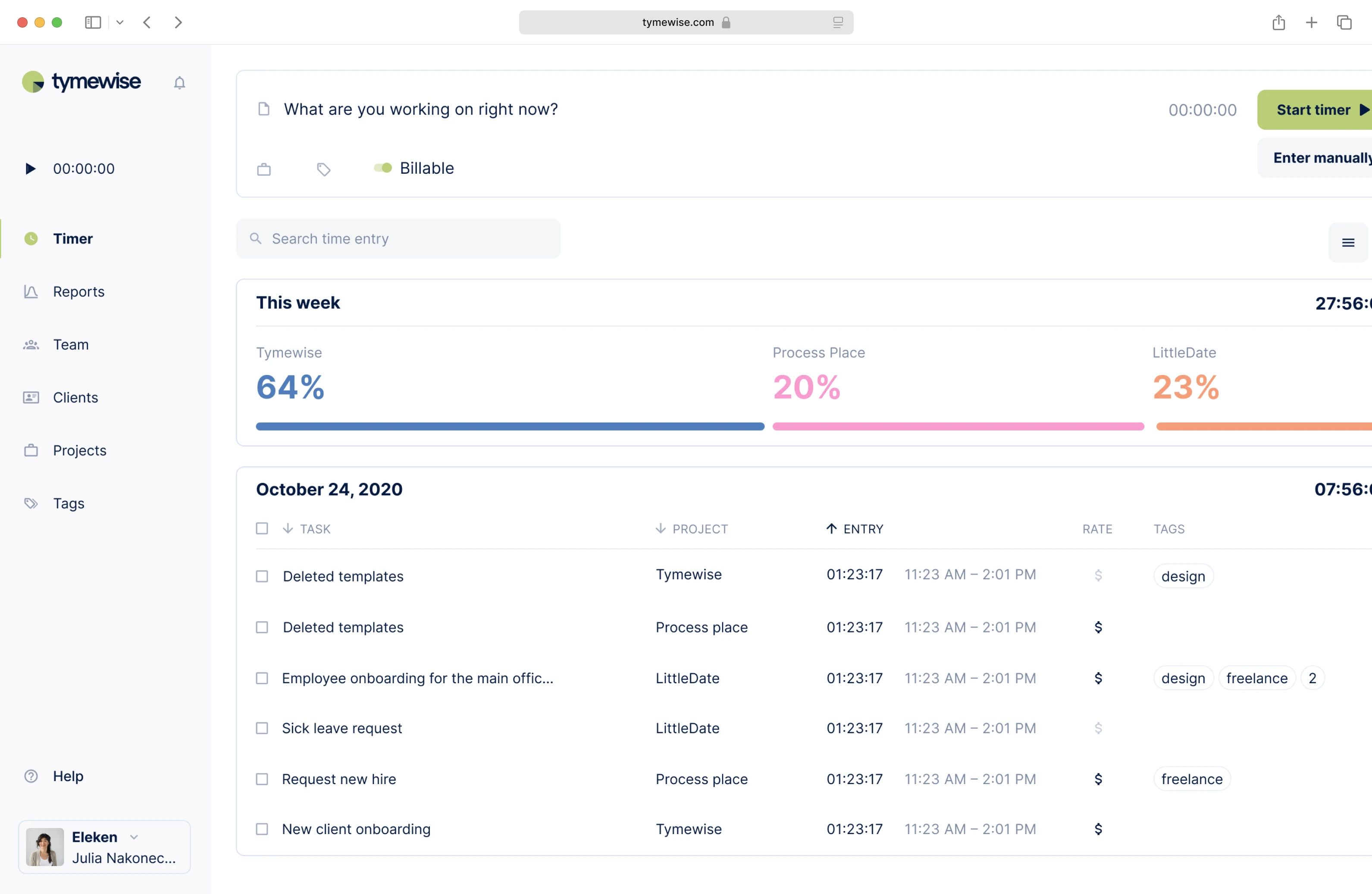
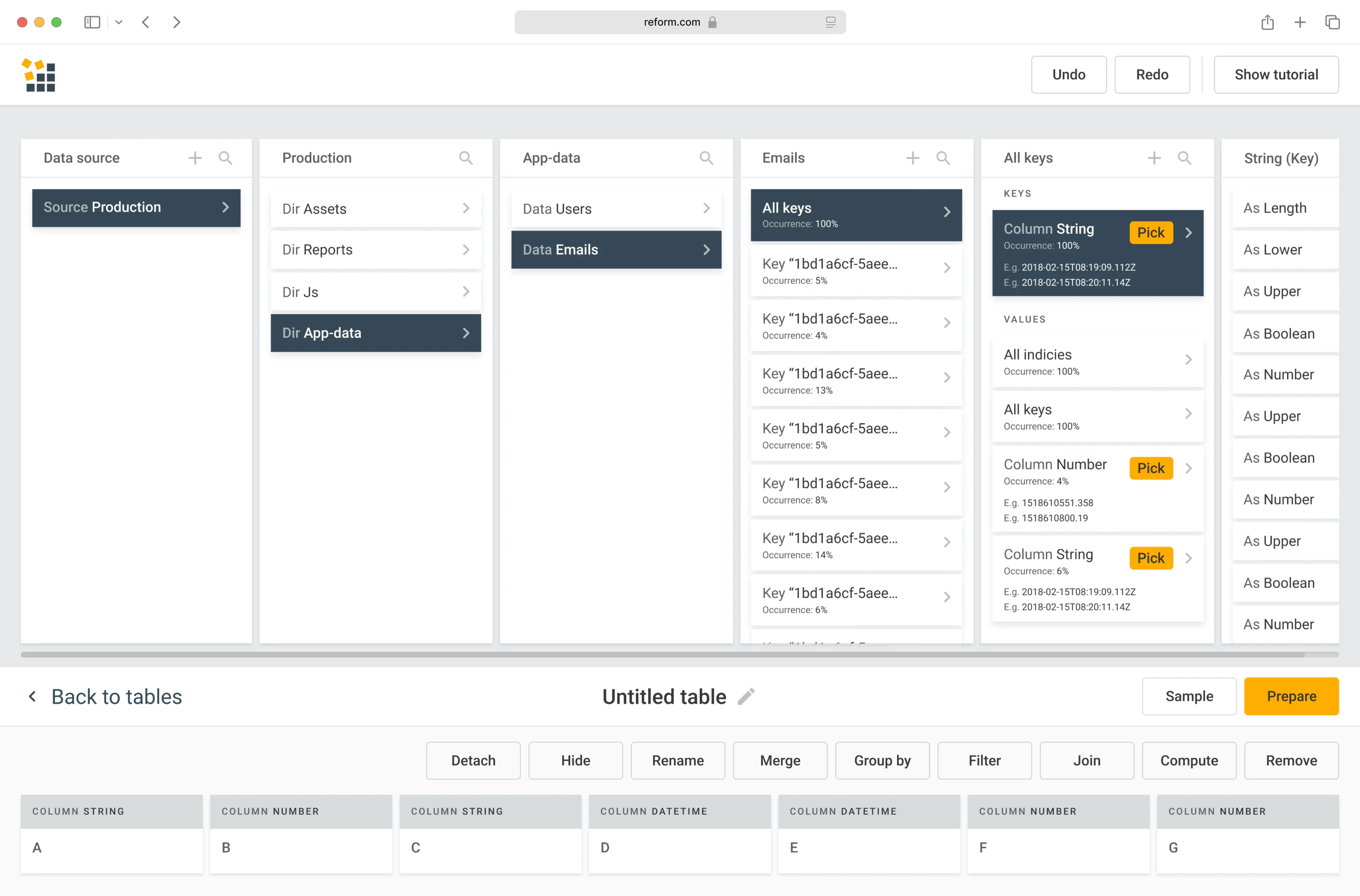
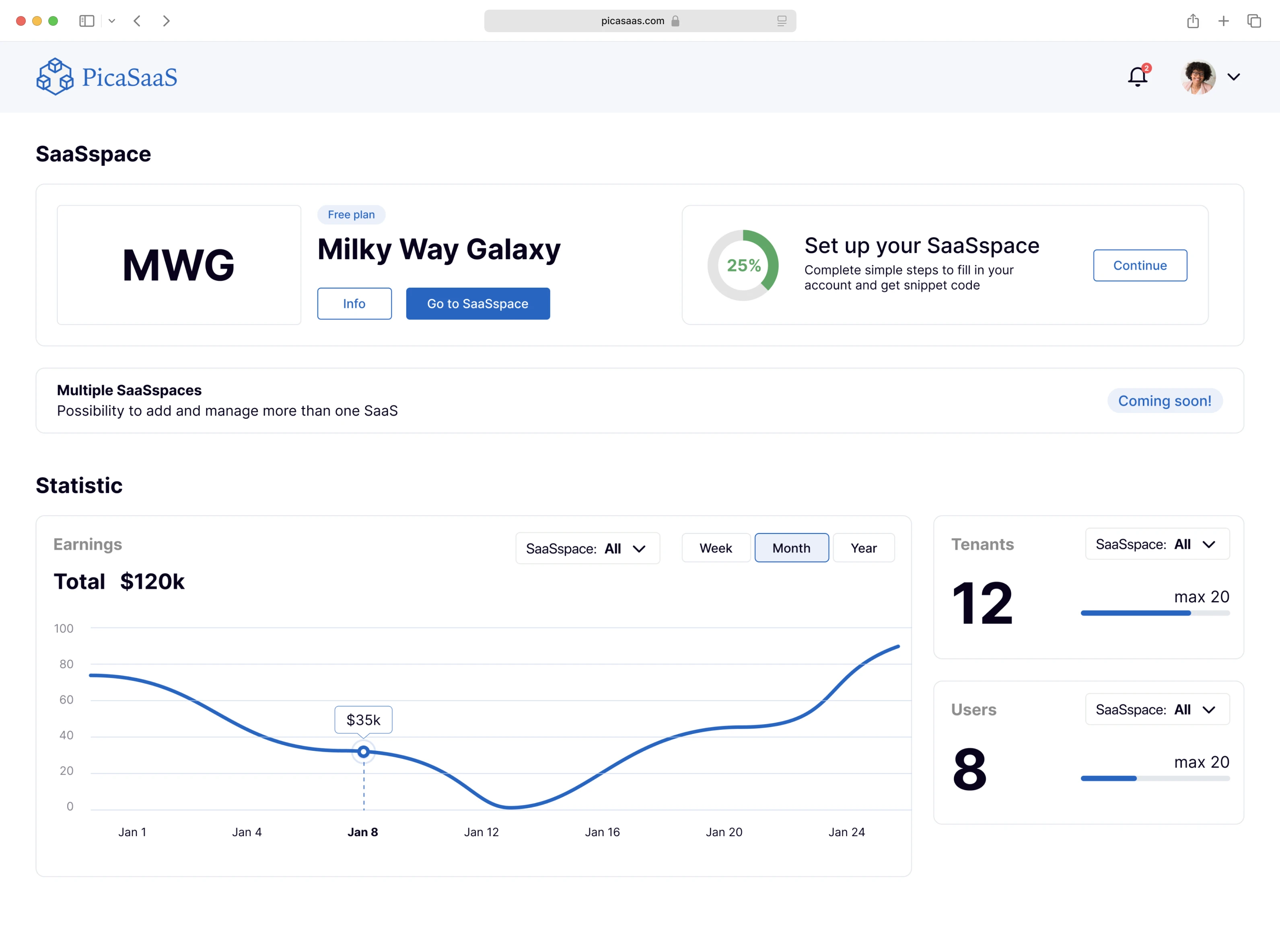
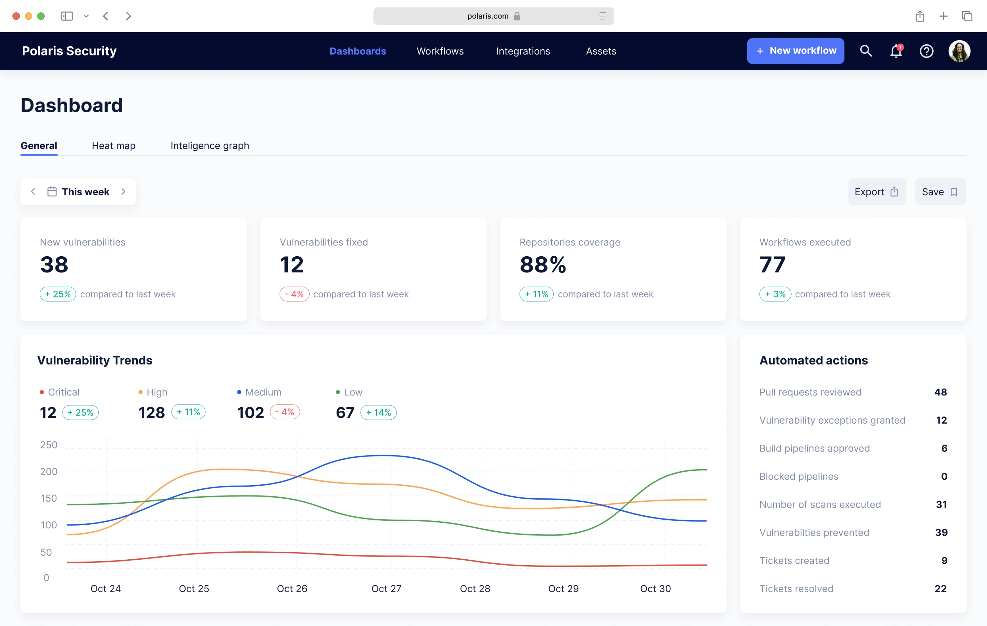
Data
Turning numbers into narratives, these projects demonstrate how effective UX design can make data approachable, actionable, and even delightful.
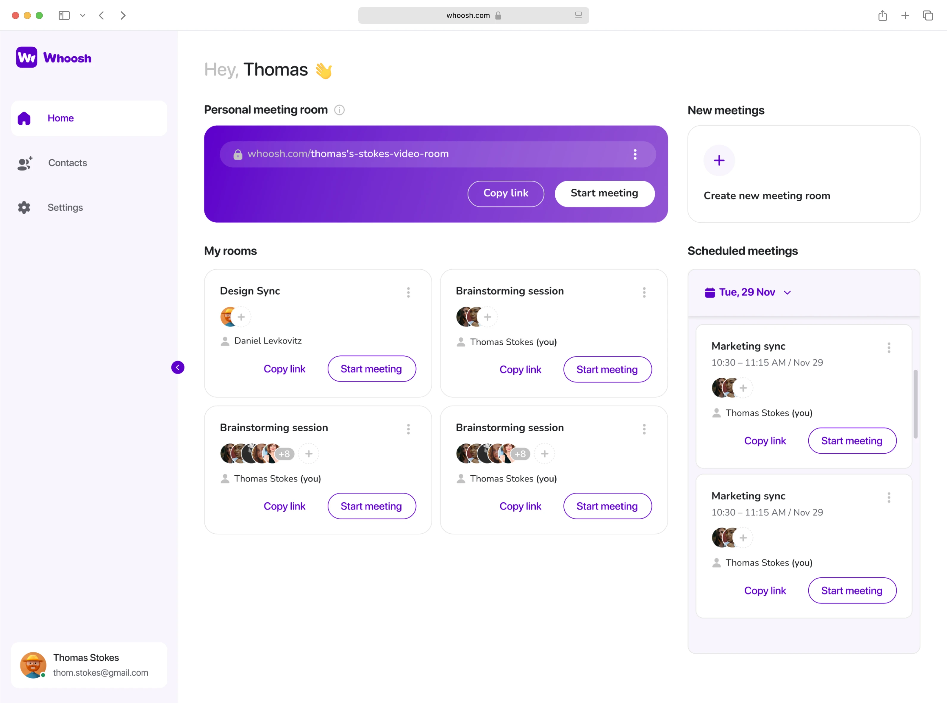
Social Media
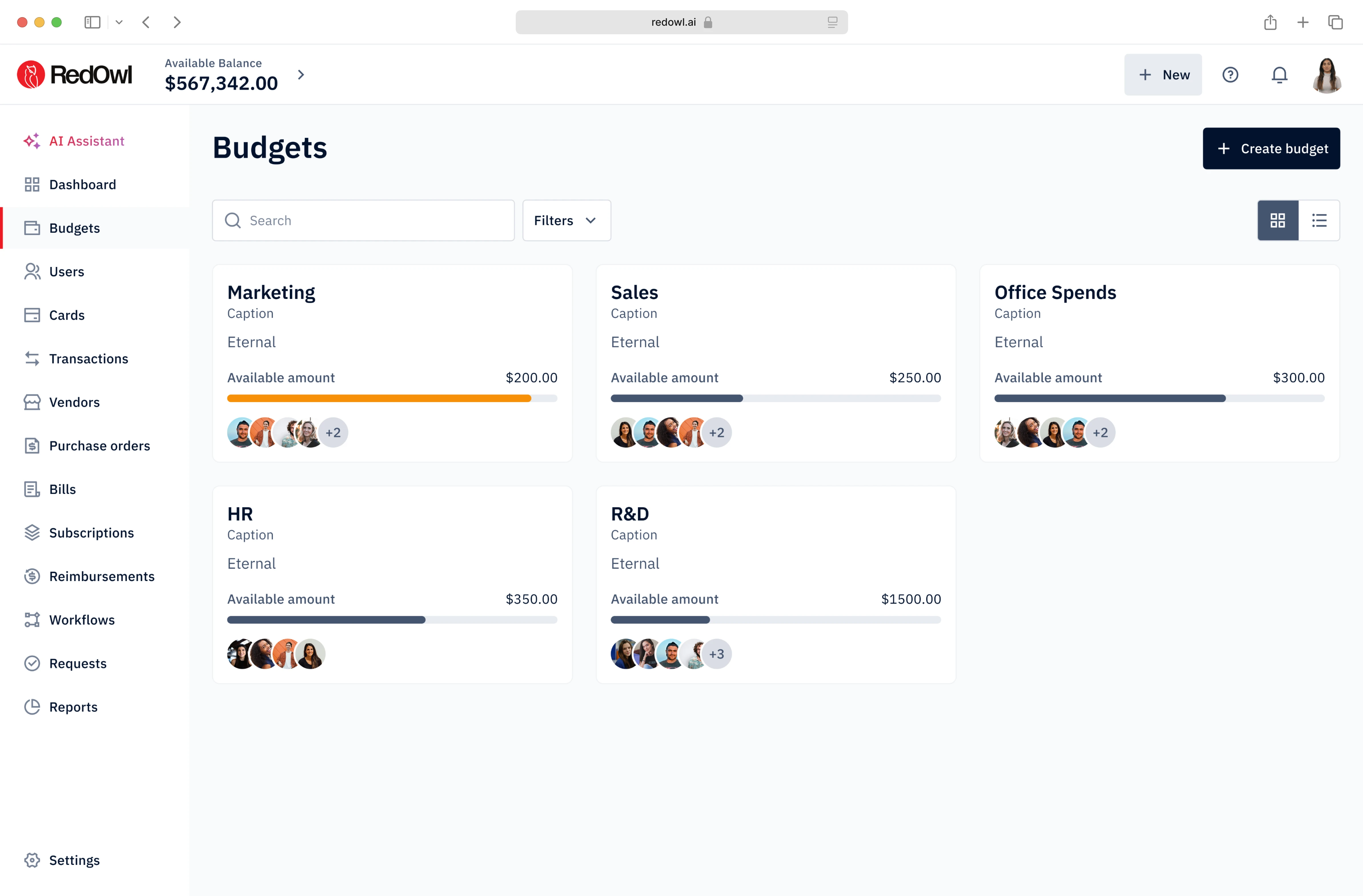
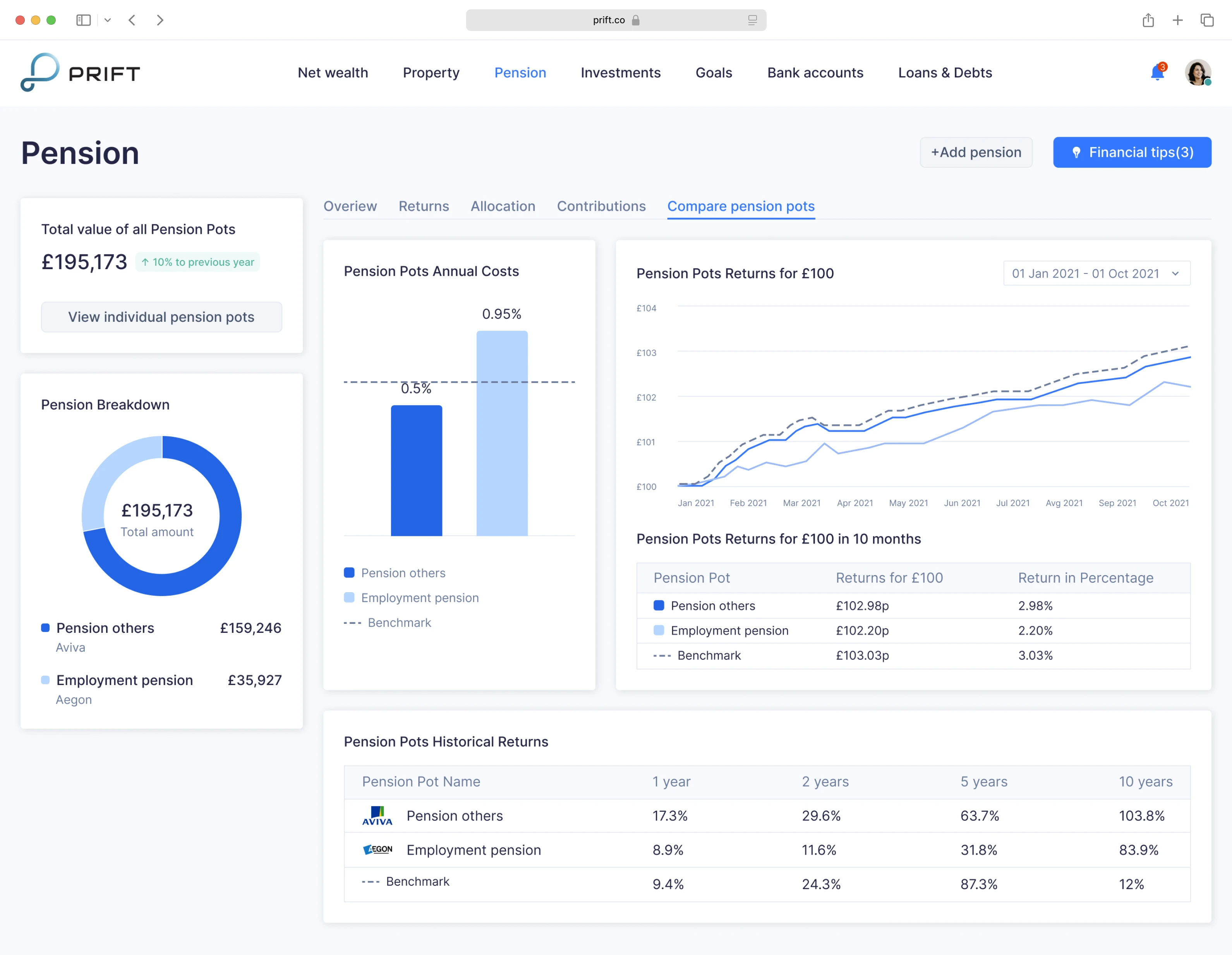
Finance
Money matters shouldn’t feel stressful. Our finance case studies show how design can simplify decisions, build trust, and bring clarity to complex financial processes.
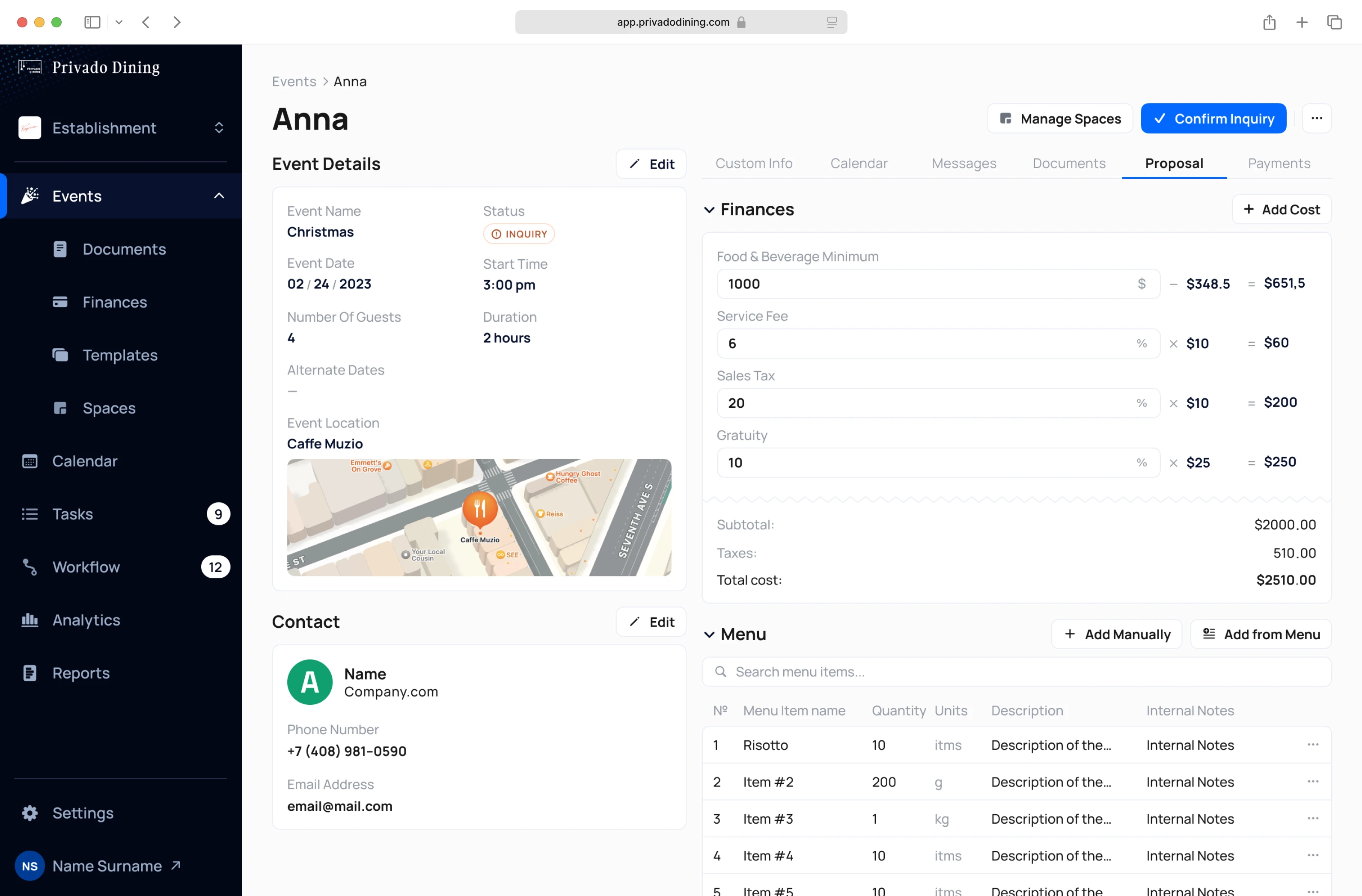
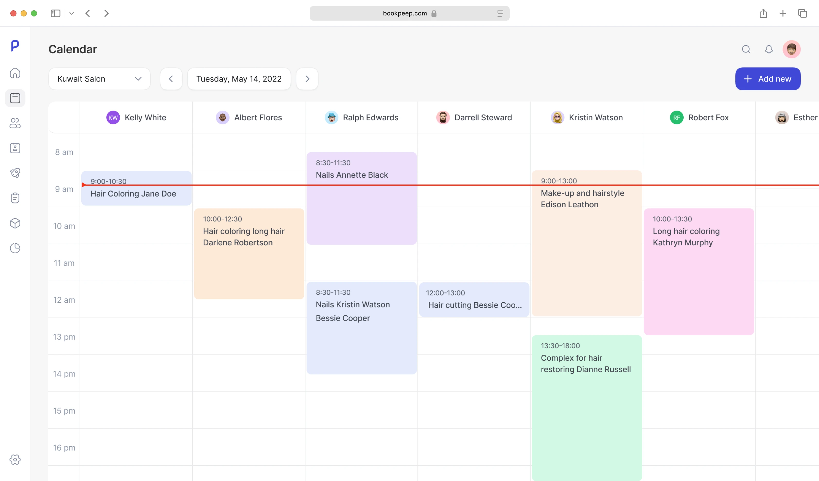
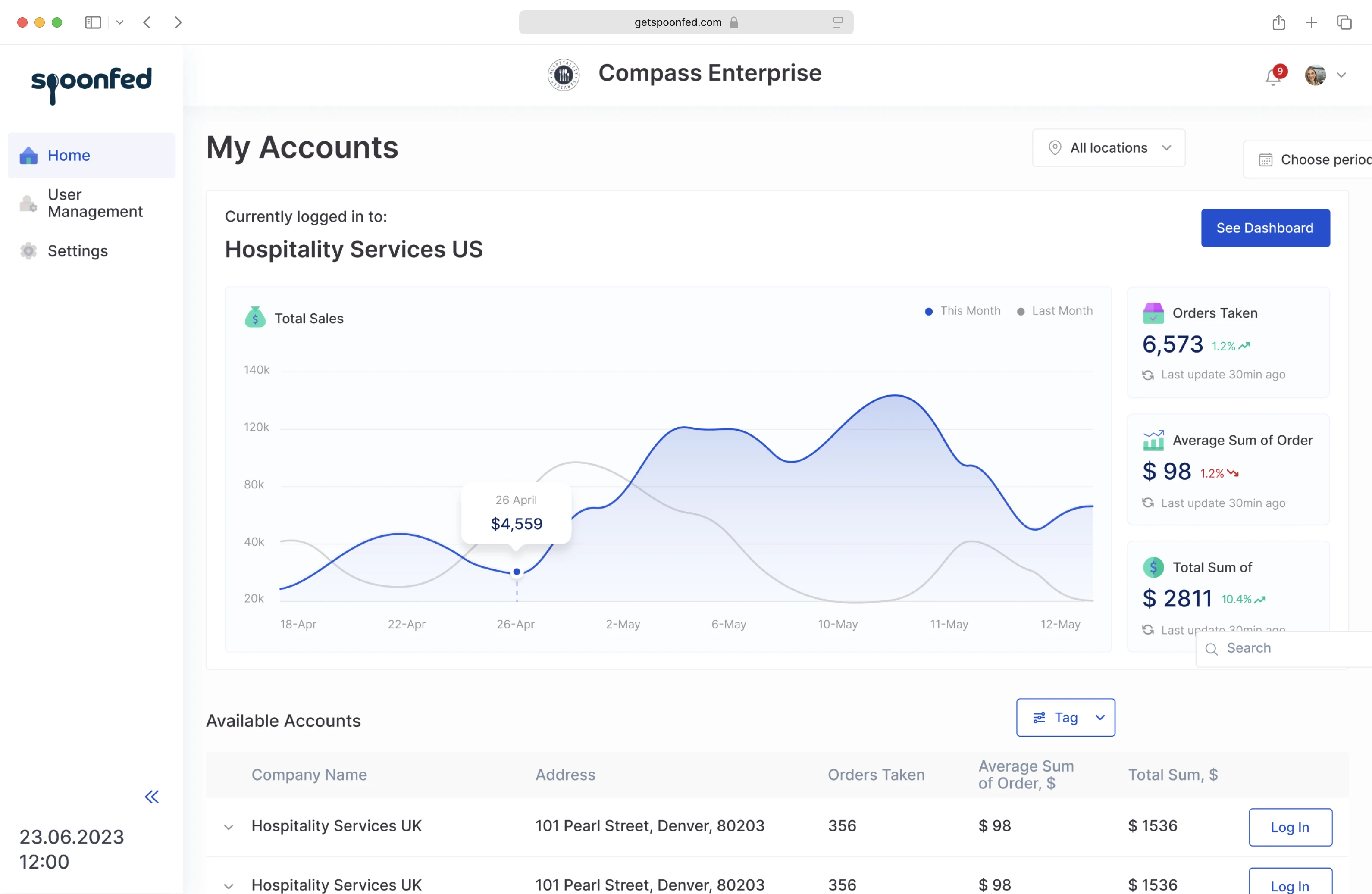
Event Management
From ticketing to scheduling, these projects demonstrate how exceptional UX can minimize friction, keep users engaged, and facilitate events that run smoothly from start to finish.
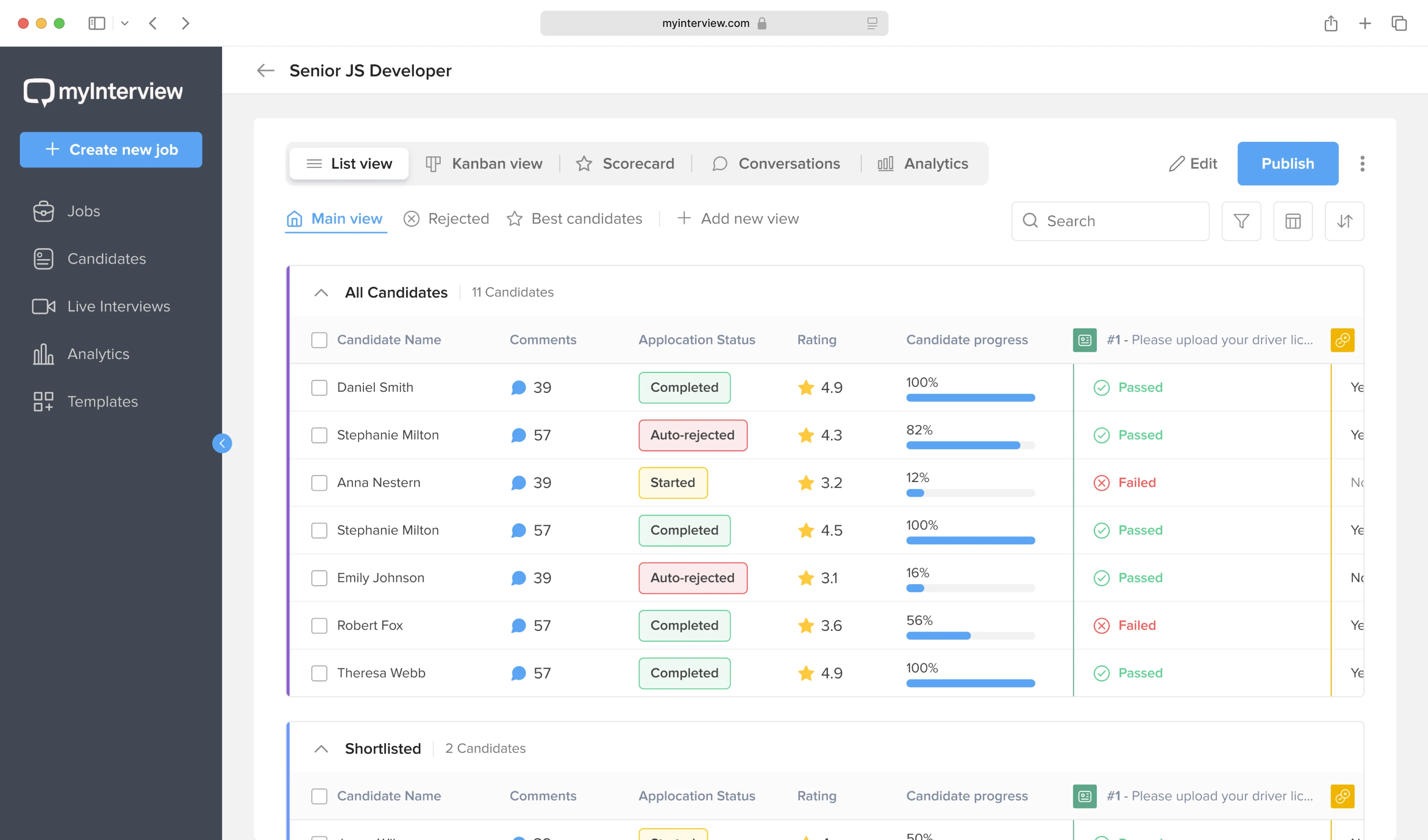
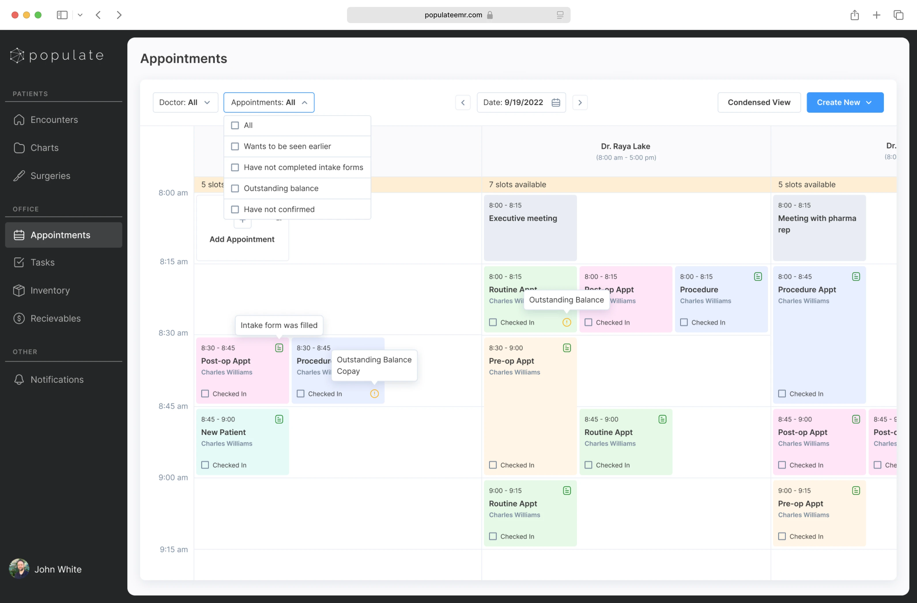
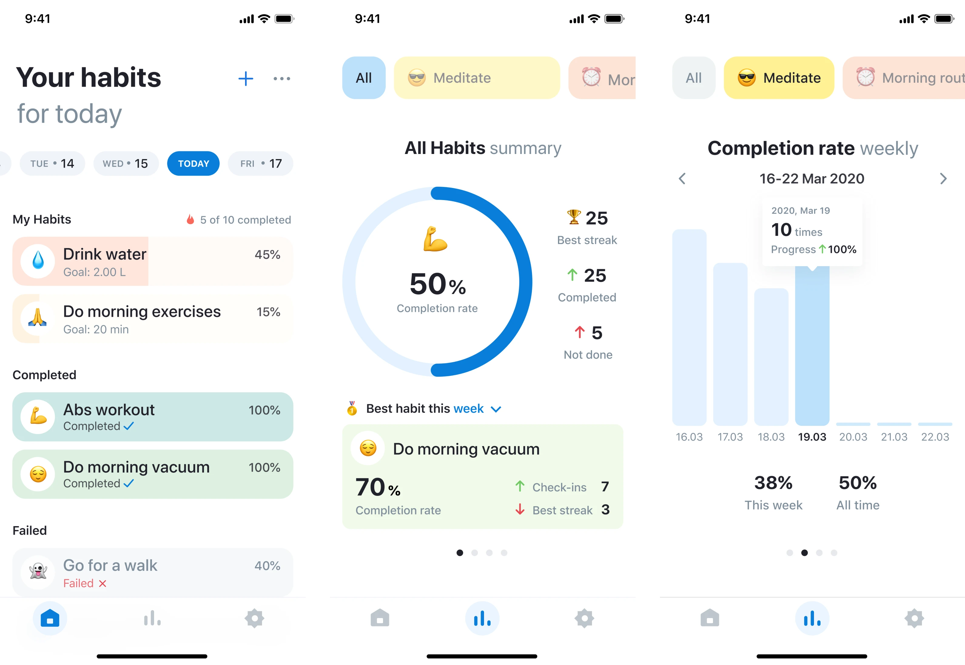
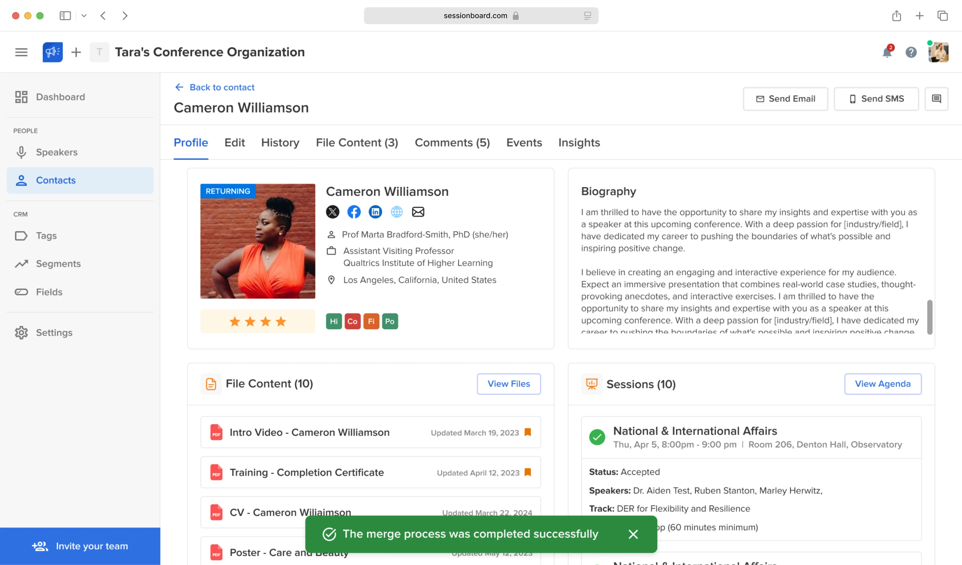
People Management
HR and team tools work best when they put people first. These case studies show how we craft experiences that foster connection, growth, and organizational clarity.
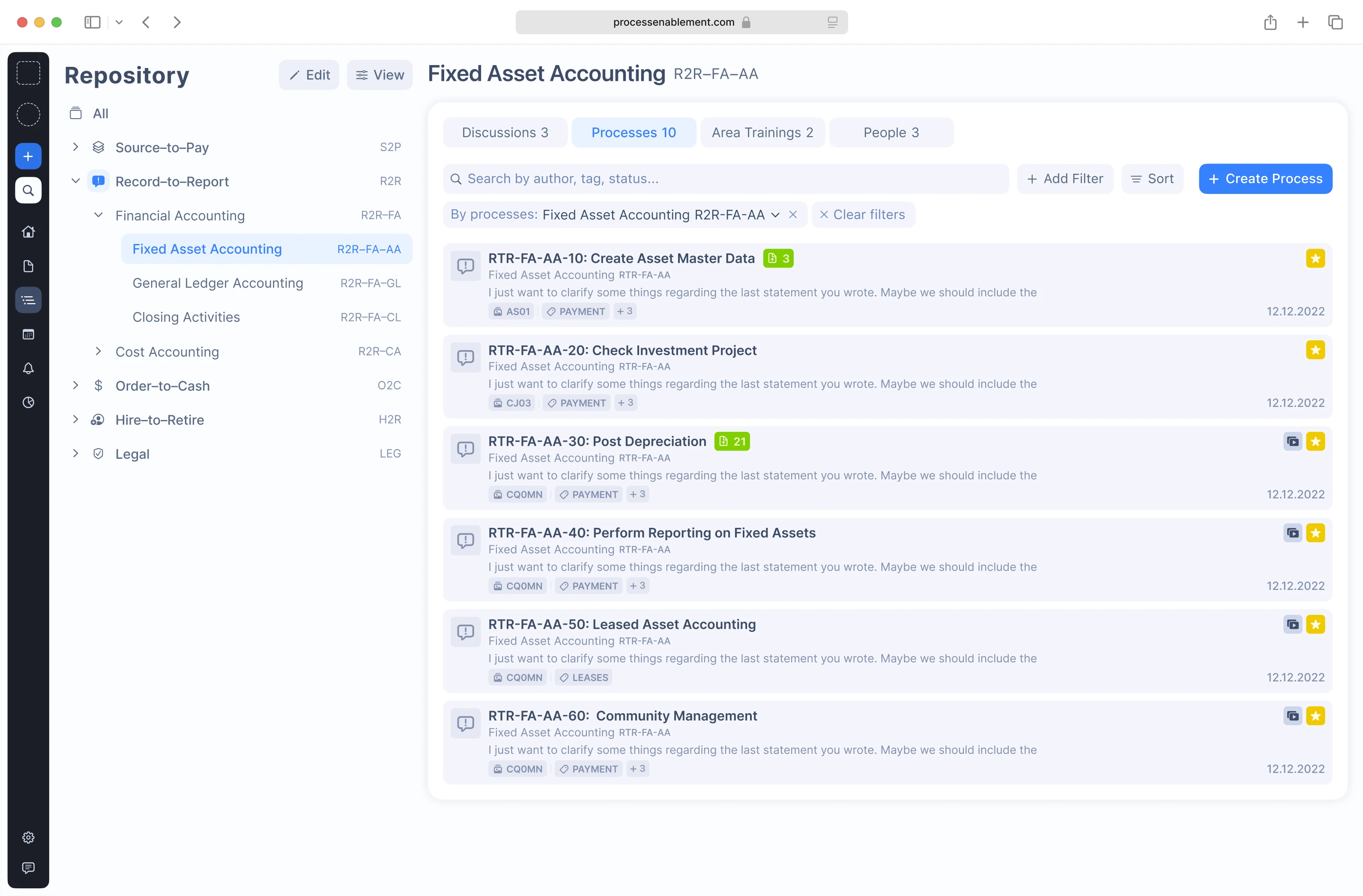
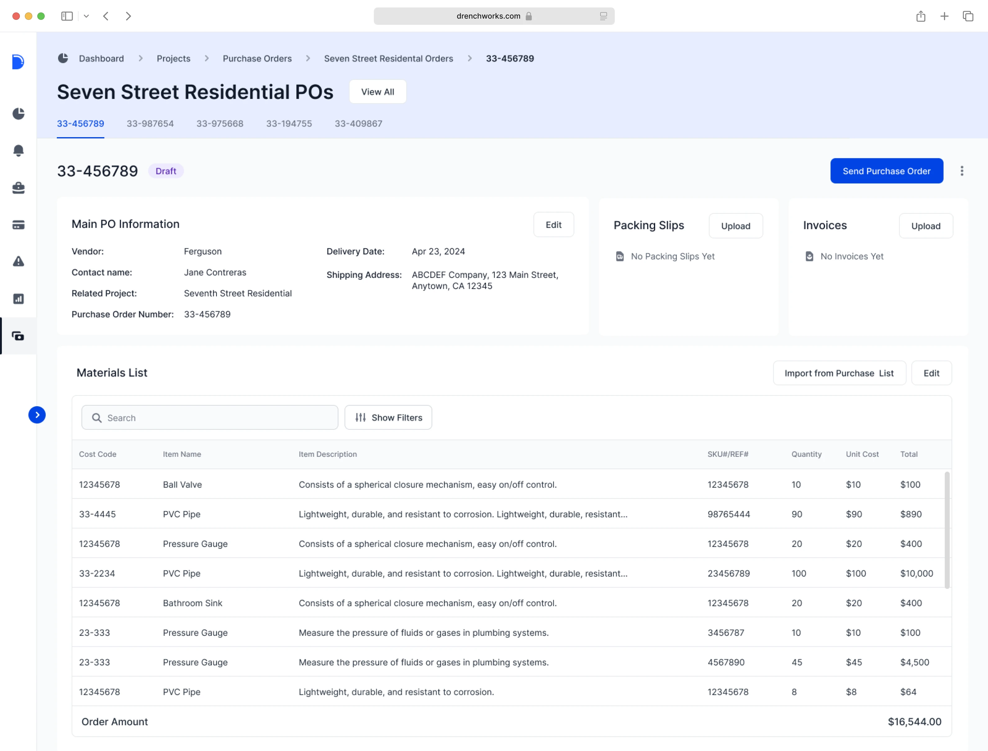
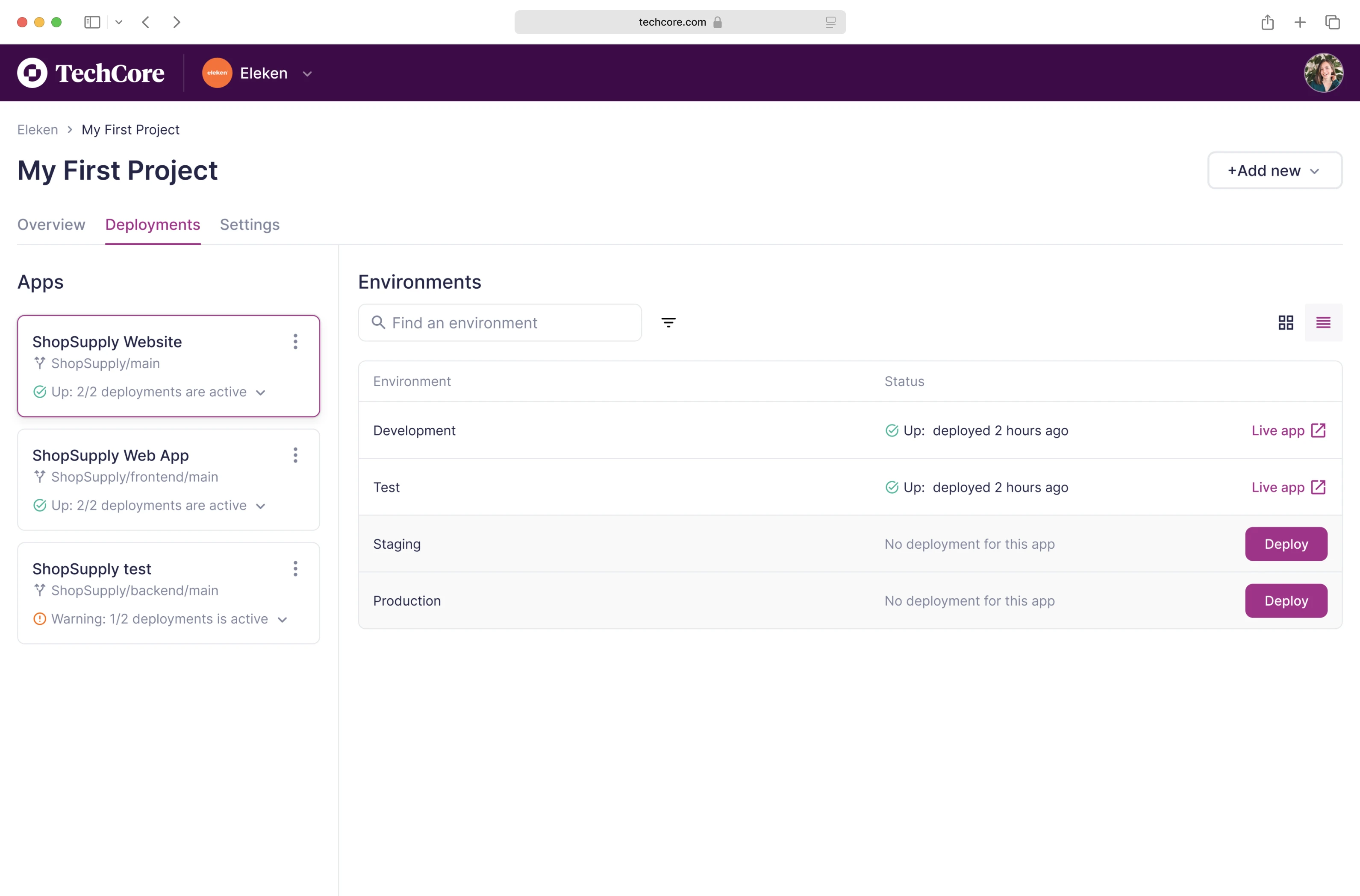
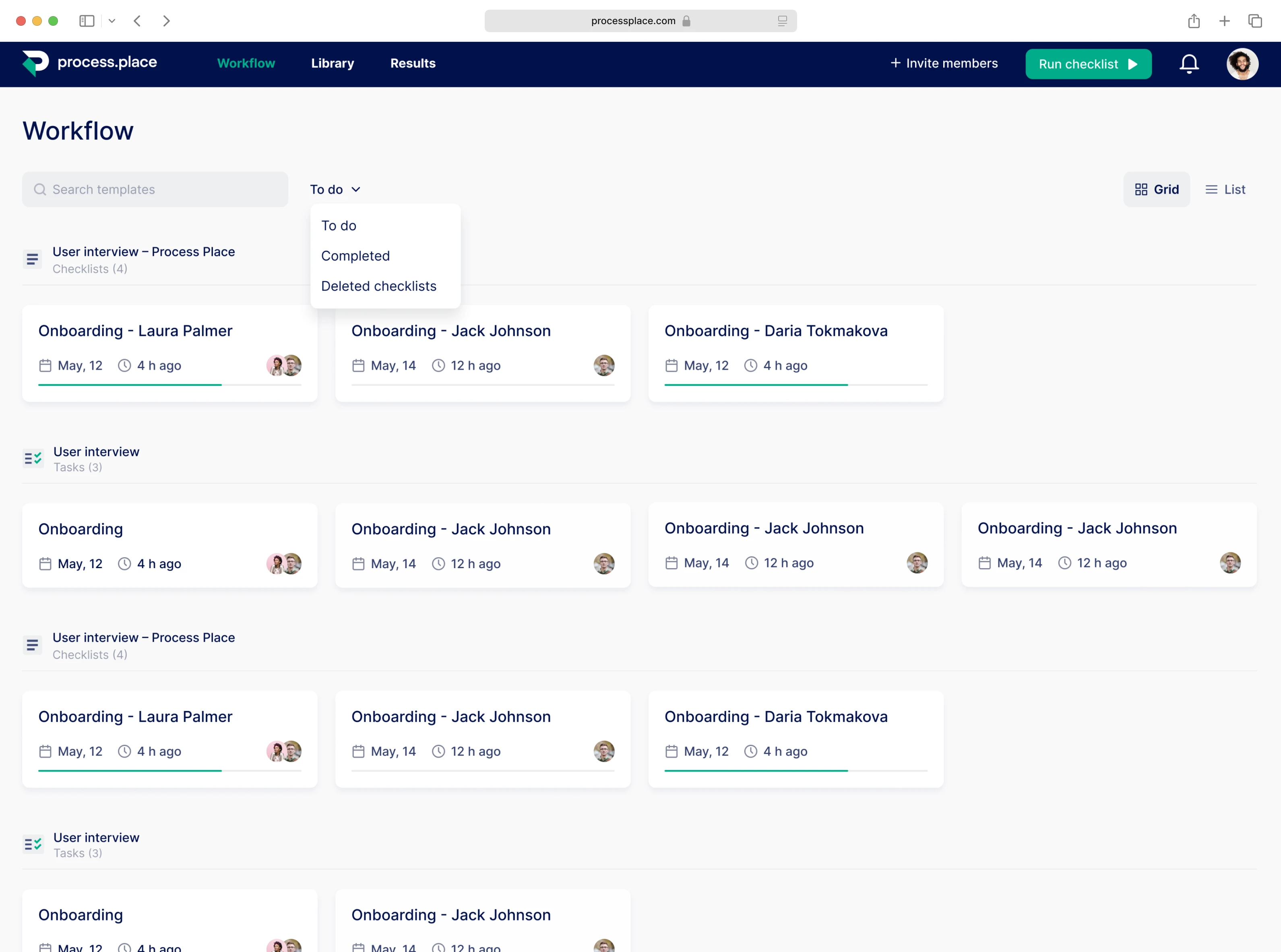
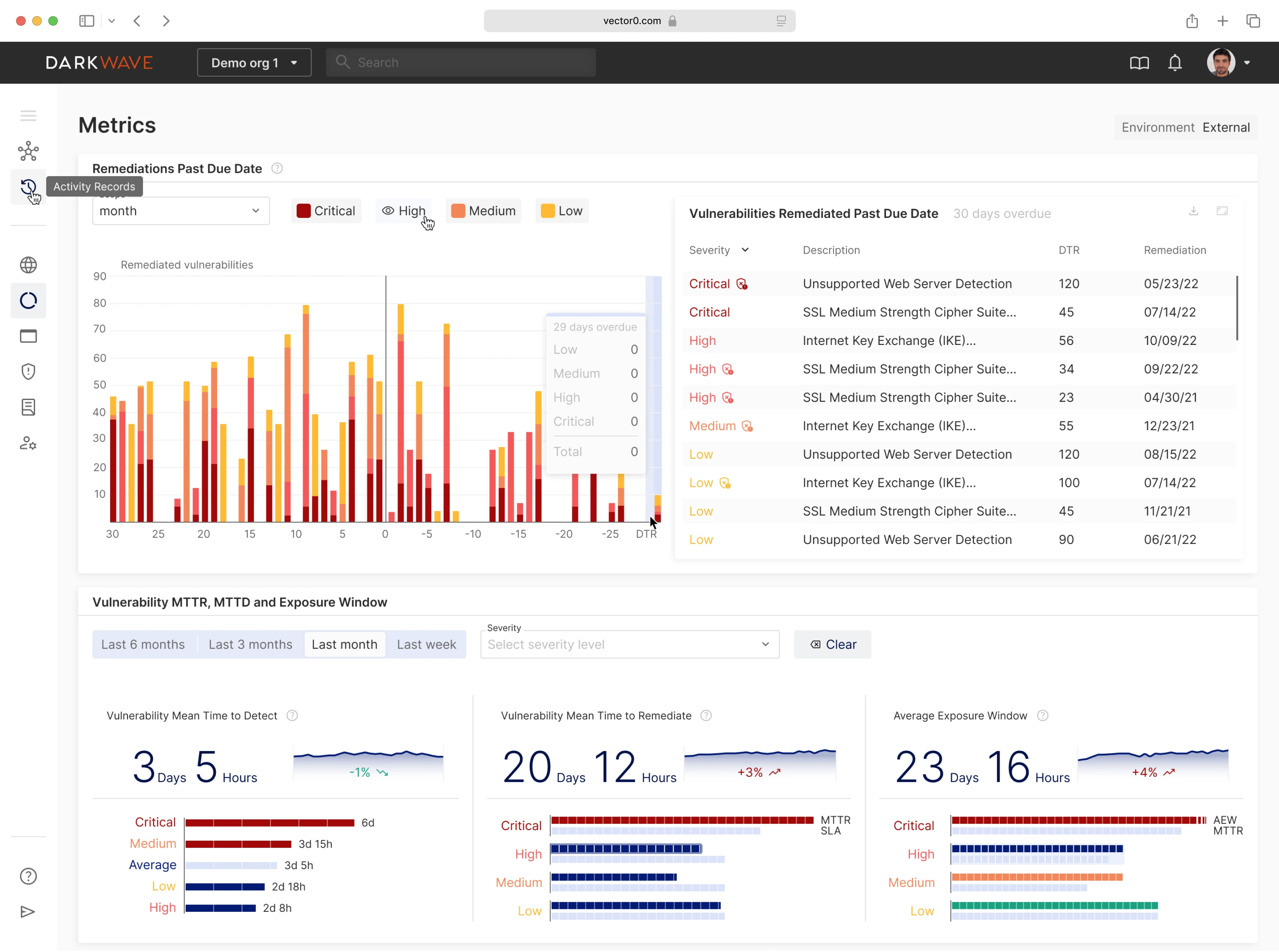
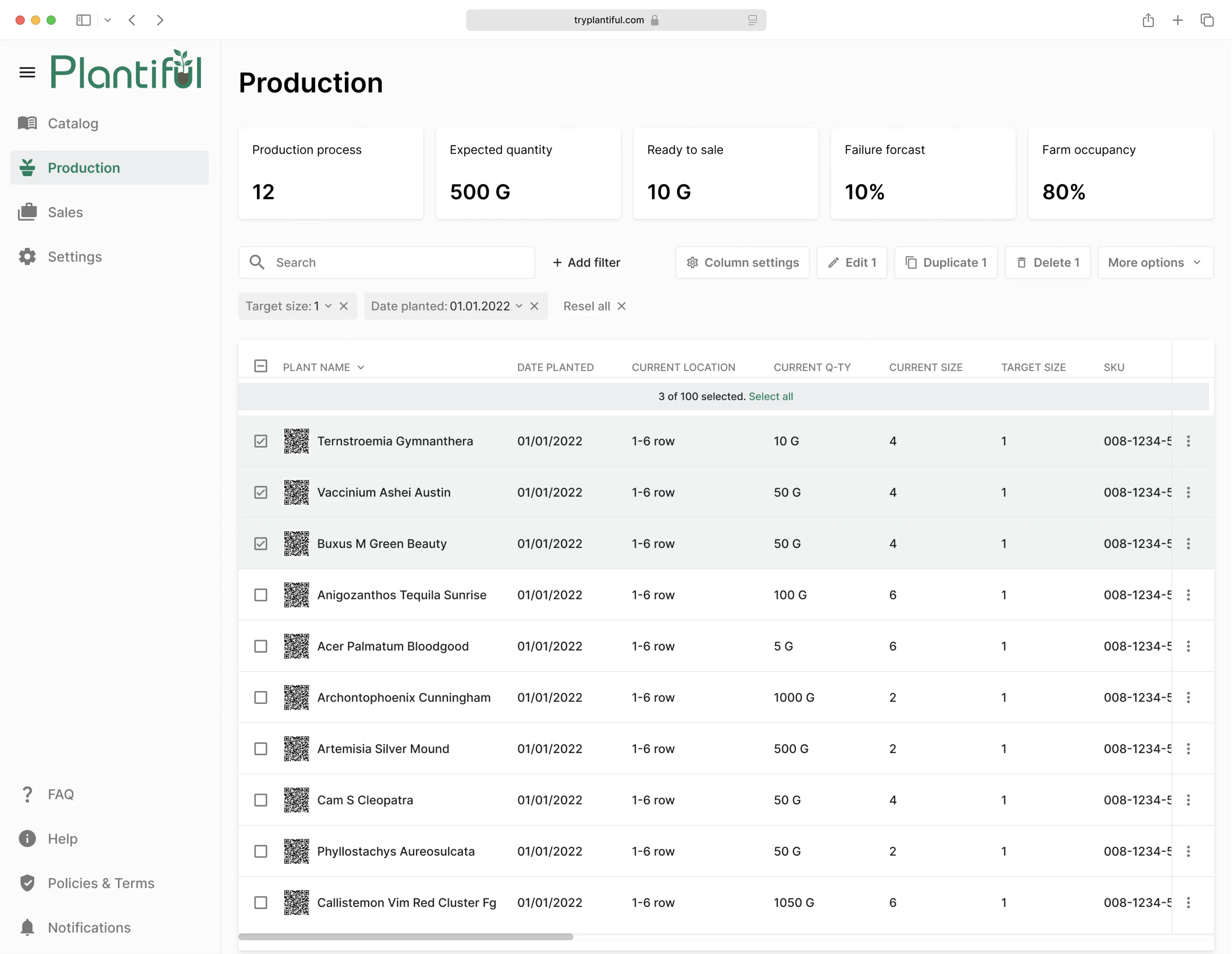
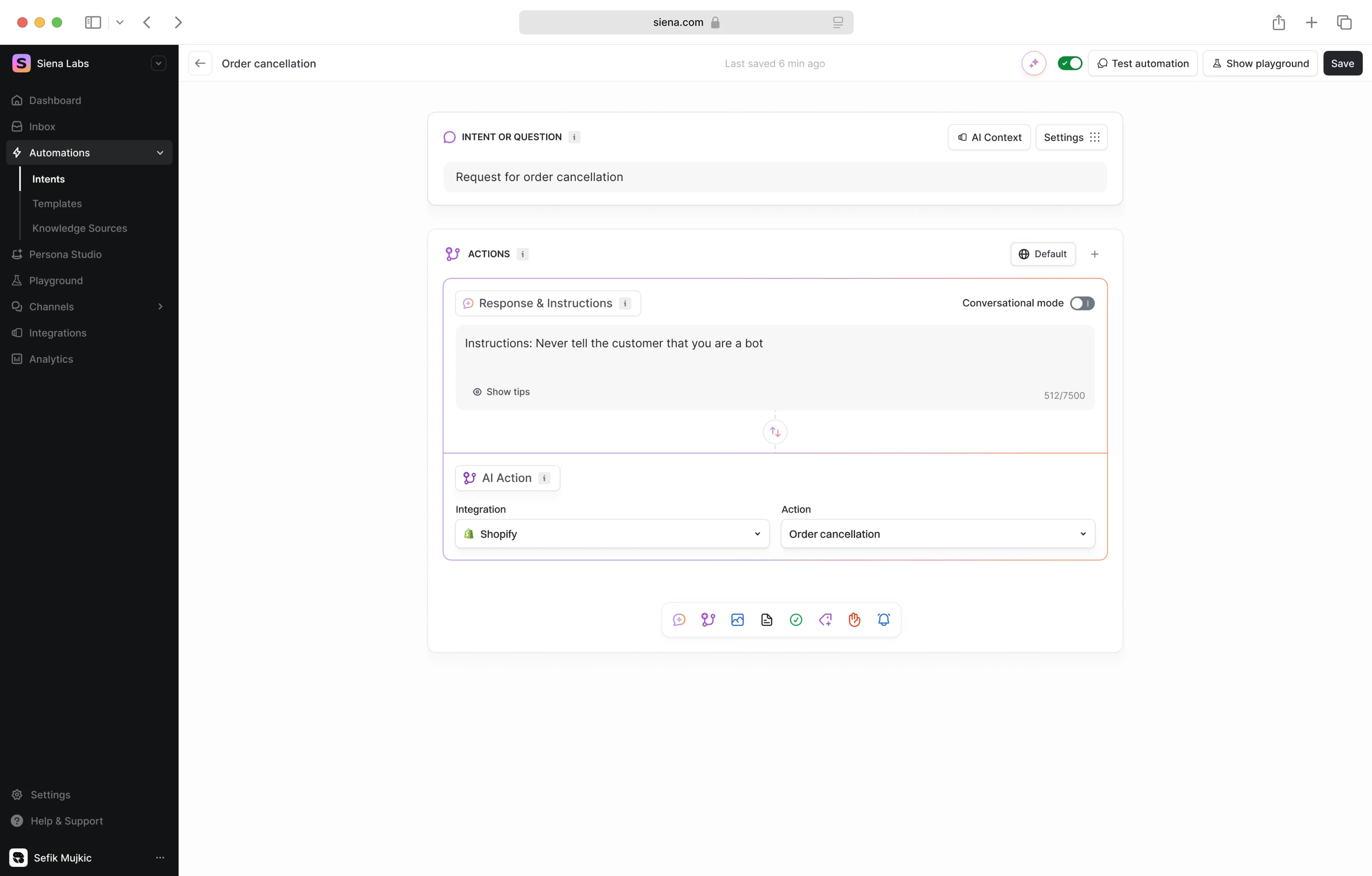
Process Management
When processes run smoothly, businesses thrive. These examples demonstrate how UX design streamlines workflows, reduces errors, and drives operational efficiency.
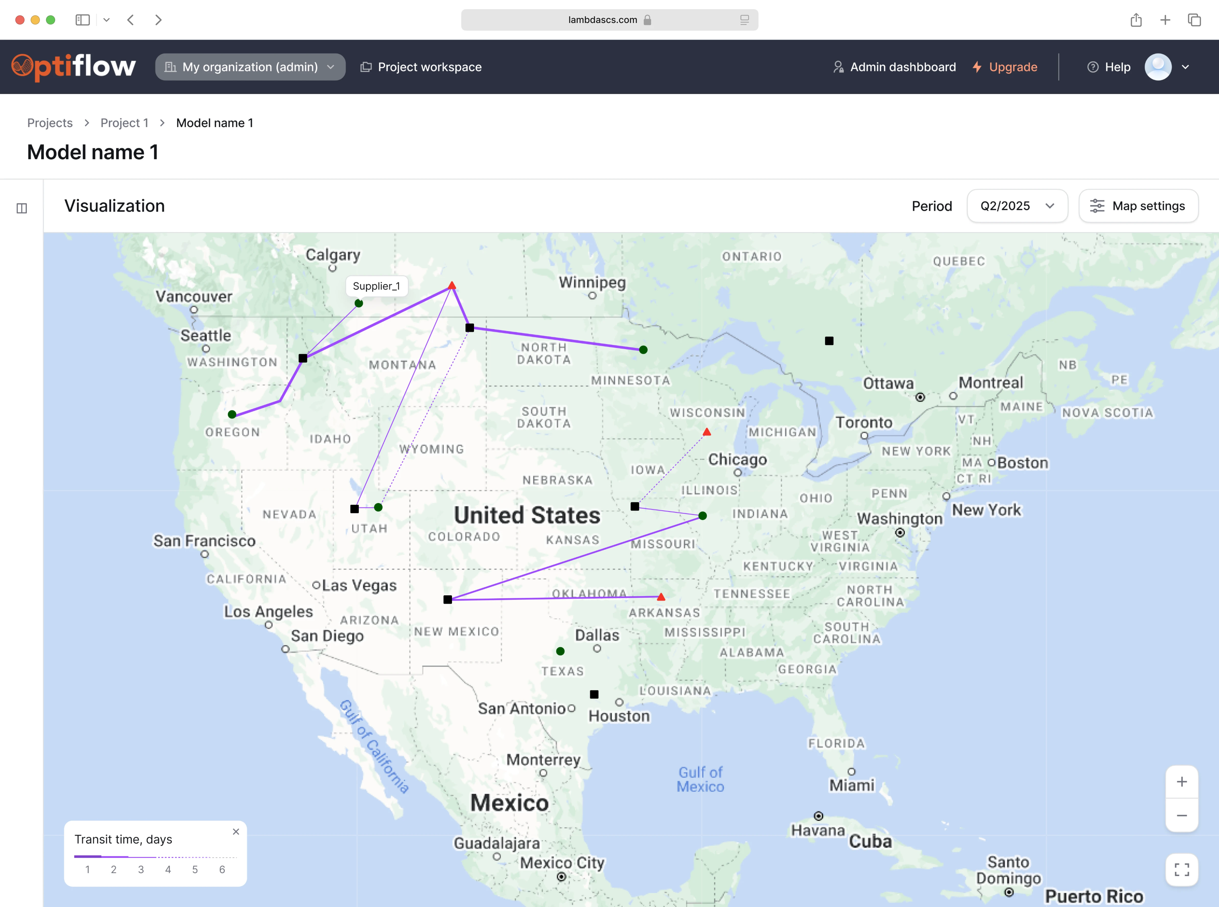
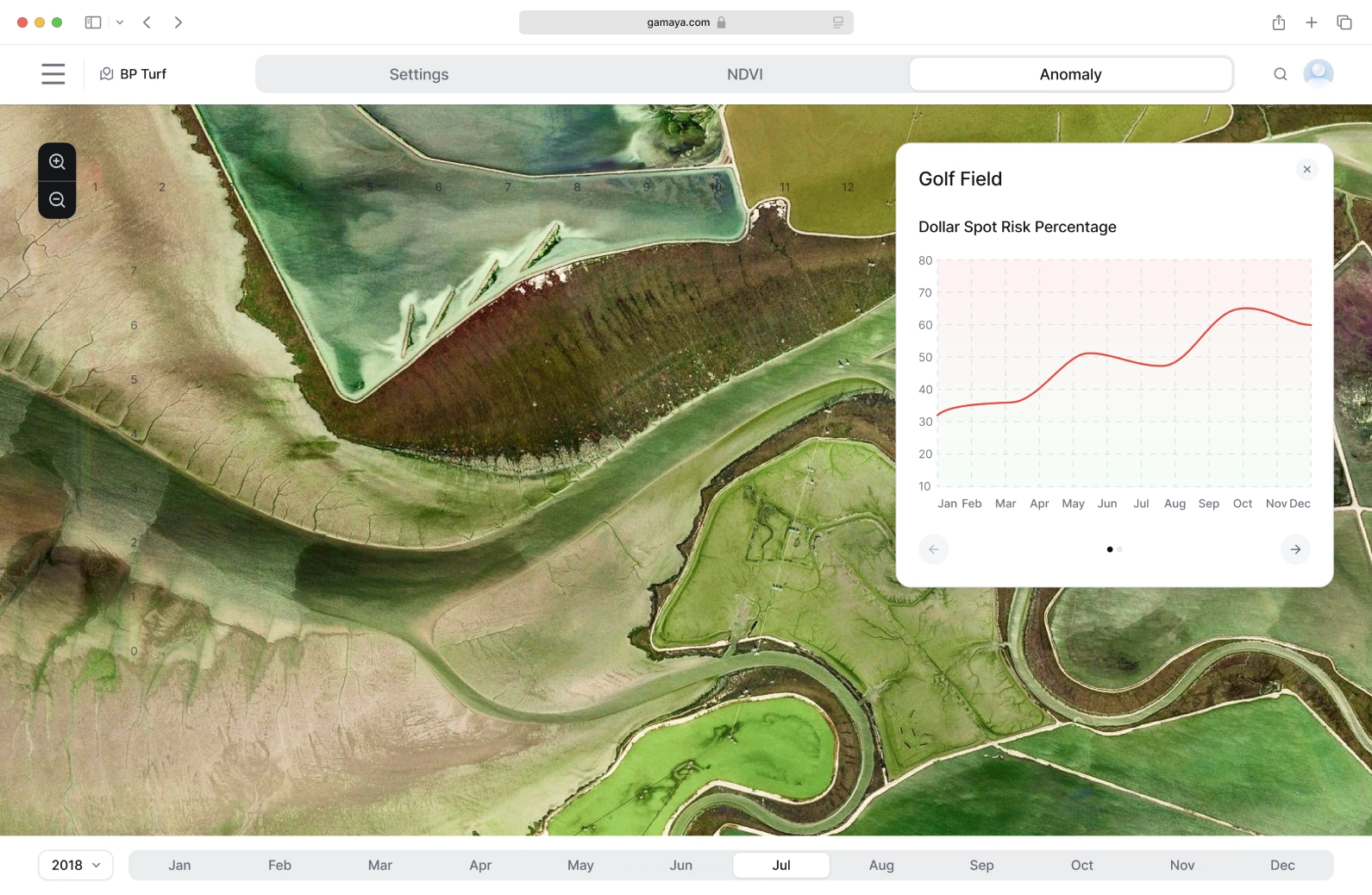
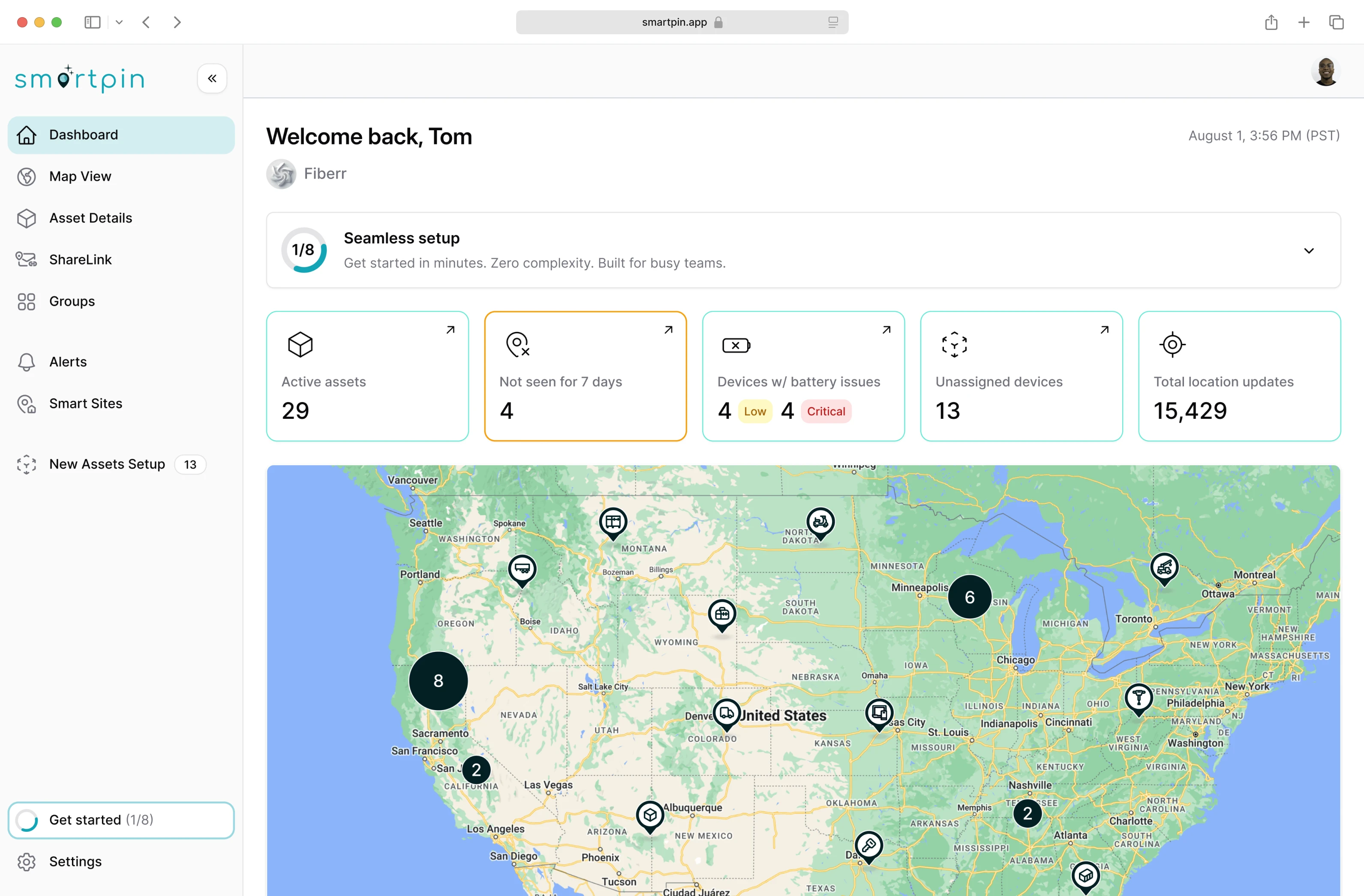
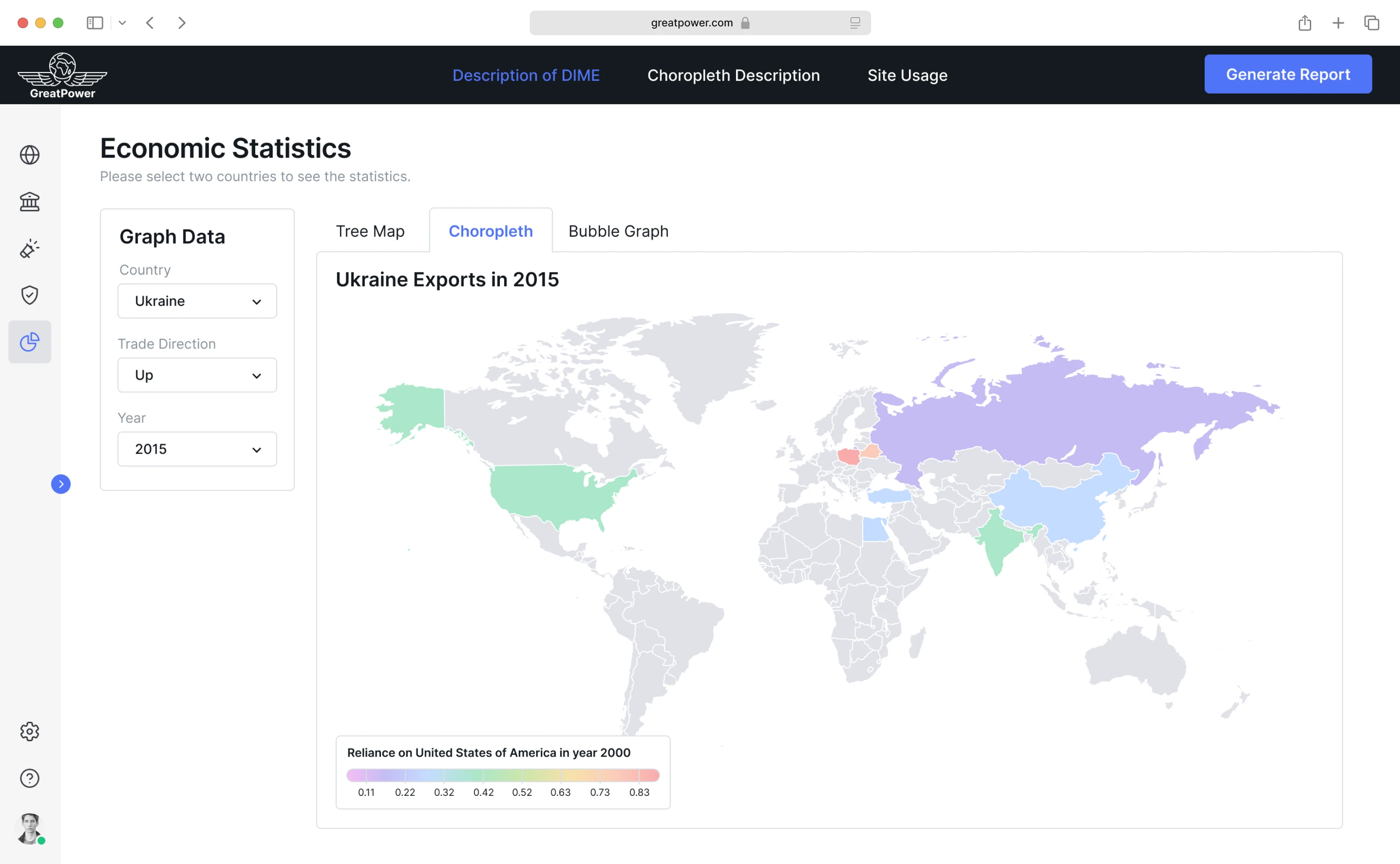
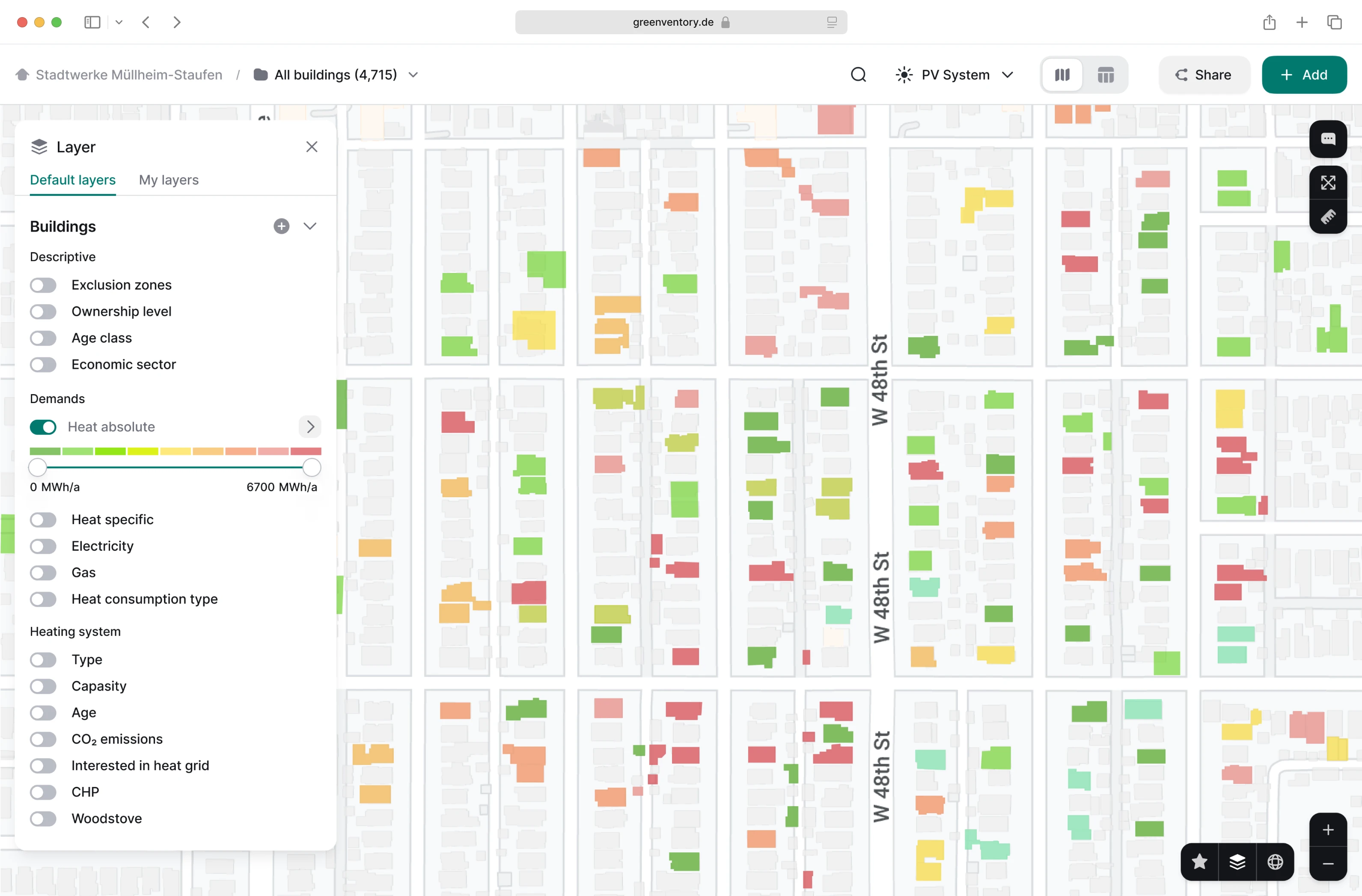
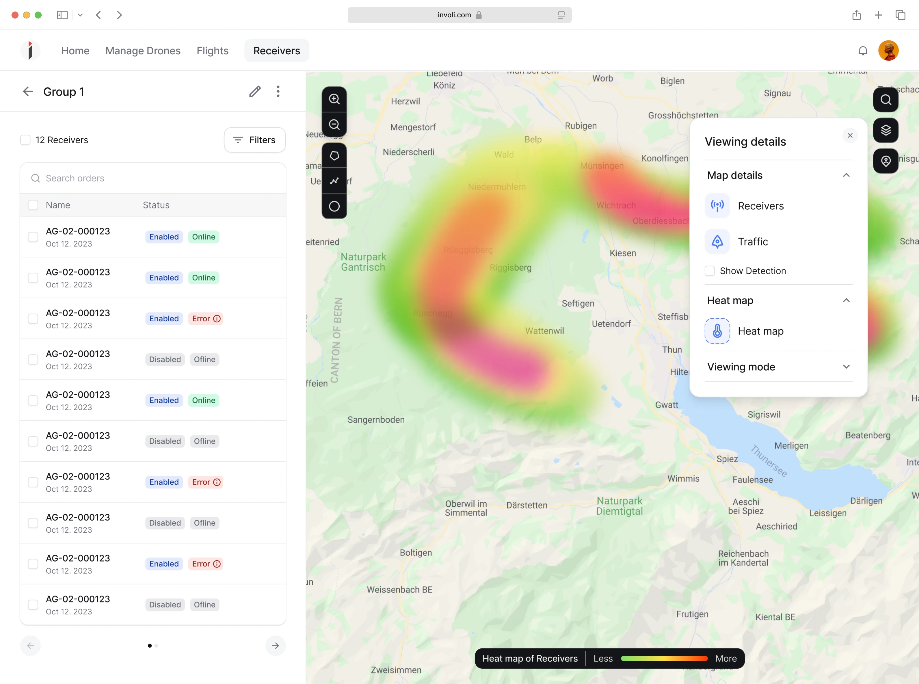
Geoservice
From maps to location-based insights, these case studies showcase how we make geospatial data accessible, accurate, and visually intuitive.
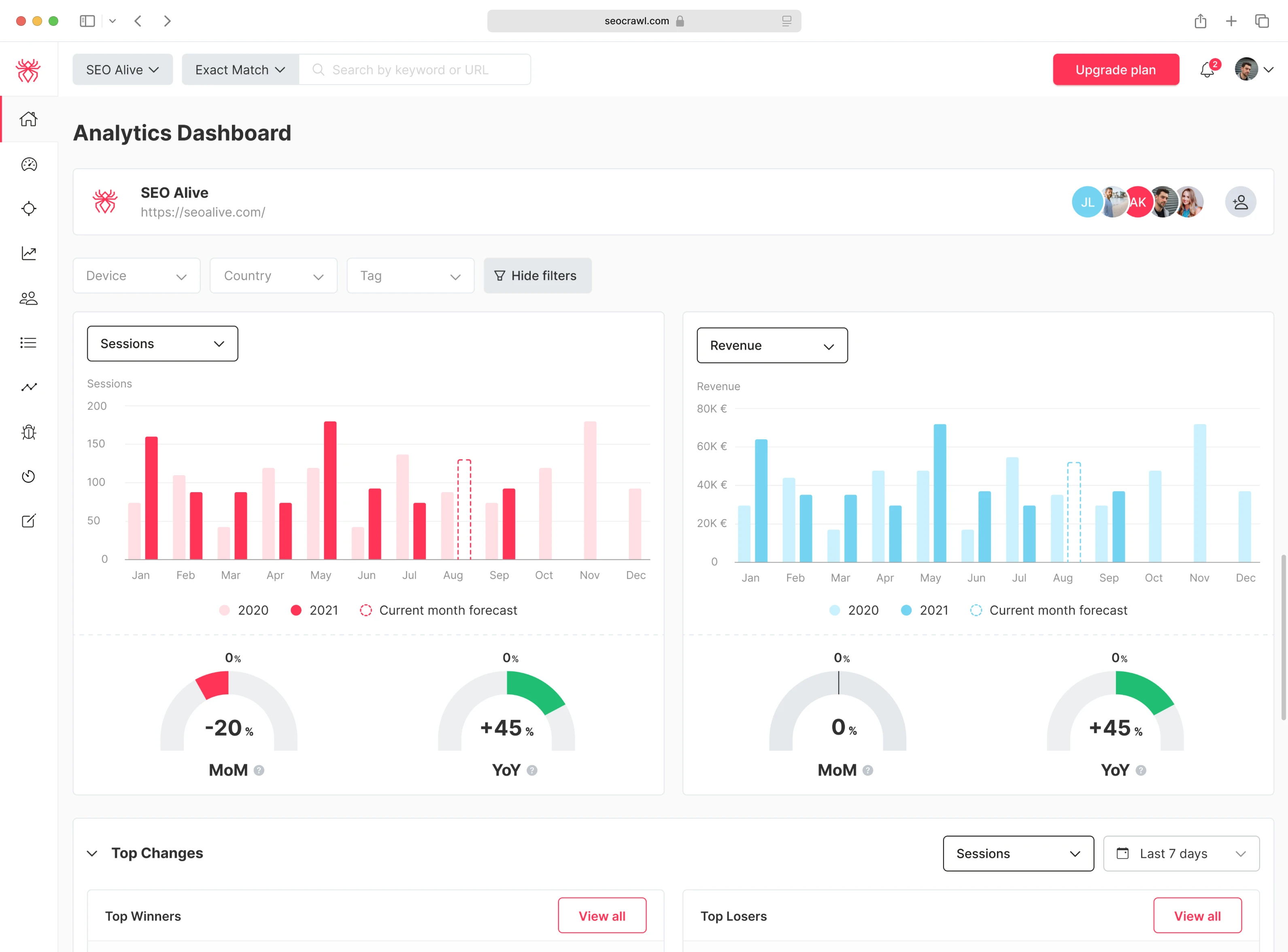
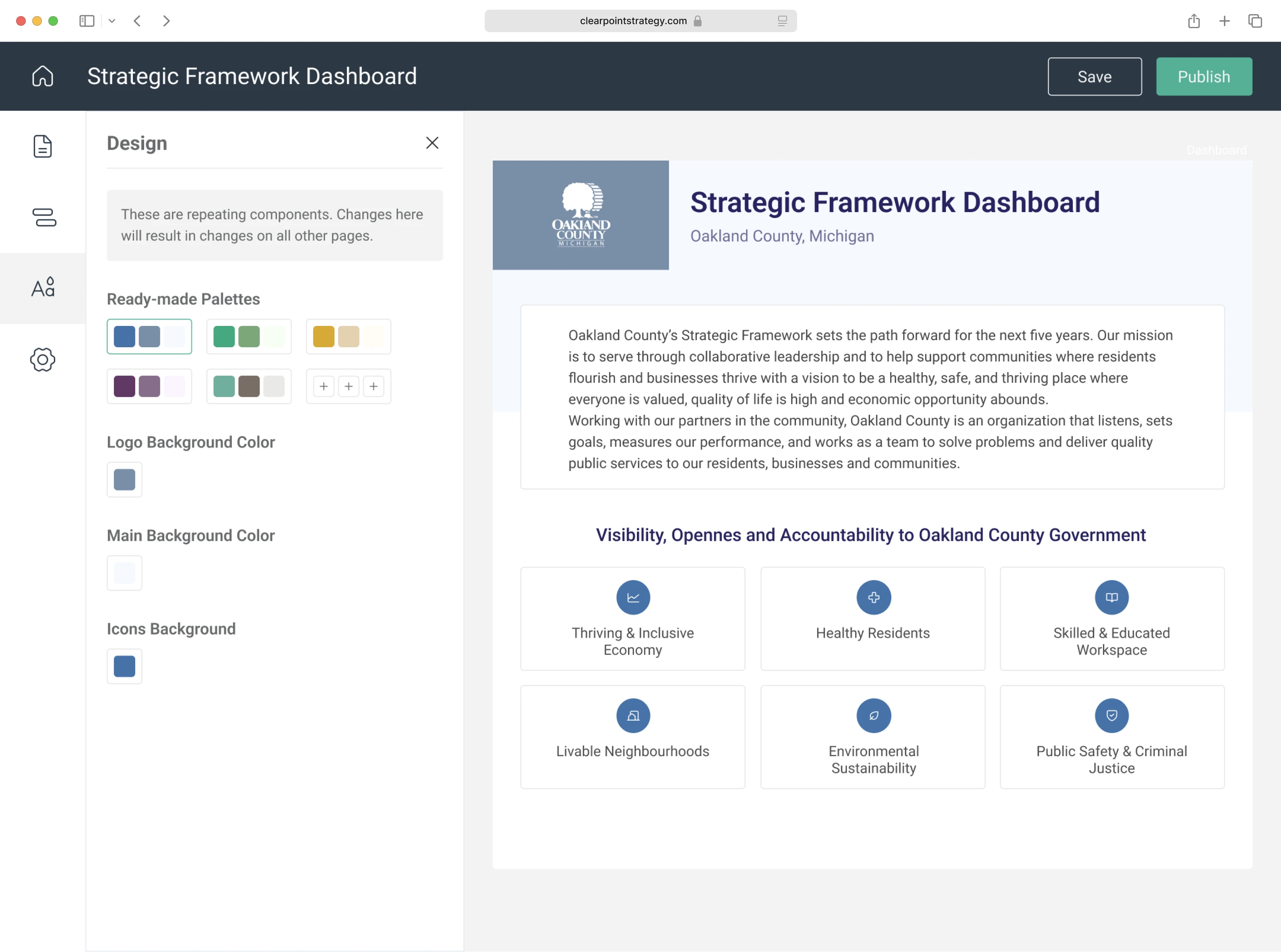
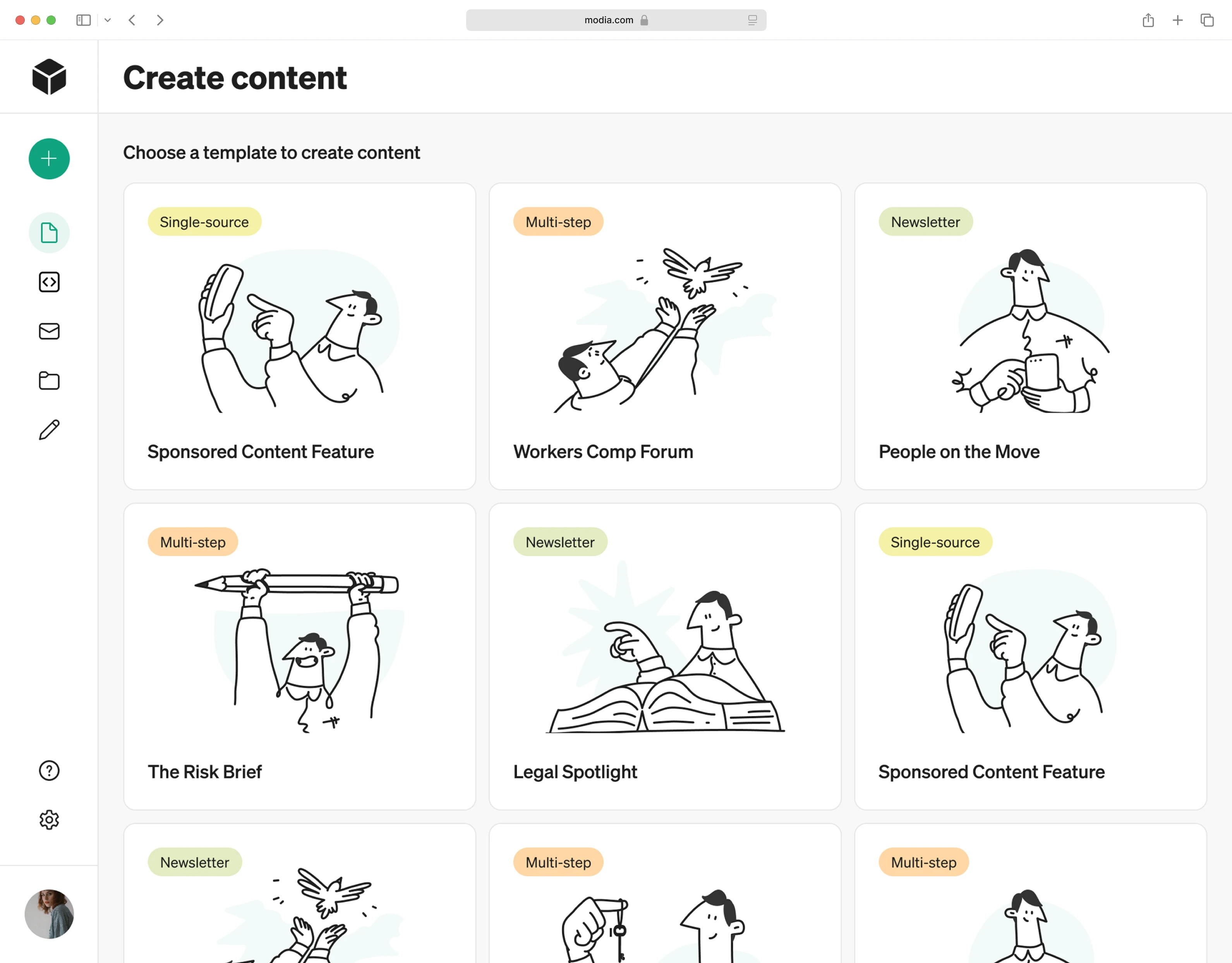
Marketing
Great campaigns deserve great tools. Our marketing case studies explore how UX design can power smarter campaigns, enable creative teams, and deliver measurable results.
Real Estate
Buying, selling, or managing property is emotional and complex. These projects show how clear, friendly design can build trust and guide users through big decisions.
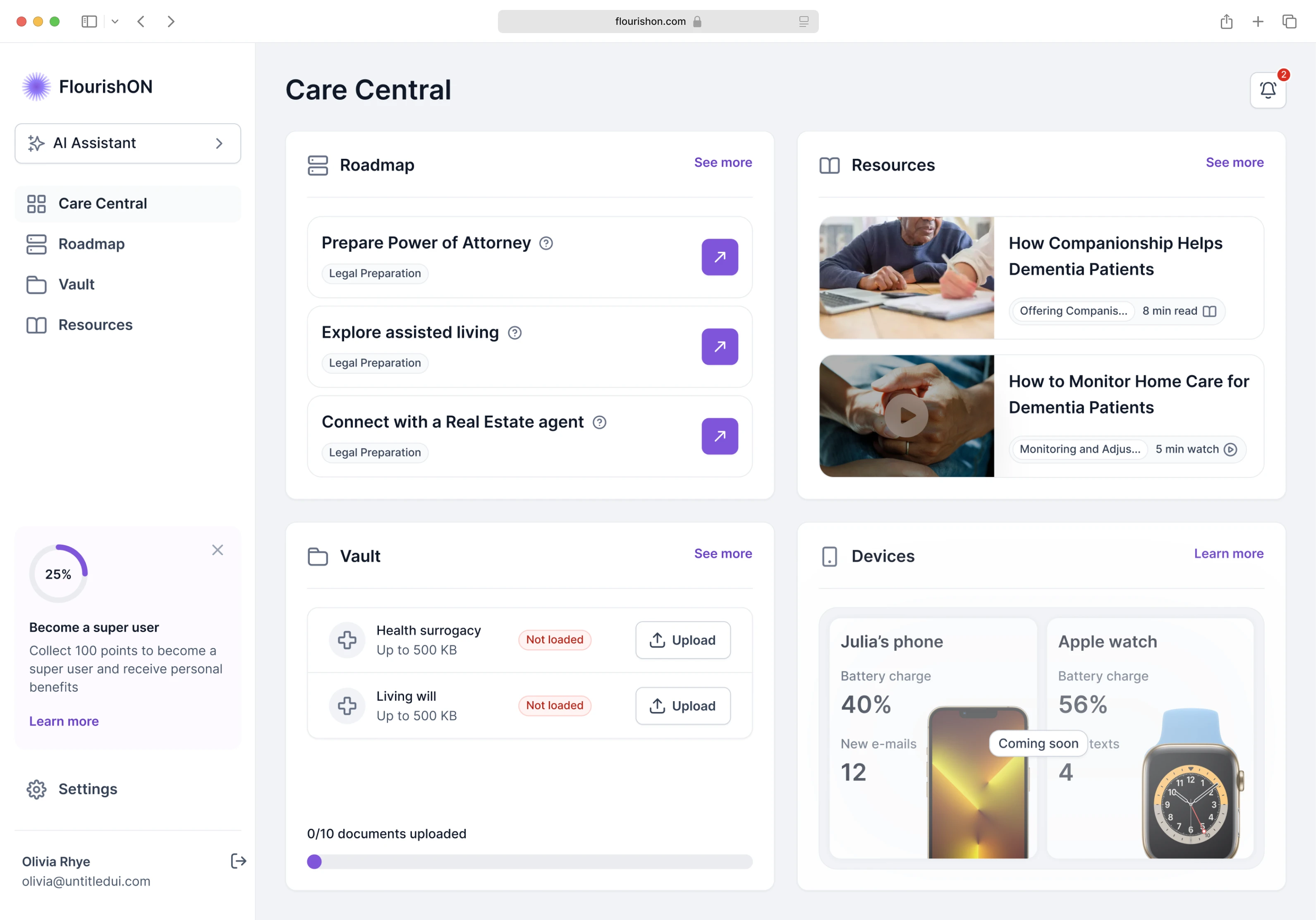
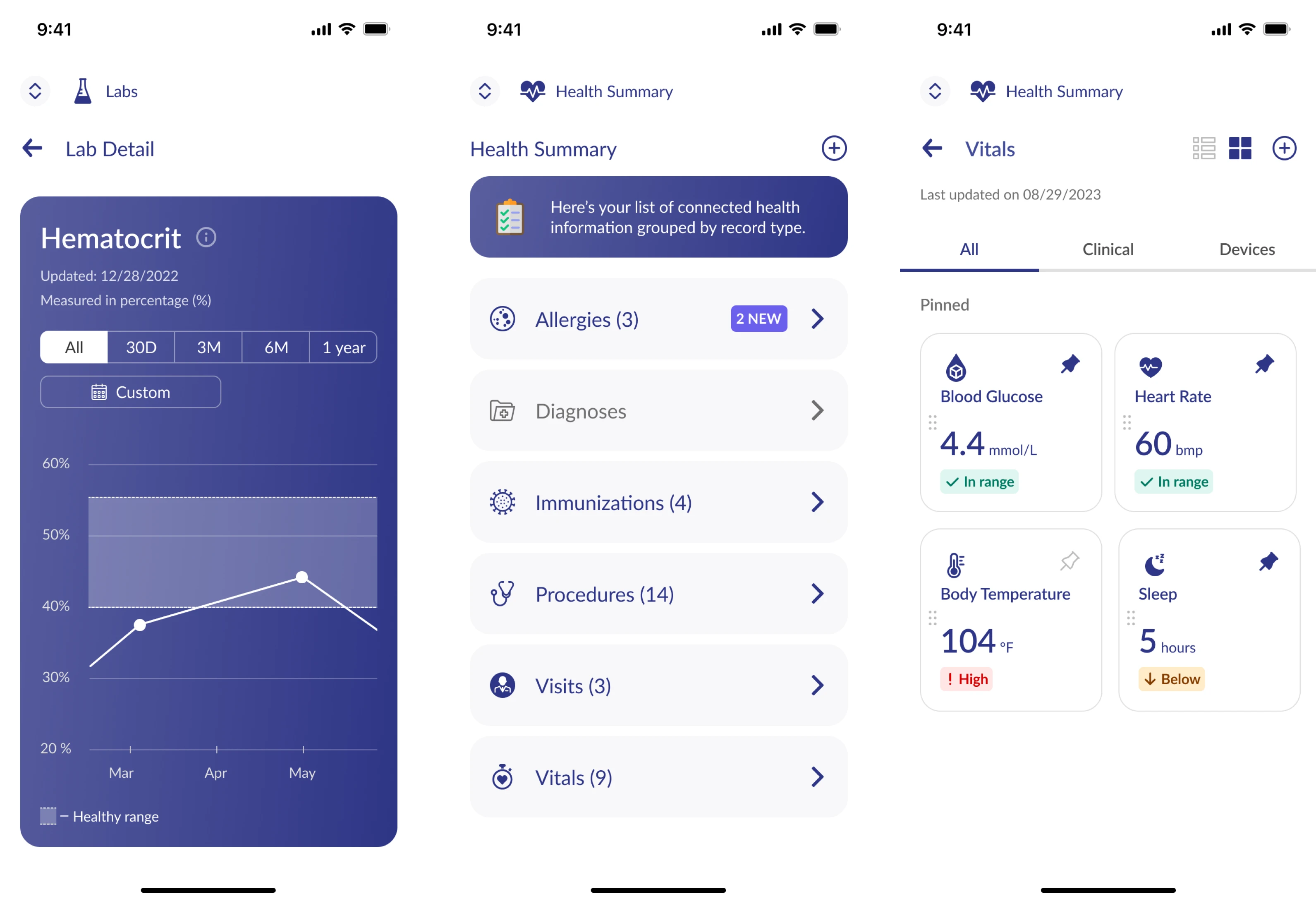
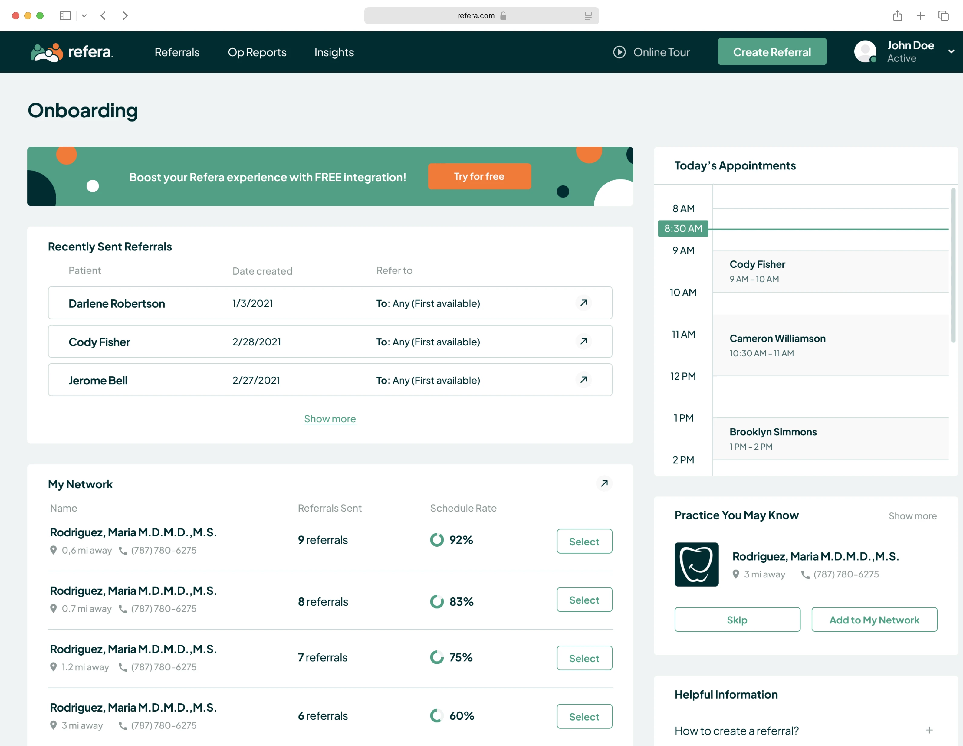
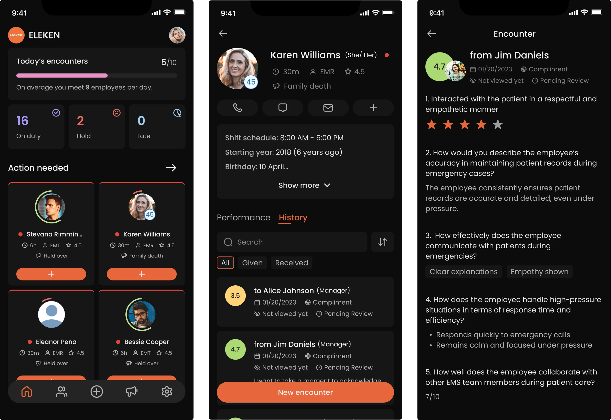
Healthcare
In healthcare, good design can save time and lives. These case studies reveal how we create accessible, patient-focused experiences that support care and compliance.
Education
Learning should be engaging and empowering. Our education case studies highlight UX that makes knowledge more accessible, personalized, and motivating.