

In our experience at Eleken, the best UX improvements start with a business outcome. Our designers look at the metrics that need to move, analyze where users struggle or drop off, and then identify the UX changes most likely to make a difference.
Often, that doesn't mean rebuilding the product. It means removing friction from onboarding, simplifying a key workflow, clarifying navigation, or helping users reach value faster. These targeted changes are easier to ship, measure, and iterate on than a massive redesign.
In this article, we break down 18 UX improvements Eleken designers made across real SaaS products. Each one solved a specific problem, made it into production, and is something you can apply to your own product.
If you'd like to learn how to identify these opportunities before they become costly, watch our video on how to find and solve UX problems before they hurt your product.
Forms and data entry
Forms are where users are most likely to give up. Every field is a small ask, and the asks add up fast. (If you want a wider set of patterns, we've collected 42 form design examples separately.) Forms are also the clearest place to watch user frustration build in real time, and the fastest place to create a bad user experience at the exact moment someone is deciding whether to commit.
Fix 1: Let people upload a document instead of typing
Manual data entry is the slowest, most tedious part of most B2B forms. The information is usually sitting in a document already, so why make people retype it?
Offer upload as the primary path and keep typing as the fallback. Let users scan or photograph a document, extract the data from it, and correct anything the parser gets wrong.
Eleken designers did exactly this for IDcore, adding document and photo upload as an alternative to manual entry.
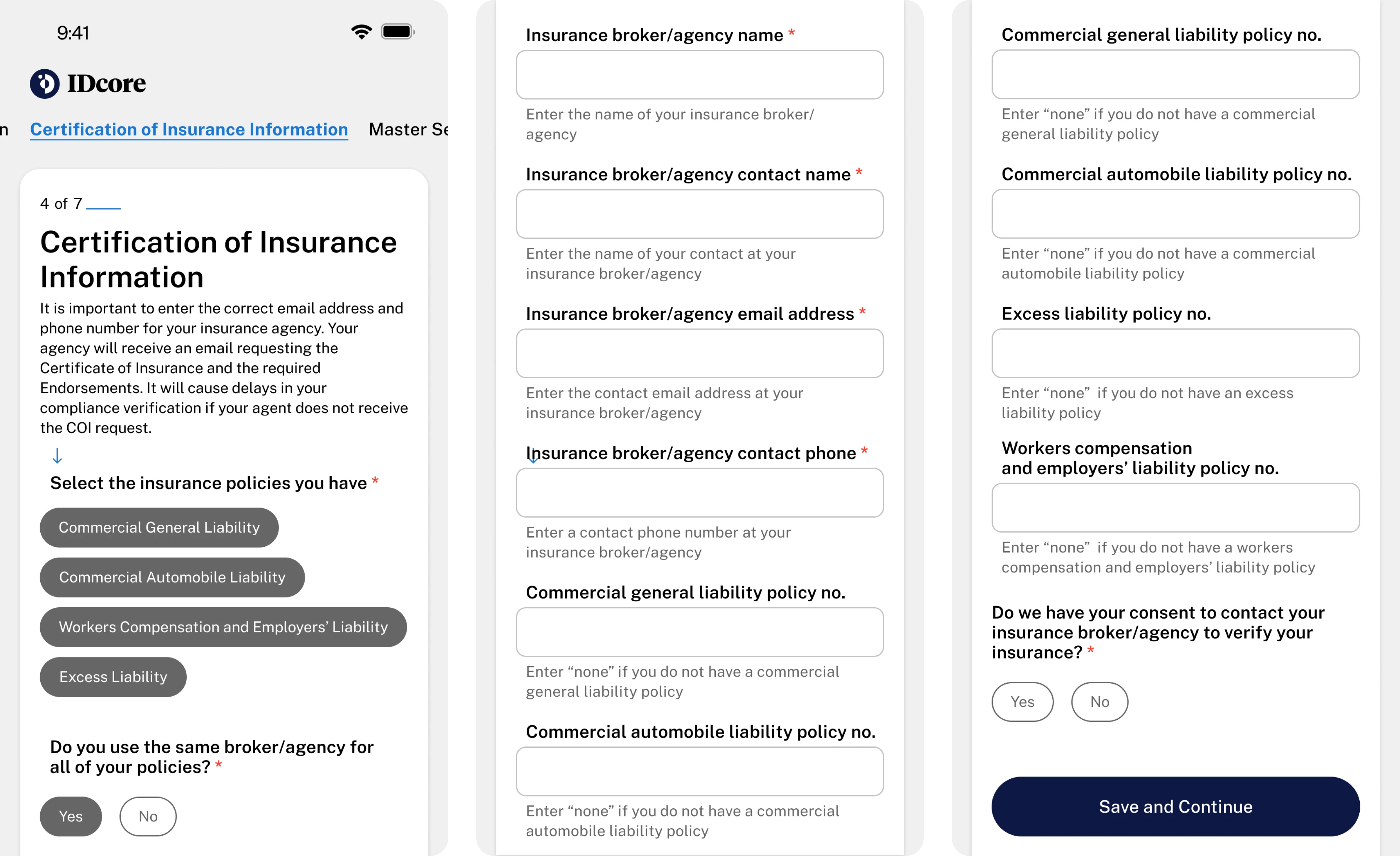
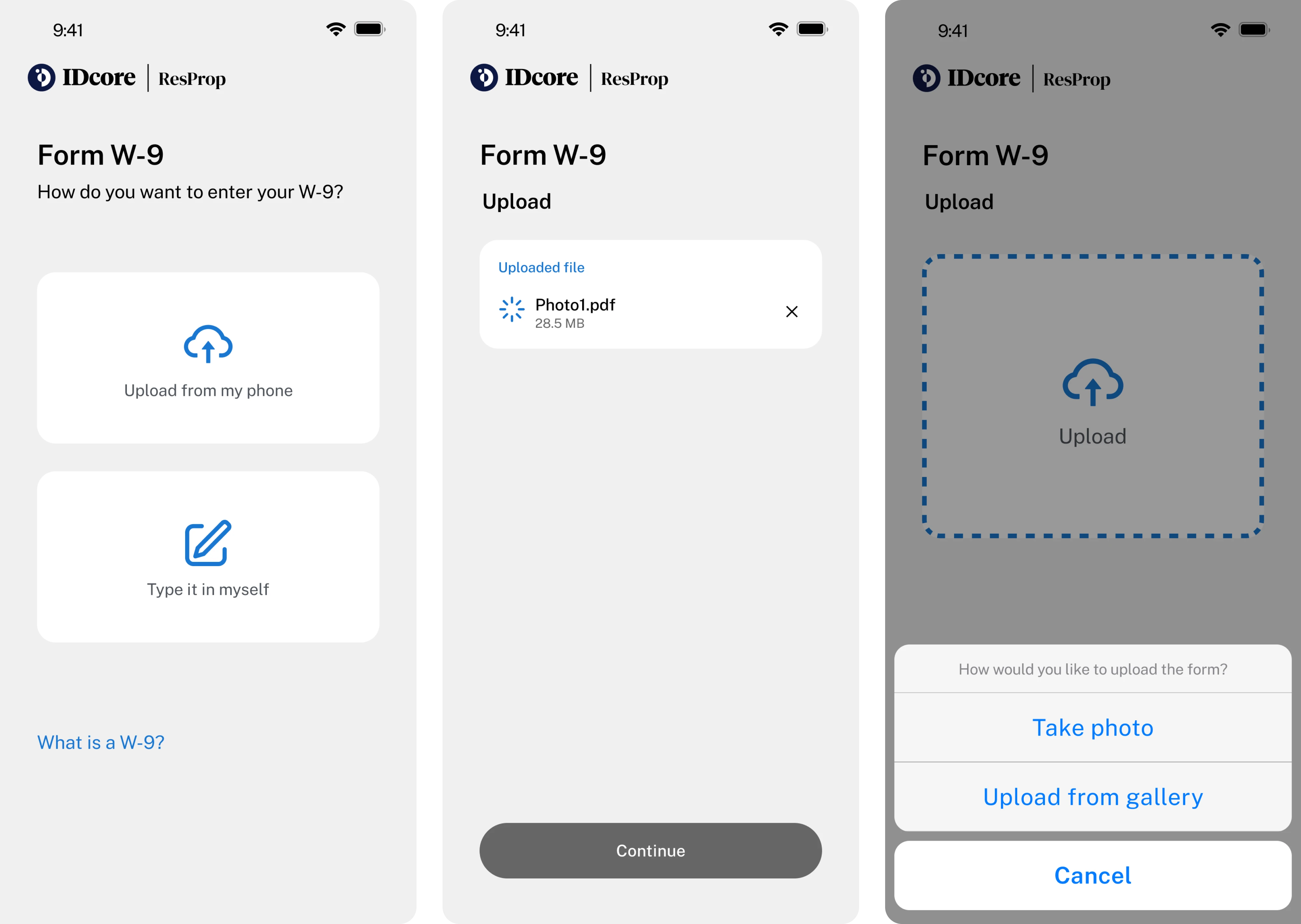
As a result, form-filling got 25% faster. That's a quarter of the time back on the single most painful step in the flow.
One caveat: parsing is never perfect, so show the extracted values in editable input fields and let the user confirm them. That confirmation step is a form of visual feedback. It tells the user the system read the document correctly. The goal is to replace typing with checking, which is much faster. When the quickest option is "don't type at all," people take it.
Fix 2: Pull scattered records into one profile view
When a user's information is spread across five pages, they lose the thread. Every jump to another screen is a chance to forget what they were doing and why.
Consolidate it. Give each person, account, or project a single hub where everything lives together.
For our project Sessionboard, we unified bios, files, and session links into one profile hub. We added tabs to organize it, pagination to keep it manageable, and redesigned the cards so the whole thing scanned cleanly. Cleaning up the underlying information architecture like this is often what makes a "confusing" product suddenly feel simple.
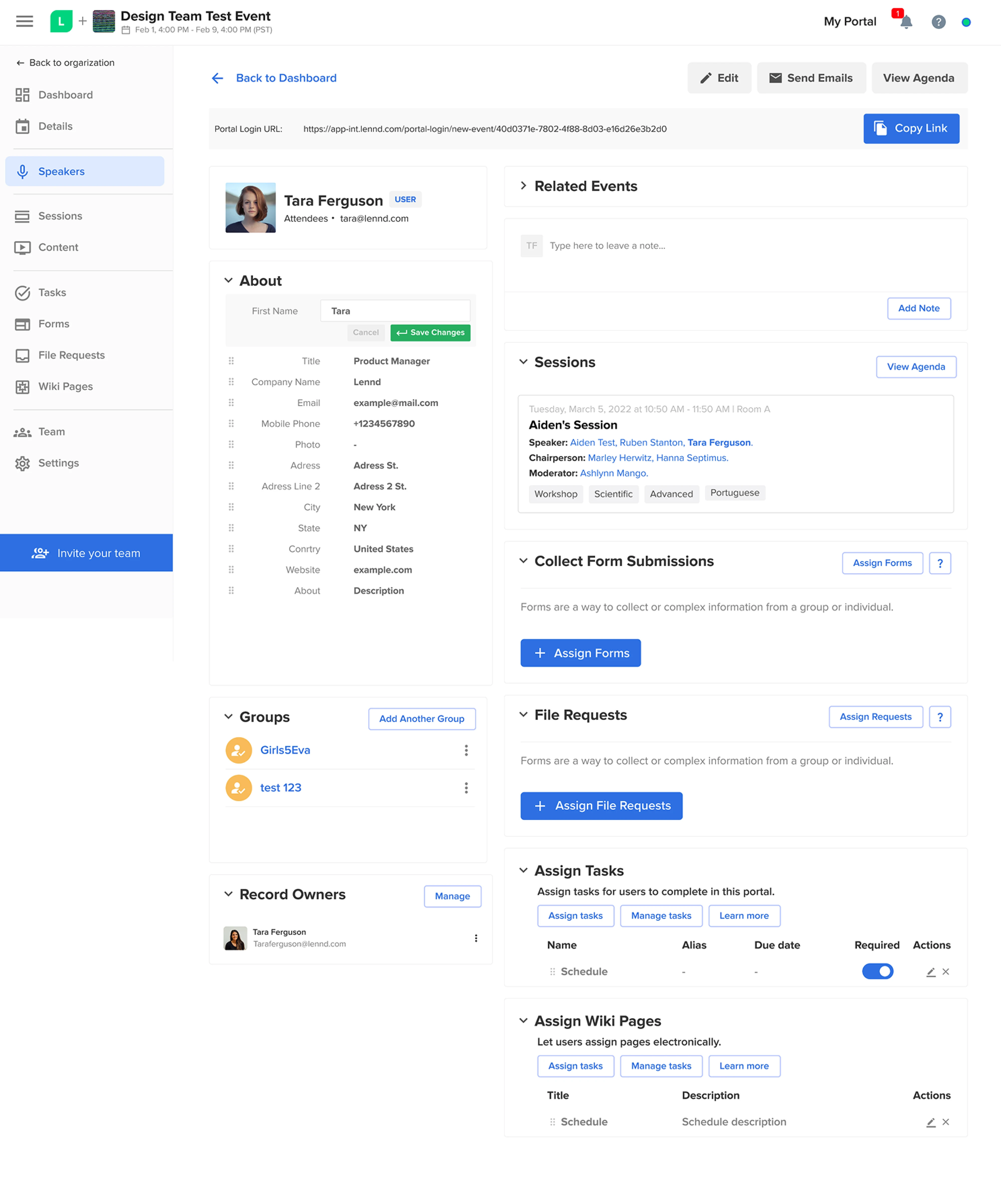
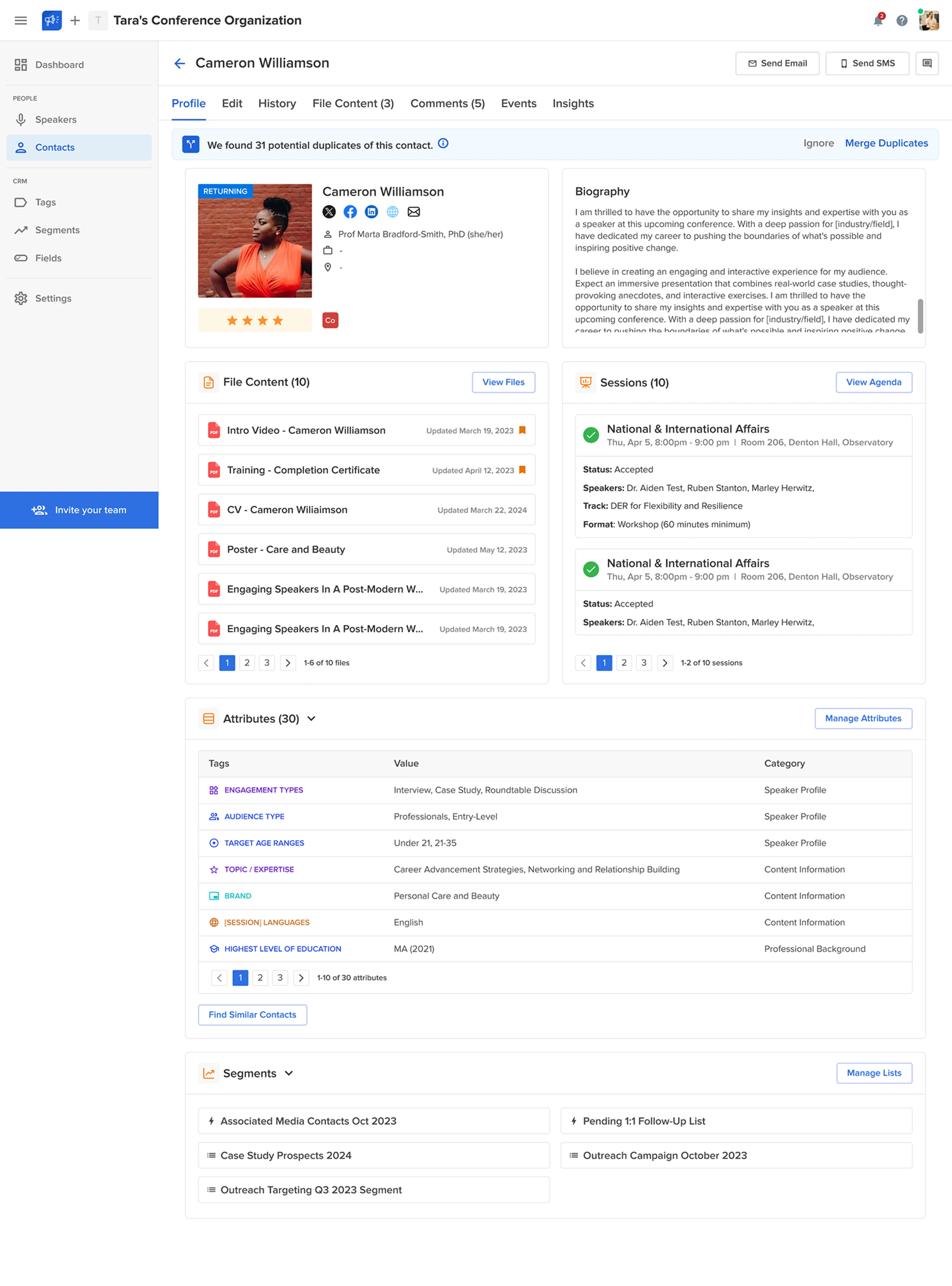
The move that makes this work is picking the right anchor, usually the entity people think in terms of, like the person or the account, and hanging everything else off it. One place to look beats five places to search.
Fix 3: Break one long form into a short guided flow
A single long form reads as a chore. The same questions, split into a few labeled steps with a visible finish line, feel shorter, even when they aren't.
The trick is a clear end state. Show people what they're building as they go. This is the wizard UI pattern, and it works because each screen asks for less.
Eleken designers turned TextMagic campaign setup into a three-step flow that ends in a phone-mockup preview of the actual message. You see the thing you're making before you commit to sending it.
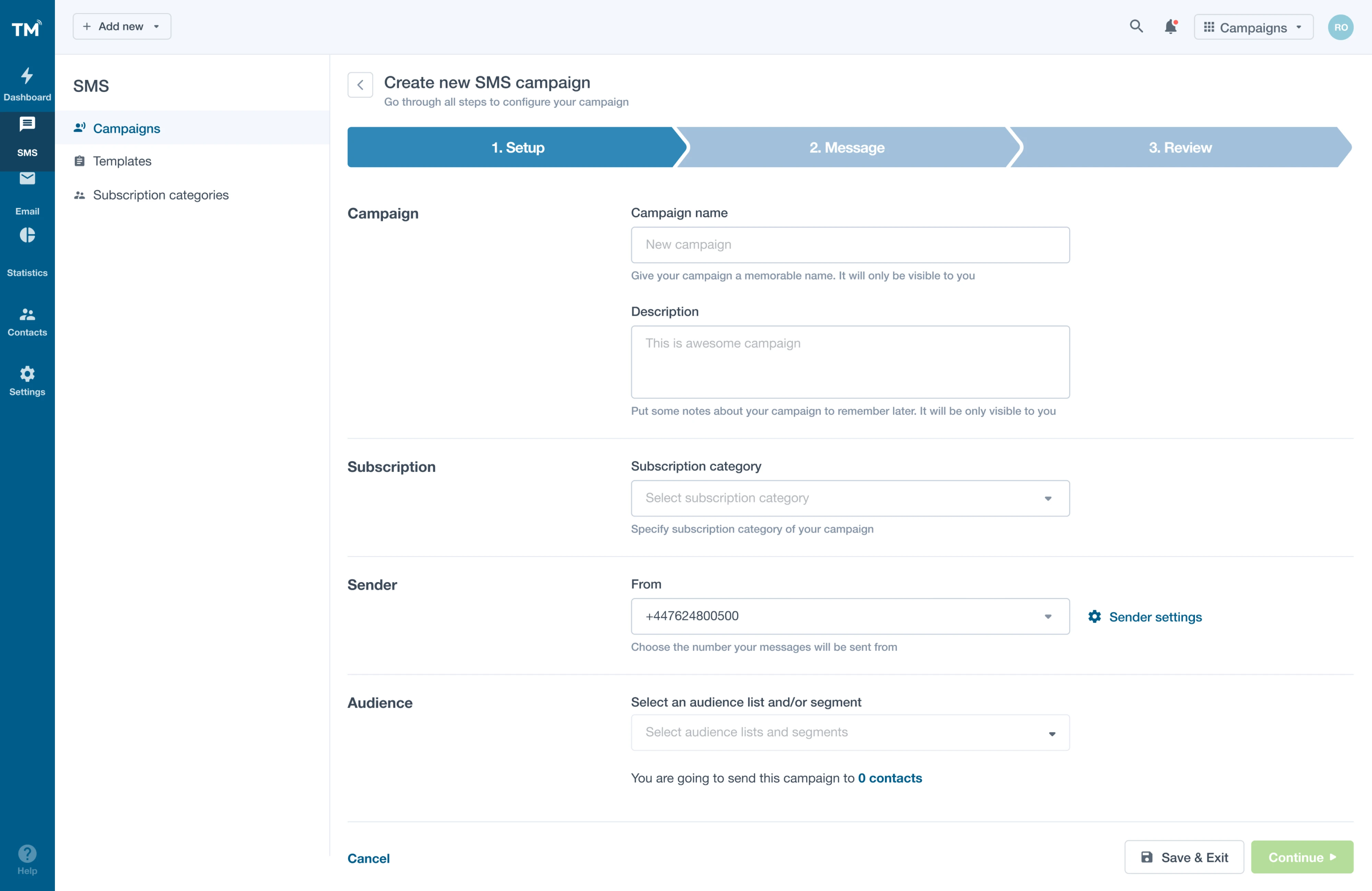
Keep the step count honest; three to five is the sweet spot. Any more and the flow starts to feel longer than the scroll it replaced. A visible end state turns "ugh, a form" into "okay, three steps, I've got this."
Fix 4: Add headers and alignment to a long form
Sometimes you can't shorten the form. You still don't have to make it look like an interrogation.
A wall of unlabeled questions reads as one intimidating block. Group the questions into sections, label each section, and align the fields so the eye flows straight down. A little more white space between groups does as much work as the labels do.
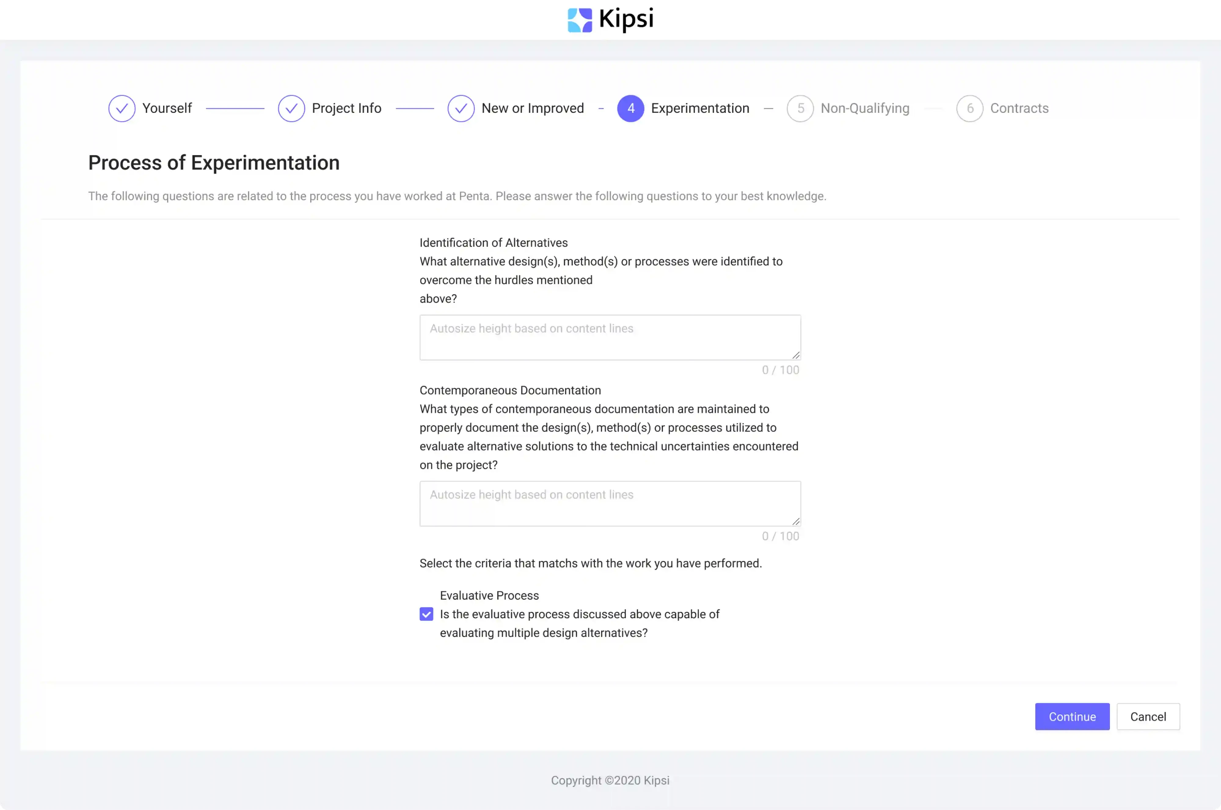
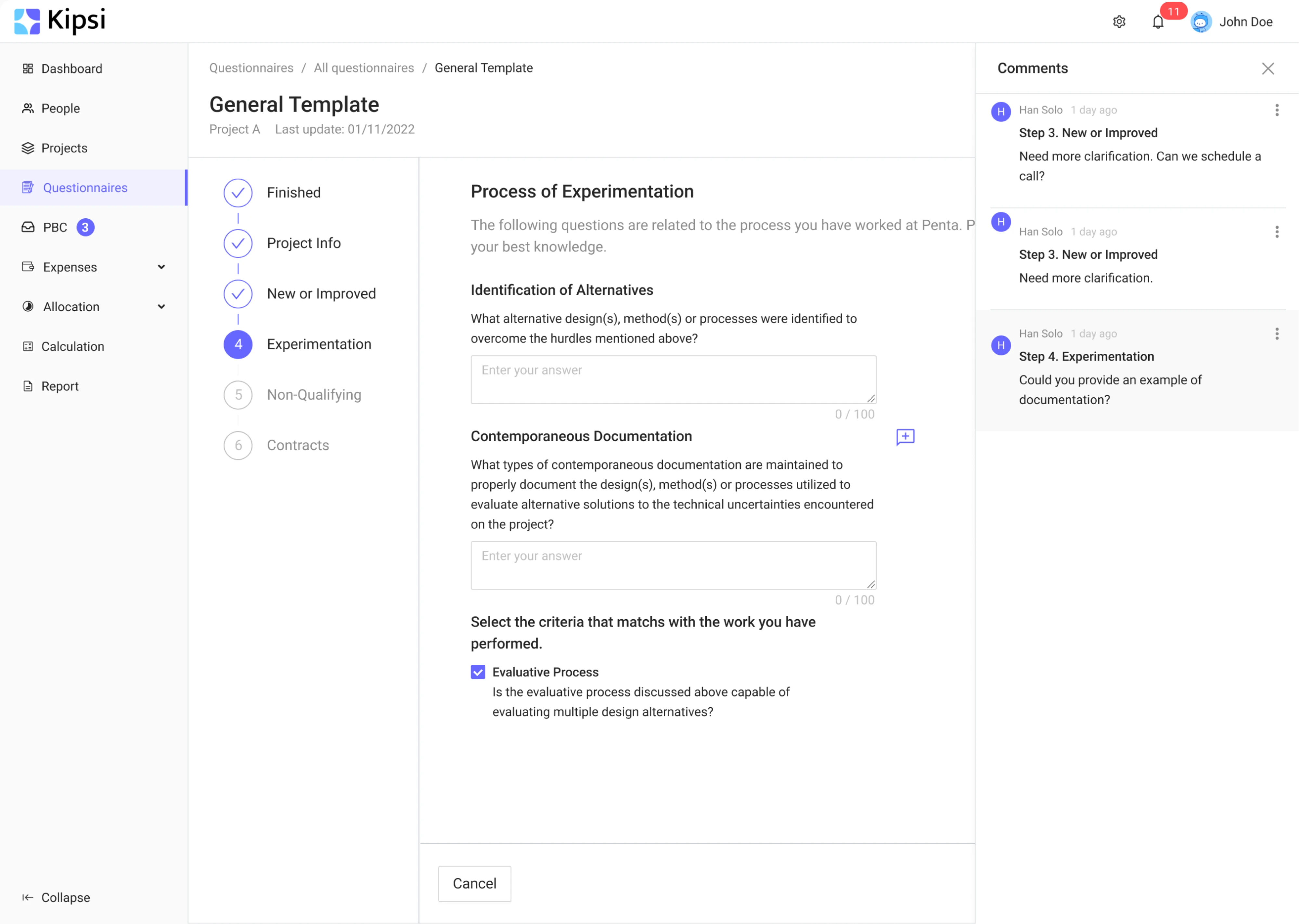
Kipsi restructured its questionnaire with headers and proper alignment, turning a dense block into something scannable.
Same questions, half the dread. Structure is free, and it changes how a form feels before anyone reads a single word. Sometimes all it takes is to increase padding and let the fields breathe.
Navigation and information architecture
If people can't find it, it doesn't matter how good it is. This is where usability problems quietly begin, and it's worth knowing the common navigation design patterns before you pick one. This is also where users find or fail to find the one feature they came for, so it deserves real attention. Which fixes matter most usually falls out of a structured UX research process: a little user research up front beats a lot of guessing.
Fix 5: Move filters into a visible sidebar
Filters hidden behind a button cost a click every time someone wants to adjust them. In a data-heavy tool, that's a tax people pay constantly.
Surface them. A persistent left sidebar shows every filter at once, so users see their options instead of digging for them.
LogitudeWorld moved all its filters into a visible left sidebar specifically to reduce the time it took to complete a task.
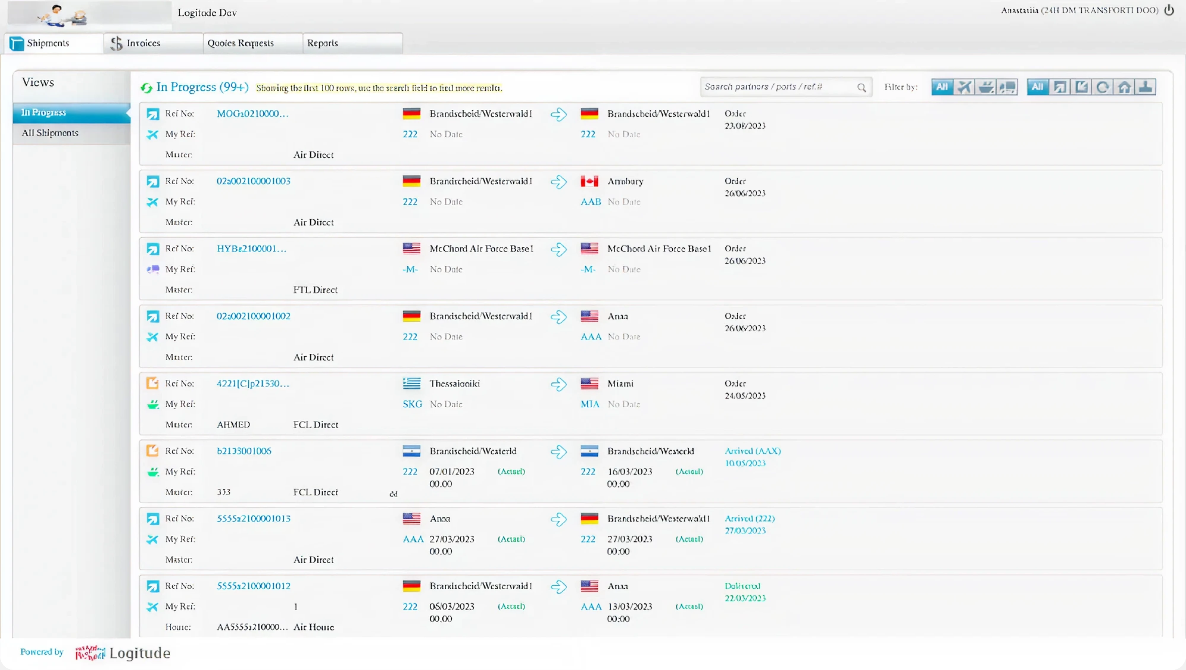
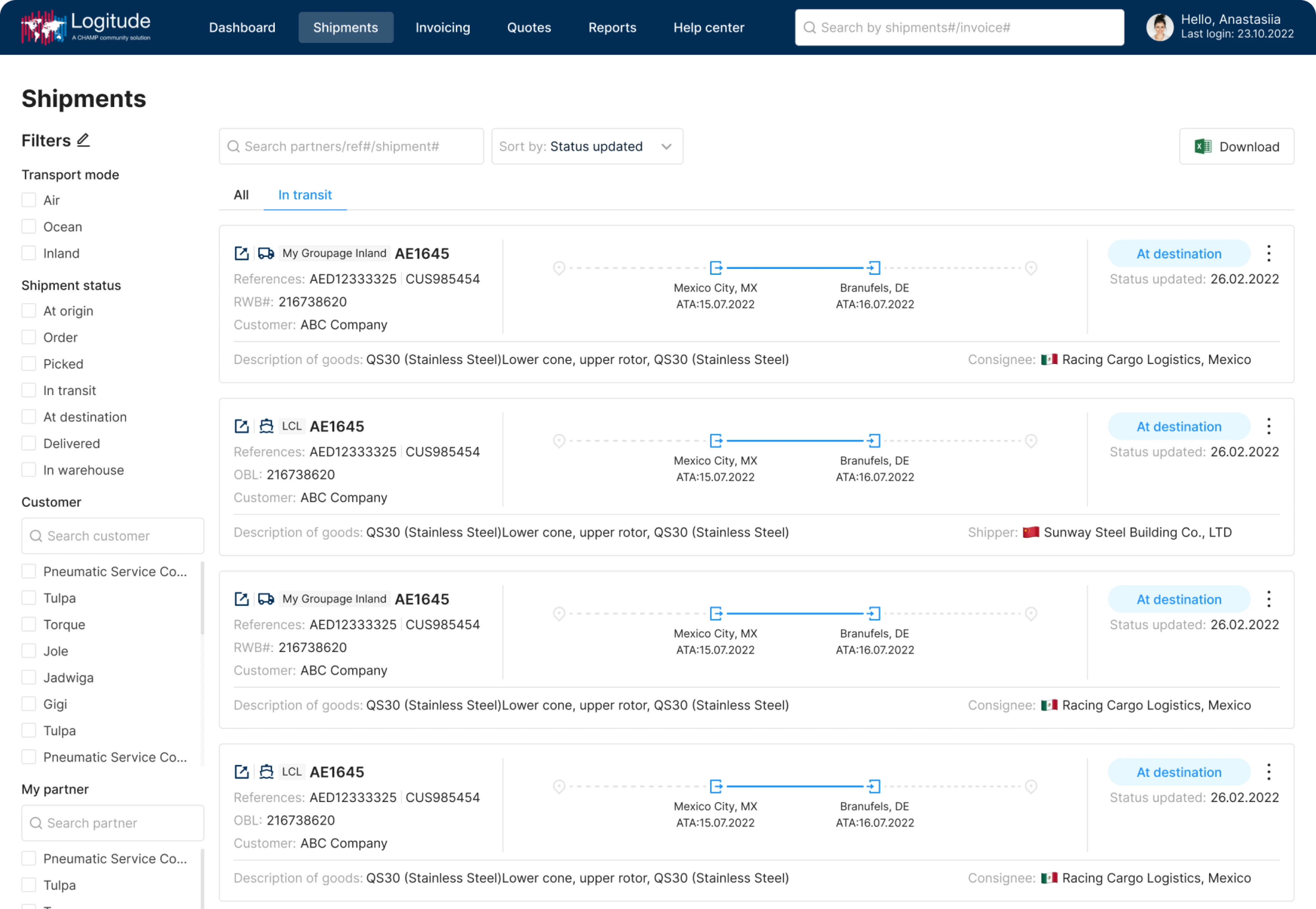
Show the active filters as removable chips above the results, too, so people always know what's being applied and can clear it in one click. Those chips are quiet visual feedback: they confirm the system's current state at a glance. Visible controls get used. Hidden ones get forgotten.
Fix 6: Swap a crowded top nav for a vertical sidebar
A horizontal top nav is fine until your product grows. Then the sections pile up, the labels shrink, and things start disappearing under "more."
A vertical sidebar scales. It has room to grow, and it keeps every section one glance away. It simply gives the navigation more space to expand as you add features.
My Video Spot introduced a vertical sidebar that houses all its key sections, giving the navigation somewhere to breathe as the product expands.
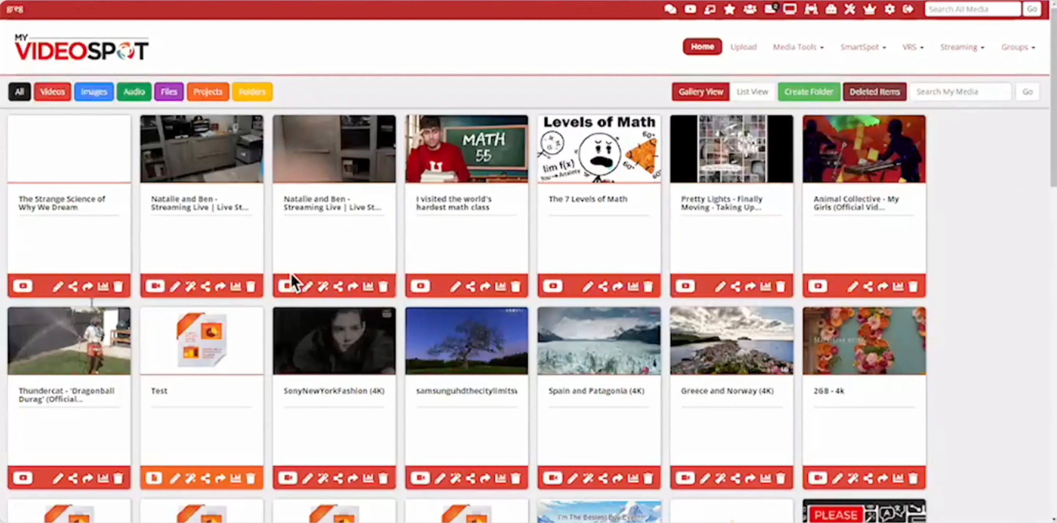
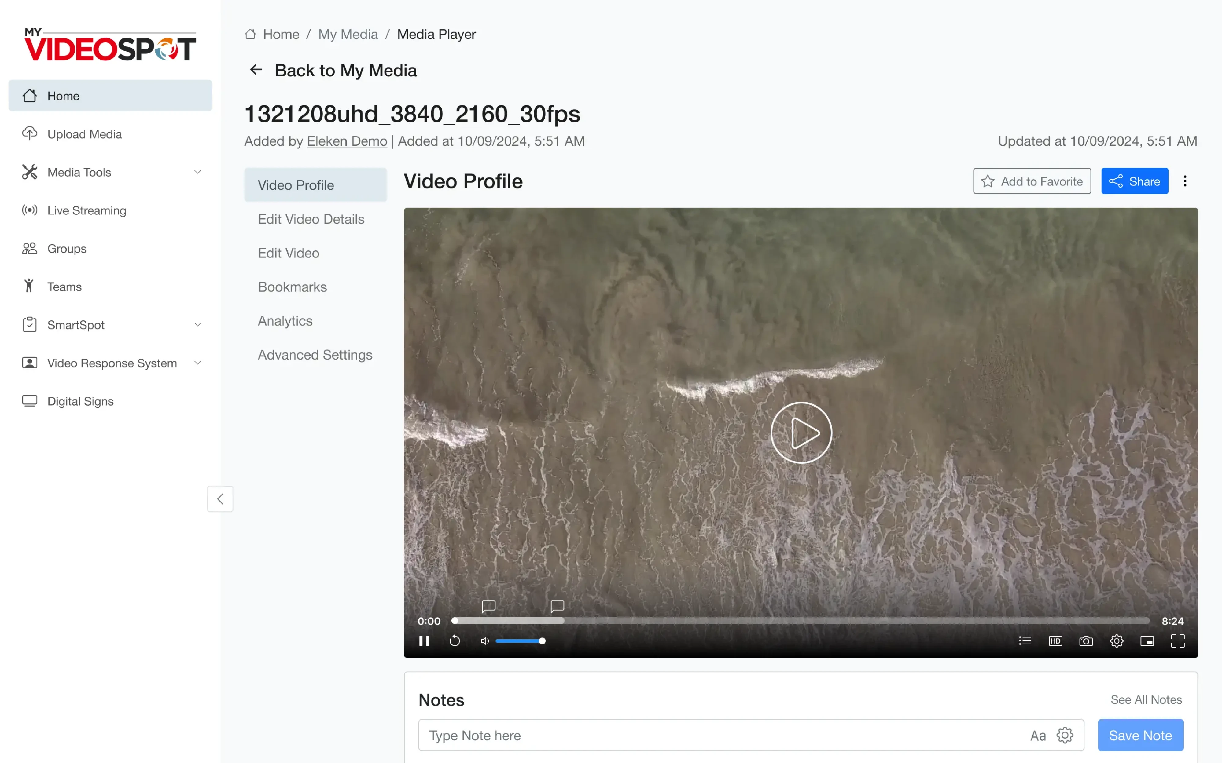
If your top nav is playing Tetris to fit everything, it's time to go vertical.
Fix 7: Put primary buttons where users expect them
People bring habits from every other app they use. When your buttons sit somewhere unexpected, users hunt, and hunting is friction you added for no reason. These placement habits are exactly the conventions a heuristic evaluation checks a product against.
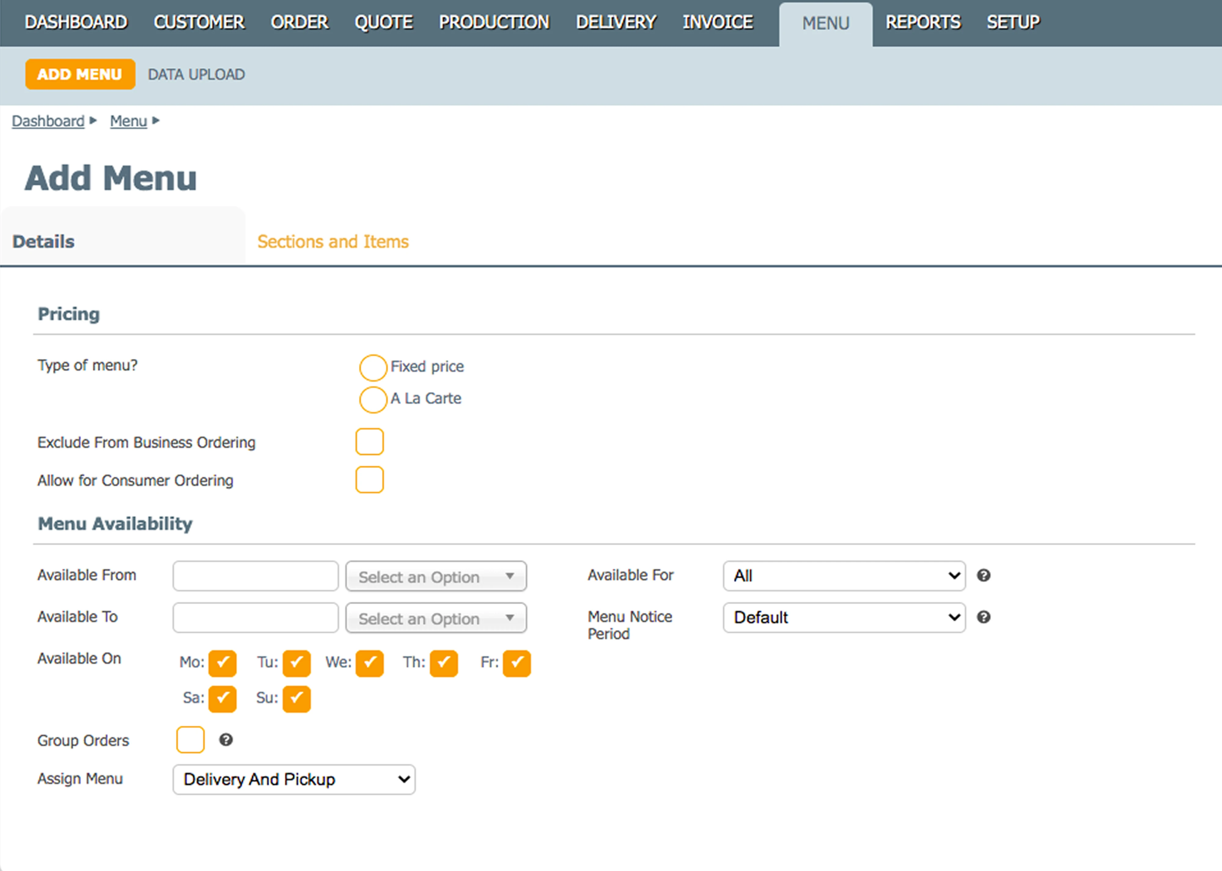
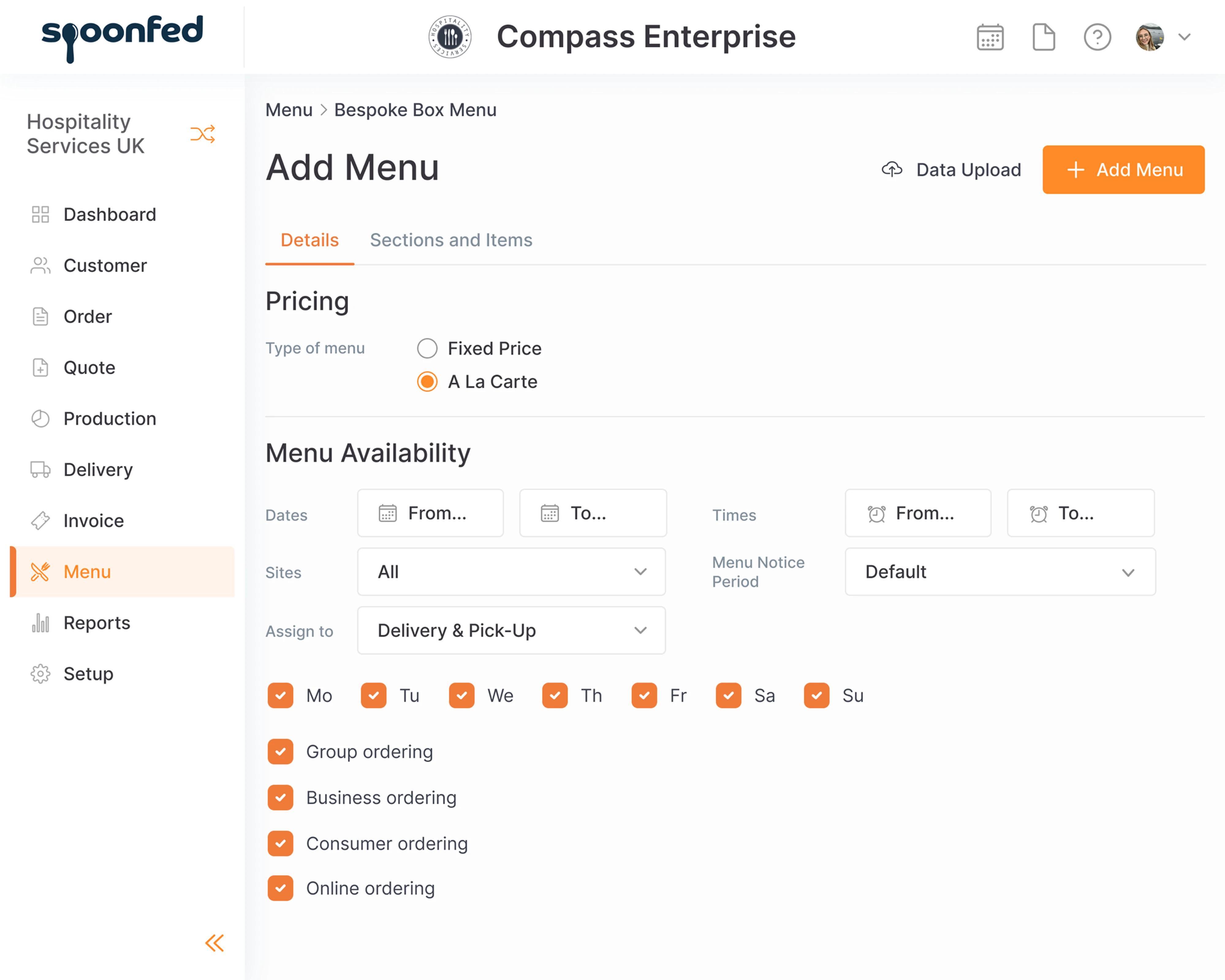
Follow convention. Put actions where modern apps put them, and add a global search so people can skip navigation entirely when they already know what they want.
Spoonfed moved "Add Menu" to the right and the menu itself to the left to match what users expected, and added a general search field on top.
Complex data and tables
Powerful products drown in their own data. The fixes here are about showing less, better, not showing everything at once. It's the same principle that separates a cluttered dashboard from a clear one, which we dig into in our guide to SaaS dashboard design. Trim the UI elements that aren't earning their place and the ones that matter finally stand out.
Fix 8: Delete the columns nobody acts on
Every column in a table is a small tax on attention. If users never sort by it, filter on it, or act on it, it's just noise between them and the data that matters.
Cut it. Be ruthless about what earns a spot in the default view.
Kipsi removed columns like client-type and tax-deadline from its main table, clearing out the fields that weren't pulling their weight.
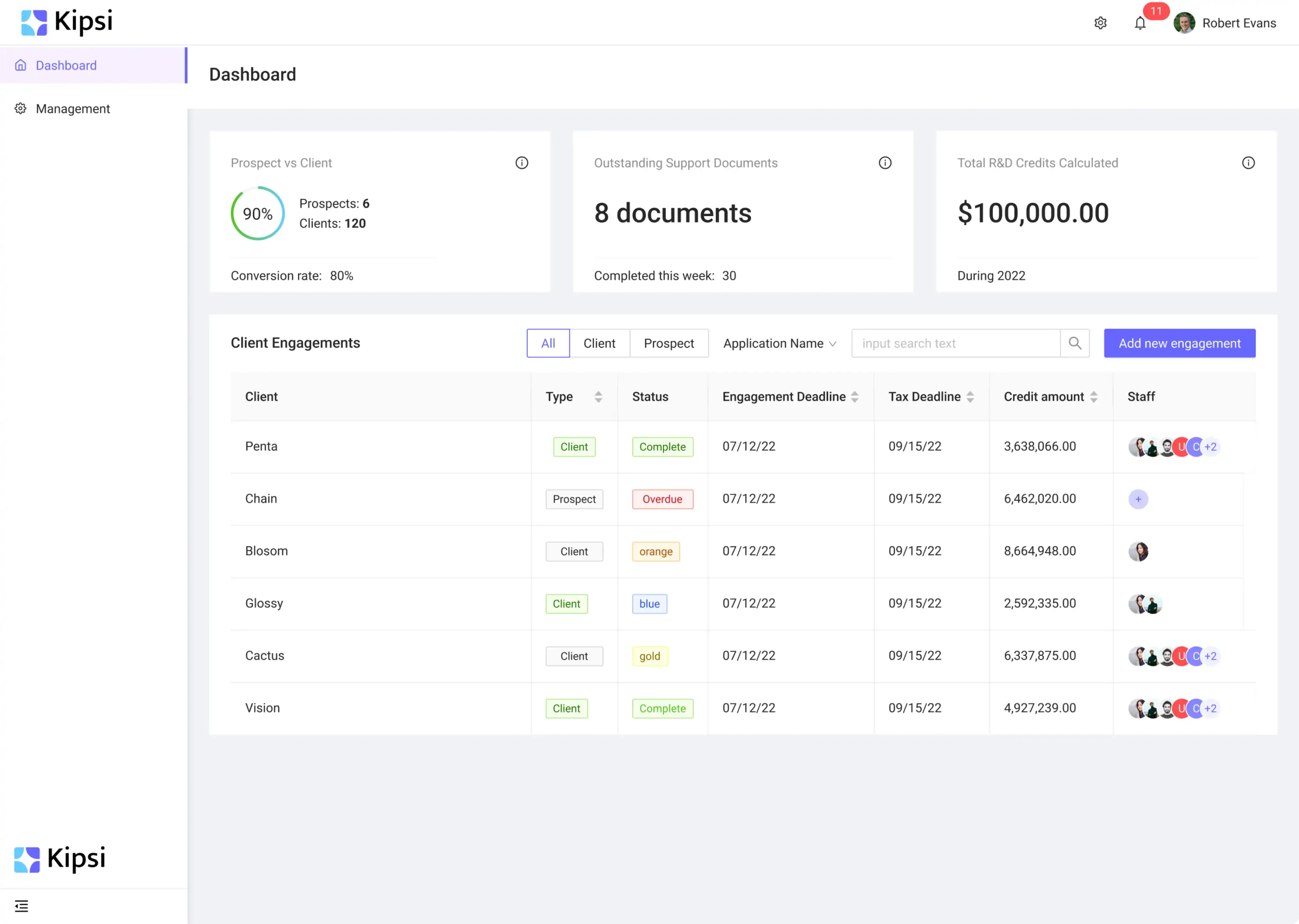
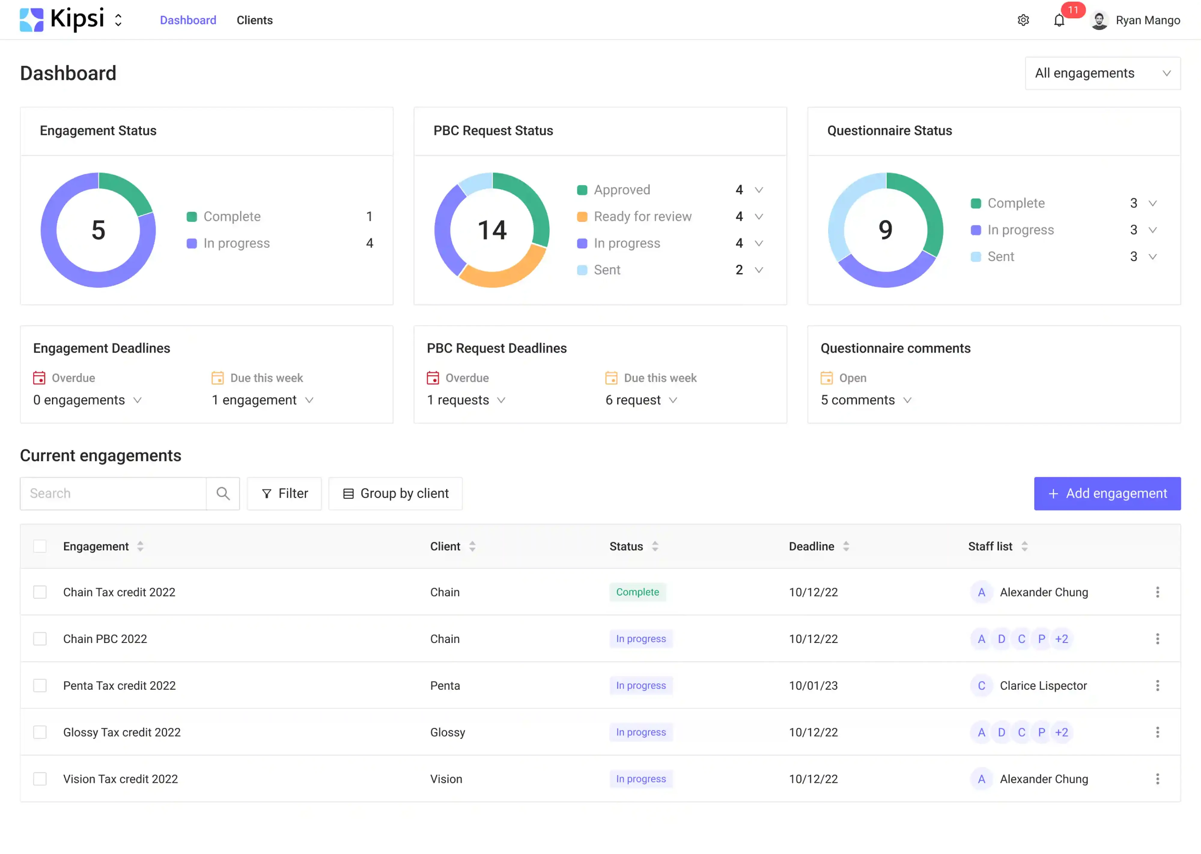
If a few users still need the extra fields, don't delete them outright; tuck them behind a "customize columns" toggle so the default stays clean and the power users can opt back in. A leaner table isn't less powerful. It's just easier to read. This kind of restraint is what good design quietly does for you.
Fix 9: Move detail into modals instead of new pages
Sending someone to a separate page for every detail breaks their flow. They lose context, and getting back is another click they didn't want to make.
Keep them where they are. Surface the detail in a modal layered over the current screen, so the context stays put behind it.
Invyzia Solutions converted full-page sections into modal windows, so users could dig into detail without ever leaving the screen they were working on.
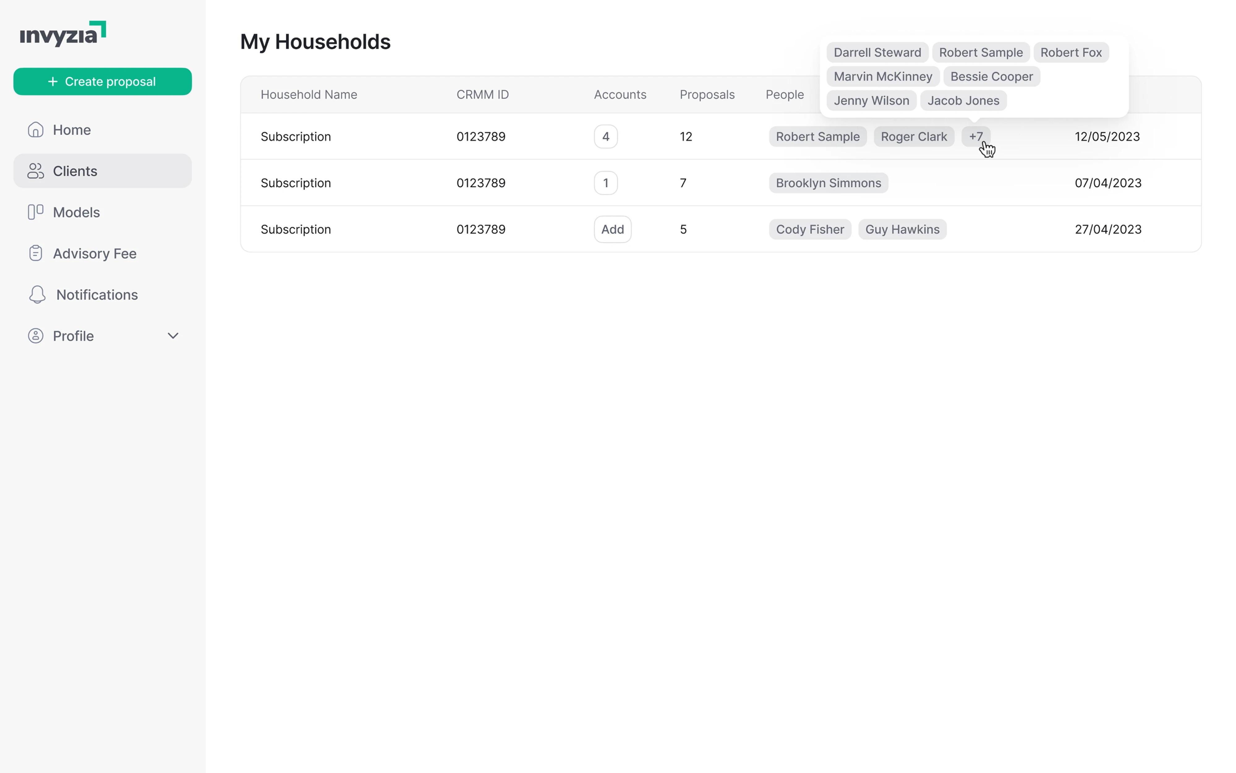
Modals earn their keep for a quick look or a small edit. If the detail is deep enough that people need to navigate around inside it, that's a sign it wants its own page after all. Context is expensive to rebuild; don't make people rebuild it for every glance.
Fix 10: Collapse a multi-step process into one page
Multi-step flows make sense when the steps genuinely depend on each other. When they don't, you've just added screens, and screens mean waiting and clicking.
If the pieces can coexist, put them on one page. Fewer transitions, no "next" button marathon.
Invyzia Solutions replaced a three-step proposal creation flow with a single page, collapsing the whole process into one view.
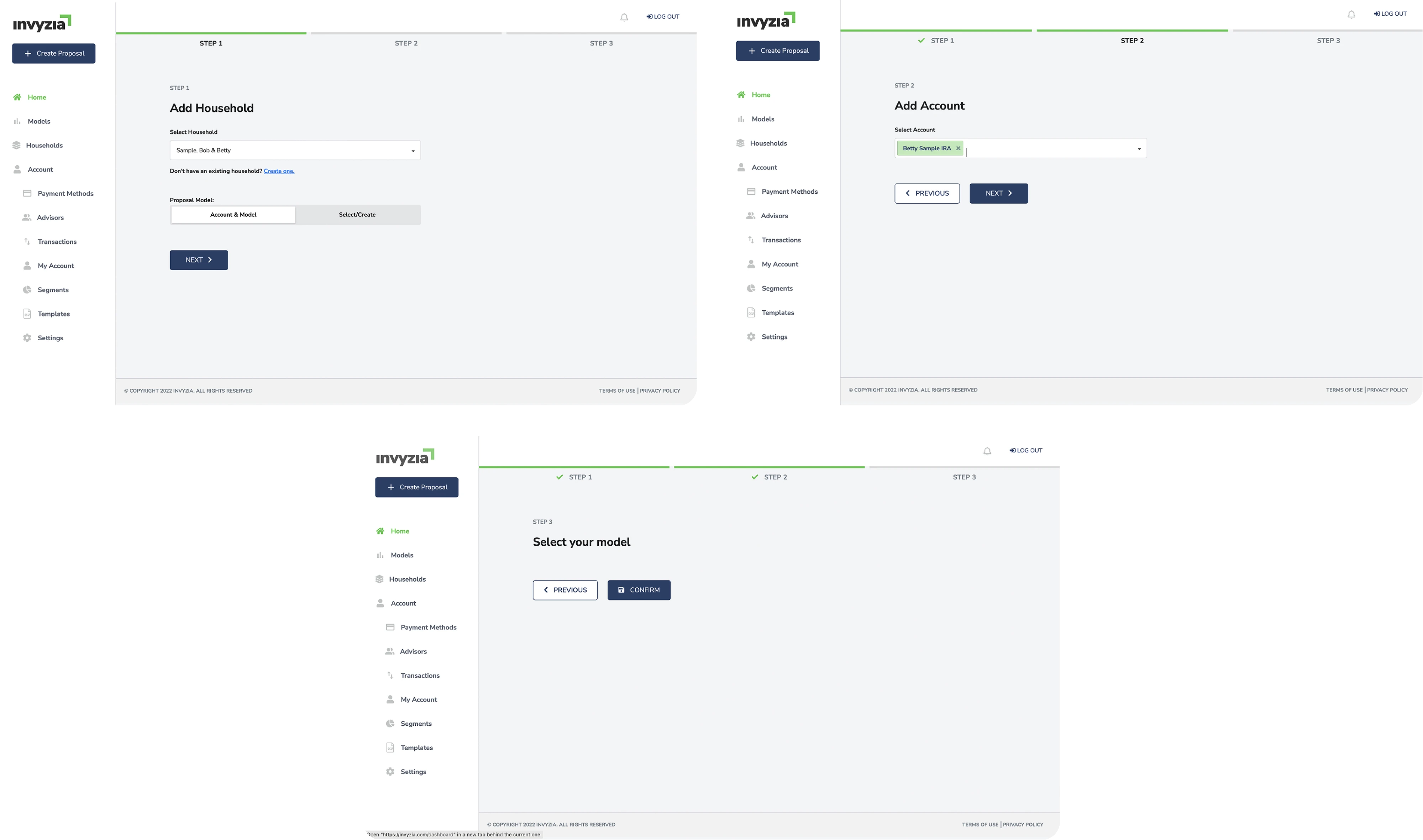
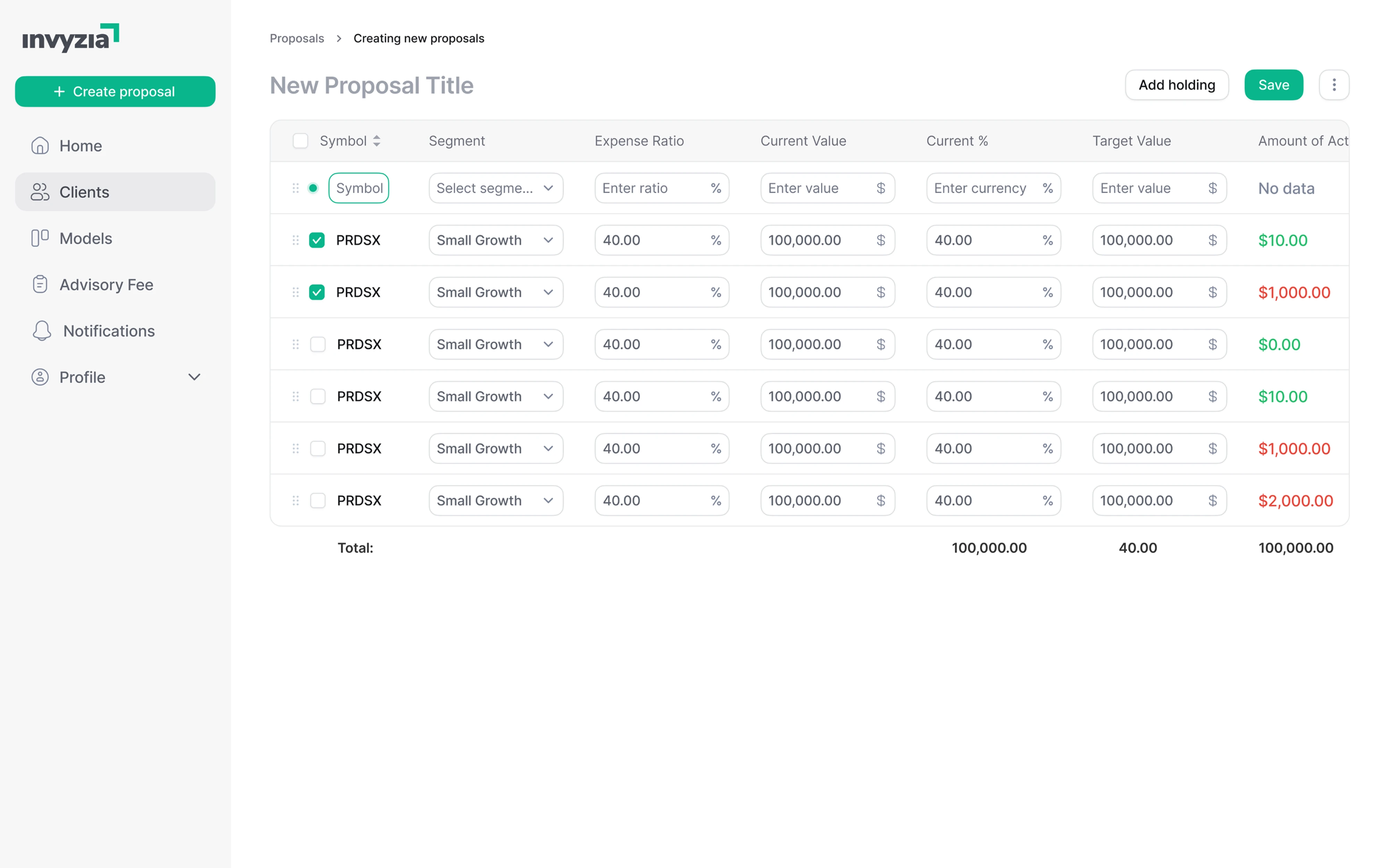
Not everything needs to be a wizard. Sometimes the whole thing fits on one screen.
Fix 11: Let users tell the tool what matters to them
In comparison-heavy tools, showing every option with equal weight leaves the user to do all the mental math. That's the interface's job, not theirs.
Let them set priorities. When someone tells the tool what to optimize for, it can highlight the right answer instead of a flat, undifferentiated list. Watching that user behavior, like what people sort and filter by, tells you which priorities to offer as presets.
Lambda added comparison priorities such as cost, transit time, or a balance of both, so the tool could surface what best fits each user's goal. A couple of presets is a smart way to match the result to each user's needs without a settings panel.
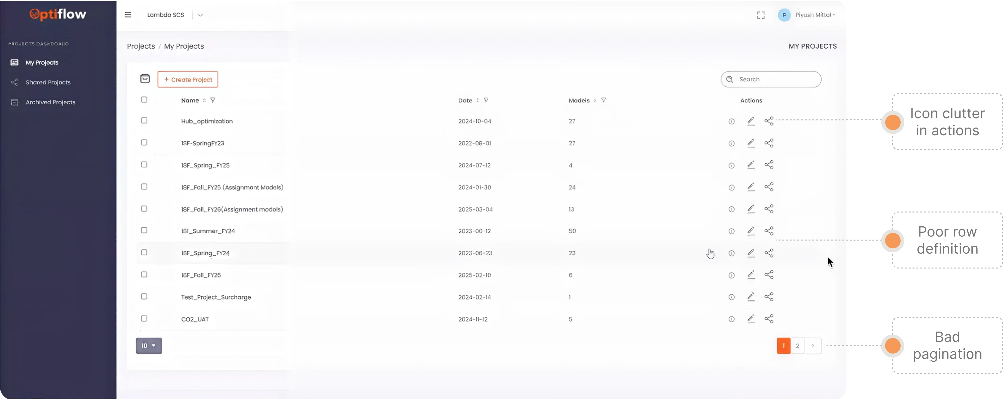
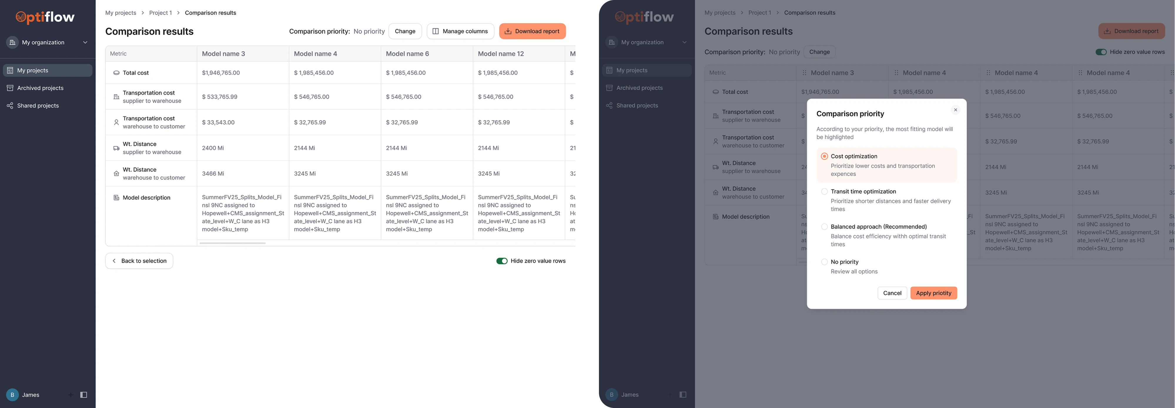
You don't need a complex settings panel for this. A couple of preset priorities cover most people, and they turn a flat comparison into a recommendation. The interface should do the ranking. The user should just say what they care about.
Fix 12: Split an overloaded page into tabs
When one page tries to do three jobs, it does none of them clearly. Users scroll past two-thirds of it every time just to reach the part they need.
Separate the jobs into named tabs. Each tab does one thing, and people go straight to it.
Siena broke a single overloaded page into three tabs, such as Customization, Satisfaction Score, and Installation, so each concern got its own clean space.
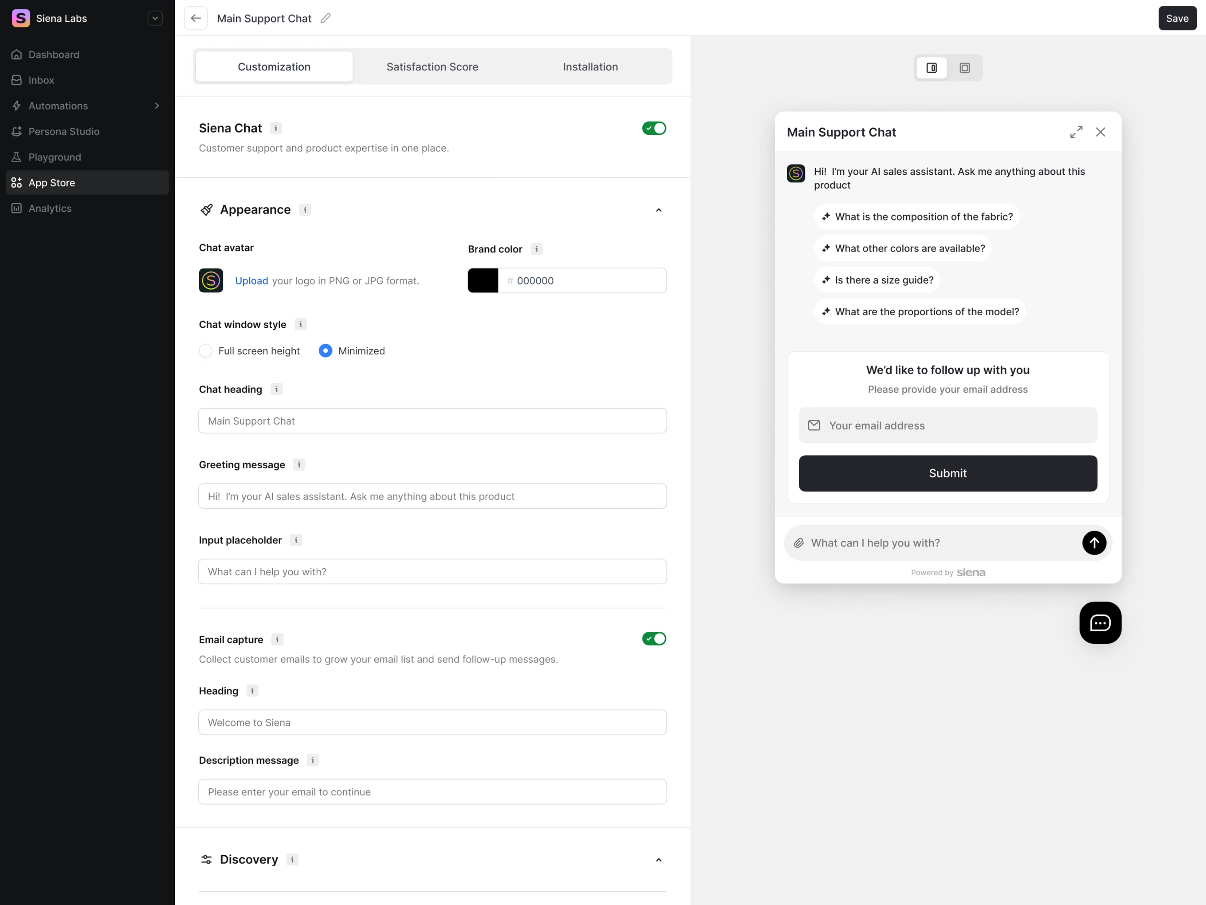
One thing to watch: tabs hide their contents until clicked, so don't bury anything time-sensitive in a tab people won't think to open. Used well, though, they turn one crowded room into three tidy ones. Tabs are underrated.
Feedback, progress, and waits
Feedback is where good UX stands or falls. Users will forgive a wait. What they won't forgive is not knowing whether the wait will ever end. The fix is almost always the same: provide visual feedback that answers the question the user is silently asking.
Fix 13: Replace the spinner with rotating status messages
A spinner that spins for thirty seconds looks exactly like an app that's frozen. The user has no way to tell the difference, so they assume the worst and leave. A long loading time with no signal reads as a crash, not a wait.
Talk to them. Rotate short status messages that explain what's happening, so the wait reads as intentional rather than broken.
Frontend AI does this during AI generation that runs anywhere from twenty seconds to two minutes. Every fifteen to twenty seconds, it swaps in a friendly update — "Designing your component…" — so the wait feels designed, not dead. That steady drip of visual feedback is what keeps users engaged through a slow task instead of bailing on it.
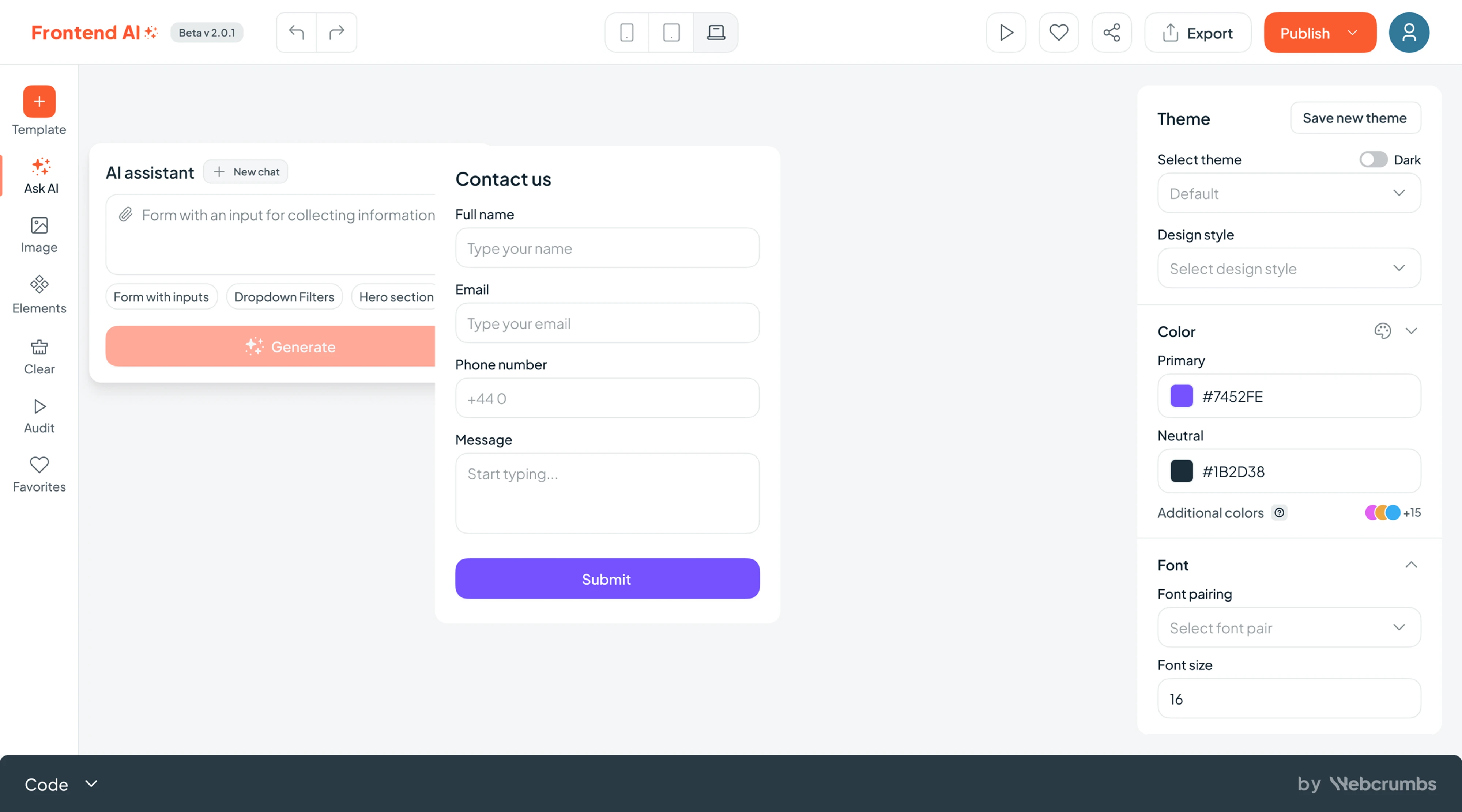
Write the messages to describe real stages of the work, not just filler. When the copy tracks what's actually happening, the wait reads as progress instead of a stall. Almost nobody bothers to design the wait, which is exactly why it stands out when you do.
Fix 14: Number the steps in a multi-step popup
A popup flow with no sense of length is a small, nagging anxiety. How many more of these are there? People bail when they can't tell.
Number the steps. "Step 2 of 4" is a tiny addition that tells users exactly how much is left; one of the small moves that make a stepper UI work. It's the kind of feedback that helps users understand where they are without having to guess.
GPI added step numbers to its onboarding pop-ups, giving new users a clear sense of progress through the flow.
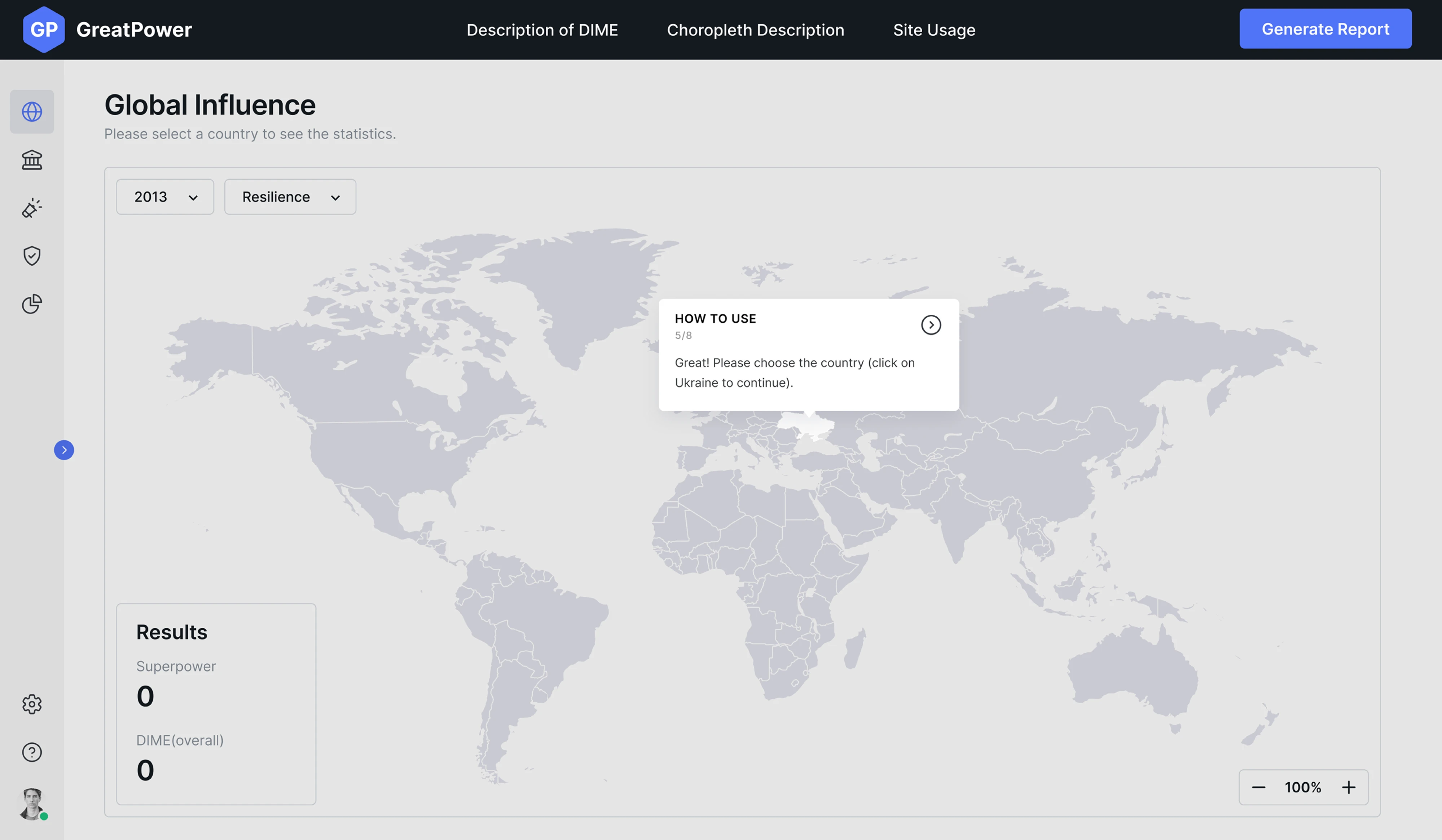
Progress people can see is progress people finish.
Fix 15: Show extra detail on hover
Every time you send someone to another screen for supporting detail, you pull them out of what they were doing. Often that detail can just come to them instead. Delivered in a timely manner, right when the eye lands, it never breaks the flow.
Put it on hover. Surface the context right where the user's attention already is.
Floret added on-hover deduction info, plus green and yellow labels, to its charts, so the supporting detail appeared in place instead of a click away.
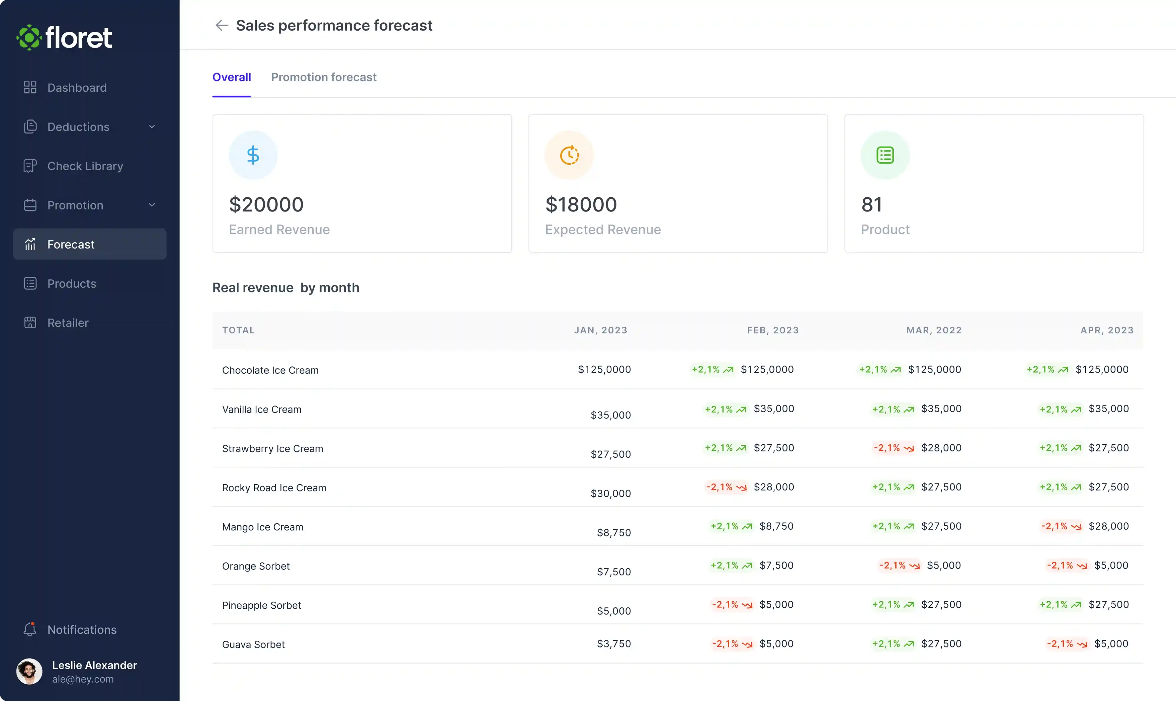
Just remember that hover doesn't exist on touchscreens, so anything essential needs a tap fallback too. Good mobile UX depends on that fallback, and on responsive design that reflows the same detail into a tap on smaller screens. Hover is for the nice-to-know, not the need-to-know. The best place for context is exactly where the user is already looking.
First action and onboarding
The opening moments decide whether a new user sticks. This is where a little friction does outsized damage, and where the right onboarding UX patterns pay off most. In most digital products, these are the key moments where you either earn a second session or lose it.
Fix 16: Auto-focus the first input field
Every flow has a first action, and too often it's a wasted click just to put the cursor where it obviously needs to go.
Drop the cursor there for them. Auto-focus the first field so users can start typing the instant the screen loads.
Bering Lab highlighted and auto-focused its main input to remove that first bit of friction. For context, the product's bounce rate had climbed to 89% before this and a batch of related fixes, proof that the opening moment matters far more than it looks. Cutting that bounce rate is also one of the fastest ways to get more users past the front door.
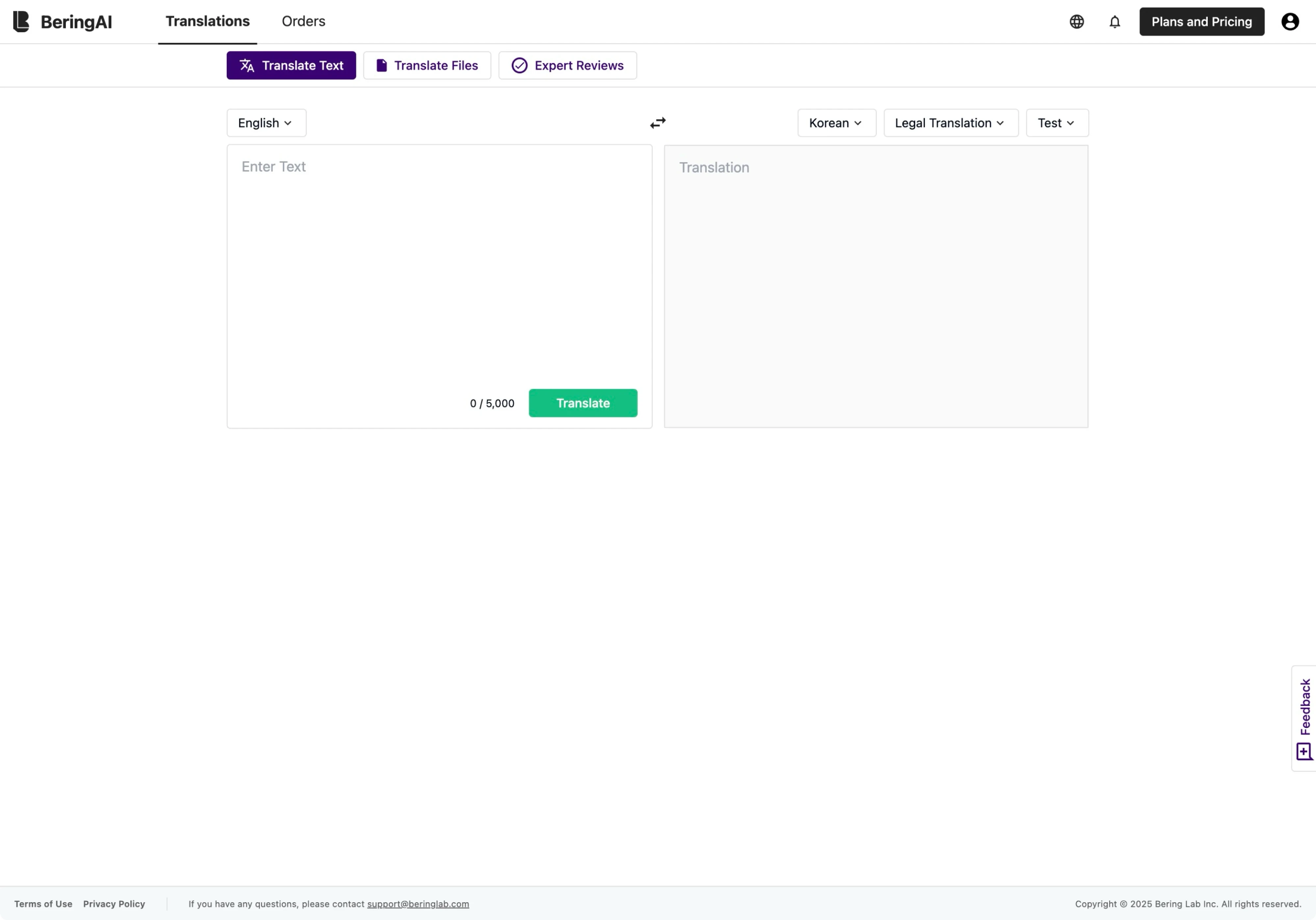
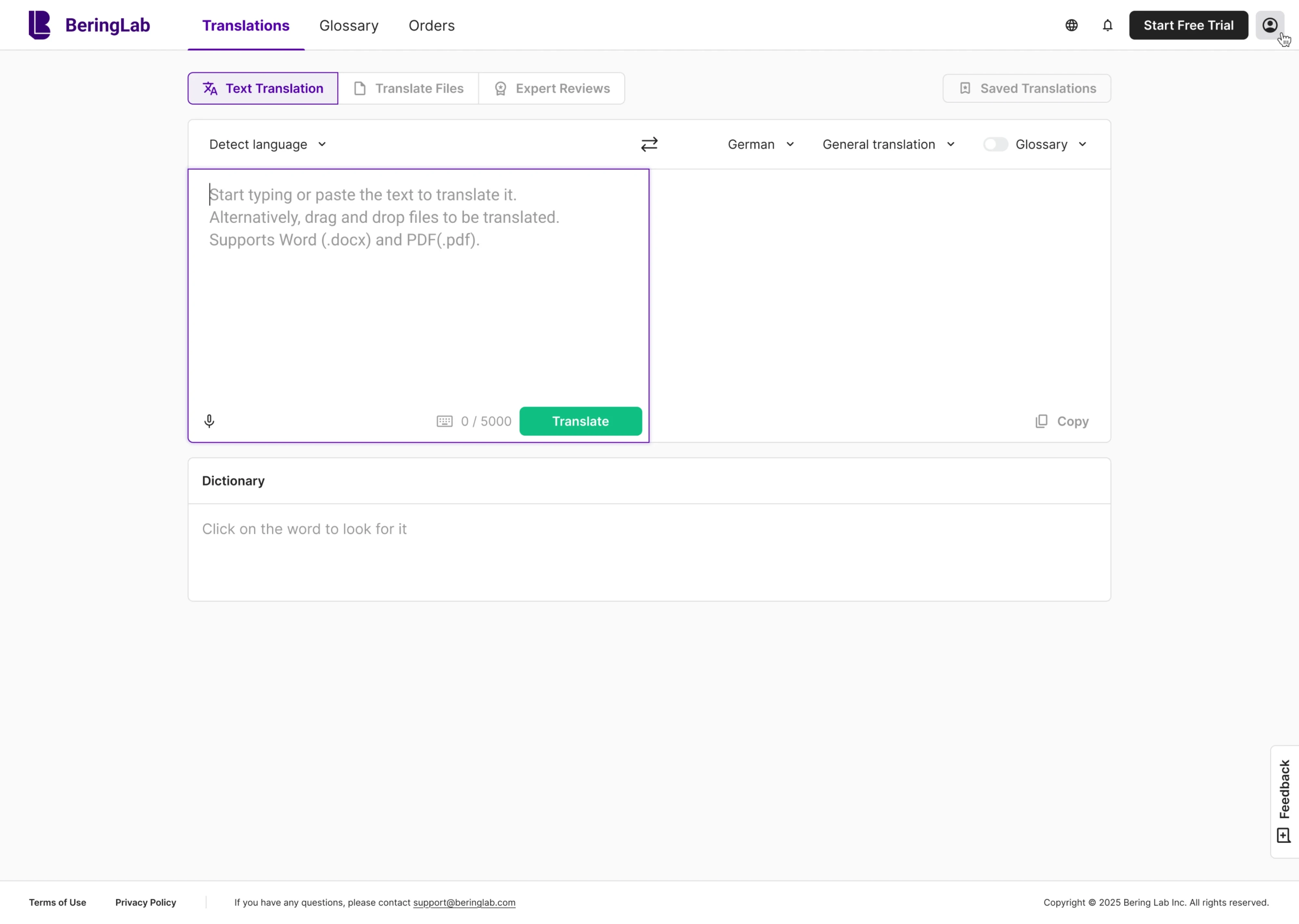
One nuance: be careful with auto-focus on mobile, where it can pop up the keyboard and shove your layout around. It's a small but real mobile UX trap. On the web it's almost always a free win. Remove the first click; it's the one standing between the user and their first small victory.
Visual clarity for better user experience
You've done the structural work. This last one is about making sure the eye lands where you want it. This is where visual design stops being decoration and starts doing a job: building a clear visual hierarchy so attention flows in the order you intend.
Fix 17: Make a control look like what it does
A control that doesn't signal how it works forces users to stop and study the user interface instead of getting on with their task. Every second spent wondering "wait, can I pick more than one here?" is a second closer to giving up.
Match the appearance to the behavior. Use checkboxes for multi-select instead of styling people have to decode. Make the whole field clickable, not just the tiny label. And make selected states read as "chosen," not "correct." This is the sort of thing a round of usability testing catches in minutes; you simply watch where people hesitate.
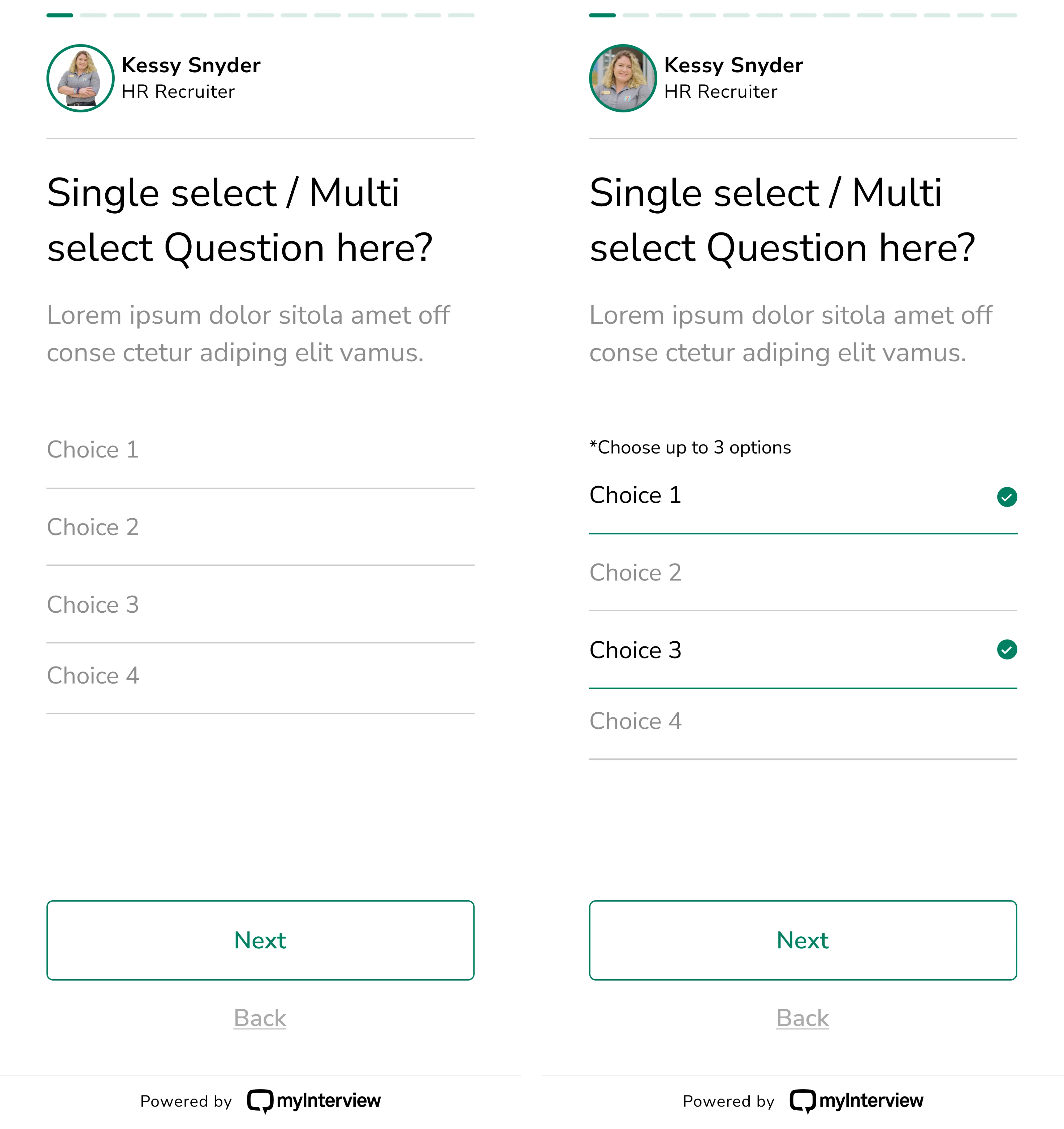
MyInterview learned this the hard way. One of its questions was a multi-select, but it was styled with underlined fields and green check marks, so it read like a graded quiz, not a set of choices, and there was no hint you could click at all until you tried. More than 90% of candidates were dropping out mid-interview. That's a brutal churn rate for a single confusing screen, and a textbook example of the UX design mistakes that quietly cost products users.
Eleken rebuilt those inputs with clear checkboxes, full-width click areas, and honest selected states, turning a screen people had to puzzle over into one they could just use. These are the UX insights that only show up once you put the real interface in front of real users.
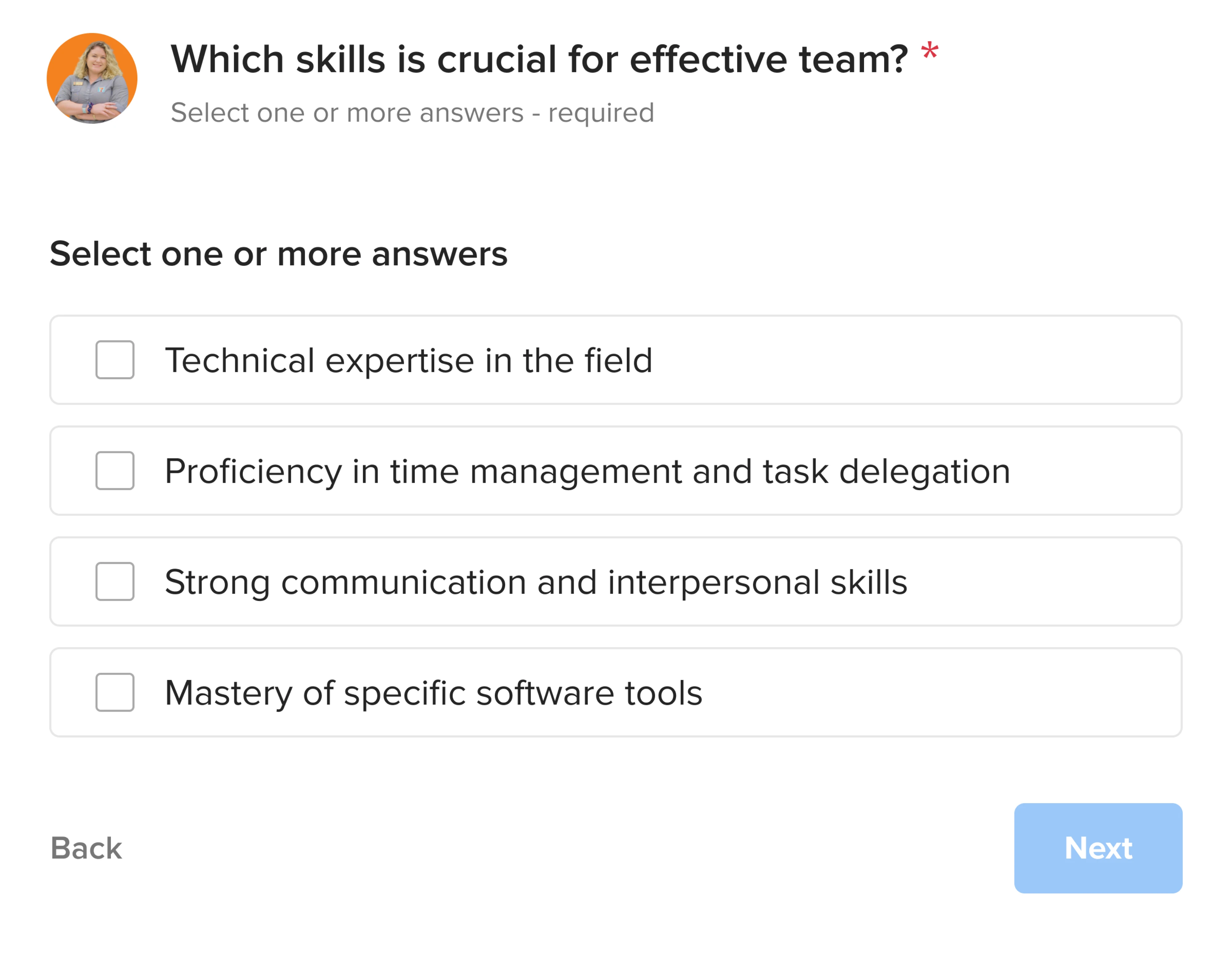
If people have to learn your interface before they can use it, the interface is the problem.
Fix 18: Commit to one accent color
When every element is colored, color stops meaning anything. The eye has nowhere to land, because everything is shouting for attention at the same volume.
Pick one accent. Use it to point at the things that matter, like the primary action and an important state, and let everything else stay calm and neutral. A single accent is also one of the highest-leverage visual design moves you have: used consistently, that one color starts to read as you, which quietly builds brand recognition.
My Video Spot cut its palette down to a single core shade and used it to guide users toward actions.
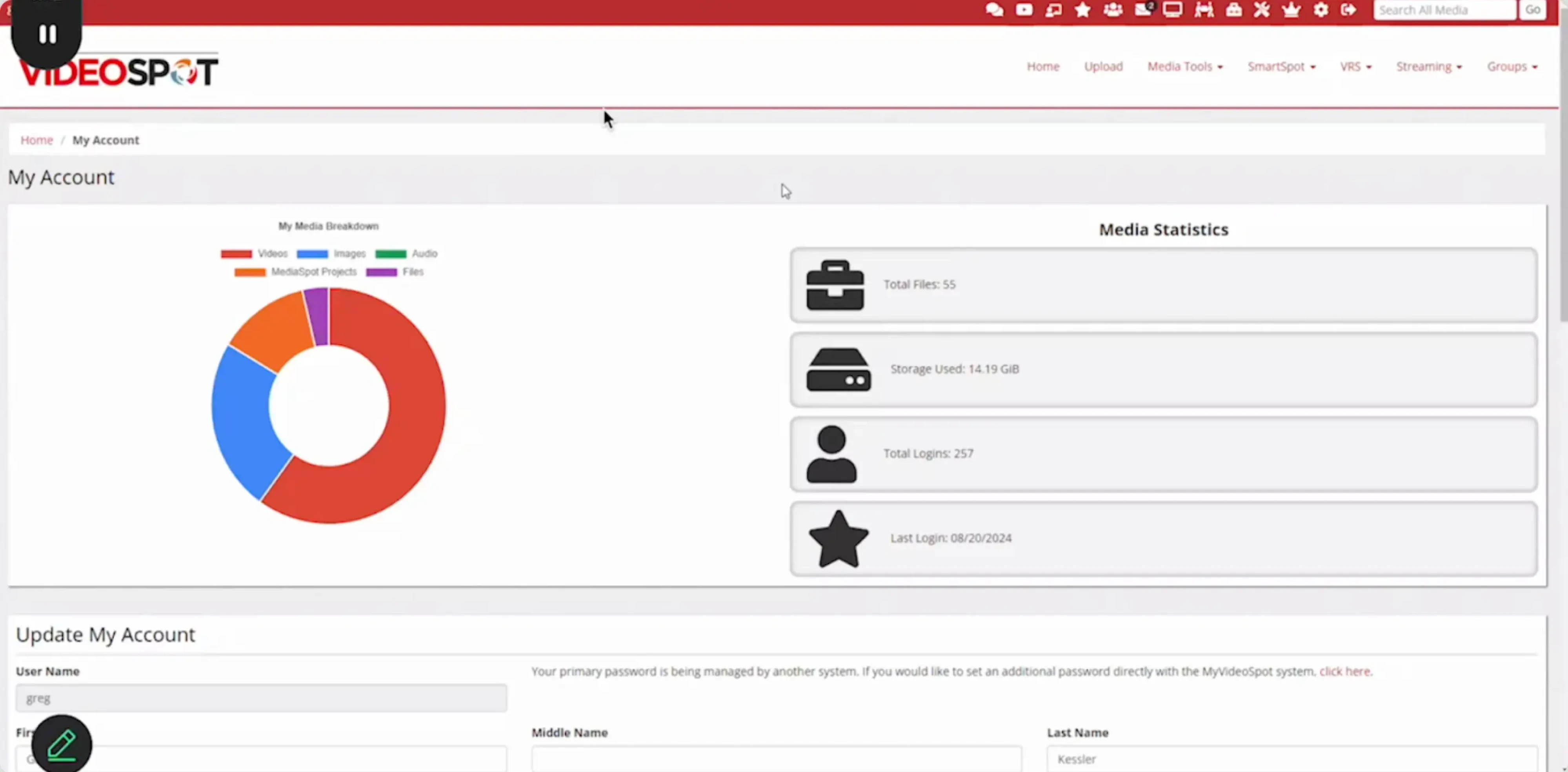
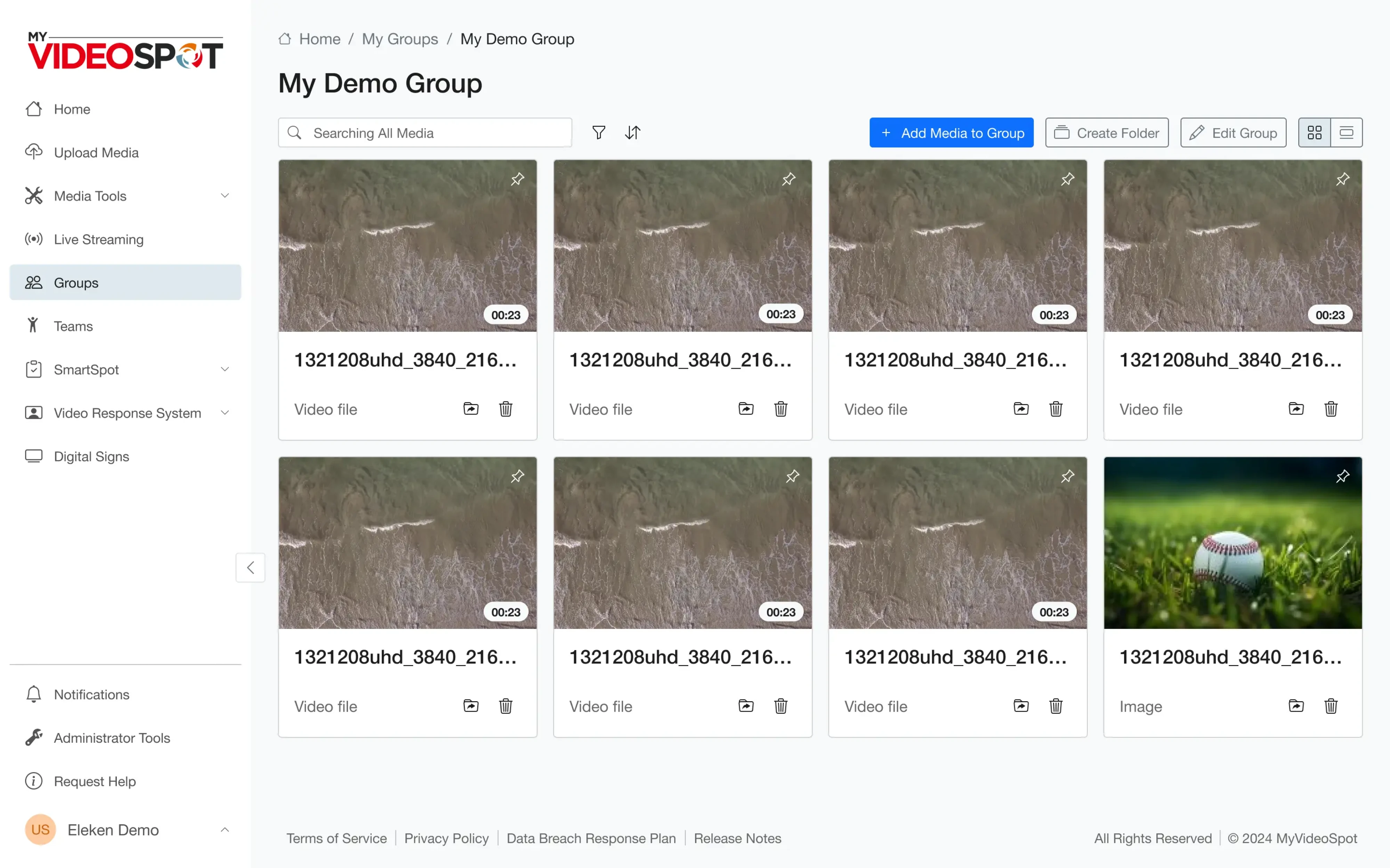
Reserve that accent for interactive things such as buttons, links, active states, and let text and containers stay neutral grey. That restraint is what gives a screen a real visual hierarchy instead of a wall of equal shouting. The moment you use the accent for decoration too, it stops signaling "click here." Color is a spotlight. Point it at one thing, or it lights up nothing.
How to decide what to fix first
Eighteen ideas, one team, limited time. The goal is to find the few changes that will make the biggest difference. Founders, great UX designers, and product managers all tend to have a favorite fix; a shared framework keeps the argument honest and keyed to the target audience's real tasks.
Start by ranking improvements based on three factors: impact, effort, and visibility. That's exactly how a good UX audit process works: it identifies where users experience the most friction, estimates the effort to fix it, and prioritizes the changes that will deliver the biggest return. A structured UX design process keeps that ranking tied to evidence rather than opinion, and in regulated spaces the stakes are higher still; see how a UX audit for fintech handles them.
High-impact, low-effort fixes should always come first. They deliver measurable results quickly, build confidence, and create momentum for larger improvements. Copy changes, better defaults, clearer labels, and smarter empty states often fall into this category.
Next, tackle structural improvements like simplifying navigation, reducing the number of steps in a workflow, or reorganizing complex pages. These usually have the biggest impact on usability, but they also require more design and development time. Plan them once you've captured the quick wins.
Finally, layer in polish. Better loading states, smoother interactions, or thoughtful visual feedback won't fix a broken experience on their own, but they make a good product feel noticeably better. Add them whenever you're already working on that part of the interface.
Most importantly, measure every change.
Collect a baseline before you ship, then compare the results afterward. Look at task completion rates, conversion, activation, drop-offs, page errors, support tickets, or whatever metric the improvement is meant to influence. A tool like Google Analytics covers the "what," while the right usability metrics tell you whether that number is good. Pair the numbers with usability tests or user interviews so you understand not only what changed, but why, and so you can watch real user behavior, not just the totals. Collecting feedback from real users is where the "why" comes from: moderated web usability testing shows you the reasoning behind every metric. (If you're unsure which method you need, here's user testing vs usability testing.)
If you look back at the 18 examples in this article, you'll notice a pattern. None required rebuilding an entire product. They solved one specific problem at a time: one confusing flow, one unnecessary field, one missing piece of feedback, one hidden action.
That's how great products improve. Not through occasional redesigns, but through a continuous stream of focused, measurable UX improvements that compound over time. That's UX optimization in practice. Fix the right pain points in the right order and a better user experience stops being a project and becomes a habit.
If you're wondering which changes would have the biggest impact on your product, that's exactly what a UX audit is designed to uncover. At Eleken, we identify the friction points that are costing you users, prioritize them by impact, and show you where to start. If you'd like to see how that works in practice, our 3-day trial is a simple, low-risk place to begin.