When it comes to refining SaaS products only sky's the limit. Even the most successful companies need a redesign to stay competitive and meet their client’s needs.
As a design agency, we at Eleken have discussed in our blog that any UI/UX design services should take into account both business goals and customers’ needs and should be based on thorough research. The redesign is not an exception.
But we know that very often it is difficult to understand how to make the first step towards revamping your product. Learning from others can be helpful in this case. For that reason, in this article, we are going to discuss some of the best SaaS app redesigns that can motivate you to get started right.
And before seeing what popular SaaS companies can teach us, we want to share our experience as a SaaS product redesign agency with you.
Griddle
Griddle (now Clientjoy) is a client experience platform that helps small businesses manage their customers.
When Gridle came to Eleken they were already seven years on the market and of course, both the look and the feel of the app needed dramatic refreshment. Our task was to make a redesign so that this cloud software would provide a better user experience and clearly communicate its value proposition.
As we always do, we started the UI/UX redesign process with the research. We analyzed which product features users use often, and which they tend to omit to understand what improvements the user interface needs. As well, we conducted six user interviews to clearly understand what Griddle’s audience expects from the app.
The research helped us to come up with the following insights:
- The app needs an intuitive user onboarding
- Users want to see an improved workflow that would allow them to manage their clients easier and faster
- Users want the product to solve their issues in just a few clicks
- We should minimize the use of design elements that don’t serve any practical purpose
Clear user onboarding
We chose a minimalistic design with a lot of white space and short easy-to-understand statements to design an interactive product tour that shows the user how the app operates and promotes them to make the first step.

As well, to help new users feel completely comfortable using the app we added a short product tour to the Dashboard.

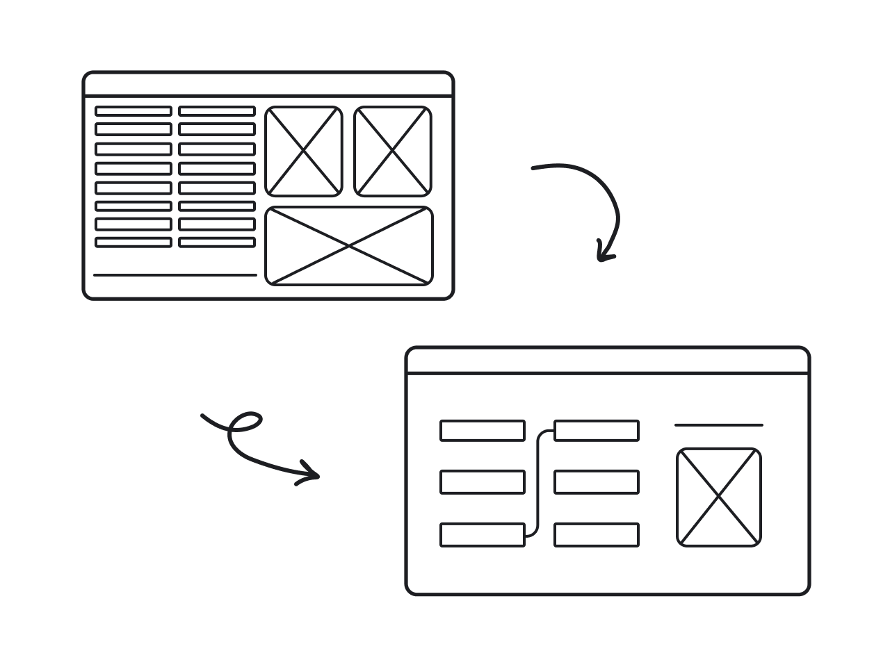
Simplifying the workflow
- Proposals. To simplify the process of creating proposals we designed several proposal templates. The user can choose the one they like, quickly edit and send it.

- Invoices. To create and send invoices in just a few clicks we created customizable invoice templates.

What lessons can we learn from this story?
- To come up with effective design solutions you should base each of your decisions on the insights you’ve found in the research.
- Teaching users how to quickly and efficiently reach their goals is especially important for complex SaaS products; that’s why you should strive to create an intuitive and unobtrusive user onboarding.
Slack

In March 2020 Slack introduced its biggest redesign yet. The story of revamping this cloud business messenger is not about launching new cool functionality, or completely changing the UI of the application, it’s about bringing the order to the app and making the experience of interacting with the application smoother and more approachable.
Make it easier for newbies
Slack was working on its redesign when the pandemic burst out. Many people were sent to work remotely and Slack acquired a lot of new users that hadn’t used this app previously. Such circumstances made the team reassess everything they’d already done once again to make an extra focus on the ease of use and increased productivity.
Though Slack is known for its powerful user onboarding, they noticed that when a new person starts using the messenger, they feel a bit disoriented (users are unaware of many features and don’t use the software to its fullest). The solution was to make the app more organized, and the first step was to optimize navigation.
Here are the most essential changes Slack launched with this redesign:
- Top navigation bar
Slack decided to put some essential functions up in the navigation bar:

The redesigned interface of the navigation bar now contains a big search field that helps you to easily browse through the organization, a “history” button, and arrows to go back and forth in your recent activity. In general, this updated navigation bar resembles a familiar for everyone design of a web browser. This way newbies intuitively know what functions this bar performs.
- Sidebar
Now you can put your messages/channels/apps in order and group them in accordance to different projects, teams, etc. The ability to build sections and put priorities makes interaction with the app easier and more effective.

- Compose new letter
At the top of the sidebar, you can find compose letter button. With the help of the “New letter” button, the user can start writing a message with no need to specify where and whom to send it first. In case you want to continue writing the letter later, it will be saved in draft.
The field of composing a new letter looks like an ordinary email that we all got used to. Such a design makes newcomers feel more comfortable using Slack.

Easier access to tools
One more reason why people love Slack so much is the fact that it integrates with different useful tools that make the work process easier (e.g. Google Drive, Freshdesk, etc.) The problem was that very often users didn’t know how to access those tools from this cloud messenger.
The design team added a small icon of the lightning right in the field where you are supposed to write a message. Now all these features are more understandable and approachable.

Click the lightning icon to see the list of actions you can take with the applications you’ve installed in Slack.
What lesson can we learn from this story?
- Getting inspired and adopting some popular design elements from other apps/services is not something you should be ashamed of. The vice president of design in Slack, Ethan Eismann, said about the redesign process: “One important principle that started to emerge was not reinventing the wheel”.
- Navigation is an essential part of the design. With its help, users find what they need and reach their goals. That’s why when improving your SaaS make sure your navigation is intuitive and not cumbersome.
Uber
The first thing we want to mention about Uber’s UX and UI redesign case study is that though it is a popular and successful app, it also had its ups and downs when refining the UI/UX.
Redesign 2016
In 2016 Uber had a rebranding campaign aimed at repositioning itself from simple ride-sharing software to a more solid technology organization.
For this purpose they presented:
- An animated video that communicated their new mission. It features bits and atoms that stand for technology and people
- The new logo that replaced the letter “u” with the symbol that resembles the backward letter “c”

This campaign failed as people found the message in the video too complicated and the new logo difficult to find on their mobile screens when they were in a hurry. Moreover, there were many memes on the Internet that the new logo has been likened to…well... “a butthole based on bathroom tiles".
Still, not everything was so bad. Besides working with brand identity, Uber improved the feel of the app which brought positive results.
“Where to?” button
Previously, Uber app was super simple, you could have your ride with only one tap (no need to choose a destination or opt for different products). Over time the interface had to somehow accommodate more than eight options in one place plus the schedule function. Naturally, it caused much confusion.
To find the right solution, the design team conducted solid UX research which included lots of user interviews and prototype iterations. Again and again, they iterated prototypes until the right answer was found.
The solution was to start from the end: firstly the user chooses the destination and only then they can decide how to get there, while you are picking how to get from point A to point B the app searches for the most suitable pick-up location.

As well, user research allowed designers to identify the problem with pick-up points.
- Drivers don’t set their exact location but expect the app to choose it by default
- The location that users set is usually not the pickup location but just the address of a building
- Selecting the optimal location of pick-up involves clarifying through the phone call, walking the extra distance to the car, and so forth.
After the redesign, Uber’s app:
- Selects the optimal pick-up point based on the user’s personal data
- Provides customers with the fastest walking route to the spot
- Gives the customer complete control of this process if needed

Redesign 2018
In 2018 to completely win back customers’ trust Uber’s team started with studying their audience.
Logo
Conducting customer research helped them to come up with the following key points:
- Add more contrast with black and white colors
- Use the word instead of a symbol in the logo
- Bring back the letter “u”
All these insights contributed to creating the following result:
It’s bold, clear, and easy to notice, so people like it.
What lesson can we learn from this story?
- First of all, you shouldn’t neglect the principle of simplicity when it comes to designing (or redesigning) SaaS products (though the product is complicated, the design must be simple).
- Secondly, always research the target audience and test your ideas until you find the right solution.
G Suite

In 2015 Google announced the redesign of their Google apps as G Suite to keep consistency within each of its tools and overall brand.
As the company grew, they regularly added new services such as Google Drive, Hangouts, Sheets, and so on. Over time, Google’s team noticed that all their applications look completely different.
Of course, each application serves its purpose, but the problem was that as a user moved from one Google app to another, they had to get accustomed to the different user interface over and over again. And the goal of the redesign was to make all services feel like they are a single service with a connected experience and a consistent look.
During the UI redesign process, Google’s design team cleaned up the interface of each service and added design elements that extend from one application to another making them all one whole.

To explain the reason for the redesign, Google introduced a detailed case study of their redesign to stay transparent with their audience.
What lesson can we learn from this story?
- Take care of consistency. Over time your brand will grow and evolve, new tools, features, or even products may appear. That’s why it’s important to have a design system that will allow you to keep the interface clean and intuitive and your brand message clear and understandable for each of your customers.
- Explain your design decisions. Talking with your clients about the results of a redesign will show them the “why” behind each change.
There’s always room for improving your SaaS
Based on lessons we’ve learned from each of the above examples we can formulate the following design principles for SaaS applications:
- Strive for simplicity
- Base each step of your product redesign on the research
- Improve information architecture
- Don’t try to reinvent the wheel
- Keep consistency as your brand evolves
- Always test your design decisions before launching them
In case you need some help with rethinking your SaaS application, you can find some useful information in another blog post on how to redesign an app or contact Eleken’s team to have all your questions answered.