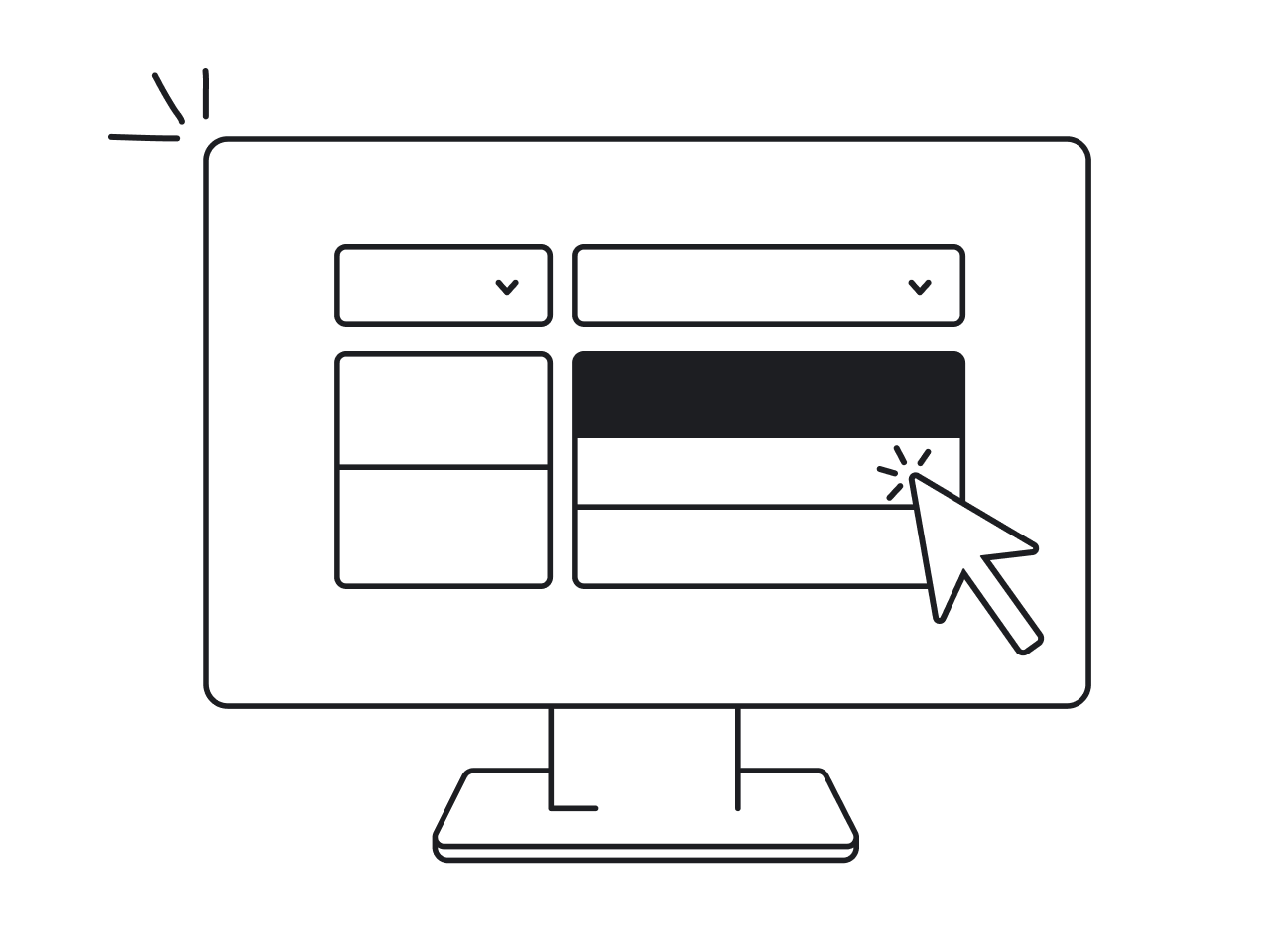
.png)


One of the fastest ways to make your users bounce? Confuse them about what happens next.
That’s why stepper UI matters and why we at Eleken care. As a design agency focused on SaaS, we understand very well how good stepper flows can drive conversions… and how bad ones can wreck onboarding.
So, let’s dig into real-life stepper UI design examples to help you design flows your users will actually want to complete.
What is a stepper in UI design?
A stepper UI breaks a process into bite-sized steps. Instead of throwing a 10-field form at you all at once, it says: “Hey, let’s do this one step at a time.”
You’ve seen them in sign-up flows, product setup, checkout carts, and anywhere UX teams want to make complex things feel doable. They’re especially common in SaaS where user onboarding can cause user drop-off.
Good steppers do two things really well:
- They show you where you are.
- They show you what’s coming.
And giving users that sense of control? That’s how you get them to stick around.
Next, let’s move to steppers UI examples for inspiration. Each example is a real product interface that nails (or at least tries to nail) the stepper UX. For easier analysis, we’ve split them into five categories:
- Horizontal steppers
- Vertical steppers
- Steppers with progress bars
- Mobile steppers
- Wizard steppers
Let’s start!
Horizontal stepper UI examples
Steppers laid out from left to right, guiding users through tasks in a clear, linear path. Ideal for multi-step processes with a predictable order, such as checkout flows or setup wizards.
1. Gotechiez’s custom test creation

Gotechiez is a recruitment platform that lets hiring teams build and assign coding or knowledge-based assessments. As well, they are one of Eleken's clients who requested to bring their idea to life. Their original test setup was a bulky, intimidating form that caused confusion, especially among first-time users.
To solve this, we introduced a structured 4-step stepper UX that breaks down test creation into clear stages, making the process easier, faster, and more error-proof for recruiters.
Why this stepper works well
- Horizontal wizard stepper: All steps (Type, Details, Question, Review) are visible and easy to follow.
- Clean layout with live preview: Helps users understand how their test will appear to candidates.
- Modular structure: Each screen focuses on one task (e.g., language, tags, code editor).
- Built-in guidance: Inline tooltips and help text reduce guesswork.
Anything to improve?
Nothing critical here
Need a hand with multi-step UX? Our SaaS designers are here to help. Learn more
2. TextMagic’s chat widget creation flow

One more design created by our team at Eleken for a customer experience platform. This stepper guides users through setting up a custom live chat widget in three steps: customization, targeting, and code embedding.
Why this stepper works well
- Horizontal wizard format: Clearly shows the 3-step process, keeping users oriented.
- Visual hierarchy: The current step (“Customization”) is prominently highlighted.
- Live preview: Real-time widget simulation reinforces confidence in settings before moving forward.
- Intuitive UI design: Grouped settings, color pickers, and dropdowns make complex setup feel easy.
Anything to improve?
Nothing critical here
3. Contra’s service creation stepper

This stepper guides freelancers through setting up a service offering, covering everything from project overview to pricing and visuals.
Why this stepper works well
- Top-aligned progress tracker: A horizontal progress bar with step names and checkmarks gives users full visibility into where they are and what’s next.
- Linear but flexible: Users can go back and forth easily with clearly placed “Back” and “Next” buttons, plus a “Save & exit” option for pausing.
- Step-specific content blocks: Each step only shows what’s relevant, like pricing fields here, keeping the UI focused and tidy.
- Calm visual tone: Neutral colors and soft spacing help reduce form fatigue, especially for a task that can take several minutes.
Anything to improve?
- The “Make available for Quick Hire?” toggle UX could use a clearer explanation on how it affects visibility or bookings.
4. Tripadvisor’s booking flow

This stepper guides users through entering contact details, activity info, and payment to complete a tour booking.
Why this stepper works well
- Numbered progress bar: Clearly shows three steps with labels.
- Highlights current and past steps: Step 1 is filled, Step 2 is bold, Step 3 is grayed out.
Linear and clear: Users know exactly where they are and what’s next.
Anything to improve?
Nothing critical here.
5. Tailscale’s upgrade plan flow

This stepper guides users through comparing plans, entering billing details, and adding payment info.
Why this stepper works well
- Numbered top bar: Each step is labeled and clearly structured in a 3-step flow.
- Active step is highlighted: Step 2 (“Billing details”) uses a bold style and blue underline.
- Calm layout: Lots of white space keeps attention on the step.
Anything to improve?
- No confirmation of step completion: Users don’t get feedback on which steps are “done.” Adding subtle indicators (like checkmarks) would increase confidence.
- Back link isn’t part of the stepper: The “Back to billing” link is detached and placed above the title, rather than integrated into the stepper, this may affect discoverability.
- Accessibility could be improved: The use of color alone to show the active step (blue underline) may not be sufficient for colorblind users.
6. Unity’s free trial signup flow

This stepper guides users through ordering Unity Pro seats with a trial offer, followed by info, payment, and confirmation.
Why this stepper works well
- Numbered top bar: Clear layout shows all four steps and current location.
- Visual clarity: Step 1 is bold and filled, next steps are outlined with icons.
- Easy scan of process: Users see what’s ahead without surprises.
Anything to improve?
- No step skipping: Steps aren’t clickable, so jumping back/forth isn’t possible.
7. Postman’s purchase flow

This stepper guides users through selecting a subscription plan, resources, billing, and payment.
Why this stepper works well
- Horizontal stepper with labels: All four stages are clearly visible at the top.
- Highlights current step: Uses a color dot and bold label to mark progress.
- Easy scanning: Helps users understand what’s ahead before committing.
Anything to improve?
- Steps are not clickable: Users can’t jump between steps easily.
8. Urban Outfitters’ checkout flow

This stepper guides users through the final stages of checkout: shipping, delivery, and payment.
Why this stepper works well
- Clear linear structure: Horizontal stepper with distinct stages helps users know exactly where they are.
- Bold current-step marker: The filled circle with label (“Delivery”) is unmissable.
Easy overview: Users can quickly scan what’s done, what’s next.
Anything to improve?
- Steps aren’t clickable: You can’t jump back unless you spot the small “Change” link.
Vertical stepper UI
Steppers arranged top to bottom, often paired with sidebar navigation. Great for onboarding flows or checklist-style tasks where users benefit from seeing all steps at once.
9. Process Place’s onboarding checklist

Designed by Eleken for a workflow management app Process place, this stepper guides new users through onboarding via a playful, task-based checklist designed to teach HR teams how to kick off new hires effectively.
Why this stepper works well
- Vertical checklist format: Steps are shown in a classic to-do layout, which taps into users’ desire to complete tasks.
- Clear visual progress: Checkmarks and step numbers give a strong sense of advancement.
- Fun and engaging UI: The final step uses humor (clapping sheep image) to create a memorable moment.
Anything to improve?
- No skip/reset option inside the checklist view: Helpful for users who want to restart or revisit steps.
10. Uniswap’s create-a-position stepper
.png)
This horizontal stepper breaks down the process of setting up a new liquidity position into clear, linear steps: selecting a token pair, setting a price range, and entering deposit amounts.
Why this stepper works well
- Sidebar step indicator: A persistent side panel shows all steps and highlights the current one, reducing ambiguity and keeping users oriented.
- Inline step context: Each screen focuses tightly on one action (e.g., defining a price range), allowing for detailed input without overwhelming the user.
- Sequential navigation: Users can’t jump ahead, which ensures steps are completed in logical order — important in financial flows.
- Elegant layout for complex input fields: Even with advanced features like charts and ranges, the step layout keeps things digestible.
Anything to improve?
- Nothing critical here
Progress stepper UI
Focuses on visualizing user progress, often with bars, dots, or labeled indicators. These steppers keep users motivated and informed without overwhelming them with full step content.
11. MyInterview’s candidate interview flow
.png)
This stepper was designed by Eleken for a video interviewing software. It walks job candidates through a series of questions, inputs, and preferences in a structured, responsive flow.
Over 90% of candidates were dropping off during the interview process due to poor UX. So, we created a step-by-step interface, which eventually improved task completion and significantly reduced drop-offs.
Why this stepper works well
- Thin top progress bar: Visually simple but communicates steady progress.
- One question per screen: Keeps focus high and interaction lightweight.
- Consistent navigation: "Back" and "Next" placement reinforces control and predictability.
Anything to improve?
- No visible step labels: Users don’t know how many steps are left or what’s coming next.
12. Whatnot’s multi-step product adding flow
.png)
This stepper guides sellers through the process of adding a single product to their live show catalog. It includes uploading photos, setting a title and price, and choosing between auction or buy-it-now formats.
Why this stepper works well
- Clear visual progress: The linear progress bar at the bottom, paired with the step counter, keeps users oriented.
- Minimal cognitive load per step: Each screen asks for just one type of input or decision, avoiding overwhelm.
- Conversational, helpful microcopy: The tone feels friendly and supportive rather than robotic.
- Visually engaging: The iconography adds warmth and reinforces each message without clutter.
Anything to improve?
Nothing critical here. But a small detail:
- The visual styling of tabs UX is very subtle. Users with poor contrast sensitivity or on bright screens might miss the distinction.
- It maybe not that intuitive to understand how to go one step back.
13. Monarch’s financial goals creation stepper
.png)
This design is quite similar in UI to the previous one, but for web experience. The flow lets users define and prioritize their financial goals.
Why this stepper works well
- Full-width, screen-by-screen flow: Each step occupies the entire screen, minimizing distractions and helping users stay focused on a single action.
- Sticky header for progress: A persistent header displays the current step title, anchoring users and reducing uncertainty.
- Bottom-anchored navigation: “Back” and “Next” buttons are fixed at the bottom – easy to reach, especially on mobile.
- Paced, linear experience: The flow feels natural and calm, matching the emotional tone of financial planning.
Anything to improve?
- The step count or total number of steps isn’t visible, which could make users wonder how much is left.
14. Blinkist’s onboarding stepper UI
.png)
Blinkist uses a clean, lightweight stepper design to guide users through onboarding—this screen shows step 2 of 4, where users select interest categories.
Why this stepper works well
- Visible progress indicator: A horizontal progress bar paired with a “STEP X OF Y” label clearly sets expectations.
- Focused interaction: The screen only asks users to select interests, avoiding distractions.
- Good use of whitespace: Plenty of breathing room makes each choice feel approachable and avoids clutter.
- Consistent visual style: Buttons, typography, and icons all feel unified, with a friendly and modern tone.
- Responsive feedback: Selected categories are visually distinguished.
Anything to improve?
- Progress bar readability: The thin progress bar could be slightly thicker or more contrasted to be clearer, especially on bright screens.
15. Airbnb’s host listing creation flow
.png)
This stepper helps new hosts define the basic specs of their property (guests, rooms, beds) as the first stage in the listing creation process.
Why this stepper works well
- Clean layout, no clutter: Spacious design with generous white space makes every control feel approachable.
- Visible, simple stepper bar: The progress indicator reassures users they’re not diving into a black hole of form fields.
- Clear undo functionality. “Back” and “Next” buttons are visible and intuitive.
Anything to improve?
- The visual progress bar is minimal, it could benefit from step labels or numbers to hint at how many steps are left.
16. Brilliant’s onboarding stepper
.png)
This stepper is part of Brilliant’s user onboarding. Using the Wizard UX pattern helps personalize the experience by learning the user's learning goals.
Why this stepper works well
- Clean, minimal progress bar: The thin top bar gives a sense of forward motion without overwhelming.
- Focused layout: Only one question per screen, keeping attention sharp.
Anything to improve?
- No step count or labels: Users don’t know how many steps remain.
- Subtle back arrow: The return control in the top-left may be overlooked.
Mobile steppers
Optimized for small screens, these steppers prioritize simplicity, thumb-friendly navigation, and a focused one-step-at-a-time experience. Perfect for onboarding, scheduling, or form completion on mobile apps.
17. PrimePro’s job creation flow
.png)
Another example of Eleken's work (this time mobile app design), PrimePro is a mobile workforce management app that helps service teams create, assign, and track jobs in the field. Originally, creating a new job meant dealing with a long, cluttered form — especially frustrating on mobile.
We solved this by introducing a clean 5-step wizard that breaks down job creation into manageable screens, making it faster and more error-proof for managers on the go.
Why this stepper works well
- Tabbed stepper on top: Clearly shows where the user is and what’s left.
- One task per screen: Each step focuses on a single input type (details, schedule, assignment, etc.).
- Mobile-optimized: Big tap targets, focused layout, and “Continue” buttons keep the flow fluid.
- File uploads supported: Users can easily attach images, voice notes, or documents to clarify the job.
Anything to improve?
- Nothing critical here
18. Shift’s test drive scheduling stepper
.png)
This lightweight, two-step mobile flow helps users quickly select a time for an in-person test drive.
Why this stepper works well
- Compact progress indicator: “1 of 2” at the top gives clear feedback on step count without clutter.
- Horizontal progress bar: Reinforces linear flow visually while staying subtle.
- Mobile-optimized layout: Large tap targets for time slots and thumb-friendly “Continue” button make it ideal for on-the-go use.
- Clear context: Reinforces the test drive location just before time selection—smart for reducing user error.
Anything to improve?
- The step count indicator could be enhanced with descriptive labels like “Select time” and “Confirm details” for clarity.
19. Grab’s linear goal-tracking stepper
.png)
This is a progress-based stepper guiding users through a multi-step challenge tied to spending behavior, with a clear visual path toward a reward.
Why this stepper works well
- Vertical milestone layout: Progress is mapped top-to-bottom, mimicking a journey and giving users a sense of movement.
- Progress bars per step: Each goal includes its own tracker, letting users see how close they are to finishing.
- Encouraging feedback: Phrases like “Keep it up. You’re doing great!” reinforce motivation, not just navigation.
- Gamified structure: The stepper blends UI and game mechanics with a visible reward and countdown (e.g., “23 days left”).
Anything to improve?
- This isn’t a traditional form-based stepper, so it lacks navigation controls or the ability to move between steps.
20. Grab’s instructional stepper for in-store payments
.png)
This screen design walks users through the process of paying merchants using GrabPay. Though it's not a form-based stepper, it’s a task-based linear flow, presented as a visual checklist.
Why this stepper works well
- Clear sequential structure: Each step is numbered and stacked vertically, following a logical left-to-right then down flow, which matches natural reading patterns.
- Illustrative support: Soft vector graphics make the actions easier to visualize without cluttering the space.
- Microcopy guides action: Each step contains a bolded title and short helper text, which clarifies the user’s responsibility without overloading them.
- Consistent layout: Uniform formatting ensures the user quickly learns how to parse the visual pattern.
Anything to improve?
- Hierarchy of information could be sharper: The heading “How to Pay Merchants” and step titles are very similar in size and weight, which could slightly impact scanning speed.
- Could benefit from progress feedback: Since this is clearly multi-step, a small progress bar or visual indicator (like “1 of 3”) might reduce uncertainty for first-time users.
21. Hims' step-by-step medical profile onboarding
.png)
This screen is part of a multi-step flow where users input their medical information in a structured and guided way.
Why this stepper works well
- Sequential clarity: Numbered and labeled steps ("History", "Lifestyle", "Contact") help users understand what’s coming next.
- Progressive disclosure: Only one topic is introduced at a time, which prevents overwhelming users with too many questions upfront.
- Clear visual indicator: A horizontal progress bar at the top and numbered vertical step markers in the center give dual cues about the journey’s structure.
Anything to improve?
- Step preview might be subtle for some users: Although the visual clarity is good, users with low vision or in bright light might struggle with the soft gray step indicators.
- Potential for minor interaction fatigue: If every step requires a long form design or explanation, spacing them into too many screens might introduce unnecessary friction without inline validation.
22. Amazon’s customer service resolution stepper
.png)
This mobile stepper guides users through a 3-step flow for resolving common issues related to orders, structured as: Issue → Details → Answer.
Why this stepper works well
- Compact and linear: The stepper sits right below the search bar, keeping it visible but unobtrusive.
- Clearly labeled steps: Descriptive step names (“Issue,” “Details,” “Answer”) set accurate expectations for each part of the flow.
- Progress visibility: Step number and highlight cues show exactly where you are and what’s left.
- Minimal friction: Smart use of defaults (like showing your most recent order) speeds up task completion.
Anything to improve?
- Could benefit from adding a “Back” or “Edit” link next to each step label for quicker revisions.
23. Panera Bread’s order status stepper
.png)
This visual stepper guides users through the status of their food order, from receipt to pickup readiness.
Why this stepper works well
- Inline horizontal tracker: A clear visual timeline shows each stage: Received, Preparing, Quality, Ready, so users always know what’s next.
- Checkmarks and icons: Reinforce each step visually, making it easy to glance and understand even without reading.
- Emotionally smart messaging: Friendly confirmation (“Thanks, Jon!”) and progress feedback keep the tone warm and personal.
- Integrated pickup instructions: Stepper pairs well with contextual next steps like pickup location and local guidance.
Anything to improve?
- Minor detail, but steps could be timestamped to give users an even stronger sense of flow.
24. Fabulous’ habit journey stepper

This stepper guides users through a structured habit-building journey, with tasks that unlock progressively over time.
Why this stepper works well
- Vertical milestone flow: Steps are stacked in a timeline format. This way they visually suggest forward motion and progression.
- Completion feedback: Users see both granular (1/5 achieved) and high-level (3% completion) progress, which reinforce consistency.
Gamified unlocking: Tasks are revealed step-by-step and encourage users to stick with it to unlock the next challenge.
Anything to improve?
- Could benefit from a clearer timeline or estimated time to unlock the next step, for goal-setting clarity.
25. N26’s account selection stepper
.png)
This stepper helps users choose between different account plans during onboarding, laying out each option with visuals and a brief summary before continuing the signup.
Why this stepper works well
- Clear visual progress: A top-aligned progress bar and step titles orient users within the broader signup flow.
- Minimal cognitive load per step: Users have to make only one decision here, pick an account. This keeps the process simple.
- Visually engaging: Icons, color highlights, and pricing tiers help differentiate options at a glance.
Anything to improve?
Nothing critical here.
26. Walmart’s multi-step registry item addition flow

This stepper walks users through the process of creating a new gift registry and immediately adding an item to it. It merges registry setup and product interaction in a seamless, contextual UI.
- Clear visual progress: Rather than a numeric step counter, it uses a segmented progress bar with contextual labels, helping users orient themselves in the flow.
- Microcopy with tone: The message “We’re excited to work with you…” sets a welcoming tone and explains what to expect.
- Visual hierarchy: The structure makes it easy to identify the main task (naming the registry) without distraction.
- Balanced layout: The modal-like container stands out from the blue background, giving it a focused, card-based UI.
Anything to improve?
- Responsiveness concern: Depending on screen size or accessibility settings, the subtlety of the step labels might reduce legibility. Slight contrast enhancement or additional cues could improve this.
27. Blue Apron’s order scheduling flow
.png)
This stepper UI is part of Blue Apron’s onboarding flow for new users setting up their first weekly delivery. It focuses on logistical preferences to ensure smooth service from the outset.
Why this stepper works well
- Segmented flow with a strong sense of progress: The step indicator (“Step 3 of 4”) is paired with a progress bar, guiding users confidently.
- Clear and relevant context: Each input (like ZIP code and date selection) is accompanied by helpful copy explaining its importance.
- Focused interaction design: Only one core decision per screen, minimizing friction.
Anything to improve?
- The day selector could benefit from microcopy emphasizing flexibility, like “You can change this later” being closer to the selection UI for better reassurance.
28. Vestiaire Collective’s checklist-style listing flow
.png)
A segmented, checklist-style stepper used for guiding sellers through the item listing process. Rather than using a linear or wizard-style UI, it presents all steps upfront and allows flexible navigation.
Why this stepper works well
- Checklist clarity: Users can see all required steps and completed ones at a glance. This reinforces a sense of progress.
- Flexible navigation: Unlike rigid wizards, this allows jumping between steps, which is especially helpful if users gather details non-sequentially.
- Lightweight UI: Simple use of typography and icons keeps the focus on tasks without distraction.
- Progress indicator at the top: Reinforces urgency ("3 steps remaining") without pressure.
Anything to improve?
Nothing critical here.
29. Headway’s onboarding stepper for personal goals
.png)
Headway uses a multi-step onboarding sequence to help users personalize their experience by selecting personal goals. The UI combines clear progress indicators and light, playful visuals to keep the experience approachable.
Why this stepper works well
- Top-aligned linear progress bar: The visual progress indicator at the top shows users what step they’re on and what’s ahead.
- Minimalist and soft design: Light background colors and large tap targets reduce friction, especially on mobile.
- Playful iconography: Custom illustrations next to each goal make the experience feel friendly and relatable.
- Logical grouping: Each step represents a single decision, avoiding overwhelming users with multiple tasks.
Anything to improve?
- The “Continue” button could visually react to selected options (e.g., enabled only when a choice is made) to improve feedback.
Wizard steppers
Wizard UX pattern is designed for guiding users through complex workflows by breaking them into manageable chunks. Often used in admin dashboards, configuration tools, or forms that require high accuracy.
30. Habstash’s onboarding wizard
.png)
Habstash is a UK-based fintech startup helping users plan and save for buying a home. And it was one of our clients that needed help with MVP design. Given the complexity of the financial process, user onboarding needed to be clear, motivating, and non-overwhelming.
We decided to go with a multi-step wizard to guide users through setting savings goals and financial info for home planning in a calm, structured flow.
Why this stepper works well
- Text-based breadcrumb: Shows full step path (1 to 5) and current location.
- Partner-inclusive inputs: Supports joint financial planning without confusion.
- Breaks down complexity: The design breaks long forms into digestible questions, improving user focus and reducing abandonment.
- Friendly illustrations: Light, relatable visuals reduce stress around financial topics.
Anything to improve?
Nothing critical here.
Need to make a complex flow feel simple in your app? Explore our UI/UX design service. Learn more
31. Braintrust’s multi-step profile completion flow
.png)
This modal-based stepper helps freelancers progressively complete their profiles by inputting personal info, roles, and work history step by step.
Why this stepper works well
- Modal-based progression: Keeps the experience focused and separate from the main app UI, reducing distractions.
- Consistent structure across steps: Each step (Bio, Roles, Work history) uses the same layout, which builds familiarity and speeds up completion.
- Action-oriented CTAs: Clear “Save and continue” buttons reinforce forward movement through the steps.
Soft gating: Users aren’t overwhelmed—they’re nudged toward profile quality without hard blockers at each step.
Anything to improve?
- No visible step indicator or progress bar, so users don’t know how many steps are ahead until they complete them.
32. Involi’s drone flight creation wizard
.png)
Involi, a drone management platform, needed a better way for operators to create and book flights. The original setup involved a long, overloaded form that confused users and slowed down operations. When Involi approached Eleken, even their internal team wasn’t sure which exact fields would be needed in the final form.
To solve this, we designed a flexible 3-step wizard that breaks the process into smaller, task-focused stages, making flight creation faster and easier to navigate. More importantly, the modular structure allowed the team to add, remove, or reorganize fields over time without redesigning the entire workflow. This gave Involi the flexibility to refine data requirements as the product matured, while keeping the experience clear and consistent for operators.
Why this stepper works well
- 3-step wizard: Breaks a dense workflow into digestible parts.
- Inline validation: Each step checks required inputs before letting users continue.
- Light, clean layout: Plenty of white space keeps focus on the form.
- Adaptive design: Built flexibly to support future changes in required input fields.
Anything to improve?
- No summary view: Users can’t preview all input before final submission.
That’s it, we’ve come through 32 stepper examples, which we hope will serve you as a solid inspiration base. However, besides looking for effective samples, it’s just as important to know when a stepper design actually makes sense.
When to use a stepper UX?
Like any design pattern, stepper can guide users smoothly through complex tasks, or, if misused, it can slow them down and add unnecessary friction. The key is context. Here's how to tell when a stepper is the right choice:
1. Use it for linear, structured processes
- Ideal for tasks with a clear beginning, middle, and end, like checkout, onboarding, or tax filing.
- Works best when users must complete each step in order.
Avoid steppers for tasks where users might need to jump around or complete things out of order.
2. Use it when users benefit from knowing what’s next
- Great when users need a sense of direction or reassurance about what comes next.
- Show step names, numbers, or a visual bar to track progress.
Avoid hiding steps or using unlabeled indicators, confused users are likely to abandon the process.
3. Use it when the process is long or mentally taxing
- Steppers break complex tasks into smaller, digestible chunks, that’s why they’re great for form-heavy or high-stakes flows.
Avoid them for ultra-simple tasks (a stepper just adds unnecessary clicks).
4. Use it when you can support users throughout
- Helpful if you can give users the option to pause, save progress, and return later.
- Show inline error messages and allow step revisiting.
Avoid rigid steppers that block users unless everything is perfect, especially without context or feedback.
5. Don’t use a stepper just because it looks organized
Consider alternatives like cards, tabs, or accordions for flexible flows.
A stepper UI isn’t always better; it’s just one of many tools. Use it only when the task truly benefits from structure and sequencing.
That’s a wrap on our deep dive into stepper UIs. We’ve looked at dozens of real-world examples, broken down what works (and what doesn’t), and shared practical advice on when to use steppers, and how to use them well.
If you’re building a product with multi-step flows and want to make them smooth, intuitive, and actually enjoyable to use, we can help. Contact Eleken to chat about how we can bring clarity to your UX step by step.


.webp)

.webp)

.png)

.png)