
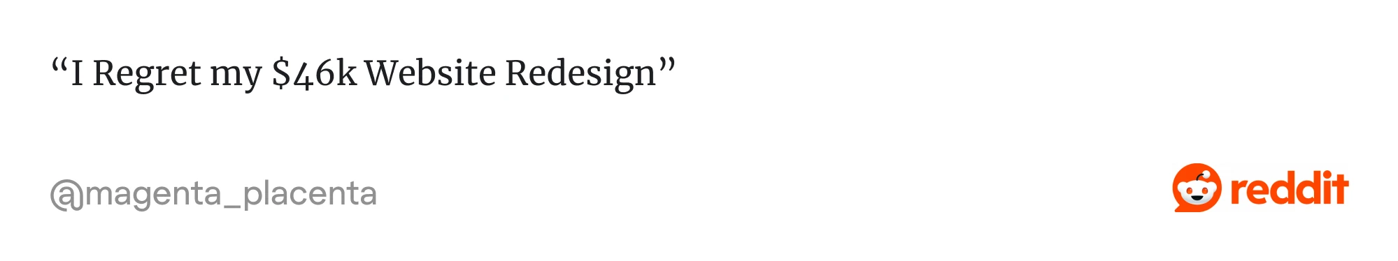
Reddit is full of horror stories, when people regret their $46K wasted on a redesign, freelancers disappearing, and agencies overpromising. Many companies jump into redesigns to “make things prettier,” only to end up burning money.
So, why does this happen?
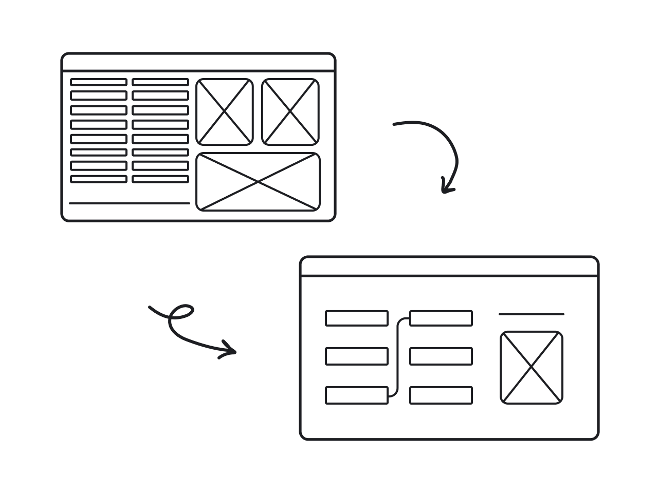
Mostly because too many teams misunderstand what a UX redesign is. They treat it like a visual refresh when, in reality, it’s a more strategic process. A UX redesign focuses on solving user problems and improving flows based on these insights.
At Eleken, UX redesign is one of our core services, and we can’t ignore how many teams struggle to get it right. For this reason, we’ll walk you through how we approach redesigns and share practical lessons (and screens) from real projects.
Signs your product actually needs a redesign
Not every usability issue calls for a redesign. Sometimes it’s just a matter of fixing a broken button or smoothing out a flow. But other times, the problems run deeper, and until you rethink the experience as a whole, everything will feel broken.
If you’re not sure whether your product’s at that point yet, here are some of the most common signals we see when it is.
Users keep dropping off at crucial steps
In many products, “drop-off” is a flashing warning light. If users repeatedly abandon your onboarding, a signup form, or a core flow, chances are something’s broken under the hood. They may like your idea, but once it’s hard to use, they simply quit.
Many experts describe drop-off as a critical indicator of poor UX. You can spot it by comparing how many users start a process to how many actually complete it.
We saw this as a real problem in myInterview, a video interviewing platform. Before they contacted Eleken, about 90% of candidates were dropping out mid-interview. That meant, for almost every 10 people who started, only one completed.
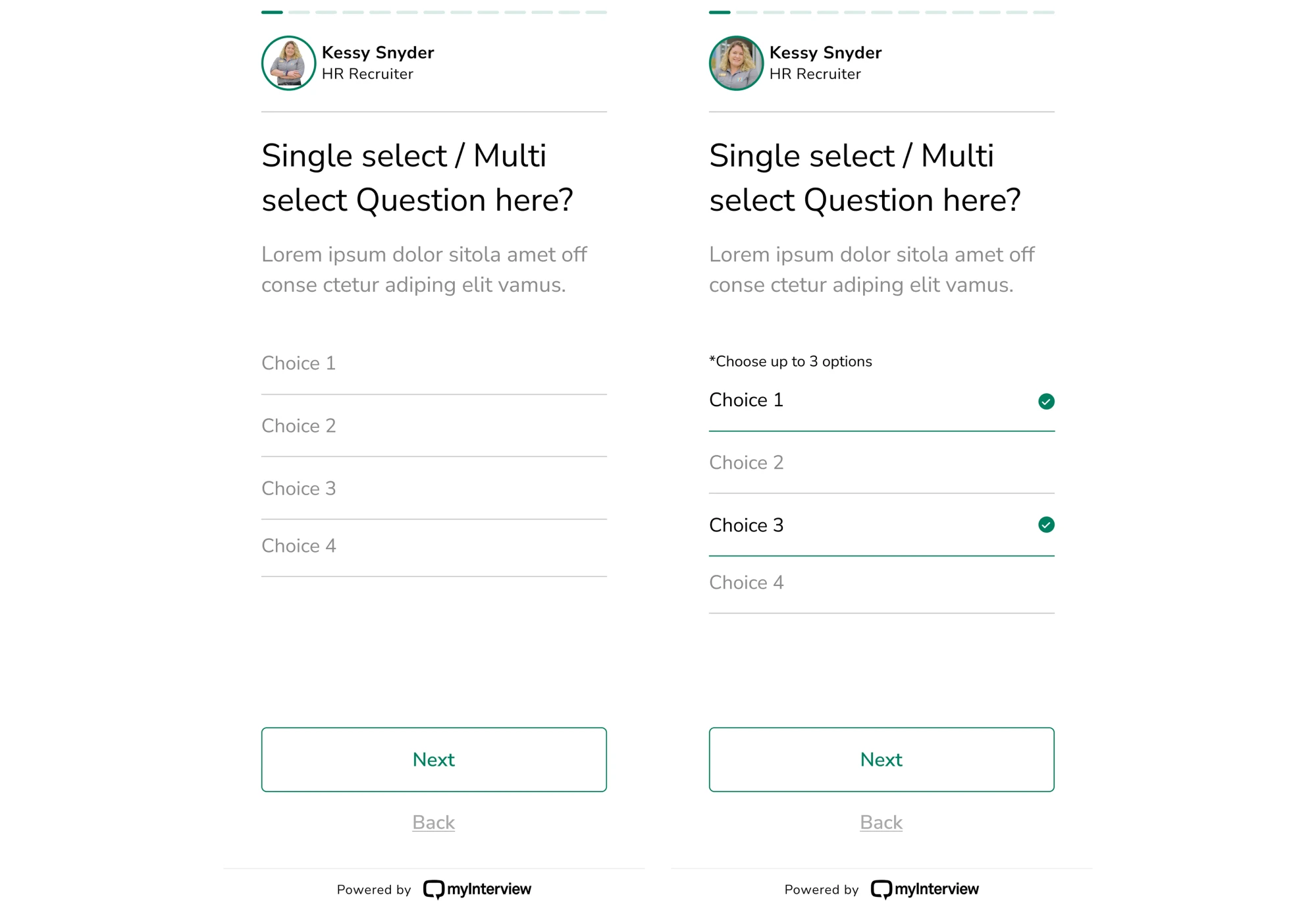
Once we recognized that the flow itself was the issue, we redesigned the user journey. Our designer analyzed what was critical, and as a result, we simplified steps, clarified what comes next, reduced cognitive load, and improved guidance.

You’re hearing the same complaints repeatedly
When your users keep repeating the same grievances, that’s not noise. It’s a signal. In a healthy product, feedback should be a mix. If it’s overwhelmingly negative and focused on the exact issues, that’s a clear sign of deeper UX problems.
To act on it, you need to build a proper feedback loop. That means collecting user input, analyzing it, making changes, and then measuring the results.
Ignoring repeated complaints is risky. You might ship a redesign or an update, but unless you treat user feedback as a starting point for real improvement, the core problems stay hidden. Over time, those small frustrations stack up.
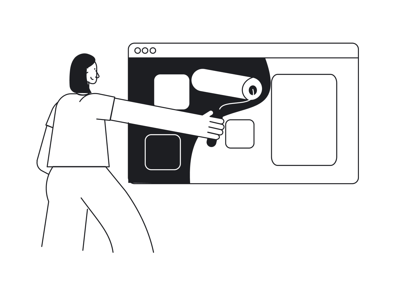
Design feels outdated or inconsistent
When your product looks or behaves as if it were made a decade ago, users can sense it immediately. Visually or functionally inconsistent interfaces leave people unsure of what to expect, how to interact, or even how to find what they need.
Trends come and go, but the core of UX is usability. When design breaks this, it becomes easy to damage the user’s trust, and with it, your brand perception.
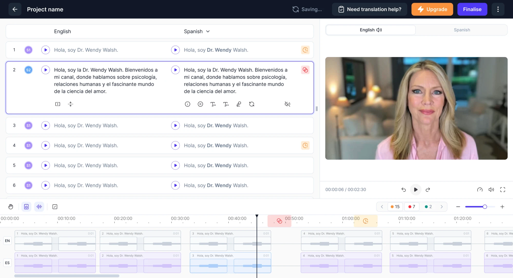
Datawisp, a data analytics platform, faced a similar challenge. Their product solved a real problem, offering a new, visual way to work with numbers. But the interface… well, before the redesign, it looked more like a relic from the Windows 98 era.
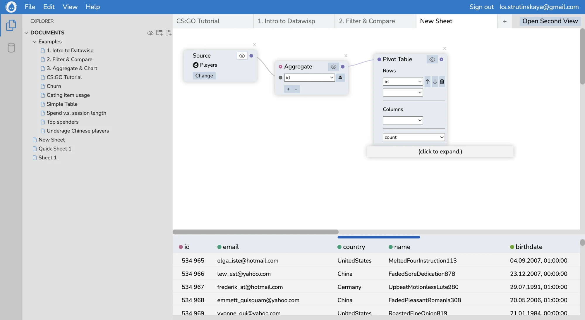
Backed by 10+ years of experience, our Eleken team stepped in and completely rebuilt the user interface. Our designer uncovered deeper UX issues and delivered a new layout that helped pave the way for the startup’s success.
Your product evolved, but experience hasn’t
Over time, as you add new features, expand functionality, or pivot your offering, the original UX foundation often doesn’t keep up. What made sense at launch can start to crack under new demands, making it harder for users to discover value.
In the SaaS world, where user retention and smooth flows are critical, that drift between product growth and user experience can quietly erode your business.
When UX doesn’t evolve with the product, you end up with a mismatch between what the product does and what the user understands. In the worst cases, your app becomes harder to use, even if it’s more powerful under the hood.
The internal team struggles to use the product
When even your own team has trouble using the product, that’s a point of concern. Internal users might not complain as loudly as customers, but when workflows are clunky and tasks require constant workarounds, productivity takes a hit.
Worse, these frustrations often stay hidden in the background until something breaks or someone finally speaks up. And by then, you just hope it’s not too late.
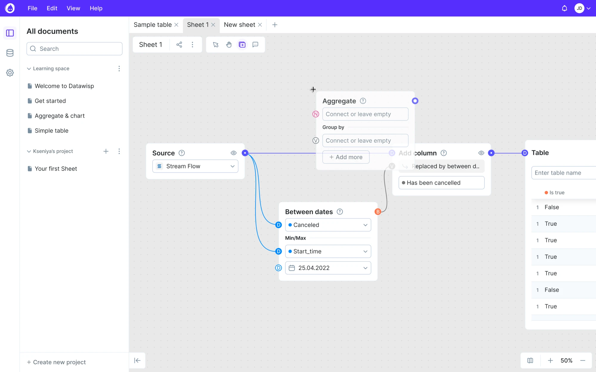
We saw this first-hand during our work with Panjaya, an AI dubbing platform. When their team reached out to us, the product was already in use by their internal translators. On the surface, things were “working,” but something felt off.
Our designer spoke to the people behind the scenes and uncovered a list of UX problems. From there, we rebuilt the entire experience around the actual user needs, removing unnecessary steps and speeding up their daily work.
Choosing between a radical and an incremental redesign
When you think about redesigning a product, you must decide whether to go for a radical overhaul or incremental improvements. Each path has its own trade‑offs, and to make the right choice, you need to differentiate these terms correctly.
- Incremental redesign focuses on gradual changes that improve existing user workflows. It’s a good fit when core product architecture and UX are stable, but there’s a need for refinement or modernization.
- Radical redesign involves rethinking the whole structure, flows, and interaction paradigms. It’s more disruptive, more risky, but sometimes necessary when the existing UX is fundamentally flawed.
If the UX feels a bit outdated, there’s no reason to reinvent the wheel. Small improvements can bring great results without overwhelming users or teams. But when a product is full of UX debt, it often makes sense to design from scratch.
There’s no universal rule. What matters is that your approach matches the product’s state, user needs, and the team’s capacity for change. And if you’re not sure where to start, a talk with design experts can give you the clarity to make that call.
Eleken’s 6-step process for a successful redesign
As a UI/UX design agency for SaaS, we’ve worked on 200+ projects, most of which were redesigns. We’ve gathered enough experience to say we know what we’re doing, and in the next section, we’ll walk you through the exact process.
Step 1: Define business goals and success metrics
Before you sketch a single wireframe or push a new button, you need to ask: what are we trying to achieve? Clearly defined goals are the first step toward a good redesign, and at Eleken, we rely on this approach for every project.
At this stage, UX metrics and KPIs can help you translate abstract ambitions into concrete outcomes. Depending on your product goals, you might track:
- Conversion rate
- Activation rate
- Task success rate
- Time on task
- Error rate
- Satisfaction scores (including SUS, CSAT, or NPS)
- Retention
Having those numbers before the UX redesign process gives you two big advantages. First, a baseline. You know where you started. Once the redesign is live, you can measure again, compare results, and truly see if anything has changed.
Second, focus. When your goals are clear, the whole team knows what you’re optimizing for. You avoid nice-looking but ineffective changes, reduce the possibility of wasted effort, and steer toward meaningful impact.
Step 2: Audit the current user experience
Having goals is a good start, but you can’t follow them blindly. You need to understand where your product feels off. Users are bouncing, and to figure out why, our Eleken team always starts with an audit of what’s already there.
That means digging into how people use your product and spotting moments where things fall apart. We rely on numbers and human feedback to figure out what’s working, what’s broken, and what’s just confusing. You might do the same.
- Quantitative data.
Analytics, funnel drop‑offs, click or scroll heatmaps, and session replays let us see the moments where users struggle.
- Qualitative research.
We complement numbers with user interviews and usability testing to understand their goals, frustrations, and motivations.
- Heuristic review.
To uncover issues quickly and efficiently, our UX expert reviews the interface against established heuristics principles.
Because different methods answer different questions, combining them gives a fuller picture. Recognizing this, we used this exact approach when working on Data Streams, a global data management platform.
Alongside the client’s internal team, we went through the research, feature analysis, and evaluation of usability heuristics. Once we gathered the full picture, we were ready to move into the redesign with clarity.
Step 3: Prioritize high-impact issues
With UX problems in place, it’s tempting to fix everything at once. But in reality, you won’t get far if you spread your effort too thin. What really moves the needle is prioritizing the issues that affect your users’ behavior and your business hard.
At Eleken, we treat each project individually, picking the prioritization technique that fits the product, team capacity, and business goals best. Sometimes it’s a quick win. Other times, a full roadmap rework, but always strategic and intentional.
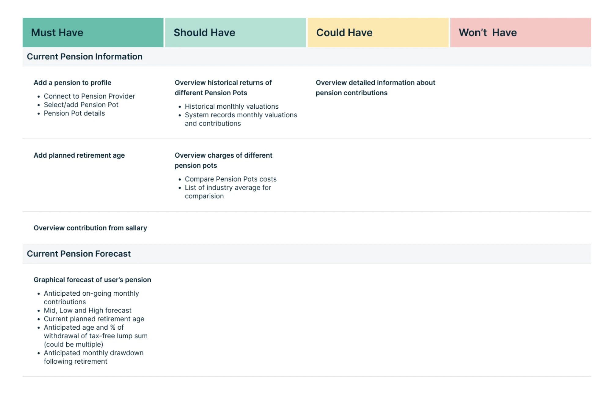
For Prift, a personal finance platform, we used MoSCoW analysis to prioritize features. Since we were working on the MVP, we decided to focus on the functionality that fell into the “must-have” and “should-have” categories.
Using a structured framework helps avoid the “loudest voice wins” trap, where the highest‑paid person or the most recent idea drives priorities. Instead, decisions become transparent, defensible, and aligned with your real needs and capacity.
Step 4: Iterate with prototypes and collect user feedback
With all the necessary info, it’s time to start building, but carefully. At Eleken, we almost always begin with low‑ to mid‑fidelity prototypes. By doing this early and often, we avoid wasting time on “final versions” that still don’t solve users’ problems.
Relying on these prototypes, we might run tests with internal team members, existing users, or people resembling future users. We observe how they interact, note where they hesitate, and ask what feels confusing or unnatural.
In practice, this approach might look like:
- Start with low- to mid-fidelity prototypes.
- Put the prototype in front of real people.
- Gather user feedback, make changes, repeat.
- Test until it feels right.
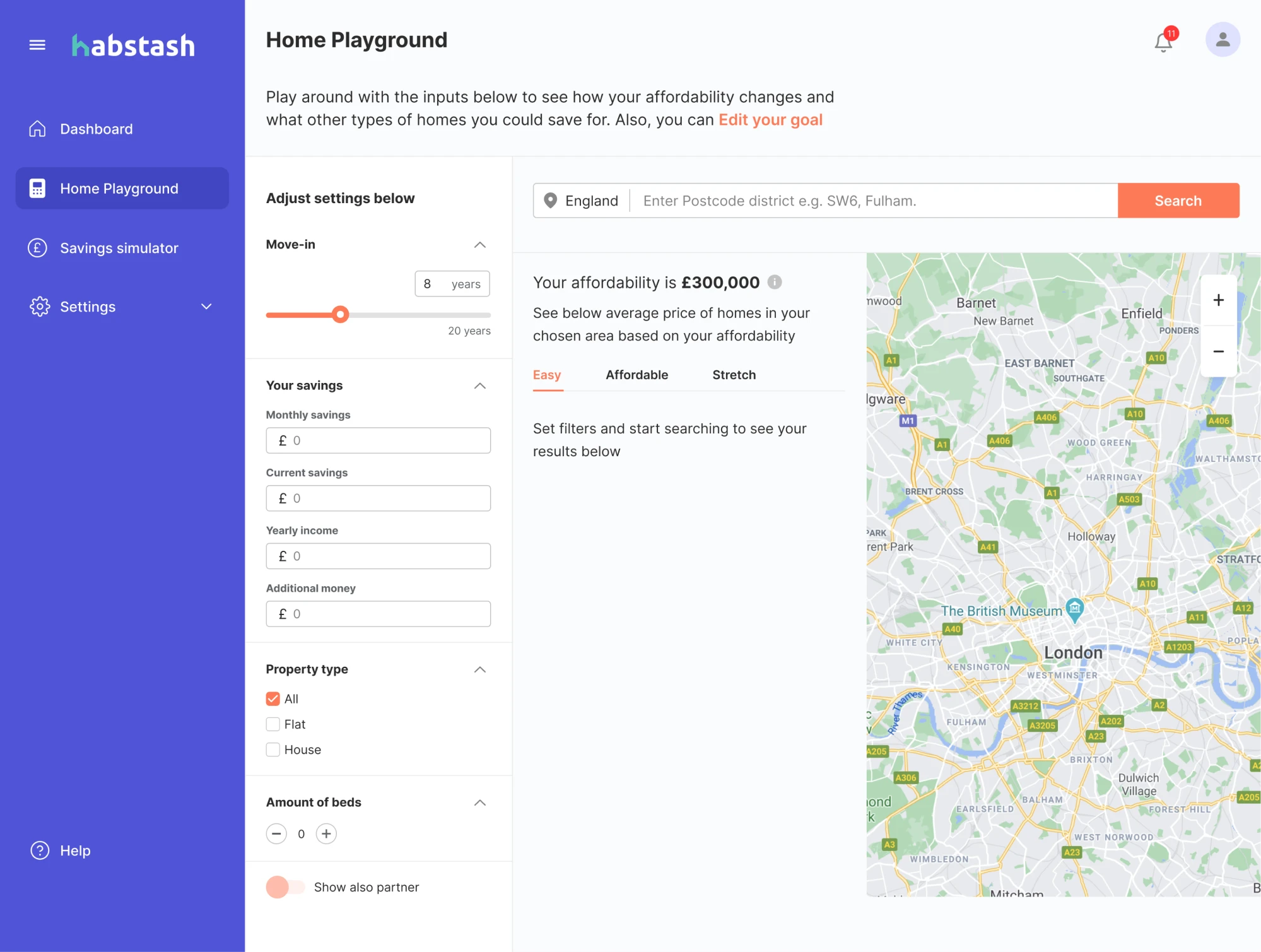
We followed this process while working with Habstash, a digital platform helping people on their journey to homeownership. When they came to Eleken, they already had some early prototypes that we needed to shape into a usable MVP.
After reviewing their materials and insights from user research, we proposed a better structure. The client was open to new ideas, which gave us room to explore and refine. Through iterations, we reshaped the flow and made the product intuitive.
Step 5: Roll out the product redesign in phases
When it’s time to ship the redesign, a full-on, nobody-left-behind “flip the switch” launch might look tempting. But at Eleken, we strongly prefer a phased rollout.
The main reason for that approach is that it gives you controlled risk. Rolling out changes to a subset of users (or internally first) lets you catch bugs or UX issues in a limited environment. If something goes wrong, only a small fraction is affected.
Release the redesign to a small group, test stability, and gather feedback. A great way to do this is by using feature toggles or a dark launch, where the new UX goes live for a portion of users while the rest continue using the old version.
This lets you compare performance, catch issues, and polish the experience. You reduce mistakes, build confidence, and invite more users on your terms.
Step 6: Launch, then monitor and iterate
Once you’ve rebuilt the product experience, your job doesn’t end there. Launching is just the beginning of a new phase where you watch closely to see if the new UX actually works and stay ready to iterate.
It’s smart to collect qualitative feedback and behavioral data. In‑app surveys or feedback widgets give you a quick window into how people feel about the changes. Simple questions like “Is there anything confusing?” can surface first‑reaction issues.
And just as we covered in the first step, now’s the time to track metrics and compare them to the baseline you gathered before the user experience redesign. This helps you see whether the changes solved the problems or introduced new friction.
At Eleken, we often continue supporting products after launch. Depending on the pricing model you choose, we’ll keep monitoring how the design performs, listen to users, and make improvements where needed.
Frameworks and methodologies to guide a UX redesign
Depending on the project, UX teams rely on different methodologies to guide their process. In the next sections, we’ll walk through some of the most popular frameworks that help bring structure (and sanity) to redesign projects.
Design thinking
Design thinking is one of the most popular frameworks used in UX redesigns, and for good reason. It’s a human-centered, five-stage process that helps teams explore complex problems, generate creative ideas, and test them quickly.
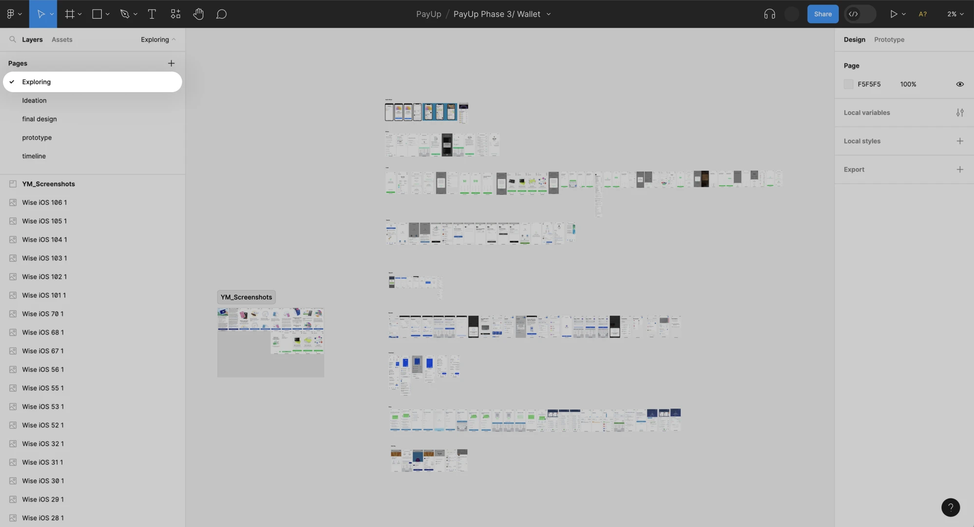
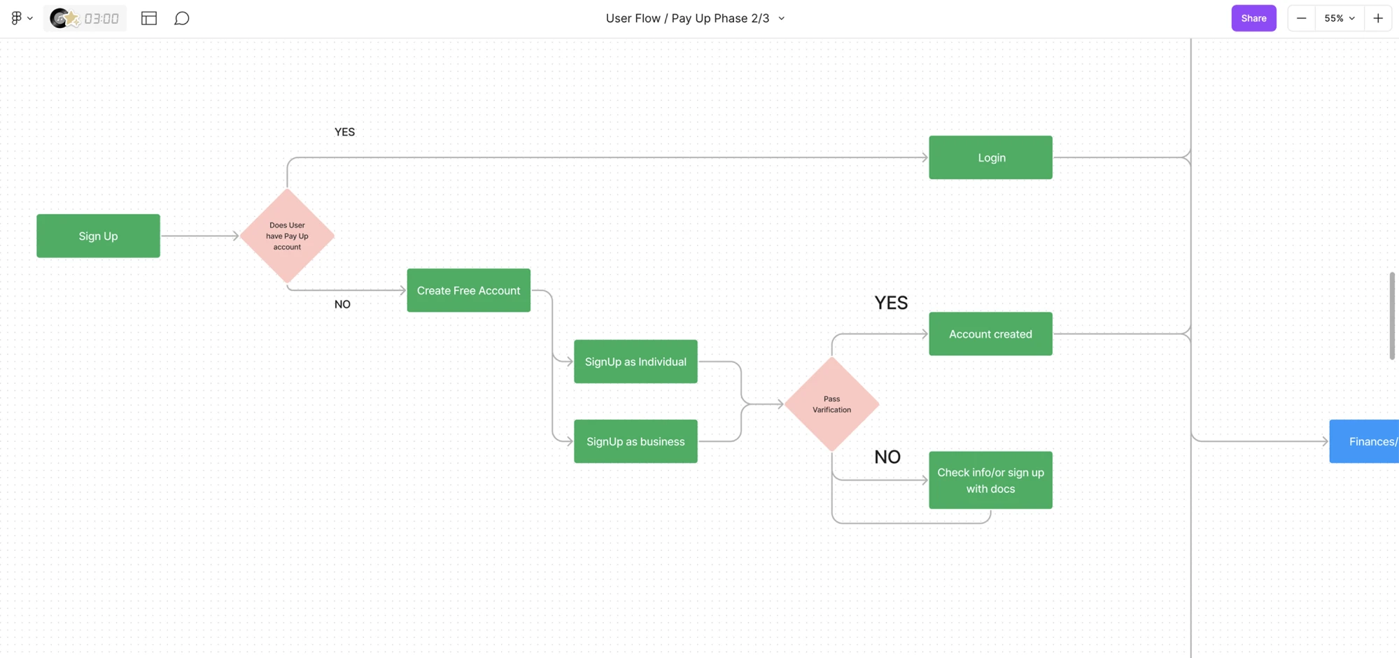
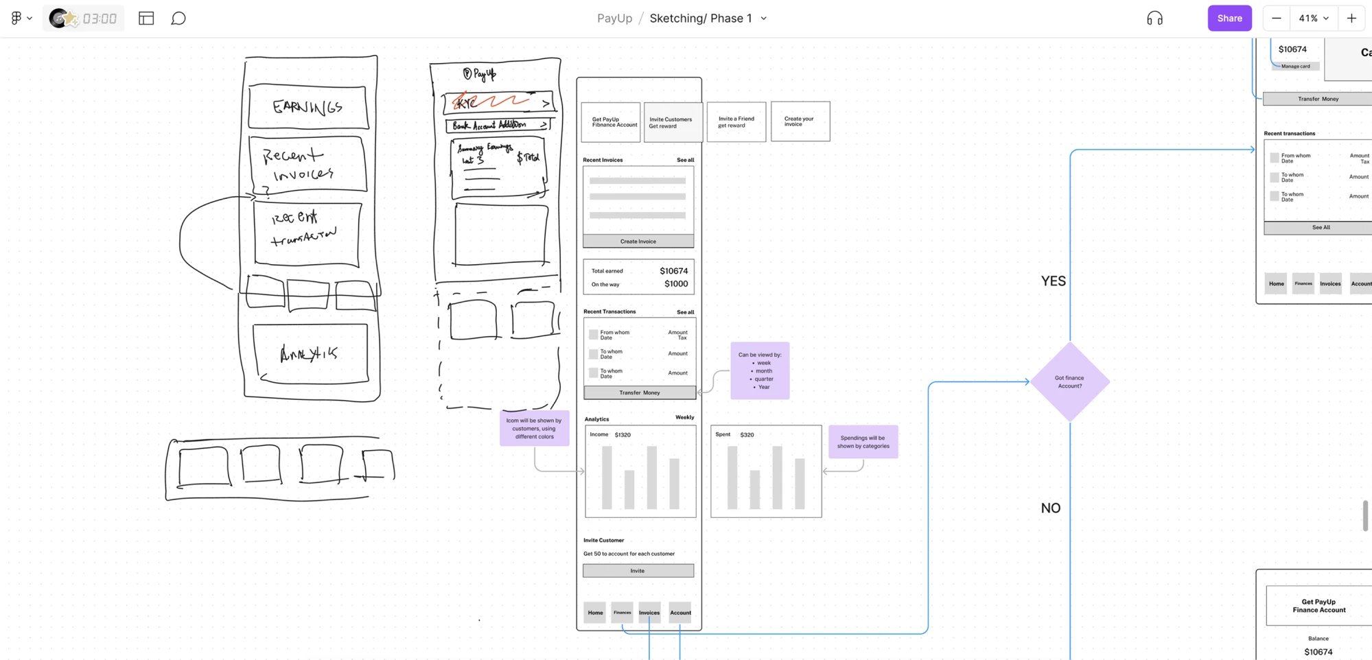
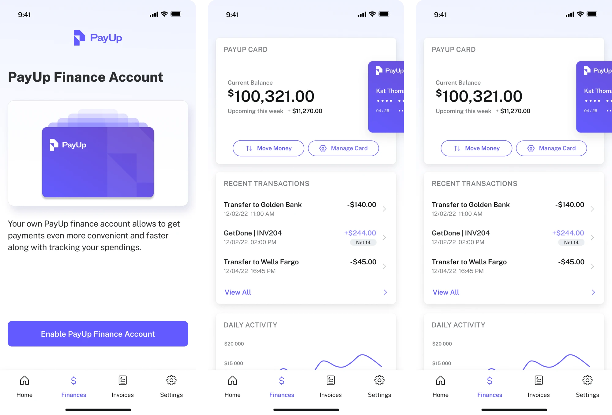
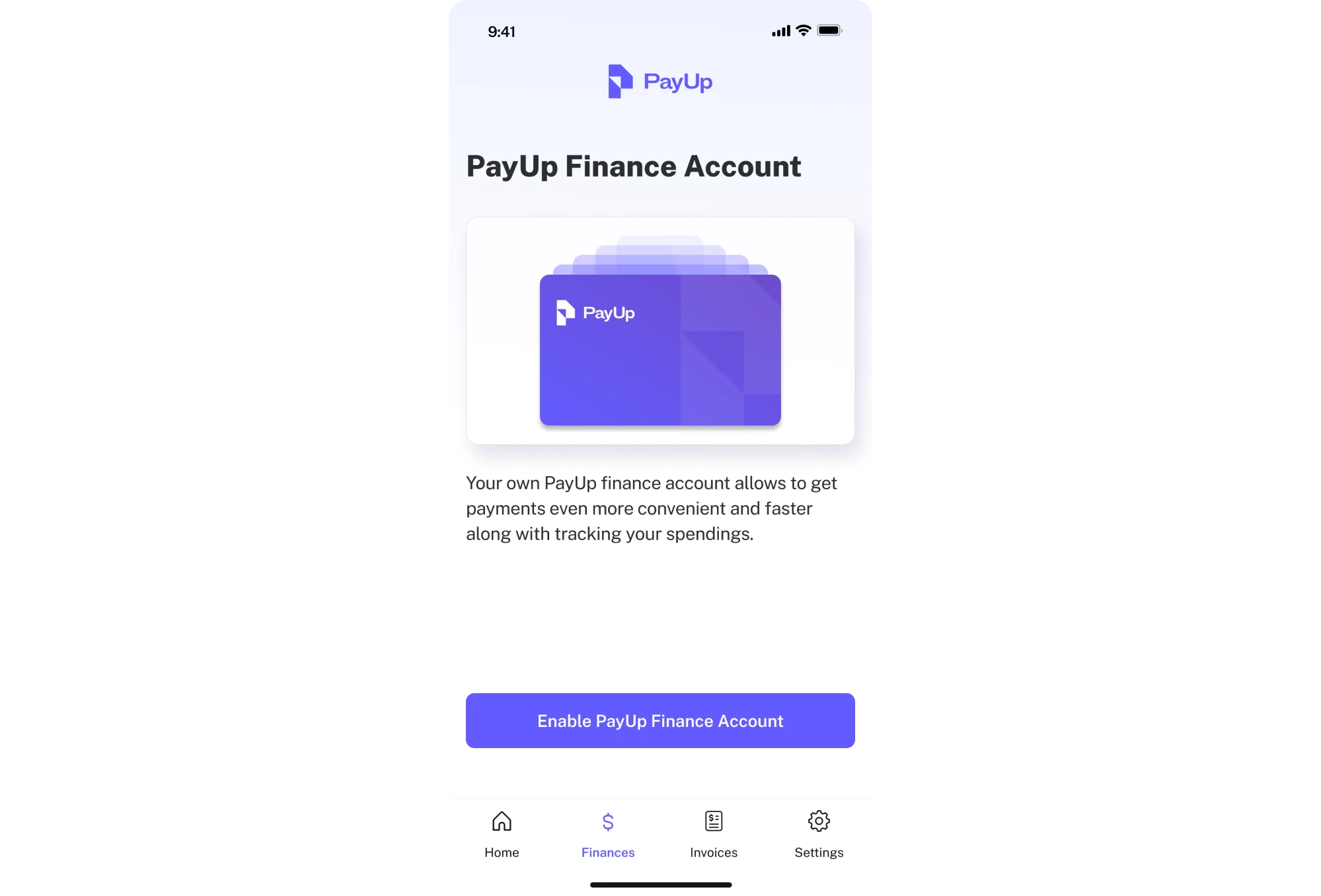
At Eleken, we apply design thinking to projects that require clarity, speed, and a strong user focus. A good example of this in action is our work with PayUp, a financial platform for non-tech-savvy users who value simplicity above all else.
When PayUp approached us, they had already launched an MVP and gained early traction. It was time to scale, but with only one in-house designer, they needed a partner who could work fast and deliver high-quality, user-focused design.
We ran through all five stages of the process:
- Empathize
We began by studying a dozen financial apps to understand user expectations, design patterns, and common standards in the fintech space.
- Define
In sketch sessions with PayUp’s team, we aligned on the features that mattered most and defined what success would look like for users and the business.
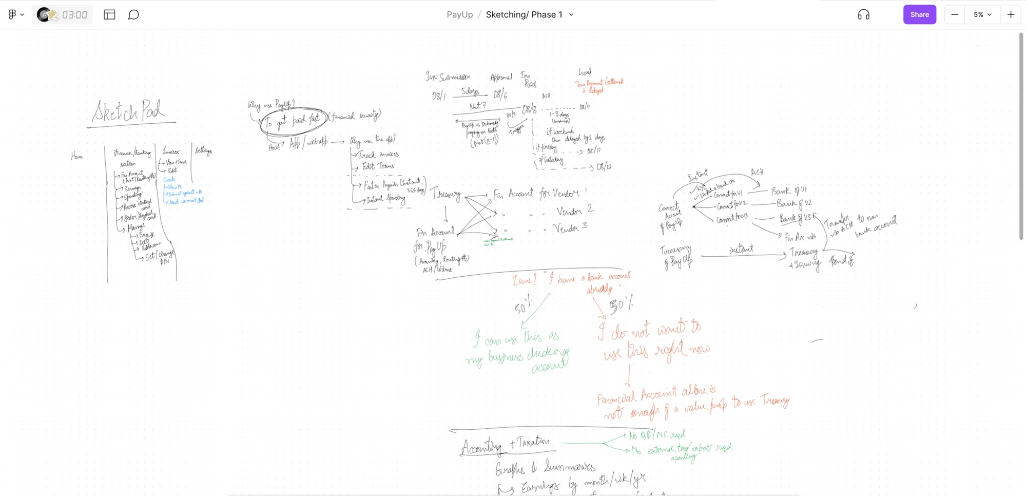
- Ideate
We explored multiple versions of user flows, journeys, and wireframes, offering several options, so the client could choose what felt right.
- Prototype
Once the flow and logic were approved, we transformed the wireframes into polished mockups with thoughtful UX and UI redesign decisions baked in.
- Test
Using interactive prototypes, the PayUp team tested new flows with their users. We collected feedback, implemented adjustments, and moved to the next iteration.
Thanks to this iterative process, we delivered designs that were intuitive for PayUp’s user base and aligned with their business growth goals. Design thinking gave us the flexibility to move fast without sacrificing user insight.
Lean UX
Sometimes you don’t need long planning cycles and heavy documentation. What you need is speed, collaboration, and learning. Lean UX can help with that. It’s a design‑development mindset built around the idea “think big, test small, learn fast.”
At its core, Lean UX flips the traditional design process on its head. Instead of perfect designs and detailed spec documents, teams build a minimum viable version, conduct user testing immediately, learn from the feedback, and iterate.
This approach works well for agile teams, startups, or any project where requirements evolve fast and speed matters. Lean UX reduces risk, cuts waste, and keeps the team focused on real user value rather than arbitrary deliverables.
Design sprint
When you’re facing a big problem or need to validate a risky idea fast, Design Sprint is your best friend. It’s a high‑energy method (usually one week) that helps teams go from a messy challenge to a realistic prototype and user feedback in record time.
In a design sprint, a cross‑functional team (often 4–7 people) commits five full days to solving a well-defined problem. Over those days, the team moves through:
- Mapping and understanding the problem
- Sketching possible solutions
- Deciding which ideas to prototype
- Building a prototype
- Testing it with real users
By the end of the week, you will have real user reactions. However, a design sprint only works if you commit to it fully with clear goals, dedicated time, the right team, and stakeholder buy-in to act on the results.
If your team isn’t aligned or you treat the sprint like a side‑quest, it’s easy to drift back into “busy work with no impact.”
Double Diamond
If you need a structured way to guide a redesign, the Double Diamond framework is a solid choice. Originally developed by the UK Design Council, this model splits the process into four key phases: Discover, Define, Develop, and Deliver.
With a Double Diamond framework, you diverge to explore many ideas, then converge to focus on the right ones, and you do that twice. First, to make sure you’re solving the right problem, and then again to shape the right solution.
At Eleken, we may reach for Double Diamond when working on products with complex use cases, technical domains, or highly specific audiences. That’s exactly what we faced with Cylynx, a no-code graph visualization platform.
Cylynx is powerful, but its target audience — people who work with data graphs — is pretty niche. Our main challenge was understanding when and how real users interact with the product, so we could design something truly usable and valuable.
To approach this, our designer used the Double Diamond framework as the foundation of the process. Here’s how it worked:
- Discover
We gathered as much information as possible about the product and its users. For this, we read through technical documentation, explored real-world use cases, and understood where the current UX created friction points.
- Define
Once we had enough raw data, we synthesized it to identify the core problems. What do users expect? Where do they struggle? What actually matters to them? That clarity shaped our design direction.
- Develop
With a clear problem definition, we began exploring ideas. We created early concepts, sketched out possible flows, and built wireframes to test different interaction models and visual approaches.
- Deliver
Once we narrowed down the best direction, we turned the concepts into high-fidelity designs. At this stage, we focused on details, consistency, and usability, making sure the final product looks great and delivers real value to users.
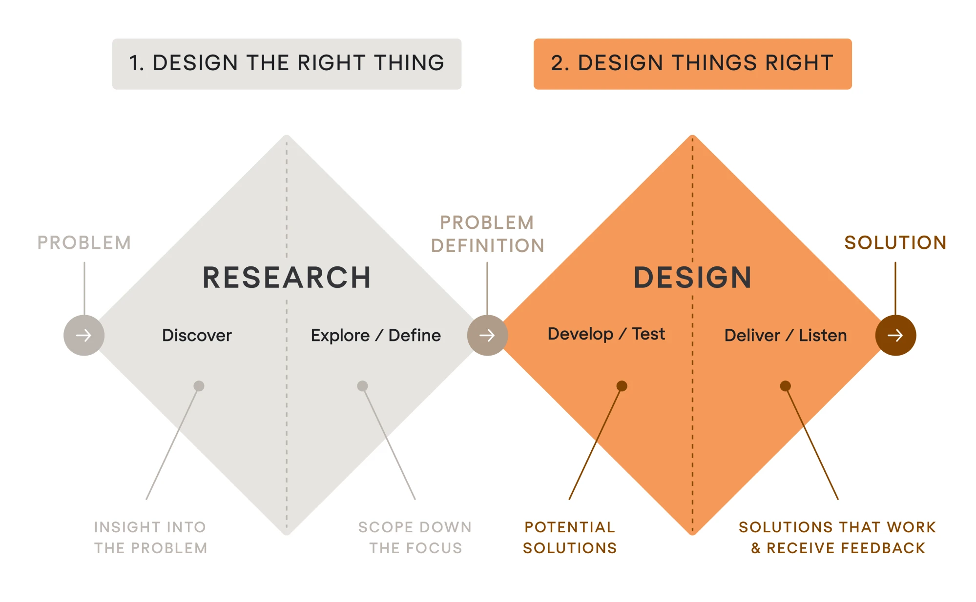
The Double Diamond gave us a clear framework to work within, without stifling creativity. And most importantly, it helped us keep user context and value top-of-mind from the start of the project to the finish.
UX design communities and forums for support
Redesigns can be challenging, but the UX community is generous and full of shared knowledge. Engaging with professional groups lets you ask questions, get feedback on your redesign ideas, and learn from others’ experiences.
Here are some active UX communities where you can discuss UX redesigns:
- Designer Hangout. An invite-only Slack community that hosts UX designers, researchers, and product folks from top companies.
- Hexagon UX. A Slack and global chapter-based network focused on supporting women and non-binary UX professionals.
- The UX Collective Community. A growing Slack workspace where designers discuss articles, post prototypes, and get constructive feedback.
- UX Mastery Community. A free forum for UX designers to ask practical questions about UX methods or get portfolio/project critiques.
- Reddit – r/userexperience. A primary UX subreddit where you can expect crowd-sourced input on your ideas from a mix of professionals.
- Reddit – r/web_design and r/UI_Design. Active subreddits that are great for visual-focused feedback and interface discussions.
- Interaction Design Foundation (IDF). A global network combining educational content, case studies, and community discussion.
- Design Buddies. A Discord-based community with career-focused designers, open feedback threads, and dedicated UX critique channels.
Last advice
This article is just a small piece of what redesign is. There are a lot of moving parts, plenty of decisions to make, and, luckily, quite a few lifehacks to pick up. So if you’re just starting to explore how to approach redesigns the right way, don’t rush it.
And when you need clarity on a specific concept or just want some fresh inspiration, our blog is here for that. We’ve got a full house of product designers who live and breathe this stuff, and everything we learn ends up there, ready for you to explore.