Bering Lab
How we turned a standard translation tool into a $2.3M pre-Series A success

In the legal industry, precision and trust are everything, and when it comes to translations, even the smallest mistake can have big consequences. That’s the challenge Bering Lab, a South Korean company, set out to solve.
Their platform combines AI translation with professional human review, giving lawyers and firms a safer way to translate sensitive documents.
But strong technology wasn’t enough, as the team recognized after seeing some red flags:
→ Bounce rate climbed to 89%.
→ Retention dropped sharply within just 30 days.
→ The interface felt too similar to free tools like Google Translate or DeepL.
Despite recently launching a 2.0 version with some design tweaks, the product still wasn’t meeting user expectations. The team realized that to compete in such a crowded market, they needed to offer a better UX.
Drawing on our years of design expertise, Bering Lab turned to Eleken for professional design support. And that’s where our story together began.

I checked some rating websites, including Clutch, and looked at several companies. What was really appealing about Eleken was their portfolio because they've done SaaS-based work, which made us comfortable working with them.
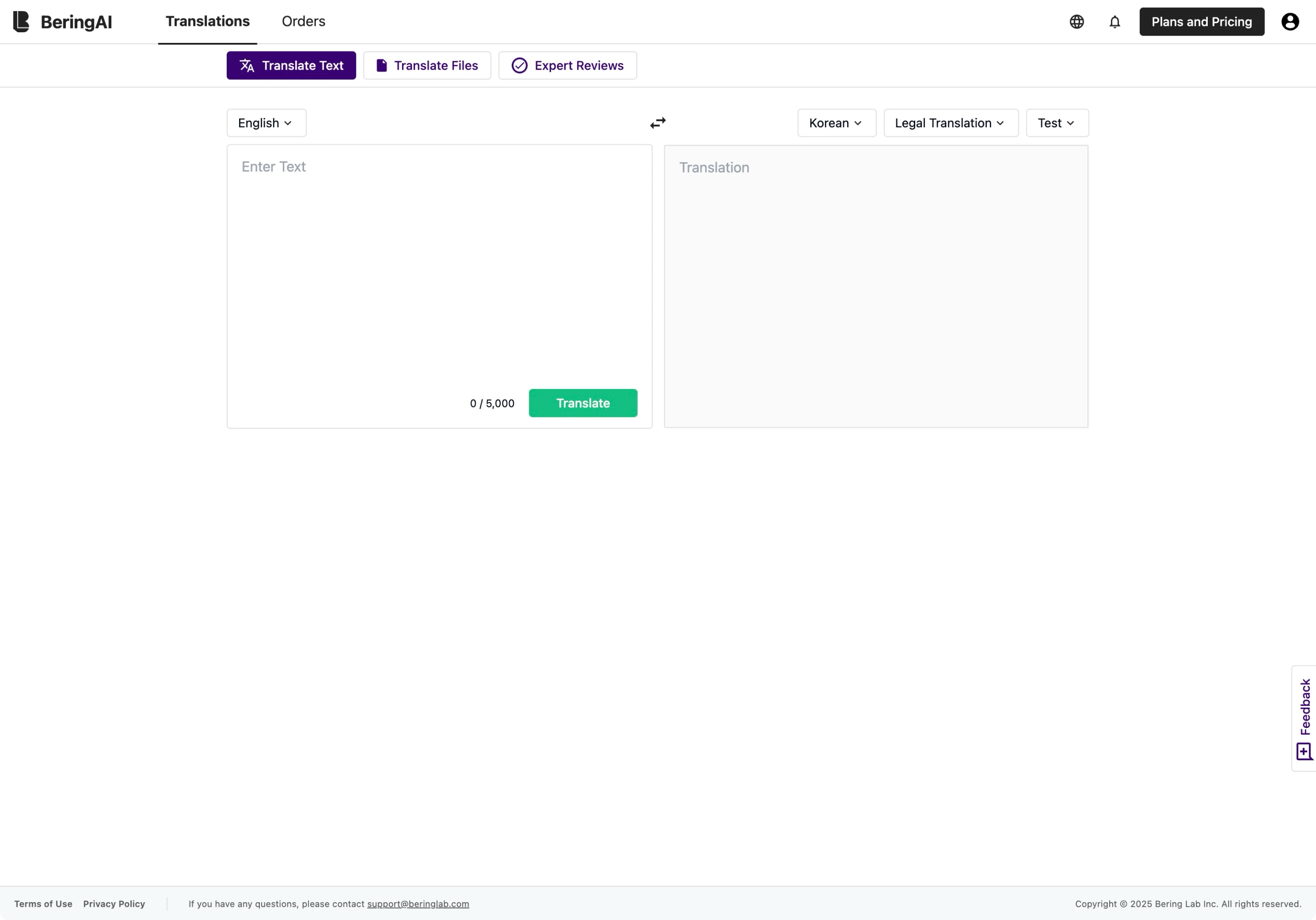
We rethought the main translation page to cut the 89% bounce rate
As the main entry point of the platform, the Translate Text tab was crucial. This page was where most users landed, and it was supposed to demonstrate the product’s value at a glance. Instead, it did the opposite. The interface looked almost identical to Google Translate or DeepL, which made users wonder: why pay for something they could get for free?
Because the translation flow was nearly identical across all tools, reinventing it completely wasn’t the answer. Our designer concentrated on details that could make a big difference in how the product felt.
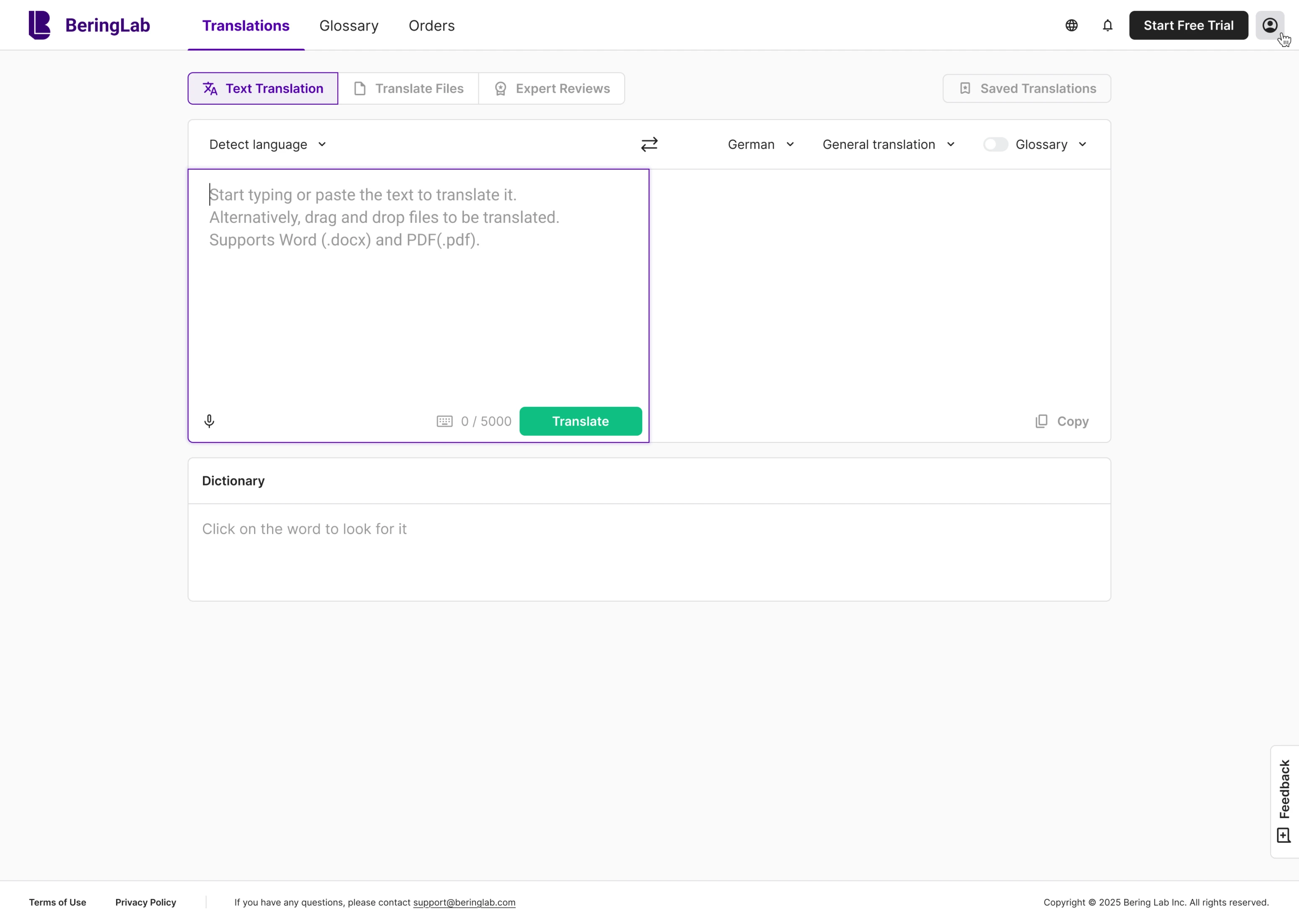
To reduce friction from the start, we highlighted the input field and made it auto-focused, gently nudging users to engage right away. Then, we worked on usability gaps. We introduced a Saved Translations sidebar, a feature missing in competitors, that allowed users to revisit past work.
Auto language detection, a built-in dictionary with examples, and improved glossary handling added the professional polish needed to earn trust from legal professionals.
To raise retention, we showed why the premium service is worth paying for
Among Bering Lab’s features, Expert Translations was the one that truly set the company apart. This service combines machine translation with review by professional linguists and legal experts. For law firms handling sensitive contracts or patents, it was a powerful value proposition and also one of Bering Lab’s main sources of revenue.
The problem was that the interface didn’t do this feature justice. Key information was scattered, the flow was unclear, and first-time users often struggled to understand how the service worked. The page created confusion. Many users dropped off before even placing an order, which directly impacted retention and revenue.
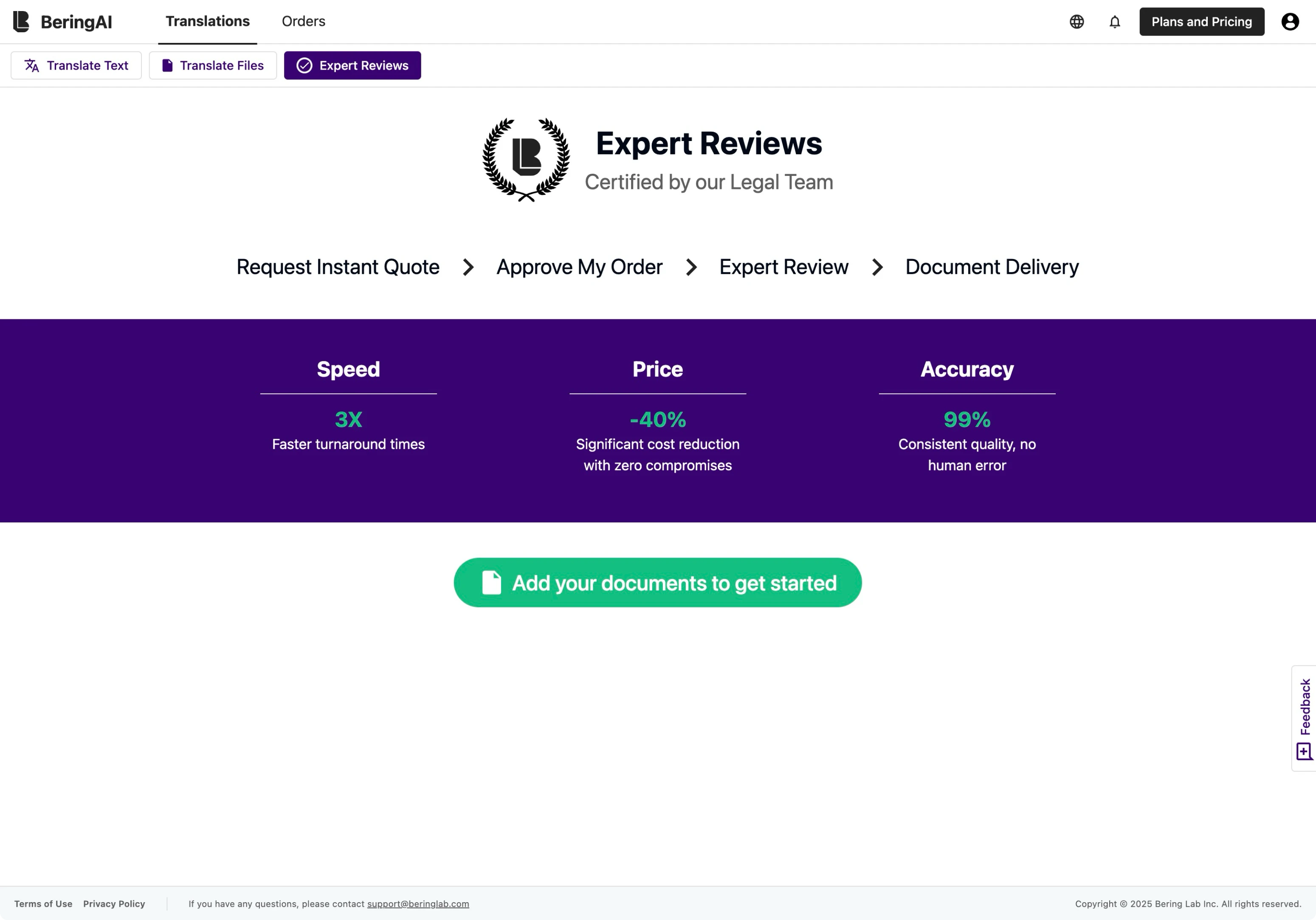
We set out to redesign the experience so that users could immediately see the value. The new page clearly outlined how the process works, highlighted the benefits, and guided users with a straightforward CTA.
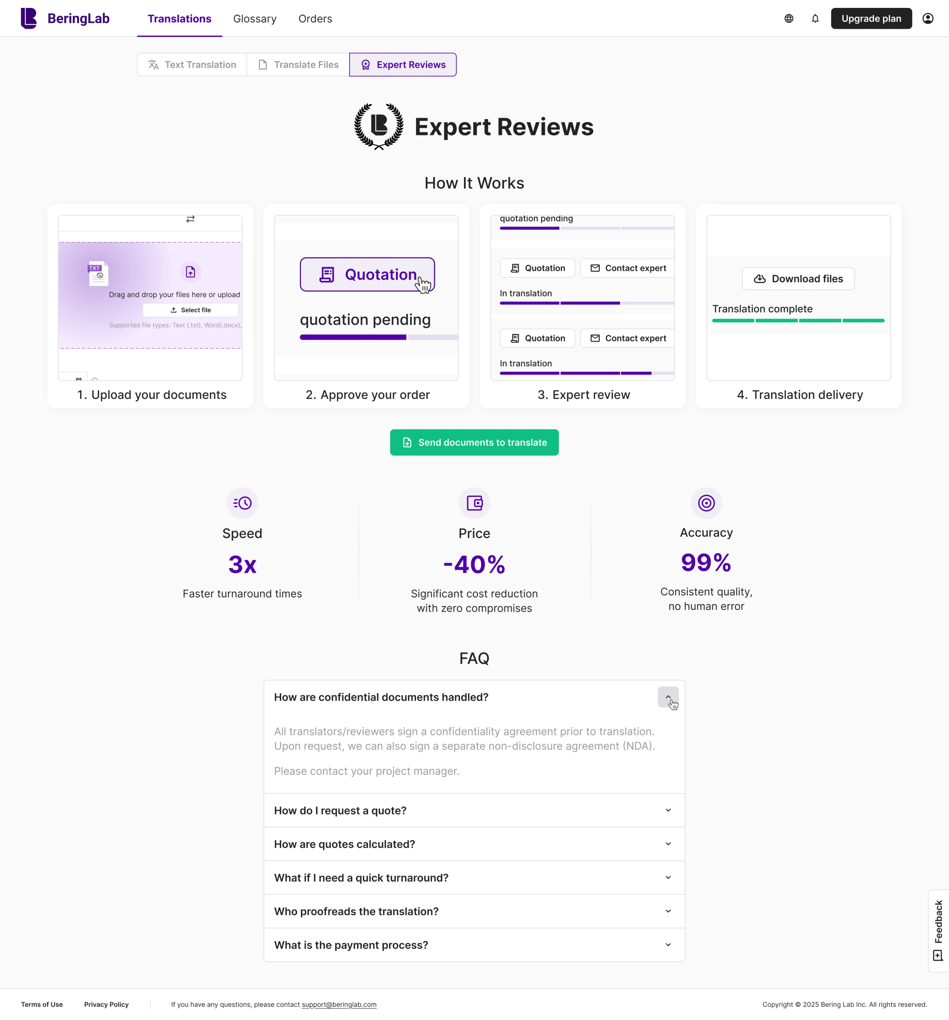

After making a request, customers were redirected to the Orders tab, where they could track the status of their documents and feel confident that their files were in good hands.

Users needed more value, and we delivered it with a new Smart Glossary
One of the biggest challenges for Bering Lab was differentiation. To many users, the platform still felt too similar to existing translation tools, and that made it hard to justify choosing (and paying for) Bering Lab over free options.
To solve this, the idea for the Smart Glossary was born. This was a feature we designed from scratch to give users control and consistency in their translations. With it, lawyers could define specific terms, abbreviations, and phrases that the system would always follow. For example, a legal abbreviation like CAT should never be translated as “cat” but as “Computer-Assisted Translation.”
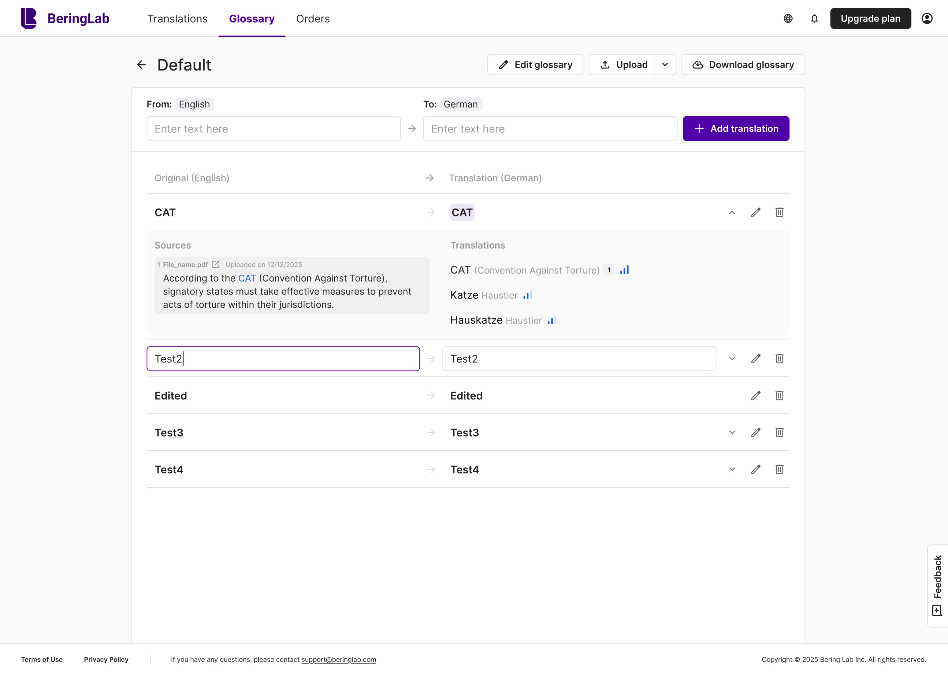
For legal professionals, this meant that translation quality was no longer left to chance. They could ensure consistency across hundreds of pages of sensitive documents, a critical factor for law firms.
It took a hard effort for us to design a new plugin that became a real differentiator
Once the product had a stronger UX, we began to explore how Bering Lab could go further. Together with the client, we looked at the way lawyers actually work. For many, their primary workspace is Microsoft Word, so the client proposed an idea that could make a real difference: a Word plugin powered by LLM.
We wanted to internationalize our products and had in-house developers, but we were weak in design, so we partnered with Eleken.
With this tool, lawyers could translate entire documents or individual paragraphs directly inside Word, without ever leaving the environment they worked in daily. We designed features like keyboard shortcuts, alternative translation suggestions, and checkpoints that allowed users to compare different versions of a translation.

What made this powerful was an AI-driven review. The plugin can identify potential problems in translations and allow users to chat with the AI to resolve issues.
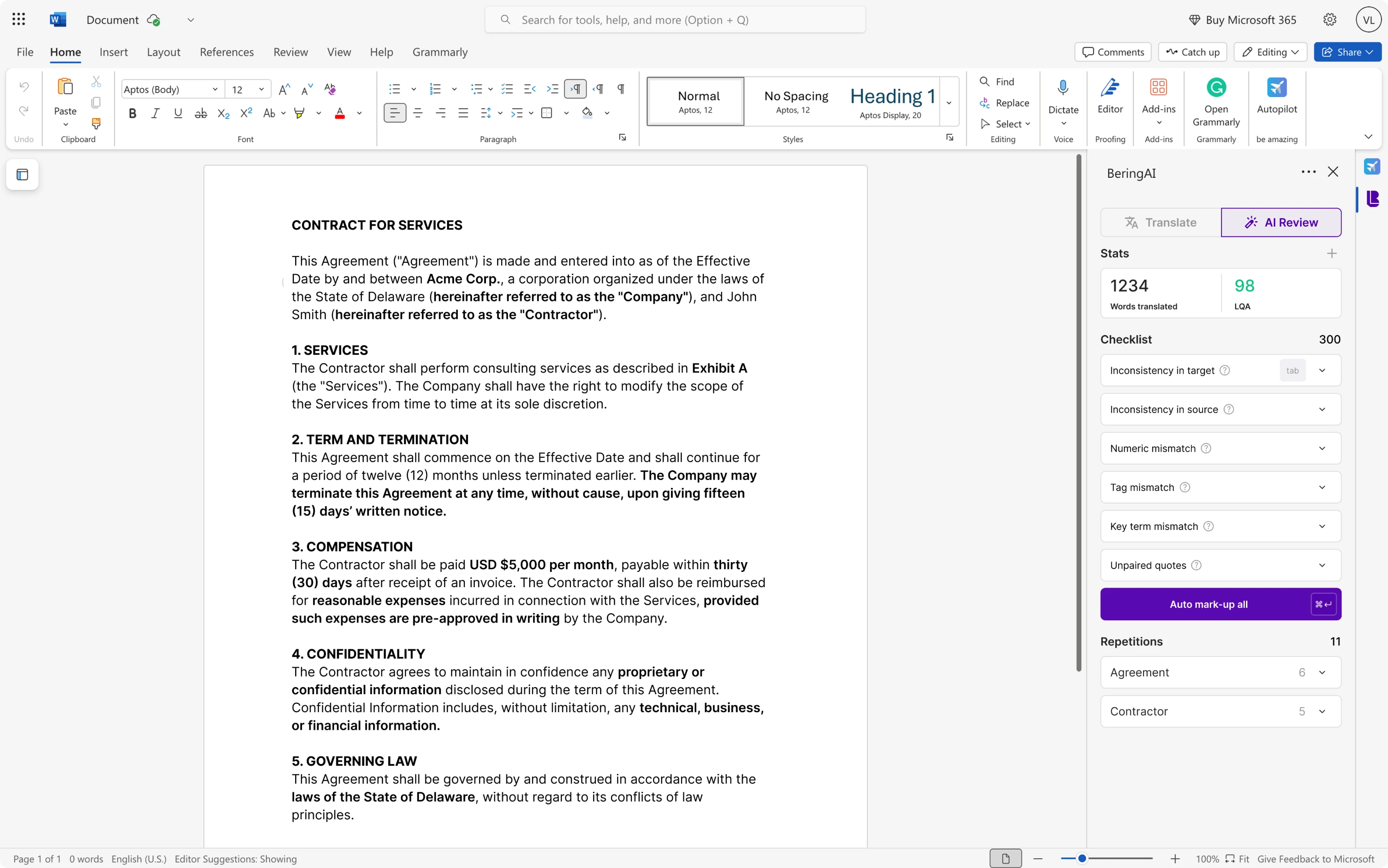
The benefit was immediate — faster workflows, fewer errors, and no need to switch between tools. For Bering Lab, the plugin created a unique competitive advantage. None of their direct rivals offered such deep workflow integration, which positioned the company as a long-term productivity partner for law firms.
For our team, this project was also an exciting challenge. Designing AI-driven workflows at this level was a new frontier, and it required quick research, experimentation, and plenty of creative problem-solving. Our designer was eager to explore this space, making the plugin a product differentiator for Bering Lab.
Our close collaboration helped Bering Lab secure funding and compete with industry leaders
Eleken's collaboration with Bering Lab was engaging and challenging, largely because of the specificity of their legal SaaS platform. Our designer adapted rapidly to the workflow, and the client appreciated the usability of the redesigned interface.
Eleken’s designs are well done and beautiful. Thanks to their work, we’ve been able to improve and globalize the UI/UX of our product in a short period of time. Moreover, the feedback from our higher management has been good.
Since the collaboration, Bering Lab has raised $2.3 million in pre-Series A funding. Their solution now achieves a repurchase rate of over 90%, reflecting the strength of their technology and the foundation established during our joint design work.