
“Let’s redesign this product” is probably not the first thought that comes to your mind when you look at an interface. What you’re more likely to think is: “Why does this thing still suck?” And those small annoyances clearly signal a need for a redesign.
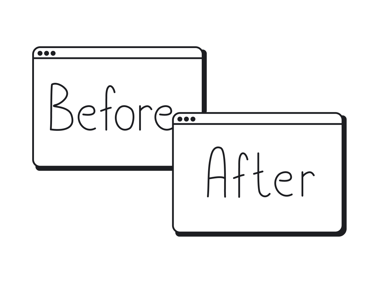
And yet, when you Google “product redesign examples,” you mostly get before-and-after screenshots. What you don’t get is the story.
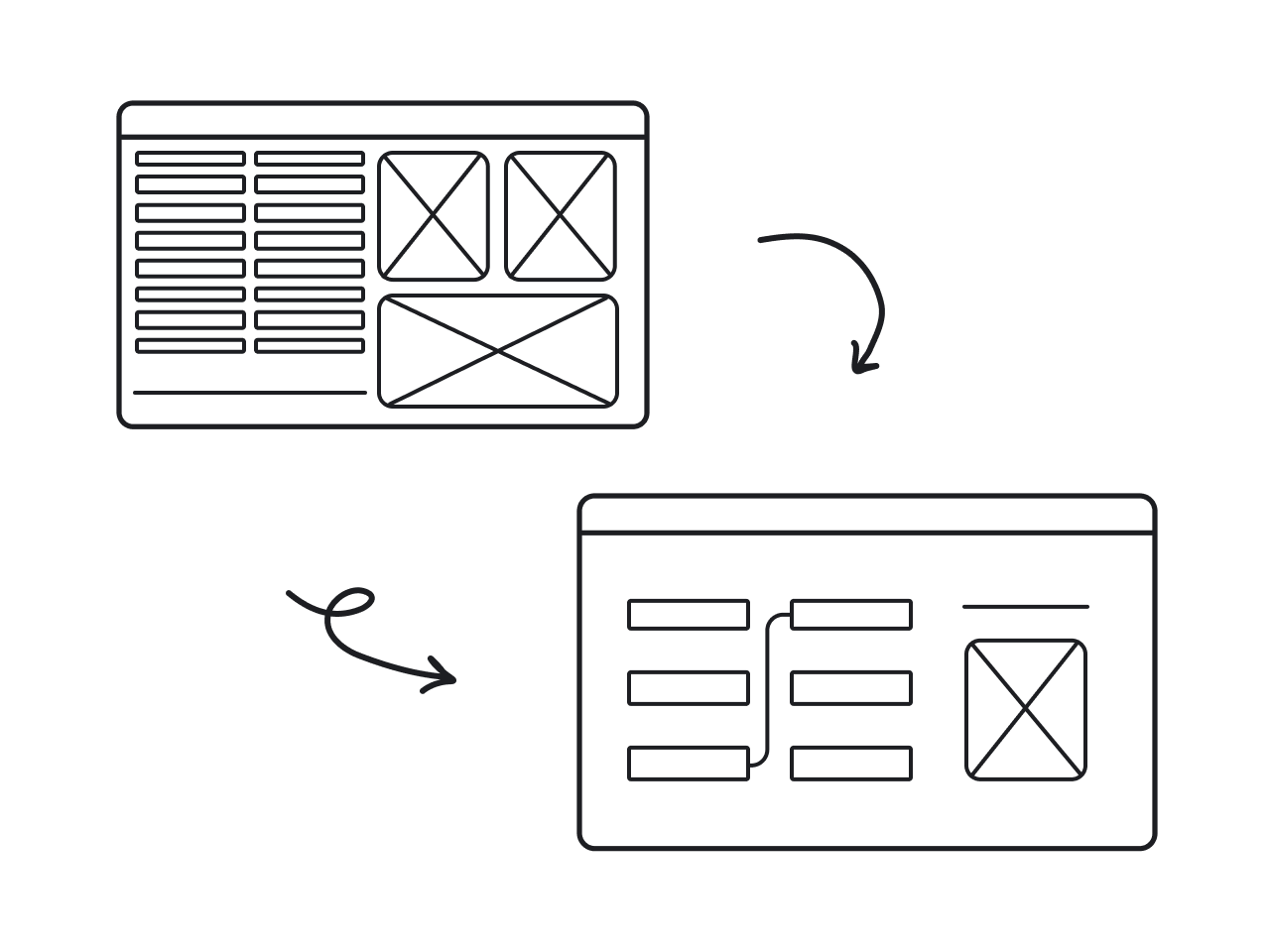
In this article, we’ll walk you through 13 redesigns, explaining what was wrong with the old version, what changed, and why those changes worked. Along the way, we’ll share UX lessons our Eleken team has learned over 10+ years working on redesign projects.
Real-world examples of successful product redesigns
Nothing illustrates the value of a redesign better than real examples. In this section, we’ve gathered a few notable cases where the product redesign process made a measurable impact. Let’s take a look at them.
1. Airbnb
Creating a global community of travelers and hosts required a product experience that felt human, intuitive, and trustworthy. As Airbnb scaled, so did the pressure on its design to deliver that feeling across every screen, flow, and platform.
When Airbnb set out to redesign the app, they made a thoughtful effort to make it as welcoming and helpful as a good host. The team leaned on Material Design principles, but reinterpreted them through the lens of clarity, accessibility, and tone.
One of the first things they tackled was expansion. For a long time, the app focused solely on booking homes, but in 2025, Airbnb rebuilt its platform from the ground up on a new tech stack. Now, it offers much more than just places to stay.
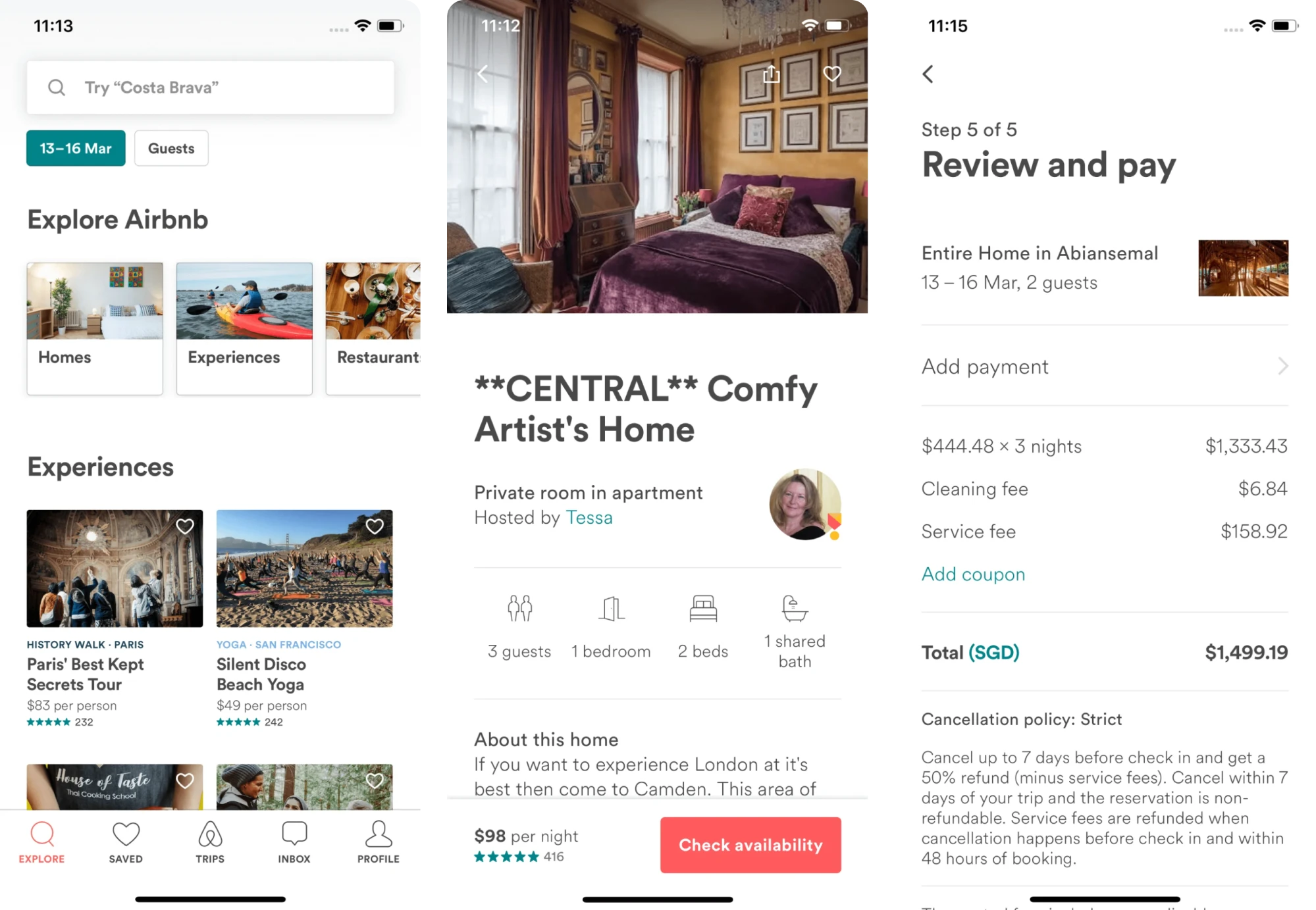
Visually, the interface also evolved. Sharp corners were replaced with softened shapes and smoother lines to create a more welcoming feel. A consistent bottom navigation bar was introduced, keeping the experience intuitive across devices.
The redesign broadened Airbnb’s offerings and invited more users to explore its growing range of services.
Key takeaways
- Unified navigation patterns improved platform consistency.
- Stripped-down layout enhanced accessibility and scannability.
- The redesign broadened Airbnb’s offerings.
2. Slack
Slack didn’t wait for a perfect moment. It evolved gradually, rolling out its product redesign ideas in response to growing complexity and user feedback.
As the product grew from a simple chat tool into a full-blown collaboration hub, the original interface started to feel cluttered. It’s a classic example of how successful companies recognize early signs of products that can be improved before usability issues compound.
Instead of patching up the old layout forever, Slack designers decided to rethink how people use the product.
On mobile, designers reorganized the tab bar from five items to a streamlined trio. They also introduced powerful filters within each core tab, helping users rearrange channel lists, narrow down workspaces, view external connections, and more.
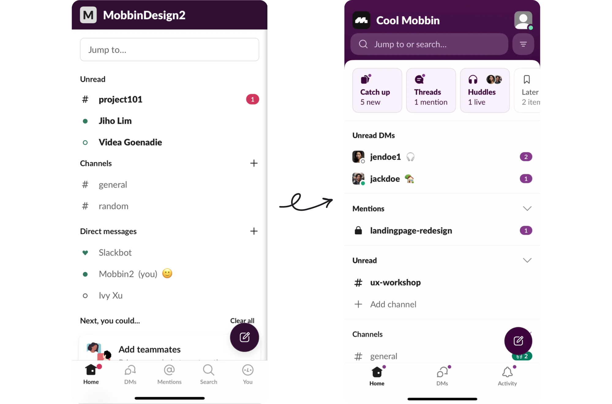
On desktop, the latest redesign brought a consolidated set of tabs, making it easier to access features, find information, and get work done without context switching.
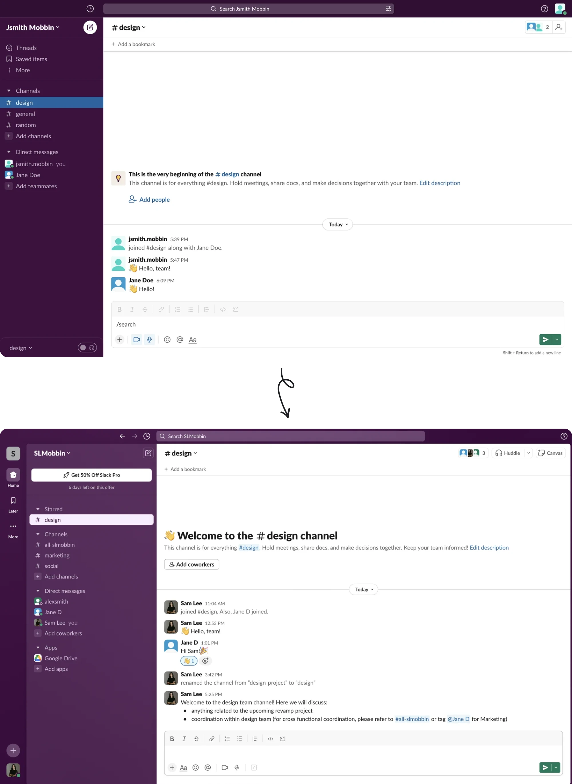
Now, users see Slack as a place to message, collaborate, manage tasks, share files, and move between tools. Its ongoing UX improvements have positioned it as a communication platform that consistently puts customer satisfaction first.
Key takeaways
- Targeted changes reduced friction in the mobile experience.
- Reorganized tab structure streamlined workflows and reduced clutter.
- Continuous UX improvements positioned Slack as a user-first platform.
3. Coca-Cola
Even for a brand as iconic as Coca‑Cola, staying relevant requires evolution. In recent years, the company has given its packaging a major rethink, showing how design can support business strategy, brand clarity, and market demands.
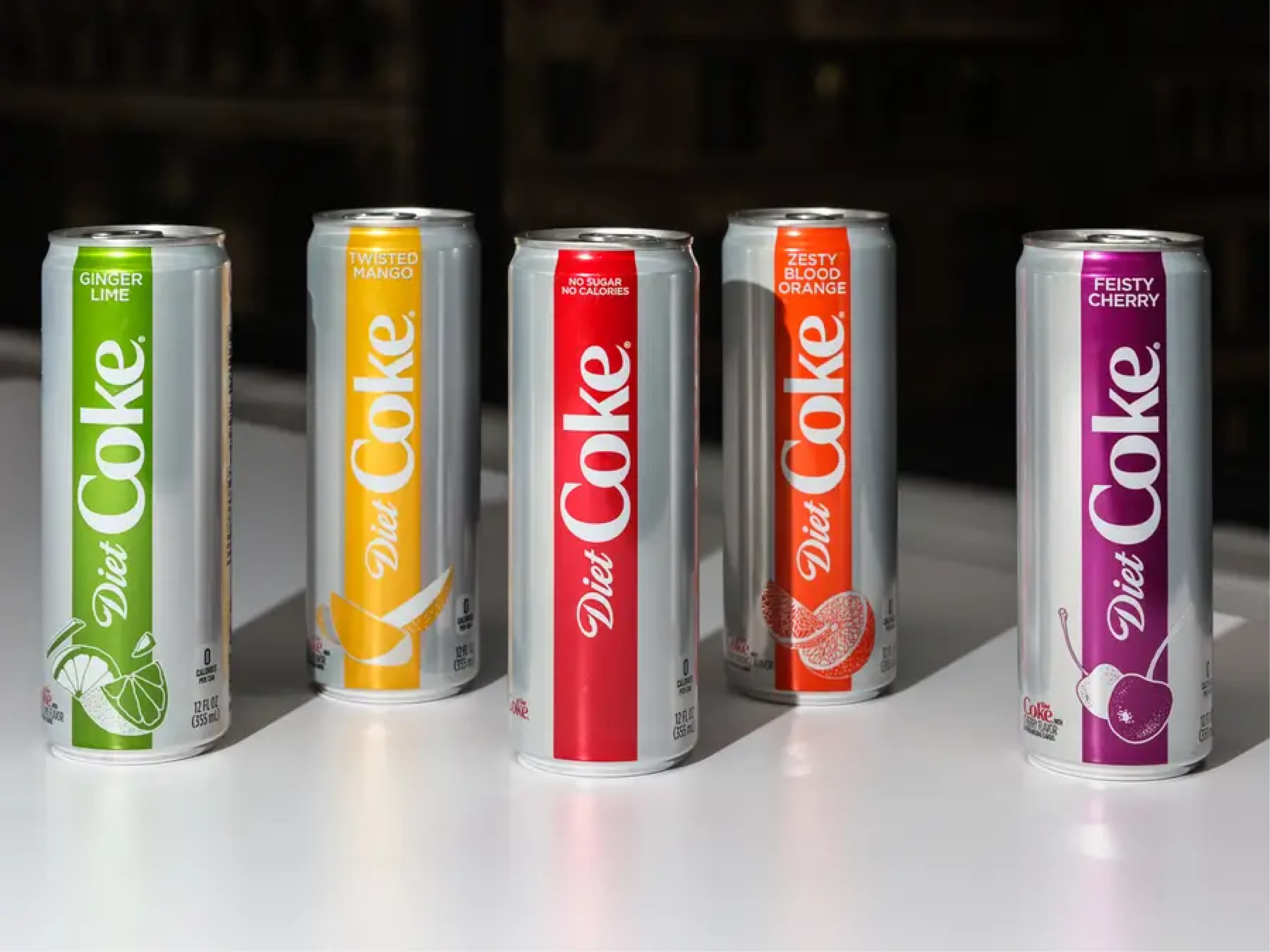
In 2021, the company simplified its cans and bottles under the umbrella of the “One Brand” strategy, applied across varieties like Original, Zero Sugar, and Diet Coke.
Rather than keeping elaborate labels, discs, and extra decorative elements, the redesign embraced minimalism. Clean lines, more empty space around the logo, and a layout let the signature red and script shine without noise.
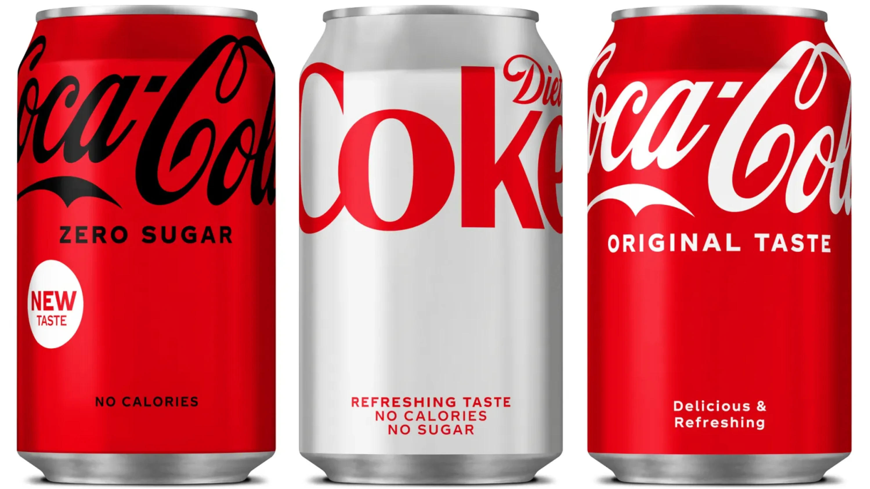
Beyond aesthetics, the redesign aligned with evolving customer expectations. As sustainability gained traction, Coca‑Cola renewed its commitment to recyclable packaging and increased the use of recycled materials.
In effect, Coca‑Cola’s redesign did several things at once. It modernized the brand’s appearance, simplified customer recognition across markets, and supported broader sustainability and corporate responsibility goals.
Key takeaways
- Unified packaging simplified brand recognition across global markets.
- Minimalist design modernized the brand’s visual identity.
- Redesign aligned with sustainability goals and consumer values.
4. Datawisp
Data‑heavy applications are often powerful, but only if they’re usable. Without thoughtful UX, they quickly become products that need improvement, no matter how strong the underlying functionality is.
In the case of Datawisp, the platform’s goal to remove coding from data analytics was compelling, but the initial interface looked like Windows 98.
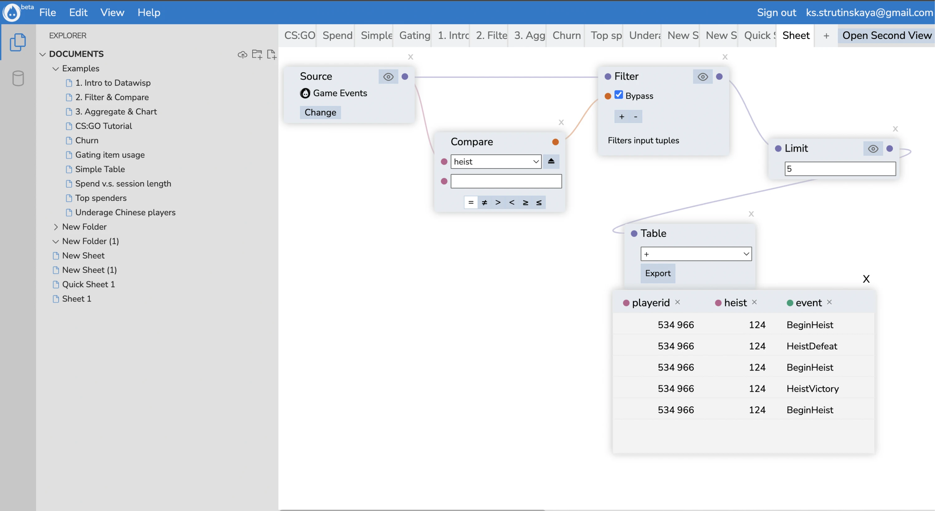
When the Datawisp team reached out to us at Eleken, we started from the foundations. Our designer mapped user flows, broke them down into data blocks, cards, tables, and analyzed the role and meaning of every element.
We complemented that with Jakob Nielsen’s ten usability heristics evaluation to catch usability flaws before touching any visuals.
One of the key focuses was redesigning the cards that hold data blocks or analytics results. We made them cleaner, easier to scan, and more functional. To help users turn data into visuals, we also introduced several new chart variations.
As a result, the platform finally matched the ambition behind it. Datawisp got better feedback from users and investors alike, and the redesign we made was instrumental in helping the startup close a $3.6 M seed round.
Key takeaways
- Usability heuristics and deep user analysis led to better design decisions.
- Cleaner card-based layout improved scannability and functionality.
- Redesigned product UX helped the startup secure $3.6M in funding.
5. Wikipedia
For over a decade, Wikipedia’s interface stayed largely unchanged while usage patterns and devices evolved. The older design (Vector 2010) had become visually dated, cluttered for newcomers, and less optimal on modern screens. It wasn’t broken, but it was one of those digital things to redesign once usage patterns began shifting.
In January 2023, Wikipedia’s desktop site got its first major makeover. The new interface introduced a sticky header, improvements to the search function, toggling among 300+ languages, and a collapsible sidebar to let readers focus on content.
Visually, the changes removed clutter and standardized the layout to better reflect modern web design and to align more closely with Wikipedia’s mobile app.
Wikipedia’s goal was to modernize its look and navigation without alienating users accustomed to its classic appearance. The focus was on making the site easier for the next generation of Internet users who may have less “wiki” experience.
Even small UX improvements had a measurable impact. Adding visuals to search suggestions led to 30% more searches in testing. The sticky header reduced scrolling by 15%, as users no longer had to scroll back up to access navigation.
Key takeaways
- Modernized UI improved readability and navigation for a global audience.
- Persistent elements reduced user friction across devices.
- Small changes led to 30% more searches and 15% less scrolling.
6. Spotify
Spotify’s core mission has always been to help people discover and enjoy music. But as the platform expanded, many users reported frustration with navigation, crowded home screens, and unnecessary features that distracted from the main experience.
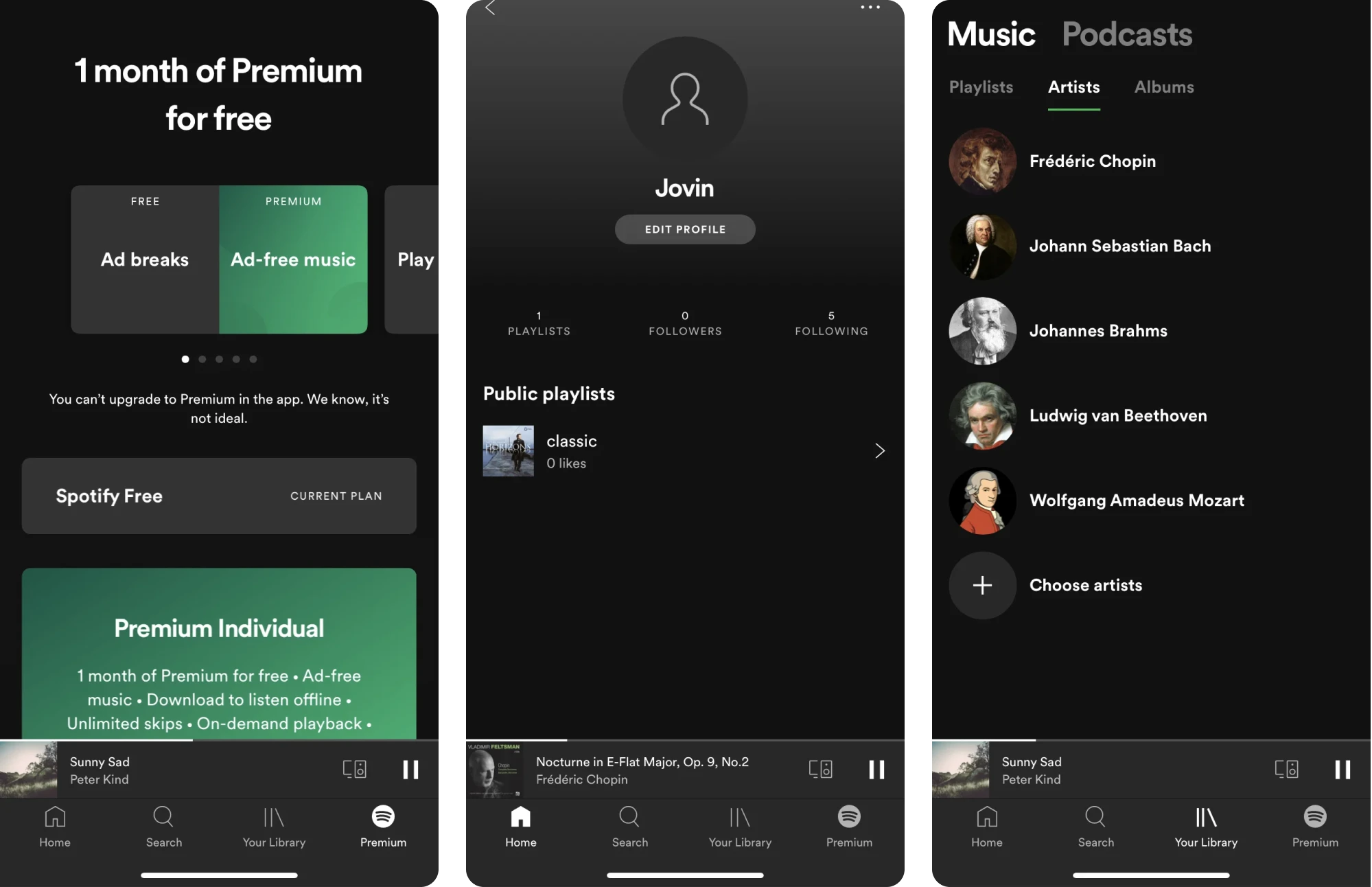
To address this, Spotify has continuously updated its UI/UX with user‑centered refinements. In 2025 and 2024, the company rolled out a series of design improvements aimed at giving users more control.
These updates included more intuitive playback and control options, enhanced discovery tools, and ongoing personalization improvements powered by AI.
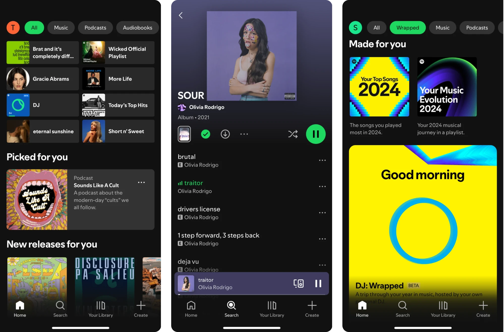
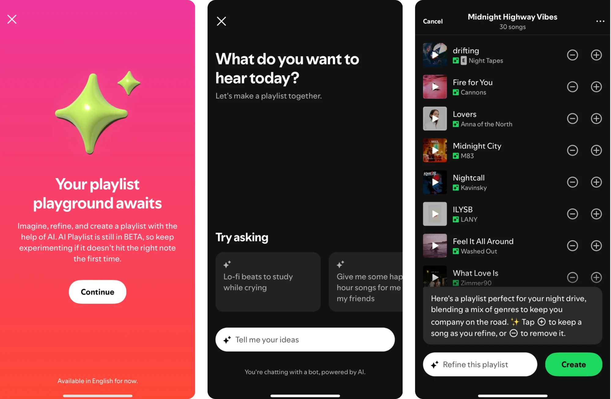
Among its latest features, Spotify now gives Premium mobile users access to AI Playlist, a tool that turns creative ideas into personalized playlists. As it rolls out to more markets, the feature is helping even more listeners explore music in new ways.
Across these iterations, Spotify focused heavily on usage data. The company made key actions like discovering, playing, and managing music faster, clearer, and more personal, while reducing friction for everyday listeners.
Key takeaways
- Redesign decisions were guided by real user feedback.
- Enhanced discovery and control features for a better music journey.
- Personalized refinements led to increased user engagement.
7. MyInterview
myInterview is a video interviewing platform that came to us with a critical problem: nearly 90% of candidates were dropping off mid-interview. That kind of abandonment rate was potentially fatal for a product built around user completion.
We needed to improve the experience and started by reviewing the application flow. The screens didn’t clearly show what to click, the multi‑select fields looked more like a quiz, and the “3 options max” limit only appeared after users began interacting.
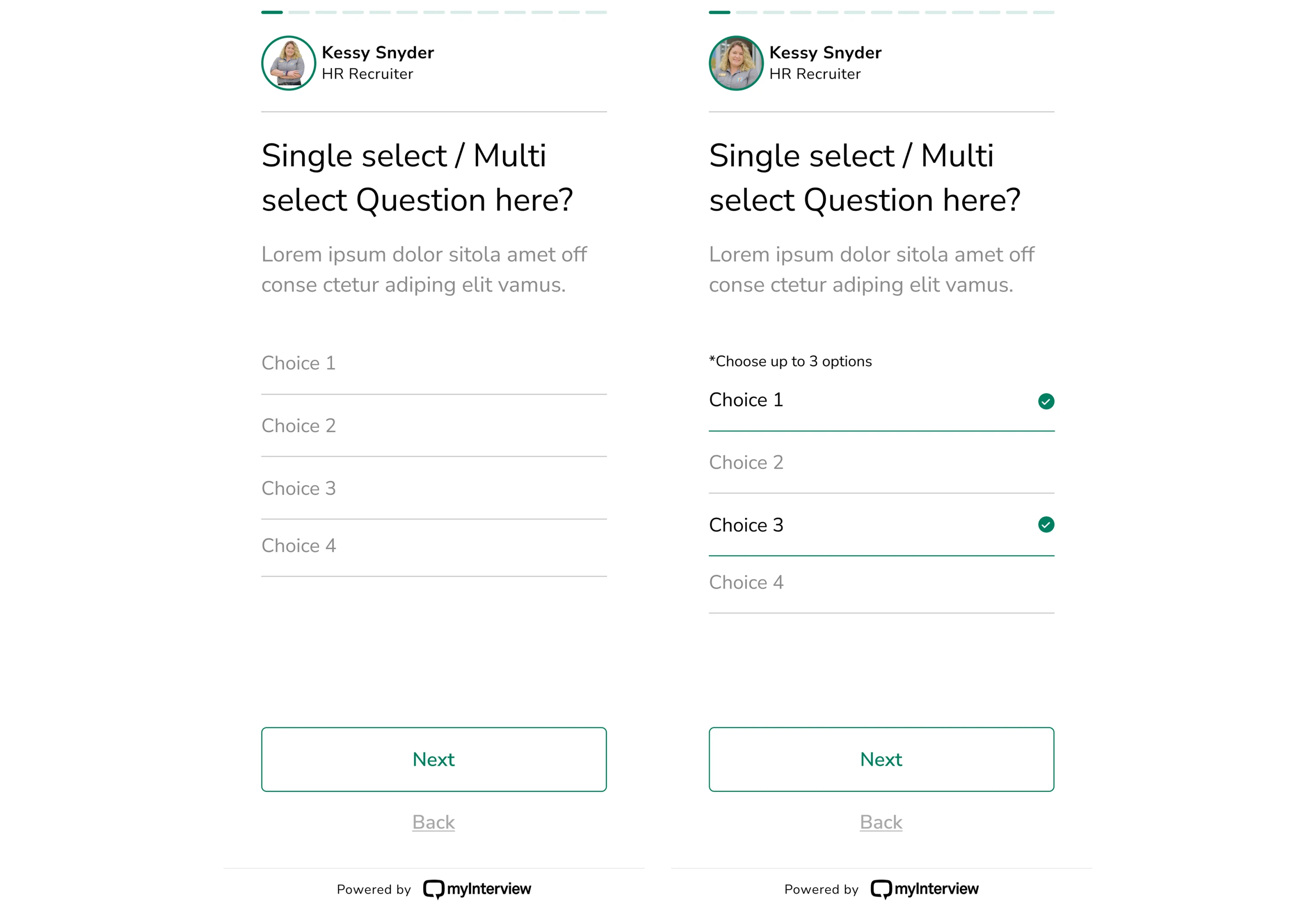
These issues created confusion and slowed down task completion. So we set out to improve every step and question module in the candidate flow.
For the new version, we added clear checkboxes to indicate multi-selection, expanded clickable areas to guide user interaction, and rewrote copy to set expectations from the start. With these changes, the path to completion felt obvious.
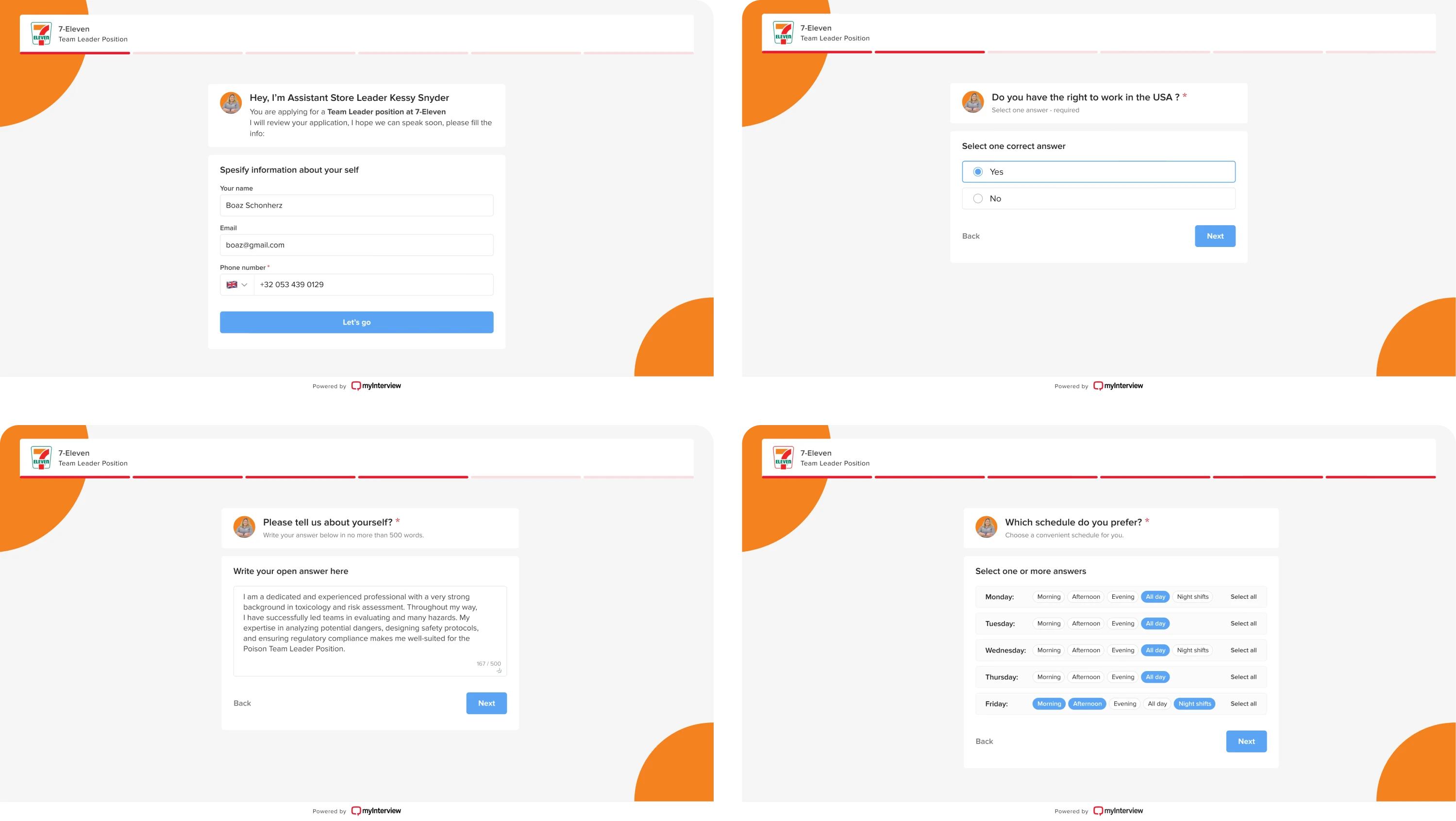
Beyond fixing usability issues, we also helped myInterview expand its offering with a fresh new look and several AI-powered features. The updates were designed with enterprise clients in mind, and we made every touchpoint feel intuitive.
Key takeaways
- Improved clarity significantly reduced user drop-offs during onboarding.
- Familiar interaction patterns helped users complete tasks with less confusion.
- Enhanced UX enabled the launch of new AI-powered features.
8. Instagram
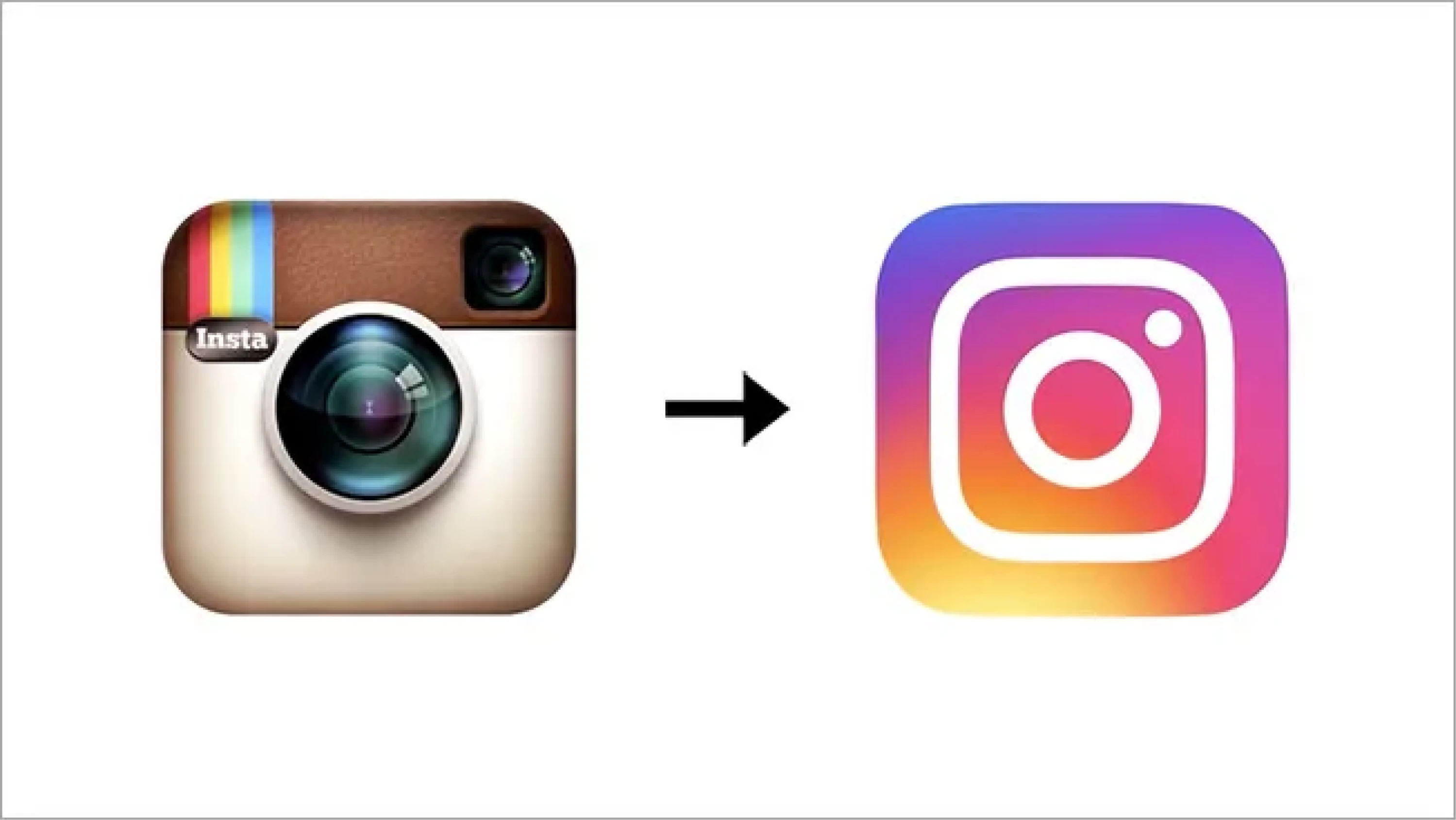
In 2016, Instagram shocked the world by ditching its famous retro camera icon in favor of a minimalist glyph and gradient. The new logo triggered countless memes and sparked strong reactions, but within days, users adapted.
Since then, Instagram has evolved into a full-blown social platform, and its interface has gone through changes to keep up with user behavior. In recent years, the biggest shift has moved toward video-first content, especially with the rise of Reels.
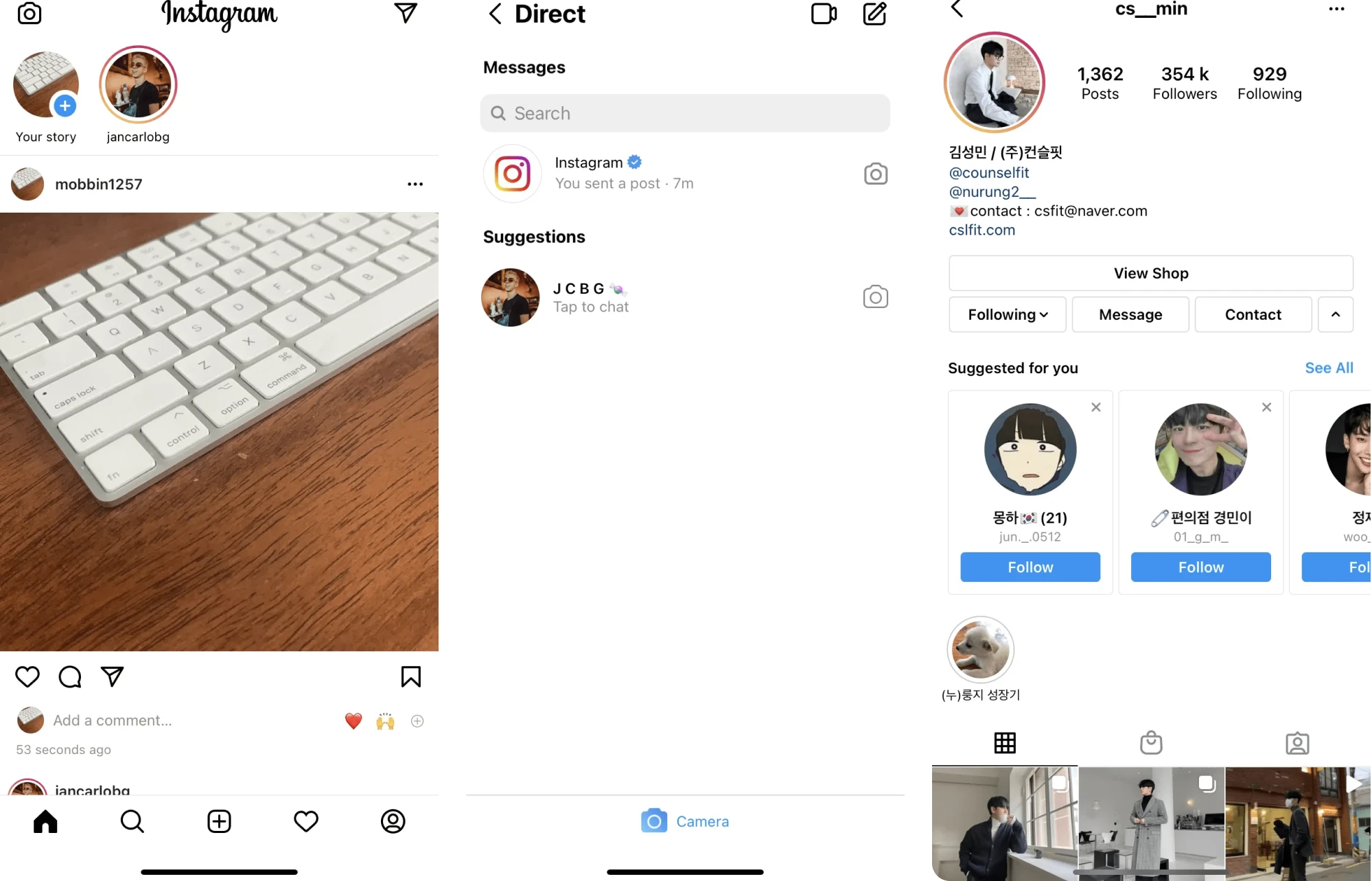
In 2025, Instagram rolled out a major UI redesign. Core navigation now prioritizes Reels and direct messages, placing them at the front of the app. As well, users can swipe between major sections for faster transitions.
However, these updates have sparked mixed reactions. Some users appreciate the faster access to favorite features, while others feel the redesigned navigation sacrifices the simplicity that once defined Instagram’s identity as a photo‑first app.
All in all, Instagram adapts to different usage patterns and makes updates based on how people actually spend their time on the platform.
Key takeaways
- The 2016 rebrand campaign helped Instagram grow to 1 billion users.
- Navigation redesign prioritized high‑engagement behaviors.
- Updated layout reduced steps to key actions.
9. Apple
Apple is known for its minimalist approach to product design, and since launch, the physical look of its devices and packaging hasn’t changed much. But in 2025, the company rolled out its broadest software design update ever.
This sweeping redesign touched every major platform in its ecosystem, including iPhone, iPad, Mac, Apple Watch, and Apple TV. The centerpiece of this update was a new design language called Liquid Glass.
Before this redesign, Apple’s software relied on the flat aesthetic introduced with iOS 7 and refined over the years. While clean and familiar, the UI had started to feel static in a world where users expect more dynamic, responsive experiences.
Liquid Glass introduced translucent, glass-like UI elements that reflect and refract background content, paired with adaptive visual layers that respond to motion and context. These changes were implemented consistently across devices.
Apple also updated controls, buttons, tab bars, and sidebars to shift in size and visibility based on how users interact with the interface.
Key takeaways
- A unified design language enhanced visual continuity across platforms.
- Adaptive UI elements helped reduce visual friction and emphasize content.
- Bold visual redesign sparked mixed reactions and reshaped digital trends.
10. Modia
Modia started as an internal tool to help editorial teams create content faster with AI. As it matured, the founders saw broader potential and decided to spin it out into a standalone SaaS product. That’s when they contacted Eleken for redesign service.
Since the platform introduced a completely new way of creating content, we needed to make the user interface explain itself.
Originally, teams faced unclear icons, ambiguous buttons, too many actions on a single screen, and a non-linear flow with no obvious next step. Because the MVP was prototyped quickly in FigJam, the interface lacked structure and visual clarity.
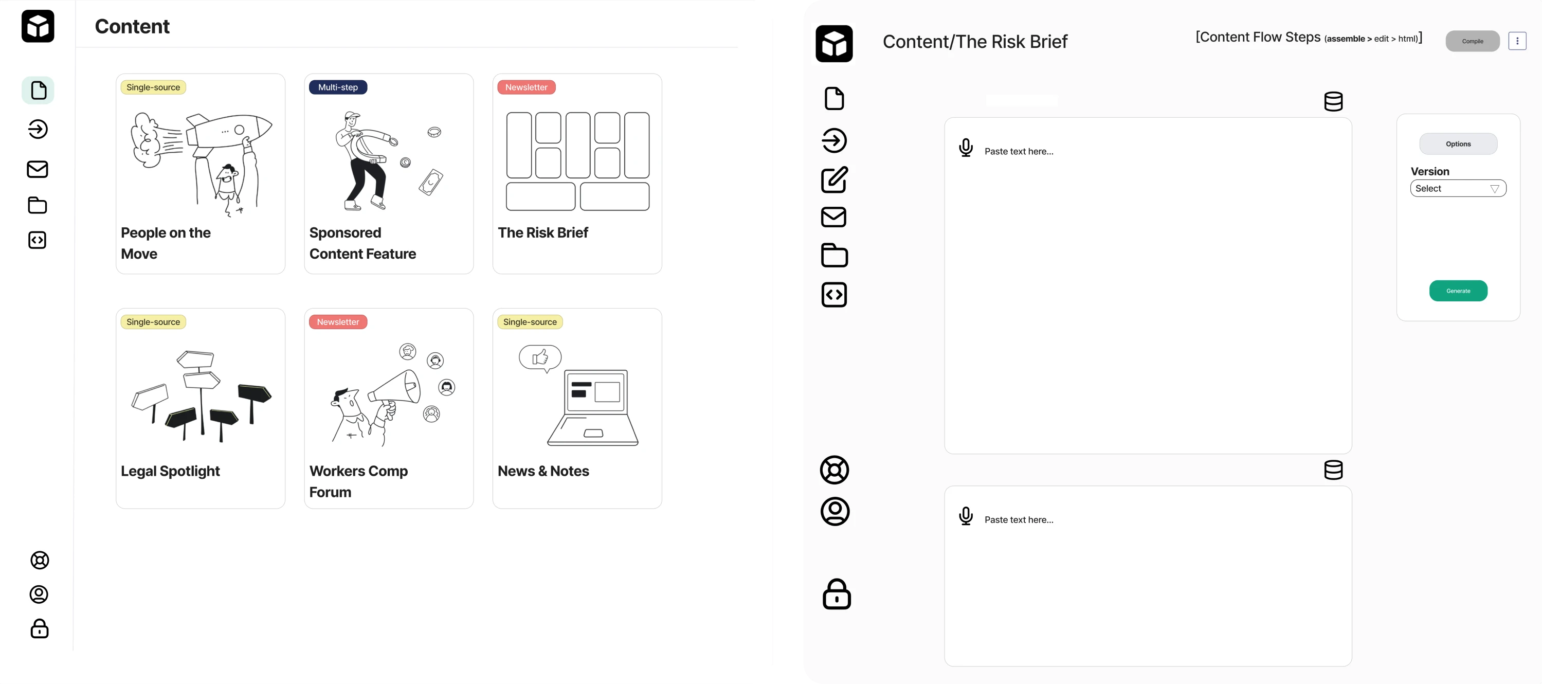
We simplified the layout by minimizing buttons and focusing each screen on a single call-to-action so users always knew what to do next. In the navigation bar, we restructured the sidebar and added a “Create content” button.
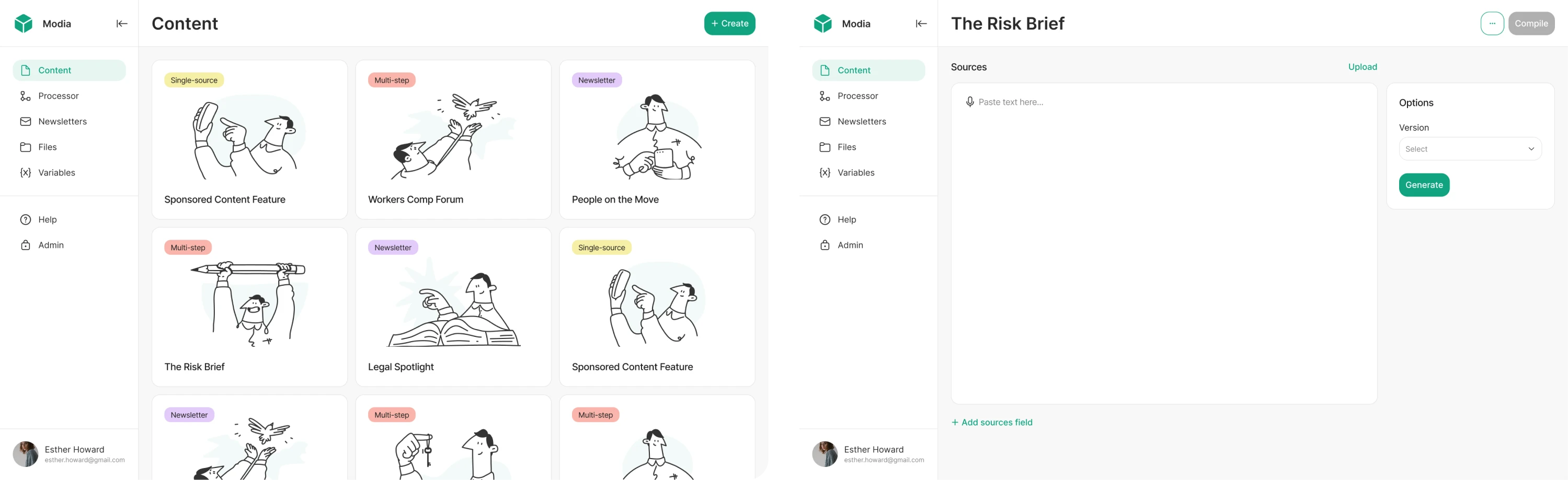
After conducting user interviews, we also reworked the block-based content generation flow. It now uses a consistent UI, intuitive icons, and a linear progression. At the end of our collaboration, the client was fully impressed with the results.
Key takeaways
- Reworked UX made an unfamiliar workflow feel intuitive.
- Thoughtful onboarding tooltips improved user engagement.
- Expanded feature set allowed the platform to serve broader user needs.
11. Uber
Uber’s interface has evolved dramatically since the early days when the app’s functionality was basically tap a button → get a ride. As the platform expanded into a global transportation ecosystem, its UI/UX had to grow along with it.
One of Uber’s core UX challenges has always been keeping the experience frictionless. Early iterations focused on a clean map, automatic geolocation, and simplified ride choices so even first-time users could understand it at a glance.
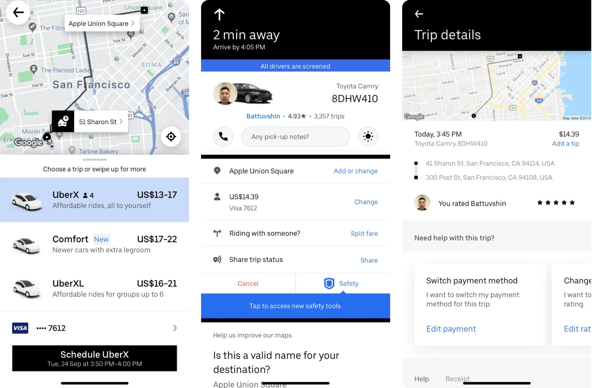
Over time, the design team refined that foundation by carefully layering in fare estimates, driver tracking, and multiple ride options without overwhelming users.
Key decisions like presenting only a few primary ride types, offering predictive destination suggestions, and making the estimated arrival time clear contribute to reducing choice overload and maintaining system visibility.
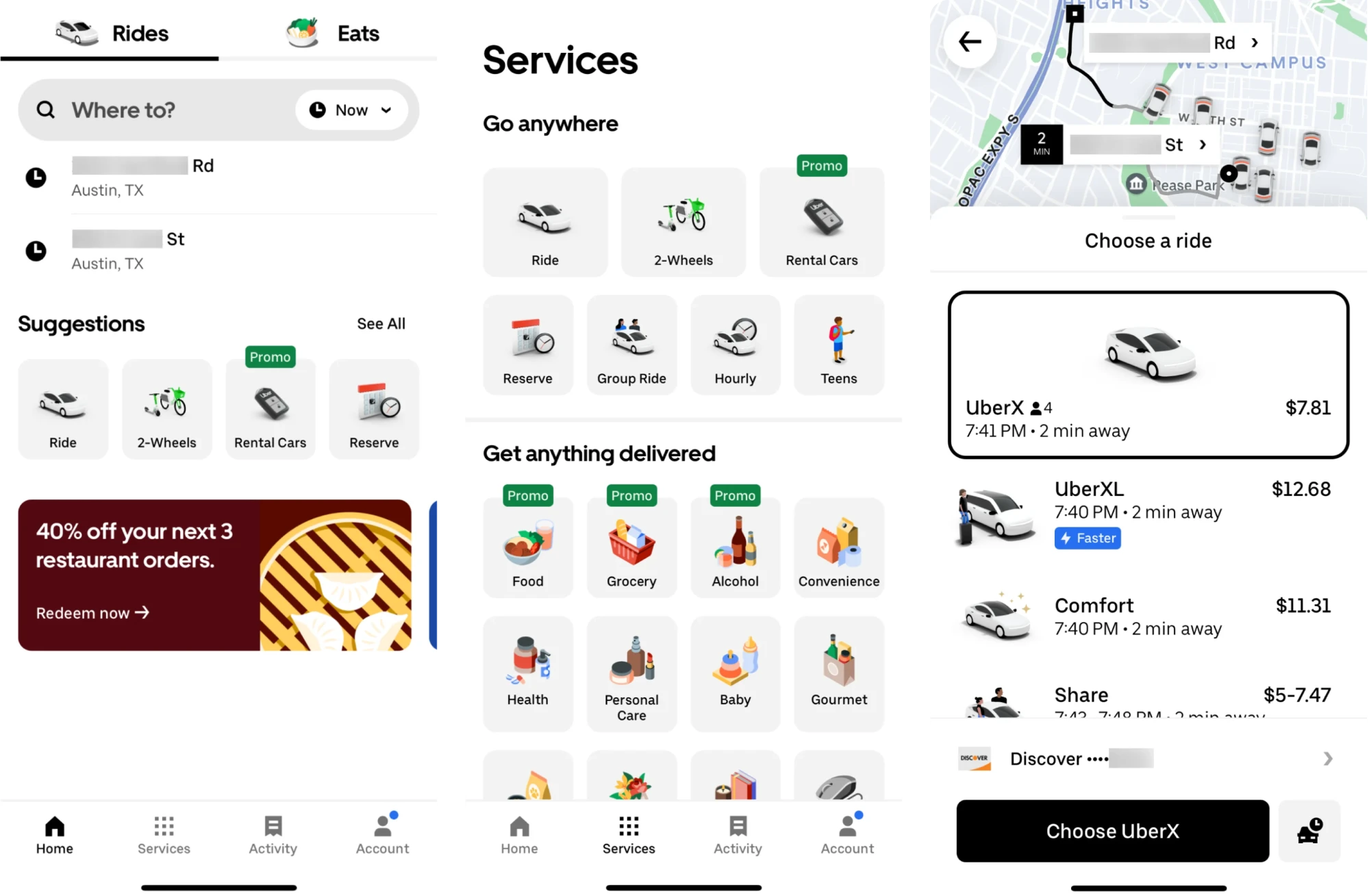
Even as the product expanded to include services like food delivery, shared rides, and micromobility, Uber maintained consistency. It leverages its Base design system to unify UI elements and interaction patterns across platforms.
Key takeaways
- Simplified core booking flow reduced friction from search to ride confirmation.
- Ride options and predictive suggestions made decision-making easier.
- The unified design system ensured consistency across features and devices.
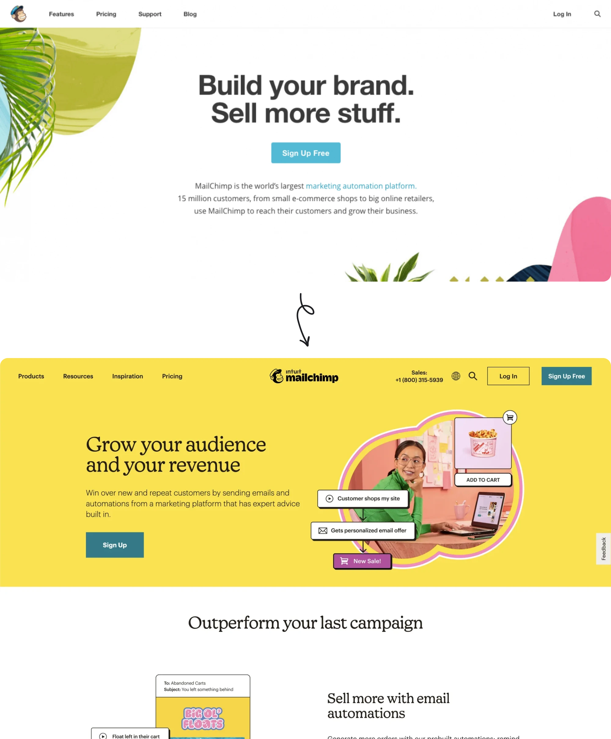
12. Mailchimp
Email marketing platform Mailchimp underwent a bold rebrand in 2018 that designers still reference for its distinct personality.
Rather than “growing up” into a buttoned-up corporate look, Mailchimp embraced its playful side while refining it. The beloved chimpanzee mascot “Freddie” was retained but redesigned in a slicker line-art style, improving legibility and impact.
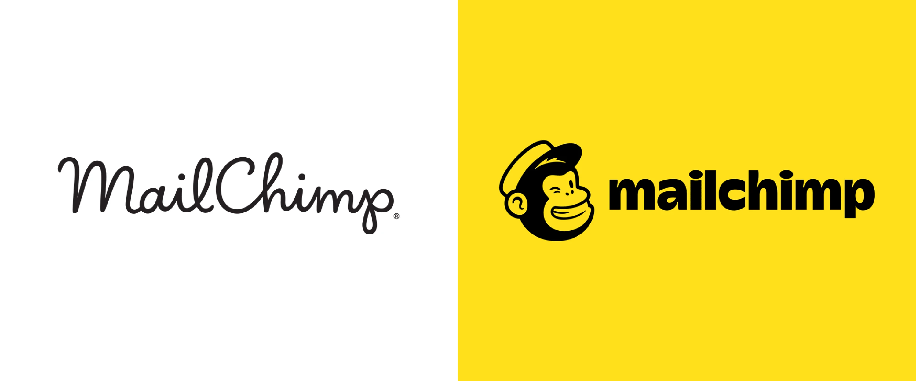
“Cavendish Yellow” became the brand’s primary color, splashed across its website and campaigns. Most strikingly, Mailchimp introduced doodle-like illustrations and animations created by artists, giving visuals a humorous, human touch.
The rebrand made waves in the design community for its originality and was broadly well-received. Many praised Mailchimp for proving B2B tech branding doesn’t have to be boring, which helped the company stand out in a crowded market.
These changes helped Mailchimp attract larger “upmarket” clients while still delighting its core small-business users. Over the next few years, Mailchimp grew significantly and was eventually acquired by Intuit for $12 billion in 2021.
Key takeaways
- Complete brand identity refresh strengthened Mailchimp’s market position.
- The growing feature set relied on modularity and usability across touchpoints.
- Redesign contributed to Mailchimp’s $12B acquisition by Intuit in 2021.
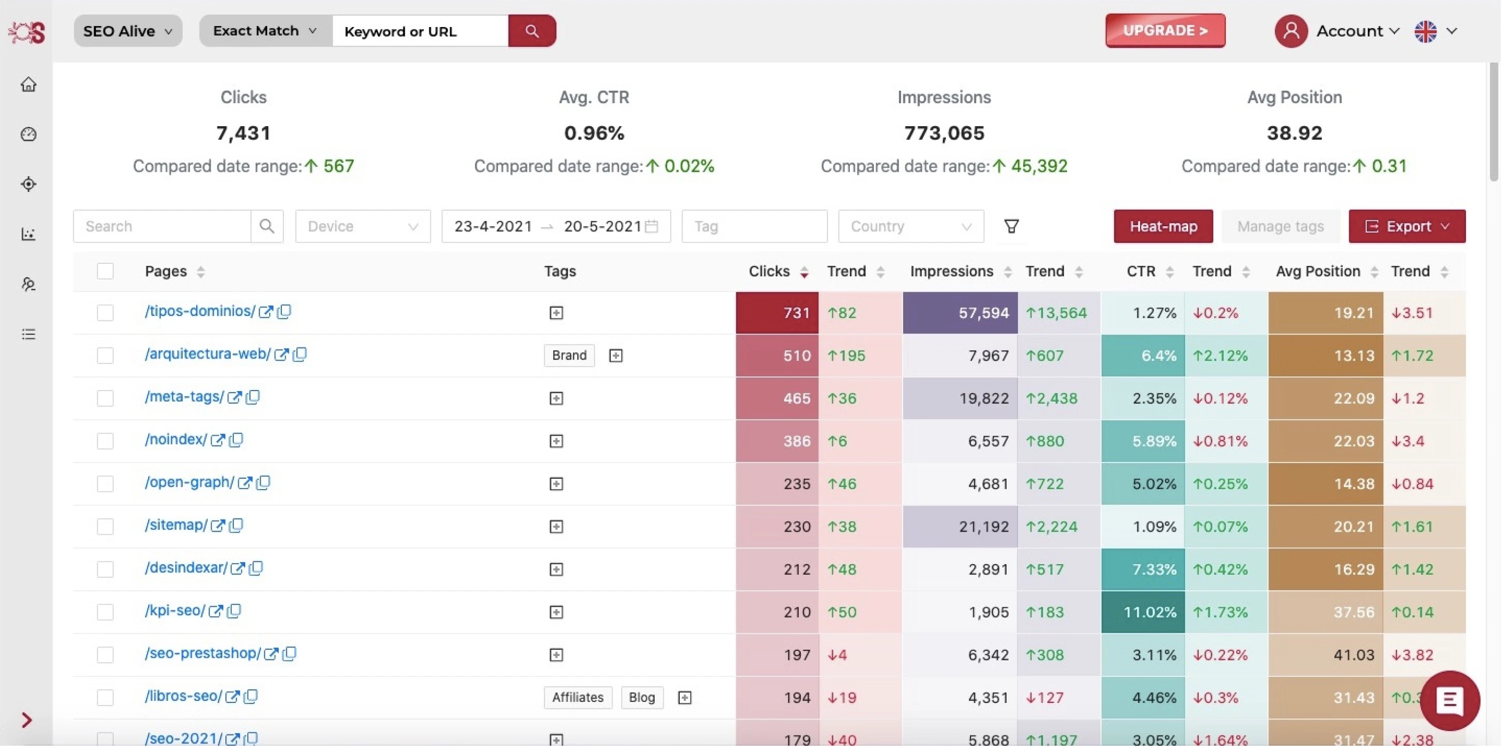
13. SEOcrawl
SEOcrawl is a suite of tools designed to help SEO professionals, companies, and marketing agencies make sense of vast data from Google Search Console. When the team approached Eleken, they had much bigger ambitions.
Though SEOcrawl had already been operating for six months, they wanted to reach more users, add more functionality, and evolve into a comprehensive SEO solution.
We started with competitor research and visual trend analysis. Around the same time, the team introduced a new logo developed by a third-party agency, and we aligned the entire product redesign with its style and color palette.
Most of the major blocks in the app needed restructuring and feature reprioritization. We analyzed the UX of each screen and redesigned key flows to improve clarity and guide users more effectively through the product.
In close collaboration with SEOcrawl’s team, we delivered a new interface that felt modern and intuitive. As a result, SEOcrawl grew from 0 to 2,000 users and significantly increased its number of paying customers following the redesign.
Key takeaways
- UI and UX redesign clarified product value and supported users’ onboarding.
- Familiar design patterns made the platform intuitive and easy to navigate.
- Strategic design improvements contributed to 2x customer growth.
Final words
If there’s one thing that ties these redesigned products together, it’s the focus on UX. In every case, teams aim to create clarity where there was confusion, remove guesswork from user flows, and build interfaces that feel obvious.
And when done well, those UX shifts unlock business growth, build trust, and make the product feel like it was always meant to work that way.
At Eleken, we’ve seen how thoughtful redesigns can help our clients grow their user base, attract investment, and scale their businesses. So if you’re ever looking to go beyond what’s currently possible, our team is always open to a conversation.


