Fintech UX is a trust game. And most are losing.
Nearly 90% of users drop off during digital onboarding in finance apps, often due to confusing or frustrating experiences. Even loyal users won’t stick around after a single bad interaction.
A UX audit helps you fix UX issues early, before users churn.
At Eleken, we’ve run dozens of fintech audits, fixing KYC friction, simplifying flows, and improving dashboards. Our goal is to connect every UX issue to a real metric, such as conversion, retention, or support volume.
In this guide, we’ll show you how to do exactly that, with a step-by-step fintech UX audit process, a practical checklist, and real-world examples.
Let’s start with the basics.
What a UX audit is and isn’t
A UX audit is a focused evaluation of how users interact with your product, and where that experience breaks down. It helps you understand why users are getting stuck and how those friction points are impacting your business, leading to lost conversions, churn, or support overload.
In fintech, these issues often look like:
- Users don’t finish onboarding.
- They don’t trust the interface enough to connect their bank.
- They contact support to complete basic tasks.
A solid UX audit digs into the data behind these problems. It combines:
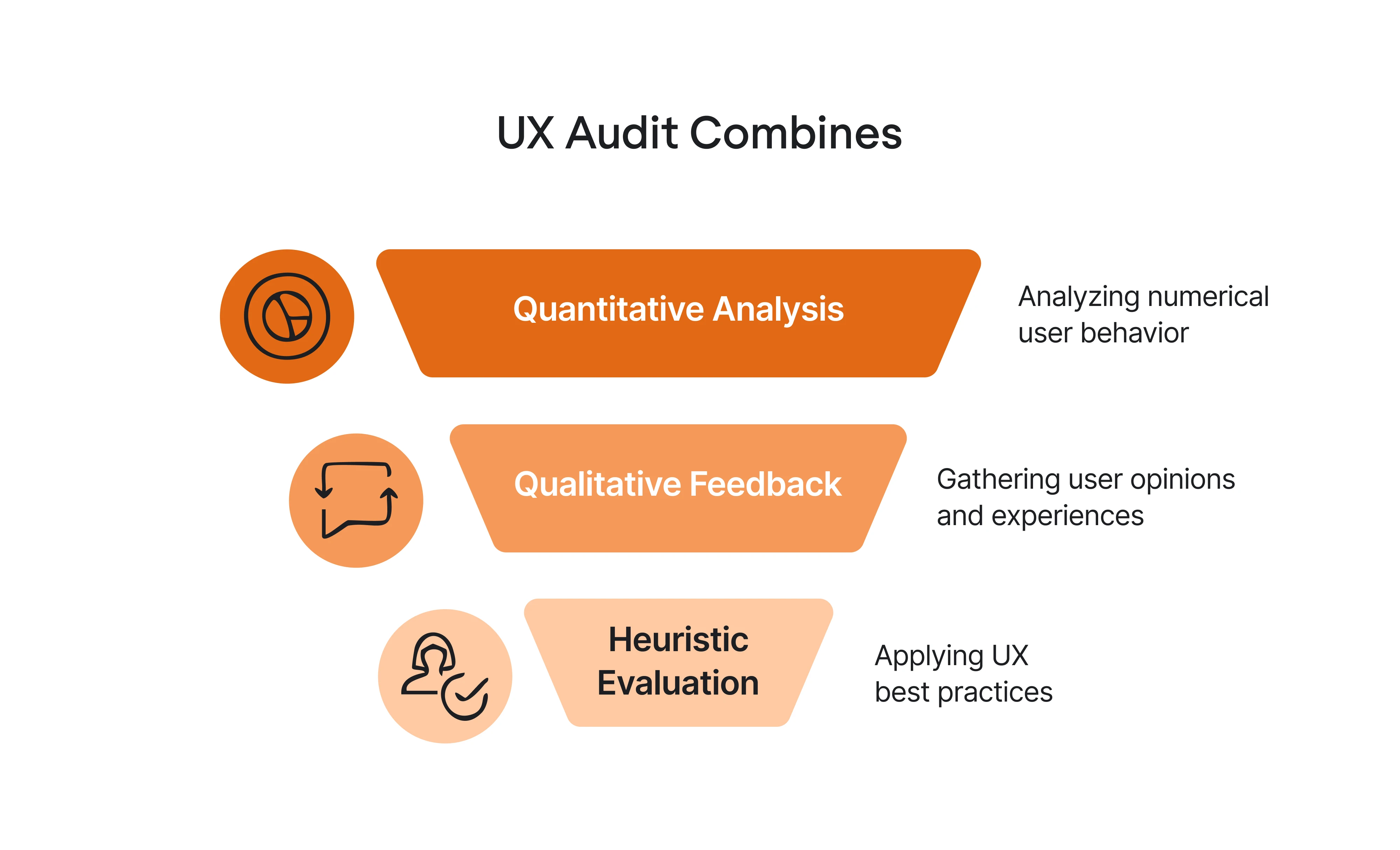
- Quantitative insights, such as where users drop off, how long tasks take, and conversion rates.
- Qualitative feedback: session recordings, usability tests, support tickets.
- Heuristic evaluation fintech: applying UX best practices, tailored to fintech’s unique challenges.
If you want a deeper dive, watch our video for practical tips and tools to get started.
It’s part detective work, part diagnosis, with real business outcomes at stake. That said, it’s easy to misunderstand the UX audit outcomes. Many teams expect it to be a quick fix, but here’s what it doesn’t do:
- Validate product–market fit.
- Replace actual user research.
- Magically make people love a bad product.
It’s also not a vague design opinion dump. If your audit doesn’t tie every issue back to user behavior or business impact, it’s not helpful. So, when should you run a UX audit?
If any of the following sound familiar, you’re overdue for one:
- Onboarding completion is low, and you don’t know why.
- You just launched a new KYC or payment flow, and conversion dropped.
- Support is buried in “how do I…” questions.
- You’re redesigning soon and want to avoid rebuilding the same UX problems.
- Growth has stalled, and you suspect UX might be the blocker.
Now, let’s look at what makes UX audits important in the fintech space.
Why UX audits matter in fintech
In fintech, you don’t get second chances. One broken flow, one unclear message, or one missing security UX design, and the user is gone. You’re designing not only for usability but also for trust.
Financial products come with built-in complexity, including:
- KYC verification
- Compliance disclosures
- Currency conversions
- Account linking
- Sensitive data
Each of those areas introduces potential friction, and many fintech teams unintentionally make things worse with clunky interfaces, vague error messages, or outdated user flows.
Meanwhile, fintechs that deliver a smooth, intuitive experience are gaining ground fast. According to Finastra, nearly half of banks say fintech competitors have already captured at least 10% of their payments volume, and 94% plan to invest in modern payment technology to keep up.
A UX audit helps you stay ahead by measuring and improving things like:
- KYC completion rate: Are users verifying, or bouncing?
- First transaction success rate. Can they send money or activate a card easily?
- Drop-off points: Where do users give up and ghost?
- Support ticket volume: Are people emailing support to finish signup?
- Referrals and retention. Are users confident enough to recommend you?
These metrics are core drivers of growth. And when those numbers stall, a UX audit helps you figure out whether the issue lies in your strategy or just in the experience you’re delivering.
Let’s dive into the framework and see how it works in practice.
The fintech UX audit framework: 7 practical steps
Here’s how to run a UX audit designed specifically for the needs of fintech teams:
Step 1: Define the audit scope and objectives
Before diving into tools like Hotjar or running usability tests, start by getting clear on two things:
- What exactly are you trying to improve? (e.g., onboarding conversion, account activation, transaction success).
- Which flows matter most? (typically: onboarding, account linking, money movement).
The more focused your scope, the more actionable your findings will be.
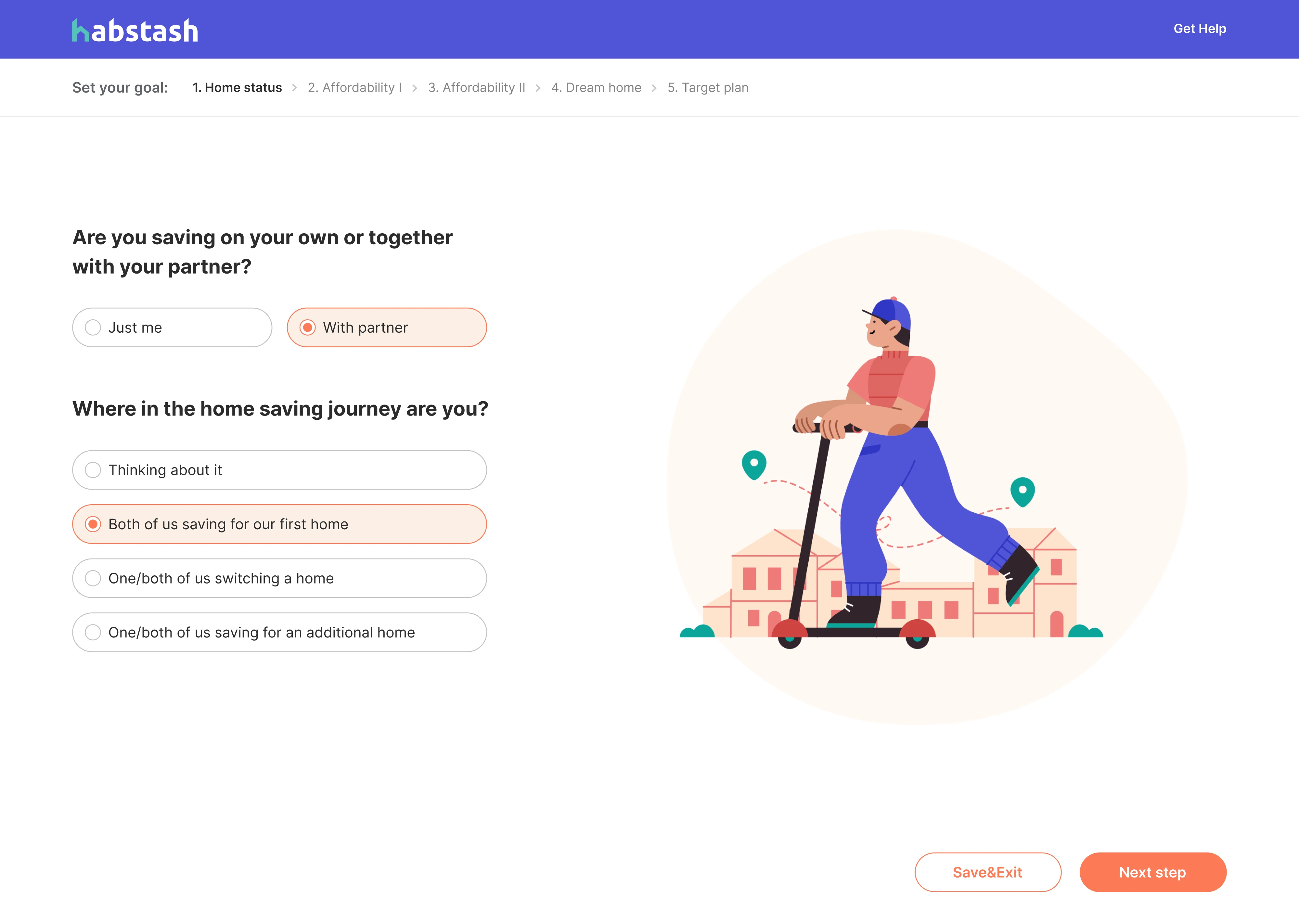
For example, when we started working with Habstash, a personal budgeting app, we aligned on project objectives from both user and business perspectives. Together with the client, we analyzed the client's prototype’s core flows, reviewed prior user research, and identified opportunities to simplify the experience.
One of the biggest friction points was the sign-up flow. The original idea was to present it like a calculator, but given the amount of information Habstash needs to collect, that format made the interface feel cluttered and overwhelming. Worse, it risked pushing users to abandon the app before even getting started.
Instead of presenting all fields at once, we broke the sign-up process into a sequence of focused screens, each with one question. This reduced cognitive load, improved clarity, and made the onboarding process feel lighter and more approachable.
Step 2: Gather quantitative and qualitative data
Start by answering two questions:
- Where are users dropping off? (e.g., during KYC, after linking a bank, before confirming a payment).
- What’s causing the friction at that point? (e.g., unclear instructions, slow load times, missing trust signals, form errors).
To get the full picture, you’ll need both types of data:
- Quantitative: Tools like GA4, Mixpanel, and funnel analytics reveal drop-off points, conversion rates, and retention trends.
- Qualitative: Session replays, fintech usability tests, user interviews, and support logs show how users behave and where they get stuck.
Pro tip: Tag each issue by business impact (e.g., high drop-off, high support cost) to prioritize what matters most.
When working with Invyzia Solutions, a proposal-generation platform, we uncovered UX friction in their multi-step creation flow. After reviewing all key pages and behaviors, we identified navigation as a major barrier.
To streamline the experience, we replaced the three-step proposal process with a single, well-organized page supported by breadcrumbs to guide users. This simplified structure reduced confusion and made it easier for users to complete proposals in one go.


Step 3: Run a fintech-specific heuristic evaluation
Don’t rely on a generic UX audit checklist. Fintech products come with their own set of trust-sensitive, regulation-heavy pain points. At Eleken, we use a tailored set of heuristics to evaluate how well a product handles the unique challenges of financial UX.
Here’s what we look for:
- Money state clarity: Can users see if funds are pending, posted, failed, or processing?
- Trust and transparency: Are fees, FX rates, and security signals clearly explained?
- Error prevention and recovery: Can users safely retry or resume failed transactions?
- Compliance and consent clarity: Are legal screens readable and easy to accept without confusion?
- Accessibility of sensitive data: Are balances, charts, and buttons usable for all users, including those using screen readers?
These heuristics apply to both core flows and edge cases. And yes, the weird edge cases matter, like when an ID upload fails during KYC or when FX markets delay a transfer.
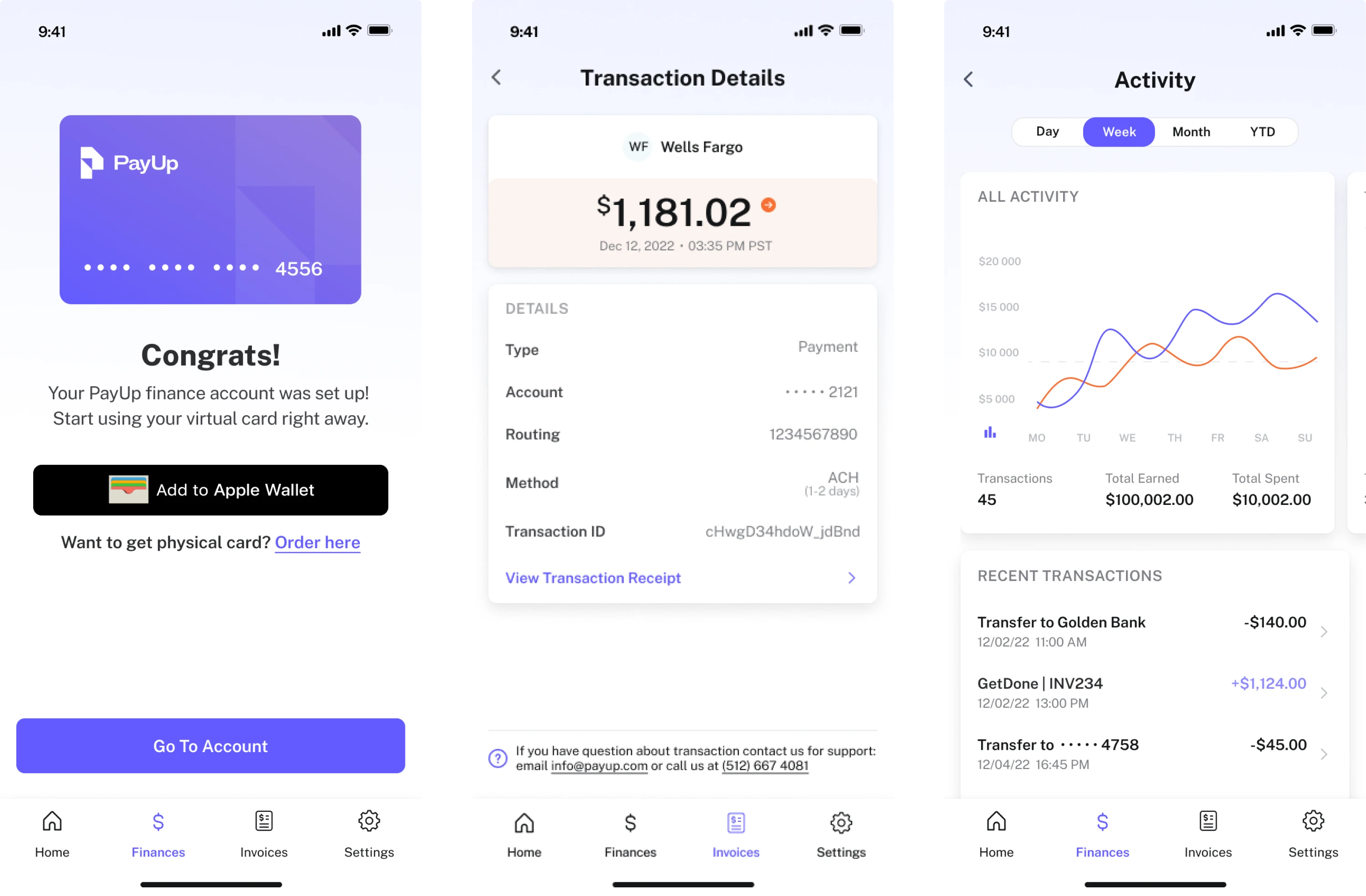
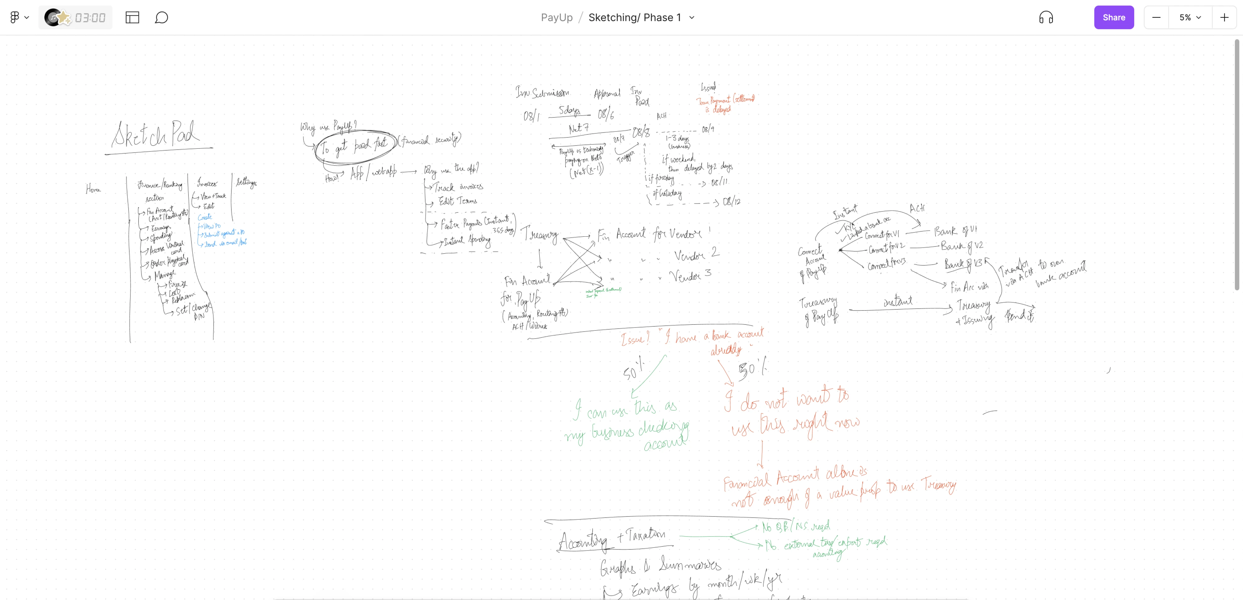
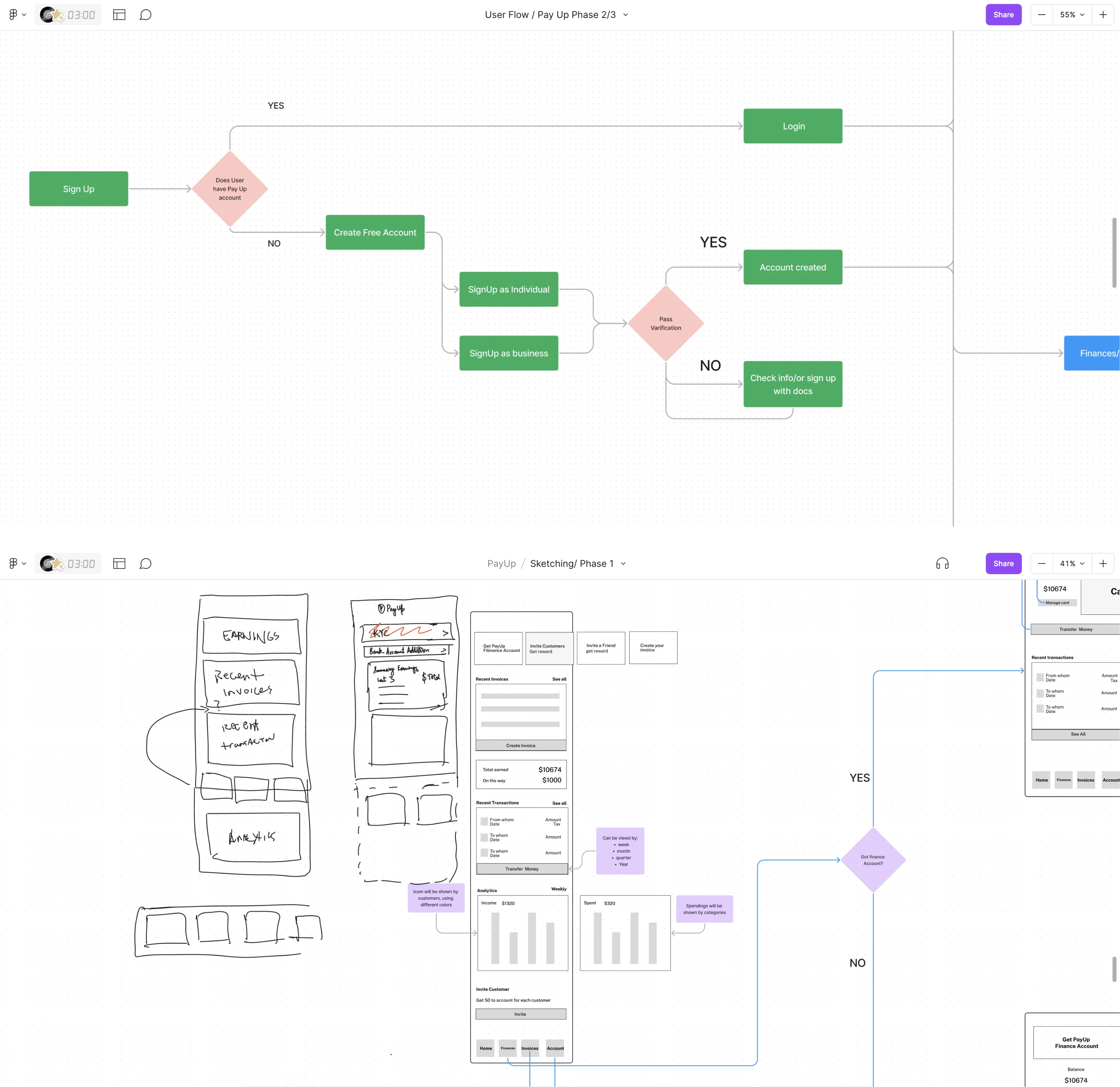
PayUp, a financial app, is a great design audit example. We faced a common fintech challenge:
How do you ask users for highly sensitive information, such as account numbers or Social Security numbers, without scaring them off?
Our goal was twofold:
- Build trust through transparency, clearly explaining why certain data was needed.
- Streamline the sign-up flow to reduce friction and avoid overwhelming new users.
Instead of cramming everything into a few dense screens, we broke the flow into smaller, digestible steps. This increased the number of screens but made the experience feel lighter and more reassuring.
We also helped introduce the PayUp Wallet, a feature that lets users create a financial account, make payments, transfer money, track income, monitor expenses, and even manage taxes. With clearer UX and added value, users were more willing to move forward and complete onboarding.
Step 4: Run targeted usability testing
Recruit real users, not just your team or anyone with access to your Figma file. Focus on testing specific, high-impact tasks, such as:
- Completing KYC;
- Linking a bank account;
- Sending a first payment;
- Checking card activation status.
Measure what matters:
- Task success rate: Can users complete the task without errors or assistance?
- Time on task: How long does it take users to complete key actions, and is it longer than expected?
- User frustration: Ask questions, observe behaviors, and listen carefully for confusion or hesitation cues.
Even testing with just five users can reveal UX design patterns and blockers that analytics alone can’t uncover.
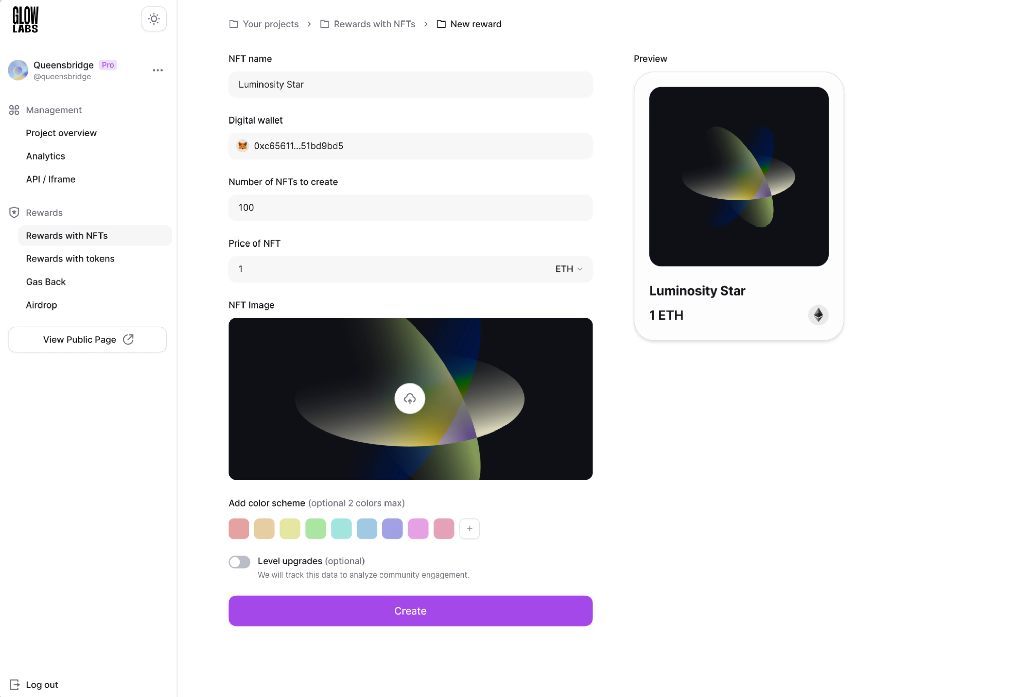
At Eleken, we see usability testing as a cornerstone of good fintech UX design. That’s why we love collaborating with clients who value it as much as we do, like the team at Glow Labs.
In that project, the product manager maintained a tight feedback loop with real users, which allowed us to adjust designs in real time. In fact, some new features were added late in the process based entirely on user feedback.
One key insight: users were struggling to find important actions. As a result, we revised button styles, making them larger and more visually prominent, to improve visibility and reduce friction.
Step 5: Evaluate accessibility and performance
Fintech apps are used under pressure on small screens, with sensitive data, and often by people multitasking or in a hurry. Your UI should reduce stress, not add to it.
Here’s what to check:
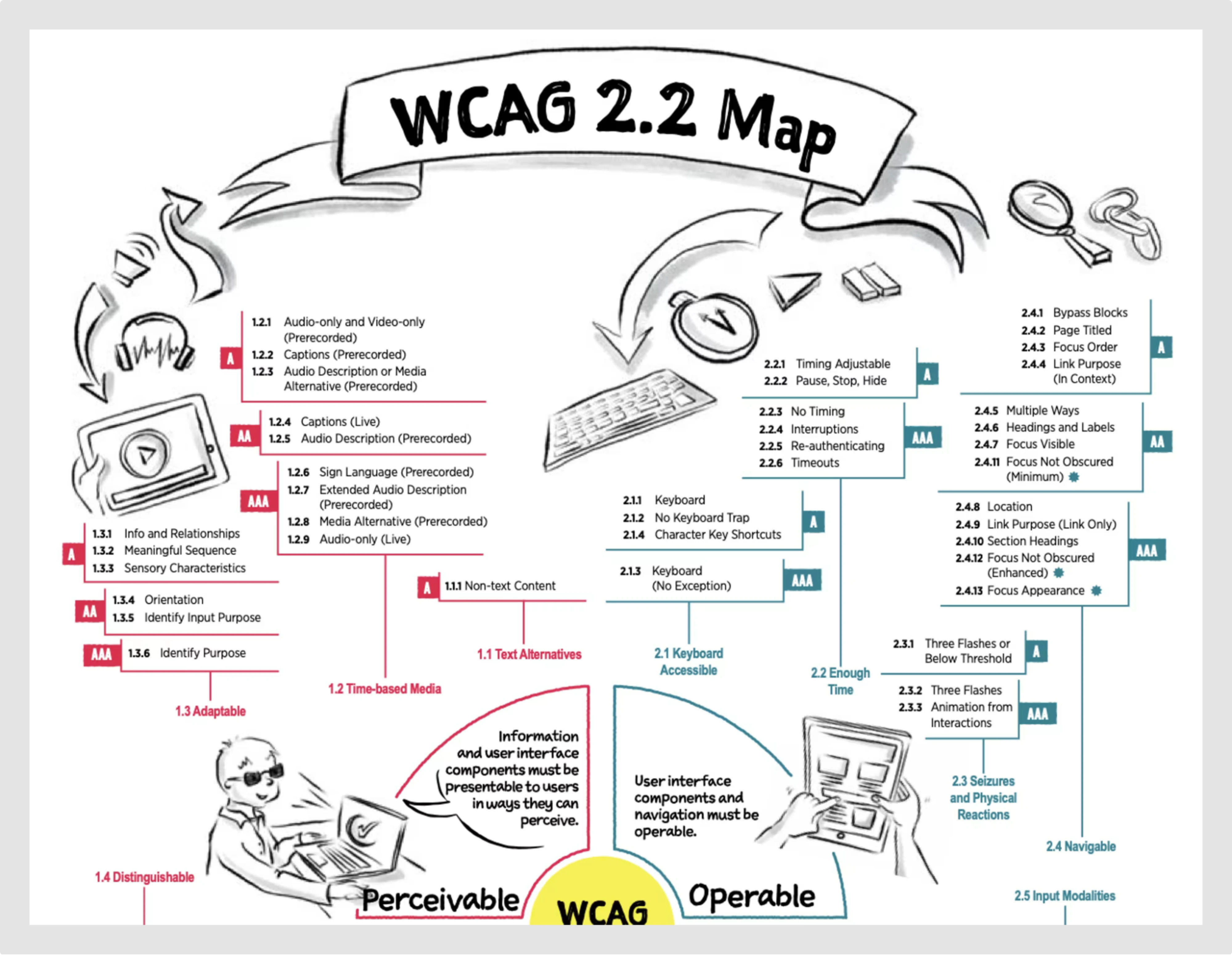
- Accessibility (WCAG compliance): Ensure your interface meets basic standards, including readable labels, color contrast, and focus states for keyboard navigation.
- Screen reader support: Can users access key data like balances, charts, and account details using assistive technologies?
- Performance: Check how long critical screens (e.g., SaaS dashboards) take to load, especially on slower connections or older devices.
Because in UX, performance equals perception. If a user waits four seconds for their balance to load, it may not be “broken,” but it definitely feels that way.
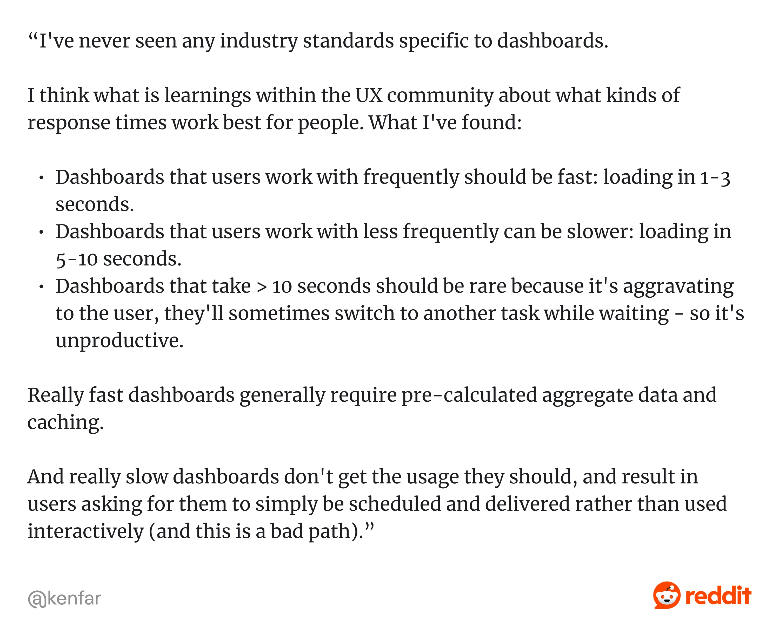
A UX community member on Reddit summed it up well: “Dashboards that users work with frequently should be fast: loading in 1-3 seconds. Dashboards that users work with less frequently can be slower: loading in 5-10 seconds. Dashboards that take > 10 seconds should be rare because it's aggravating to the user...”
Step 6: Analyze findings and prioritize fixes
At this point, you’ve uncovered plenty of issues, but the real value comes from turning those findings into a focused action plan.
Don’t just throw everything into Jira and hope for the best. Instead, group issues by themes like user onboarding UX patterns, trust cues, navigation, copy, and error handling. This helps teams see patterns, not just isolated problems.
Then, prioritize using a simple scoring model that balances impact and effort. Here's a sample structure:

Step 7: Create an audit report that people read
Your UX audit report is the bridge between insights and action. Keep it focused, visual, and tied to outcomes your team cares about.
Here’s what to include:
- Executive summary: A short overview of what’s broken, what’s at stake, and why it matters.
- Annotated screenshots: Show the issue directly on the interface, not just in text.
- Fix recommendations: Prioritized suggestions with optional wireframes to illustrate data-driven ux improvements fintech.
- KPI mapping: Connect each fix to a business goal, such as KYC completion, support reduction, or conversion lift.
It’s recommended to add a simple visual that illustrates your process, like:
Audit → Insight → Fix → KPI lift
Next, we’ll show you where teams often go wrong when running UX audits with real comments from designers in the wild.
Common UX audit mistakes from real designers and product teams)
We pulled insights straight from UX communities such as Reddit, Slack groups, and design forums, where real teams talk about what actually goes wrong and how to avoid the same traps.
Mistake 1: Auditing everything at once
Designers often try to audit every single screen and end up overwhelmed, with pages of redlines and no idea what to fix first.
One designer shared on Reddit: “I know right? When I read the assignment I thought oh okay! Just 3–4 screens I need to audit. Then I checked the app and it’s 29 screens...”

Fix: Focus on 2–3 high-impact flows
Start where trust is won or lost: onboarding, funding, and the first transaction. These are the moments that shape user confidence and long-term retention.
Another Redditor offered smart advice: “If it's that many screens I would focus on the most glaring UX issues and limit your efforts to those. Audits and heuristic evals can get very in-depth so demonstrate you know what you're doing with 7-10 issues. If there's pushback then they are most certainly taking advantage of your time, imho.”

Mistake 2: Jumping straight into heuristics
A common misstep: starting the audit with a checklist of heuristics before understanding the product’s goals, users, or context. As a result, you’re just guessing what’s wrong and missing what matters.
As one Redditor put it: “Have faith in recruiters. You don’t need to audit all heuristics and all screens. First go through all screens to find the primary use case — maybe pick one core and one edge case. Then audit those against 2–3 heuristics. That’s enough to show your process and thinking.”

Fix: Start with business goals and user data
Don’t audit what looks wrong; audit what’s impacting performance. Before diving into heuristics, ask:
- What are the product’s goals?
- Where are users dropping off?
- Which flows matter most to the business?
This A designer on Reddit shared this thoughtful approach: “...Establish your assumptions and point out heuristic flaws in the screen, Also tell them if you had a time what are things you would do to enhance the audit, Such as market research, User interviews etc… Always highlight what’s the current state what could be future state. This gives them cue that you are looking for solutions as well!”

Mistake 3: Treating the audit as a handoff
You spend days putting together a beautiful 80-slide audit report. You deliver it. The client nods and says, “Cool.”
And then… nothing changes.
One Redditor described the reality: “I did it and landed the job. I’m very against these practices but still have to put food on the table. There’s a time for principles, but you can only make that call. You can minimize risk by only sharing insights in-person and not sending materials over.”

When audit findings aren’t tied to action, they become just another PDF collecting dust.
Fix: Make your audit actionable
Your goal is to drive decisions. That means:
- Show real examples: don’t just say “fix the onboarding,” show the screen and where users drop off.
- Prioritize by business impact: what’s hurting conversion, support volume, or KYC completion?
- Include clear next steps and KPI mapping: connect every issue to a metric and a recommendation.
Audit findings don’t mean anything unless they lead to decisions. User engagement in SaaS is essential.
Mistake 4: Confusing UX audits with product validation
The product manager said the audit would help prove product–market fit. It didn’t. Turns out, users just didn’t want the product, no matter how polished the design was.
One Redditor nailed the confusion: ““How do you assess the experience of products if you’ve never done a UX audit? It’s one and the same. Table stakes for any role.”

Fix: Be honest about what an audit can (and can’t) do
UX audits are powerful, but they’re not magic. They improve how your product works, not whether it should exist, helping:
- Improve usability;
- Identify friction;
- Enhance trust;
- Map issues to business impact.
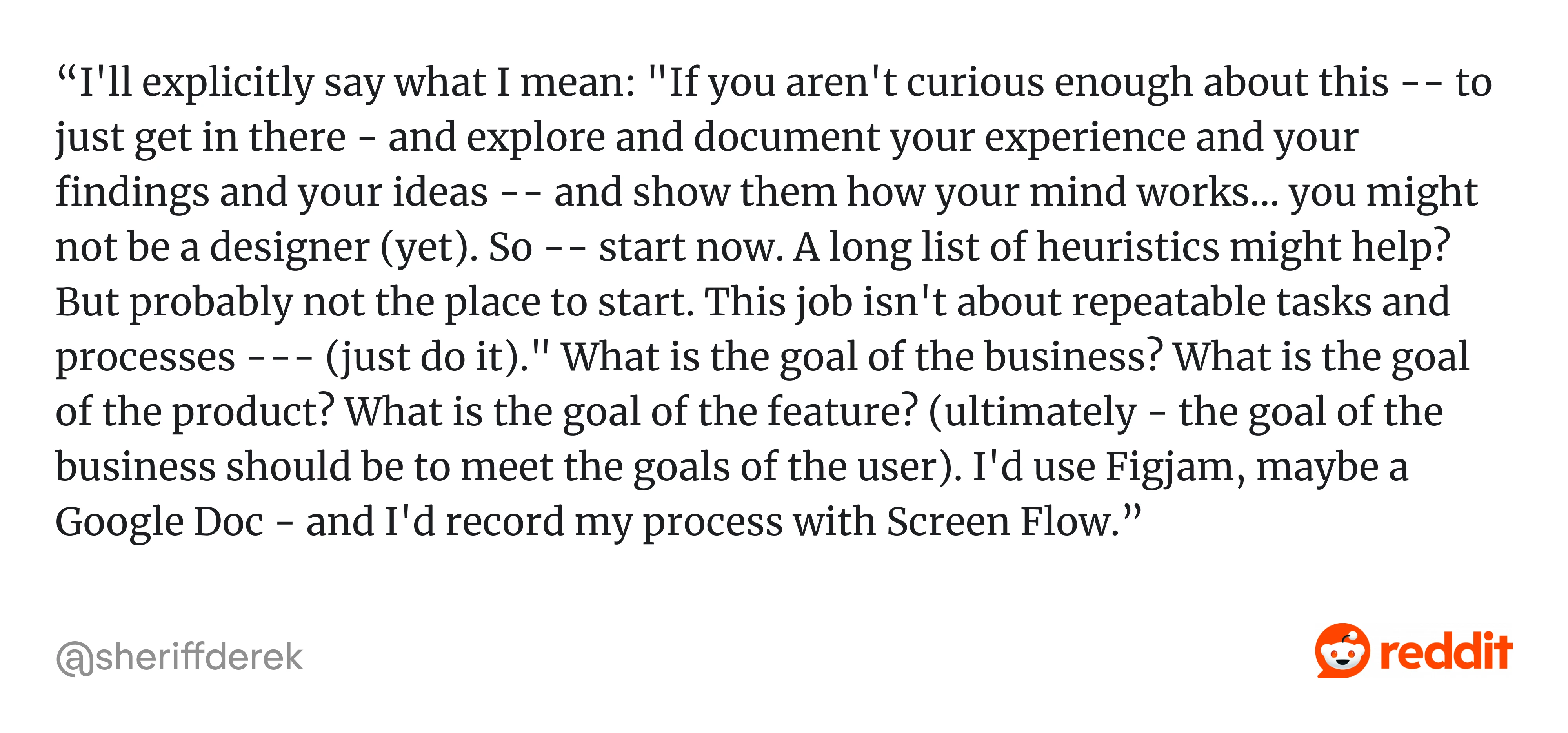
As another Redditor put it bluntly: “...This job isn’t about repeatable tasks and processes — it’s about getting in there, exploring, documenting your experience, and showing how your mind works. You don’t need a long list of heuristics — you need to understand the goal of the business, the product, the feature. (ultimately, the goal of the business should be to meet the goals of the user)…”
UX audit: myths vs. reality
Here’s a quick reality check:

Now that we’ve cleared the landmines, let’s talk about what fintech clients expect when they request a banking UX audit and how to deliver it.
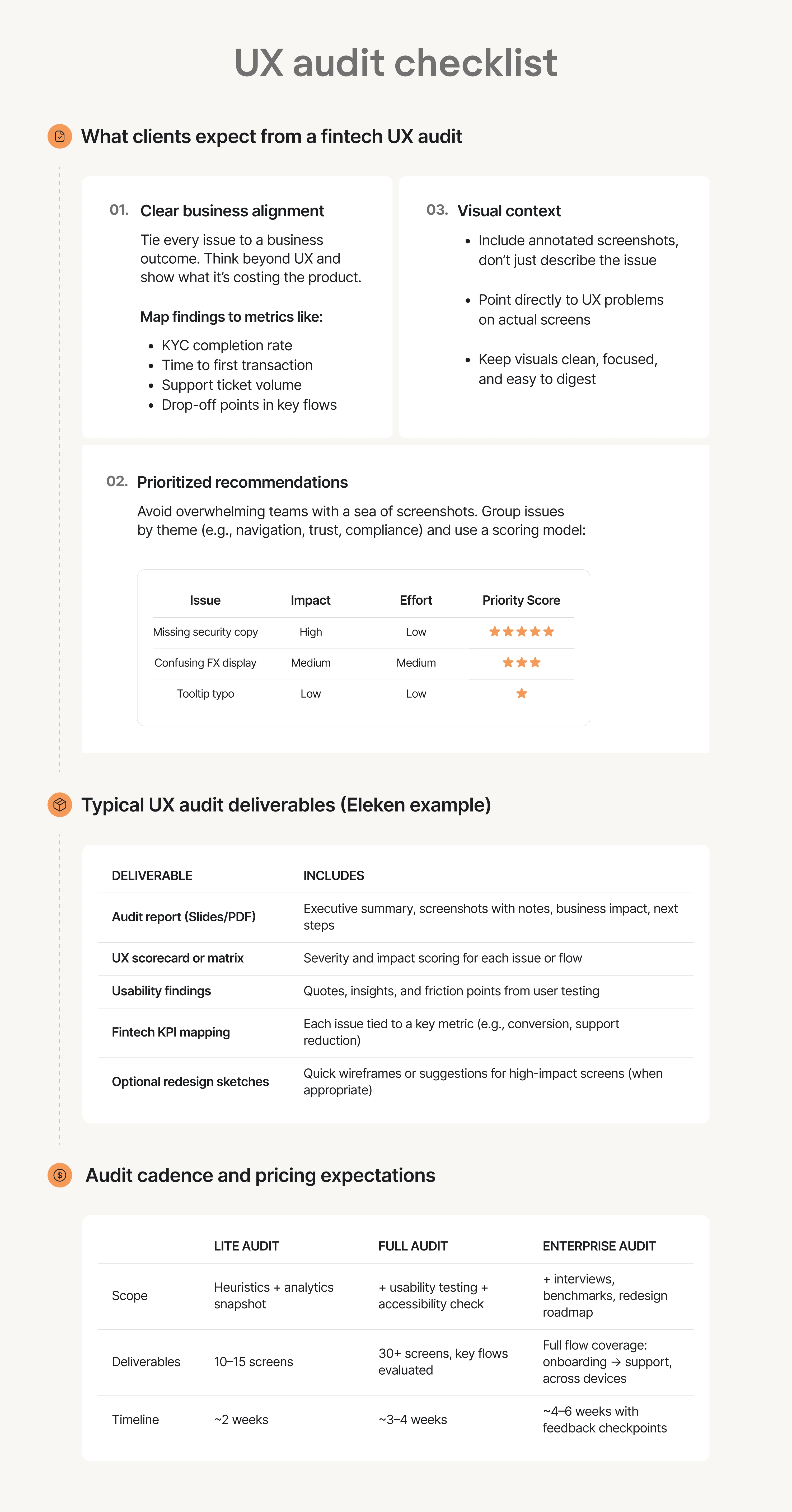
Deliverables and what clients expect
Instead of another Figma-flooded teardown, fintech teams want clarity and confidence. A roadmap that tells them what to fix, what to ignore, and what moves the needle.
Use this UX audit checklist to make your UX audit valuable and actionable:
Now that you know what to deliver, let’s wrap this up with a toolkit you can reuse.
UX audit resources and toolkit
Templates beat guesswork if you're figuring out how to conduct a UX audit, whether in-house or for a client. Having the right toolkit can save hours and turn chaos into clarity.
At Eleken, we've built a set of practical, battle-tested resources and UX ROI case studies to streamline every step of the audit process.
Here’s what we use and share at Eleken.
Fintech UX audit checklist
This checklist keeps your audit focused, structured, and aligned with the unique challenges of financial products. It covers the key UX pressure points where fintech products often lose users and trust.
Here’s what to evaluate:
- Onboarding friction: Are users able to sign up and verify their identity without confusion or unnecessary steps? Look for drop-offs, form errors, and moments that require too much effort too early.
- Trust cues (security, transparency, clarity): Are you clearly showing users what’s happening with their money, why you’re asking for sensitive data, and how their information is protected? Trust-building starts with clarity, not fine print.
- Transaction flows: Can users complete critical tasks like sending money, linking accounts, or paying bills smoothly and confidently? Pay special attention to flow logic, field validation, and in-context feedback.
- Compliance clarity (AML compliance UX, KYC, consent): Legal requirements don’t have to be painful. Check whether AML and KYC processes are clearly explained and cause minimal friction. Can users understand what they’re agreeing to and why?
- Accessibility and performance: Is your product usable for everyone, on any device? Check color contrast, keyboard navigation, screen reader compatibility, and mobile performance, especially on slower connections.
Use this checklist to structure your audit and ensure you don't miss critical fintech-specific UX details, those that impact trust, conversion, and compliance.
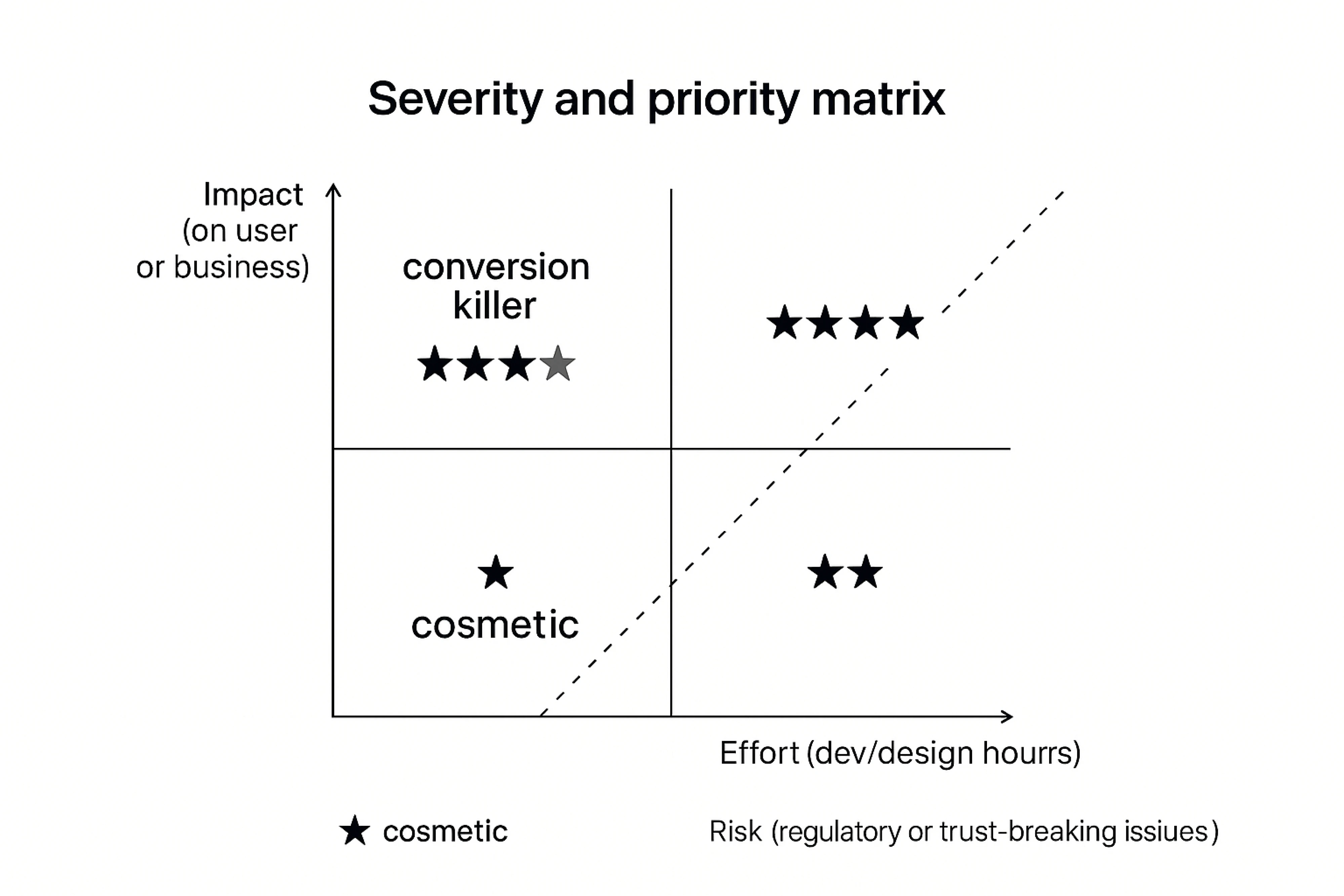
Severity and priority matrix template
Prioritization framework based on:
- Impact (on user or business);
- Effort (dev/design hours);
- Risk (regulatory or trust-breaking issues).
Simple scoring system:
⭐ = cosmetic
⭐⭐⭐⭐⭐ = conversion killer
The tool stack we use
Want to run a full audit with a lean setup? Here’s a reliable combo:

You don’t need all of them. But at least one tool for each category is a must.
Here is recommended reading if you want to go deeper:
- Nielsen Norman Group UX Design Templates
- Eleken SaaS UX audit case study
- Web Content Accessibility Guidelines (WCAG)
All these resources help turn your UX audit from a one-time fix into a repeatable process that scales with your fintech product. Let’s wrap it up.
From audit to action
Once you’ve uncovered what’s broken and why, the next step is what really counts: turning those insights into meaningful UX improvements that boost conversions, ease the load on support, and help users trust your product again.
Here are five go-to strategies we’ve seen make a real difference in fintech, especially after an audit:
- Make onboarding fast, clear, and anxiety-free.
- Build trust with radical transparency.
- Prioritize mobile-first (really, not as an afterthought).
- Design for error and recovery, not just happy paths.
- Treat accessibility as a must-have, not a nice-to-have.
An audit shows you where the friction is. These principles help you fix it. At Eleken, we treat UX audits as a launchpad for smarter design, better decisions, and faster product growth. It is your chance to pause and ask: “Are we helping users move forward or making them work too hard to stay?”
If your fintech app is struggling with drop-offs, trust issues, or stalled growth, we’re here to help you figure out why and what to do next. Talk to Eleken and let’s make your UX simpler, smarter, and more trusted.


.webp)

.png)