Lambda
How we turned an internal supply chain tool into a client-facing SaaS product
Lambda SCS is a relatively young player in the supply chain software space, operating since 2021. One of their core tools is OptiFlow, an internal platform that helps build and simulate supply chain models using real data and AI insights.
The tool had strong backend logic and was actively used by internal teams on a daily basis. But after Lambda SCS received recognition from Gartner, they decided to bring OptiFlow to market as a SaaS product for external customers.
That’s when they reached out to Eleken.

The interface offered a lot of functions, but, at the same time, it left new users unsure of what they could do. From here, we knew where to focus our efforts:
- Completely redesign the platform’s interface.
- Make the product accessible for non-tech-savvy users.
- Deliver full design scope in Figma for handoff to devs.
The client had already shortlisted a few agencies, and to prove we were the best fit, we started with a 3-day trial.
Winning the client over in 3 days
The OptiFlow supply chain platform supported two user roles:
- Consultants who build and manage supply chain models.
- Executives who use the results to make decisions.
For the project, our main focus was on improving the experience for consultants. We aimed to reduce friction and help them build supply chain models faster.
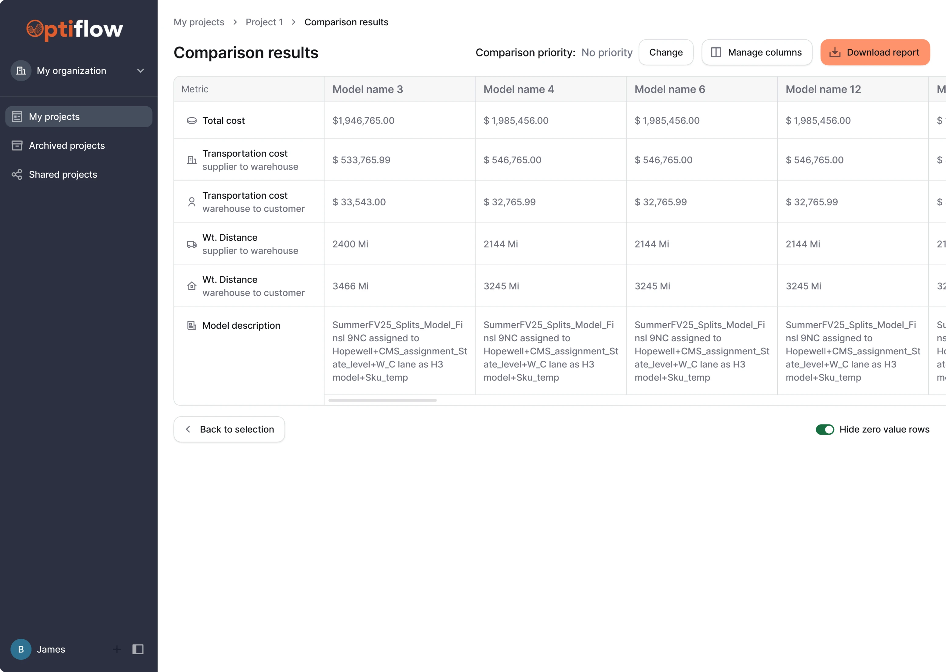
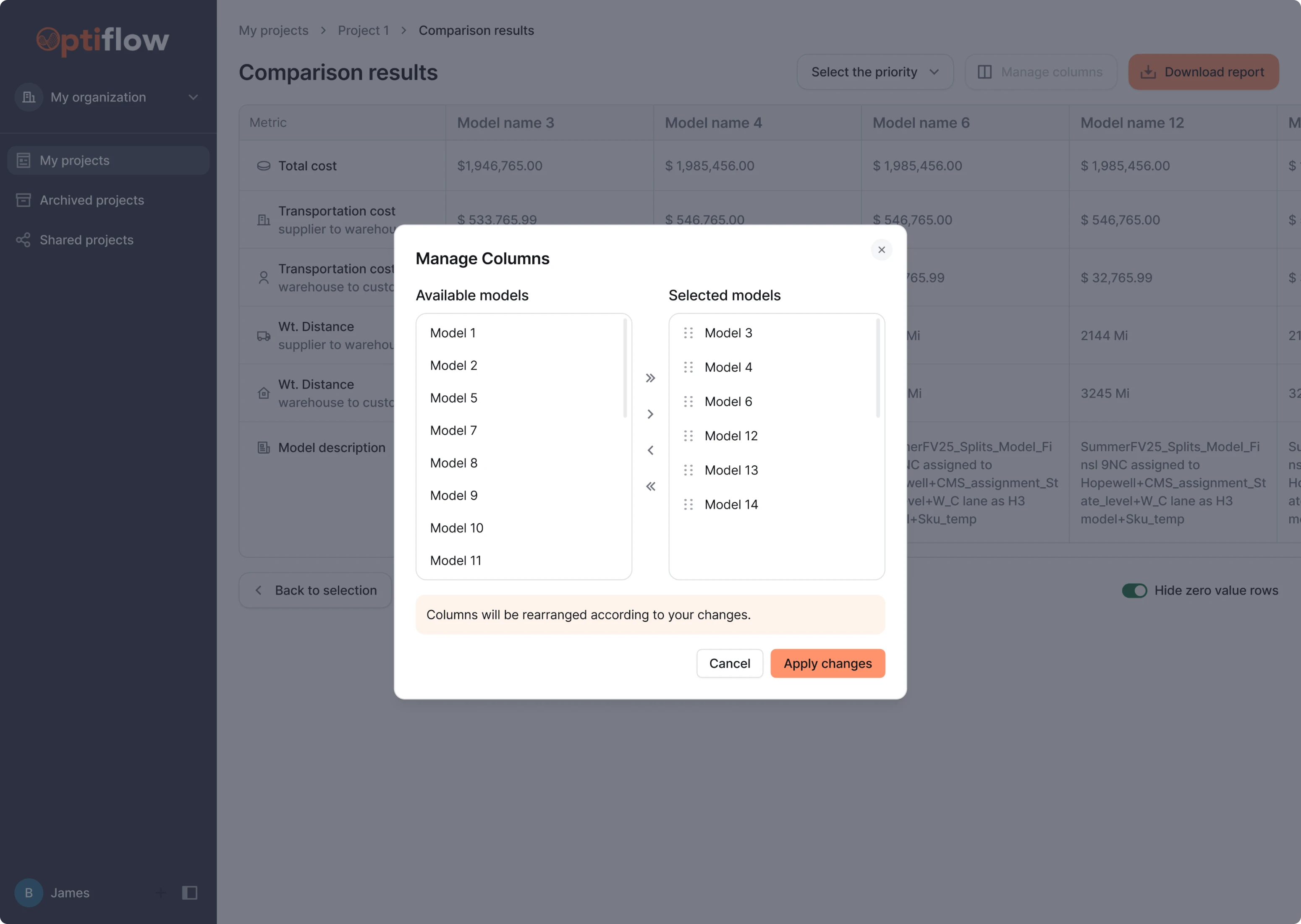
Starting with the trial, our task was to redesign the model comparison view. This is where consultants analyze supply chain models side by side and make decisions.
Initially, the interface overwhelmed users with too many actions grouped in one place. There was no way to set custom parameters for side-by-side model evaluation, and the pagination content lacked consistency.
Here, we introduced the ability to set comparison priorities like cost, transit time, or balance. This reduced cognitive load and helped users focus on what mattered most in each specific scenario.
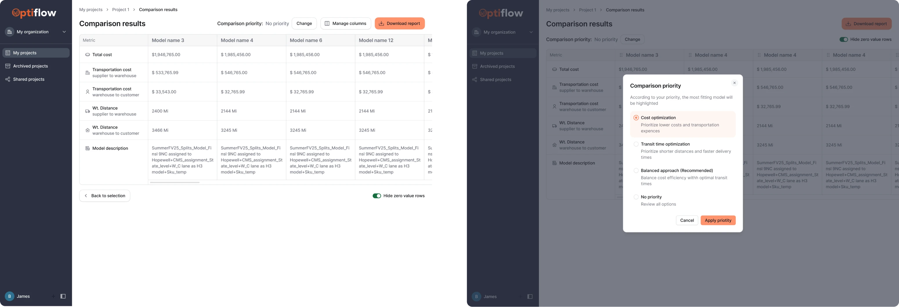
To improve column management, we explored two interaction patterns:
- A drag-and-drop interface for manually rearranging models.
- A modal window for selecting, removing, or reordering models.
After seeing both options, the client preferred the drag-and-drop approach for its simplicity and direct manipulation. The trial screens were approved, and we moved on to full-time collaboration.
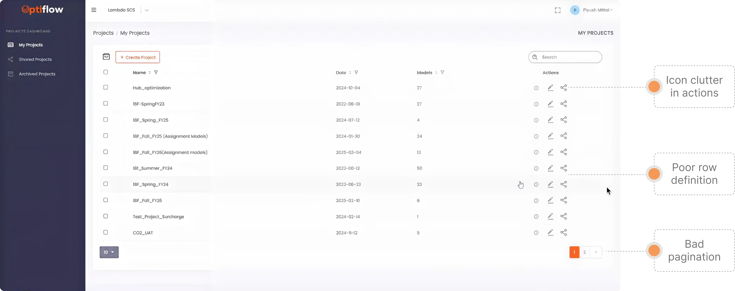
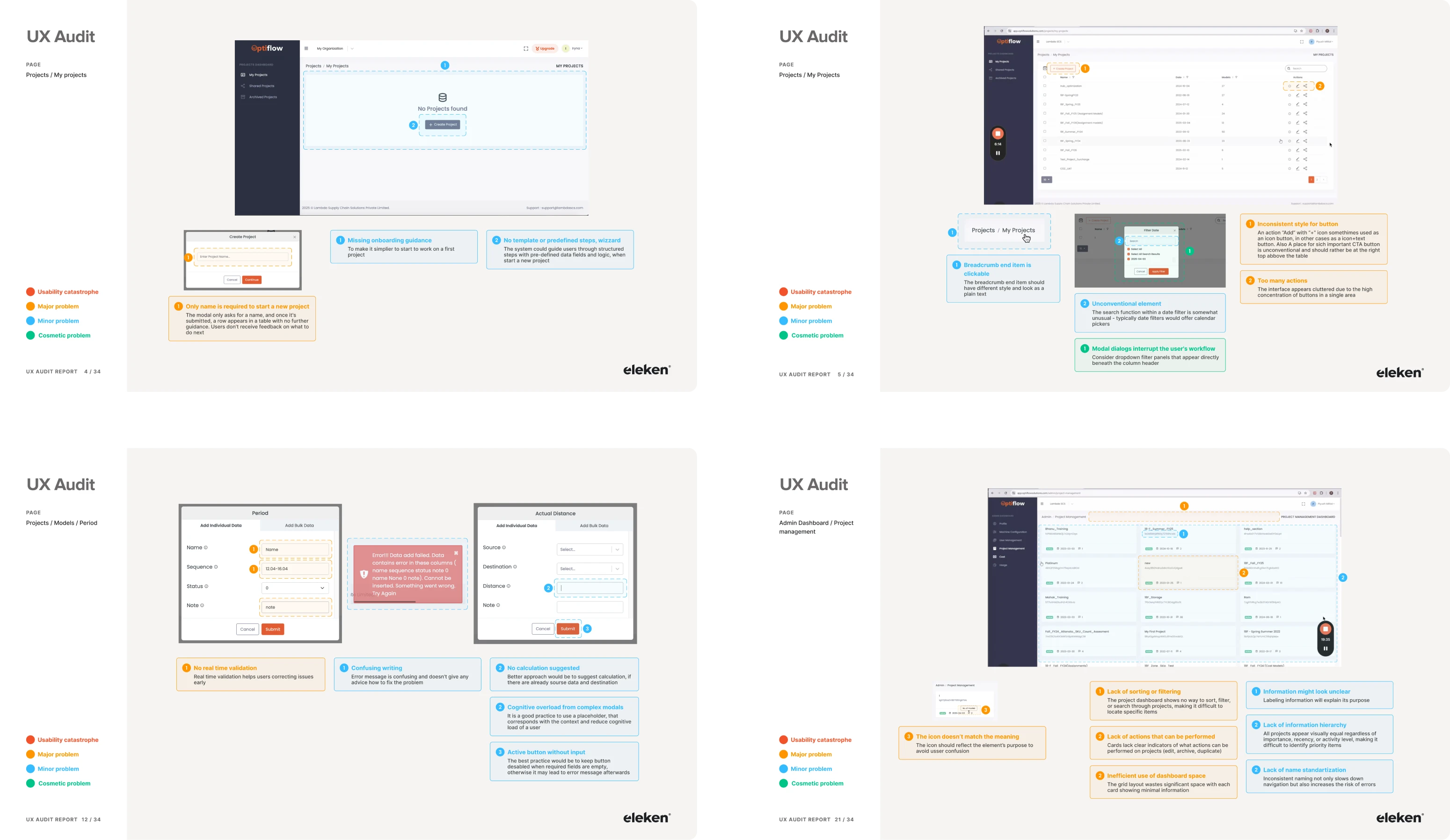
The UX audit helped us identify critical friction points
Once the trial went well and the client wanted to move forward, they weren’t sure where to start. So we suggested kicking things off with a UX audit. For our designer, it was a great way to explore the product deeper and uncover usability issues.
Here are the critical UX gaps we found:
- Lack of proper user guidance.
- Broken breadcrumbs logic.
- Overloaded action panels.
- Icons from different design systems.
- Fragmented navigation.
- Overwhelming data input.
- Hard-to-scan map settings.
- Layout inconsistencies.
We always document our audit findings in a structured report, giving clients full visibility into existing issues and opportunities.
Redesigned navigation made the product easier to use
Navigation was the foundation we needed to fix first. It connected every part of the user experience, and in its current form, it was fragmented and hard to follow.
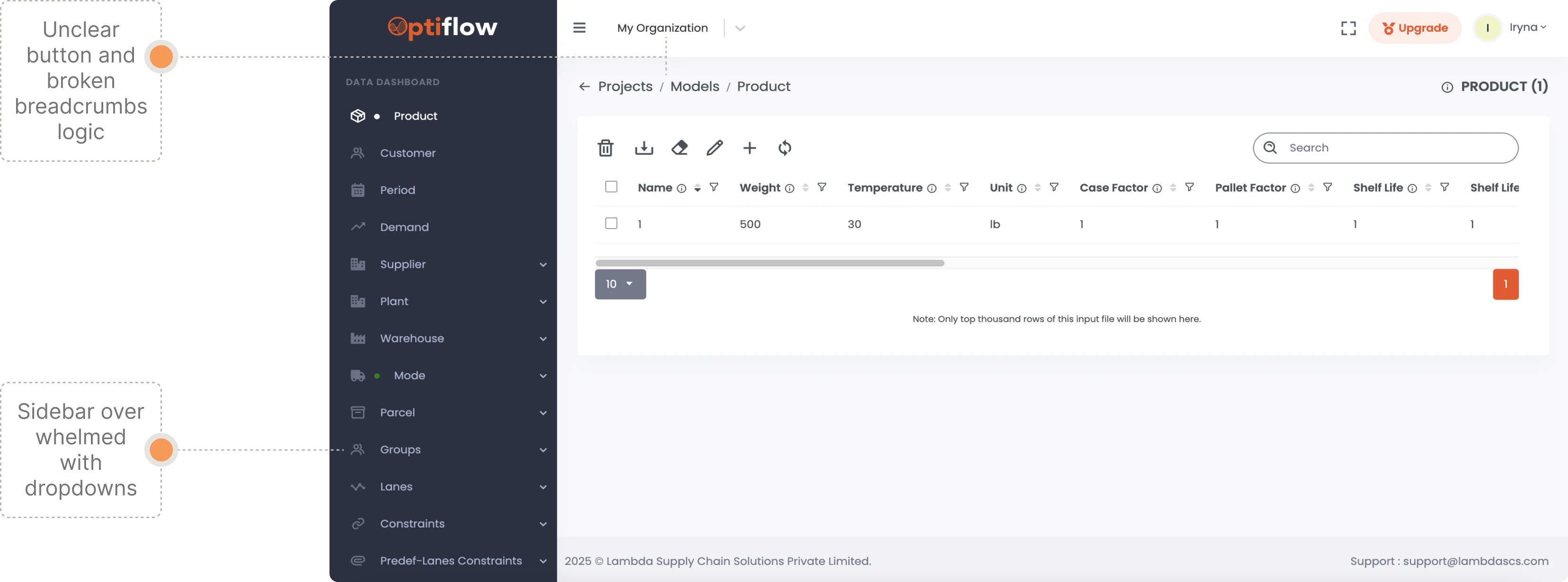
We didn’t reinvent the product’s core flow: users still start by creating a project, then add a model and input data. But we completely restructured how they move through this journey.
Here are a few key improvements we introduced:
- Multiple entry options from a top-level navigation.
- A horizontal navigation bar for easy scanning.
- Progressive dropdowns that show more options.
- Breadcrumbs to return to the projects list from anywhere.
- Helpful empty states with tips and links.
These changes solved a major pain point uncovered during the audit: users were getting lost and couldn’t find their way back. Now, they can confidently explore deeper parts of the platform and still find their way out.
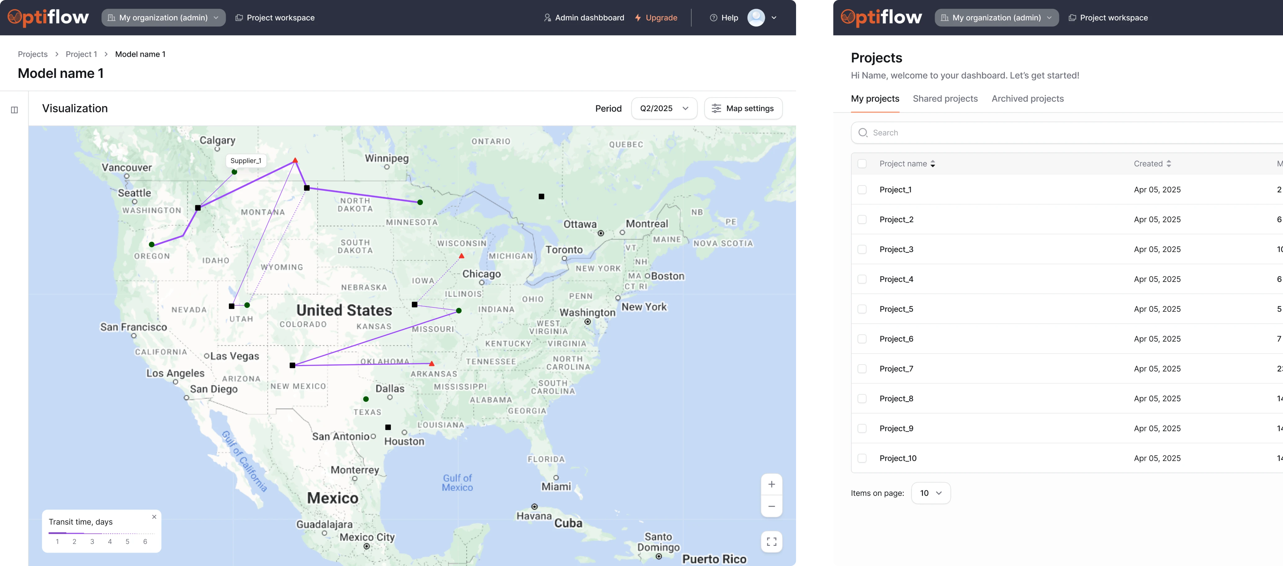
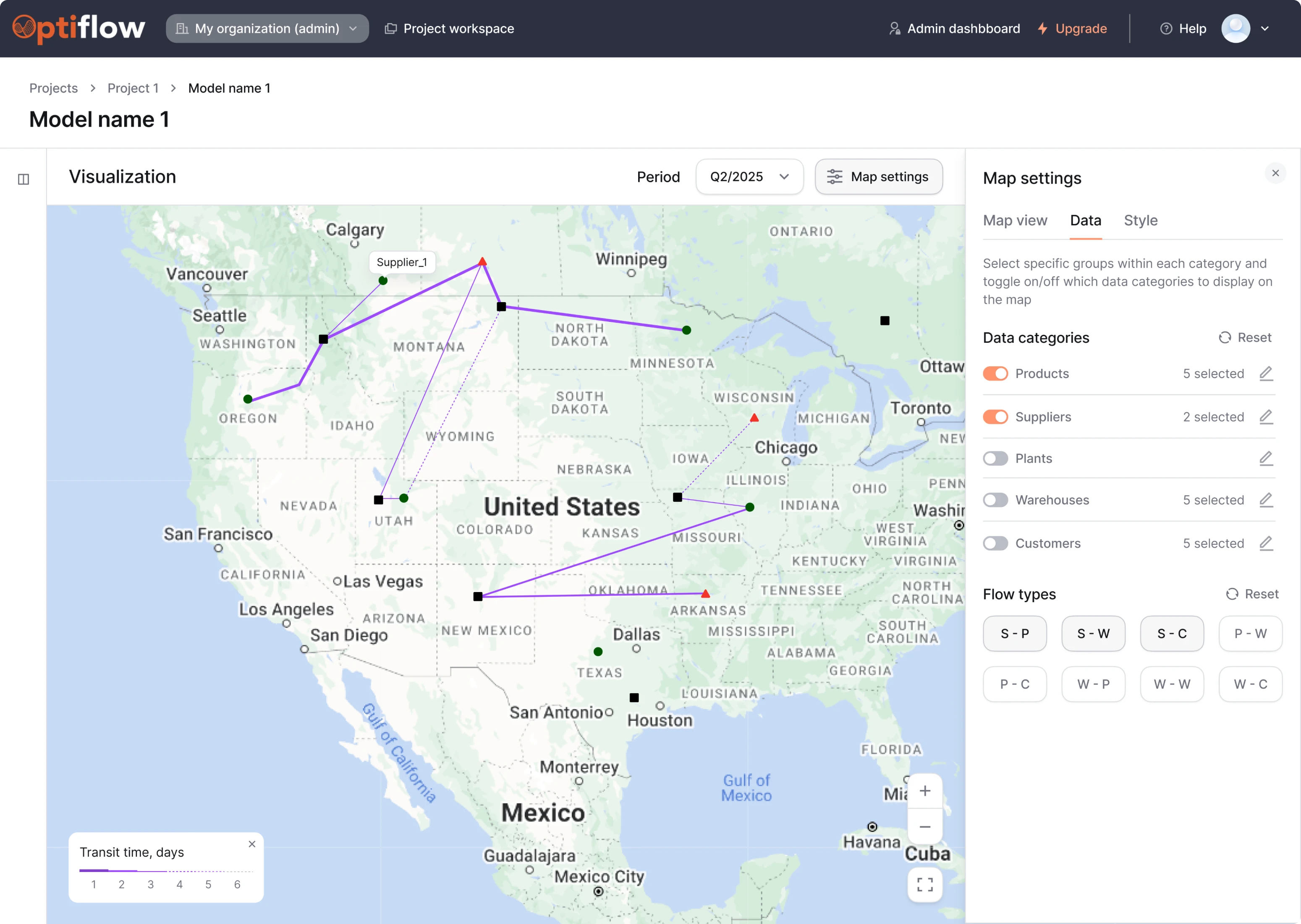
We simplified the map screen to reduce visual overload
Before moving on to chain optimization, users preview all the routes via the map screen. And this interface was cluttered enough to get in the way.
The original version:
- Featured too many distracting elements.
- Had filters, toggles, and controls stacked in a single block.
- Offered a visualization that was hard to interpret.
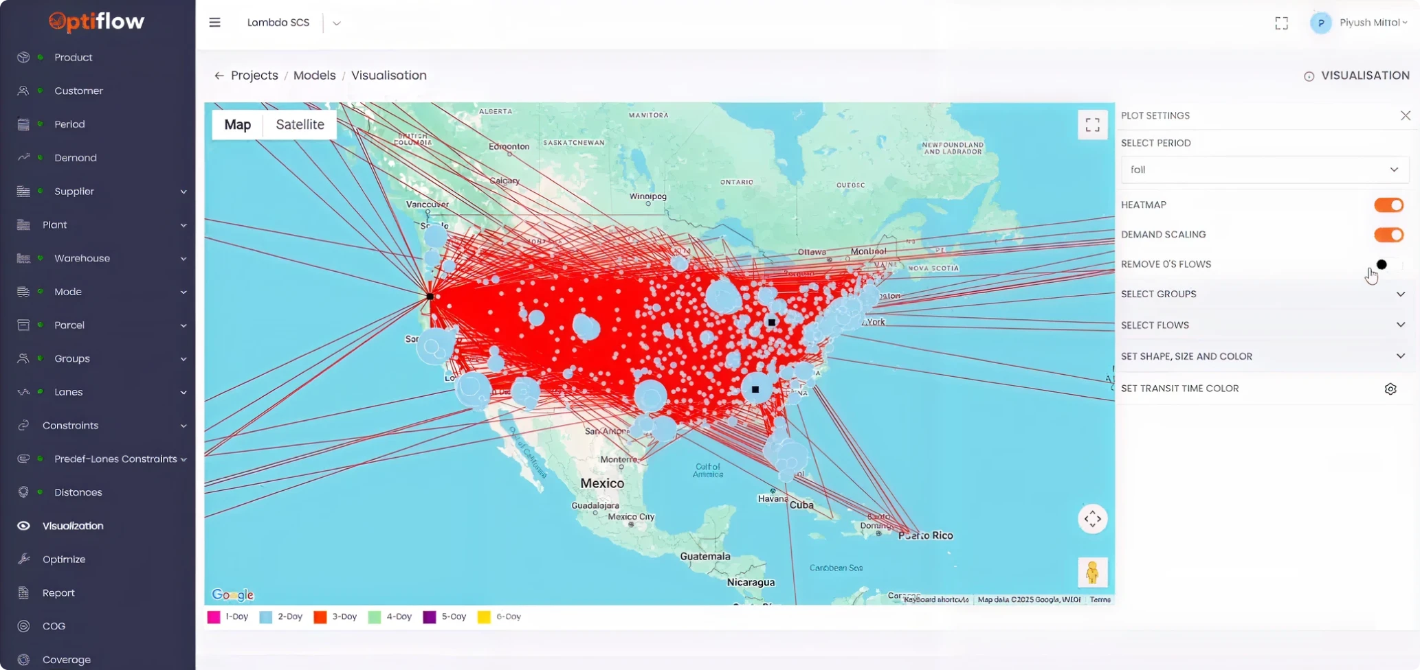
The existing functionality worked fine, and users were already comfortable with it. Our focus was on cleaning up the existing experience.
What we changed:
- Made the map fully visible with an option to hide the sidebar.
- Reorganized Map Settings with tabs and filter logic.
- Added “5 selected” counter for better control over selections.
With a clearer optimization flow, we sped things up
The optimization screen is where users run simulations to improve supply chain performance. In the original interface, everything was packed into a list of settings that lacked visual hierarchy and guidance through the process.
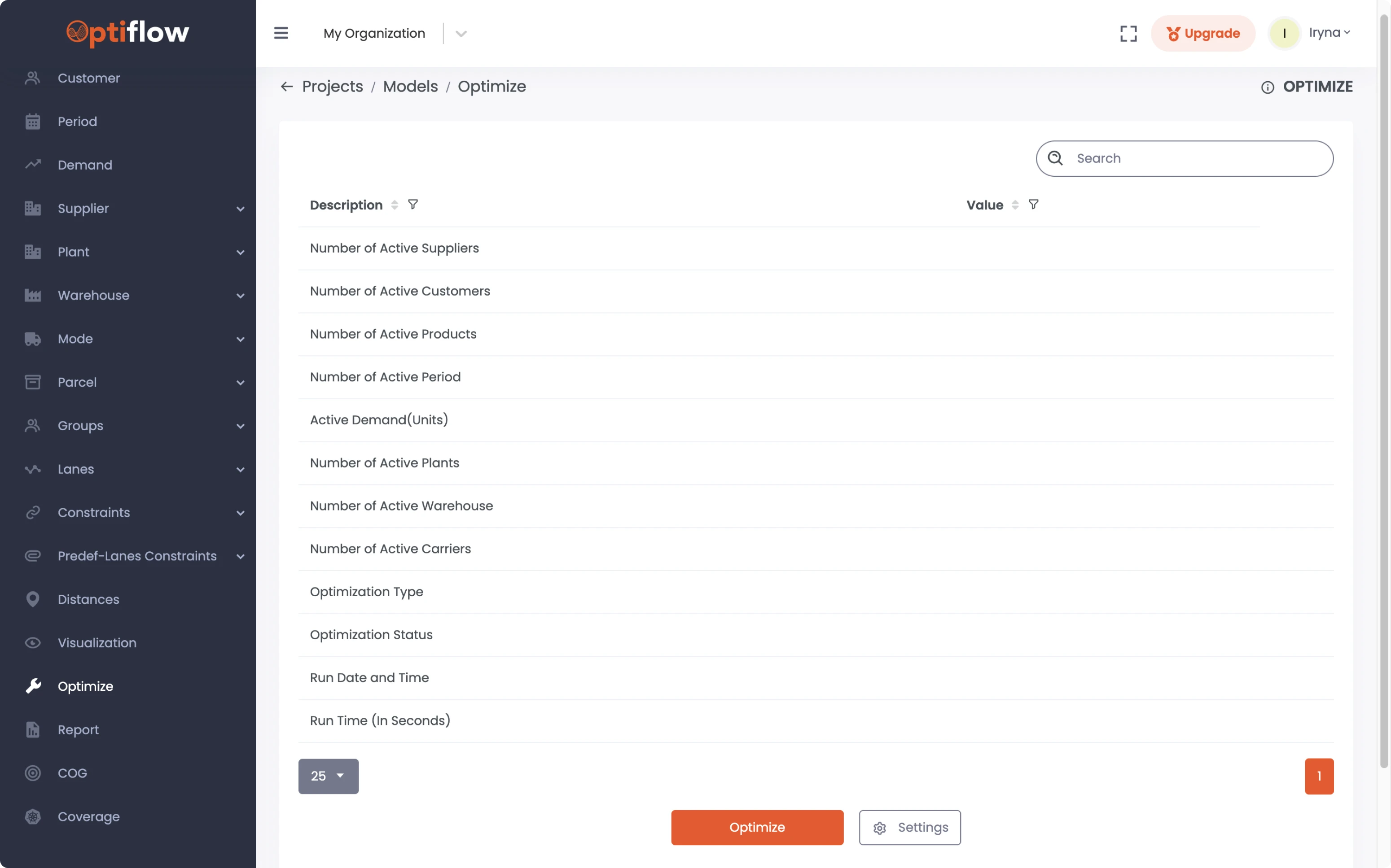
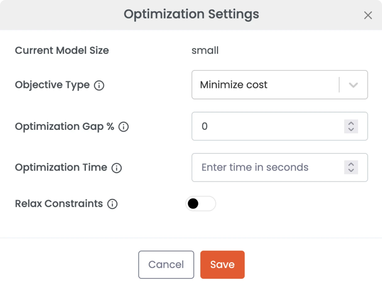
We rebuilt the flow with usability in mind.
Instead of showing users a long list of inputs, we turned the optimization modal into a focused setup screen.
Here’s what we changed:
- Added descriptive labels and tooltips.
- Introduced a “Confirm and Run” CTA.
- Added a progress bar with options to pause or stop the process.
- Included optimization history.
- Displayed machine availability status tied to the user’s plan.
Our designer gathered everything into a single modal, reducing unnecessary steps.
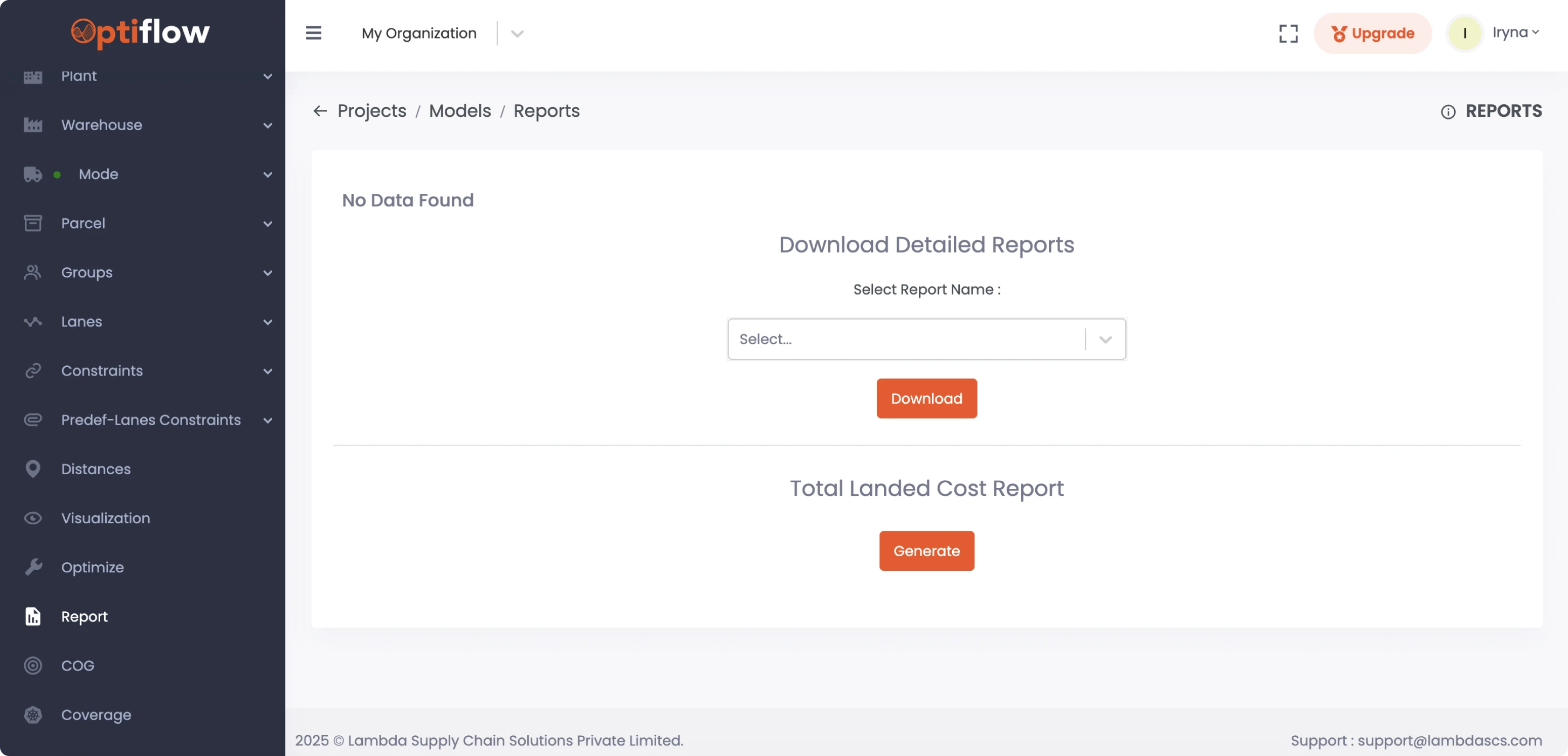
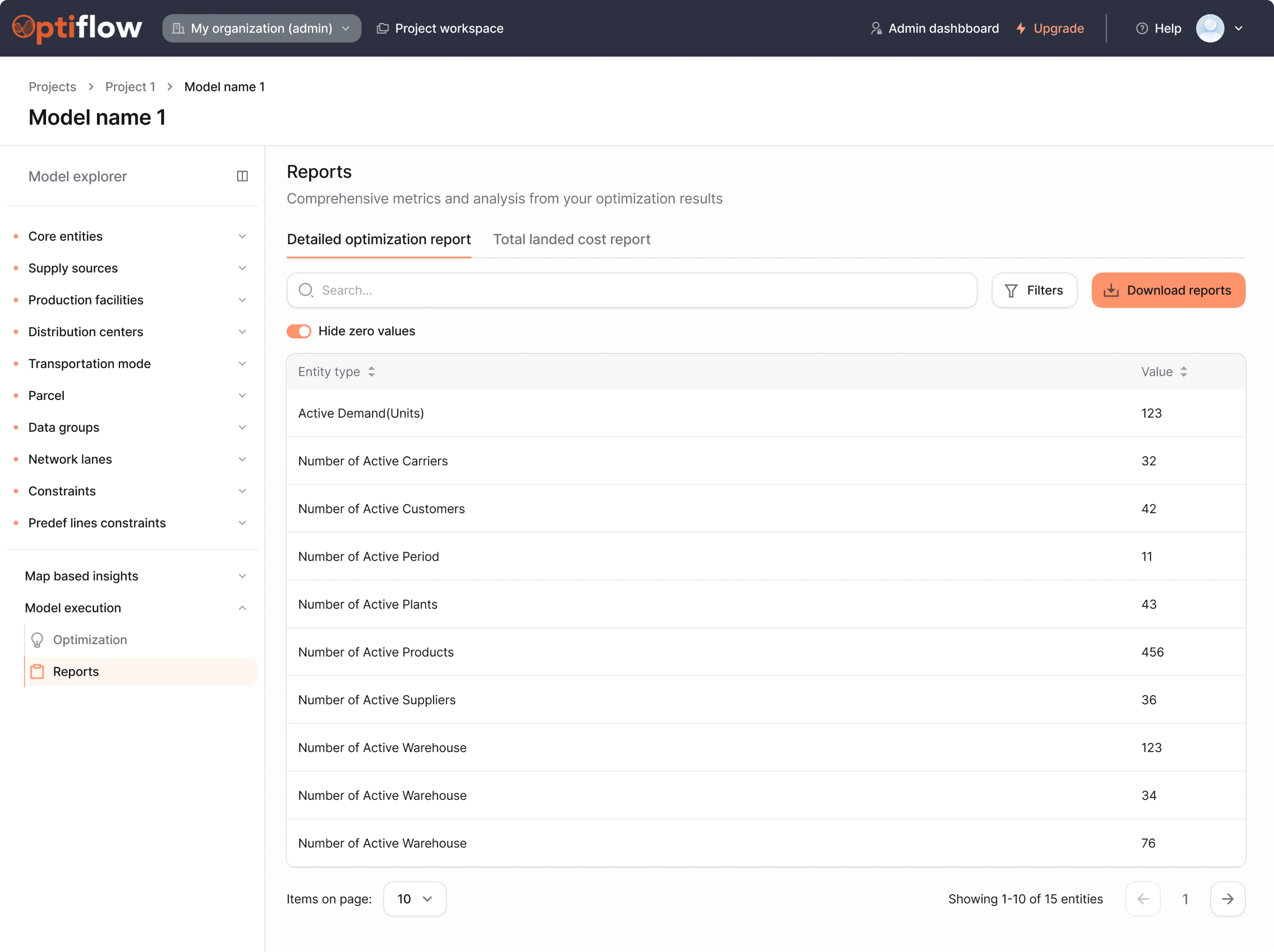
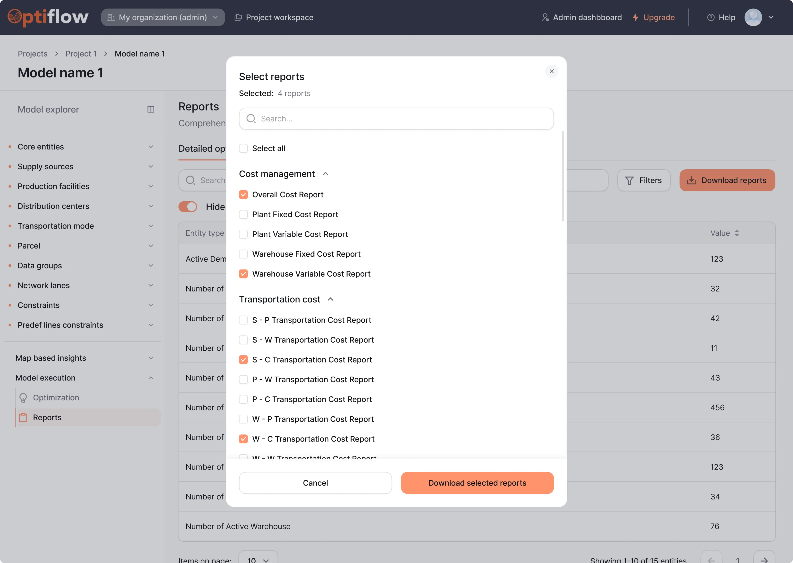
We fixed the report layout and made insights easier to access
The report screen is the final step in the flow. It’s where users view, download, or generate reports based on their optimization results.
Initially, the interface created unnecessary friction with overused primary buttons and a cluttered layout filled with centered titles. We reorganized everything under a single Reports section, using two tabs to separate each report type.
To simplify navigation, we added a reports history, search bar, a “Select All” option, clear pagination, and a standout CTA, making it easier for users to act.
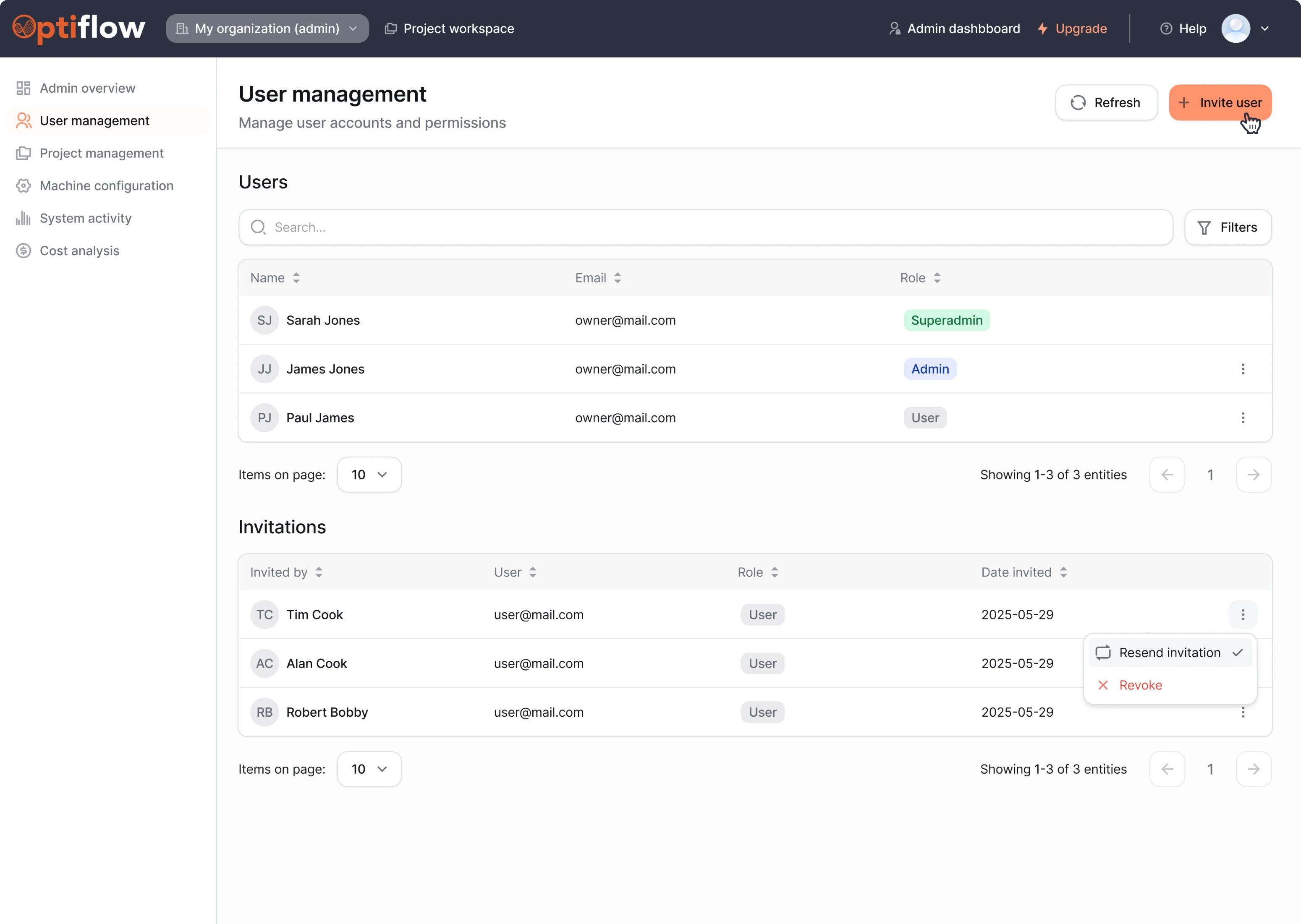
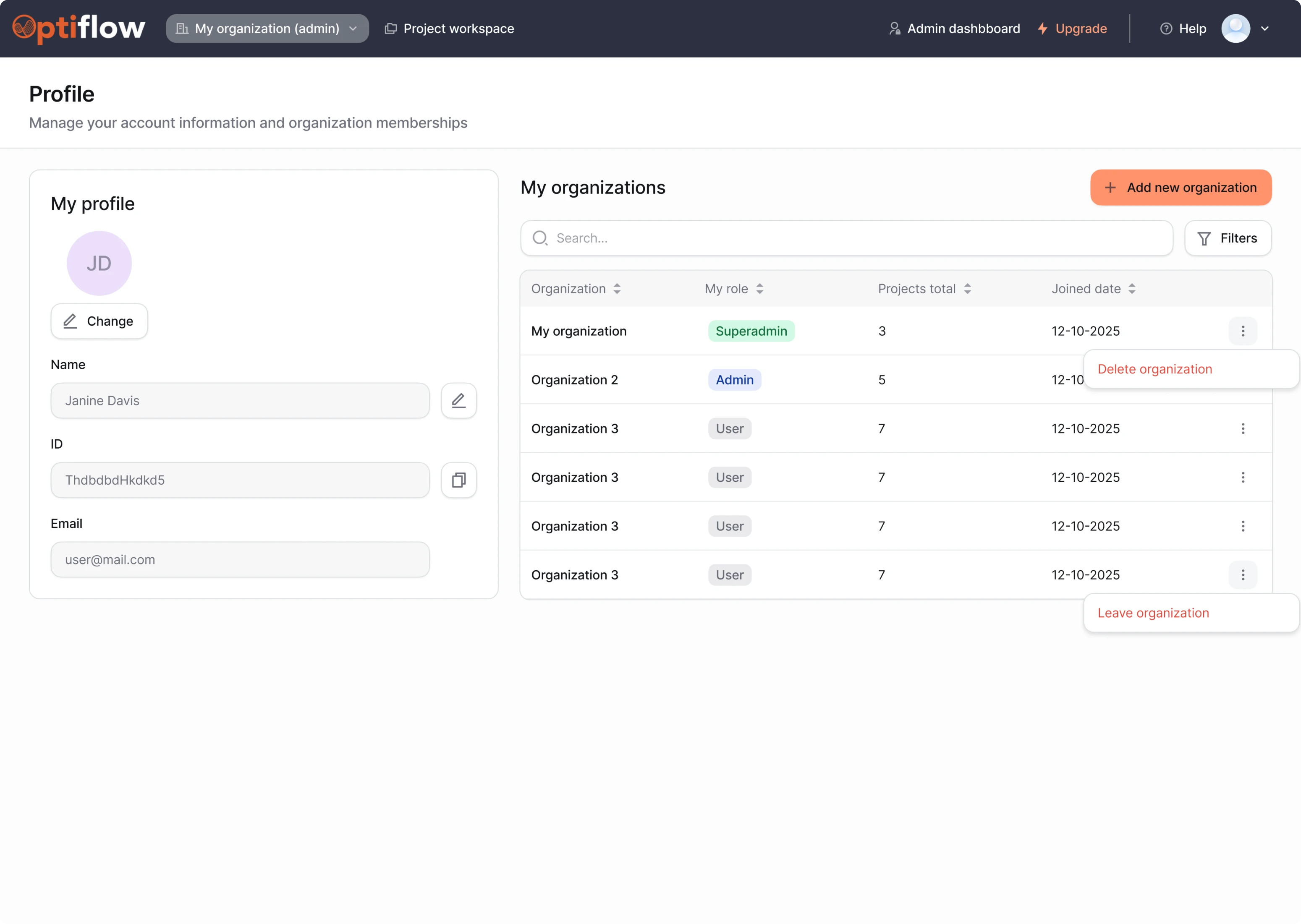
Role-based dashboards kept the product structured
Like many SaaS platforms, OptiFlow supports both admin and user roles, each with different levels of access and responsibility. Our goal was to design profile screens that reflect this hierarchy, supporting role-based access.
We created a dedicated admin dashboard where organization owners or team leads can manage key system settings. Admins can:
- View and manage organization details.
- See a list of users and their permission level.
- Send invitations and assign roles.
- Manage available machines and their configurations.
For regular users, we used progressive disclosure, surfacing only the actions relevant to their role:
- A profile card with personal information.
- A clear view of their role within each project.
- The ability to leave or delete their organization.
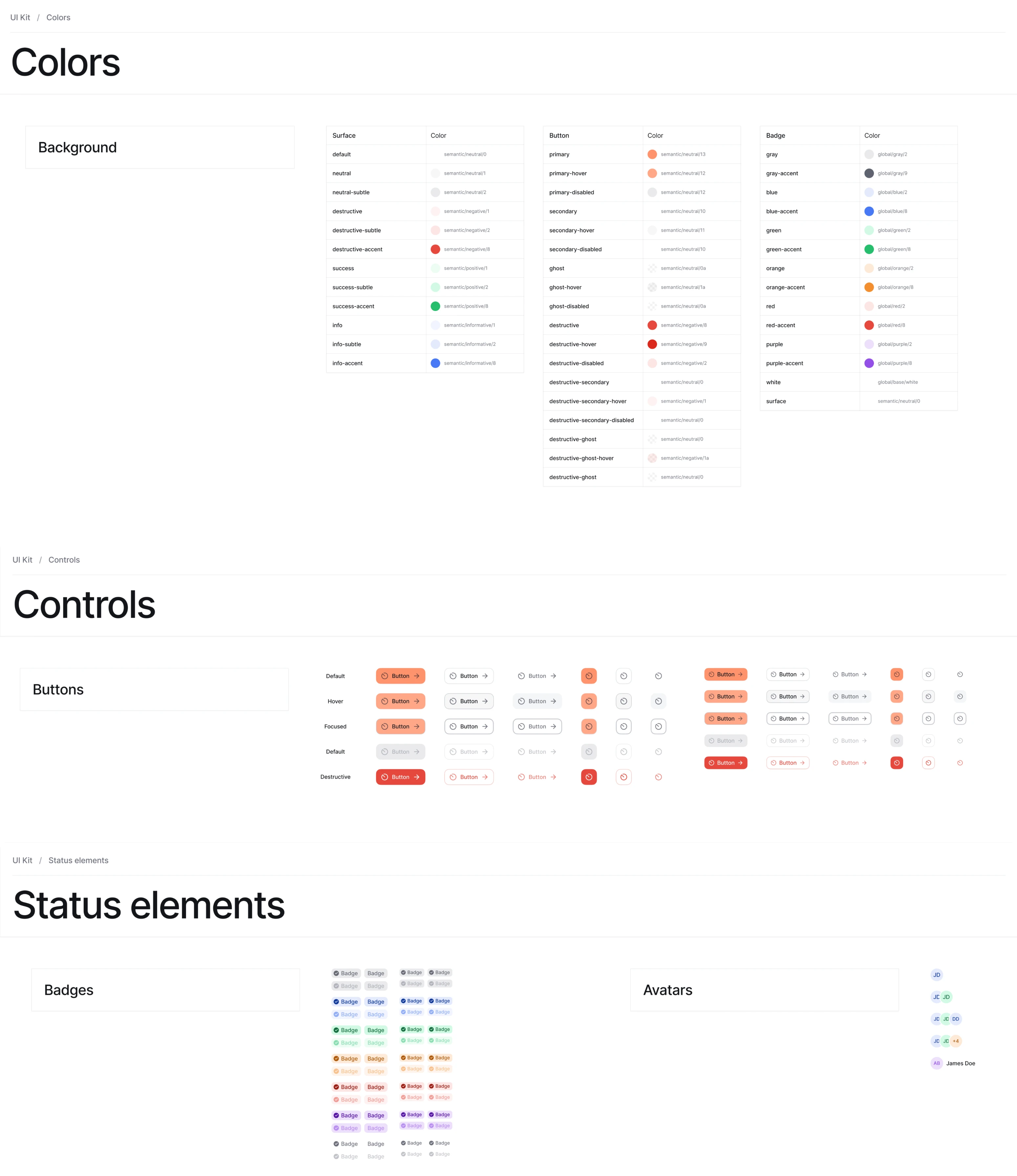
A ready-to-use UI kit for smooth developer handoff
To ensure a smooth handoff to development, we delivered the full design scope in Figma.
Alongside that, we built a comprehensive UI kit based on the Blend design system. It included all essential components, states, and layout patterns, so developers could implement the designs with clarity and confidence.
Our collaboration led to a complete product redesign in just two months
Thanks to fast decision-making and a smooth designer–client collaboration, we redesigned the entire OptiFlow platform in just two months. Most screens were approved right away, with either one iteration or none at all.
The result is a full-fledged SaaS product ready to be distributed to external clients for better supply chain management. Every part of the experience is now easier to understand for non-technical users and more enjoyable to use overall.
And for us, it’s one more successful project that strengthens our experience in the geospatial and logistics space.