
A well-designed UI can increase conversion rates by up to 200%. Improve the overall UX, and that number jumps to 400%.
But most UI redesigns never reach those numbers. They start with a fresh coat of paint, like prettier buttons, or updated fonts, and end with the same broken flows, unclear CTAs, and users who still churn before reaching value.
At Eleken, we redesign hundreds of SaaS products each year across industries like fintech, healthtech, HR tech, and developer tools. And what we’ve learned is this: Successful redesigns are built on process, user feedback, and honest conversations about what’s broken.
In this guide, we’ll walk you through a step-by-step framework our design team uses in practice, along with real UI redesign examples and smart rules from the UX community.
UI redesign process: a framework you can use
This is the process we use at Eleken to redesign real SaaS products, without getting lost in endless iterations or internal debates, and understand how not to redesign.
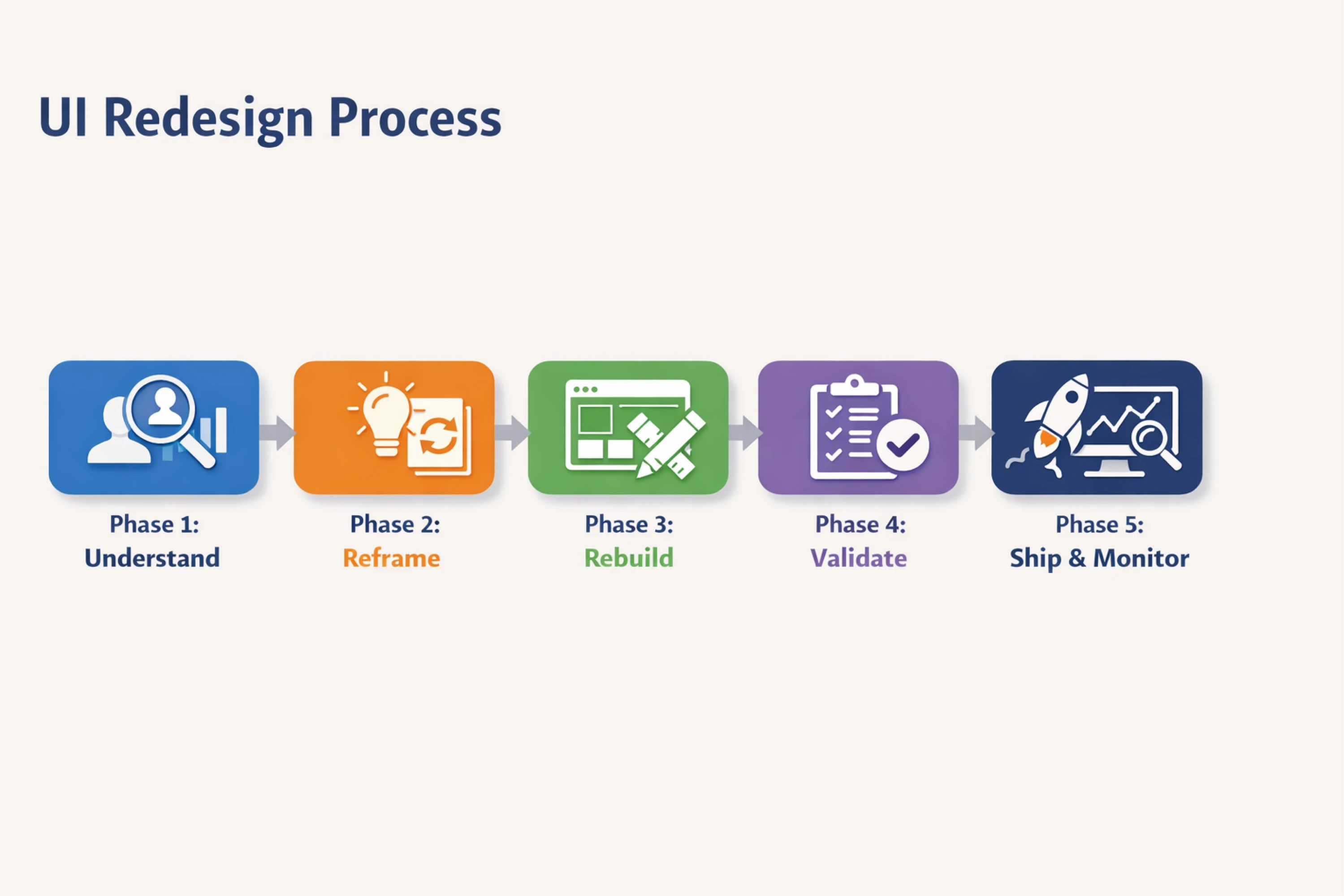
Phase 1: Understand
Before you touch a single pixel, get clear on what’s broken and why. Most redesigns fail because they jump into Figma before figuring this out.
Here is what you can do at this phase:
- Run a UX audit to find inconsistencies, blockers, and outdated patterns.
- Dig into product data to identify where users drop off and which features go unused.
- Talk to real users, especially those who churned, left negative reviews, shared bad UX examples, or filed support tickets.
- Define friction points to determine where users get confused, stuck, or annoyed.
- Set KPIs for success. If the redesign works, how will you know?
Example goals:
- Reduce onboarding drop-off by 20%.
- Make dashboards scannable in under 5 seconds.
- Increase usage of underutilized features (e.g, filters, exports).
When we worked with myInterview, a video-hiring platform, the data revealed a critical problem: 90% of candidates dropped off mid-interview. At first glance, the interface looked fine, but once we mapped UX flows and reviewed candidate feedback, the friction became clear:
- Common UI patterns were broken.
- Multi-select questions didn’t look interactive.
- Important limits (like “3 options max”) were hidden until after users clicked.
- Labels were unclear.
It all added up to a poor experience and massive churn.
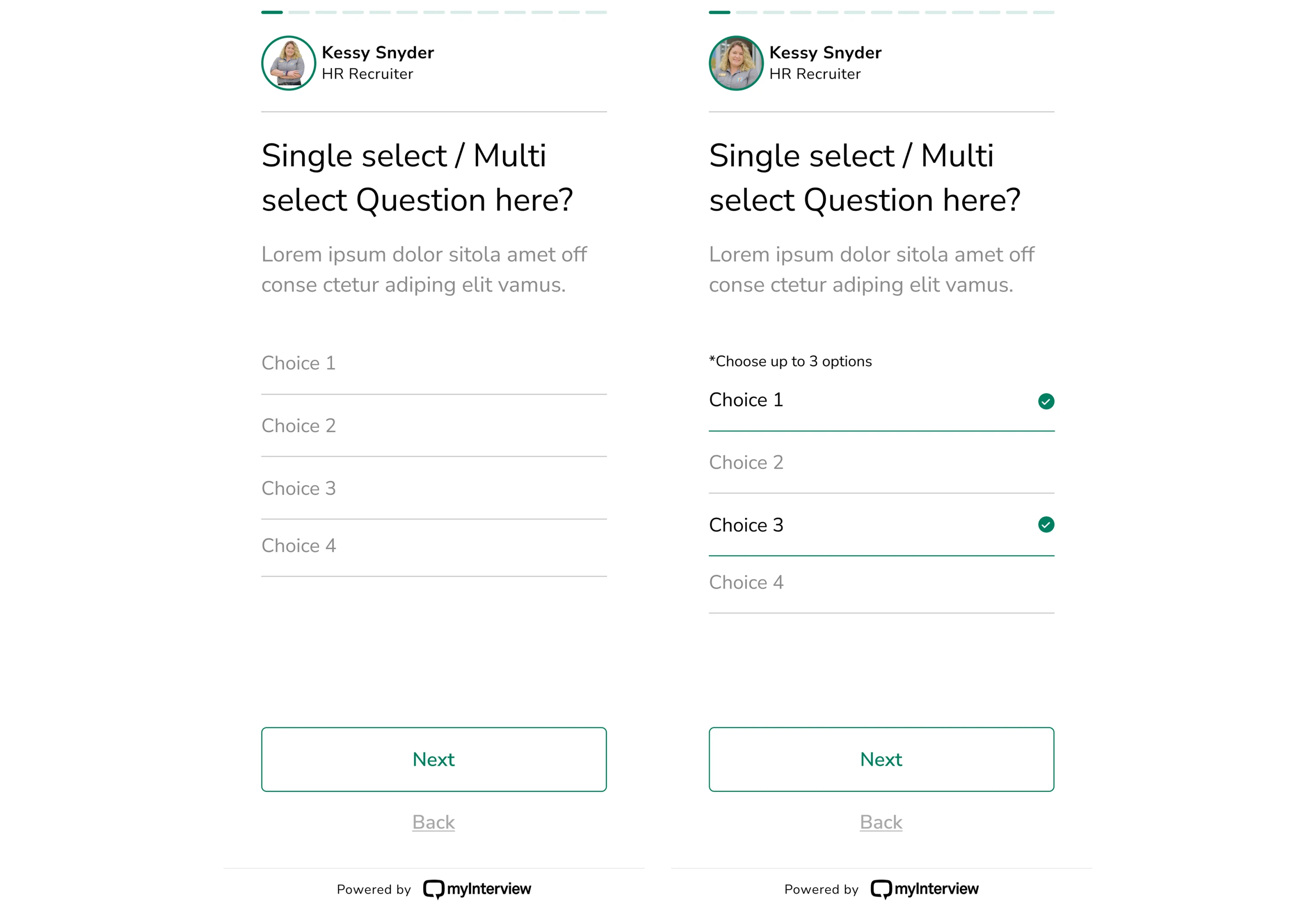
Redesigning started with clarity. We restructured every step to feel intuitive: checkboxes looked like checkboxes, labels made sense, and actions were easy to complete on the first try. As a result, the flow felt faster, smoother, and far less confusing.
Phase 2: Reframe
Now that you know what’s wrong, don’t jump to solutions. First, reframe the problem.
What to do:
- Map current user flows: Where do they get stuck or lost?
- Identify critical screens: Which ones impact core metrics?
- Prioritize by business value: Fix what matters first.
- Decide scope: UI design refresh vs a redesign.
Reminder: You don’t have to fix everything. Fix what users feel first.
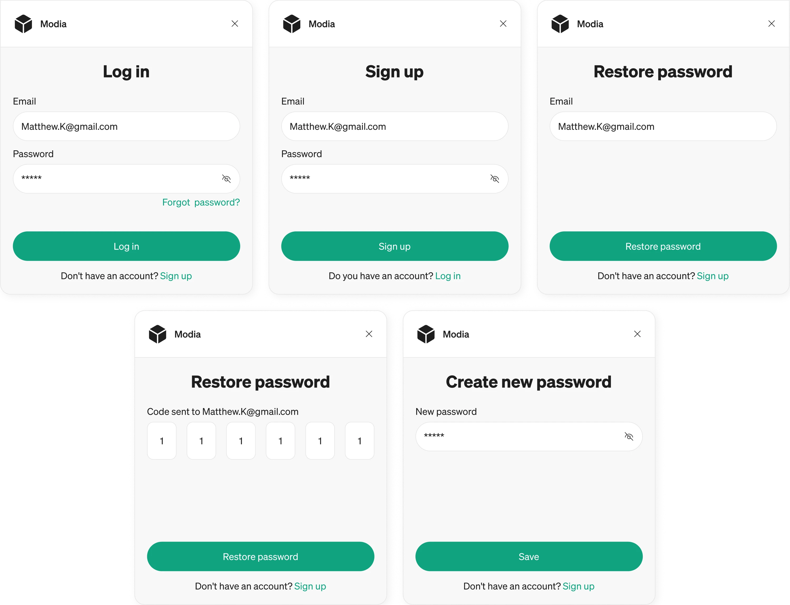
That’s how we approached Modia, a content collaboration tool. Editorial teams using the platform needed quick access during interviews, so we focused on their Chrome extension.
We mapped the login and registration flow to be as fast as possible, just enough to get users connected.
Once inside, the extension surfaces only the most essential actions, stripping away anything that might distract or slow them down.
This kind of reframing ensures you’re not just cleaning up the UI, but aligning design with real-world usage and context.
Phase 3: Rebuild
This is where pixels start to move.
What to do:
- Sketch low-fidelity wireframes to explore layouts fast.
- Build high-fidelity prototypes only once the flows are clear.
- Update component libraries to reflect new logic + style.
- Refine interactions to match expectations (microinteractions, hover states, loading).
Note: Don’t design in isolation. Share early and often with users, PMs, and devs. It saves time later.
And if you want to learn more about how to redesign, consider watching this video:
Phase 4: Validate
The most dangerous words in redesign: “We’ll test after launch.” That’s how good-looking interfaces become real-world failures.
To avoid that trap:
- Run usability tests on prototypes (even lo-fi is fine).
- Pilot with real users before going wide.
- A/B test if you’re making changes that affect metrics (conversion, onboarding, etc.).
- Record sessions (Hotjar, FullStory) and watch them like a thriller.
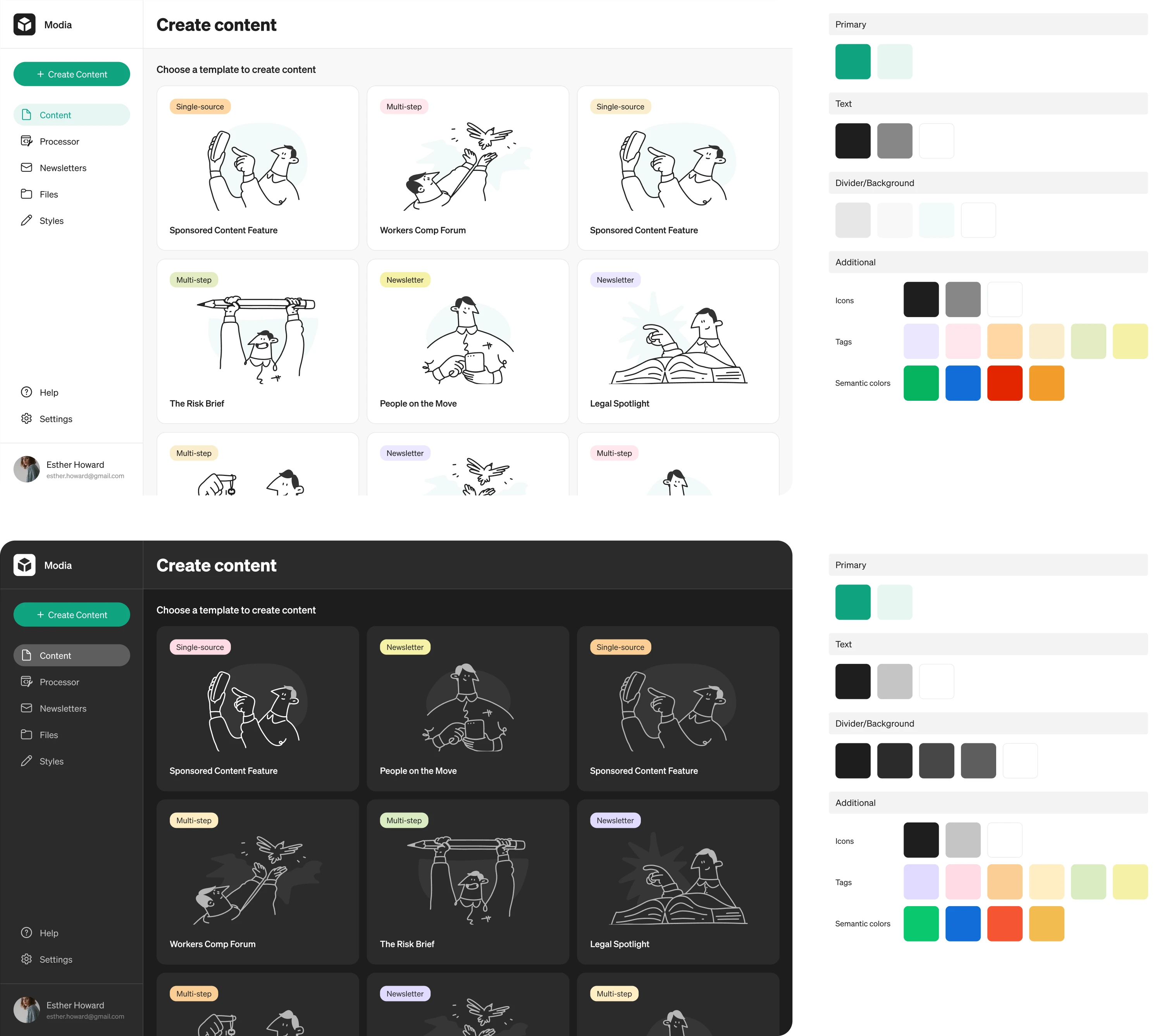
Let’s look at Modia again. The original MVP lacked consistency, so we built a clean UI system from the ground up. Every element, from buttons to input fields to component rounding, was tested with intention, not just aesthetics. We iterated through several palette options, ensuring color, tone, and contrast made sense not just visually, but functionally.
Even small touches mattered. Our UI/UX designer suggested a dark mode variation during testing, and users loved it so much that it became a core part of the theme.
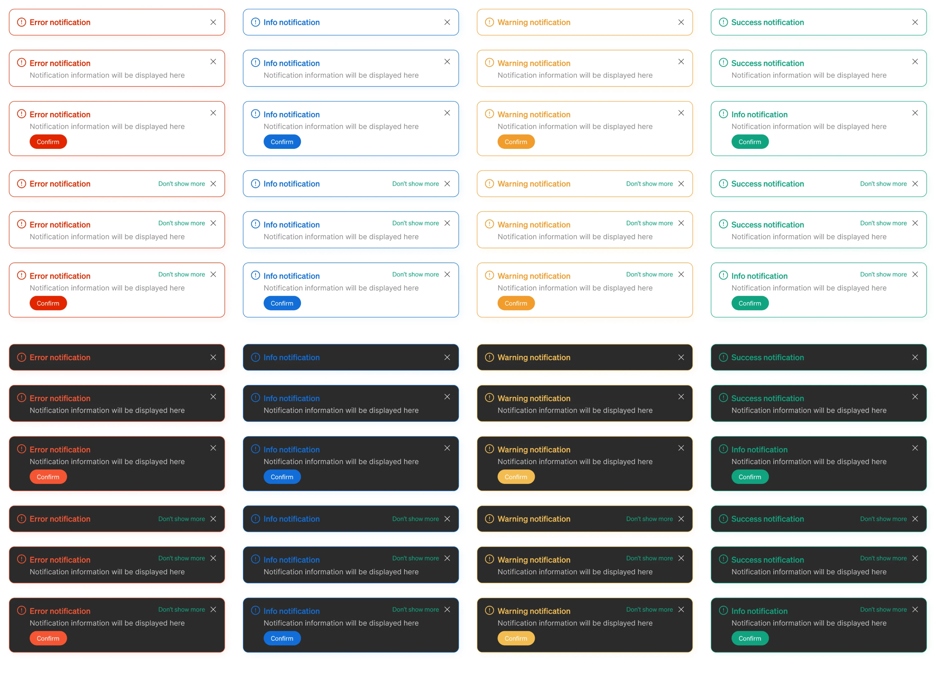
Notifications were another detail we refined through feedback: error, warning, info, and success messages each received a color treatment that made their meaning clear instantly.
Phase 5: Ship and monitor
A redesign doesn’t end at launch. That’s where it starts proving itself.
What to do:
- Roll out gradually, especially if the changes are big.
- Monitor core KPIs for signs of improvement or disaster.
- Track qualitative feedback: support tickets, app store reviews, customer calls.
- Tweak fast if something’s off.
Bonus: document what worked, and what didn’t. It’ll save you next time.
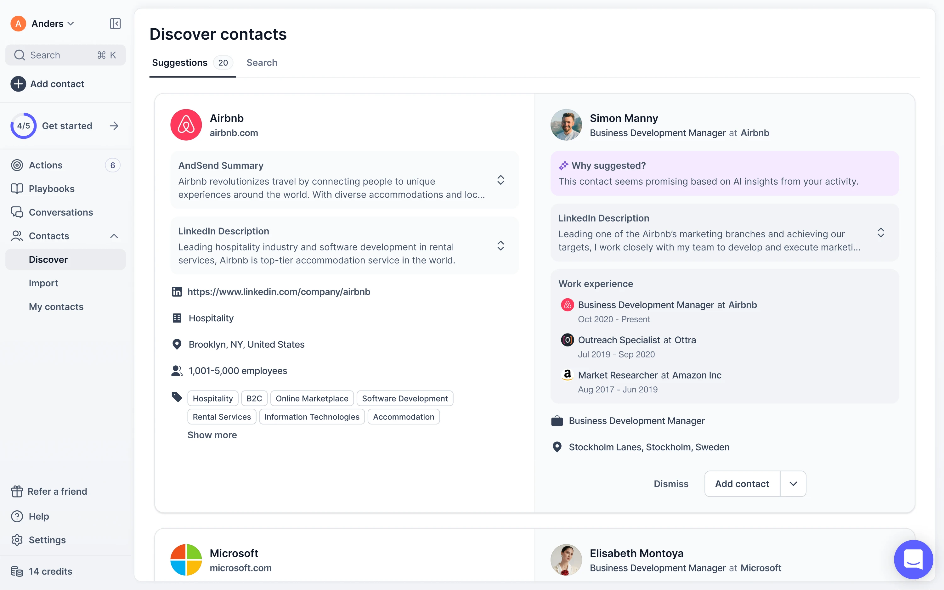
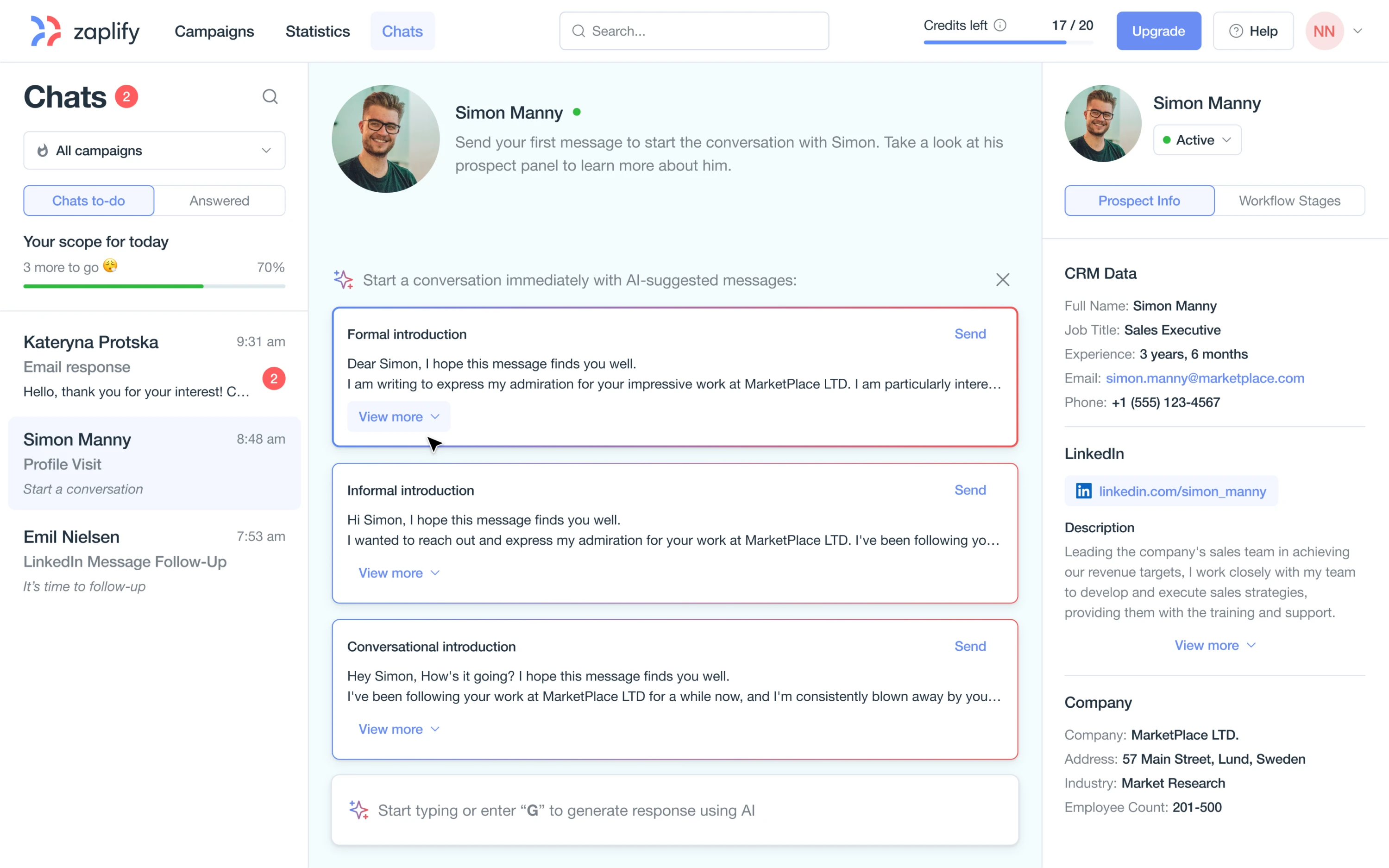
When Zaplify (now AndSend) pivoted to product-led growth, they had no sales team to guide users. The product had to onboard, convert, and retain on its own. But the existing UI didn’t support that vision: workflows felt clunky, and users often got lost.
Eleken designers shifted from a bulk-scanning workflow to a full-screen, card-by-card format. Each lead became its own focused view, complete with rich context: LinkedIn data, company insights, and AI-generated recommendations.
That clarity paid off. Users reached their “aha” moment faster and on their own. Activation jumped from ~25% to nearly 40%.
Now let’s zoom out and look at the small, practical rules that drive big results.
Small UI rules that make a big redesign impact
If you're wondering how to improve product UI without starting from scratch, start with the small things. These are practical, battle-tested tweaks, a mix of Eleken’s own go-to patterns, modern UI redesign best practices, and hard-earned lessons from UX communities like Reddit.
- Double your spacing, then halve your text.
Less noise = more clarity. You’re not fitting the content. You’re guiding attention. “It seems to follow the ‘more white space than a Klan rally’ school of design,” one Redditor joked, and while that’s a bit much, the point stands: whitespace isn’t a waste.
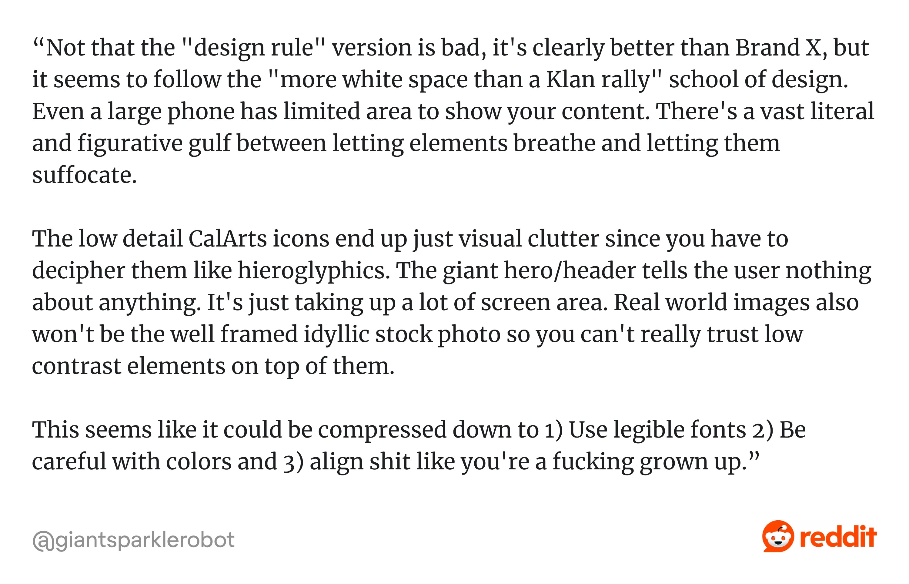
It’s how users breathe through dense UIs, like in the Reddit example below.
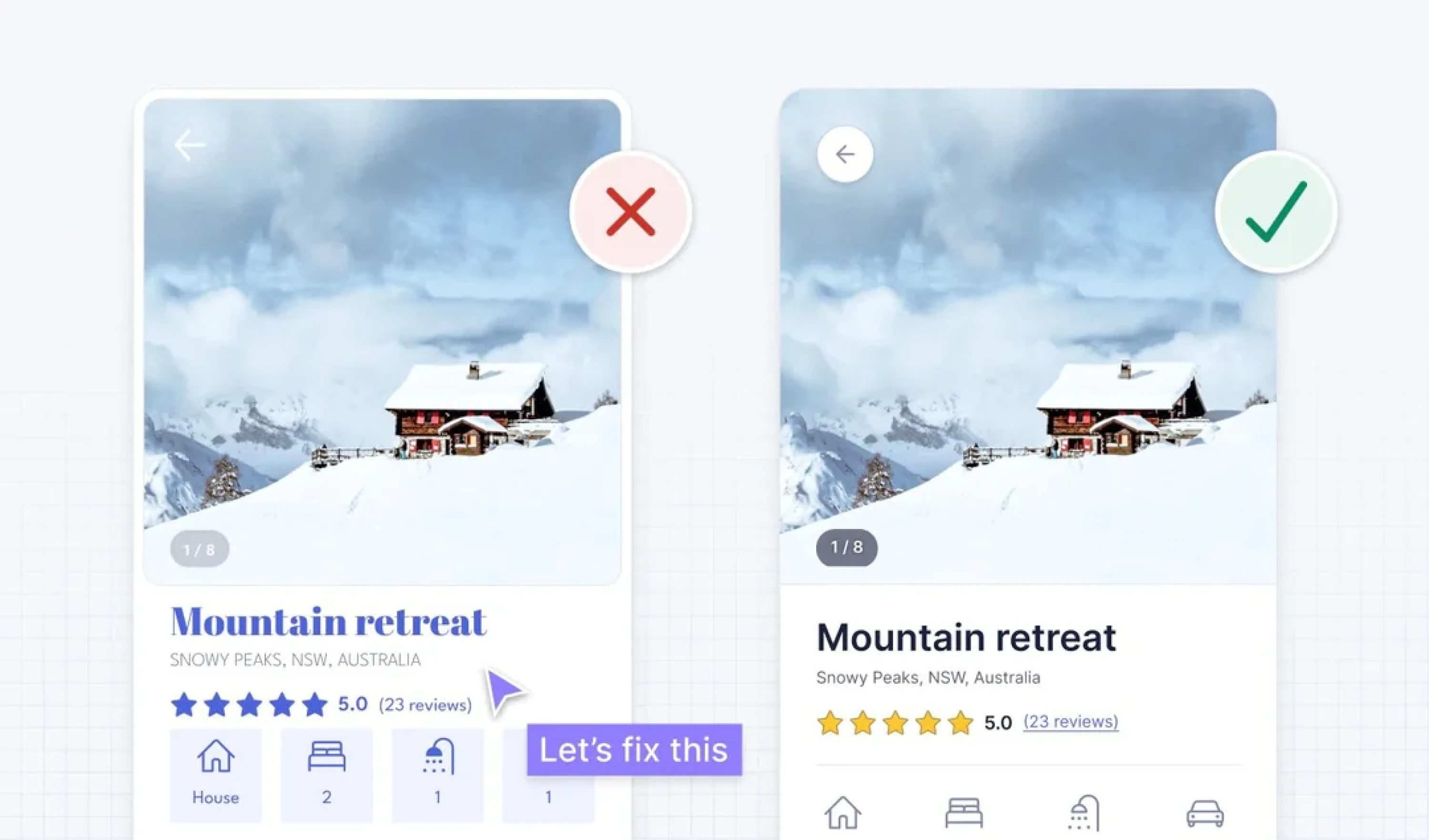
- Avoid low contrast; design for older eyes.
Don’t let cool trends ruin legibility. Check contrast ratios, especially for buttons.
“Whoever started the low-contrast fad should be sent to Pluto,” said one designer. Another added, “It’s clear they were a 22-year-old with perfect eyesight.”
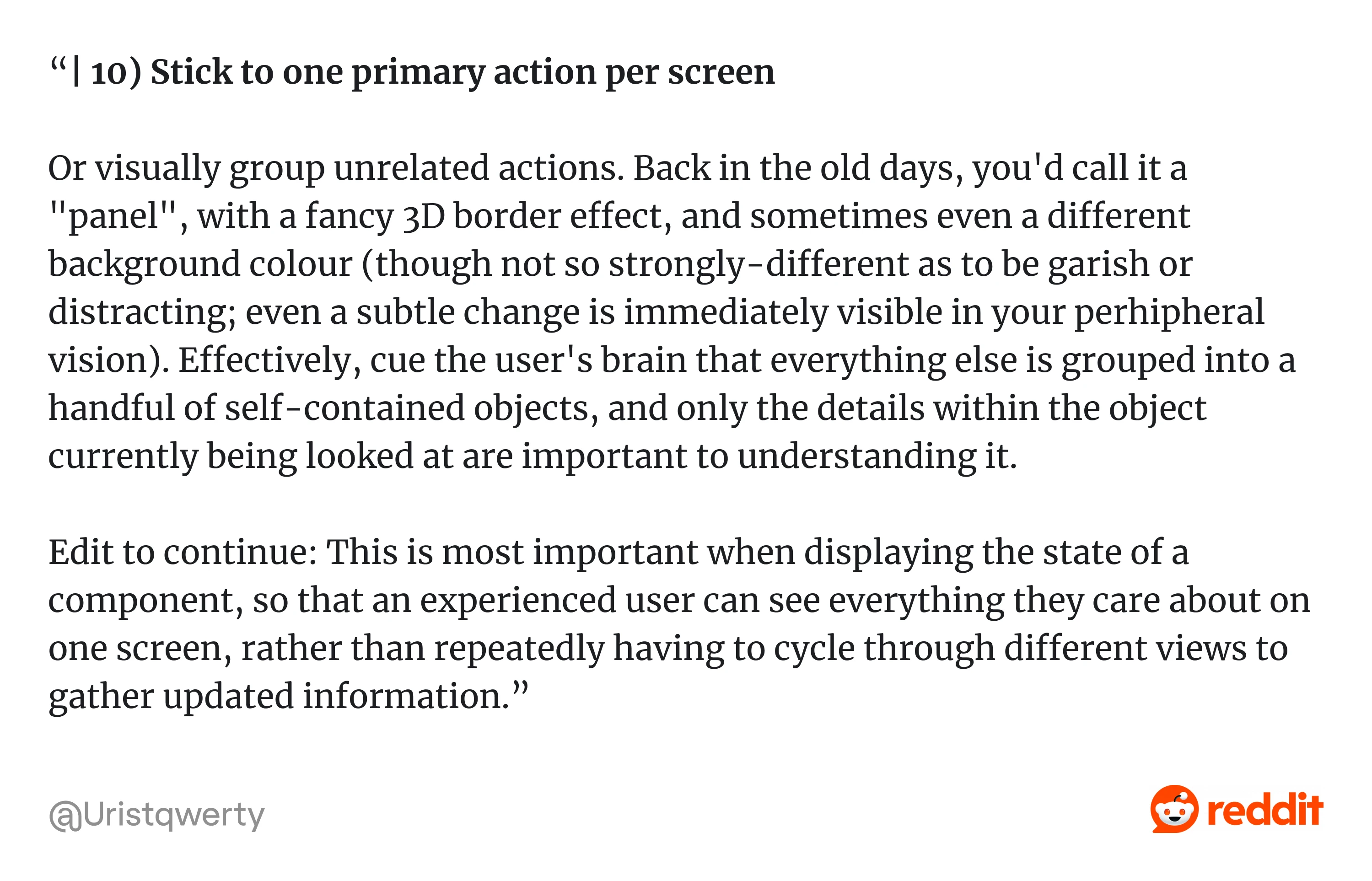
- Use one primary action per screen.
If everything’s important, nothing is. Give users one clear next step. “Stick to one primary action or group unrelated ones visually,” one developer recalled from the old-school “panel” design days, and it still works.
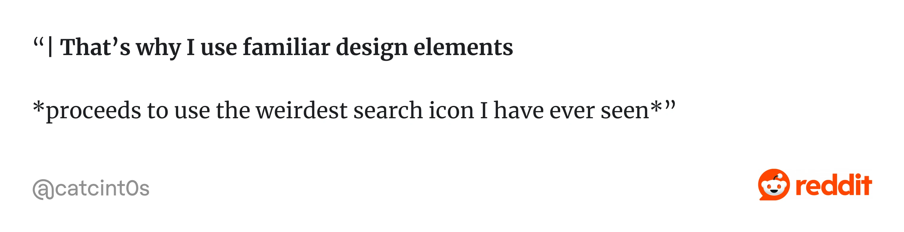
- Labels > mysterious icons.
Hamburger menus and gear icons aren’t self-explanatory. When in doubt, add a label.
“That’s why I use familiar icons,” said one Redditor right before posting “the weirdest search icon anyone had ever seen”.
- Group related items visually.
Use spacing, alignment, and background to signal relationships between elements.
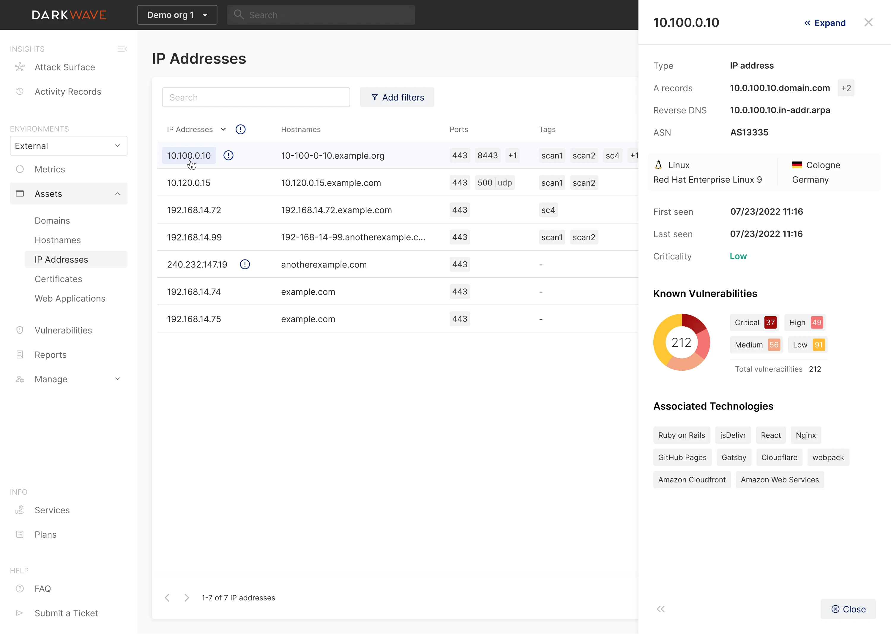
For Vector0 (DarkWave), Eleken designers kept the main view simple (charts). They grouped “details for the thing you clicked” into an expanding sidebar, a strong pattern for “related info lives together in a container, separated from the primary canvas.”
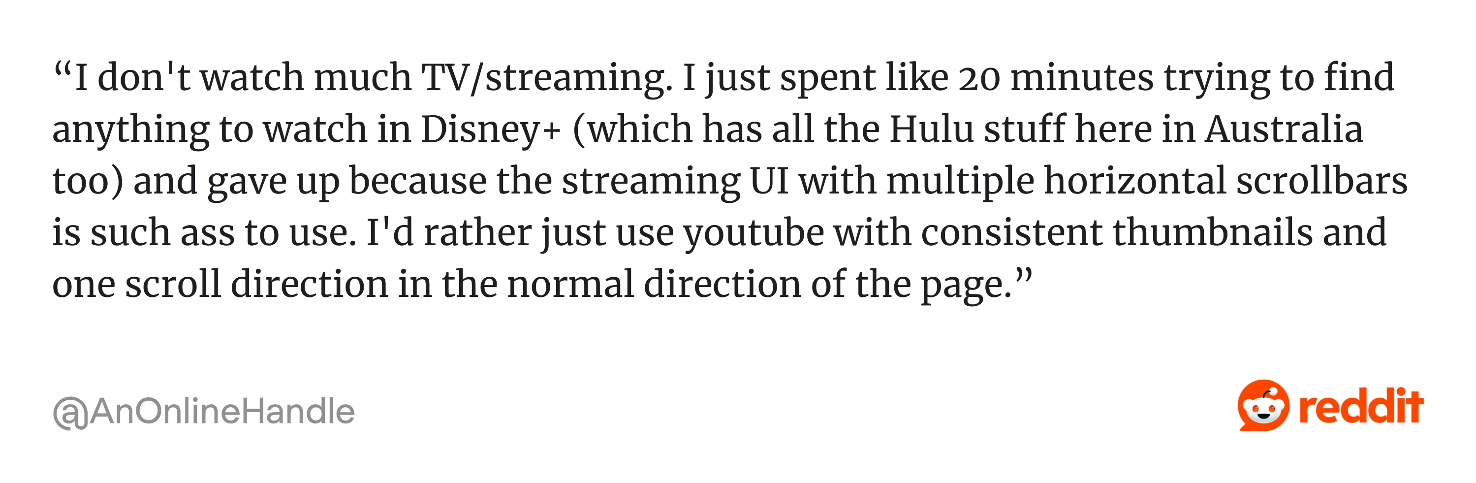
- Avoid multi-axis scrolling.
Users hate scrolling both ways at once. One Reddit user said that they gave up “trying to find anything to watch in Disney+” because of “the streaming UI with multiple horizontal scrollbars.” Too many carousels and too many directions frustrate users.
- Use predictable patterns (e.g., the search icon, modal buttons).
Don’t reinvent the wheel, especially not the Save or Close wheel. Muscle memory matters. As a Redditor explained: “Also important to note that procedural memory (aka muscle memory) is more robust than episodic memory. It is the last to be affected by dementia and related diseases.” If your users are constantly second-guessing common actions, the problem’s not them, it’s you.
- Minimize cognitive load, not clicks.
Three simple, well-structured steps beat one overwhelming screen every time. It’s not about counting clicks; it’s about reducing mental friction.
As one Redditor added: “Having to go through 5 different screens, clicking "Confirm" or "Next" to build a user profile is not a good experience for the user, while scrolling and filling in the details is much faster, and more intuitive, as well as more accessible”.
- Increase click targets to at least 44px.
This one’s non-negotiable. This Reddit user put it: “Click areas should always be a minimum of 40px square…”
- Respect platform conventions, don’t break consistency.
Desktop, mobile, macOS, Android… They all have defaults for a reason. Use them.
Button order, gestures, and scroll behavior all have norms. Don’t break them unless you have a really good reason, as it may cost you too much. This Reddit explains: “When moving a button, even if it makes total design sense, can cost a company serious $$$ in loss of productivity and training.”
All of these will make your redesign feel more intentional and less chaotic. Next, let’s talk about tools based on how designers use them in different stages of a redesign.
UI design tools and how designers use them in redesigns
Here’s how we use tools at Eleken, mapped to real redesign workflows.
For audits and insights
Before you design anything, you need to know what’s broken. These tools help you see the raw truth.
- Hotjar/FullStory: Heatmaps, rage clicks, scroll depth. Where are people getting stuck or quitting?
- Google Analytics: Funnel drop-offs, bounce rates, and session time. Just enough data to ask better questions.
- Figma + FigJam: Cluster insights from user research and session reviews into actionable themes.
Pro tip: Don’t collect data you won’t act on. Start with one key flow and dig deep.

For rapid redesign exploration
When you’re generating ideas fast, you need tools that move with you, not slow you down with pixel-perfection.
- Figma components: Design once, reuse everywhere. Huge time-saver when you’re iterating.
- Auto-layout: Makes your layouts responsive and easier to update when you inevitably change your mind.
- Design tokens: Set up color, spacing, and typography variables for consistency.
- AI plugins (like Magician or Automator): Useful for layout suggestions, dummy content, or speed prototyping. Just don’t let them design for you.
Caution: Don’t confuse tool complexity with design quality. Simpler setups often win.
For usability validation
You’ve got a new version of your UI. But does it work? Test with these tools:
- Maze: Quick remote testing with real users. Great for validating flows and finding design and friction points.
- UserTesting / PlaybookUX: Record task-based sessions with target users.
- Figma prototype + screen recorder: You can test most flows just by watching people use your prototype and asking a few good questions.
Tip: One messy usability test beats a perfect internal review. Test with humans early.
For rollout and monitoring
You can not only ship redesigns but also observe and fix them using:
- LaunchDarkly: Feature flags for gradual rollouts. Great for high-risk redesigns.
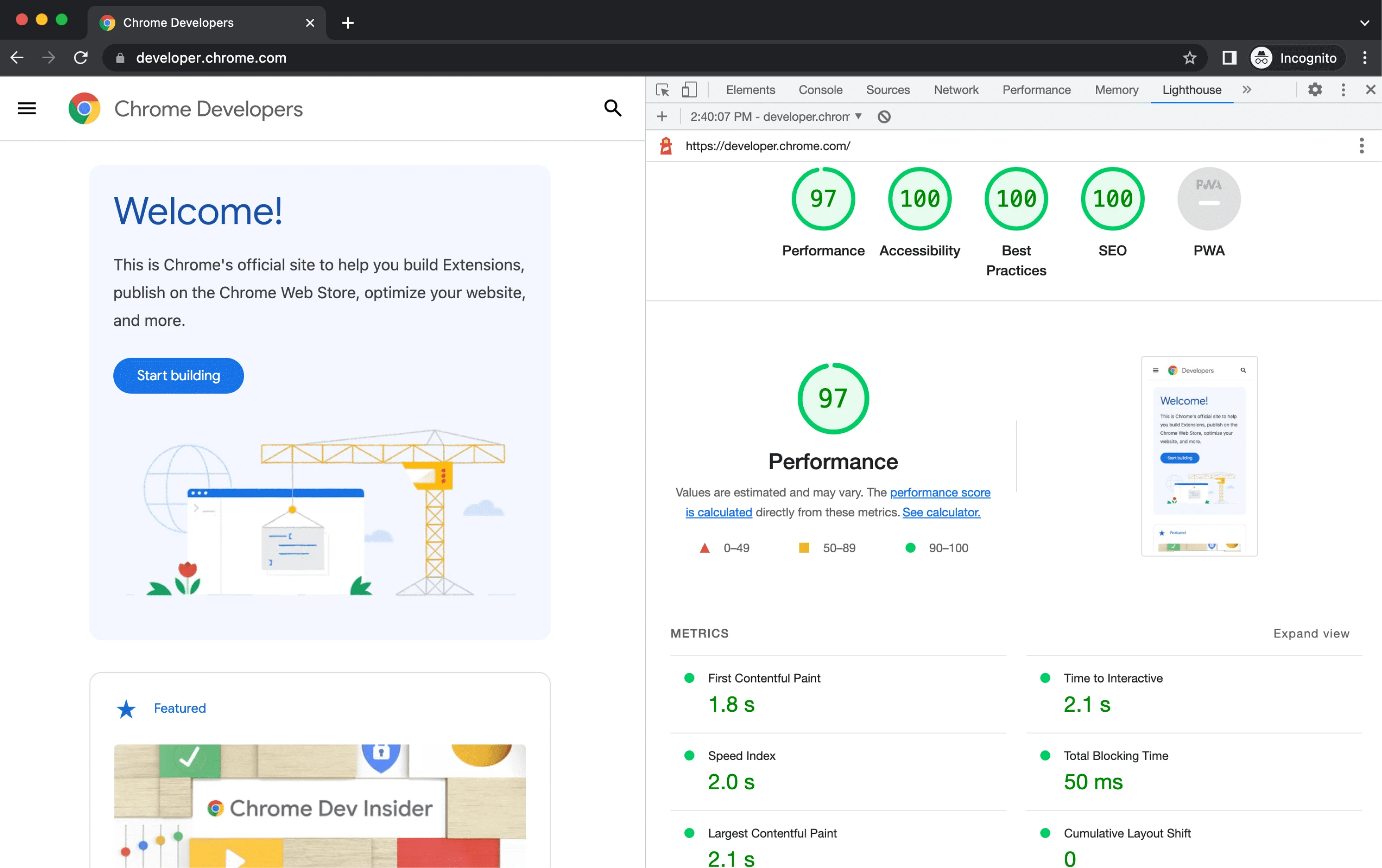
- Lighthouse: Audit page speed and accessibility.
- Hotjar / FullStory (again): Post-launch session recordings to catch unexpected drop-offs.
Reminder: If your redesign tanks conversions, it doesn’t matter how pretty it is.
With the right tools and workflows in place, you can redesign with clarity. But let’s zoom out again: what’s actually trending in UI right now, and which trends are worth paying attention to?
Latest UI redesign trends for 2026
Trends don’t mean “go copy this now.” But they can show where user expectations are shifting, and what your redesign needs to keep up with.
Here are five UI trends we’re seeing more of and using ourselves.
1. High-density dashboards with better UX
AI tools are generating more data than ever, and bad design examples often show up in dashboards that just dump it all on users.
Designers are embracing:
- Smart grouping.
- Interactive filters.
- Progressive disclosure (show detail only when needed).
Think: Show more, overwhelm less. For example, for our client Data Streams, Eleken designers introduced a drag-and-drop dashboard constructor that allows users to choose which datasets to display and how to display them. Each user could create a personalized layout to better manage visual density while improving UX readability.
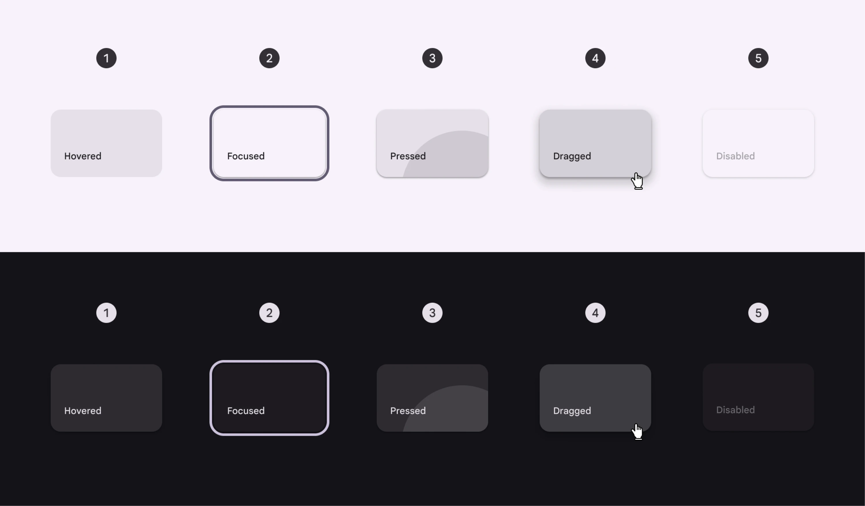
2. Accessibility by default
It’s no longer optional or an afterthought. Now it’s baked in from day one:
- WCAG-compliant color palettes.
- Keyboard-first interaction support.
- Focus states that are visible and elegant.
Think: Accessibility equals usability for all users, not just those with assistive devices. And yes, security UX design starts here too, because accessible design builds trust.
3. Personalized interfaces
More SaaS tools are adapting their UI based on:
- User role (admin vs contributor).
- UX design patterns.
- Feature access levels.
Think: Design one system, deliver many experiences.
4. Micro-3D and expressive visual depth
Flat isn’t dead, but it’s evolving. We’re seeing:
- Soft shadows.
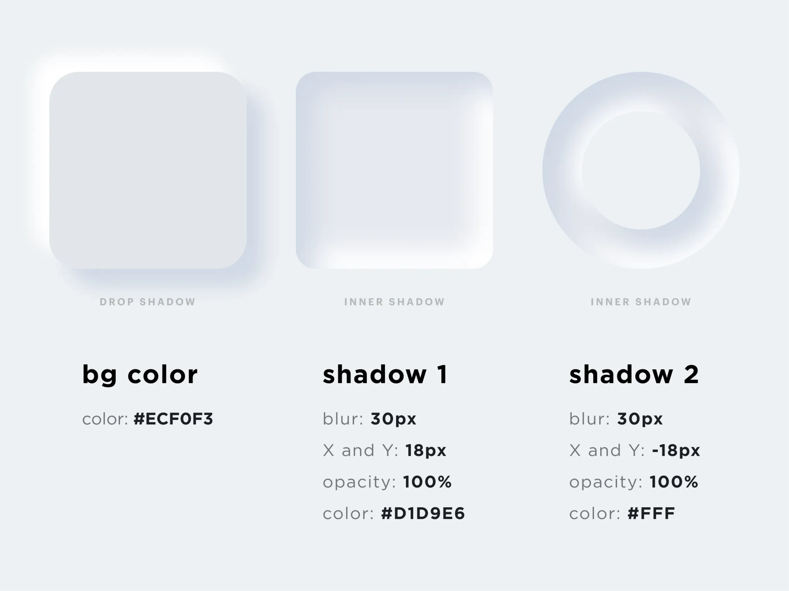
- Slight depth in cards and modals.
- Light skeuomorphism touches (without going full iOS 6).
Think: Subtle depth, not fake realism.
5. AI-assisted layout and content generation
From Figma plugins to Notion AI-style onboarding helpers, generative AI is quietly becoming part of the interface.
Think: Use AI to reduce busywork, not replace design thinking.
If you do decide to redesign, do it with intention. And check everything before you go live.
Which brings us to the next (and final tactical) section: a 30-point user interface redesign checklist.
30-point UI redesign checklist
Not sure when to redesign a user interface? Start here.
Before you ship that shiny new UI, run it through this checklist. It’ll help you catch and fix most of the issues.
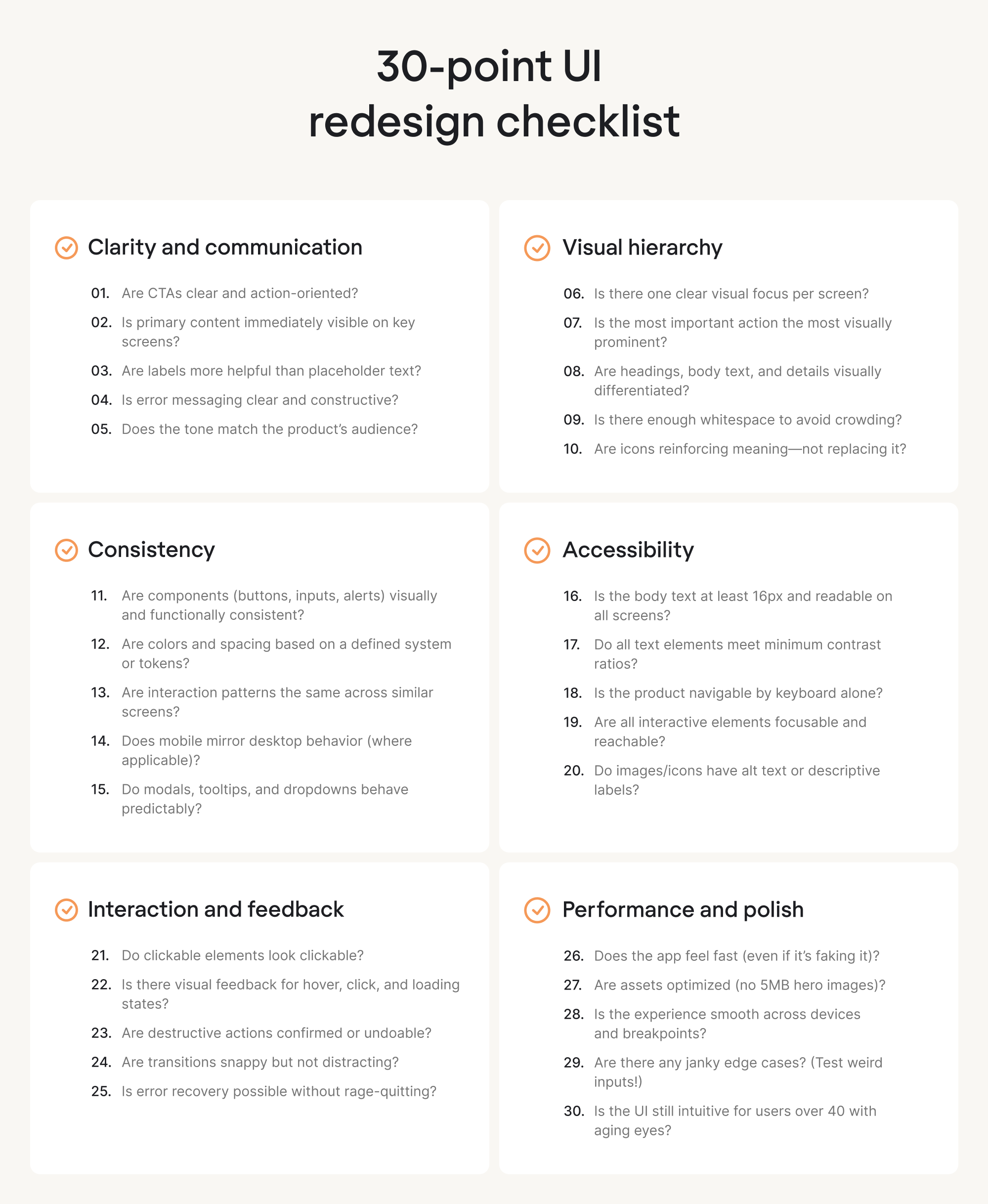
If you check 90% of this list, you’re probably in a good spot. If you check all 30? Nice. Ship it, then test it again anyway.
Conclusion: redesign with purpose, not just polish
Most redesigns fail early, not because of bad colors or layouts, but because teams skip the hard questions. If your plan starts with “let’s make it look fresh”, you’re already at risk.
Strong redesigns begin with:
- User pain, not design trends.
- Structure and flow, not just style.
- Simplicity in UI/UX design and clarity, not visual gimmicks.
If your product feels clunky, confusing, or harder to use than it should be, a redesign can help, but only if it’s grounded in real UX thinking:
- Start with users.
- Design for simplicity.
- And move forward with purpose.
And if you’re considering a UI overhaul but not sure where to begin, Eleken offers a free 3-day trial. You’ll work directly with senior SaaS designers and see how we work. Let’s talk about your redesign.


