.webp)


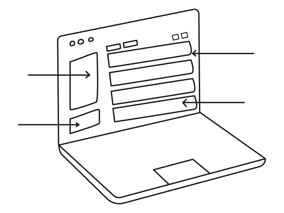
Working in B2B SaaS design for over 10 years, we can say with confidence: dashboard design is the hardest screen to get right. It’s the first thing users see when they log in, and it needs to surface the most relevant information immediately.
There’s very little room for error.
From a UI/UX design standpoint, a good dashboard demands dozens of small decisions about hierarchy, patterns, user roles, and what data actually matters. That’s what we’ve prepared in this guide, and to start with, let’s cover the basics.
A practical framework for SaaS dashboard design
There’s no universal dashboard SaaS that works for everyone. What works for a customer success team looks completely different from what an executive needs, and designers who ignore that end up rebuilding the same screen three times.
Over the years, we’ve shaped this into a five-step process that helps you make the right calls as you start designing.
Step 1 — Define the decision
Before choosing a single chart or KPI, you need to answer one question: what decision should this dashboard help the user make? Not “what data do they need to see,” but what action or judgment should they be able to reach faster because of it.
A quick competitor analysis before you talk to users is worth doing, as it gives you a baseline of industry expectations and helps you ask smarter questions. From there, user interviews or discovery calls are the fastest way to get to the real answer.
Ask your stakeholders and users:
- What do you check first when you log in?
- What would make you escalate something or change a plan?
- What information, if missing, would slow you down?
A great practice at this stage is asking users what they currently compile manually outside the product — in spreadsheets, email threads, or Slack messages. That workaround is almost always a signal of what the dashboard is missing.
Step 2 — Map user roles to dashboards
Once you know the decision the dashboard needs to support, you need to identify who’s making it.
This is where a lot of SaaS dashboards silently break. Teams design one screen and expect it to serve an executive, a product manager, and an operator. Those three people are looking at the same information through completely different lenses, and trying to satisfy all of them at once usually means satisfying none of them well.
A simple way to think about it:
- Executives need a snapshot — a few high-level KPIs, trend direction, and any anomalies worth attention.
- Managers need performance context — progress toward goals, team or segment breakdowns, period-over-period comparisons.
- Operators need real-time visibility and quick actions — live data, status indicators, tasks.
In the real world, this often means designing multiple dashboards rather than one. That can feel like more work upfront, but it’s almost always less work than iterating on a cluttered single view that nobody finds useful.
Step 3 — Choose KPIs based on actionability
With roles mapped, you’ll likely have a long list of candidate metrics. The real design work here is cutting that list down to what actually belongs.
At Eleken, the filter we always apply is simple: what action does this metric trigger?
If the answer is “we’d monitor it,” that’s not enough. A metric earns its place on a B2B dashboard when a specific value or change prompts a specific response. No clear response means no clear reason to surface it prominently.
To evaluate each candidate metric, put them against three criteria:
- Actionability — does a change in this number lead to a concrete next step?
- Impact — does it connect directly to a business or user goal?
- Clarity — can the target user interpret it in seconds?
Metrics that score low on all three may feel important, but don’t drive anything. The hardest part here is getting stakeholder buy-in to deprioritize the bad ones. That’s where the decision framework from Step 1 becomes useful again: if a metric doesn’t support the decision the dashboard is built around, it doesn’t belong above the fold.
Step 4 — Set the visual hierarchy
Hierarchy is what helps you build a dashboard that instantly communicates value. Your task is to place metrics in the order the eye naturally follows, because in most cases, new users won’t scan for more than a few seconds before forming a judgment.
The principle is straightforward: the more a metric drives decisions, the more prominent it should be. Primary KPIs go above the fold, secondary context sits below, detailed data lives deeper. Every layout decision should follow that logic.
One common mistake is grouping all charts or labels together. Yes, it might feel logical from a B2B design standpoint, but it rarely matches how users think. Group metrics by the question they answer instead.
When defining hierarchy, remember that larger SaaS dashboard components read as more important. Top-left carries the most visual weight in left-to-right reading patterns. Don’t waste those positions on logos or navigation labels.
One thing worth running early is the five-second usability test. Show someone the dashboard for five seconds, hide it, and ask what they remember. If the answer doesn’t match the metric you consider most important, the information hierarchy needs work.
Step 5 — Design for the actual user
Users open a dashboard with a specific question in mind. They’re looking for a signal that tells them whether everything is fine or something needs attention. When designing a dashboard, you should make that as fast as possible.
From our experience, here are a few principles you can rely on:
- Follow the F-pattern. Users naturally scan left to right across the top, then down the left side. Place the most critical metric top-left, primary KPIs across the first row, and secondary information below.
- Use whitespace thoughtfully. Cramming metrics together feels thorough but reads as noise. Breathing room between components helps users separate and process information faster.
- Let color carry meaning. Reserve strong colors — red, amber, green — for status and alerts. Using them consistently will guide users toward what needs attention.
- Design error and empty states. A dashboard with no data yet, or a widget that failed to load, is still a user experience. Leaving these undesigned is one of the most common oversights in dashboard projects.
Once the design is solid, a clean handoff to development matters just as much. Annotate the logic behind layout decisions, document threshold behavior, and specify how components should respond to edge cases.
And treat the first release as a hypothesis. Using analytics or A/B testing after launch is the best way to validate your SaaS dashboard layout and make the next iteration count.
SaaS dashboard design inspiration
Process gets you to the right structure, but it helps to see how that structure plays out in real products. Below, we’ve pulled together SaaS dashboard examples worth studying. Each one handles a specific design challenge in a way you can take something from.
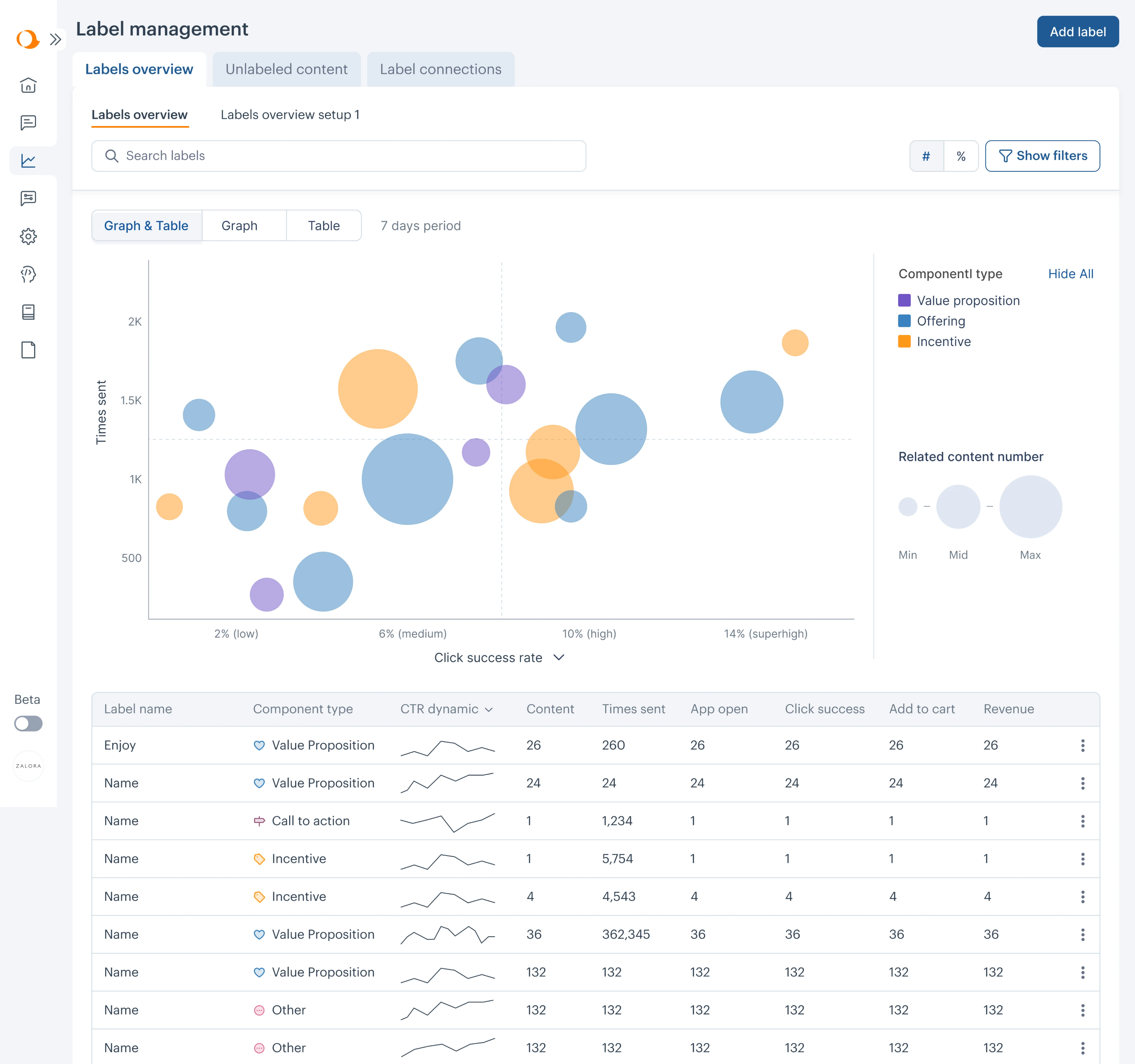
Aampe
Aampe is an AI marketing platform with a lot of data flowing through the product, which means the dashboard has to do serious heavy lifting. When we took on the project, the challenge was making what was already there faster to read and act on.
Here’s what made the difference:
- Collapsible sidebar to reduce visual noise and free up screen space.
- Renamed navigation labels so users could easily find sections.
- Bubble chart replacing a flat data table for label performance.
- Sparklines for inline trend tracking without leaving the main view.
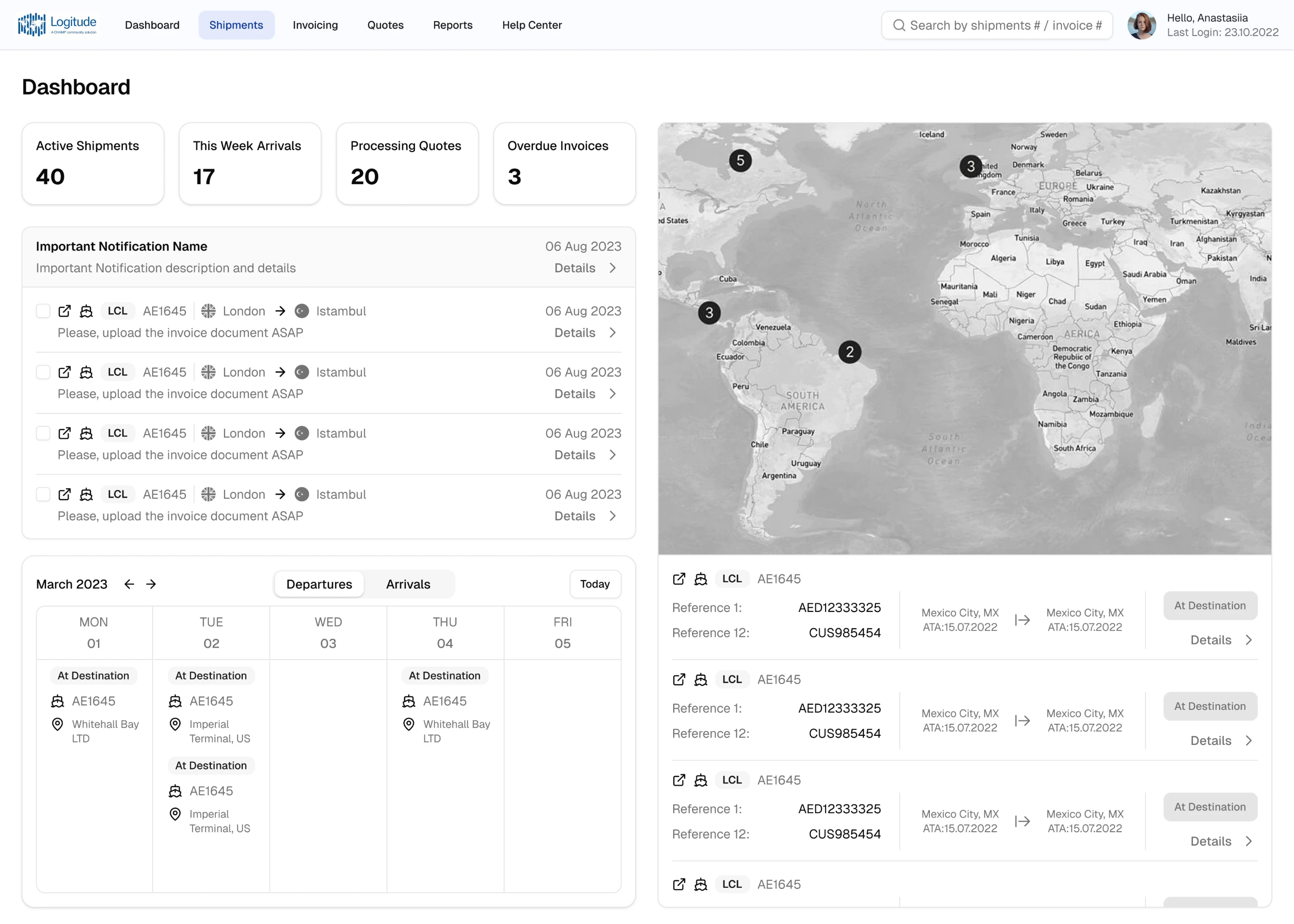
LogitudeWorld
LogitudeWorld needed a shipment tracking dashboard for non-technical end users. We identified that users needed real-time operational data to make immediate decisions about incoming shipments, and designed around that.
Here’s what made the difference:
- Added a calendar for immediate decision-making on upcoming arrivals.
- Moved filters from hidden icon buttons into a visible sidebar.
- Added text labels to all icons so non-technical users didn’t have to guess.
- Introduced hover tooltips for additional context without cluttering the screen.
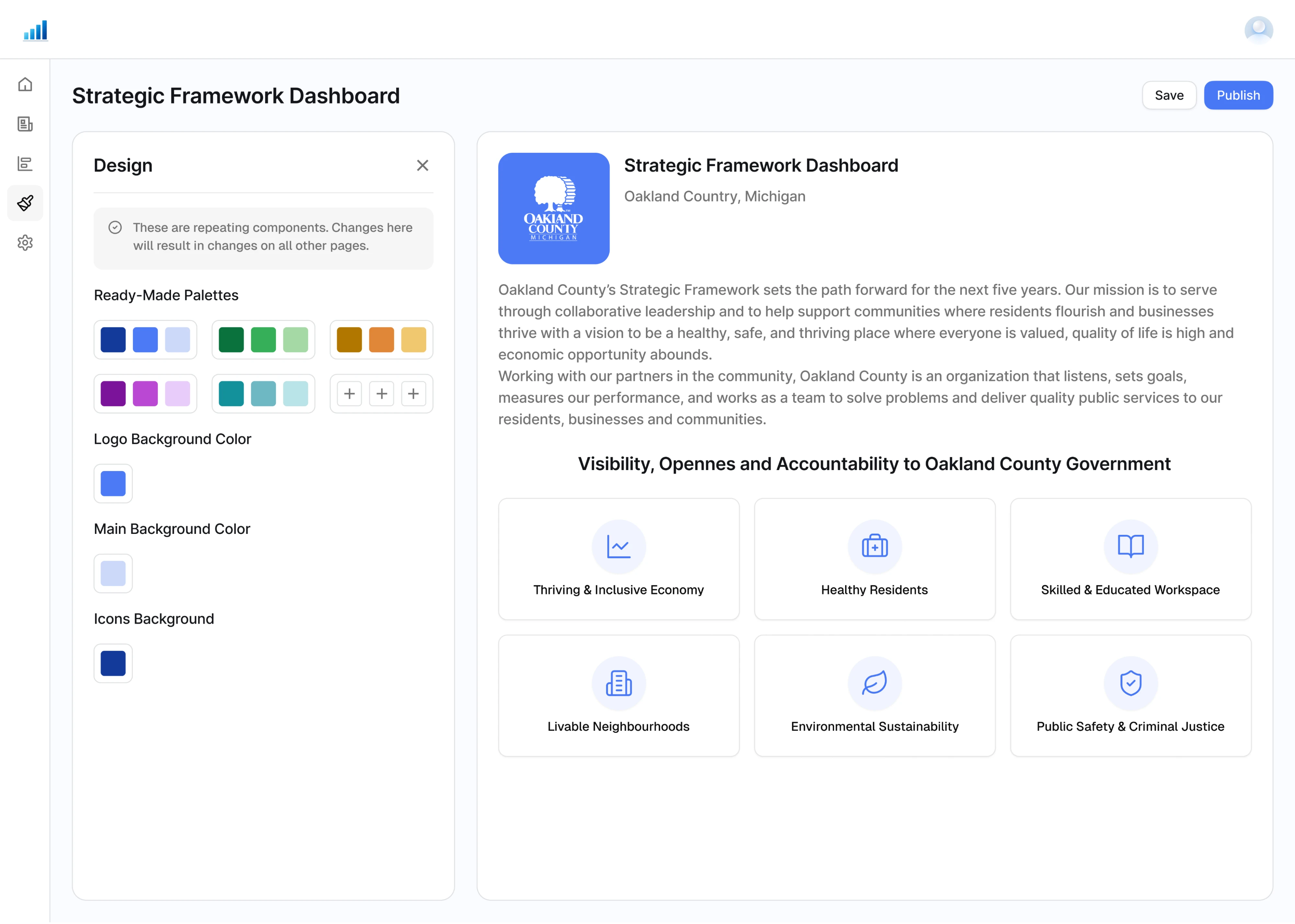
ClearPoint Strategy
ClearPoint Strategy is a reporting tool used by organizations to automate strategy reporting. The core challenge was giving users enough flexibility to customize their SaaS dashboard template without letting the design fall apart.
Here’s what made the difference:
- Unified dashboard template divided into four clear sections.
- Ready-made color palettes instead of a full color picker.
- Separate controls for logo background, main background, and icon colors
- Live preview showing changes in real time.
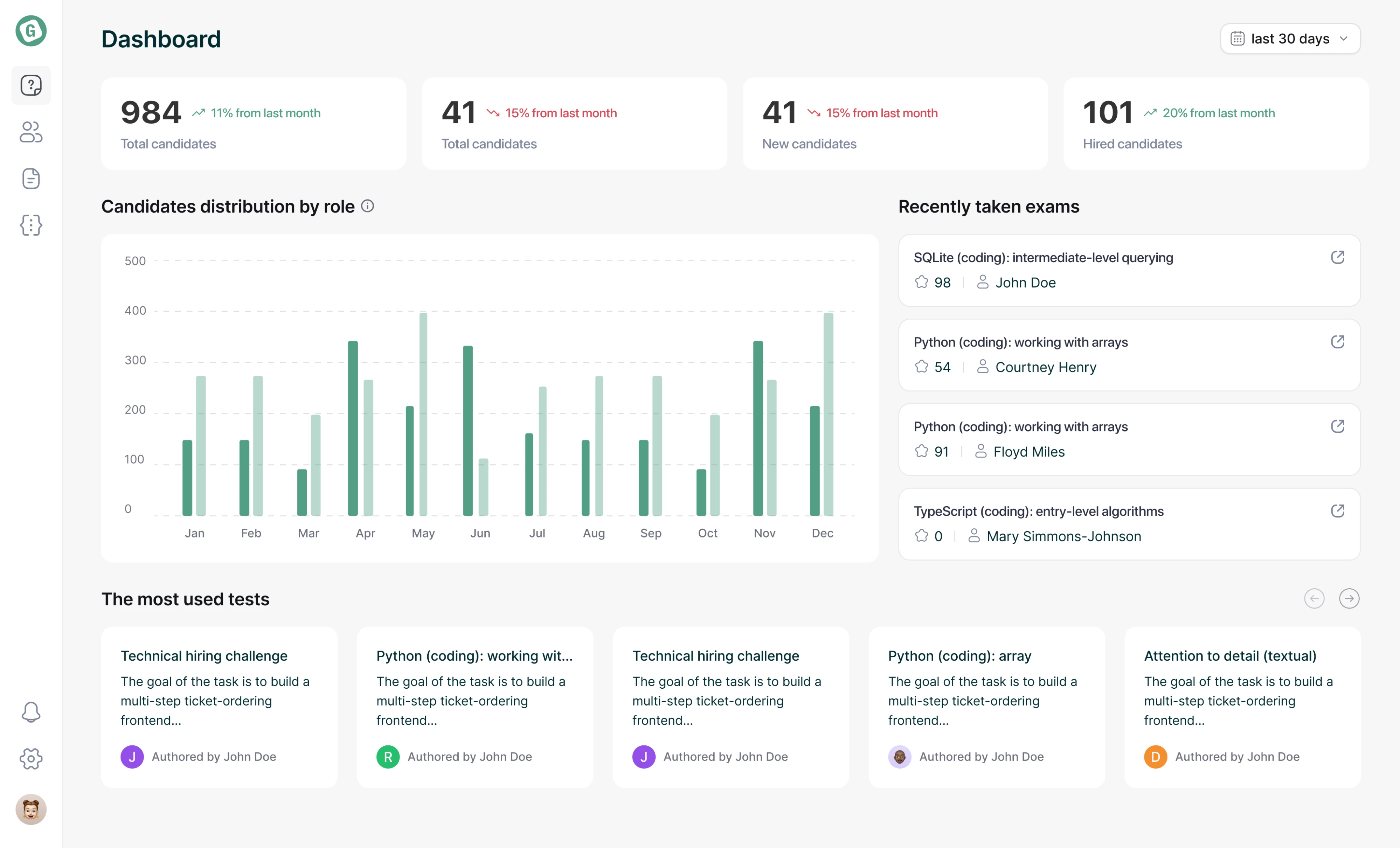
Gotechiez
Gotechiez is a developer skills assessment platform built for technical hiring. When we took on the project, recruiters needed a dashboard that gave them a clear picture of hiring activity without switching between multiple screens.
Here’s what made the difference:
- KPI tiles with trend indicators showing percentage change vs last month.
- Bar chart showing candidates’ distribution by role over time.
- Recently taken exams feed surfacing the latest hiring activity.
- Multi-level filtering on question lists by complexity, owner, duration, and tags.
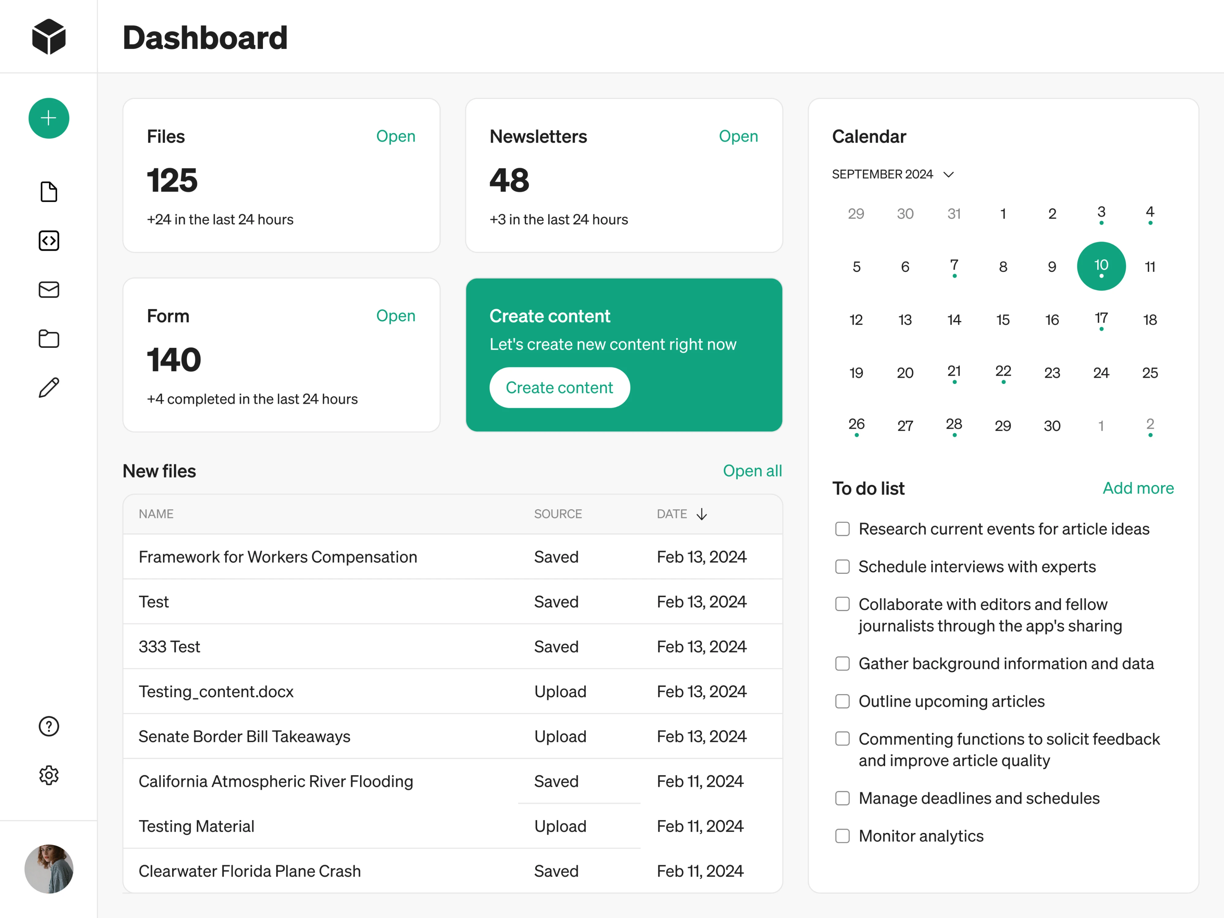
Modia
Modia AI content creation platform started as an internal tool and was being scaled into a full SaaS product. The product launched without a dashboard. We designed it from the ground up around what users needed to see first.
Here’s what made the difference:
- Key platform metrics placed at the top for instant situational awareness.
- Recently used files surfaced with quick access points to reduce navigation.
- Single prominent CTA to create new content.
- Calendar paired with a To-Do list to keep daily tasks visible.
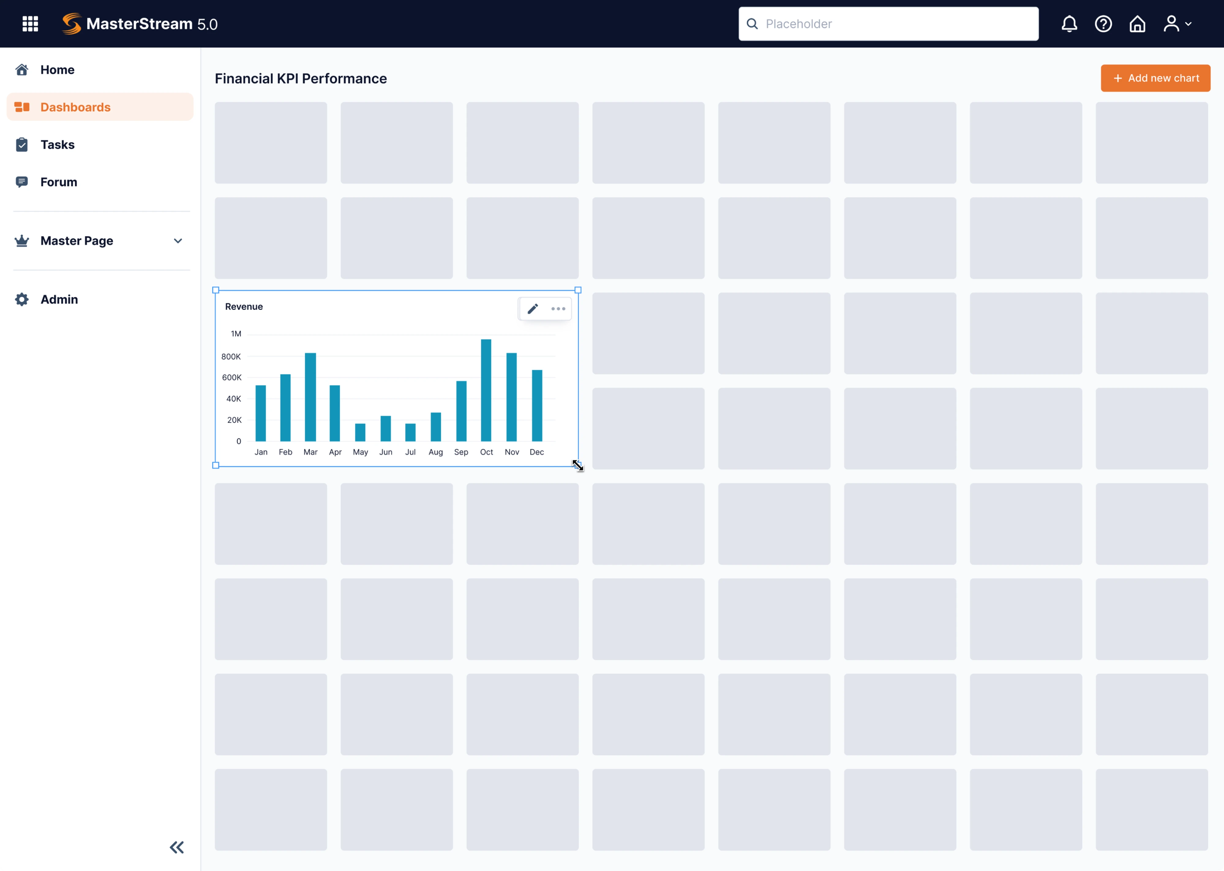
Data Streams
Data Streams is a data management platform that was struggling to break into the global market. The core problem was that everything was presented in complex forms and tables, and our designer joined in to simplify the dashboard experience.
Here’s what made the difference:
- Drag-and-drop dashboard constructor replacing static parameter rows.
- Collapsible sidebar to maximize canvas space when needed.
- “Add new chart” button keeping the dashboard extendable in one click.
- Limited color palette to keep focus on the data rather than the interface.
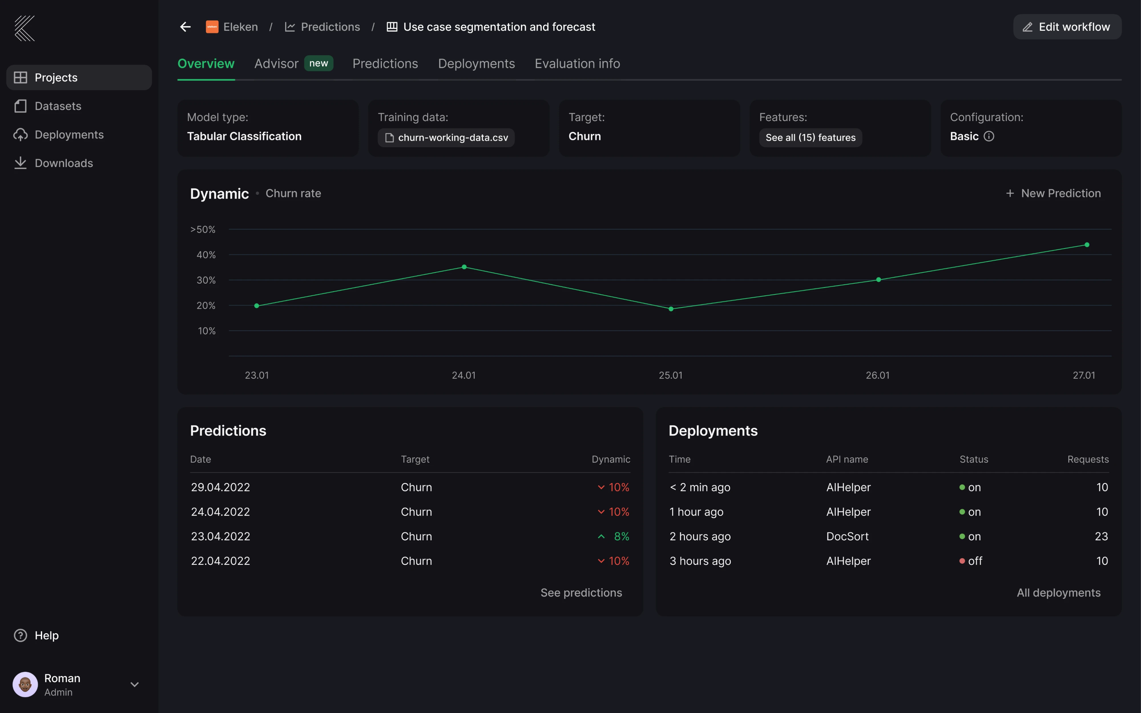
Stradigi AI
Stardigi AI contacted Eleken to design their low-code AI platform, Kepler. As the product grew, the interface became complex and hard to navigate. We rebuilt the dashboard to make the product usable for people who don’t speak data science.
Here’s what made the difference:
- Breadcrumb navigation to keep users oriented inside a multi-level product.
- Dark mode UI to reduce visual fatigue in long data-heavy sessions.
- Line chart as the primary visual showing predictions over time.
- Color-coded trend indicators making performance changes scannable.
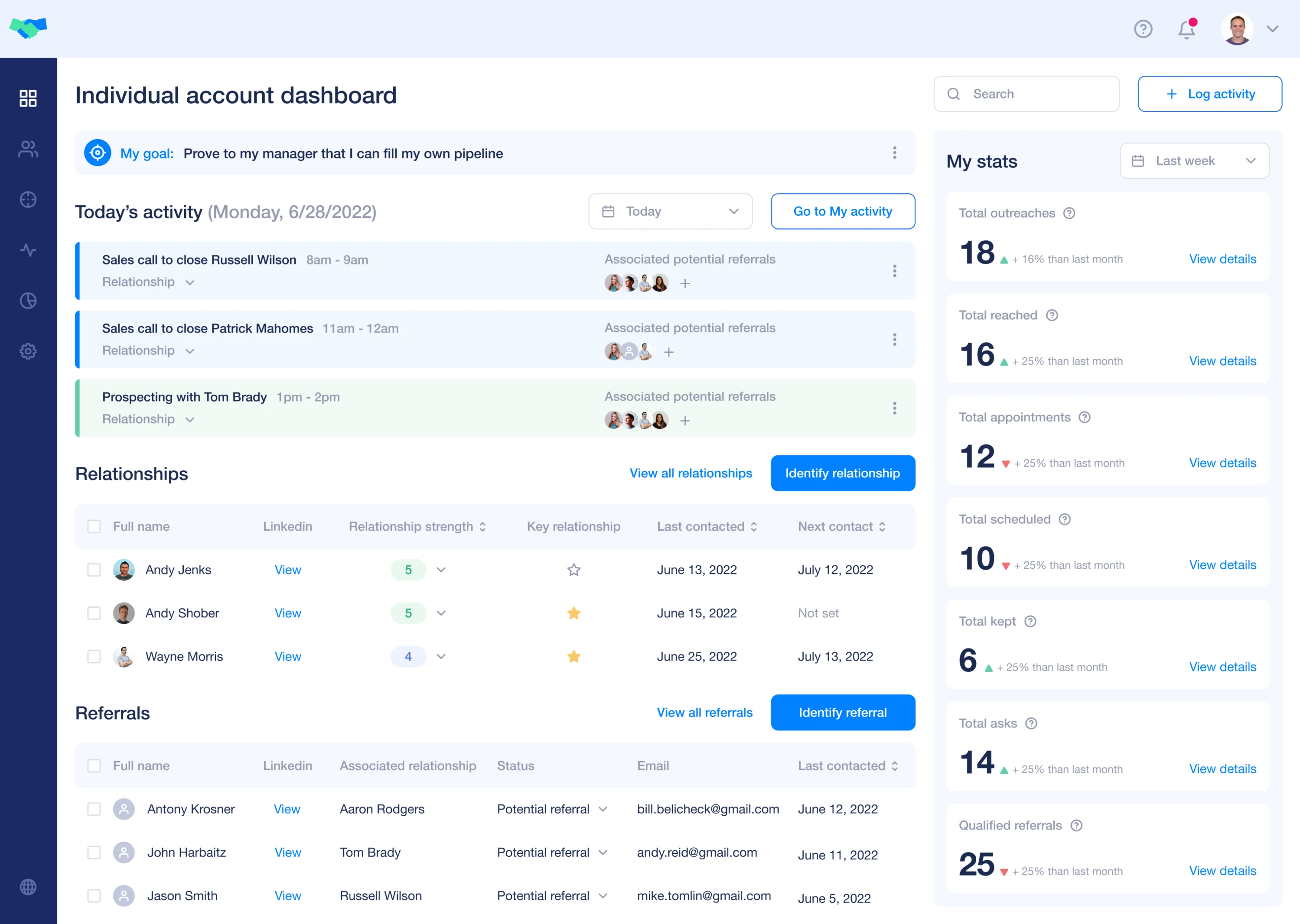
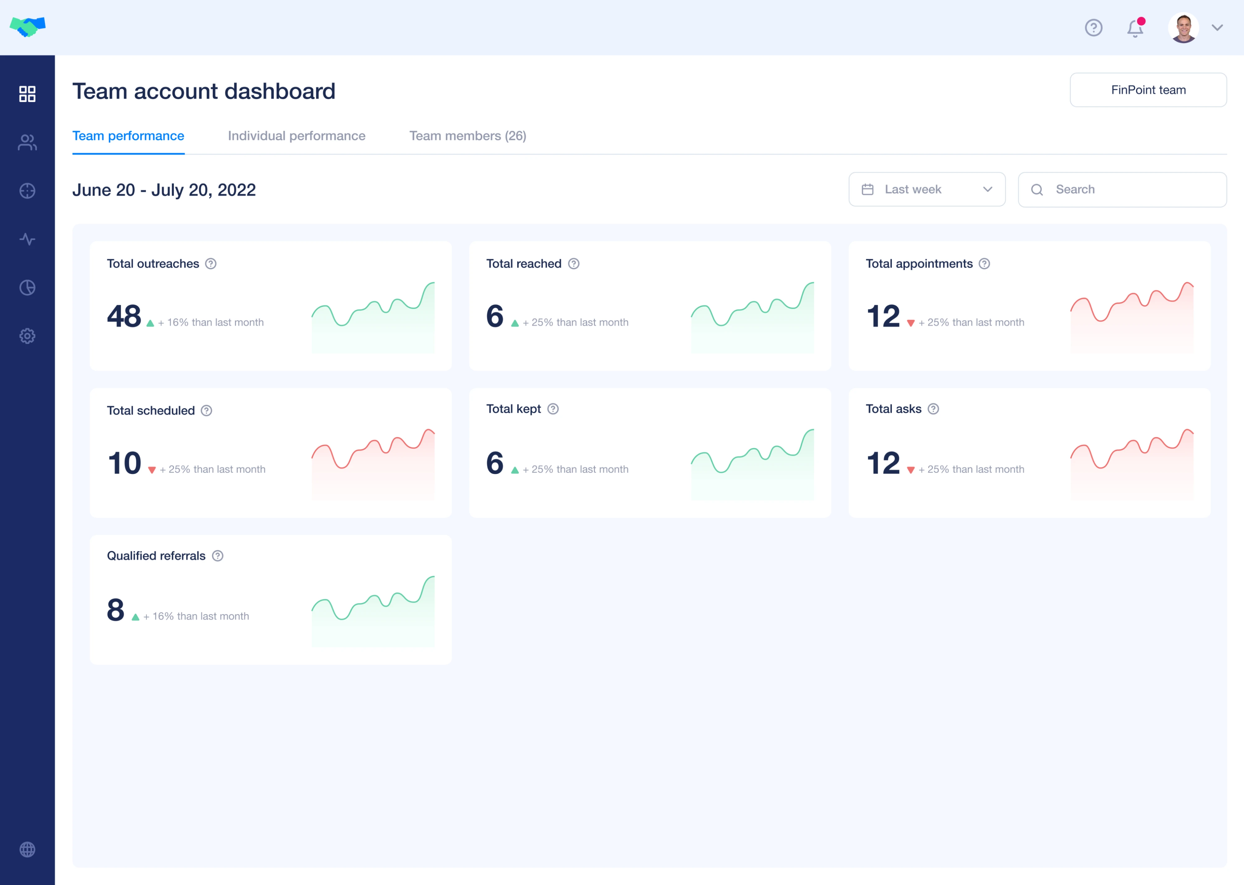
Favorably
Favorably is a referral-based sales platform that helps enterprise teams grow their pipeline through warm introductions. We designed the entire product from scratch, including two separate dashboards — one for individual users and one for teams.
Here’s what made the difference:
- An individual dashboard centralizing personal stats in one view.
- Team dashboard showing both team-level and individual performance.
- Success rate indicators comparing planned vs actual activity.
- “To-do today” section surfacing prioritized tasks with full contact context.
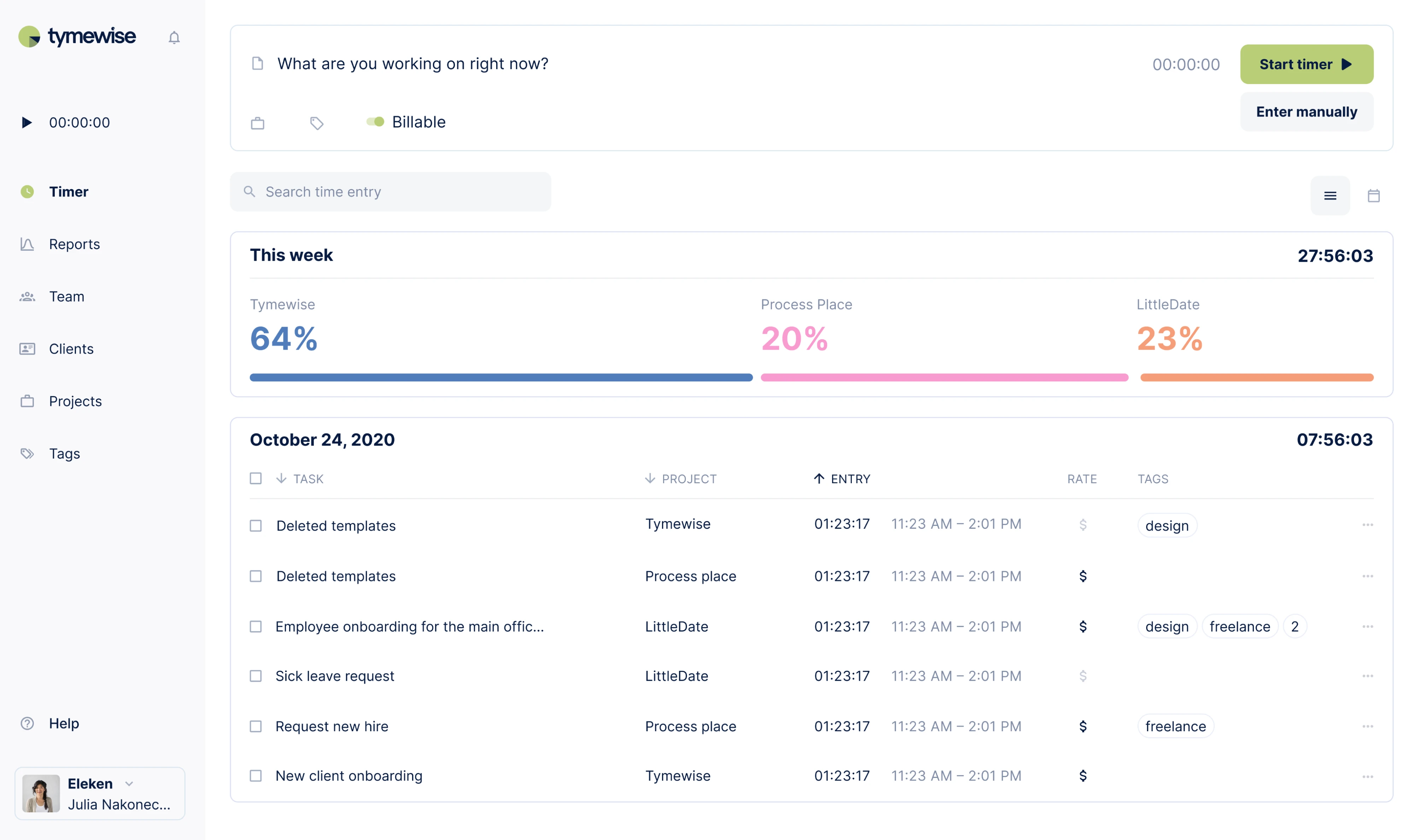
Tymewise
Tymewise is a time tracking app we designed from scratch for solo entrepreneurs and teams. The core design challenge was fitting tracking, reporting, and team management into one product without making it feel cluttered.
Here’s what made the difference:
- Color-coded progress bars showing weekly time split per client.
- Total weekly hours displayed prominently in the top right.
- Summary above, detailed daily log below.
- “Start timer” as the dominant CTA, always one click away.
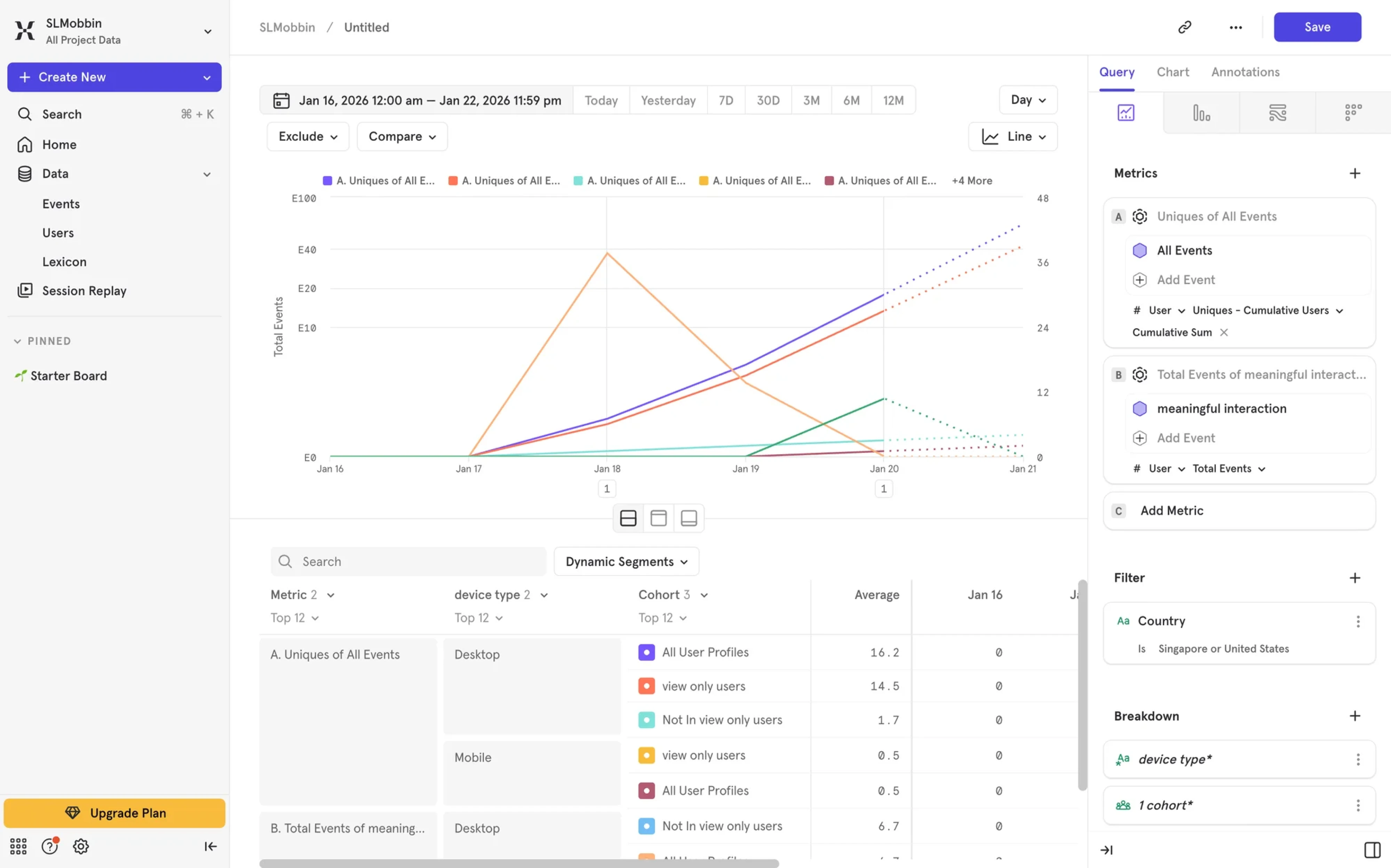
Proven SaaS dashboard UI patterns
Looking at all these cases, you might spot patterns that show up across different products, industries, and user types. These elements form the foundation of dashboard UX best practices, and in the next sections, we’ll explore a few of them.
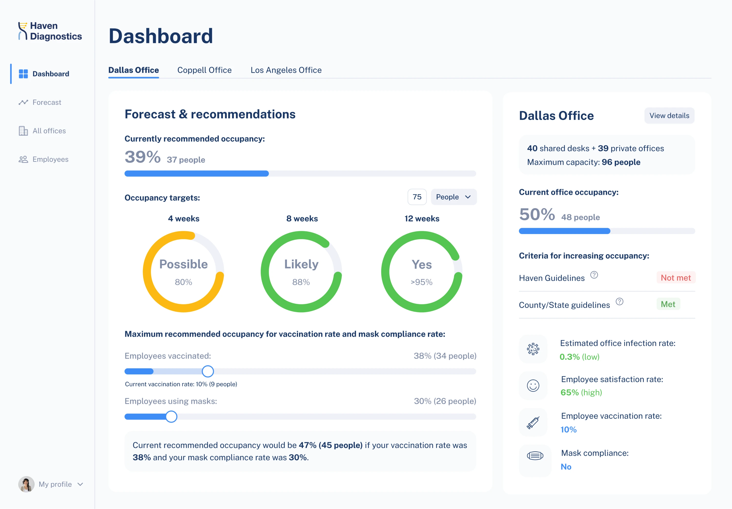
Executive snapshot
The executive snapshot is built around top-level KPIs, trend indicators, and anomaly signals that give decision-makers the full picture in seconds. Designers often rely on stat cards to make each metric instantly interpretable.
Operational control panel
The operational control panel is designed for people who live in the product all day. It surfaces real-time data, status indicators, and inline actions so users can monitor and take immediate action without switching screens.
Analytical deep-dive
The analytical deep-dive pattern gives users the tools to slice data by segment, filter by period, drill into cohorts, and follow a thread wherever it leads. The interface design takes a back seat to the data.
Comparative view
The comparative view pattern places metrics side by side across time periods, segments, teams, or products so users can spot gaps and make informed calls. Without comparison, a 12% conversion rate means nothing.
Real-time view
The real-time view shows you what’s happening right now. It’s built for teams who need to monitor live activity and respond before a problem becomes a bigger one. The pattern relies on auto-refreshing data, live counters, and status indicators.
One last thing
We’ve covered a lot of ground in this guide, and hope you’re leaving with something useful. But if there’s one thing to take away, it’s this — your users are the real design driver. Listen to them, simplify for them, and include only what genuinely serves them. Nail that from the start, and your dashboard will always feel relevant.
At Eleken, that’s the principle we bring to every project. So if you’re running into design problems or just don’t know where to start, we’re here.

