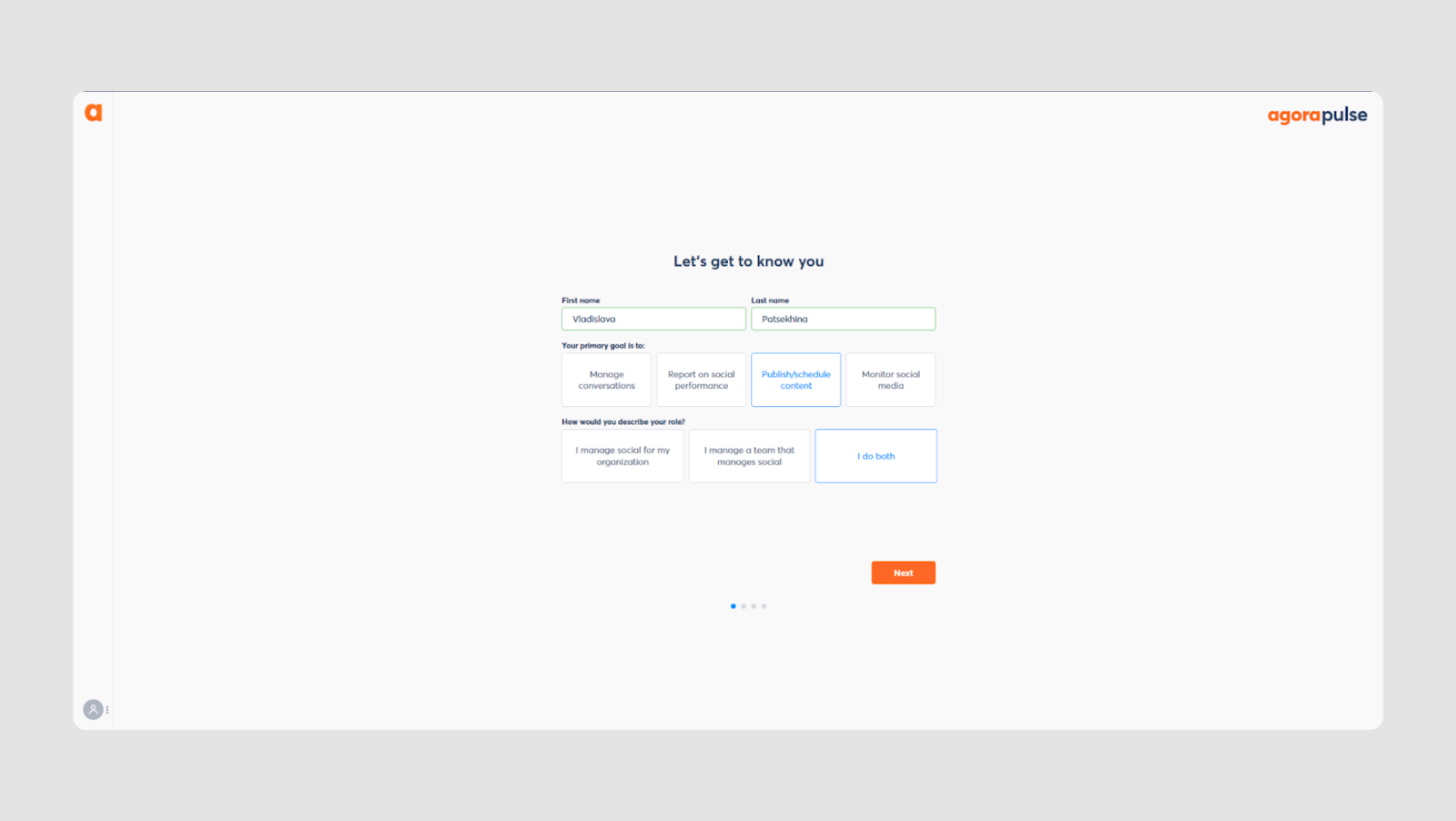
Even the most innovative technology can fail if users drop off during critical stages, such as data input. For example, myInterview, an app for video interviewing, faced a serious issue when 90% of candidates abandoned their interviews halfway. Eleken took on the challenge to redesign the form field UI, among other crucial improvements, to enhance the user experience, retain candidates, and improve overall engagement. By refining myInterview'’s input form design and improving the structure of the input fields, we were able to fix the issue with user churn and create a more efficient, user-friendly experience.
But why are input fields so critical in user interface design, and how can companies ensure that they get it right?
Let’s explore principles and examples of input field UI design to understand the impact it can have on product success.
What is an Input Field?

An input field is a part of a website or app that lets users enter or select information — like typing text, choosing from a dropdown, or uploading a file. The full container around the input gives it structure and makes it clear where users should interact. Input fields are essential for user interaction, as they capture data and enable communication between the user and the interface.
Why Are Input Fields Needed?
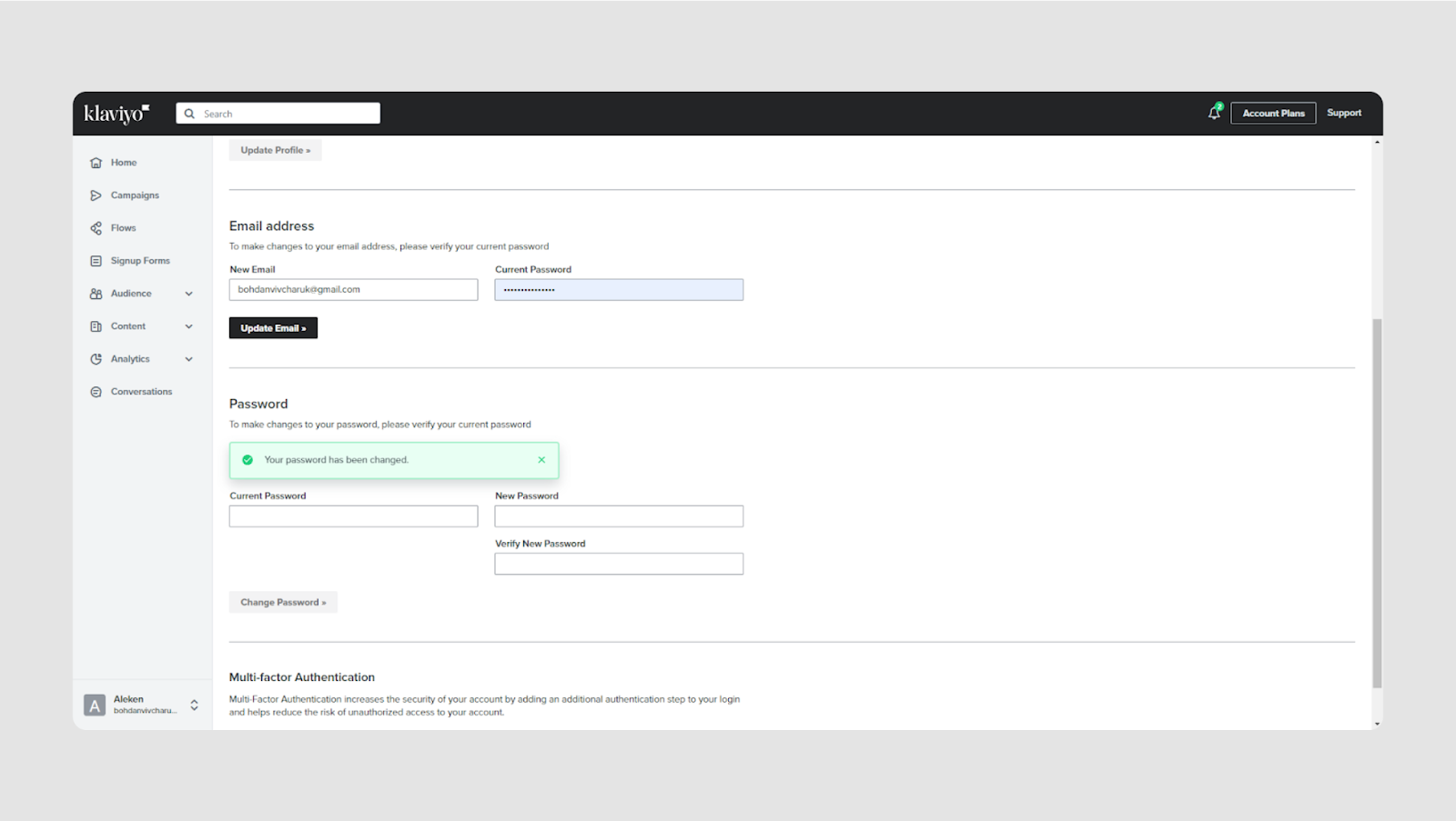
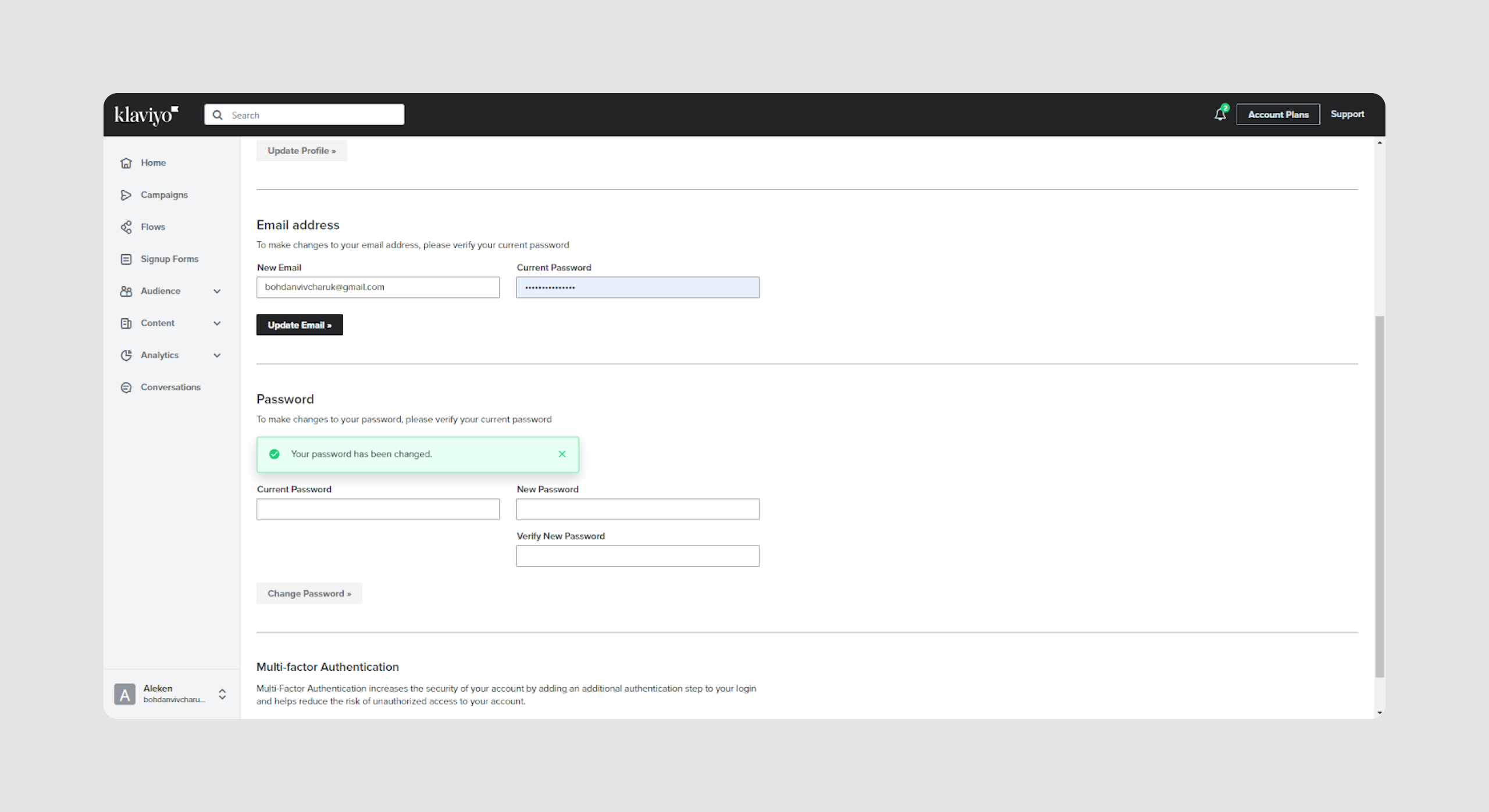
A text input field has a vital role in enabling users to interact with websites or applications and provide necessary information. It is important to clearly indicate the information required in each field to avoid confusion and ensure accurate data entry. They allow users to complete essential tasks, such as filling out forms, searching for information, or choosing options. Beyond just capturing data, input fields also help with validating user input, preventing errors, and improving the overall user experience. They can also contribute to customizing and personalizing user experiences by allowing individuals to select preferences or specific settings. In this way, input fields enhance usability, streamline interactions, and ensure data accuracy, all while helping users achieve their goals efficiently.
Now that we understand the essential role input fields play in user interaction and data collection, it’s time to explore the various types of input fields you can use. Each type serves a specific purpose and comes with its own design considerations — let’s look at the most common ones and how they fit into modern UI.
Input Field Types
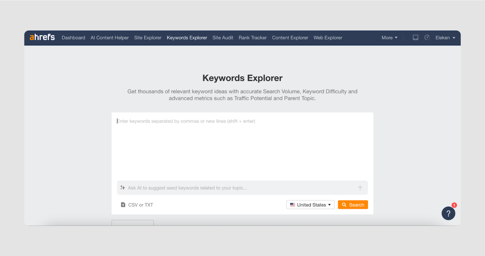
There are many types of input fields, each designed for specific kinds of user interaction. Knowing when to use each one, and what it should look like is key to building intuitive, accessible interfaces.
Let’s start with the most common types.
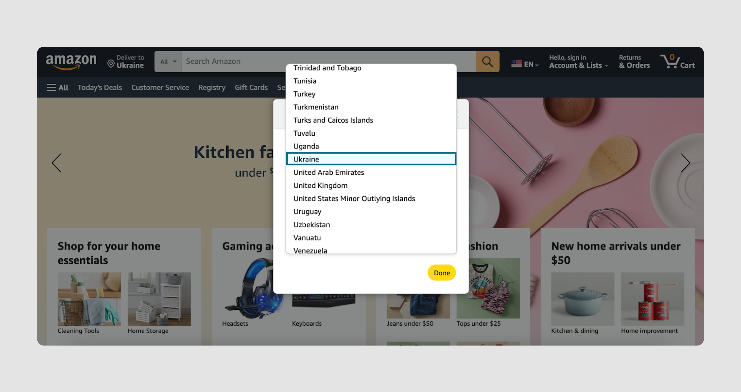
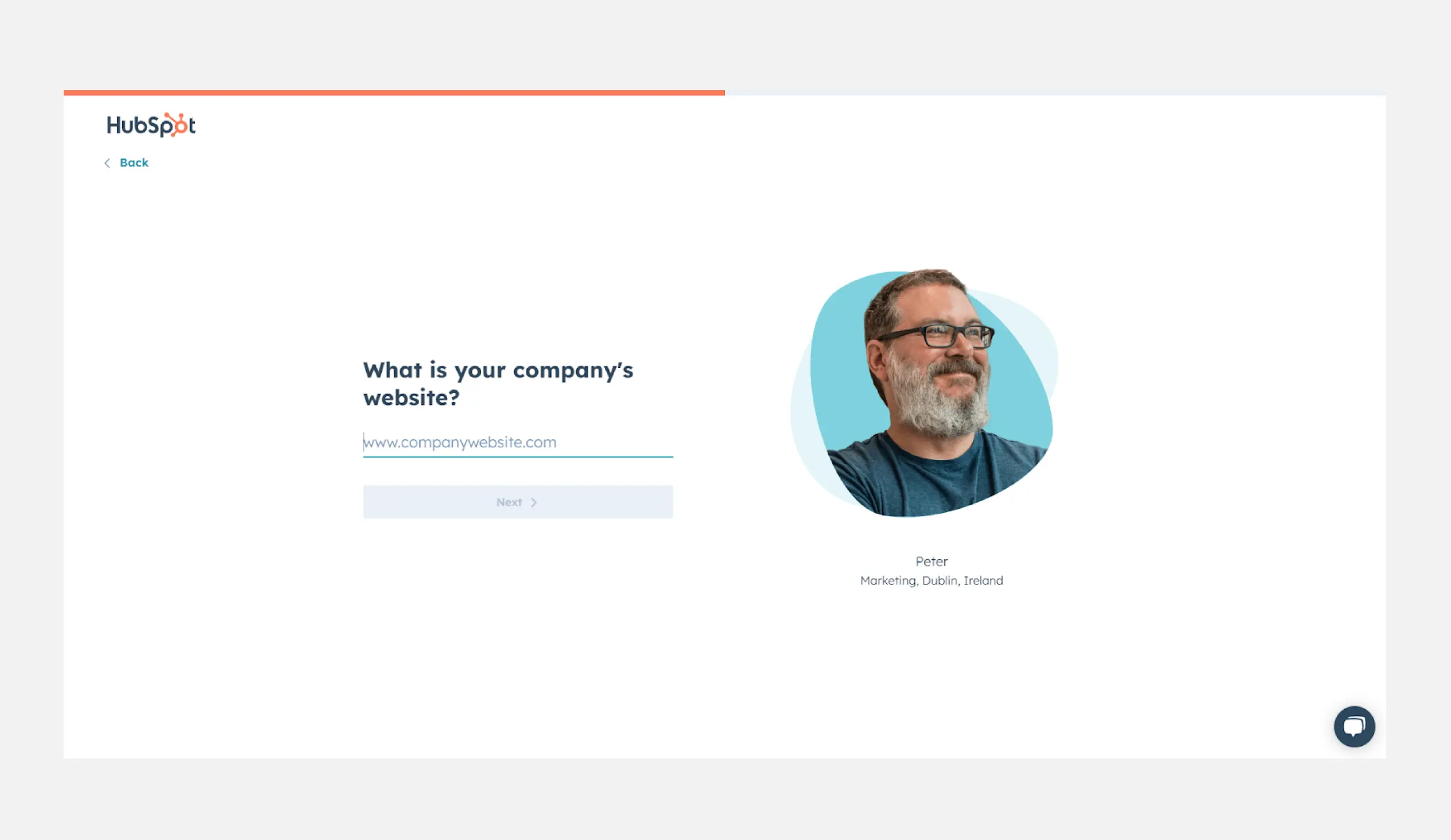
Text input field
Text field UI design is aimed to allow users to enter text, numbers, or other characters into a designated area or box.
Anatomy:
- Label text: informs users about the expected input for the field.
- Input box: the area where users enter their text.
- Entered text: the actual user input within the field.
- Cursor: indicates where the user is typing.
Additional elements:
- Placeholder text: gives instructions or examples before input.
- Helper text: provides additional guidance or examples below the input box.
- Error text: displays a message when the input is invalid.
- Leading icon: an optional icon at the start of the field to provide context or indicate purpose.
- Trailing icon: an optional icon at the end of the field for additional controls, such as clearing text or toggling visibility.
- Rounded corners: a visual style option for the input box, often preferred for usability.
- Fill: refers to the background fill style of the input box.
- Clear affordance: ensures the field is intuitively interactive and easy to use.
- Fields discoverable: design consideration to make input fields easily visible and accessible.
- Focused: describes the visual state when the field is active and ready for input.
- Following states: includes other visual states such as inactive, hover, disabled, validation, or error.
Use Cases:
- Filling forms: this input field UI is designed to collect information like names, addresses, or phone numbers. Often used for registration and onboarding design.
- Search boxes: text field UI works for keywords or phrases to search for content within a website or application. Check out this article for filter UX examples.
- Chat and comments: input text area for users to communicate or leave feedback.
Keep in mind:
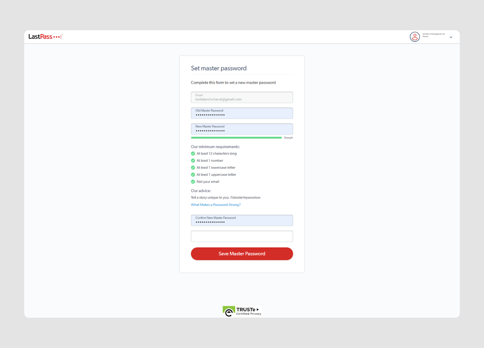
When collecting sensitive information (like passwords or card numbers), use encryption and masking systems to protect the data. For credit card numbers, ensure flexible formatting, proper validation (such as the Luhn algorithm), and input masking for a secure and user-friendly experience. Clear labels and instructions should guide users on what type of information is expected in these text field types.
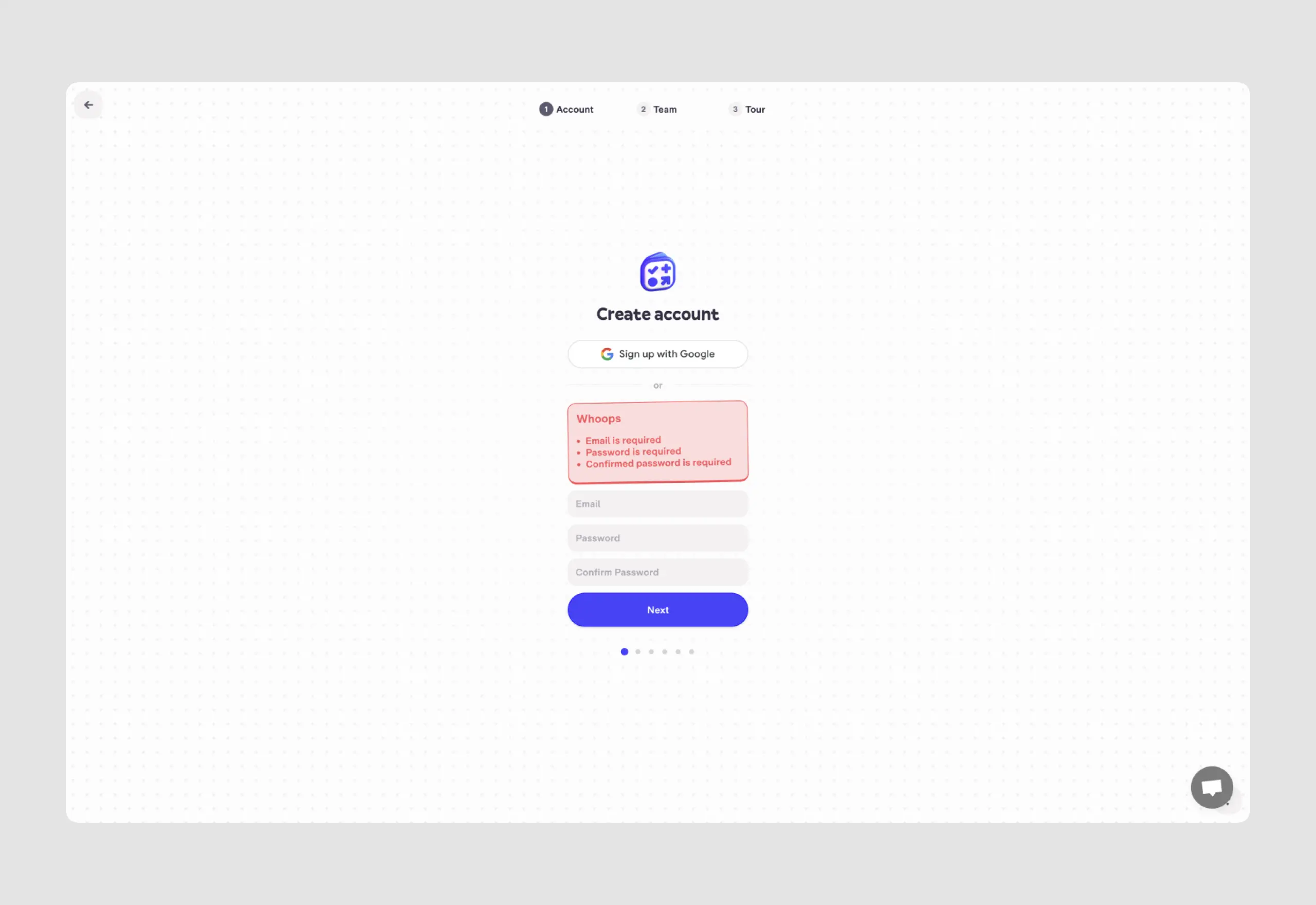
Text input fields UI examples

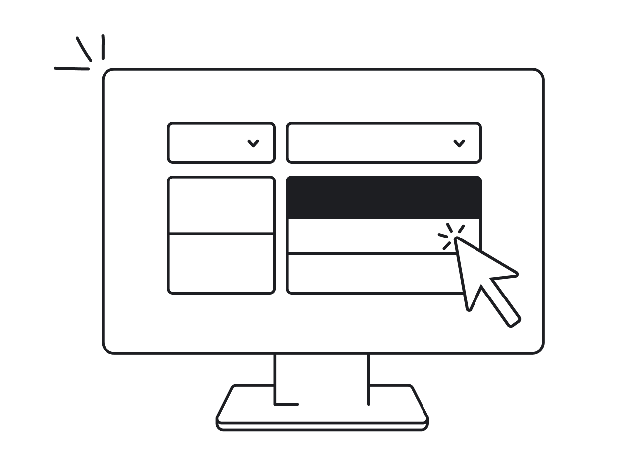
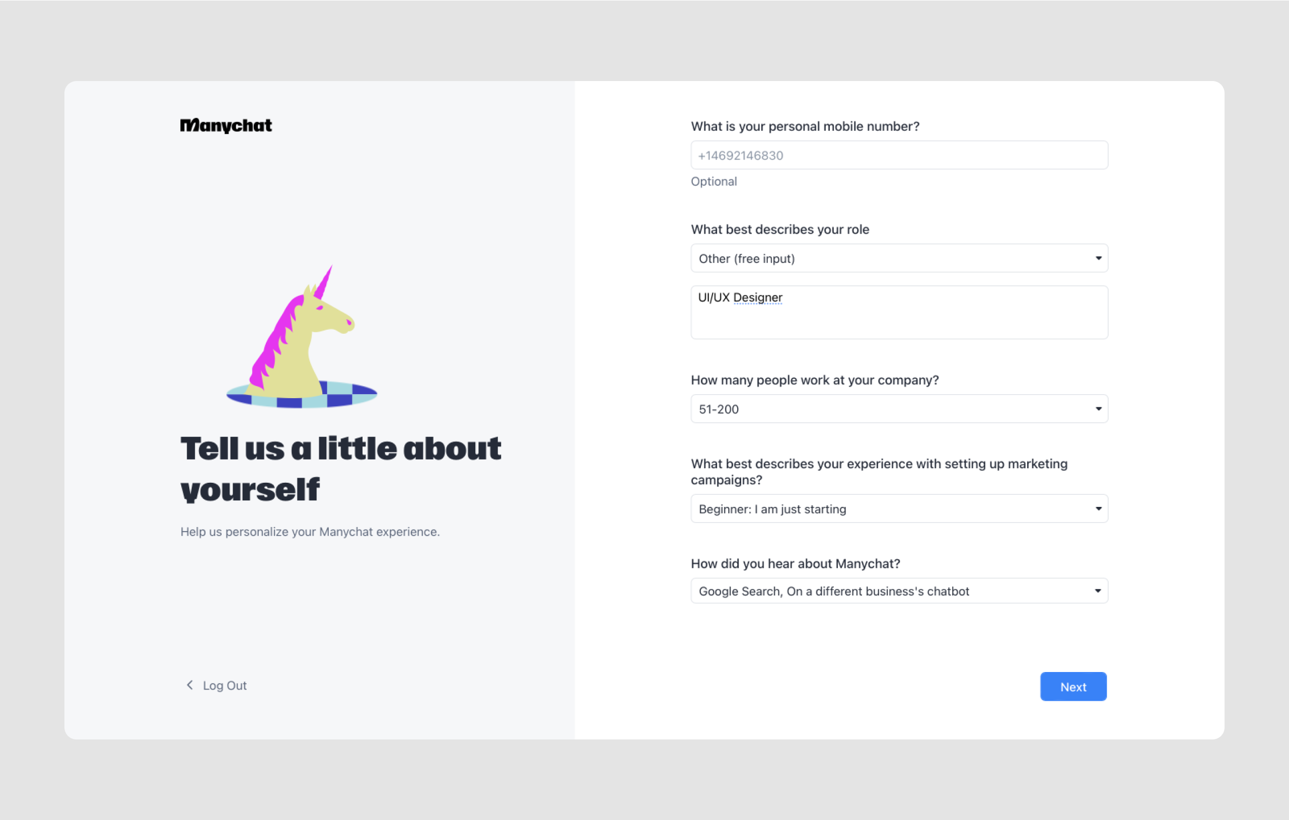
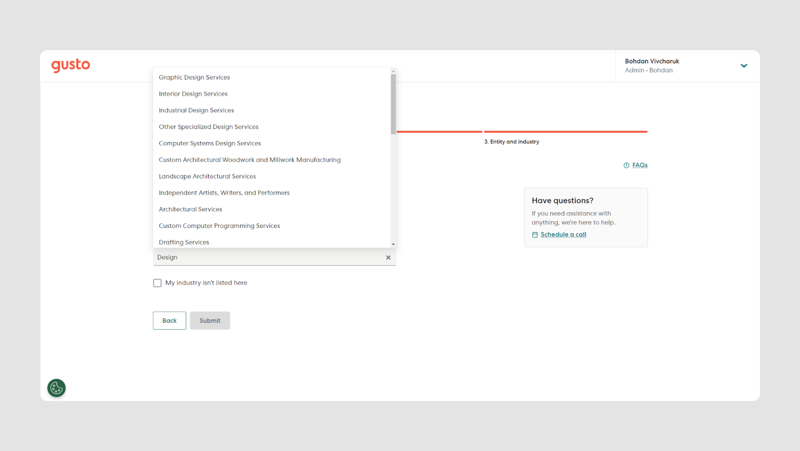
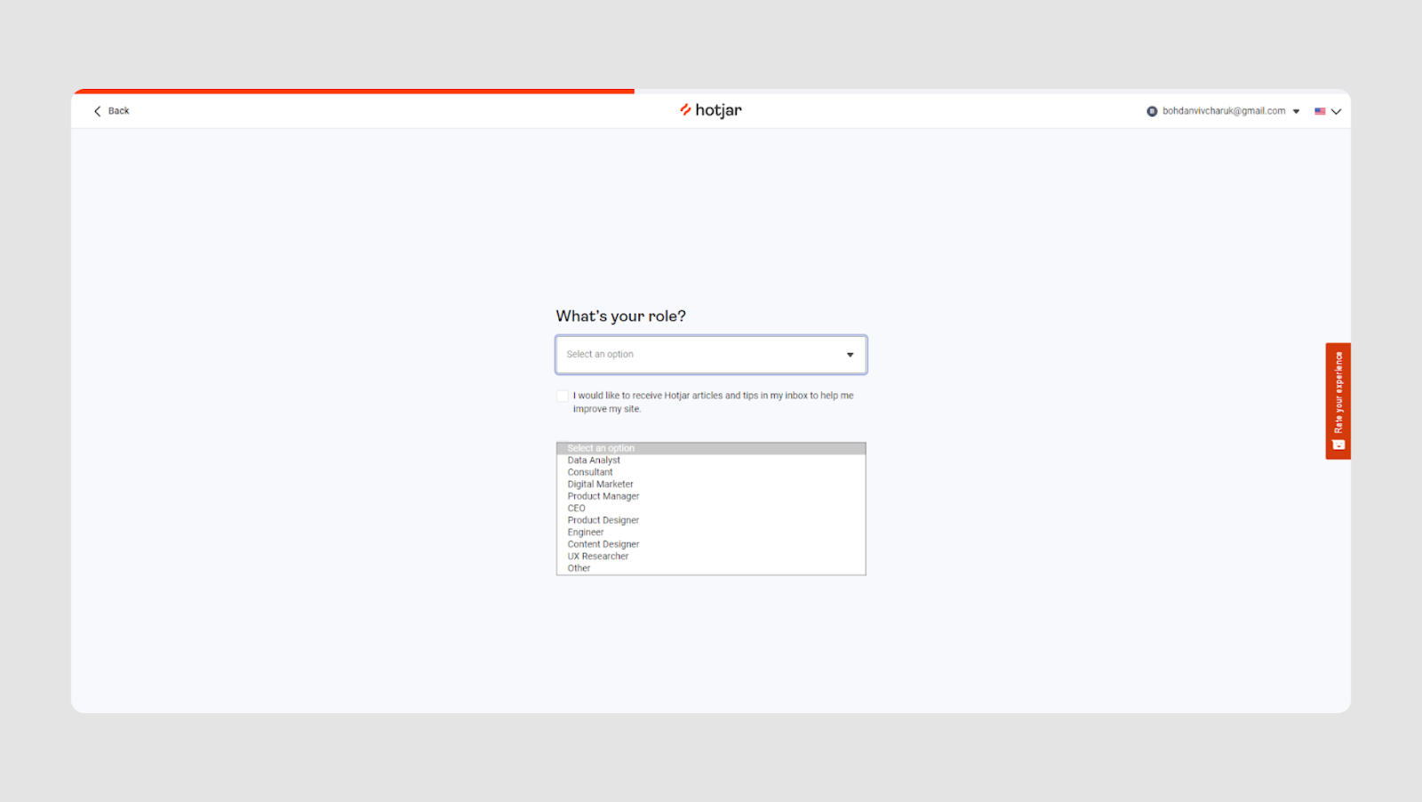
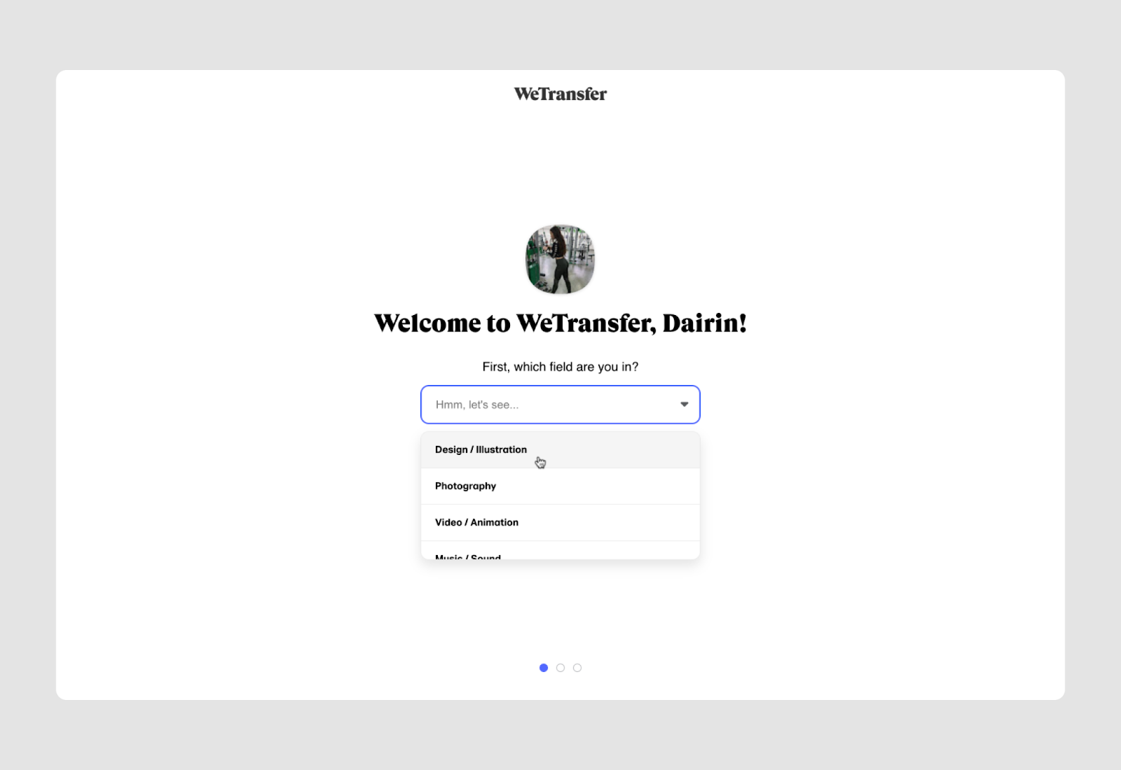
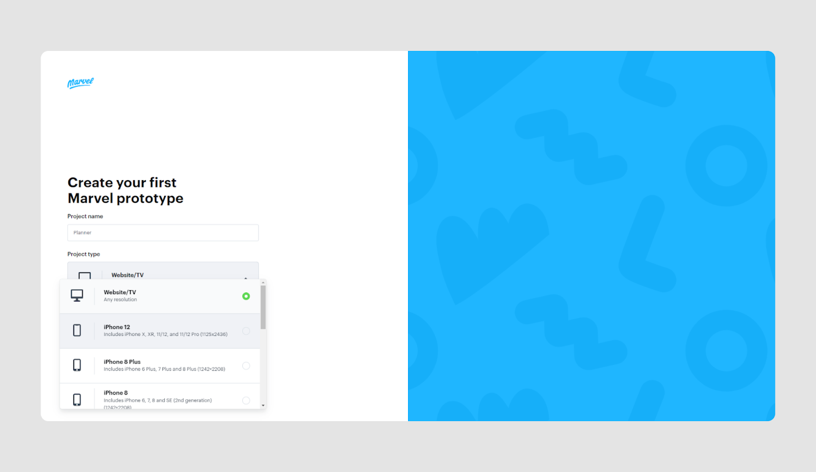
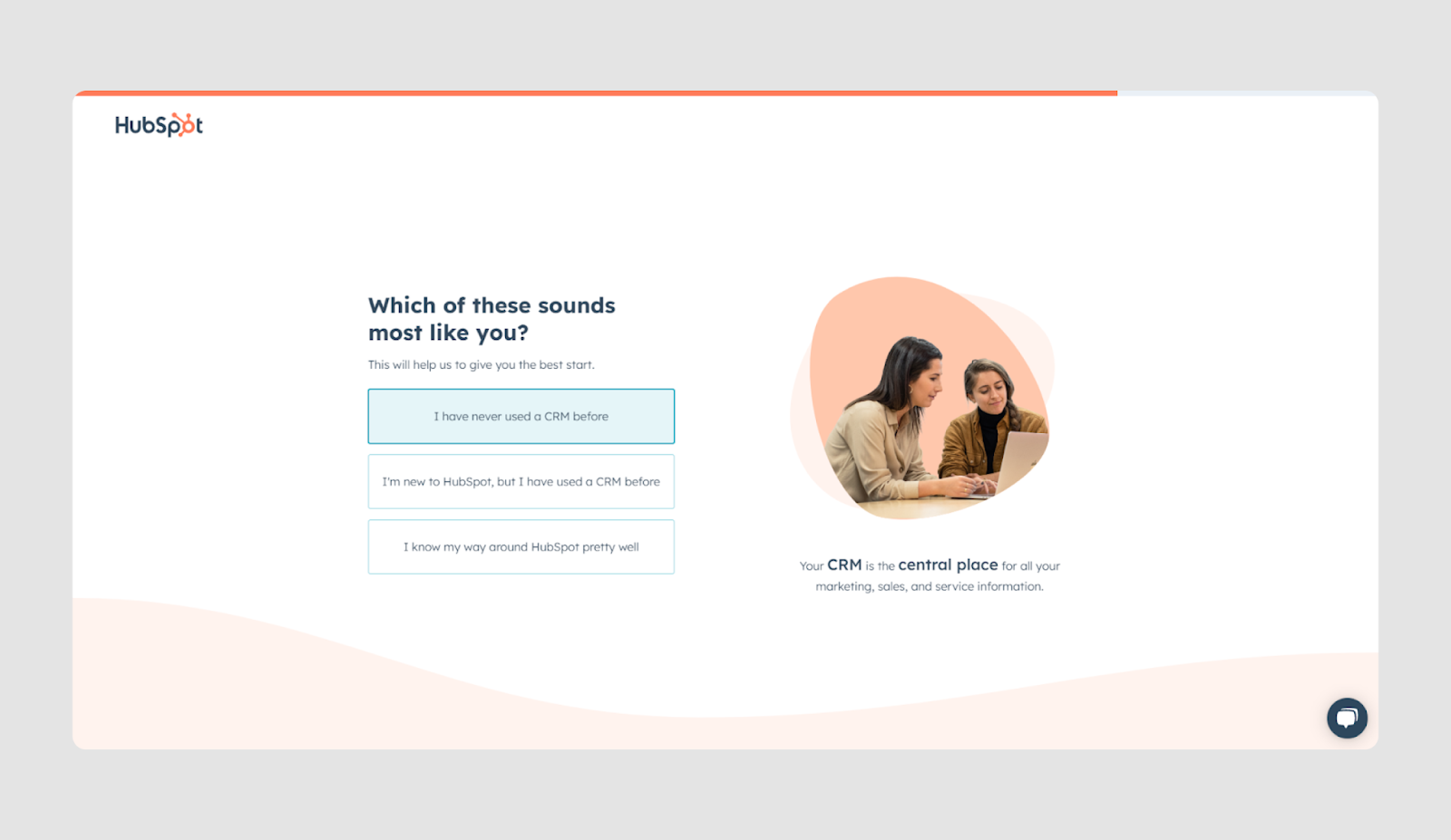
Dropdown menu
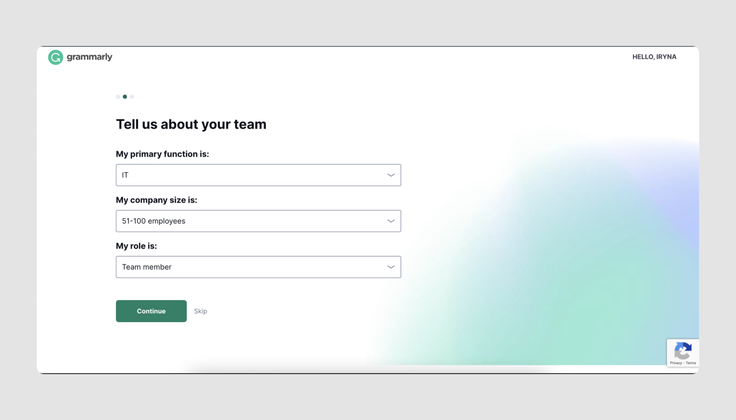
A dropdown menu is a different type of input field where users are presented with multiple options in a collapsible list.
Anatomy:
- Labeled button or field that indicates the selection area.
- Options list that expands when clicked.
- Single-selection mechanism. Typically, only one option can be chosen at a time.
Use cases:
- Country or region selection. Common for location selection on forms.
- Date and time selection. Choosing specific dates or times. Only partially belongs to the dropdown menu as it's often a calendar
- Language selection for localization or site navigation.

- Payment methods.
- Industry, role within the company, and other personal information.
Keep in mind:
Dropdown menus save space on the screen but require careful organization to ensure that options are easy to navigate. Clearly labeled instructions help users understand each option.
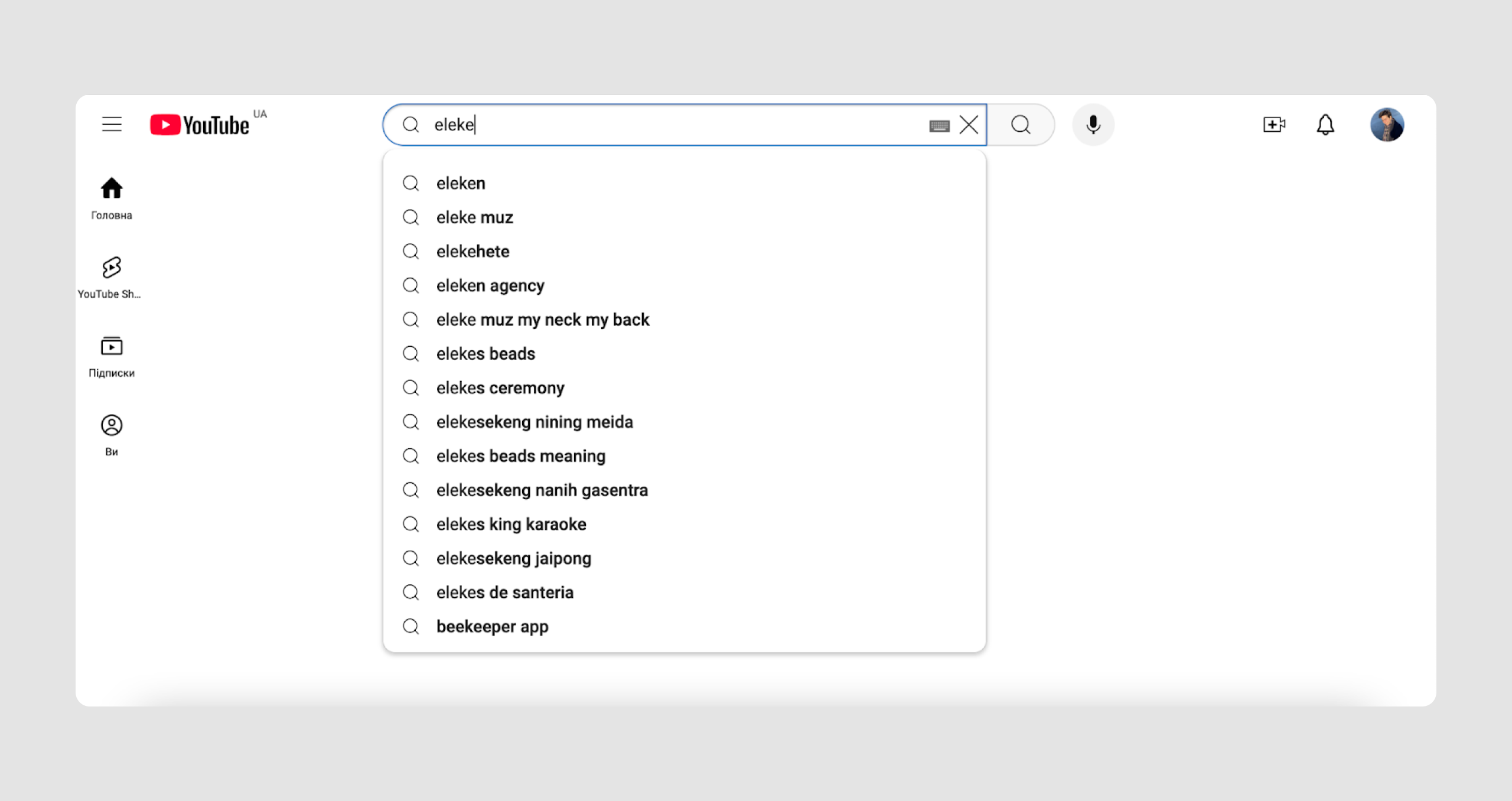
Dropdown menu examples
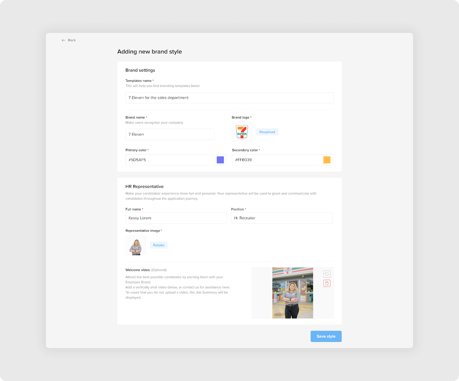
A grouping of a text input field, a checkbox and a dropdown menu.

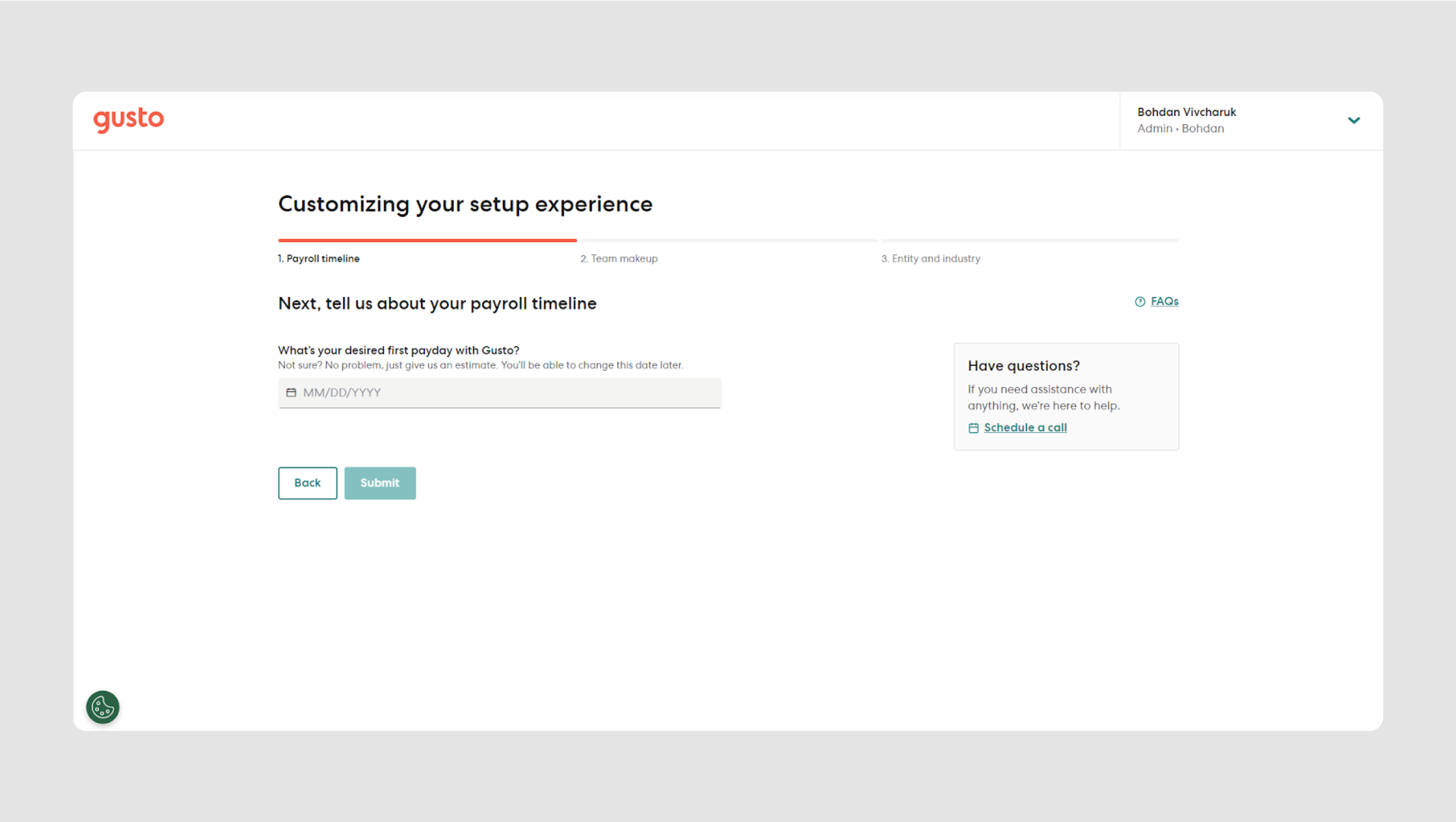
Radio buttons
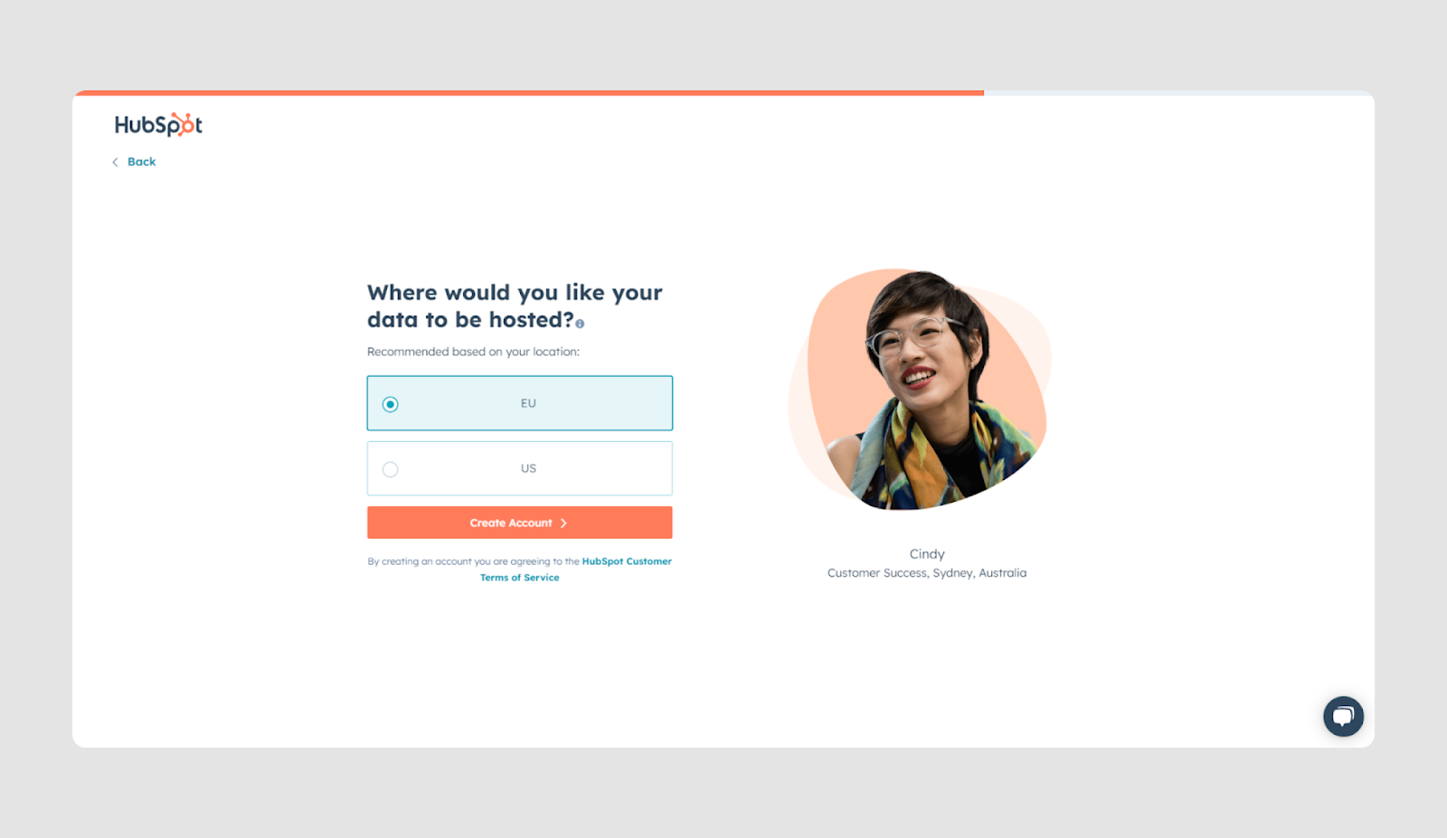
Radio buttons offer a list of mutually exclusive options where users can select only one choice from the group.
Anatomy:
- Label provides a brief description of the option associated with the radio button. It is typically positioned to the right of the button and serves as a clickable target to improve usability.
- Radio button: a small circular control that users can select. Unlike checkboxes, radio buttons are designed for selecting a single option from a group, making them ideal for mutually exclusive choices.
- Selection indicator: when a radio button is selected, a filled circle appears in the middle of the button to indicate that it has been chosen. Only one button in a group can be selected at a time.
- Grouping: radio buttons are usually presented in groups, indicating that only one option from the set can be selected. This grouping is visually or logically defined, often with a heading or label that describes the entire group of options.
- Interactive states: radio buttons may have different states such as default (unselected), hovered (changes appearance when hovered), and active (filled when selected). Disabled states may also be used to indicate options that are unavailable.
- Connection between label and button: clicking on the label selects the button. This improves the accessibility and usability of the form, particularly on smaller devices where the clickable area of the radio button may be small.
Use Cases:
- The user needs to select one option from a limited set (for example, a marital status.)
- The options are mutually exclusive.
- There is a short list of options (preferably 2-3 of them.)
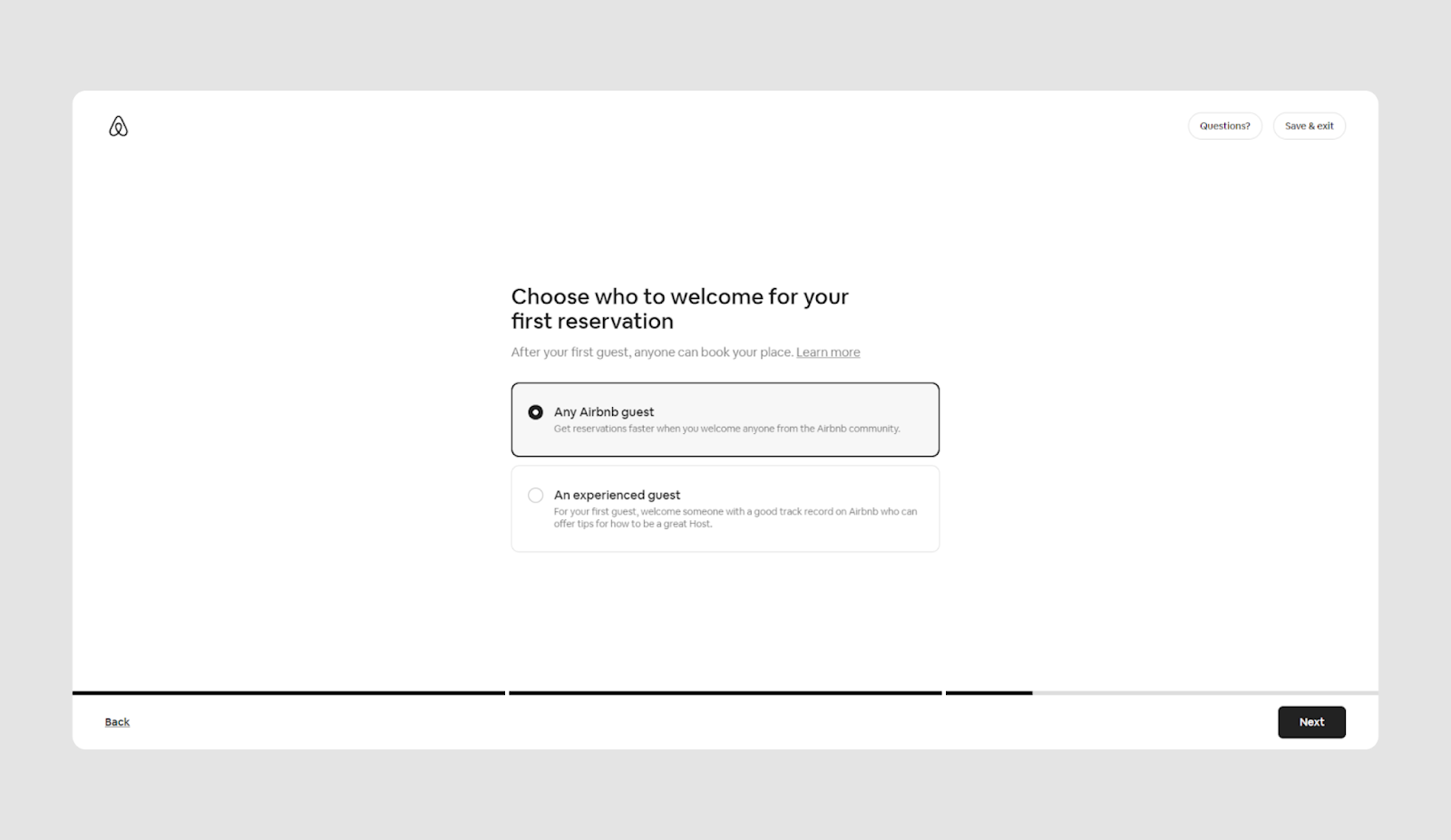
- There are clear, straightforward choices, like selecting between "Yes" or "No."
Keep in mind:
It might depend on the context but if you have more than 5 options in most cases you'd better go for the dropdown menu.
Radio buttons examples

A dropdown menu + radio buttons.
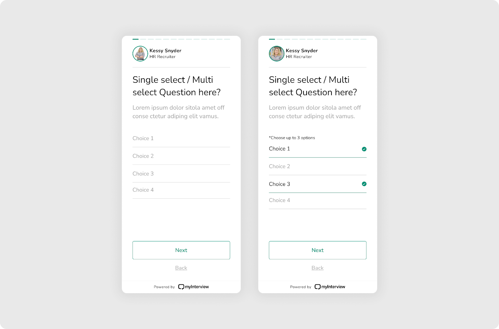
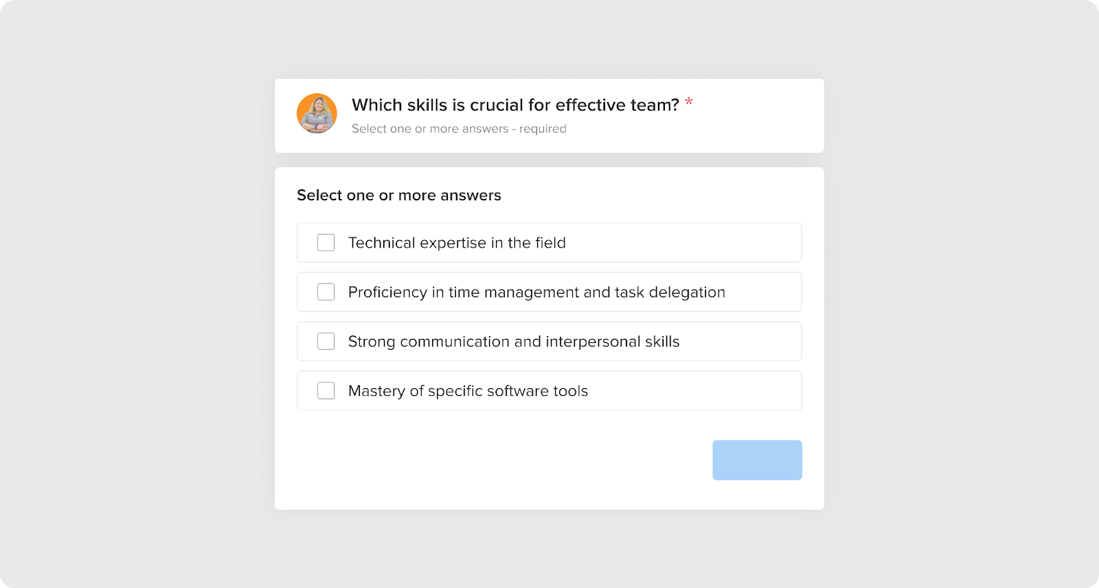
Checkboxes
Checkboxes allow users to select one or more options from a list. They are typically used in forms that require multiple selections.
Anatomy:
- Label is the text that describes the option or options represented by the checkbox. It is usually positioned to the right of the checkbox.
- Checkbox: a small square field that users can click or tap to select or deselect an option. When the checkbox is selected, a checkmark or an "X" appears inside the box.
- Connection between label and checkbox: clicking on the label will also activate or highlight the checkbox.
- Grouping: if there are multiple checkboxes in a form, they should be grouped together under a general label that describes the group. This helps users understand which options are related.
- Validation: checkbox data can be validated to ensure that the user has selected a valid option.
Use cases:
- Multiple selections, such as choosing interests in a registration form.
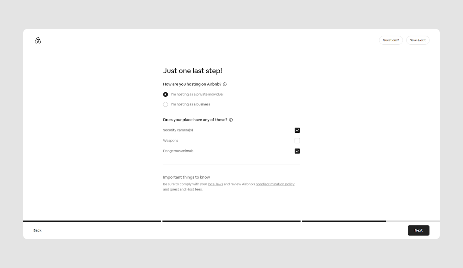
- Opt-in forms for agreeing to terms or subscribing to newsletters.
- Surveys and feedback forms to collect multiple answers or choices from users.
Keep in mind:
One option must always be selected:

Checkboxes examples

Text input field + annotated checkbox

File input field
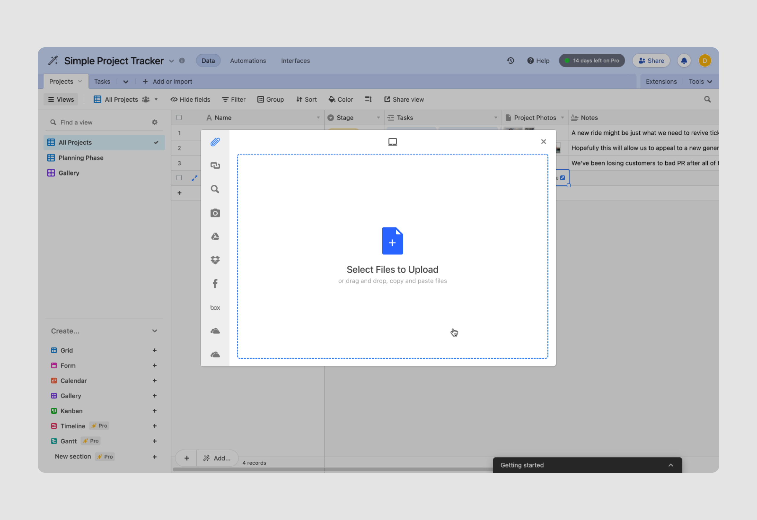
A file input field allows users to upload one or more files, such as documents, images, or videos, to a system.
Anatomy:
- Label is the text that describes the input field and prompts the user to select a file. The label is usually positioned to the left of the file input field.
- Browse button that users click to open a dialog box where they can select files from their device.
- Selected files display: this area shows the name(s) of the file(s) that the user has chosen for upload.
- Clear button that allows the user to remove the selected file(s) and choose others if needed.
- Validation: this feature checks whether the user has selected a valid file type or size, ensuring the file meets the required criteria before upload.
Use Cases:
- Document submission.
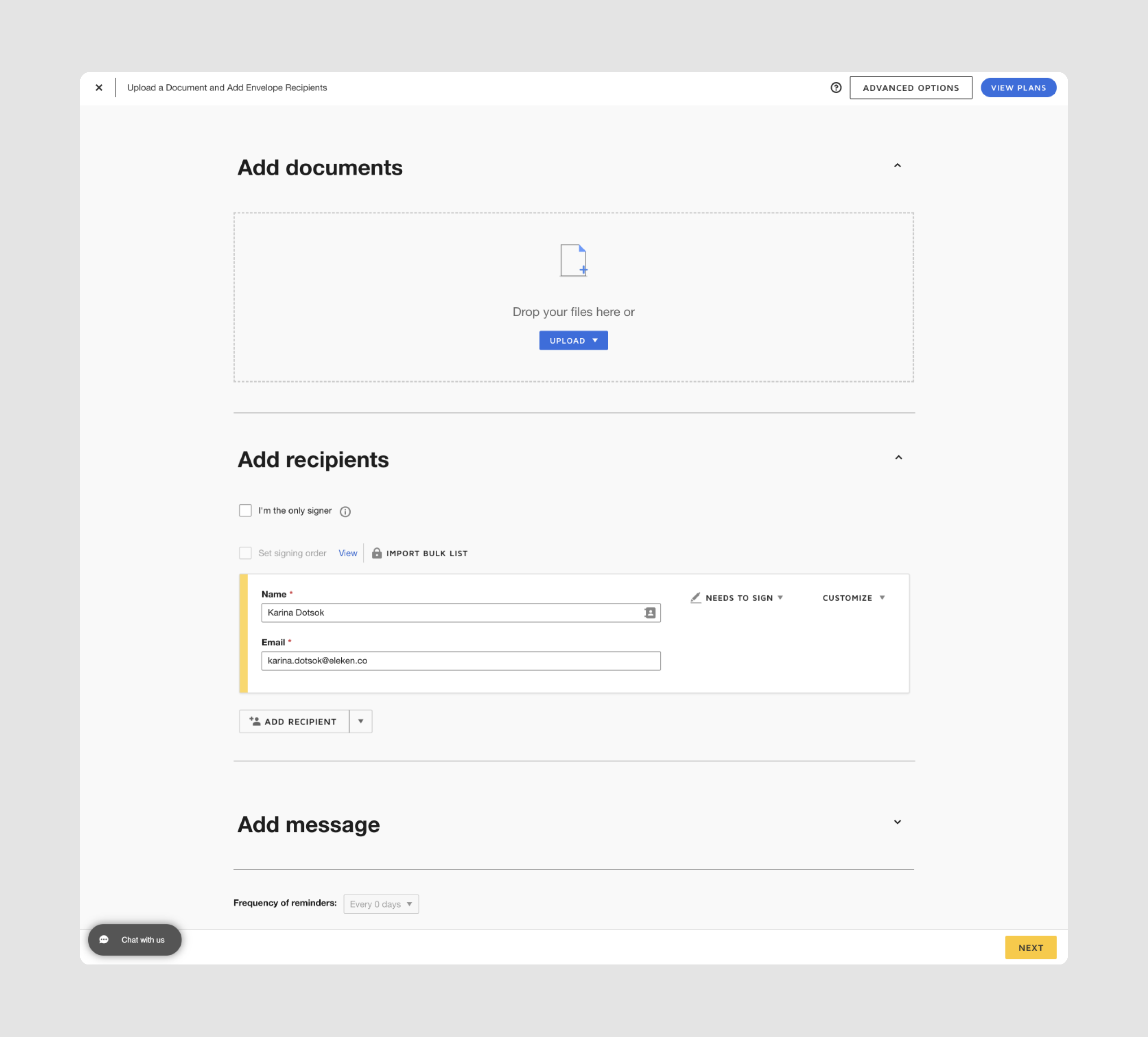
- Media uploads: users can upload images, videos, or audio files for feedback or publication.
- Feedback forms to allow users to submit files as part of surveys or customer service inquiries.
Keep in mind:
Always provide clear instructions about the types of files allowed (e.g., PDF, JPEG) and their maximum size. Use progress indicators to show the upload status.
File input field examples
Button (Submit/Action)
A button is an element users can click to perform an action, such as submitting a form or navigating to another page.
Anatomy:
- Label is the text or icon that appears on the button, indicating the action that will be performed when the button is clicked.
- Buttons can have different shapes and styles depending on the design and context of the interface. Common styles include flat, raised, outlined, or rounded edges.
- Background of a button may be a solid color, a gradient, or an image, depending on the design choices.
- Hover and active states: buttons can change appearance when hovered over with a cursor or when clicked/tapped. For instance, the background color or the border may change to indicate interactivity.
- Buttons may have a disabled state where they are non-interactive, often due to missing user input. Disabled buttons are typically displayed in gray or another muted color to signal their inactive status.
Use cases:
- Form submission.
- Navigation: moving between pages or sections of a website.
- Initiating actions like saving changes, completing purchases, or initiating downloads.
Keep in mind
Buttons should clearly communicate the action they will perform. Ensure buttons are large enough for easy interaction, especially on touchscreens.
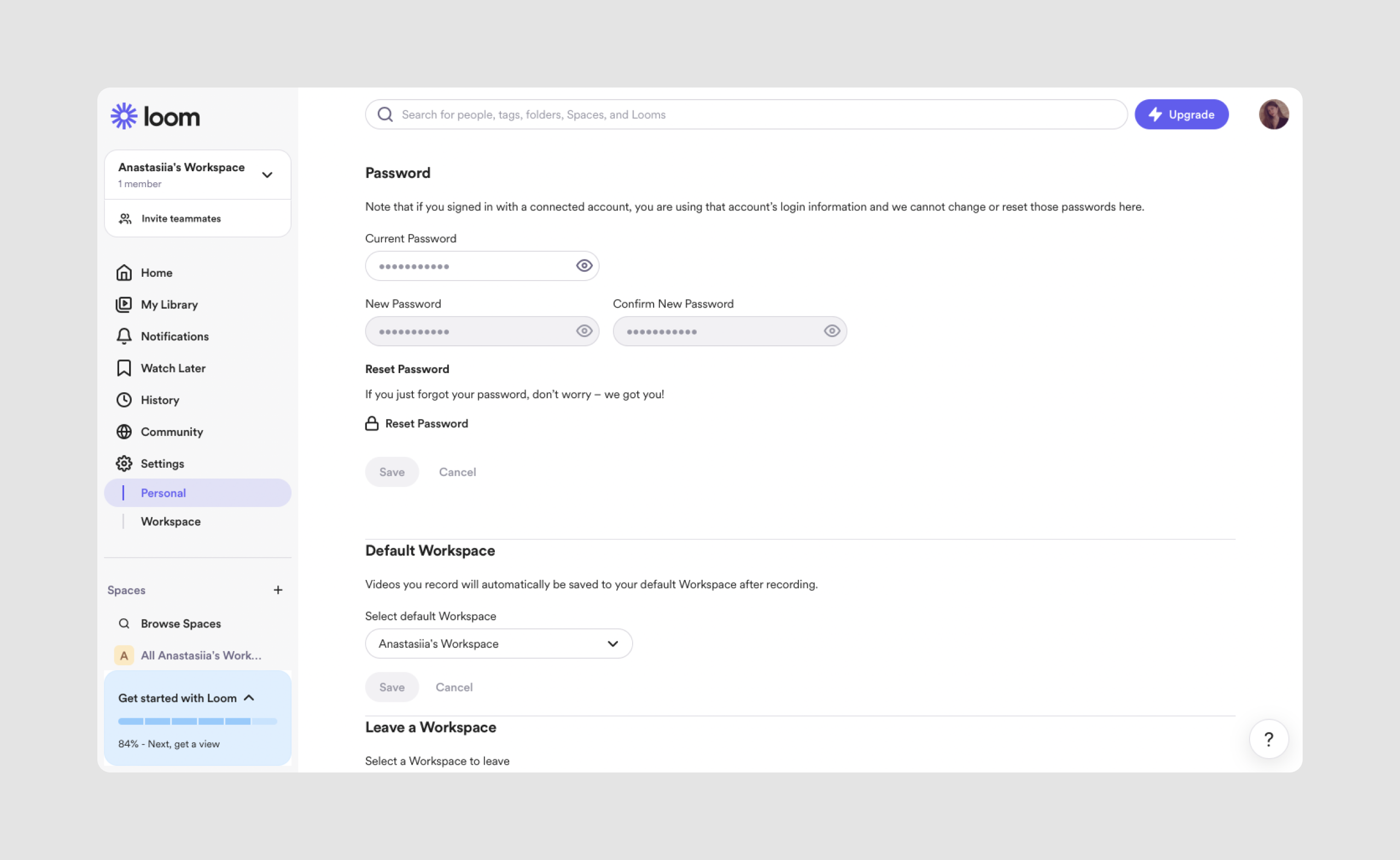
Buttons input field examples


Understanding the types of input fields is just the starting point — how you design each element at the micro-level is what truly shapes the user experience. From spacing and labels to validation and focus states, these small UI details make the difference between a smooth, intuitive form and a frustrating one. Let’s explore the best practices that turn functional inputs into seamless, user-friendly interactions.
Best Practices for Input Fields (for micro/UI focus)
Let’s ensure we cover all the key best practices for material UI input design. Here are some additional ones that we might have missed:
- Provide clear instructions and labels. Users should always know what information is expected from them in an input box. Labels should be visible and descriptive, while placeholders offer helpful hints but shouldn’t replace labels. Provide a text entry example but avoid relying solely on placeholder text because it disappears as the user types, which may cause confusion. Make sure the value entered by the user is clearly displayed and validated, accommodating different input formats to improve usability.
- Support keyboard navigation. Ensure that your input field design is accessible via keyboard for users who rely on it, such as those with disabilities. This includes enabling proper tab order and using shortcuts where applicable. In addition, use correct HTML for accessibility and provide clear focus indicators.
- Provide input types that bring up the appropriate keyboard****on mobile (e.g., a numeric keyboard for phone numbers). Use HTML input types like tel, email, or number for better mobile user experience.
- Error messages should clearly explain what went wrong and how to fix it. Placing the message next to the problematic UX fields helps users resolve issues faster. You can use real-time validation to prevent users from submitting text forms with errors.
- Don’t overwhelm users with too many fields. They can frustrate users and lead to drop-offs. Consider using progressive disclosure to show fields only when necessary, or break the form into smaller steps. Use logical grouping and smart defaults to minimize user input. Prefilled or default values in input fields can improve usability and data accuracy by reducing the effort required from users and minimizing input errors.
- Use consistent styles across all fields to ensure a cohesive user experience. This includes using consistent borders, spacing, and font styles. Incorporate these styles into a design system for scalability.
- Required fields should be clearly marked so users know what information is essential before submitting the form. Use asterisks (*) or other visual indicators and provide clear messaging when required fields are missed.

- Use features like auto-complete and auto-correct for fields such as email or address, name and address which reduce user effort and errors. However, avoid overly aggressive auto-correct that may frustrate users by altering their input unnecessarily.
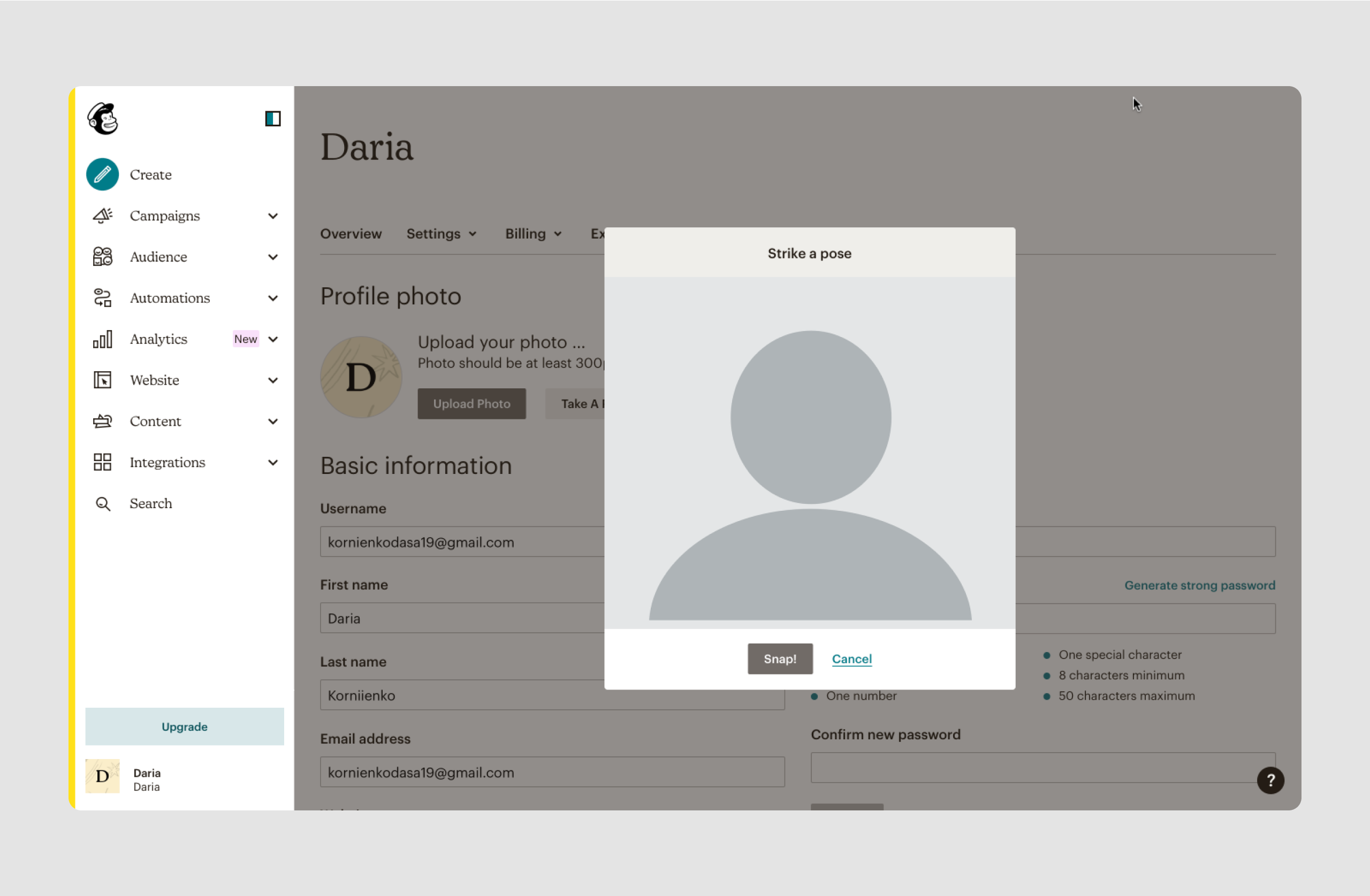
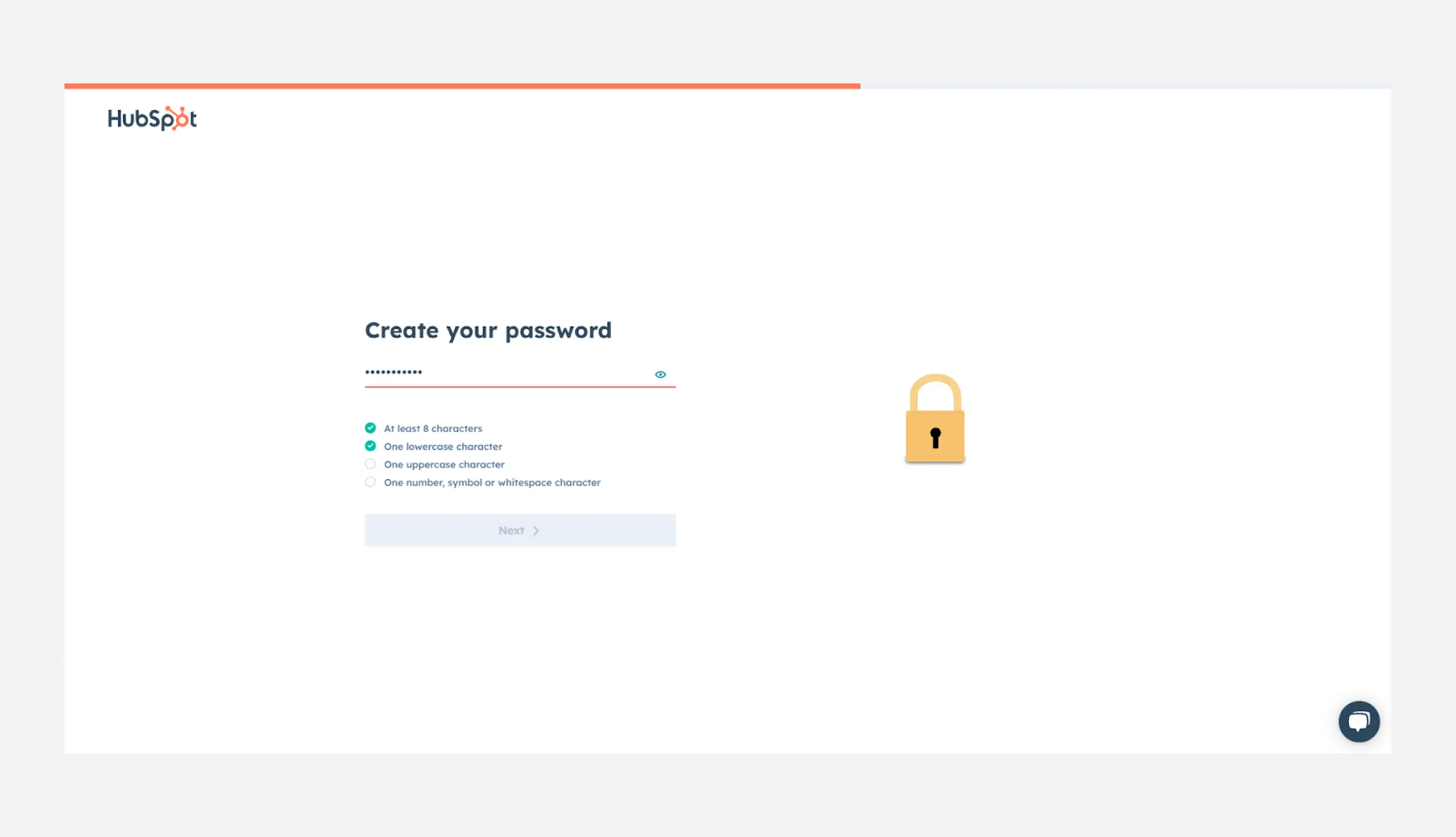
- For sensitive fields like passwords, credit card details, or personal data, ensure strong security measures to protect user privacy. Use input masking for passwords and provide secure data transmission through encryption. Offer an option for users to view the password as they type (e.g., a “Show Password” button).
- Acknowledge when users complete a field or form correctly by providing visual feedback such as green checkmarks or success messages.
While individual input field design plays a critical role in usability, it’s only one piece of the puzzle. To create truly effective forms, you also need to think bigger—about how those fields fit together across the full experience. That’s where layout, flow, and overall UX strategy come in.
Form Layout & UX Strategy (for macro/flow focus)
When thinking about input form design, it's not just about individual fields — it's about how the form works as a whole. A well-designed form guides users naturally, minimizes effort, and adapts to different contexts like mobile or desktop. In this section, we’ll explore strategic decisions that make an input form effective, from layout patterns to field grouping and dynamic behavior.
Choose the Right Layout Pattern
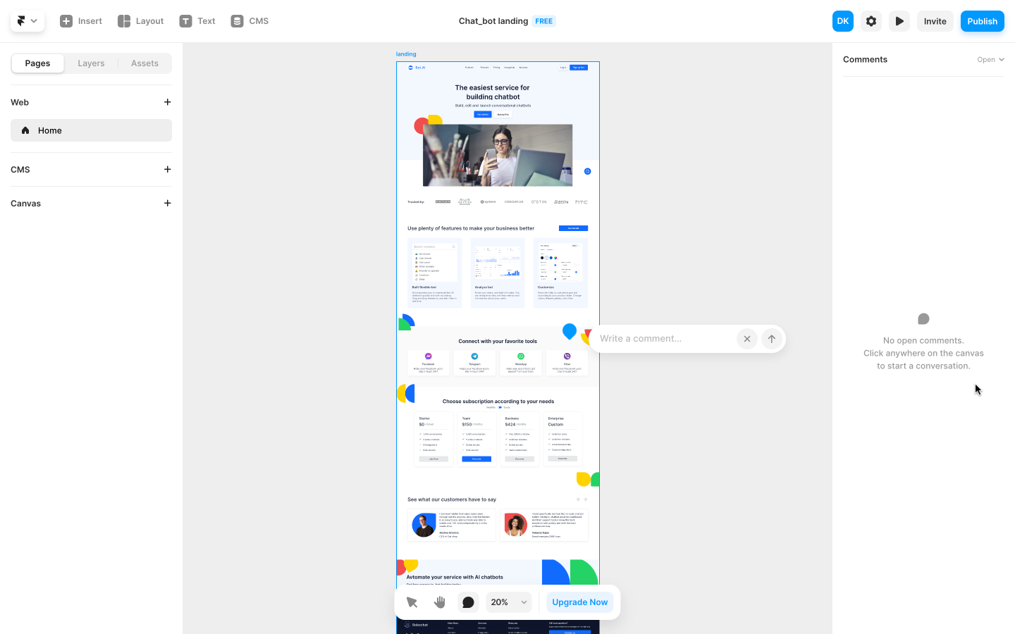
The layout of your form plays a huge role in how easily users can complete it. Most modern UI forms use single-column layouts, which are easier to scan and reduce cognitive load. Multi-column forms may save space but often slow users down by making them jump back and forth visually.
Example: A job application form with personal info in one column and address fields in another can confuse users. Instead, stack related fields vertically to maintain a natural reading flow.
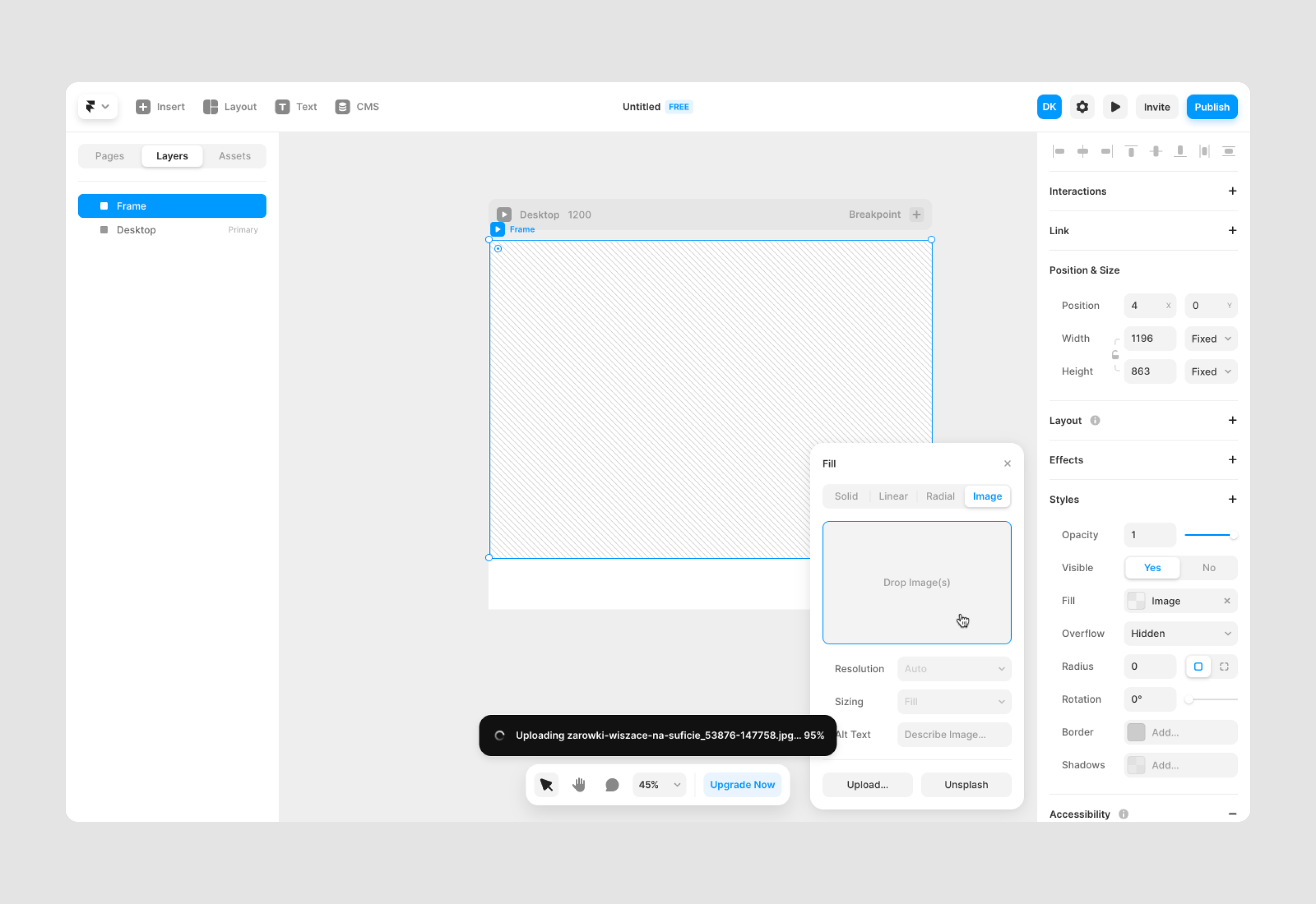
Group Related Fields Together
Users shouldn’t have to guess which fields belong together. Use visual grouping (like borders, spacing, or section headings) to help users process information faster. Logical field clusters like “Shipping Info” and “Payment Details” make complex forms feel more manageable.
.png)
Tip: Use section dividers or subtle background shading to indicate new form segments. This helps break longer input forms into mentally digestible parts.
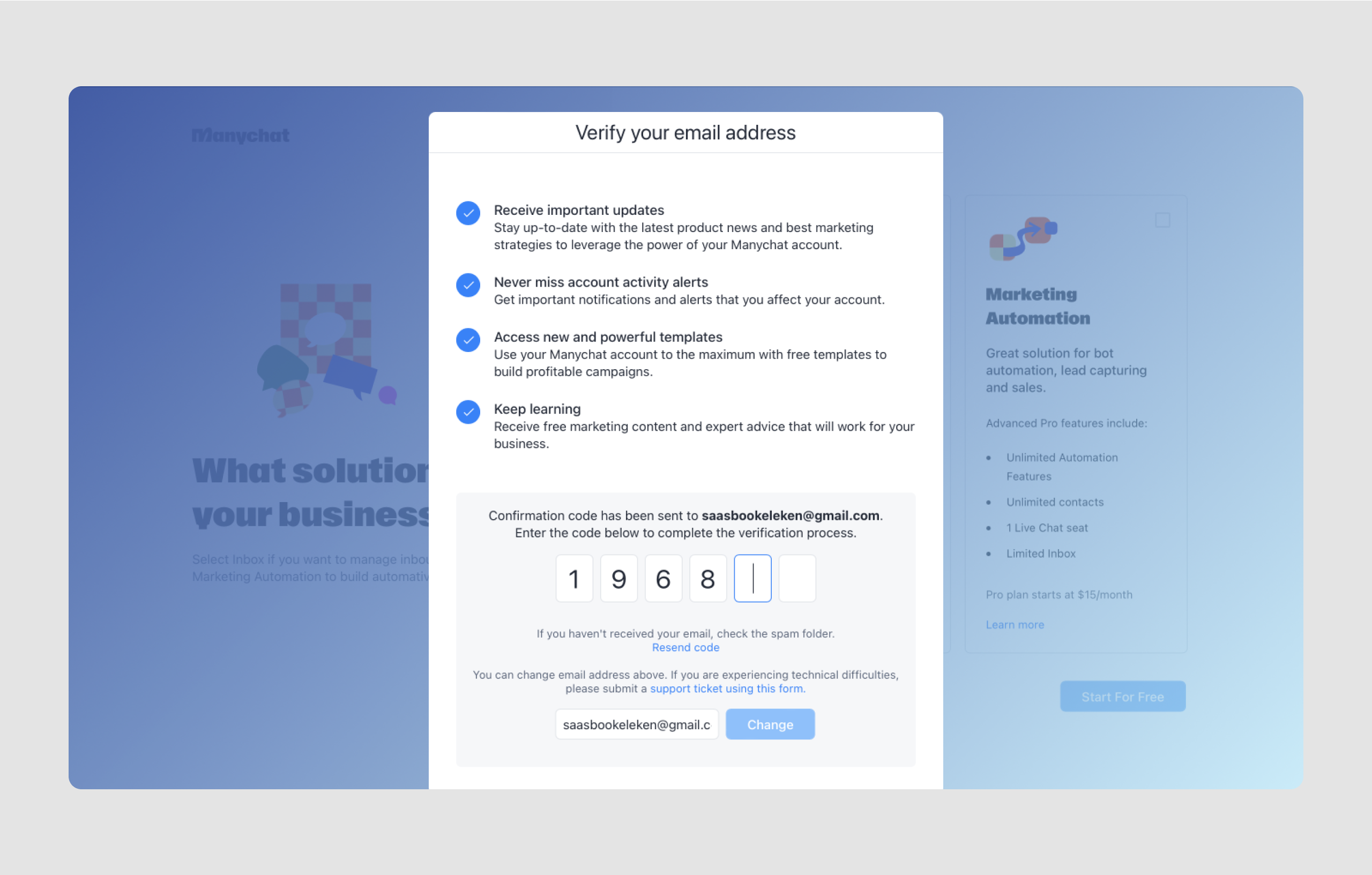
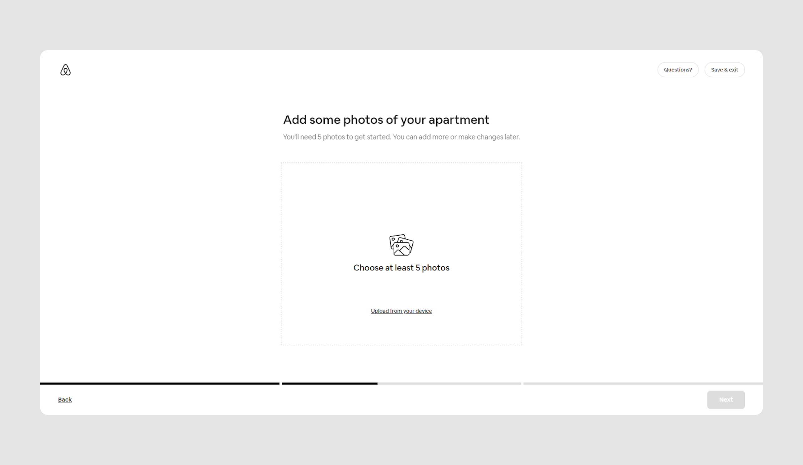
Use Progressive Disclosure for Long Forms
If your form has many steps, don’t show everything at once. Instead, apply progressive disclosure to reveal fields as needed. For instance, only display billing address fields if the shipping and billing addresses differ. This keeps the form clean and reduces overwhelm.
.png)
Bonus: Pair this with real-time interaction. When a user selects “Other” from a dropdown, dynamically reveal a text input to specify the option.
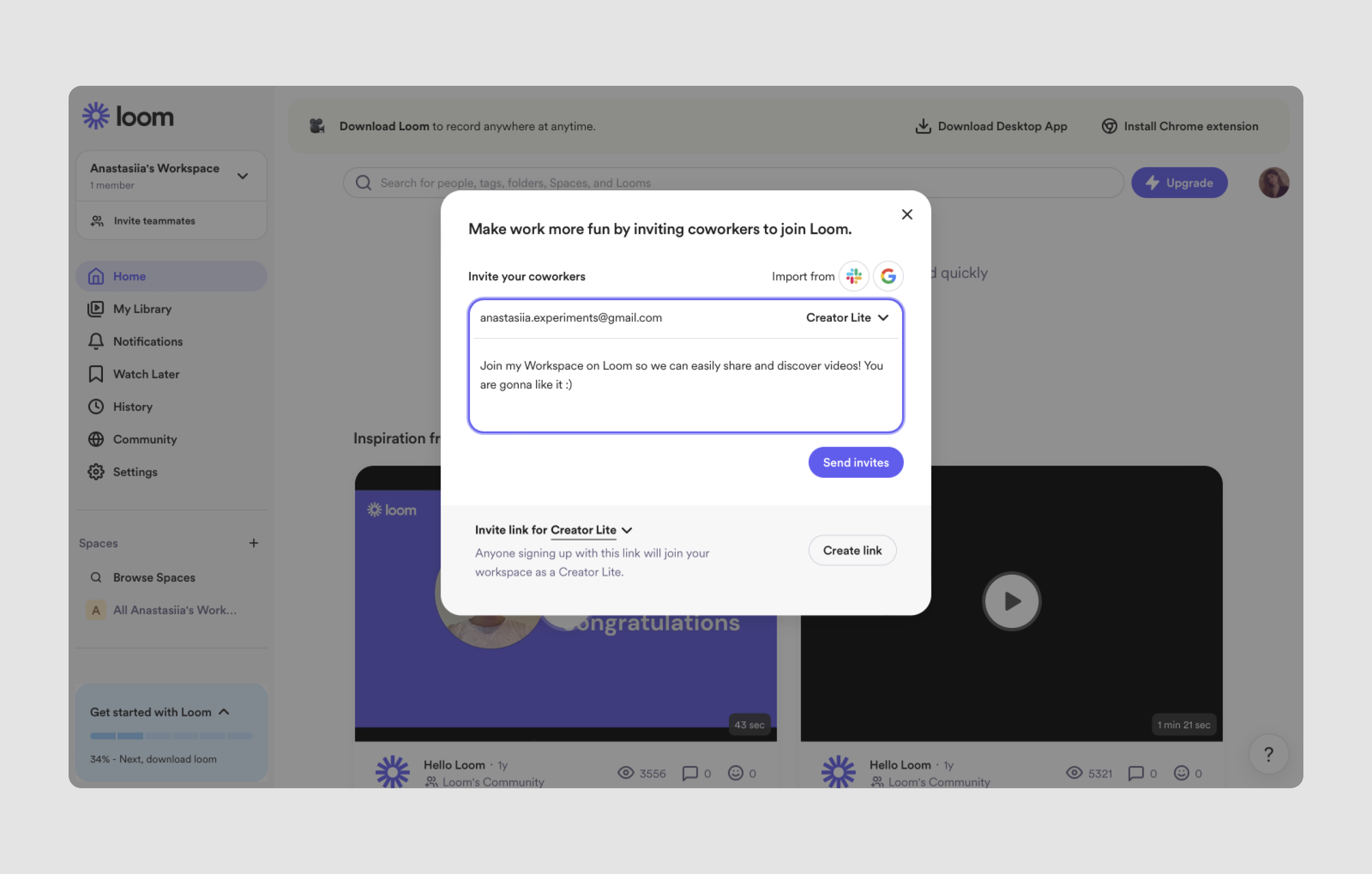
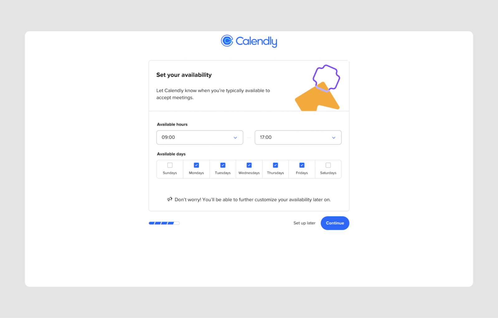
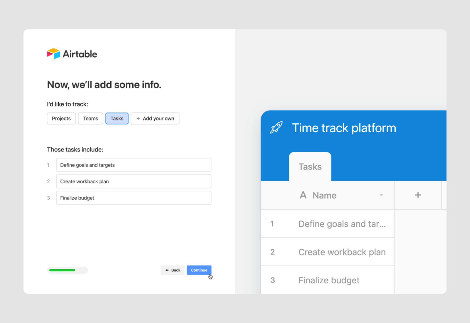
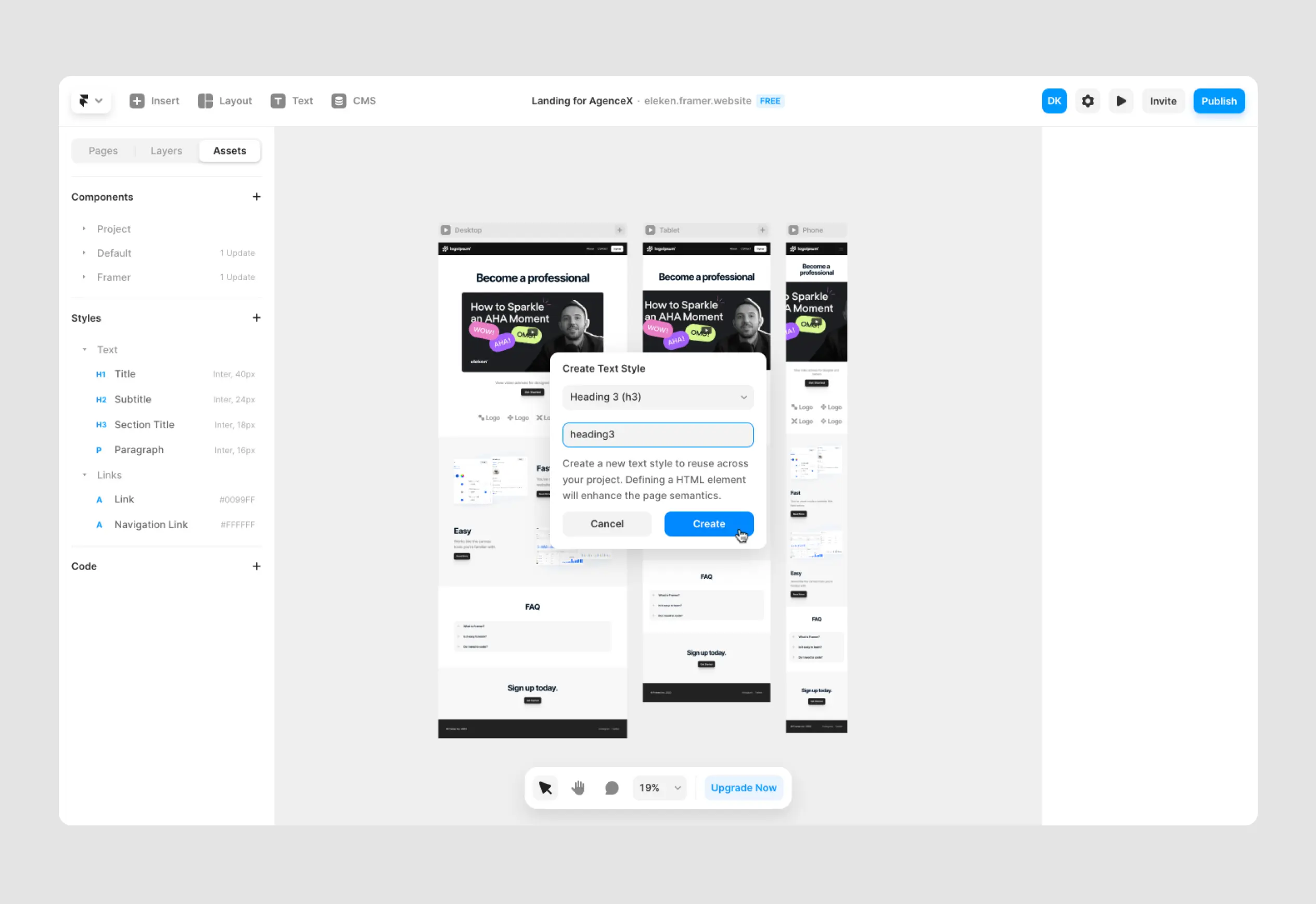
Consider Multi-Step Forms for Complex Tasks
For complex workflows (like onboarding or application forms), splitting your input form design into multiple steps can dramatically improve completion rates. Use progress indicators to keep users oriented and motivated.
.png)
Just be careful not to add unnecessary steps. Each screen should serve a clear purpose and reduce friction, not stretch the process.
Optimize for Mobile Input
On mobile devices, form design requires special care. Input fields should be large enough to tap easily, and the form should avoid horizontal scroll. Trigger the appropriate mobile keyboard (e.g., numeric for phone number fields) to speed up entry.
Also, avoid sticky headers or footers that might overlap fields when the keyboard is open. This is a common pain point in mobile forms.
By refining these micro-level UI choices, you're not just making forms look better, you're actively reducing friction and guiding users toward successful interactions.
Now that we’ve covered the practical side of input field design, let’s wrap up with a few final thoughts on why these small details have such a big impact.
Final Thoughts
Input fields might seem like a small UI detail, but they can make or break a user’s experience. A well-designed input field helps users complete tasks faster, make fewer mistakes, and feel more confident using your product. From responsive layouts to clear labels, inline validation, and accessible formatting, every detail adds up to a smoother interaction.
At Eleken, we design input experiences that feel effortless because we know even the smallest friction can lead to drop-offs. Whether you're building a signup form, a complex SaaS dashboard, or a multi-step workflow, getting your input field UX right is essential.
Want more practical UI insights? Start with our articles on card UI examples, SaaS dashboard design (part one and two), or our guide to integration design. We break down real SaaS patterns, backed by experience from dozens of product teams we’ve helped grow.
And if you feel your product needs help from an experienced product designer, get in touch with us for a 3-days free trial!


.webp)

.webp)

.png)

.png)