

UX optimization often gets reduced to small interface tweaks or isolated experiments. In reality, it’s a structured cycle: diagnose → prioritize → fix → validate → monitor.
On the surface, the steps seem straightforward. Yet the real impact comes from how deliberately and holistically they are applied. When the structural depth is missing, improvements can remain isolated, and it becomes difficult to see how individual changes influence the overall user journey.
When this cycle is missing, teams improve individual screens but fail to improve the overall user journey. Changes feel productive, yet user friction persists — in onboarding, pricing, forms, navigation, or performance.
At Eleken UI/UX design agency, we know from experience that user experience optimization is not about constant redesign – when done properly. It’s about systematically identifying where users struggle, deciding what matters most, and improving those moments in ways that support both user needs and business objectives.
In this guide, you’ll learn a practical framework for optimizing user experience, proven techniques you can apply immediately, and the key elements that help you measure whether your changes truly improve the UX journey — not just surface-level numbers.
What is UX optimization?
UX optimization process is the ongoing process of improving user journeys using data, research, and iteration.
In practice, this means continuously refining how users:
- discover your product
- understand what it offers
- complete key tasks
- navigate between pages or features
- and ultimately reach value
Rather than relying on isolated improvements, UX optimization connects three core inputs:
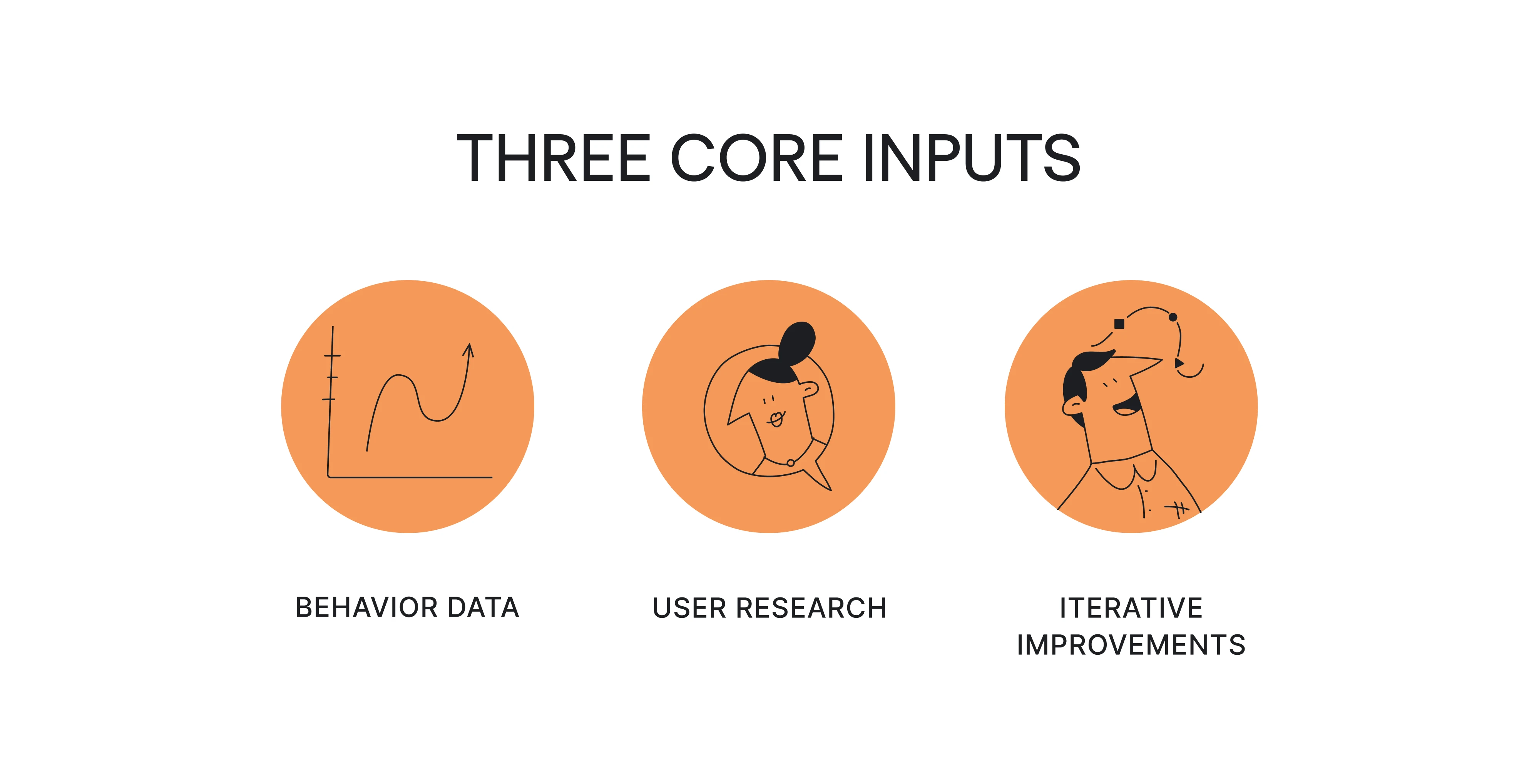
- User behavior data — such as funnels, drop-offs, search logs, and interaction patterns
- User research — including usability testing, interviews, and real user feedback
- Iterative improvements — measured changes to flows, content, structure, and performance
The objective is not aesthetic change for its own sake, but a more intuitive, efficient, and well-aligned experience that supports both user needs and business goals.
Over time, this structured approach leads to a more optimized user experience across the entire journey — not just individual screens.
UX optimization vs CRO vs UX research vs experimentation
UX optimization is often confused with related disciplines because all of them operate around improving performance. However, they serve different purposes within a product team, and understanding those distinctions prevents misplaced effort.
UX research helps you understand how users perceive your product and where they struggle.
CRO focuses on measurable outcomes such as conversion rates or revenue. Experimentation provides statistical validation for competing solutions.
UX optimization, however, connects all of these into a continuous system. It relies on qualitative and quantitative data and ensures that insights lead to action → that improvements align with broader user needs → and that validation supports long-term product health rather than short-term metric gains.
This distinction matters because many teams equate optimization with running more A/B tests.
In reality, not every friction point requires experimentation, and not every measurable improvement represents a better, more seamless user experience. When optimization becomes synonymous with testing button colors, the underlying structure of the user journey often remains untouched.
The UX optimization loop (aka your core framework)
When UX optimization is treated as a structured process, improvements begin to compound rather than accumulate randomly.
As we’ve said before, the process follows a clear sequence:
Diagnose → Prioritize → Fix → Validate → Monitor
The steps themselves are not complex. Most teams already move through them in some way. What makes the difference is applying them deliberately and as a connected system rather than as isolated actions.
This iterative process ensures:
- Each improvement builds on previous insights
- Decisions are guided by evidence, not urgency
- Changes influence the broader user journey, not just individual screens
Over time, this holistic approach turns incremental fixes into meaningful, measurable progress. And that means translates to stronger user retention, better engagement metrics, and a consistent UX success.
Let’s break down what each stage involves and how to apply it in practice.
Step 1 — Diagnose: where and why users struggle
Every effective UX/UI optimization effort starts with diagnosis. Before deciding what to fix, you need clarity on where friction appears in the user journey and what might be causing it.
The smart way to start out is by conducting a thorough UX design audit.
A UX audit can be especially valuable for mature products that have accumulated features over time. For example, when Eleken worked on redesigning the ReVeal analytics platform by Advan Research, the process began with a comprehensive UX audit of the existing interface. The audit uncovered more than 30 usability issues, many caused by features that had been added over time without rethinking the overall user experience.
Diagnosis works best when it combines quantitative metrics with qualitative insight. Data shows you where users struggle; UX optimization user research helps you understand why.
Quantitative signals reveal pressure points:
- Funnel abandonment
- High exit rates on specific pages
- Gaps between form starts and completions
- Frequent search refinements
- Error rates
- Core Web Vitals issues (e.g., loading speed or cumulative layout shift)
These patterns indicate that something in the flow is slowing users down or creating confusion, but metrics alone rarely explain the root cause.
Qualitative inputs provide context:
- Usability testing with actual users
- Customer interviews
- Session recordings
- Support tickets
- Sales feedback
These sources help you move from observing behavior to understanding hesitation, expectations, and intent.
A useful mental model during diagnosis is: What you see → what it might mean.
For example:
- High form starts but low completion → may suggest unclear fields, trust concerns, or mobile friction.
- High scroll depth with low CTA interaction → may point to weak hierarchy or unclear value proposition.
- Elevated exit rates on pricing pages → may reflect unanswered objections.
The diagnosis stage here is about building evidence before moving into prioritization and solution design.
Case in point – when CaseScribe, a legal AI platform, came to Eleken, the team wanted to improve their product. But while the MVP was fully functional, users struggled to navigate the interface and complete tasks efficiently.
To see where users struggled most, we kicked off a UX audit to identify the main usability barriers. All in all, the audit helped us reveal many problems that went beyond visuals. They were primarily rooted in workflows, structure, and consistency and included technical gaps, multiple inconsistent patterns, layout and hierarchy issues, UI problems, and several friction points within forms and input fields that made some tasks harder for users to complete.
Step 2 — Prioritize: decide what actually matters
Once friction points are identified, the next challenge is deciding what to address first. This is where many UX optimization efforts lose clarity — not because teams lack ideas, but because they lack a structured way to evaluate impact.
Not all UX issues carry equal weight. Some create mild annoyance. Others block task completion or directly affect revenue. Without prioritization, it becomes easy to focus on what feels urgent or visible rather than what is strategically important.
A simple prioritization scorecard helps bring discipline to this stage.
A quick UX prioritization scorecard
Evaluate each issue against five factors:
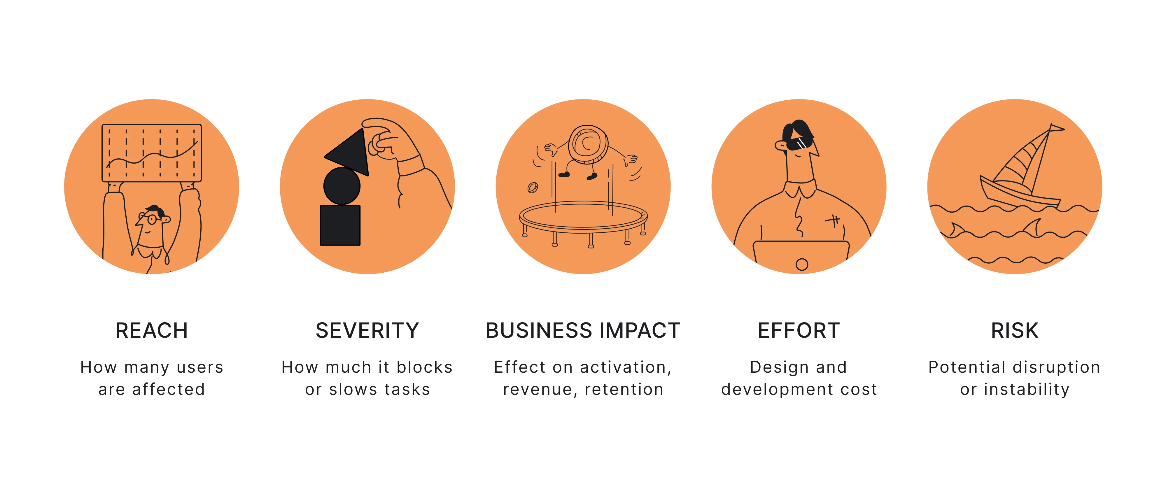
- Reach — How many users encounter this problem?
- Severity — Does it block task completion or create minor friction?
- Business impact — Does it influence activation, revenue, retention, or support load?
- Effort — What is the design and development cost?
- Risk — Could the change disrupt flows, create compliance concerns, or introduce instability?
For example, a confusing onboarding step affecting most new users should take priority over a cosmetic issue on a low-traffic page — even if the latter is easier to fix.
The aim is not to build a rigid formula, but to ensure UX improvements enhance usability, align with business goals, impact overall user satisfaction, and support long-term customer loyalty.
When applied consistently, this step keeps optimization focused and prevents effort from being scattered.
Coming back to the CaseScribe case, instead of simply restyling the screens, the UX audit revealed the need for a deeper UX rethink – unifying documents and facts, addressing inconsistencies, and creating a scalable foundation. These findings helped set the direction for Eleken’s design work.
Step 3 — Fix: Choose the right type of improvement
Once priorities are clear, the next step is implementation. The goal is not simply to “improve” the interface, but to select the type of change that addresses the root cause identified during diagnosis.
Most UX improvements fall into five categories.
1. UI clarity improvements
These changes reduce cognitive friction and sometimes also slightly refine the overall flow of the user interface where necessary:
- Strengthening visual hierarchy
- Improving contrast and readability
- Clarifying labels and microcopy
- Reducing visual noise
- Making interactive elements more obvious
Often, clarity alone significantly improves user interactions and helps users navigate the interface with less hesitation and friction.
2. Flow redesign
Some issues stem from task structure rather than presentation. So, as for flow improvements, they often include:
- Removing unnecessary steps
- Reordering actions
- Combining related tasks
- Improving onboarding UX structure
- Reducing decision overload
Here, the focus is on guide users effectively and helping users reach value faster and with fewer obstacles throughout the process.
For example, Habstash, a UK-based home-saving app, originally envisioned onboarding designed as a calculator-like sign-up form, which made the process complex and lengthy. Eleken designers redesigned the flow with a sleek multi-step onboarding wizard that guides users gradually through the process.
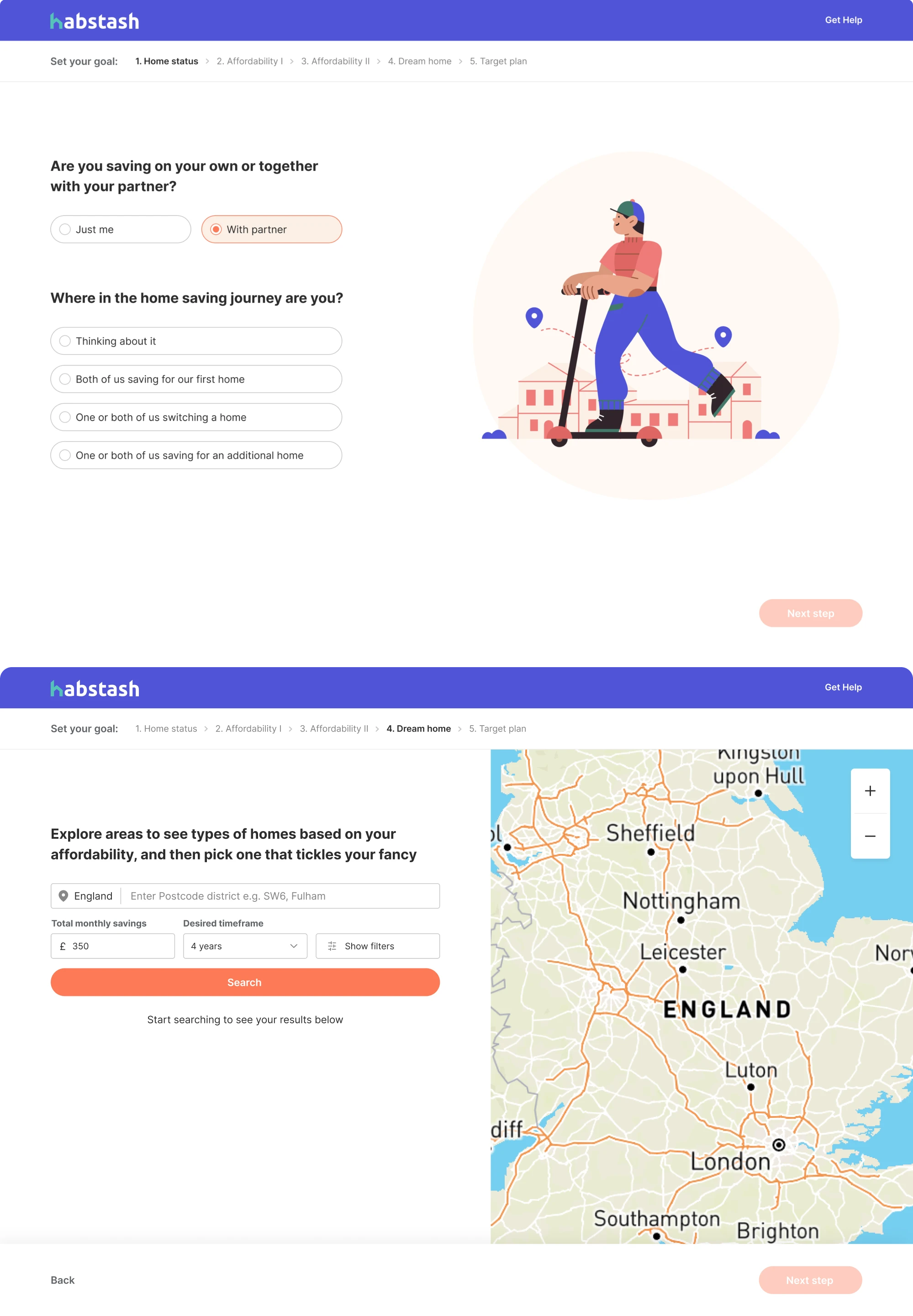
This approach made the experience more digestible, reduced friction, and helped users stay more engaged.
3. Performance improvements
Friction is sometimes technical rather than visual and may originate from how quickly and smoothly the interface responds to user actions. Performance fixes may involve:
- Optimizing images and media
- Reducing JavaScript weight
- Improving loading speed
- Reducing cumulative layout shift
- Enhancing responsiveness across mobile devices
Even modest gains in speed can improve perceived usability and make the product feel noticeably more responsive overall.
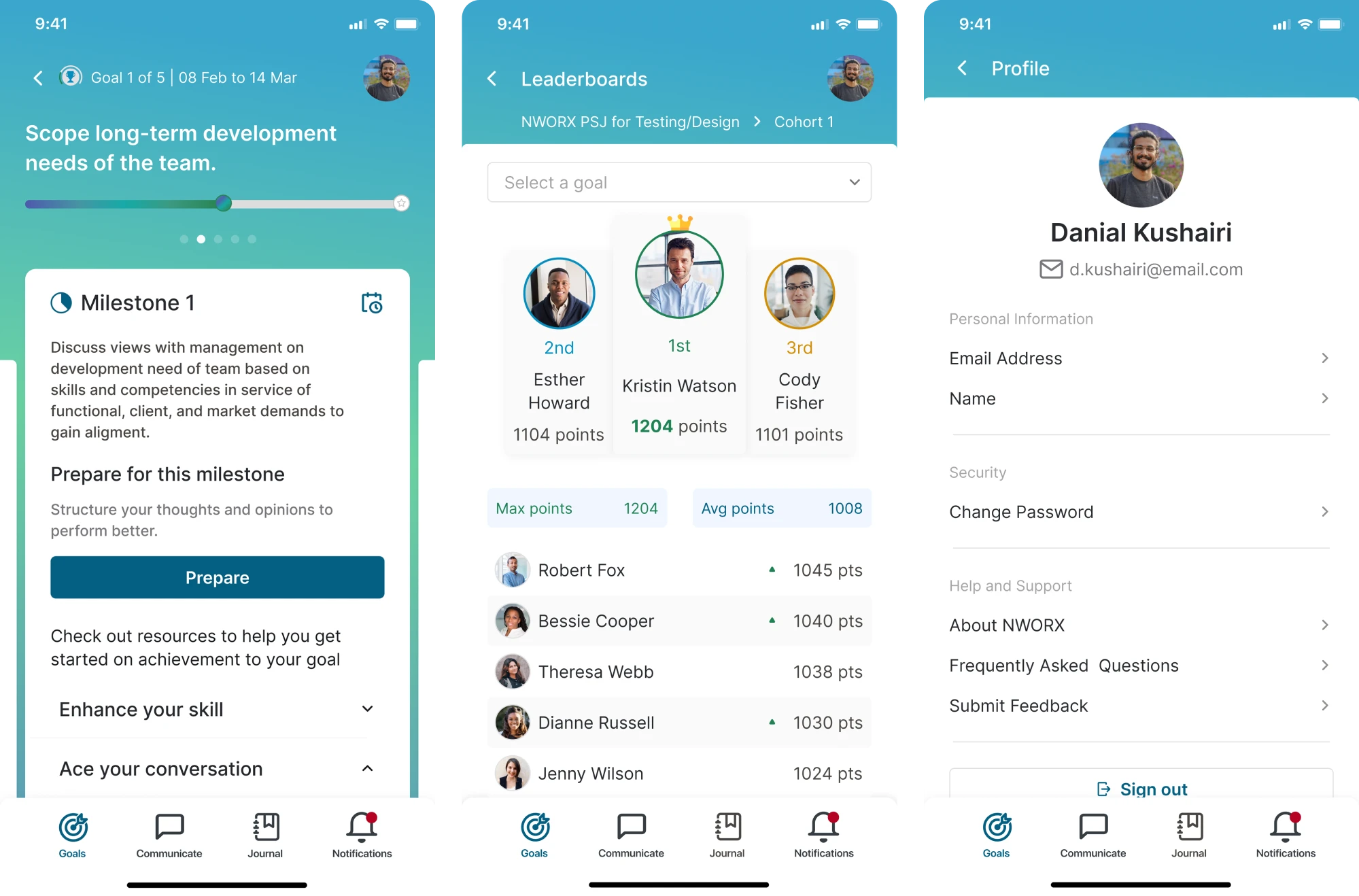
In our work with Nworx, a corporate learning management platform, Eleken designers created a responsive design that maintains visual consistency and usability across devices, enabling users to transition seamlessly between desktop and mobile.
4. Content and UX writing improvements
In many cases, the issue is language rather than layout. Such improvements may include:
- Rewriting error messages
- Clarifying instructions
- Using plain language
- Making value propositions explicit

Clear communication helps improve user expectations and builds their confidence to move on.
5. Accessibility improvements
Accessibility in UX strengthens usability and ensures a more engaging user experience for all users. Common examples include:
- Improving contrast
- Strengthening focus states
- Enabling keyboard navigation
- Making the error messaging screen-reader compatible
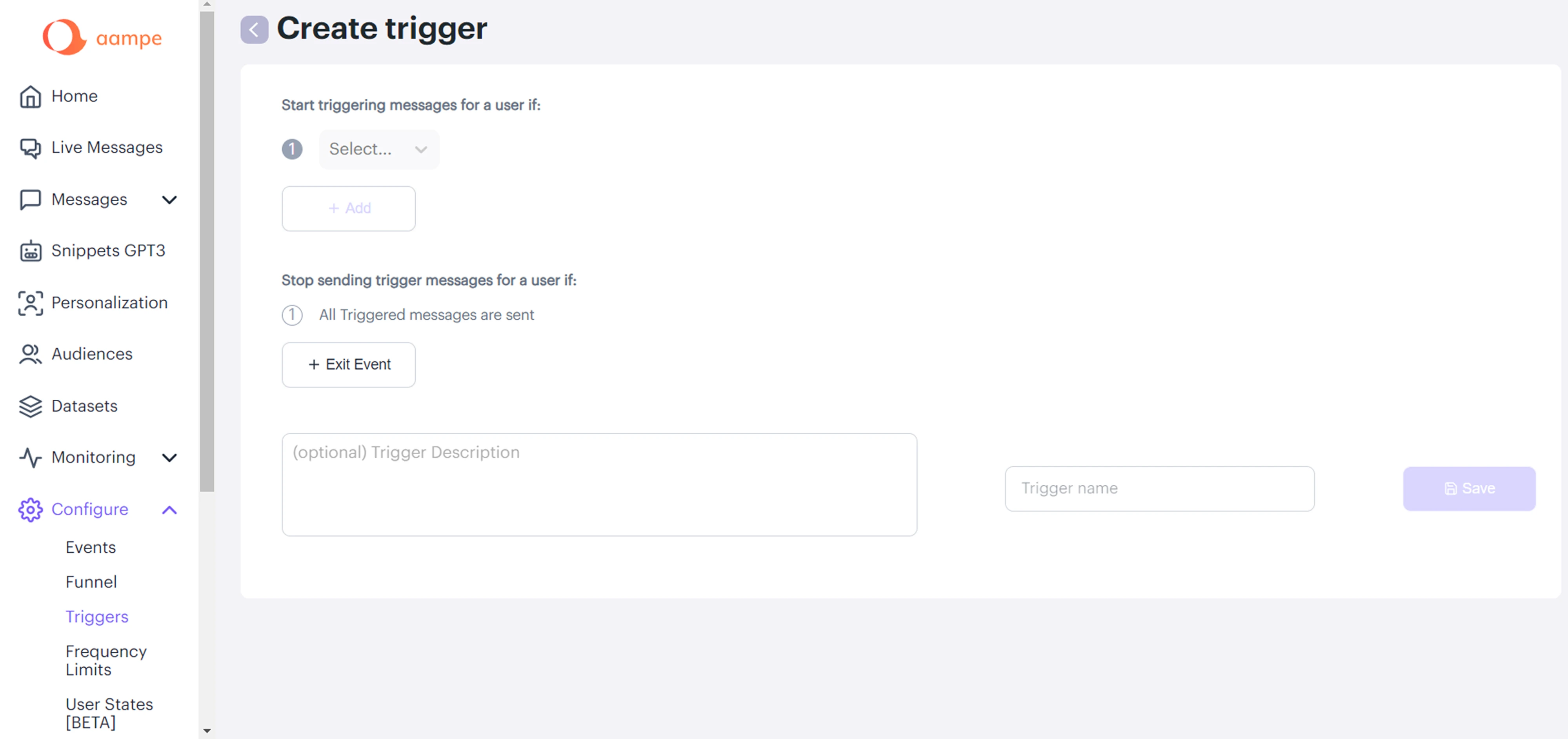
For example, in the Aampe project, we improved accessibility by redesigning the color system and increasing contrast across the interface. We also introduced icons and visual cues so that important information is not conveyed through color alone, making the platform more usable for people with visual impairments.
Overall, the key principle at this stage is alignment. The solution should match the diagnosed problem. Layout changes will not fix UX issues like unclear messaging, and experimentation will not resolve performance bottlenecks.
Step 4 — Validate: don’t ship assumptions
After implementing a change, the next step is validation. The purpose is to confirm that the improvement actually addressed the diagnosed problem.
Validation does not always require complex experimentation. The method should reflect the level of uncertainty and the potential impact of the change.
In practice, validation can take several forms:
- Usability testing to observe whether users complete tasks more smoothly
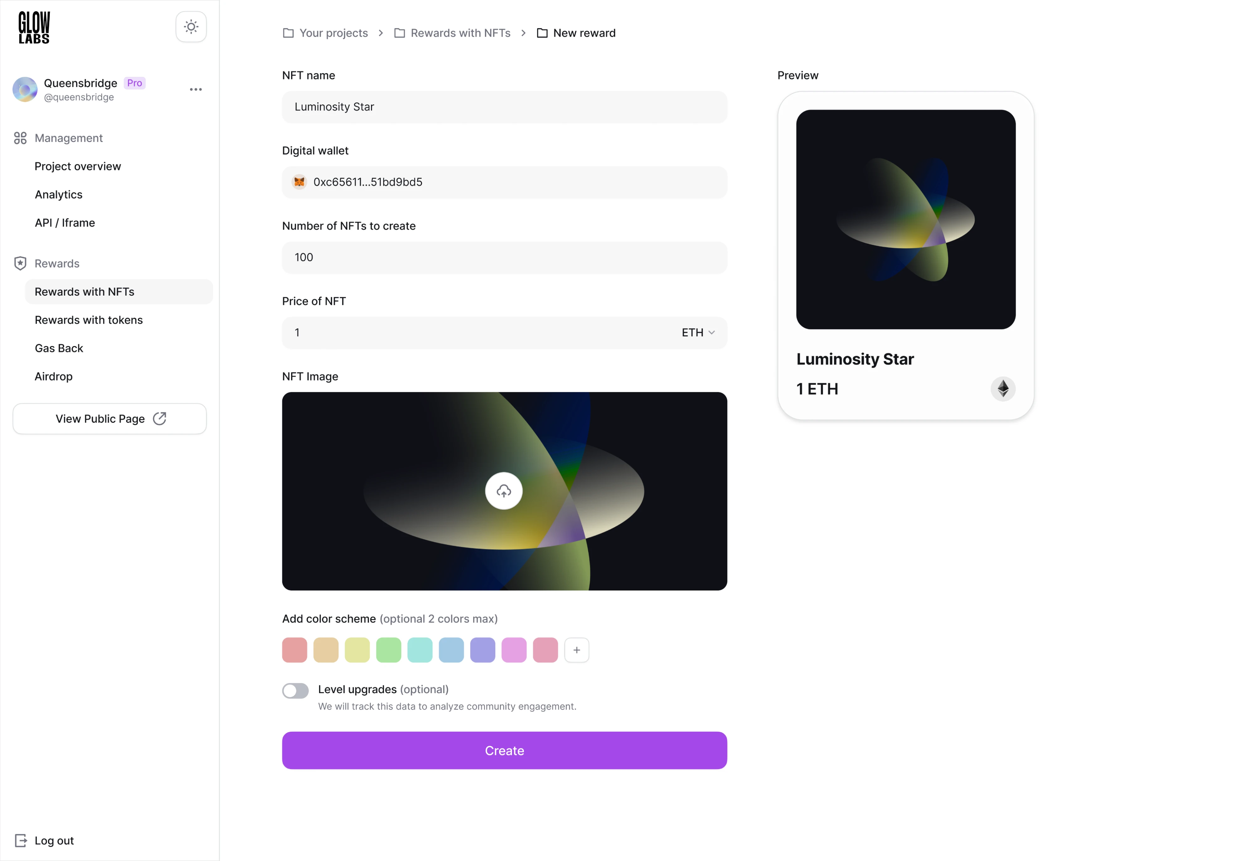
For example, in our work with Glow Labs, a Web3 SaaS, we incorporated usability testing throughout the design process to ensure the platform met user needs. We gathered continuous feedback from users through the product manager and used these insights to refine the interface. For example, key actions such as buttons were redesigned to be larger and more visible, improving usability and helping users navigate the platform more easily.
- Prototype testing before development for larger flow changes
Case in point, in the b.well project, a healthcare SaaS platform, Eleken designed an interactive prototype and conducted user testing to evaluate how users would react to a complex identity verification. The challenge was that the feature included three different authorization flows: for pre-verified users, HIPAA-protected users, and unauthorized users who had to complete ID scanning and facial verification.

Since we weren’t sure how users would respond to these steps, we tested the prototype with users and observed their behavior.
The results showed that very few users dropped off during authorization, confirming the effectiveness of the design, after which we made several small improvements based on the feedback.
- A/B testing when comparing measurable variations
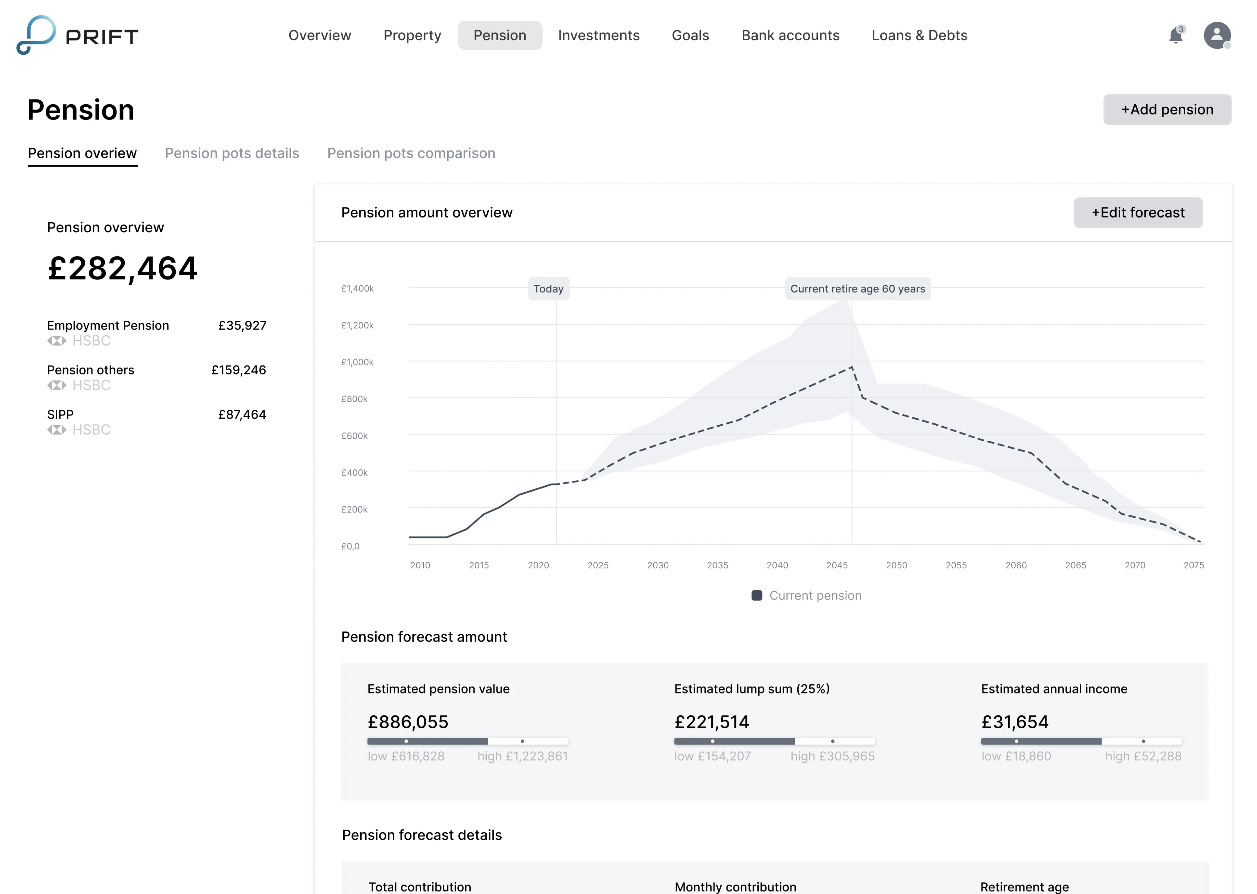
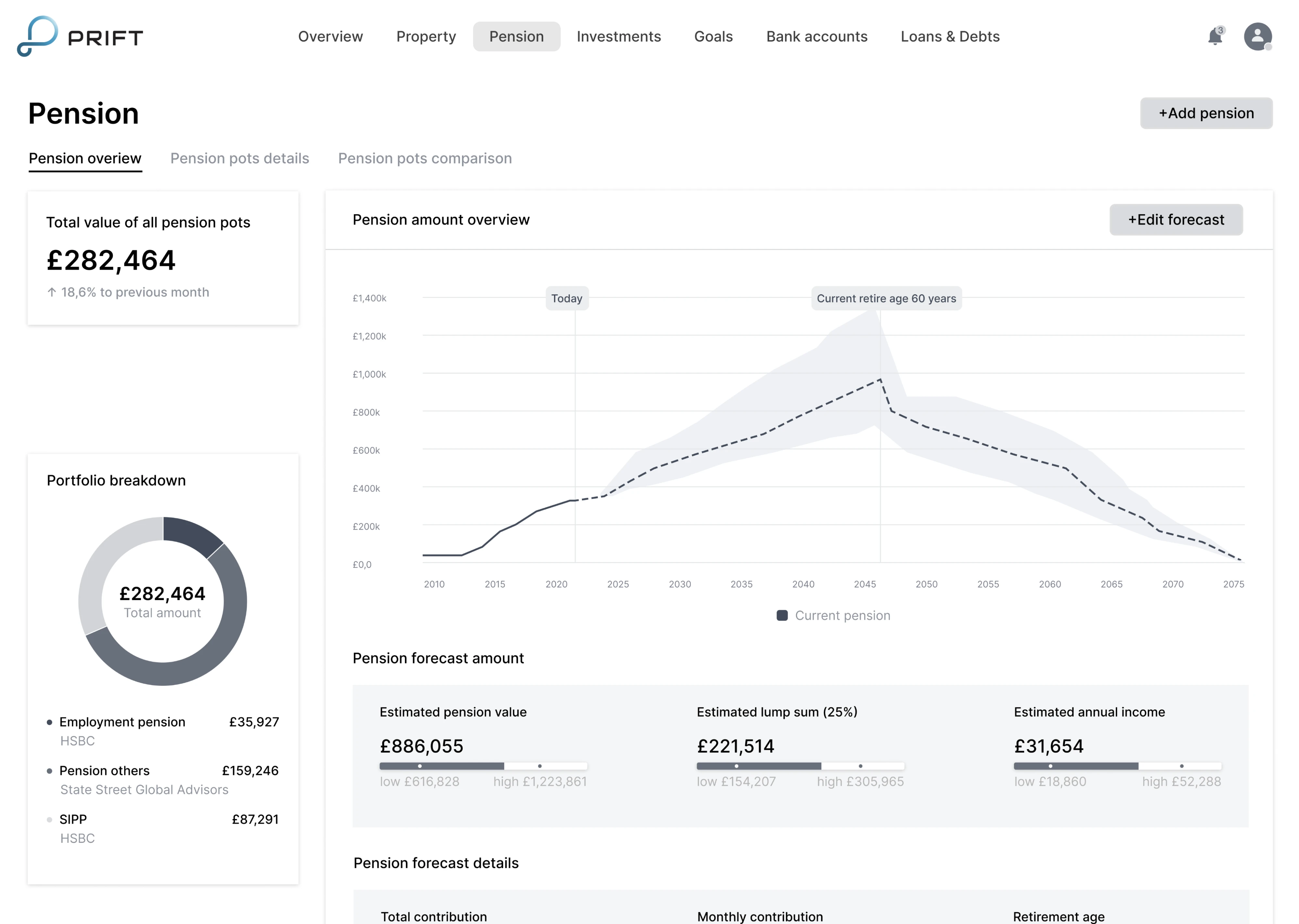
While working on Prift, a fintech SaaS platform, Eleken designers ran A/B testing to evaluate which interface approach resonated most with users. We designed multiple versions of key screens with different navigation and information layouts, tested them with users, and selected the solution that proved the most intuitive to move forward into the visual design phase.
Overall, not every UX issue requires an A/B test. If research clearly shows that, let's say, some input field design is confusing, rewriting it may not need statistical validation. However, when multiple viable solutions exist, structured experimentation becomes essential.
- Behavioral analysis to track shifts in drop-offs, task completion, or engagement
The goal of validation is not to prove that a change “worked,” but to ensure it genuinely improved the user journey without introducing new friction.
Without validation, UX optimization risks becoming a sequence of well-intentioned assumptions.
Step 5 — Monitor: make optimization continuous
Validation confirms whether a change worked. Monitoring ensures it continues to work over time.
User behavior evolves, traffic sources shift, and new features introduce complexity. What improved performance last quarter may not produce the same results today. Without ongoing monitoring, UX optimization becomes episodic instead of systematic.
While monitoring is an ongoing process, it does not require constant redesign. It requires visibility. At a minimum, teams should track:
- Core user flows and funnel completion rates
- Task success and error rates
- Key performance indicators tied to activation, conversion, or retention
- Core Web Vitals by page type or template
In addition to metrics, recurring UX reviews — such as monthly walkthroughs or quarterly usability testing — help surface emerging friction before it affects business outcomes.
Monitoring turns optimization into a sustained discipline. Instead of reacting after problems escalate, teams can detect early signals and adjust deliberately to enable higher user satisfaction over time.
For example, when Eleken redesigned the onboarding experience for the sales automation platform Zaplify, the team simplified key flows and improved clarity across the interface. As a result, the product’s activation rate doubled (from 20-25% to nearly 40%), demonstrating how targeted UX improvements can directly influence user adoption – especially when everything depends on product-led growth.

This final step completes the cycle — and feeds directly back into diagnosis, where the process begins again.
Unpacking high-impact UX optimization techniques
Instead of listing generic “UX tips,” it’s more useful to organize optimization techniques by the type of friction they address. Different problems require different interventions, and recognizing the pattern behind the friction is what makes improvements effective.
Let’s begin with one of the most common issues.
First-time user overwhelm (first session ≠ day 30)
One of the most common UX optimization challenges appears during the first session. New users open a product with curiosity, yet the interface often reflects the needs of experienced users.
The problem is not complexity itself — it is sequencing. First-time interaction and long-term usage require different levels of information and control.
A useful shift in perspective is this:
The first session is not the full product. It is an introduction to value.
To reduce overwhelm:
- Use progressive disclosure — introduce core functionality first and reveal advanced features contextually.
- Design for a “first win in two minutes” — shorten time-to-first-value so users experience early success.
- Create guided empty states that suggest one clear next action instead of multiple competing paths.
- Add a lightweight getting-started checklist with three to five focused tasks.
- Separate advanced functionality so experienced users can move efficiently without overwhelming new ones.
Reducing early complexity does not mean limiting capability. It means presenting the right depth at the right time.
When users quickly understand what to do and why it matters, they gain confidence. That early clarity improves activation, strengthens engagement, and lays the groundwork for long-term retention.
Navigation and findability (when users can’t locate things)
Even strong products lose users when navigation is unclear. Findability issues may seem minor, but over time they reduce engagement and increase drop-offs.
These problems often stem from mismatched mental models. Teams structure navigation around internal logic, while users look for outcomes.
Effective UX optimization focuses on alignment and clarity.
To improve navigation and findability:
- Use task-based labels instead of internal terminology or feature names.
- Reduce menu overload by limiting top-level options and grouping related items logically.
- Introduce breadcrumbs in deeper hierarchies so users understand where they are.
- Treat search as a primary navigation tool, especially in complex products.
- Validate changes with tree testing or first-click testing to confirm users locate items quickly.
A useful diagnostic question is: Can a new user find a key feature in under 10 seconds without assistance?
Navigation optimization is not about minimizing clicks. It is about making direction clear, so your users interact with the product effortlessly. When users consistently find what they expect, friction decreases, and the overall user journey becomes more efficient.
Forms that convert (without dark patterns)
Form design is often the highest-friction point in a user journey. Whether it’s sign-up, checkout, or a pricing inquiry, small usability issues can significantly reduce completion rates.
The goal of UX optimization here is not to pressure users into submitting, but to remove unnecessary cognitive load.
Common improvements include:
- Use visible, top-aligned labels instead of placeholders that disappear when users start typing.
- Provide inline validation so errors are caught early and clearly explained.
- Group related fields logically to reduce mental switching.
- Use sensible defaults and autofill to reduce manual effort.
- Clarify why information is needed, especially when requesting sensitive data.
Fewer fields do not automatically mean better UX. A short but confusing form creates more friction than a longer, well-structured one.
When users clearly understand what is required and how to correct mistakes, completion rates and user retention improve naturally — without relying on manipulative tactics.
Cognitive load reduction: Clarity beats minimalism
Many UX issues are not caused by missing features, but by excessive cognitive load. When users must process too much information at once, decision-making slows down and errors increase.
Reducing cognitive load does not mean removing functionality. It means structuring it so users can focus on one meaningful step at a time.
Effective improvements include:
- Chunking related information into clear sections instead of presenting dense blocks of content.
- Limiting each screen to one primary action to reduce competing decisions.
- Using progressive disclosure to reveal complexity only when needed.
- Applying consistent UX design patterns so users do not have to relearn interactions.
- Strengthen information architecture to make it obvious what happens next.
These are proven strategies for improving optimization user experience at scale.
A common misconception here is that fewer clicks always equal better UX. In reality, clarity matters more than click count. Users are comfortable taking multiple steps if each step feels predictable and purposeful.
Cognitive load reduction is about guiding attention. When the interface supports decision-making instead of overwhelming it, task completion becomes smoother, and the overall experience feels more intuitive.
Information density for expert users (when minimalism hurts)
While reducing cognitive load improves clarity for new users, over-simplification can frustrate experienced ones. As users gain familiarity, they often prefer efficiency over guidance.
Expert users typically value information density because it allows faster scanning and decision-making. Removing too much detail in the name of minimalism can slow them down.
UX optimization at this stage focuses on flexibility rather than simplification.
Effective techniques include:
- Collapsible sections or expandable panels to keep interfaces clean without hiding depth.
- Saved views or customizable dashboards that adapt to user workflows.
- Advanced filters and keyboard shortcuts for faster interaction.
- Progressive complexity, where users can access more powerful controls as they gain experience.
- Scan-friendly tables and structured layouts that support quick comparison.
Tesler’s Law reminds us that complexity cannot always be removed — it can only be redistributed. The goal is not to eliminate complexity, but to place it where it supports productivity rather than obstructs it.
A well-optimized experience adapts to user maturity. Beginners receive clarity and guidance, while experts gain speed and control.
Accessibility improvements that boost UX
Accessibility is often treated as a compliance requirement, but in practice, it strengthens usability for everyone. Many accessibility improvements reduce friction across the entire user base, not just for users with specific needs.
UX optimization in this area focuses on clarity and interaction.
Effective improvements include:
- Improving color contrast to enhance readability across different screen conditions.
- Strengthening focus states so keyboard users can navigate confidently.
- Ensuring full keyboard navigation for interactive elements.
- Writing descriptive labels and links that clearly communicate purpose.
- Designing error messages that work with screen readers and provide actionable guidance.
Accessibility is not only about passing WCAG criteria. A design can technically meet standards and still feel difficult to interpret. The goal is to create an experience that feels usable and frustration-free across devices and assistive technologies.
When accessibility is integrated early into UX optimization, it reduces long-term risk, improves the inclusivity aspect, and often results in a cleaner, more consistent interface.
UX Optimization for Speed (High-Impact Improvements with Moderate Effort)
Speed is not only a technical concern. It directly shapes how users perceive your product.
Loading speed, visual stability, and responsiveness influence user satisfaction, engagement, and even search engine optimization through ranking factors like Core Web Vitals. A slow or unstable interface creates a poor user experience long before users evaluate features.
The encouraging part here is that many performance improvements do not require a full technical overhaul. Several high-impact optimizations can be implemented with moderate effort and produce measurable gains in engagement and stability.
Where high-impact performance gains usually come from
In many cases, noticeable gains come from addressing a small number of high-impact areas that disproportionately affect loading time and visual stability.
The most common sources of performance improvement include:
- Image and media optimization
- Reducing unnecessary JavaScript weight
- Limiting third-party scripts
- Improving caching and CDN configuration
- Optimizing rendering strategy
These factors directly influence how quickly meaningful content appears on screen and how stable the interface feels while loading. When addressed deliberately, they improve both measured performance and perceived speed.
How UX design decisions affect loading and stability
Beyond technical fixes, design decisions directly influence both actual and perceived performance. Layout structure, media choices, and interaction patterns determine how quickly users can engage with meaningful content.
For landing pages, improvements often come from simplifying what loads first and limiting non-essential elements:
- Reduce heavy above-the-fold media
- Defer non-essential carousels or video
- Limit animation-heavy components
- Prioritize primary content in the loading hierarchy
For product listing pages and search grids, where large numbers of images and filters increase load pressure, performance gains often depend on controlling how and when content appears:
- Use responsive images in modern formats
- Lazy-load content below the fold
- Apply skeleton states to reduce perceived wait time
- Delay rendering complex filters until interaction
Performance optimization is not only about milliseconds; it is about structuring the experience so users perceive the interface as stable and responsive.
Aligning performance decisions with product ownership
Performance does not improve by accident. It improves when product managers and product owners explicitly include it in scope, trade-offs, and prioritization discussions. If speed is treated as an engineering concern alone, it often becomes secondary to feature delivery.
To make performance a shared product responsibility, PMs and POs should actively challenge assumptions during planning and review stages by asking:
- What element affects Largest Contentful Paint on this template?
- How much third-party JavaScript blocks rendering?
- Which elements are truly essential above the fold?
- Can parts of the experience load progressively?
- What are Core Web Vitals metrics by page type (home, listing, checkout)?
These questions anchor performance in product thinking. They force trade-offs to be visible and ensure that new features do not silently degrade the user experience.
When performance is owned at the product level, optimization becomes proactive rather than reactive — strengthening both usability and SEO outcomes over time. And yes, even small gains can lead to measurable improvements in engagement metrics and retention.
KPIs that matter and how to interpret them
UX optimization without measurement quickly becomes subjective. Metrics provide direction — but only when interpreted in context.
Not every UX improvement will immediately increase conversions. Some reduce friction, others improve clarity or confidence. The key is tracking the right indicators — and understanding what they actually signal.
Below is a structured overview of core UX-related KPIs and how to interpret them.
Improvements here often reduce bounce rates indirectly rather than immediately boosting conversions.
These help you understand how users behave and whether improvements align with your target audience needs.
The most common mistake is optimizing isolated metrics without understanding causation. A declining bounce rate does not automatically mean a better user experience, and rising time-on-page does not guarantee clarity.
Effective UX optimization connects metrics back to diagnosed friction. Measurement is not about chasing numbers — it is about validating whether the user journey has genuinely improved.
Treating UX optimization as a system, not a project
UX optimization delivers meaningful results when it becomes part of how a product operates — not a temporary initiative triggered by declining metrics. True user experience optimization is continuous. It focuses on systematically identifying friction, testing improvements, and aligning product decisions with user needs to create an optimal user experience over time.
When treated as a system, optimization creates clear feedback loops:
Data informs diagnosis → Diagnosis shapes prioritization → Improvements are validated → Monitoring feeds insights back into the next cycle.
Each stage strengthens the next, preventing teams from repeating friction in different forms. This structured approach answers the fundamental question of how to improve user experience in a scalable way — not through isolated tweaks, but through deliberate iteration.
And this structure is reinforced by:
- Design systems, which maintain consistency and prevent new friction caused by ad hoc changes.
Regular cross-functional reviews, where product, design, and engineering assess UX signals together. - Documented learnings, ensuring that experiments and insights contribute to continuously improving user experience, rather than disappearing into team silos.
Over time, this approach prevents optimization from turning into a backlog of disconnected improvements. It replaces reactive fixes with deliberate progress — the kind that steadily compounds into improved user experience and measurable gains in engagement, retention, and satisfaction.
When you’re running optimization in cycles, results accelerate when design, research, and engineering align around a clear prioritization model — not a queue of random changes.
If drop-offs persist or parts of your product feel harder to use than they should, an outside perspective can help. At Eleken, we help teams audit user journeys, highlight friction points, and redesign the moments that limit conversions. If that’s what you need, you know where to find us.


.png)