
Heuristic evaluation is your way out of that mess. It’s a structured UX audit method where usability experts review a product against a set of recognized usability principles, usually Nielsen’s 10 heuristics. Instead of “just testing things,” you walk through actual user flows and score specific problems based on clear criteria.
In a classic Nielsen Norman Group study, a single evaluator can find up to 35% of usability problems, but three to five evaluators working independently can uncover up to 75%. That’s the power of methodical reviews. But you don’t need a team of five, you just need a solid process.
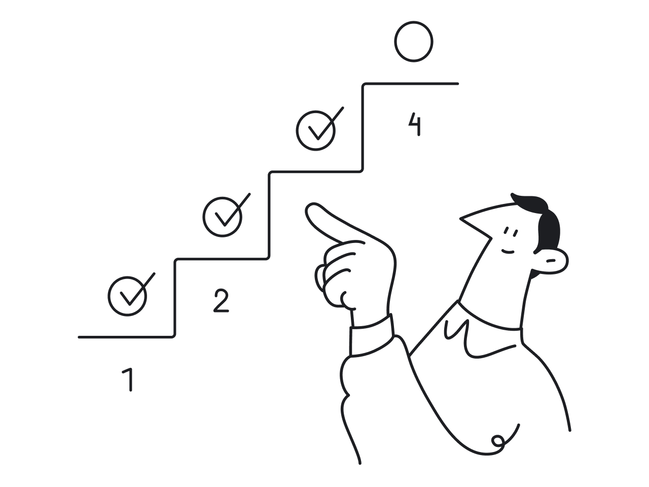
Let’s break it down, step by step.
Before you start: Set up the evaluation so it doesn’t become a messy opinion list
Before you dive into reviewing screens and logging usability issues, pause. A heuristic analysis without structure is basically just a design roast. You’ll get a jumble of opinions, duplicates, and vague notes like “not intuitive, and no real path to fixing anything.
Here’s how to set the foundation so your evaluation produces clear, actionable results.
Define the scope
Don't try to evaluate the entire product. You'll drown in feedback and lose focus.
Instead:
- Pick 1–3 critical flows that matter to your users (think onboarding, checkout, inviting a teammate, not settings pages).
- Define what’s in (screens, states, platforms) and what’s out. For example, you might focus only on the web app, logged-in state, and desktop view.
- Choose a user type to focus on. Novice users vs. experienced users will spot very different problems. Stick with one.
When auditing myInterview, Eleken did just that, narrowing the focus to two high-impact user flows.
For candidates, we tackled key issues in the video interview process that were causing a 90% drop-off.
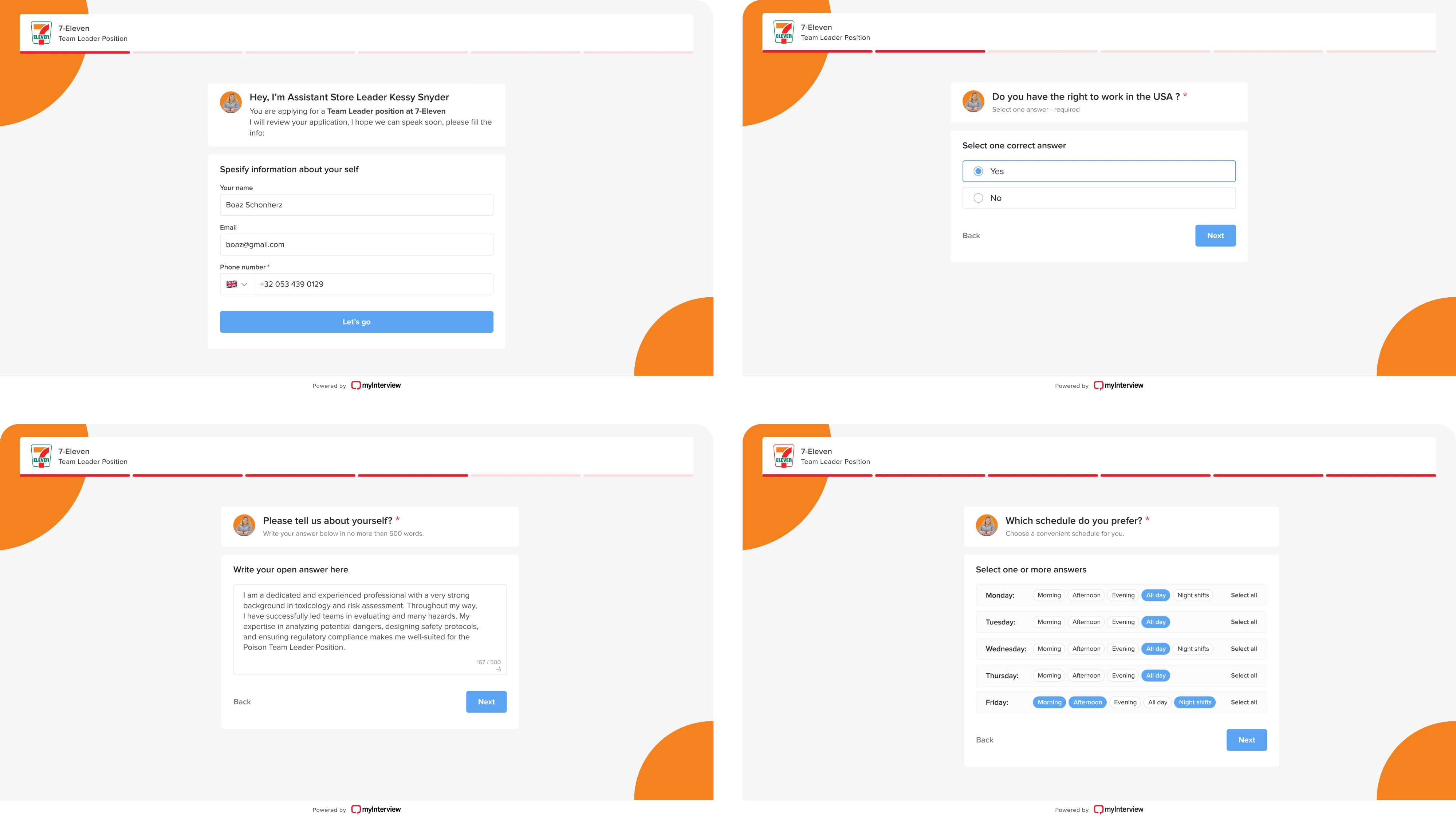
For recruiters, we improved the setup experience with better previews, branding tools, and a more intuitive interview builder.

By targeting the most critical paths, we uncovered usability issues that directly affected both user satisfaction and business performance, a perfect heuristic evaluation example of how focused scope leads to actionable insights.
Choose your tooling + logging format
This part is easy to overthink, but don’t. Use a shared spreadsheet (we use Google Sheets). Avoid Notion, Figma comments, or sticky notes. You want a single, sortable place to log all findings.
Recommended columns:
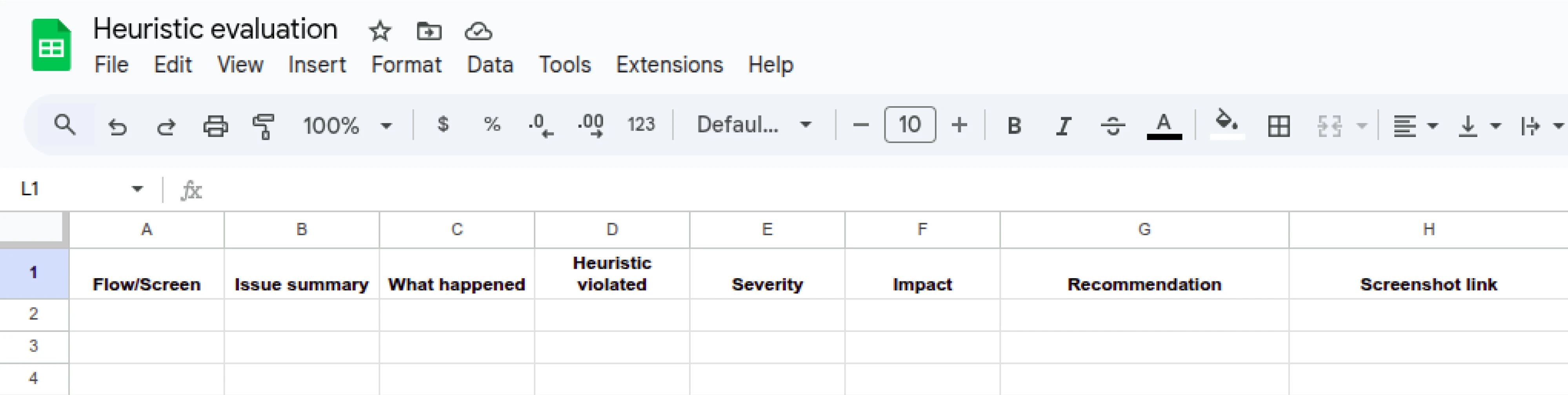
Why it matters:
This format turns vague observations into structured, fixable issues. It also makes it easier to compare notes if multiple evaluators are involved.
It's also exactly what you'd expect to find in solid UX audit report examples: clear, concise, and actionable.
Now that your scope is tight and your tools for UX audit are ready, it’s time to get into the heuristics themselves. If you’ve ever asked yourself, “What is UX research?” This is it in action: asking the right questions, observing behavior, and turning findings into improvements. Let’s keep going.
Use Nielsen’s 10 usability heuristics as your baseline
A heuristic evaluation is a methodical process, and that UX research method needs structure. That’s where Jakob Nielsen’s 10 usability heuristics come in. They’ve been around since the 1990s and are still used in every serious UX audit for one simple reason: they work.
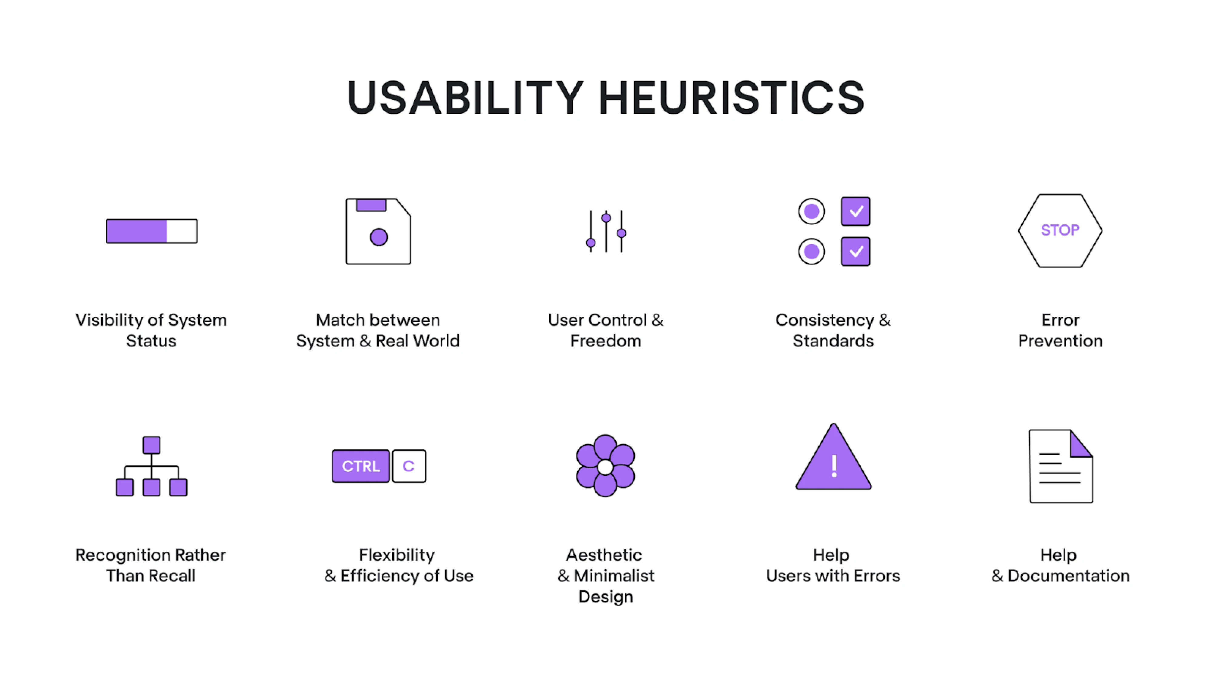
At Eleken, we treat these 10 heuristics as our go-to lens when spotting usability issues. Each heuristic represents a specific principle, such as the visibility of system status or error prevention, which lets you frame usability issues objectively, not emotionally.
Here’s how we recommend using them:
Ask structured questions for each heuristic
Each heuristic comes with its own design QA checklist of yes/no questions. For every screen or user task, you’ll walk through these questions.
Every time the answer is “no,” you:
- Log it as a usability issue in your sheet, or
- Leave a note if it’s acceptable due to context.
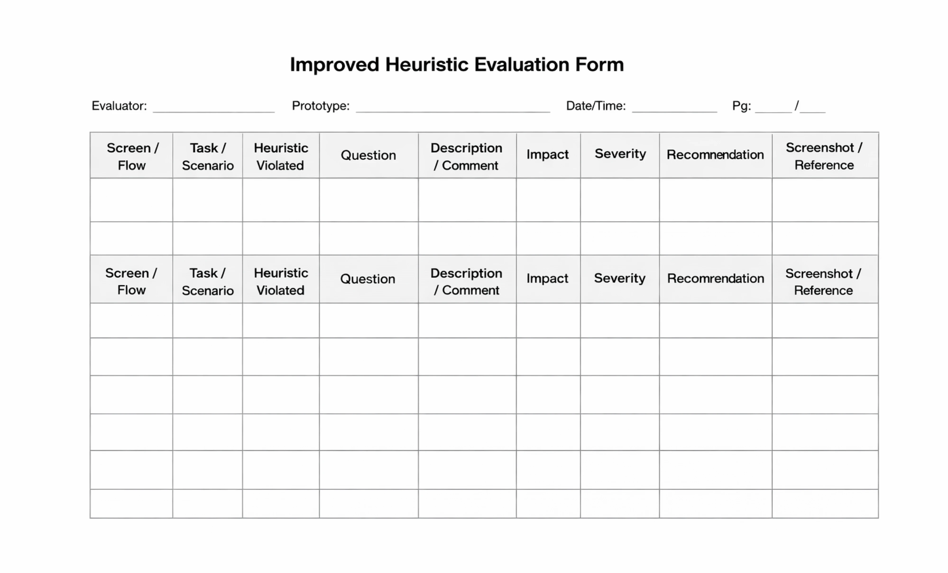
Using a structured user experience evaluation form helps you stay consistent, spot patterns, and make your findings actionable. While simple tables can do the job, a more detailed format with fields for user flow, task context, and recommendations makes collaboration easier, especially when you're handing findings off to product or dev teams.
At Eleken, we’ve created an improved heuristic evaluation template that we use in our own UX audit case studies. It’s designed to guide your thinking, reduce ambiguity, and turn vague observations into clear, prioritized insights.
Example in practice
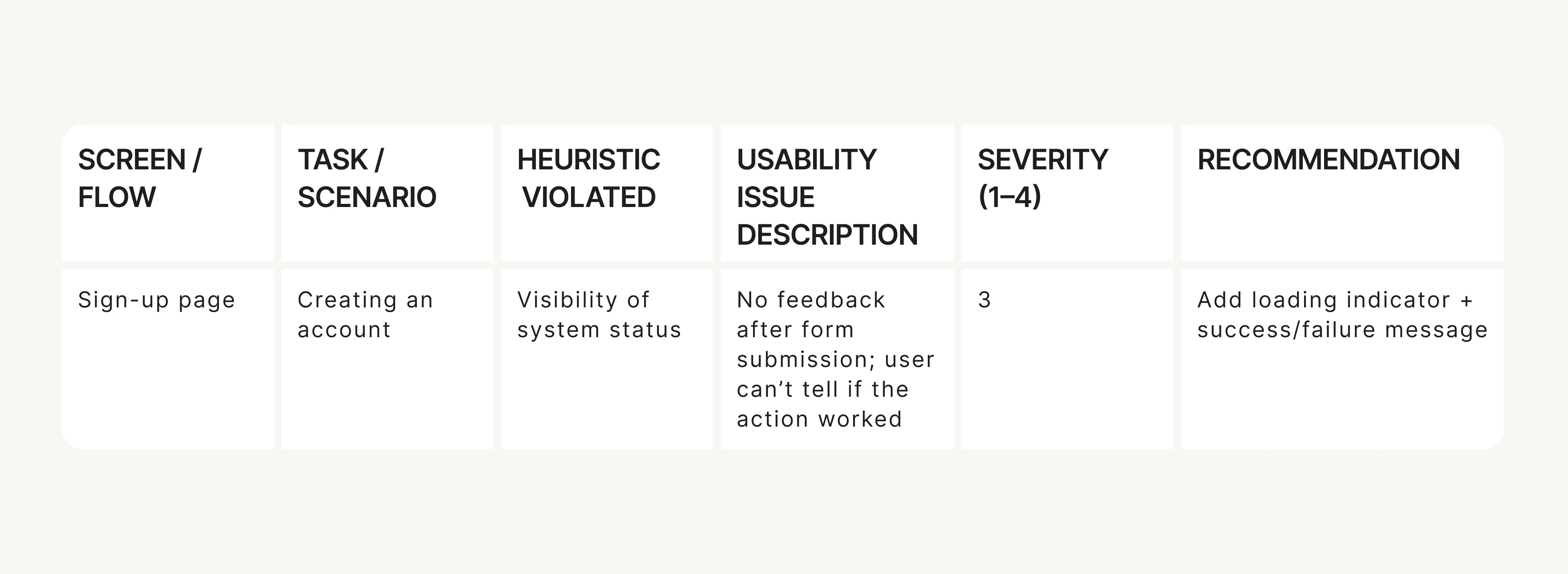
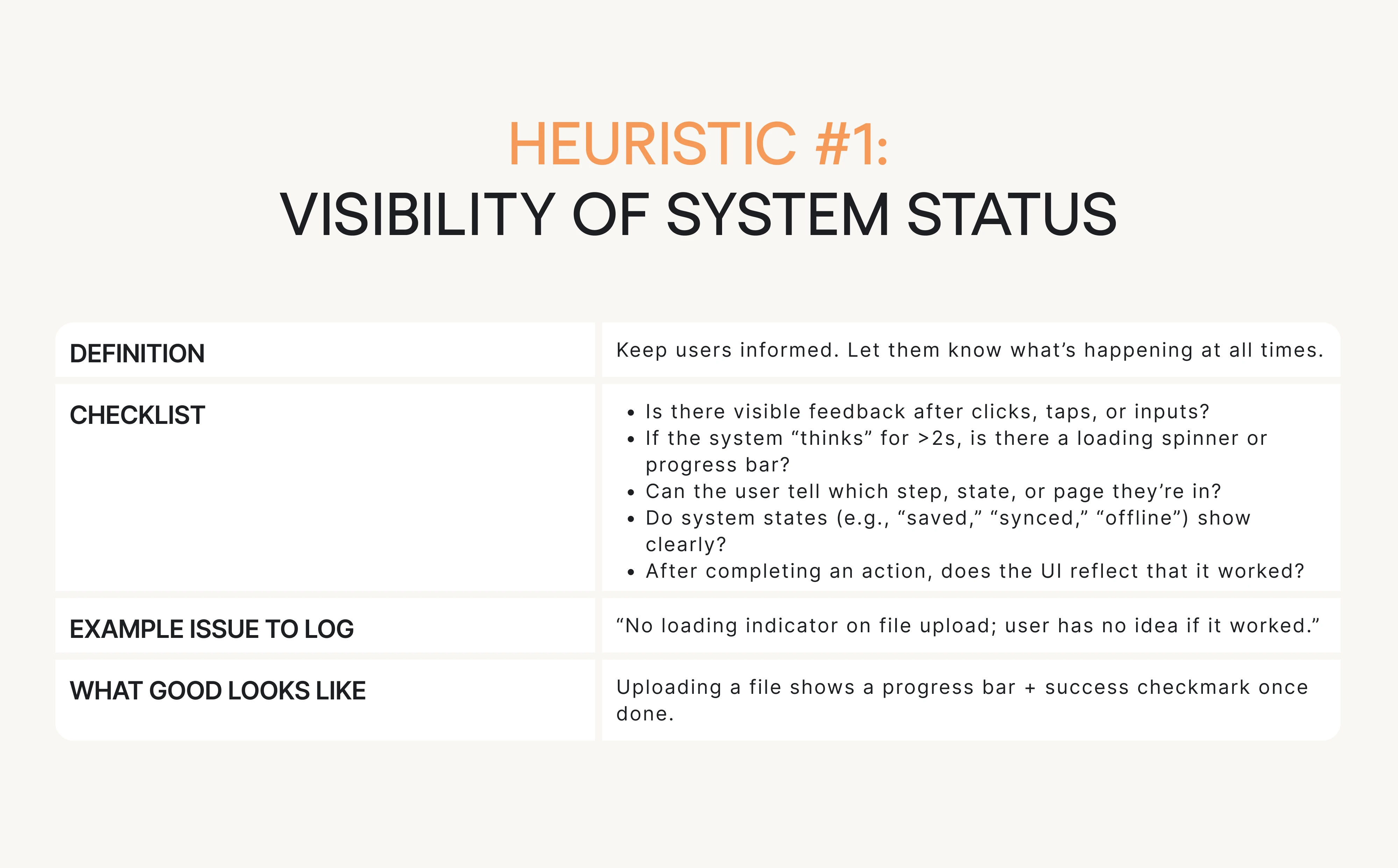
Let’s say you’re reviewing a product’s onboarding flow, specifically the sign-up screen. You’re checking it against Heuristic #1: Visibility of system status, which basically means: don’t leave users guessing.
One simple checklist question to ask is: If the system “thinks” for more than 2 seconds, is there visible feedback?
Now imagine the user clicks Create account… and nothing happens: no spinner, progress state, or message.
That’s a clear heuristic violation, so you log it like this: No appropriate feedback after submitting the sign-up form; the screen looks frozen. (Heuristic #1)
This is exactly how heuristic evaluation UX prevents “this feels weird” notes. You’re documenting a specific usability issue tied to a usability principle.
How it looks in the Eleken UX heuristic evaluation form:
Using heuristics this way lets you:
- Focus your attention.
- Avoid subjectivity.
- Map every issue to a known pattern.
Now, let’s walk through the 6-step UX evaluation workflow we follow at Eleken, the core of the entire process.
The core workflow: run the heuristic evaluation in 6 steps
Here’s how to conduct a heuristic evaluation step by step to identify and document usability issues effectively.
Step 1: Pick flows and tasks
You already defined the high-level flows (like onboarding or checkout). Now break those into specific user tasks.
Examples:
- “Create a new project from scratch”.
- “Find and edit an existing invoice”.
- “Add a teammate and assign a permission level”.
Keep tasks short and realistic. Add 1–2 edge cases if relevant, like error or empty states, present users hit those too.
Step 2: Review each flow
Now go through each task step by step.
Do this as if you were your target user. Don’t skip around or jump ahead. For each screen and interaction:
- Use the heuristic checklist.
- Log issues directly in the shared spreadsheet.
- Take screenshots or record your session (Loom is great for this).
Reminder: Don’t log vague opinions. Stick to “what happened,” “why it matters,” and “which heuristic it breaks.”
If you want a deeper dive into heuristic evaluations for user interfaces? Check out this video for a more detailed, visual explanation.
Step 3: Log issues using a consistent “issue card” format
Every issue you log should follow a strict format. Here’s the anatomy of a good one:
This format ensures every issue is clear, scoped, and ready for dev handoff.
Step 4: Calibrate severity before merging lists
Severity helps you avoid treating every issue like a crisis. Use a 4-point scale:
Decision rule: If it blocks a user from doing their job, it’s critical. If it just annoys them, it’s minor or cosmetic.
Step 5: Cluster your findings
After you’ve logged your issues, group them into themes or UX patterns. This helps teams understand broader problems instead of just fixing one-off bugs.
Typical clusters:
- Navigation and flow.
- Terminology and content.
- Feedback and status.
- Permissions and roles.
- Forms and inputs.
This step turns 47 isolated issues into a handful of clear problem areas.
Step 6: Prioritize into an action plan
Here’s where the audit turns into a roadmap.
Use this formula:
Priority = Severity + Frequency + Business Relevance
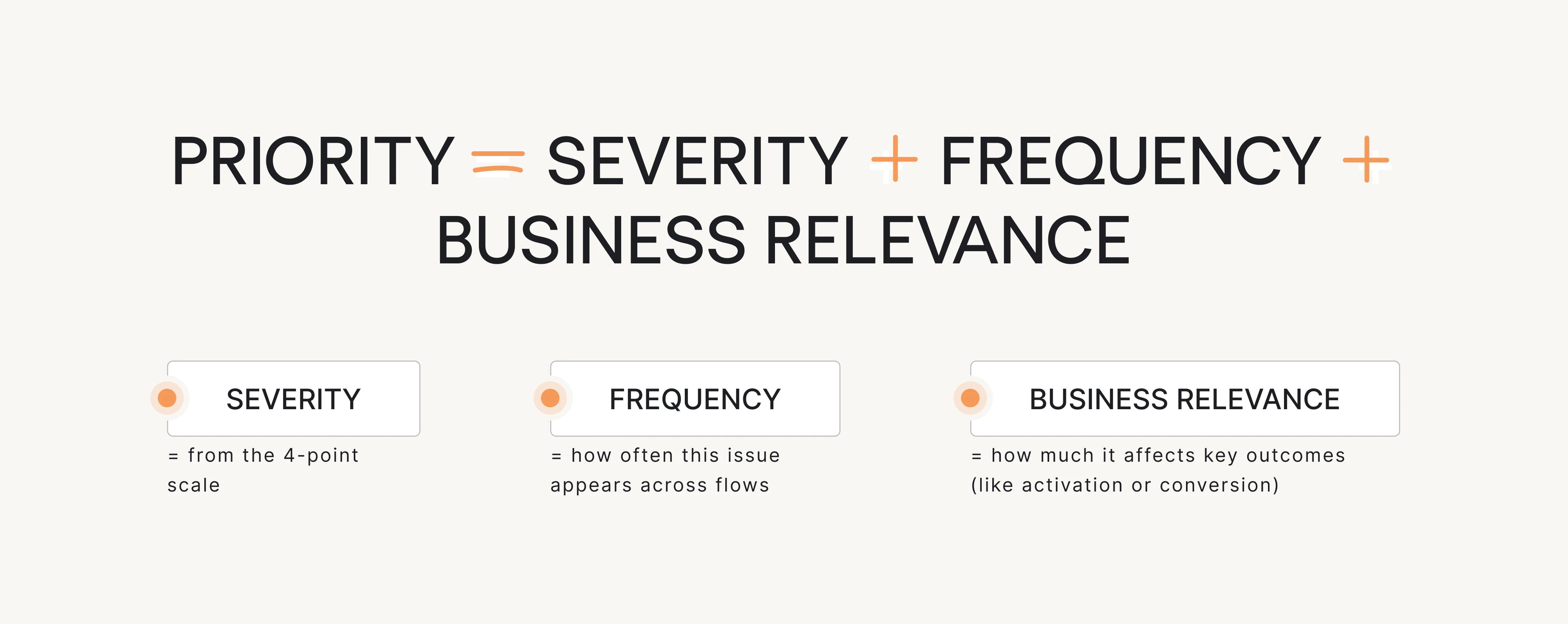
Score each issue, then sort and pick your top priorities. This gives your product team a practical to-do list, not a giant spreadsheet full of low-impact problems.
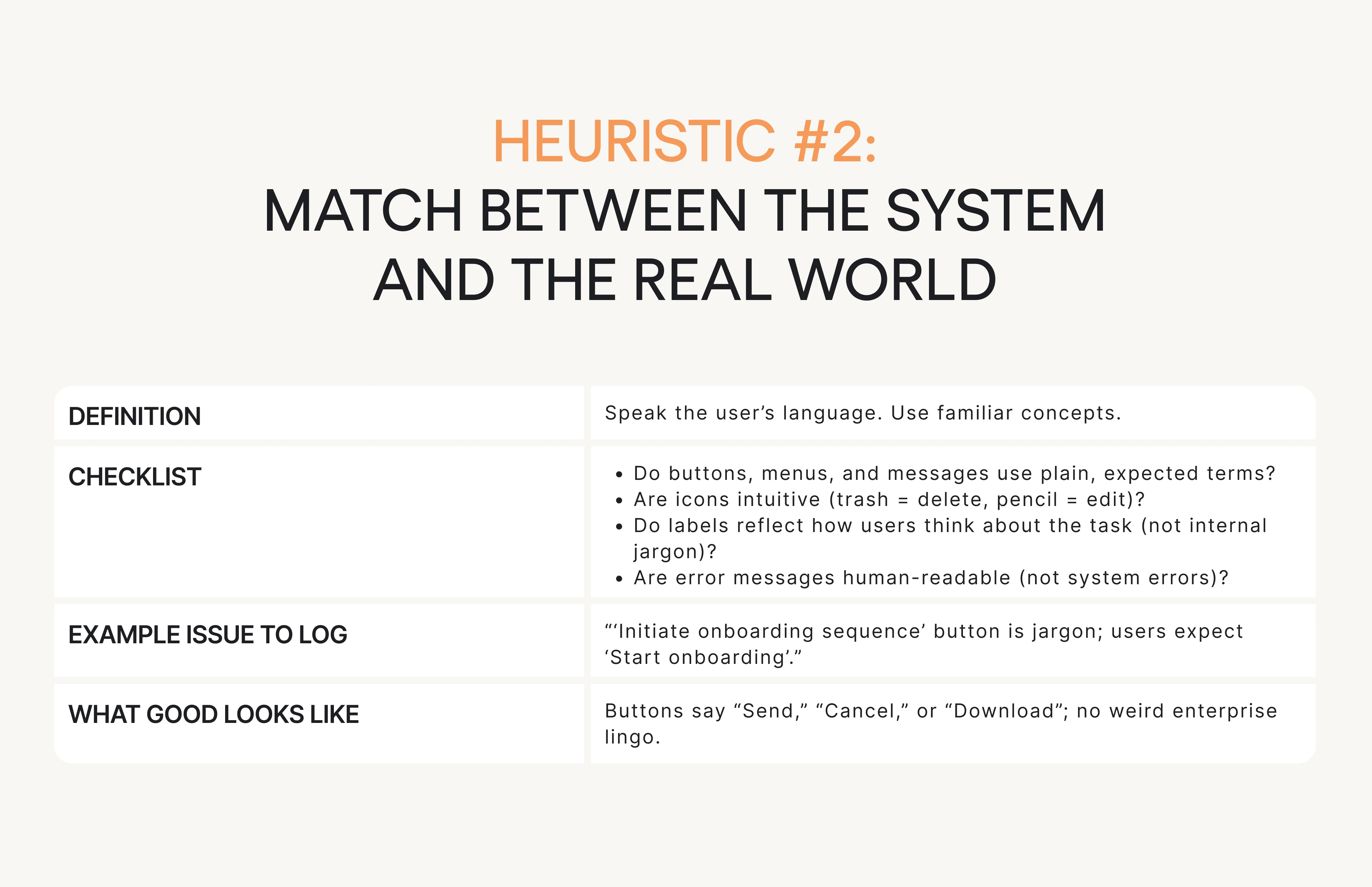
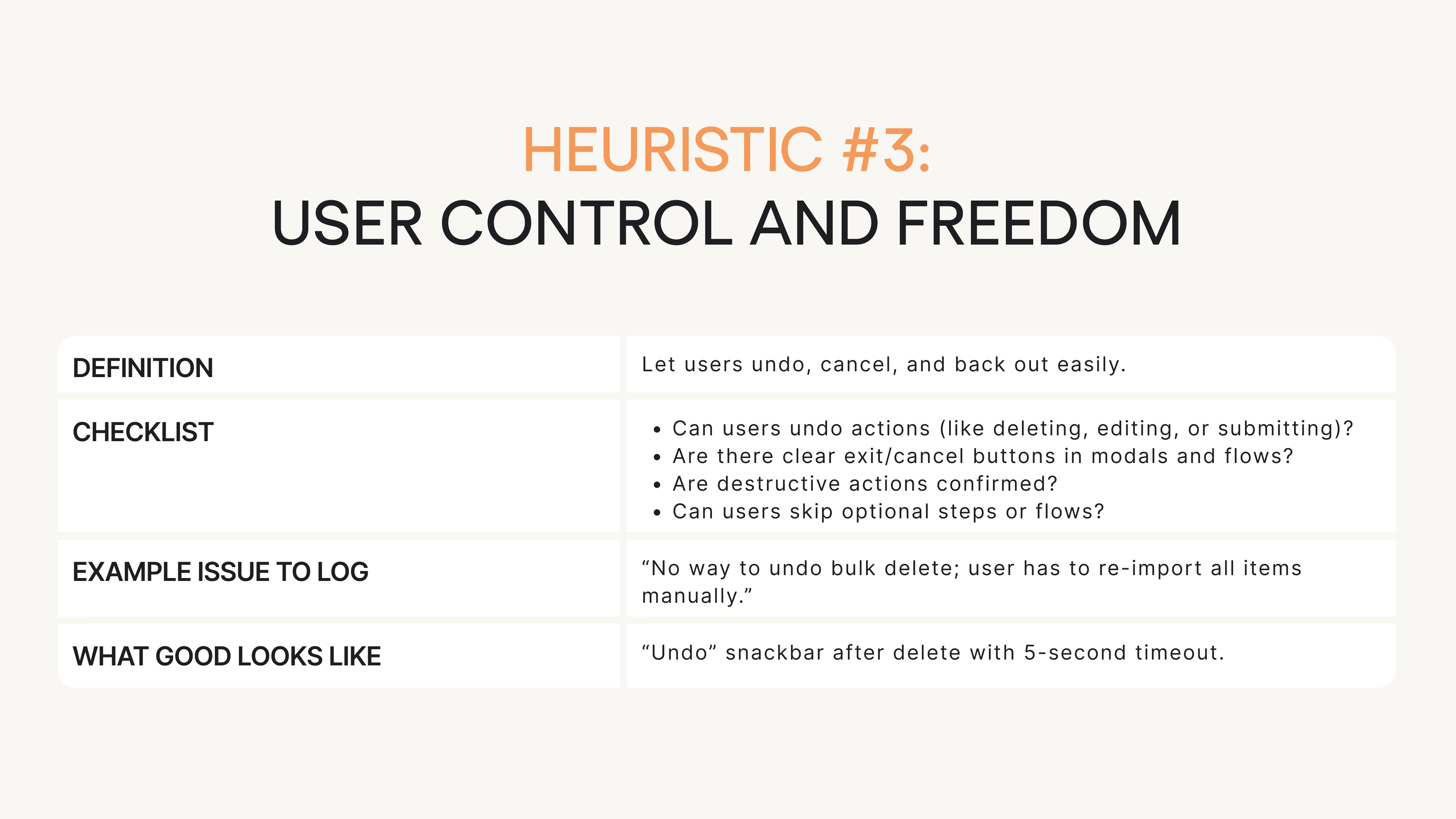
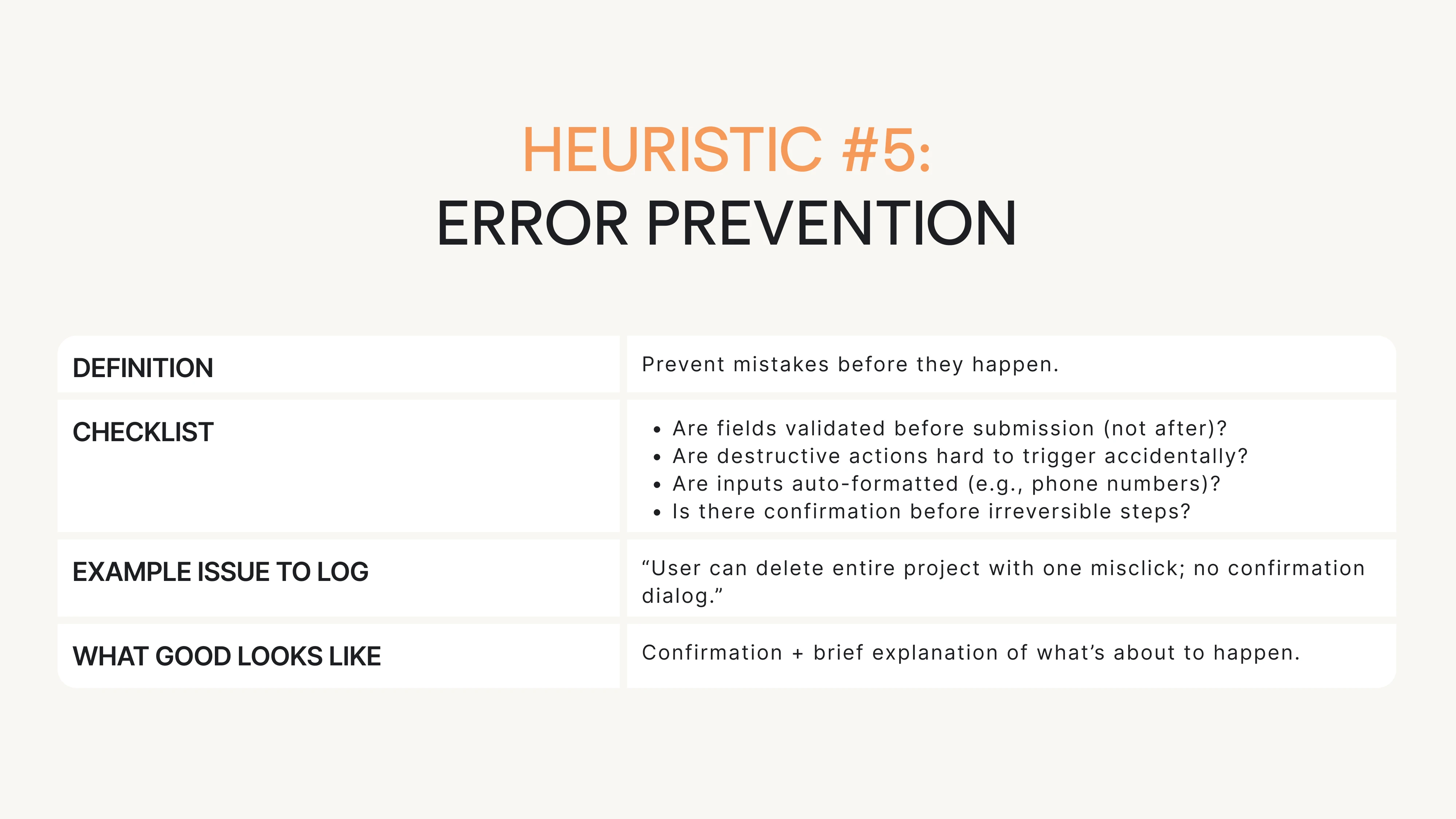
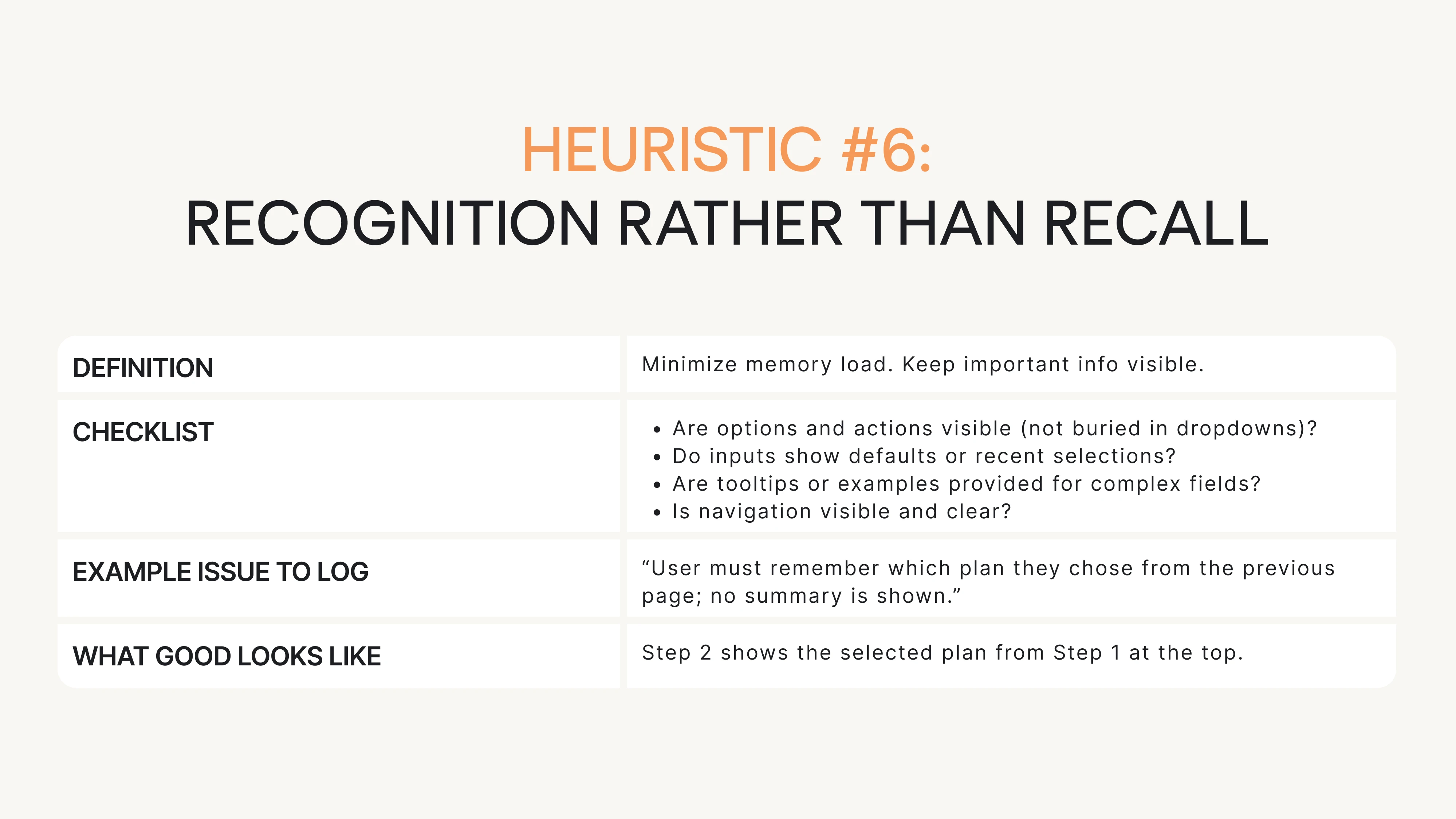
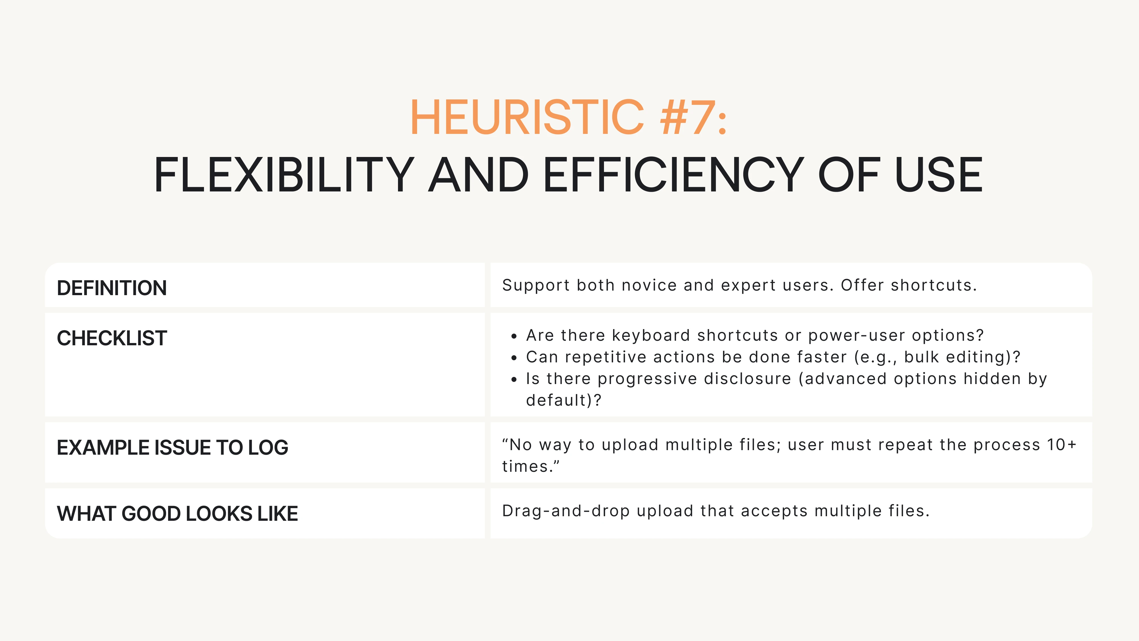
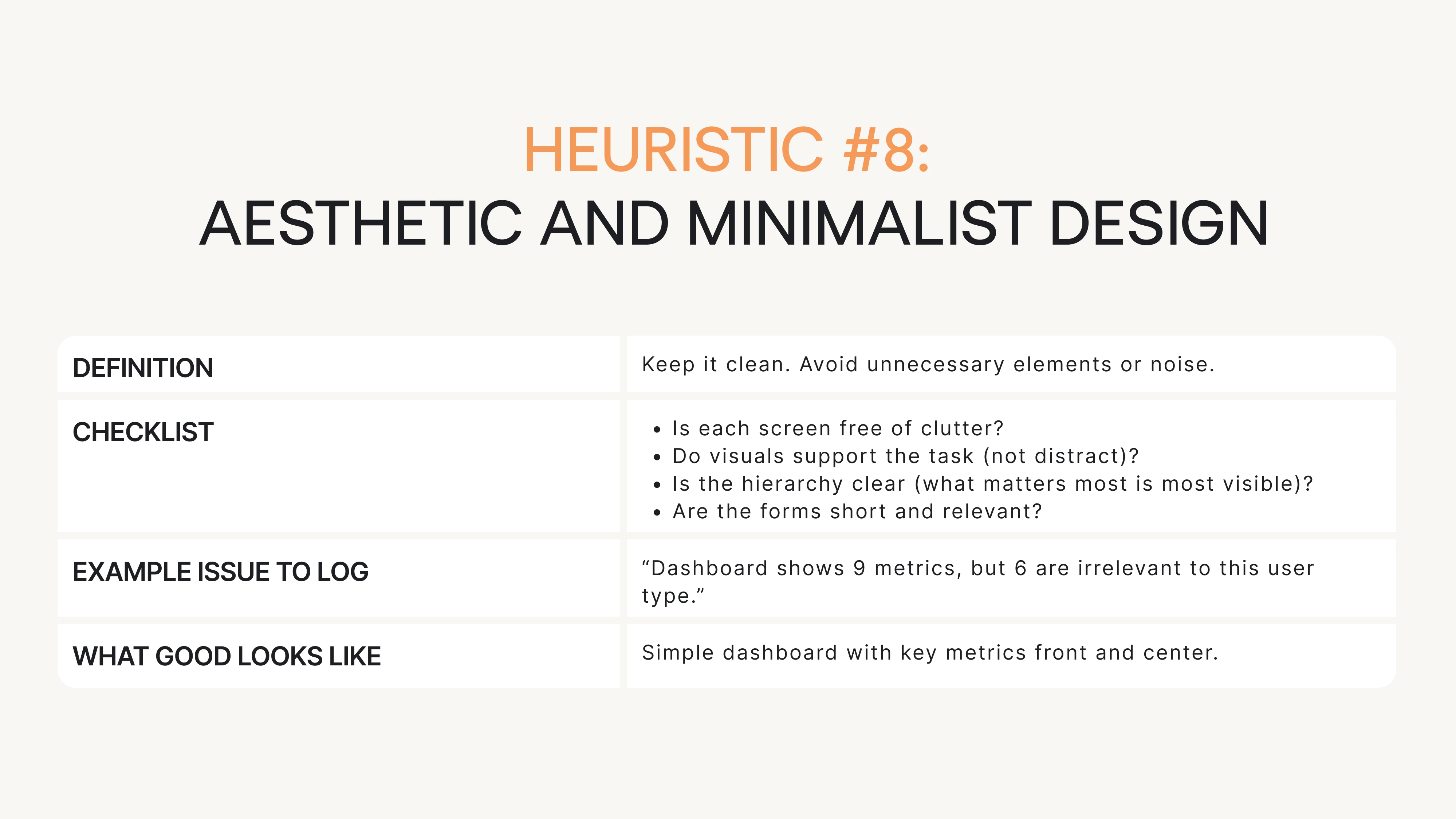
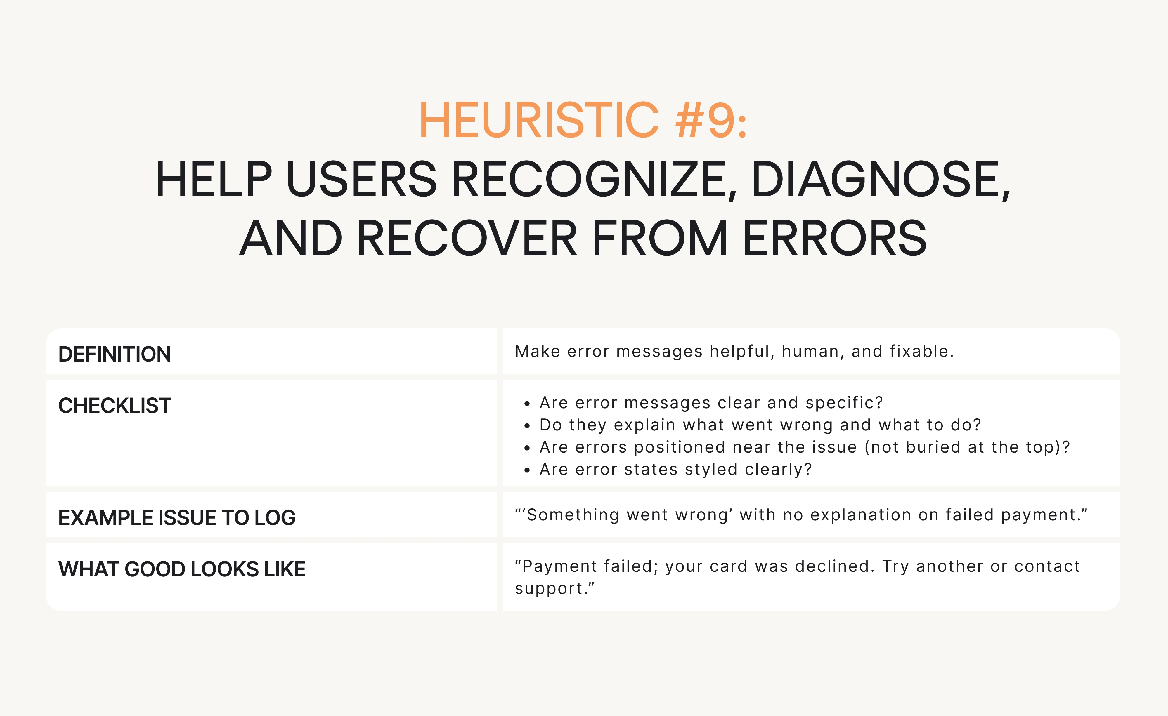
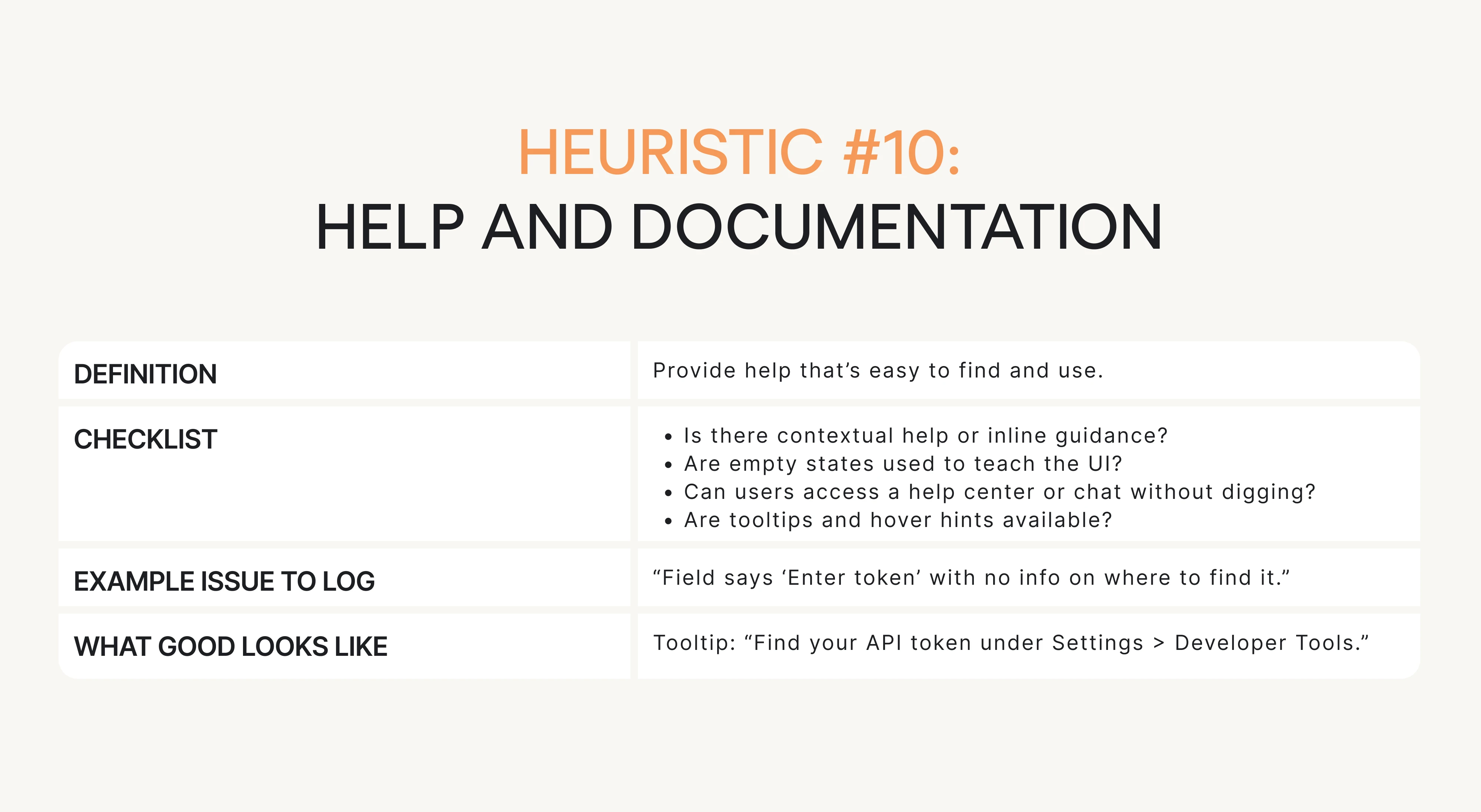
Next, we’ll give you the practical checklist for each heuristic with questions, examples, and what “good” looks like.
The practical checklist: questions for each heuristic
This is your go-to resource when running the evaluation. Each of Nielsen’s 10 heuristics is broken down into:
- What you’re checking for (short definition).
- A checklist of questions to ask.
- Example issue phrasing (how to log it).
- What “good” looks like.
Keep things snappy, scannable, and actionable. Let’s begin.

Conclusion: what to do next
You don’t need a full redesign to improve usability. Often, all it takes is a few high-impact fixes and a structured way to find them.
We’ve already given you the heuristic evaluation definition, the step-by-step process, and the checklist. No need to Google “what is heuristic evaluation”. You’ve got the answer and the UX research tools right here.
So here’s what you can do right now:
- Pick one critical user flow. Something that affects activation, conversion, or retention.
- Run a heuristic evaluation using the checklist and template. Don’t overthink it. Block 2 hours. Just do it.
- Log issues clearly using the “issue card” format. Keep it structured. Add screenshots.
- Pick your top 5 issues. Focus on what’s severe, frequent, and business-critical.
- Fix 1–2 things fast. Small changes (like adding error messages or spinners) can remove a ton of friction.
- Then test it with real users. Lightweight usability testing can validate your fixes and uncover what you missed.
At Eleken, we do this kind of thing every day. Heuristic inspection is the backbone of our UX audit process. We combine it with user interviews, analytics, and product strategy to give SaaS teams a clear path from “meh” UX to “wow, this works.”
If you’re ready to find and fix the friction in your product, we’re here to help.


