
What drives teams to spend months redesigning a product that users have already learned? Rarely just aesthetics.
Most times redesigns are triggered by business pressure – declining product KPIs, tech constraints, competitive market shifts, or a new vision that makes the current product inadequate.
As the product no longer supports growth, a redesign becomes the obvious next move.
Get it right, and you reset the product for its next stage of growth. But if wrong, you risk losing users, wasting effort, and compounding the very issues you set out to fix.
At Eleken, we've guided dozens of SaaS companies through redesigns – from subtle UX refreshes to complete overhauls. In this article, we'll teach you how to navigate an end-to-end product redesign – without making costly mistakes that drain your resources and kill user adoption.
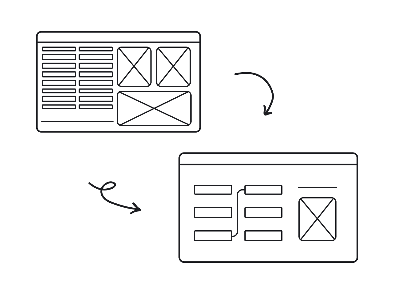
What is product redesign? Explained with examples
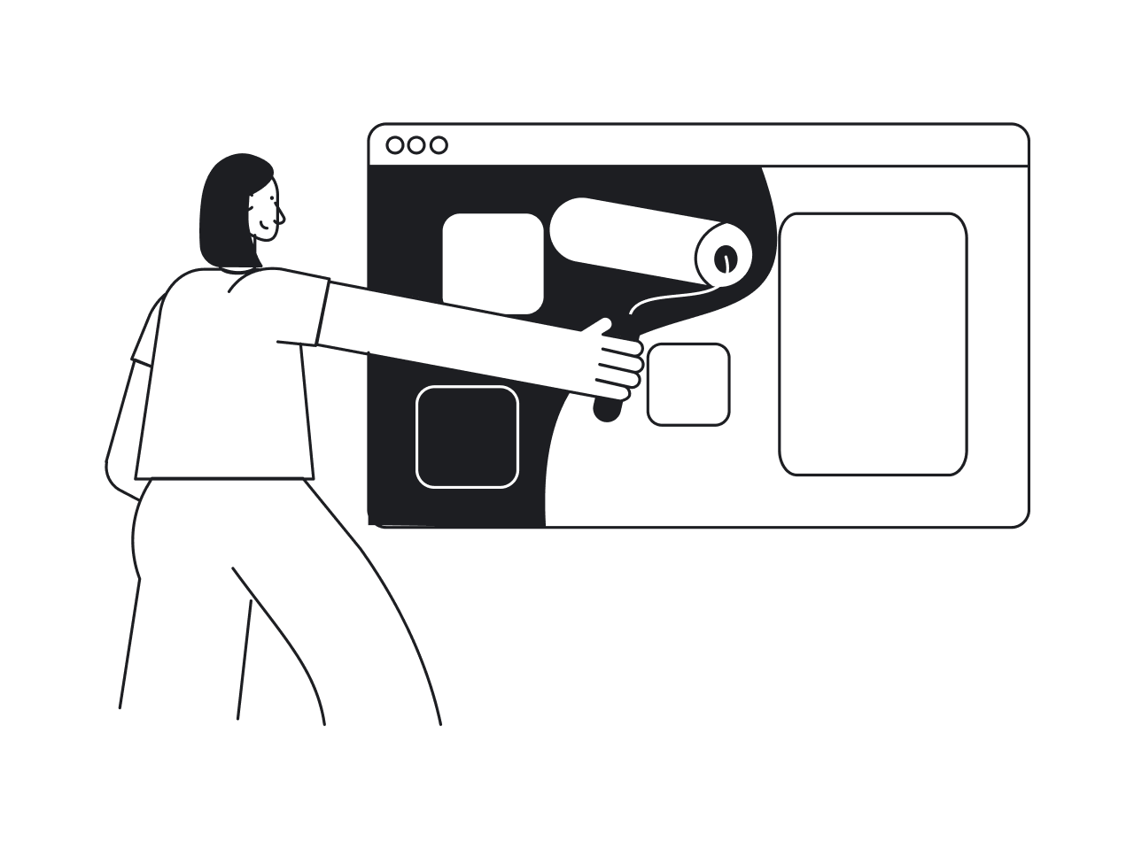
At its core, a redesign means improving an existing product so it better serves users and the business.
Being a broad term, it is used to describe anything from a small UI polish to a complete product overhaul. Hence, to choose the right path, you first need a clear understanding of what type of redesign you’re dealing with.
Understanding UI refresh vs. UX overhaul vs. full rebuild
The breakdown below will help you understand how these redesign types differ in scope and complexity.
UI refresh: surface-level changes
A UI refresh updates visual elements without changing how the product works. You're modernizing typography, refining color palettes, updating button styles, or polishing icons. The underlying structure, user flows, and information architecture stay almost intact.
When it makes sense: Your product functions well, but looks dated. Users aren't confused; they just notice the interface feels old compared to competitors.
UX overhaul: structural changes
A UX overhaul redesigns how users interact with your product. You're rethinking information architecture, simplifying navigation, restructuring workflows, or consolidating features. The visual design might change too, but that's secondary to fixing how things work.
When it makes sense: Users struggle to find features, complete tasks, or understand the product structure. Your analytics show poor performance – high drop-off rates or circuitous paths to key actions.
Full rebuild: starting from scratch
A full rebuild means reimagining the product from the ground up – new codebase, new architecture, new design system. You're not just changing what users see; you're rebuilding what engineers maintain.
When it makes sense: Technical debt is so severe that product upgrades are nearly impossible to ship, or you're pivoting to serve an entirely different market segment.
Rolling out changes: evolutionary vs. revolutionary
Beyond the degree of change, product redesigns also differ in how they approach change.
Evolutionary redesigns ship changes gradually. You update one section, validate it, then move to the next. Users adapt piece by piece, so risk stays contained.
Example: think of how Google Docs quietly improves features without overhauling the UI.
Revolutionary redesigns launch changes all at once. Oftentimes, users wake up to a completely different product. With it comes a higher risk, but sometimes necessary when changes are deeply interconnected.
Example: think of Slack's 2023 major changes to UI and layout of workspaces.
Neither approach is inherently better. The right choice depends on how interconnected your changes are and how much risk you can absorb.
What we see at Eleken
When SaaS and tech companies come to us for a successful product redesign, the request is almost never “make it prettier.” It’s usually rooted in a business problem: the product isn’t communicating its value, users are struggling, or the interface no longer supports growth.
As a design partner that specializes in complex B2B SaaS apps for all verticals, we’re often brought in when the stakes are high and clarity matters.
With over 200 completed projects and 64+ case studies, we’ve seen the same pattern across teams of every size – from early SaaS startups to scaling SMEs.
The issue rarely lies in aesthetics. It usually lies in misalignment: between what the product does, what the interface shows, and what users actually experience.
Below are product redesign examples where the real issue wasn’t aesthetics but misalignment between value and experience:
Aampe
Problem: Their AI personalization engine was extremely advanced, but the user interface didn’t communicate that sophistication. This created friction in sales conversations and investor pitches.
Our solution: We redesigned the product to improve data visualization and navigation clarity, helping the interface match the power of the underlying technology.
Result: Aampe raised $18M.
MyInterview
Problem: 90% of users churned in their first session — not because of visuals, but because core features were buried and information architecture was broken.
Our solution: A deep UX overhaul that reduced friction, clarified workflows, and made the core value of the product immediately discoverable.
Result: MyInterview went on to acquire enterprise clients such as Volvo.
Vector0
Problem: Their cybersecurity tool was technically strong but inaccessible to non-technical stakeholders. The complexity created a barrier to understanding and slowed down buy-in.
Our solution: We redesigned the interface to make complex functionality easy to interpret, helping teams quickly grasp the product’s value.
Result: Vector0 could communicate their value proposition clearly and confidently during stakeholder evaluations.
Across these examples, the pattern is consistent: companies know they need product redesign ideas, but they're not always sure what kind of redesign will actually solve their problem.
The challenge – and our job – is helping them pinpoint the level of change that will actually move the needle.
When you should redesign (and when you shouldn’t)
Let’s face it – every product has issues. So the real question is whether a full redesign is truly the right solution, or if targeted fixes work better.
Clear indicators you need a redesign
If you’re seeing the signals below, it’s a solid marker that your digital product is ready for a redesign.
1. The look & feel is outdated (and it’s hurting perception)
An outdated interface isn't a problem by itself – it's a problem when it affects perception and trust. If prospects choose competitors because your product "looks like it was built in 2015," or new users question your security based on UI age, aesthetics have become a business problem.
2. Declining activation, retention, or conversion rates
When core metrics slide, it often means users are getting stuck, confused, or overwhelmed.
Signals:
- People drop off during onboarding
- Returning users decline
- Feature adoption is low
- Funnels show friction or excessive steps
A redesign here isn’t cosmetic – it’s about rethinking flows so users can reach value faster.
3. Mounting UX debt
UX debt builds up when quick fixes and outdated design decisions pile up, making interactions confusing, inconsistent, or slow. It often appears as a UX issue, but the root is usually technical debt.
Eventually, minor tweaks don't work, and you can't significantly enhance usability and experience without rebuilding the foundation, which requires tackling the product redesign process and technical refactoring simultaneously.
4. Changing customer segments or entering new markets
Moving from SMB to mid-market, expanding into enterprise, or entering new industries – business expansion usually requires features, flows, and levels of clarity your current design wasn’t designed for. Without rethinking the experience, you end up forcing potential users into journeys designed for a different audience – and losing opportunities as a result.
5. New product vision, pricing model, or brand
Sometimes, redesign is driven by business strategy rather than UX problems:
- you're pivoting product direction, and workflows need to support the new vision;
- you're rebranding, and the product needs to match;
- you're moving from freemium to enterprise pricing and need to project increased sophistication.
These strategic shifts often require redesigning how the product works, not just how it looks.
When a full redesign is the wrong move
A full overhaul is a massive investment – and in many cases, it’s unnecessary. Below are the cases where a redesign does more harm than good.
1. When incremental improvements would solve the problem
Sometimes a targeted fix, a simplified step, or a clearer CTA solves the issue more effectively – and far more efficiently – than a complete overhaul.
Ask yourself:
- Is this a localized issue, not a system-wide one?
- Would a small improvement deliver the same outcome?
- Are we redesigning because it feels easier than investigating the root cause?
2. When the push comes from internal fatigue, not user data
If the main complaint about your interface comes from your internal stakeholders who've been staring at it for years, that's not a redesign trigger.
Don't redesign to be trendy – redesign to solve problems. What designers consider appealing doesn’t always translate into better task performance for users.
In fact, users don't hate change – they hate meaningless change. For example, Slack communicates redesigns by highlighting user benefits first: “Find messages faster,” “Reduce distractions,” “Collaborate more smoothly.” Only after showing the value do they explain what’s changed.
So if you redesign without solving real user problems, you're asking users to relearn your product for your benefit, not theirs. That's when frustration happens.
Before you touch Figma: deep understanding phase (the most overlooked step)
Redesigning without fully understanding the product is not design – it’s guesswork. And expensive guesses are how teams waste months on a “redesign” nobody needed.
Before jumping into wireframes, teams need to form a shared understanding of how the product works today, why it’s broken, and how real people are using it.
Here’s how to do that.
Step 1: Document what currently exists
Before you redesign a product, you need to fully map its existing state – not just in terms of UI, but how it flows, breaks, and behaves.
Some of the key tools to use at this stage include:
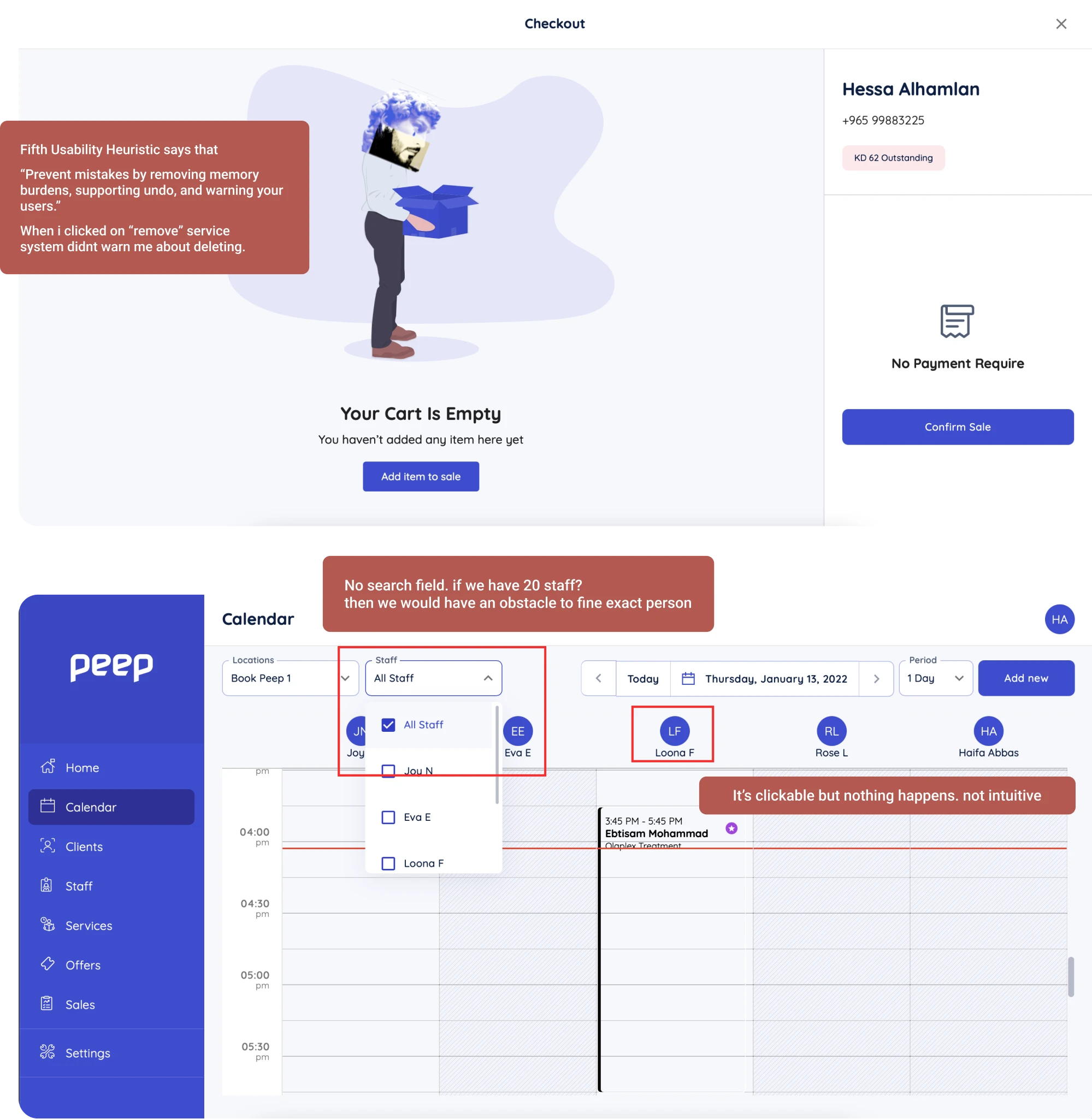
- Screenshot maps: Capture every screen and UI state of the product to get a complete picture. Group them by user flows, not by sections, to see how screens connect.
- Current-state journey maps: Map out what the user experiences today, pain points, and all. This helps you avoid assumptions about how the system “should” work.
- Flow diagrams: Visualize task flows from the user's perspective. Especially useful for exposing inefficient navigation or unnecessary steps.
- Error state mapping: Identify where the system breaks – login failures, empty states, API errors. These are often neglected, but they shape user trust.
If the product has grown organically for years, you’ll likely uncover “black boxes” – features no one fully understands or wants to touch. That’s a sign of legacy complexity that must be unpacked before any meaningful redesign.
Step 2: Understand the underlying logic with OOUX
To untangle complexity, apply Object-Oriented UX (OOUX) – a powerful (and underused) method for understanding what your product is, not just what it looks like. It's especially valuable for redesigning data-heavy or technical products where the underlying structure isn't obvious.
Focus on these four things:
- Objects: What are the core things your users interact with? (e.g., tasks, projects, reports)
- Relationships: How do those objects connect?
- Permissions: Who can do what with each object?
- Statuses and logic: What are the different states and business rules that govern them?
OOUX helps teams align on what the product is made of, and exposes mismatches between the system model and the user’s mental model.
Step 3: Interview internal teams
Designers often overlook a goldmine of redesign insights: the people inside the company. Different teams see different aspects of the product. Each conversation reveals problems and constraints you wouldn't discover on your own.
Talk to:
- Support: They know which parts users struggle with every day.
- Sales: They know which features confuse prospects or block deals.
- Customer success: They know what’s hurting activation and retention.
- Developers: They’ll reveal technical constraints or messy workarounds users never see.
Step 4: Watch real users work
While user interviews are valuable, watching how users interact reveals way more insights. Because you don’t really know a product until you watch someone struggle with it.
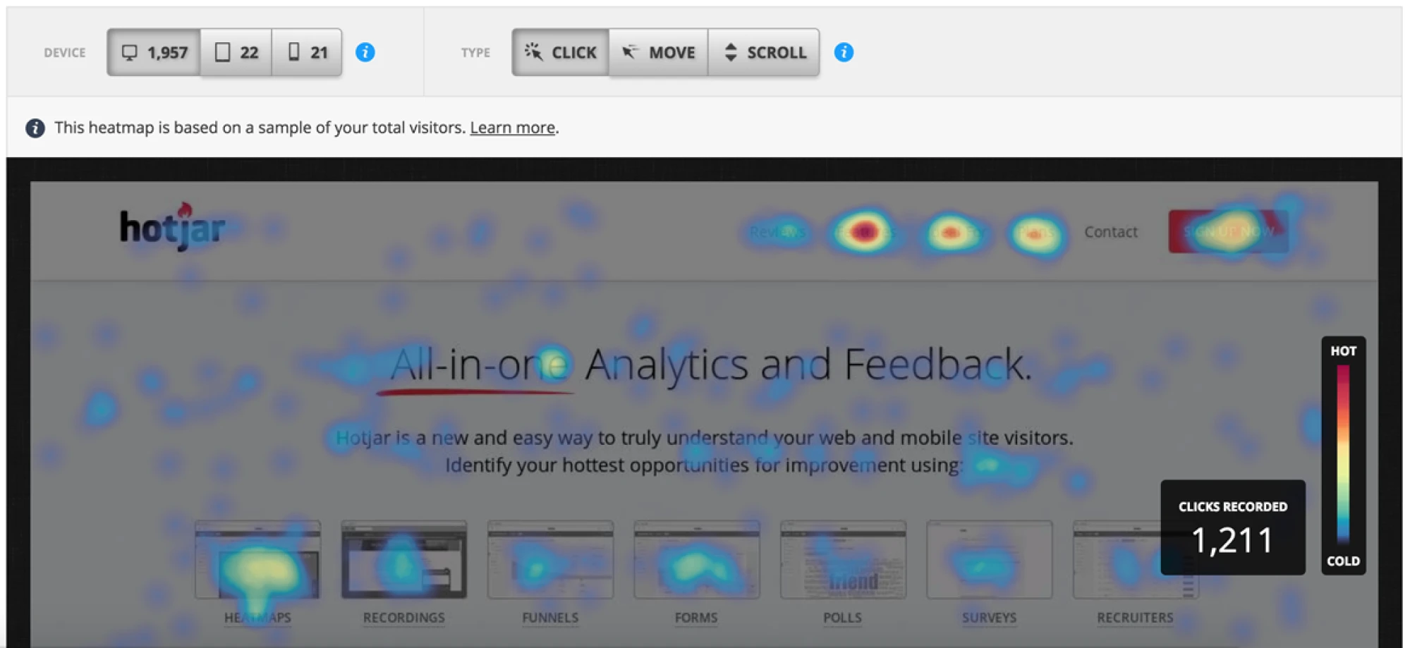
Use session recordings: Popular tools like FullStory or Hotjar show how real users navigate. Watch for moments of hesitation, repeated clicks, and backtracking – these signal confusion.
Shadow users 1:1: Sit with them while they do their actual job (not a demo). You'll see real workflows, memorized shortcuts, avoided features, and workarounds they've stopped noticing.
Study the workarounds: Pay special attention to creative workarounds, as they reveal unmet user needs. When they use ‘feature A’ in a weird way because ‘feature B’ doesn't exist – that's your insight.
All in all, this phase isn't glamorous. There's no pretty output to show stakeholders. It's documentation, interviews, observation, and analysis. It feels slow when everyone wants to see designs.
But it's the foundation that determines whether your redesign succeeds or fails.
The product redesign framework (step-by-step)
As you’ve done the deep understanding work, you need a structured plan to drive the process. This step-by-step guide walks you through the redesign from strategy to launch, with each step building on the previous one.
Step 1 – Define the problem & business goals
Start with clarity, not abstract intentions. Tie specific user problems to the clear business metrics they affect.
E.g.: newcomers find initial setup confusing → 70% onboarding drop-off
Next, structure the goals with OKRs or the SMART framework so they're measurable and time-bound. Here's what each framework looks like:
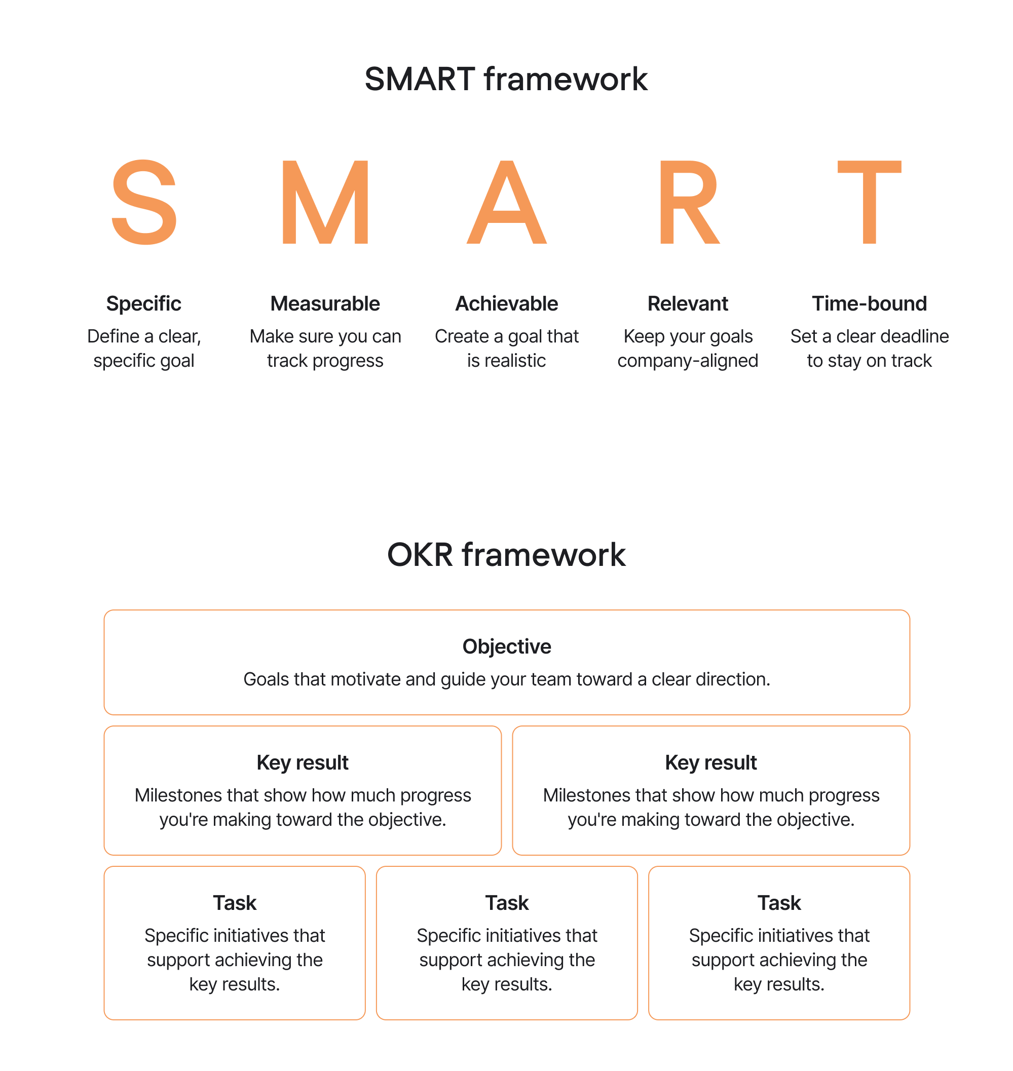
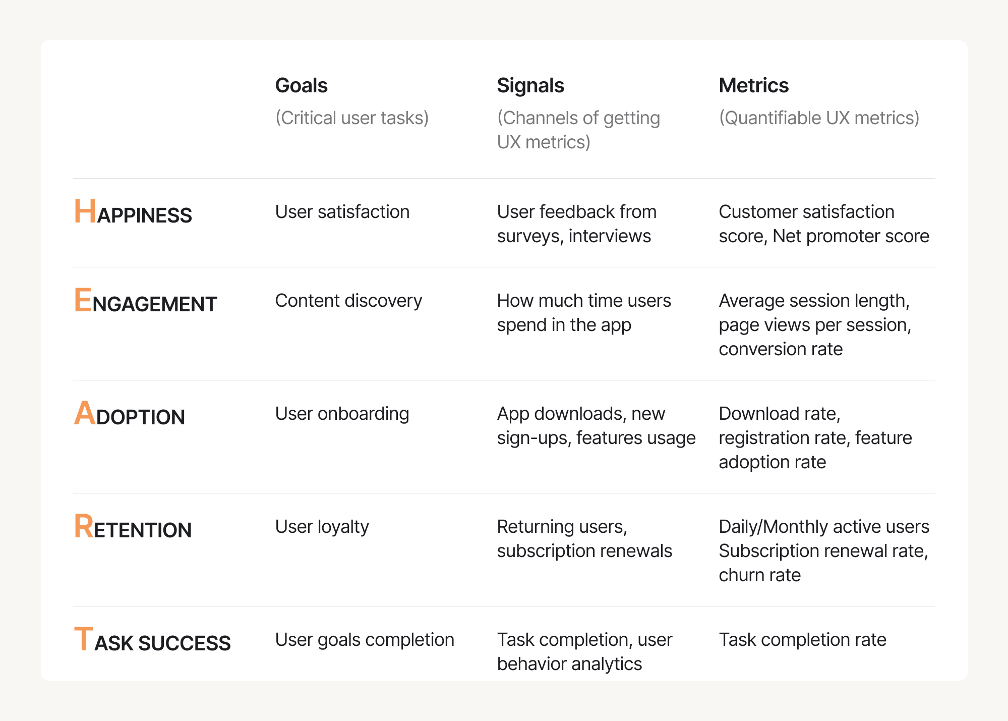
Gain a complete picture of UX with Google’s HEART framework, helping you think beyond basic metrics:
- Happiness: User satisfaction scores, NPS
- Engagement: Feature usage, session frequency
- Adoption: New user activation, feature adoption rates
- Retention: Return rate, churn reduction
- Task Success: Completion rate, time-on-task, error rate
Clear goals give you a ‘North Star’. Every design decision can be evaluated: "Does this move us toward our goals?"
Step 2 – Research: user, product, and market
With deep product understanding in place, now it’s time to gather insights on specific areas that will inform design decisions – uncovering what’s broken, what’s working, and what users truly need — from both qualitative and quantitative angles.
Here’s how to approach it:
Conduct a UX Audit
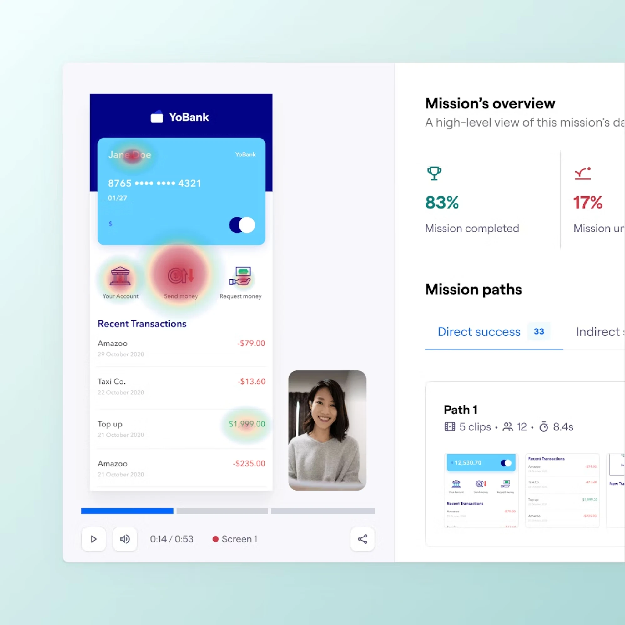
Start with a structured evaluation of how users actually interact with your product. It’s essentially a diagnostic check that reveals which parts of the experience are working – and which are silently pushing users away.
For example, at Eleken, we start by mapping key user flows together with your product team, then review the core screens using heuristic analysis (clarity, consistency, usability, accessibility) to quickly pinpoint friction. When possible, we support this with user interviews and insights from Support and Sales to reveal the real reasons behind drop-offs, confusion, or low adoption.
Next, we tie each issue to a specific step in the user journey, propose targeted fixes, and run an Impact/Effort prioritization workshop with your team. In the end, clients receive a clear UX audit report and a practical redesign roadmap – making the next steps obvious, structured, and fully actionable.
Run user interviews
Analytics show what's happening, but user interviews explain why. Talk to users at every stage of product adoption to understand how experiences evolve.
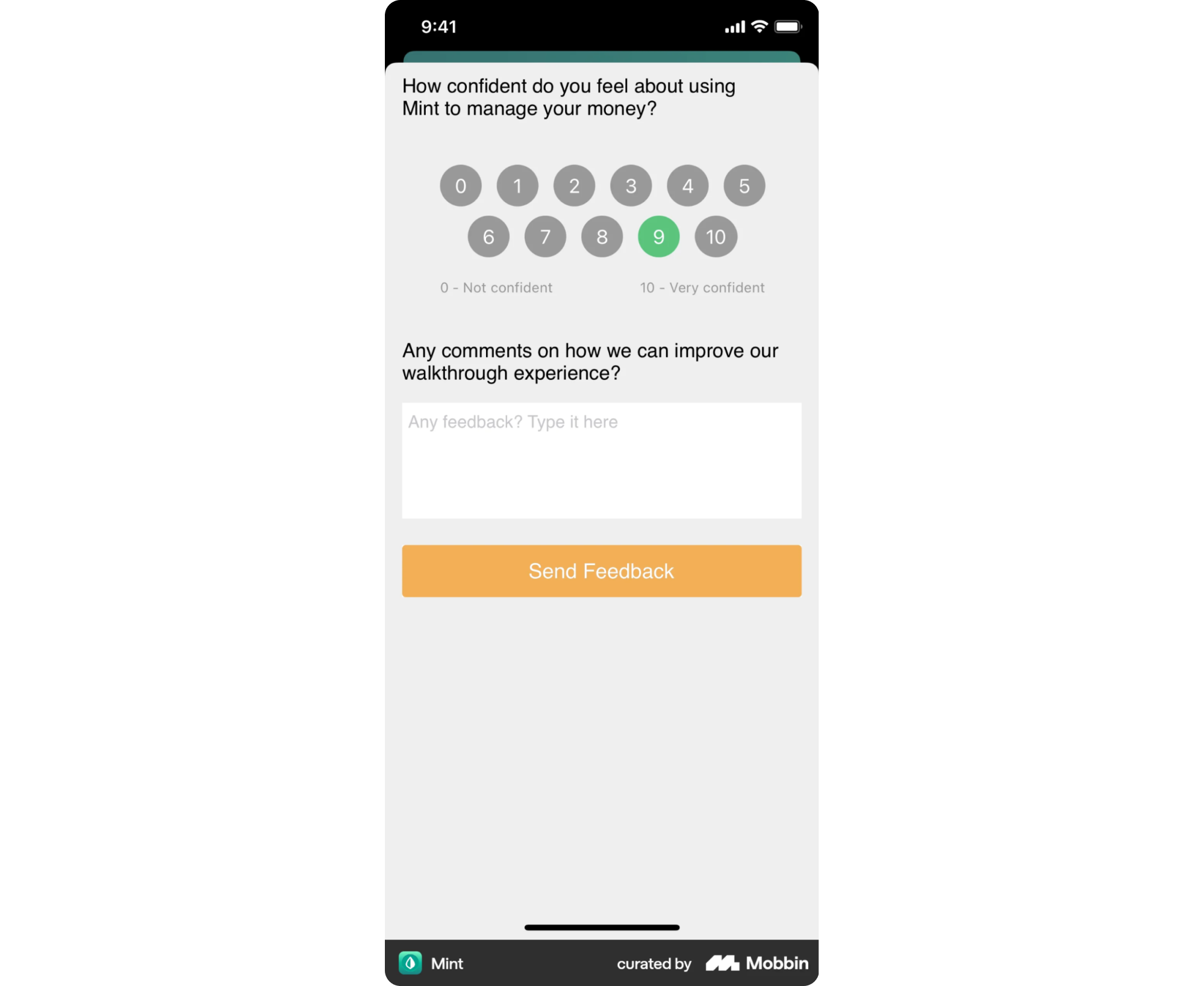
One of the fastest and most affordable ways to reach users at scale is through in-app surveys. For example, NPS surveys can help measure customer satisfaction – and with a simple follow-up question, they also reveal the why behind user frustration.
Create journey maps & friction heatmaps
Map the complete user journey for each critical workflow, documenting every step users take from start to finish. For each step, identify:
- What users are trying to accomplish
- What pain points do they encounter
- How severe each pain point is
- How frequently does it occur
This creates a "friction heatmap" – a visual representation of where users struggle most, showing you precisely where redesign ROI is highest.
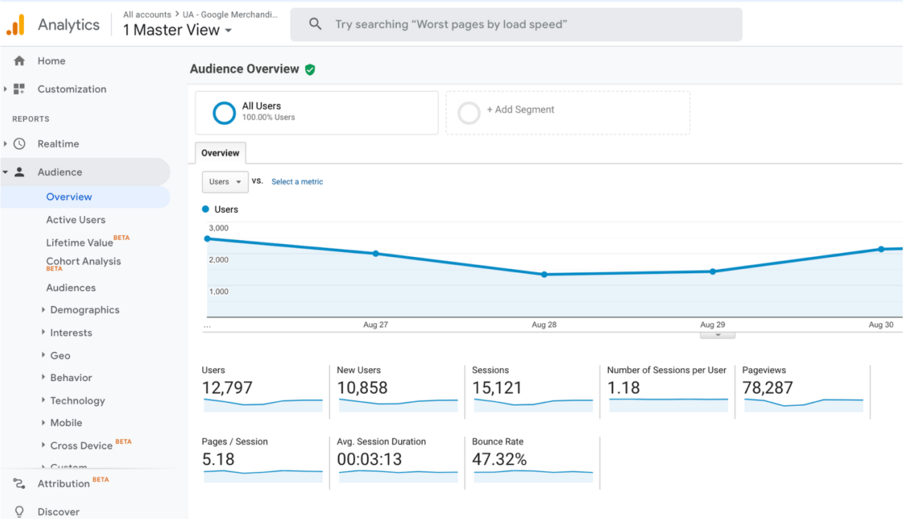
Dig into product analytics
Study your analytics to reveal patterns that qualitative user research can't show at scale. Here’s what to focus on:
- Funnel analysis: Where do users drop off in key workflows?
- Path analysis: What routes do users take? Are they circuitous or direct?
- Feature usage: What gets used heavily vs. ignored?
- Cohort analysis: How do different user segments behave differently?
Conduct competitive analysis
Review how competitors solve similar problems, especially in key flows like onboarding, navigation, or dashboards. Look for common patterns, modern UI conventions, and UX decisions that reflect evolving customer expectations.
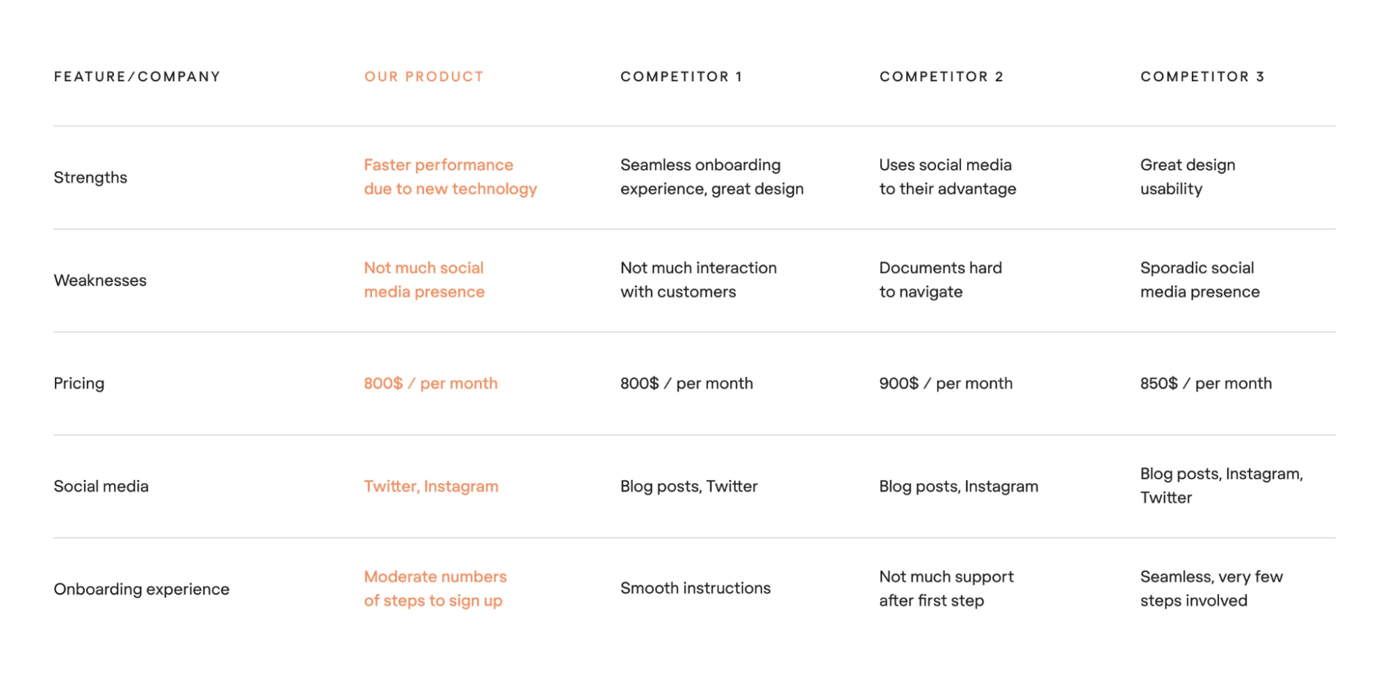
The goal isn’t to copy, but to spot missed opportunities and understand the baseline users are comparing you to.
Step 3 – Prioritization: what redesign first
You can't redesign everything at once. Therefore, choose what matters most.
Prioritize most frequent workflows: If 80% of users follow the same product path daily, start there. Niche features can surely wait.
Start bottom-up (leaf nodes → navigation): Don't redesign navigation first. Redesign the actual screens and features users interact with, then design optimal navigation to support them.
Don't chase 100% feature parity: One of the biggest mistakes in redesign is trying to replicate every feature from the old version. Use the data to determine what’s worth keeping and what can go.
For example, Google Docs launched with only essential features and avoided the trap of matching Word’s entire feature set. By focusing on flawless real-time collaboration and adding new features gradually based on real usage, they sidestepped the feature-parity mindset that often leads teams off-track.
Leverage feature value vs. cost matrix: Build a value–cost matrix to ease feature prioritization and reduce unnecessary complexity.
For every feature, assess:
- User value: How important is this to users? (High//Low)
- Usage frequency: How often is it used? (Daily/Weekly/Rarely)
- Development cost: How expensive is it to redesign/rebuild? (High/Medium/Low)
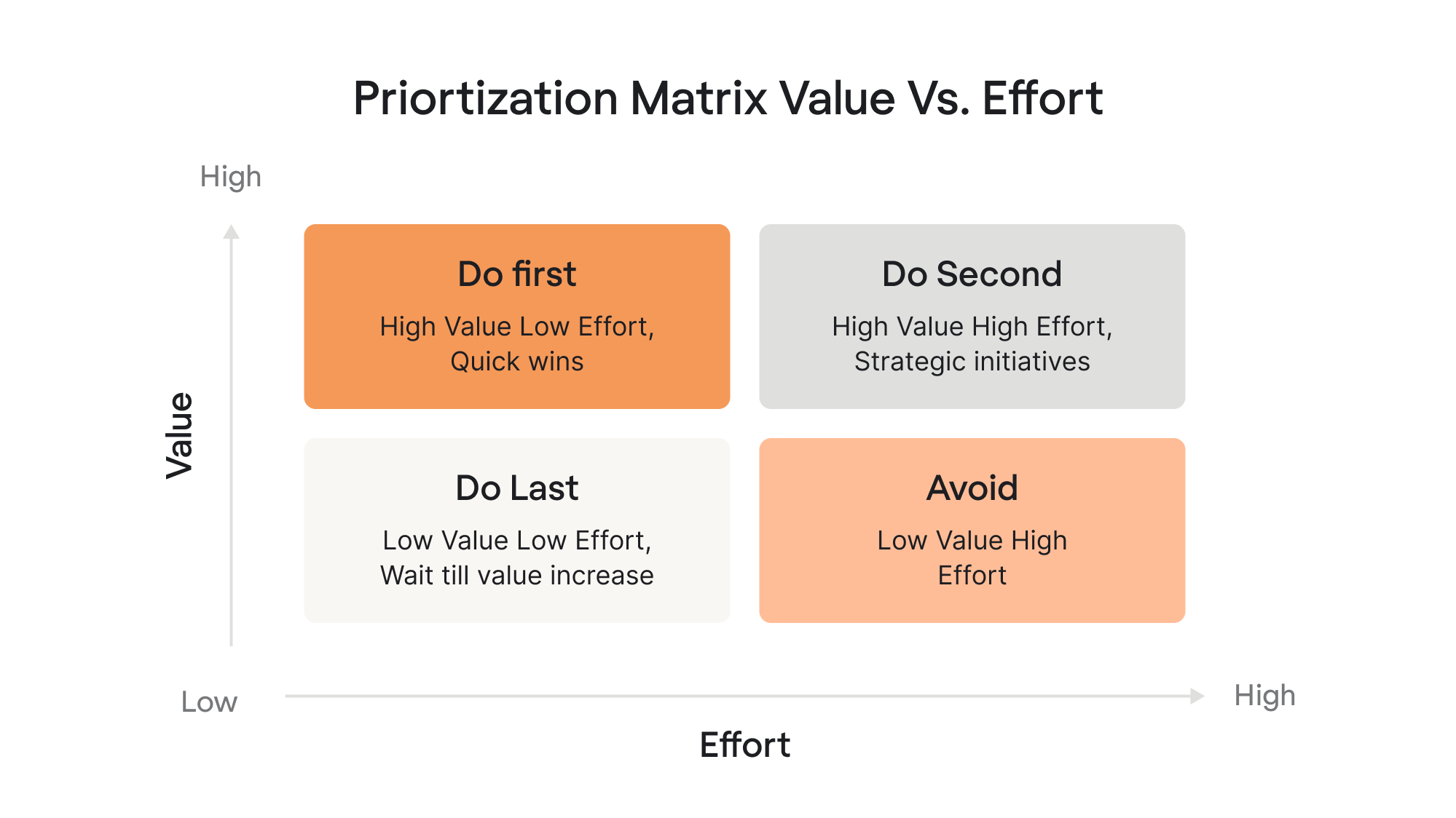
Focus redesign effort on high-value, frequently-used features. Consider killing low-value, rarely-used features.
Here’s a free Figma template you can already use to plot your features and guide your decisions.
Step 4 – Redesign concepts & prototyping
At this stage, you’re turning insights into tangible directions. The goal isn’t to polish — it’s to explore, test, and eliminate bad ideas quickly.
Start with early storyboards
Before committing to layouts, create simple storyboards that show how users move through tasks. These rough visual narratives help you confirm whether the redesigned flow makes sense.
Move from low-fi to high-fi flows
Begin with quick sketches and wireframes to explore many directions with minimal investment. Once the team is aligned on structure and logic, evolve them into higher-fidelity flows.

Validate ideas early and often
Don’t wait until things look appealing. Test rough concepts with users to confirm whether the direction solves real problems. Early validation saves you months of rework.
Don't Build a Design System First
It’s a pretty common mistake: teams try to organize everything upfront, but at this stage, you’re only guessing. Prototype freely first, then turn the patterns that stick into a system.
Step 5 – Test the redesign (before you build anything)
Never hand designs to engineering without proper testing first. Testing catches problems while they're still cheap to fix.
Ideally, you validate your redesign with real users, but that isn’t always possible due to limited time, budget, or data sensitivity. In those cases, you can still make confident decisions by combining user-based testing with UX research methods that don’t require direct user participation.
When you can involve users:
- Moderated testing: conduct sessions where you observe users completing realistic tasks, watching where they struggle, and prompting them to think aloud as they go.
- Unmoderated testing: use tools like UserTesting or Maze to collect customer feedback at scale while users complete tasks independently. With quantitative data at hand – success rates, completion times, click patterns – you can quickly access what works and what doesn’t.
- Fake-door testing: before building new features, add UI elements for them and measure clicks to validate interest before investing development resources.
- Beta Programs: release the revised product experience to a small, motivated group of users. Collect user feedback, bugs, and behavioral patterns before rolling out widely.
- Small cohort testing: roll out the redesign to a small percentage of users. If something breaks, only a small fraction of your audience feels it – and you can roll back instantly.
When you can’t involve users:
If direct research isn't feasible, these methods still uncover real insights and help validate your redesign:
- Study available feedback: analyze App Store reviews, G2, social media comments, and competitor reviews to spot recurring pain points and user expectations.
- Analyze industry trends: use reports from Statista, Gartner, or Google Trends to understand broader behavioral patterns and support design decisions with market data.
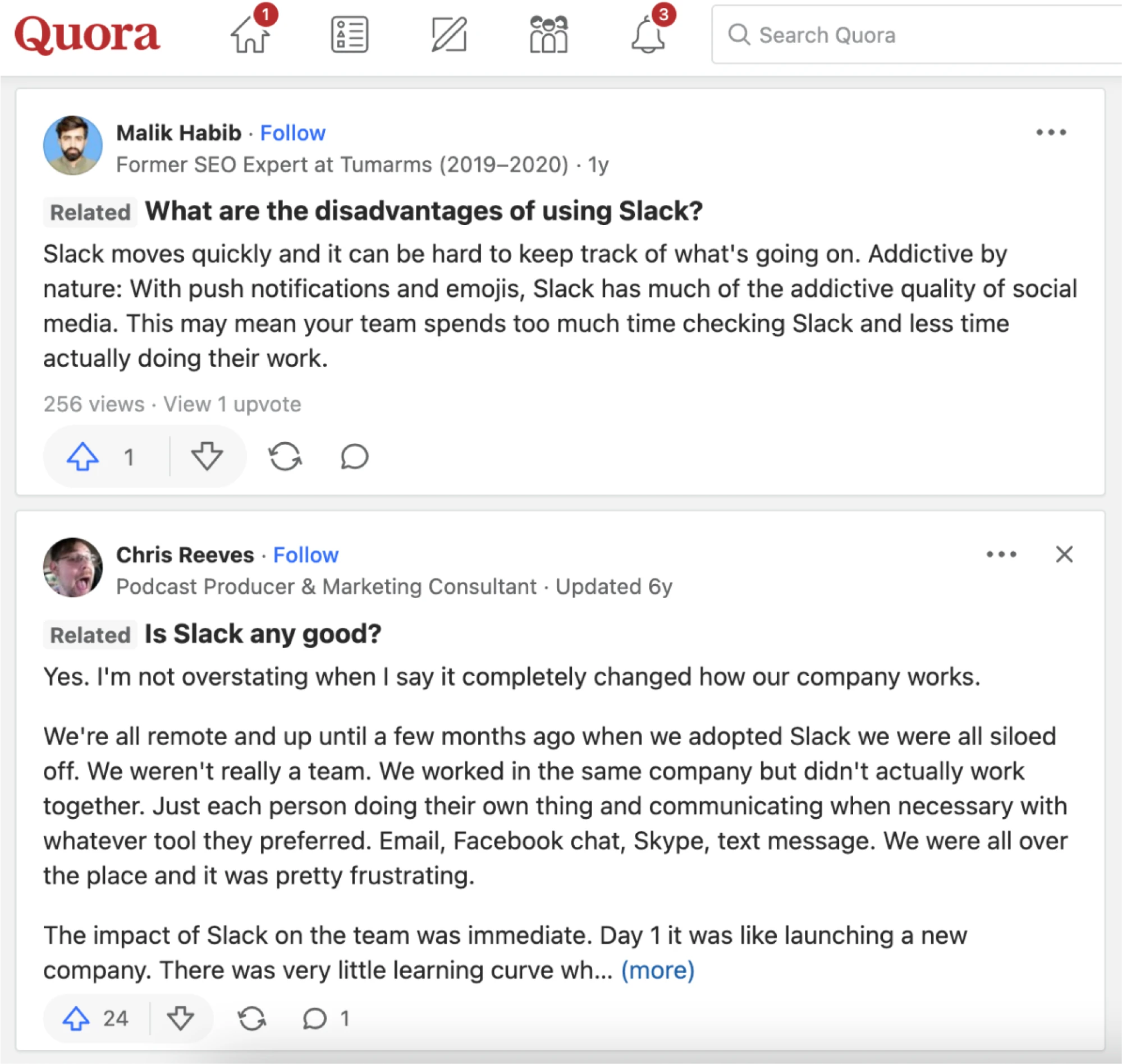
- Explore forums and communities: Reddit, Quora, and niche communities reveal unfiltered sentiment, negative customer feedback, and category-level expectations.
- Use analytical tools: Google Analytics and session replay tools like Mixpanel highlight drop-offs, friction points, and user behavior patterns without needing to run live testing.
- Read niche books and publications: case studies, industry articles, and books on UX provide proven principles and mental models when direct research isn’t available.
- Ask your support department: these teams hear user pain points daily. Their insights often surface recurring usability issues faster than external studies.
Step 6 – Collaborate with engineering and QA
Always remember that redesign is a cross-functional effort. How you work with engineering and QAs determines whether your designs ship as intended.
Stay aligned with developers
Be actively involved during development – answer questions about edge cases, clarify interaction details, review builds in progress, and make trade-offs when technical constraints emerge.
Prevent regressions and unintended issues
Redesigned components often appear in places you didn't anticipate. Test the entire product, not just redesigned sections – verify edge cases, error states, and less common workflows to avoid unexpected disruptions.
Leverage feature flags & toggles
Feature flags give you a safer path to launch by limiting who sees the redesign at first. Release it to specific user groups, monitor how it performs, and adjust quickly — you can even roll back instantly if something behaves unexpectedly.
Step 7 – Launch & rollout strategy
A redesign shouldn’t reach your full user base at once.
- Start with a soft launch: release the new experience to a very small audience to confirm stability and resolve issues in the early stages.
- Move into a phased rollout: gradually expand the experience to larger segments while monitoring performance at each stage.
- Introduce an opt-in beta path: let motivated users try out the new experience and provide targeted feedback without disrupting everyone else.
- Consider running the old and new versions in parallel: help ease user adoption and gain insight into how each version performs.
Step 8 – Onboarding for the redesign (one of the most important parts)
Even if your redesign is objectively better, users still need help adapting. Onboarding is what makes that happen.
Start with contextual tooltips to draw users' attention to what's new exactly where they encounter it. For more significant changes, guided walkthroughs help users understand new flows without feeling overwhelmed.
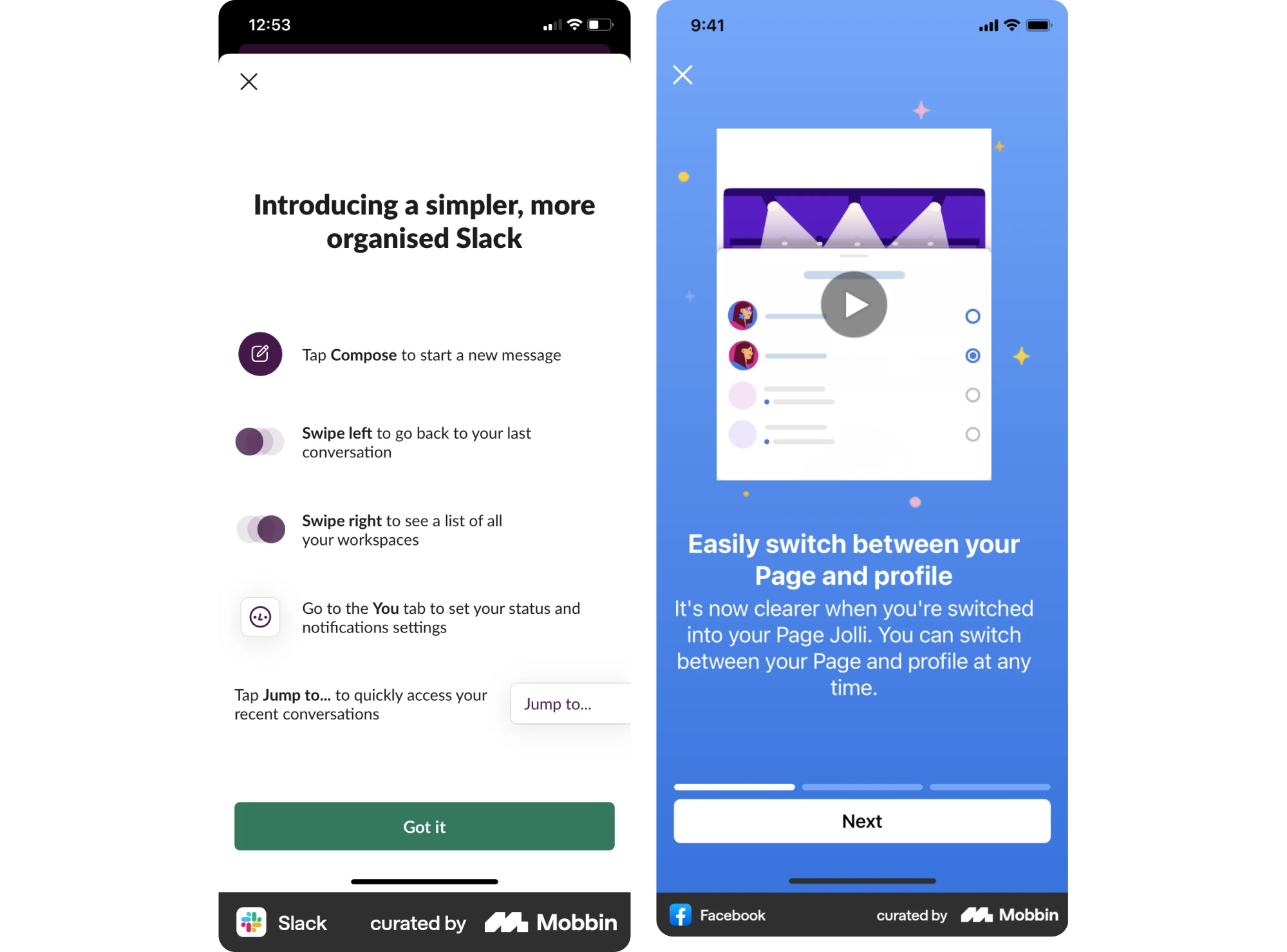
If your audience has distinct roles or needs, persona-based onboarding ensures each user type sees what’s most relevant to them, not a generic tour.
Oftentimes, redesigns spark questions like “Where did that feature go?” Introducing small “feature finders,” comparison hints, or quick pointers can prevent anxiety and reduce support tickets.
Step 9 – Measure the success of your redesign
Validate redesign success by tracking metrics against the goals you set in Step 1. Use both quantitative data and qualitative feedback for a complete picture.
Start with adoption: how many users have moved to the redesigned experience, and how quickly? Then look at user engagement to see whether core actions are being completed more efficiently or more frequently. Pair this with behavior change indicators – are users taking the paths you intended? Are new workflows reducing friction?
Next, monitor retention to understand whether the redesign supports long-term usage or introduces new drop-off points. And don’t overlook support tickets and sentiment. Increases in confusion, complaints, or “how do I…?” messages are early warnings that something isn’t landing as expected.
Step 10 – Continuous iteration after launch
Once the redesign is in the real world, your job shifts from building to improving. Treat launch as version 1.0 and commit to evolving based on what you learn from actual usage.
Use A/B testing to experiment with variations of key flows and validate which versions actually perform better. Combine this with real-time feedback loops to surface friction immediately and guide quick iteration.
Your Final Check Before Launch
Grab Eleken’s free pre-launch checklist to catch blind spots and avoid costly launch-day surprises
Get the free eBook
Plan B: Bring in Eleken to support your SaaS redesign
If the process above feels like a lot – that’s because it is. Most redesigns don’t fail in Figma; they fail in scope decisions, unclear priorities, weak validation, and messy handoff while the product still has to ship.
Eleken can step in where teams usually need the most support:
- Redesign strategy & scope (UI refresh, UX overhaul, full rebuild)
- UX audit + research synthesis to pinpoint where users get stuck and what to fix first
- Design systems & dev handoff to keep implementation consistent and avoid regressions during rollout
We’ve delivered 200+ SaaS projects and maintain a 4.9 Clutch rating, but the real value is practical: a redesign plan your team can execute, designs grounded in evidence, and a partner who’s done this transition many times – including onboarding and change-management details that reduce user backlash.
Change management: why users resist redesigns (and how to avoid backlash)
Redesigns disrupt familiar workflows, stripping away mastery and making users temporarily slower and less confident.
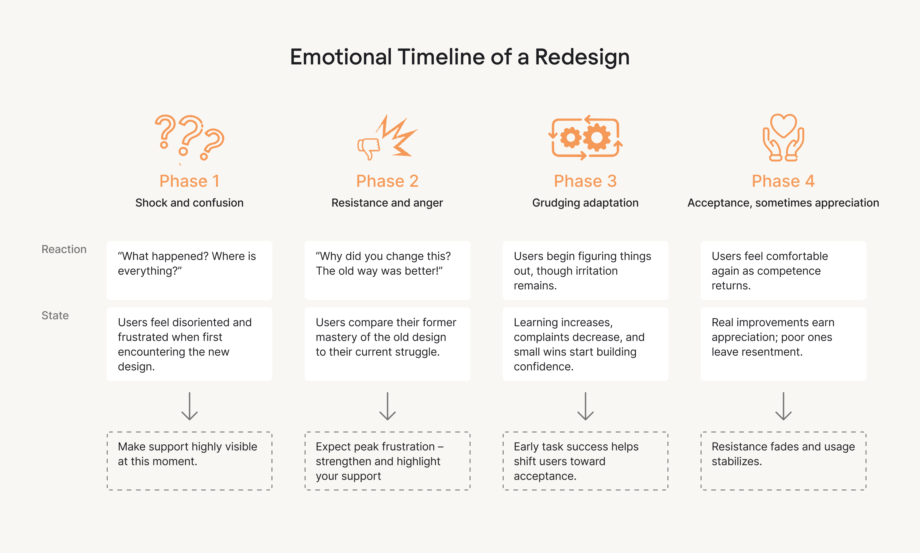
So yes, even the strongly redesigned products can fail if users aren’t guided through the change.
Here are time-tested tips to successfully guide existing users through the final product:
1. Treat transparent communication as your first line of defense
Tell users what’s changing, why it’s changing, and how it benefits them. Acknowledge the learning curve instead of pretending it won’t exist.
2. Give users early access whenever possible
Early user groups surface issues faster and tend to feel more ownership over the new experience. This move helps you turn potential critics into advocates before launch.
3. Create a user-friendly onboarding experience
Introduce clear onboarding cues, contextual hints, and simple “here’s where this feature moved” helpers to reduce confusion, fear, and irritation during the rollout. The more guidance you provide, the less support volume you generate.
Pro tip: grant users the option to switch back temporarily. Most won’t use the option, but knowing it’s there dramatically lowers resistance and builds trust.
Redesign is a long game – treat it like one
A well-executed product redesign isn’t a sprint. It’s a strategic effort that reshapes the product, the user experience, and often the company itself. When done well, it’s driven by clear goals, grounded in real user needs, and supported by thoughtful change management — not just aesthetics or internal preferences.
- Redesign is ultimately about strategic thinking: understanding where your product needs to go and aligning every decision with that direction.
- It’s about user-centered change: guiding users through the transition with clarity, empathy, and support so they don’t just accept the new experience – they prefer it.
- It’s about continuous iteration: testing, learning, refining, and treating launch as the beginning of improvement, not the end.
- And most importantly, it’s about longevity. Thoughtful redesigns help SaaS products stay competitive, relevant, and resilient in markets that never stop evolving.
If you’re planning a redesign project, our team at Eleken specializes in UX/UI transformations for SaaS – and we’d be happy to help you navigate the journey.