You're here because you realized - you aren't happy with your website. Whether your brand concept changed, conversions dropped, or you simply decided to make your digital “home” fancy and trendy, you should tackle a website redesign with all seriousness to achieve truly outstanding results. It's easy to mess things up without a defined website redesign strategy behind your actions.
If you want your website redesign to go smoothly and ultimately bring you closer to your business objectives, keep reading this article. We'll discuss what you should do before starting the process and provide you with step-by-step guidance to ensure your revamp endeavor's effectiveness.
What is a website redesign?
To start with, let's make it clear what “redesign” means. If you just want to slightly change a website layout, does it mean you need to redesign or ...?
Our designers always tell clients that before investing time and resources into the project, it's better to decide what level of changes they expect a website to undergo.
A website redesign implies significant changes to the “inner” and “outer” site elements like code, structure, visuals, navigation, and content. Done properly, the website redesign leads to a decrease in bounce rate, conversion growth, and user experience enhancement, which is why popular web design companies rely on strong web app design services to drive performance, not just aesthetics.
The difference between website redesign vs website refresh
You can compare a website redesign to a complete overhaul of a house when you leave only the basement and walls and build the rest of the construction from zero. And if you just want to repaint the bedroom walls, you will more likely only need to purchase paint and brushes, won't you?
Whereas a website redesign can entail considerable alterations of architecture, functionality, visuals, and content, a website refresh focuses on minor renovations. For example, if you want to change how the site looks and feels, you can try a different color palette or typography, and that will refresh the UI.
Or, let's say, you conducted a UX audit and then decided to change the CTA buttons' shape and color, and increase the contrast between text and background to improve accessibility in UX. These modifications will also fall under the website refresh.
This approach underscores the importance of a detailed user experience audit report in guiding actionable changes that enhance both the aesthetic and functional aspects of a website, ensuring a more accessible and user-friendly interface, and it also helps justify web design agency pricing by showing exactly where each improvement adds value.
And now you may have a logical question - how can you understand if the redesign moment has come?
Key signs your website might need a redesign
You have two options - rely on your subjective feeling or refer to analytics. I would do both. If your site brings you leads who regularly convert into customers, there should be no need for total transformation. In case you feel (and the data from tools like Google Analytics proves) that things are not like you suppose them to be, that's a time to think about giving your website a second chance.
Also, try answering the following questions:
- Does the current website version convert leads?
- Are there any technical issues with the website?
- Are you generally satisfied with the website's performance?
- Is the site mobile-friendly?
- Is it accessible?
I imagine your answers “yes” and “no” made up a certain proportion. If you have more negative than positive answers, chances are the site redesign is what you need, and a quick glance at today’s best web design examples will confirm it instantly.Then, let's talk about how to prepare for it.
12 steps of a website redesign process
Since I promised in the title of this article that there'll be no fluff here, let's move to the website redesign checklist straight away. Depending on your ultimate business goals, you can add or omit some steps; they're not set in stone. Just use them as a reference to remind yourself what else you can do to ensure your website redesign project will be successful.
Step 1: Clarify stakeholders’ needs
How can you understand whether the project is successful or not? You need someone to show you that signal flag saying you've achieved the goal. Before starting a website redesign project, clarify all stakeholders' expectations and needs, and understand what benefits they intend to get from a revamped website. In case the stakeholder is you, there should be no problem. Going further!
But in most cases, multiple people are involved, and each sees “a good website” differently. To extract their needs and expectations, use stakeholder interviews, workshops, or surveys. Below are examples of helpful questions to ask:
- What business outcomes should the redesign achieve?
- Who are the primary audiences/target user groups?
- What are the main pain points with the current website?
- What are the non-negotiables vs “nice-to-haves”?
- What constraints do we have?
- Who should be involved, and who makes the final decisions?
- How will we measure success after the redesign?
Once everyone shares the same vision of why the redesign is happening and what results it should bring, you can safely move forward knowing you’re building a website that will actually serve your business goals.
Step 2: Analyze your website’s current performance
Your goal is to check the current monthly performance and compare it later to the redesigned website indicators. Here are some key metrics you can choose from, depending on the relevance of each for your case.
- Number of website visitors
- Dwell (or on-page) time
- Bounce rate
- Best-performing and lead-generating keywords
- Number of leads
- SEO rankings for main keywords
- Domain authority
These indicators help you understand how your website performs today and where the biggest opportunities lie. At this stage, it’s also useful to look at how traffic and conversions are interrelated. It will be a sort of BCG matrix for website pages.
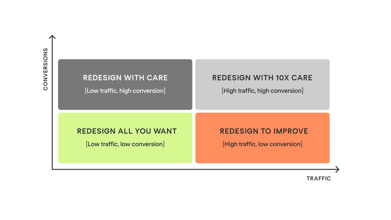
High-conversion, high-traffic pages are your bread and butter, so any unsuccessful changes here may lead to unpleasant consequences, resulting in a decline in traffic and conversions. You should approach modifications to these pages with extra caution.
The same goes for pages with high conversions but lower traffic. They may not attract many visitors, but they deliver strong business value. In contrast, pages with high traffic and low conversion have something that doesn’t resonate with users, and they give you room to experiment without much risk.
And as for low-traffic, low-conversion pages, well, they have nothing to lose, so you're welcome to make any modifications. This simple exercise will help you understand which pages are your “cows” that generate stable results and shouldn’t be broken during redesign.
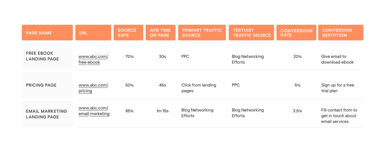
Step 3: Document your baseline metrics
You can do it in a spreadsheet, devoting one separate sheet to each web page of your site. It may look something like this table. This document will become your “before” snapshot, a reference point you’ll compare the redesigned website to once everything is launched.
At this stage, it’s also important to define which performance indicators actually matter for your business. The redesign should aim to improve something tangible: conversions, sales, user engagement, search engine optimization visibility, customer satisfaction, whatever contributes most to your growth.
So, as you collect your current numbers, make sure you’re capturing the metrics that will help you later understand whether the redesign has moved the needle.
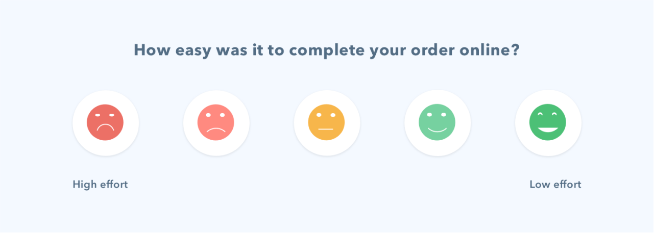
In many cases, this includes business-oriented KPIs such as conversion rate, average order value, or customer lifetime value. If customer satisfaction is one of your priorities, baseline scores like Customer Satisfaction Score (CSAT), Customer Effort Score (CES), or Net Promoter Score (NPS) will also help you evaluate whether the new version resonates better with your audience.
To be on the safe side, it would be better to back up the recent version of the website before starting a redesign. This way, you won’t lose existing SEO content in case you decide to leverage it later on the updated pages.
Step 4: Set clear redesign goals
Setting proper goals is halfway to success. Before moving on to layouts or color palettes, you need to understand exactly what the redesign should help you achieve. So, let's take a look at the most common targets of a website redesign.
You can either focus on one key goal or pursue several simultaneously, as they often go hand in hand.
- Refresh website look & feel
The trends in web design are changing pretty fast. In a year, your website will likely look outdated, losing to more in-trend competitors. If you plan to update the website's appearance, you should decide whether it'll be just a color and typography refresh or a complete website overhaul with changes in architecture, visuals, and content.
Sometimes it's uneasy to define whether you need a website redesign or refresh, which is why it helps to revisit your broader brand strategy before making a decision.
- Enhance user experience
We aren't making websites for ourselves but for users. A high bounce rate, low conversion rate, and short on-page time unobtrusively hint that there might be problems with the user experience. It'd be more effective to conduct a UX audit before redesigning to clearly understand where the bottleneck in customer experience is.
You can do the UX audit with the help of your internal team or hire third-party consultants who have vast experience in auditing websites or apps' UX by walking in users' shoes.
- Increase traffic
Website traffic heavily depends on SEO content strategy. Needless to say, a company's blog full of relevant, up-to-date materials is a “must” for attracting high-quality leads. Also, it's crucial to make regular website performance analyses in terms of SEO ranking for main keywords, as this helps you understand where new opportunities for organic growth may appear.
From an SEO perspective, the redesign's goal may be to embed essential keywords in the new web pages' content and strengthen topic relevance.
- Improve conversions
If website visitors don't take expected actions (leave contact data, subscribe, or purchase) and drop off a sales funnel on their way to checkout, it's more likely that they have some difficulties interacting with a product. The redesign may be a good opportunity to improve the customer journey. Conversion issues usually reflect deeper UX misalignment, requiring you to conduct a full revisit.
A well-executed redesign can reduce friction, guide users more intuitively, and ultimately boost the number of leads and customers you generate.
Step 5: Define your redesign budget
Let's talk about the figures. According to HubSpot's research, 63% of marketers had no idea how much their website redesign cost. What does it mean? More likely, they went over budget, which obviously frustrated stakeholders.
Whereas it's pretty difficult to gauge the exact amount you'd need to pay for the full redesign, you can start by setting a bottom line you won't exceed when planning your project expenses.
It also helps to outline the key cost drivers early on. The scope of design work, the complexity of development, potential integrations with third-party tools, and the need for new content or SEO support — all of these can significantly influence the final number.
Even timelines matter. The tighter the deadline, the higher the cost tends to be. So before you commit to anything, try to identify which parts of the redesign are essential, which are optional, and which can be postponed to a later phase if the budget runs tight.
Step 6: Identify your buyer personas
Understanding who your customers are and what they are looking for on your website helps you provide relevant and timely information. What is also important is that you won't bother users with offerings they don't really need at the moment. Thus, they will feel cared for and more likely to return when they’re ready to purchase.
The typical way of getting your target audience's portrait is by creating so-called customer (or buyer) personas based on psychographic data and the jobs these ideal customers need to get done.
According to the research Google conducted some years ago, people have four main intents when surfing the internet: “I want to know,” “I want to go,” “I want to do,” and “I want to buy.”
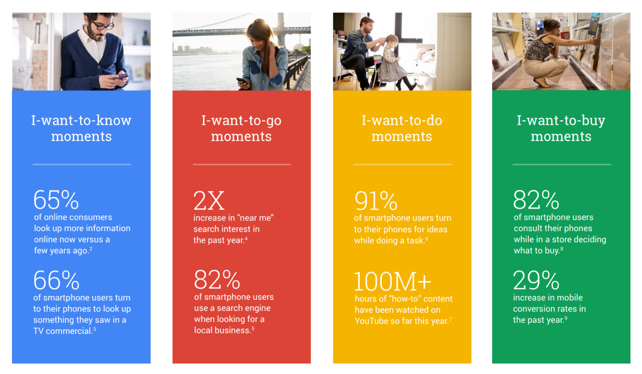
If the design and existing content on your landing page push visitors to the purchase, whereas they just want to read about product characteristics, chances are high they'll exit soon. Customer personas give you an idea of how to design and what content to focus on to improve business results.
You can also deepen your personas by reviewing user feedback, analyzing user journey data, or talking to sales and support teams who interact with your audience every day.
Step 7: Prepare your content in advance
When researching materials for this article, I came across a phrase I liked very much. “Content is water; the design is a cup.” Cool, right? There is a universal truth in these words. You need a cup that will exactly match the amount of water. Otherwise, you risk having either a half-full cup or a puddle on the floor.
Also, you'll definitely want to avoid a so-called “content gap.” The content gap happens when you attract your ideal leads to the website, but, for example, don't have a relevant case study to prove your competence in the lead's industry.
Preparing content ahead of time helps designers and developers build layouts that actually support your message. It also prevents situations where teams design beautiful components that later become unusable simply because the real content doesn’t fit. This is especially important for websites with multiple service pages, complex product descriptions, or case-study-driven sales funnels
Step 8: Conduct keyword research and plan redirects
You already know your most important pages. The next task is to protect them with a 301 redirect. Redirects are crucial to retain the traffic and link value of the current pages during the redesign process. Create a simple spreadsheet to map your old and new URLs and then pass the document to your tech-savvy staff to implement necessary changes.
What else you can do with your new pages is to natively embed essential keywords into the content to cover topics that probably didn't receive much attention on the previous website version.
To make this step more effective, it’s helpful to combine redirects with a deeper look at your SEO foundation. Before you launch the redesigned site, take time to:
- Identify high-ranking pages you don’t want to lose visibility for after the redesign.
- Check for outdated or underperforming content that can be updated or merged with stronger pages.
- Research relevant keywords and search intent, especially for new or restructured pages.
- Analyze competitor pages to discover additional keywords or content gaps you might want to fill.
- Review internal linking opportunities so your new website structure supports both SEO and user navigation.
Step 9: Build your new website hierarchy
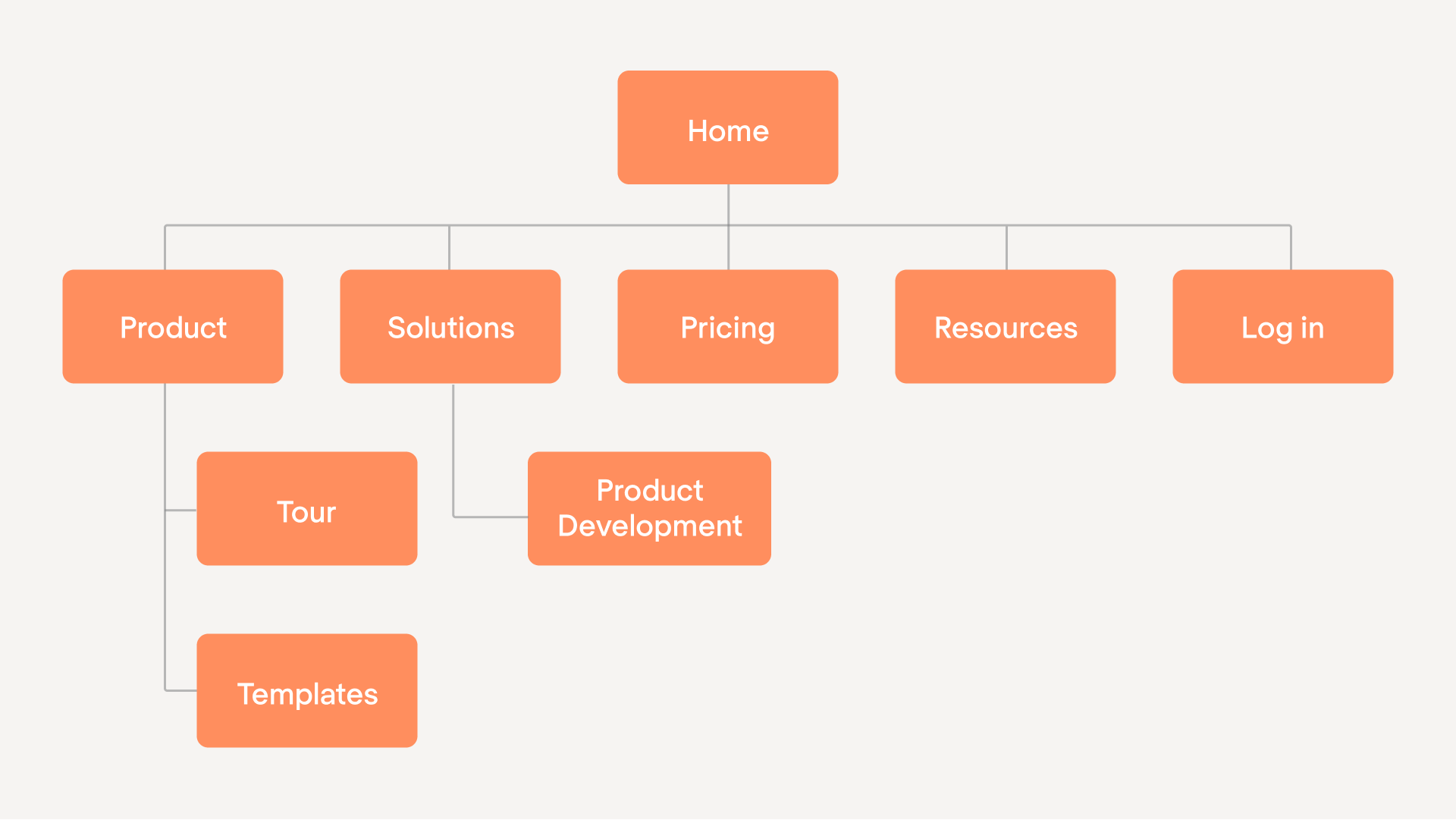
I'll be now Captain Obvious, saying that a sitemap is a website map. Sounds plain, however, thousands of websites overlook logical hierarchy, making their customers wander from one page to another. If your product is what a customer critically needs, they probably would be patient enough to find what they're searching for. In the worst case, a user will drop out, wishing you “all the best.”
A clear hierarchy ensures that users instantly understand where to go and how to get there.
When pages are logically grouped and labeled intuitively, people feel more confident navigating the site, and that directly influences conversions. A strong hierarchy also helps search engines better understand your site structure, which improves crawlability and positively affects your SEO performance.
When building or revisiting your hierarchy, think about how users typically move through your website. Sometimes, even small improvements, like renaming categories, reducing the number of menu items, or restructuring your service pages, can make the entire user journey much smoother.
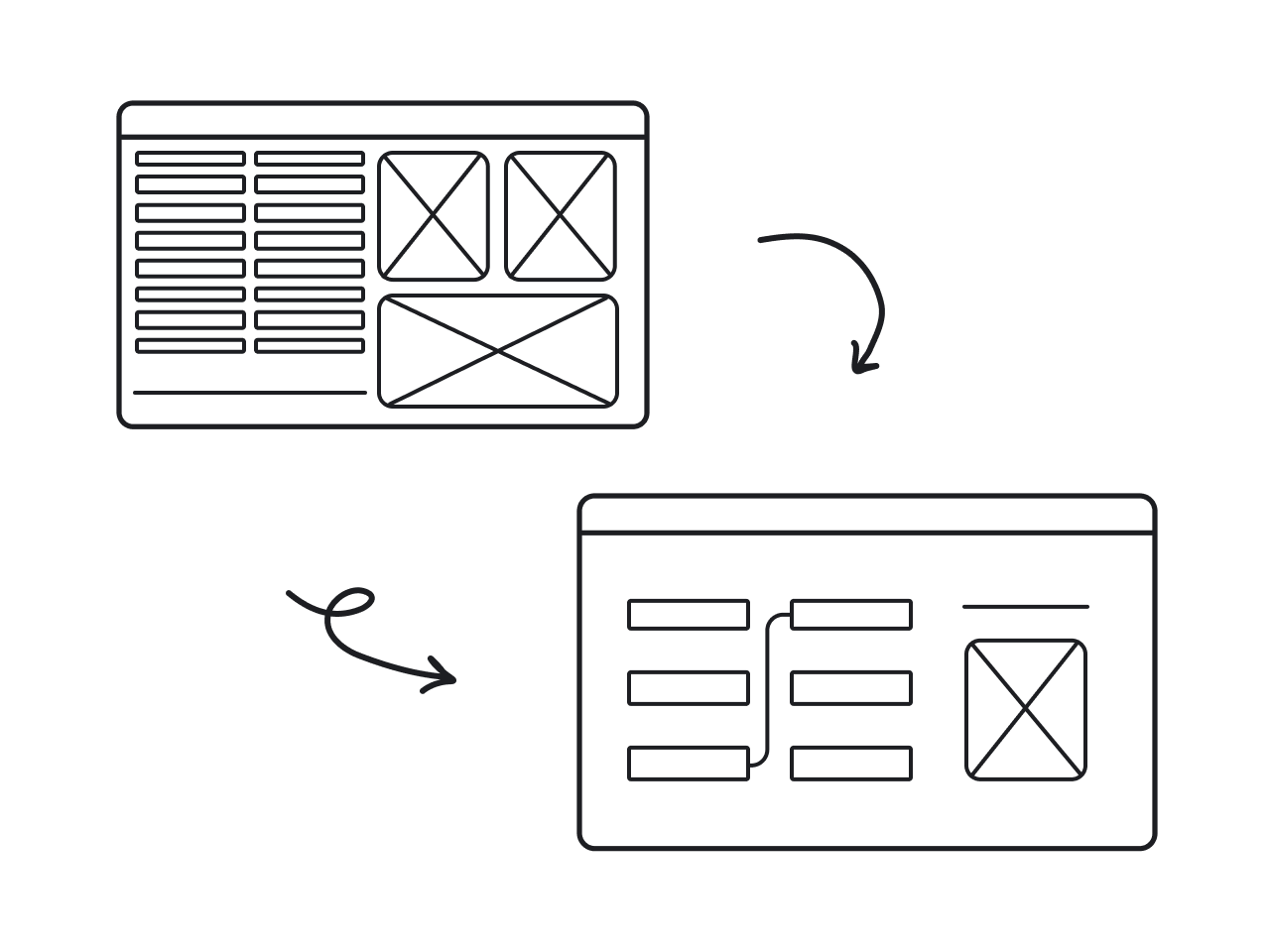
Step 10: Create wireframes for key pages
Once you build your sitemap, which we can imagine as a backbone, it's time to create a “skeleton,” aka a wireframe. It's up to you and your design team whether it'll be just a simple freehand drawing or a high-fidelity wireframe created in a special tool. In any case, it should clearly show the place of each webpage element, such as shapes, boxes, text, images, and forms.
At this stage, you can also quickly test different layout ideas without investing too much time into detailed design. Adjustments are easier and cheaper to make when everything is still in a rough, low-fidelity format.
At Eleken, for example, we rely on wireframe creation in most of our projects. This way, we create a shared understanding between designers, developers, and stakeholders. Plus, with solid wireframes in place, our team can move to the next stage knowing that the foundation of the user experience is already well thought through.
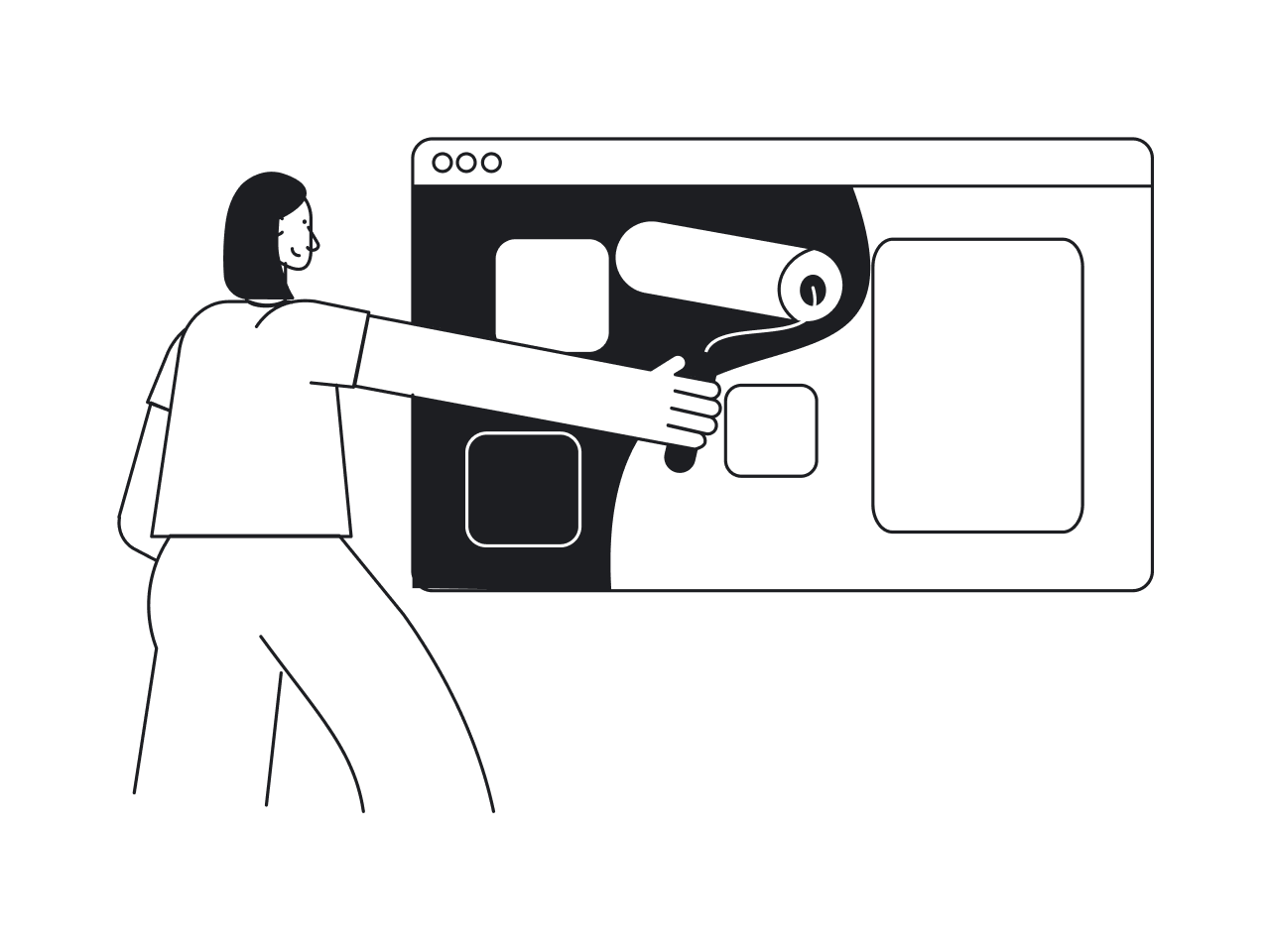
Step 11: Design your website layout
And when you're done with the wireframe, create a website layout that will convey your brand's look and feel. That means you should decide on typography, color scheme, and textures. All combined, these elements build a brand identity and a unique customer experience. By the way, did you know that color is accountable for 85% of conversion?

Considering this, you should translate structure into emotion. The visual design should reflect your brand’s personality and help users instantly understand who you are and what you stand for.
Consistency matters here as well. Repeating the same visual patterns across your pages helps create a cohesive experience and makes your interface more intuitive. Designers typically explore several visual directions before settling on the final one to find the look that best supports your message.
For our Eleken design agency, a strategic approach is creating a unified design system. When we work on projects, some clients already have a design system in place, while others might not have one at all. Our task, as experienced designers, is to gather everything into a single file so we can design smoothly and then simply pass the whole system to developers.
Step 12: Move to design and development
You did a great job above. So, now leave designers alone with their muse and allow them to create the artwork. I don't have any idea how this magic happens, but every time our designers send me the illustrations for the articles, I'm amazed by their stunning graphics.
Once the new design is born, the ball goes to the development team to breathe life into your website redesign project. Developers take the approved layouts and turn them into a fully functioning website, ensuring everything works smoothly across devices and browsers.
Design best practices to improve website UX
As a design agency, we can't leave you without the tips that undoubtedly help to improve user experience and lead to a successful website redesign.
Use a fair contrast between text and background
If users struggle to read your content, they’ll drop off long before reaching your CTA. During redesign projects, we often find that low contrast is one of the reasons behind high bounce rates, especially on mobile. UX audit tools or simple visual tests can help you identify where text clarity needs improvement.
Optimize your website from an SEO perspective
Embedding essential keywords into your new page content helps search engines understand what your site is about and improves visibility. But SEO is also about building a logical hierarchy, improving internal linking, updating outdated content, and safeguarding your search engine rankings with proper redirects.
Add visuals and unique brand elements to make your website recognizable
Illustrations, icons, custom graphics, and branded visuals help users recognize your company and remember your message. They also reduce cognitive load by making information easier to scan. Gathering all visual assets in a unified design system helps maintain consistency across pages.
Make all pages mobile-friendly
A large percentage of users browse on mobile devices, so small usability issues can immediately affect conversions. You may have already noticed in your UX analysis that some drop-offs are higher on mobile than on desktop. Use these insights to guide your redesign.
Consider offering voice search options
Voice search is increasingly popular, especially on mobile and for users who look for quick information. While not essential for every business, it can be a valuable addition if your audience often searches for product details, how-to instructions, or troubleshooting steps.
Take insights from UX bottlenecks
Before redesigning, you likely collected user feedback and identified friction points in the customer journey, like confusing navigation, unclear CTAs, slow-loading sections, or pages. These bottlenecks are what should directly inform your UX decisions.
Test elements before making big changes
Before committing to global updates, test individual design elements to understand what actually drives improvement. Simple A/B tests provide valuable insights into what resonates with your audience. This approach reduces risk, especially for high-traffic or high-conversion pages.
Final thoughts
Even though your fresh design may work pretty well for some time, keep an eye on changes in market trends, design practices, and customer preferences. In a fast-paced digital environment, chances are your website will eventually need another round of polishing, and that’s completely normal.
A website is a living product that grows together with your business, so revisiting it from time to time is part of a healthy long-term strategy.
As a design agency that works exclusively with SaaS companies, we at Eleken focus on building interfaces that scale. So if one day you decide to expand your website into something bigger, our team is always here to help you move forward with confidence.


