
In SaaS, products tend to grow, and so does their complexity. New features are added, workflows become longer, and what once was a clean navigation menu turns into a crowded list of links. At that point, users stop feeling confident.
Working with data-heavy digital products, we’ve seen this pattern repeatedly. Clients come to us concerned about user retention or engagement. But as we begin uncovering UX issues, navigation problems often surface at the core.
And when navigation fails, cognitive load rises.
In this guide, we’ll explore navigation design in depth. We’ll clarify what navigation really means, why it matters more than most teams realize, examine common navigation patterns, and share practical lessons from real projects in our portfolio.
What is navigation in UX design?
Navigation in UX design refers to the system of interface elements that help users move through a product and find what they need. It includes everything that allows users to understand where they are, where they can go next, and how to get there.
This system can include global menus, navigation bars, sidebars, tabs, breadcrumbs, links, buttons, and any interactive components that allow movement across screens or sections. All of these are parts of the navigation structure.
Navigation also supports wayfinding. Users should always be able to answer three simple questions:
- Where am I?
- What can I do here?
- Where can I go next?
Why is navigation important?
If users struggle to figure out where to click or how to return to a page, that’s a navigation design failure. On the other hand, easy-to-use navigation is key to a good UX. Here are a few reasons why navigation UX is so important.
- It keeps users oriented.
Navigation serves as a map, telling users where they are and where they can go next. When users don’t feel lost, they feel more in control. That sense of orientation reduces frustration and allows them to focus on their core tasks.
- It helps users achieve their goals faster.
Users come to a product to complete specific tasks, and good UI navigation shortens the path between intention and action. When the structure matches users’ mental models, and frequently used actions are easy to access, users navigate efficiently.
- It reduces cognitive load.
Every extra decision increases mental effort. If users must scan through too many menu items or decode unclear labels, their cognitive load increases. Clear grouping, logical hierarchy, and consistent navigation patterns reduce that effort.
- It improves retention and engagement.
When people can move through a product without friction, they are more likely to explore additional features and return in the future. In SaaS products, especially, ease of navigation directly affects long-term adoption and customer loyalty.
Let’s look at the importance of navigation through a real example.
Lambda SCS approached Eleken to redesign one of their core tools, OptiFlow, a supply chain platform used daily by internal teams. However, the company decided to bring OptiFlow to market as a SaaS product for external customers.
To determine the right direction, we began with a UX audit. While we uncovered several usability issues, the most critical one was navigation.
In its existing state, OptiFlow had multiple structural problems:
- Breadcrumb logic was broken.
- The action panel was overloaded.
- Navigation lacked clear guidance.
- Icons were taken from different design systems.
- There was no reliable way to return to higher-level pages.

Internal teams were already familiar with the tool, so they had learned to work around these issues. But for new external users who wouldn’t have that context, the experience would have been confusing and frustrating.
Keeping this in mind, we didn’t reinvent the product’s core flow. What we changed during the redesign was how they move through this journey.
Here are the key improvements we introduced:
- Multiple entry points from a clear top-level navigation.
- Improved horizontal navigation bar UX for easier scanning.
- Progressive dropdowns that reveal more options when needed.
- Breadcrumbs that allow users to return to the project list from anywhere.
- Helpful empty states with contextual tips and links.
With a more intuitive navigation structure, users can now confidently explore deeper parts of the platform and always know how to find their way back.

Common navigation patterns in UX design
Many designers build navigation based on a set of familiar patterns. The key is understanding what patterns exist, what problems they solve, and how to use them appropriately. That’s what we’ll explore next.
Top navigation bar
A top navigation bar is a horizontal menu placed at the top of the screen. It typically lists the main sections or pages and is mostly used on websites (including our Eleken site!). Because it sits at the top of the page, it’s highly visible and easy to scan. Users naturally expect to find primary navigation there.
Best for: websites, blogs, landing pages.
Sidebar
A sidebar is a vertical bar placed on the left or right side of the screen. At Eleken, we most often use this pattern when designing SaaS products because it can handle deeper hierarchies. A sidebar allows for longer lists of options and nested categories, which makes it ideal for complex systems.
Best for: SaaS products, dashboards, admin panels.

Bottom navigation
Bottom navigation is a persistent menu placed at the bottom of the screen on mobile apps, making it easy to reach with a thumb. It usually includes icons, labels, or a combination of both that lead to the app’s key sections. Because of its ergonomic placement, this pattern has become standard in many mobile applications.
Best for: mobile apps.

Hamburger menu
The hamburger menu is a compact navigation pattern represented by the three-line icon. When users tap or click it, a hidden menu appears with additional navigation options. This approach saves digital space by hiding secondary or less frequently used links, keeping the user interface visually clean and uncluttered.
Best for: mobile apps, responsive websites.

Dropdown menus
A dropdown menu is a secondary navigation pattern that appears when users hover over or click a top-level menu item. It “drops down” to reveal additional options, allowing designers to organize sub-pages. At Eleken, we often pair this key element with a sidebar when designing data-heavy SaaS products.
Best for: SaaS products.

Mega-menus
A mega-menu is an expanded version of a dropdown menu. It opens a large panel that displays multiple categories and subcategories in a structured layout. This allows users to scan many options at once instead of navigating through nested lists. However, mega-menus require strong information architecture.
Best for: content-heavy websites, eCommerce platforms.

Breadcrumbs
Breadcrumbs are a secondary navigation pattern that show the user’s path. They are usually displayed near the top of a page and follow a structure like: Home > Section > Subsection > Current Page. Breadcrumbs highlight where the user is within the overall structure and offer a quick way to move back to higher levels.
Best for: complex SaaS products, eCommerce sites, large websites.

Tabs
Tabs present navigation options as a row of items at the top or bottom of a screen. They allow users to switch between a small number of related sections without leaving the current context. Because tabs remain visible, they support quick switching. But if you have too many options, they can become harder to use.
Best for: mobile apps, settings pages, dashboards.

Best practices for improving your navigation design
Now that you have a solid understanding of familiar design patterns, it’s time to focus on how to apply them in practice. Below are actionable UX navigation best practices to help you craft clearer systems and refine your skills as a designer.
Start with information architecture
Good navigation starts with good information architecture. Before moving into visual design, take time to define how your product is organized. A clear hierarchy makes navigation intuitive because it reflects how people mentally group information.
One of the most effective techniques is card sorting, where users group content into categories that make sense to them. This process often reveals unexpected patterns and highlights mismatches between how designers think and how users think.
Among other practical techniques, you can try:
- Organizing features on sticky notes and physically grouping them.
- Creating a simple sitemap to visualize hierarchy.
- Mapping key user flows before designing menus.
- Reviewing analytics to see which sections users access most often.

For example, when we started working on Data Streams, a platform packed with tools for managing data, the interface needed a major revamp. The product had powerful functionality, but its structure didn’t support smooth navigation.
Once our full-time collaboration began, we focused on understanding common user scenarios. First, we mapped out user flows for each key scenario and broke them down page by page. This allowed us to see how people moved through the system.
Based on those flows, we rebuilt the entire information architecture. Only after clarifying the structure did we move to the navigation UX design.

Test navigation with wireframes and prototypes
Don’t wait until high-fidelity visuals to evaluate your design ideas. Navigation should be tested while it’s still flexible and easy to change. For this, it’s smart to start with a simple wireframe that includes your menu layout and core flows.
The goal is to validate how people move through the system. Tools like Figma, Sketch, Adobe XD, or similar prototyping platforms make it easy to simulate menu interactions, page transitions, and dropdown behavior.
To test your navigation UI effectively, you can:
- Build a clickable prototype of your menu and key flows.
- Ask someone to complete a specific task.
- Observe where they hesitate or click first.
- Track how many steps it takes to reach a destination.

Even informal guerrilla usability testing with a colleague can reveal friction points. You may discover that certain sections require too many clicks, that labels are misunderstood, or that users expect features in a different location.
When working with LogitudeWorld, a shipment tracking platform, we prioritized testing from the very beginning, starting with the dashboard.
In the first version, we aimed to make the screen as simple as possible. However, after gathering customer feedback, it became clear that simplicity alone wasn’t enough. Users wanted to get real-time shipment data in a clear and actionable way.
Based on these insights, we designed a new prototype and rethought the navigation. In the updated version, we introduced a horizontal bar that allowed users to access real-time data quickly, avoiding unnecessary redesign later on.

Use meaningful labels
Even the best navigation structure can fail if the labels are unclear. Users rely on menu names to understand what they’ll find behind each click. If the wording is vague, overly creative, or internally focused, people hesitate.
Navigation labels should reflect how your audience thinks. A section titled “Operations Hub” might make sense to the product team, but users may be looking for something as simple as “Orders” or “Reports.”
To create stronger labels:
- Be specific.
- Use familiar language.
- Keep labels consistent.
- Avoid internal jargon or technical terminology.
- Test labels during usability sessions.

For many complex projects we handle at Eleken, clear labeling becomes a priority, and Vector0 is a great example. The company approached us to redesign DarkWave, a platform that provides Attack Surface Management capabilities.
Given the technical nature of the product, clarity was essential, especially for first-time users.
During the redesign process, we introduced a sidebar with descriptive labels and the option to minimize it. Even in its collapsed state, hovering over icons reveals tooltips. This way, users always understand what each section represents.

Follow platform conventions
When designing navigation, don’t start from scratch. Established design systems already provide well-tested guidance for common patterns. Leveraging these helps you avoid usability mistakes and makes your product familiar to users.
For web and cross-platform products, Material Design offers detailed recommendations. For iOS products, Apple’s Human Interface Guidelines outline navigation UX best practices along with other essential interface standards.
Following platform conventions helps you:
- Place navigation elements where users expect them.
- Use proper sizing and spacing for touch and click targets.
- Combine icons with text labels for clarity.
- Maintain sufficient contrast and readability.
- Ensure consistent behavior across screens.
A good example of this approach is our work with Datawisp, a no-code data analytics platform. The team approached Eleken to redesign their product because the initial interface felt confusing and looked more like a Windows 98 interface.
To address this, our designer created a unified design system with standardized components, including navigation patterns. This ensured that every screen followed the same visual and structural logic and allowed for a smooth handoff to developers.

Design for accessibility
Navigation should be usable by everyone, including people with disabilities. If users can’t access or understand your menu structure, the rest of the product becomes irrelevant. It’s also a quick way to lose part of your audience.
Accessible navigation starts with clarity and predictability. Screen reader users, keyboard-only users, and people with visual impairments interact with navigation differently, and your design should support those differences.
For strong navigation design, consider the following guidelines:
- Use descriptive link text.
- Ensure full keyboard navigation.
- Add proper ARIA labels.
- Maintain sufficient color contrast.
- Use readable font sizes and clear focus states.
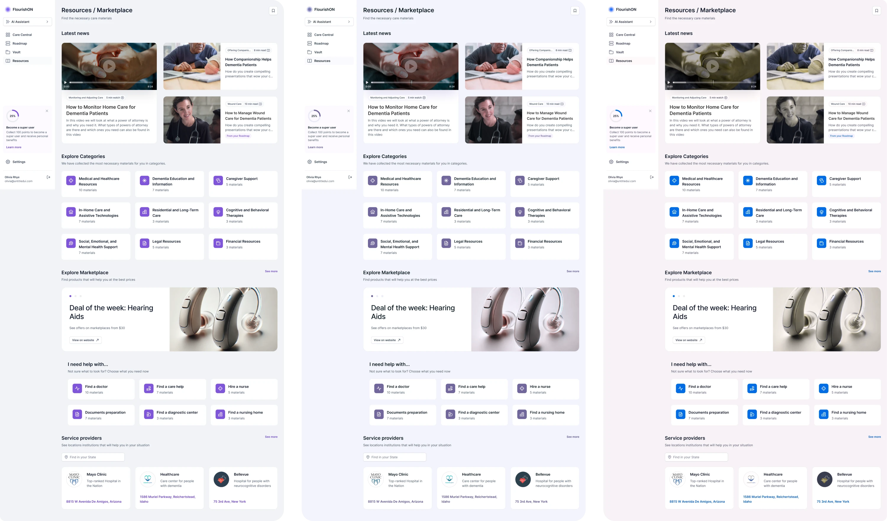
FlourishOn is a good example here. The client approached Eleken to design a caregiving MVP that supports accessibility. Since the platform was intended for users with diverse needs, the navigation had to be inclusive.
Among the navigation patterns in UX, we implemented a sidebar, a search bar, and clear labels for each section. To make the interface truly accessible, we followed WCAG standards and tested the screens under different visual conditions.
This ensured that contrast, readability, and visual cues remained effective across scenarios. As a result, the system worked reliably for a broader audience.
Adapt navigation menu for different screen sizes
Navigation that works well on a desktop screen doesn’t automatically work on mobile. As screen space shrinks, priorities must become clearer.
On larger screens, you may have enough room for a sidebar, dropdown menus, or multiple navigation levels visible at once. On smaller screens, those same design elements can quickly become overwhelming or unusable.
When adapting navigation for different screen sizes:
- Prioritize key actions for smaller screens.
- Don’t hide everything inside a hamburger menu.
- Adjust spacing and touch targets for mobile.
- Collapse or reorganize secondary elements.
- Test navigation across breakpoints.
Mobile users often interact differently from desktop users. They rely more on thumb reach, clear tap areas, and simplified flows. Designing with these differences in mind ensures your navigation remains intuitive across devices.

Our Eleken team partnered with PayUp to design their financial platform, working on both desktop and mobile versions simultaneously.
For an intuitive user experience on desktop, we used different types of navigation UX patterns, including a sidebar, tabs, and clear labels. This structure allowed users to access various sections efficiently while maintaining clarity.

On mobile, we simplified and reorganized the layout. Navigation was placed at the bottom of the screen to make it thumb-friendly and easy to reach. We prioritized key actions and adapted the hierarchy to fit the smaller screen.

Design with user psychology in mind
In navigation design, every menu item, label, and grouping affects how easily people process your interface. Users scan, recognize patterns, and make quick decisions. When navigation aligns with these natural behaviors, it feels intuitive.
Designing with psychology in mind means reducing cognitive load and supporting natural decision-making. Here’s what to consider:
- Group related items together.
- Limit the number of primary choices.
- Maintain consistency across screens.
- Place frequently used actions in prominent areas.
- Use visual hierarchy (size, spacing, contrast) to guide attention.

Remember that users don’t want to think about navigation. They want to complete tasks. The less mental effort required to move through your product, the more confident and comfortable they feel.
We followed this approach when designing Modia. The platform introduced a new way to create content, but the existing navigation was totally confusing. Users had to guess what each section represented, which increased cognitive load.
During the redesign, we simplified the sidebar by replacing ambiguous icons with familiar ones and adding clear labels. This allowed teams to instantly recognize where they were and what actions were available.

To support faster workflows, we introduced a prominent “+” button for quick content creation. And since some users prefer working in dark mode, we added a theme switcher directly in the sidebar for quick access.

Navigation mistakes in complex products
Throughout this guide, we’ve explored navigation patterns, best practices, and UX issues. When products grow, navigation often becomes one of the first areas to suffer. Features expand, roles multiply, and structure becomes harder to maintain.
Summarizing the most common pitfalls, here’s what to watch out for:
- Too many menu items.
When everything is treated as equally important, navigation becomes overwhelming. Long, unstructured menus increase cognitive load and make scanning difficult.
- Vague or clever labels.
Creative wording might sound appealing internally, but unclear labels slow users down. If people have to interpret what a section means, hesitation appears.
- Hidden navigation elements.
Over-relying on hamburger menus or hiding key actions to keep the interface “clean” can reduce discoverability. Users shouldn’t have to hunt for core functionality.
- Inconsistent navigation structure.
If navigation behaves differently across screens, users must constantly relearn the system. Inconsistency breaks mental models and reduces trust in the product.
- Needlessly deep menus.
Excessive hierarchy levels create friction. If users must click through multiple layers just to reach a common action, the structure likely needs simplification.
- No indication of the user’s current location.
Without breadcrumbs, active states, or visual indicators, users can feel lost. Clear location cues are essential for orientation, especially in complex systems.
- Neglecting mobile navigation usability.
Designing primarily for desktop and shrinking everything for mobile leads to poor experiences. Mobile navigation requires prioritization and ergonomic placement.
The final word
The truth is, you can design the most unique navigation your competitors have never seen. But if users don’t understand what it means, where to click, or how to get back to where they were, they will simply leave. Navigation demands clarity.
As designers, we advise treating navigation UI design as a core part of the product from the very beginning. When you structure it early, test it often, and align it with real user behavior, you avoid costly redesigns and wasted time later on.
And if you ever need a reliable design partner to help you build navigation that scales with your product, we’re only a few lines away.


.png)

.png)