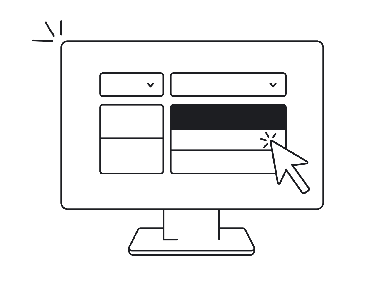

UX mistakes aren’t the result of poor taste or lack of skill. More often, they happen because of pressure, tight deadlines, context switching, or missing systems. Even the best designers can get stuck in these traps sometimes.
As a UI/UX design agency with over 10 years of experience, we’ve seen it all. Clients have come to us with products where users were dropping off, engagement was declining, and customer complaints just kept coming.
And there’s a way to fix that.
In this article, we’ve gathered the most common UX design mistakes and ways to prevent them before they reach production. Every insight here comes directly from our experience, so you can trust they’re real, relevant, and actionable.
1. Skipping discovery and user research
New designers might jump into designing without talking to users or studying their needs. They might base design decisions on personal preferences or assumptions. But skipping the research phase means you’re essentially designing in the dark.
If you don’t understand what’s going on in the market, what your users actually need, you risk solving the wrong problems or creating irrelevant features.
Sometimes, teams overlook discovery when they’re under pressure. Maybe the project needs to ship fast, show traction to investors, or get buy-in from stakeholders. In those cases, research feels like a “nice-to-have.” But in reality, it’s the opposite.
To set your design project up for success, start with at least this:
- Run user interviews or surveys to understand real goals and contexts.
- Create user personas to align the team around who you’re designing for.
- Map user journeys before jumping into wireframes.
- Study competing products to identify UX gaps and opportunities.
- Review support tickets or feedback channels to spot pain points.
At Eleken, this is exactly how we approach every new project.
Take Datawisp, for example. When they reached out to us, they had already validated their idea with a raw prototype and raised $435K in pre-seed funding. But to move forward, they needed a UX that could make complex workflows intuitive.
When we joined the project, we didn’t open Figma right away. Instead, we started with discovery. First, we deconstructed the app into user flows, and then broke those flows down into granular interface elements: cards, data blocks, and tables.
Next, we ran a UX audit based on Jakob Nielsen’s 10 usability heuristics, identifying areas where the product lacked clarity or consistency. With these insights in hand, we restructured the interface to improve both usability and onboarding.
That groundwork paid off. Relying on a research-backed UX, we delivered designs that helped Datawisp successfully raise a $3.6M seed round.
2. Creating interfaces that don’t function
One of the most frustrating UX problems is designing an interface that looks good on the surface but doesn’t function well for users. It might win praise for aesthetics, but if users don’t understand how it works, that design becomes a liability.
This often shows up as bad design with missing error states, unclear iconography, hidden functionality, inconsistent component behaviour, and much more. These issues may seem small individually, but together they create a poor user experience.
This kind of problem can also originate from a skipped discovery. One wrong step early on can snowball into a product that simply doesn’t work for its users.
To avoid falling into these traps, consider the following best practices:
- Include error messages, loading states, and empty states.
- Use tooltips, microcopy, and short walkthroughs.
- Test assumptions through A/B testing or prototype testing.
- Be cautious with trends.
A great example of this mistake in action comes from our work with NWORX, a corporate learning management platform. When the company came to Eleken, they were receiving a flood of negative user feedback.
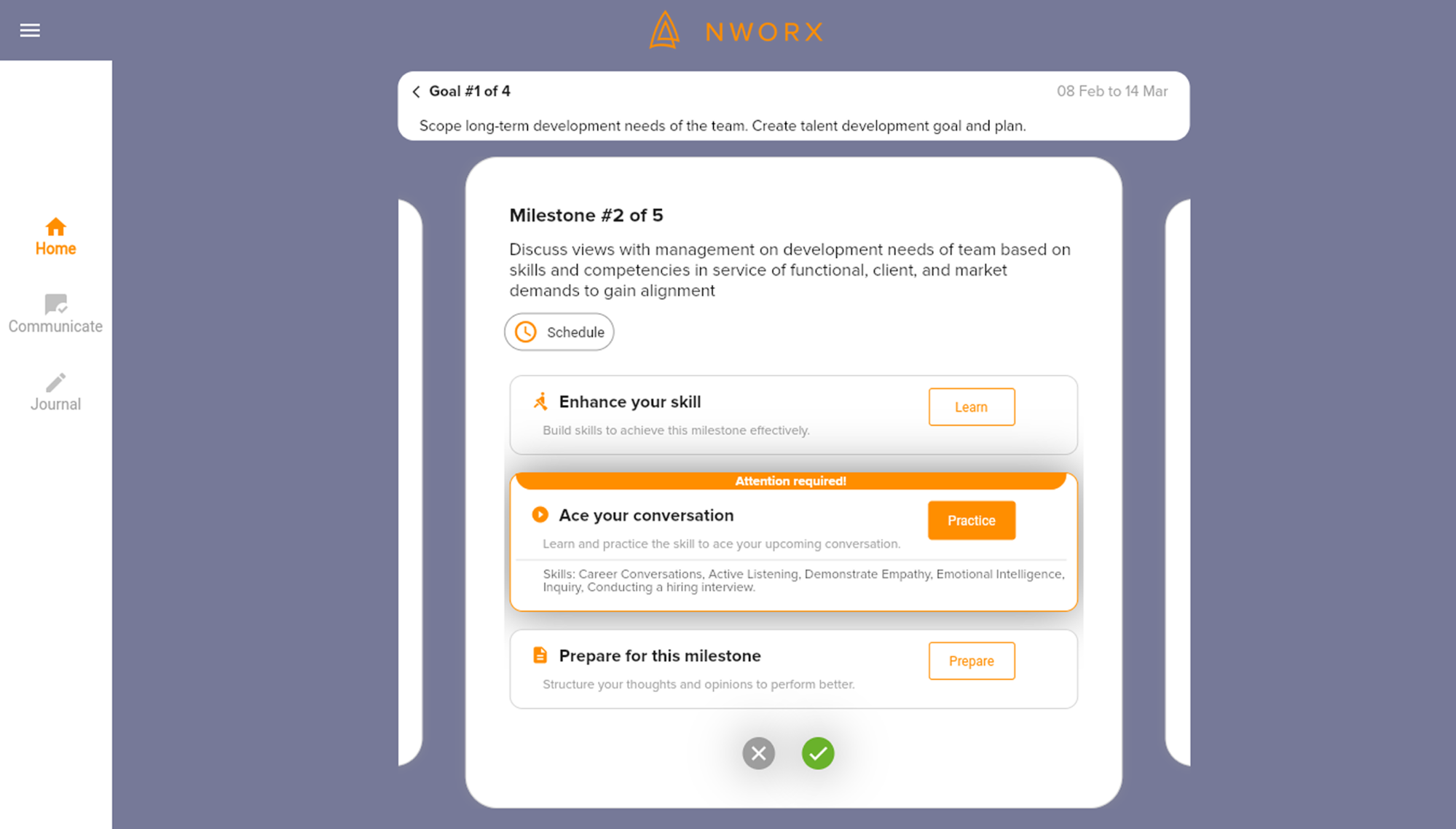
Once we audited the product, the problem became clear: the interface lacked visual hierarchy, and the navigation was unintuitive. Users couldn’t easily find key features, track their progress, or understand what steps to take next.
After our redesign, all elements are now organized with a clear visual hierarchy. NWORX learners can see their milestones and statuses, what goals they are on at the moment, and what their deadlines are with a single glance.
3. Using flows that are hard to understand
Among UX design problems, overly complex user flows are some of the most damaging. When designing a product, it’s crucial to remember that users will interact with your platform for the first time, and the flow should be intuitive.
Confusing flows often show up when users have to backtrack because the next step isn’t clear or when navigation takes them through repetitive screens.
Problems might also appear when tasks require too many steps, rely on hidden or unintuitive actions, or lack a clear hierarchy, leaving users unsure where they are in the process or what they’re supposed to do next.
These issues are especially harmful because they block goal completion, the core reason people use your product. A user might appear to be interacting with your interface, but if they’re stuck or giving up, the product is failing to deliver value.
To prevent confusing flows:
- Reduce unnecessary steps and keep actions purposeful.
- Group related tasks logically to support natural user progression.
- Validate flows early through user testing or realistic task scenarios.
- Watch for cognitive overload, especially in multi-step processes.
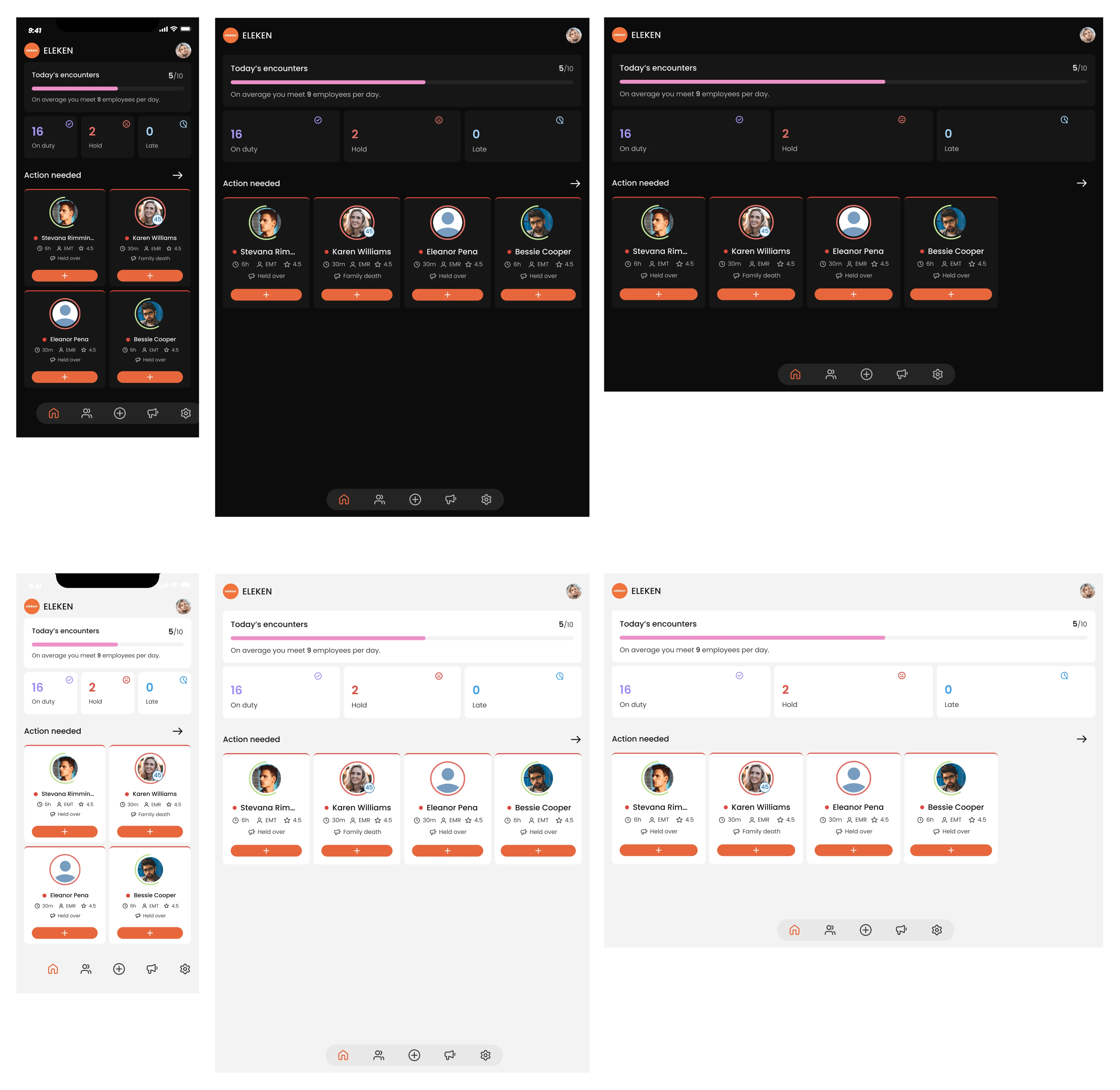
A practical example of this UX issue comes from our work with myInterview, a video interviewing platform. When the team reached out to Eleken, around 90% of candidates were dropping out before completing the application process.
First, we analyzed existing user flows and discovered that users were abandoning the platform during an application flow that felt unclear and complex.
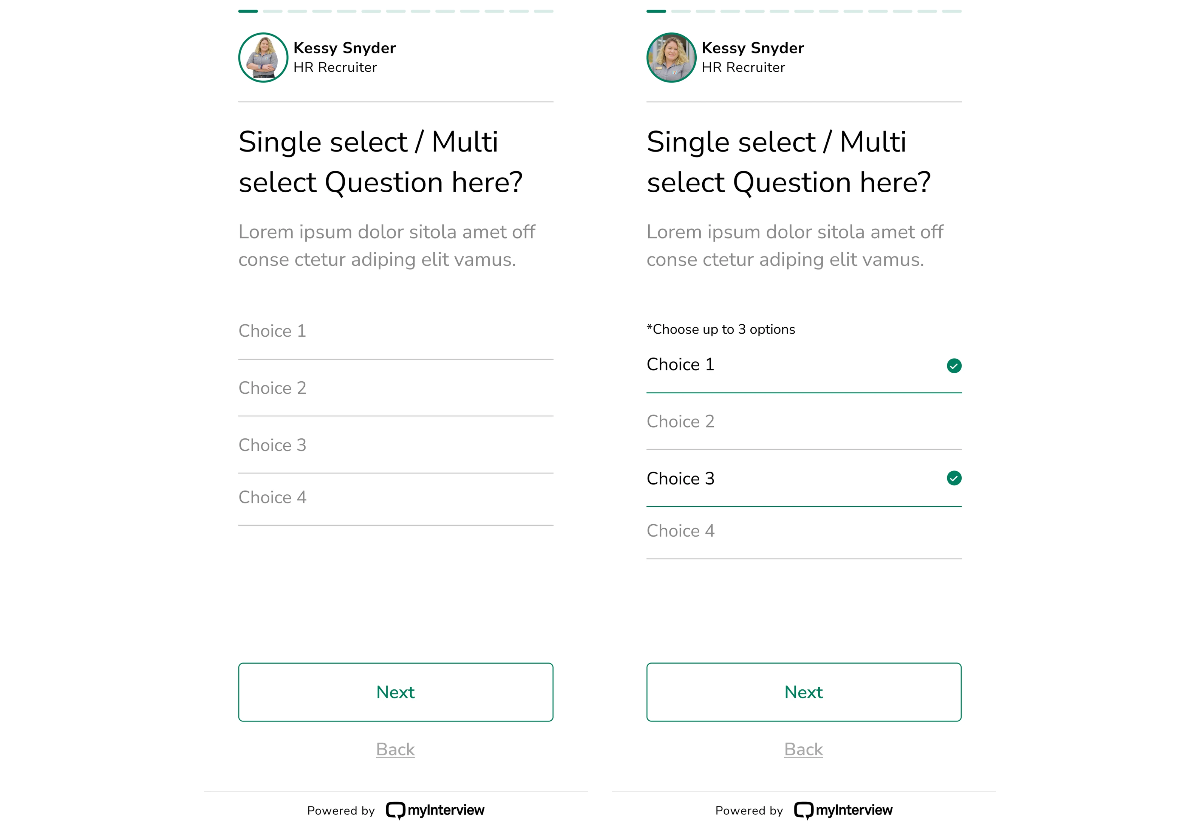
To fix this, we redesigned the experience around familiar patterns. We introduced multi-selection using checkboxes and a clear copy, expanded clickable areas to include entire input borders, and made selected options visually distinct.
4. Overloading the UI with too much content
Beginner designers often want to showcase all the features and information at once, but this can overwhelm users. Packing the interface with too many elements, dense blocks of text, or gratuitous graphics leads to cognitive overload.
When your design has no focus, users can’t find their priority tasks or information. They have to work harder to parse the screen, which causes frustration.
Clutter also slows decision-making. Hick’s Law in UX tells us that the more choices or elements presented, the longer it takes users to make decisions. In practice, that means an overwhelmed user is more likely to give up or make a wrong move.
From a design perspective, here’s how to avoid overloading your interface:
- Prioritize content and actions based on real user goals.
- Use progressive disclosure to reveal information only when needed.
- Simplify screens by focusing on one primary task at a time.
- Apply a feature prioritization framework to decide what truly matters.
At Eleken, we faced this problem when working on Data Streams, a data management platform. With a rich set of features and ambitions to expand, the product needed a user-friendly interface that could support complex workflows.
As with many data-heavy platforms, one of the biggest challenges was organizing large volumes of information on a single screen without clutter.
To reduce visual noise, we embraced a minimalist SaaS layout, limiting the color palette and avoiding flashy design elements. The layout included a navigation bar on the left, key information in the center, and contextual data on the right.
Such a structure allowed users to access everything they needed without switching between screens. More so, the most important features were always within reach.
5. Leaving out user onboarding in complex products
Unlike simple apps, where most interactions are intuitive, complex platforms require users to understand terminology, workflows, and the sequence of steps needed to achieve goals. When onboarding is absent, users are left guessing how things work.
During onboarding, your job is to guide users through core tasks, helping them build a mental model of the product, and reducing initial friction so they can quickly reach their “Aha!” moment. Skip this, and first-time users are far more likely to churn.
In UX design, onboarding supports learnability and sense‑making. It encourages smooth entry into a product through contextual assistance and guidance.
As a designer, consider integrating the following:
- Use plain language and context-aware explanations.
- Add contextual tooltips, hotspots, or coach marks.
- Design empty states with instructional content.
- Apply micro‑interactions and feedback.
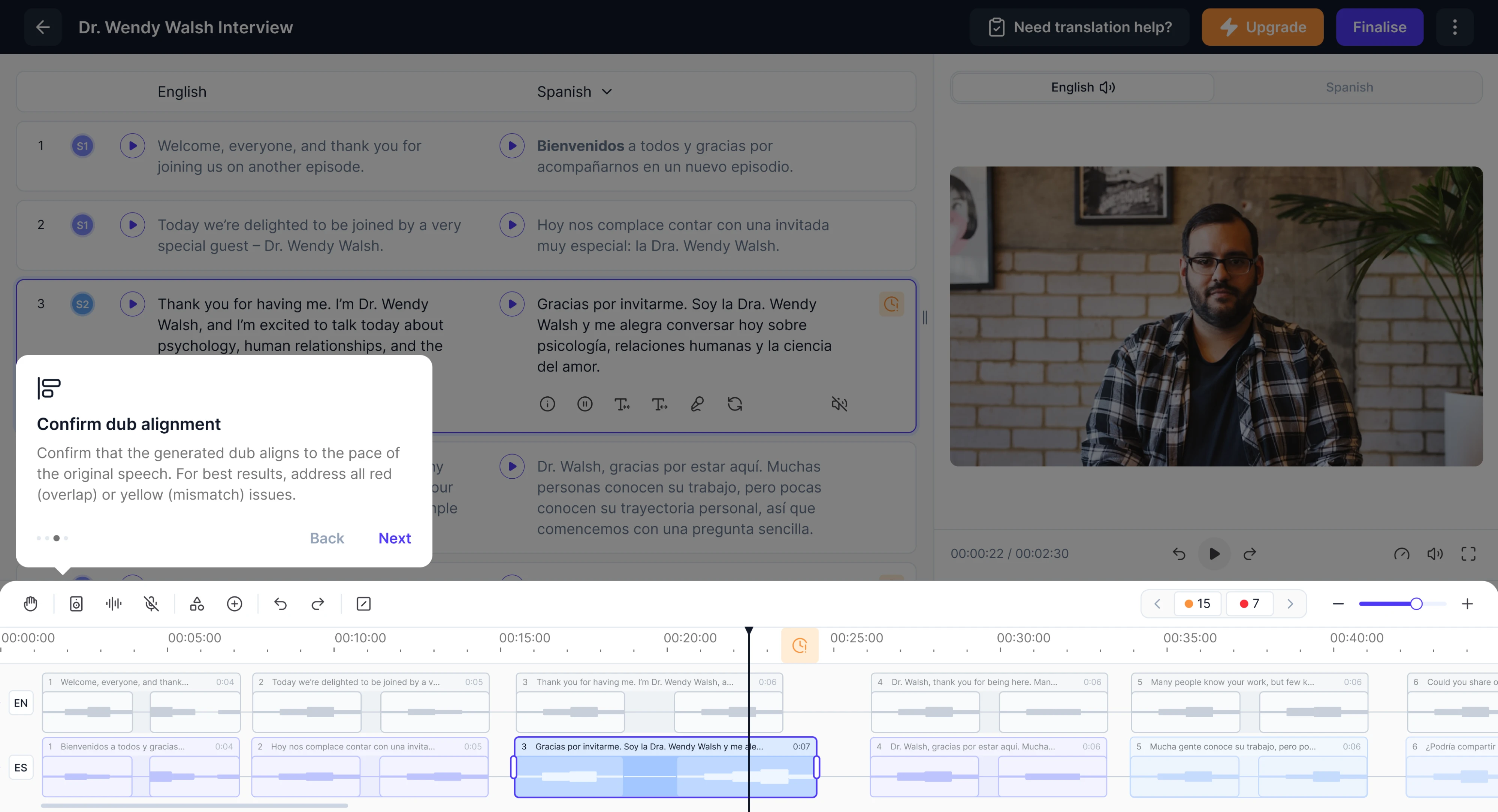
A great example of onboarding done right comes from our work with Panjaya, an AI-powered dubbing platform. Designed for individuals, teams, and large enterprises, the product introduced a powerful but unfamiliar workflow.
Because Panjaya combined AI-driven tools with editing features, new users often struggled to understand where to start. The platform’s novelty came with a steep learning curve, and reducing that barrier became our priority.
To address this, we implemented a guided highlight tour. This walkthrough pointed out the areas of the interface and helped users understand what was possible.

6. Overlooking user testing at key stages
Another classic mistake is avoiding or skipping usability testing due to tight timelines or the assumption that “it looks good to me, so it’ll be fine for users.”
Beginners might launch a design without ever watching a real user interact with it. Similarly, some are hesitant to actively solicit early feedback, either out of fear of criticism or overconfidence in their first version.
If you never test your design, you can overlook serious usability issues. Designers are often “too close” to the product, so you might not notice that a navigation is confusing, a button looks like a label, or an important feature is hidden.
Without feedback, you might invest time building the wrong solution or miss opportunities. Left unchecked, these issues can turn into expensive redesigns.
To make testing a part of your process, aim to:
- Run iterative usability tests as flows evolve.
- Use moderated or unmoderated tests.
- Capture both qualitative feedback and quantitative metrics.
- Test clickable prototypes to observe real behavior.
To prove that user testing matters, let’s take a look at our work with HealthStream. Our designer was rebuilding their product, Insights, which serves large healthcare enterprises, often managing hundreds of thousands of employees.
The product team had already tried to address poor usability by launching a new feature — Custom Reports. The idea was that more customization would equal more value. But once we conducted a round of user interviews, the assumption was off.
Users didn’t want infinite flexibility. They wanted clarity and ease. A standardized report format, with just a small amount of customization, was all most users needed.
With this insight, we redesigned the reporting flow based on simplicity and user expectations. And when the prototype was ready, the HealthStream product manager ran usability testing, which confirmed that the new flows were functional.

7. Using ambiguous or unlabeled icons
Icons are a powerful element of interface design. When they’re clear, consistent, and meaningful, they help users scan screens and take action quickly. But when icons are unlabeled, ambiguous, or inconsistent, they create guesswork.
Beginners often choose icons based on assumptions about what makes sense to them. The problem is that users don’t share the designer’s expectations. A familiar icon to you might be completely unclear to someone who has never seen it.
In UX, this relates to the principle of recognition over recall. Users shouldn’t have to remember what an icon means. They should recognize it immediately.
Design icons that support usability by following these practices:
- Always pair icons with labels.
- Prefer widely recognized symbols.
- Use tooltips and progressive hints.
- Validate icon comprehension in usability tests.
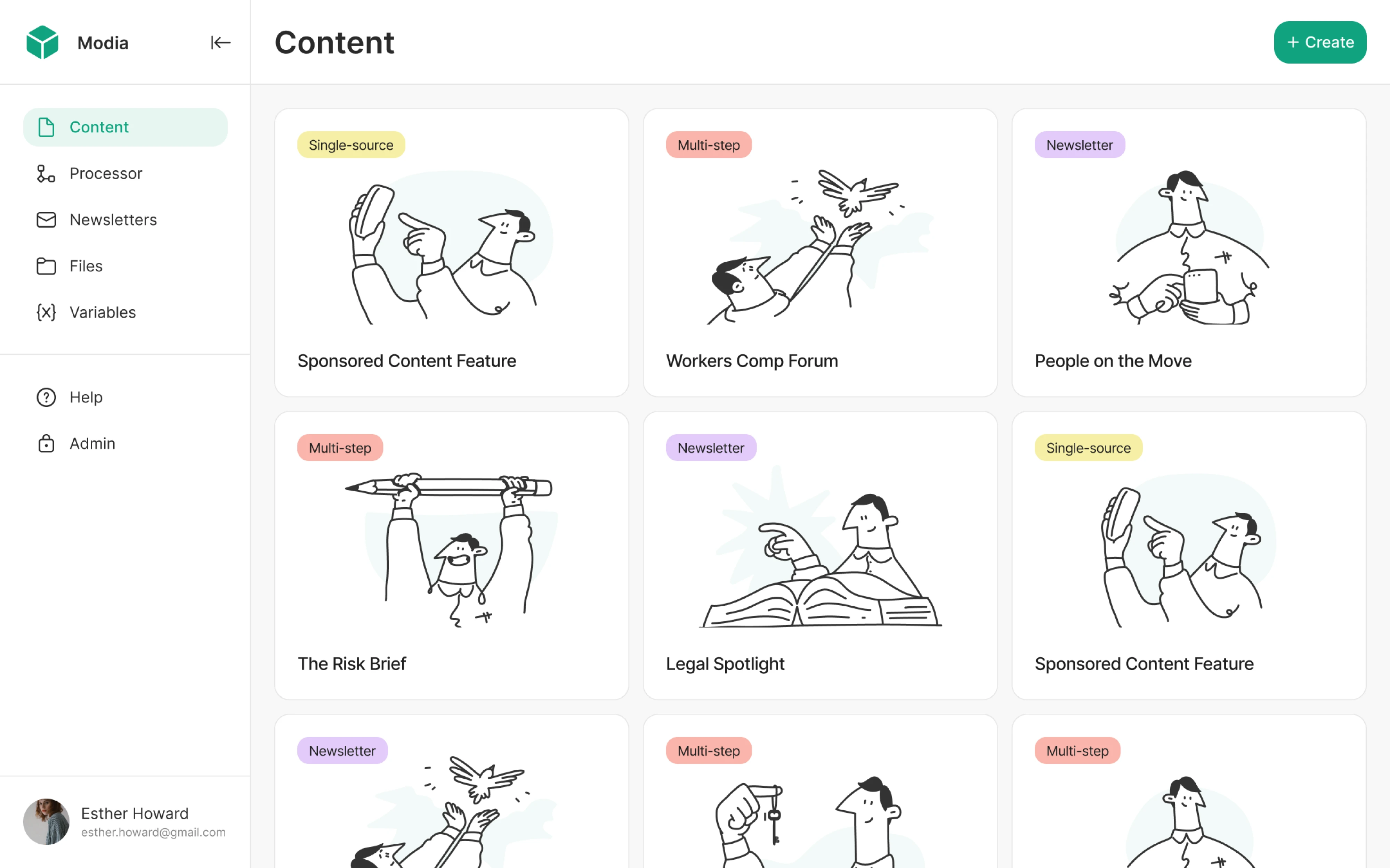
When working with Modia, an AI-powered content creation platform, we faced the exact UX issue. Initially, their product introduced an innovative way to create content, but it was struggling with unclear navigation and ambiguous interface elements.
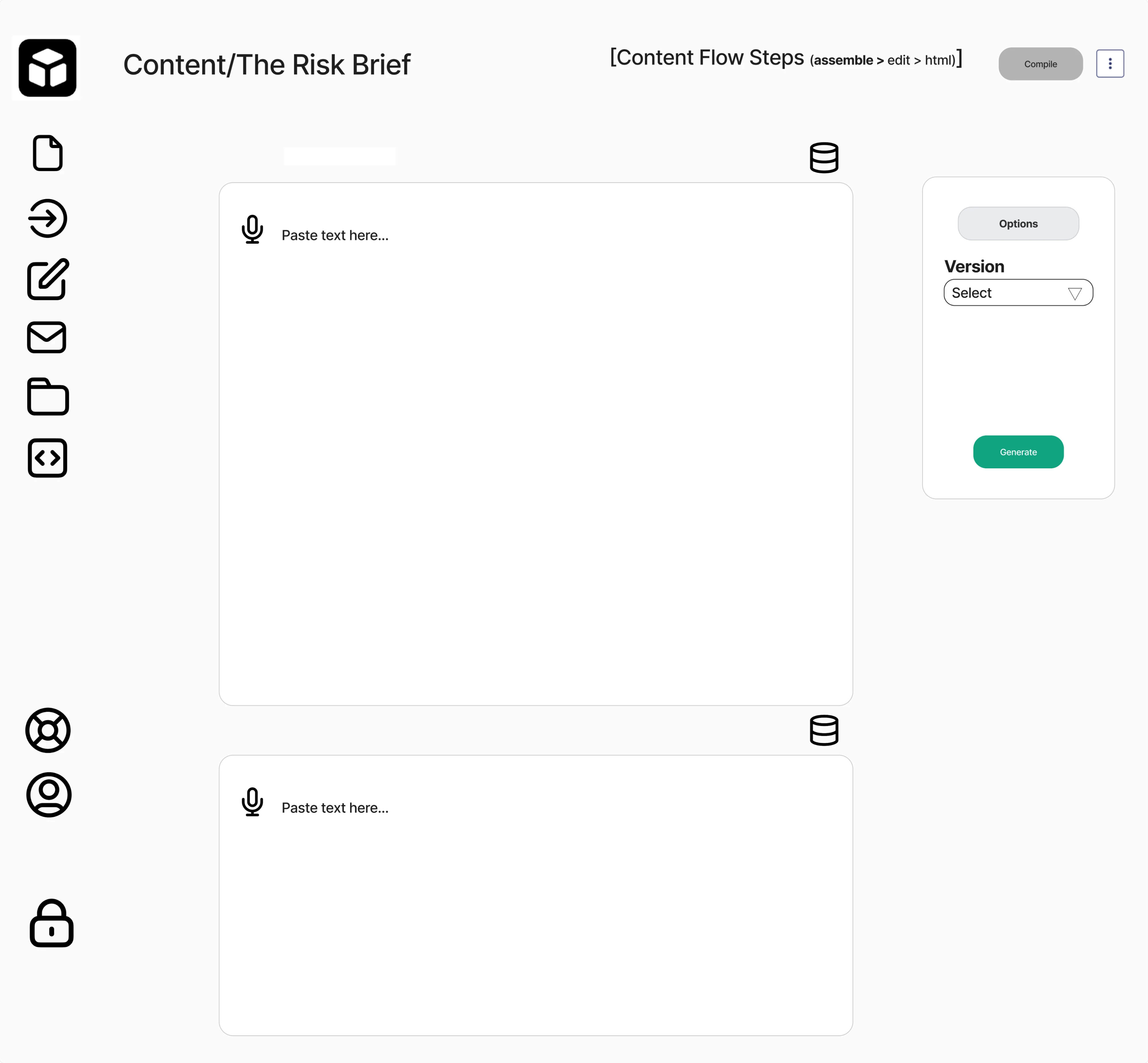
We kicked off the collaboration with a 3-day trial focused on reducing cognitive overload. Our team streamlined the layout, minimized the number of buttons, and redesigned the sidebar to function as a clear navigational anchor.
As part of the redesign, we replaced confusing icons with well-recognized symbols, added text labels, and ensured visual consistency throughout the interface.
8. Avoiding error messages and in-between states
When users trigger an action, they expect feedback. If nothing happens, or if messaging is vague, users are left guessing whether the system registered their input, whether something went wrong, or whether they should try again.
Missing error messages and in‑between states break trust. In interfaces where users perform important tasks, this kind of uncertainty leads to frustration and churn.
Being 10+ years in UI/UX design, we’ve seen how essential these patterns are in sensitive domains like finance, legal, geoservices, and more. In such environments, users expect a response to every action, and your design needs to deliver just that.
These are the most common forms of error and in-between states:
- Loading states.
- Success confirmations.
- Clear error messages.
- Validation feedback.
- Empty or zero states.
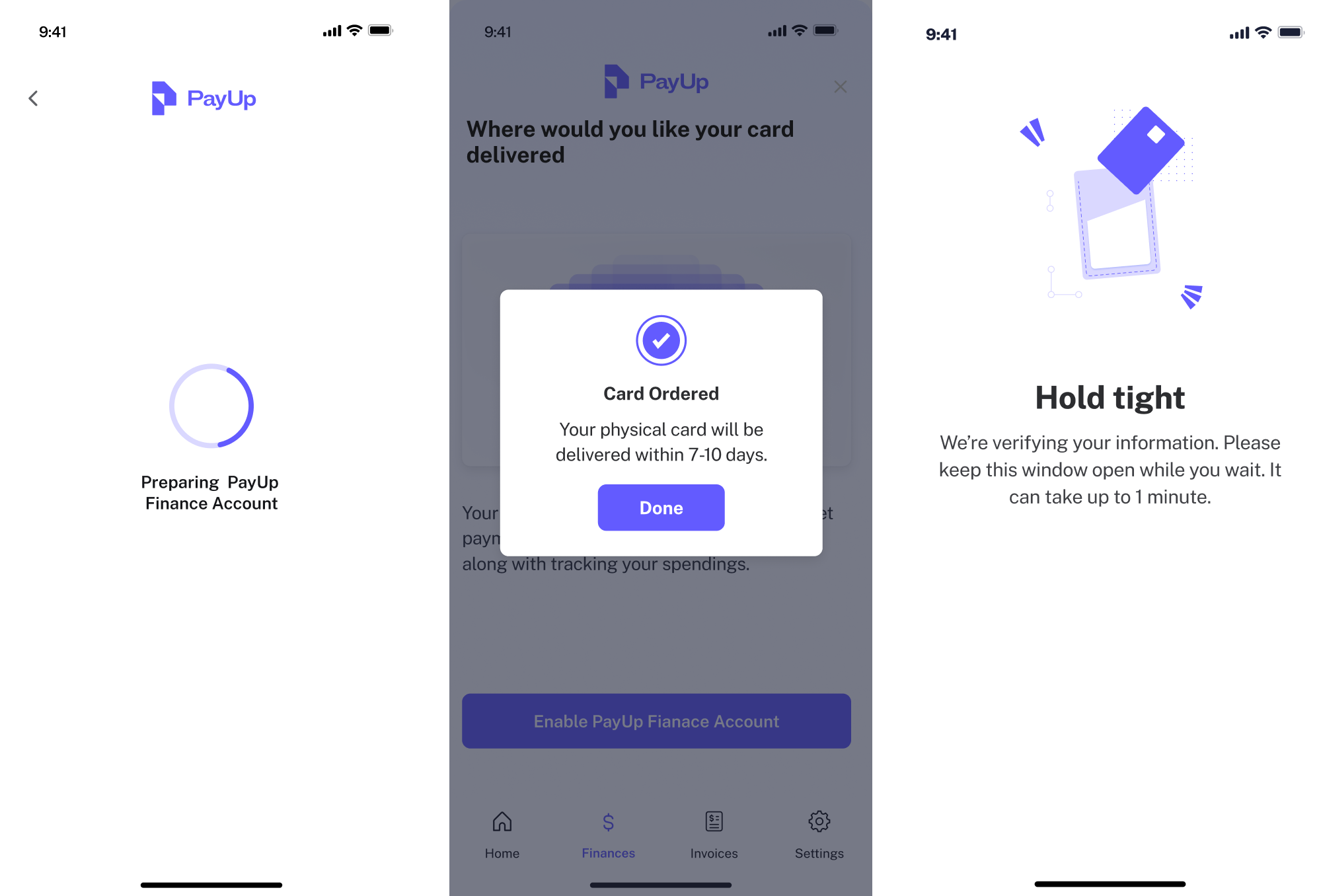
Speaking of sensitive environments, we always remember our work on PayUp, a financial startup. The platform allows vendors to choose custom payment dates and net terms, helping them get paid on their own terms.
As a small startup, PayUp was trying to grow fast. Our Eleken team turned out to be a perfect match to help them reach that goal and improve the existing designs.
Because the platform centered around financial operations, we knew that clarity and feedback would be critical. As part of the design scope, we created empty states, success confirmations, loading indicators, and other crucial interface patterns.
This way, users could see what happened, why something failed, and what to do next. It helped reduce frustration and build trust with every interaction.
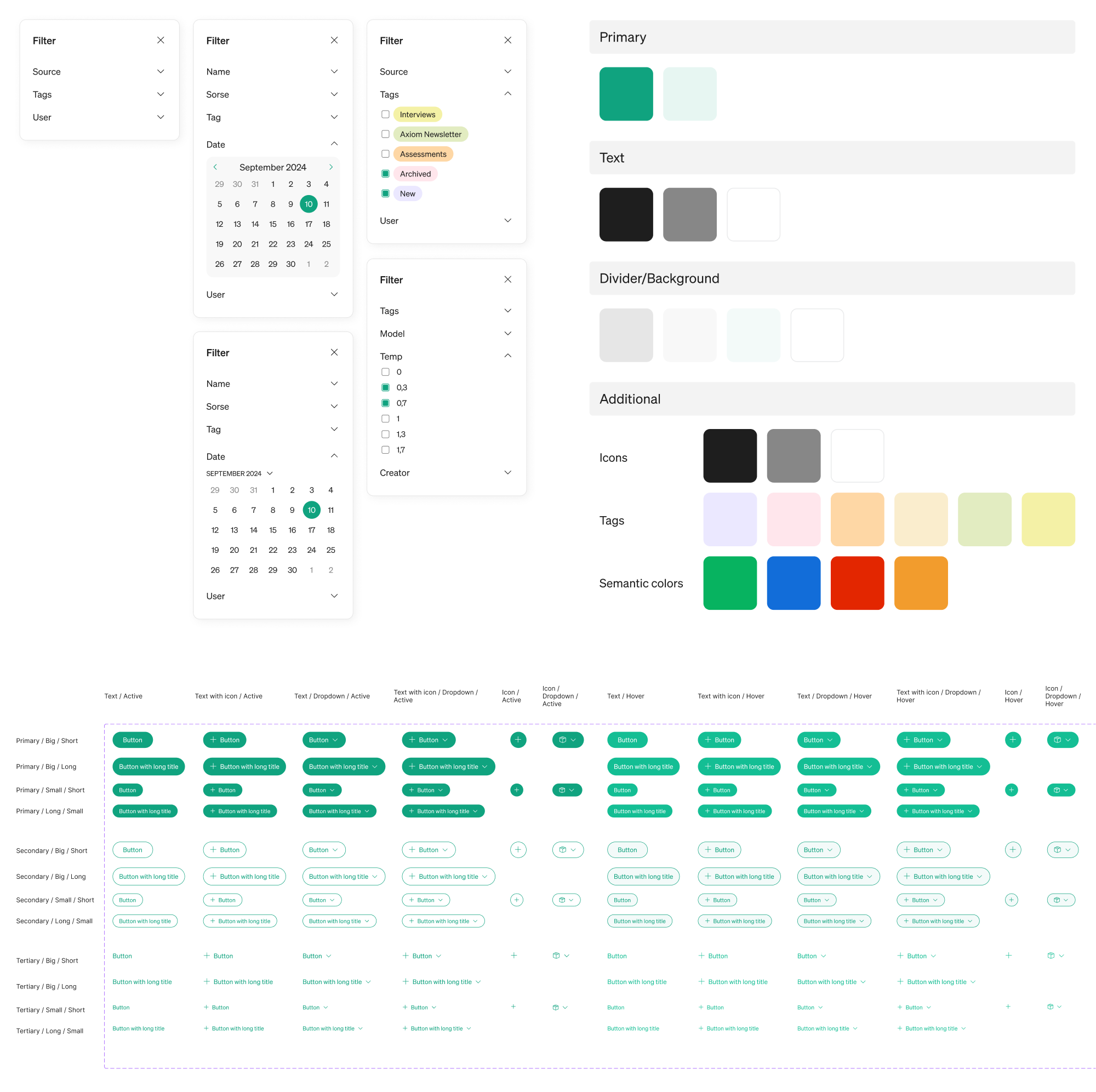
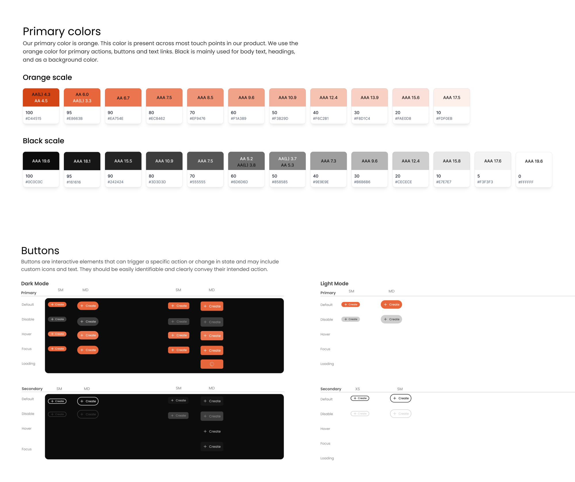
9. Designing without a design system
In early iterations, beginners might lack a unified style or set of standards and treat every screen as a fresh canvas. And that’s a huge mistake.
As features accumulate and teams grow, UI inconsistencies creep in. This creates confusion for users, who don’t understand why elements look different, and for designers and developers who interpret core components in their own ways.
Inconsistent UI patterns force users to relearn the interface on each new screen. When each page looks or functions slightly differently, users struggle to build a clear sense of how things work. This leads to frustration and mistakes.
Design systems matter because they:
- Ensure consistency in visual style and interaction behavior.
- Reduce cognitive load by reinforcing familiar patterns.
- Speed up design and development by reusing components.
- Help teams scale without fragmentation or style drift.
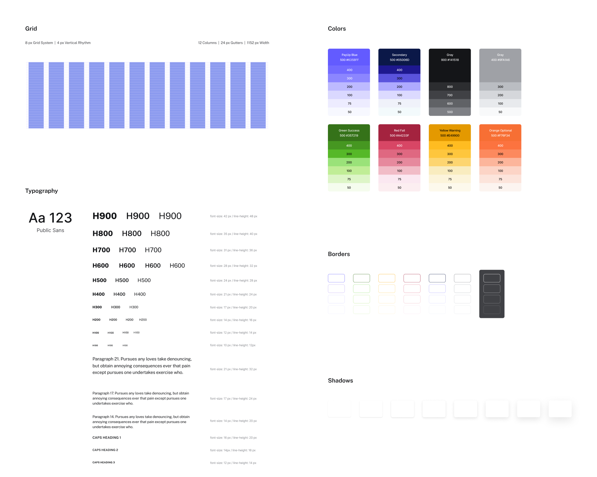
At Eleken, we work across projects of varying complexity, but one thing remains constant: we always rely on a design system to deliver scalable interfaces.
Some of our clients, like PayUp, reached out with a request to build a design system from the ground up. In this case, we created a cohesive visual language and reusable components that allowed their product to support future growth.
Then there are clients who arrive with products featuring fragmented styles and mismatched UI patterns. That was the situation with Modia, and our designer’s first step was to create a unified system that tied the interface together.
No matter the domain or product stage, we always start by reviewing whether a design system exists, and if it doesn’t, we build one.
10. Creating poor navigation structures
Navigation is the roadmap of your SaaS product. A common beginner mistake is to create complex, unclear, or inconsistent navigation structures.
This often happens when there are too many menu categories, vague labels, or key options buried deep in submenus. Sometimes, UX designers try to invent entirely new navigation patterns that users aren’t familiar with, which can backfire.
Confusing navigation forces users to think too hard about how to move around. The longer it takes to locate information, the more likely users are to give up.
As most UX design guides write, good navigation should be predictable, and users should know where an option will take them. Consistent UI patterns, clear hierarchy, and well-labeled icons help users move through the product confidently.
When designing navigation, consider using:
- Task-based labels.
- Structured menus.
- Breadcrumbs, active states, and section headers.
- Sticky or persistent navigation.
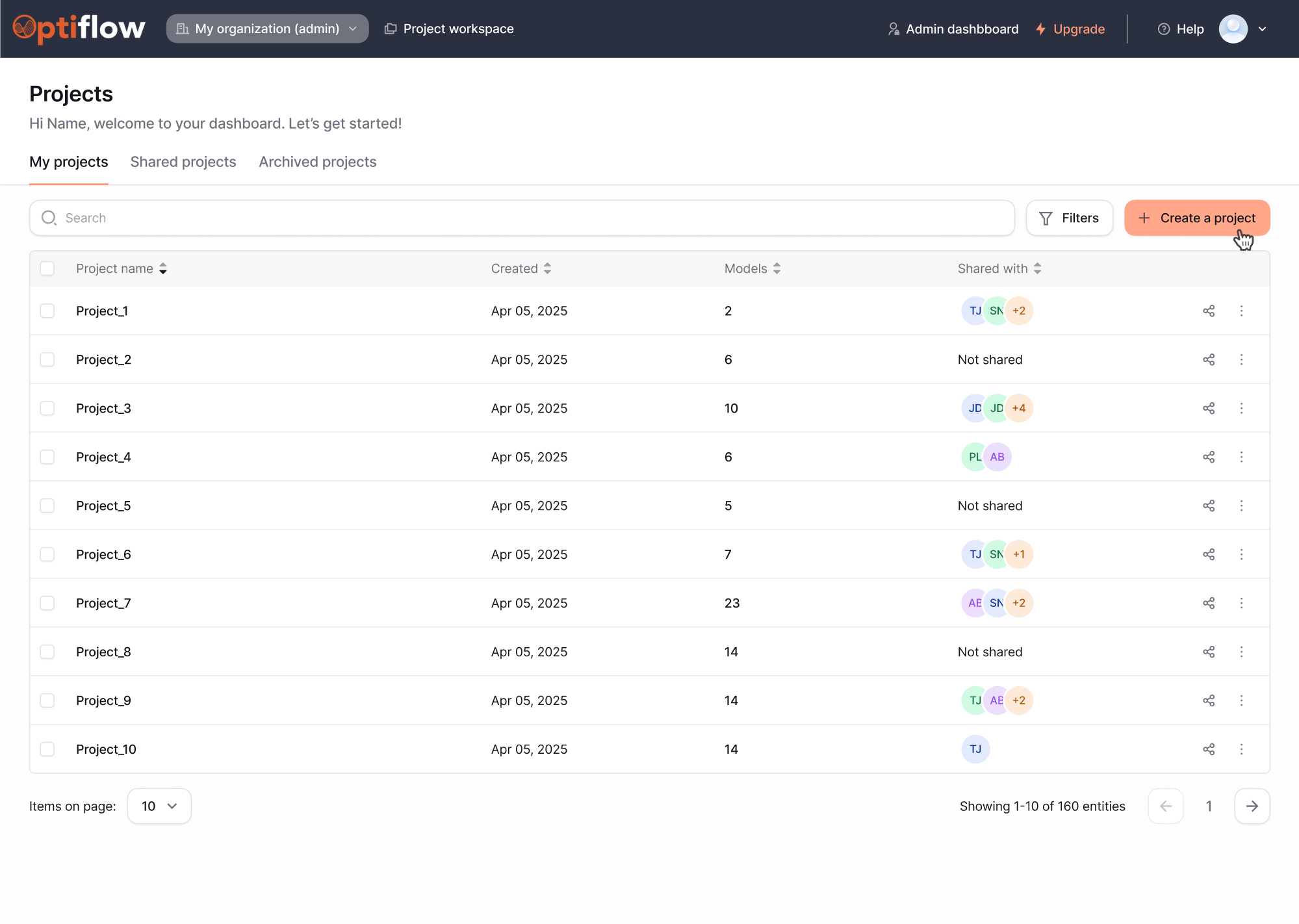
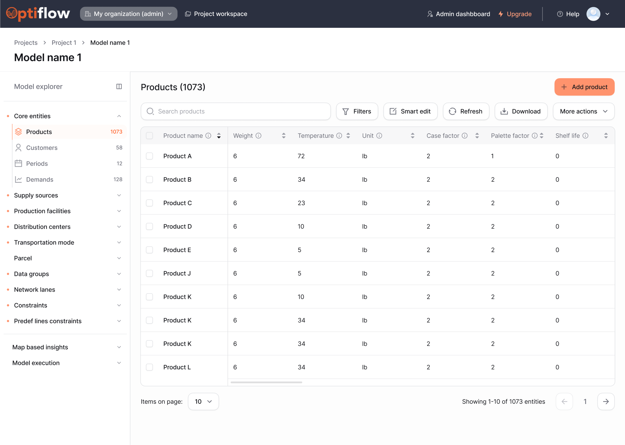
To show how poor navigation can impact product usability, let’s look at our work with Lambda SCS. They came to Eleken to redesign their core tool, OptiFlow, an internal AI-powered supply chain platform they planned to bring to the SaaS market.
We started the collaboration with a full UX audit. During our analysis, it became clear that the existing navigation was fragmented and hard to follow.
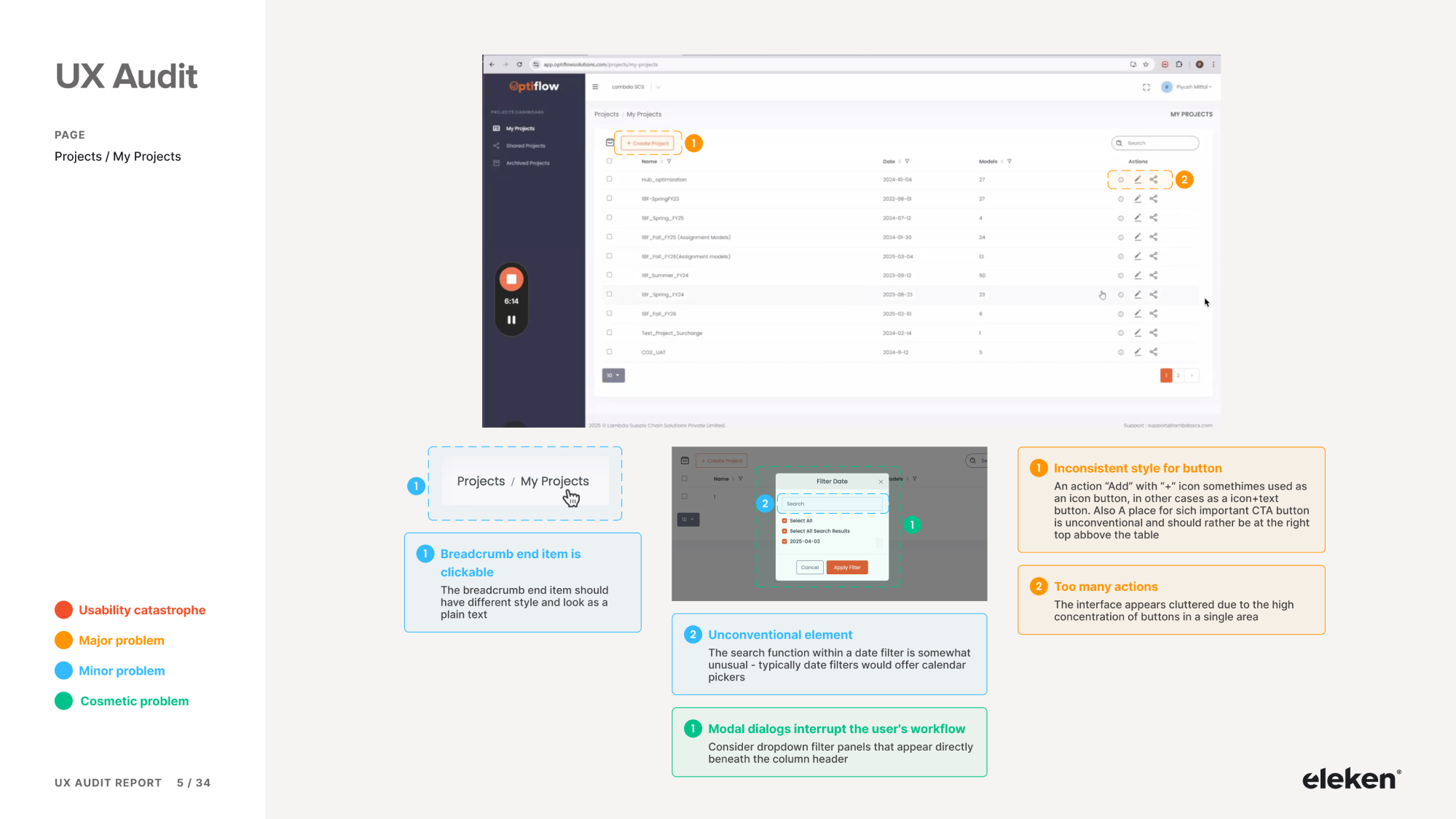
As part of the redesign, we added a horizontal nav bar for quick top-level scanning, and progressive dropdowns that help users dig deeper. We also introduced breadcrumbs, so users could always return to the main project list.
These improvements made the platform far easier to navigate. Now, users can explore complex sections of OptiFlow without getting lost.
11. Ignoring design and platform restrictions
Designers love to create freely, and while creativity is essential, ignoring platform or technical constraints can lead to user interfaces that break the experience.
Every product operates within a set of limitations, including third-party APIs, device performance, legal requirements, and more. If you design without considering those, you risk creating flows that are impossible (or extremely expensive) to build.
Designers may also forget that platforms like iOS, Android, or the web have native conventions. Ignoring these in favor of custom solutions can lead to UX issues.
However, that doesn’t mean you need to limit creativity. It means you need to be strategic. Great designers embrace constraints as a challenge. In many cases, working within boundaries results in smarter and simpler solutions.
A few practices that will help you stay grounded in real-world constraints:
- Involve developers early in the process.
- Learn the platform’s design conventions.
- Understand what systems the product relies on.
- Consider performance, latency, and access limits.
- Always validate ideas against technical feasibility.
A practical example of this challenge comes from our work on Greenventory, a young energy startup operating in the geospatial industry. The team approached Eleken looking for a designer with experience in complex environments.
One of the biggest constraints in this project came from external map repositories like Google Maps and OpenStreetMap. These platforms serve as the foundation for data-driven maps, but impose limitations that designers must account for.
Our designer created an interface within these restrictions that still delivers an intuitive experience. For this, we reduced unnecessary data requests, prioritized performance, and implemented efficient data visualization techniques.
As a result, Greenventory’s product remained user-friendly and technically feasible, striking the right balance between design and constraint-aware execution.
12. Focusing only on desktop users
Many beginner designers focus only on large desktop screens and overlook how their UI behaves on mobile or other devices.
You might craft a beautiful layout for a high-resolution monitor, but haven’t considered tablets or smartphones. In today’s multi-device world, this is a serious oversight, as more than half of internet traffic comes from mobile devices.
When an interface isn’t optimized for different screen sizes, it can break badly on smaller screens. Users on phones or tablets might encounter broken layouts, unreadable text, or cut-off content, all of which lead to high bounce rates.
In SaaS products, it’s especially critical. Users expect to move between devices smoothly. If responsive design is skipped, the experience feels fragmented.
So your interface looks good across devices, keep these UX practices in mind:
- Use a responsive grid system.
- Prioritize content hierarchy for smaller screens.
- Ensure tap targets are large enough.
- Use flexible layout components.
- Test your design on actual devices.
- Optimize typography and spacing.
We followed this exact approach when working with VLI Tech, a company that had acquired the Newton360 app for EMS teams. One of the core UX issues we identified was a complete disconnect between the mobile and web experiences.
Together with the client, we decided to start by designing the mobile app first, ensuring that key workflows felt efficient on smaller screens. Once those screens were approved, our next step was to adapt them for tablet and desktop.
The design also needed to support both dark and light modes, which added another layer of complexity to the system. To handle this efficiently, we built a unified UI system that allowed us to scale design decisions quickly.
The result was a responsive interface that supported multiple devices, giving Newton360 a much more cohesive and reliable user experience across the board.
13. Neglecting basic accessibility standards
Accessibility is often an afterthought for newbie designers, who might design for an average user by default. In fact, around 15% of the population lives with some form of disability, so when you neglect accessibility, you’re alienating these users.
Designers might simply forget to test for contrast ratios, skip writing alt text, or rely too heavily on color to convey meaning. But these small oversights add up.
Beyond the ethical issue of inclusivity, there are also legal implications. Many regions have laws requiring digital products to meet accessibility standards, and several companies have faced lawsuits for failing to comply.
In practice, accessibility also ties into good UX principles:
- Color contrast helps readability and reduces eye strain.
- Keyboard navigation benefits those with mobility limitations.
- Alt text ensures that screen readers can communicate content.
- Consistent structure supports both accessibility and usability.
- Clear focus states guide users who don’t rely on a mouse.
When working with FlourishOn, an MVP for a caregiving platform, accessibility was our top priority. The goal was to create an experience that felt supportive for caregivers under stress and older users with varying levels of digital comfort.
From the beginning, we followed WCAG standards to ensure clarity, readability, and ease of interaction. Every visual and functional element was selected with care.
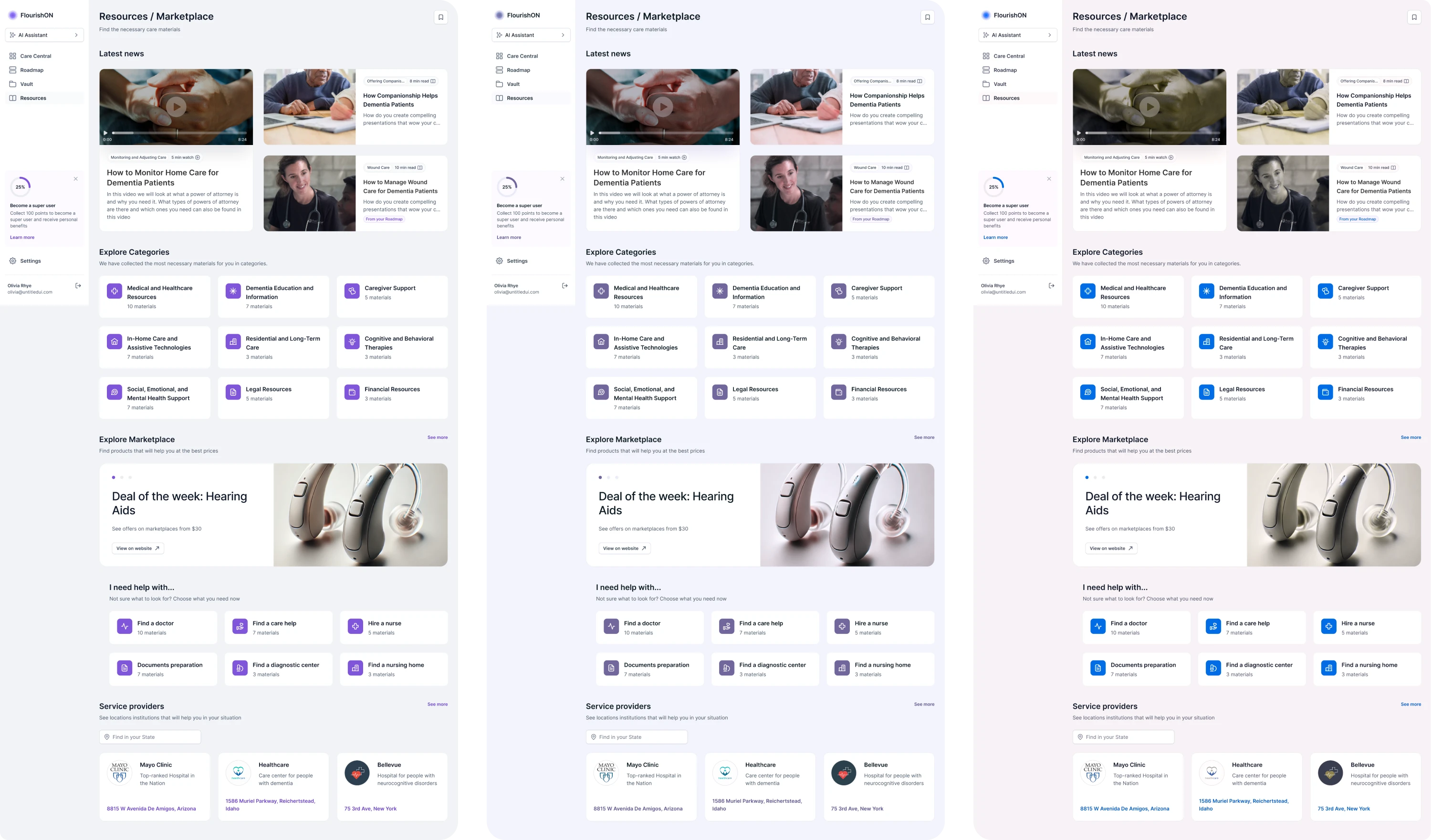
We used purple as a readable primary color and added beige accents to give the interface a calming feel. Generous spacing and large touch targets made the app easier to navigate for users who may not be tech-savvy or have fine motor control.
Our designer’s challenge was to make the interface feel like a digital companion that listens, guides, and reassures. And that’s exactly what we delivered.
14. Working in isolation from stakeholders
A common mistake among junior designers is trying to handle everything on their own. While it may seem more efficient, working in isolation leads to misalignment.
Stakeholders, whether they’re product managers, developers, or end users, bring context that designers can’t afford to miss. They hold insights about business goals, technical limitations, and user needs that shape the success of the final product.
Some designers fear collaboration because of criticism or the need to “present something perfect.” Others aren’t used to open feedback. But the truth is, design is a team sport, and the earlier you involve others, the stronger the results will be.
If you want stronger collaboration, focus on:
- Holding regular design syncs.
- Collaborating closely with developers.
- Scheduling ongoing check-ins.
- Documenting key decisions.
At Eleken, collaboration is our default. We source the top 1% of designers with fluent English, critical thinking skills, and a strong foundation in clear communication.
Once on board, every designer goes through a three-month training program to learn our UX standards, with senior oversight guiding them throughout.
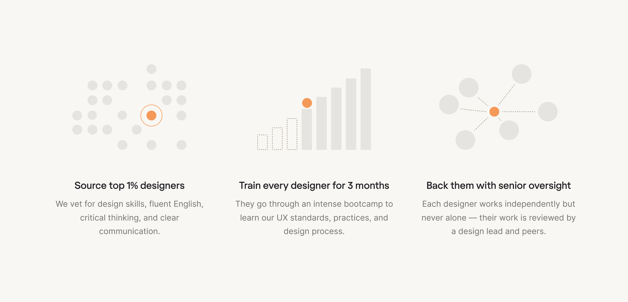
When working on projects, our designers don’t hide behind project managers. They communicate directly with stakeholders, running discovery, asking questions, and making design decisions alongside the people who know the product best.
Clients often highlight this as one of the reasons they love working with us. On Clutch, we’ve earned over 115+ positive reviews, with an average rating of 4.9 stars, and we’re committed to maintaining that standard with every new project.
Some parting wisdom
These are the most important UX mistakes we’ve seen over the years. But the truth is, there are always more. And if you think you’ll be fully prepared with best practices to avoid them all… don’t rush. Mistakes happen. They’re part of the design process.
What matters is spotting them, learning from them, and preventing them over time.
If your product is stuck, not performing as intended, or you’re simply unsure what’s going wrong, you can always reach out to Eleken. We start with a free 3-day trial, uncover UX issues, and work with you to move things in the right direction.
Let’s design a usable product together.


.webp)

.webp)
.png)

.png)