
Most redesigns fail not because the new UI is bad, but because they disrupt workflows users have relied on for years. Habit shapes user interactions, so even small changes can hurt productivity and slow teams down.
At Eleken, redesigns make up the majority of our projects. And quite often, these aren’t fresh products but long-standing systems with years of user habits, technical constraints, and business logic behind them. We’ve worked on many legacy app modernization projects that needed meaningful UX upgrades within real technical constraints.
That experience showed us one thing: redesigning legacy UI/UX requires a very different approach than designing from scratch.
In this article, we’ll break down how to modernize a legacy application safely – preserving user trust, respecting the codebase, and improving the experience without disrupting critical workflows.
The psychology of legacy UX: why redesigns break users
Understanding user psychology is critical to legacy redesigns, but it's often the most overlooked factor. While technical execution, architecture, and timing all matter, here are the psychological aspects most software design agencies miss:
1. The power of muscle memory
Users don’t consciously “search” for features – they rely on instinct built through countless repetitions. They click, scroll, and navigate without thinking. When you move something, they don’t assume it’s been relocated – they assume it’s gone.
This is just how the brain works. It stores such spatial patterns in muscle memory – the same system that lets you type without thinking about individual keys.
Each feature's location becomes embedded in muscle memory: “If it's not where the mental map says it should be, it doesn't exist.”
2. Cognitive overload during transitions
A new UI design demands a new mental model. Users must simultaneously unlearn old patterns, reinterpret labels and flows – often while trying to stay productive.
This relearning process is mentally demanding. Tasks take longer, users hesitate more, and error rates increase because every action requires conscious decision-making to get to the expected outcome.
3. Emotional friction
Resistance increases as the emotional toll mounts – feeling incompetent at tasks you'd mastered is deeply frustrating.
For longtime users, the old system is where their value lives – in shortcuts known, workarounds mastered, and edge cases solved. And redesigns can shake that foundation.
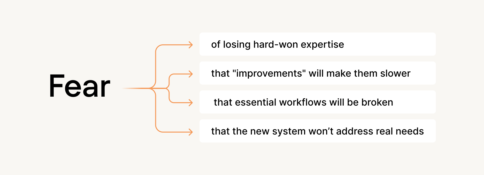
What looks like resistance to change is actually resistance to loss.
Successful legacy redesigns must account for everything aforementioned – not as obstacles to overcome, but as realities to craft designs around.
The technical reality you need to account for in a legacy redesign
Crafting UI/UX for outdated software doesn’t mean starting from a blank canvas. Your app already has history, logic, and technical decisions baked into it — and they all matter.
Some redesign ideas will be easy to ship. Others won’t be possible without major engineering work. Understanding this early helps you make smarter trade-offs and avoid frustration later.
1. Fragile legacy architecture
Most legacy systems weren't built for iteration. Oftentimes, their architecture reflects a "build once, run forever" mentality that makes UI changes surprisingly expensive.
These systems frequently rely on hard-coded layouts, where spacing and positioning are tied to product logic instead of reusable styles. They also often have no componentization, meaning interface elements (buttons, forms, headers) are built as one-off pieces instead of shared, reusable building blocks. Combined with zero test coverage, even minor visual updates can have negative, wide-reaching effects.
This is how teams arrive at stories like “two weeks to move a button”— a real case shared by one developer on Reddit.
2. Outdated frameworks & tech debt
Many legacy applications are built on frameworks that were modern at the time but are now outdated. For example, Ruby on Rails applications on very old versions can be difficult to upgrade safely, limiting the use of modern UI patterns.
Similarly, older WPF desktop apps often tightly couple layout and logic, making visual changes harder to isolate. Over time, teams accumulate workarounds and obsolete patterns that have no comprehensive support.
Meanwhile, the business runs, and technical debt grows high. Every year you delay, the gap widens and the talent pool shrinks, making eventual legacy modernization more costly and risky.
3. Hidden dependencies & black boxes
In legacy systems, connections stay invisible until they break. Somewhere in your mobile app may live a random integration added three years ago to solve an urgent problem. Or some manual script that runs every Tuesday to reconcile data inconsistencies.
Because these dependencies behave like black boxes, teams must treat changes cautiously. A seemingly simple UI update can affect systems outside the product itself, making even small adjustments require thorough research and coordination.
4. Legacy data migration risks
Modernizing a product often means adapting old data structures to support new user flows and interactions. Some legacy systems store sensitive information in insecure ways, such as plaintext passwords, which cannot be safely converted without forcing user-facing changes.
Other risks include broken or inconsistent database schemas that are difficult to reform without data loss, as well as the need to maintain historical records for legal, analytical, or business reasons.
During modernization, teams must also ensure feature equivalency so that existing user workflows continue to function as expected. Yes, a new UI may look improved, but it delivers value only if it can reliably access and update data.
Summing it up: you can't really modernize UX without understanding what the code can and can't handle. Because beautiful mockups mean nothing if your architecture can't support them.
Legacy UX redesign strategy: How to modernize without breaking everything
Most legacy redesign advice boils down to "understand your users" and "communicate change effectively" – generic wisdom that ignores why these projects actually fail.
The real challenge is practical: you need to enhance user experience while navigating resistance, architectural constraints, hidden dependencies, and data migration risks that could break production systems.
At Eleken, we’ve learned that safe modernization depends on a structured process. Here's a framework that works with these realities, not against them.
Step 1: Map the real world before touching the UI
In practice, legacy app redesign services work best when they don’t start in Figma but with a clear picture of how the product works today. Mind – not how a product was meant to work, but how people actually use it.
To surface exactly that, we suggest starting with a UX audit. Here’s what that process typically includes:
Documenting existing workflows
Capture the full path users take to get things done, from start to finish. Look for workarounds, as they matter more than intended user journeys. This will guide you to improve what’s working and avoid accidentally removing critical behaviors the team didn’t know existed.
Identifying role-based behaviors
Segment usage by persona or access level – admins, ops staff, customers, etc. – each group may interact with the same UI in drastically different ways. That means they all have developed expertise that your design vision will either preserve or destroy.
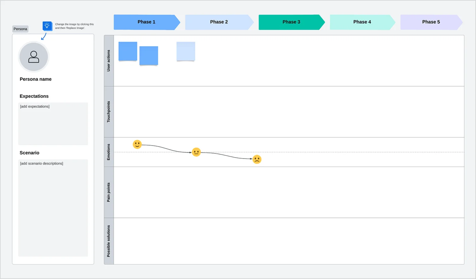
Grab this free user journey template and adapt it to fit your user personas.
Finding “functional anchors” (unchangeable UI elements)
Functional anchors are parts of the UI or workflow that can’t be changed due to critical business logic or system constraints. Before proposing UI/UX changes, you need to know which elements must stay in the same place and keep the same structure.For example, legacy tables may need to stay in place because external systems depend on their structure. Or a specific layout might be required because calculations rely on a predefined column order.
Failing to identify such elements early leads to redesigns that look good in Figma but cannot be implemented by devs.
Clarifying dependencies
Every interface element connects to something beneath the surface. A single dropdown can trigger real-time calculations across multiple databases, fire external webhooks, or impact downstream features. Identify these connections before you design to prevent major architectural breakage.
Interviewing devs to find danger zones
Developers know which parts of the codebase are brittle, which integrations are undocumented, and which changes will require weeks instead of hours. Their insights are gold, keeping you clear of the system’s most fragile areas before small tweaks become costly rework.
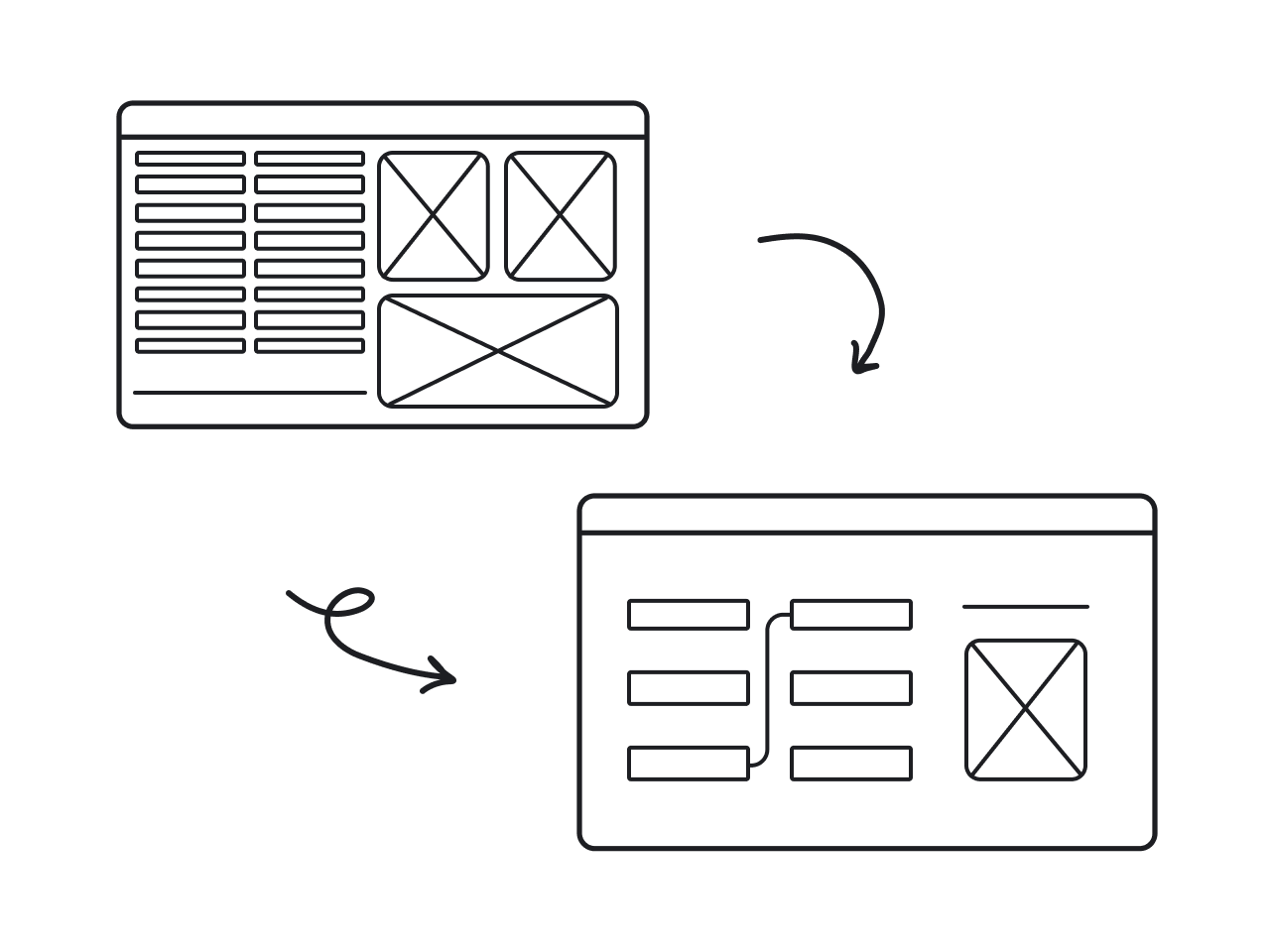
Step 2 — Identify UX debt vs. technical debt
Not every UX problem requires the same cost to fix. Build a three-tier matrix that maps each issue to its implementation reality:
Such a matrix helps teams make trade-offs consciously – not reactively – and avoids wasting time redesigning things that can’t be implemented.
Step 3 — Map users’ habitual behavior
Before relocating features, understand which elements users find instinctively versus consciously.
- Use heatmaps and session recordings to track immediate clicks, rapid action sequences, and frequently accessed features that reveal muscle memory.

- Cross-reference this data with your redesign plans to identify risky relocations.
- Create a “Feature Visibility Index” to score each element by interaction frequency, time-to-discovery for new users, and support ticket volume.
All in all, this reveals which features genuinely need better placement versus which already work well and shouldn't move.
Step 4 — Define your modernization path (choose one)
The rollout strategy you choose determines the timeline, budget, and user acceptance. Here's how each approach plays out in practice:
Big-Bang Relaunch
In this case, redesign happens all at once and is often paired with a rewritten backend. It brings maximum disruption along with both high cost and high risk. Such an approach is rarely recommended and only viable when you need ultimate digital transformation, because incremental improvement would cost more than starting fresh.
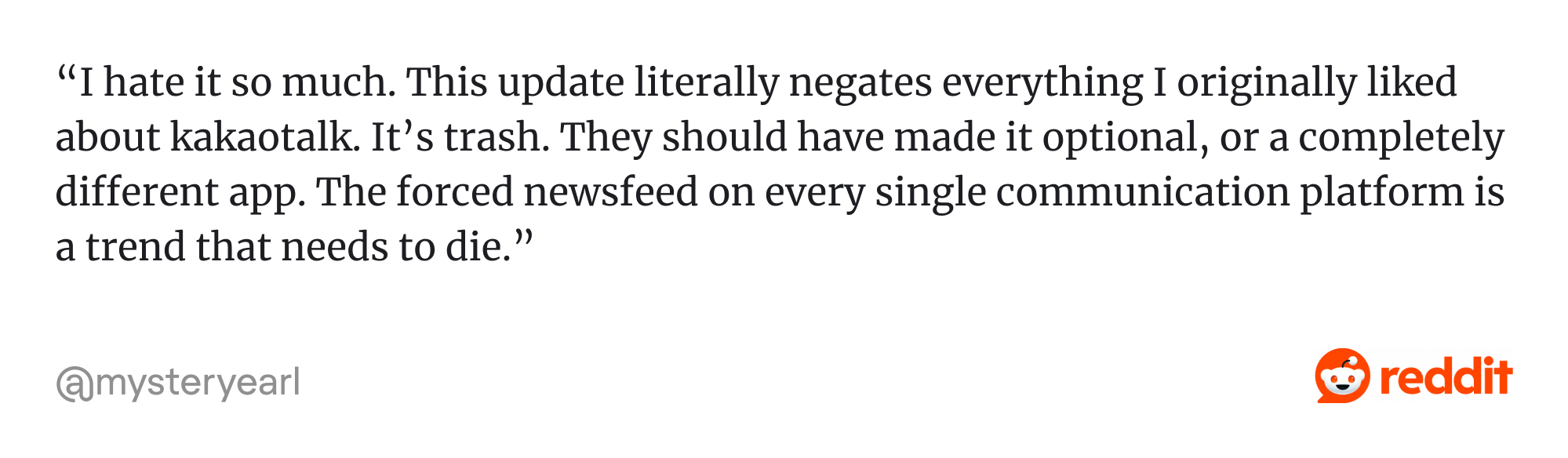
Example: KakaoTalk, South Korea’s top messaging app, launched its biggest overhaul in 15 years as a single big-bang update. The redesign didn't address real user needs, and it met with severe criticism over its “user-hostile” interface, privacy concerns, and multiple unwanted new features, triggering massive backlash and one-star reviews across app stores. Its Google Play rating fell from over 4 to 2.8 in less than one week after the update.
Incremental modernization
Updates are released one feature area/module at a time. In some cases, the interface may become a "Frankenstein" mix of old and new for months. While manageable change often comes at the cost of temporary visual inconsistency, such an approach brings ease and allows for ‘controlled risk’ in the form of continuous feedback loops that help shape subsequent updates.
Parallel UI (Beta Mode)
Here, you run both versions simultaneously with a toggle in between. Users switch when ready, falling back to the familiar version when under pressure. You gain adoption control and rollback capability but lose efficiency. Maintaining two complete systems certainly comes at a high cost. Still, this strategy works well if you need adoption metrics before committing fully.
Incremental + Parallel Hybrid
Modernized features are released incrementally while a beta mode is open for full preview. Power users get early access to everything, cautious users adopt proven changes gradually, and you collect feedback at every stage. Ideal for enterprise products with multiple user segments, complex IT infrastructure, and mission-critical operations. It offers flexibility without disruption; however, the execution cost is high.
Fresh coat of paint
Redesign touches visual styling only without changing information architecture or workflows. It’s the lowest-risk option that delivers a legacy system UI UX update without user productivity loss or workflow disruption. It’s useful when a legacy system performance is good, but the software solution looks dated, or when full modernization isn’t yet feasible.
Step 5 — Design “transitional UX”
As you design your new experience, build in transitional UX patterns from the very start. These guardrails will make your eventual rollout smoother and safer — especially when you begin validating changes with real users. Mind to:
- Keep anchors in place: preserve critical features identified in Step 1. These stability points should stay exactly where muscle memory expects them.
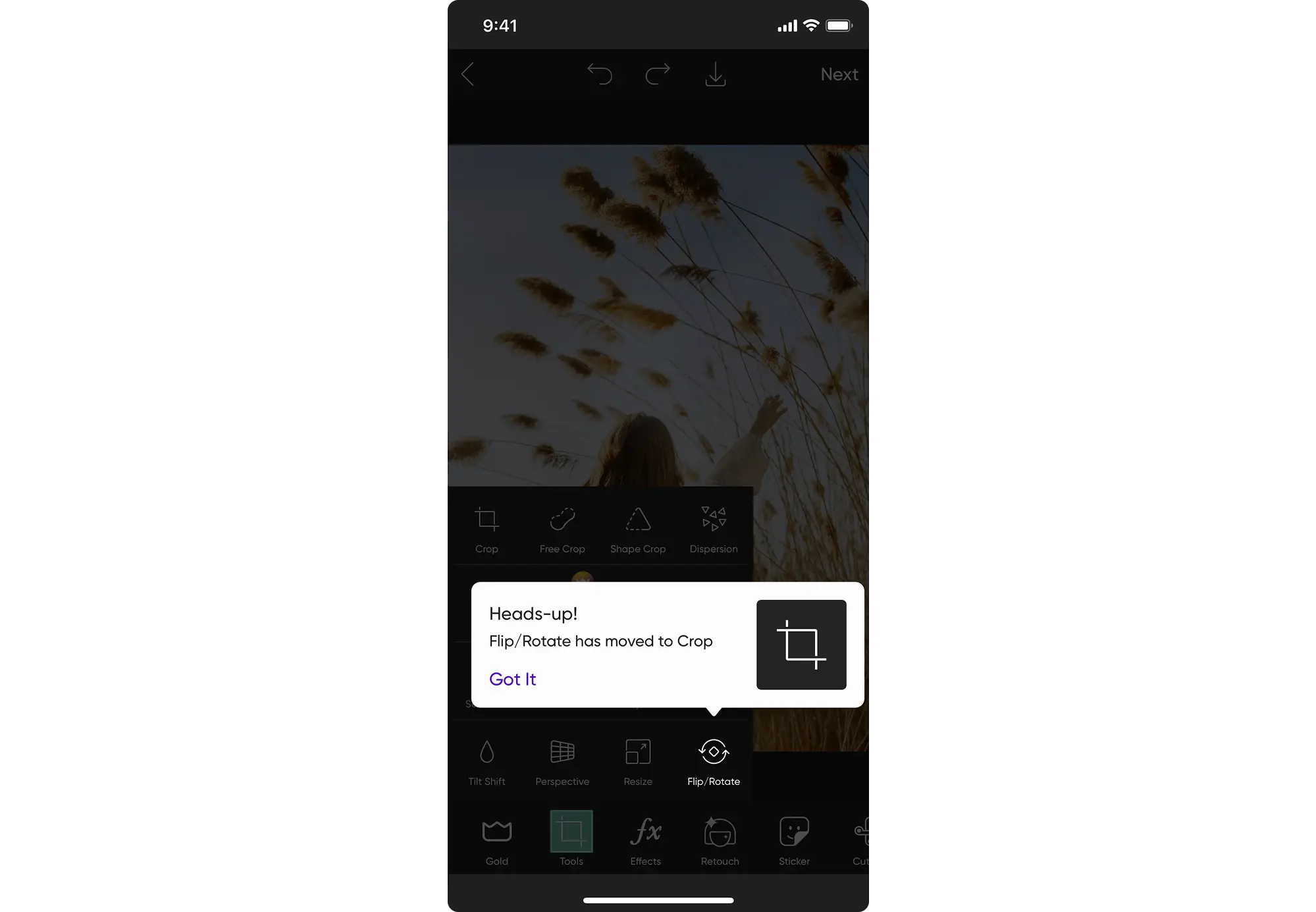
- Add "this feature moved" highlights: use visual indicators – badges, arrows, and color accents – that draw attention to relocated features. Phase them out after adaptation.
- Implement temporary tooltips: deploy contextual guidance for changed workflows. Tooltips appear when needed, then disappear after consistent successful interactions.
- Plan Gradual Restructuring: sequence changes across releases: visual updates first, workflow improvements second, and restructuring last.
Step 6 — Validate without breaking live workflows
Once your transitional UX is in place, it’s time to test – yet carefully. In legacy systems, even small changes can break important workflows. That’s why you need to test with real users – but without getting in their way.
Here’s how to test safely:
Start by running A/B tests on low-risk modules where change won’t interrupt core functionality. Begin with power users – they'll spot efficiency losses in minutes that casual users might miss for weeks.
As you validate the optimized experience, make sure you preserve keyboard shortcuts and other efficiency tools that advanced users heavily rely on. And don’t reset user settings or preferences during testing — it just adds unnecessary friction and erodes trust.
Keep in mind: validation isn’t just about proving what works – it’s about making sure nothing breaks in the design process.
Step 7 — Implement with safety nets
Redesign implementation shouldn't be irreversible. Deploy changes with mechanisms that let you pause, adjust, or retreat without emergency engineering sessions at midnight.
Use feature flags for component-level control
Wrap redesigned elements in toggles for instant activation or deactivation. If a new workflow causes confusion or breaks something, you flip a switch instead of rolling back the entire release. Feature flags also let you test with select users and gradually expand access as confidence builds.
Roll out module by module
Deploy one redesigned section at a time, rather than replacing the entire interface at once. This keeps potential issues contained in a specific area, without disrupting the rest of the product. Each module launch also brings along valuable feedback — helping you refine the next stages of rollout.
Prepare automated rollback capabilities
Build and validate automated reversion processes in staging environments to ensure everything actually works under pressure. When issues emerge, rollback should take minutes, not hours of manual database restoration and code reversions.
Step 8 – Activate change management
Many redesigns miss the human side. The tech works, but users resist without clarity on what’s changing and why. Here are 4 key actions to take before launch:
Announce changes well in advance
Communicate changes weeks before deployment, detailing what's different and why improvements matter. Surprise redesigns feel like disruptions. Announced changes feel like planned improvements users can prepare for mentally.
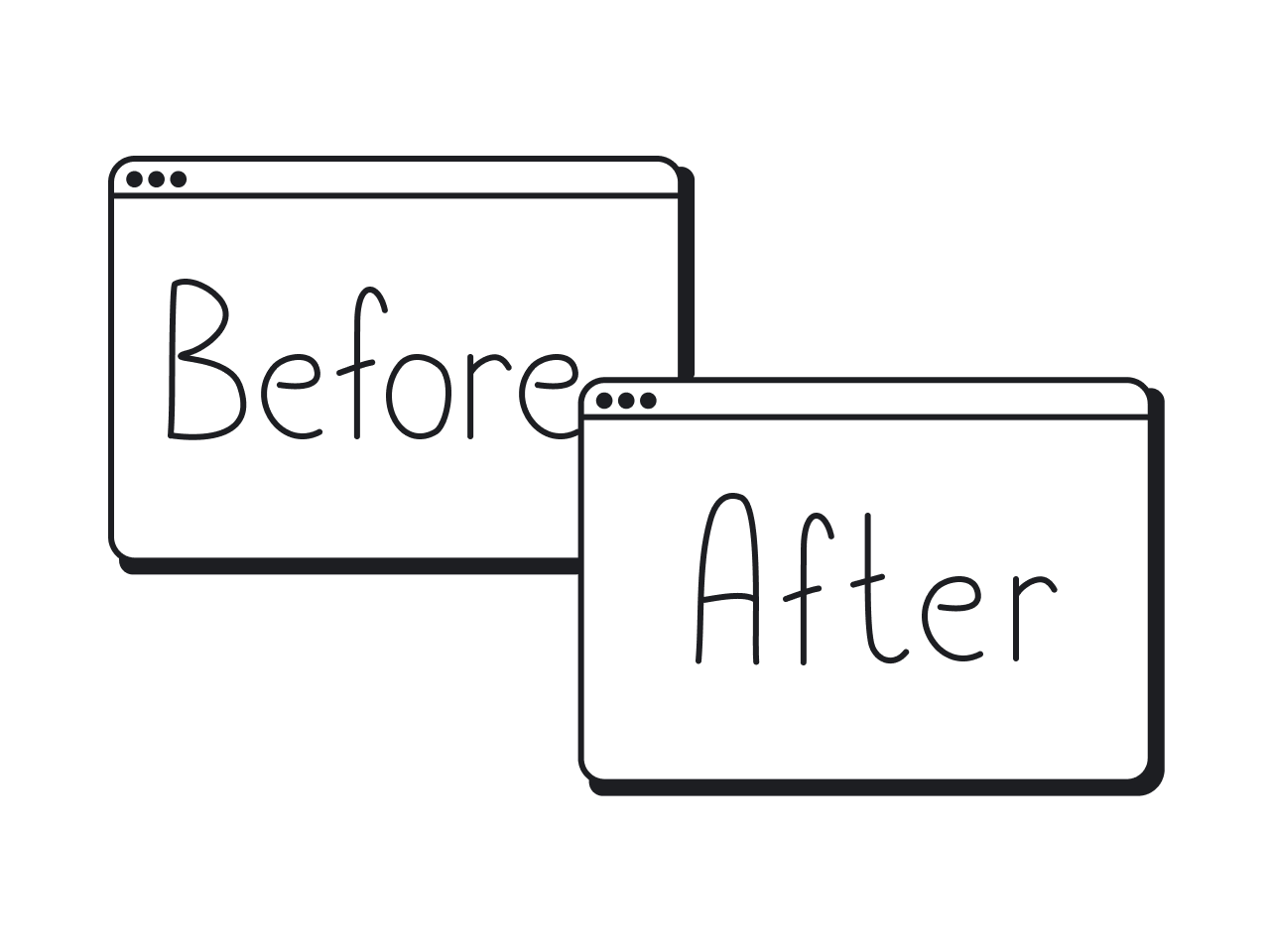
Show "old versus new" mappings
Create visual guides comparing current locations to redesigned positions. "The Reports button moved from the sidebar to the top navigation" helps users translate muscle memory into new patterns faster than exploring blindly.
Provide optional quick tours
Offer concise walkthroughs of major changes without forcing everyone through them. Power users skip tutorials; uncertain users appreciate guidance. Let users choose.
Document what was never documented
Legacy systems often lack comprehensive guides. Your redesign is the opportunity to finally create the documentation users always needed but never had.
Step 9 – Measure adoption and post-migration success
Redesign success stories aren't measured by launch — they're measured by what happens after. Track metrics that reveal whether your modernization actually improves user experience or just looks better.
Use task speed and error rate to measure usability improvements. Monitor whether support tickets drop around the redesigned areas — or spike. Shorter training time for new users is another strong sign you’ve made things simpler.
Don’t stop at usability. Watch user satisfaction, feedback trends, and most importantly — retention and churn in your final product.
A visually appealing new UI means nothing if it quietly drives your best users away.
How Eleken brings new life to legacy app UX
As we’ve said before, many of the projects we take on at Eleken aren’t brand-new digital products. They’re mature systems with real users, real workflows, and real constraints. We’ve worked with 200+ B2B SaaS apps across all verticals, where redesigning meant modernizing without breaking the experience users already rely on.
While each project is unique, here are a few principles that shape how we approach legacy redesigns without breaking what already works:
Designing with full empathy for power users
One of the first things we’ve learned is that even “small” changes can feel disruptive to longtime users. That’s why we start every project with full empathy for power users — the ones who are fluent in the product’s flows, shortcuts, and hidden logic inside out. Respecting how they work helps us avoid unnecessary friction.
A good example of this approach is our work on the Gridle project. To understand real user behavior, we combined session recordings (via Inspectlet) with user interviews. This allowed us to see which features power users relied on daily – and which ones were rarely touched.
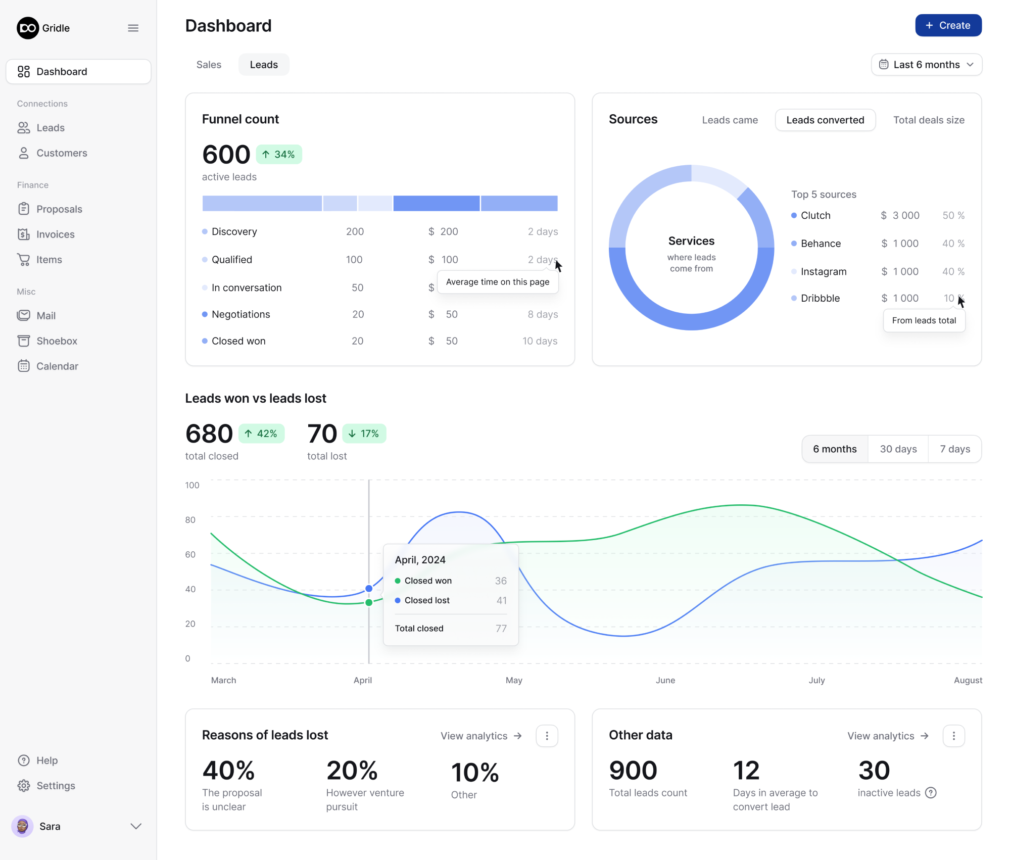
Using empathy mapping, we translated these insights into UX decisions that preserved muscle memory and respected familiar interaction patterns – while still improving clarity and usability.
Following a transitional UI strategy
A new interface might look better — but if it feels unfamiliar, it can backfire. That’s why we use a transitional UI strategy: small cues, familiar patterns, and optional toggles that help users reorient themselves without losing confidence.
A strong example of this approach is our work on Spoonfed. While the legacy version was still live, a full redesign couldn’t happen overnight without risking user trust. Instead, Spoonfed took an original yet practical approach: alongside the larger redesign, a parallel “tiny redesign” was introduced.
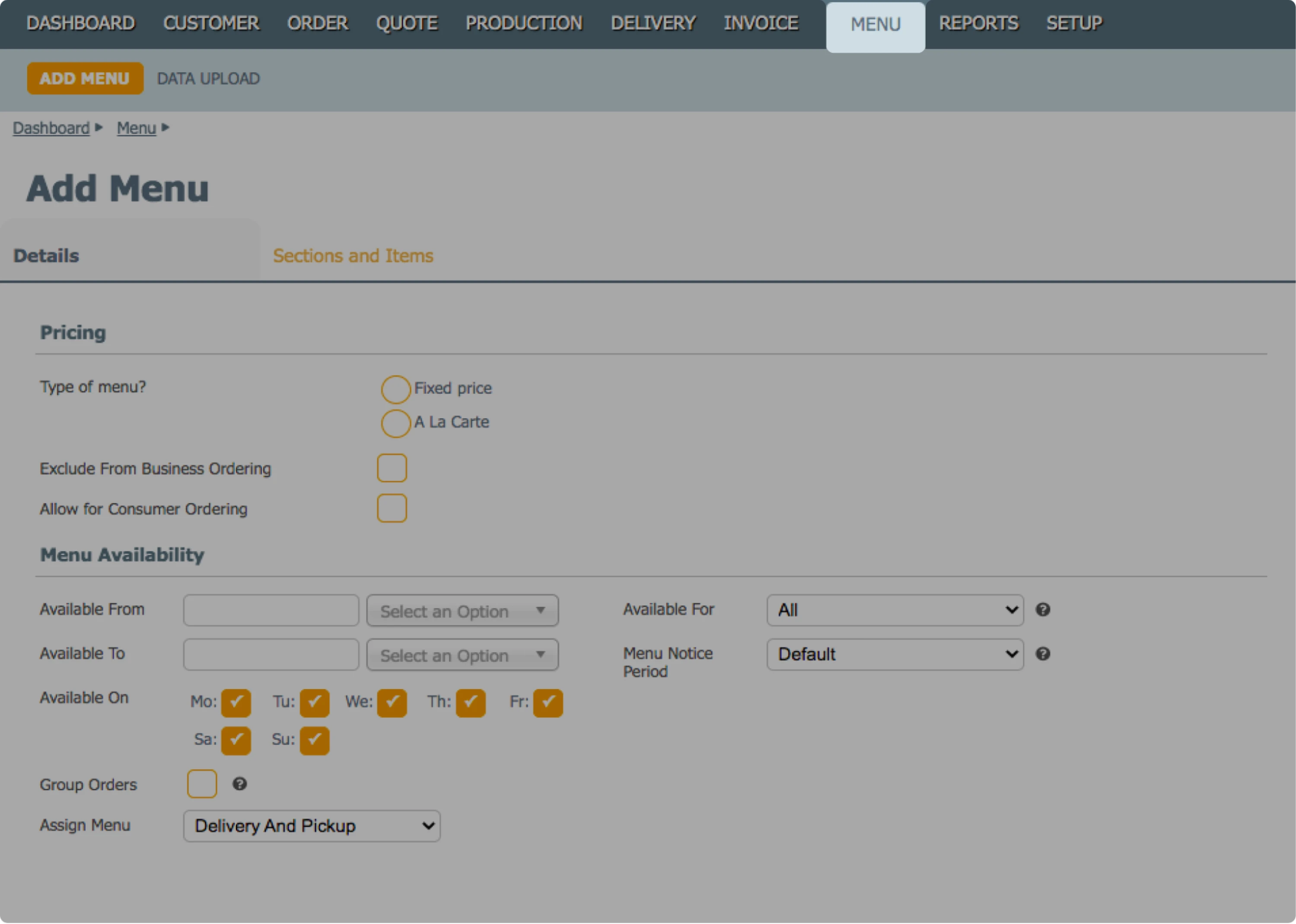
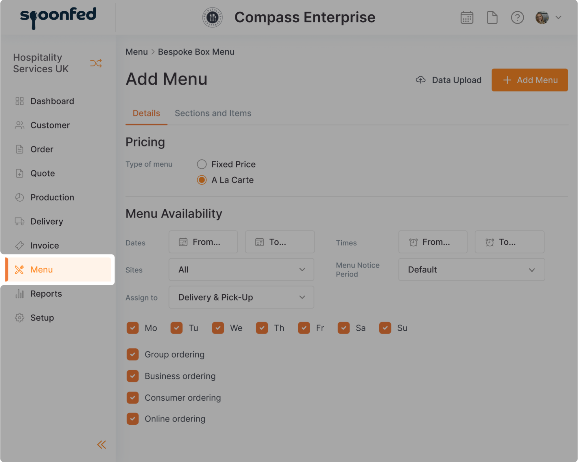
This allowed us to update the interface gradually – preserving the existing layout logic while rolling out a modern design system inspired by familiar products like Stripe. Custom icons and clearer visual hierarchy helped users adjust naturally. The result was a refreshed experience that felt trustworthy and user- friendly, not disruptive.
Embracing tech-aware UX design to keep things grounded
We’ve witnessed this thing many times – not every design idea is realistic in legacy environments. That’s why we practice tech-aware UX design, grounding our ideas in technical constraints from the start and working closely with developers. This approach saves time and prevents unnecessary rework.
Reliance on incremental modernization models
We’ve seen how dangerous it can be to try to update everything at once. So instead, we lean on the iterative design process – rolling out changes gradually, section by section. This gives teams time to adapt and lets us catch problems early, before they spread.
Design systems need to fit fragile codebases
Design systems are useful, but if they’re too rigid or abstract, they won’t survive in older systems. So we try to build design systems that are modular, yes – but also flexible enough to live inside fragile codebases without requiring a full rebuild.
This approach worked well on the Gamaya project. Eleken dropped custom UI ideas in favor of rapid implementation, building a modular user interface kit based on Ant Design that allowed developers to roll out changes gradually and safely.
We also provided clear documentation and developer training, which helped the team integrate changes smoothly. As a result, the product evolved steadily – without adding risk or friction to the codebase.
User-centered validation, wherever possible
At Eleken, we’ve seen how even well-designed changes can cause friction when they overlook real user behavior. Involving users early – even in lightweight ways – helps us catch friction points that wireframes alone can’t uncover. It’s the way we surface hidden risks early and give teams the clarity they need to roll out changes with confidence.
For example, on the b.well project, we were faced with a complex identity verification flow, so we designed interactive prototypes and tested them with users to understand their comfort level with actions like scanning IDs.

Early testing showed minimal drop-off, confirming the effectiveness of our design. So we made a few targeted improvements based on the user feedback and continued working on the b.well extension.
The bottom line
We’ve already said it before, and we'll say that again: legacy app redesign is not primarily about visually stunning upgrades. It’s a high-stakes process that affects far more than just the UI – and it needs to be handled with care.
Done poorly, it leads to churn, confusion, and broken trust. Done right, it unlocks adoption and drives better user engagement – including measurable legacy product usability improvements that users actually feel in day-to-day work.
If you’re facing challenges with your product, we’d be glad to explore how Eleken can support you – in a way that protects what works while improving what matters.