FlourishON
How Eleken designed an accessible caregiving MVP ready for investors

FlourishON was born from a deeply personal story. Our clients had both cared for a loved one with dementia and knew firsthand the stress, confusion, and emotional toll that comes with it.
After spending countless hours managing appointments, legal documents, paperwork, and medical decisions, they realized there was no single place where caregivers could stay organized and get clear, practical support.
That insight became FlourishON, a digital platform designed to help families manage the complex realities of cognitive decline while staying calm, connected, and in control.

Because success depended on a thoughtful, accessible user experience, the founders needed a design partner who truly understood UX.
Having worked with Eleken before, the clients trusted our ability to turn complex challenges into simple, intuitive products, so partnering with us was the strategic choice.
FlourishON needed a UX designer to create a clear caregiving journey
With the vision defined and trust already established, the next step was finding the right UX approach to bring FlourishON’s empathy-driven idea to life.
The founders needed a UX partner who could:
- Simplify complex workflows into clear, intuitive experiences.
- Design an accessible product for older and emotionally overwhelmed users.
- Build a scalable foundation for both web and mobile.
With extensive experience designing complex yet simple SaaS MVPs, Eleken was the right fit to make it happen. Our collaboration began with a small but telling first step, a free design trial.
Starting with a 3-day trial
At Eleken, we begin new collaborations by offering a risk-free way to try our services and see how our designers think, communicate, and solve problems.
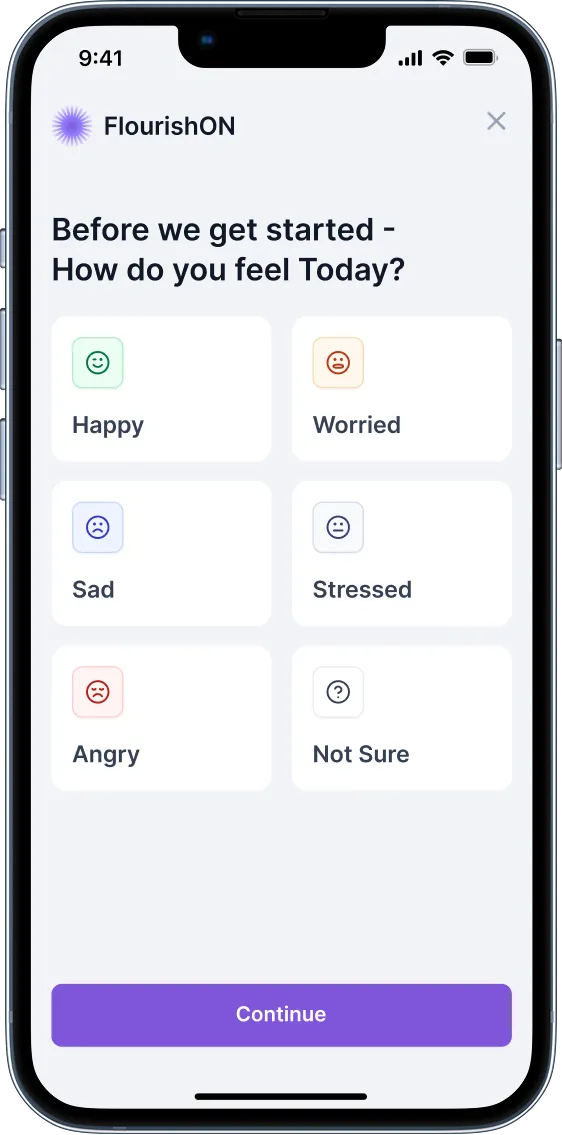
For FlourishON, the trial challenge was to design an onboarding questionnaire that could adapt to each user’s situation. A caregiver registering for the platform shouldn’t have to sift through irrelevant questions; they should only see those that truly apply to them.
Our designer created a branching logic system, where each answer dynamically led to a personalized set of follow-up questions.

The result was a prototype roadmap showing:
- Help section with personalized next steps for the caregiver.
- Educational resources relevant to their case.
- A future-to-be “Vault” for safely storing important documents.
The clients didn’t expect such depth from a short trial. The structured logic, clean UX, and user-centered thinking impressed them and led to a full-scale collaboration to design FlourishON from the ground up.
From trial success to shaping the MVP
With the trial behind us, our next step was to design the foundation of the MVP, defining the platform's structure and navigation, mapping how caregivers would interact with the product, and which pages would make their journey feel effortless.
We explored several dashboard concepts, since it would serve as the caregiver’s main hub. Some versions prioritized contacts and appointments, while others organized information chronologically.
Eventually, we designed two alternative approaches: one grouped by dates, another by categories, giving users the flexibility to complete tasks in any order that made sense to them.

As we refined these early concepts, one principle guided every design choice — accessibility.
Designing with accessibility from day one
FlourishON’s audience includes caregivers under stress and older users with varying levels of digital comfort. Accessibility was the foundation.
We followed WCAG standards to ensure clarity and comfort. Every color, font, and component was selected to make the product feel supportive rather than clinical.
We chose:
- Purple as a high-contrast, readable primary color.
- Warm beige accents to convey maturity and calm.
- Generous spacing and large touch targets for easy readability and interaction.
Our designer’s challenge was to make the interface feel human, a digital companion that listens, guides, and reassures.

That thoughtful approach to accessibility naturally shaped how we designed the product’s core experience in the dashboard.
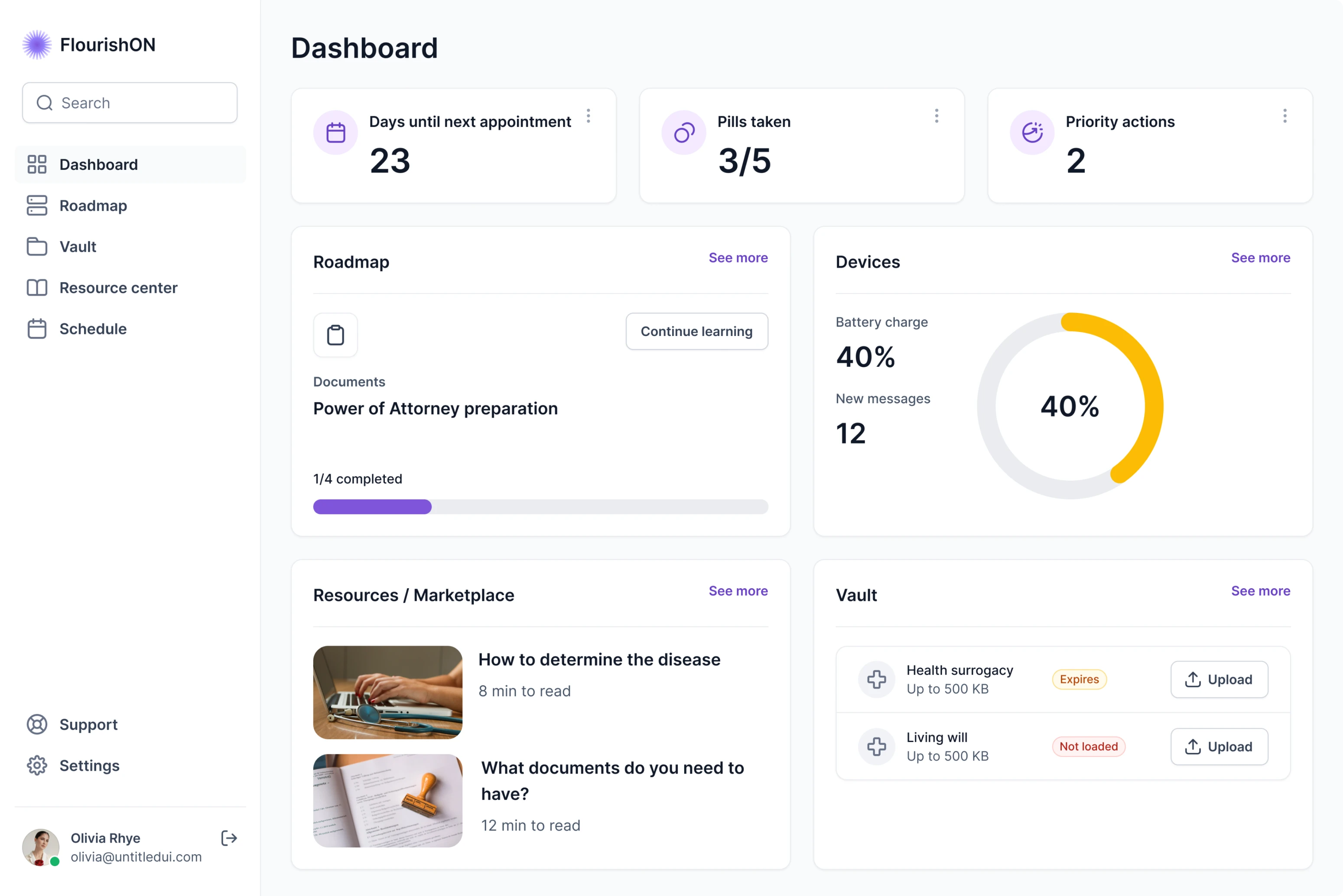
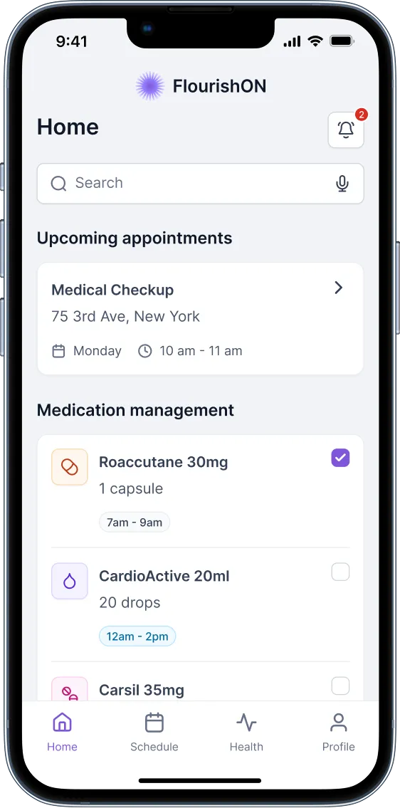
Building a dashboard that reduces cognitive load
The dashboard became the platform’s control center, a calm, structured space where caregivers can manage everything in one place without feeling overwhelmed.
We explored multiple layout options, from date-based calendars to category-driven navigation. The final version used a simple, card-based design that allowed users to see tasks, appointments, and contacts at a glance. Every interaction was designed to feel light, clear, and intuitive.
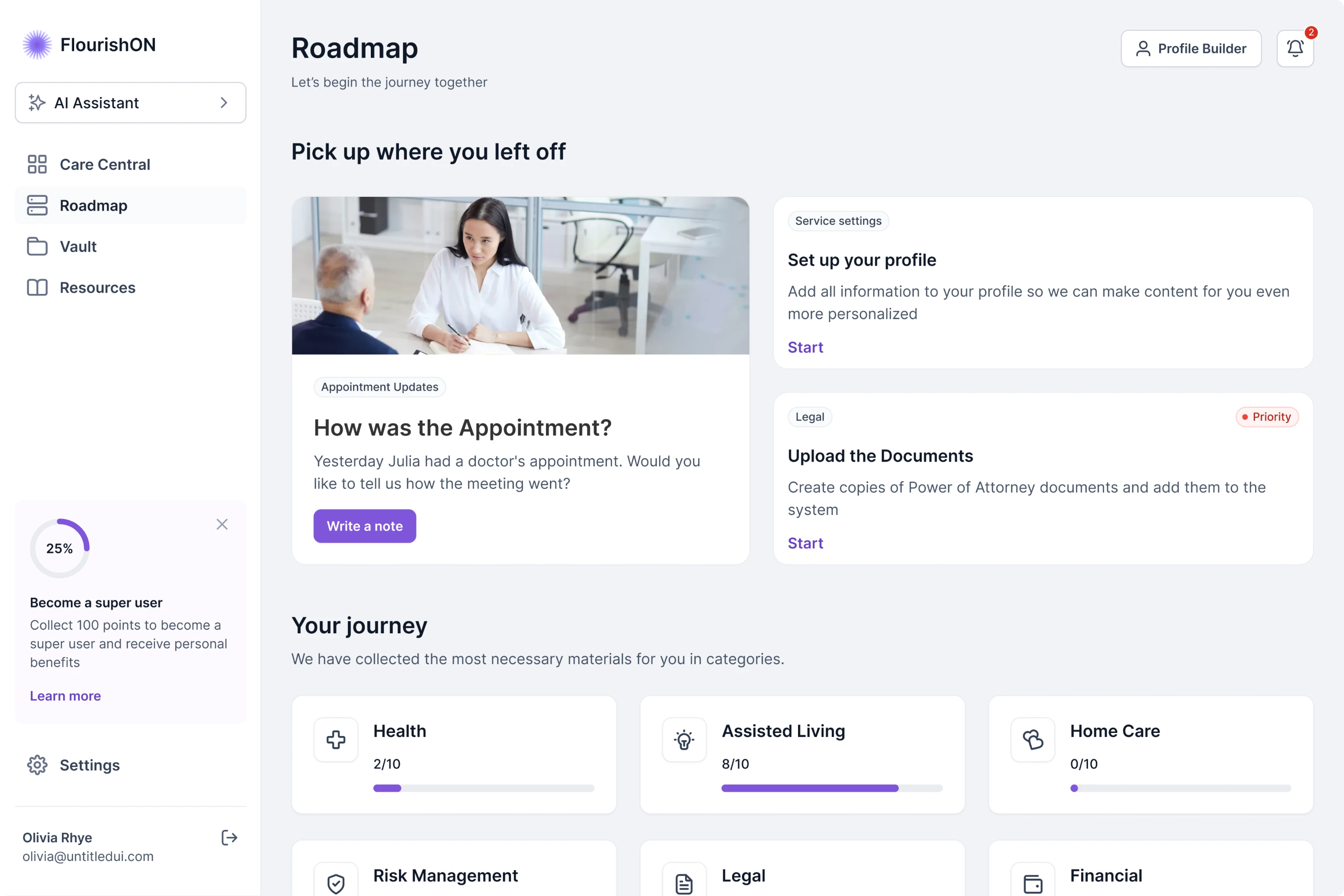
Balancing free and premium features to drive user growth
Some features were reserved for premium users, but we didn’t want free users to face empty screens. Instead, our designer created widgets that hinted at upcoming functionality and showed how useful those tools would be once unlocked.

For example, a tracker that allows users to monitor phone activity or email notifications was presented as an engaging banner, something that sparked curiosity without frustration. This approach made the upgrade path feel natural and motivating rather than restrictive.
We also included additional resources with the latest news as a separate section, helping users discover more value even within the free version.
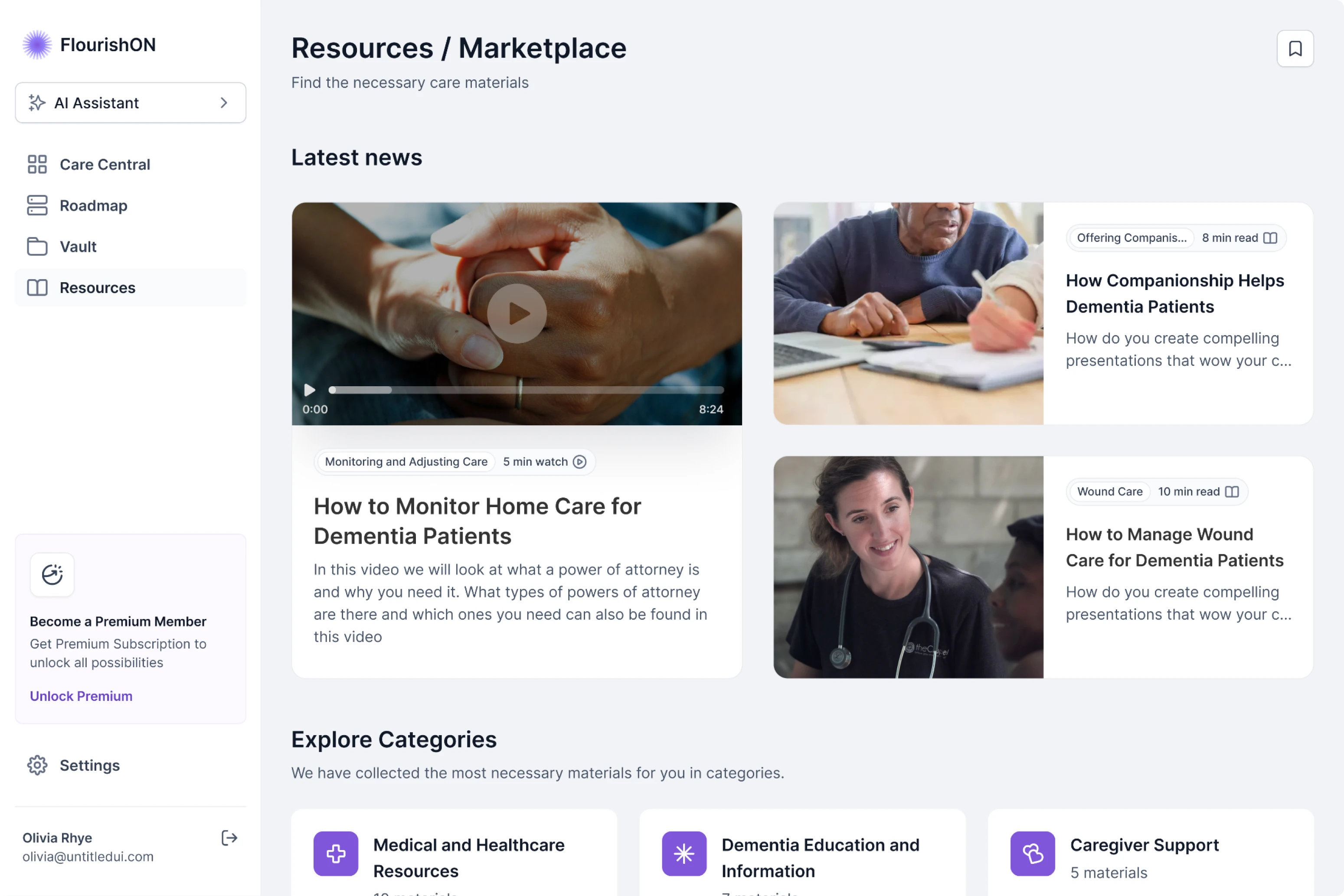
Designing a Resources hub that anticipates real user needs
Caregiving content online is scattered and confusing. The FlourishON team wanted to change that.
Our designer conducted a competitive analysis of health and caregiving apps to understand how others structured their resources and where they fell short.

Based on the research, we introduced the “I need help with…” feature. Instead of forcing users to browse categories, they simply choose their goal (for example, “Find a doctor” or “Documents preparation”) and get relevant, bite-sized resources.

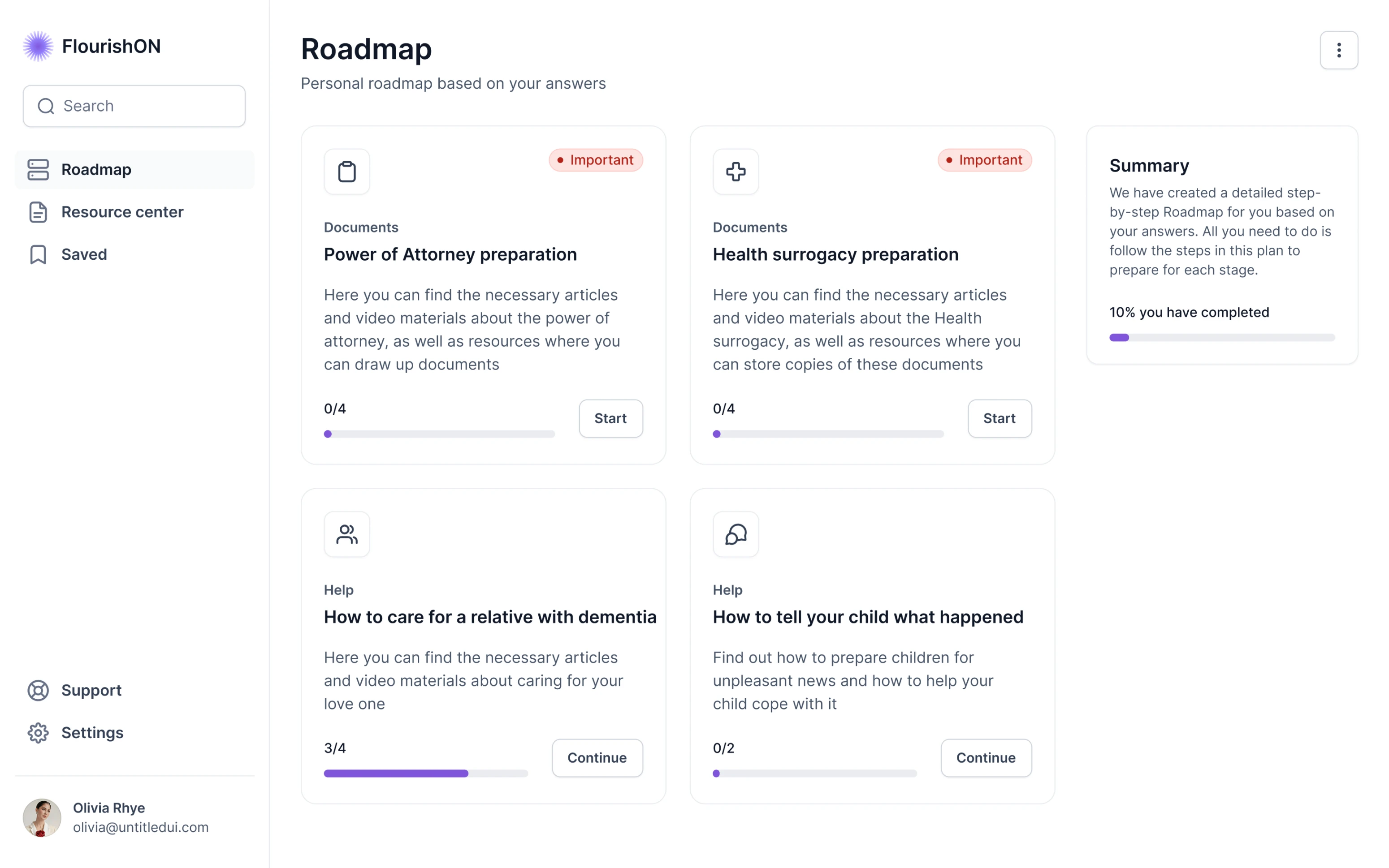
Creating a roadmap that turns care into guided steps
Most caregivers say the same thing: “We don’t know what to do next.” So we made that question the product’s core design challenge.
The FlourishON roadmap guides users through practical categories, such as legal, medical, daily care, and emotional support, with step-by-step checklists and curated resources.
Users can mark progress, read suggested materials, and always know what comes next.
Using gamification to deepen user engagement
Caregiving is already hard; we didn’t want engagement to feel like another task. Instead of badges or points, we introduced Super User status, a light, motivational layer.
Users who complete roadmaps, leave reviews, or explore key features receive promo codes for premium access.
It’s a small reward, but it helps caregivers feel recognized for their effort and gently nudges them toward long-term use.

Making a clickable prototype to align stakeholders and investors
To help everyone see how FlourishON would work in practice, our designer built a fully clickable prototype that simulated the complete user journey, from the landing page and onboarding questionnaire to the roadmap and resource hub.
She walked stakeholders through every step, showing how each interaction supported caregivers’ needs and created a smooth, guided experience. Together with the clients, we refined the flow into a compelling presentation that clearly communicated the product vision.

Designing for scalability so developers can connect faster
By the time the MVP was complete, the clients had a high-fidelity, clickable prototype ready for investor presentations, along with:
- A mobile and Apple Watch adaptation for a seamless experience across platforms, laying the groundwork for future app development.

- A comprehensive UI kit that allows developers to move fast after funding.

From idea to investor-ready product experience
What began as a request for UX support turned into a true partnership. The FlourishON team came to Eleken looking for a designer who could make their idea usable, intuitive, and investor-ready, and they left with much more.
Our designer became a thought partner, helping the founders shape how the product would be presented to investors and stakeholders. She built a fully clickable prototype that told the FlourishON story. From onboarding to the personalized Roadmap and Resources hub, every flow demonstrated how the platform simplifies caregiving through empathy and structure.
At Eleken, that’s the outcome we aim for: turning good ideas into products investors believe in and users love.