
Every tap, swipe, and click is a tiny decision shaped by interface design. When you’re ordering food, booking a flight, or setting up a smart home device, there’s a user interface guiding the experience, and someone had to design it.
But “interface design” is one of those terms that feels obvious and mysterious. You know it when you see it, but defining it? That’s harder, especially when people throw around “UI” and “UX” like they’re the same thing.
As a design agency, we at Eleken know the difference.
In this guide, we’ll break down everything you need to know about user interface design, share the principles that make it work, and show you how it all looks in real-world practice. What you’re about to read is backed by years of experience, plenty of SaaS case studies, and a few Reddit threads, too.
What is user interface (UI) design?
User interface design is the process of designing how people interact with computers and software, focusing on a product’s visual layout, styling, and interactive elements. It’s the simplest answer to what is UI designing, but there’s a lot more to the story.
In simple terms, UI design determines what every screen or page looks like and how elements behave. For instance, when you use an app to book a flight, every menu you navigate, form you fill out, and button you tap is part of the user interface.
And someone had to decide where those elements go, how they respond, what they look like, and how they guide you toward your goal.
Of course, the UI often depends on the industry. A dashboard in fintech will look and behave unlike a healthcare portal or an eLearning platform. The stakes are different, the users have different expectations, and the interface has to reflect that.
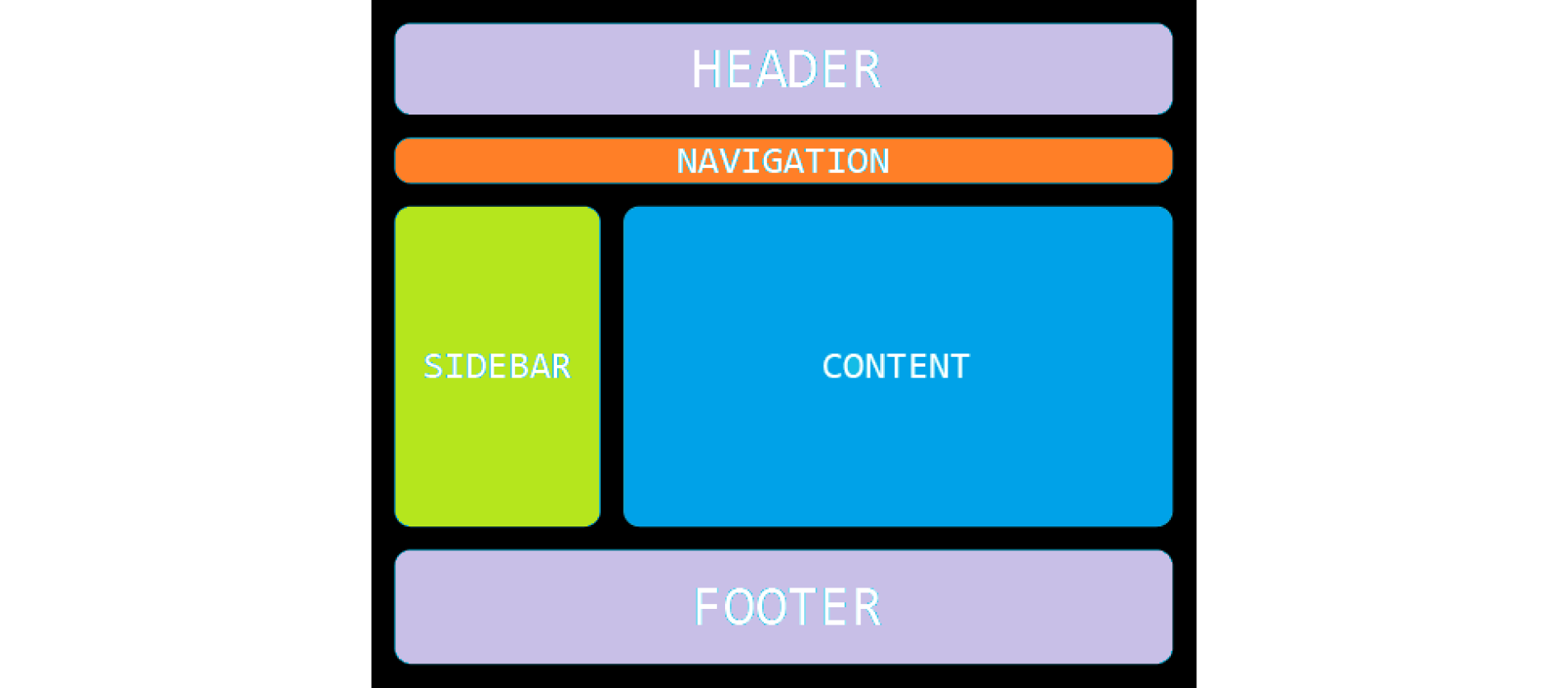
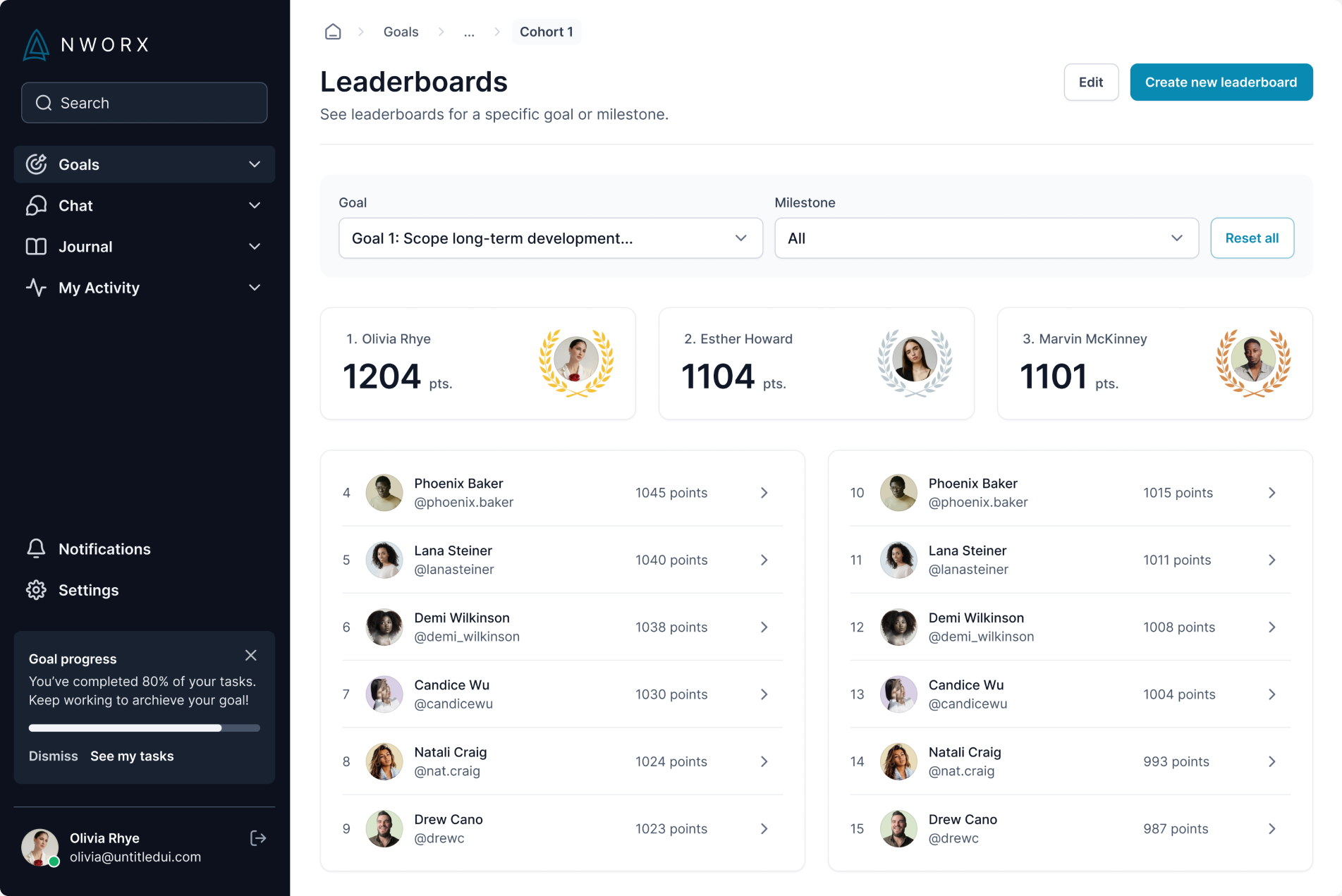
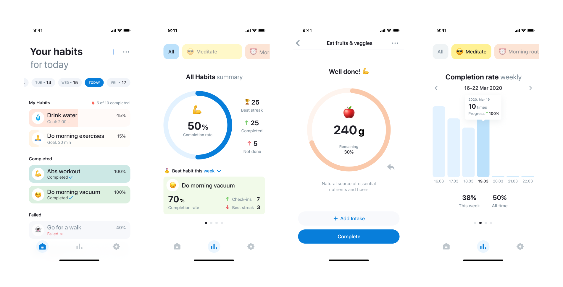
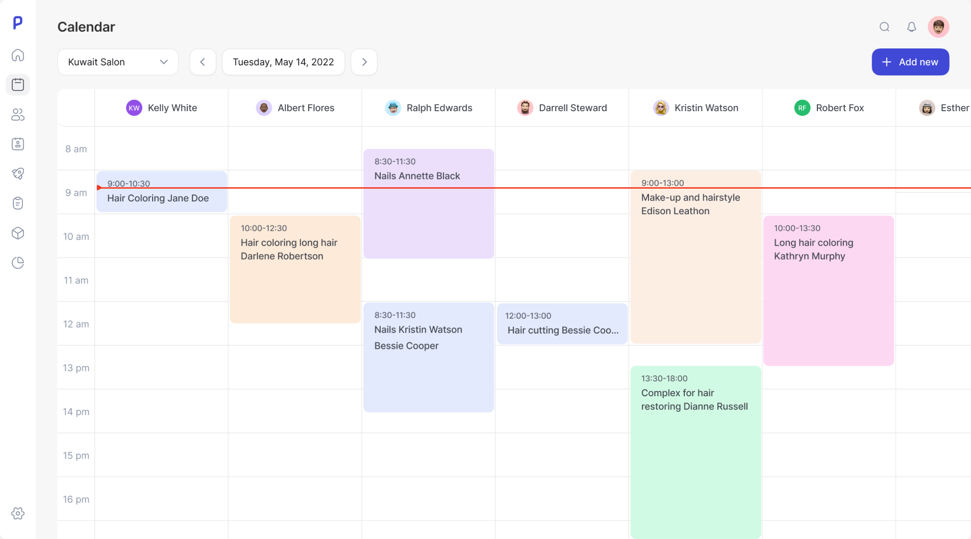
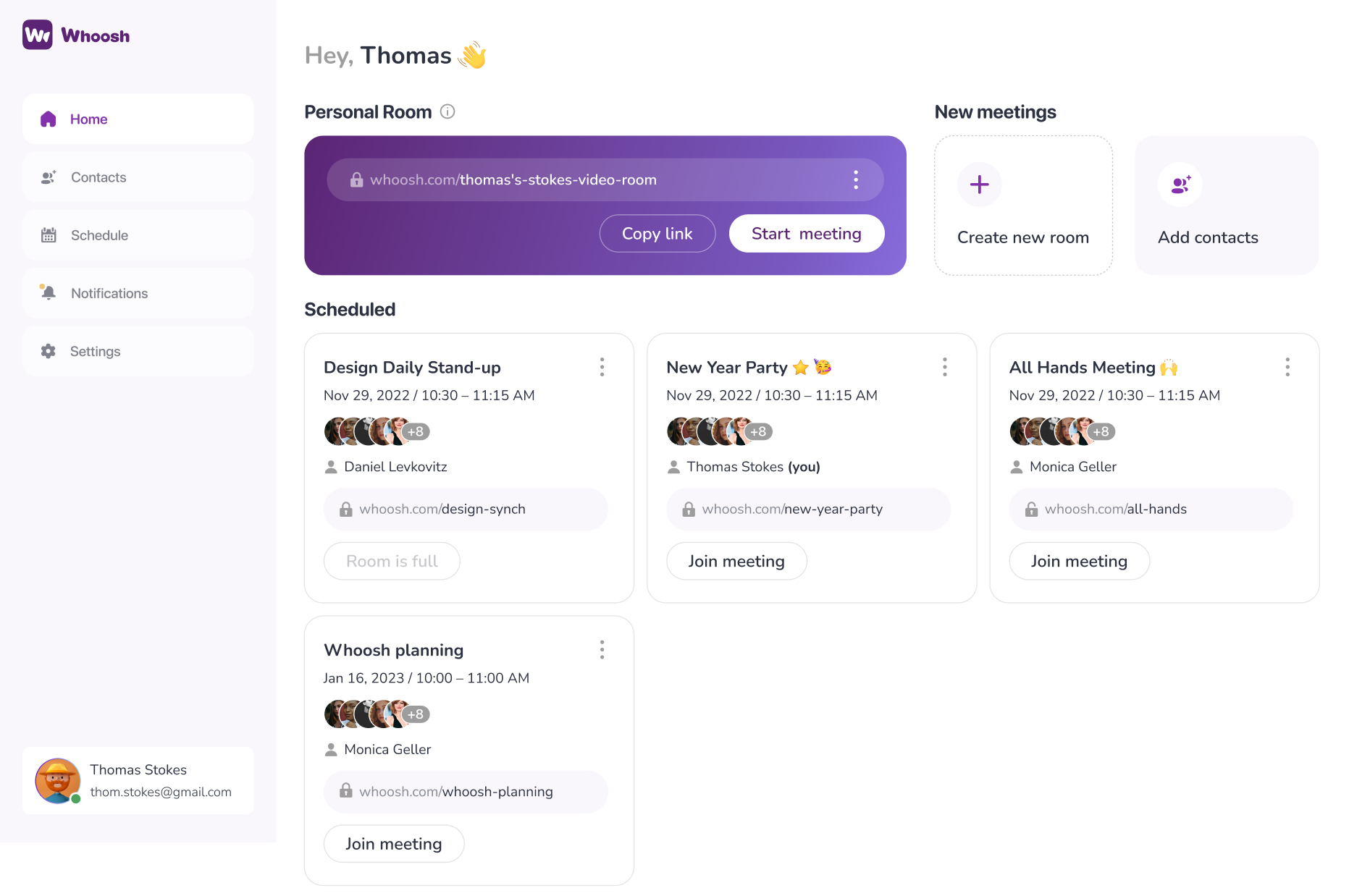
The main elements of interface design
Speaking of elements… User interfaces are made up of tiny building blocks. And while people might not stop to notice them, designers think about them constantly. Let’s take a look at the key elements that make up any interface:
- Header
The header is often the first thing users see. It usually includes a logo, main navigation, login or signup buttons, language switchers, and sometimes search. Designers make sure the header stays visible, clean, and functional across breakpoints. On mobile, it typically collapses into a burger menu.
- Hero section (first screen)
This is where you tell users who you are and what you do. A typical hero block includes a large headline (h1), subheading, illustration or video, and a single clear call-to-action. Designers prioritize clarity and focus here: one core message, one core action. This is the stage where the UI vs UX balance is most visible: while the UI makes the CTA button pop, the UX ensures the message aligns with user intent.
- Content blocks
These sections hold the body of your page: feature breakdowns, benefit highlights, testimonials, FAQs, media galleries, and more. Designers work on visual hierarchy (heading structure, spacing, alignment), readability (line length, contrast), and flow between blocks. According to UX statistics, users often scan these blocks in seconds, so clear information delivery is vital for retention.
- Sidebar
Optional, but useful in specific contexts like blogs, help centers, or dashboards. Sidebars often house filters, quick links, recent posts, or personalized recommendations. Designers need to balance utility with visual noise, because a cluttered sidebar is worse than none at all.
- Footer
A well-designed footer is the place users go when they’re lost or ready to act. It typically includes contact info, repeated navigation, social links, legal pages, and sometimes a newsletter form. On long pages, footers can be a second chance to engage or reassure.
There are also additional UI components that help make the interface work.
- Buttons and calls-to-action
Primary, secondary, ghost, destructive — buttons come in all flavors. Designers define visual priority using color, size, and shape. States (hover, focus, active, disabled) must be consistent across the product. And if every button looks like a CTA, nothing is a CTA.
- Forms
Forms are where users give something back, including emails, feedback, or money. Input fields, selects, checkboxes, radio buttons, wizards. Designers make forms accessible, scannable, and forgiving. That means labels outside fields, clear error messages, and minimal required fields.
- Cards
Cards are one of the most flexible UI elements. They are used for blog previews, product tiles, profiles, dashboards, anywhere you need to display a repeatable unit of content. Designers manage card spacing, elevation (or no elevation), hover behavior, and responsiveness.
- Modals and overlays
Used for onboarding flows, confirmations, warnings, or login screens. They should feel like a natural interruption, not a surprise attack. Designers make sure modals are focused, dismissible, and accessible (keyboard and screen reader-friendly).
Together, these components form the core structure of an interface. And with an understanding, the next thing to be aware of is how those parts relate to each other. That’s where grid layout, visual hierarchy, and composition laws come in. Knowing where to place something is often as important as what you place.
To create a user-centered design and truly understand what is UX, specialists often rely on a handful of classic UX laws:
→ Fitts’s Law
Not all pixels are created equal. The easier something is to reach and click (because it’s large or nearby), the faster users will interact with it. That’s why primary CTAs are big, colorful, and sit exactly where your thumb expects them to be. These fundamental concepts are frequently detailed in the top UI UX books used by professionals to master interactive pacing.
→ Hick’s Law
Give people 20 options, and they’ll take 2 minutes to choose or leave. Hick’s Law reminds us that less is often more when it comes to navigation, filters, or plan tiers. When in doubt, prioritize and hide the rest. By narrowing these choices, you improve the overall CX vs UX relationship, ensuring the customer's journey through your brand is as friction-less as their interaction with the screen.
→ Jakob’s Law
If your product works like something users already know, you’re halfway to good UX. That’s why most mobile apps have a bottom nav bar, modals have an “X” in the corner, and carts look like… well, carts.
→ Miller’s Law
The brain likes patterns. It can comfortably hold 7±2 items in short-term memory, which is why long menus or dense dashboards feel overwhelming. Designers solve this by chunking content into blocks — steps, sections, tabs, lists, cards.
Every interface, no matter how simple, is a system of decisions. When those decisions are thoughtful and consistent, users are more willing to stay.
Clearing the confusion between UI and UX design
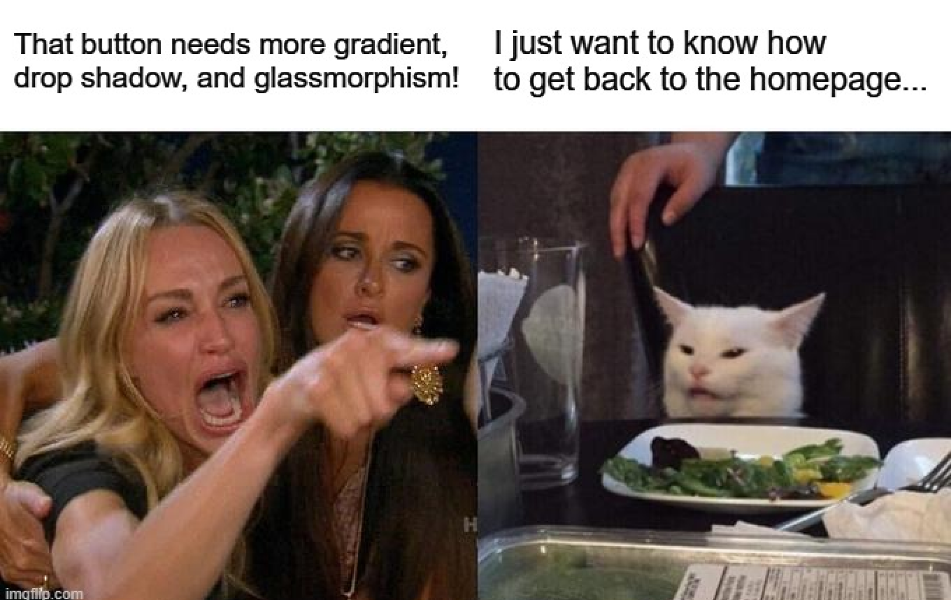
There’s a Reddit thread that says:
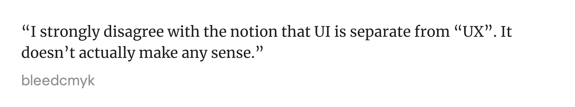
And honestly, a lot of designers would agree, at least to some extent.
In real product teams, the boundary between UI and UX design is rarely clean. You don’t finish “the UX” and then start “the UI.” You move back and forth, adjusting user flows, tightening the layout, and rethinking a button label after a round of user testing. It’s iterative. Messy. Collaborative.
But even if the two are tightly connected, they’re not the same thing.
User experience (UX) is about how a product works. It’s the structure behind the interface, the flow of actions, the logic of screens, the way information is grouped and prioritized. UX defines what happens when a user lands in the application and tries to get something done.
User interface (UI), on the other hand, is about how that experience looks and feels. UI designers work on the layout, the spacing, the styling of buttons and forms. But more than that, they shape how users perceive the experience — is it confusing or clear, rigid or flexible, dull or delightful?
Let’s get back to a travel app design example. The UX is the journey from search to payment — what steps it takes, how the screens are structured. The UI is the visual and interactive layer: the search bar, the typography, the icons, and the transitions that make the app feel smooth (or clunky).
The Reddit commenter is right in one way: you can’t separate UI from UX in the user’s mind. They experience both at once. But as designers, knowing where one ends and the other begins (even loosely) helps us build better products.
Types of user interfaces (past, present, emerging)
Interfaces have changed shape many times, sometimes it was slowly, sometimes overnight. What started as lines of code typed into a black box has grown into touch, speech, motion, and beyond. And with every shift, the designer’s role shifts, too.
Here’s how different types of user interfaces have shaped the way we design.
- Command-line interfaces (CLI)
Everything started with the keyboard. Users typed exact commands into a console, and the system responded. There were no visual cues, just blinking cursors and correct syntax. You’ll still see these in development tools and server management, where interfaces are built for people who already know what they’re doing.

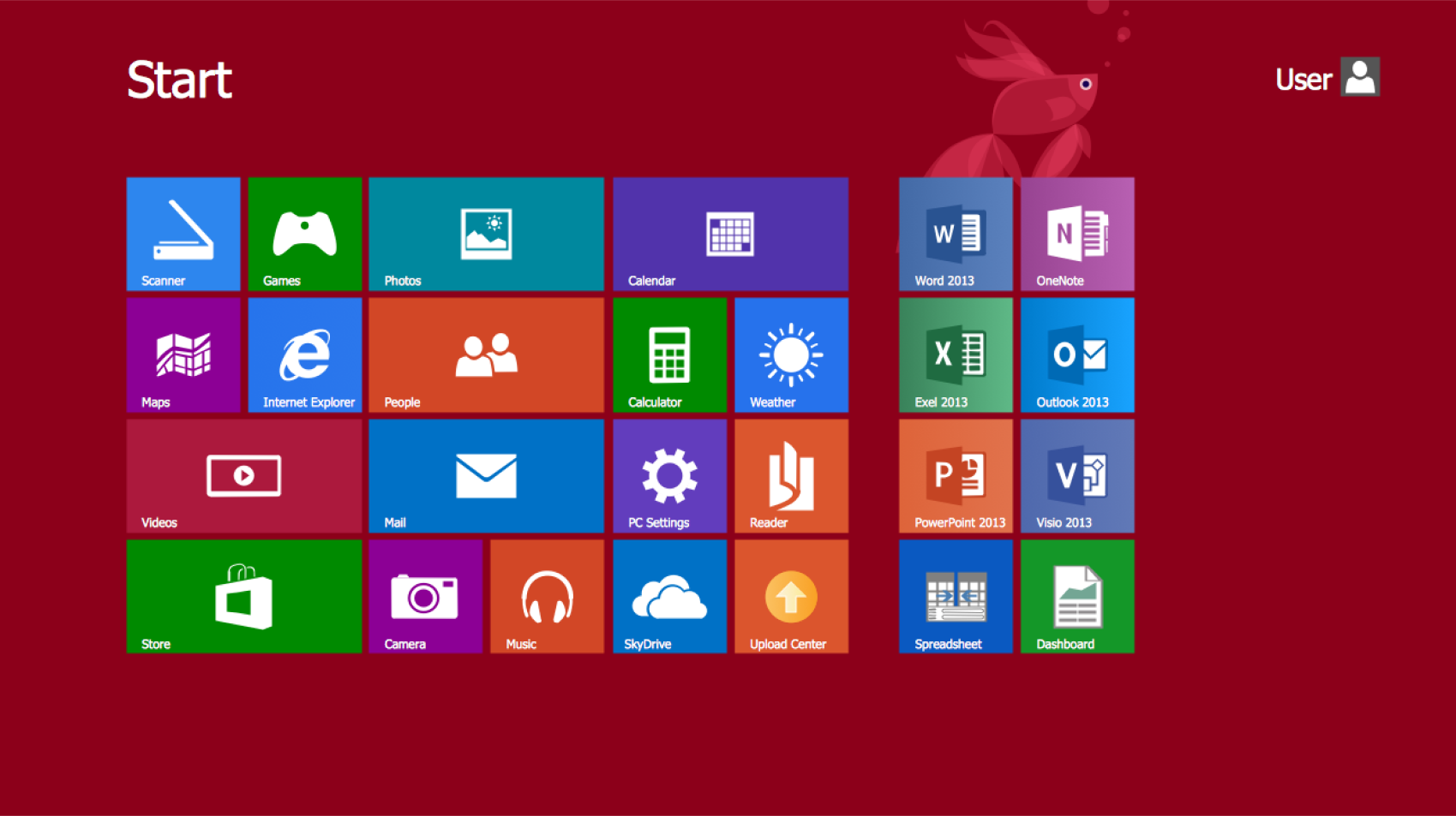
- Graphical user interfaces (GUI)
Once computers hit the mainstream, visuals took over. Buttons, icons, windows, and scrollbars made software feel less like code and more like a workspace. In tools like Slack or Notion, designers build GUIs by threading together text, buttons, menus, and motion into interfaces that feel natural.
- Touch interfaces
Touchscreens changed everything. Designers stopped thinking about clicks and cursors and started caring about thumbs. Hit areas got bigger, margins got wider, and gestures like swiping and pinching became standard ways of navigating. When you design for mobile, you're designing for fingers first.

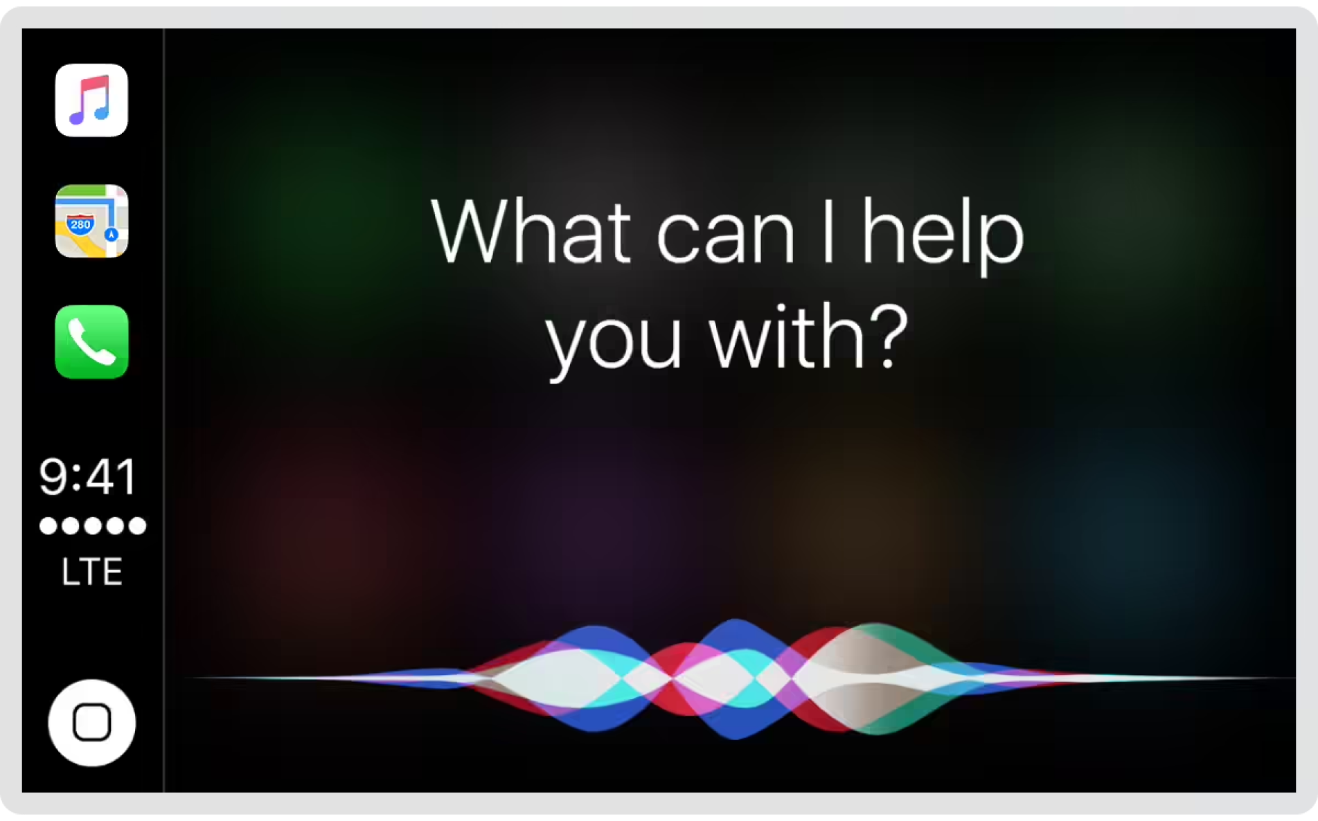
- Voice-controlled interfaces
At first, voice control felt like something you'd try once and forget. But it stuck around. Now, products like smart speakers and car systems rely on voice input entirely. People working in this space shape prompts, anticipate user confusion, and figure out what happens when the system can’t hear you clearly.
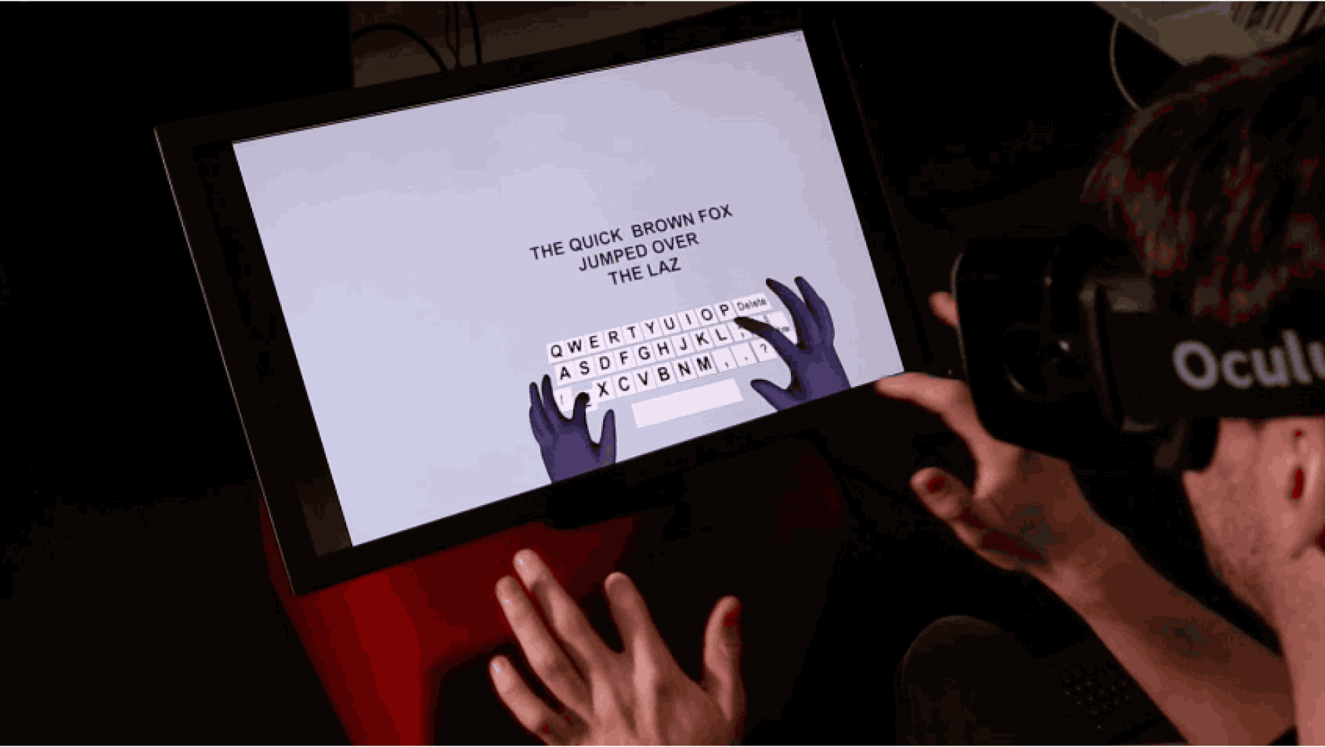
- Gesture interfaces
There was a time when waving your hand in front of a screen felt like science fiction. Devices like the Kinect or Leap Motion brought gesture control into gaming and experimental apps. Today, those ideas live on inside AR and VR, where motion and body tracking are part of the experience.
- Conversational interfaces
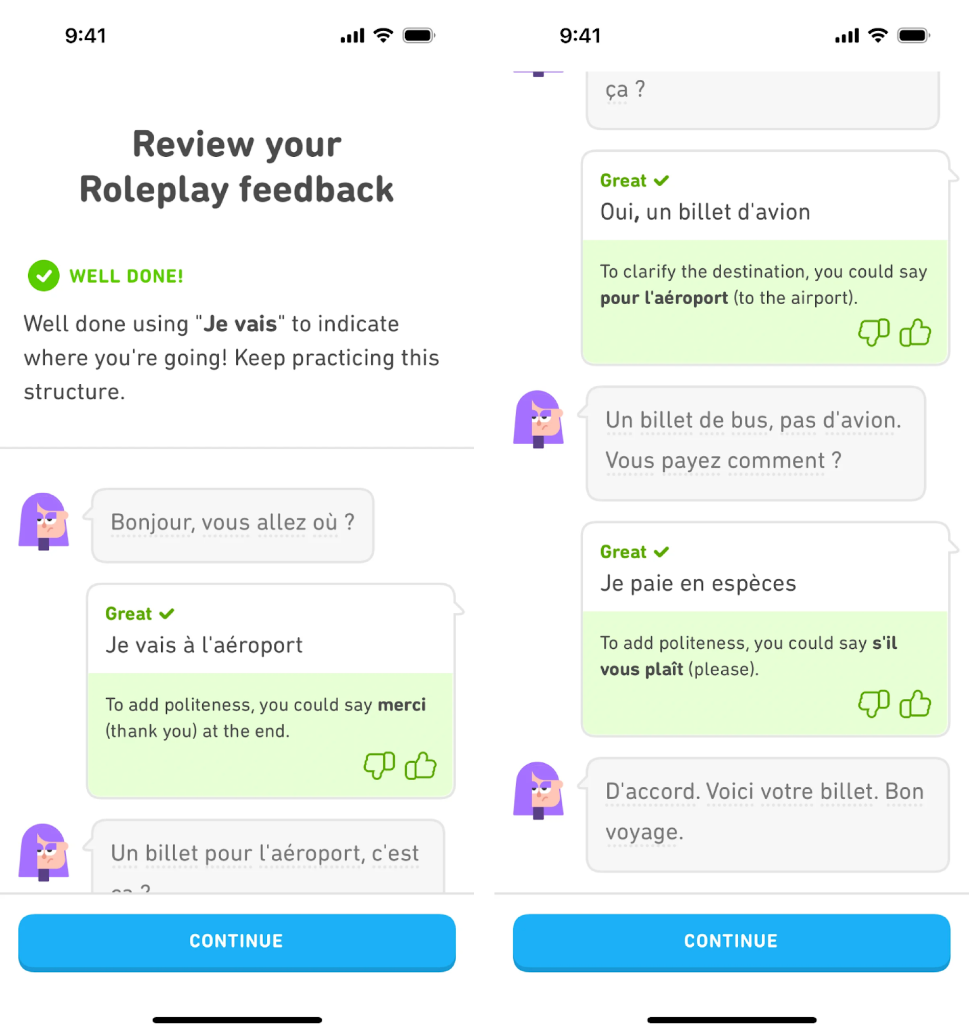
Some products talk back in buttons, in chat bubbles, or through language models. Designers working on conversational UIs spend less time on layout and more time on tone, intent, and fallback flows. Even Duolingo offers character chats, teaching users through fictional dialogues that feel surprisingly personal.
- Multimodal interfaces
Some products mix modes. You might say something out loud and confirm it on screen. Or you could tap a button while a camera tracks your reaction. Multimodal interfaces blur the lines between input types. They work best when the system decides what makes sense in context.
- Adaptive and personalized interfaces
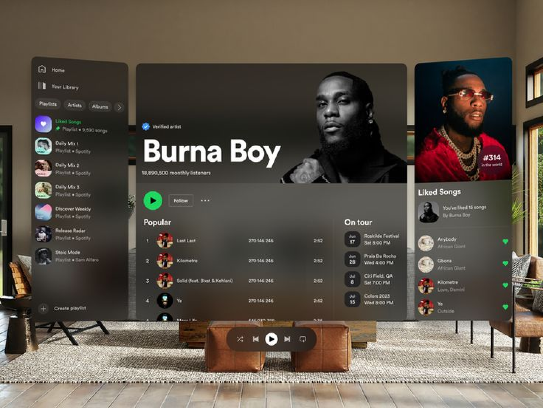
Products adjust themselves more now. For example, Spotify rearranges your homepage based on what songs you liked. Google Maps moves the “Go Home” button when it thinks you’re about to leave work. For these interfaces, designers work on personalization, defining rules, behaviors, and edge cases.

- Spatial interfaces
Apple Vision Pro pushed spatial UI into the spotlight. Interfaces that float in space, attached to your living room wall, or anchored to your desk, need new rules. In this case, designers have to think in three dimensions, consider physical comfort, and account for what’s happening around the interface.
- Automotive and IoT interfaces
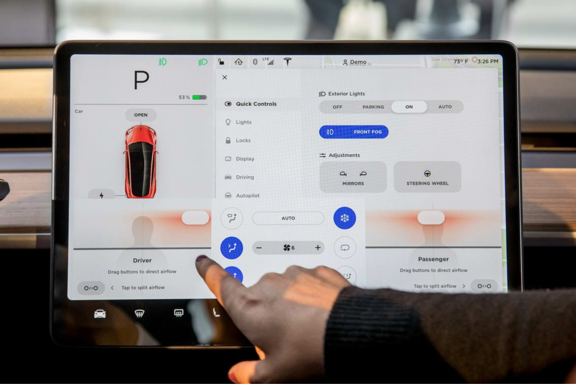
More and more, interfaces are appearing on surfaces that weren’t screens before. The dashboard in a Tesla is a great example where drivers manage climate, maps, entertainment, and car functions. And there’s more stuff like that, where designers are required to work under limited input, limited attention, and high stakes.
As you can see, interfaces rarely arrive fully formed. They evolve, break, come back in new forms, or quietly disappear. Some of them will probably be around for a long time. Others are still figuring out their place. And somewhere in between, there’s a designer trying to make it all make sense.
Key UI design principles and best practices
We’ve already touched on a few classic UX laws that help shape how interfaces behave. But behind every effective layout is a broader set of principles that guide how it feels to use. Here are five pillars specialists rely on to create UI designs that feel clear, consistent, and trustworthy, which are foundational to effective customer experience design.
Clarity
Every screen should make one thing obvious. Whether it’s filling out a form, clicking a button, or scanning data, the user shouldn’t need to pause and figure out what’s going on. In design terms, you can make this happen by using plain language, clean layouts, clear labels, and spacing that gives room to breathe. This structural logic is often defined early on through a sitemap UX, ensuring that every page has a distinct and understandable purpose within the larger journey.
Even simple adjustments, like removing an extra button or tightening a headline, can make a screen feel more intentional. When the interface is clear, users move faster, make fewer mistakes, and rarely need to ask for help.
Consistency
If a button looks and behaves a certain way in one place, it should do the same everywhere else. Once spacing, color, typography, and icon usage follow a pattern, the product starts to feel familiar, even to first-time users.
In consistent products, you don’t have to relearn how things work on every page. The patterns stay the same, the visual elements behave predictably, and nothing feels out of place. That kind of internal consistency trains the user without them realizing it, and that’s when the interface starts to disappear.
Feedback
Interfaces should always answer the question: Did that work?
Clicking a button, submitting a form, dragging a file — every action should trigger a clear, timely response. It could be a color change, a loading spinner, a toast message, or a green checkmark sliding into view. These signals make users feel in control. Without them, they’re left wondering if they should try again.
Even small interactions matter. A subtle hover effect can say “yes, this is clickable.” A progress bar says, “Hang tight, it’s loading.” And when something goes wrong, feedback should guide the user toward fixing it.

Familiarity
Users don’t come to your interface as blank slates. They bring habits, expectations, and mental shortcuts from every app they've used before. Good UI interface design works with those expectations, not against them. This is why typography design often sticks to established sans-serif families for readability; users expect a certain level of visual comfort and predictability when consuming information.
The gear icon means “settings.” Blue usually means primary. Navigation often sits at the top or left. Breaking those patterns can be risky unless there’s a very good reason. Designing with familiarity in mind doesn’t mean copying other products blindly. It means understanding what users already know and building from there.
Flexibility and forgiveness
Interfaces should support how people actually work. To do this, you should give beginners simple, linear paths while letting experienced users move faster with shortcuts, filters, or custom views.
Flexibility also means not punishing users for small mistakes. Let them undo actions. Make it easy to exit a flow. Warn them before they do something destructive. Build in buffers that let people explore without fear. Nobody wants to restart an entire form because they clicked the wrong button.
Interface design tools in 2026
Once you’re full of theory, it’s time to get practical. And at this stage, one question usually comes up: what tool should you use for interface design?
In the past, you might have relied on multiple apps to create a unified interface. Now, most of that work happens in one place. But every designer chooses a slightly different setup depending on the team, the platform, and the type of product they’re building.
At the center of most design teams in 2026 is Figma.

It’s a collaborative tool where designers, developers, product managers, and writers can work inside the same files. Auto layout, design systems, components, and real-time editing made it standard across the industry. Add FigJam for early ideation and prototyping tools that don’t require third-party plugins, and you’ve got the core of most workflows.
There are also other tools that the community shares.
Sketch is also around, but mostly with Mac-first teams. It was the pioneer of modern interface design software, and it still offers strong component libraries and fast performance. However, Figma’s cross-platform flexibility and community-driven ecosystem have made it harder to compete. Some teams stay loyal to this app, while most have moved on.
Penpot is the open-source option. It’s still early, but it’s gaining traction among designers and devs who value full transparency and cross-team compatibility. Since it’s browser-based and tech-stack agnostic, it's positioning itself as a more “developer-friendly” alternative to Figma. Adoption of this platform is still growing.
Axure remains the go-to tool for teams working on complex UX flows with advanced interactions, dynamic content, and logic-driven prototypes. It’s heavier than Figma, and rarely used for visual design, but when stakeholders need a clickable simulation that behaves like the real thing, Axure holds its ground.
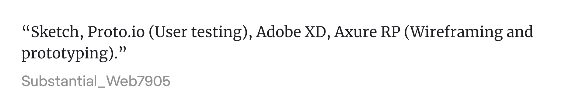
Some teams use specialized prototyping tools like Proto.io or Principle, especially for mobile-first products or when rich animation and transitions are central to the experience. These tools help communicate timing, motion, and microinteractions in ways that flat mockups can’t.
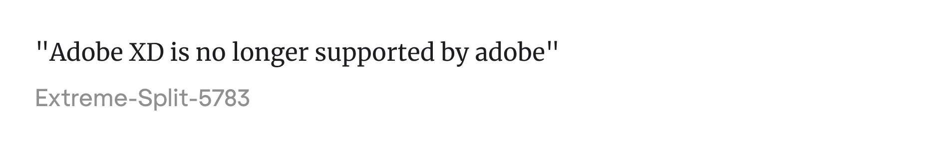
Meanwhile, Adobe XD is effectively out of the picture. Adobe has officially pulled the plug, and the design community moved on long before that happened. If you still have files there, it might be time to migrate.
At the end of the day, tools come and go. Some rise fast and vanish just as quickly. What matters most is choosing the right one for the work and knowing when it’s time to move on from the wrong one.
UI design in real-world SaaS
The further you get from theory, the more UI design becomes about constraints. Time, tools, tech stack, team size — they all shape what gets built and how polished it feels.
At early-stage SaaS startups, the pace is fast, and the UI has to keep up. Sometimes, designers lean on ready-made kits, component libraries, and tools like Magic Patterns to move quickly. What matters most in the process is creating an intuitive interface that looks familiar to users but stays unique.
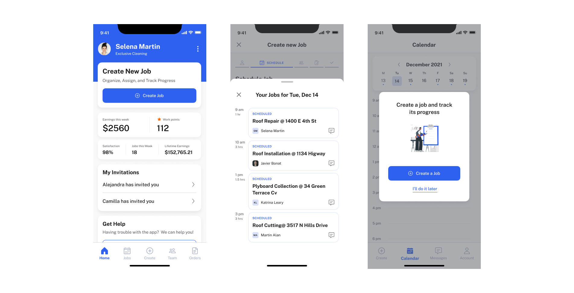
We saw this in our work on PrimePro, a tool designed for field service managers who weren’t especially tech-savvy. The goal was to reduce friction on every screen. That meant designing fewer actions per screen, simplified icons, and larger hit areas.
And it worked. The Eleken team prioritized complete simplicity and avoided unnecessary details or decorations, making the interface predictable and easy to follow.
As companies scale, the UI challenges shift. Teams grow, designers specialize, and the product becomes more complex. Now the work is about consistency, accessibility, and collaboration across disciplines. UI decisions start living inside design systems. Tokens, components, and naming conventions matter.
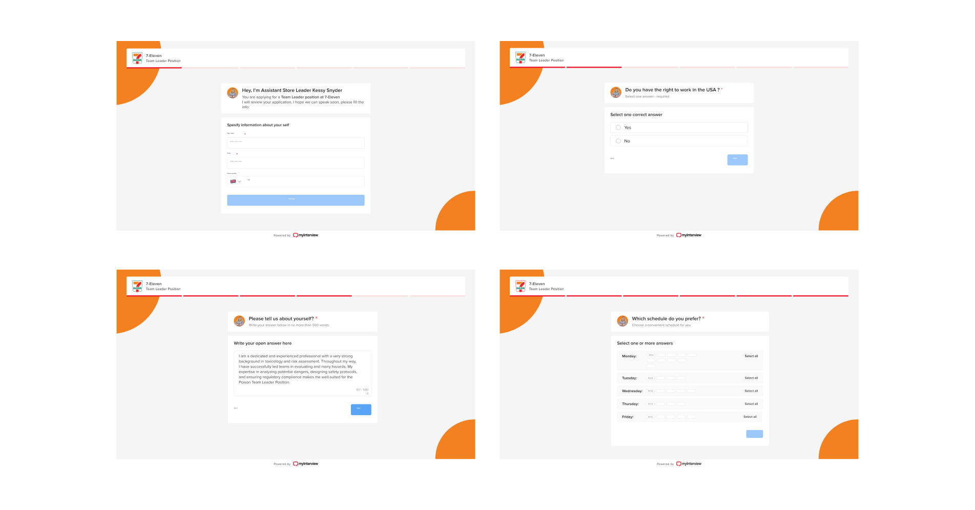
In our project for MyInterview, a platform used by candidates and recruiters, we redesigned the entire candidate flow. For that, we reworked each question module, optimized visual hierarchy, and improved the UI across every touchpoint.
Our goal wasn’t just to polish screens. We aimed at supporting a product that real people relied on to apply for jobs.
Honest take on whether UI is a good career
People talk about UI design like it’s a golden ticket — flexible, creative, high-paying. And yes, it can be. But it’s also a field that’s changing fast, filled with competition, and not as glamorous as it looks from the outside. Keeping up with current UI UX trends is no longer just about aesthetics; it's about staying relevant in an industry where AI and automation are rapidly shifting what "standard" design looks like.
If you're considering it as a career, especially from a non-design background, you’re probably asking some of the same questions we’ve seen on Reddit threads and forums:
Do you need a degree? Will anyone hire you without one? Is UI/UX oversaturated? Is it worth it?
From our point of view, you don’t necessarily need a design degree to get a job and create interfaces, but you do need a strong portfolio. For most employers, where you went to school doesn’t matter nearly as much as whether you can deliver a well-designed user interface and explain your thinking.
We’ve seen people hired straight out of bootcamps, self-taught through YouTube, or pivoting from business or engineering backgrounds. It happens all the time.

That said, the bar is higher now. The field is crowded. Bootcamps have flooded the market with junior designers, and a lot of portfolios look the same. That’s why just learning Figma isn’t enough. The designers who stand out are the ones who understand the tech limitations, user behavior, and business goals, and can fluently navigate complex UI UX terminology when communicating with developers and stakeholders.
Some people do go the formal education route — design school, HCI, interaction design degrees — and it can be worth it, especially if you want to build strong fundamentals. But even then, the best programs are the ones that make you actually build stuff, not just submit slides and get graded.
So, is UI a good career?
It can be, if you treat it like a craft. If you like thinking about problems, drawing ideas, testing, tweaking, and staying curious, this field can be deeply satisfying. But if you're chasing it because it sounds trendy or looks cool on LinkedIn, you’ll burn out fast.
And one more thing: the UI user interface designer role is just one piece of the bigger design world. There’s motion design, product strategy, service design, interaction design, content design, and they’re all connected. If you stick around long enough, you’ll probably end up touching more than one.
That’s a wrap
You don’t notice a great interface, and that’s kind of the point.
When you design UI well, people don’t stop to admire it. They just move through it, book the flight, finish the form, and complete the task. Designers shape those moments quietly, click by click, screen by screen. Now, you’ve got everything you need to start your UI design path.
And if you ever need help building a better interface, you know where to find us.


.webp)

.png)


