VLI Tech
How Eleken redesigned a workforce app for the complex world of EMS teams
In emergency medical services, communication between field personnel and supervisors is critical, but not always handled properly. VLI Tech, a focused team delivering software and consulting to EMS providers, recognized this gap firsthand.
They had acquired an application called Newton360, a workforce management tool designed to help ambulance workers and their supervisors stay connected. While the app had the right intent, it lacked proper functional design.
VLI Tech had strong backend developers in-house but no UX/UI expertise to bring the app up to standard. Since hiring a freelance designer didn’t make sense at their stage, they reached out to Eleken to explore a design partnership.
During our initial meeting with the client, we reviewed the app together and surfaced the following key challenges:
- The mobile and web experiences were completely disconnected.
- Information was not presented in a clear or actionable way.
- The product lacked engagement and didn’t encourage regular use.

A short trial gave the client a clear picture of our design thinking
After the call, we invited the VLI Tech team to a free 3-day trial. At that point, the client approached us to redesign three screens.
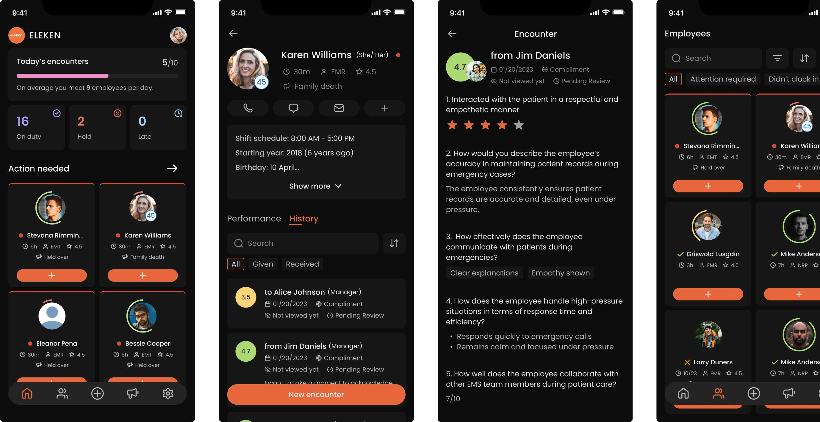
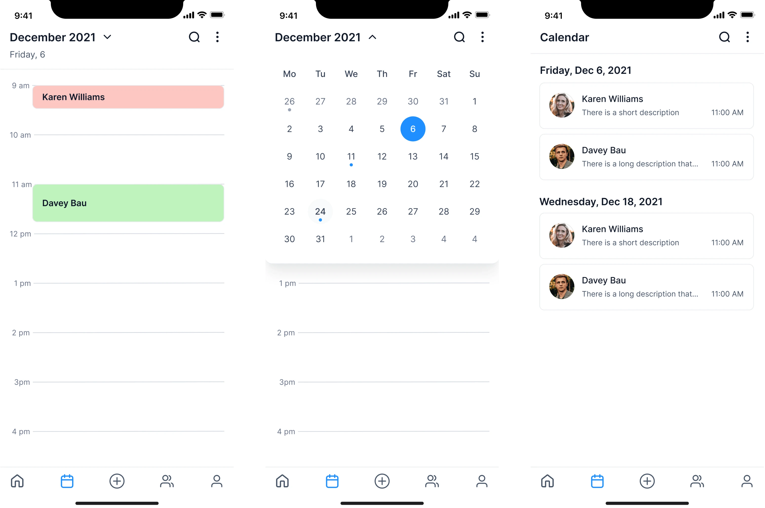
Supervisor log in
We started with a major UX issue that affected the main manager screen. The existing interface relied on small cards packed with text, which made the information hard to scan and even harder to understand. In this regard, we:
- Reworked the card layout to make it more structured and readable.
- Reduced visual clutter and clarified hierarchy.
- Enlarged profile photos, since this is a product about people.
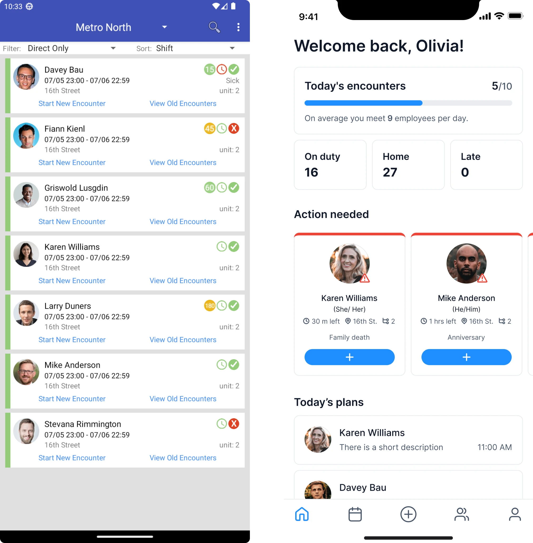
One key idea we introduced was Today’s Encounters, a tracker that shows how many interactions a manager is expected to complete and how many have already been done. This helped turn abstract expectations into something concrete.
We also designed an Action Needed section on the main screen. Employees who required mandatory interaction were highlighted visually, so managers could immediately see who needed attention and plan their time accordingly.
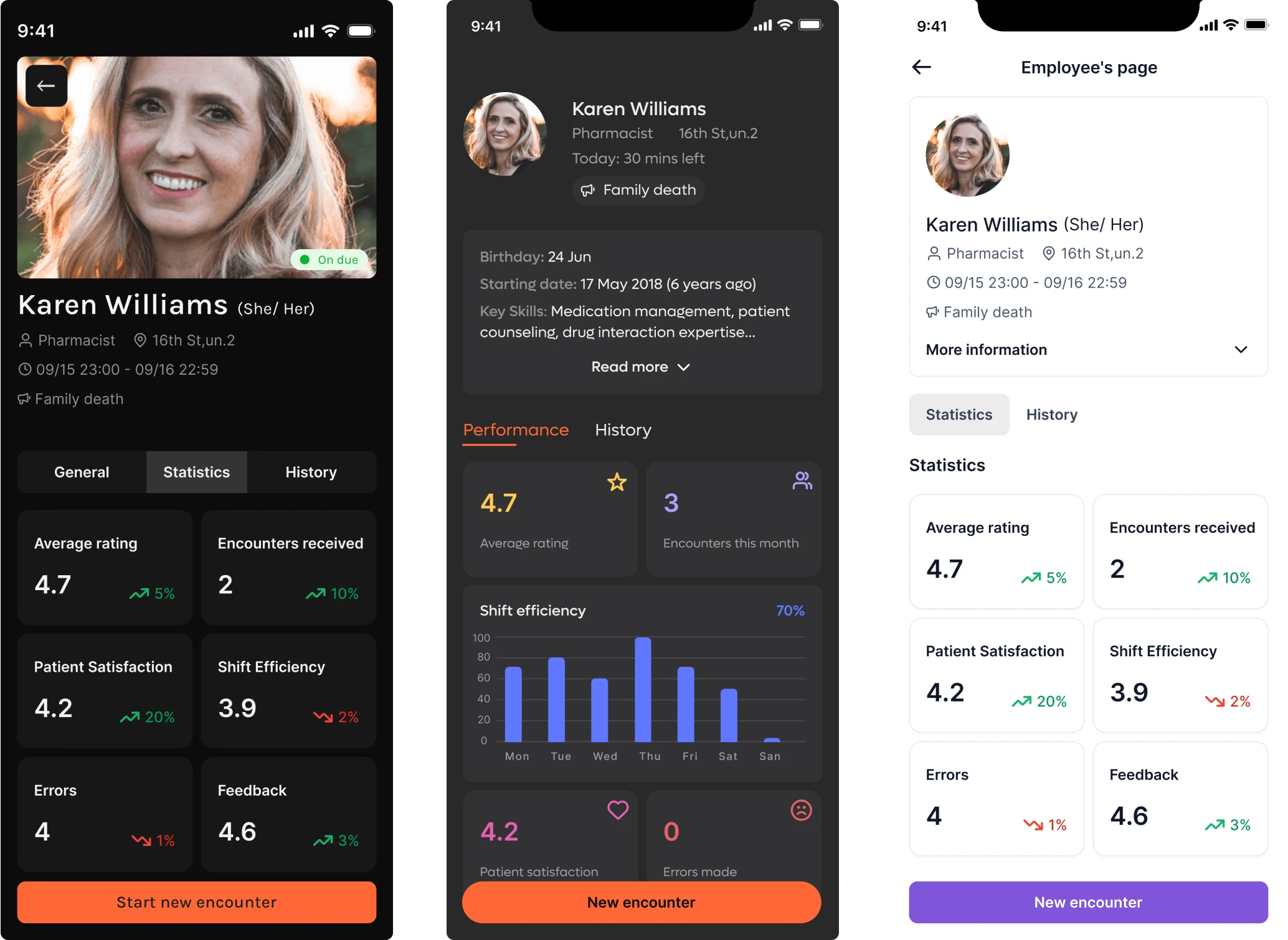
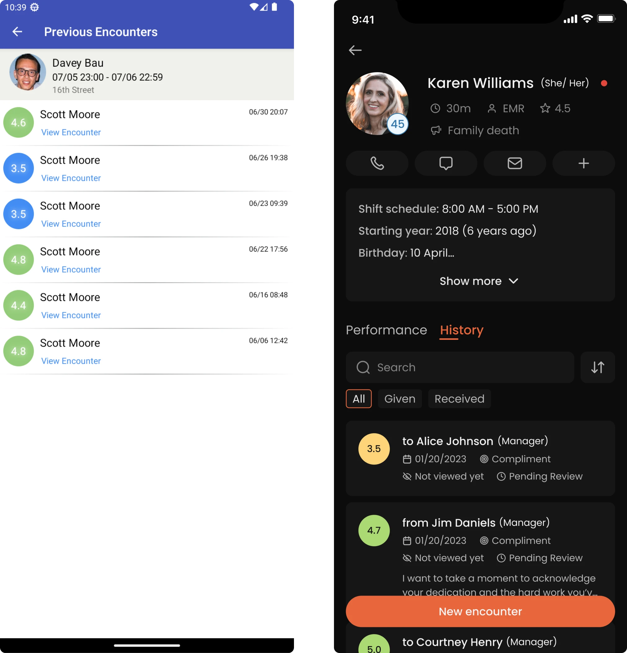
Supervisor’s view of employee
Building a foundation for Newton360, we turned our attention to the employee profile screen. Here, supervisors could get a full picture of someone on their team.
The design idea was to show relevant performance signals at a glance. For this, we included basic statistics like patient satisfaction scores or error rates. To better support each individual, we added an expandable menu with additional info.
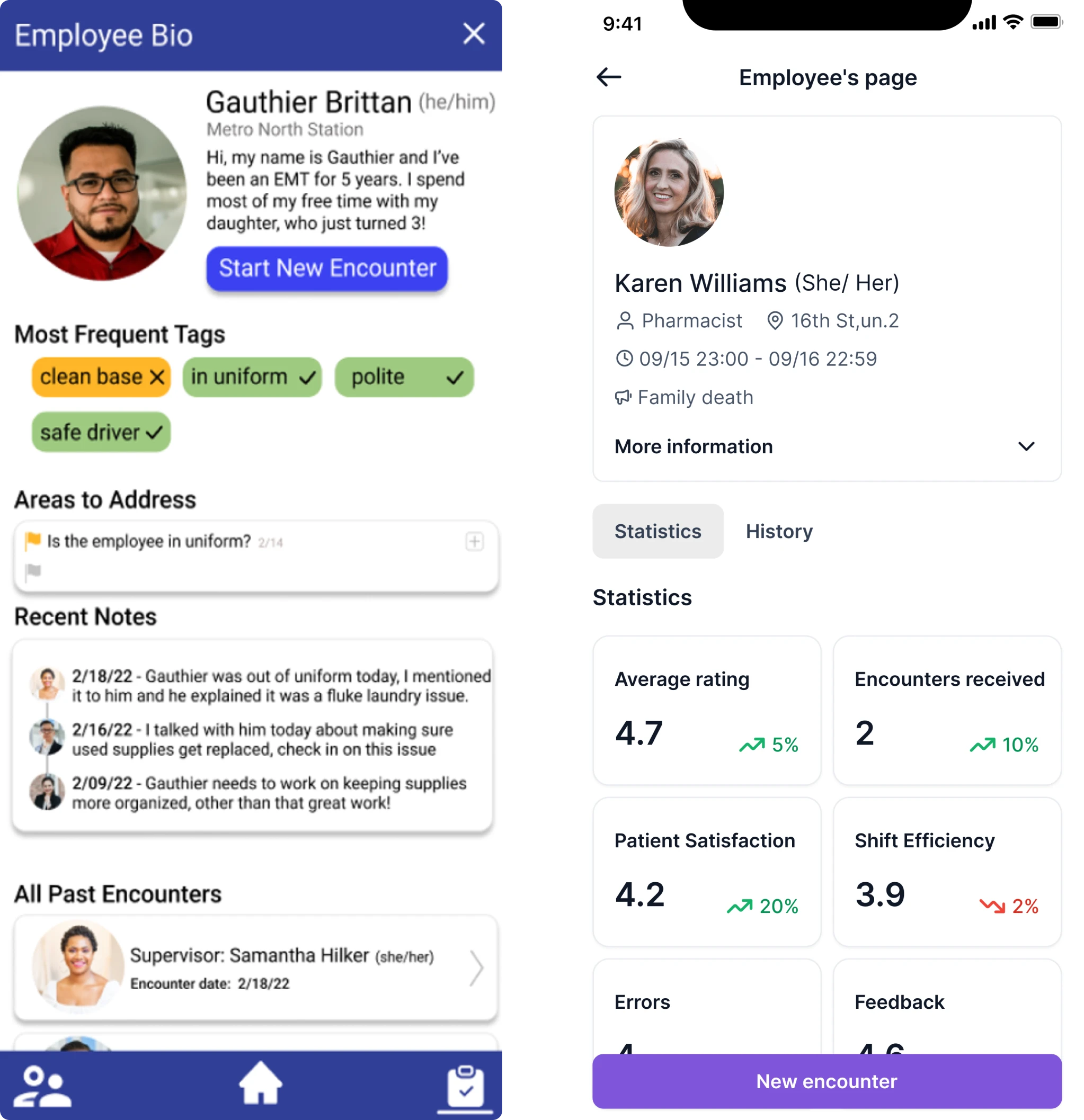
This flexible layout helped different organizations shape the dashboard to match their unique operational needs
Employee encounter screen
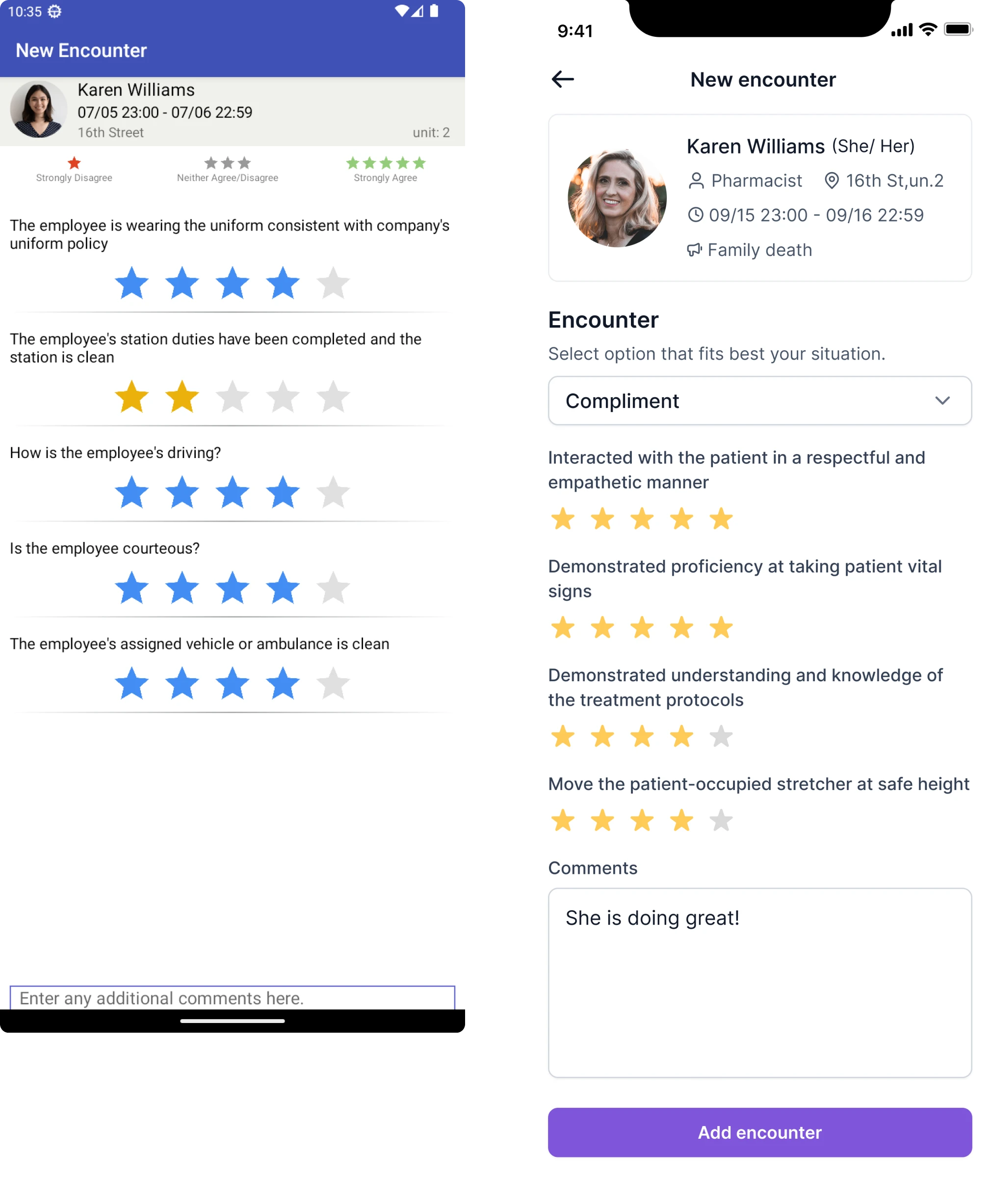
At this stage, we also created an early version of the star-based evaluation screens, where users could quickly assess their interactions with others.
We went beyond the brief to improve user engagement
Within the 3-day scope, we wanted to show the client how the product could grow into something more thoughtful and human-centered. So we shared a few feature ideas that could enhance the experience over time.
We introduced a calendar tailored to the EMS context. It would give managers the ability to plan interactions with the team and see what’s already scheduled. It also became possible to set reminders for work anniversaries or family events.
To support a healthier work culture, we proposed adding a moodtracker for employees to share how they’re feeling at work. Over time, this would help supervisors identify issues early and open up conversations when things feel off.
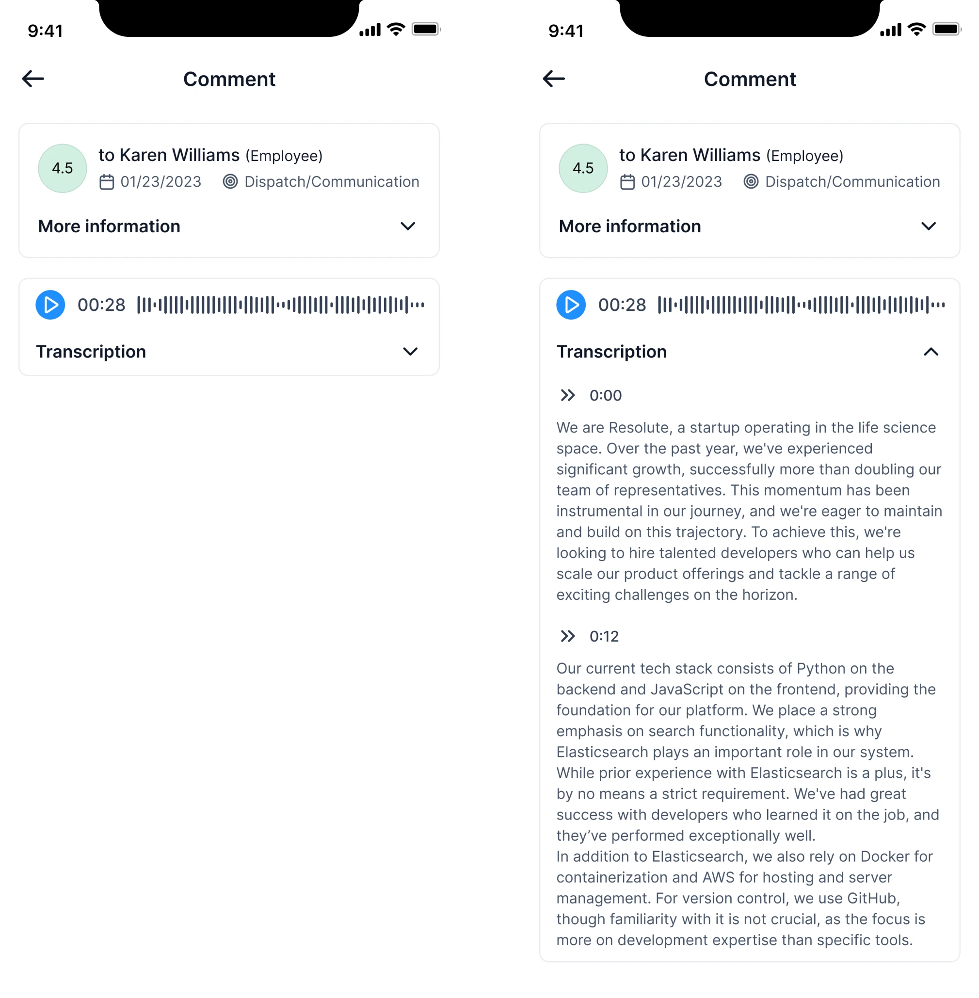
Finally, we suggested supporting voice-based feedback. In high-pressure environments like EMS, speaking is faster, especially since voice conveys tone and intent that text often misses. We also imagined adding automatic transcripts.
Our designer actually went above and beyond and provided lots of recommendations and guidance on some of the specifics of the design. We ended up adopting almost all of her ideas.
Integrator & EVP at VLI Tech
Trial insights shaped our roadmap and long-term collaboration
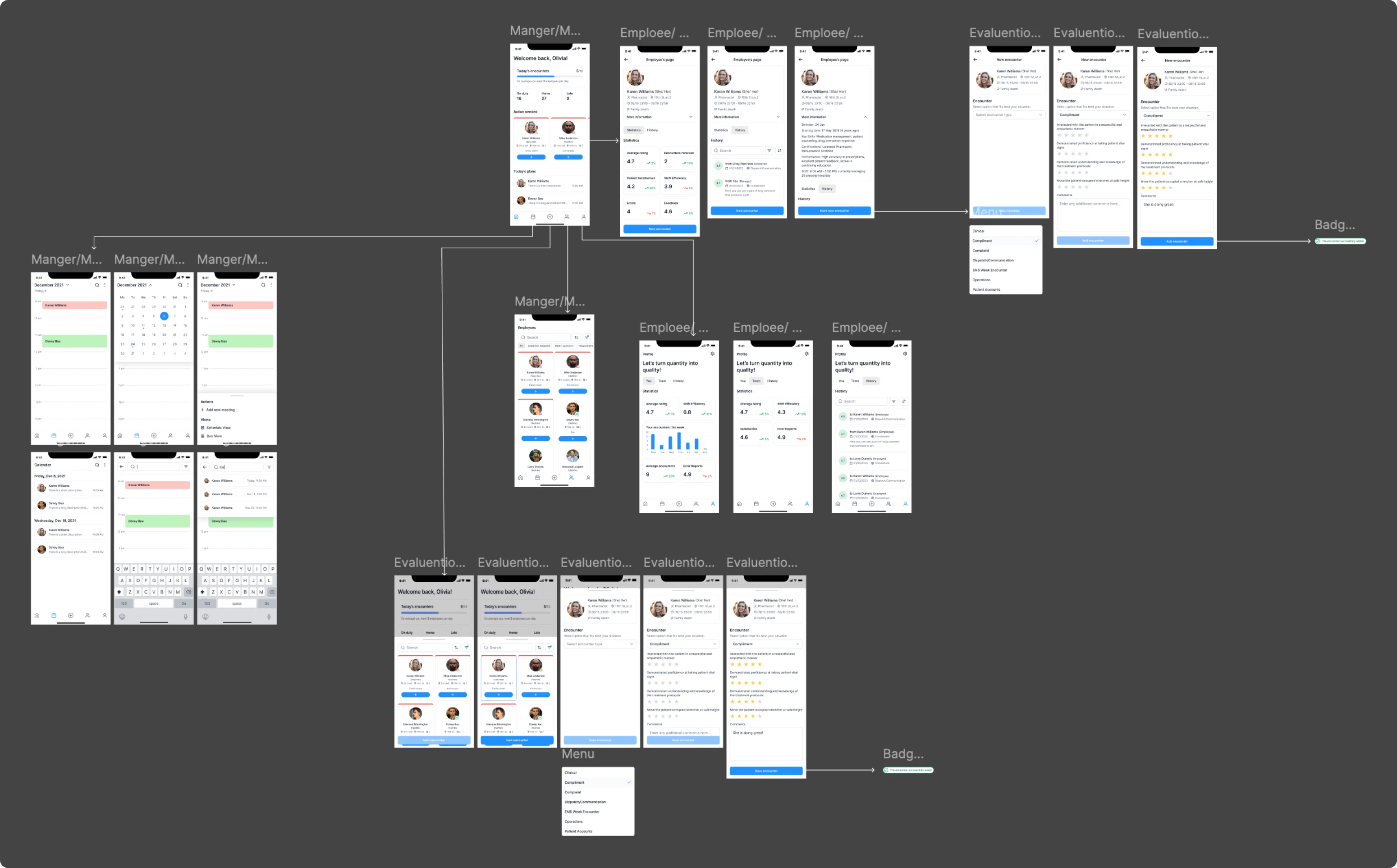
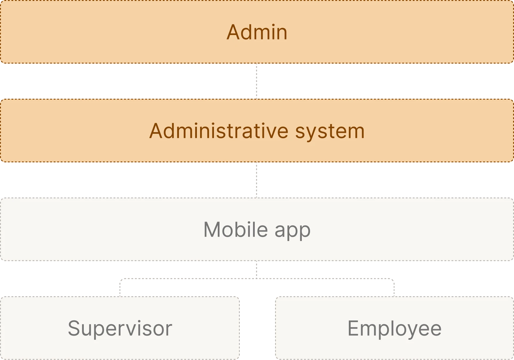
As part of our handoff after the trial, we shared a lightweight architecture concept for Newton360. It was a visual starting point, showing how core features could be integrated and how different modules might interact over time.
To help the client find the right visual direction, we also created three distinct design styles during the trial. The client liked one of our dark versions so much that we went with it as the default mode for the rest of the platform.
Discovery helped us define clear roles, systems, and constraints
The client was so impressed with the trial period that we quickly moved into full-time collaboration. To start, our designer immersed herself in the EMS field, learning more about this environment and exploring the market with similar products.
During this stage, we outlined that Newton360 relied on two workflows: a mobile app and a desktop-based administrative system.
We started with mobile to shape the core product experience
In alignment with the client, we moved forward with designing the mobile app first. Since the trial phase had already covered a significant number of key screens, we focused on refining and expanding what had been started.
In addition, we were tasked with designing the app for mobile and tablet, while supporting dark and light visual modes. This ensured flexibility across devices and accessibility preferences.
Here, we had two main user roles in mind: Supervisors and Employees.
Supervisor
For supervisors, the mobile app needed to support quick communication and personalized interactions. With that functionality, it should be easy to navigate what was happening in the environment and make informed decisions.
- Streamlined feedback flow with optional anonymity
We redesigned the feedback process to let supervisors select a person, define the interaction type, and leave a compliment, concern, or general comment.
While transparency was important to the client, we suggested adding an anonymous mode. Users are often more honest when their names aren’t attached, which is why we added a simple toggle to enable more open communication.
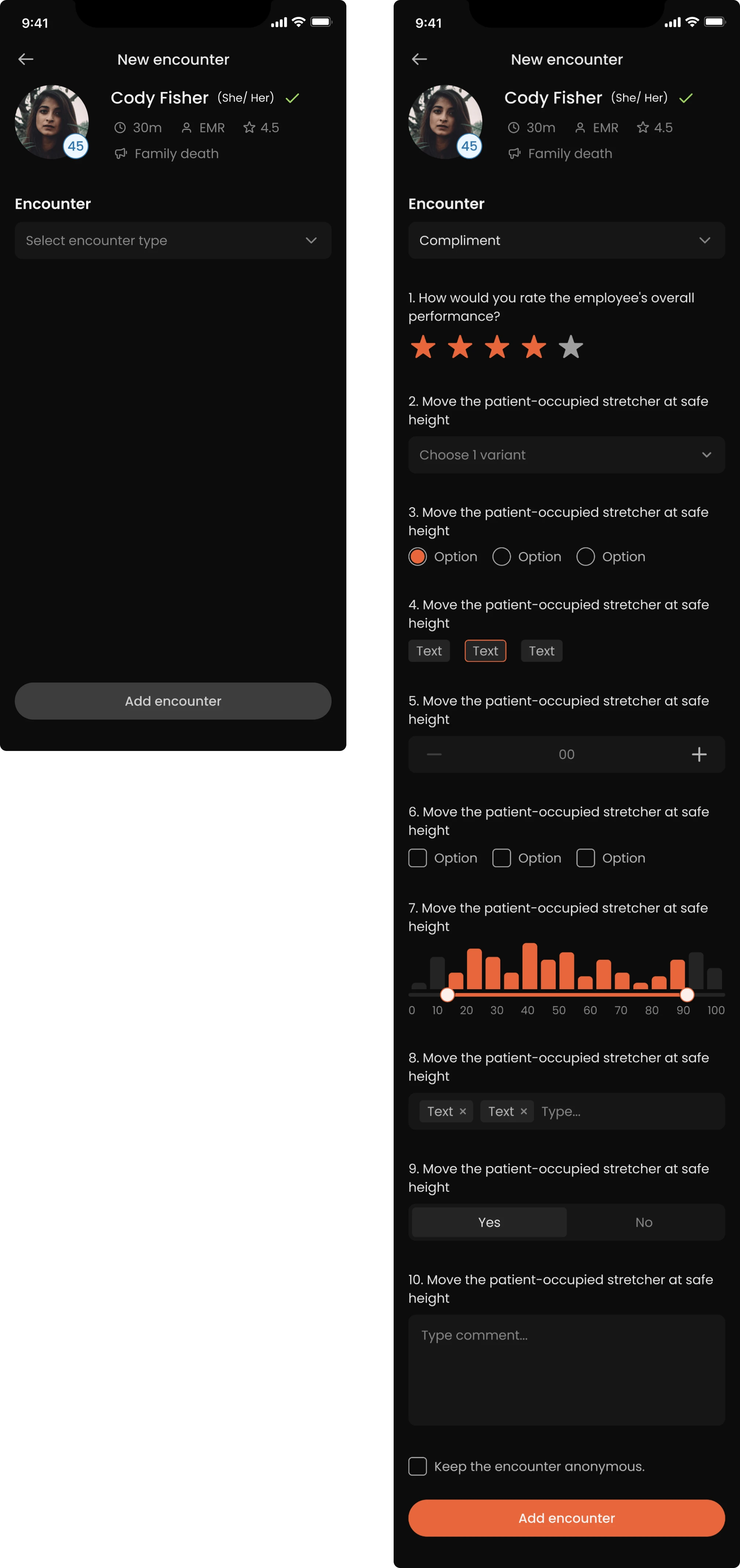
- Clearer interaction cues and faster access to action
To help supervisors manage daily interactions, we simplified card layouts and clarified visual indicators. Instead of ambiguous icons or colors, we used clear signals to show remaining shift time, overdue interactions, and potential issues.
To reduce friction, we moved the main action — starting an interaction — to a plus button, so managers could begin a conversation in one step.
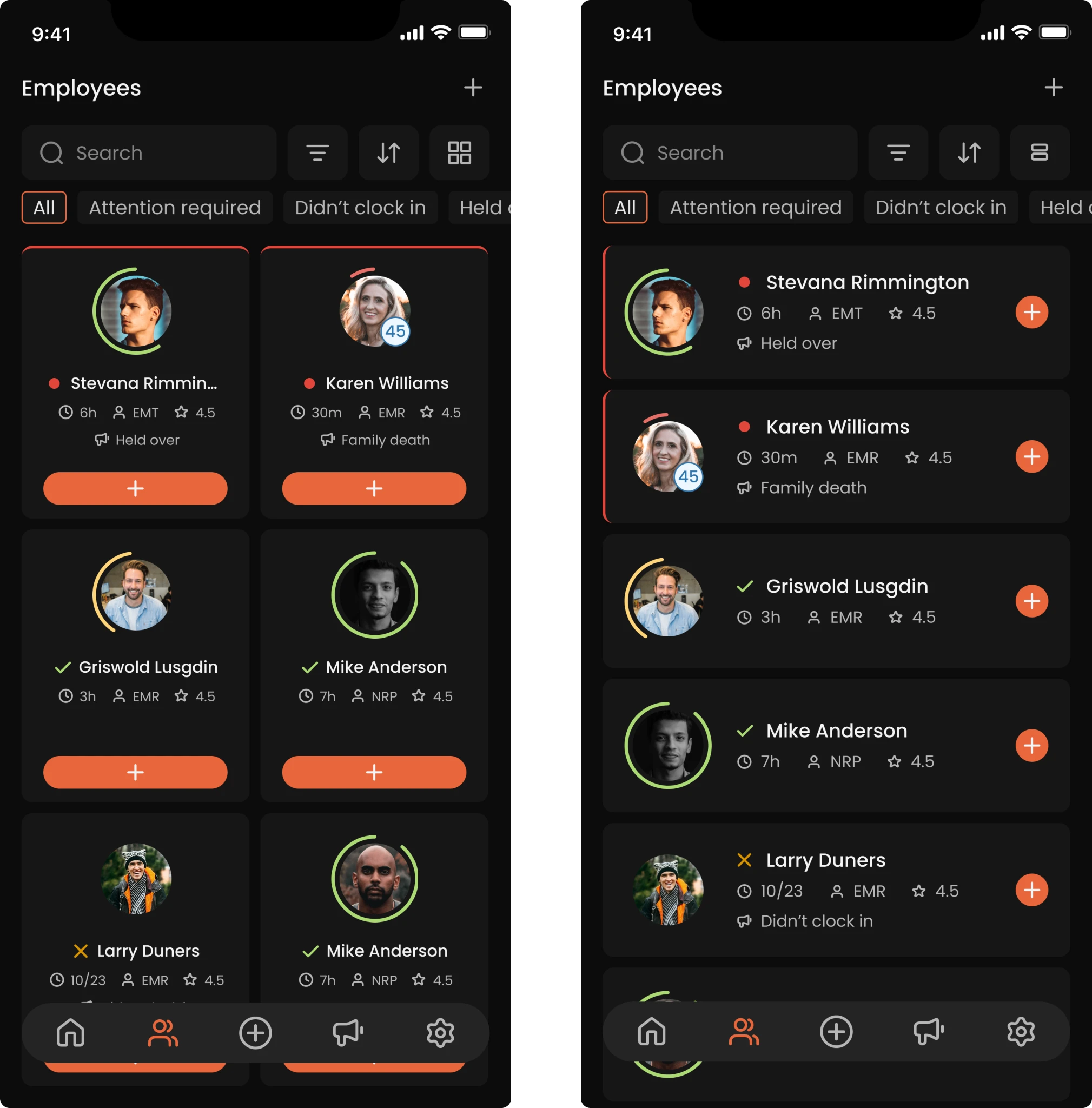
- Visualized performance insights through color
We used color-coded indicators to show how well each employee is perceived based on past interactions. Supervisors can see who left the feedback, when, and what sentiment it carried. It’s easy to identify patterns and offer support where needed.
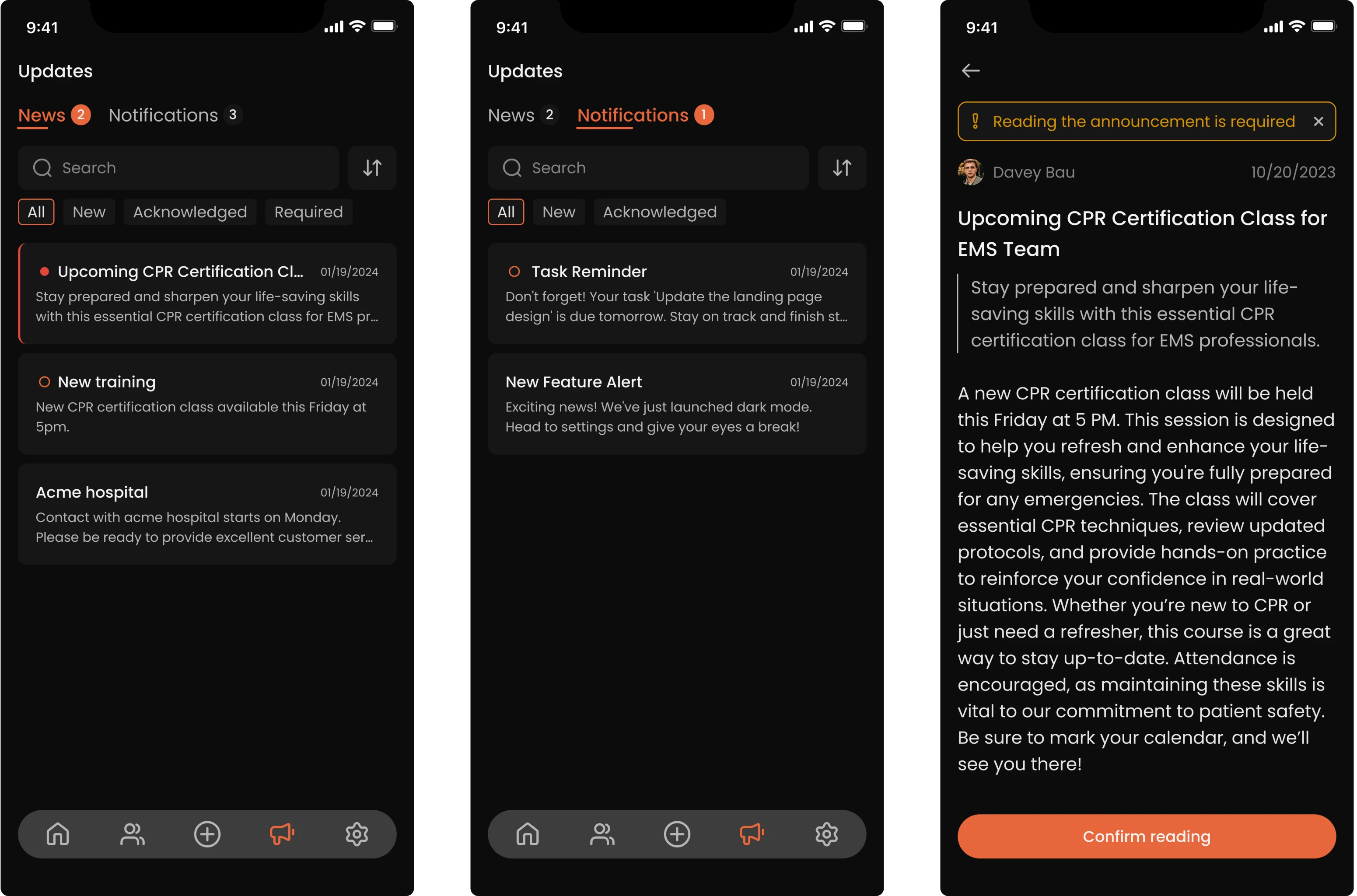
- Updates and notifications that don’t get ignored
We introduced a system of admin-triggered updates, such as training reminders or testing announcements. Important updates remain pinned until the user fully scrolls through and confirms they’ve read the content.
We also unified in-app notifications, using filters and categories to prevent clutter. Urgent messages stay visible, but they never get in the way of core tasks.
Employee
For employees, the app had to balance personal clarity, engagement, and privacy. While supervisors needed a broad view of the team, individual users needed to understand their responsibilities, access their data, and interact with others.
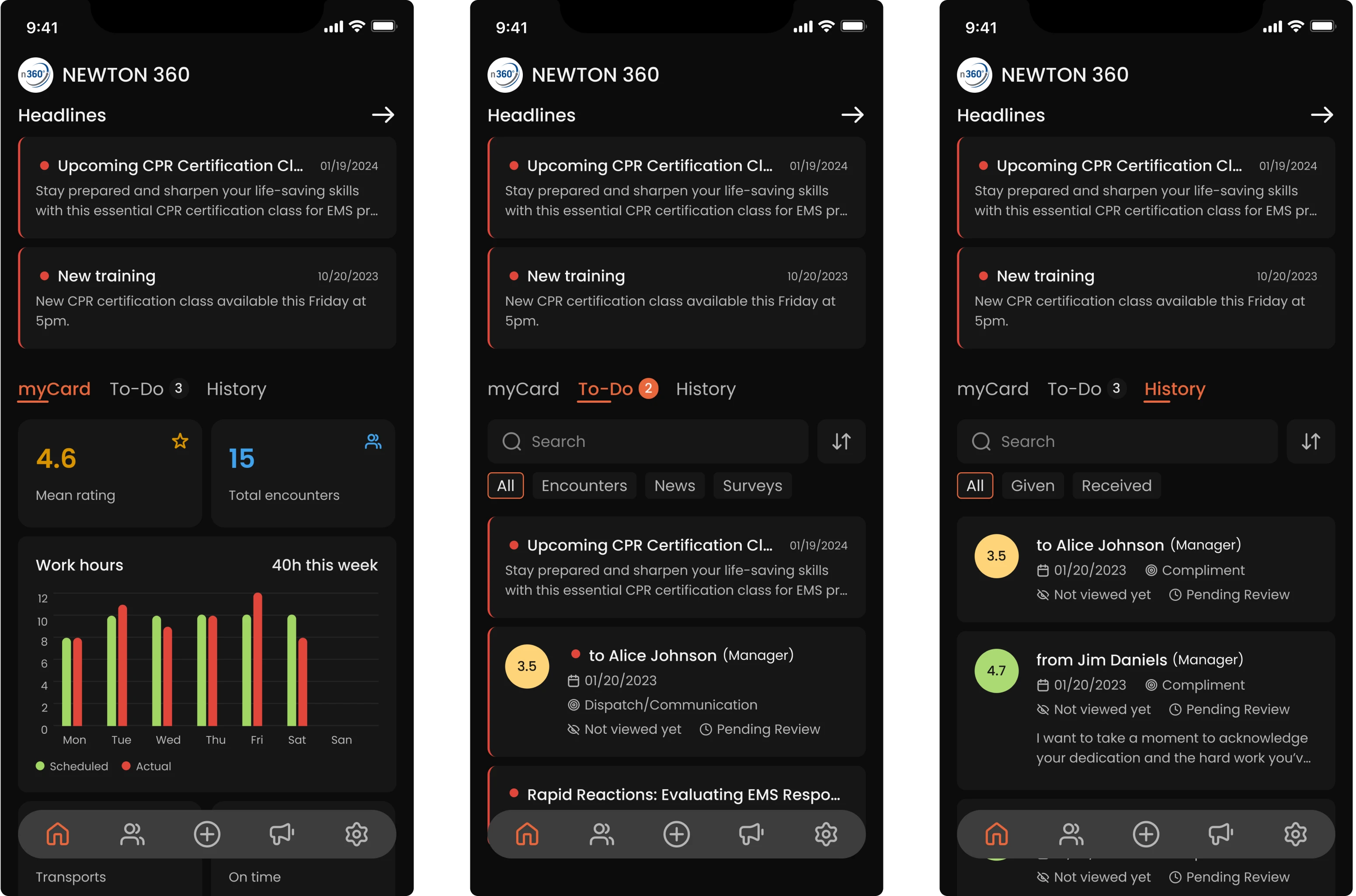
- A home screen focused on personal progress
Unlike supervisors, who mainly see people they need to interact with, employees land on a screen that highlights their own data and responsibilities.
Key items, like mandatory tasks, training, or announcements, are pinned at the top to ensure visibility. Below that, there are personalized stats, a To-Do section with pending actions, and a History tab with received feedback.
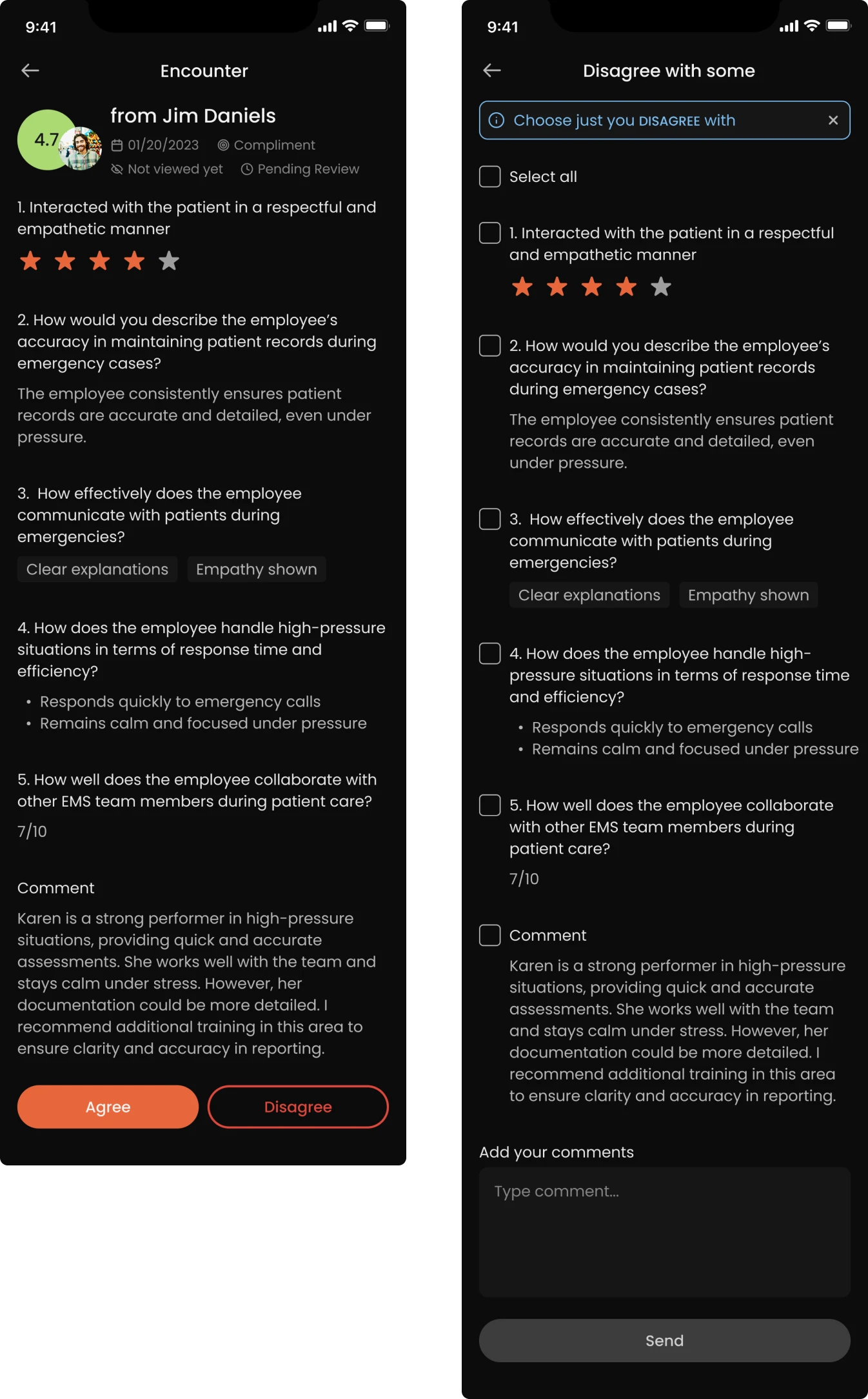
- Giving employees a voice through feedback-on-feedback
While working on the feedback section, we realized that people often leave subjective comments, which the other party may not always agree with. To address this, we designed a feature that allows employees to respond directly.
After choosing a response, users can add context or clarify their point of view. This promotes a culture of mutual respect, not one-way evaluation.
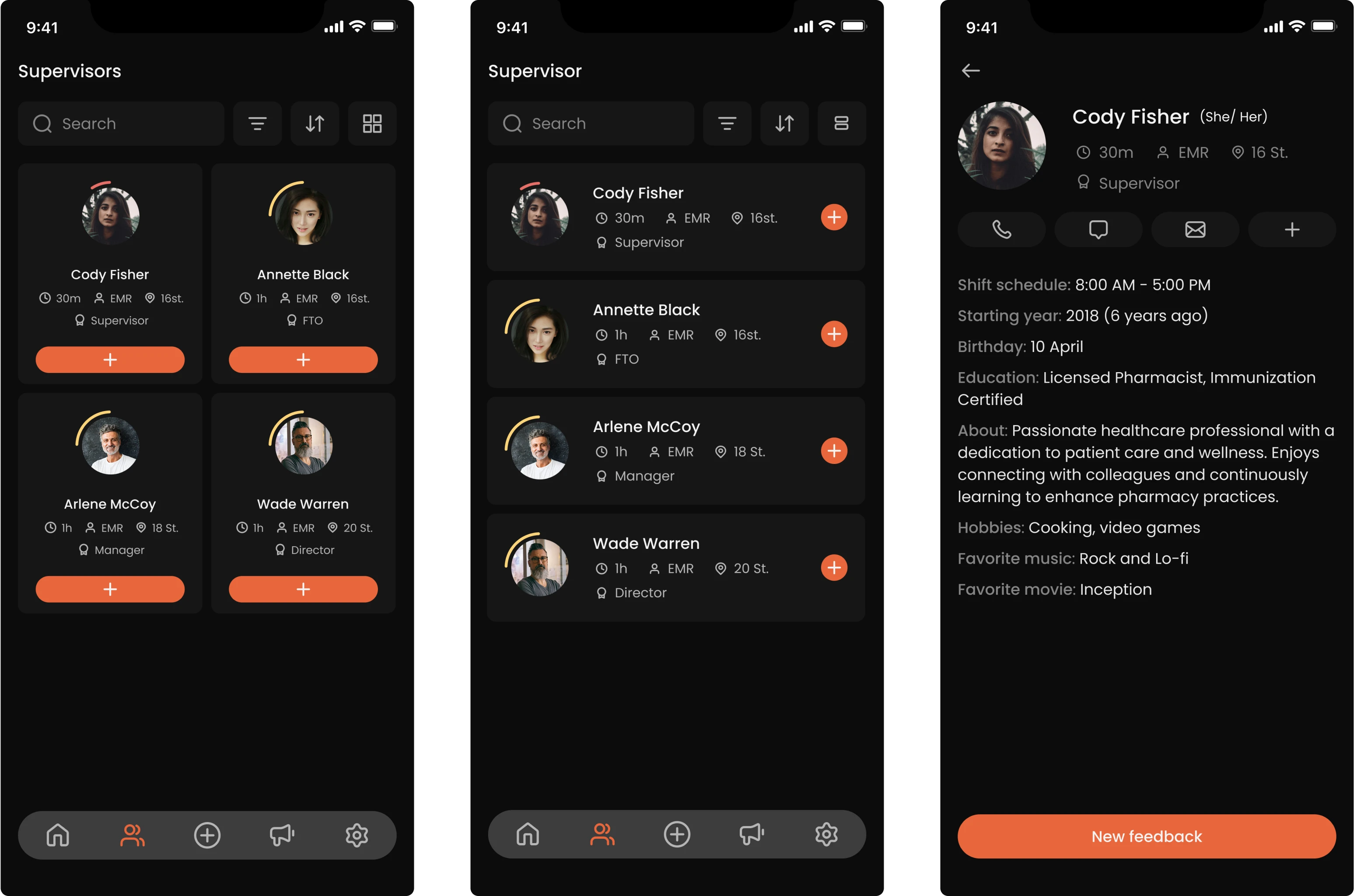
- Access to colleagues’ basic profiles
To support team familiarity while preserving privacy, we gave employees access to limited information about their coworkers. They can see who they’re working with and browse basic details, but nothing performance-related or sensitive.
Items were delivered on time, and we found that our Eleken designer was almost always ahead of my internal team. They were very responsive and very professional in all communications.
Integrator & EVP at VLI Tech
We connected the dots between mobile and admin systems
While the mobile app focused on day-to-day communication and feedback, the administrative system served as the control center, enabling high-level configuration and customization. Only users with elevated access could enter the admin panel.
Configurable dashboard to fit each team’s reality
We built the entire administrative system from the ground up, starting with the dashboard. One of the early improvements was allowing managers to view statistics in more detailed breakdowns, with filtering options and customizable widgets.
This flexible layout helped different organizations shape the dashboard to match their unique operational needs.
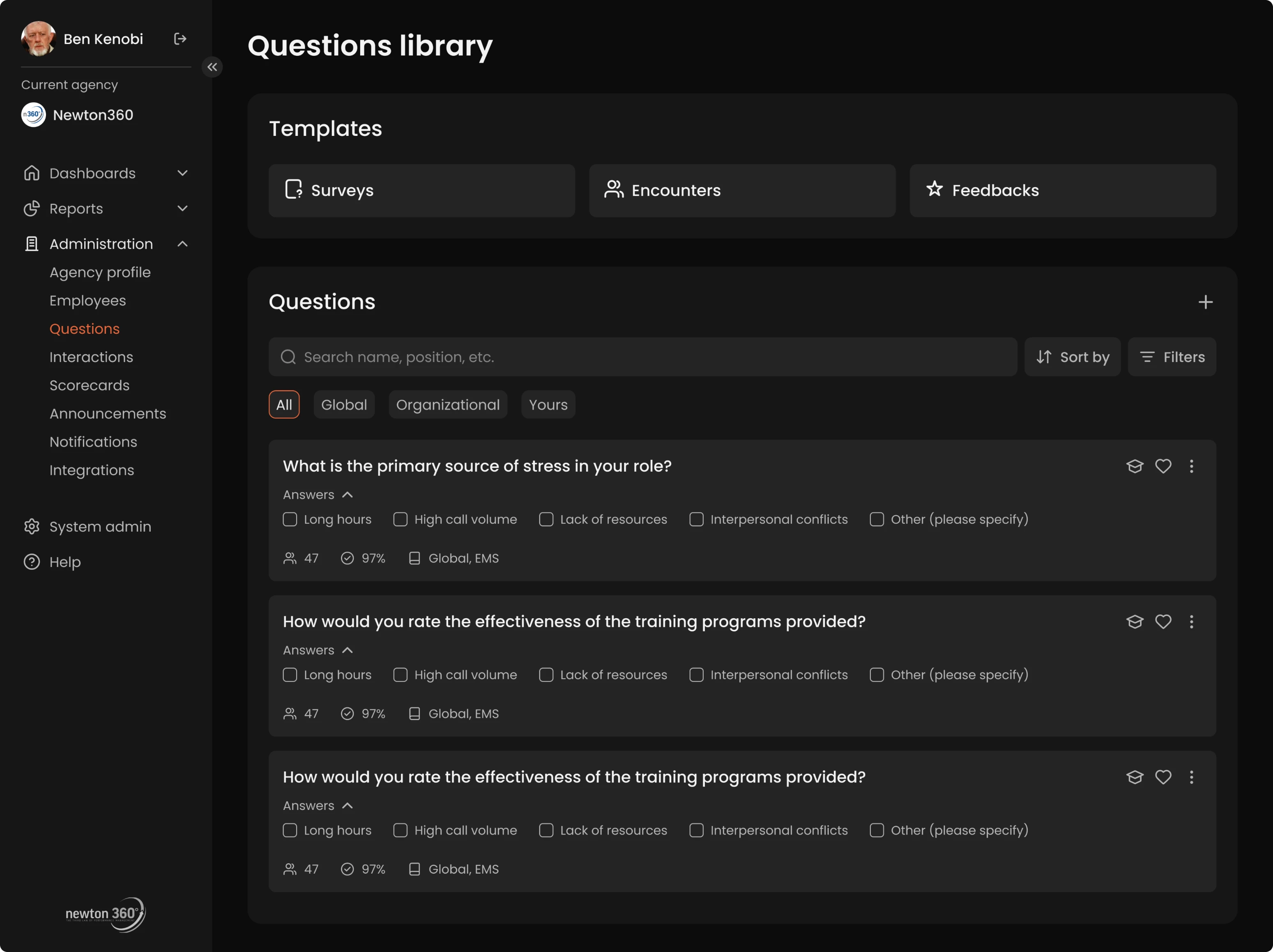
Reusable question library for better efficiency
One of the core features of Newton360 is its question system, used to structure employee feedback and evaluations. While there was a library of pre-written questions from internal experts, there was a risk that users would create near-duplicate entries, cluttering the backend.
To solve this, we introduced:
- Question templates users could reuse or lightly customize.
- Contextual metadata for each question.
- Usage indicators highlighting question adoption.
- The ability to favorite common questions for faster access.
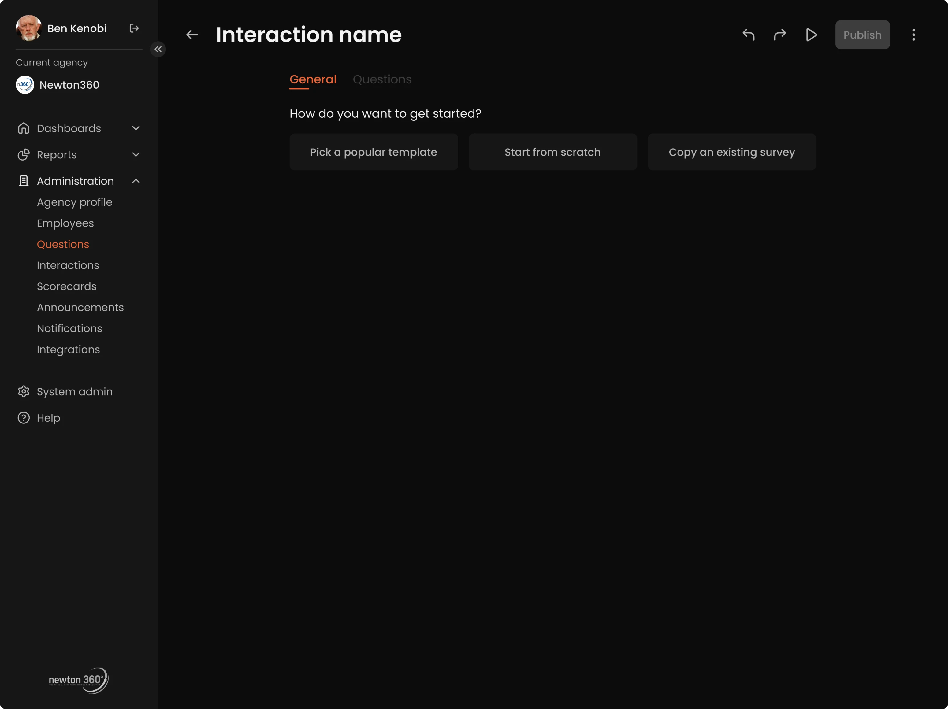
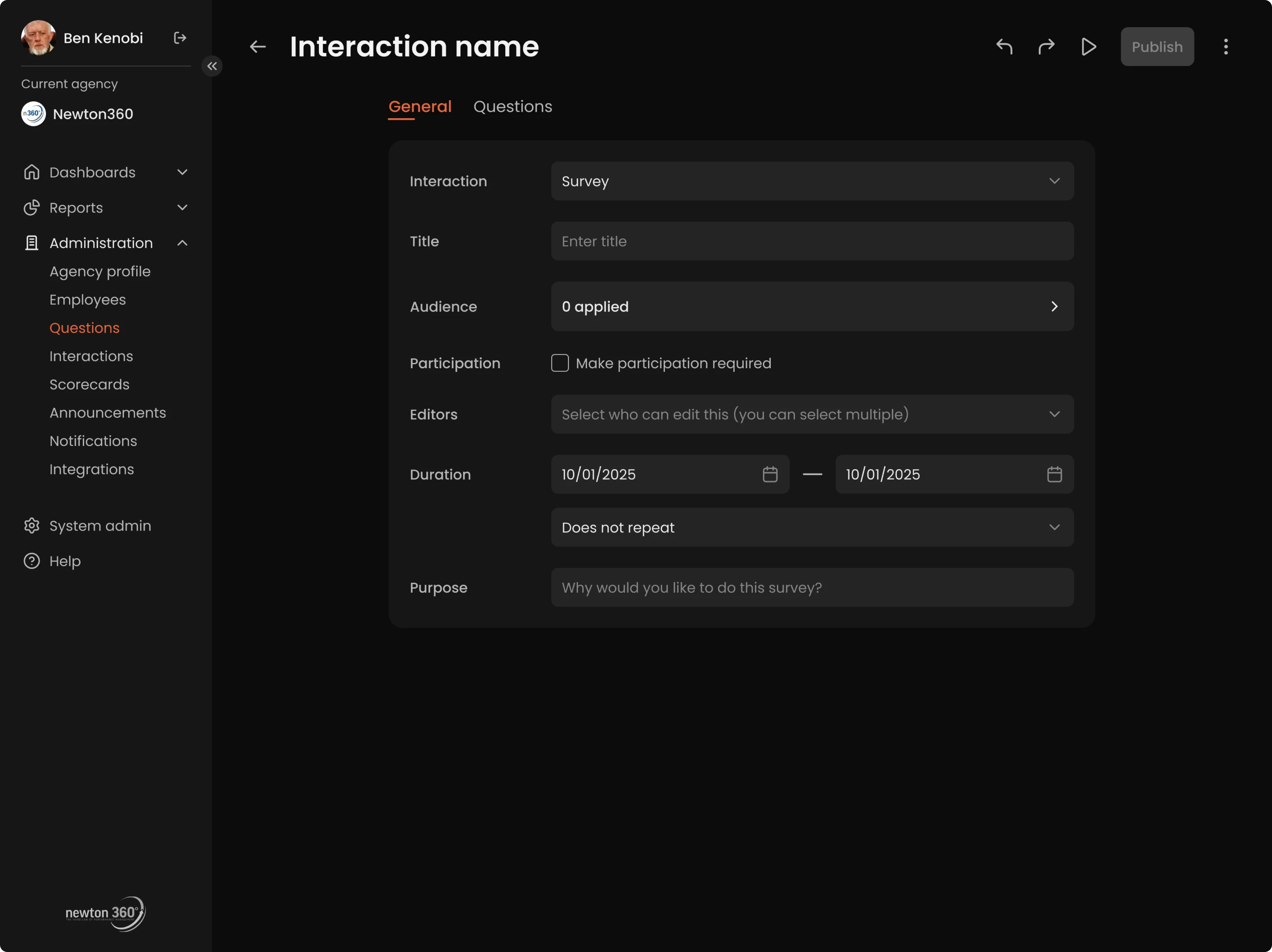
Structured interactions builder without friction
Beyond managing questions, admins could also create full interactions, like surveys, check-ins, or training flows. We designed the builder to be flexible for advanced use but simple enough for anyone to use without a learning curve.
Admins could start from scratch, duplicate existing interactions, and adjust them for different roles or use cases. We clearly defined what content types could be added and how they could be combined effectively. To speed things up, we added templates for common scenarios.
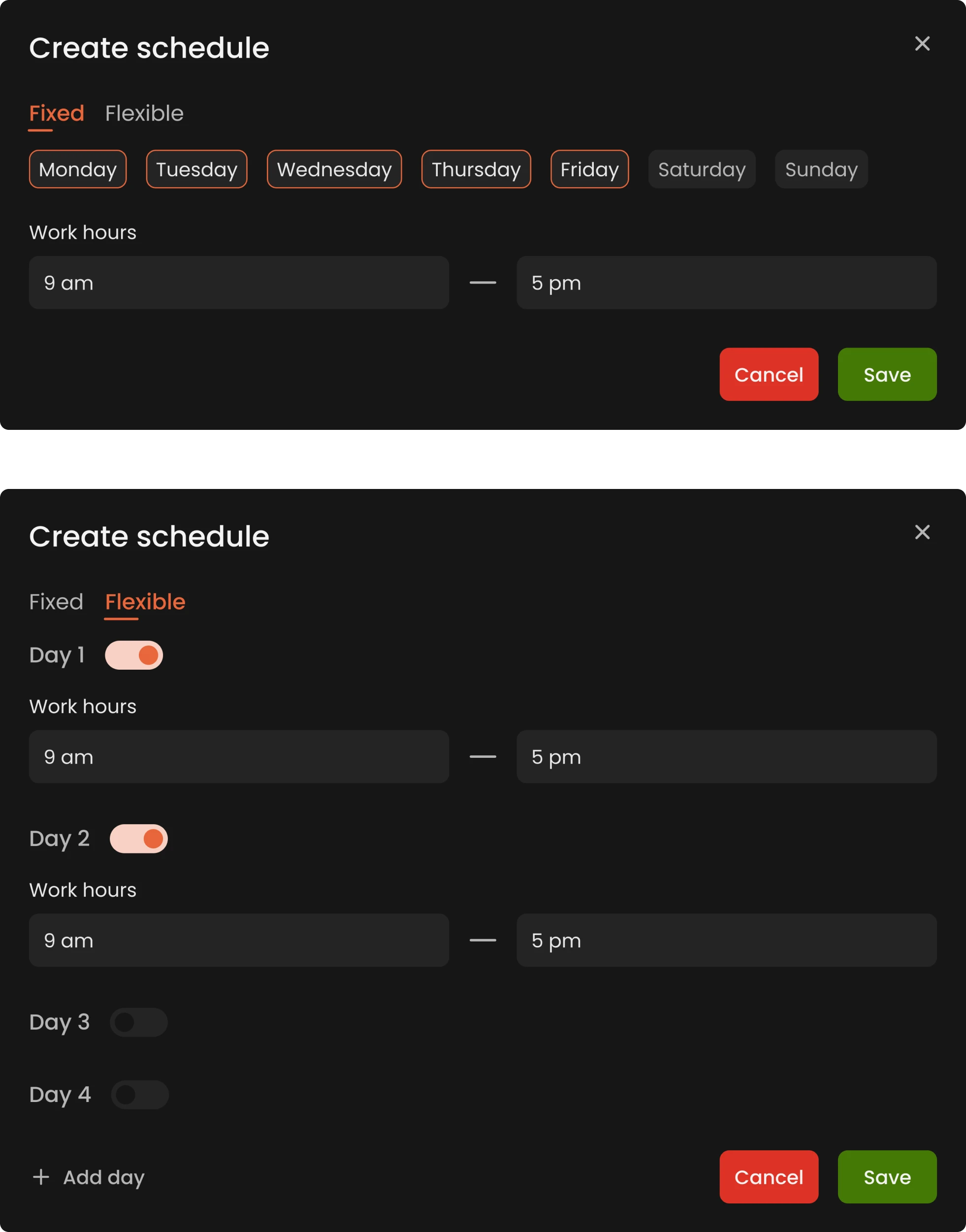
Custom schedules that match real-life shifts
While researching the medical field, we noticed that shift-based schedules are the norm, with patterns like “2 days on / 2 days off” or other rotating formats. From that insight, we designed the scheduling system to reflect those conditions.
We introduced a fully customizable schedule builder. Admins could set unique schedules for each employee or group, down to the individual day. This ensured Newton360 would truly support the operational realities of healthcare.
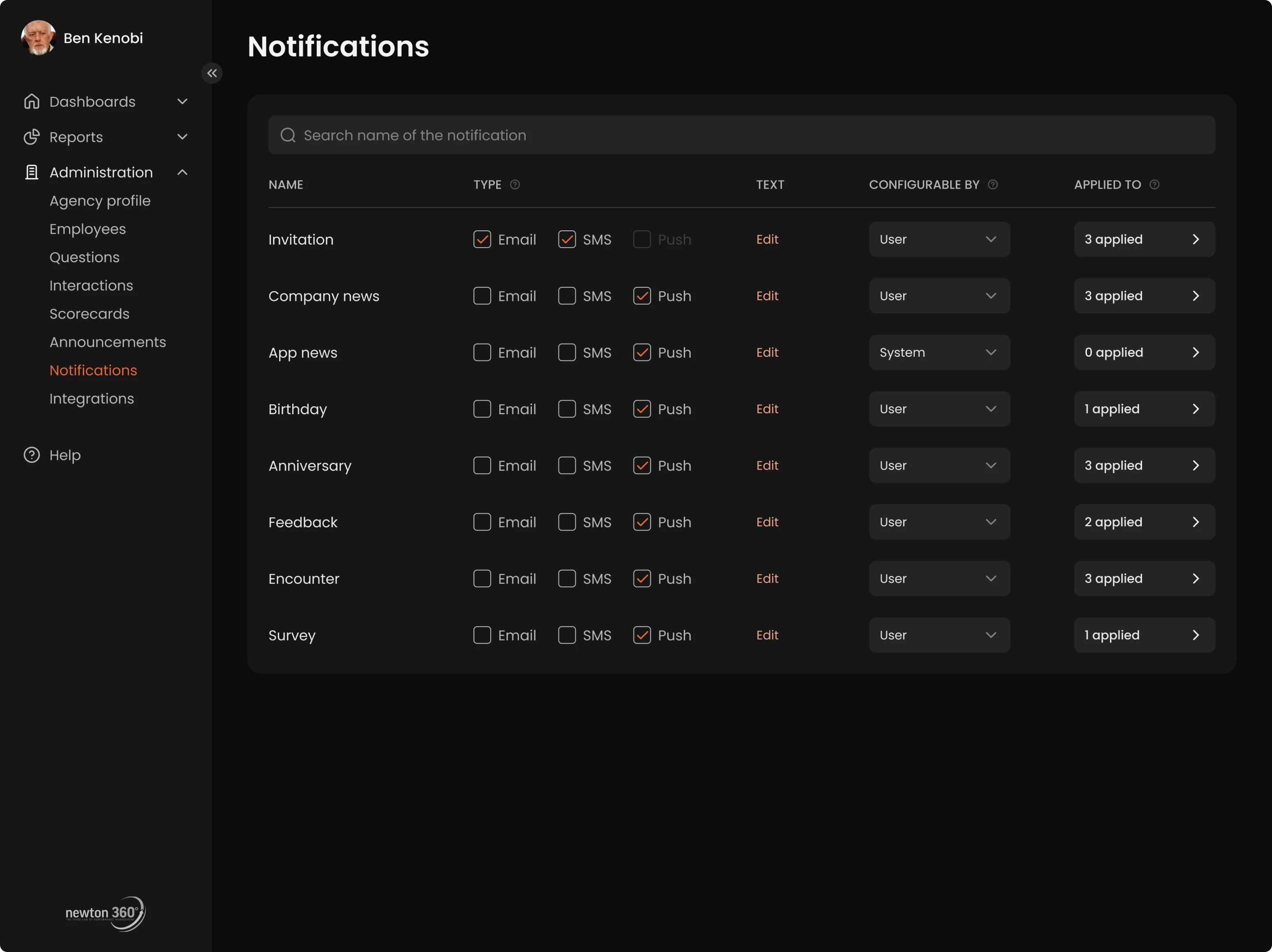
Notification controls to manage what matters
Admins also had control over which notifications and campaigns could be dismissed by employees, or whether they should stay visible until acknowledged. This level of control ensured that critical updates wouldn’t be skipped or overlooked.
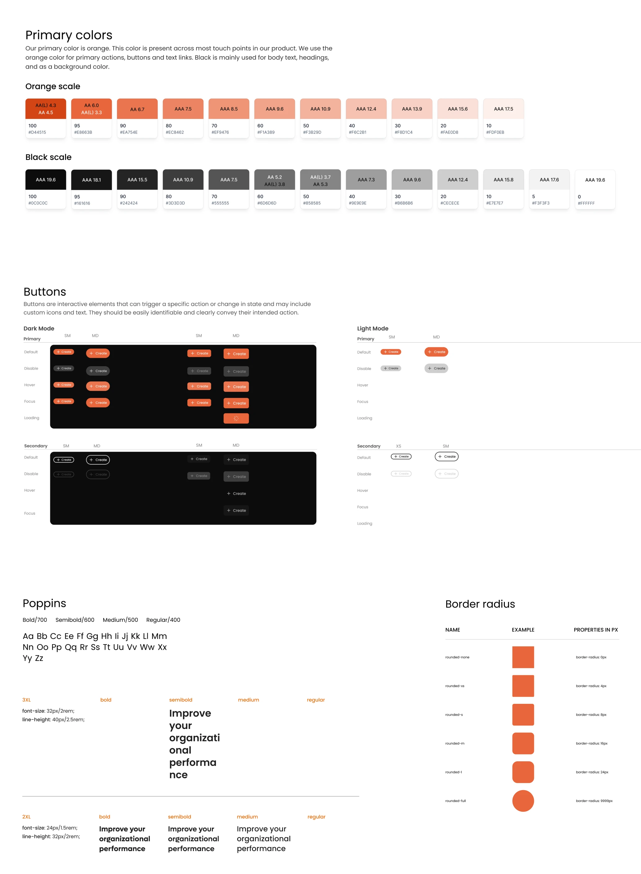
A reusable UI system let us move fast without losing consistency
Our designer developed a full system that covered color palette, fonts, border radius, and reusable components like dropdowns, buttons, and inputs. Each element came with clear documentation on how and when to use it.
All components were collected in one place, making it easy for developers to stay consistent and implement designs efficiently.
Our redesign turned Newton360 into a product teams rely on, and the partnership continues
With positive feedback from the client, we knew we had done our job well, especially for such a complex medical domain. The collaboration between our designer and the client was smooth, and the handoff to development went without a hitch.
Even after wrapping up the main Newton360 engagement, the story didn’t end. The client came back to us, this time for a part-time collaboration, and we’re already on a new design journey. Who knows, that might become a case study one day, too.
Success was simply measured by completion of the 2 main goals — app and website redesign from scratch to completion. Eleken is very professional and organized, offers great value for the cost, and has skilled designers.
Integrator & EVP at VLI Tech