/
Product design

Why Simplicity Is Overrated: Clarity Is the New Design Hallmark

0

mins to read

Have you ever heard anyone saying that simplicity is overrated in UX? When no, today is the day, as we challenge the notion of simplicity being the hallmark of good design.

Most educational pieces of information and books about design tell us that simplicity is one of the most vital parts of UX. But what does simplicity in design mean exactly? We tend to throw that word around without fully realizing that simplicity is relative.

When it comes to UX, it’s unfair to call a certain design simple. Most products that are available now aim for a minimalist design that cannot be called simple by any stretch of the definition.

In this article, we will unpack the differences between simplicity and clarity, as well as show how to create clarity in design.

Does design always need to be simple?

We all remember the days of chaotic and cluttered design that made our eyes hurt after a few minutes of interacting with it. It might be one of the reasons why we’re so hellbent on making simplicity in design a focal point nowadays. But does design really need to be simple by all means?

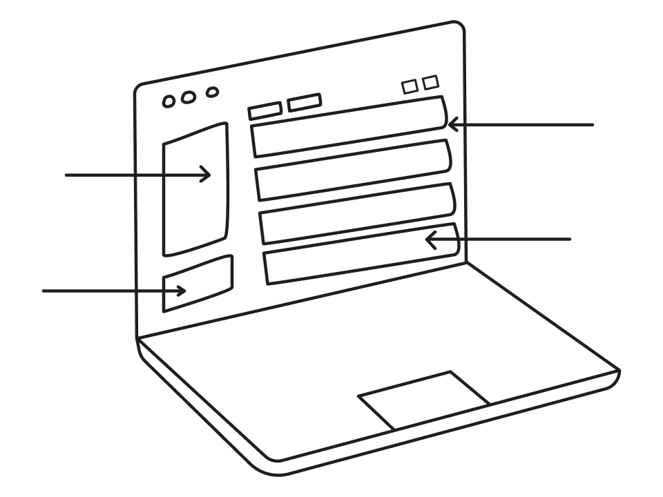
The truth is, most products, like applications and software solutions, are complex in terms of design. The reason is pretty straightforward: it’s impossible to have a complex project, like an extensive management system or editing software, without it having complex UX design. But here’s a thing: when we’re saying that the design is complex, we don’t mean that it’s complicated.

There’s a definite distinction between complex and complicated. Complexity incorporates necessary elements needed to maintain the integrity of operations. Think of it like gears — every piece moves with a certain purpose. Complicated, on the other hand, means burdensome, hard to comprehend. Surprisingly enough, going for simplicity doesn't necessarily fix the issue of complicated design.

So, simplicity neither applies to complex designs as it should be this way, nor does it solve the problem of complicated design. But what does? 

The paradox of technology

When a new product is created, it evolves from its most complex form to a simpler version and back to complex again. The most basic example of this evolution is cell phones. What started as a room-sized device later became a small and elegant Nokia 3310 that we all had at some point. And then Steve Jobs came around and said that Apple is about to “reinvent the phone” and presented the first iPhone, which was somewhat bigger and more complex than the Nokia phoned we used to love. This is called the paradox of technology.

The paradox of technology infographic

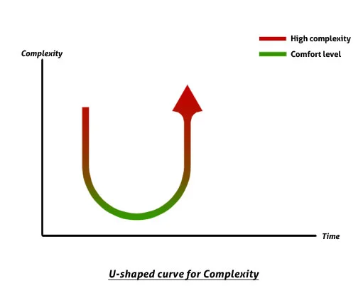
Cell phones evolved alongside the change in users’ expectations and demands. The more functionality was added, the more complex the product became. So, you can definitely say that Jobs made cell phones more complex, but does that mean we want our simple Nokia’s back? The answer is probably “no”.

This goes to show that simple design doesn’t equate to simple product.

The issue of being overly basic

The other side to this story is that some designs, in an attempt to be simple, tend to fall into a trap of becoming overly basic. Taking away as many design elements as possible increases the chances that the user will be unable to carry out necessary tasks efficiently, which ultimately affects usability.

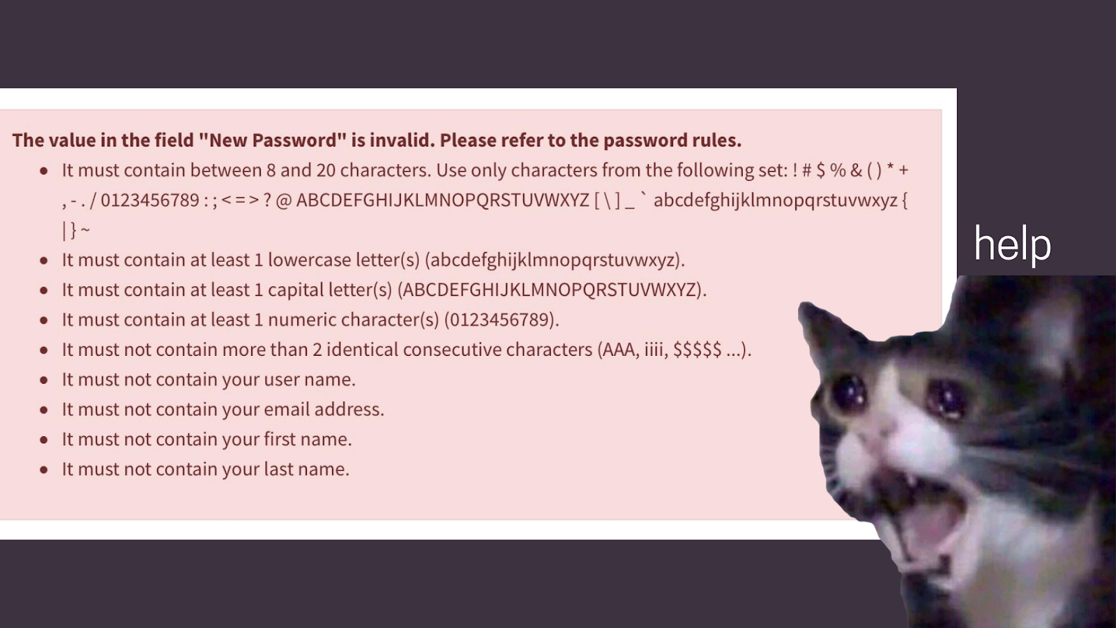
For instance, imagine you’re trying to create an account on a website. After tediously filling out dozens of forms, you push the submit button… only to have the entire registration form completely reset and display a message that your password was supposed to contain certain symbols.

Sounds infuriating. In this case, the design should have been more complex but also more clear to make operations frictionless.

How overly basic design can harm user experience

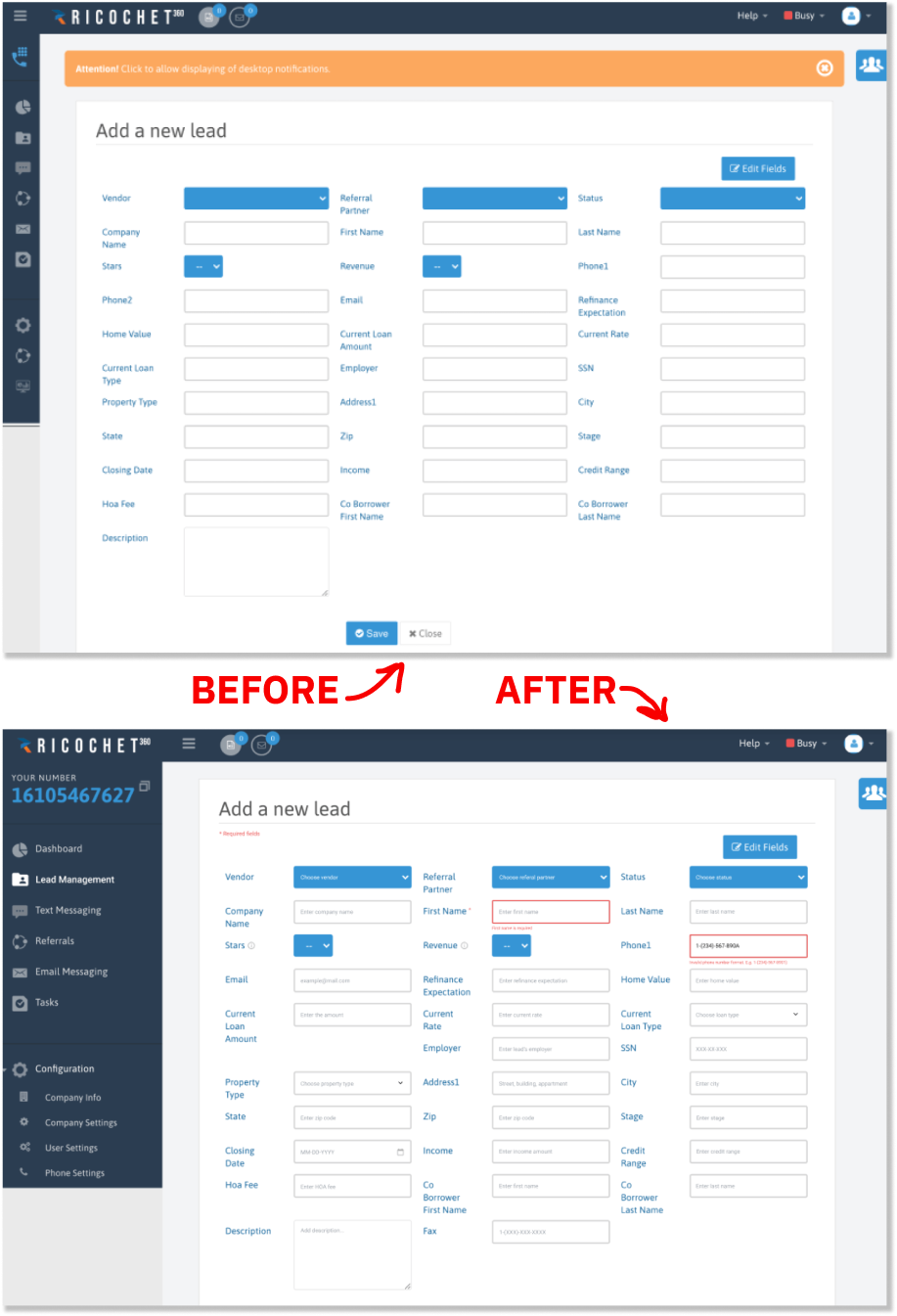
One of our clients, Ricochet360, reached out to us, asking to redesign their CRM platform to improve user experience. The root cause of most issues was unclear and, frankly, confusing UX design. For example, “Add a new lead” screen featured 31 fields with no clear instructions on how to properly fill them out and which fields weren’t necessary. Our team implemented small changes, like tips for each field and an error message when the form was incorrectly submitted. What is the result? A much clearer and streamlined user experience. It is still quite complex. But it is also functional. 

Ricochet360’s design before and after Eleken’s work

Why clarity is more important than simplicity

Clarity in UX refers to how comprehensible and easy to access the information on a given screen is. A clear screen allows for frictionless navigation and interaction without any obstacles. In other words, clarity is when the user can segment the task flow to reduce potential mistakes.

Generally speaking, sticking to the principle of clarity helps maintain the balance between minimalist design and functionality. We say “minimalist design”, because a clear webpage also means avoiding unnecessary elements to let the necessary ones “speak”. Basically, achieving visual clarity means reaching a point where there’s nothing to add or exclude from the existing design.

So, what is the difference between simplicity and clarity then? Simplicity includes many aspects of UX, such as:

  • Functionality
  • Design elements
  • Ease of use

The concept of clarity, on the other hand, is centered around delivering easy to use design. This is where the confusion lies and it’s something designers need to always keep in mind when working on UX. So, it’s time for a little confession: the argument we provided initially isn’t necessarily about why simplicity is overrated, but rather why changing the angle of the conversation towards clarity in UX is more logical and productive.

How to create clarity in design?

Now that we’re on the same page about simplicity versus clarity, the next logical question is: how do we create clarity in design? We now know that design should be simple and clear to curb the inevitable complexity of SaaS products. Luckily, we’re not going in blindly, since there are existing principles of how to deliver good user experience. Such principles are detailed in an approach called ten usability heuristics.

Jakob Nielsen created a systematic approach to making sure the user experience is unmatched. Curiously, these ten heuristics aren’t all about how to make your design simpler. They’re more about how to harness design to make people’s lives easier.

For instance, when our client TextMagic turned to us, they were looking to transform their text messaging service into an all-in-one marketing tool. The biggest challenge was ensuring that added functionality didn’t make user experience worse. Our team implemented design patterns that made complex processes clearer.

The result — TextMagic is now a holistic marketing tool with a more user-centered design. And there are many more examples of basic SaaS services — such as Notion or Intercom — transforming into all-in-one tools and continuously working on delivering clarity in UX.

Calm. An example why clarity is more important

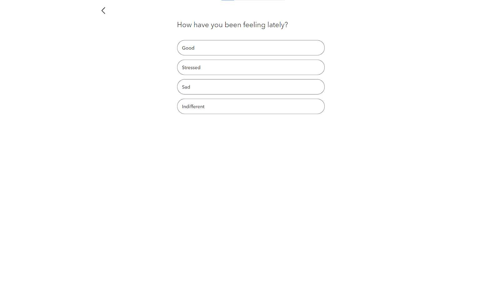
One major argument for why simplicity shouldn’t be the main focus is that trends in design are becoming too minimalistic and lifeless. The word “simple” tends to get interpreted as “blank”. A good example of clean UX design that actually looks exciting and engaging is the application called Calm. The app provides music for meditation and sleep therapy.

Calm’s example of prioritizing clarity in UX design

The UX design of this application truly has customers in mind. The navigation hierarchy is streamlined and intuitive, swiftly guiding users through web screens, one question at a time. Such navigation ensures that the users won’t get overwhelmed with tons of different options and can focus on filling out the questionnaire. This is also a good example of how to utilize  psychology in UX design.

Calm’s streamlined questionnaire 

What’s interesting is that the answers are used to further personalize the UX. Once you finish the questionnaire, you’re taken to a dashboard, where, based on your answers, you’re recommended to try certain features. It’s also worth noting that the app isn’t afraid to use a colorful scheme, but still in relaxing tones.

Calm’s colorful and comprehensive dashboard 

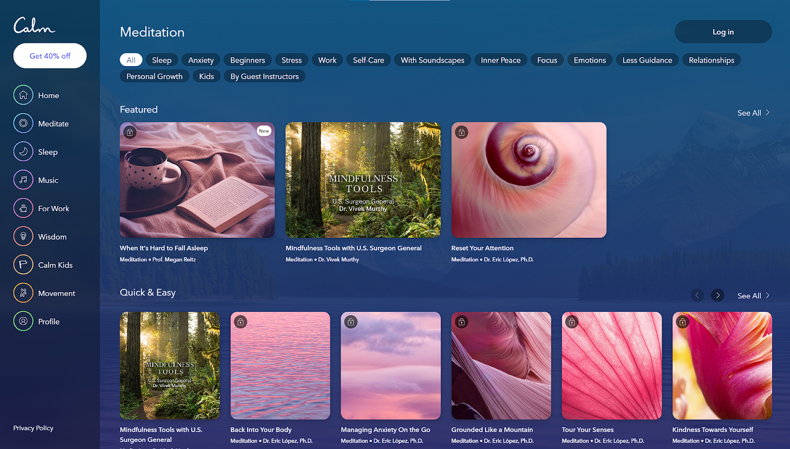
While Calm doesn’t necessarily demonstrate simplicity or minimalism in visual design, since it’s not afraid to use bold themes, it certainly is a good representation of how prioritizing clarity in UX can open many creative possibilities.

Tips on how to achieve clarity

The term “simple design” can be misinterpreted because of how vague the definition is. The “simplicity” we care about in UX design is making the user’s life easier. And, based on what we’ve discussed, what we’re actually looking to improve is the design’s clarity. Here’s a few tips on how to achieve clarity in a good design:

  • Chunking. A segmentation technique used to break apart messy task flows into smaller groups of information that people can easily process. On one hand, it may seem that chunking can slow the user down. However, when done right, it can actually speed up task completion by reducing the user’s cognitive load.
  • Cues on screen. Using visual cues on the screen, like descriptive headings or buttons, helps the user navigate more intuitively. Not to mention, it’s a great practice to improve accessibility in UX.
  • Visual hierarchy. Organizing information on the screen based on visual hierarchy principles guides the user through complex tasks in an intuitive and digestible manner. Consistent visual hierarchy can reduce the number of mistakes and task completion time.
  • Progressive disclosure. This interaction technique segments the most important information to appear first and tucks other elements away. For example, in most settings menus, the most important options are presented upfront, while additional options are hidden behind another menu.
  • Less is more. It’s not a crazy idea, but in order to design for simplicity and clarity you can’t overcrowd the screen. Design less features to begin with and only add new ones if they make sense and don’t disrupt the clarity of the user experience.

A design created with clarity in mind demonstrates why simplicity is heavily misunderstood. After all, most product designs are not simple, they have to be complex to deliver necessary functionality. Ensuring that the UX is clear is better than trying to simplify complex tasks. Focusing on delivering frictionless operations would result in a much more comprehensive and enjoyable user experience.

Final thoughts

It may seem that the argument of why simplicity is overrated is a more semantic issue. However, wrong use of simplicity in design can greatly damage user experience. However, the notion that simplicity is the main goal of good design needs to be challenged if we want to avoid falling into the pitfalls of becoming overly basic.

A much more resultative approach towards UX is focusing on clarity. Understanding how to design for clarity, instead of designing for the “simplicity”, is how you produce efficient design that users will actually appreciate.

If you’re looking for UX professionals to bring clarity into your product or software design, feel free to drop us a line to schedule a consultation! At Eleken, we are happy to provide highly effective UX solutions for projects of any kind of complexity.

Dana Yatsenko

Author

Table of contents

Top Stories

Product design
/
0
min read

How to Design a Dashboard That Helps People Make Decisions

A dashboard is the first screen a user sees after signing in. It’s like a compressed quintessence of all the app’s pages or an overview of a product that should allow you, as a user, to instantly scan the essential information, understand the current state of your business at a glance, and give you fast access to the needed app functions.

Well, that’s what a good dashboard should be like, but how to design a dashboard that promotes quick decision-making?

As we at Eleken provide UI/UX design services for SaaS products, we had a chance to create more than a dozen of dashboards for a variety of different industries. We know that designing a nice dashboard may be challenging, so we've compiled a list of practical recommendations for you, based on our experience. You will undoubtedly find something useful here.

The way we start our dashboard design

Dashboard is an important analytical tool and to make it useful, you have to display only the most essential data to viewers. So, despite the desire to jump straight into the design, at Eleken we always take some time to understand why we are creating a dashboard, who is going to use it, and what information we need to put there. And that’s what we recommend before opening a design tool when creating dashboards.

So, below are four essential steps to create a dashboard.

Step 1. Define how the dashboard is going to be used

First of all, identify what your customers need a dashboard for (its purpose), and how they will use it.

Depending on the goal, there are three main types of dashboards: analytical, strategic, and operational.

Analytical

Using analytical dashboards the viewer may examine large volumes of data and identify trends. These dashboards often consist of complex charts that help find data insights. Analytical dashboards can be used to make forecasts, find answers to “why” and “what if” questions, highlight how trends change over time, and the like.

We can choose this type of dashboard to track the progress of ad campaigns, monitor a product's income throughout its lifespan, or see the country's population patterns over time.

Below is an example of an analytical dashboard we designed for Haven Diagnostics. It depicts contagion graphs with future projections and allows making forecasts.

Strategic

Strategic dashboards help executives to check the progress of KPIs. Data on these boards allows making long-term decisions.

Strategic dashboards frequently provide a timeline of performance (month, quarter, year).

For example, below you can see a strategic dashboard we designed for Enroly, a student engagement app. It shows the data on CAS (Confirmation of Acceptance for Studies), like how many students applied, from which countries, how they cope with their arrival milestones, and so on.

Operational

Operational dashboards usually help to carry out tasks connected to monitoring. They often include current data presented in several simple graphics. This type of dashboard updates very often and is mostly used to monitor the progress and performance of a system in real-time.

Here’s an operational dashboard with real-time information that we created for a customer experience platform. Its purpose is to help managers analyze chat performance and customer satisfaction.

To sum up

  • Use analytical dashboards for analysts and executives to identify weekly performance issues, spot trends, establish analytics targets and gain an in-depth understanding of key processes.
  • Use strategic dashboards for executives to analyze organizational KPIs, track monthly performance, and meet KPI objectives.
  • Use operational dashboards for managers and their teams to track daily performance, and raise employee awareness and goal-tracking.

Step 2. Consider the users

In fact, this step is tightly connected with the previous one, but we decided to put it separately to emphasize its importance.

Whatever the purpose of your dashboard is, it should encourage the viewer to take action. So you need to know who your audience is to make them turn to your dashboard for insights.

Answer the following questions: 

  • Who are the people that will view my dashboard?
  • What data do they need to make decisions?
  • What are their existing understandings of the metrics?
  • Do they have experience working with data?
  • What misconceptions may they have about visuals and color?

Keep in mind that the way you perceive your data is different from the way your audience does. Try to explore what your users are seeking for, and put their goals first.

Step 3. Define what metrics to monitor

Effective dashboards help users make better decisions by providing the right data and context. That’s why, if you learn what decisions they need to make, you’ll know what metrics to include. 

  • Interview direct dashboard users to learn what decisions they want to be more informed on.
  • Learn how they currently inform themselves on these decisions, so that you can understand users' goals and motivation. 
  • Taking into account users' goals, think of all the decisions they need to make to reach them, and then single out those that need to be supported with data.
  • Talk with the user to pinpoint the metrics that will inform their decisions and provide answers to their concerns.

Step 4. Choose the proper visualization for each metric

A chart makes it far simpler for a user to identify trends than countless spreadsheets do. To create a useful dashboard, you need to know which chart to use to depict a certain dataset.

Here’s a short dashboard guide that we use at Eleken to choose one chart over another.

Displaying a single value

  • Single value chart to show a highly significant metric and help the audience quickly notice it.
  • Single value with an indicator to show a highly significant metric that’s changed.
  • Bullet chart to show a highly significant indicator in comparison to a goal.

Displaying several datasets

  • Table to showcase two-dimensional data sets that may be categorized or break up big data sets that have a natural drill path. Include no more than ten rows in your table.
  • Line chart to express continuous data, identify general trends and patterns, compare how they change over time, or make forecasts. Don’t compare more than four values on your line chart.
  • Bar/column chart to show change over time, compare values that fall in the same category and express how partial values relate to a whole value. The starting value on the y-axis should always be zero.
bar chart design example in a dashboard
  • Pie/donut chart to provide information quickly and in digestible chunks. Beware that users usually find it difficult to compare sections, so use this chart type for a small number of slices. Also, show more detailed info about each segment as the user hovers over each slice with the mouse.
the use of pie charts in dashboard design
  • Scatter plot/bubble chart to show how several quantitative variables relate to each other. Choose this chart for your dashboard if you have no other options, because they demand a lot of mental effort to process, even when the depicted information is simple and has additional context.
the use of scatter charts in dashboard design
Image credit: ppcexpo.com

Step 5. Organize the dashboard

Now, with all metrics defined, your task is to properly locate them on a screen. Here are several dashboard design tips on how you can do it. 

  • Start creating your dashboard prototype with paper sketches or using low-fidelity tools. Firstly try to visualize individual metrics, then try to group multiple charts together.
designing a dashboard layout with the help of a grid
  • To arrange charts together, try to start with a grid that will help you create a basic structure for your dashboard.
designing a dashboard layout with the help of a grid

Image credit: designer-daily.com

  • Place the most important indicators in the top left corner (as most people read from left to right).
  • Make sure related metrics are grouped together so that users don’t have to search them across your dashboard.
  • Mind the way you use the white space (the area between elements on your dashboard) - there should be enough of it to make the design light and not cluttered, but not so much that it becomes difficult to understand which charts belong together.
  • To keep the dashboard consistent, reuse design elements in different charts over your dashboard.

The way we make dashboards simple and easy to comprehend

At Eleken, we’re the supporters of minimalistic dashboards. We believe it’s not a place where you can distract users with graphics, so everything has to be clean and clear (you can make sure it’s true by looking at some of our dashboard examples). And we know, you can make data easier to grasp at a glance with the help of the right use of color, typography, and layout. 

Here are several rules to keep the design simple.

Choose colors wisely

  • Remember about consistency. If you chose a certain color scheme, use it for every chart on your dashboard. As a result, it’ll be easier to find relationships between data in graphs, tables, and charts.
  • To prevent one set of colors from standing out too much from other groups, keep all of the colors in the same range of lightness and saturation.
  • Use up to six colors in the layout, as using too many in one chart can hinder the user’s focus. 
  • To generate contrast and emphasize some data, use color accents for the information you want to draw attention to, and neutral colors for other data.
  • To show amounts or numbers of continuous data, it's better to use various saturations of one color, not different colors.
  • Keep in mind that certain colors can evoke strong associations (like green for positive changes and red for problem areas), so don’t flip their meaning.
  • Use additional visual clues, such as icons or labels, to further explain the significance of the chart colors.

Mind labels and typography

  • Choose the appropriate fonts (Roboto, Inter, or SF Pro can be your safe choice).
  • You can show how important certain information on your dashboard is with the help of headings and font weight. Yet, select a few typographic styles.
  • Add a description or a formula to metrics that may be difficult to understand - this will help viewers correctly interpret a chart.
  • Don’t use icons alone, accompany them with a label to clearly represent key information.
  • To keep the chart legible, avoid over-stuffing it with axis labels.
  • To make the labels on the chart easier to read, they should be positioned horizontally. Don’t rotate or put labels vertically.
  • Put a legend under a chart on a desktop, and above the chart on mobile to keep it visible.

Put the information in hierarchical order with the help of layout

  • Divide all charts you want to include in the dashboard into three groups depending on the importance and arrange them in descending order. Put the most critical data first, then trends that explain the previous insights, and then add details that help comprehend the issue better. This will make the board easier to read. 
  • Focus the viewer's attention on important indicators with the help of color, size, and visual weight. 
  • To make it possible for users to compare charts, make sure they don’t have to scroll through the dashboard. If there is some data below the bottom of the screen, your dashboard probably contains too much information and you should consider removing irrelevant charts.
  • Eliminate anything that doesn’t communicate data.

Final recommendations

As with everything in your app, the dashboard should change and evolve over time to continue being useful for the audience.

  • Gather user feedback to keep the dashboard up-to-date and find faults more rapidly.
  • Schedule time to analyze the feedback so that you can identify trends and set work priorities.
  • Check the dashboard's functionality frequently to determine if people still use it, if the data is still correct, and if there is a need for improvement.

And if you feel like your journey to a perfect dashboard will be much easier with a dedicated UI/UX designer in your team, we specialize in creating SaaS dashboards

Schedule a call to learn more about how we work.

Product design
/
0
min read

How to Design Workflow Management Software That Helps Streamline Work

Did you know that in most companies employees spend only about 60% of their work time ( often even less) productively? You may be wondering, what is the remaining 40% spent on, then? Well, employees spend this time attending meetings, writing long emails, filling in spreadsheets, trying to find the needed document or file in loads of other information, and so forth. 

No matter what size your company is, managing repetitive business processes can be quite tedious and even challenging as it requires dealing with organizational chaos, thinking out branching paths, and looking for a variety of auxiliary tools. 

Workflow management software (WMS) aims at helping you fight this complexity, reduce distractions and streamline your work activities. Being a team of product designers, at Eleken, we had a chance to design workflow management SaaS from scratch and in this article, we want to share our experience with you.

Below we are going to cover the following topics:

  • What is workflow management software?
  • What should a workflow management system possess to be effective?
  • What are integral parts of the workflow management software design process? 

What is workflow management software?

Let’s try to explain this term gradually, word by word. And we should start with the notion of “workflow”.

Workflow is a repeatable set of steps performed in a sequential manner over time, which enables people and systems to achieve a certain goal. Establishing workflows and ensuring that they are implemented effectively is a key factor in running a successful business.

Most workflows are complex and include many steps (information handoff, interactions between different people/departments of an organization, and so on). 

workflow example

This complexity leads to inefficiency, inconsistency, and impaired productivity. As an organization, we need to ask ourselves: “Are we operating as efficiently and effectively as possible?”. This is where workflow management comes in.

The goal of workflow management is to understand and determine what tasks need to be executed, in what order they need to be accomplished, who is involved, what systems are being used, and what rules are being followed.

And finally, not to deal with all the above-mentioned stuff manually, you can use workflow management software. Its features allow you to automate tasks and enable project team members to create, update, and manage task progress throughout the project.

What should a workflow management system possess to be effective?

The workflow management software is supposed to deal with complicated processes to streamline your work, such as:

  • Establish relationships between tasks
  • Create and manage subtasks
  • Set up a task to repeat at a specific time or date
  • Assign tasks to one or more people
  • Import task list from an external file, and more.

To effectively cope with those duties WMS should have the following characteristics:

Be cloud-based

In 2021 the benefits of using SaaS technology are obvious and don’t need long explanations. Investing in making your WMS cloud-based ensures your team can work from anywhere, all tasks are regularly updated and maintained and you receive not a one-time deal, but an ongoing experience that gives you continual value.

Integrations with other tools

DO workflow management software integrate with other tools? Monday.com example
Integration page of Monday.com. Image credit: support.monday.com

When scaling, businesses tend to adopt more solutions over time. Therefore, the ability of WMS to integrate with these existing solutions plays a big role. 

The best project management tools have many integrations either directly, via  Application Programming Interfaces (APIs), or webhooks. The flexible solution can easily integrate with many popular apps and services used by companies today, such as Google Workspace, Microsoft 365, Salesforce, or Dropbox. Zoho Projects, Monday.com, Asana, and many other project management vendors offer numerous integrations to connect to other types of business software.

Reporting and analytics

reporting and analytics feature in Asana
Task reporting in Asana. Image credit: asana.com

Large teams have a great need to track and analyze key workflow data from various sources. They need workflow management software with a reporting and analytics engine to display the following metrics to help them successfully complete tasks and deliver projects:

  • Average process time
  • Average time per task
  • Tasks by stage of completion
  • The number of tasks per team member
  • Points, hours, or other metrics that indicate the importance of the task

Reporting and analytics in your WMS can help to indicate process bottlenecks or other indicators of required performance. They help the team build a plan on how to increase productivity based on real data.

Conditional logic

Conditional logic lets you set rules and conditions in your processes to show variable tasks based on the information you record. 

For example, when you hire a new employee you need someone to approve (or reject) the candidate. Depending on the job position, you may need approval from people from different departments. So as not to create many workflows, you establish the so-called "conditional branches". Accordingly, if the candidate is a content writer, the approval goes to a content manager, and when hiring a UI/UX designer, their CV goes to a UX lead.

Creating conditional branches should be easy even for non-tech users.

No-code, intuitive design

As workflow management systems aim at clearing up messy processes, they should provide the best user experience possible. A good WMS lets any non-tech savvy person create, change and manage workflows, while all complex processes are done by the system.

Adding ready-made, customizable workflow templates to your system will be a huge plus as well.

CRM template example at Monday.com
CRM template example. Image credit: monday.com

What are integral parts of the workflow management software design process? 

Great apps are not the result of the genius designer (although it also contributes), but of the correctly organized process that leads the designer to a great solution.

The phases of the product design process we are going to analyze below are based on the Eleken design team's experience they got from working on Process Place, a workflow management system created to clear up headache work activities.

Though we are used to depicting the design process as a sequence of steps, it’s never linear, you constantly have to go back and forth to test and refine your design decisions. But to give you a clear picture, we singled out major vital components without which it would be impossible to create an effective workflow management tool. Here they are:

Competitor analysis

When it comes to project management workflow software, there are dozens of apps that come to mind, like Monday.com, Asana, Notion, Kissflow, and others. 

best workflow management software

It becomes clear that there are many rivals in this field and, to be able to survive in a highly competitive environment, you have to define what features are must-haves for task management workflow software and what unique features can make you stand out on the market. It’s a task of competitive analysis.

Getting back to our experience with Process Place, conducting competitive research played a vital role and allowed us to define that most products on the market are confusing due to lack of intuitiveness in their interface. Consequently, creating an intuitive user interface became a competitive advantage of Process Place. 

ATS onboarding
Process Place onboarding screen

User research

“Empathy is at the heart of design. Without the understanding of what others see, feel, and experience, design is a pointless task.” Tim Brown, CEO at IDEO.

Which type of user research you should use depends on both your workflow and your reasons for doing such research. In general, studying your customers helps:

  • To create a design that is completely relevant to your user and takes into account their pain points.
  • To create designs that are simple and enjoyable to use.

Our team conducted user interviews to create a tool that helps people cope with real existing issues. 

We talked to HRs, as target audience representatives, about their regular workflow — hiring a new employee. The insights from those interviews were visualized on a customer journey map and helped us better understand customers’ needs. 

Customer journey map created for Process Place

For example, during the interview, we learned that to have the hiring process documented HRs need to collaborate with the team on it. “We had to hire a business process assistant to coordinate this process”, says the interviewed user. Therefore, there is a need to teach the team to use a new tool.

For that reason, in Process Place you can easily assign or invite new team members. And for newbies to adapt quickly, there is an intuitive onboarding.

ATS onboarding design
“Invite new member” feature
ATS onboarding design
Short tooltips to make onboarding easy and fast

Wireframing

workflow management system wireframe

When all the needed research is done, it’s time to put together the insights we got from it and turn them into a consistent user experience with the help of wireframing.

Wireframes are an essential step in any design process that serves as a skeleton of the future app. Wireframes primarily define the information hierarchy in your design. They help determine the place of elements in the layout, depending on how we would like the users to perceive the information. They allow the designer to plan the layout of elements and interaction with the interface without being distracted by the choice of color, font, or even text.

When the structure is ready, it’s time to think about the look of the software. 

UI design

People today are overwhelmed with information and tend to choose products that are easy to understand and easy to interact with, especially when it comes to tools that deal with workflow process automation.

From the experience of our design agency in the SaaS industry, we know that a good user interface is important in the sense that it helps your target audience solve their problems effectively with your product. The user interface is designed to display features that you offer, without any ambiguity, it grabs your users' attention and helps them easily navigate through the app.

The user interface not only focuses on aesthetics, but also maximizes the responsiveness, efficiency, and accessibility of the product.

As you remember, the competitive advantage of Process Place is its intuitive user interface, here’s how we designed it:

  • Blue-grey color palette according to the laws of color harmony
  • Distinctive and readable text styles
ATS typography example
  • Minimalistic and easy-to-perceive interface
UI kit for a workflow management tool
  • Unique and memorable illustrations

Ready to create your workflow process software?

The greatest challenge of designing such an application is to be able to turn the chaos of business processes into intuitive and user-friendly interfaces. 

To cope with this challenge, talk to your users to identify what matters the most for them, see what your rivals’ products advantages and disadvantages are, make sure each icon/button in your app has its clear purpose, and once the product is ready, learn how to market SaaS software to successfully present it to the world. 

If you still have some doubts about how to design workflow management software, let’s do it together — contact Eleken!

Don't want to miss anything?

Get weekly updates on the newest design stories, case studies and tips right in your mailbox.

Success!

Your email has been submitted successfully. Check your email for first article we’ve sent you.

Oops! Something went wrong while submitting the form.
Don't want to miss anything?

Get weekly updates on the newest design stories, case studies and tips right in your mailbox.

Success!

Your email has been submitted successfully. Check your email for first article we’ve sent you.

Oops! Something went wrong while submitting the form.