Panjaya
How we redesigned an AI-powered dubbing platform for an enterprise-ready UX
For a long time, traditional dubbing required a full studio setup with a director, sound engineers, translators, and voice actors. From the outside, it looked like movie magic, but in reality, it was slow, expensive, and full of tiny moving parts.
Panjaya is an AI-powered video localization platform that helps creators translate, dub, and lip-sync videos into over 30 languages.
The product is used by individuals, teams, and large enterprises looking to reduce production time. The technology behind it is impressive, but, as with any AI, mistakes happen. Panjaya reached out to Eleken to help make those imperfections easier.
By that time, the company had already raised $9.5M and built a strong foundation, but they needed a polished UX to support the next stage of growth.

During our initial exploration, it became clear that Panjaya was a new paradigm. To make dubbing accessible, we needed to rethink the entire interaction model and design a workflow that felt easier for newcomers and professionals.
After the call with the client, we highlighted the core UX problems:
- High learning curve due to the novelty of the platform.
- Need for clear onboarding and user guidance throughout the process.
- Tactical challenges in placing key features and actions effectively.
This became the foundation for everything we worked on next.
In three days, we uncovered and tackled Panjaya’s most critical UX issue
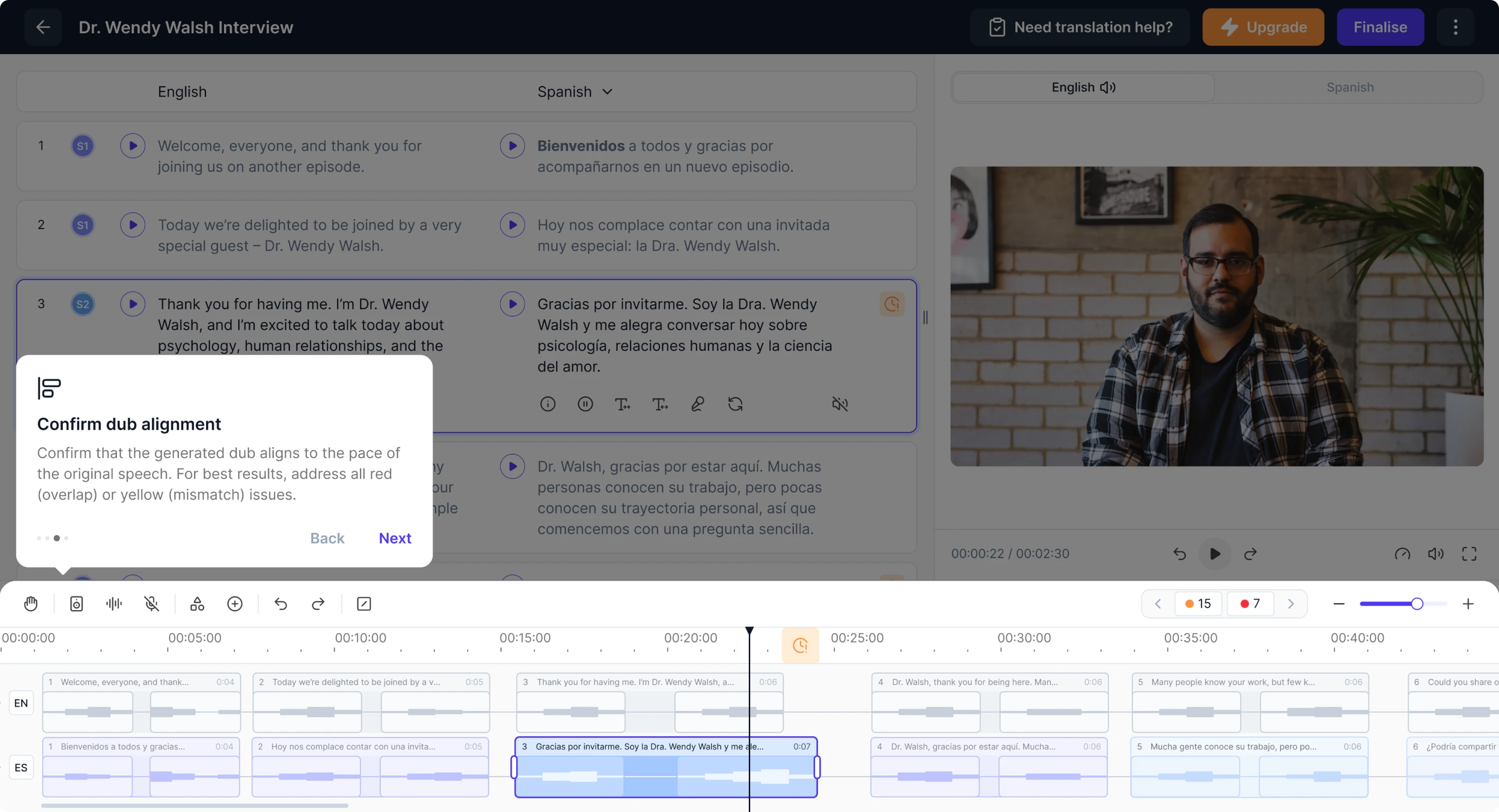
Before committing to a complete redesign, we invited Panjaya for a 3-day trial period. Our designer was tasked with addressing one of their most pressing issues: users couldn’t understand and manage AI errors.
Previously, the platform marked mistakes with small badges placed directly on the timeline. In theory, this should help users quickly jump between problematic areas. In reality, people didn’t grasp what colored markers meant and how to fix them.
To improve this experience, we first looked at the bigger picture.
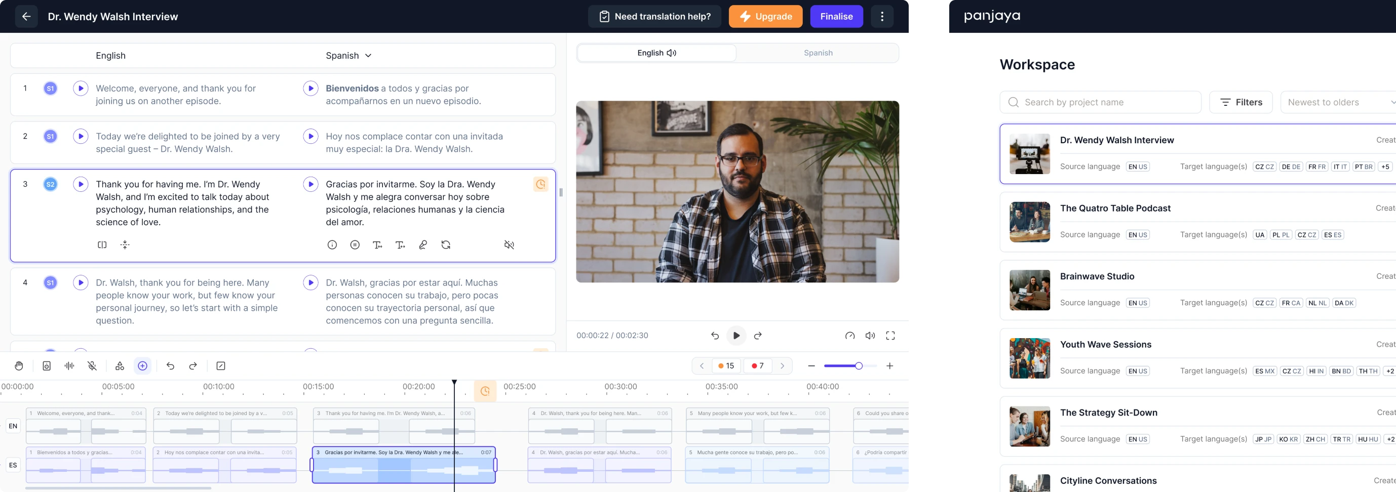
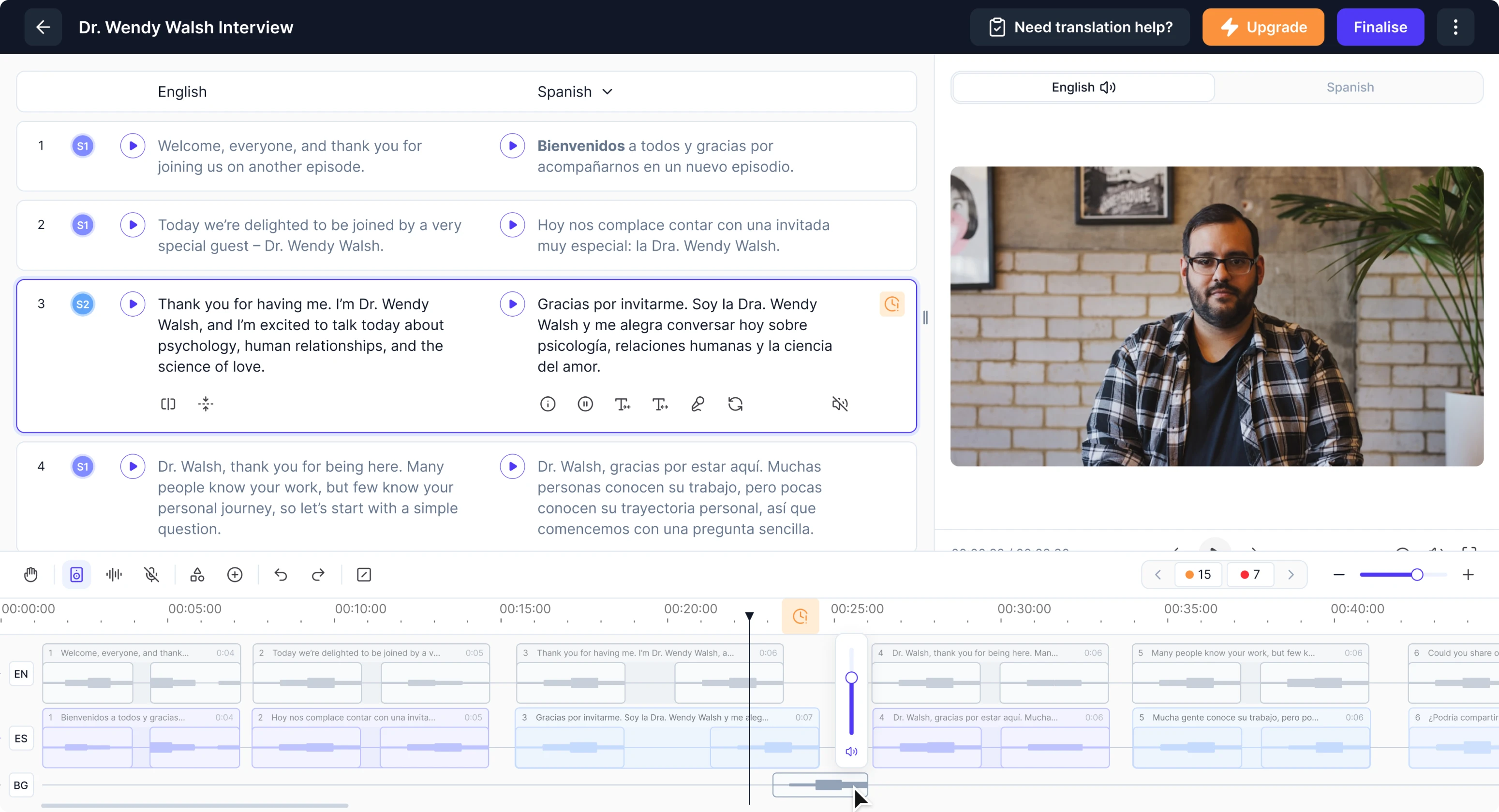
A major source of cognitive load came from the layout. The video sat at the top, while the transcript and timeline were squeezed below it. Large portions of the screen remained unused, leaving no intuitive space to surface error details.
We proposed placing content side-by-side rather than stacking it. This shift created enough room for important details and made the underlying logic easier to follow. To show users why each error mattered, we designed a clear error summary panel.
From there, users can see how many issues remain, understand the exact problem in each case, and decide how to proceed. Not every mistake requires manual attention, so we also added the ability to skip non-critical errors.
The trial phase gave the client confidence in our designer’s UX approach, and from there, we moved into full-time collaboration.
The platform audit helped us expose deeper usability challenges
At the start of our work, the client gave us access to the platform, and we spent three days exploring the interface. Our designer went through every screen, interaction, and workflow, documenting where users struggle the most.
To give the client a clear picture, we prepared a detailed review summarizing:
- what wasn’t working well,
- what could be improved,
- and how these issues might be solved.
Eleken's designer became a true thinking partner, jumping in immediately, learning the product, identifying gaps, and proposing clear alternatives.
VP of Product, Panjaya.ai
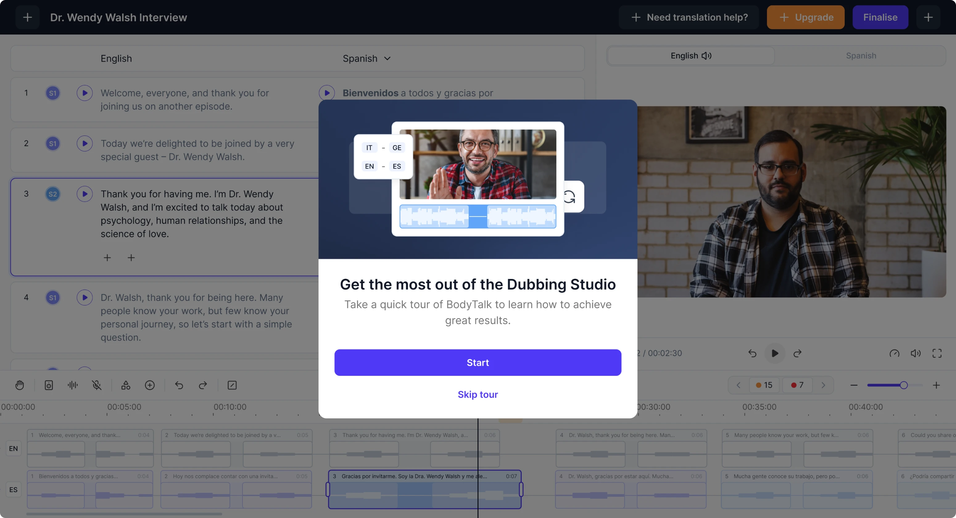
We simplified onboarding to make the AI workspace intuitive for newcomers
Panjaya’s platform offers powerful capabilities, but without prior experience in video editing, newcomers struggled to understand where to start. On top of that, AI introduces an entirely new workflow, making clarity our top design priority.
To reduce this barrier, we focused on onboarding. Our solution was a simple highlight tour that points out the core areas and shows what users can interact with.
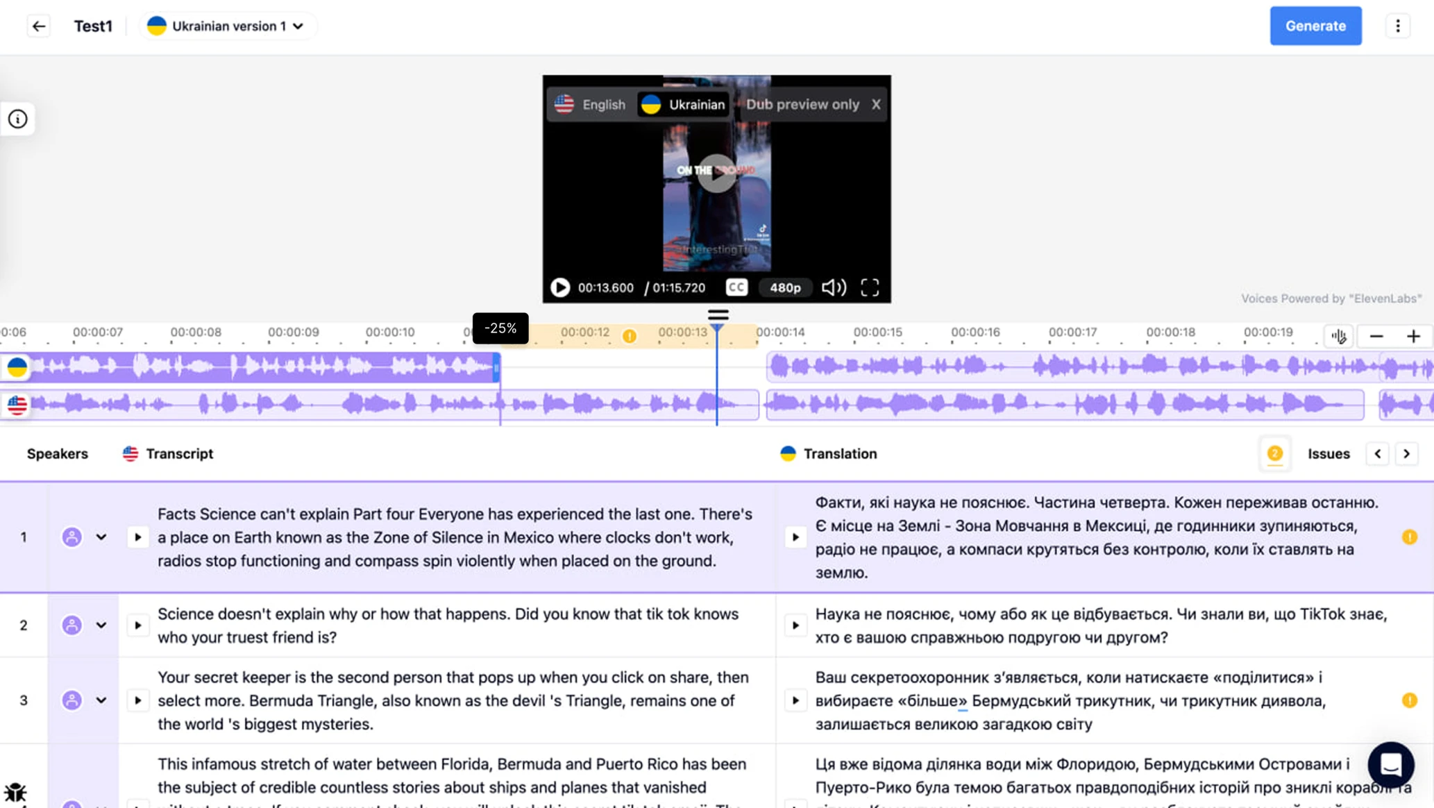
AI makes mistakes, and our interface needed to communicate them clearly
As we explored the platform further, we saw that AI tends to fail in complex scenarios when multiple people speak at the same time or when face recognition is required for lip sync. These challenges pushed us to rethink how users work with audio and video data.
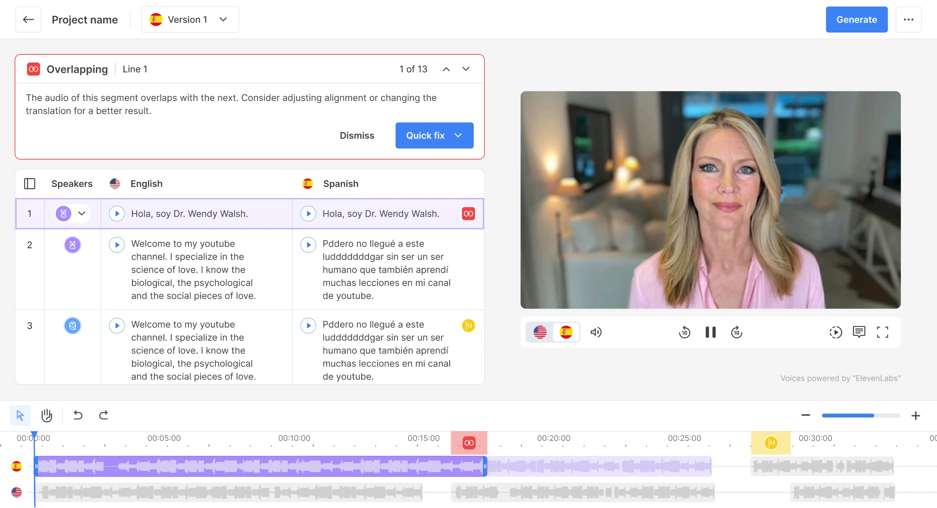
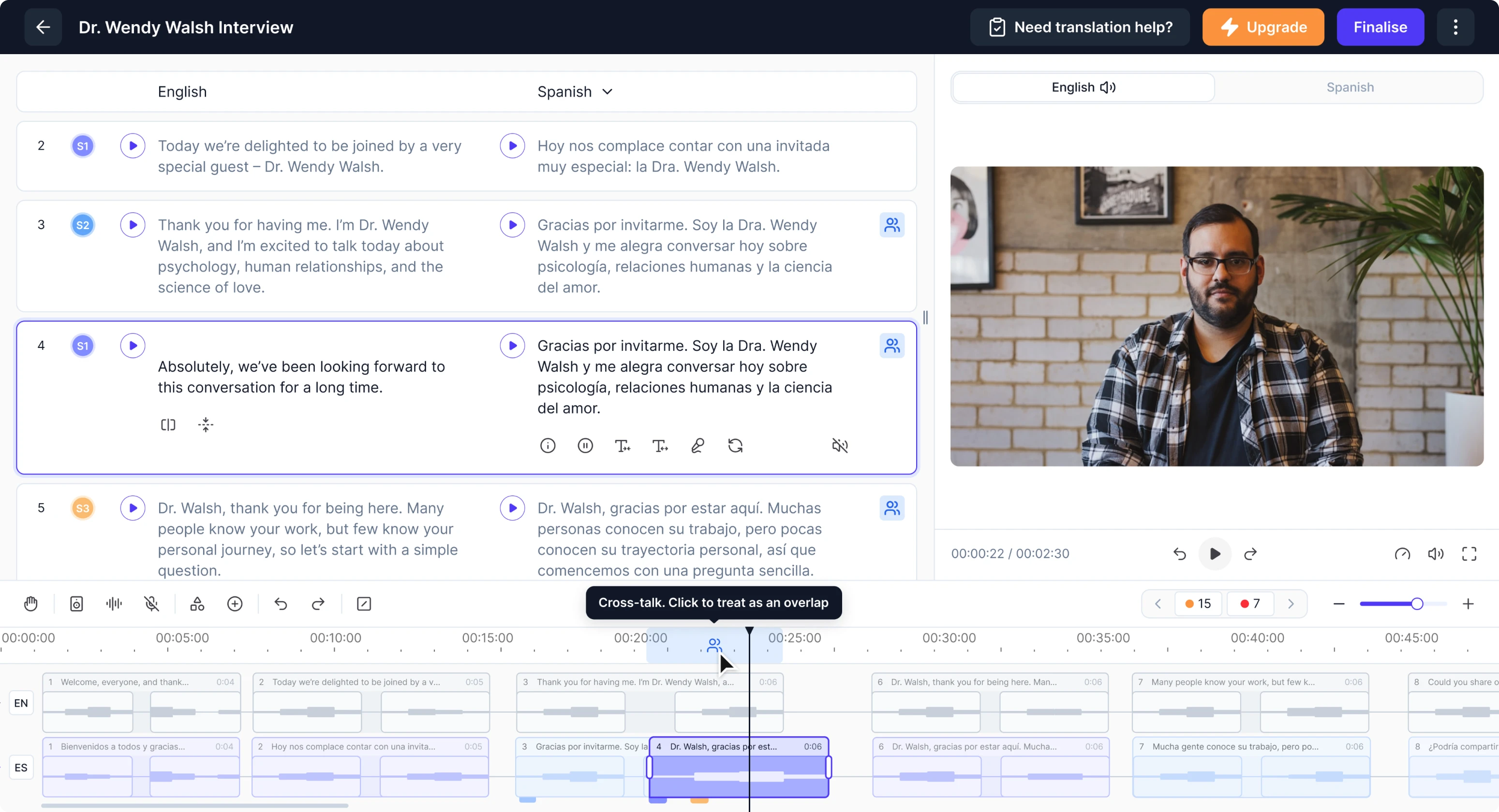
Cross-talk functionality
Cross-talk happens when multiple people speak at the same time, interrupting each other or talking over one another. This creates huge challenges for AI.
The model can’t reliably understand what’s being said, can’t split the audio into accurate segments, and often misaligns the dubbing. Most competitors solve this by adding extra audio tracks, but Panjaya’s editor already had limited vertical space.
We explored many concepts and eventually arrived at a solution that gave users full control without cluttering the interface. Our designer allowed translators to insert additional segments manually directly on the dubbing track.

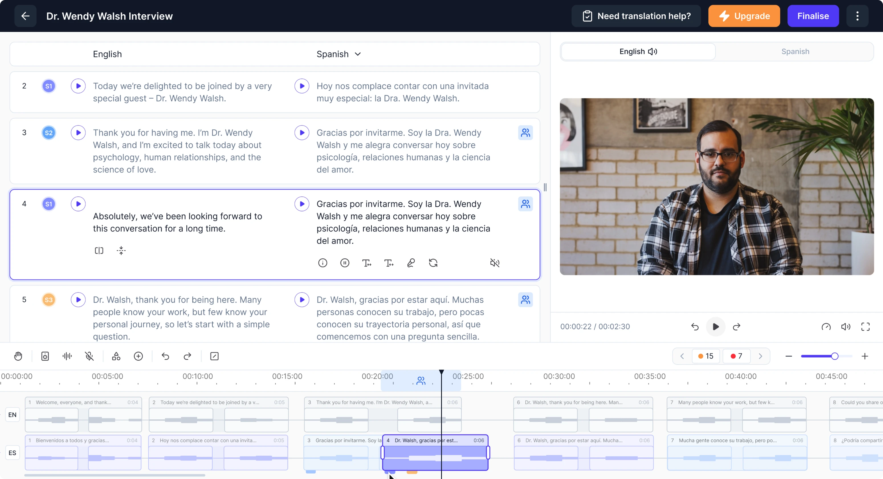
To make overlapping speech easy to notice and manage, we introduced small badges that act as identifiers. Hovering over them highlights the exact conflicting area, while lightweight tab-like markers let users switch between speakers quickly.
The interaction was inspired by tabbed notebooks, bringing a familiar real-world pattern into the digital editing experience.
Lipsync video controls
After a user is done with translation and dubbing, the system automatically applies AI-generated lip sync. The model detects who is speaking at each moment and adjusts their mouth movements accordingly.
But sometimes AI can get it wrong, especially if someone covers their mouth with a hand or if two people are visible in the frame.
To give users control, we designed an alternate layout dedicated to lip-sync adjustments. In this mode, the transcript is hidden, and the video becomes the main focus, allowing users to clearly see who is speaking in each segment.
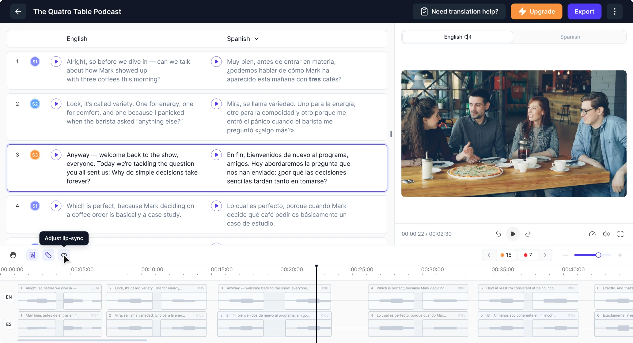
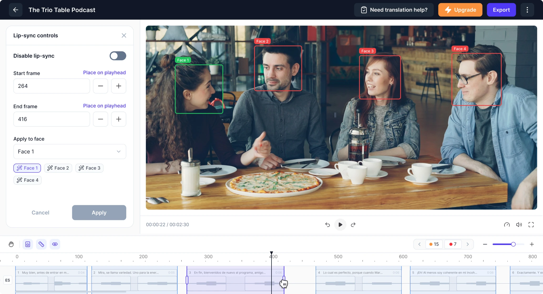
Selecting a segment highlights its frame range, and users can either click the video directly or use a side panel to assign the correct speaker. They can also disable lip sync for specific moments or create custom segments if more precision is needed.
The result is a cleaner, more cohesive UX that meaningfully leveled up our product. I highly recommend Eleken to any team looking to elevate their product design.
VP of Product, Panjaya.ai
A workflow designed for enterprise-level collaboration
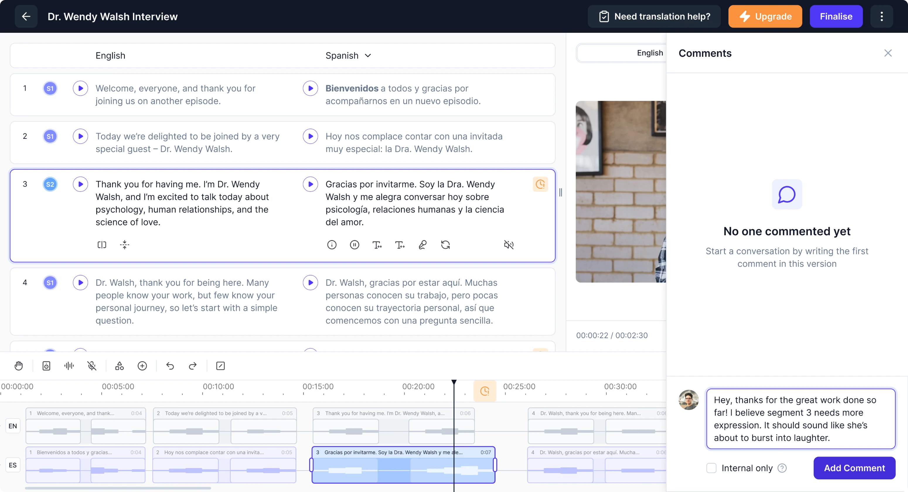
As Panjaya grew, more enterprises began using the platform. Their workflows were far more complex than those of individual creators, and they needed tools that could support multi-stage review cycles, client-side corrections, and team collaboration.
One of the biggest pain points came from the revision process. Enterprise clients review translations on their end and send back edits. But when a video returned to Panjaya’s internal translators, there was no way to see what had changed.
Translators had to rewatch the entire video and guess where the client had updated the text, which made the workflow slow and error-prone.
To streamline this process, we introduced an in-platform commenting system. Clients can leave comments, with each segment number becoming a clickable link to the part that needs revision. Internal reviewers can also leave private notes.

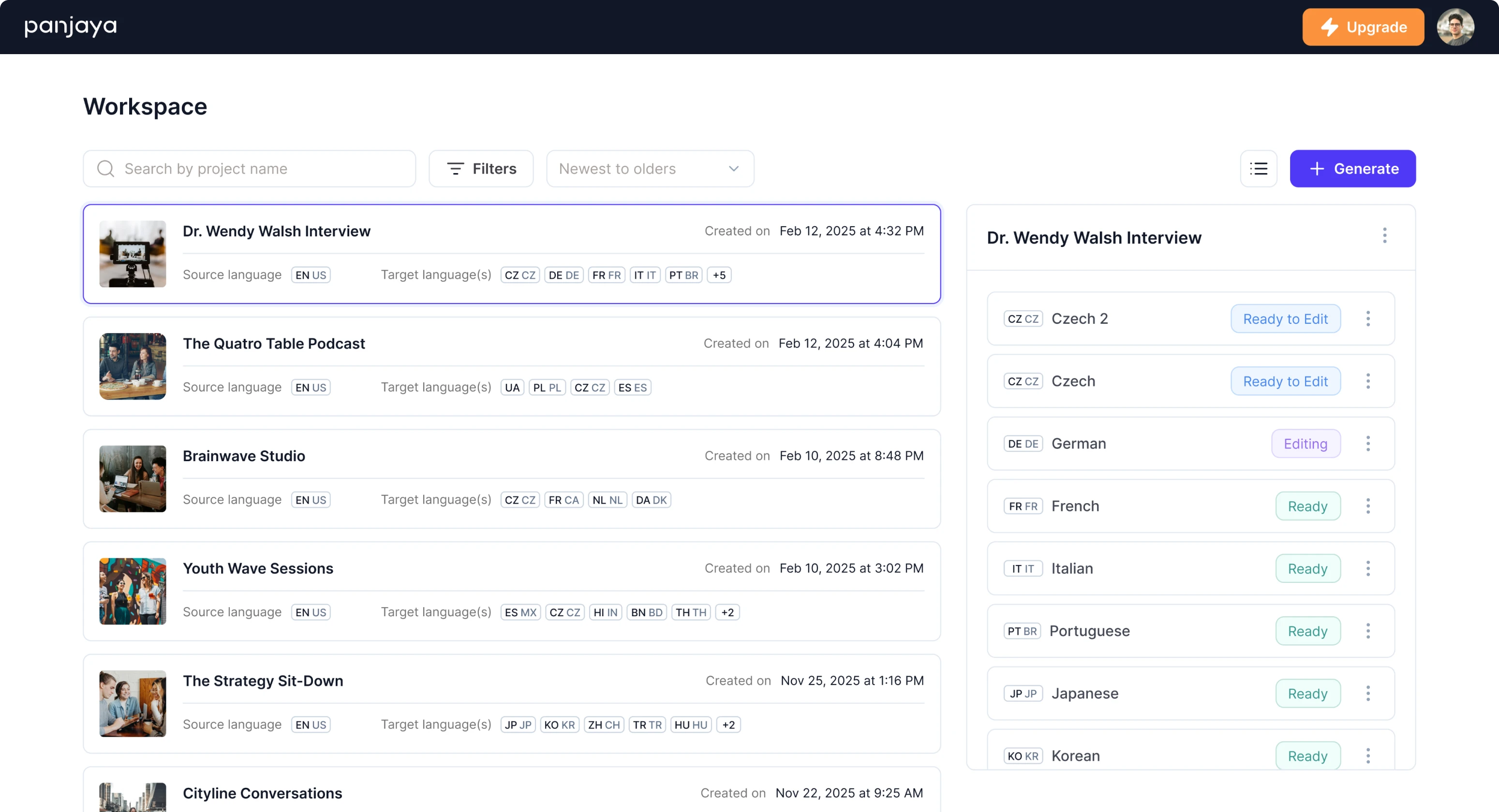
Another challenge was managing large video libraries. Some clients upload 40 videos at once, each with 20 different language versions. The old system displayed these as long, unreadable tables with no search functionality.
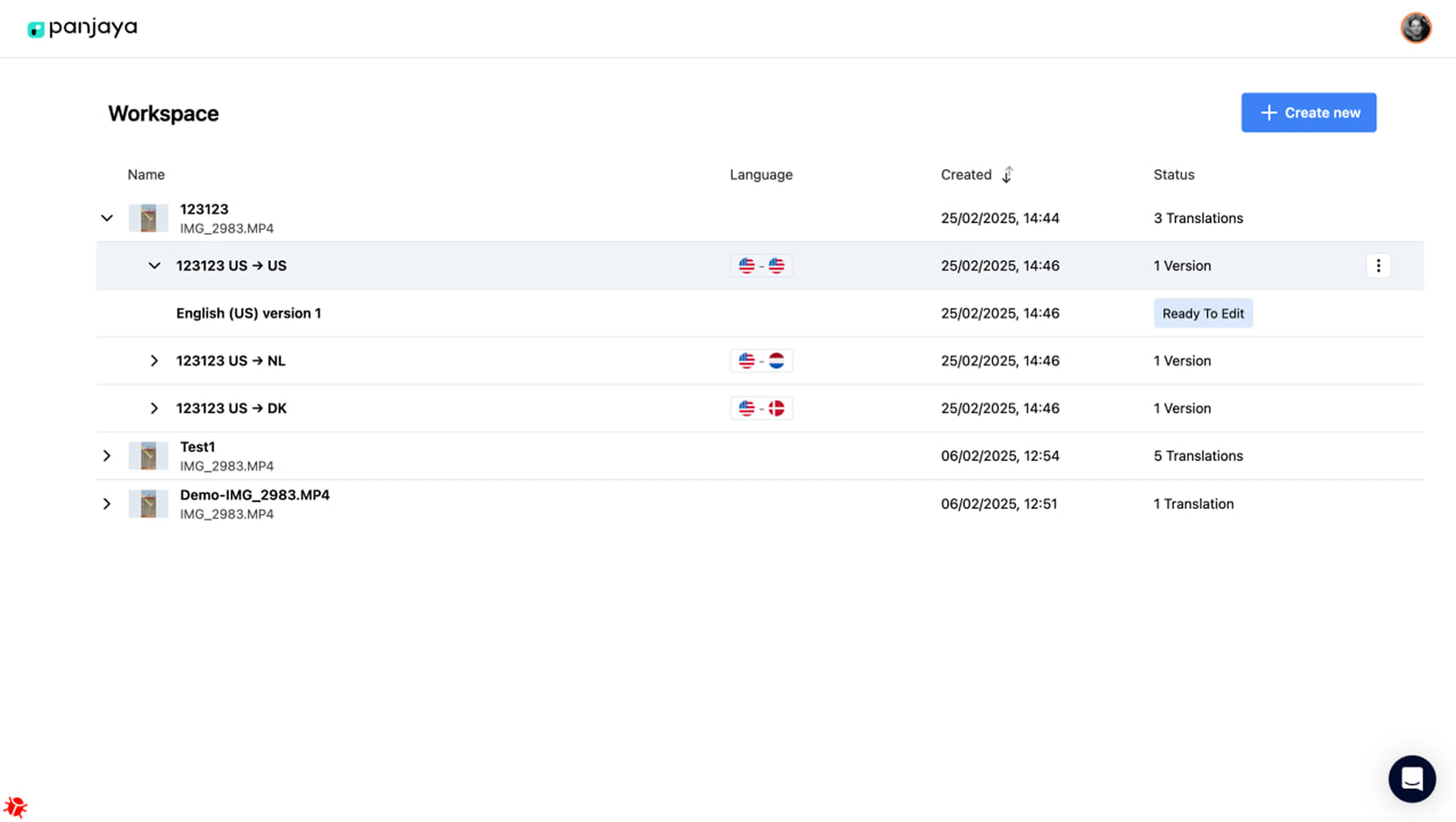
We redesigned the entire search and navigation flow.
Now, when users click on a video, all its versions appear neatly in a panel on the right side. The main preview or project name stays anchored in place, making it easy to navigate across dozens of files without losing context.
User interview insights shaped our next UX decisions
As the platform expanded its functionality, our designer proposed conducting user testing to uncover hidden friction points. The client supported the idea and connected us with several internal translators who were open to participating.
It took about two weeks for us to schedule sessions, run interviews, transcribe conversations, and analyze patterns. The results revealed numerous “small” issues that, in practice, slowed translators down significantly.
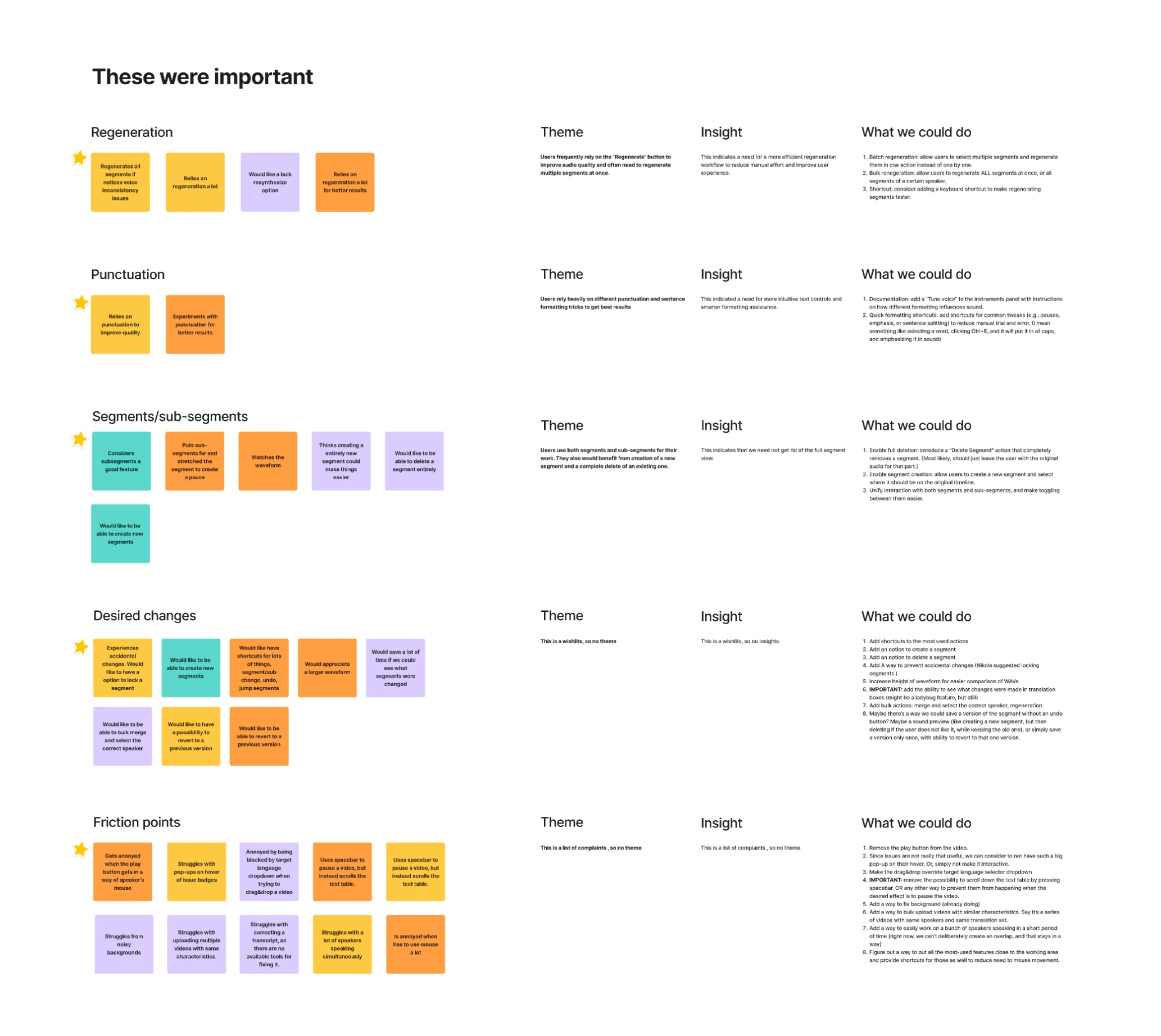
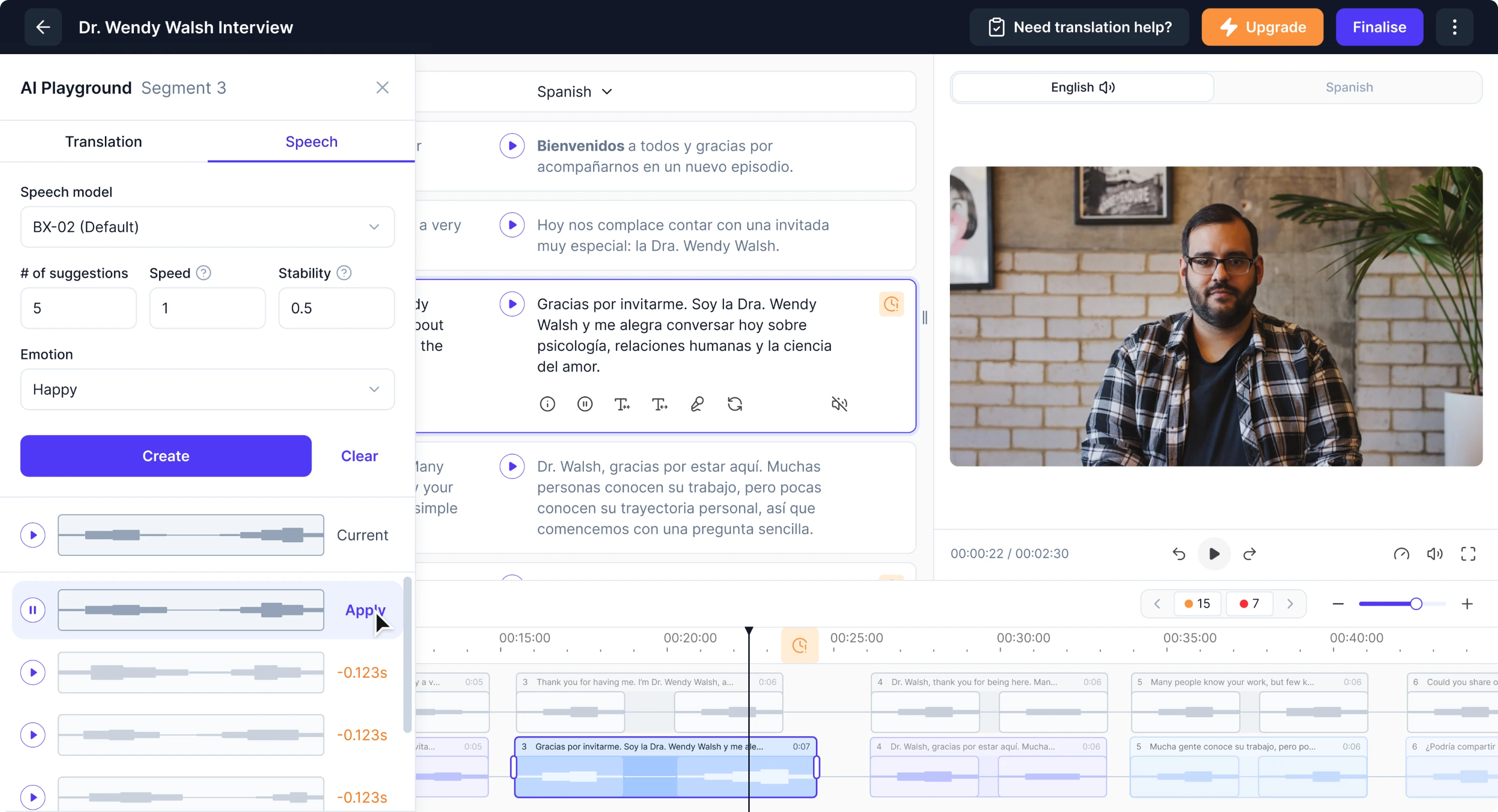
- Controlled audio generation over blind regeneration
Originally, fine-tuning a dub mostly meant clicking the “regenerate” button and hoping the AI would produce a better result. There was no guarantee the next attempt wouldn’t be worse, and no easy way to return to a previous version.
We reworked this flow. Now users can decide to regenerate a single segment or all edited segments at once. To make refinement even more predictable, we introduced multi-variant generation, allowing users to compare several options.
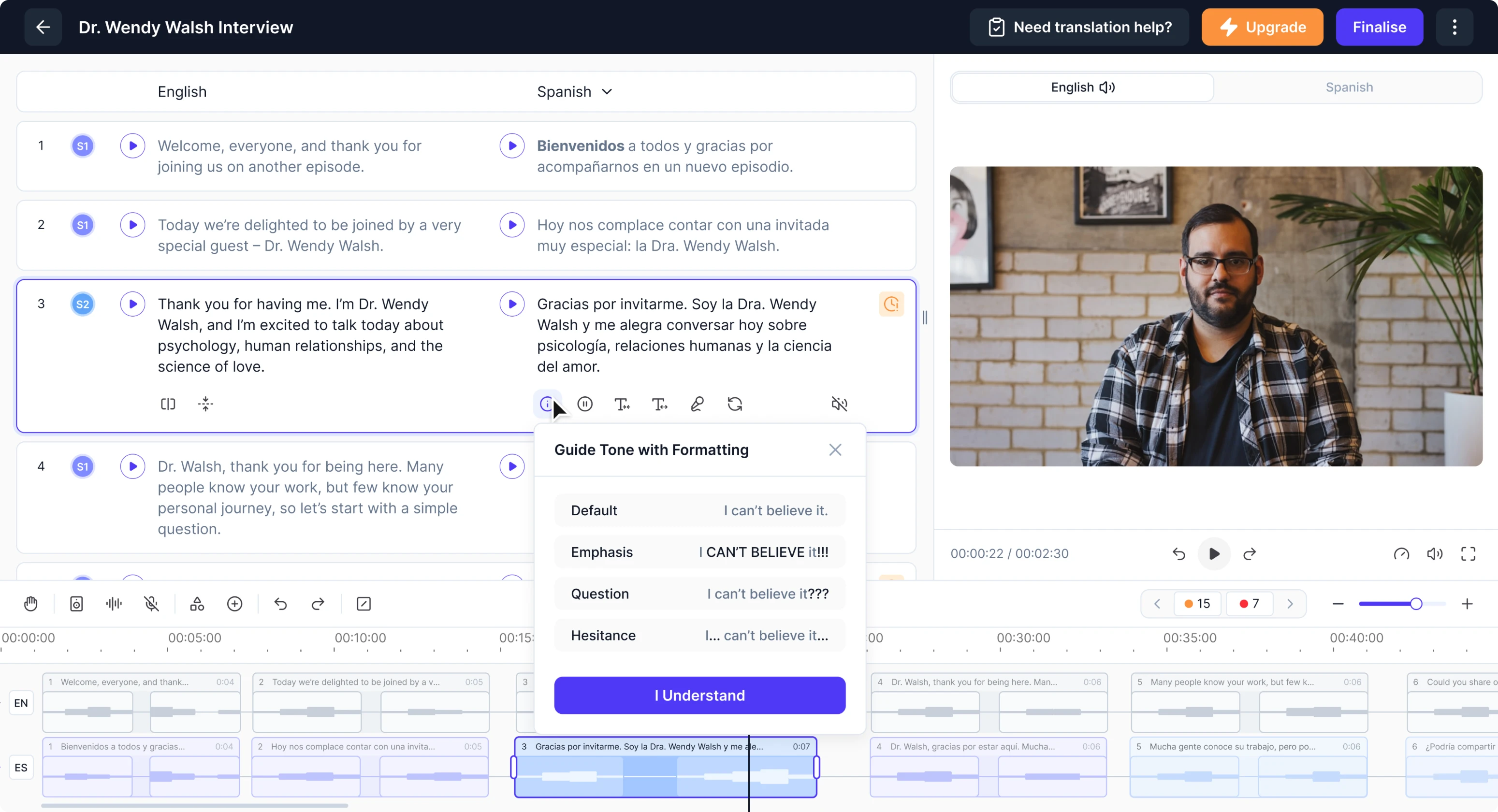
- Transparent formatting effects
Many users didn’t realize that punctuation and formatting (CAPS, commas, exclamation marks) affect how the AI delivers audio. We created a modal with a simple guide that explains how formatting influences voice tone and emphasis.
- Efficient segment/subsegment switching
Switching between segments and subsegments originally required clicking a dedicated button placed far from the editing area. On large screens, such as 4K monitors, this caused constant, time-consuming mouse travel.
Taking cues from tools like Figma and Illustrator, we added a double-click interaction. A single click selects a segment, a double-click opens its subsegments, and another double-click brings you back out, removing a lot of extra cursor movement.
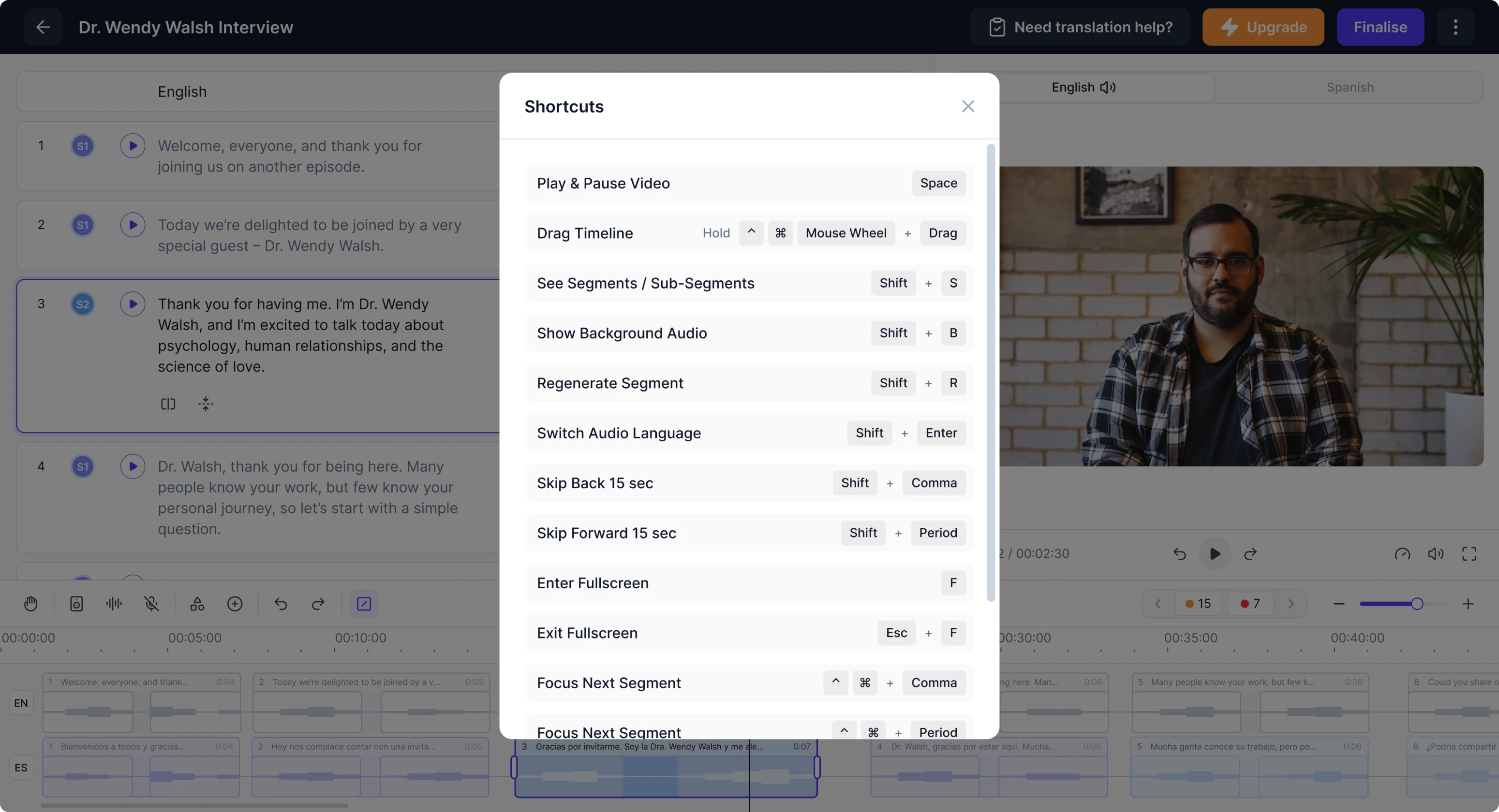
- Optimized workflow with shortcuts
Translators repeatedly mentioned how much time they lost navigating dispersed controls. To solve this, we prioritized the most common actions and introduced a system of keyboard shortcuts available through a small in-app entry.
- Granular background audio adjustments
Panjaya generates separate audio tracks for voice and background noises. Sometimes these sounds were too strong or split incorrectly. We gave users control and added the ability to view, split, and adjust the audio volume.
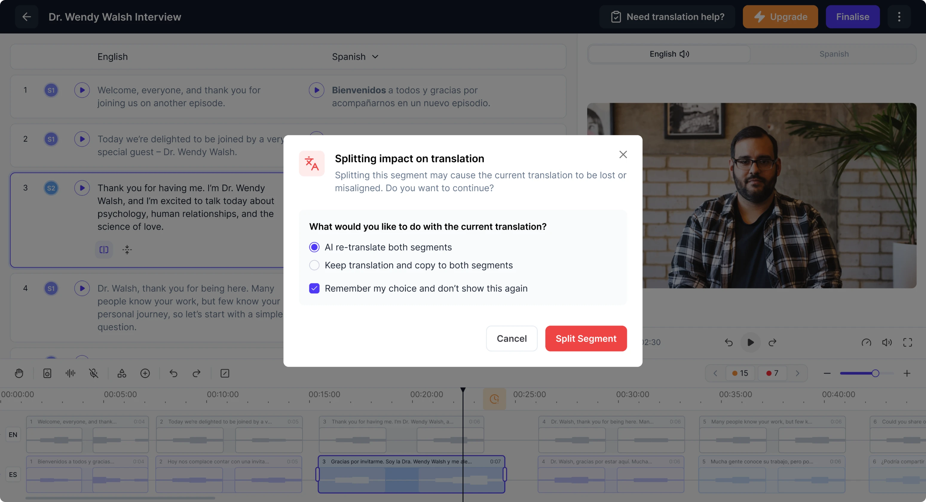
- Flexible segment splitting options
Users often need to split a segment in two, either because the AI merged two speakers or because they want to improve clarity. Previously, splitting triggered a modal warning and forced automatic regeneration.
We redesigned the modal so users can choose whether to keep their existing translation or regenerate it. They can also save this preference to skip the modal entirely in the future, removing repeated interruptions from their workflow.
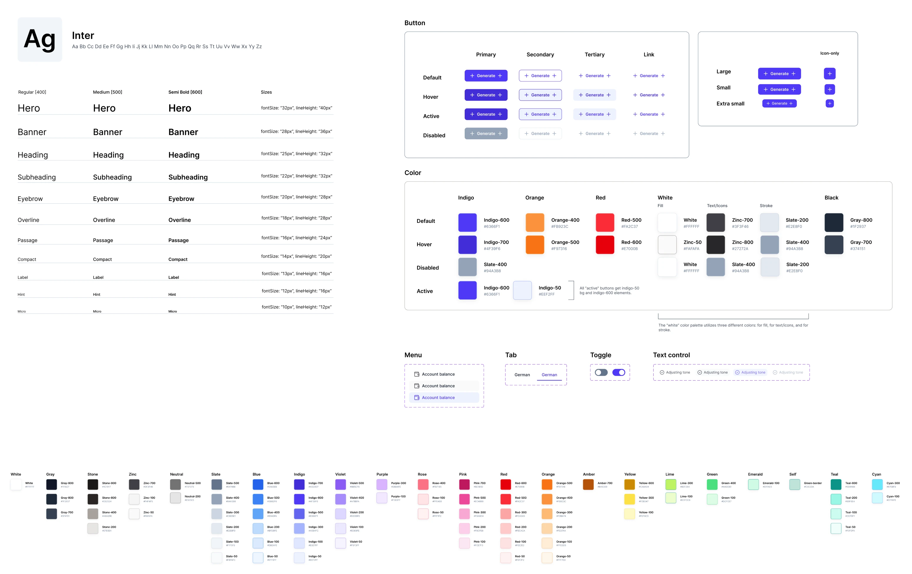
A modern design system to unify the entire platform
Alongside the UX work, our designer built a complete design system from scratch. The client had a basic foundation in place, but the platform needed a more modern, cohesive visual language to match its evolving functionality. We delivered just that.
Backed by advanced UI/UX design from Eleken, Panjaya strengthens its market position
Our collaboration with Panjaya turned into a rewarding journey. The client gave us full support, quick feedback, and the space to explore meaningful improvements, while we focused on delivering a high-level product experience in return.
Today, Panjaya stands as a strong competitor in the dubbed content market. Some well-known names, including TED, rely on the platform and report a 115% increase in views. With the redesigned UX and UI, this impact has the potential to go further.
Eleken was an absolute pleasure to work with. The entire team was responsive, proactive, and genuinely invested in our success. Their engagement model is highly flexible and truly feels like having an on-staff UX designer embedded with the team.
VP of Product, Panjaya.ai